Transcripts
1. Introduction: Hello, and welcome
to this class where we are going to journey
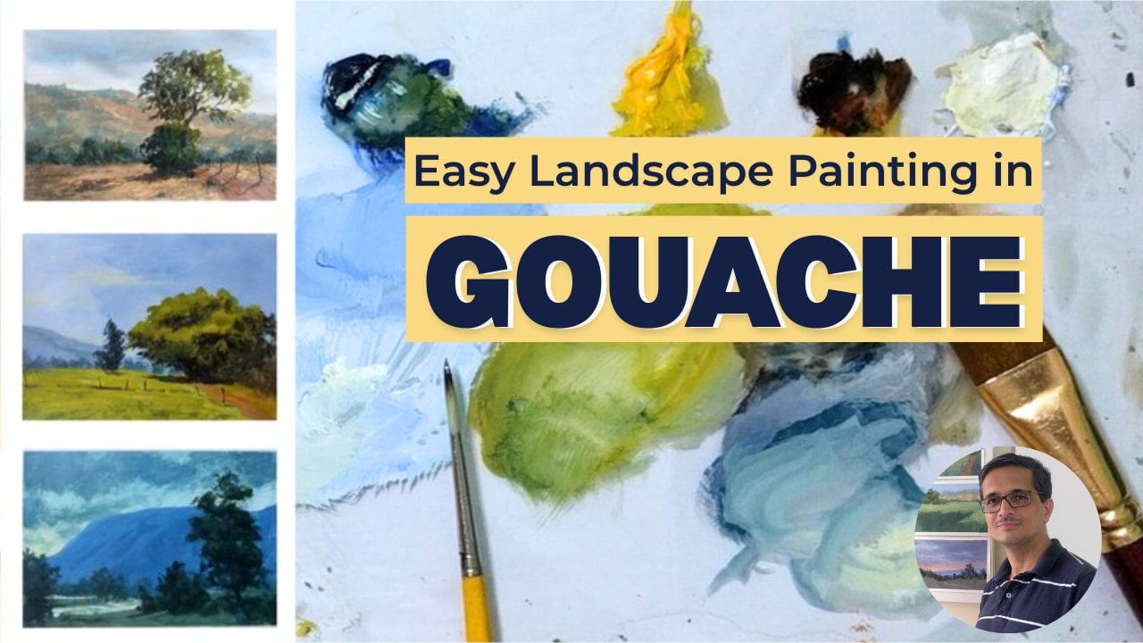
to the heart of the Alps and learn how to paint breathtaking Swiss
landscapes using vibrant and versatile
medium of quash. I'm Mandar Marathe,
a fine artist, sculptor, and an art educator. Over the years, I've had the privilege of
teaching more than 25,000 students both
online and offline. My goal is always to take
complex subjects and break them down into steps that
any artist can master. Whether you are just picking up a brush for the first time or you are an experienced painter looking to explore a new medium, this class is designed for you. I've kept the approach
generic and accessible so that anyone with a passion for landscapes can follow along. I've developed a
comprehensive art framework centered around six essential building blocks of painting, which are concept, drawing, composition, value,
color, and technique. I have several courses
dedicated to each of these blocks to help artists
build a solid foundation. In this specific class, we'll be focusing primarily
on the technique block. We are going to dive deep into
gouache specific methods, learning how to layer, blend, and handle
the paint to get those crisp and
beautiful textures that make landscapes pop. Using reference
photos I personally captured during my
travels in Switzerland, we will paint two
distinct landscapes together step by step. You will see exactly how
I translate a photo into a gouache painting from the initial sketch to
the final highlights. For your class project, I've attached my original
Swiss reference photos. Your task is to choose one
and apply the techniques you've learned in this class to create your own
mountain masterpiece. I can't wait to see your work
in the project's gallery. So are you ready to paint
the Alps? Let's get started.
2. Swiss Village On Slope - Materials: This video, we're
going to learn about the materials that I'm going
to use for this painting. I have this 230 GSM
handmade watercolor paper taped on a board. Then I have three brushes. These two types of brushes are used generally for oil
or acrylic painting, but I like to use them
even for the way I paint with watercolor and uh because I like the texture
which they create. So this is a 1 " hog hair brush, and this is half an
inch hog hair brush. Then I have a small round
brush with soft bristles. These are the only three
brushes I'm going to use. Then talking about the colors, these are all watercolors. Only thing what I have here is white gouache color to
make the paints opaque. I'm going to use only a few
colors for this painting. I'm going to use cobalt
blue, some Prussian blue, yellow ochre, lemon yellow. And titanium white. And I might need to use Venetian red or Vermeilion
color as a red. So basically, I have two blues, two yellows, one
red, and one white. And with that, I'm ready
to start the painting.
3. Swiss Village On Slope - Composition: Before we jump into applying
paint to the paper, it's always a good idea to compose a picture
based on the photo. So this is the
original photo which I clicked from the moving
train in Switzerland, and I like some part
of it, actually, this portion, and that's why I cropped the
image to get this. But even in this, I want
to refine it further for making the painting more captivating or more
interesting to look at. So what I don't like about this photograph is that
you can clearly see one, two, and three shapes, and I want to break
that monotony somehow. So what I've done is I've
sketched a rectangle of a similar proportion
that I want to paint on, which is six by 8 ". So I'm going to use this photograph as my
reference and make a sketch. And what I plan to do is
make some modification in the shapes so that it is not monotonous as
the photograph is. So I want to keep the
foreground as it is, so I'll just draw
this line like this. And then I want to make some changes to the
outline of the mountains. So instead of going
straight from here to here, I'm going to make the
mountaintop slightly flat, and then I want to bring it down here and then
end it like this. So there is a variation
in the shapes. And of course, this
is just an idea. When I actually paint, I might make some changes, but at least this
gives me a good start. So let me put in some of
the objects that are there. I want a few houses here
just an indication of those. Then a few trees, let me increase the size of the brush and I don't want the viewers attention
to go out from here. So I'm going to have
some trees here also, and there's going to be some kind of indication
of slope here, maybe a tree or two here
or not really maybe here. I want to darken
this and also show these sheaves which are actually the rock on which
there are no trees growing. And in all the other areas, there is dark blue
colored foliage and so on. Let me
not share this. But I think this is slightly more interesting than
this one to look at. And you may not
feel that there's something nice to look at, but its aim is not to look nice, but to give me an idea of what kind of compositional
changes I need to make. So with that said, we can go to the next stage
where I actually draw this in more detail on the
paper that I'm going to use. And when you do composition, I just used an iPad
just because it is easier for me to zoom
in Zoom out and draw. But you can do this composition with a
simple pencil and paper. So now let's get to the
next video in which I'll actually draw this and then continue with the
painting. See you there.
4. Swiss Village On Slope - Drawing: Come back. Now that I have
this composition, rough study made on iPad, I can actually draw
it on the paper. So I'm going to use a simple
pencil to draw it out, and I'm going to also look at the photograph and
the composition. And I don't want this
line to be at the center, which I did in this sketch. So I'm going to take
it slightly down. This is the approximate
vertical center of the paper. So the line can be
something like this. And I might actually end the stoke here so that
it goes more downhill, and I'm going to
change the mountain or draw the mountain
from here and make few details in the outline
and make it outline that. And then I'm going to have
a tree here, a tree here. I want a house here, which is going to be
something like this. And maybe another
house just behind it, which we don't see completely. Then a tree here, a tree here, and a few more trees here on the slope of this hill and
maybe a roof peeking out here. And then there are
a few trees here. I just want to give an idea of houses being
there on the slope. I don't want them to be the complete star of the
painting, so to say. And I don't want the viewers
attention to go out. So I'm going to have
another tree here which simply obstructs the viewers
attention from going out, and then I have these
rock formations or the rock face where there are no trees
growing and maybe show some more clouds than
what this photograph shows. I'll overlap some of those on this mountaintop so as to blur the outline maybe
slightly flat ground here and something like that. So I think I'm ready with this sketch for the
actual painting. And I will post a photograph of this
drawing a rough sketch in the description so
that you can use that to make your drawing and
then start painting. So see you in the next video.
5. Swiss Village On Slope - Painting Part 1 of 4: Now is the time to actually paint on this drawing
which I've made. And I'm going to start with
the darkest shapes that are there in the painting and which are the
trees that are here. And in opaque medium, it is generally advisable
to start from the darks, though it's not a rule,
more like a thumb rule. And in this case, I would like to start
from the darks and go towards light
because then it will be easier for me to gauge the value that this
mountain needs to have and you can see the ready or the final painting
in the top right corner. So I'm going to start by
mixing blue green color. So cobalt blue. And I want this green
to be darker green. I'm going to not
use lemon yellow. I'm going to use yellow ochre. And let's see how
this color looks. If I feel it's dark enough, then I can continue. If not, I'm going to
add some red to it. And I'm using this half an
inch hog bristle brush. So let's see how this looks. I think it's good
enough to start with. I can always add some
accents later on. So I'm going to keep
on wearing this color. I don't want to use it
as it is in every tree. And I'm going to assume that the light
is coming in from here. So there will be some
highlights or lighter side. And so the left side of the
trees and all the objects here will be slightly lighter
than the right hand side. So let me make this green
slightly lighter on this side. Let me start with this I think I can add
some lemon yellow. This is the lemon yellow to make this colour
slightly lighter. And I can always come back
and modify the values. So I'm going to paint left
side of all these trees first and then come in with the darker color for
the right hand side. So now I need the darker side, and I'm going to make
it slightly more dark or darker than what I get by mixing just the
blue and yellow ochre. I'm going to put a tinge
of red in This is. And let's see how this looks. Yes. Interesting. And even though these trees look like just a blob right now, I can, of course, come back later and adjust anything that
needs adjustment. Okay, now let's paint
the houses. Those house. For the color of the roof, I'm going to make a
reddish grey color, adding some blue
to the vermilion. And I want to add some
white to make it opaqu. And I want to darken this, so I'm going to put some
more blue and some red. And I want to desaturate, so I'm going to put some
little yellow ochre in it. Yeah, let's start with
this and let's see if this colour needs
any change later. I'm going to add
some more white. And I'm using this small
round brush because I want some precision because of the size of the roots
that I'm painting. And maybe a hint of a
house here or a roof here. Then as you might have noticed, most of the farmers houses in Switzerland have two stories, and the ground floor
walls have white color. And top floor is made with wood. And I'm going to
make a dark color or the wood dark brown. I think this should be good. Let's see how this looks in comparison to the
color of the roof. The fine. Yeah, that's good. Be sue. And the first floor will
be very much white, but I don't want
to put pure white. So I'm going to use
this color to just add a tinge to the color that I'm applying or maybe
I can repaint this later when I have all the other things
planned out or painted out. Okay. Now it's time to paint this because this
is darker than this. Next grade in darkness
will be this. So this is actually mountains. It means to have
that mountain color in some places the
rock color rather. And for that, I'm
going to mix this, maybe add a little
more white in it. Let's see how this looks as the base color for I'm going to make it
slightly more yellowish. So what we have here is blue, then red, then
some yellow ochre. And white. And so this will give me a base color for the rocks. Of course, I can
change it later, but this gives me
a starting point. And now I need to mix a bloom. So for this, let's use
some Prussian blue. And I'm mixing this in this puddle in which I
made that earlier color. So some Prussian blue and some yellow make
it slightly greenish. That's too green. So more Prussian blue. But Russian blue is
very, very intense. I want to add some
cobalt blue also in it, and I want to lighten it because the mountain
is at a distance, it's going to be much lighter. So let's see how this looks. I think this looks
too vibrant color. So it needs to be darker with some Prussian
blue and some red. Let's see. I think it needs
to be light or even more. So more white? Yeah. And in respect to this
trees, how it looks. I think it looks so. So I'm
going to paint this mountain. And I'm also going to create
some variation in this blue by adding blue some more
blue in some areas, some less blue and other
colors in the other areas. So never paint a
shape filled with same color monotonous inner
landscape because the nature has so many delicate colors. And if you paint it flat, it looks more like an
illustration and not a painting. So I'm going to carefully paint around these shapes that
I've already painted. And I'm using vertical strokes, and I'm going to also drag this brush onto this
color because I don't want pure flat color. And Don't be afraid to
make bold breasttoks. And I want these
reeks to remain as it is B to smooth it out. We In painting, first, you have to make a
guess about the values. And as the painting progresses, the painting itself tells
you whether you need to ingest any values anywhere
or you are going to go. I want to give a lot of
importance to the house. So you can see that with
this color now added, the house looks very dull. It's not popping out and I'll have to do
something about it. But at least it gave me the
earlier painting layer gave me an idea of what
it should look like, and then we can
keep on adjusting. So painting never
happens in one go. You have to paint in layers
and keep on adjusting. As I go towards the
top of the mountain, I'm making the color
slightly more greenish, but I don't want to
compete with this. I'm going to also
add some white. And gently drag this over this. Some more bloom. And you can see how this bristle brush
is creating the texture. With soft brush, you
cannot get this effect. And that's why I
defer these brushes, even for wash paintings. I'm going to take
some yellow or of this yellow and give a hint
of some more yellow in here. The colour need not show. It has to just create an
impression of variety. And create some interest. So now I'm dragging this
darker color on top of this in few areas where I feel I need to show the
depth or area which receives less light that is also helping me break the
monotony of this big shape I don't want any
area to look flat. Let's stop here as far as
this mountain is concerned, and we can, of course, revisit it once the whole
painting is painted. See you in the next video
where we are going to proceed further into
the painting process.
6. Swiss Village On Slope - Painting Part 2 of 4: Now, let's paint the foreground, which is much more bright
green slope of the mountains. I'm going to take lemon yellow and a touch of cobalt blue, and let's see how this looks. I think I need to
add some white to it to make it more opaque. And let's first apply this
and see how it looks. I think I'll start with this
but make changes to it. And because the grass is never of the same
color everywhere, I'm going to make variations
to it as I go along. And I want these treks
to be there because they give much needed
texture to the painting. And as I go towards
the bottom and end of the painting or the
corner of the painting, I'm going to darken
the green because I don't want to
make this area very attractive to pull the attention back into the center
of the painting. Here I'm going to use some of this leftover green and add some yellow Just by using the brush strokes, you can see how I've created two different sloping shapes. And you don't always have to arabic shapes to suggest
the change in the terrain. You can use just different
brush strokes to suggest that. And the viewers eyes and brain fill up the
rest of the things. So here, I'm going to now paint a few shrubs of the similar color that
I've used for the trees. So I'm taking this same color and putting a tab
here and there. Need not State everything. You can just suggest
and leave it as it is, and it does create an illusion of some
shrubs being there. Now, let's quickly
paint the sky, and then we can come back
to painting the details. So see you in the next video.
7. Swiss Village On Slope - Painting Part 3 of 4: Before I proceed, I like to
always keep my palette clean. So I'm going to clean this up. Okay, now we can come
to painting the sky. So for the sky, I need white and
blue cobalt blue. So I'm going to start with
some cobalt blue here. And let's see how this looks. I need to add some white so that color is not transparent, okay? This looks good. I'm looking at the
photograph just to see what kind of cloud
formation I need to paint, but I'm sure that I need
to make the corners dark so that the viewers
attention doesn't go off, and I'm going to
paint lighter clouds, some of them even overlapping
this mountaintop. So what I have on my
brush is actually a very rough mixture
of white and blue. But I'm going to
make it or apply it first and then think
about how I need to adjust this green has come into this white and
making it difficult. I'm going to pull it off. And now I can use this white. Again, I'm using the
brush very lightly so that I don't create
any hard edges. If you're using a soft brush, you won't be able to make
these light marks easily. You need to use a stiffer brush and there is no particular direction in which I'm painting the sky because the clouds do not have any
definite shape as such. But I'm going to make sure
that towards the horizon, the color is lighter
than what I have here because that's
how the sky looks. The horizon has lighter
colors lighter glaze in this kind of scenarios,
lighting conditions rather. And let's see if it
needs any changes. I think I can show
some blue patch here. Just cobalt blue. And I'm going to take
your whites now, and I've cried in a few places. Now I don't have any
blue on my brush. And if there are any hard edges, we need to get rid
of those Okay. I think that's enough. I think I should clean up the edge of the
mountain at least in this area. I don't want to make
it super sharp, but I can even use a finger and run it over Yes, now it's time to take stock of the situation and
see what this needs. So what I feel now is that
this color has still too dark, and I need to make it
lighter so that I can then also add some dark accents to these trees so
that it pops up. So to do that, I'm going to mix a lighter
origin of this color. I think I can add
this color itself. And so I need to add
some Prussian blue. And make it lighter
and slight grey. I don't want a very
vibrant blue there. So if you want to
gray down a color, you always add its complement let's see how this would look. This is too light, and it
competes with the sky color. So some more blue, some more red and
some more yellow. You can see that the
palette is getting muddy. The colours are getting
muddy, but it's okay. We can clean it up when
the painting is done. Now let's see how
this would look. This looks better. And also, I'm not going to paint the whole mountain shape again. I'm going to paint a few areas. I don't want to cover everything so that I leave some of the
dark showing through. Again, you can see the direction
of the strokes that I'm using in some areas I
can darken it further. This is how you add just
the value of a shape. And value is much
more important than the color or the to be precise. If you want to learn
more about color theory, I have a course specifically on that and color mixing. You
can check it out. Just dragging the
brush on top of it. The earlier layer. Y This is something like glazing wherein I'm
applying one layer or the other. And even though this color is not open, sorry,
not transparent. I'm applying it in
such a way that some of the underlying colour
keep showing through. So to that extent, this can be sent to be
similar to glazing. And now I think let this dry, and then we can come back and add a few details
to finish the painting. So see you in the next.
8. Swiss Village On Slope - Painting Part 4 of 4: I have taken a look at this
painting from distance, and I can see that I
need to slightly blur these or tone down
their brightness. I'm going to apply
this same blue colour. And because they are shining too much. So let's tone it
down a bit. Okay. Now it's time to put finishing
touches to these trees. But before that, let me add
some details to the houses. So starting with white. So reapplying the white maybe here so we can
show give a hint of the. And I'm also going to need a slightly darker
version of white, not exactly pure white. So as to suggest a few windows. Yeah. Maybe one
here on this house. And I'm also going
to lighten the roof. So some red let made
lighter with white. So I have coal blue, vermilion and some white in it. And see how this too. Now I need to use a
darker color to show windows in the white wall. So I'm going to make
a darker color. Again, a mixture
of blue and red. I which got pigs. We don't need to
paint every detail. I now need to you can see that the bottom of this tree where the shape of
the grass starts, it's looking very clean, whereas or a sharp edge, whereas I need some grass
there because the grass is closer to us than
the wall of the house. Or the farmhouse. So I might overlap it with
some green color tight. Indicating some grass
growing near the wall. We just need to
suggest a few things, and then the viewer's
brain fills out the rest. Well, I don't know if I need
to make the roofs lighter. Let's see if making it a bit lighter makes
it more interesting. Because I'm using now a
thinner origin of color, this is going to try
more transparent so it will not be as obvious
as it looks right now. These are just indications. Oh, yeah, there is a house
dead. Yeah, this looks good. Now, let's add some finishing
touches to the trees. I'm going to use this
same area to mix a green. So yellow ochre, blue and red. This is going to give me
a dark green, very dark. Yeah, let's try this. This is much more bluish than greenish. Yeah. Let's see. This is also not very dark, so let's mix it from scratch. So blue, some yellow, and it's some red. Yes. This mixture already
had some white in it, so that's why it wasn't
looking dark enough. So I'm going to add
now a few accents of dark and make the edges
of the tree shapes more uneven or unfinished because some leaves
do like to pop up or pop out of the
shape here and there. Even here because
the trees are darker towards the base as that
area gets less light. So now I need to mix
a lighter green, so some yellow and some
blue. And let's see. This should not be
as light as this. I think it is lighter
than what I need. Yeah, I'm just dragging
the brush over this. And and painting just a few areas. I don't want to overlap the lighter side with
this color completely. So you need a lighter
touch to your brush. Yeah, I think we are close
to finishing this painting I think I can darken a few
areas in this mountain here. So some cobalt blue
in already made area. And let's see can be darker. Let's use this dark. I think I can go darker. Okay. Also, the color the blue color looks
very flat here. Someone to drag this brush over to create some texture and then and towards the edge anyway, I need to darken it down so that the viewers
attention doesn't go towards the edges and
comes to the focal area. So I think we are done. I hope
you enjoyed the process of painting and to remove the
tape and see the cleated peg. Be careful when you
remove this tape. Always pull it away
from the paintings. Yes, that's it. I hope you will give
this painting a try. You will paint it yourself and put into action
whatever you have learned. And that will give
you more confidence. I'm sure this will become
lighter when it dries. So thank you and see you in
the next video where we paint yet another landscape
painting from Switzerland using quash and
watercolors. Thank you.
9. Snow Capped Mountains - Supplies and Drawing: Come to this video.
In this video, we're going to paint
a landscape based on the photo which you see
on your screen right now. I clicked this photograph from the gondola ride in Switzerland
when we were coming down from Mount Ketels and that's the inspiration
for this painting. Let me now quickly tell you
what materials I'll be using. This is a 230 GSM
watercolor handmade paper. I've taped it onto a board. These two are my trusted
bristle brushes. They are typically used
for oil paintings, but I like to use them
even for this painting on paper because they give
me a nice texture. And this is a soft
artificial hair brush and the color that I'm going to use for this painting
are Prussian blue, white, of course, then I'll use vermilion red
and yellow ochre. There's not a lot of
variety of colors in this painting in terms
of color mixing, this is going to be
an easy painting. Let me now quickly go to draw the scene with
a pencil and I want to start with this I'm
drawing it by this, and then there is another
peak a smaller one, of course, which goes like this. And there are a few
peaks in the distance, just marking their rough edge, and then there is this one slope of a mountain in the foreground, which goes like this somewhere. If I draw the areas of rock I want to draw or I want to paint more rocked areas here
because otherwise, this bottom area would
be light in color and it'll attract a lot
of attention from the viewers, which I don't want. I want the focus to
go somewhere here, so I will make less area of this part snow covered and
more of it will be rock. And there is a rock seen on this side as
well of this peak and then this part I'm just randomly drawing this. But keeping in mind
the overall shape, I don't want to draw all
the details as they are. I want to have the
overall shape correct. I guess that should be enough of drawing and we can
start the painting. See you in the next video.
10. Snow Capped Mountains - Block In: Come to this video. As you know, I will be using the Prussian
blue for this painting. I want to first make the brown. So I have taken
some Prussian blue, adding some yellow
ochre to it to make it dark greenish
and I want to add some red to make it
into a brownish color. And it still looks greenish. I want to add more red. Yeah. I Yes, this looks good. I guess I can add
some more yellow. Yes. Even some more will do. As you can see, there is not a lot of
water in this color. It's thick and that's what
I'm going to apply here. I'll start with this peak. A wherever I marked
the area for the rock, I'm applying this color. And I can use the white color of the paper as the snow as far as possible, but I will also be using
opaque white. Uh huh. This is the edge of the cliff. That's why we can see the rock. Because of the slope, not much snow can
accumulate there. I think those are all the areas where
the darks need to be. I can of course come back
later if any idea is missed. Now I'm going to go
to the blue areas. Again, Prussian blue
and some white. I also want to
darken this a bit. I don't want the
pure bright color. I've added some red
into it to tone it down and I'm going to start
with the sky area here. And I need white to
indicate the clouds. A I'm taking white directly from here. I didn't take out
this color fresh. That's why it's
slightly thickened. There is going to
be a cloud here. I'll not paint the top of
the cloud with this color. Let's paint the other areas this is establishing the
boundaries here first, and then we can get
into the details. Let me paint the
distant mountains now. They are again going to have
much intense and dark color. You can see that
there is not much of a variety in terms
of color here. But in terms of values is lot Now, let me come back
to the sky area. I want to take some
cleaner white from here and let's start painting
the cloud top of the cloud. Even the white that I am
talking about is not pure white in this painting because there's not much of a light in there. I just filling in the area
with radiation in the color So red, too dark in the color, and it's too dark. Let me start with this idea. I want to put white in it
to tone it down a bit. H. And some light areas here. So clouds, as you can imagine. But I don't want these
clouds to be very defined because as they say, these are the
supporting characters and not the focal
area of the painting. I don't want to maintain
any hard edges in here. There is another cloud which is here and it's the area below it is going to be lighter. Let me first fill it in and
then see what it needs. Wever I'm applying
this dark color, it is basically a mixture
of Prussian blue, vermilion, and some white. Whenever it's light, of course, it contains a lot more white. But the main ingredient
colors are the same. This is the reason why
I use these brushes. Soft brushes would
not be able to create this texture or roughness. I'm getting rid of extra
moisture from the brush and just drying the brush
there to suggest clouds. I'm not interested in defining each individual cloud as such. Okay. So highlights. Right now, my brush
doesn't have any color. I'm using it just to smudge or to spread the
color what is already there on the paper and create
the feel of these clouds. Here it needs some color. Mm. Okay. Now if you see the snow is also blue wherever there is shadow and only where
it is brightly lit, there is pure white in it. What I'm going to do is
take a lot of white, mix it in here, and create a very light blue color and
let's see if this looks good. I think it needs more white. Yeah, this shade is okay. This is the edge of the cliff. That's why there is shadow on the snow and it's because of this blue shadow
or because of the shadow, it's looking blue, which is actually deflecting
the sky above. Otherwise, the snow is white. I'm still going with
the broad brush. I won't switch to
any smaller brush. I think I can still paint
some areas with this. Some of this also
will be in shadow. I'm painting or my brush strokes are in the direction
of the slope. That's why they automatically
create the dimensionality. Now I'm going to wash my brush and just with damp
brush, no color on it. I'm going to rub it on this edge so that I get a smooth feathered edge
and not a hard one. I'm going to use the white of the paper at least
as long as possible. And these distant mountains
also have snow on them. Let me suggest that. I'm barely touching the brush to the surface of the paper. But I guess you can see
the effect it has created. Now it's time to switch
to a smaller brush. I think I should use
white directly from the from the bottle because all of this
has become blue. So now the brightest
area of the snow. There'll be less blue on the left hand side because this is where the
light is coming from and there'll be more blue on the
right hand side. This is the edge of the cliff and it's the snow on the
edge is catching the light. I need to make this edge smooth because this is the
edge of the snow. Some of these areas are also catching the light,
but not much. This side it's not
catching any direct light. I'll not have any
bright white areas. Okay. Now think some areas
need some more definition. This can be bluer. The edge of the snow
is a smooth area. So I'm not keeping
any very rough edges. As you can see, I'm not looking at the photograph or not painting as per the
photograph so much. Now I'll come back with this dark color and restate a few dark areas. Maybe there is a
small rock here. On the slope looks odd. I think I need to fix
this and even here. Basically, I want to
break this big area of white snow some more dark color with blue and red and a
hint of yellow ochre in it. Yes. Let me now step back and see
what this painting needs. H, I think what it needs is some more
definition here, which I'm going to do
with darker blue color, some red to make it slightly darker so that the peak has enough contrast
against the sky. But now the cloud needs to
be slightly more defined. For that, This white color is going to be it's going to
become light when it dries.
11. Snow Capped Mountains - Details: I think what this
painting now needs is I need to darken a few areas here so that the
attention goes here. I'm going to come with this color and make even
the snow slide darker. This is the dark
blue color which I used in the sky sometime ago. I'm applying that on even
the rocks in some areas. I don't want to cover
them with this blue, but this will
reduce the contrast between the white and the rocks, which will help me to push
the viewers attention up Let me make the
dark color again. You can see that I made this color several times
during the painting, and I need not get it exactly same as the
earlier version, but it needs to be close enough. So these are some of
the details that bring in a more finished
look to the winding. But we should not
overdo them otherwise, they take away the attention. Now I want to do one
more thing is to even have this part of
the snow slightly more bluish because it's too
bright and it's not allowing the peak to be the
focus of this painting. I'm using this same
color, the blue. But this time, it's
slightly thinner version, and now I'm coming back
with just a damp brush, no color on it so that I can get a good transition and
not not a hard one. I think what I'm doing now is just adding few finishing
touches to the painting. I think that's it.
I'll stop here. Maybe a final touch
of white here. Again, this is going to dry
transparent so it won't look as bright as
it looks right now. Yeah. I think that's, you know. Let's remove the tape and
see the final version. When you remove the tape, it creates a natural
frame around the painting which makes
the painting shine. By shine, I mean, it looks
complete and doesn't look half done if you know what I mean,
there you have it. This is a painting which we just did using watercolor and gouache white of a mountain peak in French in the Swiss
Alps, not French. I hope you like this painting and I also hope you will try your version of this painting and I will see you
in the next video. Thank you. I
 Mandar Marathe, Fine Artist, Sculptor, Illustrator, Designer