Transcripts
1. Introduction: Welcome to the class
Easy Landscape paintings in Guach where you will learn to paint three landscape
paintings with the M three method
using gouache colors. My name is Mandar Marat. I'm an artist, and I
have taught over 11,000 students through my
studio workshops and online courses like these. I will be leading you
through this course. Guash medium is very
similar to watercolor, but with an important addition
of opaque white color. This makes it easy even for beginners to
get great results. If you have used any opaque
medium like acrylics or oils, wash can produce very
similar results, but with the convenience
of watercolor. MT method of painting evolved from my teaching over
the last many years. It breaks down the
painting process into three steps of composition, block in, and detail, which even beginners can
follow and paint confidently. To further simplify things, we just use three colors and less than three brushes
for the entire painting. Each demo in this course clearly demonstrates these
three steps and also gives you the reference
photo so that you can download it and use it
for your own paintings. By the end of this course, you will not only learn the
M three method of painting, but we also learn the
effective use of uh medium and will be able to approach any painting
with confidence. This course is right for you, even if you're a
complete beginner or an intermediate
artist who wants to bring some structure to
the painting process. You don't need any
prior experience to take this course
and benefit from it. Feel free to look through the description and the
curriculum of this course, and I look forward to seeing
you inside. Happy painting.
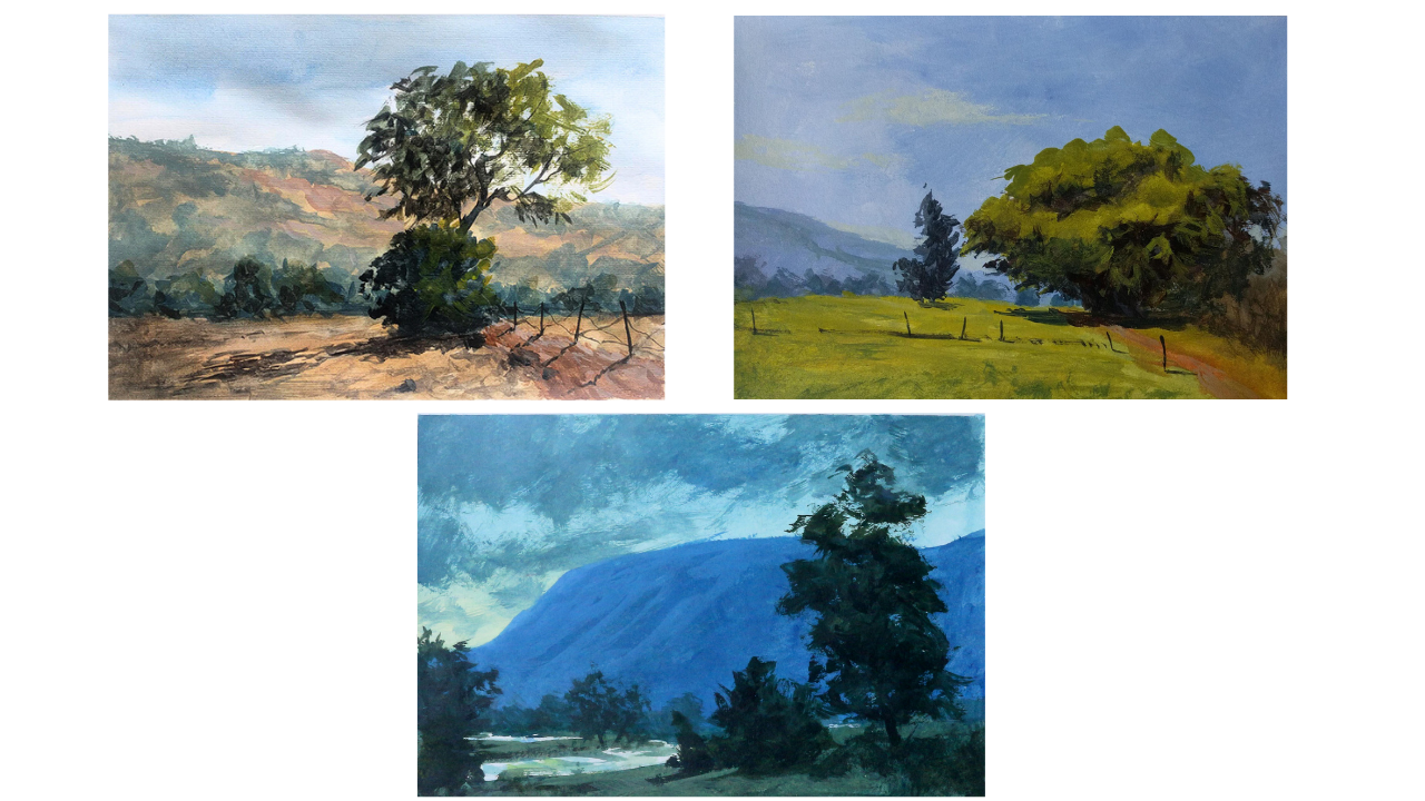
2. Afternoon At Mulshi Step 1: Welcome to this
painting project. We'll be using the
M three method of painting to
compose the picture, block in the colors, and add details to
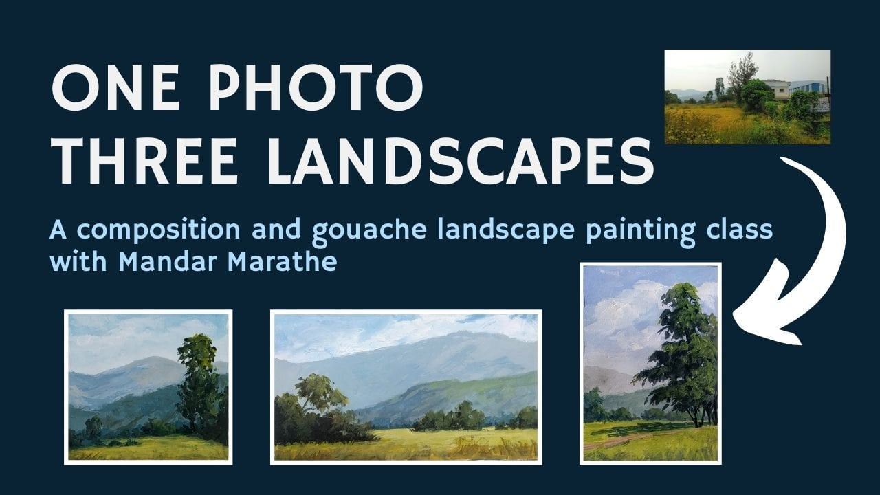
complete a painting. This is a photograph which I
clicked near Mushi and I'll be using this as my reference
photo for today's painting. I'm going to choose a canvas
in this shape, a rectangle. And I'm going to use elements from this to
compose a picture. Obviously, I see that there
is a lot of area here which doesn't add any
value to the painting, but this will be my focal area. I'm going to have this
big tree here as the, focal point and here will be
the base of the mountain. Instead of having
these two hills, I'll be having just one mountain like this in the background. I'll have this fence and it's shadow as the light is
coming in from this side, this part of this bush and
the tree will be in shadow. And that will cast
a shadow like this. I can show the
unevenness or slope in the foreground by changing
the shape of this shadow. If I show it
completely straight, then it will suggest that
this land here is very plain, whereas if I have some
undulations in that, it will suggest that the land is having some kind of unevenness, and that's what I want to do. There'll be another bush
here, maybe I'll add it, maybe I'll not add it, but this will be something which I'll decide while painting. Instead of these two, I made it into one
mountain shape. But then I'll add a few
bushes here towards the base of the mountain,
something like this. This will be my compositional sketch for this painting. Obviously, this will be slightly darker than the foreground. So this is step number one. Step number two
will be blocking, and step number three
will be details. So this one is composition. So that's what we have done now. See you in the step number
two where we block in. This time we'll be
using watercolors, but I'll be also using
white in watercolor and use the colors like wash and not very transparent
watercolors, see you in step number two.
3. Afternoon At Mulshi Step 2: Welcome to step number two, in which we'll first draw the
outline of the major shapes here on this paper and then we'll start
painting in or blocking in. I'm using watercolor
as I mentioned in the previous lecture, and this is cobalt blue. This is chrome yellow. This is burnt sienna and
this is titanium white. I'll be using only
these colors and I'll be mostly using
this flat brush. It's number 12 and a small round brush if I
need to add in few details. So let's start with first
laying in the outline. I'm using some of
the cobalt blue, and I'll first
indicate this line. This is the line of the pathway. And there'll be
these posts here. And this big tree will be here. Then there'll be
some leaves here. And the mountain will
be something like this and few bushes here and there.
Something like this. Now let me start by even though this is watercolor and
I'll be using it as guash, which means I'll
be adding white to make some parts of
the painting opaque, I still recommend that
you start painting from lighter colors
towards darker colors and from background
towards foreground. So we'll be doing sky
first, and for that, I'm mixing this cobalt
blue. With a lot of water. And as we always say, the sky is darker at the top and gets lighter
towards the horizon. I'll be using very
fast brushstrokes to lay in this color. I'll thin out the color
as we come towards the base or towards the horizon. Maybe I can add some darker blue here towards the top of the. I have not leaned this paper
against something like this, which will make it slightly flow better or the colors
will flow down better. I think I need to do that and I'll add something
like this here. This is better. Now let's come to
the mountain first. In the mountain,
I'm going to have a a color which is very much like yellow ochre. So I'm creating
I'm mixing a color which is like yellow ochre. And I want to keep
it very, very light. So I'm mixing white in it. But I don't want
it very saturated. That's why I want to add
some blue to make it dull because the mountain
is at a distance, the color of the grass
which makes it yellow or of the clay or soil, it will not be as yellow as it would appear when it
is in the foreground. So I'll be using this now, and I can make it even lighter, I guess, and slightly
more bluish. This seems a better color, and I'm simply laying
in the color here. I don't want to
leave any space for this tree right now
because anyway, the tree will be darker in
color and it can easily overlap the lighter
color of this mountain. Again, this mountain
will be slightly having more foliage or more trees as we come towards the
bottom of the mountain. I'm going to make this color
slightly more greenish. But I still want
to make it light. You can see the slight
shift in color. But again, still, it
is very, very light. I'll have this color
come down till here. As this is watercolor
and not pure gouache, it doesn't have that much of opacity and that's where
adding white helps. Now I want to come in and add a few bushes towards the bottom of the mountain because as
the color is still wet, it will merge or the
bushes we add right now will be more fuzzy
and that's what we want. Won't have any sharp edges. Let's see how this looks. Seems okay. I'm going to
add a few bushes here. And you can see how
the color is slightly spreading in the
earlier late color. I want that effect. And I'm trying to avoid any uniformity in the size
and shape of these trees. I can add slight white in
it and some more blue. I wipe my brush dry
and I'm using the, the color which is
already there to make some marks outside its edge just to make these
slightly more rough edged. I don't want them to show very sharp edge because
they are at a distance. Now let me add the next color, which is the color of the foreground the color of
the foreground will be it's a sunny scene so I don't want to add
any white right now in the foreground color and I'll keep it transparent and very, very thin some places
I can add some yellow. I want to lay in this
color very roughly. I don't intend to make this very smooth hence
I'm applying it. I applied it roughly. We might have to change the value of this
color once we lay in some trees or suggest some trees on the mountain
in the background, but let's wait for that. Now comes, I think
the darkest part, which is the tree. Let me mix a color. Blue and burn sienna. And I'll start laying in that. And the tree will have
its base here somewhere. And for the tree trunk, I'll be using this round brush, and I'll mix a dark color. And I'll try to draw
the tree trunk. And the leaves on that, again, I'll have to
do with this brush. First, the leaves on this
side will be slightly darker. So I'm using a darker green, let me see how this goes. I'm roughly creating this
tree or leaf like structure. As I go towards the right, I'm going to add more yellow to it to suggest the light which is falling on those leaves because the light is
coming in from this side. I'm using a thick colour, and that's why it's creating these dry brush kind of marks. And I think I can go slightly
more darker this side. So I'll mix a
darker color again. A So this completes the blocking stage of
this painting in which we have covered the complete
paper with some kind of color. And then in the third stage, we will add more
details to this. So see you in the
next lecture. I
4. Afternoon At Mulshi Step 3: Come back to this stage. This is the stage three or step three of three Method
of painting in which we'll be adding
details to this landscape, and this is where
sometimes we feel frustrated or unhappy about the painting which
we are making. But because at this stage, the painting doesn't
look quite nice. But then the whole
point is to go through all these steps and then decide whether you
like the painting or not. And remember that
each painting is a Remember that each painting gives you practice and the resulting painting
is not only is, Remember that each
painting gives you practice and that's one of the major outputs
of this exercise, and a successful
painting is not always the only output which you need or get from
any painting exercise. Let's begin adding
details to this painting. I'll start again with the mountain and for
that on the mountain, I need to add some
areas of trees. I'll have some color which
is something like this, which we used here, but I'll
make it even more lighter. I'm adding white
and I'll also add some blue so that it
becomes more bluish. Let's try this color on this. This looks okay to me, let's see how this works. This is too blue, I guess, so I need to add slight brown. Et's see how this works. Yes. This looks better
than the earlier color. And I want to
indicate that this is some kind of tree cover
on this mountain. So I'm going to make sure that it creates
shapes like this. Let me do this
with bigger brush. The bigger brush creates much more looser strokes or more free strokes
than small brush. And then it gives that
painterly character to the art or the painting
which you are making. So it's always better to use a larger brush
than a smaller one. So I'm slightly
wearing the color as I come towards the
bottom of the mountain. You can see it's
become slightly more bluish and darker in value. I want to slightly
soften this edge which was too sharp for an object
which is so far off from us. With these brush marks, I made this edge
slightly more detailed because these kind of shaves will suggest some
trees on the mountaintop. That's what I want. Now, let's come to
the shadow here. And for that, again, I'll
be using this broad brush. And I want the
shadow to be dark. Hence a lot of brown
or burnt sienna and some blue to make it dark. This trees shadow will fall here nearby and this tree shadow
will fall somewhere here. I want to I'll suggest the
undulations in this ground by suggesting or drawing
the shadow like that. This is the shadow of this tree. And this is the shadow
of the bigger tree, and I want to keep it
thinner like this here. I'm using the corner
of this brush and I added some water
in the brush later on to make the shadow
thinner here or the color slightly more thinner than what I
had for this shadow. Still, it looks too
straight lined. I'm going to vary the
shape of this shadow. This looks better than earlier. Now I want to make this part of this tree darker
than what it is. Again, dark mix. I'll add some green or
some yellow to make it slightly greenish, not green. And let's test this. This looks good. Now since this is
the final color on this area of the painting, I want to lay it in
nicely and also suggest some small leaves or small
branches poking out. As I come towards this side, I'll make my brush lighter to touch so that it doesn't
deposit so much of color. And I can, in fact, use the same color to
make some leaves here darker than what they are right now because they are towards
the far end of this tree. I want to suggest some
darker leaves even here because these leaves will cast a shadow on this side, this side, and then that's
what makes it dark. A because we painted
the sky first, these sky holes look
very natural now. If we had painted this tree first and then tried
to paint the sky, the sky holes would have
been or we would have had to work on it a lot to
make them look natural. So depending on what kind of
painting you are attempting, you have to think about in what sequence
you're going to paint the various shapes to
make your life easy. Now, this area of the ground
is not looking as it should. This should be darker because these trees also will cast
a shadow here somewhere, and also I want the
attention to be here. I want to make this
slightly darker. I'll use the same
color but thin it a lot and make it
slightly more reddish. Let's see how it looks. I want to use a dry
brush technique, so I'll first test it here, I just wipe the brush here so that I get rid of extra color. And then I'm just laying
in the color like this. You can see how light it is, how light I'm
applying the color. And I want to show a path here. I'm going to mix
light brown color. And let's test it
here. Looks good. I don't want it to
be overly contrast. This is a mud road,
so it will not have any sharp or definite
or straight line edges. Let's make it slightly
more lighter in color in some places, at least. Like this. And to get rid of the monotony of
the flat land here. I'm brushing in some color. And I want to show some
darker posts here. So I'm mixing again a dark. And let's see how this looks. The posts will be
taller on this side. And as we go towards the tree, they look smaller and smaller. I'm not drawing them
parallel to each other because each one will have its own angle of standing. And each one also will cast a shadow the shadow also will be in this direction
just like this tree has. That's what you
have to remember. And I'm also not drawing these
shadows in a straight line because that will suggest a very smooth surfaced
road which it is not. And let me suggest some
barbed wire in between them. Now, what's left
is I want to add some lighter color
on these trees. Though they are at a distance, they will also have some
highlight however faint it is. Let's try this color. I'm taking in a very
light green color, and I need to add slightly
more brown to it. Too much. This looks good. Just a suggestion that they're
not lumps of same color. Now I need to add some
highlight on this tree here. Even though it's dark, a so I'm adding these
lighter touches to the side of this tree. And because there is
blue color underneath, it looks like green, even though we are just
applying yellow to it. I think I need to make this road even lighter
at some point. Because I'm using titanium
white and not pure gouache, it tends to become
transparent as it dries. If you use guash, then it's much more opaque. So you can use any of these colors depending
on how you want, how much opacity you want. I might have to do the
shadows of the fence posts again because I added
some color later on. I need a stone here somewhere just to add some
interest to this area. I'll add something like this. Just a suggestion of
a rock or a stone. And do the shadows again
of the lamp posts. This is the advantage
of using opaque colors. So if you're not
comfortable with using the transparency
of watercolors, or if you think this style of
painting suits you better, then by all means, use the white color
and paint like this. This wire is in straight line of this shadow
which is causing confusion, so I'm just wiping that out. And I need to add some more darker color in these trees somewhere
at some places like this. And let me see if I
can or how it looks if I add some highlights
to this mountain here, somewhere at some places. Yes, this looks good. This also brings the feel of
it being very sunny time. But I'll add it sparingly
and not all over. That's enough, I guess. Maybe there is some
small grass here, which is just to break this area into smaller some
interest to this area, some variation in the color. I'm dragging my brush dry brush. Nothing too fancy. No. I think that's it. Let me add one more dot of color here. I think I'm happy
with this sketch. So let's remove the tape
and see how it looks. I always love this part
of the painting process. And here goes the last tape. And and that's it. Just to summarize what we
did in today's painting is we started with a
photograph and then we compose this as part of first step of three
method of painting. Then we blocked in the colors
main colors of each area, and then we added details
to finish the painting. We have used watercolors like wash in opaque manner
by adding white. So I hope you enjoyed this painting and
you will also make an attempt to paint using the same photograph which
I'm attaching to this video, and you will make a
painting based on that. I'll see you in the next video. Happy painting till then.
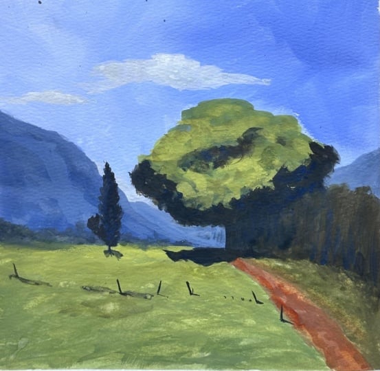
5. Farm Road Step 1: Hello, and welcome to
this painting project. If you have already watched
my previous videos, you would know that we
use the three method of painting which simplifies
things even for beginners. If you are new here, let me explain what
this three method of painting is in one
or two sentences, and then we can get
back to project. Three method of painting
involves three steps. The first one is
composition where we use reference photographs
and compose a picture. The second step involves the
blocking of basic colors, and the third step
involves adding just light amount of details so that we can call the
painting as complete. We also use just
three colors and two or maximum three brushes to complete the whole painting. This way, the things are
kept very simple so that even beginners and
intermediate level artists can use this method
and get great results. So now let's get back to this
week's painting project. I was out on a weekend trip and where I
clicked many photographs, and I'm going to use two of these photographs and make
one painting out of that. Which is this is one photograph,
which I'm going to use. I'm going to use certain parts of this photograph and then I'm going to use some
part of this photograph, which is this big tree and
the shadow below that. I'm going to combine
these two things or these two photographs and
create one composition. As usual, I'm going to use a horizontal or landscape
mode of canvas or paper. I'm going to let's first
look at this photograph. From this photograph,
I'm going to take the mountain this tree, but I will reduce the
size of this tree when I bring it in here and
some part of the road. I'm also going to change
the angle of the road. I'm going to make the road
go something like this, and I will make it look as if the road goes past the
tree which will be here. This will be the big tree
from the other photograph, and then the road will
somehow turn like this. This will be a suggestion. I'll not make the
road very obvious. This mountain will be here. While doing that, I will
make sure that none of these points divide the
vertical into exact two halves. This is somewhere which is the half distance of this paper. I'm not going to have any
line cutting the canvas here. This is the mountain
and this is the road. Then I'll be
reducing the size of this tree or I can pick this tree which is already
of a smaller size, and then I'll place
it somewhere here. I also make it
slightly taller than wider because I don't want this tree and the big
tree to have the same shape. Now I'll come to this photograph
and use this big tree as the reference and again, the bushes here on
this side of the road. There'll be something
here, which is just to point the viewers
attention towards this. This is the focal point.
There'll be shadow here. There'll be some
shadow here also, and this tree this part of
the tree will be in shadow, there will be some areas
of shadow and light here and there'll be some bushes here towards the base of the mountain and there'll be this area which is going
to suggest some field, a farm or something like that. It's basically a very
simple composition again. This is the u end result of the first step
of entry method, which is the composition. This will be slightly
darker than the sky. How many big shapes
do we have here? This foreground is number one. This big tree is number two, three, four, and maybe five. We have five big shapes which
complete this painting. Now let's go to the step number two in which we draw this on the actual paper and we also
block in the major colors. See you in the step number two.
6. Farm Road Step 2: Welcome to the step number
two of this painting project. I'm going to use watercolors in the fashion of
gouache colors, which means I'll
be adding white to the colors and applying
them on the paper. This is 150 or 140 GSM paper. I've taped all the corners, all the sides so
that it can give me a clean edge when I
finish the painting. I'm using just three
colors and white. This is ultramarine blue. This is chrome yellow. This is burnt sienna, and this is titanium
white or Chinese white. All these are watercolors
and since I'm going to use these colors in the
fashion of gouache, which means applying thick paint and adding white
wherever necessary, I'm going to use
a glass palette. Otherwise, if it was a
transparent watercolor painting, I would have used a
palette with the ls, which is typical of
any watercolor artist. But I'm going to use a
glass palette this time. We are going to use
just two brushes. This one is a flat
brush number 12, and this one is a small
rigor brush size number six. I'm going to take some
ultramarine blue, add a lot of water to it because at this
stage of drawing, I need the outlines
to be very light. I'm looking at the composition
and I'm going to draw the ground here and there'll be road,
something like this. I'm avoiding the corner of the painting and the
big tree will be something like this and
there'll be some bushes here. And the big mountain will
be something like this. And then be a small
hill beyond that, which can be seen somewhere. To some extent, it
can be seen here. And then just to balance
this big shape of this tree, I'll be having one
small tree here, a taller tree, which will
be something like this. Or I might want to shift it
towards this side slightly. And then there'll be some bushes here towards the base
of the mountain. But I'm going to show
these very small so that it creates the illusion of this mountain
being very far off. Maybe I can shift the base
of the mountain here. And there'll be
some indication or some lines which
cut through this, which will indicate
that this is a farm and maybe some posts
like this fence posts, and that will be it. I'm going to have the
light coming in from here somewhere so that this
part of the tree, this part will be
lighter and this will be darker on the similar lines, this part of the sky will
be darker than this. There'll be slight gradation
from here to here. Now let's go on and start
with the background. I'm going to have this ultramarine
and white added to it. Let's see how blue this is
and let's test on this side. It can be slightly more blue. As I go towards this side, I'll add more and
more white to it. Okay. And as we come towards the bottom
of towards the horizon, the blue colour has to be lighter and I'm adding
more white to it. And similar white I'll
carry towards this side. I'm adding water just to
make this paint flow. I don't want any hard edge here. Again, here I'll add
some more white. For now, I will cover
this tree even because anyway I'll come in with a
darker color to show the tree. And this side will
be even lighter because of the sun light
coming from this side. I'm applying this color in thick fashion and not
typical watercolor. I can slightly make it more bluish somewhere
in some parts. But towards the top of the sky or top of the
painting to be precise. Now let's come to this mountain, and this will be slightly
more bluish than this because it's
still a solid mass. But I want to make
it slightly grayish, and that's why I'm adding a bit of burnt sienna to it to
make it slightly gray. And let's test
this on the paper. Yes. This looks better. And let me add some water
just to make the paint. M. Remember, this is
the blocking stage, so I'm not worried too
much about the details. Also, I don't want
to make this edge very sharp because the mountain
is at such a distance. I'm making it slightly blurred. I want to show
this mountain now, which is towards the even
behind this big mountain there is some he'll here, which has to be different
color than the mountain in the foreground and maybe that
color will continue here. It will not be very
obvious because of the distance of the mountain
from us or from the viewer, but there'll be slight
change in the value. Let me have some of
that color here also. If we may not use it
in the final painting, but let me at least
cover it right now. Now let's come to the
foreground color. Let me wash the brush. The foreground will be
a light green color. So let's mix a
light green colour. I'm here adding
some white to it. And let's test this. Yes, it looks good. So let me apply this
over this whole area. And I'm going to apply
this slightly thinner. Here and I don't want
a hard edge here, so I'm just running
my finger over the edge which makes
the edge less sharp. As I come towards the
bottom of the painting, I'm going to add
some more blue to it so that it becomes darker. The green becomes darker. As this is going
to be a farmland, I don't want a very
smooth painted surface. I'm okay with rough texture. On this side, where
there is grass, I'm going to add a slight amount of burnt sienna to
change the color slightly and make it less Less fresher color. Just to add some
variation and anyway, I don't want the
viewers attention to be brought here too much. Then what remains are these
three things the road, these bushes, and this tree. Let's start with the road. For the road, I'm going
to use transparent color, at least right now. Later on, I might
add opaque color. I'm using the burnt Siena here. Though I had drawn or avoided going into this corner
somehow while painting, I forgot that or I missed that. I'm going to cover that part and bring the road slightly
towards this side. Because having any
line going out of the corner is a
compositional mistake. I mix this color again. And I'm going to cover
that part of the road. I might have this applied
in some areas in between. Now let me add color
to these bushes. So this is the second last
area of darkest color. Again, I'm mixing blue and brown and some white
to give it opacity. So let me apply this colour
to suggest some bushes. I don't want this
edge to be sharp. Maybe these are some small trees or dried bushes or
something like that. Now let's add dark
color to the big tree. Again, at this stage, I'm adding or applying
very dark color. As we said, darks
will be on this side more and this will be a
lighter part of the tree. I'm going to start from here. A Let me cover this up right now. If required, I'll cut
through this color later on. In this color, I'm
not adding any white because I want that
color to be dark. This is the area which will receive the least
amount of light. Maybe some of this area
also will have some shadow. Then I'll also had a
suggestion of the tree here, but I want that tree to be slightly lighter
in color as there is a distance between
this tree and this tree in terms of depth, it will be slightly less dark
so I'm mixing burnt sienna, ultramarine and some white. Maybe the tree will be
here. Something like this. You can see that I'm using
the corner of this brush. And this tree will not be near the bottom of the mountain. I'll be slightly towards us, it will have it
will be based here. And while I'm at it, let me add some more
white to it and suggest the bushes at the
base of the mountain. As per the aerial
perspective theory, as the objects move away from
us, they become lighter, so I added white and bluer because of the
atmospheric color. That's why I added
some more blue to it. Now let's test this color can be slightly more
blue and darker. Adding blue makes it darker, so I'm using a dry brush, not added too much of water
to it because I don't want this brush strokes
to be very sharp. Because they are at a distance, these trees or
bushes will not have any sharp edge or sharp outline. I think that's enough
of a blocking. Only thing remains to be blocked is the highlight
color of the tree, which will again, green, but will be darker than this. Let's test this. Yes.
Looks okay right now. We can modify this
later if we want, but for now, it's okay. In painting, you need to adjust colors depending on
what surrounds it. There is no absolute color or absolutely correct color when you mix it on the palette. Only after you apply it
on the paper or canvas, you actually know whether
it's right or wrong. And most of the time it needs some kind of
adjustment later on. This completes the
blocking stage. I'll allow this painting
to dry up slightly, and I'll be back in the next
video after about 5 minutes, I'll start painting
the next step, which is the detailed step. See you in that lecture.
7. Farm Road Step 3: Come back to this
stage of painting, which is the third stage. This paint has dried, and I'm going to add details
to this painting now. So in this stage, we'll be going one shape after
the other and add details. So what I want to
do first is add some darks here towards
the base of these trees. So let me grab some dark blue. And let's test this. This looks good. And I'm using a drier brush. So I just wiped extra
paint off my brush and I'm making the bottom part of these trees slightly darker. A Now let's turn to the grass or the crop. So some yellow and some white to make it
slightly more opaque. I can go slightly more lighter
green towards this side. I'm now going to
cover this trunk of this tree so that it looks
much more appropriate. And I'm going to
use this on top of this underlying layer randomly. And as I come towards
the bottom part, I'm going to make it slightly darker and you can see that
this is a very dry brush. Let's test this on the edge and I'm just scrubbing it just to indicate
some grassy things. And I might suggest a line here. Just to add some
variety to this area. Also, this side can be
slightly darker because I don't want the viewers
attention to go out from here. Okay. In earlier I can make this area slightly more lighter. So I'm going to use more
of yellow and white. And let's see how this looks. I need to make it
slightly more opaque. Yeah, this looks good.
Might add some color here, but I want to keep
this area dark. I'm adding this lighter
color here because I want to show the shadow dark. That contrast adds
to the darkness. Now let's add maybe a touch of darker blue to the mountain. But I not add it all over maybe a line which
suggests a ridge. I want this color to be thin. This is a kind of highlight for the mountain because there's
some white added to it. But I don't want to go overboard and suggest a
lot of details in it. So I'll leave it at that. Now
let me come to this tree, and I want to slightly darken
it up towards the bottom. So blue and some brown and this looks too
uniform or too singular. So let me add something here, which might be another
bush just behind this tree just to make
it non symmetric. And I can use the
same dark color here. I'll just suggest
darker foliage here. See how loosely I'm
using the brush. That gives or that naturally adds randomness
to the strokes, which is what we want in
landscape paintings like this. I'll use this color again
at the bottom of the tree. And I want to add some lighter
green here because it's looking too predictable. So let's try this. Looks good. I'm using a thick dark color
or thick colour, not dark. And this is suggesting
some branches which are coming towards
me or towards the viewer. And now let me suggest the
shadow of this big tree. So I want it to be more
bluish than brown. And so the shadow will
be something like this. I'll make the shadow more
brown here where the road is. Again, this part of the
bushes will be in shadow. I'm carrying over
that same color here. So this is negative
painting which brings these bushes towards me and pushes this part
of the bushes back. Similarly, this tree will also
have its shadow below it. Only thing is it will
not be as dark as this. A That's enough of a shadow for this tree. Now I'll make this
area of the bushes slightly darker with
brush strokes like these. Vertical ones just to suggest some tall grass or
something like that. Nothing too fancy or
detailed added here. And now I need some fence
posts here and there, which were also there, I guess, if I remember correctly
in the photograph. But even if they were not, I can still use my
artistic license and add a few stumps like this and maybe some
dark line like this. I think enough. I don't want to add them
in too many places. Only thing remains is I need
to paint their shadow also. Otherwise, they'll
not look real. I might want to add some lighter brown on the road just to highlight
it at some places. I'll use this very light
brown color burn Siena, let's see how this looks. It needs to be still lighter. Only at some places. This will anyway become more
transparent as it dries up. But I think I don't need to
add anything more. Let's see. This vast expanse of the
sky looks a bit boring because of because there
are no clouds in it. I want to add some clouds
in it with white color, but I don't want to overdo them. Otherwise, they'll
shift attention from the rest of the thing here. Let's see how this looks. This is too dull.
This looks okay. And I can add lighter or make it lighter
towards the horizon, which will make these
trees even more stark, which is a good thing for me. I think I'll stop at this point. So to summarize, what we did is we first made this composition based on the two
photographs which I showed. Then I drew that on this piece of paper
with light blue color. And then in the next step, we added the basic colors
of all the shapes. And in the final stage, we added details to all the shapes and pull
together the painting. So I think it's time to remove the tape and let's see how
the final painting looks. While removing the tape, you need to be careful
that you don't peel off any layer of the
paper which happens sometimes it's like it's
happening right now. But for that reason, you have to pull
the tape away from the painting so that even if it damages or peels
off some layer, it doesn't peel off
the painting layer. Now let's try this. Yes. And that's it. I hope you like this
painting and the demo, and I'm attaching the
reference photographs with this lecture so that you can use that and compose your own paintings and then paint with whatever
colours you choose. This method of painting
will remain same, even if you use oils or acrylics or even watercolor
in the Gouache style. So I hope to see you in the
next video, happy paint. Y
8. Monsoon at Malavali Step 1: A. Welcome to this
painting project. Here I have a reference
photograph which I clicked near the Mali Village, which is on the way
from Mumbai to Pune. During monsoon season,
this region of India receives a lot of rain and there is a lot
of greenery around, and that's what we will try
to depict in our painting. The major shapes from this
photograph which I want to use are the sky,
this mountain, this foreground,
which has a lot of green grass and some puddles of water and one or two big trees. So I've chosen a landscape
format of the paper, and the horizon line or the bottom of the mountain in this case, will
be somewhere here. Remember not to cut the vertical into
halves with any lines, and then I'll have this
mountain something like this. And I'll have some trees here. Most of these trees will
be silhouetted because of the You can see it's
cloudy weather, there'll be clouds in the sky. But there'll be some
light towards this point. There'll be clouds like this
and there'll be a big tree here which will tower
over the mountain line. There'll be a big tree here. And there'll be some
shrubs here and there. This will be one shrub and towards the base
of the mountain, there'll be some shrubs. And so on. And this all will be either
reddish due to the earth or green due to the grass
which grows in this region. So though I've shown
this tree as elliptical, I'll make sure that I
paint it realistically. But just to identify the shapes, this foreground will
be shape number one. This mountain will be
shaped number two, the sky will be
shaped number three, and this will be four and
maybe five and so on. I won't count these
small shapes separately, but we have approximately five to six shapes in this painting, and this simplification will
help us in the next stage. See you in the step number
two where we will draw this sketch or composed
painting onto the canvas or paper which we are
going to use and then block in the main
colors, see you there.
9. Monsoon at Malavali Step 2: Welcome to the second step
of this painting project. I have this paper here. It's 140 GSM watercolor paper. I've taped the sides of this paper to get a nice edge when I
complete the painting. I have the colors here. As I said, we use only
three colors and white. This is Prussian blue,
this is chrome yellow. This is burnt
sienna, and this is Chinese white or titanium white. And I'll be using
just two brushes. This one is a flat
brush of size 12, and this is a round
thin brush of size six, and I'll be using
this mainly to draw the outline and add
details in the next step. Let's start with
some drawing first. This is the composition which we did in the first step,
and as for that, I'll be making or drawing
the big shapes here. So this is the bottom of the mountain and the mountain will go something like this. Maybe it'll have a
dip here and again go up and there'll be a tree here. There'll be some piece of land here and there'll be a
puddle of water here. And it'll be a big tree here, which will rise above the
line of the mountain. And there'll be another bush here and maybe one
or two bushes, one here and towards the bottom of the
mountain somewhere here. That's the broad outline
which I'm going to have and I don't want people's
attention to go here, there'll be some bushes or something like that
here in this corner. O. And there'll be clouds in the but I won't draw the
clouds outline of the clouds, but I'll I'll paint them directly because I don't
want the outlines to show because we may not
paint the clouds so thickly. So now since I want to maintain some yellow white area here, I'm going to start with white
and add some yellow to it just to lighten it
or just to give it some tinge of yellow. And I'll start laying
in the color here. You may not see it right
now because it's not very different from the
color of the paper, but it will be obvious when
we lay in the other colors. I'll let this color
dry before I come in for the next layer
on top of that. I'll have now the blue color
and I want this to be light. I might add some of
this color into it, which I had premixed. Let me see how this looks. I want this color to be the sky color wherever
there are no clouds. I've lightened it further
and I'll be applying it on the sky. Let me make it slightly thin
and I can apply it now. I'll go over this tree also because I can then
have some sky holes. I'll make it slightly dark or more bluish as I go towards
the top of the sky. You can see that I'm applying it rather in a dry fashion and not completely fluid color because I want to have
control over what it does. I'll have some of
this overlap on this also because I don't
want any hard edge here. Now, I'll let this color dry
before I add in the clouds. I'm washing my
brush and now I'll come in with the color
for the mountain. Actually, I did not have
cleaned the brush, but anyway. Now I'll start. I want to paint this mountain in a dark tone, but an opaque one. I'm mixing Prussian blue, some burnt sienna to gray down and white to
make it opaque. I want to test this color now. Let's see how this looks. I think it I'll have to make
it slightly more bluish. Let me get some more blue color. Psienblue has very
high tinting strength. So whenever you use it, you have to be careful. It gets dark very fast. Now let me test this.
This looks okay. I'm going to apply this. I might want to make it
slightly darker here. Some amount of white
and some brown. I'll add a little
bit more white to it because I want this tree
also to show up against that. I'll cover the tree for now. And I don't want this
edge to be very sharp, hence I'll run my
finger over it. To make the edge blurred. I'll cover this tree shape also. I'll come in with a darker
color anyway later on. And here also. I just want to get rid of
the white of the paper here. I know that I'll be covering this whole thing with
darker color for the tree, but I just want to make sure it's not white
at this stage. Just to add some character
to the mountain, I'll make the shape a
little bit definite. I'll leave it at that. Now I can come in
with a color for the base of the mountain or the green area
in the painting. I want it to be green, but still I want it
also to be dark because it's an evening time painting. So it will be green, but it'll be darker green. Let's test this color.
Seems okay to me. And there'll be
some ground here. And maybe it'll be browner here. And as I come towards
the bottom of the painting or towards
the immediate foreground, I'll start to add in some texture by using
the brush like this. And I'll have this color
come towards this point now. And there'll be land here also. It's something like an island or something with some
puddles of water around. I don't want this
edge to be sharp. Again, I should have done it earlier, but
I can do it now. I can go in and add some
bushes with the same color. I want them to be hazy or blurred because they
are at such a distance. This also makes this separation or the edge between
the foreground or the ground and mountain less
important or less obvious. Now I'll come in with
darks for the big trees. Again, a very dark color, darker than the ground
because these are the silhouetted trees and make them slightly more
brownish and some yellow. These will be more
brownish than greenish. I've added more of brown
and a little bit of yellow. Let's see how this
looks. Yes, seems good. I'm using the brush like this. This way, I can make the
strokes very light and fluid because I don't want any sharp edges right now
and there'll be a bush here. You can see that
this is darker than the bushes in the background
for obvious reasons. Maybe there'll be
some bushes here. And now I lay some of
that for the big tree. And now I'll have
to design the tree basically because this is
the final shape of the tree. I can't be or I can't get away with a
elliptical shape now. So I have to be careful how I lean or design the
shape of the tree. I don't want it symmetric. And also, I don't want the tree to be completely
standing upright. I want some tilt in the shape. As I come towards the
bottom of the tree, the color will be darker. Let me suggest the trunk of the tree. Something like this. And some bushes here, which are also in the shade. There is very less light,
I won't say shade. That completes the second stage of painting, which
is the blocking. We have color in every
part of the painting and all the shapes have been given their base color
in the next step, I will add the right amount of details to complete
the painting. S in the next part
of this project. H
10. Monsoon at Malavali Step 3: Welcome to the third part
of this painting project, which is the section in which we add details to the painting. And now I will start by adding details to one
shape after the other. I will start this time by adding clouds to the
shape of the sky. And for the clouds, I need a gray color. So I'll make a gray color using I need some
Prussian blue again. So I'll make the gray using
blue and burnt sienna. This burnt sienna has dried
because I had a gap of some time until when I
wanted this color to dry. After I add white,
we'll get a gray. This is still a greenish
gray and I want to get rid of the greenish tinge. I'll add more blue to it. Let's see what happens
when we add some brown that color seems
to be good and it has less of a green tinge now. Let's see how dark this
looks when we apply it here. Let's test this.
This is too dark. What I'll do is I'll
add more white to it. Now let's test this. This seems right. I'll still make it slightly more bluish. I'll also use a dry brush. I'm wiping my brush on
this piece of cloth, and let's see how this works. I want a cloud to
come in from here. I'm using a dry brush, and that ensures that the color doesn't
spread on its own. This is the speciality
of using watercolors in the gouache style where
we add in white to it, which means that we spread the color in the
area where we want it. Otherwise, in watercolor, if
you use in a transparent, more fluid fashion, the
color spreads on its own. And let me see where I can
add a few more clouds. I'm keeping the color very dry. I'm adding just enough
water so that I can spread the color on the paper. These are some clouds which are still in the sky after the
rain shower has passed. They do have some
moisture in them, but not enough that
it will rain again. I want this side to be
slightly more darker now. M. I now need a lighter touch here, lighter color of clouds because they'll
be distant clouds and they'll be smaller in size. And I'm looking at
the painting from a distance just to see what needs some tuning
or some correction. I think. What I'll do
is I'll stop working on the sky and go
ahead with other areas and then again
revisit the sky area. I want to show some light coming here on this part of the
mountain and for that, I need a lighter blue. So let me mix of color here. So I'm adding this Prussian
blue and some white, and I'm going to test this. Let me see it here. And this is slightly
lighter than what I want. So I'll make it slightly dark, adding more blue to it. This seems good. These are some areas where
more light is falling. This gives more dimension
to the whole mountain. Now I'll come to this area
or this tree because I want something which obstructs the viewers attention from going down like
this and going out. But this time I'll use a smaller brush and I need
a color which is so dark. Again, using blue and brown. This burnt sienna
has dried up. Yeah. Now I'll try to do something
which should prevent the viewers attention from going out, something like this. And this color also has
to be very much darker than this color for it to be
in front or near the viewer. Otherwise, we won't get
that illusion of depth. I'll just brush it over
some areas like this. And also a line like this. Is creating some
texture a thin layer of that here somewhere just to
add some variety in value. I also don't want this area
to be completely white. I'll use very thin layer of
this color and just drop it in few areas because that's
the reflection of the sky. It's enough to
suggest that it is water which is
reflecting the sky. I'll come to this part
of the painting now. I need some darks here. Again, blue and brown. You can see that when we use
a limited palette like this, how easy it is to mix colors. And it doesn't create
any confusion. Things are very easy to control. When you have a lot of colors, it actually makes our job very difficult as to which colors to mix and what to do in each area of the painting. So having a limited palette
is always a good thing. It unifies the painting in a lot better fashion than using a palette which has
a lot of colors. I mean, you can use
a lot of colors, lot more colors, but you
should know what you're doing. Otherwise, it tends to
become a hodgepodge of different colors and doesn't add any value to the painting. I might add some opaques here of lighter
green and for that, I'm going to use the big brush and I want this
color to be thick. I want it to be very light
green, something like this. Let's see how this looks. I'm trying it on the side
or on the portion of tape. Let's see how this looks. This looks okay. Let me
add this at some places. Just to indicate some
areas which is receiving some light from the sky. I don't want to overdo it. I'm also now. I'm now again
looking at the painting from a distance to see
what can be improved. I think this area of the
mountain can still be lighter. I'm going to have
another go at it. Mixing a blue which is
lighter in shade than this, and I want it to be thick and opaque let's see how this looks. I'll try it here.
Yeah, this looks cool. I want to use this sparingly, I don't want to
use it everywhere. But now I make I wiped out the
extra color and I'm trying to merge it into the
existing blue colour. I and I'll wait for
this color to dry because once it is dry it changes a bit because
this is watercolor. If it was oil, it wouldn't have changed its darkness or value. But since it is watercolor, it changes its value and
that's why I want to wait till it dries up and then decide
if I need to add anything. I think I have or I can add
some vertical element here, which is again
going to be a tree. Or it could be an electric pole. But I'll prefer to keep it a natural element and I don't want it also
to be as dark as this. But I'll use caution and
try to add something here which is which adds some
interest in the midground. I want this tree to
slightly echo this tree, but I don't also want it
to be the lone tree there. Is something here, which may not be as big
as this tree, but then Let me look at the painting
from a distance and add last few br strokes before I
call the painting as done. Let me try adding a spot of
white in this area just to suggest that this area
or this puddle of water also extends here or there is another puddle on the
other side of this tree. I think that's enough
of a suggestion. And I think I'm happy with
the painting overall, and I'll just see
if I need to add some indication of a cloud
here behind this tree. Otherwise, it looks
as if the cloud is gathering around the tree, which I don't want to happen. Yeah. Now let me remove the tape
and see the end result. Hopefully, this tape now
will not peel a layer of the paper. So far so good. Now, let's see which
one is on top. This should go up next. And the final edge and that's it. I hope you like this demo
and also like the output. And I'm attaching the
reference photograph which I used for making this
painting with this video, with this painting
project so that you can download it and make
your own version of the painting because that
is where you will learn the techniques and the
more you practice, the better your
paintings will be. So keep practicing and see
you in the next video. Thank you. And
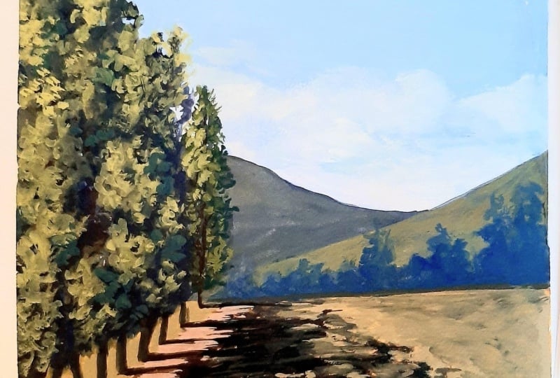
11. Long Shadows Step 1 Composition: Welcome to this
painting project. As you know, we use
the M three Method of painting for simplifying
the painting process, which involves three steps. We use three colors and
just three or less brushes. The three steps involved in the painting process
are composition, block in, and details. So I have this
photograph which I clicked a few weeks back when I was out on
a weekend trip, and I'm going to do
this first step in which I compose a painting
based on this photograph. What I find interesting
about this photograph is the long shadows which these trees are casting
and the pathway. And the mountain
in the background. But the path is almost
central to the photograph, so I'm going to move it
towards the left side. This is going to be my
proportion for the painting, and I'm going to have the
path come in like this. And I'm going to stop it
before the halfway mark. This is the center
of the painting, so I'm going to stop
it before that, and this is the line
which will be this line. There'll be trees
here, big ones, and I'm going to
have one tree which is slightly farther away. I might have these trees. Some of them might be random, some of them might be in a line. There'll be This will
be mostly dark area. And there will be
a mountain here, and some trees or bushes towards the horizon and towards the bottom
of the mountain. And these trees will be
casting their long shadows across this path and
this open field here. I'm going to have these lines
not perfectly horizontal, but I'm going to
have these shadows slightly slanting or slightly at an angle just to avoid them matching with
the border of the painting. So roughly this is
what I have in mind, and this is enough for me to get started
with the painting. I might have a white cloud here, one or two, just
one or two of them. But the main focus
will be this area, which is the path
and the shadows. So that completes
my composition step and let's quickly go to the next step of block
in before block in, I'll be painting
or I'll be drawing this composed shapes
on the paper. See you in the next video.
12. Long Shadows Step 2 Block In: Come to this part of
the painting project. This is the step number two, which is blocking and we have this composition
from the previous step. I'll be drawing
this on this paper. This is 140 GSM
watercolor paper. I have three colors and white. This white color is what
makes these watercolors turn into gouache or
gouache like, if you will. I'm using just two
brushes, one broad one, which is size 12
and a round brush, which is thin brush just for some details
towards the end. I'll be using this blue color. This is ultramarine blue. This is chrome yellow and
this is burnt sienna, and this is titanium white, or Chinese white to be precise. I'm thinning this
color and I'm going to draw the big shapes here. This is the horizon. This will be the road
or slightly broaden the road and the big trees
will be somewhere here. I won't draw the exact
shapes of these trees. And there'll be one tree separate, slightly
different color. Here, I might change the size of this tree as I go into the
third step or second step, and the mountain will
be something like this. And the shadows will be like
this, something like this. I don't want to draw the
shadows in detail right now. As in Gouache, we always start from the lightest
part or the farthest point, farthest area of the
painting, which is the sky. I'm going to mix
ultramarine blue. And start painting
the sky from top. I want to have some
sky holes here, so I'm just laying
in this color here. I might overlap it later on, but I want to have that
color there right now. As I come towards the horizon, I'm going to add
some white to it. Okay I'm roughly laying in the sky. The sky in this painting is not going to
be very detailed. I might have some cloud
things or clouds, faint ones, not very opaque
ones and towards the horizon, the sky is anyway lighter. I'm going to brush in
more white into it. I might have to adjust
this area later on, but let's see if I can drop
in few, this looks better. I'm coming in with some
white and ultramarine blue, but this time it's darker blue and I'm going
to brush it in. This is just to make
the sky a bit deeper, deep colour and just so that these clouds
become slightly outlined. Now I'm going to the mountain. I want the mountain to
be slightly greenish, not as yellows or sorry, I want the mountain
to be slightly more greenish and not
completely blue because I want that mountain
not too far away. Let me test this color. This is a bit confusing color. Let me apply it more. I want some brown also in it. Let's first keep it more bluish. I might overlap some part
of this mountain later on, but I just want to fill it in
right now with some color. As you know, with gouache, we can add color over
one top of the other. I'm not worried too much about this color being very correct. As the sunlight is coming
in from this side, I want to add some lighter
touches towards this side, but I don't want it
to be too green. So let's see how this looks. This gives some character to the mountain. I'll
leave it at this. Then I'll come to the foreground and I want the
foreground to be very light so that these shadows become
prominent or become obvious. I want a bright color. I might even apply it
very thinly to keep it light I'm applying the same
color on this side also. I might cover it up with
some other color later on. And the road needs to be
having some other color, so I'll keep it This color. I'm not making it super
obvious right now, but I might add
lighter touches later. Now in the blocking stage, what remains to be
painted are these trees. I'll need a dark color. I'm using blue and brown. Or ultramarine blue
and burnt sienna. I'm not adding intentionally
any white to it, though there is some white
in the already mixed color. Now it's time to
paint the trees. I want to paint
them very randomly. Without any I don't want them to be manicured and I'm painting
them just like this. I need it to be more brown. And these trees will
have their trunks here. And I don't want these
trunks to be equally spaced. So I'll start with
the first one. Here goes the second one. One more. One more. This tree is just next to us. So its trunk is going even beyond our vision or beyond the border
of this painting. And now I want to paint the shadows and the shadows will be a darker version
of these two colors. So here it'll be darker yellow, which will be a brown like
this, greenish brown. On this path, it will
be slightly more reddish because the path
is reddish in color. And as I had drawn
in the composition, I want these shadows to be slightly inclined
and not parallel to the road or parallel to
the border, this line. I'm going to paint the
first shadow like this. And I'm keeping the touch very light. So it's the brush is
barely touching the paper. So it leaves some areas unpainted
and that's what I want. The shadow starts from
the base of each tree. Okay And as I had mentioned earlier, I want another tree which is slightly different
looking and I want it to be more greenish
because it is far away, it's not it's receiving
more light from this side. I'll be painting
light on this side, but then for now, let me paint this tree
with more light on it. He and that also casts a shadow. But that shadow will be thinner as the tree
is far away from us, and that's why I'm using a
smaller brush to paint that in This is the
trunk of the tree. Maybe it's visible at some places and now I'm going to paint the
shadow of that tree. So it'll be something
like this. That's enough. Now, what remains is in the blocking at least is some shrubs towards the base of the mountain and they'll be more bluish towards the base of the mountain and as
we come forward, it'll be much more
greener or darker green. Let's see how this mixture looks like if I use it directly. It doesn't create it's of the same value and
almost the same color. I'll need more blue. Let's see how this looks. Yes. This looks nice. I'm happy with this color. So these are few bushes towards our trees and the
base of the mountain. I'm using the corner
of the brush to paint these I want to avoid
the monotony of shapes. I might even paint tree which
crosses the mountains line. And towards the
base of the tree, I'm going to make
it slightly darker. We are almost done with the second stage,
which is the block in. So this is the block in stage, and I'll see you in
the next step where we refine these shapes and complete the
painting. See you there.
13. Long Shadows Step 3 Details: Welcome back. Now I'll be
observing each shape and we'll see what adjustment it needs
to finish the painting. As the light is coming
in from this side, there'll be some light areas on these trees and I want
to show them first. I'll be refining
that area first. I'm taking this yellow
and there's already some white in it on the palette. I'm going to test this color. How this looks for the highlights on the
trees and looks good. I'm going to carve
out some areas of light on these trees. This tree also will have
lighter areas on this side. I don't want this
light area to be so blunt in the sense I want
the colors to be merged. I'm using a dry brush. Now again, using the
highlight color. And this tree will have the lit side on this
edge of the painting. And I might come in
with darker color to make the shapes more clearer. This color already
had some white. That's why it's not
getting so dark. I'm going to wipe my brush and start mixing
that color again. I want a dark color
which I'm going to mix with blue
and burnt sienna. I'll use this to throw in some leaf structures or some branches like this against the lit area
of the other tree. And while I paint this, I'm squinting my
eyes so that I can see or get the effect of seeing this painting
from a distance. If you can't walk away from the painting or watch
it from a distance, you can also squint your
eyes and try to see how it looks makes the same or
gives you the same effect. I need some lighter green here. I'm keeping this color very thick because I want it
to be applied opaque. It's too bright, but let
me use it at some places. It's too bright. I'll have to slightly bring
it down, and this seems okay. So this is where the light
is hitting these trees. And the darker areas
are the areas where the light is not hitting
the trees directly. A trying to adjust this shape, and I'm almost done
with the trees. I want some texture here. So I'm just brushing
in this color. And this tree trunk
needed some correction. In some areas, the tree trunk is seen just some suggestion, I don't want to overdo this. And this side of the tree
trunk will be darker. I'm thinning the
color now and I'm going to adjust the shadows
wherever necessary. I don't think a lot of changes are required
in the shadows. But I might throw in
this color some in between wherever there is the shadow is also
never uniform, or you need to paint it slightly translucent or with varying
degrees of darkness. So that's what I'm doing. Let me see this painting
from a distance. This is too organized. I might add a few
darks here and there. I might I think I
need to increase the height of this tree
because it's so near to us, it will be taller than the or it will look
taller than this tree. So I'll make sure that
it looks like that. So it'll go out of
the picture frame. And it will have its
own areas of light. On this side. Yeah. So I just wanted to show that this tree is at least of the same height
as the next tree. And before I don't think any
changes are required here, I might add some texture here. Before that, let me add some highlight to
the mountain here. A few dark accents
here and there. Towards the base of these trees. And let's see if I can add
some texture on this side. Anyway, I want this corner
to be slightly darker. So I want this color
just for the texture, and I'm going to use
it as a dry brush. So this should be okay. Yeah, I think I shouldn't
overdo it. That's enough. And let me add a
few highlights on the road with burnt
sienna and white. Let's see how this looks. Yeah. So this kind of defines the edge of the road. But I'll
leave it at that. I'll not make the
road super obvious. And just as a final touch, I might add some
white, pure white. I use this brush because I don't want that white to
be adulterated. On this side of the clouds, I'm just rubbing it in
applying very thickly. Some white clouds
floating around. That's it. I think we are near the
end of this painting. So that's it. Now let me remove the tape and show you
the final painting. So here is the final painting. I hope you enjoyed watching how this painting
was made or is made, and you will try to
make your version or try to paint your version of this painting and learn from it. So that's it, and I hope you enjoyed and see you
next time. Thank you.
 Mandar Marathe, Fine Artist, Sculptor, Illustrator, Designer