Transcripts
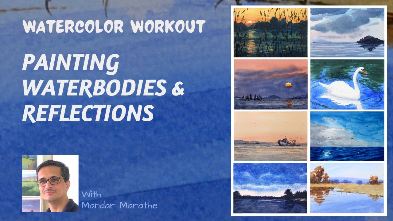
1. Introduction: This class, we are
going to paint seven simple watercolor
studies together step by step. Through these bite
size projects, you will get hands on
practice capturing a wide variety of landscapes
and atmospheric effects, including mountain cliffs, serene beaches, vibrant sunsets, soft cloudy skies,
snow clad peaks, dramatic, stormy
skies, and more. Painting, theory is good, but practice is the
real key to progress. Real skill comes when
your brush hits paper. That's when you learn how
water actually moves, how pigments mix, and how
to master brush timing. That intuition and muscle memory only come from doing the work. To make this as easy as possible to fit into
your busy schedule, every single painting lesson in this class is 30
minutes or less. You can easily complete a full study in one
short sitting and walk away from each session feeling more confident and
noticeably improved. I'm Mandar Marathe, a fine
artist and art educator. If you love watercolor
as a medium and want to build real confidence
through deliberate, enjoyable practice, this
class is meant for you. Grab your brushes,
prep your paper, and let's jump straight into
our first painting study. I'll see you in the class.
2. Important Points - Before We Paint: I want you to treat this as a practice to help
you with that, I want you to keep
the image size or the painting size very small. In this case, I've
kept it four by 6 " that will help you to complete the painting in short
amount of time. And also, if it goes
completely bad, then you can start over very quickly without investing
too much effort in it. One important thing
which you have to do while painting with watercolors is to allow enough drying time
between two layers. That way you will get
your layers correctly and not have any blooming
colors or unwanted effects. You can, of course,
use a hair dryer to dry your paintings between the layers to speed
up the process. All of the videos in this class
are less than 30 minutes. Even if I consider the
drying time in between, each painting
should not take you more than 45 minutes
of work with practice, you will be able to do
this in lesser amount of time so that you can
practice every day. Another thing is not to keep
any painting incomplete. Lot of time, what
happens is that we reach the middle point of the painting and we don't
find it very pleasing, and so we are tempted to
abandon the painting. Just don't do that. Go through the full process and see
how the painting evolves. Most of the times, even
the paintings which appear uninteresting in the middle of the process turn out to
be very good in the end. Each painting of course
will have some learnings for you. Happy painting.
3. Painting 1 - Vibrant Sunset: Welcome to this video. In this video, we're
going to paint this painting which you see
on your screen right now. And I'll be using cobalt blue, vermilion, chrome yellow, and burnt sienna
for painting this. So I have this paper
taped on my board, and I'm going to start with
very, very light drawing. I have a line which goes
down from here till here. And then there is a line
which goes like this, which is a mountain
in the distance. And I don't want to draw
these lines very dark because I don't want them to show through when
I paint over them. And there's going to
be a large mango tree here and it'll have
its trunk here. And there's going to be a bright streak of
yellow orange here. This is a morning scene based
on a photograph which I clicked a few years ago at dawn, and I like the silhouette
which this scene has, and that's what we're
going to paint today. I haven't drawn the
streak because I don't want it to have
any pencil marks. I'm starting with chrome yellow. And I'm going to lay
that color like this. And then to use vermilion to paint
kind of around it. Like this. I'm
softening the edges, and now I'm coming
in with cobalt blue. I want the scene to have more
saturated color at the top. And as I come down, I'm going to add more
water to the mix. So now I'm adding more water
to make this color thinner, and I'm going to carefully
bring it close to the vermilion patch
and also paint here. I do not want this streak to go through this patch too much, and I need to soften this edge. That's why I've come in with a brush which doesn't have a lot of color
on it or rather, it doesn't have any color on it. This is just plain water on my brush and I'm dragging it
on this edge to soften it. I also don't want this streak to be too wide here towards
the edge of the painting. And again, I'm
softening this color. And for better impact, I'm going to throw in this saturated color in this
now for it to mix through. But I have to be careful
not to add too much of it. And I think I can go more
saturated at the top. I'm doing this while this
underlying layer is still kind of wet because once it dries, then you won't be able to get
these gradations properly. And towards the bottom
of the painting, I'm going to paint it more
like a blue violet or purple And I'm going to try this
color all over because I don't want any white
paper to be left. So it'll be easier for me to paint the
foreground later on. And I'll allow this
thing to completely dry before I add
any changes to it. Now that this paper
has completely dried, I'm I'm now ready to paint the next stage
of this painting. So I'm taking, again, cobalt blue and a
touch of red to make a thin purple violet color. And I'm going to paint the
distant mountain with this. And I don't want a very saturated and
very dark color here. That's why I'm
keeping it very thin. Again, I'm going to allow
this to dry completely. Because after this dries, I'm going to paint the tree
and the foreground and I don't want this color
to get into the mountain. Now, this color also has dried and I'm ready to paint the tree. And if you want, you can draw the tree again with pencil if you don't see
the earlier pencil marks. I'm not going to
do that because I know where the tree needs to be. So now I need to mix a
color which is very dark, so I'm taking in cobalt blue. And I'm adding burned
sienna to this color. So what I'm getting is
almost a black color, but it's not black. It has a particular color, which is not black, but we want it very dark. So now I'm going to come in and paint the foreground first, and then I'm going to paint
the silhouetted tree. So I'm starting
from the left edge, and I want to indicate some
shrubs in the foreground. That's why I'm not keeping
this edge straight. I'm going to paint ups and downs in this which
obviously read as shrubs against the bright sky in to mix more color. And here, the requirement
is not so much about a particular color. We want a color which
is pretty dark. That's the aim. And I'm using mostly vertical
brushstrokes because I'm suggesting some shrubs and grasses and things like
that in the foreground, which is, again, a hill or a mountain on which we are standing and
looking at the horizon. Okay, now it's time to
paint the large mango tree. So I'm mixing the
color again with burned sienna and cobalt blue. Make sure you have
a thick color. And I'm going to paint the trunk first and then add the foliage. So I'm going to start like this and paint the
trunk upwards. I'm making sure that the branch is becoming thinner towards
the top, which is how the Tree leaves or
tree branches are, and I'm going to start from here and I'm also
making sure that I keep some sky holes so that it doesn't
look like a cutout. And you also need to take
care that you don't paint this tree very
symmetric or manicured, which we tend to do as humans
because we like symmetry, but the trees aren't very
symmetric unless they are pruned and maintained. And I want a wild tree here, which is not manicured or pruned I'm adding these
smaller brush strokes towards the edge of the tree to make sure they
read as smaller leaves. And while I'm doing that, I'm also going to add some
shrubs at the bottom, maybe some blades of grass
which are at the horizon. And since this first layer of dark color has almost
dried, if not completely, I'm going to create some
marks here which also read as the lighter areas read as flat land which is maybe some very thin
grasses are growing, and wherever the color is dark, it reads as shrubs or
some things like that. I'll allow this to
dry completely and then remove the tape to show
you the finished painting. Now, this painting
has completely dried and we are ready to take off the tape and
reveal the painting. So always pull away from the painted area so that
even if the paper peels, it doesn't remove
the painted area. And that's the final
ready painting. I hope you enjoyed
this simple landscape, and you will give
it a try yourself. Thank you and see you
in the next video.
4. Painting 2 - Snow Clad Peaks : Welcome to this video. In this video, we
are going to paint the scene which you see
on your screen right now. And for that, I'm going to use ultramarine chrome
yellow, vermeilion red. And now I'll start the painting. But before that,
we need to sketch the scene on this 300 GSM paper which I have taped to my bowl. And let me start with
sketching the outlines. Here is the base of mountain. And this line needs to be
pretty much horizontal because this is where
the focal area is. This is the outline for
the large mountain. And then we have the
horizon line here and the top of the mountains
which are very much distant and which have
snow on top of them. So I'm going to mark
some areas which I want to preserve as white. And then we'll have a
bunch of trees here. And there'll be
clouds in the sky. There'll be one cloud
which will be here, which will be a white cloud
and a smaller one here, and the rest of the sky
is going to be blue. Of course, the top
portion of the sky is going to be more
saturated blue. And as we come down
towards the horizon, it's going to be much
more lighter blue. And we need to preserve
some portion of this scene or some portion of this water body for
the reflection, which is something like this. I'll not paint anything here. So with that done, I'm going to start with
wetting my paper here. I'll wet it till the
base of this mountain. I'm checking that it should not have any major beads
of water floating around because that
will not create a nice spread of the color. So now I'm taking
ultramarine blue, and the idea is to drop the color and not to
apply it so much. I'm dropping the color like this here and I'm going to also tilt the paper as required
because I don't want the color to spread
more than what I want. Maybe a cloud here. And now I'll get rid of all the color on my
brush or maybe a very, very thin color and
just apply it here. I don't want any hard edge here, so I need to be
careful about this. Yeah. And I would have liked more of this area to be cloud. So what I can do now is dab this tissue to take out some of the blue in that region to make the clouds larger. So this is also one way
of suggesting clouds. If I want to get rid of more
or I want cleaner cloud, then I can just wet this
area with clear water and then dab it again to
take out more of the color. And I think I will leave it here because
I've tilted my paper. I need to support it
like this only till it dries so that it doesn't the color doesn't
flow down too much. And what I can do
in the meanwhile is to add some color here. And I also lost some
of this white area, which I had preserved
for the snow. So I'm going to dab
color out of that. And allow this thing to dry
completely before I proceed. Now, this layer of color
has dried completely, and now I can proceed
with the further layers. So now to paint the bins, I'm going to use the
same ultramarine blue. But this time, I'm going
to use it slightly more intense or thicker. And let's see how this looks. And I'm going to make
sure that I keep the area for the snow pretty
much unpainted. So I'm carefully painting around those areas
which I marked. And You have to make sure that the color doesn't dry while you paint paint the scene or paint
this portion of the scene, which is the mountains. Otherwise, it'll create
some layered feeling. So I'm going to leave
this at this Yeah. And also, I had a brushstroke
which came out here. I'm not worried too
much about that. But what I'll do now is
I'll continue with this blue and paint around. Remember, we had
marked some area which we should not paint, and now I'm painting the
area which we should paint. And why we are leaving
this area unpainted is because there is a reflection of the sky or the
cloud in there. That's why I'm
keeping it unpainted. And the rest of the area of this water poddy I'm
painting with this blue. The same blue as
the sky Iuntain. As I come towards the right, I should actually mix some vermilion into it to
make it slightly darker. I'm making sure that I'm using only horizontals because
what I'm painting is water. One important thing
about this line is that it should not be
horizontal because otherwise, it'll create three
uniform portions of the scene which
are not so great. So this has to be not
parallel line to this. So that's what I've done now, and I will wait a minute for this to dry because next I want to paint this
mountain, and for that, I want this completely
dry because I won't be touching or
maybe to some extent, I'll touch here, but this
color should be dry by then. But let me see if this
area has dried, yes. So now I can proceed with The color for martin, which is going to be a green. So what I'm going to do
is re use this or use this ultramarine and then add chrome yellow into it
to make it into a green. And I want to keep it
and not too thick. Yeah. Let me see how
this looks, looks good. And I'm going to
add some variation into this once I
start painting this. I'm using brush strokes
which come down like this. Maybe I should have used a larger brush, but
this is also fine. I'll have to just apply
more brush strokes. I'll take it till here. And by this time, this
blue has completely dried, so I don't have
to worry about it getting mixed with this blue. And I can now this is already semi dried because
the color is so thin, so I'm going to use
this same color once again and create this kind of texture on the mountain. Always using brush strokes in
the direction of the slope. And at the bottom
of the mountain, I'm going to paint it again because this area is going to be having some shadow
making this area dark. And now I can proceed to paint
this area at the bottom. Because this is much closer to me or closer to the viewer, I'm going to paint
this even brighter, which means I'm adding
more chrome yellow to it. And let's paint it
simply like this. I also plan to make this area slightly
darker at the bottom, because it's a
compositional thing that the corner should be always dark of any scene so that the viewers attention remains in the focal area and doesn't go towards the
corners of the painting. So slight value change or color change at the
bottom of the mountain. And now I'm ready to keep this again or give this painting a few more minutes to dry
before I add any other details. Now this painting has
dried completely, and I'm ready to add the
next level of details. For this, I'm going
to need darker green because I want to paint
some larger trees here and some trees or
suggestion of shrubs and trees on this mountain
and near the focal point. Before that, before I forget, I'm going to make one line of blue near the
bottom of this mountain. Which I could have or
should have done at the start or when I was painting this, but
I just missed that? Yeah. That looks good now. And now let's make a
dark color, dark green. So again, starting
with ultramarine blue, and I'm going to add some red to it and also
some yellow to it. What I want is a dark green, which this is not, so I'm
going to add more blue to it. And now I have a green
or greenish color, which is very dark. So I think this should be okay. Let let me test this. First, let me indicate a
few trees or bushes here. And I want these to be very, very tiny because they
are so far away from us. And maybe some here. And I want some trees
here at the focal point. So I'm using vertical strokes
to suggest these trees. So what I've suggested
is a bunch of trees growing on the slope and at
the end of this headland. And I want to use this
same line to seem dark green color
to be used here. And I'm going to paint now the larger trees which are here. So I'm going to use
the brush like this. So these are the trees
which are on this shore. And I can make or I should make this colour
slightly thicker because I want them to be very solid. A. I'm very carefully
painting these trees. And something suggesting
some dark objects here, maybe a rock or something. And I think I can make
some of these areas in this mountain slightly
darker towards the right. So what I've done is I've taken this same color, made it dilute, and I'm going to use
this brush strokes to kind of give some
variation in the color. Yeah. Now what I think is what has happened is this area
has become too light. So what I'm trying
to do is I'm taking this ultramarine
very, very thin, and I'm going to see if
I can correct this so that the snow on top of the mountains can
shine more brightly. Now you can see that I'm not
adding too much of water. I'm using a fairly dry brush because I don't want the
color to spread so much now. This is the correction which I'm doing. If you get this color of this
intensity at the beginning, then you need not
make this correction. But since I did not, the color did not turn out to be that intense which I needed. I'm doing this. So in a way, I'm showing you
how to fix things. First, we used a paper
towel to take out color or lift color when
we needed more white. And now I'm adding blue very sparingly where I
want the color to be. And now the only thing remaining is I want some
variation in the foreground, which I'm going to do by using
the same color but thin, and I just want to
make some streaks so that it doesn't look like
there is this very flat land. And I think that's enough. I'll wait for this
painting to dry so that we can remove the
tape and see how it looks. Now, this painting has dried. I don't get any
color on my fingers, so I think we are good to remove the tape and
reveal the painting. There it is. I hope you
enjoyed watching this scene being painted and also hope you will yourself
give this a try. So now it's your time and
see you in the next video.
5. Painting 3 - Soft Cloudy Sky: Welcome to this video. In this video, we're
going to paint the scene which you see
on your screen right now. And for that, I'll be
using cobalt bloom, yellow ochre, chrome
yellow, and vermilion. I have this paper
taped on this board, and I'm going to draw the scene, the outlines first before we
start applying the colors. So here is the horizon line. When we draw horizon line, especially when we are painting any scene
that involves C, we have to make sure that
it's perfectly horizontal. So that's what this
line is right now. Then there is a headland or a mountain which
is seen like this. The seashore is
something like this. And some part of it
will have darker color, and the rest will have
the color of the surf, which I will try to keep
white as much as possible. Let's see. And then there is a hedge kind of thing or distant trees
which are like this. And then we have
a bunch of trees which are closer to
us than these trees. This is the area which
has some grass on it, and then we have these trees. No drawing them very
detailed because anyway, they are going to
be a suggestion. These trunks may or may not
be visible individually. So the trees will be
something like this. And these trees will cast a
shadow. Something like this. And the sky will
not be very clear, but it will not be filled
with heavy clouds. There'll be some suggestion of grayer clouds
and then clear sky, which I obviously won't
be able to draw here, but you will see that when
we start painting it. So now I have to first thing, wet my paper, and
I'll wet it only till this point where I
will be painting the sea. So clear clear plain water, and I'm wetting this
surface here, till here. Okay. Now, I'll come in with a lighter version of this
cobalt blue at the bottom. And I'll have to tilt the paper so that it doesn't
become too much. I need to keep something here
so that it doesn't tilt. Let's keep this nose here. Yeah. And before this is dry, I'm going to come in
with grayer color. So I want to make a blue gray, which I will make by
mixing this cobalt blue, some vermilion into it, which will make a
violetish color and then some yellow ochre. And I want this to be
blue dominant gray. So I'll be adding
some more blue to it. So what you see now is a gray, and I will test it here. Yeah, that's more than enough
in terms of its intensity. So I'll add some
more water to this and paint these
horizontal strokes. And I will leave this
thing to dry as it is so that we get a nice cloudy
feeling to this painting. I'm just tilting the bone so that I don't get vertical
streaks of color. You can see that the color on
my palette is also tilting. And now I want to
tilt back so that I also don't get a lot of
accumulated color here, which I can, of course,
Dave out like this. And I will allow this color to completely dry before I
start doing anything else. I have a feeling
that I should touch this portion because
it's completely white. But, yeah, that's okay. But most of the times, it's good to avoid this
temptation because it tends to spoil the thing which I
think I'm already doing. Anyway, I'll stop here now and let the watercolor
do its job. Now you can see that this
thing has completely dried, and now what I'll do is I
need to paint the headland. What I'll do is I'll take the same color and apply it
again over this headland. The thing with watercolor is that you can use the same color to apply multiple layers and
then it just works fine. It creates a darker
value automatic. I'll use this color
to even paint some of the darker portion of the sea. And while doing that, I'll leave some gaps
or kind of surf so that I don't have
to paint the surf with white color as much as possible, I'll make this color
slightly darker with more blue and
that red was too much. I'll add some more blue to it. I'm painting this portion. Again, Okay. Now I need to paint
this bunch of trees. So for that, I need, again, a gray, which is
similar to this, but slightly darker
and slightly warmer because the trees will be
catching some sunlight. So I've taken some yellow ochre, and I'm mixing it right
into the same color which I have and which will give me a gray which
is slightly warmer. It's not blue, and
let's test this. What did I mix to
make this color? Or let me mix this color again so that you understand
it clearly. I'm starting with
the cobalt blue, adding some vermilion to
it to make it slightly more reddish and adding
yellow ochre to it. So I'm getting a green which
is kind of moss green. I'm adding some more blue
to it because I need to make it slightly bluish. Yeah. And let's see how this
looks in comparison to this. Yeah, I think it can be
slightly more yellowish. Yeah. And let me paint. I'm using the brush,
not with a tip. I'm making this go
slightly spread out, and then I'm using it like this so that I get these ups and downs automatically
without a lot of effort. And as I go below
the as I go down, I'm going to fill these gaps. Even though we won't see these trees behind
these larger ones. I'm still painting
that because if we do happen to keep
any gaps in between, these are the trees
which will be seen. I'm taking in some
more yellow ochre and I'll apply it in a few places. Also, I will add some more
blue in some other area. So basically what I'm trying to do is create variation
in the color, which will suggest
that there are these trees and some areas of those trees are
catching light, and that's why they appear
to be warmer in color. Which means they'll appear more yellowish and others will not or will be
slightly more bluish. Now we need to paint the sand. I'll start with yellow ochre. And let's see how this looks. I'm just diluting
it a lot. Yeah. I might add a touch of
red to it. It's not much. Yeah. I'll make
sure that I leave some gap between this
color and this sand color, which will read as
the white surf. And now I can paint
without much of a problem. Here I'm using
horizontal strokes because the sand is flat. When I painted these trees, I used vertical strokes because that area or that object was more vertical
than horizontal. Now, to make this I need to make this slightly
darker towards the bottom. So I'll add some red that's
too much and some blue. So I have this darker
version of the same color, and I'll apply it here. And I'll also use it to show some ups and
downs in the sand. And this portion is going
to have bright grass. So I'm going to mix this chrome yellow and some cobalt
blue and use it here. Now I will allow this
painting to again, completely dry before I
paint in the larger trees. And now this painting
has completely dried and now I can
start adding the trees. For the trees, I'm
going to need, again, a color which
is similar to this, so I can start just for showing this color
mixing completely, I'm cleaning this portion and I'll again mix the color so that you
can see it clearly. I mix the color for the trees. I'm starting with cobalt blue. And I'll add a yellow ochre to it to make it into a green. And these trees are not
going to be bright green. So I'm going to add
a touch of red to it to make it slightly
darker than what I got. Yeah. So now I'm going to use I'm going to indicate
a few tree trunks. I may not paint them
completely because, completely in the
sense, I may not paint their branches
because anyway, they will not be visible
due to the foliage. But this just gives
me a starting point. And now I'm going to paint the leaves or the
foliage of these trees. This one is going to
be slightly smaller. And the next one is going
to be taller than this one. We won't see the
top of this tree. Similarly, these ones. Now I'm not painting
the individual trees, but I'm painting the general
shape of the foliage. But I'm making sure that I use brush strokes which are
either like this or like this to show the
branches, so to say. I think I'm going to
add one more tree here. I might make the left hand side of these trees slightly darker
by adding more blue to it. Um. And I will because I want to show
the shadows this way, the shadow will be a dark green, which is very similar to what we have on the
palette right now on the area where it
is the shadow is falling on the on the grass, it'll be dark green. And where the shadow
falls on the sand, it will be a darker
version of this color, which is what I had here. So it'll be something like I need to make
this slightly thicker, some more yellow oper, some more red, and
some more blue. And so it's a brownish color. And the shadow will be like
this because the shadow is a darker version or the shadow color is the color of the object on which
the shadow falls, but a darker version. So this will be the shadow. And I'm showing the shadow
even here because I want to show a shadow which is coming from the tree
which we don't see. And I'll extend this
shadow like this. And let's see what else
this painting needs. I think I can make this
see a bit more bluish. I'm taking the cobalt blue again and I'm adding
a layer of that. And because I have
maintained this white here, it's not going to I don't need to paint the surf again
with white color. Now I need some some
grey at the bottom of the mountain here because
there is a lot of area between where the sea
stops and this bunch is there. So I need something which shows that there
is something here too. So what I've done is I mix this slightly more bluish color, bluish gray, and I've
painted a few blobs. And I think I'm done
with the painting. Okay, I'll allow this
to completely dry, and then let's
take out the tape. Now, this painting
has completely dried. I can touch, and then I get
no color on my fingers, so let's remove the
tape and reveal the final painting. So, there it is. I hope you enjoyed watching
this painting being painted, and I hope you will give it
a try and learn from it. I'll see you in the
next video. Thank you.
6. Painting 4 - Mountain Cliff: Welcome to this video. In this video, we'll be painting the scene which you see
on your screen right now. And to paint this, I'll be using cobalt blue, yellow Ochre, burned
Siena, and vermilion red. And before we get into painting, I need to draw this scene. So I'm drawing on this 300 GSM paper which
I've taped to the board, and with a pencil, I'll be
drawing a simple outline. I'm aware that here is
somewhere the halfway mark. So I don't want to bring
this cliff to that portion. I want to end it before that. Cliff will go down like this. And there are these
separate rock formations. This is the scene is inspired by the Yosemite National Park. But I'm not drawing it exactly as anybody
would see it there. I'm just taken some
inspiration from that. These are the cliffs. These
are the distant mountains. This is the floor of
the forest and they'll be sky with some
white clouds in it. I'm starting by
wetting the area of the sky and the first mountain. I'm using a very wide
brush two inch brush. And for the rest
of the painting, I'll be mostly using
this mob brush, rigor and another round brush which is slightly
larger than this. I'm not specifying any
numbers because you could use any of the
similar brushes. All these are soft brushes. And now let me take
this mob brush and introduce some clouds. So I'll be leaving some areas unpainted where
I want to show the clouds. I'm just applying the color. I'm not totally inclined towards spreading the color
in a particular manner. I want the watercolor
to do its own thing. I want to leave one cloud
here and maybe a cloud here. And as I come down, I'll be I washed my brush. There is no color on my brush
now, but it's slightly wet. I will drag this color down. Till this area. I could go down here also, so I could go like this. And now I will
leave this thing to dry before I introduce
the next layer of colors. Now, this paper has
completely dried. Now I'll be switching to
a slightly smaller brush, around brush, and I'll
take some yellow ochre. And I want to lay down the base color for
this mountain cliff. So take a touch of vermilion. So it's a warm rocky color. And let's paint this
cliff from top to bottom. Right now, I'm not worried about any specific dark
areas or light areas. I just want to introduce this color as the
base for the rock. Just make sure
that you don't get any hard edges or
while you paint this, it doesn't dry on
the way because then it'll create those different
variations in the color. And I'm using only
vertical strokes to do this because the
cliff is vertical. So it adds to that feeling
of being a vertical object. O. Again, I'll wait for this area to dry before
I add any other details. But since this area is dry, I can go in and use
the same color, dilute a bit, and I want to indicate the
distant mountains. So for that, I'll start here. I know that this is
slightly wet here, so I'll not touch
that area right now, and maybe I'll
indicate some snow at the peaks of these mountains. Now I can go near this edge because I think
it should be dry by now. Yeah, that's enough. I can use brush strokes like this
to indicate their slopes. And we'll be showing light
coming in from here. So I'm making these
areas darker on these mountains and leave some areas as light or blue. Again, I can use, or rather I would wait for this whole thing to
dry before I add any other layers so that these don't get mixed with
any following layers. Now this painting is completely dry and I'm ready
for the next stage, wherein I'll be painting
this mountain and also painting this area. But before I apply the green
colour to the trees here, I want to have the same color
onto these slopes also. So what I'll do is
I'll again take some yellow ochre and a touch of vermilion and I'll
apply it over this also. Most of this color will be covered with green
trees later on. But I want some of
that to show through, and that's why I'm
applying this color here. Now, I want to paint
these mountains. And since these are closer to us and the light is
coming in from here, there'll be lighter areas here and darker areas
on the left hand side, and the lighter areas
would be more greener. So what I'll do is
I'll make a green here with cobalt blue
and chrome yellow. I want this color to be
applied on this side. Some of it will be covered
later on with a darker blue. But I want to have that here. And now I'll come in with more or I'll mix more blue in here so that we get a darker green, and now I'll be painting
this side of this mountain. And I'll use some
vertical strokes just to create the illusion of trees. Covering some part of
these, light green areas. I'll bring that color to the
base of these mountains, and I'll continue
this color here also. So let me mix this color again. A lot of cobalt blue
and some chrome yellow. And here I'm going
to use what call strokes because the trees here are going to
be closer to us, so we'll see them more clearly.
And I'll continue that Approach. I don't want to
paint any individual trees, but collectively, I think this would create a nice forest. And as I go uphill, I'll add some lighter yellow, which is the chrome
yellow again. And I'm making short vertical
strokes just so that I see these trees as I'm
going towards top, I'm adding more chrome yellow. Now you will see why I painted this color
here because I want to have some area showing
through the rock color. Now let me add much more
chrome yellow and some water. That's too much water. Because the trees on
this slope will be much lighter because of the amount of light
that's falling on them. So I'm painting them
with lighter color. While I paint this, I'll
be leaving some gaps in between in which I want the
rock colour to show through. You see that I'm not using
any horizontal strokes. That's on purpose
because I want to create that impression of trees. And let me paint a few
trees here also. Yeah. Now, the remaining
part to be painted is the details in
this rock face. So I'll start with now I'll
use a very thin brush, which is this, and
I'll use burned CNA. I'll start painting them, painting the areas in between these rock faces
with this color. Basically, I'm showing
the areas where the light is not hitting
because these are the crevices. I'm making the color now very, very thin, making it here. I can show some texture
on the rocks. Like this. Sometimes I'm taking more
saturated color or more color, which is this pool,
and this pool has a lot more water
on it or in it. I'm painting the
left hand side of each portion of the rock
with slightly darker color. I'll do the same here also. And again, I'm using
only vertical strokes. I want to pick up
the extra color. So I'm just dabbing
my brush on a tissue and then lifting this
extra color here. Now, I will need a much darker color
for the shadow areas. So I'm taking burn sienna and adding some cobalt blue in it, so I get a much darker
version of the color. I think I'll wait for this to dry so that I can add in
more details later on. Now, this color has
completely dried and I can add the next layer. I'm reactivating this color. I want a color which is
much darker than this now. I'm taking in a lot of blue
and some burnt sienna. And you can see
that this color is thicker in consistency than the earlier version
and also much darker. This dark color
represents the areas which are catching the
least amount of light. Now I need some details on
the main lit areas also. I want to have the
burned Cena again, and I want to show
some more details. This colors lot of
color on that brush. I just dabbed it on the tissue. I'll just use some of this, some of this color here. And add a few trees here
with some vertical strokes. Mm. I think that's it. Now I'll wait for this
to dry completely, and then we can take off the tape and see
the final painting. Now, this color has
completely dried and let's take out the tape
to reveal the final painting. And that's the painting. I hope you enjoyed
watching this simple demo, and I hope you will
also give this a try yourself and
learn from it. I'll see you in the next video. Thank you.
7. Painting 5 - Serene Beach: Welcome to this video. In this video, we'll be painting the scene which you see
on your screen right now. And for that, I'll be
using cobalt blue, burnt sienna, yellow
hooker, and chrome yellow. And I'll be using 300 GSM
paper taped onto the board, and I'll be using
just three brushes. This is the biggest
one. It's a mop brush. This is slightly smaller
than a round brush, and this is a rigor which
is for the detailed work. You will see me use
different brushes at different stages
of the painting. So before we start
applying the color, let me start by drawing
in the big shapes. So the horizon is
somewhere here. And the very distant mountain
is something like this. And then there is a mountain which is slightly closer to us, closer to us as compared
to this mountain, which goes something like this. And then we have the closest headland which is
maybe something like this. For it to look more natural, make sure that the width of this mountain which we
see is the largest. This one is the smallest, and then we have this one, which is towards the right. Even the distance
between these two, the baselines of these
two should be smaller than the distance between the baselines of
these two mountains. And make sure you're
not drawing them exactly in the center and so on. Then we have the line of
the water this is a scene of the seashore or the beach when the water has
receded, it's a low tide. And so the sea is
not very dynamic. The waves are smaller in size. And there is some land or the area where there
is grass growing. I won't be drawing the
grass in detail here, but I think I'm done
with the drawing part. And now I can commence
the painting. So I'm wetting the
paper in some areas. What I'll be doing
is I'll be using the same blue color
in this water, because this is the water body, and I will be throwing
in the color. I don't want the sky
to be too dynamic. So I'm just roughly
applied water to the sky part and also
to the sea part, and I'm taking in
some cobalt blue. Not too thick, because
I want to keep the sky not so dynamic. I'm painting even
over the mountains because anyway,
they'll get covered. And similarly, I'm dropping in this blue color
in the water body. And I'll leave this to dry before I apply
any other color. Now, you can see this
layer of the color has completely dried and I'm ready
to paint the next stage. Now I'm switching to the
smaller round brush, and I'll take the same color, just the cobalt blue, and I'll paint this mountain, which is the distant one
or the farthest one. I'll wait a few
minutes for this to dry because I now need to
paint the second mountain. And for that, this
edge needs to dry. In watercolor, this is the most important
thing that you need to let the first layer dry completely before you attempt
painting the second one. Now, you can see this
has completely dried. So what I need to do
now is I need to modify this color to slightly
yellowish color, and this mountain color
will be slightly darker. So it's not very green, but it needs to be
slightly thicker. Because this mountain is
slightly closer to us. And that's why it's less
blue and less light. And when I apply this color, this color has to be slightly darker than the previous color, which is what I want to ensure. I yeah. So you can see this color is slightly darker than
this mountain color. And I'll allow this to completely dry
before I paint this. Now, this color has
completely dry, and now I need to
paint this mountain, and this will be the darkest
shape in our painting. So I'm adding more
cobalt blue to the mix, which I had the color which
I had for this mountain. And I'll add some more yellow. And this is the thickest one in terms of
thickness of the color, I mean, and let's
see how this looks. And it also needs to be darker. So once we apply this
maybe once or twice, it'll become dry.
I'll become darker. So I'm applying this
color to this mountain. And I'll use more
vertical strokes now. Because I want to indicate
the slope of the mountain. I'll apply the same color again as a layer again because as this underlying
the first layer is drying, I can create variations in the color just by
applying the color again. So light areas, some
dark areas, and so on. Yeah. Now I'll come to painting the
painting the sand. I'm again switching to the mob brush because
this is slightly larger and the sand area is
slightly larger in size. So I'm taking in yellow ochre. And let's see how this looks. I need to keep some area unpainted because I want to
suggest that as the surf. Yeah, looks good. And as I come towards the
right hand side, I will add some burnt sienna to this and use this in this area and in
the corner here. I didn't want any
hard edge there. That's why I'm
brushing this color. And I'll wait for this
to completely dry. Now I need to paint the
sand bank which is there. Here because the
water has receded. This is the sand bank which has been exposed and I'll throw in some burnt sienna towards
the bottom of this just to indicate darker or
the area in shade. And I'll wait for this
whole thing to dry now. Now, this layer has
completely dried, and I can see that
this is looking a good variation in
the light and dark. But this dark hasn't
been so effective. So what I'll do is I'll come in again with some burned Siena. And yellow ochre, which
was there earlier. I just want to darken
some area on this side. I'm very lightly applying
this color here. I don't want to cover
the whole area. Yeah. That's enough. Now, while this dries, I'll work on the sea. I'm again switching back
to the smaller brush, and I need a slightly darker
color for the sea now. I'm taking in cobalt blue, and I want to make
it slightly dark. I'm putting in a
touch of burnt Siena. If it is too dark, I cannot lighten it, but if it's light,
then I can darken it. I've added some
more water in it, and let's see if the
tape is coming off, I'm applying it again. Let's see how this
looks, looks good. I just want to ensure that
this is a straight line. I'm going to leave some white
areas in here which will suggest that it's the
surf and as I come down, I actually might
lighten this color. So I'm adding more water to it, and I'm dragging in this now. And now I want to leave some white gaps or
light blue gaps, which will read as surf when they are placed
next to darker blue color. Here I don't want to touch touch with the darker color because this will be
very shallow water, and hence it will not have
a very dark color to it. You can see that this
has bloomed a bit means the water contained
in this has crossed above. So I'm coming in with
this same color again, and I want to reapply this portion so that I don't
get those strange effects you see that I'm using only horizontal strokes. Yeah. Now, as this dries, I can apply. This has completely dried now. So what I want here is
a light green colour. So I'm taking in this chrome yellow and mixing it in the green which I made
for this mountain. Making it thin and I'll brush some of this
color vertically. This is not the final
version of this grass, but I want this to be
the first layer of that. And I want some dark color at the bottom of this grass on
adding some more blue to it, and then just using this
brush strokes like this. Now I'm ready to suggest the pebbles on the beach which get exposed when
the water recedes. So I'm using a very,
very thin brush. This is called the rigor, and
I want a very dark color. So I'm digging in this blue, cobalt blue, and burn sienna. And I'm not adding too
much water to this. Just enough water to
apply this color. You can see how
thick this color is. And I'm going to
use this to paint a few pebbles and rocks. So this is actually
a suggestive thing. We don't paint pebbles to say, or not particularly painting
any exact shapes of pebbles, but some dark Objects here
will read as pebbles. That's the whole
point. Just make sure you don't paint them very uniform of the same size or same shape or bunched together
or something like that. Now I'm going to slightly
add more burnt sienna to it and so a lighter
version of this color. Even though you might
see this as same colors, once they dry, they
will start looking different or they'll
reveal their true colors. Now I want to have some
marks on this sand. So I'm putting in a lot
of water because I want that mark to be very light. And let's see how this looks. If I say apply it here. Yeah. That's enough. It's only a suggestion. Maybe slight thicker
and more warmer. Just to indicate
some movement of You might see a
reflection of this in this portion of
the water which is still whereas we won't see any reflection
here because this moment, there is a lot of movement
of the water in that area. And then I'm not very
happy about this portion, so let me apply that
same color again. I'm taking in the same
color which is cobalt blue and burn Siena in it. Some more. It What this will do is make it
darker in few places, which is actually good. Yeah, I'll let this
thing whole thing dry. And also, because this
is too white here, I'll just apply a few
brushstrokes just to indicate that there
is some reflection here. And it's not plain white paper. Now, I can see that this
portion has also dried. So I'll switch
back to the rigor. And I want to suggest a few dry twigs of shrubs
which grow on the beach. So I'm making that dark
brown color again, which is blue and burnt sienna. And let me suggest a few needs a bit of water because
it's too thick. Make sure you don't
have a lot of color on your brush because otherwise you will not get a thin line. And I also want to suggest one or two fence posts
which are now defunct. So they are leaning
in different angles. So one is like this and
another is like this. And let me indicate a few
darker blades of grass. So for that, I'm having a green, which is a mix of
burnt sienna and yellow yellow chrome yellow. And I'll just use the
brush from bottom to top. Instead of using the
line as top to bottom, I'm using it like this. I think that's enough
to suggest. Some grass. And let me see if I need
to add anything more. I think because these
dots have come out to be of the same value, I mean, they are equally dark. So let me add a few pebbles
which are of lighter value. So I'm just taking in
this burnt sienna. There's no other color in it. And let's see if
I can paint a few which are lighter in value. This is just to add
some interest to the otherwise clean beach. Yeah. And I think I'm
done with this painting. Maybe I can add this portion looks too cute and
slightly unnatural. So I'm going to add
a dark bluish shrub here just to create
some contrast here. And maybe a smaller one here. And with the same dark color, I'm indicating a few rocks. One can be here slightly inside the water or away from the shore needs to be very dark. No. Yeah. I think that's enough. I'll wait for this to dry and then we can
take off the tape. Maybe I can add some
variation in this mountain. So I'm taking in this blue
which I had mixed for the mountain and just
brush it over here. It will create some
variation in the color. Yeah, very minor change. This is the final layer. I'll allow this to dry completely and then we
can take off the tip. I'll do a few additions
to to the area here. I'll just add a bunch
of pebbles because otherwise the pebbles seem to be only restricted to this area. I'm taking in this brown
slightly darker brown And I also want to suggest a small a rock or
something here, and it will have its reflection. We need to make it slightly bigger because I messed
up the reflection. I'm going in and adding
these few details on the on the shore here because that will add to
the feel of the reflection. Make sure you don't paint
these rocks on the same size, otherwise it will not
look very natural. Yeah. And I think we are ready
to remove the tape. I need not worry about
drying this because it's in the center of the painting
and not where the tape is. And that's it. This is the ready painting. I hope you enjoyed
watching this demo, and I'm sure you
will give this a try yourself and learn from
your own experience. And I'll see you
in the next video. Thank you.
8. Painting 6 - Stormy Sky: Welcome to this video. In this video, we're
going to paint the scene which you see
on your screen right now. And for that, I'll be using just two colors Prussian
blue and burnt sienna. So let me first start by
marking the big shapes. This is the foreground, and here is the mountain. This is a scene from
the Sikem state of India where it rains very, very heavy during the monsoon. So this is a scene from there. So there is this tree which is here and there is one large
tree which goes up like this. We don't see the
top of this tree, but its foliage would
be somewhere here. So what we are trying to show is the heavy rain and
the scene which we see when there is some let up from the rain and
what do we see there. So for that, I'll be using
these three brushes. This is a mob brush. This
is a smaller round brush. And if required, I'll
be using this brush, which is a hog hair brush, which has very stiff bristles. And typically, this is used
for acrylic or oil painting, but I'll be using
this if needed to create the texture.
So let's see. And what I have here is
300 GSM paper taped to the board and let me start
by wetting this whole area. I might use a large brush of this size just
to wet the paper. So let me start by taking
some Prussian blue here. And I'm going to apply this here and let it do its own thing. Not worried about it getting into this area because anyway, we're going to have
darker value in there. Now I'll have to wait for it to dry or I can
go into this area. And here this is the foreground, and for that area, I need a color which is
mostly brown and some blue. So this is burnt sienna and I need some Prussian blue in it, and I'm going to
apply this here. Maybe some more
Prussian blue will do. Sorry, burnt sienna will
be good because I want to show some warmth in
here of the road. And now I will wait for this to completely dry before I
get into further layers. Now, this layer has
completely dried and I can come in with the details
for the next layer. So the first thing,
what I'm going to do is paint this mountain. And I don't want to paint it
with a very uniform color. So what I want to do is I'm going to not make
this into a point. I'm going to leave this
as spread out as this, and then I'm going
to use it to paint. So as to create those uneven marks because this is a mountain which
has a lot of trees on it, and so they're going
to create this kind of texture visual
texture, I would say. And now I'll come in
with darker color and maybe near the edges
or in some places, I'll use darker brush marks. And comparatively, this mountain is going to be
much more lighter. So I'm going to use a thinner
version of this same color and paint this again, with thicker color and to
have some patches in there. The aim is not to have
a very smooth area. Now, the clouds are also
right now very smooth, but I don't want that feeling. I want to make it into
a stormy kind of sky. That's why let's make a
slightly brownish color. I'm going to put some burnt
sienna into this to make it into a gray but not
as brown as this. And let me add a
lot of water to it. This looks green
because brown is a very dark version of yellow. I'm going to dab
it on a tissue so that there's not a
lot of color onto it, and I'm going to make
these marks like this. I'm spreading out
the bristles or the hair and using this
to suggest these clouds. Yeah. And we can use
this same thing to suggest this is actually a road on the edge of which we are standing and
looking into the valley. A now I will come in with I think I will use this brush to first paint
out the tree trunk and then use the bristle brush for painting the
foliage or the leaves. So I'm taking this blue
colour Pocan blue, and I'll add burnt sienna to it to make it into
a dark color again, which is very similar
to what we made here. And I'm going to paint
that tree trunk first. See that I'm using the brush, pulling the brush from bottom to the top and not the other way. That's because I want branches
to be thinner at the end. And because this tree is on
the slope which we don't see, it's going to be
cut here like this. We don't see the
trunk below this. And now, just for the
ease of painting, I'm going to use this
bristle brush and use the same color
and make these Paint these leaves. You can do this with
softer brushes, which are typically
for watercolor, but it would take some more
skill to do it because those brushes are meant
for smoother strokes. And not strokes like this. Mixing the same color again. Burn sienna and Prussian blue. You can see now the
color is very thick. So in some areas
I'm going to use this thicker color
which suggests areas where the
foliage is very thick and so light is not able
to penetrate through that. Wherever there are lighter
colored patches like this, it's where the
foliage is thinner so the light can pass
through and you see it. So I'm going to restate the
tree trunk because that's become slightly more transparent than what I would like to have. And similarly, I'm going to
paint bushes on this side, but these bushes are not as tall as this tree on the
right hand side. So maybe till here. So this is a different
species of tree, which doesn't grow
as tall as this. But because of the rain and
low light, cloudy atmosphere, all the colors are
muted and what we see are just more of values
and not their colors. So this type of bristle brush is very good for creating
this kind of texture. Which a normal watercolor brush would not be able to create. At least not with
this kind of ease. I'll wait for this to
dry and see how it looks and if I need to
add anything to it. Now this color has
completely dried. And I can apply some more color here because the whole thing
is looking very uniform, which is generally not
the case with clouds. So I'm going to make
this color again, activate this color again. And I'm going to this time
I'm going to use this brush. I could have used the mob brush with the way I used it earlier. But this is also fine. And I'm going to remove extra
color from the brush and just What I want to create is an impression
of a darker cloud here. Yeah, that's fine. I
think that's enough. So it's time to now
remove the tape and reveal the printing. And there it is. I hope you
enjoyed watching this demo, and I urge you to give
this a try yourself. It's a very simple
two colour painting. And I think you will learn a lot about values when you
learn to paint like this, and I will see you
in the next video. Thank you.
9. Painting 7 - Winter Scene: Welcome to this video. In this video, we're
going to paint the scene which you see
on your screen right now. And this is, as usual, 300 GSM watercolor paper
taped onto my board, and we'll be using just two colors cobalt blue
and burn Sienna. And let me first draw the scene, and then we can get into
the painting process. So there is a foreground
line which goes like this. And there is a Hill
which goes like this. It'll have tree line, but there'll be one distant
tree line like this. This will have trees
which are like this. I don't want these two to
follow the same pattern. I have to modify
that when I paint. Yeah, this should be okay. And then this will have
tree line like this. And there are a bunch of
trees still in the front. One is here, and
one will be here. And there is a bunch which
is in the foreground, which is something like this. Yeah. That's the minimal drawing
which I'm going to do. Now let me This portion and this portion is completely
going to be left white. So I'll wet the
rest of the area, which is this till here. Maybe till here also. And I'll come in with a
gray Discobal blue and Burnsieno slightly more
bluish than brownish. And now I'll come in with this I'll take it till this hill which
has snow on it. Maybe I'll keep a area which
doesn't have trees on it. And now it's time to
keep this for drying, and I'll add next layers
once this is dry. Now this layer has dried, and I'll come in with a slightly darker version
of the same gray. For the tree line
in the background. I'm going to bring it till here. And I will allow
this to dry again. Maybe if needed, I can if I
want to show some details, I might come in with smaller
brush just for the edge. And now I'll allow this
to dry completely. Now, this layer also has dried, and I'll make the
same color again. But again, this will be
slightly more thicker and darker than the previous layer. And this is used I'll
be using this to show the tree line
which is closer to us. Then this line. There is this some snow which is still
seen through the tree line. Notice that I'm using only vertical brush strokes because I'm painting the trees. Maybe I'll leave some
vertical lines here, which can suggest
some tree trunks. Yeah. Again, I will allow this to completely dry before
I get into the next layer. Now, I have this bunch of trees which are
much closer to us, and so they have much
more warmer tone to them. So what I'll do is I will take this larger brush and make a color which is
much more warmer. So it'll have more brown
in it and less blue in. And I also want this to be
of similar consistency. I'm making sure the brush
is like this spread out, and I'm going to use use only the vertical brush
strokes to show these trees. Again, I'll leave
some white areas, white vertical lines so that
they suggest tree trunks. Wherever or at least
towards the base, I want this color to
be slightly darker. So I'll add some more blue in it and try to put it dab it in. And I could also use
this brush which I have cleaned and there's no water on this or
no color on this. And I can drag it up like this to suggest
some tree trunks. So in some places
it's lifting color. I think that should be
enough of a suggestion. What I'll do is and use
this thin brush and make a few brush marks just outside this to show some individual
leaves or branches. Just like adding some
details to these trees. Be using the bigger brush means there are lesser
details in that and so on. Some more darker color goes in here to accentuate
the tree trunks. Now, I'll use the same color and the same thinner brush to add a few suggestions of
smaller bushes here. And I want to show kind
of shadow in the snow. So for that use this cobalt
blue, very, very thin. And I'll just drag it like this, which would suggest some shadow and accentuate the lighter
areas similarly on this side. This way, when I
add this blue here, this color becomes more bright and attracts
more attention. Similarly, I can
add a few touches of darker color here just
to add some contrast. And maybe a bunch of
trees slightly closer. So it has a baseline
which is not the same as this in the background, this tree line in the
background, something like this. I think I will wait for this
to completely dry and then think about if I need
to add anything else. Now, the painting has
completely dried and it's time to take out the tape. And that's the painting. I hope you enjoyed
watching this demo, and I hope you will give this a try yourself and
learn from it. Thank you, and I'll see
you in the next video.
10. Project: Welcome to this final
video of this class. I hope you have enjoyed painting all these
seven paintings. I want you to post
one of the images and let me know if you have any questions about
the color mixing, the consistency of the color or anything what
comes to your mind so that I can solve your problems and you can start painting
better and better. I look forward to seeing your completed painting in the project's
gallery. Thank you.
 Mandar Marathe, Fine Artist, Sculptor, Illustrator, Designer