Transcripts
2. High Key Painting Part 1: Welcome to this video. This is a scene which I
painted a sketch which I presented last week on a Sunday and visited place near plane, which is called a worksheet
allow or monotonic allow. And I was standing there
with my palette and everything in hand with standing and didn't even have
in place to properly set all of these
things in one hand. And with the right hand, I painted this in
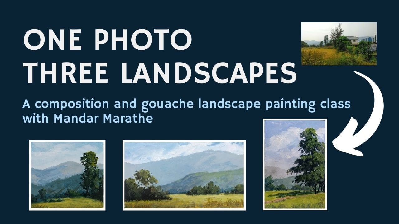
about ten minutes. I wanted to create three different paintings
based on this same sketch. I'm not going to change
the composition much. I'm not going to change
the colors much. I'm going to change only the
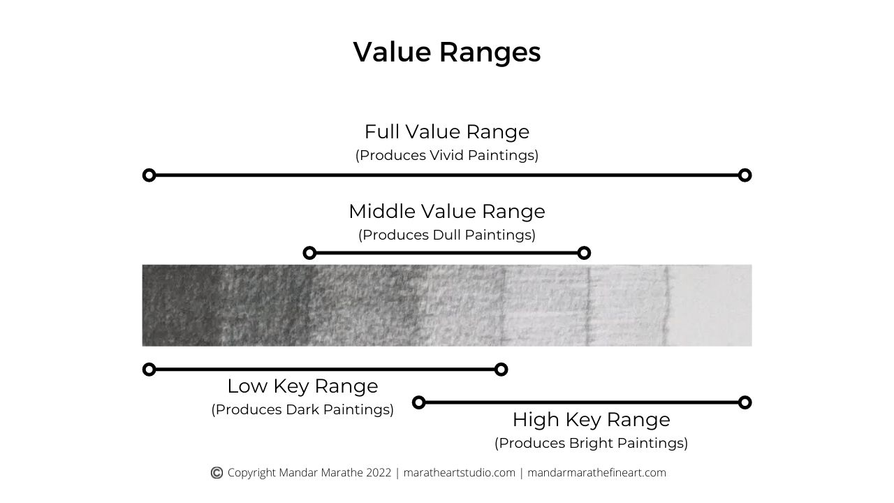
value range which are used. There are some paintings
which are called high key, which use a higher value colors. Then there are paintings
which use mid-value colors. And then there are paintings
which use low value colors. Low value in the sense. Darker colors, darker values. And mid-value means
middle range values, mid-tone colors,
and higher value. Paintings have all
lighter value colors. So the first thing
what I'll do is this is a kind of
mid-range painting. And what I do is now I paint very light value
Heikki painting. And in upcoming videos, I'm paying two different
versions of it. Let's get started. I'm going to draw this sketch on painting again is to give me
some reference to feed on. This is kind of wall sloping land. Then there is this
good OS which is really brightly lit in the sun. And then there's these
Greece bunch of trees. One is here. Another one is, I have
the right in the center. Maybe reduce or change
the composition of bit and keep it same across
all the breeding things. I didn't want to keep
them off the same size. Then there'll be
smaller shops here. And I wanted to add some details to the mountain in
the background. Not many details in sprinting, but just use it as
a means to show you how you can vary the value range which
you use for painting. And then three
different paintings. Paintings, three
different buildings with three different moods. This painting, I'll be using all Heikki colors so the dots will not be as dark and the
light will be very light. And I'm going to keep
the same colors. Cobalt blue, chrome, yellow, burnt sienna, and white. Only four colors, three
colors plus white. Painting. The whole
thing with that. The idea is not to
make a gallery. The painting here. I'm doing this painting to show you a particular thing
about using colors. That's the key of the painting. How you need to key in the right values so that you can create the
mood which you want. I'm starting with the dark. So as I'm painting a
high key painting, the dots will not
be as much dark. But I need to
create a dark which is fit for this painting. I'm starting with
this mix of color, cobalt blue and burnt sienna. And it's going to be a green, dark green of the, IS of the shadows. I'm going to add a bit of yellow to it so that
it becomes green. I'm going to apply that here. I should paint more opaque so
I'll add more white to it. Some, some yellow. What I've done is
I've just created and similar value color. I'm just using opaque white. Instead of using the color
in a very thin manner. What I do is I'll push this. Three slightly in the background and keep it even lighter. Probably this is going to be the darkest dark which
I'll have in the painting. The dark on this
tree will be even lighter and use
light that color. So I added a bit of white. I'm painting the
right-hand side of each tree because the light
is coming in from here. Now I'll go for the
lighter side of the vein of these trees into S1
to be more of yellow. Because this is a
high key painting. I'm going to make the
light colors even lighter. Start with this midground
or mid value color. With respect to this painting, the middle value or values are always related to each other. Now I'll add the
brightest, yellow. Now let me switch back to change to another
shape, which is this. This is going to be
much more brighter than this because it is a flatland, more horizontal than this. It's going to be even
lighter so far that I started with you already yellow, no agreement and some
white dove hint of green. So I've added a bit of this lean to remain too much yellow. Only yellow. This is the gate. Then I'm going to paint this. Let's paint this first because
it's in the same color. Family. It's distant green, so it'll be much more bluer. So what I'll do is I'll modify this pool itself and
animal glue to it. Because it is at a distance, it will be even it will have even more
white in it because it's perspective which
is affecting that. And let's see how this looks. This is Fulbright, more blue, some more white. Let's see this, this, it needs to be even more bluish. Can go even lighter,
some more white, and it should be okay, is to start with, I think I can go even lighter. Because as you can see, the value of the dark side of this tree is looking
very similar in value. I want to test it against. This is, this seems to be good. I'm making this edge
so that it looks as if the photograph and grass is
the tip of tips of the grass. I've seen variation. Is colored in a bit. Right now I'm
applying one value, one color shape
of this mountain. Go by the M3 method than what we are doing right now
is the second stage. The first stage was growing and composition, which wasn't, wasn't big in this splitting
because already composed, seen on location and replicated that drawing
is to add some details to this mountain and
adding more blue and let me add
patches of that in some places is to
create some variation. As this mountain is
not too far off, I'm adding some
details which might get obliterated when
I paint this guy, but right now I'm keeping them. Now let me add the
grounds of this. And again, because this
is a high key painting, I want to keep this light brown to this
yellow which was already dead, which will make the brown lighter and also add
some white to it. And let's see how this looks. Should be okay to start with, I can add few dark
accents later on. Where does the first layer? This is fine because this
is a vertical surface. I'm using vertical brushstrokes. Keeping this edge because this is not a flat
ground and there'll be some grass which will
cleave on and so on. Not be up. Clean edge. Let me paint this. This will be lighter
than this one because it will be similar to this color but not so
bright because I want to, this is not the focal areas, so I'm going to have to
make it slightly dull. Adding brown, white. I want to keep it
a yellow color. Yellowish brown color. I want to also make it slightly
more. That's too much. Let's see how this looks. I didn't want to suggest
some foreground which is focal area basically not have many details. Again, I don't want
these colors to be dark. I'm suggesting some detail. Also. I wanted to
suggest a few retain some details in this edge. I do that once I paint the sky, the sky, obviously you
will be very light. Started with white
tinge of blue to it. And I will add some more
blue to it once I go here. Brush has some remaining color
from the, from this mix. That's why it's not
very clean color, but that's fine with me. Know, Let's add some more white. Some more blue. Make the sky blue. Maintaining the icky structure
of keeping colors light. This completes our second stage of the painting if we
go by the empty method, because it's a
high key painting, you will see a lot
of lights and darks, even the data salivating light, as compared to this painting, can see how light the dark side. Now see you in the next video when I add some details to
complete this painting.
3. High Key Painting Part 2: Welcome back. In the
previous portion of this painting or in
the previous video, we painted this light version of our Heikki version of this sketch which I
had done on location. And I'll be finishing it
up with some details. Let's get started. I'll be using smaller
brush this time. Let's use this regard. Not well-suited to
paint the details, though I would have preferred
a slightly larger brush. Let's go ahead with this. I need a dark which is here. It needs to be
slightly more dark even though I want
to keep it light. But I'll mix a
dark using cobalt, chrome, yellow, and some brown. Let's see how this
is the darkest dark. So let's see how this looks. This should be fine. Even for this Heikki painting. I'm not interested in
making too many painting, too many details, just a
suggestion of few things. Here and there. This dark will be slightly
lighter than this dark. I'm adding some white. They'd be this dark cure. This dark will be actually
seen only against the lighter mountain
in the background. Since I have this, I will add a few details here and there. Now let me add some
details to these, to this, rather to this ridge. For that, use,
brown, burnt sienna. And I will add some blue to it. I don't want it very
thick, very dark. So I'll use it thin. I could have added white
and done it, but again, make it dark and make it light enough by just by just using it. Thinner consistency so that
it doesn't get too dark. Just adding some texture
to this surface. And maybe in one or
two places I will add some definite shapes of dark. Somewhat ID. I want to go
overboard and paint too dark. That's enough to
suggest that this is now let me do something else. What do I add details to now? I will make this, I need to make this lighter. And I will also add
a few details to the some details to the
to the yellow grass. Let me clean this up. I can use the palette for
mixing another color. I need a slightly
darker version of this. So what I'll do is I'll
use this yellow and add a tinge of brown to
it, slightly darker. And add a few. Marks of that in some
places, not many. And I'm using the side of
the brush so I don't want to paint blades of grass. I'm just painting
patches of grass which might be slightly darker here and there
is two variation. That's enough. Now I need
to make this lighter. For that I can modify this. This was the color which
I had mixed for this. I'll do that by adding some more white and reactivating
this color. Let's see how this
looks. Seems good. This will push the mountain
even more in the background. And instead of painting
the whole mountain again, I'm painting patches of that. Patches of this color
on top of that, so that it does create
variation and it also lightened the
overall value. It will also nicely separate out the threes here
from the background. Earlier, not so
prominently seen. Bit more white here, overlap with this color so that I had painted
the sky later on. And because this
mountain is in front, I can add the finishing touches
with the mountain color. Can suggest some trees
which are rising above the mountain line in some places without making
them too attractive. Now, to add some more interest, add a few fence lines
or something like that. Just to make things
somewhat more interesting. Maybe the fence
line is like this. Again, the fence posts also, I don't want to make them dark. Something like this. Just this a bit lighter,
yellow color again. This is the brightest green, which is shining because of the direct sunlight
warning on it. Few more mid value
because this was looking like one big area
or dark dark area. I'm just trying to break it up. So I think that's enough
for this painting. You can see that the difference between let me make a
border and then I'd show both these paintings
together so that you will see the difference between
kind of impression, mood, which these two
paintings create. This is a high key painting, and this is more of a
mid-value or looky painting. You can see the
difference between the two kind of move
which they create. This is more cloudy, dull kind of atmosphere, whereas this is very cheerful
and bright atmosphere. I hope you enjoyed this video and also saw an
opportunity to interpret the scene depending on how you
want to portray and create an artwork which is
authentic to you and not being slave
to the scene, which you'll see in front
of you can modify things and make the scene
into a work of art. Not only a copy of what
you see in front of you. So thank you and see you in the next video.
Happy painting.
4. Low Key Painting Part 1: Welcome to this video. In the previous video, we painted this Heikki painting, which means it has most of the values which are tending
towards very bright side. And it's based on this
on-location sketch, which I did on last Sunday. In this video. Today we're going to paint
loci version of this painting, which means most
of the values will be on the darker side. To do that, let's
first draw the scene. I'm not making any changes
to the composition of it. I'll be also not changing
any colors that I use. I'll be using the same colors. I'll tell you those in a moment. Again. Let me first
draw the border. Maybe this will be better. And there are,
there is this line of the grass which
goes like this. I don't want to hit
this exactly at the center of this
vertical lines are and bring it slightly downwards. And then there is this
wall or edge of the farm. This is some area where
there is some grass growing. Then there are these bushes. This is a large one. There is a tree in
the background, slightly behind this tree. And there is one bush here. Nothing very complicated,
very simple subject. There is this mountain
which is in the background. And that's it. There
is nothing much to this painting in terms
of shapes or details. Now let me start by explaining, start painting the
doing the painting. And before that, let me reiterate the colors
which I'm going to use. Cobalt blue, gamboge, chrome, yellow you can use they're
both very close to each other. And burnt sienna and white, three colors over blue, gamboge, burnt sienna and white. I'll start painting
from the dark shapes and the darkest dark in
this painting is going to be the shadow part
of these trees. To mix that color and start with covert and add
burnt sienna to it. Because it's green
and I also have to add some yellow so
that it becomes green, but a dark origin of green. If you compare this, let me show it to
you in a minute. Just laying in the dark
side of these trees. This will be dark here. This also is a bush which
has this shadow area here. If you see, compare this
dark with the dark here, you can see it here. How dark this is as
compared to this one. So this is a high key painting. This is going to be
a low-key painting. Let me continue. Since I already have
green on my brush, I will slightly tried to
paint the mid value by adding some more yellow to it so that it becomes
mid value color green. And I want to do this in as little brushstrokes or as fewer brushstrokes
as possible. Just to make it look
fresh and simple. This way. I'm making sure that it's not
mixing with the darks. Because otherwise I'll get a middle value
between these two, which I don't want because of the mixing
of these two values. Now let me paint the paint
the red wall or edge. It's not a wall, it's edge of this farm for that and
start with burnt sienna. And I wanted to make it dark, so I'll add some blue, not add any white, because I want this dark. Let me paint that with vertical strokes so that I get the texture automatically. That's how I'm adding painting the wall rather
on the edge of the farm. I don't know why I keep
calling it a ball. Keep it at that. I did not
work on the details right now. Now let me paint the
mountain in the background. This is, this blue
is also going to be darker than what I
have in this painting, will be much darker than this. We had a blue. Let's
start with a blue. I want to add some white. I want to bring down the chroma. I will add some brown to it. That's too much. You can see. It has become almost agree. I'm trying to bring it back
in the realm of blues. Let's see how this looks. This is too dark. Some more white. See how this loops. Yeah, this looks okay. So let me quickly paint the mountain. I don't mind or rather
I'm making sure that these brush marks
are not covered up. I don't want to paint a wall. That's why I'm leaving
these brushstrokes alone. I'm not trying to cover them
up or make them smooth. Wouldn't be mountain. I can always come
back and modify this, but for now this color and
this value looks okay to me. Now let me, since I
have blue on my brush, let me paint the guy. Let's start with white
and need some more white. The sky is lighter
towards the horizon. I'm using this
white on my brush. And because the brush already
had this color on it, I'm getting light
blue gray color. If you have watched to
our brush in-between, then you can make this color
and paint it. Paint with it. As I go up the sky. I'll add more blue to this. Because the sky is more
blue towards the top. Some white, some more blue. And let's see how this
looks. It looks good. You can see that I'm making no attempt to cover up
these brushstrokes. In fact, I like the visual
appeal of these brushstrokes. It's up to you
whether you want to make your painting smooth, leaded, have that texture. I like paintings which have texture and brush
marks scene in it. I think I'll have to
make it make the sky lighter because it
has become dark. Take some white. Tried
to suggest a few Cloud. I don't want to make
it a bright sky because then it will not remain. Low key painting. In a low-key painting, The Brights are not very bright
and the dark, very dark. That's how it creates
a rather serious mood. As compared to bright painting. Our high key painting. Now let me come back. Come to paint this where
the bright grasses, as we just now mentioned, the brides will not be as bright as they are in the ICU painting. But I'll start with yellow. And I don't want it
to be so bright. So what I'll do is I'll add some green from here into it so that it becomes
slightly greenish. And let's see how this looks. Of course, this will be much more brighter than
its surroundings, but I will make it into a
slightly more green color. Let's see how this looks. This shouldn't be okay. Because we have to remember
that we are trying to paint loci painting. Not added any white in it. It's not opaque. I want to create. These may add some white and create these blades of grass which are kind of
overlapping the mountain shape. You can see that even if, even after I added the white, it has not become very bright. That's what I wanted. I wanted to maintain its
low key characteristic. Now the last shape to
be painted is this. And then we'll have completed the blocking part of this painting or blocking
step of this painting. This will be a color
similar to this, but it will be
slightly more dull because I want this
to be the focal area. What I'll do is I'll take
this color and add it here. So that becomes a color
between these two. And let's see how this looks. There has to be, I can add
details in this later. What I want this to be a slightly darker color as compared to what
is already there. Then completes the part of the painting or stage
two of the painting. I'll have to make this
darker in the next stage. That doesn't compete with this. But I will allow this
painting to dry for a bit and then
I'll come back and show you how to
paint the details. See you there.
5. Low Key Painting Part 2: Welcome back. Now let's
paint the details. But since we want to paint
this as a low-key painting, I need to make these
two shapes darker. Because that's when I
look at this painting, I still get a very
bright feeling. And that's not appropriate. The way we want to
read the result, I will have to darken
these two shapes. I'll start with the sky first. Start with the blue. And I want to make it
dark so I add some brown. Let's see how this
will turn it in. Yes, this might
be too, too dark, so let me add some
white some more blue. Still in the blue range. Use of pretty dry brush. So I'm just wiping my brush
on this piece of tissue. Not darken the sky all over, but I'll just lay in this
color in some areas. That will increase the contrast here against the light
color of the cloud. I'll have to take
care of or reduce the contrast by dragging
this dryer brush over this. It's the same color, just the brush is much more dry and it doesn't have
a lot of color in it. Dragging the color on the
brush in a circular fashion. But still you can
see that there is value difference
between this and this. Maybe I can accentuate that by laying in
this color again. And that makes it
necessary to make this mountain also
much more darker. So I'll again modify this same color because
it's already near, this is the color. I'll have to modify
it to become much more blue, slightly greenish, but instead of adding yellow, I will add brown, which is a
very dark version of yellow. Maybe some yellow also. Some white domain,
it slightly opaque. Let's see how this looks. Shouldn't be okay, I guess
maybe some more blue. This is good. Let's paint. This side of the mountain. Looky painting
represents a scene wherein the light
is not very bright. Because of that, the values are also close to each other and the values are on the darker
side of the value scale. Have to make this
darker than what it is. Now let me adjust this. To make this darker. I will add some brown
to this color itself. And let's see how this looks. I leave some lighter
areas in-between. I'm not covering the whole EDAR again with this color and just leaving some
gaps in-between. Now let me make this dark. This is also for this painting. This I will use brush which
is slightly smaller in size. So this is what I've
been using till now. Now I'll use this. I will use a dark color, which is a version of the
same color but slightly dark. I will use it in this fashion. So I'm trying to press
the brush and get its fibers spread out so that I can use it to create
this texture. I don't have a lot of
color on my brush. It's complete dry
brush technique. Let's do too dry. I don't want any details
here where there's one impression of
some drag grass. I think that's good
enough for now. I also want to blur the
edge between this grass and this edge of the farm. Now, let me also
make this dark in some areas because it's too bright as compared
to the overall thing. I'll modify this color itself. Some more blue and
some more brown. I will make it. Let's
see how this looks. It has to be slightly thin,
becomes slightly darker. Even though we are painting
in a gouache style, it's not necessary to make
the color opaque every time. By adding white. Keeping it bright here. As long as you get the result. You don't have to think in terms of transparent and opaque. What you want is
the final painting should look the way
you want it to look. Now I have to make these
shadow areas dark. So for that I need
a very dark color. Blue and brown again, some green to make it green. And use it to paint this, you can see how dark it is. Now this being the final color, I'm not paint it all over. Leave some mid-value patches. This painting will give you a much more monsoon
niche feeling where the sky is heavy
with monsoon clouds. The sun is not so bright. Now, let me add
some lights here. I want them to be opaque, so I'll add some white. I don't want them
to be so bright. If I add this, it
will be too bright. I don't want that to happen. So I will add some
dark green here, bring down its value. Then let me apply this. It is still light as compared to the darks, not very bright. Some fine tuning mid tones back when they were left. To paint this dark
blue. That's fine. That is, in the camera, you will see your reflection here because the color is red. Please something here so that you don't see the reflection. Now with the ringer, I will add few even
darker accents. To finish up the painting. Need a dark green. Let's see how dark this is. Good. Now I'm using the
point of this brush, the fine tip, and
adding few details. Okay, The last thing, I need to add some
details here also, the crevasses where there is very less light reaching this to use this to paint
few marks like this. Now I'm using not the
point but the edge of this brush that I get that texture from the
side of the bristles. Same color goes in here for
some, integrating some grass. These are just some
supporting characters to help this subject get the importance. That's how it is.
Now let me paint a few fence posts. Give it more bit
of a human touch. Because we humans like to put
a fence around everything. You see your pins. You can be sure that there
is a human presence here. Not very descriptive sense, but it will just create
some interest area. Let me see this painting
from a distance. I'm just stand up and seed. It looks. It looks okay. It's it's a dark value painting
or loci painting. That's what it is doing. Let me draw a border around it. Then we can call it finished. This is a scene
which you might see when the light is low. Not much of sunshine. Cloudy weather. The Brights are not
very bright and the darks are pretty dark. Just by changing the value of the colors you can
create different mood. Now I'll show you
the lite version and the dark version we've
been painted just now. I zoom out. You can see that this one, this is what we
painted just now, has all dark values. This one has light values. So this is Heikki painting. This is loci painting. The subject is same. I hope you will take
advantage of this concept of the values to paint
in a certain style or a certain value range
so that you can create the impression or the feeling that
you want to create. Inspired of using a scene which had a different
kind of impression and atmosphere at
that time. That's it. I hope now you will take out your colors and try to
paint a low key painting just like this and experience the strength which this concept
gives you as an artist. I'd see you in the next
video. Happy painting.
6. Full Value Range Painting Part 1: Welcome back. In the
previous videos, we have seen how we painted this based on this
planar sketch. This is a high key
painting I painted. In the next video, I
painted this Loki painting. And now instead of painting
a mid value painting again, what I'll do is I'll paint. A value painting means if there is lightest light here
and darkest dark, you are then added to tend
to use the maximum range. So out of these painting
which have different, this has mostly bright, this has mostly dark colors. And this is kind of
squeezed in-between. What I'll do is I'll try to
use the brightest brights and the darkest darks
in one painting and create a bright
and sunny painting. Let's see how it works. So it will be an exercise again in
controlling the values. But without just values
will be also using columns. If we were to use
just the values, then it would have been a
black and white painting, which we are not
doing right now. Just sketch out the painting. The drawing once again. Simple thing,
nothing complicated. Doing these exercises of
painting same scene in multiple values gives you a very good command over how you can control the
mood of the painting. That's from that point of view. This kind of exercise is
very, very important. I'm just sketching out
this edge of the farm. Then this is the bright
idea where there is grass, then there are these trees. There is a fence here,
smaller tree or bush here. The mountain in the background. That's it. That's the sketch. Will be using the same
colors as we have used in the previous paintings,
which cobalt, blue, and yellow is already here. Burnt sienna and white. Let me get out the burnt
sienna, some more. Chrome yellow also. Or you can use gamboge
very close to each other. So this being the full range or full value range painting. The darks will be very dark. In the brides will
be very bright. I'll start with the darks. That blue, brown. Let me quickly lay in the darks. Because we are painting in
gouache style or opaque style. I can cover up these dots
with light later on. Then I'll paint the mid value. Mid value will be
slightly more greenish. Some more yellow goes in, overlap some of these
darks with this color. And I'll paint the
whole thing and overlap the lights
here. The bright. Let me try to zoom
in a bit more. The reflection which
you get here is because of the wet color, right? Knowing, just ignore that. Once the brain tries,
do not see it. Now let's go to the wall
or the edge of the farms. So I want to make it
into a brown color. I'm using the same brush and not washing the brush
in-between edges wanted to make this slightly dark blue. I'm using this brush vertically. You can add some
more brown to it. You can do this kind of value
exercise with any painting. Green to paint the same scene in different values structures or one with very light values, one with dark values, one width squeezed in values, and one with full range. And that is bound to give
you a very good exercise. I need some color
which is dull green. I'm using this mixture
of both these colors. Nothing very fancy, or
new, different color. Let's see how this looks. Just brush it in. I'm using this colored in a thin manner just to lay
it in, cover the area. I'll add the details later on. Now let's paint this Mountains. I'm washing my brush. The mountain is going
to be much more blue. Start with blue. Add
some white in it. Just to make it lightly dull. I can add either a brown or
I can throw in this color. Shouldn't be okay. Let's
see how this looks. Value wise. I think I need
it to be much more lighter. I will add more white. What I've seen is this watch white doesn't really
reactivate easily. It's always better to
take out the white again. And let's see how this is. Yes, same school. Me quickly paint this. Here. I'm using all
kinds of up and down brushstrokes to
create that picture. Suggestion of detail. That is something
interesting on the mountain. And it's not a flat
colored paint. Some more blue we'll do. Start with this corner. Sky holding. Now since I have the
blue on my brush, I'll paint the sky for. So, for the sky, I've taken much more quantity of white and start
painting with this. Needs a bit of water. You can see the value
of difference between the mountain and the sky. The sky is lighter.
Has to be lighter. As I go up, I will
add more blue. Because this is a bright
sunny painting which has the full range of values. I'm also using the colors in a much more saturated manner, at least in the sky. Since the vocal idea
is this the mountain, the edge between
the mountain and the sky should not be ready. In border not prominent. And add also a few clouds. Suggestion of clones. Because the light is
coming in from this side. This side of the clouds
also will be bright. And this side will
be much more graded. Now let me wash my brush. Laying the bright
color of the grass. The crop. For that I will start with yellow and some white. Let me get opaque. Let's
paint with this bright color. Later, decide whether
it needs to be made graded down later on. This is too bright. Make it slightly more greenish. Blue will make it green. This at least has a hint
of green, which is good. I'm using this very large
brush for this area, but then I can still create these ups and downs in
the line of the grass. If we look at it, look at this painting
from the M3, M3 method of painting. Then we have completed the
second stage of the painting, which is the blocking, wherein we have colors
for all the shapes. Now what I'll do is I'll wait for this painting to dry for a few minutes and then come
back and add the details. So see you in the next video.
7. Full Value Range Painting Part 2: Welcome back. Now let's start adding the
details for that. I have chosen to use. This brush, which
is slightly smaller than the earlier plant
brush which I was using, that I have more control
over what it does. Start by adding details to these areas because they
are pretty dry now. For that, I need to add few more dark accents
in this shape. Then some grass like
texture in the, in the bottom part. Let me mix dark brown. I'm starting with
blue and brown. Let's see how this looks. I'm using the brush sideways
so that I get a final line. I can use it this week. I think this is better. I'm just making
sure that this edge doesn't look very flat. Picture will make sure
that that doesn't happen. Now let me, I need to add the grass like structures
or grass texture. I'll use thinner brush, rigor. And I use the same color. Because this area is much
more lighter than this. This should create some
difference in can use this. This should be enough to give that feeling of some
grass being there. This is too bright
or too dark brown. Let me use the brush like this. Easily create this. Using the side of the brush
displayed tip of the brush. So it's not the point anymore. Musing a denominator mode. Black man up. After the while you brush, comes back to the point. Again, use that in this map sideways so that
they get the picture. Just an indication of
something being there. And nothing really precise
needs to be done here. Now let's come to first make this mountain slightly darker in few places so that
the lights which we apply here will
become more bright. For the mountain. I'll use the same powder
and add some more blue. Obtained your brown. Let's see how this looks. I think this should be okay. I won't paint the whole mountain with this and just apply it in few places so that there
is some variation also, and overall value also
decreases. To an extent. You can see I'm leaving
some areas unpainted. Here. I'll the base towards the base, I'll paint the whole
thing because it has to. Stand out against
this bright thing. This kind of creates
an impression of the mountain having some light areas and
some dark gradient. Obviously because that's
always the case because the mountain has the
mountain has trees, then some areas catch
lights, some areas don't. And that's how the Mount Doom gets different shades of color. Now let's come to they'll brights on the
highlights on the trees. The part that I wouldn't
start with the yellow, I'll modify this color
and take some white. Apply. Use the use the tip of the brush and it has to
be slightly blue, green. So I've added a tinge of now let me paint
some dark areas, slightly darker areas
in on this grass so that other areas
become bright. So what I'm doing is I'm
adding a bit of brown to this. Let's do much. Let me add because I want this
area to be the focal area. I'll start with this. I'm using a slightly
drier brush, not too wet. And then paint this area with that so that this area
becomes slightly dull. This area gets more attention. This is a very, very small change in value. And maybe I can
make that more by adding darker version.
On this side. Very small changes in values, but then they do that effect. What I'll do is I need
yellow, the original color. I'm adding more white,
make it opaque. And use it to create this, this grass rising against the shape of the tree. Same thing here. Maybe a dash of dark
accents on this. Because there'll be no,
not much light falling on. This. Won't be highlights. Mid tones and dark values. That looks good. Let's make this
even more brighter. Final highlights. Now I'm using the
regarded itself because I want very tiny highlights. This we are hearing
to do because the color dries
slightly transparent. Here. I don't want
a lot of contrast, so not much of that. I'll need some darker green. Dark color rather
won't be even green. In some places where there is almost no
light reaching. Very, very less light
reaching, I will say. That makes these things
pop out even more. Maybe a branch, dry
branch poking through. Some points here where
that is undecided of these leaves will have a
slightly darker color. I need the highlight in
one or two more places, and it wouldn't be the
end of the painting. The brightest. The last thing to be
added is the prince. Use this same color. Draw fence posts. Make sure then add a
different angle every, every post on otherwise
it looks on a deficient. Naturally they won't be standing all in an
upright position. Perfectly vertical. Has to be some angled to them. Something like this. I think we're done. Let me draw the outline and this has yet to dry otherwise. Then you will see it like this because there is reflection of light on this
because it's still wet. As you can see. When I, as you will see more clearly and show you
all the four paintings. And you will see
that this painting has the brightest brights also and the darkest darks also. This painting uses a very
wide range of values. One thing but again, do still is the sky more
blue in this corner? And feather it lipids so that makes the cloud
more prominent. One more line. Now, let me show you all the
four paintings in one go. So that you can see
that the same painting, how it creates different moods when you use different values. This was the sketch
done in ten minutes. This is the high key
version of that. This is the low
keywords and all that. And this painting
uses the whole range. You will see the darks, which are equivalent to
dark in this painting. And you will see Bright's which are equivalent to brides in this painting and see how
it creates different, every painting creates
a different mood. This is much more, this is blistering, heat
or very, very bright. This is done. This is also done. This is very bright sunlight, but not very hot. As, as this, every painting has a different
look to it and feel to it. This is what you should do with different paintings
so that you get the hang of how to
control the values. And also how you can manipulate the scene to create the mood which you want
to show in your painting. You will not be any more slave to what the scene
looks like right now. Whenever you are at
the scene and you will get better results in terms
of the paintings you create. I hope you enjoyed
this painting. And now you will take
out your colors and try different versions
of the same painting with control over values. And see you in the next video. Happy painting.
 Mandar Marathe, Fine Artist, Sculptor, Illustrator, Designer