Transcripts
1. Introduction: Hi, my name is Amanda Marathi
and welcome to the class. Simple watercolor painting,
monochromatic landscapes. Just as the title says, I will show you how to paint simple landscape
paintings step-by-step using just one color. You will see that these
paintings look very impactful and yet are
very simple to paint, as there is no color
mixing to be done. This class is completely
beginner friendly. And even if you are an
experience in watercolor rest, you'll pick up some
ideas and techniques that you can use in
your own paintings. See my color palette and the final painting throughout
the painting process, so that you will know how each brushstroke contributes
to the end result. I narrate my process throughout the painting
activity and explain the reason behind
my every action. Along the way, you
will learn to use watercolor techniques
such as wet-in-wet, wet on dry and colored lifting that are speciality of
the watercolor medium. All this learning will help
you go beyond just copying someone's painting and actually creating your own works of art, will be painting
these landscapes on a small size paper so that
they can be completed in a short span of time
and easily be given as greeting cards or turned into
inspiring desk declaration. Your project for this
class is to paint at least one painting based on the ones
shown in this class. For maximum benefits though, I encourage you to paint
all the landscapes shown in this class and
some more of your own. Going through this
class and doing the project will not only give
you immense satisfaction, enjoyment, and really
from daily stress, but also improve your
painting skills overall. I'm very happy to have
you in this class. And so let's get started.
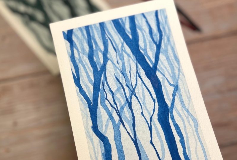
2. Tree trunks in a forest: Welcome to this video. In this video we're going
to paint a simple scene with a blue background and
some trees. Against that. The way I will be
proceeding is that I'll first display a flat
wash on this paper. This is a 300 GSM paper and
I've taped it all around. And once that layer is dry, then I'll paint few
trees on top of it. And while doing that, I'll be using two or three
different consistencies of the color so that
the faint ones, we'll create a field that is far away from us
from the viewer. The middle tone, or
semi-transparent, will be the one which
had a closer distance. And the darkest tree will be the tree which is closest to us. So let's get started. I'm using a round
brush number ten. This is Prussian
blue watercolor. I'm going to create a wash. And for that I need
lots of colors so that I don't I don't know how to color and have to mix
it while I'm painting, which would lead to
inconsistency in the wash. Now I have enough
color on my palette. And now I'll start. This is taped to a board so that I can lift it
easily and tilt it. I'm doing that now. Because of the tilt in the water and the
color will come down. That's what I want to happen. You should never
allow this to dry. Otherwise, the color doesn't become consistent and
you get a hard line, which is not so desirable
in a wash. That's it. And now I will have to
wait for a few minutes. The paper so that
whatever is gathered here can to some extent at least move around and
reduce in intensity. Though I had planned for very flat wash. What I'm getting is kind of an uneven wash
because of the tilt. Lot of color from
here came down. And that's fine with me and
just wait for a few minutes. You can also use a hairdryer
or heat gun to dry this up. But I'll just wait
for a few minutes and we'll be back with you again. Now this layer has dried, and now I'll be
painting the trees. For that, I'll be using this rigger brush
or a liner brush. The advantage of this
brush is that it creates Our with this you can create
very nice flowing strokes. And I'll be using that
for the three trans. I'll be starting with a thin wash, thin
color consistency. Even though this
is same as this, because I'm applying it on top
of already existing layer. It will become
slightly more dark. And that's what I want. And I will start painting the trees like this because the base of the
tree will be here. So I'm just starting, paint a few trees. If you want. You can draw these trees beforehand with a pencil
and then draw, then paint. You can practice on some of the paper and then
paint them on this. I'm not following any
particular design. Where do you want I feel it, right? I'm painting branches. And I'm also avoiding
symmetry, unknowingly. Got human tendency to draw
things in a symmetric fashion. And some ONE in nature, you won't find so
much of symmetry. At least in the ways these
trees are growing in the wild. These trees are
planted by humans, then you would have equal distance between
them and so on, which looks so
boring to look at. These trees have
grown naturally. Obviously, they'll be much
more randomly placed. Now I'm going for
a second layer. For this, I have thicker
consistency of color. Again, fainting a few trees
with this consistency. You can see that I'm using the brush this way
and not this way. Because this way the line
becomes thinner and thinner. And that's how the branches are. They become thinner and
thinner as we as they go up. Now I'll be doing one
winding, one final image. I'm going to paint with
value-added take color, which is going to be the three closest to
where the viewer is. And I don't want to
paint it in the center. I wanted to paint it
either here or here. I think I should paint it here. And again, I want
to make sure that the tree trunk is
not very upright. Just like I've done
for all these trees. Don't like to paint tree trunks which
are exactly upright. And that's because in nature
also they're not like that. There is some organic
curving here and there. I'm making sure that this color, which I'm using is the
darkest one in this painting. Because this is the
closest object. I'm going to give it much more attention in
terms of how I paint it. I'm applying the same
color again because I want it to be very dark. Maybe a branch starts here. Just to balance this somewhere, I need one more tree, which is not so thick. But just to balance this triode. Do I need it? I think
I'll paint one more here. I don't want to paint it in
the same at the same angle. Just paint one here. Let's see how this looks. I think that's enough. We don't want to create very busy scene. And now it's time
to remove the tape. Make sure you remove the tape away from the painted surface. Move this. Once I
remove the team, the painting starts looking
much more beautiful, dynamic looked other ways because that is a clean
border around it. Looks perfect. Now, you
can write something here or use it as a gift on
just keep it on your desk. I hope you like this simple little painting
with just one color. Now it's time for you to give it a try and see how it comes out. So thank you and see
you in the next video.
3. Pine Forest: Welcome to this video. In this video I'll be painting
a very simple landscape. And as usual, I have a paper taped to a board and
I'm using Prussian blue. And for the first washes
on this painting, I'll be using this mop brush. I'm not drawing it, but
I have it in my mind. What kind of structure I
need in this painting, the first wash will
be very, very thin. Start at the top. I'm not tilting the
paper too much because that way the top portion
loses all the color. This way I've laid this color on on every portion
of the painting. And I'll wait for
this to dry so that I can start painting the details. If you see any color of
pooling in a corner like this, either you can pick
it up with a brush. Event, tilt the paper so that it doesn't create bloom there. Let the paper dry. Now, in this paper it
is not completely dry, but it's almost dry. And I want to now paint the mountains so I will
not have to wait till it completely dries because
I don't mind having a soft edge if that color
spreads on the paper. Here. I'm just preparing the color. And I will be painting
a few mountains. I'm starting from here. And I'm not rubbing the
brush onto the paper. I'm just laying in and
leaving it alone and do it, do whatever it has to do. Now I'm want to paint a mountain which is
slightly closer to us. I'll be using color. And this will kind of spread in a different way because this color is still wet. I will also use this
brush to create some kind of tree-like
things without painting, because these trees
are very far off. I don't need to paint
them individually. But this kind of indication is enough to create
that illusion. The Last Mountain which I have, which is closer to us, I mean, just paint it like this because I'll be painting
larger trees on this mountain. I don't want to paint
this very dark. I'll allow this to dry now
before I can add more trees. Now on this color is almost dry. Again, it's not completely dry, it's not a 100%, right? This is still wet. But anyway, I wanted to paint the larger
tree is here, this area. So it doesn't matter
if this is still wet. Now I'm switching
to a thinner brush. And I'll be now using
much thicker color. Get some faint. And this color is
very well taken. It doesn't have a lot of
water and I'll be painting. Please note the
first weight will be somewhere in the tree trunk. I'm making these
marks like this. Maybe there'll be another
HDRI which is in the Which is closer to us. We don't see it stopped but then look like this. I don't want to paint
these trees also. And a very similar
kind of distance. Award symmetry. I'm believing some areas
without any three months. And I'm also consciously
leaving some gaps in-between sky holes through which rather holds in
the 3s for the age. Through it. We can
see the land beneath. Keep some gap and paint
film mode trees here. You can see how losing in a simplified
manner and bending. There is no new data which
is done very precisely. Few more trees here. The farther away look smaller than the ones
which are closer to us. I'll wait for this
to dry or lead. We can do it with
even thicker color. In some places like this. Color doesn't have
any water in it. Opaque. Even in the dark shape. That is somewhat ID value. Let's try adding a few birds. Only an indication not I won't be painting
them very detailed. So we have to take care to paint them also
in a random manner. Paint one killed. This paint is not ready to take. This bird has become slightly darker then what I will need
briefer, but that's okay. That's it. Let's see if I can
pick up some of them. Make it slightly frame.
Yeah, that's fine. That's fine. It was looking too dark. Once this dries, it'll make this burden to
slightly darker. It's time to remove the tape. It started with this. That's what we have. And that is a bit of
which has come out here. Let's see if we can
get rid of that. So I'm using plain water
applied on this area. If not a 100%, we can at least reduce the intensity is not
going away. Anyway. That's it. That's it for this video. I hope you liked it
and you will give this a try and see you
in the next video.
4. Moon Reflections: Let's do one mode landscape with the same setup with
the Prussian blue. And this time I'll be
leaving some white areas. And I want to show one moon here and its reflection
in the water here. While I'm painting, you
would see that I'm keeping some area without any color. Let's get started. Let me using tin first layer. Too much of color. I didn't keep anything white. Let's see what we can do. Let's see if we can
lift some color up. Though. This is not gonna
be perfect circles. Trying to lift some. I'm going to lift
some more color from around this because that way I can create effect
of the ripples on the water. If required. I can of course, add mode of color, do it. In fact, this is an
accident which has me trying to make it circular as persimmon,
but that's fine. Keep it at that and
allow this thing to dry. Before I add anything else. Think it's fairly dry. I don't want it to dry completely because
I wanted to paint a mountain which is
also long distance. So it's not going to, or it should not
have any hard edge. With watercolor, it's
best if you don't touch the brush stroke
once you've laid it on, because the moment you touch it starts getting bad. And while this is still dry, I want to add some
color for the trees. And I'm painting this in color because without
allowing this to dry, because I want some
smudging to happen. I want the color to spread. If required, I can add details with the consistency
color later on. Once this is dry. When I have this short
window of time when I can do this wet
in wet technique. I'm going to paint the
reflection on these trees. I don't want to
paint it right now because I want the underlying
layer to dry first. Now, by the time I
was painting this, this has dried quite a bit. Now I will be painting with the same color,
the same consistency, but I'll be laying strokes which won't
spread on their own. And I will go on increasing the gap between the brushstrokes as I come down, because that is the reflection. Similarly for these trees, I will use a thin
consistency color to paint a few waves here. Please indicate I'm filling in these gaps with
this light color. Because then it will
have concentrated effect on the EDR where I want to want the people or
the viewer DO Loop. If I keep all these
highlights here also as bright as this one.
5. Towards the mountain: Welcome to this video. Again, Let's paint
one more landscape with just one color
that's pushing blue. I'll make a few marks here. What I wanted to paint. There is a mountain here. There is a road which
goes like this. There is a bunch of trees here. We don't see their tops. They are toner. Then what do we can
capture in the painting? And then there is some
piece of plan here. I don't want to make
it parallel to this. So let us make it this way. Then there is a bush here which will act as a counterbalance
for this bunch of trees. That's the simple
drawing. Let me know. Start with, as usual, a very light color. Light mixture of pushing blue. Start applying this. As usual. We'll have to wait
till this thing. I'm doing it so that it doesn't the color
doesn't pull anywhere. Wherever it's pulling,
I'm just lifting it with a corner of a tissue. I'm making sure that it's
not pulling in one place. And that's why I'm
tilting the paper. You can see the color
dripping down here. I don't want to
create that line, so I'm turning it upside down. That line is not created. I still see that this area
has become too light. This is looking
darker, but again, this will also be become
lighter when it dries. You can see that the color
hasn't dried very uniformly. There is online which has formed because of the
color pooling there. But I don't think we'd
be a big problem. Let's see what to do
about it later on. Let's keep painting. Let's now the mountain. The mountain is like this
and carried all through the width of the painting. While this is wet, I can paint these trees. These trees on the left, on the right-hand
side will be much darker because they
are closer to us. I'm starting with
a very dark color. I want to leave some
sky holes in-between. When say Come here, the color will start spreading. Not let us see how it goes. Not necessarily that it spreads for the
painting to look good, but I'd have to make
some changes later on. That's the dark curve. Bunch of trees. Then we have let me
take a smaller brush and this won't be as dark
as the police themselves. This area will be in shadow. Because the way I'm painting
the light should be online is coming from
behind the trees. Also will be darker here. Very light color
and spread this. Let this dry because it's looking cool
completed right now. We're going to do is
paint on this side. Maybe a smaller
bush. The road side. That is a bit of darker color which has
flowed onto the road. I want to get rid of that. Wait, and I'll be picking up picking it up with this tissue. I let this dry and then
I'll come back later. Point tomb that I can add
few darker spots here. There are three trunks
and areas of the tree which doesn't get any light. Ends needs to be done. This is almost dry. It's not completely dry. I can go in and make the
changes on the road. The road can be made darker. Now I've washed my brush
big some clean water, and then make this color spread. Doesn't appear link of batch. Again, I think I did a bit more. I didn't want it this color
to flow down again on the road thing I'm almost done with the painting. Details. Dry brush now because the underlying color
has completely dried, I can add details without disturbing than sorry,
I think that's it. Some very dark colored your own. So I'm to remove the tape
and see how this looks. I think I can add a few more dark paint is on the trees on the
left, on the right. Don't make it. This is looking uniform. Let me add a few dark accents. When doing this, you have
to make sure that you have enough color on your brush and not a lot of water
because you wanted to apply the color and not
remove the earlier column. That's something which
need some practice. Since seventh added dark, darker areas, doors,
the base of the trees. And that's it. I don't want to overwork it. Again, you can see how
simple this painting is. Didn't require a lot of time, didn't require any color mixing. Just controlling
the thickness of the brain which we are applying. And if you remember, the earlier color
has dried here, the wash head, right? Not so pretty. And we continued painting on that and you can see that
it's not looking very bad. I mean, not something which is spoiling the bending
if we can live with that. Accidents, select this in
watercolor are very common. But it's not that the point
of the painting altogether. Just try to work around them
or you can live with them. I hope you will
give this painting a try and see you
in the next video.
6. Country Road: Welcome to this video. And this video again, we'll paint one more
monochrome landscape with pushing blue,
which I have here. I'll be making a few marks on the paper so that I
get the drawing correct. You may not see this right now because I'm drawing
it very lightly. But you'll be able to see it in the image which is being shown on the
screen in the video, which of course I've put in after the recording
while editing. And there'll be a bunch
of trees here and some smaller trees here. For me. To start with. I'll be using
a mop and very, very thin. Let me share of Bush in blue. I've been using this
same ballot for many paintings now which I
recorded for this class. That's why it's all
fiddled with the color. Now let me start applying it. And I'll apply it all
over the painting. I will tilt it this way so
that there is any extra color. I wanted to come
towards the sky, but not pool there, so I want to tilt it in the
reverse direction also. I love to wait for this to dry, at least to some extent, before I can apply the
next layer of color. Let me just take a
small piece of tissue and wipe container on the side. You can of course, use a
hairdryer to quickly dry this, but I prefer to wait. This paper is again dry. It's still damp, but
it's not wet either. So I'll mix a slightly
thicker consistency of color. And I want to paint
the mountain here. Okay, So let me quickly
paint the mountain. The mountain base will
be somewhere here. While this is wet. Carry till here. This is wet. I want to drop in fuel. Dark accents, which
will be actually trees. Shrubs, drop one here. Too much color on my brush. Then Trump here on fuel. And use a slightly smaller brush because this brush carries
on lots of things. That can be a problem. Sometimes. This is a
smaller simple brush. And I'm using it to drop
in some color here. And also, what I've done
is I've brought this tree slightly closer to the viewer because I've changed
the baseline of that. You can see that this
tree has a baseline here. Whereas these trees are near the base of the
mountains there. Away from this idea, they're at a distance. Now we'll use this
same smaller brush. I'll paint these
big trees first. I'll take this paint again, which is thicker, but it's not, I don't want to use a color
which is as thick as this, but it's not as thin
as the mountain also. And let me quickly paint
the trees which are nearer. And these aren't the trees which on this side of the road. I'm making sure that
this line is not very sharp in the sense
it's not very script. I just want to soften that. I also will go ahead and
indicate the edge of the road. And you can see that I've not
made any continuous line m just made three lines
which do give the outline, but they don't create
a kind of an outline. Feel as if I've drawn it
with a pencil or something. And then I'll create
some area where there is shadow and so on. We also create some are indicates some
detail. This corner. Let me make base of
these mountains, these trees dark so that can see that there is almost
no light reaching here. That's why this
media is very dark. And then there are multiple
trees which are in this bunch, something like this. Then I want to have
some indication of the vehicle marks on the tire marks
on the road. A few. Dot-com. This area is almost dry, so I'm making these
marks as dry brush, less color on my brush. But then because
this thing is dry, it's not spread at all. And just to make the sky
slightly more interesting, let me see if I can add one
or glaze of this column. I will do it very, very fast and make sure that or should I
leave it like this? I think I should
leave it like this. I was planning to have
a brush mark here that would have made the sky darker here and lighter here. But I think it will be due to escape the fluid because
if I get it wrong, then the bowl
painting we love bad. I will fold on. I will avoid that temptation. And I think I'm ready
to remove the tape. Though this is not very dry yet. I don't think that removing
the tape will be a bad idea. Let me start with this. That's it. What do you see in this
painting is going this way. There is a mountain
in the background, a bunch of trees here which
are very thick and dark. I'm just using the end
of this brush to create some marks which kind of
indicate tree trunks. Then there are these
bushes which are near or trees near the
base of the mountain. And large, larger bush or tree, which is still away
from this area. This is the closest object. Then this and then this
and then the mountain. That's the way objects are
arranged in the space. And you can see that even if
we have used a single color, I'm painting looks
very, very impactful. At least that's what I feel. I hope you will do
like this. That's it. Thank you. And see you in the next video.
 Mandar Marathe, Fine Artist, Sculptor, Illustrator, Designer