Transcripts
1. Welcome to the Class: I remember the first time I
bought a set of quash beads, clueless about the
wonderful properties. And Todd, I just
recently heard about them on the art
community on Instagram. I had to hop on the trend
and try it out for myself. I tried a very simple landscape for the first time and the y was not really happy with the
way my art was back then. I was instantly love
with the medium. I think the creamy texture and the velvety matte finish is what really attracted me to wash. It eventually became my
comfort zone because it was so much fun to just let loose and do whatever
I want it to do. It was very different from the other mediums that
had tried earlier. Hello everyone. Welcome to
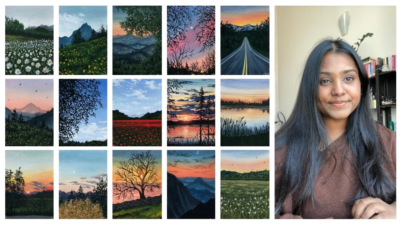
my 11 Skillshare class. My name is biased. I'm an artist and an art educator based in battery and originally
from India. I take classes online
and teach students offline to help them grow
in their art journey. I also sell a few of
my handmade products online at this Instagram
handle, you can check that out. I go by the name, that's
simply aesthetic. And I shared a lot about
my day-to-day life there. For anything in this world, practice is very important. If you want to get
better at something you have to practice and
practice and practice. Because practicing makes
a huge difference, brings in a lot of improvement. And that is what I did with my gouache landscapes as well. I kept practicing and over the course of
yours and months, my art went from this to this. Though there's still a
huge room for improvement. I'm very happy with how far I've come along
in my gosh, journey. In this class, I'm
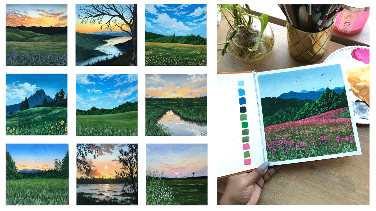
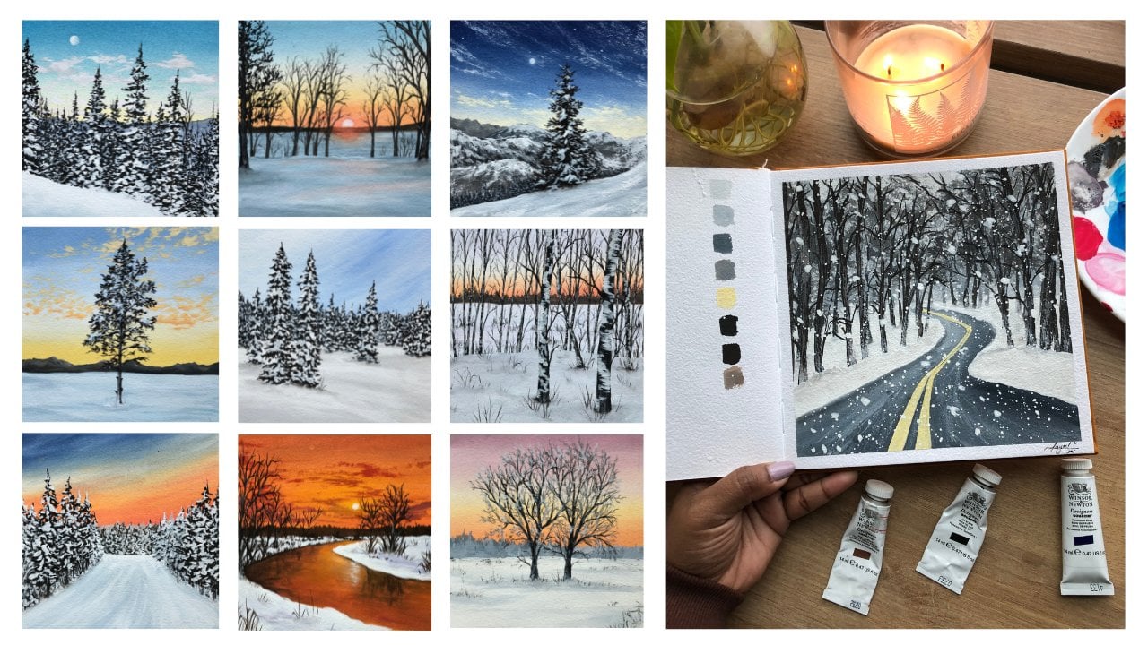
bringing to you as 70 sketchbooks challenge. Have you been seven
gorgeous landscapes over the course of 14 days? This challenge will not only help you start a new sketch book and get rid of the first paging
psyche that we all feel. It also helps you muster gouache better and it will
definitely see a huge change in your artworks. After the seven days are over, I guarantee you that you
will be so tempted to add in more landscape paintings in your sketch book and
complete the entire book. This loss is designed in a
way that you can join in at whatever level you
are in your art journey. I'll just walk you through everything that you
need to know about. Wash before we go ahead and start painting
in our sketch book, I'll talk about the right
materials that you need. And we'll brush over
some beautiful, gorgeous tips and tricks and
techniques with wash and using our basic
knowledge will learn how to paint seven
gorgeous landscapes. These landscapes around
about 30 to 40 minutes long. And you can split them half and half and take two days to
complete one class projects. So if this is something
that you find interesting and you want to learn and grow with me in your course journey, then join me in this class
and let's get started. See you inside.
2. Gouache Overview: Walsh has the goodness of both
acrylics and watercolors. Many people refer to gouache
is an opaque watercolor. Let me give you a quick
overview of what gouache is. Gouache is an opaque media
made up of a combination of natural or synthetic
pigment and gum Arabic. It is a meeting between
watercolors and acrylics, combining a goodness
of both of them. It has the leading
capabilities of extra legs where you can lay a lighter
color over a darker color, and reversibility of
watercolors where you can reactivate the
paint once it's dry. Wash is water-based medium, and adding more water will
make quash lose its opacity. That makes gouache a very
versatile medium because it can be used invaders
different consistency. You can use a thick
consistency to get a more acrylic look
and more oil finish. And you can also add a lot
of water into the medium to get the nice light
washes of watercolors. You may find gouache in the market in many
different forms. It comes in tubes, jars, and even these
cute jelly tabs. Either way, all of
these gouache is going to give you
the same result. The only thing that
you have to keep in mind that is to use fresh paint to achieve
the velvet matte finish. It is important that you
use freshly squeezed paint, because if you're going
to reactivate the paint, the quash may lose its opacity, the beautiful matte finish
that it's famous for. The opaqueness and gouache comes from the white pigment or chalk that is added along
with the pigment and binder. When you're painting
with gouache to get the lighter tone color, instead of adding water like
watercolors, we add white. I will talk more about this
in the techniques lesson. One of my favorite
things about washes, how it dries so quickly, which means it has
very less drying time. I don't need to wait for a
longer period of time between the layers and I can complete an entire
painting in one setting. Another thing that
I absolutely love about gouache is how it gets to this beautiful
velvet matte finish and it does not reflect
any light once it's dry. This is why a lot
of artists who do illustrations prefer
this over acrylics, as it's very easy to
make prints out of them. One thing that really
attracted me to this medium was how you could easily
cover up your mistakes. If you don't like how your
painting is turning out, you can read that the paint, move them around and even
cover up and start over. In this class, over
the course of 14 days, we are going to explore the
beauty of gouache in detail. So now that we know
what gouache is, let us discuss all the materials that we need for the class.
3. Art Materials You'll Need: Let's talk about all
the art supplies that we need for today's class. Since it is a
sketch book series, the first thing that you
need is a sketchbook. Now, it's not important for
you to have a sketchbook. But like I said, we're doing a
sketch book series, so it'd be good if you
start in a new sketchbook. I'm using the one
from fairy tales out. It's called the sketchbook. It's valid in India and they
do ship worldwide as well. I really like the texture
of the sketch work. It's really rough and it
helps me achieve a lot of different our textures
and looks into my paintings without really
having to try hard for it. But you're free to
choose the size of the sketchbook and the
sketchbook that you want. It's very easy to use gouache on any kind
of a sketch book. So just pick the one that
you have available with hue. It does not matter
what the GSM is, but preferably more than one ET. Next thing that we're going
to talk about are the paint. So we're done with
our sketch book. Like I said, do remember, you can choose any
size that you want. You don't have to stick to
the size that I'm doing. Next, let's talk
about the colors. I'm going to be using
these gouache tubes from Winsor and Newton and Titanium
White from Bruce stroke. Now you can use to
quash Jelly Gouache, Gouache from jars. Absolutely. Any gouache that you have
with you doesn't matter. We're going to use very limited color palette for our painting. So I'm just going
to quickly mention all the shapes that
I'm going to use. Here. I have cadmium
yellow and cadmium orange. So these two are going to be the yellow orange
color that I use. Next, I have two blues with me. One is primary blue and
one is Prussian blue. I absolutely love Prussian blue and end up using
for all my skies. So Prussian blue is what you'd majorly watch me
use in this class. These are the two
blues that I'm using. Next I have sap green, as you can see, I use
these paints are a lot. That is why they're almost over. I'm going to use
only one green for the painting that is sap green. Next, I have lamp black. And just to make
more warmer tones, I'm going to use a primary red. These are the base
colors that I'm using wherever I
use anything new, I will make sure that I
mentioned it to you as well. Next, let's talk
about the brushes. Now with quash, you can
use any synthetic brush. They are not very picky
like watercolors. So any brush, paper,
anything works, you just need to know
the right techniques to get beautiful paintings. Too. Flat brushes
to round brushes. These are bigger
sized round brushes. They're 86 or four, yeah. 84. Next I have another round brush, long-run brush that
I absolutely like. It's this long round brush
by Princeton, its size six, but you can see
it comes to Jolie find dependents
gorgeous when it comes to making bigger strokes and
even thinner detail strokes. Then I'm also going
to keep a bunch of few tinier or smaller
sized brushes size to size one, size 0. These brushes are going
to be used for adding those extremely fine
details into a painting. So just go ahead and keep a bunch of different
sizes of brushes that you have available with you and you'll be good
to go for the painting. Next, I have two jars of
water, as you can see, one is dirty, so I'll be using
one to clean my brushes. And the other one is going to
be a fresh supply of water. So whenever I need clean water, I'll dip my brush into that jar. Next you have a mixing palette. I'm using the ceramic
tray or plate, whatever you want to call it. I'm going to be using this
for my mixing palette. I really like using
ceramic palettes over plastic ones because they
don't form those bubbles. So again, free, feel free to use any palette that
you have with you. You're not limited to the art supplies
that I'm mentioning. You're free to choose
your art supplies. Next, I have the steep to
get those crisp edges. If you don't want crisp edges, you can totally skip this. You need scale pencil eraser, all our basic stuff to
sketch out the base. And next I have a cloth rag. You can use tissues, anything just to clean up, brush and get rid of any excess
paint that we might have. And that is it. These are all the art
supplies that we need. So that is quickly
learn some techniques.
4. Gouache Techniques & Tricks: Let me walk you through
some really cool techniques and tricks when it comes
to painting with gouache. I'm sure a lot of
you are about them, but it's going to be a really quick exercise
lesson as well. I use the squash tube paints from Winsor and Newton,
designers gouache. And I absolutely loved
creamy consistency, the beautiful matte finish
that these speeds gifts. But you can use any paint
from any brand as well. I've taken primary
red on my palette, and this is directly
from the tube. You can see how thick the
consistency is, right? It's nice and creamy, but at the same time
it's really thick. I will be using this
paint to show you what the thickest consistency
of paint looks like when it's directly
from the tube. It's very teeny. It's a really thick.
As you can see. This consistency of paint
can be useful when you're trying to achieve some
texture play into your work. But when I paint with gouache, or even it's advisable to
add a little bit of water. Since gouache is a
water-based medium, when you add water to it, it slowly starts to lose its obesity and starts
behaving like watercolors. As you can see,
the second stroke that I made is still opaque, but each time I add more
water into the make strides, I'm just actually
dipping my brush and loading it up with more
water each time as I go. And you can see it started
acting like watercolors. You can see the paper
beneath it and this is how close to us
to lose its obesity. Let us try another exercise. Well, for Europe, added a little bit of white
onto my palette, and I'm going to mix my white to the primary red color
that I already have. As you can see immediately, the color gets toned down as compared to our color
directly from the tube. It's still slightly lighter. And each time when I
add more white into it, the color becomes lighter. So when you're
painting with gouache, you want to make sure
that when you want to achieve a lighter
version of a color, you want to tone down
version of a color. You add white goulash to it
instead of adding water. Let me show you a few swatches
of my mixes with white. So each time I add, add white, you can see the
color becomes more like a baby pastel pink shade. And when I add more
water to this, it becomes lighter and
loses its opacity and start acting like watercolors. So as you can see, we've got a really
light variation of the pink and this
is how you work with the consistency of gouache. Next, let us take some yellow, oranges and blues on our palate. And we are going to start off by creating the first
section of our painting. So I've taped on my
paper on all four sides. And I'm going to show you two little section,
two little blends. So when you work with gouache, if you figured out how
to blend your colors, you've figured out how
to work with gouache. And I'm seeing this
outdoor experience because I didn't
know how to blend initially and I was having a
lot of trouble trying to get that perfect the transition
between the colors. But once I figured it out, That's pretty much it actually
to learn about gouache. Other than that, everything
is just about layering and putting it there based on the
idea that you're going for. I'm going with a darker, deeper tone, let's call a deeper tone of the
Prussian blue at the top. And each time that I moved down, I am going to slowly add a little bit of white and
add a little bit of white, just like what we did
in the consistency bit, that each time we want to
make the color lighter, we add white and not water. Over here you can see the consistency of my
paint is slightly thin. I'm loading up my brush
with a good amount of water to make the
blending process easier. I like to blend my
base colors into Laos. And that is only because the first letter I apply
is very thin and I like to add because it just helps me
understand the placement of things rather than just
going with the thick layer, adds the base layer. What I am saying that is
because if your paint, they said it's too thick, then it's going to start to get reactivated once it's dry. And that is why I start off with a very nice light
consistency of the paint. As you can see for
the blending process, I just use the paint later, all the colors and I'm just
using water to move into left and right to
and fro motion from one direction to the other
in a horizontal manner. So I'm not changing the
direction in which my brush moves in one single direction. And we're going to blend. One single direction you
get a beautiful blend. Other thing to keep
in mind is to try and use a bigger flat brush. When you use a
bigger flat brush, the blending process
becomes much more easier and you get those beautiful
transitions that you need. So I'm just going
to stop right here. I like to blend in the
sky as you can see, it's a really nice light color. And now I've mixed yellow and white on
my palette and we're going to make a transition or a blend between three colors. I'm starting off with this nice light yellow color as the base. So I want to make a sunset sky. So I'm starting off with
yellow as the base. Later yellow color in like
almost 1 third of the alien, not even 1 third actually
just a little tiny bit. And then do my same yellow mix, yellow and orange here. Of mixing these three colors, added a good amount of water, made the consistency,
consistency of my paint almost
like water-like. I wouldn't call it water
because water is too thin. There's almost like
between water and ink. So I'm just going to use
that consistency of paint and go in this to and fro
motion and blend them together. You're blending the yellow
and the orange to cut off. Right above the orange, I'm loading my brush
with just white paint. Again, moving in the
to and fro motion to blend the white with the orange with the yellow to get
that nice transition. I'm doing this because
the middle section where the orange is going
to blend with the blue, I don't want to create any muddy brown or gray is in
that transition phase. I want there to be a smooth transition from the yellow to the
orange to the blue. You can achieve that smooth
transition if you want to use white in that middle section and I'll show you
exactly what I mean. So started off with a darker
tone of the blue at the top. And as I come down, I'm slowly going to start adding a little bit of white
and then again moving in the store for motion to
blend the colors together. So as you can see,
each time I come down, the light, the
color gets lighter. And now I come to
a point where I want to blend the white
and blue together. I've left a little space loading my brush with a
little bit of white, moving into to and fro motion. And as you can see, there's a very light orange like
extremely light orange, extremely light blue color. And that is how the transition
between the two colors becomes smooth when
you use white. So as you can see, if you
can try it out for yourself. If I were to blend orange
and blue together, it would just turn out
muddy in the middle. But to make them beautiful transition when you
use white to get that nice smooth color
transition from yellow, orange to the blue. And I'm so happy with
the way this looks. Still, the, the finish of the paper is really
light, right? You can still see the paper. It's not, it's the
Guassian iconic, matte finished look yet. So I go ahead and code this section again
with another layer. So I go ahead and just
repeat the process all over again and wait for the paper to completely
dry before I go ahead and do anything else. I'm going to increase the speed right here because I'm just repeating the step and making
the paint slightly open. So that was pretty much it
about our blending process. As you can see, the paints
look much more opaque right now the layer has
gotten its nice matte finish, the iconic quash finish. So now I'm going to start
with the layering technique, which is basically what it means is layering one thing
over the other, as simple as that, right? So good to lay one
thing over the other, so one leg over the other layer. So with quash, when
you want to get nice, look into your painting, you want to work in layers,
especially for landscapes. You end up adding a lot
of layers of Green, lot of layers of blue spoke with whatever you're
painting depends on that, but you end up using
a lot of layers. Right now I'm using my size
eight round brush and I'm quickly going to show you
how I make my clouds. They are very simple to make. It's not as complicated
as it might seem. But you can definitely
try this exercise out for yourself and
see what works for you. So I load my size eight
round brush with white, thick consistency of white. Like I said, I use
thick consistency of paint because that works really well for me for
painting the clouds. And I'm going to start by
making the surf round motion. I go into the circular
motion when I want to get that slightly
fluffy cloud, look, I'm going to want
just textures and just the clouds spread
out in the sky. I go for these linear motion. So again, my clouds mostly you will find finally making
them in that linear form. Even if they look
slightly fluffy, I am yet to figure
out exactly how you can get the perfect fluffy
cotton candy clouds. But until that, I am just showing you what I do
fit the sky section. I go into circular
motion in sections where I want to
advocate clouds and then go in this linear stroke
in the left and right very, very minute to and fro motion you will watch me
do with my hands. And this is just like an involuntary movement when
it comes to clouds for me. Because without even
thinking like in my sleep, I could paint a sky. That probably comes
because I end up painting a lot
of skies aren't, end up adding a lot of clouds. I think with practices
just comes to you but in voluntary to and
fro motion or that, that little vibration in
my brush is something that gets me to make these
beautiful textured clouds. Start off by just laying out the bigger clouds wherever
I feel like adding them. I made sure that I add them from the left and right
side and then add tinier ones at the
bottom section and then move my way through it. I think this is
how I figured out. I come in from the left,
I come in from the right, and then I just sort of
like try to blend them all together in the middle with
tiny, tiny floating clouds. So this is how you create
The Florida clouds. The whole section,
what I'm trying to say is you've got the bigger
class, the fluffy ones. And wherever you want to make these clouds which
are more scattered, you end up just using a
thick consistency of paint in a slightly
brushing over to do. Since like I generally
tend to use rough grain or even cold press paper because of the
texture on the paper. Using the dry brush technique
creates that beautiful, uneven, broken clouds that
are scattered in the sky. That really, really
works out for me. Now I'm quickly decided to add in a little bit of
highlights to the clouds. And I'm just doing
that by lifting my brush with some white and going over the layer
that I've already laid. When you let the first
layer of titanium white, it dries out to be
slightly lighter. So you can use this
to your benefit because when that
layer completely dry, so I can lay over that with another layer of white paint and
that makes it more opaque and acts as the highlight
in the class projects. I'll show you exactly
how you do that when we're painting
that they can achieve beautiful
fluffy cloud effects by just layering paint
one over the other. As you can see over
here, I've added, you can count the
fluffier ones are the clouds with proper
of that circular shape. And everything else is
just Florida clouds and textures adding
infectious into your sky. And that is pretty much how I ended up painting my clouds. So this is almost like a
cloud in the clear sky. But if you were to
make this cloud in a sunset or sunrise sky, the process for slightly
remain the same. The only thing that would
change would be the colors. So, yeah, this is pretty
much it for this section. And in the next one
we will be adding the clouds in the sunset one. Alright, moving on
to my sunset sky, the first thing that I
want to do is add a sun. So for that, I'm going to
load my size six round brush and make a little circular shape in the center of my Skype. Not center, but really that transitional phase between
where the orange is more, that's where I want
to lay my son. So as you can see,
the sun currently has these really
sharp edges, right? Because it's laid
over a dry layer. So to get that soft
glow around the sun, I clean my brush completely. As you can see, there's
no paint on my brush. This just a tiny bit of water or you can just
say the wet brush. I use the wet brush
to just sort of blend out the entries so I
reactivate the paint slightly, just guide the paint to
blend out even more. And that creates that
beautiful glow around the sun. That this can be done many ways. This can not only be
done for the sums, can be done for
the moon as well. This can be done
for a star as well. So you can use the same, same effect where you
want something to glow. You can reactivate
the paint and use the same white to create a soft glow around it
and then layer over again just to make
the sun more defined. So now moving on to the clouds, I'm going to mix
this orange color with a tiny bit of white, tiny bit of white, and a tiny, tiny bit of blue. So as you can see, some
yellow ocher color over here. I'm doing this because
I want to show you how I make my linear clouds. Now, you are free to
choose type of clouds that you like and you
are comfortable with. You can practice both of them because you end up using both of these in your
class projects and even in landscapes in general, you'll see these two being the most easiest ways in which you can add clouds and sky. Over here, you'll see
that my brush movement is more just in that horizontal
to and fro motion. We've done that same
at the top as well. But since we had some slightly
fluffier clouds in there, so the movement was not
entirely in that linear form. Over here, my brush movement
is entirely denier. Then you can almost see that
I'm scribbling over here. But that is one of the ways
in which I add linear clouds, painted this just leaner
clouds, just different colors. You can play around with a lot of different colors as well. Over here I've added
a tiny bit of orange right around the
area that you think receives the direct sunlight. And like I said in
the sunset sky is you end up mixing a bunch
of different colors to create the highlights
clouds into your sky. So as you can see, adding
in that orange really makes the clouds
pop out even more. They look much different, much more realistic
if I were to call it. And that is pretty much it. How I add the clouds elderly, but everything else
is, like I said, border lines crippling,
especially for the detectors, but support line scribbling. Scribbling in a little bit of a direction where you
just going horizontal. But as you can see, you can also vary the sizes. I wanted to mention that you
can vary the size as where the side ones are bigger and as you come
closer at the bottom, you increase or
decrease the size of your strokes so you can
add in the variations. Again, you'd watch me moving from the left and right
side and sort of blend everything together in the
center of my painting. Now over here, I said
that once that sun dries, you can lay over it. And as you can see, there's a really nice
soft glow around the sun. And then you have your sun in the middle of a volt to take a little bit of yellow and add that and also brushed
over little bit of white in the area that is
the closest to the sun, just to bring in
some radiations. That is pretty much it. Look how Chloe sun sun
effect is in the clouds. Looks so nice. And I'm so happy with the
way this has turned out. Just good practice before you go ahead and start with
your class projects. Now, I could keep decided to add a silhouette on
both my paintings. So I started off with the silhouette of almost
like a mountain for the first one and
the second one is just some bushes and trees. I'm just going to
add a silhouette. You can do that. And so well, if you wish to
have two more mini paintings with you before you start
your class project. One thing that I wanted to bring your attention to was how you can use the wet paste layer to add another layer of depth. So as you can see, the
black that I lead earlier, I've just gone ahead and
Lido For some white over it and immediately turned three because the base
layer was still wet. So we'll be using this to get in that nice effect in
our class projects. So we want two different colors to blend with one another, but at the same time we
don't want to lead over a dark like a dried-up layer. While the paint is still wet, you can always go ahead and add another color and just
make them blend together. For this little silhouette, I went with black
being at the base and right in the center where the sunlight directly
fonts in that section. I went ahead with the
orange color and blend it out with the black again
so that when it dries, it creates that beautiful
glow effect in the middle of my silhouette. This is it. I've peeled off the tape
and as you can see, we learn four
different techniques and also learn how to apply them into our painting to create these two beautiful
many landscapes. Before we go ahead to
our first class project, I hope you learned a
lot about consistency, blending and layering,
and also how to use the dry brush technique and create that effect
into your paintings. And that's pretty much
it for this section. In the next lesson, we are going to learn a little bit about
our class projects.
5. Class Projects: Let me give you a quick brief
about our class projects and how you can incorporate these beautiful techniques
that we learned. So we'll be using a combination of these basic
techniques that I just showed you in the
previous lesson to create some beautiful paintings. As you can see here, we've got a beautiful
sunset Lake going to use a combination of the blending technique
that I showed you along with cloud to be
adding in some clouds. We're going to use the
layering technique layer over different sections. Again here we are
going to use a bunch of different layers
for the foliage. The grass sky is a
beautiful blend, just like I showed you
in the technique lesson. This one is slightly different. We have one gradient sky. Then we've got a bunch of different layers
for the foliage. And even in the foreground,
we've got beautiful, beautiful flowers that we'll be working on with
different layers. The consistency section that I showed you is going to be used to learn how to create those
beautiful different things. Again, here in this
class project we'll be using the linear drying
method for the clouds, then adding in the dry
brush technique for the textures that you
see on our little hills. Next, again, here
we have a nice, cute gradient sky and a lot of different textures in our hills, for the clouds, the water, lots of different textures. Here we have a nice gradient
sky and we're going to use the same cloud
method to click to create those beautiful
fluffy clouds. And then a lot of different
layers for the foreground. Here. And again, we have
a nice gradient sky. And then we're going to use
those fluffy clouds and adding textures in
our grass using that. A lot of different techniques are going to be incorporated in R7 class projects that
we're going to feed. It's all just a bunch of
different combinations. Once you figured out how
to blend, like I said, you figured everything
out already. So I'm so excited to take you on the seventh day journey with me. I hope you're as
excited as I am. And that is start with our first-class project
in the next lesson.
6. Day 1 Part 1 : Sunset Lake: Let us paint our
first-class project, which is this
beautiful sunset leak. The colors that I'm
using are going to be cadmium yellow, cadmium orange, primary red, Prussian blue, sap green, titanium,
white, and black. So I've taped down my paper on all four sides using the tape
and taking the colors out, as I mentioned
earlier on my palate. So we have the yellow, blue, red, green, black, and
white all on the palate. And we're going to start off
by creating our base sketch. Using your pencil
and you're scared you're going to divide
the paper in this, our 2 third, 1 third. As you can see, this
guy is bigger as compared to the lake bed, right? So we're going to divide
your paper like that, draw the horizon line. Right above the horizon line. You're going to sketch
out some mountains. Now they're not very large. Remember to have the
shape slightly smaller so that it gives that
view of the distance. Next in the right corner, I'm going to have a tree. So I'm not really sketching out all the details of my tree, but I'm just lightly placing
it roughly on the paper so that I get an idea of what it's going to look like, right? So I have added some
branches on the left side, most adding those little ground
space on the lake, right? You've got the ground
and then you've got those little rocks in
the league as well. So I'm going to sketch
out the details of those sections roughly before
I go ahead and lay it out. So again, it does not have to be a perfect sketch even if you think you've messed
up here, don't worry. When we paint over this
sketch is going to go. And in this step, basically creating that
base sketches gives us an idea to understand where
our objects are going to be. Right above the horizon line in the sky and somewhat in
the middle of the paper. I'm going to also
make a small circles. I'll serve as the sun. Now that I'm happy
with the base sketch that is start painting. First. I'm creating a
mix of orange and white. So I get this slightly
lighter pastel color of the orange or a slightly tone
down version of the orange. And I'm going to start that, start applying that
using my flat brush. So use any size of the
flood brush that you have and start going over in the
center of the painting. Next, I'm going to mix my
cadmium yellow along with, as you can see, it's a lighter tone down
version of the yellow. And applying this yellow all around the orange
that I laid out. So I've got orange
in the section where the sun is going
to be all around. It is going to be this yellow color that
I'm going to leave. I'm just moving my
brush in one direction. That is in this
left-hand rights stroke in a horizontal way. I'm just going to go ahead and keep blending the
colors together. If you feel like your
brush is getting drier, then you can just load your brush with a
little bit of water. Resume you're blending process
right above this yellow, orange mix on the top, I'm going to load my
brush with them clean, white, just white
with a bit of water. I'm going to go in
this left and right stroked slightly blend it out. Next. I'm doing this because
we are going to blend the blue and the yellow
together using this color. So I'm going to add
a little bit of Prussian blue into my white mix. As you can see, it's
a really light color. And I'm going to apply
that right above the white that I
laid down earlier. So right above that
I'm going to have this light blue shade. And you're going to go again in that left and right motion. As we reach almost
the end of the paper, I'm going to add a
little more blue into the mix that is of the white and the blue
that we had before. And I'm going to lay down a slightly darker version
of the blue at the top. Now usually I go ahead with a really thin consistency
of the paint as the base. And then as I, once this
layer is actually dried, then I go ahead with
another layer just to make it more opaque being done, the first color just sort of helps me understand
where I want each of these individual colors to
be and how they're going to look when we have the
more opaque layer over it. So right now, I'm
going to repeat the entire process
that we did earlier. Again. You have to slightly wait
for your paper to dry. You can use a hairdryer to
speed up the process and then repeat the step again just
to make the sky more opaque. Now, if you're
comfortable with it, you don't have to
do it in two ways. This is just a method
that I follow for my sky. Layer it two times so that I get a nice opaque base color. And initially I always start out with the lighter
consistency. Like I said, a lot of artists start with a thicker
consistency itself, but I find it easier for me, just start off with a
lighter consistency because when I go
ahead and add clouds, I don't activate the base layer. So that's again a
personal choice. Yeah, right here. I am just repeating the process and creating the same
blends as we did earlier. So go ahead and repeat
the process again. Alright, now that my base
layer is completely dry, I'm going to create
a gray color, but not using our normal
black and white mix. I'm going to mix my
Prussian blue with white, orange and a little bit of red. As you can see, I'm adding
a tiny bit of red to make the gray slightly warmer. And I'll use this gray
to add the clouds. Now, you can lighten this gray color by just
adding white to this. And using direct
black and white, the gray clouds don't really add to the effect that
you're going for. Using the colors that you're
actually using in the sky, really mix the three
pop up even more. So now using a round brush, so I'm going to use my size
eight round brush here. I'm going to go ahead
and add the clouds. Now, my personal
preference and the way I add clouds is slightly using a thick consistency of
and using the texture on the paper to add in the rough textures or the
rough edges around the clouds. Now this works really well
when you're trying to create clouds that have more
spread out edges, what I mean by that
is they're not those fluffy, fluffy clouds. The more of the scattered
clouds in the sky, they don't show, the more
in a linear formula. Watch me create clouds, mostly in the linear
form because I'm still really scared of trying the
extremely fluffy clouds, but I will get there one day. Still practicing
that. Over here, I just load my brush, make sure that the consistency
of the paint is fake. My brush does not
have a lot of water. In case it does, you can always use a tissue
to dab out the excess paint. And using this, I just
rub over my paper. So just go over
with the brush with a very light handed
brush movement. I go ahead and
create these clouds. Now, if you ever feel confused where the clouds are
and where do I place them, you can always look at
the reference picture. I tend to look at the
reference picture for ones. And then I get really
lost along the way because I just want to
add clouds in my own way. But you can always follow
the reference picture, what the clouds look like. For me, it's all
about understanding the colors that are being used
in the reference picture, the placement of the elements. And then I just go ahead and wing everything that
I see on my own. Again, it's a personal choice. You can follow along in
whatever way you want. The only thing that I'm going
to keep in mind is that the clouds that are closer
to the horizon line. I want them to be
smaller in size. I want them to be more
spread out like linearly. And the clouds that are on
the top are going to be more about a largest size because we want to give the
illusion that they are more closer to the observer. Also, you'll watch me only the clouds on the
left and right side. I haven't added
any clouds are in the center where the
sun is going to be. And that is because as we
get closer to the sun, you'll have more
different colors in the sky and the clouds. Actually. We'll work on
that in the next step. So I've got clouds on the left and I've got
clouds and write, and write at the top, I am going to have some
clouds coming downwards, downwards, not all
the way downwards. And makes sure that
you're not bringing it to the center of the
paper downwards, but rather give it a detection, give it a slightly left
or the right movement. Right? Another thing that you'll
notice is when you are using this thick
consistency of paint, you'll notice that your paint on the palette is
drying quicker. What do you do
when that happens? It's just load a little
gentle touch into the water and add that in and dry your brush and
start over again. So yeah, that is one of
the ways in which you can just make sure
that your paint is completely dry because
there are high chances that they will start drying up and
you wouldn't get the thing, the victims assistance,
he becomes way too thick for you to rub on your paper. So we don't want
an extremely thick consistency of paint as well. And really thin consistency of the beam because then you're not able to get the textures that we're
looking for in our painting. Anyway. A lot of conversation about
the consistency of the paint. Right here. You'll see that the gray
has slightly changed. And that is because I added way too much
orange and my mix. And the Greek gods
slightly more warmer, but once it dried up, it didn't look as odd as I thought it was going to
look when the paint is wet. And of course, we're
going to add a lot of different colors for the
highlights in the clouds. So everything gets covered up. When we add in those highlights slightly here I'm just sort of playing around with the
shape of the cloud. Really not following
particular structure. Like I mentioned, I don't like to follow the
exact structure, just like to play around in this section. And
that's what I'm doing. I'm making those bigger
clouds slightly, adding some tiny ones
around it as well. Once you're happy with this, you're going to wait
for this layer to dry. And then we'll move
on to the layer in which we add more highlights. Alright, once this layer is dry, we're going to add the
highlights for that. I am going to use
this grayish color. This is going to be the
second color that I'm going to use to add in my clouds. And I got this color
by actually just using the same mix
that we used earlier, but this time I've added
more red into the mix. You get the warm or the
brownish color and use that. I will be adding the
highlights nice. You can see I'm adding
it on the right side for the clouds that on the
left of the paper, that'll be adding it
on the left side. On the clouds are on coming from the right
side of the paper. And the clouds at the top are
going to be at the bottom. I'm going to make sense
when you watch me do it. When I say it, it's almost
like a tongue twister, but it will make sense
when you watch me do it. This color comes in, in this direction because the sun is in the center, right? So it's going to have the
light's falling all around it. So whatever clouds are closer to it or whatever
side of the curve, Let's put it like
that in simple terms, whatever side of
the cloud is closer to the sun is going to
receive this color. The left two months
that are coming from the left side that
the right section, the ends of that cloud is
going to receive that color. Likewise, all that section
that are closer to the Sun will receive
that color. Again. You might see that there are really harsh edges
when I lead a scalar, but don't worry, we're going
to blend it with the Cloud. It's all going to look
like one single fluffy, different colored clouds once
we blend all the colors in. So don't worry,
It's okay to have harsh edges right now.
You're going to fix it. We're just laying down
our colors before we go ahead and do
anything about it. So yeah. So now that I'm done laying out all the colors and the
different sides around the sun. You're going to wait
for this to dry again. We use a thick consistency of paint like you
can see so that you get in those little
textures that we need. And once this is, once you're done with this step, you're going to wait for
this to completely dry and then we'll go ahead and
add in our lightest color, rounded, and then go ahead
and blend everything out. Alright, so before you
go ahead and add in, I like the colors. I wanted to blend this
one that we already had. I'm going to use my same
round brush and this time loaded with a
little bit of water. Just clean layer of water. Nothing else. Nope, ain't nothing. And using this clean brush, I'm going to reactivate
the edges and blend them out with the grader
was already at the bottom. So like I said, only clean water in case you
feel like you're lifting off a lot of paint
from your layer. Then just clean up, brush again, slightly dry it, and then use the clean brush to
blend the edges out. And that is it that you will see how it looks very different, slightly more blended
into the same mix, the same color that
we were using. You're going to add more orange
into the mix and then use the slightly brownish
color to add in some float clouds with this
lighter shade around the sun. Then again, add this at the
outermost edges that you see. You can add in some
more clouds in the sky using the same color. I'm adding the highlights. So again, it's kind
of like repeating the same steps as
we did earlier. But the only difference
would be is that this time we're using this
lighter color on. We're doing that because around the sun when it was
smaller clouds so that you're able to receive a different sort
of light, right? So there are chances
that the entire cloud is going to be off
that single color. And that's exactly
what we're doing here. Adding in the highlights,
adding in some tiny clouds. So you don't have to, again, follow the exact
thing that I'm doing. It feel free to add in as many Florida
clouds as you want. Add in more textures around
your clouds if you'd like. Make them look fluffier
if you'd like. So there are endless
possibilities of what you can do with your, with your same thing
with your clouds. But the basic idea
is to have a three, then a lighter color, the middle color, and then
the lightest color for the sections that are
actually closer to the sun. To make the area around the
sun slightly more vibrant, I went ahead and added just orange in the outermost
edges of the clouds. And then I'll be only using
a scholar, like I said. And the outermost
section maybe add in a few float clouds
if I want a defect. And again, use the clean
brush to just blend out the edges or the
harsh edges that are on the Cloud so that they
look as one single entity, one single cloud, right? So stressed about this because I understand creating these
clouds can be slightly tricky. So the only thing that
I want you guys to remember is to not get
stressed about it. And that is why this class
is divided in different, but it's also divided. You also have like two
days to finish off the project so that the process of creating art
is not stressful for you. Because a lot of times, a lot of people don't
have the same amount of time that maybe I have
for creating an artwork. So that is why you can
split this half and half and paint along with whatever
is comfortable for you. You can do the Skype it, you can do the base layer
for the league maybe today, and then add in all the
details in the foreground at the trees and all of those
details maybe tomorrow. So you can just go ahead
and do it at your own pace. Do it when you are comfortable to add in these paintings
into your sketchbook. As you can see, I've just added a few more floated clouds
around the bigger clouds. And when you look at it
now you're really see the major difference
that has come when we added the orange shade. The clouds that are going
to be around the sun look much more vibrant than
they did earlier. And that is how you
play with these colors. And if you also notice, I haven't used a
single colour that is outside my color palette
that I mentioned. So what if a Browns are crazy? Neutrals, whatever
you're creating is going to be using the colors
in your palette. You can have lighter colors, darker colors can
have variations of colors with a very
limited color palette. And that's how you learn
and grow even more. So that when you grow up, you realize your art journey. When you go, you realize
that you don't need a lot of colors to create beautiful
shades is just neat, very limited basic talus. And it can get amazing, gorgeous shades
just out of those. So this is going to be the
clouds in to our painting. If you feel like there's
something you want to change, go ahead do that. Sure, that when you're
done with this section, you are happy with
how your clouds look. Even if they're not perfect, it should make you happy. All right, I'm happy with how these clouds look right now. And in the next lesson
we are going to add details into our foliage
and then paint our lake. So see you there.
7. Day 1 Part 2 : Sunset Lake: Alright, now that we're done
with all the details and our clouds in our sky are
going to meet the sun. So then I'm loading my
brush with white paint. I don't have any other color
mixing is just pure white. And remember the
technique lesson, we sort of blended out
the edges of our Sun. That's exactly what we
are going to do here. We're going to
create the circle. And once I've filled in the
circle that I drew before, you can redraw it by the way, again in case it's gone. And once you're done with that, you're going to clean
your brush and then just use the clean water to blend out the edges and
smoothing out the harsh edges. This also creates that nice
little glow around your sun. So as you can see the
harsh edges you are gone. And now while that dries, you can go ahead and add the foliage near
the horizon line. For that, I've mixed my sap
green with a little bit of black and orange to get
that olive green shade, as you can see, it's like
this deep olive green color. This is the color that
we will be using for all the foliage that's going to be right above the horizon line. Going to use your brush and make these uneven movements
in the brush, right? So make sure that you're not making a straight diagonal line or whatever you want
to give the variation. This shows the
different sizes and heights of the foliage that is, in case you don't want to do
the normal vertical method, you can also tap your brush vertically and the bristles
will just spread out. And when that spreads out, it creates a little
bit of texture. So you're gonna use
your brush to create that bush extra, right? So right from the left and the
right side of my painting, I'm going to be using this olive green
channel green color. In the middle section
where the lightest directly falling on
that foliage section, it will be slightly lighter. The first thing that
you'll do is just make these folds right and the left and the right
side of your painting. And as you come closer, we'll add in the colors. So like I said, you can either make it vertically like
I'm doing right now, as you can see, it's making
these vertical strokes. Or if you want to
add in more texture, you can just dab your
brush vertically, which I'll do in add that
texture in for that look. Right now, I'm just focusing majorly on filling
in this space. As you can see, I've
come all the way till the center to the
either right below the sun and a filled
in all the other area, made sure that I got
and all the caps. And I was really careful around
the horizon line as well. So once they reach
the center bit, I'm going to make a larger
amount of orange and a tiny bit of red into the same pre mixture
that we just using. So right around the
corner you can add that. This is a nice brown,
burnt sienna color. I wouldn't say it's
exactly burnt sienna, but it's still on
that brown spectrum. I'm going to add this
fright below the area that is below the sun and then blend it out with the greens that
were already there. In case in green is dry, right? So there are high chances that your green would have dried
by now, but that's okay. You can always use
a little bit of water to reactivate the paint in that section and blended
out and make it look nice. And even as you can see, doing this creates that
nice blended effect. Where you have the orange
brownish color right below the horizon line and then you have the deep green
color going in. And remember how I showed
you that I'll be adding the texture using my brush vertically upwards
and just using the bristles to
create that action. And that's exactly what
I'm doing hymns carefully, making sure that I
have a good grip on my brush and I'm going to dab it vertically to the
paper to print the next row. I'm not sure what the texture is going to
look like with your brush. You can always try it on a
scrap piece of paper first. And once you're comfortable
tapping your brush like that, you can go ahead and do
it on your main painting. Because I am stand when you're starting a new sketch book, it's you you have that first
page anxiety where like No, everything needs to be perfect. And I know this
because I feel that we do not spend a lot of
time just looking at a blank sheet of paper to get that perfect painting
for the first page. But here we are to
get rid of that. So, um, I've got you covered. So in case you ever feel
like you're not there yet, you feel like you're
not comfortable enough to start off with a second page or
the third page two, it's come it's your
sketch books that you are free to choose. Whatever page you want
to start on it as an august have to be
the first page. So as you can see, I've
created that texture using my brush on the
left and right side. I really like the way
this looks right now. We've got a beautiful
brown right under the sun. And then you've got the deeper, darker foliage from the
left and the right side. Now I'm also going to create
the same sort of texture in the area that was
under the sun as well. Make sure that you're using
the brown shade for that, that you don't end up using a green over there and then it just really looks out
of place once it's dry, it would not look out of
place when it's still wet. But in case because once it dries changes, it gets lighter. So there are chances that
it might look out of place. So make sure that you're
using the same shape that you used for that brown section. And that is it for
our fullest section. We're not going to add
any more details to this. And I'm so happy with
the way this looks. With texture with the brush. Looks amazing. I'm so happy with the
width at passed on out. So this is pretty
much it for this bit. Now, while this dries, we're going to go ahead
and paint our league. You're going to start off
with the orange color. The lighter version
of the orange, slightly toned-down
version of the orange, which is just cadmium orange
and white mixed together. I'm using my flat
brush here, right? And I'm going in this vertical, horizontal strokes, but I'm holding my brush really
vertical to the paper, like perpendicular to the paper. That is the orange
color that I made. And the next color that
I've made is using black, Prussian blue, and white. So when you add in a
little bit of a lag, it brings out the
color that we need. I'm going to start applying that color from the left
and the right sides, sort of stopping in that
area where the orange is. Now you can overlay the oranges. Well, bringing some strokes sideways to that is
completely fine. But make sure that you're
not completely covering the orange color because
then the blue is going to overpower that section
and it's not going to give that glow effect that
we need for our lake. So I'm going to apply it from
the left and right side. As you can see,
I'm still leaving a little bit of the
orange space right there. Because when I'm going to go
ahead and blend it all in, I'll be reactivating that
orange section again. And I'm going to be adding that blended in
the blue as well. Right now, it looks crazy. It looks all over the place. And you might think
that, oh my God, I've messed up, but
nobody leaving yourself. You've got this, right. So over here I've
overlaid with the orange. So this was me
slightly blending in the orange as well
so that I have the glowy look but
not completely. And then I'm going to
repeat the process again. Like I told you, I do it
in two layers because I like to have a slight bit of
the watercolor effect to it. And not completely the velvet
finish off the gouache. I really liked that
look where it's mad, but it's not completely
like watercolors. And anyways, so I'm getting very deviated in the
properties of gouache. I've laid out the
blue, as you can see, I've left some space
in the middle. Again. That is where the orange
section is going to be, but that is why I left
that little section dry. And when I laid the
orange over it, it's going to pop out even
more as it did before. So you're going to
go ahead again, hold your brush
perpendicular to the paper. Use the flat pinpoint
of the brush. So you have a flat side and then you have a
thin side as well. When you hold your
brush slightly and use the thin part of the
brush, the flat brush. I'm going to be
using thin part for all the wave details that I
need to add in that section. And as you can see, sort of blended the orange
with the blue. I'm going to try not to overdo this section and just
stop right here. And once this is completely dry, we're going to add the glow or like the sun shining
on our lake. For that, I'm going to mix
white and orange together to get an even lighter orange color as compared to the previous one. I'm going to go ahead
and make these lines, these vertical lines, but
they're also broken lines. They're not fully
straight lines. Now because the orange
was drying out to be slightly as the same
color as the previous layer. Added a little bit
of yellow to it as well to make the glue
happen, even more. Orange mixed with
yellow and white. Now, as you can see, I'm making these little
broken lines starting from the area right below the horizon line coming
all the way down. So you're going to
do the same thing. You're going to have the broken lines coming all the way from the area
below the horizon line, coming all the way till the
end way you fleet the paint, as you can see, I've
left a little bit of section empty, white. You can go over it as well in case you've gone over
it, it's not a problem. This is just a section
where we'll be adding all the other foliage and plants and flowers
and all of that. And that is why I left it
empty because it didn't make sense for me to lead again
and then look over it. It's fine that it's white. So again, good
properties of quash. You can always overlay
on your mistakes are. Your mistakes really well. So meet those broken lines. Right in the center bit. Sort of tried to get the each
broken lines to be uneven. But I mean by that is if line a, line B is not the same
size as line eight, so that adds to the variations
that you are adding. So make sure that they're
not all of the same size. There is a little
bit of variation in the distance between them. That is pretty much it I really
liked the way this looks, and we still have a
few little things to tweak and about the league because it looks
really flat right now. I want to add in a
little bit of texture into Lake without having to
add in a lot of details. So once you're done with
the white bit like I am, I've added all the
little glowy things that I want to add
into the water. You're going to
wait for it to dry. And then we'll move
on to the next step. Alright, now that
this section is dry, I'm going to add
in a little bit of shadow for the area right
under the horizon line. For that I'm using
same brown color, but I've added a lot
of photo ahead and tapped in the excess
water on my brush, my brush on my tissue. So tabbed in the excess
water and as you can see, it's a very light
consistency of pain. So what I'm basically doing here is using that
light brownish, grayish tone of color. I'm going to use it to add a text shows on the left and the right side of the painting, we can bring some of
the strokes all the way into the middle as well. But right now I'm
focusing more than just adding in a
little bit of texture. And I felt like
sexual overpowering are lots of went ahead
with the same blue that I used earlier and pushed
it slightly upward. The major idea is to have the shadow bit off the horizon line of the foliage that's
above the horizon line. You need to add in a
little bit of the shadow. So carefully go about
in that line and just use your thin strokes to blend
it down not all the way, just slightly, very, very fine. Blending downwards. And this is while that dries a little bit odd right now
because the paper is still wet. Like I mentioned, once it's dry, it's going to dry out
a little bit lighter. So there are chances
when you are trying to add in another layer, it might, even on
blending the whole thing, it might look really odd, but when it dries, it
looks really nice. Right now. I'm just going to go ahead
with my plain white color. I'm using a smaller size of my round brush properly
size two round brush here. And then I'm just going
to make more lines. Those broken line
sustains smaller, not all the way to
the yellow that we already leap at the back is
going to be slightly smaller. This is just to show the extremely sparkling white
bits into our painting. That is pretty much it. Once you're done with this, you are going to wait
for your lake layer, the base layer to completely
dry before you go ahead and add in anymore details. So I'm really happy with the
way this looks right now. I know it looks really on it, but trust me, once it's dry, it's going to look really nice. And in the next lesson
we will be adding the details to our rods
and our foreground.
8. Day 1 Part 3 : Sunset Lake: Alright, now let us start
making all the rocks and the foreground
elements so that you can either sketch out these rocks
first and then go ahead and lay them or you can just
wing it like I am right now. I mean, I'm not
totally bringing it. I do have a basic idea of
where they're supposed to be, so I'm just going
to follow that. I'm using my round brush
here and I'm making an uneven bulgy shape at
the top and at the base. I'm trying to make it look flat. Not completely flat, but yes, sort of flat because
I want to add in the shadows to add later that look like it's
submerged in the water. So that is why that piece
is going to be flat. But the top of it
is going to have some even bulgy shape really. I don't have an exact shape to give you right here is
just a random shape. The only thing that I'm
keeping in mind is that, let's say the rocks that
I, let's call them rocks. The rocks that are
made in the beginning. Writers really small because
they are slightly more away from the observer and the
ones that are more forward. They are slightly bigger. And they can be small in size, like the area that is going to be visible
to the observer, can be slightly small as well, but you can see I've
added the bigger one as well to the Asia that's
closer right above them. I'm going with the brown
mix and I'm adding that at the top just to give it
that dual color, right? It has to have that
little shiny color from the sunlight falling
on it directly as well. As for the color for
the rocks that I chose was the same as
the foliage color that we made in the base, which is a mix of orange, sap, green, Black, Knight. It's that nice color. And what I'm doing right now is using a
deeper green color. And I'm just going to add in a few little vertical strokes that can be called a cross
on these drugs as well. So just, just a little
bit of unevenness, a little bit more texture play. You can skip that
step completely. But I just didn't
want to leave it at that bulgy shape and add in a little bit
of details to it. And that is exactly
what I'm doing here. Just a tiny, tiny details that all that goes into
this little section. You can see adding in
the textures really make them look uneven and add in a lot of variations in their shapes the way they
appear to the observer. Now using my round brush, I'm going to go ahead and make the ground that is at
the end of the paper. Again, following the same rules, make sure that you're covering the whitespace in
case you missed it, like me or just thought if
you don't not covering it up, make sure you cover
it up right now. Then use a variation of colors. Now over here, I'm just mixing some lighter greens,
some darker greens, even some browns, and just
sort of playing around with a deep colors in my palette right now that I
just mixed earlier. Doing that just like I said, brings out the different,
different colors in. It doesn't look flat. It doesn't look with the black
since they're dark colors. When they dry,
they're going to dry out to be darker, right? They're going to be drying out to be slightly
closer to black, but they're not
completely black. This is just using the colors from our previous
color palettes. We've got orange
and you've got to clean all the
colors that we need in our painting are being used as compared to
just direct black. So I've just connected those
rocks that I made earlier just to bring in that
nice fluid connectivity. And as you can see, it looks
really nice right now. We have a lot of texture play to put into our
painting in the league. For now, this is what it is. And then I'm going to mix, actually first load up
your tiny round brush like this size two. And I am just going
to mix more black into the paint this time making a color that's
slightly closer to black. I'm going to start
giving same class look, the texture that I
made on the rocks. So to the area that
is on that left and right edges where it ends and making smaller
strokes as you can see. Then in the ether
that's at the bottom, making them slightly bigger. And just with the size, you can add in a
lot of variations. You can make them
appear further away. You can make them
appear closer to you. So it's all about
the way in which you meet the size of these elements. If they're going to be larger, they're going to
be closer to us. They're going to be smaller, they are going to
be away from us. So that's the only thing
you have to keep in mind. Just make these grass shapes
with this deep, dark, almost black color all over in the bottom ground
place that we just added. Don't think too much. Don't try to make
it look perfect. Don't run after
that because that's not fair here for we're
here for having fun. So just do that, right? Just enjoy the process of
adding these cross-shaped, where ever you want
some giving you the freedom to just have
fun in this little bit. Now, I am going to use the
same color, the brown, green color that we use, and adding a little bit of water into it to make it nice and r10. And using this consistency, I will be adding in that reflection of
rocks in the water. She just carefully in case you
think that it's too runny, you can always dab
off the excess water and then just use a slightly
dry brush with this texture. Portrait of a year. I think I have a perfect
amount that I'm looking for. As you can see, it creates
that nice shadow effect. It's going to be at the
bottom of these elements. That is why I said to make
that thing flat, right? So when you add in the shadows, it looks really nice and I'm so happy with the way this
is turning out right now. So just carefully add in
your shadows right below. You can also look at the shape of the drug
that you've added, where the bulge is more, the shadow is going to
be slightly bigger. And where the
challenge is lesser, the shadow is going to
be less and so well. And make sure that it is really close to the rocks, right? So this should be
slightly connected, so make sure that you
are adding that in. And that's pretty much it as you can see, we've
added beautiful, beautiful shadows right under our little land
spaces that we have. And it looks so nice this way. Once you're done with
this, wait for this to completely dry and then we'll
move on to the next step. Alright, now I'm going to load my size 0 brush
for fine details. I'm going back to adding those grass shapes
as we were before. I did this because I forgot to add in the shadows and if I
would lay the grass over, it'll be difficult for
me to add the shadow that is where to stop with. We go back to adding the shadows first and then go
ahead with the cross shape. But yeah, go ahead and add
the grass wherever you want. Plural noun in this section
until you are happy to give any Your Land little bit of variations with different
sizes of foliage. I also went ahead and added some more tinier rocks in
the middle of the painting, just tiny one so
that it looks like this little section is further
away from the observer. So like I said, smaller
means they are V and phago means they are
closer to the observer. I also added the shadow to it as well using seem small brush. Either you can go
back to loading up that greenish yellow
that we used, or you can just wet
your brush slightly and bring the color
down and blend it up. Either way is correct. So I've just added that in
and I'm just fixing up a little more of the shadows
that we added earlier, giving it a little
bit of radiation, little bit of texture so that they don't
look really flat. We want to show that these slight movement in
the league, it's not. Fully dry or it's like
not fully flat and still, there has to be some
movement in it. And we can add that
move from rent by just adding little bit of variations and the
shadow as well, just put that unevenness. And we're now back again to
adding in some cross shapes. We're not going to overdo this. We're not going to
have it everywhere. We're just adding
a little bit of details into our
foreground elements. So just tiny tweaks of the scratch sheep and
we are good to go. Alright, so I'm
really happy with the way this looks right now. So I'm not going to overdo this and I'm just going
to stop right here. I'm loading my brush with
a little bit of white. Of course, clean your
brush before you do that. I'm loading my brush with
a little bit of white and I'm going to make the sun again just redefine the section because you remember we had slightly blended out the edges. So this time we want to have
a more defined sun shapes. I'm just layering open it and making the shape look more
prominent and more opaque. I'm really happy with how
that's going to start out. It looks so cute and the sky and that you can really see it now. And I'm going to go
ahead and add in tiny, tiny lines using my
really thin size 0 brush. Just to make the glue pop
up a slightly bit more, just a little bit more, and then try it where
the horizon line is. I am going to lay over that
section with my white paint. Now doesn't have to be a
straight line as you can see, it's slightly broken, thick
consistency of paint. So there's that x show
play that's happening. It's not a your white line
just going across the page. Right? So cute little bit careful in that
section, too much. White can look a little bit odd. So slightly be careful around that section at them
that you're good to go. Now we're just going to use our bigger round brush and using a slightly
deeper gray color. This time adding a
little bit more black to the blue and white mix, I'm going to add
in some texture. Now, this can be using
a light consistency of the paint or a thick
consistency of the beam. Either way, what
you have to see is that your brush needs to be dry. Using the dry brush technique. As you can see, my
paint is really dry. I'm just loading up a little bit kind of like an
essence of the paint. I've just used that
essence to add an action. As you can see, this brings out the mood of the league
and it looks like this, a little bit of
movement in the water. And that's pretty much
it for this section. In the next bit will be adding the trees branches that are the closest to the
observer in the foreground.
9. Day 1 Part 4 : Sunset Lake: All right, so now this
section is going to be the last bit of our
first-class project. Or for your, as you can see, I'm using a sheet that's
very close to back. It's almost black raid. And using the scatter, I will be adding all the details in the
foreground elements. So we have in some
branches and some leaves. And all of those
details are going to be using that color. I'm going to use my
size six round brush, but you're free to use
any smaller size brush. Maybe a size two or maybe a size for whatever helps you
achieve thin strokes. I'm going to use that
and start making these branches coming in
from the top left corner all the way down and tap and just thoughts around
it to make the leaves. Now, I'm saying this because if you've been following me
for a while on my Skillshare, you'll have noted how
I make these leaves. Obviously, if you've watched
a few of my classes, exactly how I do it
and I've taught it so many times in my
previous classes. But over here, I didn't want to put you in this box where I tell you
that this is how you do it. I don't want to confine
you into that box. That is why feel free to add in the branches and leaves and
what way you feel is right? I'm pretty sure you
trying this class, even if you're a beginner, you are pretty much familiar
with brushstrokes, right? Even as a beginner, you, I'm pretty sure
you're here because you've been painting
a little bit. So I'm sure you know
how to move your brush, even if you don't, don't worry. This is not just a
section where I tell you that people who have
practiced before can do it. Even if you've not
done it before, you can definitely do this. You're going to start off by
making some main branches. So you start off
by making one line connecting some sub
branches to it. Then around that, you
make these little dots, almost dots, lines to
give it a variation. Make some of them
clustered together. Make some of them slightly
away from one another. And that eventually
adds to the texture and the variations of your leaves and end up really looking nice. So that is pretty much
what we're doing here, giving our photon
elements a little bit of details with the
branches and the leaves. So the process here
is very repetitive. And I don't want to keep talking because there's nothing
much really to save. It's just that we are repeating the process
over and over. From the left side. In the left side we'll have
just branches and leaves. And in the right side will
have almost like a full tree, which I'll show you how you do. And yeah, that's pretty much it. So this little section
is just recitative. You're adding branches
and then adding enter. Alright, so I'm really
happy with the way the left bit off the
foreground elements. So let us move on
to the right side. Like I said, we'll
have a full tree, so you'll have the triangle,
have the branches. Now you can draw this out
in case you are not very comfortable with just going with the brush straight
away, you can try it out. Please send those elements
placing the branch how you'd want them to look and then
move ahead with the branches. Over here, I'm starting off with more pressure
at the base and as I move upwards and he's
releasing the pressure. And that's how I get those
nice variations in the lines. So you can just use
one single brush, move it upwards, release
the pressure and you have thinner
lines at the top. That's exactly what I'm doing. I'm creating a bunch
of different tranches. So I'm going to have main tree, I'm going to have some
branches coming out of it from the left side, some branches coming out
of it from the right side. Once you're done with this, I'm going to switch to a smaller size brush and
add in some more branches. This time these branches
are slightly thinner, as you can see. You can achieve this by using a smaller size brush as well. So we're going to make some more sub branches and
some connecting branches. The ones that we already
laid out earlier. Once you have the base of
these branches laid out, you're going to stop
right there and start adding in the leaves. So I'm really happy with how the branches sort
of look right now. So I'm just gonna go ahead
and start adding dots on these branches to
depict the foliate. So just make clustered dots at the ends of branches
that will just lead out. And very light handedly,
don't overthink this. You're just going to have
fun in this little section. That is one way to do it. The second way is just
using a spoiled brush. I'm just going to use
a brush that is really old and the prisons are
all over the place. I'm going to use that for
adding in the texture. But don't worry if you
don't have this brush. If in case you don't
have an old brush, you can just use your normal
new brush and just create the dots as the clusters
that I showed you. Or if you have a
spoiled brush can use it for your benefit
right now by just loading your brush
with some paint and just tapping it
vertically on the paper, vertically perpendicular
to the paper to create an action that really
adds to the bushy effect. And using a small brush for
this is really beneficial. So I'm just going to use
my small brush and create that pushy effect on almost all the branches
that I just drew. And in case you want to
add in some more than you can just make it floating
for the time being, and then go ahead and connect
it with some branches. Again, the process here
is very repetitive. And we're just playing
around really having fun, not thinking it through. And we're just trying to
make our tree appear in a way that it has a bunch of different names
attached to it. Alright, now that I'm done
with the base bushy look, I'm going to go ahead and
switch to a size 0 brush and use that to add
in mood branches. Add in more details. This time we're
making sub-branches, making tiny branches
coming out of the bush, bushy, clustered leafy
look that we went for. And then you can also
add some more branches and tap and using same small-sized brush to
add in more details to this. This process is again
very interpretative, so I'm going to keep
quiet and let you have fun and explore this
little section. Alright, so I'm
really happy with the way the tree has turned out. Now I'm just going
to make the flow right under the sun a
little more defined. Just adding in a few little
tweaks things that I see currently that I want to fix and make it look
better, but overdraw that. I'm really happy with
the way this turned out. Once everything dries,
you can carefully the tape off to get your
suit little crispy edges. And I'm so happy with the
way this has turned out. Here's a closer look
at our painting. Fifth got beautiful clouds that look really odd
in the beginning, but turned out so amazing. You can see all the
shapes that I've used on the left
side of the paper. And overall, gorgeous,
gorgeous painting, love the clouds, loved the lake. The branches also
looks really nice. I'm really happy with
the way this turned out, and I hope you enjoyed
watching the one. Here's a sneak peek of what's coming on day two.
So see you there.
10. Day 2 Part 1 : Into the Meadows: Hi there, welcome to project, to the class project
for today is titled into the meadows and the colors that
we're going to use, our cadmium yellow, cadmium
orange, primary red, primary blue, sap green, titanium white, and lamp black. I have taped down my paper on all four sides using
the masking tape. And I've taken the colors out on my palette as we discussed. So in case you don't have
either of these colors, you can always go for shapes
that are closer to it, which means if you don't
have primary blue, you can still use ultramarine blue or Prussian blue
in place of that, if you don't have primarily red, you can use cadmium red as well. So that's completely okay. Now I'm going to start off
by creating a basic sketch. I am going to divide my
paper in half roughly. I don't need to use a scale
because I really want that rough line and I don't want it to
be exactly straight. So next I'm going to make a
bunch of bushes and trees, basically a lot of foliage in the area that's
above the horizon line. Now, not as clear. So in case you want to look at the reference picture
and see how I'm getting inspired and
placing these elements. Feel free to do that. But right over here, I have just created a
bunch of foliate with bigger sections and the
left and right side. And in the middle I've left a little bit of
space and I'm going to make these far off hills and mountains with
my paint later on. So this is just a very simple, basic sketch that I've made. Very light, very
faint, and very rough. You don't have to worry
about perfection because in case you don't
like your sketch, you can always cover it up and go about your day with that. Anyway. So let's start painting our sky. For that, I'm going to
create a nice mix of the yellow and orange
and the titanium white. As you can see,
it's a nice pastel, light tone down version
of this yellow color. And as I mentioned before, to make a shade lighter instead of adding water, you add white. So even in case there's a situation where you want
to tone down the color, you add a lot of
white into the mix. So I'm going to have
this nice transition in my sheets from yellow to orange. And blue is very similar to
our exercise lesson, right? So you remember how we created
that second bit where we went when done with the transition of the
yellow, orange, and blue. That's exactly what we're
doing with nice pastel yellow at the base and
then slightly orange, slight orange shade above it. Then we have to blow at the top, and that will transition to the orange color
using just two white. So I've taken my primary blue, like I mentioned earlier, you can use any blue. You can use Prussian blue. You can always tone down
Prussian blue by adding white. You can also do that by just using ultramarine blue as well. And I've mixed a
little bit of red to make the blue mode Obama. And that is why I've added red. So whenever I'm
making a, wherever, I want to go with a more
warm shade of blue. Instead of just using
ultramarine blue, I end up mixing primary blue
and Prussian blue together. This is almost the
same effect because ultramarine blue is
also slight warm blue. You're going to have this
warm blue at the top. And you're going to use
the same horizontal, left and right motion to
blend these colors out. So just keep using
your brush and moving in one direction to blend the orange and
the blue together for a smooth transition
between them. In case you feel like
your brushes trying, all you have to do
is slide the dip your brush in water like
just the tip of it so that you take in a little bit of
water and you can go ahead and use that wet brush
to blend everything out. Now I've created a
base layer over here. I'm going to wait for this
to dry and then we'll repeat the same process
again right over here. Once my layer has
completely dried, I have gone ahead and created the same
layer all over again. I do this because I really like starting off
with a light layer of paint so that in case I don't end up liking something
once it's dry, I always have the
liberty to coat it with a much thicker consistency
of paint and make it opaque. But starting off with
a light tone really gives me the liberty to move things around and
just understand the placements of the
colors in the sky. So all I'm doing is just
repeating the same step, going from yellow to orange to the blue transition
using our blending with white method where we
are blending the orange and the blue together
using white in the middle. Alright, so I'm really
happy with how the blend looks right now the paper
looks nice and opaque. So I'm just going to stop
right here and wait for the people to completely
dry before we move on with the next step. Now that my paper
is completely dry, I'm going to go ahead and
make some far off clouds. For that. I've switched to my size six round
brush and load it up with a mix of orange and white where the quantity
of orange is more, the amount of orange
color is more. And that is why it's this
nice deep orange shade. And I'm going to use that to
make these far off clouds. Now, I'm not going to really
focus on the shape of the clouds are very more about how many clouds
are supposed to be there. I actually want just a small
slide into these clouds in the sky at a distance and
only add almost in that era, which is a, which consists of the yellow
and the orange color. So I'm not going
to use this shade, this particular orange shade to make clouds in the blue color. Because as we'll transition up, if I were to make clouds
in the blue section, I would have to make
them slightly gray for the yellow orange shade
because of the sunset, the clouds are
going to appear to be slightly orange in color. So I've just added a
few little tweaks, just using my dry
brush technique that I taught you earlier, but just focusing more
on adding the texture. As you can see, these
are all linear clouds than not fluffy. So it's one of the simplest ways in which
you can add clouds and adding the texture without really worrying about making
it look perfect. Alright, now that's
been done with acute clouds or distance. Let us make those hills that
we drew earlier in case your hills or mountains have completely covered
up except the gouache, you can always catch it out again just to place
them properly. They're going to be
very small and tiny. So in case you have, don't have a sketch, you
can totally wing it. I've got the faith in you. So I've mixed a shade of the
red color and blue color, which is this primary red
and primary flow together. And I'm using that to just
randomly make an uneven, bumpy stroke. Let's
put it like that. And I'm not bringing
it all the way down because it's not necessary. There gonna be a
lot of elements in the foreground are in the
middle ground rather. And it's gonna get covered up. So I'm not going to spend
a lot of time trying to bring the shade down all the
way to the horizon line. So I've just covered up
the section as you can see using this nice purple shade. But as it goes over
the yellow and orange, It's slightly becomes that nice, muddy, gray purple that it adds to the look
of the spins really, really far away
from the observer. So here's a swatch of
the shape that I just use in case you wanted
for your reference, it's just a nice purple shade. Next, I've added a little bit of black to my blue and red. I'm going to use that
to make a set of mountains right below
the ones that we made. And this is why I
was saying that there's no point
in bringing them all the way down because they eventually going
to get covered up. And as you can see,
you've got two sets of mountains that they
do look really odd because blue is still wet and the previous
layer has dried. So as you can see,
it looks really odd. Now while this is drying, I've added more black and a little bit of
white into the mix. And I'm just going to
lay that over almost making the same shade
that we used earlier. And I'm going to lay
over it again just to give it that
nice, opaque look. He was a swatch of the shade just in case you want
for your reference. As you can see, this
nice deep blue, almost like a Prussian
blue, indigo. Hello. Alright, now that this
layer is completely dry, we're going to go
ahead and start making the foliage section
that's in the middle ground. For that, I'm going to use my round brush and
I'm using a mix of black as the base with
a tiny bit of orange, just a tiny, tiny
hint of orange. And I'm going to
use that shade to apply in as the base layer. Now I'm doing this because
I will be building up that entire section in a lot
of lot of different colors, lots of different shades
of green actually. And we'll bring in that nice, bright vibrant look that you
saw in the final painting. So for that, I am just going to start applying it randomly. And at the tip I'm
just taking see, making these vertical
strokes just to get them unevenness in the Asia, I don't want it to be flat. And that is why I keep making these uneven vertical
strokes where each stroke is different
from one another. It's almost like a
rhythm that you pick up. Once you keep painting a lot, you end up picking up
this rhythm where you can do this without
really thinking about it. Honestly, if I were
to explain it to you, the only thing that I'm
doing is just moving up and down with my brush and
making these uneven strokes. There's almost close
to no thought behind my brain at this
point because I'm just like making that strokes. The only thing that I know is what the size is going to be. And by that, I mean, you remember how I told you that the middle section is
slightly lower to give the illusion that that
section is really far away and it's like a
V, It's like a valley. As they reach the area that's more towards
the right side, as you can see, I'm
increasing the size of it. I'm increasing the size, making it slightly
bigger so that, that gives the illusion
and me add in the many, many layers and the
future on this section, it gives the illusion that the rightmost section
is closer to us. Even the leftmost section is
going to be closer to us. It gives us that nice illusion that we need and not painting. Once I get all the shapes
that I want to make, that uneven shape that
I was talking about once I have the outer
layer of a treaty, I just go ahead and fill the entire section
with that shade. So as you can see, I'm just randomly
filling this end. We just want that to be as a
base layer for our future. There's a quick swatch of the shade that I just used. This nice deep, almost
close to black color, but it's not entirely black. So I don't tend to use black
directly in my paintings. I always mix it with another shade just
to give it that nice tonal mixed feel like it's connected to all the other
colors in my paintings. I always end up
mixing a little bit of some of the colors
that I'm using. So it's either
green or the blue, or sometimes it's orange. Just select the black
fields connected and not completely out of place and just black in your face, black. Now that we're done
with this layer, we're going to let
it completely dry. And in the next lesson we'll be adding all the details
to our foliage.
11. Day 2 Part 2 : Into the Meadows: Awesome. Now that we
have our base steady, that is, go ahead and
add layers over it. So the first makes that
I've created as of the sap, green and black, as you can see, it's a very deep green color. It's not black, it's
way lighter than black. And that is why laying this
light color over our black will create an effect
of the darker greens. And as we go ahead, we'll see even lighter greens that
will put on top cell creates that nice
variation in our foliage. So for now, I've loaded my round brush with some
of the paint and I'm just brushing over making
these vertical dots and lines and just
random stroke. I think a lot in
this section just, you're just going to make a
bunch of different lines, dots and vaguely verb the shapes covering
the entire section. So now, now the only thing
that you have to keep in mind here is that you're
going to want to try and cover almost, let's say if the black was 100% of the area that
we have covered, now you want to cover
around 75 to 80 per cent. So you want to
make sure that you are able to see
some of the black, but at the same time you are
adding the green over red. You want the green to be honest, spent spread out in a
larger area. Over here. I'm just making a bunch of different brushstrokes trying
to cover that section. So the process here is
very a potato, right? I'm just doing the same
thing over and over until I cover the
entire section, especially for the lower part of the foliage and not the tree that you see on that right side. Over there, the strokes
will be more at an angle that I've made
a brush strokes in. So I'll be following that
angle right over here. I'm just making those
straight lines. I'm also going to use
my size two round brush and make a tree. Lot of tree that
I will make will be somewhere in the middle of the bigotry that is already dead and the lower 48
section that you have. So as you can see, I've almost cover the lower part of the foliage
that I was talking about in these random strokes just going all over the place
in different directions. Just trying to get in our deep green color
over as a male. Now, I'm just going
to load my size two round brush with some of the same paint
that I was using, the deep green color. And just carefully make a few different
branches and add in some dots around it to make the tree just to give
it that nice full lux. I've just made a vertical line. I've added a few branches
on the left and right side and a bunch of
different dots similar to what we did in the
previous class project, but a much smaller and
much tinier version of it. So you have made a single tree, as you can see, very
minimal details. I'm not really going
into the depth of the tree should
actually look like just, I'm trying to create
some trees that are even further away from this
little fully at section that we have in
the middle ground. This tree is probably
behind that area. And I'm going to make a
similar one next to it. This time. I'm sort of varying
size of it by a little. I'm going to make it slightly shorter than the one that
I made on the left side. So it's a little bit
smaller than that. But the process in which I've
made them remains the same. Just switched up a little bit. So choppy brushstrokes just a tiny bit so that
they don't look completely the toe
of one another. There's a little bit
of difference in math, and now we're back again using a round brush to create
those random strokes. I'm pretty sure you can't really make the
difference out a lot. In the video, you can
see a little bit of that clear glow
when I'm laying in the green paint and it really shines over the
black at the base. But I'm sure you can see there's a huge difference once the
paint is dried, the left side, you can see once it's dry, it looks much more
interesting than it does when you actually lay it
on the black paint. Over this will be
building it up in many layers so you
can really see the difference and the
effect it pulls out once you have a bunch of
different layers together. Now we're back to the
tree on the right side. As you can see, I
told you I will be varying the brushstrokes
that I make in this section. Try to make it alongside
the tree shape that I have. I've also added a
few tiny branches just to make the
tree have that nice, pretty shape that you
have in a pine tree, let's call it, kinda gives that image of a
pine tree, right? Let's just assume it's a
pine tree and you have those nice little upward
moving leaves and stems. And that is exactly what I've
made on that top section. And the bottom are not
really thinking it so much. I'm making the same
brush strokes that I did in the middle part. And then I'm just making this at an angle so that it gives that illusion of this section
having an upward movement. And that is it. Once you're done with this, you're going to wait for
it to completely dry. And then we'll move
on to the next step, which is adding the
next layer over it. Alright, now that the previous
layer is completely dry, I'm going to use sap green
in its natural form, which means I have not added
any black or yellow to red. I've just taken sap
green and I'm going to start making the same
strokes all over again. One thing that I really
wanted to add in this little section was
that in the middle, middle are fully at section. I wanted to add lighter
green, blue strokes. As you can see, I'm making them a little clusters
just to give it that nice shot of bush in front of the bigger foliage
that's behind it. So most of the times I
really just overnight take inspiration from
a landscape image. Actually, I just look
around what I see once I have the basic
shape of the elements and the basic location of
the elements is just go ahead and play around with
what comes into my mind. I don't really think it should
think it through properly. Go ahead with what
comes into your head right now I just said
It's like creating these smaller bush
structures in front of the bigger foliage that was behind it in the middle ground. That's what I'm
doing. I'm making these clusters almost
like a dome shape. So that is a shape
that I'm going with. The left side. The
strokes are moving in the slightly slanting
upwards movement. And the right side is
very similar to that, slightly slanting
towards the write up. That way I get these
nice dome shaped shrubs in the
foreground element. Other than that, I'm also adding a few little strokes
in the back, just to add in the
lighter greens to it, and repeating the
process all over again. So you'll be doing
this everywhere, even in the right side. You're not going to touch those too far off trees that you made. You're not going to touch
them. We are done with it. And just adding the lighter
green in the folder stats, sort of in the forward section. One thing to keep in mind when you're making these strokes is to not cover
the entire green. So remember how if black
was the 100% there, we went ahead with the deep
between which was 75 to 80. This time, the lighter
green that you're going to make is
going to be sort of, let say 5255 per cent, right? Just the outermost section is going to receive
this green color. You're not going to go all the way covering the entire
section as we did before. You're just going to
sort of imagine a tree. And if we were to give the
tree the lighter greens, the lighter greens are
going to be only in the outward sections,
not in the depth, not in the in the area
which is deep inside only part of a tree or
a really thick tree. The tree is going to receive
those light green colors. The depth where it attaches
with the trunk and the branches that's going to be still dark or have
a medium green color. And that is what you're
doing here again, I'm just going to go ahead
and sort of imagine what the outer section of the tree is going to look like,
where it's going to be. And then go ahead and add
lighter greens in that area, only covering 5255 per
cent of the section. In case you feel confused
where the light falls, you can always look at the reference image
just to understand. Light and shadow play
that's happening. And that'll give
you a better idea of where you want the
lighter colors to be. I just assume the
lightest sort of falling from the top section, right? Only the top part. And for the tree,
the outer section, like I was talking, is
going to receive that side. And that is why they're going to have the lighter green section. Once this layer dries, we're going to go ahead with
a lighter green. This time. It's just sap green mixed with a little bit of
yellow and white. So it's going to be a lot lighter than the previous color. We're going to repeat the
entire process again, but this time covering only
about 30% of the area. Just going to add
highlights to it. But at that stage we're
just adding highlights. We're not going to
cover the whole thing. And you can see that I'm only
making this at the tip of the section to each of those little shops that I was talking about that I created. I'm just going to
put it on top of it. And a few strokes slightly
in the middle and at the bottom just so that
it doesn't look very odd. And we're just going to
add in these highlights, repeat the entire process
again and sort of cover, sort of go over the
entire section. The only thing that you have
to keep in mind here is to make sure to not cover the previous layers
that you've added. It's okay to go
beyond the section. Your strokes can go beyond the little
sections that we have, but makes sure that you're not covering the previous list. We stood, we should still be
able to see the deep green, the medium green and light green shade that
we're adding on top. Other than that, the
process is buried, updated. So I'm just going to
slightly increase the speed here in case you
want to follow me along, then you can slow
down the process by clicking at the
bottom and you'll see a setting to slow
the video down. And then you can follow
me along that way. But right now I'm just going to slightly increase the speed. I'm really happy with the
way this section looks. So we're going to
stop right here. And in the next lesson we'll be adding the left tree and
all the details to it.
12. Day 2 Part 3 : Into the Meadows: Alright, let's start painting
the tree on the left side. So what we did for
the right side is going to be repeated here. I wanted to do it
in separate firms because I wanted
the left side tree to appear much more closer in the middle ground as
compared to the right side. And that is why I left
that little section empty in the left. So over here we're
going to repeat the same process of
filling out the base. And then at the end, just trying to make a bunch of different vertical strokes, trying to depict the leaves. It's okay to make the vertical
strokes first and then go ahead and fill in that
entire section with this deep, almost black shade
that we used earlier. So this is going
to be in the bass and right above this will
add a bigger section, which will appear to be a tree that is
closer to the observer. So once I've filled
out that empty white space that I had, I'm going to go ahead and load my brush with a little bit of the same color that we used. And I've changed my brush, I've gotten smaller brush. I'm using my size four round brush from
silver black velvet. It comes to a really
nice fine tip. So you can use any brush that
comes to a really fine tip. So using my brush, I'm just going to start making a few branches and just tapping
in my brushes randomly. So the idea here is
to just fill out that space, the right section. I just want that
thing, triangular, kind of gradient, slant, whatever you want to call it. It's very similar
to the one that is on the right side.
Very similar to that. The only difference is
that this is going to be slightly taller than the other one and slightly more fuller and
much more bigger. Just just a little bit
of difference is going to be in-between them. Not a huge effect, just
slight difference. And that is, as you can see, I'm just trying to make
the outer edge first. And then once I make
the outer edge, it's very easy for
me to just fill in the section so you
can just follow that, making the outer shape, adding some branches
and just tap randomly to fill
out that section. And then once you have
the outer edge affected, all you have to do is load
your brush with some paint, just fill out that section. So over here I've
left a little bit of whitespace is in between. And that is just to bring in
a little bit of a variation compared to the other
side so you can completely fill those spaces. Don't have to leave that white. It's completely your choice. But I just went ahead and
left a few white spots. The process over
here is going to be repeated all over again. We're going to start off with that deep green shade that
we used above the black, covering almost 70 to 75
per cent of the area. Over here again, you can
watch me make these strokes. I'm just trying to not make all the strokes
in one direction. Going to bring in a
little bit of variation, some moving towards
the left side, like in a cluster
in the left side, a cluster in the right side. So this just brings
in a little bit of variations when you
add the stroke. Other than that, everything is just repeating what we did
in the previous section. One thing that I kept
in mind very similar to the right side tree was
to make the brush strokes slightly slanting upwards Just as to the direction of the base color that
we've already added. And just make sure that the cluster of these
different colors that you're adding in a, not really all over the place. But rather they do
have a little bit of a direction where your
artery is straight up and its leaves and its branches are shooting slightly upwards,
moving upwards. And that is why we want to add the colors and the
brushstrokes in that motion. Now we're moving on
to the next color, which is the medium green shade. Again, we're going to repeat
the same step covering almost 5255% of the area, going more in the outermost
sections of the tree. What I mean by that is you have the outermost section right
there, the outer lid. And then inside you want
to give radiations, but you want the bush to
be slightly protruding outward because they're not
all in the same line, right? You have some branches
that are bigger than the others and then you
have some that are smaller. Likewise, the light falling
on them is going to differ. That is why you
can add in some of these light green colors in
the middle part as well. But don't cover the
entire section. You know what I mean? You
can see me adding only in the sort of like
picking up a section, then adding it on the outside of that little area so that when
I add in the lighter green, It's going to look like
That's one cluster of trees and tree, sorry, but like
branches and leaves. Now that we're done with
our medium green color, Let's go ahead and add in the lightest screen just similar to what we did in the
previous section. And repeat the entire step
again this time covering 3235 per cent of
the brushstrokes. So as you can see, I'm
just trying to add in the highlights to that section so that when you look at it, it looks like you have
branches that are patrolling outwards and a different
sort of light falling on them and then sort of things in the unevenness in the tree. Yeah, go ahead and repeat
the entire process again. And once you're done with it, you'll have this
beautiful middle ground consisting of beautiful greens. You can also go ahead and fix in the branches if you'd like, make some branches coming
out without sleeves. And once you're happy
with how it looks, I'm going to stop right
there and let it dry. And then we're going
to move ahead and start painting the
foreground element. So I've switched
to my flat brush. This is a size 12 flat brush
and I'm loaded my brush with the same light cream as you
were using for the tree. I'm going to go ahead
and carefully applied right under the horizon section. So as you can see
right under the trees, I'm going to apply this
light green color. The consistency of my
paint is nice and thin. I told you I like using thin consistency for gouache
just for the base layers. And once I come to the middle
section of the foreground, I'm going to go ahead and add
in a little more sap green to make the color
deeper and darker. Going to have a
transition between a light green color to a medium green color and
then add the bottom, you will have a
slight dark green. So that can be a mix of your green along with
a little bit of black. So just make sure that you are adding just a
tiny bit of black. Otherwise it'll be
too overpowering and you'll end up with a very, very deep green shade. And we don't need a
very deep green shade, we just need a nice light, deep green shade if
you know what I mean, it shouldn't be too black. You should be able
to see the green, but still it should be darker than the other
greens that you lay at the start of the foreground and in the
middle of the foreground. What we're doing here
is sort of creating the base layer for all the other layers that is
going to come on top of it. So for the lighter and darker grass elements
that will add, we want to make sure that it has that base that it
needs to rest on. Switch is creating that. As you can see, I'm just blending all these
colors together, making sure that
cannot completely even you don't want the blend
to be nice and even, but rather, if it's uneven, It's really good because it
really adds to the text, at least that's what I think I personally like having
that uneven blend. That's light watercolor effect
to blend because it really adds to the textures when I'm adding other layers over it. I'm really happy with the
way this has turned out. I've also gone ahead and
added a few strokes of the depot green color in the middle and the
top section as well, just to add another
bit of texture. That is, it we are
going to wait for this layer to completely dry. And in the next lesson
we'll be adding all our different shades
of grass and flowers.
13. Day 2 Part 4 : Into the Meadows: Alright, Let us start adding
details on our foreground. So I'm using my same size four round brush that comes
to our journey. Nice step. I'm using that and
I'm going to go ahead with the same light
cream color that we use at the top of our background base.
I'm using that color. I'm going to make tiny, tiny
lines just to give the, the section, the horizon section which connects
with the middle part. I want to give that
section a little bit of uneven, grassy look. I'm making these really
tiny vertical strokes. As you can see, they're
very, very tiny. And I'm making that
just so that there is this unevenness on that area. So what we are doing here
now is trying to make that grass like I
want to make this a foreground to be really
grasp like a grassy element. So for that, we have
to work in many, many layers and I'll show you
how you can do that easily. So here's the green
that I'm using. I've added a little
more green to my mix and white so that
it stays opaque, like a lot more opaque
than the other ones. So adding white to it
will really help it stand out on our base color. As you can see, this
is the swatch and now I'm going to go
ahead and sections. So the first one that I created was just to give
that uneven look. And each time I come down, I'm slowly going to
increase the size. And what I mean by
this is right at the top of my foreground, like at the top where it
connects with the middle part. That is going to
have tinier lines. So the brushstrokes that
I'm making are smaller. As you can see, this might take, this whole section takes
a little more time than you think because there's a
lot of repartee to process. There's a lot more of just repetitive brush
movement, right? So you really enjoy it because
it's therapeutic and obey. Because it's just doing the
same thing again and again. Usually when I'm painting
something very similar to this, I tend to get lost in
my own thoughts because somehow my brain just noticed that this is
what I'm supposed to do. And this is going to repeat until I reach the
very end of the page. If I started from the left side until I reach the right side, my brain just knows
that this is the size. This is what I'm supposed to
do and it goes on. Anyway. Moving on to that,
as you can see, I finished the first line and try to make
them uneven, right? Try to make them
not very much in the same line and same height tried to
bring in that variation. So I just thought of creating a little section in the left corner to understand what the most closest grass
is going to look like, right? And I will go back to that
second line of grass. As you can see, I'm just
varying in the brushstrokes. You can go in a way that you
tap the brush and release it upwards or you tap upwards
and release it downwards. Both ways are correct. There's no right or wrong. Whatever you're more
comfortable with, do that. What happens with tapping down and then
releasing up is that your bottom stroke is going
to be slightly thicker because that's the point
where you touch the brush. And as you released, that's
going to be thinner. So as you can see, what I'm
doing now in this corner is tapping and then releasing. And I quickly go back
to tapping and then releasing downwards to both
the methods are correct. Whatever you're more
comfortable with. As I was saying, when
you tap and release, the n stroke is going to be much more thinner and sharper. In case you want your
stroke to be sharper, you can go ahead and tap
and release upwards. But if you don't
want that you can tap and release it downwards. And then when you
have a bunch of these strokes very
close to one another, they don't end up
looking back on it. Now over here, I'm
just repeating the step trying to
cover in this section. So each time you complete
one line and come down, you slightly want to increase the size of your brush strokes. I didn't want to make lines go line-by-line because
then it would look like It's
going line by line. So I'm just mixing and
matching over here, trying to just understand what different sizes are
going to look like together. So here I have taller ones. Then in the middle somewhere, I'll make a medium-size. And then above that
slightly smallest, this entire section
just gets filled with this nice
opaque grass color. And once you're done with this, we'll move on to the next step. So this is going to be
slightly time-consuming. I'm just going to increase
the speed of this by two times because the
process is rapid data, as I said, you can reduce this. Reduce the speed. I'm sorry, this is such a tongue
twister for me. Reduce the speed and come
back to my normal speech. They just have to use that to make me go slow in the video. Alright, I'm really happy with
the first layer of grass. Now to the theme
makes I've added more white to make the color lighter. And it looks really,
really nice. I'm going to tell you this
graph shade is so nice, so highlighted, it's
based as sage green. I don't know, just
makes you feel so nice. And I look at this color, and we're going to use
this color and start repeating this same
step over again. I'm sure you must have noticed that in
this class project, everything is just so
reputation, right? You have the same steps happening
over and over and over. We did the same thing for the middle, middle
foliate section. And then even in the grass,
that's where the type potato. So this project is kind of
therapeutic in its own way, but it's also very easy to get angry because you have to do the same thing again and
again and just takes time. I sometimes get angry when I have to sit down for too long. But when that happens, you feel that you're getting too annoyed with the
degradative step, you can always take a break
and then come back to it. And that is why I'm giving
you two days to complete one class project because I don't want it to
be a burden on you. I want it to be fun. Anyway, coming back
to what I was doing, I have taken the nice light
green color and we're going to start making this sea grass strokes
as we did earlier. As you can see, I'm doing
a variation here, right? I go up and then I come down and go up and
then I come down. I'm just doing different
variations with the brush strokes tapping
and releasing upwards, tapping and releasing downwards. This is to just sort of
adding variations and my grass so that
the brushstrokes would have tabbed and
release downwards are going to be the ones at which I rest my flowers
that I was talking about. But either way, do whatever
makes you feel happy. Now, I'm going to repeat
the step in all of them. Makes sure that
you're making these slightly lesser in quantity. It's very similar to the
middle foliage, right? So if the first grass
layer we did was, let's say it covered fully
about 75 per cent of the area. This one's gonna be
more 50 per cent for just slowly kind of
like adding highlights. It's very similar
to that. Yeah, go ahead and repeat the same
steps all over again. I'm so happy with the
grass is turning out. Now I've mixed more white
into the same paint that we used earlier just
to make it more lighter. And then this time
we're going to add in some more grass strokes, just like we did earlier. This time in even
lesser quantity, which means only 3235 per cent. We'll be adding
these brushstrokes, just a few of them to bring in slightly little
highlighted cross colors. But as you can see, I don't know if you can see it, but I feel like I'm sitting here and looking
at this painting. I think I didn't appreciate it enough when I was painting it because I didn't know what the final painting was
going to turn out like. But now when I see it, it looks really nice. I'm so happy. Like looking at it just makes me feel
happy to look at that. Look at those greens. They are so pretty like
aesthetically pleasing I guess. But anyway, coming back to this, I just get through
them to get so lost when I'm talking
about the greens. But yeah, it looks really nice. So you're going to add the
stroke on all of the area, again following the
same size pattern guide that you created, right? So the ones that is closer to the horizon line
is going to be smaller. And as you transition downwards, the size of your
grass increases. Now, we're just going
to add some splatters, which is like my favorite
part about painting. So I'm going to make a mix
of yellow and white, right? It's a nice bright yellow color. And I'm going to
use that loaded on my round brush and then pick
another brush and tap on it. This way. You hold the brush and tap
using the other brush, makes sure that you
don't have a lot of paint and a lot of thin
consistency of paint. You want it to be trainees go when you tap, you
get these tiny, tiny splatters, which act like little buds
on the grassland. So just go ahead,
declare another, take your brush loaded with
paint and take another brush. And just stop on, tap on it and you get
these beautiful splatters. I mean, just look at
it, looks so nice. And now that we have those
tiny, tiny splatters, It's time for us to add
some bigger dots. For that. I'm just going to load my brush with the same color and tap it on those graphs that went
from top and downwards. I told you you tap and
release them downwards. We can use those
for your reference, but instead you can
put it on anyone. It doesn't have to be
that brushstroke itself. And now there is no
perfect way to do this. You're just going to
make bigger yellow dots, specifically in the area
that's in the bottom half. And it can be anywhere. You don't have to follow
the way that I'm doing it. Just place them wherever
you feel like placing them. That says you're free zone, you're free to do it in
any way that you like. Now that we're done
with the yellow bit, I'm just going to use a mix
of yellow, green, and white. Then I'm going to use
that color and just add in some more splatters. Now, make sure that
you're not adding a lot of this shade. I just want a tiny bit
of it in the chat. Then using that same color, I'm going to make some
more flowers that are almost very close
to white but not white. Now they're very random. It's almost like a wiggly
blob that I'm creating, aren't really
thinking it through. Just wanted to add a little bit of variation into
the grasslands. So I just doesn't
look very flat with a yellow and different colors. It's cleaned up,
just randomly added these blogs wherever I
felt like adding them, I can add them. Again, wherever you'd
like to add them and try to make them
somehow clustered together. Some of them very
close to one another. Some of them resting
on individual stems, some dots, some blobs, whatever. Next I've taken just
the orange color from my palate and tapped it
in between all of them just to give it a
shape and sort of like a different color in
the middle of our flowers. And that is it. Am I going to really work
on the details of it? And then I'm using
this deep green color to give them a stem to rest on, just to make that
stand out even more. So right under the flower, I'm just carefully making
a line going downwards. So tab under the blobs that you created
and pull them down. And that is it. You are done with the
painting. This is it. We can wait for this to dry because that's what I did here. But yeah, once your
painting is fully dried, you can carefully peel the tape off as you can see how I
pull it away from the paper, It's important that you pull it away from the paper
so that you don't end up getting your painting
that you worked so hard on. Sometimes it happens
that we end up pulling against the paper
and then it just lifts off the painting
and then that sucks. So make sure that you're
careful in that section. And that is it. Look how
beautiful our painting looks. I started out, I had some
doubts in my head because I didn't know how
I was going to get that beautiful grass effect. To be honest, it did
look complicated, but I'm so happy with the
way this has turned out. It looks gorgeous because
I feel like I'm just here. Yeah, I hope you enjoyed
painting. They do. And here's a little sneak peek of the Clean. See you there.
14. Day 3 Part 1 : Spring Days: Hello everyone, Welcome
to Project three, D3. This is a beautiful
spring day landscape that we're going to paint and
the colors that I'm using, or cadmium yellow, primary jet, Prussian blue, sap green, titanium white, and lamp black. So I've taken all the
colors out on my palette, as I mentioned earlier. And then we're going to
start off by a quick sketch. So I've taped down my paper
and on all four sides using my masking tape and
using my pencil, I'll start creating the
basic sketch for this. You're going to create
a rough horizon line. It doesn't have to be perfect. I'm not going to make
a straight line. I want to make it slightly
slanting upwards. So as you can see,
I'm making a slant upwards and then I'm making a kind of cove almost like
a straight curve downwards, just to add in a
little bit of texture. Now, above that little section
that divides the ground, I'm going to have a
set of two pushes. One of it is going to
be slightly further away and the right
side that starts from Midland goes up is going to be closer
to the observer. Then behind that
you're going to have a set of mountains or hills. Alright, it's a
very basic sketch. You can also look at the
reference picture to understand the placements
of these elements. But I'm just going with
something that I have gotten inspired from
the reference picture and then I'm putting
these elements in place. So it's a very basic sketch. Don't worry about the perfection of your sketch
because either way, if you mess up here,
you can always fix it when you're
painting with gouache. So let us start creating the background for
the sky first. So I'm going to mix
my white paint. I've added a little bit of water to it to make it
nice and slowly. And do my white paint, I'm going to add a little bit of Prussian blue to
make it lighter. I want this nice clear
the color for the sky, and I absolutely love Prussian blue is why
I ended up using Prussian blue a lot in my skies. Be it if I want to make
a dark sky, I used, especially if I want to
make the lightest guy, I use pushing buttons, but there's always
Prussian blue in my sky. So I'm going to
make a clear blend with this nice light
Prussian blue color. And as I transition downwards, I want it to be lighter, so I'll keep adding a
little bit of white to it. I want this nice
gradient transition and the blend you can
see I'm just using the left and right
motion going in one direction and then
to the same paint, adding white to make the
color much more likely to make it much more soft
and bright in the sky. So carefully go over your
section, the sky section. It's okay if you go into your mountains as well,
It's completely fine. And as you can see, I've used a nice thin consistency
for the base layer. And once this is done, I'm going to wait for
this to completely dry. Now that my base layer
is completely dry, I'm going to repeat
the process again. So I'm adding more
Prussian blue into the mix and then adding white to
make it lighter this time, the color is slightly deeper, but I'm going to just use one streak of that color
at the top just to give my sky a little darker shade because I feel it's
too light right now. So load your brush with some
Prussian blue add white. So the more white you
add into your mix, the color is going
to become lighter. We've learned That's right. So the more white you add, the more lighter the
color is going to be. So I've just use this nice light blue,
Prussian blue color. And I'm going to repeat
the process again, going in this left
and right motion and trying to get
that nice sky color. Once I've come halfway
in the sky region, I'm going to go ahead and load
my brush with some white, make the consistency is slightly thinner so that the
blending process is easy. And then I'm going
to go again in this left and right
motion to bring in the lighter colors for the sky near the hills in the mountains. Make sure that you're moving in this left and right
motion because that gives you the perfect blend that you'll need for this guy. And I'm really happy with
the way this has turned out. I'm going to wait for
this to completely dry before moving on
to the next step. Alright, so now my paper
is completely dry, which means I can go ahead and start adding details over it. Right now what I'm
going to do is use this slightly deeper color
of Prussian blue and white. So I've mixed, I
mix this earlier, so I'm just going to use that. As you can see,
there's a difference between the two colors. The sky one is lighter and the more Prussian blue
you add into this, the deeper the color gets. And I've sketched
out my mountains again just to bring
in a little bit, make it deeper in color
so that he can see. And then I'm using the deep, slightly deep blue color at the really far off
hills that you see. I'm just covering that section, especially the areas that are behind the for
the most mountains, I'm using that color
over that section. And after it's dry, I'm going to go ahead and add more Prussian blue into the mix. As you can see, the color
has gotten much more deeper. Still with a tiny
hint of white in it. So this is not Prussian blue in its pure form directly
from the tube. It does have white in it. So I'm going to use this color and then I'm going to apply it in the mountain that is
slightly in the middle. So each time you come closer,
you're moving closer, you will add more and more color into your mountains
to make it deeper, make it up, you're
deeper to the observer. And I'm carefully
just going over this section and
filling in that area. You can also use water or slightly thin
consistency to blend them at the base so that it also adds a little bit of a white, misty effect to it. And I'm really
happy with the way this is turning out right now. So once this is done, you will wait for this
to completely dry. And when that happens, I'm mixing another sheet which is a deeper version
of the Prussian blue. And I've added a little
bit of black into it. And then I'm going to use
that color to slightly go over at the tip
of the mountains. Then I'm going to blend it out carefully so that
there's a transition between slightly lighter blue at the base and then deeper
colors at the top. And once you're done with this, you're going to wait for this
color to completely dry, this layer to completely dry. And then we'll move
on to the next step. Alright, let us move on to
our third set of mountains. So for that, I've used
a mix of Prussian blue, green and a little bit of black. So it's this nice, deep, almost like a green, blue, black color, Let's call it that. And using that, I am
going to go ahead and start making this
third set of mountains. As you can see, the
movement of my brush, especially at the edges, are really, really rough. I'm not giving them
a clean surface. You can see I'm moving up
and then blending it down so you want to create those vertical strokes and
right in the middle, I'm also using the green
color directly with my brush and tapping it in to bring in some textures
into the mountains. So I'm going to switch between are the deep black
color mix that we made and just add in a little
bit of the sap green color. And if you look closely, there's a section that's lighter and then there's
a section that's darker since it's just to add a little bit of texture
into your painting. When it's still wet, you can use them
like watercolors. So you've seen how
in watercolors, when you just mix two colors
together, they blend, but the effect is not the same, which I mean is it does not just flourish and move
along like watercolors. It's still more controlled. But when the paint is still wet, you can add in lighter
colors and it will slightly blend with the
previous shade that you added. And then it'll nicely gives you that nice texture
look that you want. So without really actually working hard to
make that happen. So this is the light green
color that I've been using, which is just sap green actually
enough to stabbed it on my mountain while the paint is still wet in
this random order, I'm not really thinking through. This is just an area where
there's a little bit of green in it without
many details. So I've just randomly
added that in that area. And then if you think that you've made the green too much, you can always go
back with your dark, almost black color
that you've used, this deep green shade. You can go back to that and then add it in to make it look good. And once you're done with this, you are going to wait for
lead to completely dry, and then move on
to the next step. I decided to add in the sap green mixed with a
little bit of white. And I was doing this just
to add some more texture, a little bit more
lighter green color. Again, you're going to do this while the paint is still wet so that you don't get
those rough edges. And like I said, just like watercolors, if
your paint is still wet, it will slightly blend in with the water that's already in that wet section
and then give you the texture look that you're
going for in case if, if you feel like your
section has dried, that area is dry, then you can always lay
another layer of paint over it and then just
add the lighter bits. You can go ahead and add
black are the deeper, the other green that
we used and then add the lighter green over it. This is it. This is how the section looks. It looks funny right now, but once this dries, all the colors will likely get separated
from one another. And then the extra loop
that I was talking about will come into play
when it's wet. Try not to really
dwell on it a lot because it looks different when it's wet and once it's dry, it looks completely different. I'm really happy with the
way this turned out now with the lighter greens
that I added over, I also fix the edges
and made them slightly rough so that they look
like they're trees on them. So once you're done with this, you're going to wait for
this to completely dry. Alright, now you can see once that section is
completely right, has that nice textured look. You have those lighter
greens, darker greens. All if it looks so nice without, without really actually
having to work so hard on it, you've got a nice texture
that we were looking for. Now I'm going to go ahead
and use that dark mix. This time I've added a little more black into this section because this is going to
be the base of this area. Now, this is, let's say, a hill that's much more
closer to the observer. And that is why
we will be adding more details in this section. So the previous
set of mountains, I didn't want to add
details because in this one which is
in the foreground, Let's say the middle
ground rather has more details to it. Closer to the observers
is going to see all the light greens,
the dark greens. And the previous
one is still awake. So he does not have to see the exact details of the
greens that you're adding. So I'm using this
nice deep black, dark green, deep green color. And I've just added
it carefully over the horizon line
that I sketched. And we're going to wait
for this to completely dry before we move
on to the next step. Alright, now that this
layer is completely dry, we're going to repeat the same step that
we did in project. So this is almost like
moving ahead using the same techniques that we did earlier to achieve
something different. Now, over here I've created
this nice deep green color. So you have to go in shades that are
slightly lighter from one another until you come back to the lightest green shades
I'm using my round brush. This is size six
if I'm not wrong, and I'm going to go
ahead and just tap these dots all over the section, randomly covering 70
to 75% of the area, very similar to our
previous stuff. You can also make this rough
movement with your brush. It doesn't have to be all dots. You can also make little blogs as well because this
is the base layer, so it's not going to be perfect. You don't want it to be perfect. So just go ahead and create
this all over this section. Once that yet is completely dry, we are going to
create a grain that's lighter so you can use the light green that
we used earlier, that is sap green
directly from the tube. And they're going to
go ahead and again repeat the same process, but this time making
these vertical strokes carefully because this is going to be the third layer
that you are using. And this time you don't want
to go all over the area. But just imagine this being like a volume in this bush, right? Hill with a lot of trees. It's going to have some
sections that are light, are some sections
that are deep up. You have to go in that order. Now you can look at the
reference picture to understand where the
light will fall. But I'm just going to
tell you that I do it. However, I feel
like in the moment. I'm just going to make
sure that I called on 5250 per cent of fifty, two, fifty five, fifty
to 55% of the area. And making sure that
I'm leaving some space for the darker greens
and the blacks. They should be slightly
visible as well. Once that layer is
completely dry, you're going to go ahead and add a little bit of white
into your sap green, and then use that color to add in more highlighted
with this time, even much more carefully
because you're not going to cover the
entire area as you can see, I've just added in some
places just to bring in that nice light cream color to give that nice fluffy bush. Going to use this color carefully making
this line covering around 30 to thirty-five
percent of the area. It's not supposed to be perfect. Those lines as vertical strokes, those random dots are not supposed to be
perfect, so don't. Funny about it. This is just to add extra, just to add that effect. Alright, so I'm
really happy with the way that section has
done out and I'm going to create another
mix of black and a little bit of sap
green into my palette. This time we need a color
that's even deeper. So you can also go ahead
and use black directly and then add in the
greens and the middle like we did with the
third set of mountains. So I'm gone ahead and add just a tiny bit of
green into my brush. And then I'm going to just
follow the shape that we left, the white shape that
we have left behind. And just create this
nice mountainous shapes is not exactly mountains, but they're just like
a cluster of trees and bushes in that,
in that area. So we're going to go
ahead and go ahead and make the edges first and then fill out the
entire section. We can use a light
consistency of paint over here
so that you don't have to really deepen the color because
it's the base layer. You can also go ahead and
add a little bit of green. And like I was talking about, right now, I'm just
adding this deep, deep almost black color into the area that's in the middle ground
carefully above the edges. And once I'm done filling
out the entire section, I am going to go ahead and
make sure that it nicely connects with the line and then add in a little
bit of green. So I've mixed black
and green together. And I'm just going to add it on the left sides of the area. So this is just to add in
a little bit of green into our background layer
so that it does not look really flat and black. So I'm just going to lay
down a little bit of green so that it helps us men
by layering with our brush. It helps us to
achieve that nice, fluffy look that we need. So as you can see in watch me add it to the left side because I'm assuming the
light is going to come from the left of the paper. And that is why the
left of this section is going to have
that green to go ahead and add a little bit
of this deep green color. And once you're done with this, you're going to wait for
it to completely dry. And in the next lesson we'll be adding more lighter colors to this section and then creating the base for our foreground.
15. Day 3 Part 2 : Spring Days: Alright, Let us start adding details on the lighter
colors to the tree. So I'm going to start off with this nice deep green color. This is not exactly black, but a nice deep green
color which I've made using a mix of
sap green and black. And I will be using this
shade to add in the stroke's. I've used my round
brush here because I wanted a more round
look for this section. And I will be adding these
word called stroke slightly going upwards in
towards the left side. And as you can see,
I'm adding this more towards the left side of the section as where we added the lighter green color when
we were making the base. You can see me along. I'm basically almost covering
70 to 75% of the area, just like how we've
done in the past. You're just going to
repeat the process again and make sure
that you're creating these different little
sections and not going all over and
just as a flat way, you create these
tiny, tiny sections. So when we add in the
lighter colors to this, it gives that nice fluffy
3D look tool geometries. Alright, now that I'm
done adding this green, as you can see on the left side. I've also gone ahead and
cite the added this green on the previous set of foliage. That was because that green, I really didn't like how it
turned out when it dried. So I just went ahead and added this deeper green
over it just to lay it over and then we'll add in another set of lighter
green over it. So I wasn't really a fan of the way the brushstrokes
look, I guess. So I just went
ahead and laid over using the deep green that
I was using right now. Once you are done creating
this little section, I've covered almost
75% of the area. I've also made these
little sections and clusters together. Once you're done with that, you are going to wait for
the layer to completely dry. And once that
happens, after that, you can go ahead and
layer the second, second, second set of colors. So I'll tell you how
you do that. For now. Just make these little
strokes and fill the area up to 75 per cent. Now for the next set of colors, I'm going to use sap green, this nice second green that you can see in the swatch section. It's just sap green
in its natural form. And you can add a little
bit of fight if you'd like. But for now I'm just going with sap green in its natural form. Then using the same color
to this Time cover almost 5255 per cent of the Ada going over the previous
trucks you made, but this time making less of strokes that you can also see the black part of the foliage, can see the lighter
colors and the medium green that we added. So the process is again
very debilitating. So you're just going to add
over n layer over your phone. While this layer dries, let us go ahead and create
the mix for the next color. Over here, I'm going to mix a little bit of yellow,
a tiny bit of yellow, a tiny bit of white into the green just
so that this study, yellow, vibrant yellow,
undertone to the green. So I could use white
directly into the green, sap green, but I want that hint of yellow
to make it more warm. So now using this
little mix of yellow, white, and sap green, I'm going to start adding the
lighter colors over again, repeating the step
this time covering only 3235 per cent of the area. I'm just going to
add some strokes which act as the highlights. Alright, so we're just going
to make sure that you can see the medium green, the black, the deep greens. You can see all of those greens, but at the top of it, you have these night light, nice light color falling
on that section. And you can also use
this color to add in the lighter colors in the
folios that's behind it. As I told you, this process is going
to be very repetitive, absurdly going to
increase the speed. But you can enjoy
painting along with me. To do that, we'll have to
slightly reduce the speed. So I'm just going to
make it 1.5 times, but you can reduce it
just to follow me along. Why are fully section is drying? Let us go ahead and create the base color for
our foreground. So I'm starting with
this pink color, which is a mix of
primary red and white, but you can use a pink color, maybe a permanent shows
and add a little bit of white to it to make it
nice and opaque and lighter. I'm going to go ahead and add
it in this little section. You remember we had
two little sections in the foreground. We had a triangular
shape and then we have a section that was
going slanting. So that is the
triangular section which I'm adding
this pink color. And then along with that
I'm adding a little bit of green and slightly mixing
the deeper greens, the lighter greens together. So you've already have this mixed on your ballot
in case you don't, you just need a light green which just sap
green directly from the palette and light are
slightly darker green. And if you feel like
your pink was being overpowered and you can
always add pink over, but makes sure that you're not blending the pink
completely with the green. Because otherwise you'll get this muddy color not show up. So be a little bit careful when you're adding in the pink color. Once you're done with
this, wait for this to completely dry before we go ahead and add the base
color at the next section. Alright, now that my
section is completely dry, I'm just going to use this nice pink color
mix that we used. And here's a swatch
of the pink color in case you want it
for your reference. I have used primary
red and white together to get this
color using the same mix. I'm going to go ahead
and added right under the other triangular section
that I was talking with a slant is Section.
Use this color. I've added a little
bit more red so they appear more vibrant here. And using that column just
going to carefully go in this slanting towards
the right side. And then I'm adding
more pink over here because I wanted it to be more vibrant and stand out a little bit more
as the base color. Then right under the pink, I'm going to go ahead
with a light tone of the green carefully because I told you being and the green
will blend together to give a very muddy color
which we don't need. So be careful when
you're blending the pink with the green color. And then when you
are done with that, you're going to slightly
just start blending and downwards with this
light green shade. And as you come
somewhere almost half at the little section
that we have, that slant is section, you're going to use
the dark green mix, but this is not completely
dark as you can see. It's not fully dark, but it's a dark color. It's a dark, deeper green color. You can also add
green to make it lighter or black
to make it darker. All you have to keep in
mind is that it has to be dark because over this, we will be laying
the lighter colors. If your shade is too light, it won't show up properly. So you want a deep dark
color as the base color. It's similar to what we've
been doing in the past. We've been laying black. And then over that we have a
bunch of different layers. So similar to that of a here we need to lay the
colors accordingly. Now you can see that I'm
going all over the place. I'm not going in a
particular order. And that's because this is a section where
you'll have a lot of these standing tall
grass and all of that. So it doesn't have to
be a straight blend. You can do blend it in this random order
and once it dries, it also adds to a nice texture. Seek and use that texture to your benefit and
paint accordingly. So you can do this while
the paint is still wet. So I've gone ahead and
added a little bit of white to my pink, solid red. There's two vibrance. I just turned it down
with a little bit of white and then I'm doing
the same blending method. And right now it might look like you're painting is all over the place because the
top half looks amazing. And then you have
the bottom half, which looks a little bit crazy, but that's because
it's the base layer. So you have to be a little
bit patient with yourself. There's no perfect ordering
in which you do this. You just have to follow the color theme that
we're going with. I'm switching to my
size six round brush. And I'm really making these
words because shapes, as you can see while
the paper is still wet. When I do this,
while the paper is still wet, like I told you, a slightly blends with the water and you don't
get these sharp edges. And since I want this to be in the background as
the base color, I have to do this while
the paint is still wet. I'm also using this darker
green color to just add in a little bit of texture
in that foreground area. I just don't want it to be
light green in the middle. I want to add a little bit of darker color so that when
I later layers over it, it has this little
shadow effect to it. And that is why you're
adding the darker colors for the shadow onto your other
layers that you add over it, it'll create this nice shadow. And once you're done
adding the darker colors, you can also slightly move
it to the pink, right? And you can also use pink and slightly move
it to the greens. You're just blending these
colors in a random manner, creating shadows
as the base color. I felt like you're the darker green slightly
overpowered everything. The lighter greens that I had. I'm just going to use
the light sap green directly from the tube
and just added randomly, as you can see, not going
in perfect brushstrokes, but rather going
all over the place. Random squiggly motions because
this is the base layer. You're going to have a
bunch of layers over it. So it's not really going
to show up that much. But it will just
add a nice texture to the background. That is, it. You got to wait for
this to completely dry. And in the next lesson
we'll be adding all the details to our foreground elements.
So see you then.
16. Day 3 Part 3 : Spring Days: All right, So to start adding textures and working on layers. First, I'm starting off with this lighter green
color where I've added a little bit of
white to the green. I'm using my round brush and
the dry brush technique. I'm going to start
adding textures. As you can see, I'm
just brushing over with this thick consistency of
my paint over that area. Now, this technique
is something that I really like when it
comes to adding texture. See, as I add more
white and layered over, it just looks like I spent
a lot of time trying to bring in that roughness
in that area, but rather it just took me a few seconds to create a
thick consistency of paint. And as I brushed over because of the
texture of the paper, it's going to create
that beautiful. Now I'm going to switch to
my size four round brush. I'm going to use that nice red color so
you can make this in a larger quantity because
we'll be using a lot of the shade for adding
in the flowers. I'm using this color. I'm using the dry
brush technique again, just to add in the
textures because this area is really far
away from the observer. So we don't really need to work in the details
of our flowers, but rather we can just add a
little bit of the texture. And this will give
the sort of look into your landscape that this area
consists of these flowers, but they are really far away. So you can see the details, but you can see the color, you can see the color, it spreads into the ground. You can see that they're there, but you can see the details. So in case you feel like
you loaded a lot of ain't, you can always brush it on the side of your masking
tape to get rid of it. And then you can use
the dry brush technique to start over and add
in the textures again. So when he created the base, we just wanted that area
to have that color, the nice pink color as the base. So that when we go
ahead and add textures, you have a base color and the texture is
happening over that. I've also gone and
created some tiny, tiny dots like a cluster
of them along with the textures is to make it
more opaque in that area, especially at that dark bed where it connects
with the foliage. So I've just added a few
dots here and there's a scan depict the bigger flowers
and slight little dots. You can see the details of
those individual flowers. Once you've done with this, we are going to wait for this to dry and move ahead
in the next section. Now over here, my footage
got lost in this area. But I'm just going to quickly
tell you what I've done. I have repeated the
entire step again, which is adding the textures. So you can see that
I've randomly added textures on the ground about a little bit of
pink texture as well. But just a tiny bit, I focused more on this
nice light green texture. I've used a thick
consistency of paint for it. And right at that bottom area
where you can where you saw that we added the black
strokes with our flat brush. I've just gone ahead and created individual stocks like we did in the previous
class project. So that is the only thing
that I've done with a little medium green colors. I have not used the
same light green that I used for the textures, but rather use a little, little darker green
version to add in the details for the stems. And now I am using my pink color to go ahead and add in
textures over the green. So you go with the green texture first and then on top of it, you're going to add
the pink texture. So I'm carefully just using
the same dry brush method to go over and bring
out the pink color, picking up the color for the flowers that are
there in our foreground. So the dry brush technique
works really well in this section because it just creates that
texture for you. You don't really
have to work hard to make them happen, right? And that area which
is at the top is the starting point
of our foreground. You're going to have textures. And then as you
slowly progress down, you're going to start making clusters of these dots together. These dots are going to be the
Florida that at resting on the light green that you've added as the texture
in the base. And since this is still
closer to the observer, he can see those
individual flowers. So the top area is the
area that's further away. So he cannot see, or she cannot see
the exact details, exact shapes of the flowers. But as this area comes closer, you're able to see the
individual flowers. And in the bottom section
of our foreground, you can really see the
shape of the flowers. For now, since we're working in this middle, middle section. We're just going to make dots and you're going
to make the dots right over the green
textures that you've added. So make sure that you're adding these green textures randomly in clusters so that it's easier for you to add in this color. Now, this shade that I'm using, it's slightly darker as the as compared to the pink
that is at the top. And that is because that
pink has more white in it. It's red and more white. This one has more red and just a tiny bit of white to
make it nice and opaque. Now on this we'll
add another layer. So it will really add to the
layering bit of our artwork. So right now we're focusing more on creating those clusters. So let's go ahead and add
that on your painting. You can add them
wherever you want. By the way, you don't have
to add it in sections are in just exact sections that
I'm making can just randomly add them wherever
you feel like it. Here again, I lost the
footage of this step, but what I've done here
is I've just taken more white into my
red mix and then added dots like we did earlier. And this time I'm adding
lesser dots just to add in a little bit of the highlighted
bits into our flask. That is the only step that
I've done is I've just good. I'm just going to give
you some time right here so that you can maybe pause the video
and just complete the step and then we
can continue together. Yeah, this is very similar to adding greens method where you
have the base layer first, then on top of it, you
added a darker color, and on top of that you add a lighter colors that's
very similar to that. The only difference
comes is that in this, in the folate section, you have vertical strokes. Here, it's just dots, so we're just trying to
create individual heads up, throw off the flower. So it's just little dots that I've added and that escapes. So that is the only step
that you have to do, an add in the light TO
Galloanserae of flowers. And now we're going to
move on to the next step. And that is to use
our long round brush. I'm using my round
brush and I'm using a mix of yellow,
green, and white. It's this nice light green
color that I'm going to use. And using the shade, we are going to create some more details to the
bottom part of our painting. So I'm just going to make
these vertical grass shapes in different directions. I'm going from top to bottom, releasing top to bottom and then also extending from
bottom to going up. I'm going to just add in these
random strokes around it, just uneven shapes that
I'm making around it. That is because this
area is going to be the details for our lease. So you don't have to
make the exact details, but I'm just some somewhere down the line adding a little bit of left and right movements into my stocks as well just to
have those leaves in place. Other than that, this
person is very depth data. We're just adding a light color and I'm just going
to cover everything. One thing to keep
in mind is to not make all of them the same
size and same height. So you just want to play around. And I didn't have bigger leaves if you'd like some
smaller leaves, some extensions in the
left and right side at which you maybe want to
make those flower buds. But let's go ahead and add in
two of these thin strokes. I didn't really
like the shape of the flower heads that up added. So I'm just going to
skip that step for you guys and we're going to fix everything in the next bit. So what I'm doing
here right now, it's just using a nice
light green color, which is a mix of
sap green and white. And then I'm going to use this plateau method which
just splatter in some colors, splatter in some dots
into our fields. So I'm just loading my
brush with some paint. Tapping it against
another brush makes sure that you're not
loading up a lot of paint. Otherwise, it's going
to make bigger dots are to get finer dots, splatters. You need to load in very
little amount of brush, paint. Brush. You need to load up
very little amount of paint on your brush and then tap it carefully against another
brush to create that texture. So I'm going to
splatter this all over in the foreground field. As you can see, Do
not overdo this because there's a
heightened and see. I tend to do it a lot
as well that I go overboard with the
splattering sometimes, but don't try to
not go overboard. And once you're done with this, you're going to wait
for this to dry and then you're going to
move on to the next step. Now while this is drying, actually let us go ahead
and add in some birds in the sky before we go ahead
and fix our flower heads. So I'm just going to make the
space they can our shape, we're just extending
the starting and the ending point carefully. So for this you need
a really thin brush, so you can use a size
0 brush as well. Then right in the center, you can make a
little circle just to show the body to
be slightly bigger, to just make a tiny bit of a
circle and then the shape. Now if you're not
very comfortable, you can try this on
a piece of paper or not add them that is
completely on you. All right, now what
I'm going to do is fix these flower heads. So what I'm doing is loading
my brush with some pink, the light pink color. Then I'm just going to make these vertical strokes
around in a circular form. And you can make the shape
how we, however you want. I went from dark to light
color, which I didn't like. That is why now I'm going
to go from light to dark. That is why I wanted to fix it. And I've also added some buds as well with
a light pink color. So as you can see,
I'm just going around making this vertical stroke around the base that
I already created, but it's okay if you
haven't created the base, you can just make
a circle and then make these little strokes, vertical lines around
it for the flowers. One thing that you
can do is make those lines around an a so
good or make a circle and make those lines or make a line and then fill the entire circle in the middle as I'm
doing so I'm just making these lines and then
filling it in the middle. So this is one of
the easiest ways in which you're going to do it. You're going to repeat
it for all the flowers. Now there's no right or wrong as to how many
flowers you have to add. You can add as many as you want. Wherever you want,
whatever size you want. Just remember to give them
a little bit of radiation. Try to make some of them bigger. So often smaller, some birds, some widely open flowers. So completely up to you
how you want to do them. I'm just going to tell you what the shape is going to be like. So let's just make
this vertical strokes and fill in that section. Alright, I'm actually okay
with how this looks right now. And what I'm going to do is just load my brush with
the darker color, which was the darker pink color, and just make these little
blobs in the center. As you can see, I'm
not really focusing on the exact shape. I'm just mixing it
in and then using a very thin consistency
so that it's easier to blend it with
the previous year. And I don't want
it to look really odd while the paint
is still wet. I'm just loading my brush with
the dark color and adding that in as well while
the paper is still wet. And that way you don't get
those really harsh edges. You can add in the darker
pink in some of them. You can also choose to
add them in some of them, but this is what
your overall shape is going to look like. Once it dries, you can splatter
some pink if you want. Or you can just carefully peel
the tape of acetone live. You're not going
to focus a lot on the details of your flowers, but rather just focus more
on adding the textures, adding the flowers, then
you can see those flowers, but not really in the
best possible way. And this way, as you can see, I really actually like this
class projects so much. I love how pink it looks. I love the greens
of this landscape. The one thing that I really
didn't like was the flowers, but silicates fine that we ended up adding it
this way, we fixed it. But as you can tell, it's better than the
previous one that I added. And here is a final product. As you can see, many
beautiful shades of greens. And we've got two
beautiful colors of pink. One got a clear sky. Everything about this
landscape is just so pretty. And I hope you enjoyed
watching the three. Hope to see you in the four. Here's a little sneak peek
of what's coming next. So see you there.
17. Day 4 Part 1 : Dramatic Sunset: Hello everyone, Welcome to
day four of our series. Today we're going to
paint this beautiful, dramatic sunset. And the colors
that I'm using are cadmium yellow, cadmium orange, primary red, Prussian blue, sap green, titanium
white, and lamp black. For the purple, I'm going to be using a mix of red and blue, but you can use while
led directly itself. Alright? So I've taken my paper
on all four sides using my masking tape and
taking the colors out on my palette
as we discussed. So let us quickly get
started with a base sketch. For now, I'm going to
draw a horizon line dividing the paper in two
halves, almost like a 2.5. And you don't have to make
a straight direct line. I really liked the
unevenness in the ground. I think the straight
lines is too harsh. So you can just
roughly sketch that. And behind that, or
rather above that, we are going to add a
series of mountains. Now. Make as many as you want, make them urine, whatever
shape that you want, you can follow me along as well. You can look at the reference
picture to understand the placements to that's
completely your choice. I've just gone ahead with
a seas of different hills. And that's going to
look really pretty when we add in the
colors actually that some flight
sketch that we have, the placements of these hairs
are the only important, but other than that, everything is just random. That's all that we're going
to do while we're adding layers in the bottom half, not bottom half at the most
bottom section of the paper, you're going to have a bunch of flowers and leaves and all that. So that is it, That's
the basic sketch. So let us quickly start
painting for this guy, I'm going to use a mix
of my cadmium yellow and white and a Madigan
little bit of orange, just for adding a little bit of an orange undertone to it. But this time the yellow is more so you get this nice
yellow, orange color. Uses swatch of the
shade that I'm using. Remember that adding white
means you're going to lighten the tonal value of the
color using my flat brush. I'm just going to brush
it over like this. And if you notice
my brush movements, they vary from being completely flat to using the
sides of my brush. So basically for now we're just laying
down the base colors. Now I'm going to mix it
yellow and white together. So it's just going to be yellow. And it's not going to be
the yellow, orange color that we mixed earlier. And right above the
yellow orange color that we laid out in the section, the sky portion, we are
going to lay yellows. As you can see, this
color is much more vibrant and yellow as
compared to the base color. And that is a transition
that we want. We want to transition from
the orange to the yellow. And then I'm going
to mix a little bit of black, white, almost. We're going to
create a gray color, and I'm going to add a
tiny bit of blue to it. And we get this nice neutral
gray, grayish, bluish shade. And that's the
color that we need. So it's not too blue, it's not the actual
Prussian blue color. And it's not even, say it is
just a mix of Prussian blue, white, and a little
bit of black. And I'm going to apply it
in the top part of the sky. And I'm going to use a
left and right motion to slowly blend it down. You can keep the
consistency of the paint to be slightly
thinner over here. Because this is the base layer. We are definitely going
to add another layer over it and make it more opaque. Right now we're just
understanding the placements of the colors to mix the
yellow and the gray, bluish gray color
that we've used. I'm going to use white. It's almost like
using the mixing with white method where you're trying to blend
two primary colors or even secondary colors. And you're trying to not make
the muddy mix of these two. So you can use white
to blend it together. As you can see, I'm moving the yellow upwards and
bringing the blue downwards. And in-between we
have the white, which is going to help these
two colors merge together without creating any green or any muddy shade
in the middle. So you can just go in
this nice left and right motion until you're
happy with the blend. Whenever you feel like
your brush is too dry, you can use water to
blend everything. And once the layer
is completely dry, you're going to repeat
the process again. So you have to wait for the shade or the
background layer to be completely dry
before you go ahead and start laying
colors over it again. As you'll notice, the
color becomes much more opaque and it's
times out even more. And one other thing that you
have to keep in mind is that gouache dries to be lighter than the color that you
put on the paper. So you might think
that the yellow is too dark when you
lay it too wet, but when it dries,
it's going to dry out to be slightly lighter. So just keep that in mind. So right over here,
I'm actually really happy with the way the
blend has done out. Your yellow and orange
are nicely blending into one another and
then transitioning to the white of the sky, and then transitioning to that bluish gray that
we have at the top. I really like the way the clouds look over here and fill this. I'm just going to add a
little bit of orange while the paper is still wet
and just blend it in. Now, I didn't want the whole entire section to be yellow right
above the orange. And that is why I went ahead and added orange from
the left stopping midway because I
want somewhere in the right section to have the
brighter colors in the sky. So I just went ahead and
added a little bit of orange and then blended
them altogether. Once you're done with this, you're going to wait for this to completely dry and then
we'll add the clouds. Alright, now that my base
layer has completely dried, I'm going to go ahead and
start adding the clouds. I'm going with this
yellow color which turned out to be really light and
wasn't showing up that well. So I ended up adding a
little more white to it and I'm going to start
adding linear clouds. Now. Making fluffy
cloud has really tough, but making Lena clouds
are much more easier. Because in this the brush
movement remains very similar. And all you have to do
is kind of like guide your hand to guide them, to tell them where the
strokes need to be. But anyway, I'll tell you what the secret to
myelinate clouds are. I actually end up using my brush slightly
slanted to the paper. I'm going to switch
to the orange color. Let me just tell you that first. So here's a swatch of the
orange color that I'm using. I've added more
orange to the mix so that it's much more vibrant. It stands out in the sky, and it's not a very toned-down version
as compared to before. So it's nice and vibrant. And I'm going to
use sort of like the dry brush method where you don't want to load
up a lot of paint, but you want your brush
to be slightly dry so that you can use the texture of the paper to your benefit. The price movement
that I go with is kind of like making this. Telling my paper no, right? With my brush. I end up telling my
paper no with my brush. And this is like a
constant movement that I have in my brush. It's almost like
a ticking clock. It has that movement
the entire time. And all I have to do is
like rested on the paper while continuing the
movement and then lifted and then drag them drag
it wherever I want. And because you're using a
thick consistency of paint, using a textured paper, end up creating these textures
that look like clouds. And this is probably
one of the easiest ways in which you can
add clouds and to make your scale of look much
more better and dramatic are adding that beautiful
colors in the clouds. You can use this method
because it's easier and it's very beginner friendly practices out on a piece of paper in case you are not very
comfortable with putting it on the paper
in the beginning itself, because I understand how you might have to sketch
book in front of you and you're just so scared to make mistakes and mess up because
we've all been there. We don't want a row
in a single page in our sketchbook and we want
it to be perfect, at least. That's what I used
to go in my head. So you can try it on a
piece of paper and see what your brush movements look
like when you do it. It does take a
little bit of time. Maybe it's easier
for me to do it because I'm so used to
making these clouds. But I'm telling you because
you can do it though. I trust in you and I know that you can do the
same movements. So practice it on a piece of paper in case you're not
confident in making, put it in your sketchbook. Now, I'm going to
make a gray mix, an added the orange like this
in the sky as you can see, coming from the left
stopping midway where the yellow now made a
mix of this nice, warm, neutral grayish color,
which is a mix of blue, little bit of red, a
little bit of orange, basically just using
all the colors that I've used in the sky. And we want it to be
somewhat that mix anyway. But before we do
that, I've added a little more orange
and connected the yellow and orange
with one another. And I was actually happy with the yellow the
way the yellow look. I'm just going to go ahead and fix that little
section because it's too wide as compared to the orange
that is in the sky. So this time I'm just using yellow direct hello
with people a little bit of white to make it slightly more opaque
and standard. But it's still a much warmer. Tonal value of the yellow
color that we have used. And I'm just blending it into the lighter yellow color
that we've added earlier. And then just mixed around and make the same linear motion like I was talking
to you guys about. And fix that little light, vibrant yellow that we had covered up with some
nice warm yellow color. I also went ahead and added a few little clouds coming
from the right side and coming closer to the yellow that we laid out because the right that looks
slightly empty, especially at the bottom. As you can see, my
clouds, really, the orange Cloud specifically stay more concentrated
and the eta, which is orange in
the background and just lightly went
up to the grave. Just a few strokes,
not all of them. You can make the
concentration of this orange clouds just in the background
where the orange was. And now I'm making that same gray mix that I was
talking to you guys about, which is a mix of blue, red, a little bit of orange, and tiny bit of black. And then there's a bit of white, a lot of white actually, you get this nice
gray grayish color. I wouldn't really
call it pure gray. It has this warm undertone to it and we want that
warm undertone. Slightly popular shows
if you, if you asked me. So we want that warm
undertone to be there because we are
always looking for a sky to be orange and purple. The shadow, the deeper colors in the sky is going to
be with the purple. I've just mix this if you
think the color is too dark, remember you can add white
to slightly tone down the vibrancy of the
particular color. And now I'm going
to use the same. The linear movement that I was
talking about the same no, to my paper with my brush. And I'm going to add
this at the top. Now, what I'm
basically doing here is this is going to
be the sort of like, let's say the darker
bits in your clouds. It's going to be at the
top because the sun is somewhere in concentrated
in that yellow bit. That's the most brightest
part of the sky. Let's go into cast some
light on the clouds, which is the orange
that we laid out. So instead of doing poeple first or this gray first
and then adding orange, we went with orange and then
we're adding purple over it. So at the top, I'm going to have this
nice purple color. And under it is going
to be the orange. What you've done,
you've already laid out the orange right over it. You're going to lay the purple
using the same movement. You are going to lay the purple. But in case you have made solid sections that you don't have space to add the purple, you can just go over some of
the orange bits and added, this is not the perfect class. You're just trying to add in
the darker clouds right now. Even if we're doing on it on a rough paper instead
of your sketchbook, you might notice that
it looks crazy, right? It looks, it looks
like you've ruined it, but trust the process, right? We're going to fix all a fair, we're going to blend
them together so that they look like one nice fluffy, dramatic clouds in the sky. So you're just going to go ahead and add this little section, concentrated more on the left side because
as you can see, the Sun is somewhere here. And it's going to cost a lot of light that falls in the clouds. And all of those clouds
are going to be nice. And orange, orange. And right for the shadows, will use this nice
gray purple color. Once you're done with this, you are going to, like I said, fixed stuff. But before you fixed off, it can also go ahead and add in some more clubs in case you're not happy with the
way this looks. Right now. I've just
got it at an angle so that it's easier for you
to see how I'm doing it. I've covered the
orange that was there, those sharp edges at the top. It's all gone now. It's covered in this nice
bluish purple color. I'm really happy with the
way this looks right now. So now we're going to
switch to the orange color. And I'm going to
add a little bit of white to my orange color just to tone it down slightly
similar to the color that we used for the
previous brush stroke. And I'm just going
to add orange. And especially at
the edges, right, those harsh edges that you see where I lead in gray on top of the islet cells open
and gray that we laid on top of the orange
tonight at those edges, I want to add in a little bit of this
orange color so that the wet paint slightly reactivates the
purple, purple gray. And it helps lend with
one another so that they look like they are part
of a single Cloud, rather than being just two
different individuals, fellows in the sky. So we want it to have that nice blended mortgage to look so you couldn't see the
lighter parts of the sky. You're going to see the
darker parts of the sky, but same time you want them to be slightly
blended with one another. This isn't the time when you
can also add in some tiny, tiny clouds wherever you
feel like adding them. Some filler Cloud, some
other extra clouds floating in the sky wherever
you go with the flow. You can look at the reference
picture to understand. I look at the reference picture for the colors and my sky, but eventually end up making the clouds in my own
different forms, which is much more
achievable to me. And what I mean by that is there are a lot of
different types of clubs that I can't eat because I
find them really difficult. It's not like that, I can't, but I'm still not very confident with that
and I still have to practice a lot before I can master how to make
this fluffy clouds. Eventually end up making
these clouds in my own style. And that is completely
okay, right? This is your painting. No one is going to
question you or ask you why this is like this or
why you've done this. Unless you're kind of like
trying to beat someone. But it's your painting. You can always have
explanations for the way you've done things,
why you've done it. Making fluffier clouds
are easier for you than you can switch
to that completely. But if making these leaner
clouds are easier for you, then you can incorporate them
in most of your paintings. So that is my
little conversation about making the clouds
and the way that you want. Now it's just gone ahead
and added a little bit of that light yellow color
that we used earlier, just to add in the light
of bits in the clouds. I'm actually really
happy with the way the clouds look right now. In some places they look off, but that's because the
paint is still wet and it looks kind of weird sometimes when the
paint is still wet, so you have to give it a
little bit of time to dry out. And once it dries, it
looks really good. If you feel like there are certain places you want
to add more orange. Two are certain places where you want to add more blue to. You feel free to go ahead
and do that instead, because this is the time where
you're just going to add and blend and fix the
things that you don't like. And once you're happy with
the way your sky looks, you are going to wait for
it to completely dry. Then the next lesson
we will be painting all the green hills
in the middle ground.
18. Day 4 Part 2 : Dramatic Sunset: Alright, let us start making all the details of our hills that are in
the middle ground. For that, I'm going
to go first with a truly dark mix of color, which is a mix of black, sap green and a little bit
of the Prussian blue colors. As you can see, it's almost
very close to black. And I'm going to use
the shade and block in the mountain that's
really, really far away. The first mountain that
you see under our sky, we do use this color and block the color right in
using my round brush. Now, as you can see, I am making this
uneven brushstrokes. I'm just moving up and down vertically making some strokes and that's exactly
what you want to do. Don't make it all straight. When you make it all straight, it just looks too flat. But when you just add in a
little bit of variation, it makes the mountain or whatever shapes that you're
making for your help, whichever direction
you are flowing, it makes it look
much more natural. So make sure that you
add in a little bit of up and down movement,
your brushstrokes. And once I'm done
with the outline, I'm just going to fill the
entire section in width. The mix of color. You can also add in a
little bit of water so that that section becomes
slightly brighter, like a much more thin
down consistency. Now I'm going to load a little
bit of black on my brush. And I'm just going
ahead and adding much more careful strokes
randomly in that area. Now the base color
is already blacks. I've just made the
color even darker. And adding these
vertical strokes, it's just going to bring a
little bit of variation. And it's going to
show that even though this margin is really far
away from the observer, you can see there are trees
and there's a little bit of foliage that in
around that section. So go ahead and
use a round brush. This is a size four round brush, but you can use a
smaller size as well. I've added the shapes. I've made really,
really tiny strokes that give the appearance
of really far off clouds. And right at the bottom or
in that area in the color, I've gone ahead and added
some dots that it's going to give out a
little bit of texture. And once it's dry, you can actually see it. When it's wet, you might not
be able to see it clearly, but when it dries, you can actually see the
wet bit wet, darker colors. Now let us go ahead and paint
the next set of mountains. So for that I've mixed my sap green color with a
little bit of orange edge. So you can see it creates
this nice brownish orange, if I were to call it, it has
the orange undertone to it. I'm going to go ahead
and carefully lay that right below the black
that we have had. So you can use a flat brush
or you can use a round brush, whatever works best for you. I am going with a flat
brush right here. So if lead the lighter color at the top and right at the bottom, I've mixed sap green with a dark color as we used earlier. And I'm going to
go ahead and add that in and block
in the color in my sketch in the next set
of hills that I drew out. Now if you're confused,
you can look at the reference picture and it'll give you a clear idea of how
I have sketched these hills. So as you can see, I'm blending the lighter color
with a darker color, bleed them right
next to one another. Now I've switched to my
size four round brush again and then just making
the slant thing stroke. So that, that gives kind of like a movement in the,
in the mountain. It's going to give you slide. Look that it's going
downwards, right? You can see it moving downward. So there's a section that's
up and then slants down. And you can do that by
just making the slant, slant lines using the
colors, the lighter colors. And I've also added a little
bit of this brownish color. It's more towards like
a light green brown, almost like a muddy green
color if I were to call it. And that's because
I'm mixing the green and the orange
with one another. I've just added
that just to create a little bit of texture
in that section. Once it dries, you're
going to wait for this layer to completely drive. Once it dries, you'll
move on to the next step, sort of repeating
the same steps. If you're not happy with
the blend of anything, you can always go ahead
and add in more colors just to make the
texture play come in. And when you're
happy, just leave it right there and
wait for it to dry. Now that my section
is completely dry, I'm going to go ahead in the second set of
hills that you see. For that, I've mixed my sap green color
with a little bit of yellow just to make the top part to be more
brighter than it was. So I'm just going
to go ahead and carefully lay this
color up at the top. So this is just
going to show that this section receives
a little bit of light. It's higher up and
that's why it's lighter. And add the base you
have the darker color. So I've mixed a little bit
of sap green and my orange, which was already on my palette. I've just mixed both
of them together and lead that color under
the light color. So as you can see,
there are two shades of green right here. And then right at the base where it touches the horizon line, you are going to make a darker mix of the green
and just add that in. Then again, once you add
in these three colors, you're just going to use
either of these lighter colors to blend them together to
create that nice slant look. So as you can see right now, it looks very flat. There is no movement
in it, right? It looks too flat. The colors are not
blended with one another. So right now, once you
lay all the colors, you're going to clean your
brush and like I said, load another light color, the same light colors that
you've used and sort of bring that inmates land and
blend with one another. So you can play around with the darker colors
and light colors to see what makes
the blend look nice. And once it's done, they're going to
wait for it to dry and then move on
to the next step. Here again, I'm mixing my sap green color
with a little bit of yellow and then repeating the same sort of
step again rise. You're going to have the
light green and under that you are going to have
this medium green, which is actually a mix of sap green and brown
just so that it has that orange undertone or the muddy orange
undertone to it. And then you're going to
add the darker colors at the base where it does not
receive a lot of light. The process here is very deputy editor for
all three of them. Even though we ended up
using the same colors, you can still separate. You can still see
the different hints. You can see them as
three individuals set of hills that are kind
of close to one another. At the base, I'm
using a darker green, which is actually just
green in its natural form, the sap green in
its natural form. And then I'm blending all
of these colors together. I have the orange, green, and then I have the normal
green that I just use, which is just sap green
and its natural form. And then as I reach at the base, instead of adding the
really dark green, just add, just yet, I am adding the orange color. And then in the corner, in the corner of the
shape of the last hill, I'm adding the darker green. And right now again, it looks very flat and that's
because the paint is wet. So whatever you move around
will not really show up that well unless
it really drives. So nice chance to sort of add in your lighter colors
and blend things and see what really makes
that he'll go downwards. If it's lacking lighter colors, you add in the lighter colors. And if it's lacking
the darker ones you add in the darker colors. It's funny. It's not as complicated
as it looks. It even sounds rather here it's just about adding
the different greens. So you have to keep in mind where the light
would fall and which would be the lighter
green and the darker green and
the medium green. And then just blend all of this out and add
in a little bit of texture by making random strokes just so that when it dries, it looks uneven and nice. I'm really happy with the
way this has turned out. So once this dries, it's time for us to add
in the final details, which is actually a
lot of texture play. So right now again, even after it's dry,
it's still flat. It doesn't have
any textures too. It's a nice the time
you add in texture, some switching to my
size four round brush. You can use this even
smaller sized round brush. That's completely okay. And using a thick consistency
of paint on a dry brush, I'm just going to brush it over in the direction
of the hill. If it's slide thing left, I will make the same slant
following the lines. And I thought it was too dark, so I went and added
a little bit of just normal green
textures as well. Play around with the
textures, don't. It's very easy to
overdo this step as well because you tend to get carried away
with the texture, but I'm really
controlled with it. Make sure to add them in
the sections where you see that it does not receive
a lot of flights there, the texture play will be a lot. And in the Aedes that
receives a lot of light, the texture play will
be slightly less. Either way, all you
have to keep in mind is to add an
input of textures and variations into your
heels so that you don't really have to work so hard to make them look perfect. But with just these
little strokes, it ends up looking really nice. Alright, so I'm
pretty happy with the way though actually
looks right now. So I'm not going to overdo
this section and now I'm switching to actually using
the same round brush. I haven't switched to any brush. Same size four round brush. And I'm going to
start making these far of foliage sections, right? So you're going to
have some right above the horizon lines. I'm just making these
random cluster of blobs and shapes together. They are not really
in a perfect shape if I were to describe it, I'm just making these
uneven strokes and they're all clustered
together just to add in variations of the foliage that's right above
the horizon line. So you're going to go
ahead and add that in, make sure that you're adding different sizes just to
bring in the variation. Then right above the first hill that you see on the left side, we can make some foliage
on top of that as well. That, that acts as the trees
that are over that section, over the hill at standing
there so you can see it. You can also look at
the reference picture just to understand where
the foliage stance, but in case you don't want to look at the
reference picture and follow me logged in. You can do that as
well and add them in these sections as I have. Alright, now that the section or the foliage section is dry, I'm just going to switch
to another smaller brush, which is a size 0 round
brush and it's very uneven, almost like a spoiled brush. Actually say it really
adds beautiful textures. I'm using sap green in its natural form that acts
as the lighter colors. And this can be one of the medium sheets that
you see in your foliage. I'm just going to go
ahead and tap that in just to depict the
lighter parts of my, my trees that are on the hills. This is very random
as you can see. I'm just adding that
in the top portion, especially at the top portion of the little trees
that I just painted. Once you're done with that,
you're going to again, wait for this to dry
and then go ahead and add in an even
lighter color. So right now I have mixed a little bit of white
into the sap green mix. And I'm going to go
ahead and again, add that in at the top
bit of the foliage that I've made to add in
texture for the trees, just to depict the lighter
parts of the trees that you see where the light is going
to fall directly on them. In case you don't
like our section, maybe you think the
Guinness too much, or if you think the
white is too much, you can always go
ahead and fix it, add more green over it, or just use water to
blend it out so you're free to sort of change things. In this section, like I said, you are just focusing on
adding a little bit of lighter colors to
the little trees that you've sketched out. So that's what I've done. You can also add in
some more textures if you feel like the textures have dried out and
they don't look as you desire or
you want them to. So you can just go ahead and
add in some more texture. So I'm going to add
in a little bit more with my size 0 round brush. I've just gone ahead and
added a little more extra. So if even in this section, if you feel like you're
green is too much, you can always add extra using the lighter green and then fix things that you don't like. So over here you can
see, I don't like the way the brush stroke
look at the top. I'm just using a clean brush. Just slightly bend it out so
that it doesn't look as odd as it did when I first
made the brushstroke. So basically now is
a section that you would think what you want those middle
ground he needs to look like and fix anything
that you don't like. Things that you'd want a new missed out in the first time. And once you're done with that, you are going to leave
it alone and let it dry. And then in the next lesson, we will be adding details to all the elements in our
foreground. So see you there.
19. Day 4 Part 3 : Dramatic Sunset: Alright, Let us start
painting the foreground. So for that, I'm going to mix a little bit of orange
and my green together. Because as you really
liked how the orange and the sap green with cadmium
orange, sap green locked. I'm going to carefully go over the area that's right
below the horizon line. Using my flat brush. Flat brush makes a blending
process really easy. So I tend to use plaid
brushes a lot when I am doing all my base layers. So I'm going to start off with this nice light
orangey green color. And then right under that, we'll switch to more green. So there's going to be more
green into my base layer. And as you can see,
the consistency of the paint is quite thick. I'm not really focusing on making the layer really
opaque right now because I want to focus more on blocking in the colors first. And then once it dries, I will go over it again just
to make it more opaque and come to the gouache base
that it's famous for. Right now, I'm
just focusing more on blending the
colors and putting it right there and sort of
just creating the base. So once I'm done blending
the orange green and the sap green
or a depot green. I'm going to come back. I've left this white-space
because that is a section where I will
add a darker green. For that. I'm just mixing my sap green with the darker color
that was at the base. And then again, going in
this left and right motion, I'm just going to add it in and blend it with one another. For the blending processes
in the background, I generally tend to move in this nice left and
right motion because it covers the entire surface without creating
any uneven shapes. Yeah. This is what the color
of all the greens are going to look like once
they are laid together. I'm just going to
slightly blend them and wait for them
to completely dry. Now that my layer
is completely dry, like I said, we are going to
repeat the process again, which is just go over the layer with the same colors
all over again. So you're going to start
off with the yellow, orange color that we
laid at the base. Then slowly transition
to a deeper green, which is just more green
mixed with the orange color. And then using the
left and right motion, you're going to blend
it out and then add in dark color at the base and blend them all
together nicely. Alright, now that you can see all these colors are
blended together, what I'm going to do is
just add in some radiation. So adding the darker colors at the top where
delighted greens are. This just acts as the shadow and the unevenness
to the ground. And you're going to do this
while the paper is still wet. So like I said, since squashes
a water-based medium, then you add that in when
the paper is still wet in, the harsh edges really
disappeared and just sort of melts with the
water that's there. And now I'm going to switch
to my size four round brush. And I'm making these
nice grass shapes just releasing from the
bottom of the paper, moving upwards in different
sizes and elections. And again, I'm still
doing this method while the paper is
still wet so that it kind of melts with
the base color or the wet surface that there is so you don't
get really harsh edges. So do this while the
paper is still wet. If you think that people
have slightly dry, you can always lay
over the same color as the background and
then repeat the process. I've also gone ahead and
added some lighter greens and some darker greens to add into the shadows of the section. And once you're done with that, you're going to wait for
it to dry completely. Alright, now that my
layer is completely dry, it's time for us to go ahead
and add in some texture. So I've made a mix of
my light green shade. I'm going to use my
round brush for that. So this is the mix of green and a lot of white so
that it gets lighter. And I'm just using the
dry brush method to brush it over the section
to create this texture. Now since the paper is a rough, almost like a rough green paper, when you add that in, even as, even on a cold press
paper actually because of the
texture of the paper. When you use a dry
brush over it, it's going to create
this very scattered. Texture. Now this really adds to the details of your
painting without really having to make these
individual maybe strokes or, or like dots to
depict the textures. You can just use the dry
brush method to create these gorgeous textures without really having to work so hard. And now I'm going to mix
a little bit of black and green to create this
nice dark green color. Again, using my dry brush, I'm going to add in textures. And these textures are going
to be the darker textures. You can make it right under the light textures or
intersections where you lead. The uneven colors while we
were blending the backgrounds, you can lead wherever
you feel like it. This is just to add
variations in your ground. And once you're done with that, you are going to wait for this
section to completely dry. And then we shall move
on to our next step, which is to add in details to the elements that are the
closest to the observer. Alright, so I have made a mix of sap green in its natural form. So I'm just going
to use sap green directly as the color which
is directly from the tube. I'm going to make
some grass shapes like this repeating or
you can go both ways. You can go top to bottom
or bottom to top. That is completely
a personal choice. I generally tend to do bottom to top and I want that to be a flower head and top to bottom when it's just grassy shapes. So go ahead and add that
in the entire section. Now this color is not really
visible as you can see. It just blends right in with the color that is
in the background, but it really adds
to the effect. Once it's dry, it
does dry slightly lighter and then creates
beautiful, you know, layers. Once we added a
while, you will see. So yeah, go ahead and
do badly in dissection. Alright, so once that's dry, I felt like there was
just too much cream does not really visible. So I went ahead and
created a bunch of different strokes with
a deep green color. So as you can see,
I'm making a line and then making these strokes around it so that I can make my flowers are the heads of
the flowers rest on them. So I've just added a bunch
of different strokes. It's very random as you can see, I'm not really
thinking it through. I'm just adding a bunch of strokes top to bottom
and bottom to top. Make some of them tall, some of them shot, some
of them moving left, some of them moving right. Just to add to the variation of your brush movements and then wait for it
to completely dry. All right, now that this
layer is completely dry, I've mixed a lighter
green color. Now I'm going to use light green color and
again, repeat the step. Alright, so we're
just going to add in some more grass shapes. The shape remains the same. You can just move top to bottom
or bottom to top also lay over the blacks big stems
that you made if you'd like, or just slightly
leave them black. That's completely a
personal preference. I'm just going to
repeat the entire step in the whole section
at the bottom. I'm really happy with
the way the grass or this bottom section
looks right now. So I'm just going
to leave it right here and wait for it to dry. Until then we can make
our purple color. So you can use
Prussian blue and red mixed together to get
this nice purple color. Or you can make both directly. And over here, I've just mixed a little bit of my
Prussian blue color with a little bit of red to get this nice warm purple color. And you can turn down the
vibrancy of the color by adding a little
bit of white to it. So here is the sheet
that I've made, which is a mix of my
Prussian blue and red color. So as you can see, it's
this nice purple color. So I'm just going
to go ahead and use my round brush, right? And I'm just going to start
making these dots over. The little stems and
grass shapes that I've made and add as many as you
want, wherever you want. There's not really a right
and wrong in this section. Just what really
resonates with you. So go ahead and add as many as you want in
whatever shapes that you want. I'm just going with blobs. Really. It's just
dots and blobs. It's not really an exact
shape that I would say. And just add them all over the bottom section to make
them rest on the grass. I would like just to make
them hanging in the air. Yeah, that's the only thing that you have to keep in mind. Make them rest over the
strokes that you've made. That's why we made
the strokes so that you get an idea of where the placement of the
flowers are going to be. Alright, now that I'm
done adding the flowers, I've just added a
little bit of white to the same color to add into the highlights of these flowers. Just to give them a little
lighter tonal value. Right, over these
flowers at the top, you can add in a smaller
blobs and you can make some little buds as well around it using this lighter
purple color. Alright, now that I'm
done with the flowers, I've just gone ahead and made an even lighter green color. And using that
lighter green color, I'm just going to make a
few more stems and grass. This is going to be
the lightest stems and drugs that you add. So you just don't have to
add all over this section. Just a few strokes
would be enough just to add a mediation
to your nail. The lightest color
which I've just used, using a mix of white and
a little bit of purple. I'm just going to make a
bunch of different strokes. These are, these can be the lighter purple flowers or you can even say these
are going to be tiny. But as you can see, it looks really cute
actually altogether, I really like the way
they look at the bottom. These flowers look really nice. So I've just added some more
dots using the same color. And I'm done with this section. I really like how this looks. Now I'm just going to
put another paper. You can put tissues
but anything over. Then using the same
light purple color. I'm going to splatter some in that section just
for a little bit. Splatter fun. It's always fun to add
in these splatters. So just go ahead and
carefully tap against another brush and
you will end up with these gorgeous splatters in your flowers section that is at the bottom
of your painting. You can also add few of
them without the paper. Just doesn't look
really odd that it's just concentrated
in that section. And once you're done with that, you can carefully peel the tape of pulling against
from the papers so that you don't mess up and tear the paper while
you're building your tape. I always love the tip
healing process because it's so satisfying and it really brings the painting
to stand out. And just, you know, you can
admire the beauty of working so many hours on it and I'm so happy with the way this
one has turned out. Actually, I love
the dramatic sky, the greens, like
it looks so nice. I'm so glad I was able
to mix these greens look so beautiful
and this has to be one of my favorite class
projects from all four of the paintings
that we've done in our sketchbooks so far. And I hope you enjoyed
painting along with me. And use a little sneak peek
of what's coming on day five, and I'm really excited. So see you soon.
20. Day 5 Part 1 : Under the Tree: Hi there, Welcome
to Project five, which is the fifth day of
our sketch book series. We're going to be painting
this beautiful landscape under the tree. And the colors
that I'm using are cadmium yellow, cadmium orange, Prussian blue, sap green, titanium white, and lamp black. So very, very limited colors that are going to be used
in this class project. So I'm starting off with taping my paint on all four sides and taking a little bit of
the colors out on my palette. So the first thing
that we're going to do is create the basic sketch. Now, you can look at the
reference picture to understand the sketch or you
can just follow me along. So right now I'm
going to start off by dividing the paper into half, just like in my imagination, dividing it into half and then making this rough
sketch off line. So as you can see,
this is going to be the mountain that's furthest
away from the observer. Then I'm going with this zigzag line if I
were to describe it. And this is because
this is going to be the river that is flowing. Now, again, like I said, you can look at the
reference picture to understand how I am making this sketch so that it's easier for you
to follow me along, but in case you
don't want do it, that is completely fine too. So right here we have
this nice river shape that I've made coming from
right below the horizon line. Then I'm carefully connecting that to the left
side of the paper. Now, we're going to have
a series of different, let's say hills, right coming right next to the river
that is flowing in. So I'm just drawing that
in on the right side. We have one ****,
as you can see, I've drawn that little kinda like an isosceles
triangular shape. At the base, we have
this nice helot, which we have some trees, and then a tree resting
on top of that. You have one hill at
this base at the bottom. The second one is going to
be the one that's behind it. As you can see, I'm making that little shape
where it turns. And then you have another one. So that altogether is
actually the second one. There's just more curves in the one that's next
to the horizon line. And then at the right corner you have a little foliage section. And I'm also making
a tree which is halfway in R painting
and halfway outside. So all you have to do is
sketch the half of it. Now, you can look at the reference picture to
understand the sketch better. Or you can just follow me along. You can pause here and just sketch it the way
that I have done. It will all start
making more sense when I put in all the colors. Because without the colors, it looks like I'm just doing
some crazy business here. But once you look at
the reference picture, you'll get an idea
or it can just get something similar and we can dive right
into the peak day. So I'm really happy
with how this looks. Anything that I've messed up can be fixed while
we are painting. So let's quickly get
started with this guy. I'm loading my
flat brush and I'm starting off with a nice
orange color at the base. I'm mixing orange
with a little bit of white to tone
down the vibrancy of the colors can see it's not your usual very vibrant orange, but it's a slightly
toned-down version. And I'm going to use this color. In case you feel like
you made it to light, you can always add
more orange to it or add more white
if it's too dark. So I'm going to start off
with this color at the base. So I'm going to
have a transition from orange to yellow
and the blue sky. So again, we're using the
blending with whites, white method to blend the
yellow and the blue together. Now that I have orange laid out, I'm going to switch
to the yellow color, which is a mix of
yellow and white. I still kept a little bit of the vibrancy of each
of these colors. I haven't made it to light
or two pets, they'll, I've tried to keep the vibrancy similar to the original shade, but also ended up
adding a little bit of white to slightly
turn it on because they're very vibrant when
they are in the natural form. Alright, so you're just
going to mix the yellow and the orange together using
the left and right motion. I tend to use these
long motions, these long movements
from one end of the paper to the other end to get a very nice blend
in my, in my paintings. So make sure that you're using even strokes
evenly spread out. Next color that we have is blue, which is a mix of
Prussian blue and white and a little
bit of black because the blue is too
vibrant and I want it to be slightly gray and
slightly more toned down. So I add a little
bit of black to it. So here's swatch off the
color that I have used, which is a mix of Prussian blue, white, and a tiny,
tiny bit of black. And I'm going to start
applying from the, from the top of the
sky and then move in this left and right
motion, coming downwards. Now since this is a
very simple blend, I decided to just sort of use
kind of pick consistency of paint and not too
thin because it's a very simple blend is nothing complicated that's
happening here, so it's fine if you use a light, a thick consistency to blend
rather than the light one. And to blend our yellow
and the blue together, I'm just going to
use white directly and slowly move the yellow
upwards and at the same time, add a little bit of water
to the paint if needed, or to your brush to make
the blending process easy, I just move the blue downwards. So you have to be very
careful in the step two. Mix them really too
vigorously or directly, because you'll end
up getting green and that's not what we want. So just carefully move the blue slowly downwards
as you can see, it'll start creating that
nice light blue color. And at the same time start
moving the yellow upwards, which will create
this nice light yellow, pale yellow color. And then you're just going to blend both of them together. I'm really happy with
the way the sky looks. Next, we're going to
move on to the riverbed. So for that we're just going to add in the same colors
that you see in the sky getting reflected
in the opposite way. River. So first you will have orange, which is at the starting
point of the river, which will transition to the yellow color and that
will transition to the blue. So it's very similar to
the colors in your sky, since we're not going to add
in any clouds into the sky, it makes it very easy for us to just add in the same colors, the same way that
you've blended the sky. You're going to do the same
thing in the river as well. You can choose to do flat blends or at the angle in which
the river is flowing. So I'll just show
you what I mean. I am going to move it
upwards in the direction of the river so that I get
a nice blend and a nice, it also shows kind
of a movement, a very light movement
in the individual. So this is the way in which
I blend them together. So you're going to
use this theme, the same to and fro, left and right movement using your flat brush to blend them. And I felt like it
became too great. So I ended up adding blue, similar to the color
that we used in the sky. As like I said, I'll be using the
angular movements lightly because I
felt it was too flat and it didn't really go with the texture that
I wanted in the river, because unlike the sky, the river is going to have
some movement in the water. It's not going to be
completely still. And that is why I just ended up making a little
bit of a diagonal. Don't to my brush. As you can see, I'm making that nice diagonal movement
in the water just to depict the flow of my river and get in some different colors
moving across the room. Well, once they dry,
as you can see, it looks so nice
to be able to see a very similar color in your water as
compared to the sky. Next, we're going to move
on and start adding in all our little
mountains and hills. For the starting bit, which is right above
the horizon line, I am going to go with a color that is very similar
to the mix in my sky, but I've added a little
more black into the mix. So it's a deeper gray column. So the first set of
mountains that you drew, you're just going to use this
paint and go over and fill that entire area with this color and wait
for this to dry. So I'm just using a round brush for this
to get in the nooks and corners and make
sure that you are giving it a little
bit of a flaw. Rather than making it
completely just flat, moving up and down makes sure
that you are using a very light flow into your mountains and just moving up and down, creating a little
bit of texture. Next about it, a little bit
of white into the paint, just to use that as
the bottom color. As you can see,
you purely able to distinguish between
the darker color that I lead and
the lighter color. And then using the dark color, I will just be blending these two shades together
just so that there's a transition between
the lighter gray to the darker gray and it just
doesn't look flat. So this is one way
in which you can add a little bit of depth
into your painting, especially when you're creating mountains to create
that misty look. This is the technique
that I follow. So I laid down the darker
color and then move to a lighter color at the base
and then just blend them together to create
that misty look. Now next, I'm mixing
Prussian blue and a little bit of black again to get a deeper bluish gray color. As you can see, it's
a deep Prussian blue mixed with black gray mix. And that is going to
be the mountain that I made right above
the horizon line. And you're going to
repeat the same step. Makes sure that
you're not covering the mountains that
you painted earlier. Make sure that you're not
entirely covering that. But at the same time, adding a new set of mountains in the area that's
above the horizon line. This time I haven't gone with a lighter white color that I did earlier for the misty
misty mountain mix. But I just went ahead and fill the entire section
with this color carefully keeping in mind
that there's a horizon line. So make sure that you
don't go beyond that. Alright, so I'm
really happy with the way this has turned out. I'm going to wait for
this to completely dry before moving on to the
next set of mountains. And for this, I am going
to use a mix of green, a little bit of orange. I'm just kinda like I always end up mixing
the colors that are already on my
palette to see if I like the color
that gets created. So here I have a mix of
green and then also loaded up a little bit of blue lock. And almost like a dark color, you need a dark blue
green mix of color, which will just
make it stand out, pop up even more. So this is a color
that's not entirely black as he could tell
from my mixing palette. That is a mix of a bunch
of different colors. It has a little bit
of tweaking it, a little bit of blue, a little
bit of black and white. And this is the color that
I'm going to use for the, for the mountains that is in
front of the horizon line. Go very carefully
in this section, you can use your round brush. You don't have to
use a flat brush. I just ended up using a flat brush in the
beginning section and then immediately switch
to a lighter brush, I mean, a round
brush, the brush. And then when the head
with a green color, the green mix it I created in the side and then added that. The idea here is to not have a very flat set of mountains. Let's call them a flat
set of mountains. I want to have
variations in them where the darker bits is going to be the area that's near the river. And then at the top in
that little section, which is on the left side, I want to add a little bit of
variations where there are lighter greens,
the deeper color. And you have to do
all of this while the paper is still wet so that you don't end up
having harsh edges. Because we will be
adding textures in this section and adding all
the little details to this. But for now, I just
added the base color in, in this blue wave, which is closer to the river. And then when I move
towards the left side, I am going to just add a mix of this green color
in there as well. While it's still
wet, as you can see, it creates a little bit of
unevenness into your painting. You see a little bit of blue, you see your green. And when that, when it dries, it'll dry out to give you
a little bit of texture, a little bit of unevenness
on your mountain, and then you can add and
further details over it. So here's a swatch of the
two shades that are used. As you can see,
you have the green and then you have the blue. So just go ahead and blend
both of them together. Alright, now as you can
see, once it dries, it creates this
beautiful texture. There's uneven look
where you have the lighter parts and
the deeper parts. And now I've switched to my
long round brush size six. And using the green color that
is already on my palette, which I use as the base. I think about it a
little more white to make it stand out on the, on the deeper sections. And I'm going to make
vertical strokes. And then I also ended up just
brushing it over to add in some textures so you don't
really have to work so hard. I, if you look at the
reference picture, you'll understand why
I've done this step. This is just to add
in a little bit of p deviations in that area when I'm making these
vertical strokes, adding in a little
bit of texture. So you're going to do
this intersection. That's the second tone that
you see in that little area. This shows that there's some lighter foliage
in this area. I think there are some
movement in this area, so you can just
achieve all of that by just making these
vertical strokes. I'm adding sort of like
shows right under that area. So the step is very simple. It might look complicated. You're not able to
understand what I'm doing, but I'm just adding textures here to be
very honest with you. And now I'm going to stop. And in the next lesson we are going to paint the
next set of hills. So see you there.
21. Day 5 Part 2 : Under the Tree: Alright, Let us start painting all the other hills that
are around that section. So I'm switching
up to this darker, bluish mix that we use. So it's very similar shade
to the previous one. But this time there's a little more black in it so that it gets to this darker color as compared to the previous
one that we've made. And again, I'm using my size six round brush if I'm not wrong or it might be size eight. But I'm using a
round brush here, size six, there we go. It's a size six brush. And I'm going to use that brush, just make these vertical shapes not making it fully flat, right? So the n strokes
that are making, I'm just making
these random lines. And it's not straight
as you can see, it's not a flat surface. We don't want the heels on the ground that you're
making to be flat. And that is why I make
those vertical shifts that it looks like
this little bit of different trees
elements in that here, rather than it being
just slanted lines. I'm just filling up that
area with that color. As you can see, it's a color that's very close
to Payne's gray. Now when I look at it, it's a color that's closer to pains case if we have
Payne's gray with you. Well and good if you don't, just makes your black
and Prussian blue color together to get a
Payne's gray color. So I'm using this color, especially at the bottom and
the right side of the hill, also making some individual
shapes just to make it more pointy outwards
as you can see. And be very fine with
this brush stroke. If you do, if your size six brush does not give you
those fine strokes, you can always switch to
a smaller size brush. Right now, once I've laid out the Prussian blue
or this deep color, I'm just going to go
with a mix of greens. I've just loaded my
brush with some green, mixed it with the Payne's
grayish color that we made. Then I'm just going to
use the same brush stroke and add that in. So the idea here is to have that little green tone towards the left side of this
little hill shapes. So you have to do this
quickly because you want to achieve that effect, the flourishing unevenness of this health while the paint
is still dry so that you can add all the colors that
you need without really having them as
really harsh edges. So as you can see, the textures when we added in the previous stroke,
they were on dry. So you can see those edges, you can see those
individual strokes. But right now I
just want to focus on it being blended so you have to do this while
the paint is still wet. Alright, now that we've laid out the base color with the
green and Payne's gray. We're going to go
ahead and mix in some more strokes while
the paper is still wet, while that section is still wet. If it's dry, then you can just add the same
color that you've added in the piece just to revisit the surface and
add in the stroke. I'm not really
thinking it through. I'm not doing
anything particular. I'm just making random
strokes to add them to the texture so that it
looks like there are different greens in that area. As you can see
when it dries out, you can see those individual
stroke that I've made, but at the same time, the edges of that section
is sort of blended. Now we're going to
move on to the, to the hill that is on
the right side using the same dark Payne's gray color that we used in the bottom one, we're going to use
the same color and use a round brush to just go ahead and add in a similar sort of mountain
as you can see there. So yeah, just go
ahead and added in. By now, I'm pretty
sure you figured out or gotten the hang of how
these things are done. You can also add in
a lot more blue. So when you want a color
that's similar to indigo, you can make a plot of Prussian blue and a
little bit of black. You get that indigo shade. But if you want a more
Payne's gray color, color that's closer to black. You can always add a lot of black into the mix
so that it gets to that Payne's gray colors of this shape that I've
used in the right side is more leaning towards
the indigo side. And once I've laid out
the base shape of it, I'm just going to go ahead
with my size six brush and making these random
vertical strokes to add n to the variation of the sub off the surface and not
make it fully flat. And even at the bottom, I've just gone ahead
slightly made it wiggly so that it's
not flat, straight. But at the same time you
can see a little bit of movement at the base
where it meets the water. You can also have a little
bit of green in that area. I've gone ahead
with a darker green rather than going
for a lighter green. And once you're happy with
how everything looks, they're going to wait for it to dry and move on
to the next step. Alright, now that
my paint is dry, it's time for us to add a
little bit of texture in the water right now the
water looks very flat. And I just want to
go ahead and add in a little bit of
texture and I'm using. My size six round
brush for that. And I've made this gray mix. It's a gray color to be exact. So there's a little
bit of green limber of blue and white and a tiny
bit of black into that mix. And using that, I'm just
making this texture on the water using
the dry brush stroke. I'm just going to
use the same color, the gray color as I was talking about audio and
adding the texture. This picture depicts
the movement of the water where since this
is a very far off you, you're not going to
see the exact details of the movement in the water, but you'll see a little bit of shadows being caused because
of the slight movement. And that is exactly what you
are trying to depict here. We've just gone ahead and added the texture
to add the texture. Wherever you feel like it, you can look at the
reference picture. There isn't really a lot of
texture play in that section. So I've just gone ahead and
just add this on my own because it felt right to do. And it felt right to
add in a little bit of this nice grainy texture
using the dry brush method. Alright, so now that we're
done with the texture play, we're going to go ahead
and add in a little bit of the shadows off the heads
right, right under it. It's going to have some
shadow is going to have some dark bed on the water. And that is exactly
what we're going to do. I'm just using my
size six round brush. I'm going to go ahead and thin down the consistency
of the paint. I don't really need a thick
consistency of paint. I need a very thin
consistency of paint. And I'm going to go over and outline that section
that was already there. Then go ahead and make
these vertical strokes, again, pinning down the
consistency of the paint. This way you're able to add
in a little bit of shadows. You can make vertical
strokes or you can just brush over
that section again, something very similar to the dry brush method to add in the texture
right under it. So this is a very simple way
in which you can do that. As you can see, it
creates this beautiful, beautiful shadows
of this element that is above the
ground on the water. You don't have to
exactly make the shadows in the exact shape that
is above the ground, but sort of add a little bit
of the color on the water. You can also follow the
direction of the mountain. So if it's like moving
upwards and you can see how the light would fall
in that section and casts the shadows of
the sun is behind, the light is coming from behind. So it's going to cast a shadow that is very similar to that. So you can follow that effect and go ahead and
add bad writing. Alright, now we're
going to move ahead and create the foreground elements, which is the tree that I was talking about and all
the little foliage that's around it, right? So for this app, made a
mix of black and orange, which is this deep brown color. I'm using this deep brown color. I am going to go ahead and start making these little
shapes of foliage. It's vertical lines, few different branches
around in that section. And this especially
in the top part of that white space
that is left empty. Now, there is no
exact way in which I would follow the method. There is really nothing
specific that I'm doing here. When you look at the
reference picture, you will see that there
are a bunch of trees in that area and they're added
distance from the main tree. They're just tiny branches and a bunch of different clusters. It's almost like a
cluster of black and brown in a section. So I'm just making
vertical strokes, making a few
branches and tapping in some leaves and foliage. Elements are rounded
and we're going to cover the entire section
and that's pretty much it. This step might take some time. Just follow me along. It's going to go
diagonally moving upward. And the process
remains the same. So only in the outer edge, you need to add in some details, make those branches and those
elements much more visible. And as you come in little
section that's below it, you can literally
just fill in the gap using a lighter consistency
off that paint. So as you can see, if
you've almost filled out the entire bottom
section with this step. I just wanted to add in a little bit of
variation in the color. So I went ahead and created
a lighter brown shade. This is very similar to
what we did in the hills. While the paint is still wet, you add in those
brushstrokes and they serve merge into one another without
making it really obvious. And I've left the right side empty because you're
going to be making the tree in that section so you don't need to go over
and fill that in. You can totally just
leave it black. Again, I'm loading my brush
with a little bit of orange, making these vertical strokes and tapping it around
in that section to add in a little bit of the lighter brown shade
as I was talking about. So as you can see, it doesn't
have those sharp edges. And specifically when it dries, it won't have those
harsh edges because you're doing this step while
the paint is still wet. I'm just going to add in
a little bit of brown. If you look at the
reference picture, there is a little bit of brown there, these trees that are
slightly brown in color. So I'm just adding that
in and also adding in a few extra details right at the top bit where you can
see those little branches and leaves or stems. So you can also switch to
a smaller size brush here I've switched to a size
0 to add in those final, final details for the branches, as you can see, they're
really, really minute. So carefully just go over. You can leave your hands
nice and loose you are, you don't have to concentrate on making these
branches perfect. Really just COVID the floor, add in some details at the top and you can do
it however you want. This is your painting, so have fun in this process. And once you're done with this, you are going to let
it completely dry. And then we shall move
on to the next step. All right, so I'm really
happy with the way this is done out and we're going
to wait for this to dry. And in the next
lesson we will be adding the details to our tree. So see you there.
22. Day 5 Part 3 : Under the Tree: Alright, let us paint
our foreground elements. So I'm pretty sure that the sketch that you created
in the beginning of the class is going to be cupboard
and you're not going to be able to
see it So for now, but we're going to do
is take up a pencil and 3D sketch the entire thing. Now you can look at
the reference picture for how I'm making the trunk and how I'm making the major branches and
all the tinier branches. But you can also follow
me along over here. We have a big trunk on the side. Like I said, it's half of
the tree in the frame. We have remaining half
outside our painting, so we don't have to
worry about that. I'm just going to go ahead with one main thick trunk on the
side and I've got a bunch of different sort of sub
branches and nature branches. So the thicker ones are
the major branches. And all those
little details that I'm adding are the
tiny branches. Now, you can carefully
add those in, specifically the major ones. I end up making the main
ones that you can see. I sketch them out. Then when the entire
thing is done, when I'm done painting
over the main stem, I go ahead and see
if there needs to be anytime you're wondered where I can fill in the tinier ones, and then just go ahead and paint my tree according to that. So for now, I'm just
creating the base sketch. As you can see, I want
to cover the top the sky region a little bit
because we have a lot going on at the
base, as you can see. I want to cover the
top bit, a little bit. So now what I'm going to do is start painting
itself, sketched it out. I'm switching to my size or six long round brush because I think it's the perfect
brush when you're trying to paint in details. So I will be using that brush
to add in all my details. For now, I am going to use
a mix of black and orange. It's a deep, deep, very close to black colors
is not still directly black because I don't like using direct blacks
on my painting. But this is a color that's
very, very close to it. It does have black in it. So I'm going to use this
color and fill in our sketch. So you're just going to follow
your sketch that you made. And that is why this is
a section where you can properly sketch it out and just follow it along
and you don't have to really bring anything, right? Usually, I tend to do that. I used to tend to sort of wing the steps
when in the branches, but in case I'm going for a very particular
look for my tree, then I end up sketching
the main trunk and the main branches first. So this is what I'm
doing right now. I'm just going to
follow my sketch putting the palatal side because it was getting in my way. And now I'm just going to
paint over the entire section. Now, you're having
a good control over your brush really helps. And what I mean by that is, if you don't have a good
control over your brush, which means if you don't know
how much pressure to apply, how much pressure do
not apply when to lift your brush pen
to add in pressure. That's when things get
complicated, which I need. Not exactly complicated. That's a really harsh
word to put in. But I think that
then you'll not be able to get your desired
brush strokes that you need. But when you figured out
your brush movements, you capabilities of your brush, how much pressure
you need to apply. You can just use a single brush. You can see me here. Use a round, long
round size six brush. Size six is quite a big number. I think it's a bigger number
to add in finer details, but to be able to do that
with a size six brush, even though it comes
to a really fine tip, is because I have
figured out how to add less pressure or apply less
pressure using my brush. So it all comes with practice. Don't be so hard on
yourself if you're not able to do this because I've been painting for for yours continuously and I've
gotten a lot of practice, so I know how much pressure does not apply and that really comes with practice. But don't be so hard on
yourselves and just paint a tree. You can always switch to another brush for the
finer details, right? For me, I'm going to use
this brush for now for, like I said, adding in all the details for
the main branches. And then wherever I want to
add in the final details, I will switch to my size 0 brush and fill all
those tiny branches. So the process here
is very agitated. They're just going
to add in a bunch of different branches and
they go wants to know one. So this is pretty much
it for this section. So just enjoy the process
of pulling your sketch. Alright, so over here I'm happy with how the main
branches loved, but I ended up switching to
my size two round brush. And this one is by
silver black velvet. I think that's what it's called. And it comes to this
gorgeous, gorgeous fine tip. I cannot even explain how
beautiful this brush is, but feel free to
switch to a size 0. As you can see, I
get this journey really tiny details
using this brush. I love, I love these series, this series of brush, the silver black velvet ones because they come to a really
fine tip and they're so, so good when it comes to
painting fine details. So yeah, right now, I'm just like I said, I've figured out what the
main branches look like. So now I'm just adding
tinier branches and kind of making this tree fuller. I'm just giving it
slightly fuller look. So adding all the time
Danny branch details. So again, the process
is very rare potatoes. So enjoy. I'm really happy with the
way our tree has turned out, and I'm just going
to go ahead and add in a little bit of texture
using a brown color, which is a mix of the
black and the orange. So it's a lighter color, it's a brown shade. And using the dry brush stroke, I'm just going to rub
it over the trunk. Now, doing this is
going to create the rough texture that is
there on the tree trunks. You must have seen
it, I'm pretty sure. And it just adds to
the rough texture. As you can see, this is a tree that's closer to the observer, so he's able to see
all the details and look at the
texture of the tree. And that is what
adding the textures, so nice, I think it looks
really adds to the effect. Just go ahead and
add in this texture. You can add this in kind
of like the main branches, the thicker ones as well. And then I've added more
white into the mix just to tone down the vibrancy
of the brown to make, let's say lighter brown shade. I'm using this
light brown shade. I will be adding in
more texture right now, brown that I laid out as
a slightly darker brown. And over this I'm going to
add in a lighter brown. This again adds into
the variations of the, of the texture that you're
going to see on the tree. So using this color, I've just added a lighter brown. And I'm actually happy
with the way the tree looks right now because
the effort that is being put into creating
the texture is very minimum because you are just using the dry brush stroke
to do it right? But with this dry brush stroke, you're getting that
exact look that you really need in a tree when you're looking at
it up close, right? You can read this in two
to three different colors. I've added three
different types of brown. So you've got the darker, the medium and the slightest
brown that I'm adding. So this is just going to add in different colors into
your tree trunk. Don't forget to add this texture on the main
thicker branches as well because that's
where you're going to be seeing this little texture. So do add that in
that section as well. Don't just leave
it empty because then that will look really odd. Once you're done with this, you're going to wait for the
entire thing to completely dry and choose a swatch off the brown that I
use, one of the browns. Actually, I couldn't fit in
all the browns and the side, but yeah, let it dry. And then once it's dry, we're going to carefully
peel the tape of moving away from the paper so
that we don't paper. So as you can see, I pull
away from the painting. This way. I end up not tearing
my painting, which is a good sign. And once the tape comes off, actually Jolie makes your
painting pop up even more. And I think it looks
beautiful once, once the tape gets spilled, that's my favorite part
because look at it. It looks I don't know. It just looks unreal to me. I'm so happy with the way
this painting has turned out. You've got beautiful
textures in the mountains. And we've got the
tree with this, with this nice tea
tree trunk texture with very minimum efforts. And like I said, using your dry brush technique is
really helpful because you can get such amazing
textures are aware without really working so hard. So I hope you enjoyed
watching the five. Here's a sneak peek of
what's coming on day six. So see you soon.
23. Day 6 Part 1 : Serenity in Spring: Hi there. Welcome to
Project sex such as this PU to first bring
bright spring landscape. And the colors that I'm
using are cadmium yellow, cadmium orange, primary blue
instead of primary blue. You can use that rule in blue or ultramarine blue as well. Next I have sap green or
titanium white and lamp black, uptake and all the colors out on my palette as discussed
and taped down my paper on all the four
sides using my masking tape. Now, the first thing
that we are going to do is create our base sketch. You can look at the
reference picture to understand the placement
of the elements better. Here, I've just gone ahead
and divided my paper 2 third. And the horizon line that
I'm making is not straight, it's slanting downwards. Right above the horizon line. I'm making a hill. Let's call it a hill
because it's not really steep and it's
closer to the absorber. Lets see another set of grounds. Right above this horizon line
or the foreground element. We have a bunch of
different foliage of trees. We've got cluster of trees, a little bit of smaller ones
which are at a distance. And a lot of tree and texture play is gonna go
on in this landscape. I've sketched it out very
basically as you can see. So you've got to have
beautiful clouds and the sky is going to be nice, it's going to be vibrant. And then you're going
to play with a lot of texture details in
our folk dance. So let us quickly get
started with the sky. I'm pretty sure by now
you've figured out how to create those good
blends into your sky. So you're going to start off
with the primary blue color. And I'm going to mix
primary blue with a little bit of white so that it's not too bright and it a slightly tone down
version of the color. Here the idea is
to transition from a lighter blue color at the base and move
to a darker blue. I'm going to apply this
lighter blue shade right above my sketch where the sky is moving in this left and right motion
just fill in the space. Now, over here, as you can see, the consistency of
my painter's light, which is thin consistency because I am going
to lay this over again just to make it
nice and opaque right now I want to focus
more on the placement, the graded wash, understanding the beauty
of the style section. I'm going to start adding
more paint into my mix and that is going to make the color
gets brighter and darker. As you can see, this is a much more bluer
shade as compared to what I painted or added
on my paper right now. And I'm going to start
applying this again in this left and right motion, moving from one end
to the other end, so that we get a seamless
blend into our sky. And right now, we've reached
a second shade of blue. To get the darker blue, we will add more
blue into the mix. That is just going ahead and adding more blue to
get a deeper blue color. And this is why primary blue
is a nice light blue shade, like it's not as deep
as Prussian blue. Similar to cerulean blue, sky blue, or ultramarine blue. It's the color that
comes in the lighter, lighter bits of the blue. And I'm going to
apply that at the top this time and adding a
little bit more water, I will blend it down in
the left and right motion, as I just told you, that it's very good to
blend your skies using a, a single motion of your brush. And the bigger
your flat brushes, the better your blend
is going to be. So happy with how the placements of the sky looks right now. So I'm going to go
ahead and let it dry. And once the paint is dry, it's time for us to
repeat the entire step. Again. There's nothing new
that's happening. It's just that the step
gets repeated all over. So I'm just going to slightly increase this video
because we are just repeating the steps. I'm really happy with the
way the sky blends look. And once it's dry, it's time for us to
start adding the Cloud. So for the clouds,
I'm just mixing my white paint with a tiny bit of water and using
my round brush, we will be making the clouds. Now over here. The slightly different as
compared to our previous clouds where we had a more dry
brush method for doing it. This time we're going on a more, let's say the circular
motion in which I'm doing the clouds just to
give it that fluffy look. I am also trying
it out to see if I like the way it turns out. Like I said, as I teach, I also experiment
things for myself and see how it's going to
turn out. Over here. I've just used a much lighter
consistency of paint. It's not as thick but I
wouldn't say it's thin. It's not painted
directly from the tube. It does have a
little bit of water, which glides a lot more
smoother as you can see when I lift my brush or load my
brush with some paint, it creates these nice strokes. But at the same
time when I brush it over a couple of times, it starts creating
the dry brush stroke. So if you watch very carefully, which means that
the consistency of the paint is not too thick. Right? Now you can look at the reference picture
to understand the placements of your Cloud. You don't have to
follow the same shape. You can just understand how the clouds look in your
reference picture. Or you can just follow me
along, which is what I do. I just look at one of the
clouds and sky and then sort of add my own and mess
around in the sky. Actually, there's not really
a perfect way to do things because you're learning more than getting into the
perfection of things. You should enjoy the medium, we should enjoy
painting with it. So that is what I do. For me. Painting is more
about enjoying the process. And along the way, if you are
able to get great results, that's like the
plus point for me. I've always painted for
the joy of painting rather than painting for
getting something out of it. And eventually my
odd God better, because it's just
stopped worrying about the final result and started focusing
more on the journey, how it felt when I
was painting one of the things I can
work on, of course, I'm not saying just
completely don't take in or the knowledge
to pass the knowledge, learn how to apply it, but at the same time, but
force yourself too much. Anyway. Thank you for coming to
my dog for this section. Moving on, I am just
as you can see, adding in the lighter
consistency of the Cloud. If you look very closely and
carefully at this section, you'll see that there's
a hint of blue. You can see the blue
that is beneath it. And don't nobody, okay, if you see the blue,
it's not wrong. You're not doing anything that is messing up your painting. Usually when we add titanium
white with a little bit of water on a wash that has
some color beneath it. It dries to show that color up. And you're going to use
that to our benefit actually in this class
or in this lesson, we are going to use that nice light blue
shade that we see to use to sort of get the shadows or the darker
bits into our clouds. So to get the nice
standing White, the vibrant white, you have
to let it a couple of times. So that's what we'll do now. I've just gone ahead and added
some clouds floating in. And once you have
the bigger shapes. I'm also using the dry brush
method here to sort of get a textured outer edge instead of the plain one
that you see right here, wanted to have a
little bit of texture. And you can achieve that easily by using the
dry brush method. So I'm really happy with the shapes of the
clouds right here. Right? So the shapes
in the clouds and nice, they look fluffy. The only thing that
they are missing is vibrancy than lighter
parts, the highlights. So we're going to achieve
that once we are done with our basic shapes over here, I've just gone ahead
and added a little bit of texture on the outer edges. And once this is done, I'm going to wait for this to dry and this one's
a thick layer. It just drive that that goes. And you will not need a lot of time to get it completely dry. Now that you're done
with the base clear, what I'm doing right now
is just using a wet brush to reactivate the
paint at the base. And since we have
blue at the bottom, it's going to create
a shadow effect. I'm just using a clean brush and in case you feel
like you're loading up a lot of white or
it's getting dry, you can just go ahead and add
a little bit more water so it has to be very controlled
or not add a lot of water. Dip your brush the tip of
it in the water and you can use that to brush
over that section. And as you can see,
when we reactivated, It's getting bluer and
that is what we need, just a tiny hint of blue. And once you're done with that, you're going to use
your brush to load it up with some white paint
directly from the tube. You need a thick
consistency of the paint and brush it over the section. This is going to create the
highlights. As you can see. You're able to see
the darker parts of the clouds and even
the lighter parts. You're going to add in
the highlights using our thick consistency of gouache paint and the
previous stroke and the re, wet surface that
we did right now it's going to act
or the shadows. So you're going to apply
this on the entire clouds, are all the clouds that you
have added in your sky. They're just going to go ahead and add in some highlights. This is also the time
where you can add in textures or any float
clouds that you'd like. So I went ahead and added a
few more slaughter clouds in this linear form of reasoning that no brushstroke that
I taught you earlier. Using that method, I
went ahead and added some more clouds that are
not fluffy as the others. I'm actually really liking
the way this has turned out. I like the overall
look of the clouds. They look really nice. And I know this might
be a little bit tricky, but hanging there, it's just a technique that comes
to you with practice. Right at the bottom
of the clouds. I went ahead and added
some tiny clouds as well. And it looks really
nice the sweep. And this is it, this
is for our sky. In the next lesson, we will learn how to add
details to our middle ground.
24. Day 6 Part 2 : Serenity in Spring: Alright, let's start
painting the details that is slightly above
the horizon line. So for that, I have mixed sap green with a little bit of blue. Now this, this makes it
a very cool blue color. As you can see when you
make sap green and blue, It's become, it becomes
much more cooler. And using the sap green, I am going to use a swatch
of the shade by the way. And I'm going to apply this in the section that I was
talking about carefully just go over using
a flat brush and just add in this brush
stroke in that area. Filling in the details, filling in that age, I'm using this big flat
brush and the shapes. So go ahead and fill in
the section carefully. Now I'm used to mix of yellow, a little bit of
white, and green, and I've loaded my round
brush with this sheet. Here is the color that
I'm talking about. It's a nice, lighter, lighter green color and it has a nice yellow
undertone to it. So this is going to act as the highlights of that section. So we're going to use
your round brush and just sort of move in
this diagonal motion. Your brush is, does not
have a lot of water. So it's kind of like adding into the texture of
your, of your head. So you're just going to add
in a little bit of texture. Like I told you, there's gonna
be a lot of texture play, a lot of details that
we're going to achieve using very simple
brushstrokes and very, very minimal texture
play as well. So using this lighter colors, I'm just adding into the
highlights of the section using the thick consistency
of paint, moving diagonally. And when you move
them diagonally, it kind of gives the illusion of the upward movement
or the slant, the slope of your, of your hill or whatever
subject you're painting, it gives that nice slope. Now this is a color
that I've made using sap, green and black. So there's a lot more green into this as compared to black. So it's a nice deep green color. And using this, I am going to fill in that area that you see, which is all the foliage section that I was talking about. This is the time when
you use a shade to just add it in right at this corner, I'm just making these
vertical strokes and carefully making the
vertical strokes and then filling in
that section with, with the, with the,
with this color. Actually, you're just going
to round brush carefully, make the outer edge, and fill in your section
using the same color. We will work in a lot more
layers just to add into the details of that area
will work in layers. But right now, we're
just focusing on creating the basic
shape of this element. Now right here we've got these far off trees
right in the corner and then you see the ground
sloping downwards, sloping upwards. And then we are going to make a bunch of different
trees around that area. So you can use
this color itself. It's this nice deep green color. You can make more of it. And you can also make it darker by adding a little more black. But I just went ahead with the same sheet because
it's nice to use the same similar color tone for all the details that
are in that section. Using this shade, I am
going to start making a bunch of different cheese in the Ada that's above
the horizon line. Now, you can vary them, think of them as pine trees, but they are at a distance, so they're much more bushier. And in order to see the exact
details of these trees, I'm just making a
triangular shape and then making these very pointed edges to it and filling
in this section. And that is exactly
what I'm doing. Just making a cluster of them
together varying in sizes. And that is a so go ahead and add them in whatever way
you want or you can just follow me along to see how I'm
adding these brushstrokes. Now that we're done
with this section, we're going to go ahead
and make all just rather use a sap green color mixed with a tiny amount of
plaque so that this is a shade that is lighter than the one that
you've just applied, but still not too light, right? So this is the shade
that you will be using for the depot green
into this section. So carefully just go ahead and following the steps
that we've done before. I hope you've gotten the hang of the way in which we do this. I'm just going to go ahead and use these vertical
strokes and doors and different shapes to add in this nice green color
into our foliage. So we're just repeating the steps that we've done
in the previous class. Projects can apply
them here as well, like we did in the past, to add in the
lighter colors into our trees or into a foliage
that's in the middle ground. That is exactly
this step will go. We will have the deeper color, then we'll move to
a lighter one and then to a lighter one over here. The only difference
probably might come in the shape of the tree is
that this is a pine tree. So you want to move in strokes, but I think we've done
a very similar one in class project too,
if I'm not wrong. So we had those
slides slinky or much like a diagonal brushstroke that we were adding
for the tree. So we'll use the
diagonal brushstroke for this section that's, that's in the foreground. I've also gone ahead and added a little bit of shadow
off the trees there. Since the sun is shining behind us are going to have a
little bit of shadow. I also felt like that
hill looked very flat. So I went ahead with
a thick consistency of paint to add in some texture into the
areas that it looks like. There's a little
bit of movement. So as you can see, it
just adds to it, right? It adds to a deeper green that you might see in that area. Alright, once we are done with this nice deep green
into all our elements, I have actually
used a mix of Sap, green and just a
tiny bit of yellow, just a tiny bit of
yellow so that this one stands out even
more under section. And then again,
repeating the step of adding these
brushstrokes only at about 50 to 55 per cent
of the easier just to add into the lighter bits
are going to go ahead and repeat the steps again over, but just covering a few
lesser area like just tiny, smaller brushstrokes are
lesser brushstrokes. Alright, now I'm
going to mix a shade that is lighter than the
green that we applied before. This time it's going to
have a lot more yellow. And you can also add
a tiny bit of white to get color to
stand out even more. So you can add white, yellow, and green
to mix together. So each time that we are going, the idea is to just
make a mix that is lighter so that it
stands out even more. And because of the
quality of the Ghosh, which are basically the quality. But this is, this is something that
especially with gouache, you can lead the lighter
colors over darker colors. You can go each time,
lighter and lighter. This time using this
lighter green shade, I'm going to go ahead and
add in some more highlights. Just standing and making
these brushstrokes in an even lesser surface
that we did earlier. So basically, last
time we did 5255. This time you are just going
to make even less or so, whatever is lesser than that, we are going to go let
fit 30% or 40 per cent. The last mix of color
that I'm making is actually a really
light cream color. And this is for just adding
in some more highlights. This is the same shade but with a little bit of white so that
it stands out even more. And as you can see, this
is just to 15 per cent of Ada that I'm covering. Just your final highlights are going to beat
with this section. So you can assume that
the sun is falling from the top or somewhere
from the behind. So only the top portion
or the left side, the left to the top or the right to the top section is
going to receive the color and the bottom bits are
going to remain darker. So just make sure that you add your highlights in that way. And that is it we
are actually done with with our middle
ground portion. Once we add in the highlights. Once you're done with that, you are going to wait for this
section to completely dry. Then in the next
lesson we shall move on to adding details
in our foreground. So basically, making
the foreground first.
25. Day 6 Part 3 : Serenity in Spring: Alright, Let us start
painting our foreground. So I've made this mix of yellow and a little
bit of white. So it's this nice yellow
shade that I'm going to use. We're going to transition
from yellow to a lighter green to a
darker green at the base. Because I want this little section where you
see most of the yellow to be where the
flowers are, right? You've got beautiful yellow
flowers on our field. And that is why this
live section has a huge concentration
of these flowers. And that is why they
appear to be yellow. So I've just carefully
laid out the yellow shade, as you can see next, the color that I'm going to
apply is this green sheet. Right below this, I'm using the lighter green mix that
we made for the highlights. I'm just using the same mix. I'm not really mixing
any shade ovale and two, which I'll add a
little bit of green. Just to make it
appear more green, I can add in more greens
or make it darker, but not too dark right away. So we want to have, like I said, transition from yellow to a lighter green to deeper
green at the base. So as you go you can add in the colors and also carefully
using a flat brush, blend both the colors
that you laid together. Now I'm going to make a
darker green mix for that. I've used a little
bit of the sap green and a tiny bit
of the blue color. So making a mix of a
nice cool green color. And to add, if I add a
little bit of black becomes a nice deep olive
greenish shade. So I'm going to use this nice olive greenish color to be the darker
parts of the sky. Sorry, not this guy,
the foreground. So all of these colors
are going to be used. Like I said, we're
making the transition. So go ahead and use a mix of these colors and just
blend them all together. Once our base is completely dry, we're going to go
ahead and start adding a little bit of
texture to the ground. I'm using the dry
brush stroke and a deeper green color
and I'm going to go ahead and just brush it over, drag it across the paper in case you feel like you are
lifting up a lot of paint, you can always rub it on
the masking tape to get rid of the extra paint
or on your tissues. And right now I'm just adding the textures and
the greens are right. I'm not adding it to the
deeper color that is at the base because
there we will be using more defined brushstrokes
to see the flowers. Over here. I'm just focusing on the texture in the middle
section and I'm not even adding the texture to the yellow color that is
at the top because I will be using a mix of the
yellow in that area. So the texture will be with the yellow color that you see. Right now, like I said, focus on the green and when
you reach to the yellow bit, you will use yellow
to add in textures. Now you can add this a
very fine line between actually adding in a lot of texture and a little
bit of texture over here. I wanted to add in
a lot of texture. And right now it might look just very weird because
it's all just dark green brushing over one another again and again and just
look, it looks like a lot. But when we add in the lighter green to it and also adding
details to the flowers. It'll all start to make sense. Over here. As you can see, I am using the yellow color to add in the
texture at the top. It just likely in the yellow area itself you
can slightly move it down, but make sure that
you don't move it all the way to the green. Alright, now that
this section is done, I have made a mix
of light green, which is just sap green
and a little bit of white. And using the scholar, I'm going to go ahead and add in lighter texture
to the ground. So you can use the lighter
color to brush over and above the darker color that you
just laid out so that it acts as the highlighted
bit into your section. At the base using a mix
of sap green and black, probably like a
dark green color. I'm going to go ahead and
make some brushstrokes, make some grads,
make some stems. And I'm using my size
six round brush here. So just go ahead and
add a bunch of bees. Moving in different directions, some towards the left,
towards the right. You can extend the
stems from top to bottom or from bottom to top. So that is completely
your choice. I really between both of them. Some of them I make
from top to bottom, and then some of them I go from bottom to top releasing upwards. So that depends based on
where I want my stems to be. Mostly for the stems
I want flowers on, I end up going top to bottom. But if it's just grass and
some little gland elements, I just go from bottom to top so that they have
those sharp edges. As I release the brushstroke, I felt like the
light was too much, so I just went ahead and added a little more
texture using this green, this little darker green, I went ahead and added some
more texture in that area. As you can see using
the dry brush stroke, I'm just brushing it over, not adding a lot of
water into the mix. Now, I've made another mix
over here of green color, which is just sap green, It's not a dark SAP. Note the duct sap
green mix that we use. It's just sap green
and its natural color. And I'm making the
same brushstrokes over those stems at the base, right at the
foreground, the base. I'm just making those
brush strokes and again, repeating the steps, just adding slightly lesser brushstrokes
as compared to before. Right here I've made a
lighter green mix by mixing a little bit of
yellow sap, green and white. So using this color, I will go ahead and
make the stems again. Just to add in some highlights. You can also go ahead and add some more texture
in your ground. If you feel like it was
always about varying, you can add the darker shadows, darker textures as the shadows and add lighter ones over it. If you think one color
overpowered the other, you can always fix and
wavy between them. So it's all about judging them. It's all about seeing
what you feel like it. And also looking at
the reference picture, just try and understand
what the colors look like. So right here I'm just going to focus on making these stamps. This is just like a very
repetitive process, like we have done layering. This is exactly
what we're doing, just adding layers and
layers over one another. So go ahead and add some
stems and the base, making slightly lesser strokes as compared to the previous one. Using this nice
light green color, went ahead and added some
more texture over my crowd. And I'm really
happy with the way this is actually
looking right now. So I'm going to wait
for this to dry. And in the next
lesson we will go ahead and paint the
flowers. So see you there.
26. Day 6 Part 4 : Serenity in Spring: Alright, let's start painting
the flowers for that. I'm using my round brush and I'm using the yellow color
that we use at the base. You can also tap up some more
yellow color and just add a little bit of white to it
to tone down the vibrancy. And over here I'm
just going to start making these dots in that area. Now if you all have a huge concentration
of the yellow color, and that is why we want
it to be slightly darker. So make sure that you're
still able to see the color. Start off by making
these tiny, tiny dots, so very controlled
dots in that area. Now, the entire step in this, in this part is to just be very controlled with
your brushstrokes and bake these flowers
in these little chunks, I would call it in
different, different areas. You can also brush
over that area to just create the texture that
then making the small dots, especially at the tip, right? I make sure that you're
adding those little dots and shapes just to give it that uneven look, especially at where it meets that hill section,
all those trees. And then when you come into
this area, as you can see, I've got different
sort of infections. You can see them
where its light and dark and the light
and dark underneath, light and dark underneath. I'm going to go ahead and use a mix of yellow mixed with
a little bit of white. Just a tiny bit. I'm
using this color, I'm going to start making
dots in those areas. So instead of doing it
like all over the ground, I'm just going to
pick up sections. I'm going to make this
dots in those sections. Only. You can pick your sections where you'd want, even if you don't have the
light and the dark transition, you can make them
right now to define your different sections and go ahead and make the flowers. The only thing that you
have to keep in mind is that as you come closer
to the observer, the shape, the size
is going to change. So, right, all that you see
that I'm doing right now has just taught
just a cluster of dots together in different,
different shapes. Still the size of these
shapes is really small. But when you come to the stems
that you see at the base, you will likely have
to increase the size, just barely in the
sizes as well. Make some of them bigger, make some of them
smaller so that there is a variation in
these brushstrokes. Over here. As you can see, I'm making these dots, but they're not exactly circuit. They have different
shapes to it, so don't really worry about
what it's going to look like. The final result is going
to look like just focus on enjoying the process of making
these dots over it, right? You're just going
to go ahead and baby the different
sizes, like I said, make it in different
shapes because your flowers have very
different shapes, especially in the
way they are turned. Some of them are
facing towards you. Some of them are turned
to the left side. So because of that, you will see different
angles of these flowers. So don't worry about
the exact details. Just go ahead and add in different shapes and
variations in this section. On with the flowers
in the yellow bit, we are going to go ahead and make a darker color. For that. I'm going to make some
little bit of orange to my same yellow just to get
that nice yellow orange color. I don't want to use orange directly my painting
because I would be too vibrant to orange. And that is why using a mix of yellow and orange is
a good idea here. So that it just goes
with the painting color, the flower colors that we have. This is the shade
that I'm using, this unequal amount of yellow and orange,
if I were to say. And it's this nice
vibrant color. Using the shade,
I am going to go ahead and add a little bit
of white to it as well, just a tiny bit because I
felt like it was too vibrant. So just to tone it
down a little bit, I added white into the mix. So using this
orange mixed color, you're just going
to go ahead and tap it slightly over the yellow that you have laid in
the foreground at the base. And then using the same thing, you will go over the little sections that you have as well, just to add in a little bit
of variation to your flowers. But all of them are going to
look exactly yellow light. You'll have little
bit of orange, little bit of even
lighter yellow color. So that is why I went ahead
with this nice Depot, yellow, orange color just
to add in variations. So go ahead and carefully add
this section n naught all over just to add a little
bit of detail in your area. I also decided to brush it over the top part just to add in
texture to that section. And I'm really happy with
the way the colors are coming out in these flower beds. And now that we're done
with this little section, we are going to go ahead and add in light
the colors to this. Now over here, I'm using a
mix of yellow and white, as you can see on my palette. It's a nice light yellow color. It's a much more toned-down
version of the same color. Using this color, I am
going to go ahead and add in details or just like
the bits into our painting. I'm just going to tap it
over the flowers again. And in case you are the
orange at the base, we're just going
to slide the ad, this lighter color in the side somewhere just for it
to act like highlights. You can also go ahead and
just tap it randomly, which can act as buds as well. So just slow small details, not thinking so much here. Actually. This going
over and doing is the process just adding different colors
into your section. So just like we did
with the orange, we're going to do that with the lighter yellow
color as well. Just go over and add this in and make it act
like highlights. So enjoy this process because
it's very depth data. So just go ahead and add it
in wherever you feel like it. Once you're done
with the flowers, we're just going to add in some more highlights
to our stems. I'm using a nice
light green color, a mix of sap green and white. And then I'm just going
to make these stems right under the bigger flowers that
I have, the bigger blobs. And then some of them just
in-between having fun and some of them attached to the flower heads just so
that there's a variation. You can see the flowers head. At the same time. You can see the stem
that it's attached to, but there's also a
lot of highlights with the grass elements. So go ahead and just add it in. Not so much, just a
few little tweaks and a few little highlights. And I'm so happy actually the way this has
turned out right now. So you can make them taller
ones as well like I did. But again, there's not a lot of thinking process
that's happening here. A lot of doing.
So I've just done that section and then
I'm going to mix white with a little bit of the
yellow color using this shade. I'm just going to
make some splatters in the, in the foreground. So make a nice light, light color and then load your
brush with it and just tap it against another
brush to create some splatters on your painting. Make sure that
you're covering the sky so that you don't end up splattering these
things in the sky, but just be careful of that and use a thicker
consistency of paint. Don't use so thin
and don't use a lot of load up a lot
of paint actually, otherwise it'll just end
up making bigger dots. We don't need bigger dots,
we need to find the dots. And I'm going to
repeat the process again with this
orange color as well, just because I felt like adding some more splatters
with this orange color. So I've just added these two, and we are done with
the foreground element that I'm actually
really happy with the way this has turned out. Now the last thing
that I felt like doing was adding some birds. Now you can choose
to add these birds or you could not
add them as well. I felt like the sky is really
needed some flying birds. So I'm making this our shape, extending the wings and just giving a
different direction. I'm not really going into
the details of the birds, but it's mostly an arch shape, extending the wings
and making a dot in the middle for it to
act like it's body. And then just to add in a little bit of
highlights to this bird, I am going to just go ahead with my white paint and just tap in the middle and
brush it over the wings, just so that it
adds to the light. For your bird's wings acts. I have highlight and I'm really happy with the way
the bird stuck in the sky. So happy flying over our beautiful spring landscape
in this nice blue sky. And once your painting
is completely dry, you are going to
carefully paint the tape of just carefully moving away from the paper,
you're going to peel it. And this is where the beauty
of the painting lies, right? Everything looks so much
better once the tape is spiel, I didn't mess up a tiny bit
in that area like a small, tiny bit of my painting just sort of came
off with the tape. I keep setting if you
want to be careful, but sometimes you end up
making those same mistakes. And loss depends on the paper. Some of the tape
just gets really, I think it's the fact that
the tape is really sticky. And sometimes even the paper just like nothing
plays in your favor. So you just end up
during your edges. But thank God, it
wasn't too bad. I'm actually really
happy with the edges, the borders that we have. It looks really nice. And look at our painting. I am pretty sure you
had fun painting this. And this was slightly
less challenging. I think it was slightly less challenging than the other ones that we've
done in this class. It was so much fun.
I'm so happy with the foreground actually,
it looks so nice. So yellow, the yellow
and the blue is just, it's just so
beautiful and I'm so happy with the way
this has turned out, and I hope you enjoyed
watching this as well. Here's a little sneak
peek of what's coming for our final class project.
I'll see you soon.
27. Day 7 Part 1 : Warm Grassland: Hello everyone, Welcome to your last and final
class project. For this class,
we're going to paint this very gorgeous
warm grassland. And the colors
that I'm using are cadmium yellow, cadmium orange, Prussian blue, sap green, titanium white, and lamp black. Alright, so I've taped on
my paper on all four sides using the masking tape and taking the colors
out on my palette. As mentioned
earlier, I also took a little bit of red just
in case I need red, just a tiny bit of red. You can also skip that in
case you don't want it. Now, let us start off
with a base sketch. So I'm going to divide my paper into this two-thirds at
the bottom and 1 third. And that doesn't
mean more than half. You're going to make
the horizon line. And the area above is your sky. And the eight are
below is going to be for your grassland. And now we're going to
create the small bond. For that bond will shape. I'm going to start off
with a distance right at the bottom and make this S-shape
going towards the right. And then making a zigzag
line on the left side. It's very similar to the river, the flowing river we made in the previous or the
fifth class project. Actually, it's very
similar to that curve. So you can just
make a curve like this zigzaggy and just
given a little bit of movement to this water
that is in at the bottom. So the Ada that's all above
is going to be our grass. You're going to be able to see the shapes that
you put out there. You're going to see
the grass shape in that little section. And then you're going to
have this stagnant water that is going to
reflect the colors in the sky and everything
that you see in your Skype. So you can just walk around
roughly in this sketch pad. It doesn't have to be perfect right above
the horizon line. I'm also going to
have sort of like this rough edges
of these foliage, trees, shrubs,
anything that is at a distance of just
roughly put it there. And the area right below the horizon line is going to
be the father of grasslands. You're not going to see a lot of details, only the texture. So this is our simple
sketch and you're going to start off
with the painting. Now, I want to transition
of the yellow, orange, and gray at the top. So I'm starting off
with this yellow color, which is a mix of yellow and
white surf just tone down the vibrancy of the yellow
color using the white paint. So the more white you add, the more base stele or lighter the color
is going to become. So I'm just going with a
slightly tone down version of the yellow color. And I'm going to go with
a nice thin consistency. Doesn't have to be
thick at this point because we're just placing
the colors right now. I'm just going to apply it using my flight flat brush right over the horizon
line carefully. Now like I said, I
want there to be a transition from the yellow to the orange
and then to the gray. So I've just carefully sort
of added that at the bottom, not going all the
way to the top. In the middle. I've
just brushed it up more because that's where
the sun is going to be. And that is where I want the yellow color
to show up more. Now to my yellow mixture, I've gone ahead and added
a tiny bit of orange, not so much as you can see, it's just a little
bit of orange color. This is just to create
a color that still goes with the yellow that is laid out and it's
not too vibrant. I'm going to apply it right
above the yellow and at the same time move it in from the left and
the right side. So like I said, in that section, that curve that you
see in the river, but right above that bond, sorry, bond part
right above that. I'd want the yellow color to be around that it can have that nice orange
color in the sky. Next time making a
mix of Prussian blue, a little bit of black and white. So I'm basically creating
this gray color, but not just a mix of
black and white gray. I want it to have a
blue undertone to it. So that is why I went ahead with a little bit of Prussian blue into the mix and I'm going to apply it at the
top and move it in this left and right motion
bringing it downwards. So make sure that the gray
is not too dark or too blue. We want that gray to slightly be lighter and to go with the color that is
already in the sky. Now to blend these
two colors together, you are going to use white. So just go ahead and
load your brush with just plain white and
add a little bit of water to your brush
so that the blend is nice and even
and flowing around. And you're just going to blend these two colors together
until you get this nice, seamless blend
from the yellow to orange to the gray color. Once you're done with the blend and the sky are
actually going to repeat the same process in
the pond section as well. That you are going to start with the yellow transition
to the orange. It's okay to go
beyond your sketch, you can enter into the
Jacelyn section as well. It's not a problem. And you'll want to transition to the gray. So whatever you see at the top, you'll have a very
similar transition of the colors on
your ponder so l, So go ahead and just use
the same colors as you did. But this time just sort
of inverting the image. If you saw yellow, orange, and gray moving upward. So yellow to orange to green. Over here, you'll slowly
move them downwards. So yellow will be
the first color than orange and then the gray. And of course, the white in
the middle that is going to help you blend those
two colors together. What is our lead
is completely dry. It's time for you to go
ahead and add another layer over it just so
that it's nice and opaque to the
process here again, ring remains very
similar, already updated. We're just going to go ahead
and add in the same yellows, oranges, and the gray colors. This time I'm also
vertically added a little more white in that
section just to bring in the brighter color of our Sun where
it's going to be. So just add in a little bit
of white where the sun is, which is almost towards
the left of the paper. And then go ahead and add in all the colors like
we did earlier. You can also switch to a more sideway blending
with your flat brush. But it's completely your choice. Basically we are just
adding in the colors again. Now that my base layer is dry, it's time for us to
add in some clouds. I've gone ahead
and made a mix of a little bit of orange and
yellow and a lot of white. It's almost a color
that's very close to white with a little undertone,
the warm undertone. And we're going
to use this color to sort of add in the clouds
using the dry brush method. Just going to load
your brush or down brush with the color
and tap in any extra on the masking
tape and just go ahead and add some
clouds in the sky. Now, I'm going to have
a variation of clouds. I'm going to have these
lighter clouds in the sky. And at the same time, I will have in some darker gray or clouds
as well. Now the placement. This is very, I wouldn't say
completely similar to the reference picture, but it's kind of
there so you can understand the placements
of these clouds. And as you can see,
I'm making them more in a linear form. I'm not making them fluffy, especially these nice
light orange ones. And they're almost
at the section that is in the gray area. In that section,
I didn't want to add in dark gray clouds and that is what this color really
stands out in that area. So I went ahead and use this
color for this section. Now make sure that your
paint is not completely dry. Otherwise, it will not sort
of create your nice look. It will not show up on
the table. Basically. You can add in a tiny
bit of water just to make the paint more and
more of them. Now right? In this section,
the point section, you are going to look
at where you place these clouds and just make
an inverted image of this. To make it more simpler, you can flip your
painting upside down and then see
how you placed it. You can, you don't have to
make it exactly perfect. Alright? Don't focus
on the perfection. Don't make it look
exactly the same. But you can sort of
see what brushstrokes you've made and place them on your on your painting
in a similar manner. Again, not going
for the exact look, just trying to place them. Similarly in voted
in the bone section. You can flip it back
to see how it looks. As you can see, it's
a nice inverted image of what we did in the sky. And your water is
always going to show that inverted color. And that is why you
have the yellow at the top and then you're
transitioning to the three at the bottom. Now we're going to go ahead and make those create clouds for which I have mixed my black, my white, and that nice light yellowish
color that we used. We can mix that with
the shade as well, or just go ahead with this
nice light gray color. Make sure that
it's not too dark. It needs to be
light and it should have some of the undertones
of your sky itself. So I think this color
is really good. It's not too dark. It's
not too light as well. And it has the yellow, orange mix that we made for the previous, previous
brush stroke. Tab in your excess paint out on the masking
tape on your tissue. And this time we're going
to go ahead and move into circular motion and
add in some more clouds. Now, don't worry about the perfection and
the exact location because those are things that we're not focusing on in this class were more focusing on joy of painting
and trying to make something look very
similar to what you see. So go ahead and add
in these clouds. And then again, you are going
to repeat the process and make it MD under
section as well, which is your section, you'll make an inverted
image of what you'll see. To add them to the
highlights of our clouds, I've used the same
light orange color that we used for the
previous section. Maybe this one has a
little bit of gray in it, but the color is very
similar to the previous one. Now, going to go ahead
and tap it under the clouds because
the yellow section is where the sun is going to be. So you're going to have the
lighter parts reflected in the age as you
can think about it. Sort of reflecting or having the lighter
parts all around it. For the clouds that
are higher up, it will be under to the
ones that are next to it. It'll be on the left
side of your section. So I've just gone ahead
and added this color roughly right under the section and wherever the light falls. And then using my clean brush and just blend them
together so that they don't look as odd and as sharp edges. Now that we've done with
this little section, we are going to wait
here and let it dry. And in the next lesson
we'll be adding some more details to our clouds, adding in some darker grays. And I think in the details
to our foreground.
28. Day 7 Part 2 : Warm Grassland: Alright, let us add a few
more details to our Cloud. So I'm just going to go ahead
and first place the sun. So like I said, the sun is going to be in a section
that is yellow. So I'm just using
my round brush and making a tiny circle
and fill in that. Then placing it right below it in the pond
section as well. And then using a clean brush, I'm just going to sort
off, land the edges. Now. For the water
bet you will not have an exact sharp
line for the sun, but a little blended
out version. Now using the same light, very light, almost
white, orangeish color. There's a very tiny
amount of orange. That's why I keep saying
it as an orange color, but it's a very
light orange color. I'm just going to
go ahead and add in a few more floating
clouds around the sun, which is not going to
have any gray in it. Because it's a cloud that is having getting all the
light of the sun basically, it will not have a
lot of gray in it. And I'm trying to replicate what I see under
sky and the pons section. Like I said, audio, it doesn't have to
be exactly perfect. But when you do it
simultaneously, just make like a, like an inverted image
right then and there. And the placement of these clouds is going to be
slightly easier for you. Even for me, I feel
like my painting is not exactly the clouds are not exactly placed
in their locations. But when someone looks
at it at first glance, they get an idea of how
it's being reflected. So I've gone ahead and add some more white
into the section. And I also felt like
the gray was just to sort of light.
So we'll fix that. But before we do
that, I'm just using a clean brush to blend in the harsh edges of the
yellow that you see, right? You can see the yellow
resting completely as a separate layer on the
gray, but we don't want that. We want it to be slightly blended with one
another to just see the transition where you have the lighter colors and the
darker colors behind that. So I've just wet that surface and blended it and
using a clean brush, then I'm going to use a slightly darker version
of the gray color, right? And I'm just adding
it on top of it. Now if you're not very
confident about this, you don't have to do it. Okay. I just felt like the
gray was too light and wasn't really like popping
out that much. So I went ahead and added
a little darker gray at the top and advocacy
and just randomly adding these lines
over the layer. And then using water
and just a clean brush, I will blend it and mix them together so that
they don't look odd. Ones place this dark gray. You're just going to load my
brush with some clean water, make sure that you don't
have any paint over it. Then using a clean
brush and just sort of going to blend it in and just move it around so that the entire cloud
looks like one layer. So now that you've gotten
the darker gray color, put in, the white or the
lighter color is gone, right? It just became TV while you were doing the blending
process in case you have preserved the white,
that's good for you. But mine ended up
becoming like that. So what I'm going to do here is just layer the yellow
light orange color, the very light
pistol orange color. I'm going to let it over and
then using a clean brush, I'll blend it out again, just like we did earlier. You can also add a
little bit of white. This time you can make
the sunshine brighter by just using white as well. And for the pons
section, for the sun. Blend it out using a clean brush and just add in the
lighter colors TO clouds. This is your chance
to actually make anything pop out even
more that you need. If you think though, the white is my standing out so much, then you can add it in as a
process where you just fix and make your clouds
look pretty add in some more Frodo crowd
clouds if you feel like it. And once you're done with this, you're going to wait
for everything to try and then we shall move
on to the next step. So I'm really happy with
the way to slip strike now. So what we're going
to do is make that little bush or the trees that a distance
above the horizon line. So for that, I've mixed a
little bit of Prussian blue and black together to form
this darker gray color. So you can also add a little
bit of white and orange. We're just going for
a dark brownish mix. At the same time,
a gray brown mix. So it's just when you
mix all of these colors, you get this nice
dark deep gray color. And I'm going to start
applying it from the left and the right sides and making
these vertical strokes. And be careful when you go
above your horizon line, then making very tiny
strokes and just uneven. We want the surface to be uneven and we don't
want it to be straight. It also go ahead
and sort of outline the sections so that
you don't get confused. Make sure that your line
is trade and not wobbly. And you're good to go. So I'm just going to add
these vertical strokes using the same color. As you can see. I'm just
adding uneven strokes. And then when I
reached section that is right under the sun, I'm going to leave it for
now and then use this color to come in from the
right side as well, moving towards the left. Now, like I said, you can
make the ends bigger. And as you transition
towards the center, you can make it
smaller just to give that illusion that the right
side is slightly closer. And as you go It's like a
Let's take a long way through. And once you reach the
section that's under the sun, you're going to add a
little bit of orange to make this color
lighter and move on. Then repeat the process again, making those wobbly
lines and just connecting it with the grid
that you added earlier. This just adds a nice lighter
color right under the sun, so you can do that and you can add the
warmth in that area. So I'm really happy with the
way this has turned out. You're going to wait for
this to slightly dry. And then we will move on to the next step that
is adding the green. So now I've made a mix of sap green and a little
bit of Prussian blue, so it's a deep green color. I can also add in a little bit
of black into the section. I'm carefully going over
with this color and start, I started filling
in the ether that's right under the horizon
line like this. You can use your complete flood of the brush or you can just go ahead and use the side
brush method as well. So I'm just using the sides
making thinner strokes. This time about it a
little more sap green, just to add in the
variation to the green, I don't want the
green to be just flat or the base color
to be just flat. So I add the darker green first and then I'm going
ahead with just sap green, which is going to show
them lighter green mix and then just blend everything
out with one another. The consistency of your paint
can be slightly lighter. You don't have to make
it completely thick. Now I'm adding a little
more of the sap green, add Prussian blue just to get
in a little darker green. And then again, using
the same process, I will just fill in the entire
section with the color. And I can also keep
waiting between the colors just to add a little bit of
the darker bits as well. So once you're done filling in the entire section
with the green color, we're just going to go ahead and add in some darker
bits to the green. Right at the edge of used, a little darker green
just so that you can see that as a shadow
or as a deeper color. While the paper is still wet, we're going to add in a little bit of the
darker green color, which is a mix of sap green
and a little bit of black. And I'm just brushing
it over two. Our darker greens,
uneven ground and just do some darkness and
just some variations in, in our ground or in a grassland. I've used a mix of black and
sap green as you can see, and you can do this while the
paper is still wet so that you don't get those sharp edges like you've done in the past, in the previous class
projects we don't get, we don't need those sharp edges and we want them to
be slightly blended. So this is a perfect step to do when your paper is still wet. You can also use your round brush to
create these strokes. And then as you come
to the section that's, that's at the
border of the bond. You can make these
vertical strokes. This can act as the depot
glass color that you can see. I'm just making these shapes. That's a tongue twister grass
shapes right at the end. And the only thing that I'm
keeping in mind is that the brushstrokes are going to
be smaller at the sun area. And as I come towards the
bottom of the painting, the brush strokes are
going to be bigger. As you can see, I'm making these bigger, bigger brush strokes, especially
at the base and right, when I move, transition
towards the top or the middle of the
paper or the painting, it's going to appear smaller. So when you do that, you add the variation in the
shapes of the graphs, the grassland or the section
that is closer to you, it's going to appear bigger. And the ones that
it's slightly away is going to appear
smaller to the observer. You're going to
slide, please try and do this while the paper is still wet and you can just leave it
right here and let it dry. And in the next lesson
we'll be adding all the details
to our grassland.
29. Day 7 Part 3 : Warm Grassland: Alright, let us add some more
details to our grasslands. So what I'm going to
do here is just use my brush to pin down the consistency of the
paint is this nice, dark, almost black color. I'm going to apply it
in the borders where the grassland meets the bond. Adrian. When you do that, it just adds into the deeper colors to
your fear grassland. That section is
going to be really dark as compared to the
ETA that's above it. I'm just going to go ahead
and outline the section and start making these
vertical strokes just like you did
at the top section. You're just going to repeat it and increase the size
when it's at the base, and increase the size, decrease the size when it's in that section which
is around the sun. So I'm just going to go ahead. And especially in the section that turns towards the right, where you will be able to see the shadow of the
grass that's above. You're going to go ahead and make the glass whatever
shape you want. It doesn't have to be exactly like the section
that's above it. This is just to add into
your do your shadows of that Ada so it doesn't
have to be entirely correct. You can cover the sun. If that's happening.
That's not a problem. And you can just add a couple of TAs facing downwards in
different directions. Now, using the same dark color, I am going to add in
some more darker bits into the grass and especially at the Ada that's
closer to the observer. And he can see right at the top, we're going to start making these little brush strokes
in different directions. So you can outline
the section again just to bring in some
more darker colors. And then add these bunch
of different strokes vary the size with
the directions. Especially keeping in mind
that the area at the end well, which is at the end of
the pond section is going to have smaller brush strokes. Reach a point-based all about
adding texture of meat, this light green mix. Actually it's not
completely light. It's just a shade lighter
than our base color. And I'm going to go ahead and start adding textures using
the dry brush strokes. So this is a mix of green, sap green, a little bit of white and black so that it just Shows up when we are
adding in the texture. So I'm just randomly
moving in this left and right strokes to just bring in some lighter
color when it dries. It might not stand out
that much, but it's okay. We are going to work in
layers to add in the texture. When I reach this Asia where
you can see the grassland, I'm just going to go ahead with a little bit of
black color in it to add in the darker
textures because I feel like that section
needs a little bit of it. So I'm just using a
darker green mix, almost black color
to just sort of add in architecture in that area. And once you're done with this, you are going to wait for it
to dry or while it dries. You can also work on
your next mix of color, which is sap green and a little bit of
white into the mix. Again, using the
dry brush stroke, I'm going to add in some
textures as you can see, I'm just brushing
it over the black slightly above so
that you're still able to see the darker colors. And I'm just adding in the
lighter colors in the section. You can also add in some more white to make it
slightly more brighter. As you can see, the shade
is a lighter green color. And then I'm going to use this green color to go ahead and add in
some more textures. Now, over here, there's
nothing right and wrong. We're just doing a
lot of texture play. We are just adding in different brushstrokes using
different green colors. I'm also going to go
ahead and make this verbally up and down
very similar to the, to the Ada that we put
above the horizon line. Same brush movement. This is just to show these far off textures
of your grassland. So just go ahead and make random strokes and
also go up and down. One thing I've noticed here
is that you have to be very light with your,
with your brush. You don't have to hold onto
it really tight. Let it flow. Like I said, there's
no right and wrong, so don't be scared
to put it on paper. A lot of times I feel like my students that I
teach in-person, they are too afraid
to just let go and make these meet
these brushstrokes because they like
what if I mess up? But there's no messing
up with quash. You can always fix it
if you don't like it. And display around. Be very gentle, be
very loose with it and everything will just
flew up and look pretty. So once I'm done adding the
texture in the far of area, we will move on to just adding
in a little more details, little more wobbly
lines to depict the graph that you can
see at a distance. And once we're done with this, we are going to start adding details to the graph that
you see at the base. So like we did earlier, we will be moving on
in layers, right? Have a darker layer
on top of that, you'll have lighter layer. Then it goes on def
done this before. So it's very similar to that. I'm starting off with
a sap green color. And I'm just going to
make those brush strokes like we did earlier
and following the same sizing and just adding in a bunch of different
brushstrokes in that section. Once we're done with
that, we are going to move on to a lighter color. So just adding in a little
bit of yellow and white into the mix just to make it lighter than the base layer
that we applied. And then we're going to
just repeat the step, adding in these
different brush strokes in different directions, adding highlights
into our section. So just go ahead
and have fun here. Again, keeping in
mind the sizing of your brush movements
and the grass. Other than that, you're
good to go and just make lesser brushstrokes as
compared to the previous one. So like we've done in the past, you cover a 100 per cent of data with the black dark color. And then you decrease the amount of brushstrokes that you're
adding into that section. Once we're done with
this, we have makes an even lighter green
color and I'm using this color to add in some
more brushstrokes and the fire of areas just
few vertical strokes. Because you're not only
going to be able to see the glass in
that outline bit, but you're going to see some of those in the fire
of area as well. That is why I went ahead and
added some more texture and some more grass shapes
just to fill in that area. And then once you're
done with that, I actually really like the way the slug I felt like audio. It took them a little bit empty. So I just added some more
brushstrokes in that section. And then once you're
done with that, you can switch to an even lighter color and
add in some more highlights. I'm really happy with the
way this has turned out. So now is the time we add in the lightest highlight
using a mix of green, a little bit of
yellow and white. So just a few strokes, not so many, just a few. To add into the highlight
of your section. To just go ahead and
repeat the same step. Just go ahead and just add it to randomly around your painting. Follow the sizing
of the graphs that you make and just
fill up that section. I also decided to add in a little bit of texture
using this light color, even in the area that
is slightly away from the foreground, exact
foregrounds section. So I've just added
some more texture, lighter colors in that area. And I'm actually
really happy with the way this section looks. I'm just going to go and outline the base of the grassland
where it meets the pot and just sort of add in
some darker colors and that section also add in some
darker shadows at the base. You can just pin down the
consistency of the paint and just sort of move in this left and right
motion to blend it with, with the bonds so that
it's not very sharp. And also add in some
vertical strokes downwards so that you add
in some darker shadows. And once you're done with this, you are good to go. I also added this deeper
colors slightly upwards to add into the darker
tones of that area. And once everything dries, you can carefully peel
the tape off away from the paper and get these
nice crisp, clear edges. I'm so happy with the
way this has turned out. Honestly, I felt like I was a little
confused if this was going in the right direction. But I'm really
happy with the way this has turned out and I'm sure you would have done a
great job at the section. And that is eight, this is your final painting. It's the seventh painting in your landscape book
or your sketchbook. And I hope you enjoyed
watching this with me. I love how the sky, the reflection
logs and the green is absolutely to die for. I hope you enjoyed
painting along with me.
30. Final Thoughts. See You in Next Class: And this is it, you guys, it reached the end of the class. I hope you enjoyed painting
along with me and spend some nice seven days painting in your sketch book using
the medium gouache. I hope you learned something
new from this class. This was a slightly
advanced version of the previous classes
that I've done using gouache with a lot more
layering techniques. We painted seven gorgeous
landscapes in our sketchbooks. And I really, really
hope that you are excited enough
to add in some more. If you're painting in a
sketch book, if you want, then you're good to go with the seven beautiful paintings. And I've tried to cover all the aspects from the beginning so that even
if you are a beginner, you can join in as well. So we've covered all the
basics that we need to know to advance in gouache and
even get started with it. You can also take my
other classes that I have on Skillshare
for the medium Koch, where we're painting gorgeous
clouds, skies, silhouettes, and even just picking up 15
days, of course, challenge. Just to help you get
familiar with the medium. You can follow me on
Skillshare so that you are updated every time I'm
coming up with a new class. You can also follow
me on social media, on Instagram at this
simply aesthetic. You can also follow
me on Pinterest and all the other social media
platforms under the same name. I post more about my
day-to-day journey, everything that I'm up to, my upcoming online
classes, live classes, product launches, everything
gets posted on social media. So you can follow
me on Instagram to just stay up-to-date
with my life. And I shall see you
in the next class. Bye.
 Payal Sinha, TheSimplyAesthetic- Artist & Educator