Transcripts
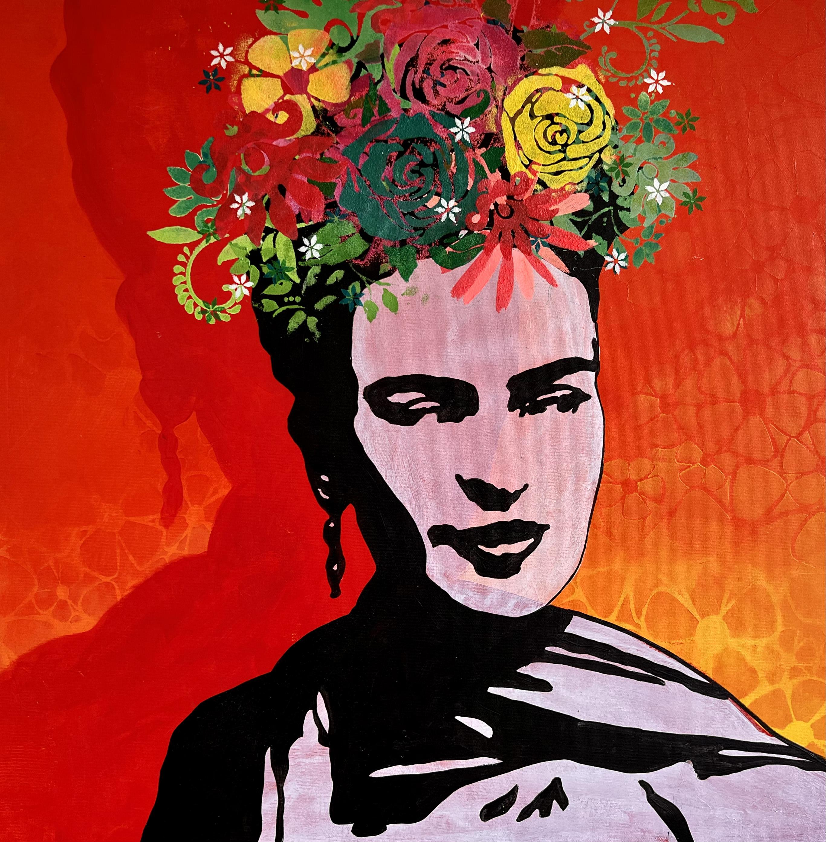
1. Intro Frida Kahlo Painting: In this video, I will teach you how to make this
Frida Kahlo painting. All you need is
kitchen to punches, a Posca pen, some paint brushes, acrylic paint, stencils, Canvas, and an ITU protector. Then you're already
well on your way. I'll see you in
the first lesson.
2. Choosing my background stencil: Hi again and welcome to yet another tutorial on painting your own
amazing paintings. In this portrait of Frieda, I've used the Florida stencil in the background to create a
little excitement and life. Unfortunately, I cannot
link to the stencil. I've used. This one. I caught myself a few years ago. It does not matter though
what kind of stencil you use. You can use what you have
and what suits your style. I have a lot of different
flowers and it's just because I've been painting and
teaching for many years. This freed up
painting, for example, only a single stencil with a rose in her hair
has been used. So you can also make it a lot simpler if you like that better. I've gone a little bit crazy with the flowers
on this painting, as I wanted to show
you the effect of working in layers upon
layers upon layers. It can certainly also be something that is
super exciting.
3. Starting up my background: Okay, let's get started creating this
beautiful background. I've chosen the
colors red, yellow, and orange as I wanted to
create a little sunset mood. Therefore, a lace more
blobs of paint in different colors all around and work them into each other
with my kitchen, two bunches. I always have a lot of sponges
ready when I work as I constantly take a new one every time I have to work my
colors into each other. Now I started working
in the first color. I let my sponge do
the work for me and I run it quietly around
and small circles. I work quietly into
the next color. I do not put pressure on. Just let this bunch
do the work for you. Now I just keep working on getting my colors
worked into each other. Using these kitchen sponges. It's a super easy way to
create a beautiful background. I do not take a new sponge until I have to
mix my two colors nicely into each other to omega beautiful and
soft transition. As you can see, the
transition between the yellow and the red is
not very nice at first. When I make a transition
between two colors, I take a new sponge and then I worked the colors
into each other. Again, I do not put
pressure on this branch. I let this bunch do the work
for me to not disparate. If you do not get a nice
in the first attempt, another layer of paint
will come on later, which can damp any architect transitions
between the colors. This is a discipline that
requires some practice. It is super important
that you work your color transitions together while your paint is still wet. Otherwise, one color
just runs over the other and then it does not
become a soft transition. You can possibly make
a sponge a little bit wet if the paint is too dry. But be careful with
that because you can easily pull off
super dry paint on, make the paint
transparent instead, and that is not what we want. We want opaque,
beautiful colors. Here you can see I put a
little bit of water on my sponge to omega thin
layer of color between the two colors so
that they glide more nicely together and
make a soft transition. As I said a little bit earlier, you have to be a
little careful with this as you can easily
pull the paint off again. As you can see here, I get a little of the semi
dry paint pull off as I run this bunch over because
the paint is not hardened. However, I do not think
this is a problem because it's just giving an extra effect in
the background. But if you want to prevent
this from happening, please let the paint
dry completely before giving it a new thin layer
between your transitions.
4. Making cool effect in the background: Okay, so now I want to make some effect in my
background with my stencil so that my paint does not much in the back
of my students are white. Most of the paint off again on a piece of paper before I
start dabbing the paint on. Since I do not want the
effect to be too visible. I used the same
background colors, but with a little bit
of orange mixing my red so that it only just hints. And then work my way down into the yellow area so that
you can sense the effect. And there is a
little contrast in the transitions from the red, the yellow background color. My stencil is very light and it lifts easily when
I worked with it. Therefore, I roll my sponge with a light pressure
instead of typing it. That way my stencils
stays down and place. If you want, you can use a spray glue with
non curing glue. You can easily spread on and move it around
again and again. As to glue works many, many times, it is often
called rebound glue. Now I just work until I think my transitions are nice
and covered by my stencil. That way you should not
worry if it's not perfect. We can fix a lot with a stencil to come fresh transitions. We're not completely happy with. Just carry on.
5. Painting the shadow of Frida: Now I have projected
Frida onto my Canvas. For that, I use a
small IT project that I'll link it
in the text below. If you haven't
already invested in a project that I would strongly
recommend that you do. So it's a great tool to have
when you want to create super cool Are you got a lot of freedom and the
possibilities are endless. There do not cost much anymore compared to when I
started 12 years ago. That was a small fortune. The one I use here costs
around $150 and it can easily be used in broad daylight even though it isn't
LED projector, it is my plan to create a shadow behind Frida, her own shadow. Therefore, I have projected
her in a different size. It's actually is my plan to paint the actual
portrait of her. I played around a bit
with the size before I started to figure out where
I would paint on my canvas. This is easily done by
moving the projector back and forth for a
larger or smaller image. Now we'll just paint
the red shadow with a white soft brush and
make the layer opaque. But you can also make
it more transparent so that you can see your effects
in the background through. I have not made them clear enough that they
would be visible. So therefore, I have chosen
to make the layer opaque.
6. Cleaning up the background: Now I have predicted
freedom once more. This time I make her
a little bit smaller. So you can, since the shadow
behind her, as you can see, a line goes straight
down the middle of her face from the shadow behind. And I want that moved. Therefore, I clean up my
background by painting the silhouette of
her white and then drawing the black
shadow afterwards. You only need to paint the
white where there's no black. But if it's more manageable for you to paint white all over, then you can easily do that. It can be a bit tricky to see the difference in the shadows. You can just paint the
entire silhouette once more. I'm mixing a little
bit of water to my paint so that it's a little
bit easier to work with. Now I just finished painting
my white background. The fact that my background
is white and clean also makes Frida stand out more in a
term we want to focus on. Once my white layer is dry, I paint one more layer, so it covers completely. Finally, I worked my paint
around and small circles with a small sponge so
that it's nice and even and so you can not
see the brush strokes. Then I can also have word
painting a third time. If you have a good wet titanium with a lot of pigment in it, two layers should be enough.
7. Drawing the outline of Frida: Now I have to draw after the
lines are protected image, I'm very careful with the
details around the eyes, nose, and mouth, as it is, the details that tell who
it is we're painting. You cannot be creative here
and invent extra details. Just surf or avoid
drawing some acid will not look like the person
you're trying to portray. Just have to accept
that the computer is smarter than
us at that point. However, I do not draw pixels. Sometimes you can see this
more squares called pixels. If our photo has not been in a high enough resolution
when we edited, it can become a big problem
when we're going to draw it. Therefore, I round them off, make straight lines
across the tops of the small squares for
our general expression.
8. Painting Frida: Now I want to paint
beautiful Frida. I do this with a regular
black acrylic paint. As sometimes use black ink because it's very
concentrated in the color and easy flows down into the texture
of my Canvas. That way, I only have to paint a single layer to get it opaque and really nice
and intense in the color. When I paint, I always
make sure to have a brush that in size fits
the area I need to paint. As you can see, I work with three different brushes
in three different sizes. When I'm not using them, I make sure they are wet with paint so they do not dry out. In addition, it is important
that you wash your brushes along the way when they start to get dry paint on the edges. That way, you could preserve your brushes for a longer time. And at the same
time it wouldn't be much easier to paint with them. When they get crust of
dry paint on the edge, they're not as flexible anymore. I say otherwise. I'm where
they're clean on you.
9. Stenciling flowers and finishing of: Okay, Now it's
time for some fun. Playing with stencils and
complimentary colors. I've found a lot of senses. I have a lot of them because
I have taught since 2009. If you do not have
a lot of sensors, then you can actually make
some yourself very quickly. I would recommend you to
see my course was tensors. As I show you a lot of ways you can both make your own stencils, as well as a lot of ideas
on how to use them. I'm going to make a green button with a lot of leaves
from my students. Remember to mix a little
widen your green color. If it's not opaque, otherwise, it will not be the color
you have chosen it to be. I've cut my kitchen sponges, which had been used
in different colors. As you can see, I've now chosen a lot of complimentary colors. I want my flowers to stand
out and become very clear. If you want a more
neutral painting, you can easily
make less flowers. And you can also work with the same colors and not used
to complimentary colors. It's entirely up to
you and your taste. I like broken several layers with many different
color changes. I think it creates life in my paintings and
it's fun to make. Along the way, I use a hairdryer to dry quickly
so that I can move on. And never claimed I
was very patient. Sometimes I work in
several colors on the same stencil and
make color changes. Now I've built their upon layer. Twice. I turned my stencils
over and do a reverse print. As there's a lot of
painting sitting on it. It gives a lot of color and
also a funny shadow effect. This is called a ghost print. There you see the outline of the flowers and that is
a really cool effect. I have a stencil
with small flowers that I cover with masking tape. So I only use three
of the small flowers. I also make the hair
and several colors. They helped to give
a good finished as well as bring it all
together in a whole. I hope that you've been inspired and that you have the desire and courage to get started painting your own
amazing paintings. Remember to play and have fun. And if it did not work
out the first time, painted white and start over. Practice makes perfect, right? And remember to see
my cousins tensors. If you want to learn a
lot more about making your own cheap stencils for greater variety and
freedom in your paintings. See you in the next video. Roger, over and out.
 MilleMajArt, Danish artist teaching modern art :-)