Transcripts
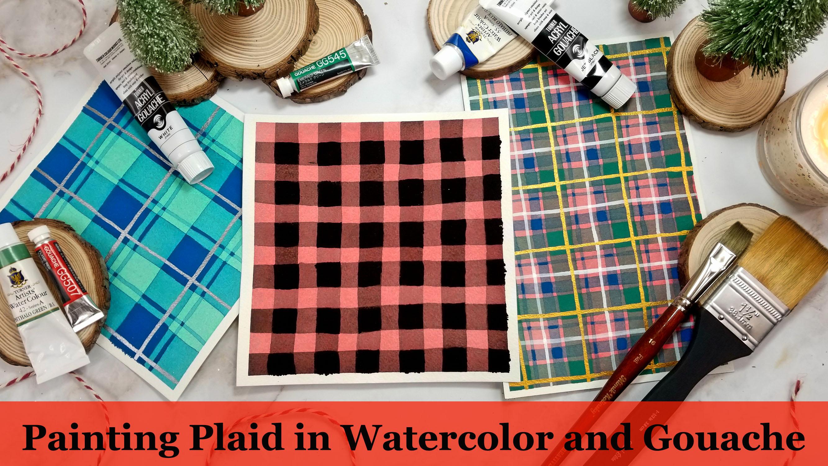
1. Introduction: Hi, I'm Arian, an artist, small business owner and educator here on Still Share welcomes my class and painting clad in watercolor and wash. In this class, we're going to delve into the transparent and opaque qualities of watercolor egg wash. Learn how to layer the two mediums to create patterns that will give you a warm and cozy seasonal fields after an overview on our mediums and warming up with some brief exercises will learn some techniques on how to achieve broad flat washes. Then we'll explore different ways of layering with both watercolor in wash through the value, transparency and layer and fundamentals that will learn throughout the class. We will create three different yet cohesive patterns that build upon each other in skill level. Proper paint and brush techniques, as well as color theory are discussed along the way. So whether you are a beginner or a seasoned artist, you will come away from this class with new ideas and be excited to experiment with unlimited patterns and color combinations. Painting these patterns is a fun and meditative experience. The once you could feel for layering the possibilities are endless. Painted plaid patterns make great art statements by themselves, but they can also be used to create gift tax bookmarks, greeting cards and more. Now that you know what's in store for you in this class, I hope you'll join me and painting these joyful, colorful patterns I can't wait to see you come up with in the project gallery and is always reach out. If you have any questions, feel free to tag me in your projects. If you post them on Instagram in the next lesson will go into our materials and supply list , so I'll see you there.
2. Materials Overview: the way the supplies will need for this class. And I'm going to start with the most important in my opinion, watercolor paper. I am going to talk about this briefly because although May seeing like I'm a paper snob when I'm going to say that you need 100% cotton paper, preferably 300 GSM thicker paper. But it really does make all the difference in the world, especially for this class where a project is gonna be based in layering. I would encourage you to research watercolor paper on your own. And the mind of watercolor on YouTube has some fantastic paper comparison videos. I could put the link in my class notes if you were interested. But just trust me on this will most definitely need 100% cotton paper if you want good results. So paper packaging is always going to tell you the components of the paper on the package wood pulp and cellulose paper, which is common in student great paper. Although they may boast to be equivalent to con paper, it's not going to give you the layering capabilities that cotton paper will paints more apt toe lift and be disturbed during the layering process of these papers because with cotton paper, we have the absorbent cotton fibers that allow the paint to sink in and seep into the paper when it's wet, essentially becoming a part of the paper itself. In that sense, it's up for success. When we layer on top of each other with the student grade paper, the pain tends to just sit on the surface. So when you layer another color on top, you're just kind of going to scrub the paints on the initial surface away because it hasn't seeped into the paper. So I tell you this because I want you to succeed in this project, and not having the right paper is ultimately going to hinder you and leave you discouraged with your final project. And that's definitely not what we want. I see a lot of beginners buying the cheaper student grade paper just because they think it's gonna be more cost effective to practice on would ultimately I feel like it leaves a lot of beginner students discouraged and turned away from watercolor because their results , no matter how hard they practice and how many times a day they paint, they're never going to get the results that people or professional artists on YouTube or tutorials do because they're using the common paper. I'm gonna be using arches today. It's my favorite paper who were not making patterns. Most of the time, I work on a few at the same time, I tape off chunks with masking tape. I'll do the first initial washes on, like, two or three patterns and let them dry and work on each one interchangeably. But today I'm gonna be teaching each pattern individually because it will just be a little bit easier to grasp the concepts. For that, I'm gonna be taking some pre cut size is on aboard with some masking tape, and this is gonna be really important to you. If you're not working in a watercolor block with its sides already taped up, you will definitely need to adhere your paper too hard surface, because the amount of water we're gonna be using can work the paper. Next, we'll need a paint palette or mixing cops for this project. We're gonna be mixing up large amounts of washes and various transparency. So having individual mixing cups, Orwell's at least is gonna be really, really useful for this project. Even you can use cereal bowls because you will see the larger the patterns you want to make . The more mixture paint you need to mix, and also having a small separate palette for your wash will come in handy as well. Rushes wide variety of square brushes is helpful, but only a few are really necessary. The larger the brush for the initial flat washes, the better. If you don't have one this large or even larger, I'll share some tips on how to get smooth, flat broad washes with smaller square brushes. So don't really worry if you don't have bigger brushes. Also, after the flat wash is applied, we're going to be adding and overlapping strips of varied transparencies. So having a size of the stripes you're working with is gonna be really helpful. For example, our first pattern is going to consist of stripes and, like a checkerboard pattern, half a inch stripe, spaced half inch with apart. So having a brush that is 1/2 an inch is really gonna come in handy. Some smaller round brushes are going to be good for our accent. Small stripes at the end. And if you're gonna be working with acrylic wash instead of regular wash, or if you don't have acrylic wash or go wash it all and are gonna be using acrylics, I would recommend getting some cheaper brushes for those because the acrylic wash and acrylics those mediums could be a little bit harsh on watercolor brushes. Having some cheaper square brushes is useful. It all. I think I got a pack of thes at Michael's. There were about nine of them. I think I bought it for, like, $8 so you don't have to spend a lot on brushes. And then a roller, as I mentioned earlier, we're gonna be marking are overlapping stripes and we're gonna be using a ruler. And don't be intimidated by this step. Are measured. Lines are gonna be there simply to guide our brushstrokes. There should never be any pressure to paint perfectly straight lines. So although we're gonna be measuring them out, try not to get hung up on the straightness of them. This is a painting and not a woven piece of cloth. In any wobbly lines are going to be overlooked once the layers are built up and you get the full appearance at the end. Also, I hate math, and I'm really horrible at it, So I'm gonna be sticking to easier measurements that won't make my brain hurt. I'm gonna be working in one inch, half inch increments or if you're like the majority of the world, you can work in centimeters as well. Pencil an eraser says we're gonna be drawing on top of layers that are already painted to mark out our lines. Having a pencil that is an H pencil is gonna be really helpful because it has lower graphite content than a regular HB pencil. So you will have less much ng of the lines on top of the layers that we paints. Three water jars, one for cleaning or brush off, and one for using the clean water to dilute or mixtures some paper towels or a soft cloth to dry your brush. And, lastly, a selection of watercolor and wash. Or, if you don't have wash, you can use acrylic wash or just regular acrylic paint. For this project, the tubes are a little bit easier to work with because you can squeeze them out onto your palate and dilute them with water. But if you don't have any tubes and just have the pans, don't worry. I'll share some tips and tricks to get vibrance and full pigment washes with the pans. So in the next video, I'm gonna be going over the differences between these mediums as well. Let's go over the colors we're gonna be using for the three class projects. But just know that you're gonna wanna have similar colors and both mediums for this project , for example, for gonna paint transparent green stripes with watercolor. We're gonna need a similar shade of green in wash, or at least a tube of white. Quash that you can mix with your water colors to increase the capacity. And like I said, I'm going elaborate more on this as the class progressives. So all of this should become clear in time now that we have our supplies in the next lesson , we're going to learn about the transparent and opaque qualities of watercolor and wash, and how we can use that knowledge to make the most out of this project.
3. Watercolor Warm-Up Exercises: No way we're going to start talking about water colors, and chances are, if you're taking this class, you've used water colors before. But just to review watercolors considered the medium of light due to its transparency and ability, the layer colors on top of one another. Basically, watercolor paints consist of pigment suspended in a water based and water solid bull binder with minimal fillers. So the lack of fillers that are common in other mediums, like acrylics oils, means that the pigments in watercolor when they're laid down on the paper, they're in a pure form and therefore appear luminous. What makes the watercolor painting Pappas well is tonal value, the contrasts in scale between lightness and darkness. In watercolor painting, we control that tonal value with water. So the more water that's added to the paint, the lighter the value. And conversely, the more paint that's in the mixture and less water, the darker the value is gonna be. When thinking of her two opposite values, light and dark, we can consider plain water is gonna be our lightest solution, and paint straight from the tube is gonna be our darkest solution. Let's demonstrate this concept by mixing up a few colors. We're going to squeeze a little bit of paint onto our palates, and then we're gonna add a little bit of water. Now, you can either dip your brush into water and scoop water into your little mixing area on your palate. Or you can use a pipe at and just drop some water. Just gonna drop just a little bit just to start moving these pigments around in the water. Take your brush. Just mix everything around thoroughly. Blend the paint with the water so that there's no chunky bits. It's a little hard to see. When the paint is this saturated. We're gonna add a little bit of water. Usually you just need a little dot of paint on your palate. My daughter was a little bit bigger than I wanted, but it's a K. We're just gonna roll with it. So as you mix this up, you can test how light or dark it is on some scrap paper so that we have a darker value of paint. Mixed stop assed faras Later dark. We're not really gonna know where this measures up until we paint some other values. Let's just practice and make a broad, flat wash. So an easy way to do this is start by tilting your paper up slightly and with your brush, just going to do some nice study brushstrokes, refill the brush and then slightly overlap that, and you will see the water start to pour down and pool. At this barrier where the paint is wet in the papers dry, continue adding paint to your brush and just dragging it down, overlapping slightly. And as you continue dragging your brush down the paper, you'll see that the top is already starting to absorb into the paper and dry a bit. So before that fully drives. Let's go back and add some paint to the top, and you'll just see it start to flow downwards. We'll see we up the intensity of the area that was already starting to dry, and you don't want to go over the areas. You already went over too many times because then you're going to see the brush strokes, and that kind of defeats the purpose of having a broad, flat wash. That's nice and even, but I like to do it. If I'm working on a smaller scale, I'll do it a few times. Just go over the area that I already painted. And as you're painting, continue to swirl the paint in your palate with your paintbrush just to keep those paint pigments nice and suspended in the water so it doesn't get chunky or anything. Okay, I think we're pretty much done with this value. I'm going to go and add some water with my pipe at to my solutions. I'm just gonna take clean water. I've moved over here when I rearranged my desk. Just gonna do a little bit more. Mix it with our brush. Okay? Again, just like before. We're going to tilt our surface slightly up. You don't want it a crazy angle that you don't want a flat. Let's see how this value measures up to the one that we just painted. But this color is neutral. Tint by Turner Watercolor. By the way, you can use any color that you want for this exercise. You never want to be doing a flat wash with a paintbrush that doesn't have enough water or paint on it. You're gonna end up having to go back over areas too many times, and it's just gonna ruin the even wash effect. So it wasn't really evident in the darker tone. But see how this water pulled up at the bottom. We don't want Ah, hard edge. So what I'm gonna do is I'm gonna clean my brush off and then slightly dry it so that it's the damp brush. This is what we call a thirsty brush. When you touch the pool water, see how it just kind of gently absorbs it can. It removes that harsh line that was pulling. Let's go further later and add even more water slightly. Tilt your surface, then just continue. - Okay . Again, we're going Teoh slightly dampen or slightly drier brush to create a thirsty brush and just suck up this hard line. Okay, it's hard to get it all off, but just do the best you can, because if you leave too much water pool at the edge of a flat wash, whenever you release your surface down, that water is going to start to spread outwards and up your flat wash area. And if this area up here already started to dry and this is wet, it's going to invade the area that is in the process of being drive, and that's where you get balloons or cauliflower. You might hear those turns throwing around. That's when you see it kind of like a bloom of white water bursting. Sometimes that's really pretty and actually like that in a lot of pieces. But for this class, we're basically going. Teoh work on getting broad, flat washes, so we're not really looking for that technique. Let's do and even lighter square. So you'll see. Just before I move along, we will see that this dark square that we thought was our darkest value if tried a little bit later than I was expecting it to. Because watercolor as it seeps into the paper, it does dry lighter than when you first laid down the wet paint. So always keep that in mind. When you're doing value studies like this, you might think that values really nice and dark until you test it out and it drives. And then you realize that it's actually a lot later than you wanted, and then, in that case, not a problem at all. You can always redo it, and that you just do that by adding more paints until your pre mixture, so you can always up the value or darken the value, especially when we're only working with one color. It's easier just to keep shifting the values up in down. If you're working with two colors that you're mixing and creating large quantities of and make sure of two colors, that's a little bit more difficult, and that's going to require a lot more experimentation. So let's try to make There are last light. Value is latest. We can. So I'm gonna really go crazy with this water. Hopefully, this is re yeah, this is perfect. - Now you can clearly see that there is a big difference between the value of this square as opposed to the value of the first square. These two middle squares, they're pretty similar. I didn't get his biggest differences I was hoping for, but like I said, you could really spend a whole day doing value studies like this and learn a ton. I definitely encourage you to do that, but we're gonna move on right now and basically do the same principle that we did for these squares. Only we're going to be layering those values on top of these squares that we just painted. So let's get out. Another color somewhat of a complimentary color. The first color I put down was a neutral tent. This is permanent Scarlett. It might look a little bit weird in contrast with this, but I have found that with these plaid patterns, contrast and complementary colors work really well with each other. So just like before, we're going to pour out just a little bit onto her palate, grab some clean water and just deluded a little bit. We're gonna try to get a nice pigmented value. This color is super creamy as well. We should get a really dark value, even though it looked like I added a fair amount of water. This color is super vibrant, so you'll see as you mix it around with your brush. You'll notice that there's chunks of paint inside the bristles. You definitely want to make sure that when you end up finishing your mixture, there aren't any chunks of paint, and you're in your brush bristles. You may have toe rinse your brush a little bit, but just make sure everything is thoroughly blended when washing your brush and going into a new color. Always wash your brush in the dirty water jar and then do a final wash in your clean water jar. That's gonna ensure that we don't have any residue from the previous color invading our new Cutler. So let's just test this. Walk this color out, and that's a pretty pretty good color. I actually knowing what we know that watercolor is going to dry lighter than how it looks when it's wet. I'm actually going up the value and add some paint back into this water mixture. So, yeah, just gonna add another little drop in. Okay, that's that's much better. That's definitely more what I'm looking for. So we're gonna use this value to start practicing layering. However, we can't do that just yet, because our first layers they have to be 100% bone dry before we layer stripes on top of them. Like I said earlier, when I work on multiples at a time, by the time I'm done with one wash and moved on to another one and come back to the previous pattern, those layers are usually dry, so I can just work seamlessly. Also, you can use a blow dryer to speed everything up. However, when you if you do use a blow dryer, make sure that the paint has at least seeped into the surface. And there's no visible polling like the polling that we saw on the edges. Because if you take a blow dryer to those, basically the blow dryer is going to blow those pigments before they've had time to set into the paper. So it's just gonna ruin this whole beautiful flat wash effect that we've got going on. That's what I'm gonna do. I'm going to take my blow dryer and just zap these for a few minutes, and then I'm also gonna wait after that for a minute or two because the papers still gonna be warm from the blow dryer. I wanted to make sure that it's just natural, like it just dried in the air. I will see you in a minute
4. Layering with Watercolor: okay, my papers all nice and dry. I made myself a cup of tea, and I'm ready to do some layering. We're gonna take the mixture that we made up earlier and just swirling around in your palate, because if it's been city, you might see some paint pigments settled to the bottom. And let's just see what it looks like when applied on top of a wash that we made already, and you can see the paint below it shining through. And it's especially evident when this second color that we made is layered on top of just the regular paper. So basically think about layering as if your watercolors are separate pieces of glass stained glass that is, and as they layer and build upon each other, you can still see the underneath, and you can see the barrier of the color underneath it, where those colors cross and intersect is a nice mixture of both of them. When we're layering, we also don't want Teoh do too much back and forth. It's really important to not pass over the same area too many times when you're layering because it will reactivate the paint underneath it because even though it has sunk into the paper, it's still water soluble. Two point you can see if I scrubbed with my brush. That's a term that you might hear a little bit. You'll see that this color will eventually just lift up. And, of course, I picked a color that's really, really not wanting toe lift for this exercise. So I really liked this value. But let's see what would happen if we lightened this orange reddish color quite a bit and made a lighter value. With this stripe, you can definitely see more of the underneath color than this stripe, where there's more of the orange color because we have diluted it so much now. So instead of a darker break, Scarlett pane of glass is gonna be a paler pane of glass layered on top of these gray squares. This is a good time to experiment with different widths of brushes that you have and get the feel of using a square brush. When I first started, I only used round brushes square Russia's air actually fairly new to me, and they do take a fair amount of getting the hang of even make this even lighter now just to see what a really light pane of glass. If we're going to refer to it as that, what that will look like layered on top of this gray. Yeah, this looks like a really, really unorganized and messy warm up, but it is really important in the process of making all of my patterns because the contrast and ratio of tonal value between the colors, it is going to be something that you're gonna have to experiment a fair amount of. And I'm just gonna show you real quick. As an example, I'm kind of jumping the gun by showing this to you. But this was the first time that I painted. A traditional buffalo plaid pattern is what they call it when it's just a red background and black stripes. When I first made this, I was like, super excited about it, and I thought it was awesome. But the more I looked at it, the more I realized there could be a bit more contrast between all the different tones. So, second time I did it. I lightened my red value and also lightened the laugh value. But with the wash accents, I feel like it makes the pattern top a little bit more playing around with tonal value. Like I said, it is really important for this class. And don't be discouraged if you make some patterns and aren't happy with them, because probably what you're missing is just a better tonal value contrast.
5. Gouache Warm-Up Exercises: So now that we practice layering with watercolor, it let's talk a little bit about wash and how we can use its capacity to enhance our plaid patterns. So basically wash is very similar toe watercolor, as it also contains the basic same components like a pigment and a water soluble and based finder, however, washes more opaque than watercolor. In the past, he comes from either added white pigments or chalk that's included in the binders that makes it more opaque unless transparent and see through. Regular wash is very, very similar to water color, as it can be reactivated when layered. You can see how this is the area that I was scrubbing, and you can see the bottom layer. The boundary between the grey in the red is pretty hazy, and that's because the under layer was reactivated as my brush went over this area too many times. So the same goes with wash. If you put a layer of wash down and go over with another layer of quash and are too heavy handed with your brush, you can reactivate the underneath color wash. And I have kind of a complicated relationship. I really love how Matt, they look and how opaque they look. Illustrators used wash a ton just because the really versatile you can build values upon each other easier than watercolors. Sometimes, however, the reactivation quality of wash kind of always messed me up. I'm really glad that I discovered acrylic wash that has the same consistency of wash. It's moves like wash on the paper, however, is not water soluble. It's water based but not water soluble, which means it cannot be reactivated by water once it's down on the paper. Once it dries, it is like an acrylic, basically waterproof. I like to use acrylic wash more often than regular gua sh. In all artists have their preference and one isn't better than the other. Now, if you don't have wash, one way to increase the capacity of a water color paint is to use whitewash. So I mean, you do definitely need a least Wait wash for this technique, and you just basically add a tiny bit of white wash Teoh your watercolors, and you don't want to add too much to create a pastel version of that water color. But you do want to add at least a little bit to add to the capacity. Sometimes I'll use Windsor Newton designers squash. But most times I'll just use my white across wash if I need it. And if you don't have any washing all white or any Collins you can get away with using regular acrylic. So I'm just gonna demonstrate how we can further brighten these areas that we already layered. This is gonna be our third layer. And I picked a color of a krill wash that is very similar to the water color paint that I used with wash. You don't need to use too much water, but you definitely need to use a little bit like that was definitely not enough water. But I use So I brought my pipette. Just a few drops of water mixing Pugwash just to keep it a nice, creamy consistency is gonna be really helpful. So let's see how we can layer this on top of these squares that we painted. Depending on the pigment, you're still gonna see some of the under layers seeping through. But for the most part, especially on the lighter areas, that creates a really opaque look and washing acrylic wash can also be watered down just like water color to make really smooth light washes as well. I'm just going to show you with this. However, if you have water color, there's really no need. Teoh be doing too much deluded work with Wash. You can see up here. It's pretty transparent. However, let's get some pure wash back into our palate. You can just see how nicely it layers on top of everything so clearly around with your different brushes getting familiar with the types of strokes and the width of strokes that they make and feel free to just continue playing around with this until you're really comfortable with the different, transparent and opaque qualities of the mediums that you're gonna be using on before we move on to painting the patterns. I do want to add that a lot of times, at the end of my patterns, I like to add Jamari pens or even shimmery watercolors or simmering wash. So this is our warm up, and I know that it looks like a hot mess. But don't worry all of these concepts that we just went over, they're gonna come into play when we're building our patterns. That being said and the next class, we're gonna be learning our first pattern. The buffalo plaid pattern
6. Buffalo Plaid: Flat Wash: begin. Whole plaid patterns have a few components. One is the background flat wash, and in this case it's background. Flat wash color is going to be read, and then the second component of plaid pattern are the intersecting and overlapping stripes . They could be various widths. They can be various colors, but they all go either horizontal and vertical, horizontal and vertical. And I thought this was a really good pattern to start with, because it is only two colors and they are evenly spaced apart. But start off. I cut a 6.5 inch square, but I cut out 6.5 inch squares because I'm gonna take my masking tape. I just tape it down kind of eyeball what 1/4 of an inch looks like in my mind and just start taping down each side at the time. Okay, now, but we have our paper tape down. We're going to mix up a nice shade of red, so it's not gonna be super dark, and it's not gonna be super light. We're probably looking for about like the middle range that we did in the warm up. And don't worry about measuring anything yet. We're gonna put our first layer down first, so I'm gonna be using high roll read and Ivory Blackwater color. And then I also have a jet black acrylic wash that I'm gonna be using for the accents at the end. Let's put a dollop of paint on our mixing palette, and this is a fair sized, definitely bigger than what we did as faras painting the squares in the warm up. So don't be afraid to squeeze a bunch of paint out. You can always lighten it, and conversely, you can always make it a lot darker. The reason we need to make a fair amount and we shouldn't be afraid about making a lot is because you never want to get halfway through a broad, flat wash and run out of paint. That is pretty much the worst thing you could do, because by the time you mix up a comparable shade and value tone, that of what you were using, what you have already put down is already started drawing. So when you continue with the broad, flat wash, this is just gonna look like strike be. And like I said, natural blends and bleeds with watercolor is usually very sought after. However, I don't want that for this project. I feel this with a lot of water because I want to make sure that I do have enough. If I test this color and it looks to week, all I have to do is add more paint. It's not a big deal and this could get a little messy. I'm not even gonna test that yet because I already know that. It's probably not as dark as I want it. So I'm just going to put a little bit more. It's still a little bit too weak. I don't know if I want to get this stark that my printer printed out, but I want a bigger color pop than just this. We definitely need more pain and I put way too much water. But like I said, I never want Teoh get halfway through, wash and run out of paint. Okay, this is still fairly watery and it will lighten up as it dries, So I'm gonna continue darkening this. You probably thought I was crazy when you heard me say that cereal bowls work well for mixing wells. You just definitely need a lot of pre mixture readily available for a project like this, especially if you're working with large sections. The second time I played around with patterns, I had that full arches block, and I split it right in half, and I did one whole pattern on one side of one pattern on the other. I mixed up its Han of paint for those large areas, and I didn't run out, which is which is great. It's already showed you how you can overlap your brush strokes until you're surface to create a nice flat wash. I'm gonna be using one of my bigger brushes for this. This is a 1.5 inch flat wash brush from Princeton, and I really, really, really like it. I just got it so pretty excited about it. Like I said, if you don't have a big one like this, you can still make a successful, even wash with a smaller brush. Okay, I don't want to really wet brush going into this mixture, because that's just gonna dilute this mixture that we already made, and we're happy with the color, so let's just go for it. Dip your brush into the mixture told your surface, Start overlapping. If there's too much water pooling, don't be afraid to use a dryer brush and sopping up as you go and you can see the top already started to dry. So I'm just going to gently go over that area. Then at the end, take your thirsty brush like we had discussed that is slightly damp, but not dry, and just pick up whatever's hanging on there at the edge. So I noticed this, but I forgot to mention it when our first layers of our warm up dried. I wasn't really happy with how they dry. There were some lines at the bottom. That was probably because after I tilted my surface, I put it flat too quick. So these pigments, they still had time to scatter. This time, I'm gonna learn my lesson and keep my surface elevated just a little bit. Just for a couple minutes, as thes pigments seep in and can also just rotate your surface around and it's just gonna kind of disperse whatever pigments are still floating through the water. Okay, Now I'm gonna put a flat, and now I'm gonna let it drive if you want to speed up the process. You can use a hair dryer, but I'm gonna wait just a moment. You don't want to blow dry. If you still see the sheen of water on your paper, you wanted to at least absorb into the paper for the most part before you blow dry.
7. Buffalo Plaid: Layering with Watercolor: the, uh, first wash is bone dry, and I really like how this turned out. This is pretty much a six inch square now that I've taped off the sides and what I'm gonna dio is gonna start marking half inch increments. This last square is not a full half inch, but that's OK. And now we're going Teoh do the same thing marking half an inch up at the top of our sheet . Now that we have a dog on this end and a dot on this end, what we're gonna do is we're just going Teoh, just match them up and draw a straight line. Okay? Way have our lines lightly drawn out. I like to paint my stripes from right toe left because I'm left handed. I like toe work from top to bottom so that my hand doesn't mess off what I already painted . So you might have to adjust this step toe how it's gonna be easiest for you. But before we paint our 1st 7 stripes, let's make up our mixture of black paint that we're gonna be using for the intersecting stripes. So, just like in The Exorcist, the warm up exercises, let's test our value. Okay, You could see that is way too light. We definitely want to up the value in that by adding paint. The amount of water is probably a good amount of water because we do have all these straits to get through. And don't forget about the intersecting horizontal strengths as well. Whenever you think you have enough paint mixed mixed more. Okay, let's try it again. That's a lot better. Maybe not as stark as we want, but it's getting there. And just remember that we don't have to make it our darkest value, our darkest value we're gonna add with wash or acrylic wash or acrylics at the end. So what you're looking for is a nice medium mixture. I think this is gonna be the winner. Yes, I like that. Okay, so we have our mixture, and I'm gonna be starting from the top to the bottom. Now there is a certain technique that goes into these stripes. You want to make sure that your brush basically your paint mixture on it at all times. You don't want to be laying down thes stripes with the brush that is either dry or running out of paint. This is a little technique, but I think might help. You were gonna start at the end. This is my half inch sized brush. Start at the very edge. May even start your brush stroke before you enter the red square and just slowly and deliberately drag it. Now, once you get to a part where you think the water on your brushes kind of drawing up gonna lift your brush did back into your mixture and then you're gonna backtrack, you're gonna overlap a little bit of your straight and then continue on with it, okay? And there is a fair amount off pigment pulled, and I'm just going to tell my paper to disperse it. When laying down these stripes, You don't want to continually go over and over a stripe. You just want to make it is little passes through it as possible. We don't want to be digging up this red underneath. We wanted to look like two separate panes of glass layered on top of each other. And yeah, you see, even though I had my lines drawn out, this is widely used to bother me. When I first started painting the patterns But knowing what I know now and knowing how the whole effect of all the accents and layers at the end shows this is the least of our worries right now. Work on the next stripe, get a loaded brush and just start deliberately and slowly. Now, I didn't have my brush. Nearly is loaded. You can see it already started to run out off paint. So instead of starting my stripe here, I'm going to backtrack where my paint was already still wet in drag the wet paint across That is not a perfect strike dealer. And I'm OK if you're working with smaller sections of plaid. This whole overlapping technique that I'm showing you isn't super important, but it definitely is for large sections of plaid. Like when I discussed how, I, um cut a full arches pad and half and did one pattern one side, one on the other. You better believe that this is a technique that is very useful. And this trip I'm gonna show you what will happen if you let your brush dry and not loaded with enough pigment so you can see right away the values way different cause we're barely using any pain, and then that forces us to go back over again. And what that does is basically it's even more of a risk of the bottom layer coming up and being disturbed in mixing with this top black layer. Okay, so you tilt your paper around. If you see any little puddles appearing just like how we used the thirsty brush technique in the flat wash, you can always lift up some of those bubbles of water that form. But overall, I'm really happy with how this layer looks. Most of the stripes are nice and even for the most part and what's not notice and even isn't going to be an issue at all. Once all the layers air down and the plaid effect comes into view, we have the one set of stripes down. Now we have to work on the intersecting perpendicular stripes, and what we need to do for that is make sure that this layer of stripes that we just put down is 100% dry, just like how the background had to be 100% dry. These do is well because you don't want to be starting doing the stripes on this side and then these colors, even though it's the same color that we're using, they're gonna disperse. You're not gonna be able to see 1/3 pain of black glass placed on top of the glass that you already have. Okay, so my paper is 100% dry, and I also took some time to measure out 1/2 inch on opposite sides for the perpendicular stripes. When you can see there faint, but they're there and our stripes, they did dry, nice and even like I was hoping so I'm pretty glad with that. Let's mix up our paint mix for cause it's been sitting for a couple minutes at least. Let's just continue the same technique of smooth, deliberate stripes with a loaded brush. And if you have to lift your brush to get more paint, try to lift so in in overlapping section and try not to go over the boundary between those two colors more than once. We don't want Teoh. We want to see the difference and the transparencies of everything coming through, and if we keep going over, it's just going to blend the stripes into the background. It's gonna lift the background. We're not going to get this fun layered Look, and then just continue the stripes as we did in the first part of this. Oops. So I did have to get over that a little bit because my hand kind of shook. That's okay. That didn't really disturb the other layers. And we're gonna go over it with wash or acrylic anyways, So all these issues that we think might be coming up aren't gonna be issues. So also, with this stripe, my brush is a little bit too dry over here. And I didn't want to overlap and backtrack too much with my stripe, so it might not be the most even stripe as far as value goes, but that's OK. Just going to continue moving on. I should have lifted a little bit earlier. Yeah, Like I said, these pencil lines are just a guide. Don't get hung up on them too much because we'll be like me. When I first started doing this forever trying to fix your mistakes and ruining the work that you already laid down. It's not worth it. Okay, grab my thirsty. Brush some of these edges a little bit pain, especially where we first started the stripes on this side. I'm just going to sop up that. Okay, so, just like before, let this dry 100%.
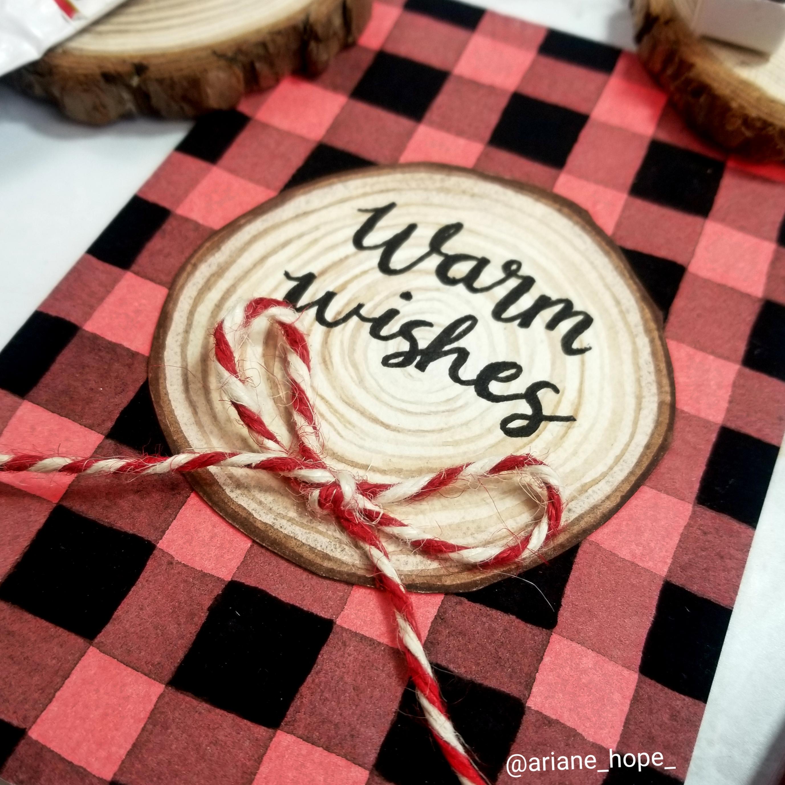
8. Buffalo Plaid: Gouache Accents: way have both of our stripes intersecting layers 100% dry. The next step to fully visualize our plaid pattern is to think of everywhere a color intersex with itself basically in your mind. Cancel ELTs the color of the background that's behind it. We don't want to see any red where those two overlap. Just pretend that where those colors ever lap that square becomes opaque. Just pour a little bit of your wash or acrylic wash or acrylics into your little palate, and I'm gonna be using black because it's the same color of the straits that we painted. And I'm also gonna be using one of my order brushes as well and just mix a little bit of water into your wash just to get it to a consistency of slightly creamier than when it comes straight from out of the tube. And then we're just going to paint the square that you see already shaped out by the intersecting colors. Just a couple couple of strokes. One way a couple strips the other way, and you can move on. Just be aware of the squares as you start to paint them. Be aware of which ones are dry and which ones are still wet. And try not to drag your hand through them. I like to move in, turn my surface around as I work just to get all the angles. And it really is much easier to do this with a square tipped brush because you can just show me the edge of the brush up to this edge of the square and then just drag it along that line. So continue painting in all of your squares way. - Uh uh Okay, now that we're finished with the wash layer, I really hope that you can see how fun this Waas Let's take off our tape. You should really take me to take up the tape. Tilburg Wash is dry, but I'm a little impatient and I just really want to see what this looks like. And you can see how the wash accents where it's darker and less see through than the in between lines. You could definitely see how that just brought the whole plaid pattern together and really made a pop. It looked like plaid before, But now that we added the wash accents, this just unmistakably clad. Now I'm really really happy with how this turned out, as I was saying earlier, the first couple of times, and in this pattern, well, the first time I did this pattern might not be able to really see with the lighting in this camera, but this looks a lot darker red than this one, the smaller checkerboard. Even though our squares are perfect, it's a little wobbly. It's still unmistakably plaid. It's still super cozy and festive looking. If you ever make a really big mistake that you don't think you can bounce back from, you can always cut it up and use elements of it for greeting cards. Let me just show you what I made the other day. I had really messed up some of the lines in the middle. So what I did was I just painted a little, would slice on a separate piece of watercolor paper and just pasted it and put a little both. So now it's like a little warm wishes supercute greeting card, which I like so much that I'm probably not gonna give anyone, probably just gonna keep it to look at it and hoard it. But you know, that's most of the stuff that I make. It's in the next class. We're gonna be learning a little modern take on the traditional Scottish blue and green tartan plaid, so I'll see you there.
9. Blue and Green Plaid: Flat Wash: Okay, so I went on, and I already taped my 6.5 inch square to my paper. We're gonna be doing a modern twist on a traditional blue and green Scottish tartan plaid. You can see there are some darker tones of blue and green as well. There's a lot to explore when making plaid with just two different colors. You can definitely dio wide range if you play around with those values, but we're going to start with first identifying what color we're going to put a zar base flat wash, and when looking at any type of plaid, that's pretty much the first thing you have to determine. Typically, the later color gets put down first, and then you layer the darker colors. But a lot of times colors are the same tonal value. It is something that you're gonna have to play around with. I'm going to start with putting my green down first and building the blue on top of it because I have a really pretty sky blue wash color that complements this halo blue that we're gonna be doing the stripes and I'll brighten the intersecting areas with the sky blue wash I think we'll look really, really pretty. I'm gonna be using, like, a halo green. It's a little bit cooler and more of like a bluish green than this spring rain. But I didn't really have a shade of green that color that I liked enough. We're going to see how this works. And I'm gonna be using a pan today because I don't have this color in a tube. So I'll show you how we can achieve large mixtures with using a Panoz Well, so you just want toe what? Your brush just swirling around on the pan just to activate the pigments with the water and then bring it over to your little palate. Run the edge of the brush on the side of your little mixing well or bull wherever you're using, and we'll see a nice, vibrant color come to life. Okay, It's pretty good for now. I'm going to now add my water pipe. No, I've done variation of these colors a few times in preparation for this class. I'm really going to play around with using a lighter value of green as the background. The first time I did this color combination, I feel like my background was way too dark, so that when I did Duthie stripes with the blue, they kind of just blended into each other. And that wasn't a big impactful statement made when they interacted and overlapped. I definitely want a little bit more of contrast. Second time I did it with a little bit closer toe the look I was looking for. Okay, that's a little too late. So just gonna swirl the paint around on the pan in darken or mixture, just like with using to paint, make sure that the paint mixture, paint and water are thoroughly blended. It's a lot better, but I want a little bit more color. Okay, I think I like that. And although well, dry a little bit later, I definitely want to try to make it a little bit later. This time, let me just before we go on, let me show you my first few experimentations with this color combination, and depending on the light, you may be able to see the difference between the blue and green. I feel like both of my values. The blue and green were a bit too dark, and I did like how break in opaque, the overlapping squares covered with the sky blue wash look. But my second time around, I like the green a little bit. My 1st 1 I used a silver pen to make thin little accent marks, and I pumped up the volume with the silver on my second time. Around these look a little confusing, but as we go along, you'll just realize that basically, it's the same principle as the buffalo plaid pattern that we did. It's basically a flat wash and then horizontal stripes and vertical stripes overlapping. Okay, so now that we're happy with this, I'm going Teoh, use our big brush and mix it in. Grab up some base color, tilt the surface and just start painting. Yeah, on second look, this might be a little bit lighter than what we're going for, but it's all good if you really want, and the color doesn't come out was dark. If you wait for the first layer to dry, you can go over it with another flat wash layer, using the same method of tilting the paper in the long, broad, flat strokes, stopping up the excess in tilting to disperse all the pigments nice and evenly. I want this darker. What I can do is wait for it to dry it 100% but I think I have a little bit of time just to add some more paint before it starts drying. It's a little bit risky to try to gain this, but we're going to try Woo. Yeah, my paper was thankfully still what? And able to take this little second wash If it started drying in areas, then I would have had to wait until it was 100% dry before going over again with another vote. But this little extra boost of color that we just added might be enough. Now that we moved pigments around, we're gonna let it try. That might still move these pigments around just a couple more moments just until they start to settle in and seep into the cotton paper fibres. Okay, so I'm gonna clean up this green mess that I have everywhere because we're done with that color for now. I actually might save this mixture for our last pattern because we might be using green accents
10. Blue and Green Plaid: Layering with Watercolor: Okay, so I just finished mapping out my one inch lines can see them a little bit clearer than you probably did when we did the red pattern. Because this background is a little bit lighter internal value using the same technique as we did in the buffalo plaid. We're going Teoh paint, nice stripes every other inch marked off and gonna use, um, se lo blue. And this is a really strong pigment. I'm only gonna try to use a little bit, and that was probably too much. But we can always add water, and then we'll probably end up using whatever leftover we have in this blue color for our last pattern. Okay, let's get our scrap paper out. This will be good enough to see how the colors overlap. You can see distinct blue, but whenever it overlaps into the grain, it's kind of like a bluish green. And I kind of like this value of blue that we have. I think any darker, you wouldn't be able to see the green as much shining through. So I think we're just gonna rule with this, also going to use a larger brush. This is a 3/4 inch brush, so it's not fully an inch wide, but it's closer to an inch, so we're gonna have less over lapping and backtracking to do when we do our stripes. But if you have a smaller brush and don't have anything this big, the same technique that I'm going to show you will work with both size brushes. Just as before. Load your brush up and start dragging nice even stripes. Then you're gonna lift up and then continue down to the line that you drew out, and that turned out pretty nice, but it tipped the paper just to sop up some of this excess liquid. Then we're going to skip an inch. With that, we mapped out and move on to our second. Just as you start to feel water leaving your brush and believe me, you'll you'll know the feeling. Once you paying enough, you want to lift up and grab more paint. You don't want to be dragging a somewhat dry brush across thes stripes, and this lineup here kind of encroached into the green, and that's okay. We just don't want toe fiddle around with it too much. Once it's on the paper load up the brush. Yeah. Before we move on, I'm gonna get a smaller brush. This is just a regular round brush and I'm going Teoh add a little bit is as to this pattern no need to measure this out and draw a line with a pencil or anything. Basically, just use you were stripes that you already laid out as a guideline and just say I want the stripe to But you just slightly on this side of this larger, straight. And then just start painting and use the same techniques that we used with the larger brush picking up more mixture as you go along. Like I said earlier, Just don't worry about the straightness or the line thickness being all 100% even the whole way through. You could see this is wobbly here. I'm gonna pay no mind to it and just move along. Who's gonna look fabulous when it's done anyways? Okay, Now we can let this dry if you want to. You can add stripes on both sides. You could do multiple stripes. I'm just gonna keep it at this for now, just to make it a little bit more simple. Once these air drive, we can start our other intersecting lines. Okay, so I just mapped out my one inch margins and made my line with my soul. Probably just barely see it. And just like before we're going Teoh Duthie intersecting stripes we're gonna do every other one inch section is going to be painted blue And then we're also going to go with a thin stripe on the bottom of it. So our pains been sitting out, make sure we swirl it around just to get it nice and evenly mixed. And then the same type of technique that we did. Okay. And then we're going to do the thin straight just how we did. If you look at your pattern this way, you see the thinner stripe below at block. We're gonna do the same thing. We're gonna make it consistent. The more patterns you dio the straight airlines air just gonna naturally be. And if you're striving for perfect lines and this is a wonderful exercise to practise that but there's no judgment if you can't get them straight. Okay, that looks great. Gonna let this dry 100% and then we're going to go in and where those lines intersect. We're going to go with Argh, Wash and make those areas opaque because we're gonna imagine just like before our blue panes of glass. When they intersect, the green glass below it just poof disappears, Always see is blue. So we want to erase any green that's still showing through with the wash.
11. Blue and Green Plaid: Gouache and Metallic Accents: uh, I really like how this is turning. How It reminds me of a checkerboard tablecloth pattern, and I'm really digging it. And I definitely like how, like the values of these colors a little bit later, how they look layered. Like I said earlier, we're going to be using sky blue, the cruel wash where you can use any other type of washer acrylic paint. And we're just gonna pop thes squares as well as anywhere where a blue and a blue intersex of these thin lines in that little square right there that's gonna be covered and washes Well, a little bit of water, a couple drops of water to your wash just to get it that nice, creamy texture. I'm just going to Hank the large squares first. - Yeah , uh, so the same goes for these areas of thes thin stripes that come in contact with the blue. We're gonna be painting those two. I know this little area is tiny, and if it's really hard to paint a tiny square, a little blob of paint will dio just so you get the illusion that it's darker where those intersect that looks like it should be. It for the quash. Wait, Mr Peace, That happens sometimes. Okay, so now that looks like it's about it for the wash layer. I am gonna add some metallic elements to this, though. So I'm gonna wait for this blue wash to dry and get some of my silver water color paint. Or you can use silver or metallic gentle pens. Or you could just skip this step all together. But I think I want add a little shimmer to this the quash areas or dry. So I have some silver water color paint in a pan that swishing around inactivating with the water, sometimes metallic paint. You need a work a little bit more with the water. Whatever metallic paint you're using, make sure it's nice and creamy. Same thing we don't want any chunks or anything, just like we did the thin stripe on the sides of the squares. I'm going to actually overlap this shimmer watercolor and do a straight just like how I did here. The stripes go on top of the dark squares for the blue squares only I'm gonna do them a little bit thinner with this one. I just wanna test some things out and this silver paint. It's called a variety a serum, and it's from the sprout creative, And I leave a link to this pain and the rest of the paints in the class notes do Okay, yeah, I really like how that looks. And you can definitely see it's becoming more of a plaid effect instead of just a checkerboard affect. The more intersecting in varying with lines we add the I guess, more plaid. It becomes this. This is just like a shimmer accent. I'm not even going to bother to wait for those shimmer lines to dry before going over with it. Perpendicular lines. Okay, Yeah, I'm super happy with how has turned out going away. Just brief couple seconds so that the paint the metallic paint Congar I Before I take the tape up, I'm really glad that I decided to do this pattern again and mess around with values. Even though I really like this, I am very drawn to this later, more delicate version as well. So let's take the tape off. I really hope that you're enjoying this class. If you have any questions, feel free to drop them in the questions and comments section if you have any questions along the way. But hopefully by the end of the last lesson, everything was gonna come together. And you're gonna be really happy with your plaid patterns. And so see, in the next lesson
12. Red Tartan Plaid: Flat Wash: our third and final pattern is gonna be inspired by this red, multicolor traditional tartan plaid. I was referred to it as like the holiday plaid, because when I think of plaid in the holiday season, I must often think of this type of pattern. If we look at our inspiration photos for this pattern, we can see that in majority of the areas are taken up by red squares and stripes. So we're gonna take that clue to know that red is gonna be our background color. So I have read for the background, color it spiral red. It's the same shade of red that used in the buffalo plaid pattern. And I'm also gonna use a little blue. And this is one of the same colors or stripes that we used in the last pattern as well. Feillu Green and I'm also going to use a little bit of gold sparkle and shimmer and then for wash. I have white, sky blue and Verdean green, and I thought about adding a yellow wash into the mix, but I think I just might stick with using the gold as representative of the Yellow Stripes . So the first time I painted this pattern. I was really happy with how it turned out so much that I ended up cutting it up and using it for gift tax. Put a little ribbon. But even though I was happy with how this pattern came out, I know that I can improve upon it, especially now that I know a little bit more about values because I've been painting so many of these patterns. So now that we have an idea about the look that we're going for, let's just start with the backgrounds. Also, I already taped my paper down, and I'm using a little bit bigger over the peace. This time it is a five by eight. Rectangle will be a little bit more challenging to do the long stripes, but I think we're ready for it. And just like before, start by squeezing a little bit of paint from your tube or scooping it out of the pan. We're working larger this time, so I'm gonna keep that in mind when I'm making my pre mixture. Okay, that's more like it. I think I made enough. We're ready to get. I'm gonna be sticking with my smaller brush just to demonstrate how you can still cover large areas in a nice flat wash style with a smaller brush. Yeah, uh, so it looks like most for pigments and water have settled into their place on the paper, have started to seep into the fibers. So I'm going to lay this flat and just like the previous patterns were gonna let it dry 100% before moving on to stripes. So I'll see you then.
13. Red Tartan Plaid: Layering with Watercolor: the 1st 2 patterns that we did were more of an even checkerboard pattern. However, I'm going to switch it up for this last pattern. So instead of measuring off one inch or just half inch margins, I'm going to do half inch with an inch space half inch inch, half inch so we'll see what that looks like. I think it's gonna in a long gait, are pattern a little bit. So I'm gonna line my roller up and we're gonna measure out 1/2 inch section. And then I'm going to skip a full inch that I'm going to measure 1/2 inch skipper ful inch measure half inch and skipper full inch. Then that leaves us with a little bit more than 1/2 an inch of bend and then at the other end of your taped off piece of paper, do the same thing so half an inch space and inch, half an inch inch have inch full inch, then connect two points to make a line. Okay, now I have my horizontal stripes planned out, so I'm gonna make my first ribs because it looks like these patterns of drawing inspiration from the second most prominent color that I see in these patterns is green. So I'm going to do the half inch drapes with a grain, and it's gonna be the same green that we use earlier. The variety in green and you'll see from my flat wash credited with my smaller brush. You can see that it's slightly uneven in areas, but that's okay, because once we put the stripes sound, you're not gonna notice a thing. Let's just test this. I like that. You can see where it intersects with a ride. That's gonna be a really fun color play. - So , as before, we're gonna let this dry before we do our intersecting stripes. I already mapped out my half inch stripes based one inch apart. So if you haven't done that already, make sure your paper is 100% dry before you do so. And we're just gonna continue along with our green stripes. So this is shaping up nicely, and I'm gonna let it dry, and then we're going to start intersecting 1/3 color stripe. The green stripes are dry, so I'm going to go through, and I haven't used the size brush out. This is a number six flat measures to about roughly 1/4 inch. And I'm not gonna draw out my lines for these stripes. Just gonna kind of eyeball them and put them in between the green stripes. I think I don't look good. I think I might want to add just a little bit of water to it. So get in a comfortable position and figure out where you want your blue stripes toe land. I'm gonna put them close to the green stripes, but leave a little bit of red in between them. - Yeah . So before I left, he's dry and move on. I'm just gonna add a thinner blue line in addition to this line on the opposite side of this blue stripe just to switch it up of it. Okay, Now I'm gonna let that dry before I move on, and you can really see it looking more more like plaid every stripe we lay down and ready to move on with the blue intersecting stripes. Okay, so my crisscrossing blue stripes and my green stripes were done, and although we want to go over with white and gold accents and additional stripes, I want to end up layering them and maybe not all of them, but some of them on top of the stripes that we already painted, we're going to paint the wash.
14. Red Tartan Plaid: Gouache and Metallic Accents: we're finally ready to start the wash accents inside of our squares. I do have a variety in green acrylic wash that I planned on painting in these overlapping green squares. However, I'm going to try using the green that we use this they lo green and mixing in a little bit of plain whitewash. If you remember from the introduction, I said that if you don't have a color of wash, that's okay. There is a way to make water color a little bit more opaque by adding a little bit of Wake Wash. Not enough to make it a Pasto, but enough to make it less see through. We're going to get a fair amount of highly pigmented paint with very little water. I mean, I had to use water just to swirl around the paint and activate it. Take my gosh. This is just plain white wins or a Newton desire wash. I put just a little dab right next to our water color paint and then, just little by little, mix in. Yes, we definitely used more than necessary, but that's OK. A little bit of Wake Wash goes a long way. It's gonna get a little bit more green just to pump up the color. No, maybe just little bit more. Let's test this out and see what it looks like. Oh, yeah, That's definitely a good shade. It covers on top of all these colors and layers. Is it just like the previous patterns were just going to go where? The same color intersex. And we're gonna block that out with Argh! Wash! - Moving on to the blue squares Been in Just use straight sky blue acrylic wash. - I think we're all set to move on to our white stripe accents. I'm gonna be using white acrylic wash, and I am gonna dilute it down a little bit at first and then, just like how it did these other stripes, once it's dry, we're going to go in with a more Otake whitewash on top of intersecting areas. Then you can decide where you want this white strength. I'm gonna save the gold for the intersecting stripes that go on top of the green areas. So this white, I think I'm just gonna have blue how In between the blue and green stripes, that's all dry, and we're gonna do the intersecting white stripes and just like the white stripe is right below, the thicker blew straight, so we turn our paper horizontal. We're going to be doing the same type of pattern closer to the horizontal, larger blue stripe than the thinner straight. Once this is dry, we can go through and where all the weight lines intersect, we can put a thought of pure white wash. It stands out a little bit more than the thinner white lines. This little addition of white quash to the intersecting weight stripes may not be super noticeable, especially right now, because I didn't delete my white stripes as much as I probably should have. But that's okay. It was still at a nice little accent. Now we're ready. Teoh, go in with the gold accents, and you can use a metallic pen, acrylic paint, watercolor paint, whatever Schumer's you have, or you can move on to another color. Like I said earlier, I think I want this green straight to intersect. Thes larger green squares. - So initially I thought about adding more stripes of gold. I think this is as busy as I want it for now can always go in and add more, but I'm pretty happy with it. So let's remove or tape
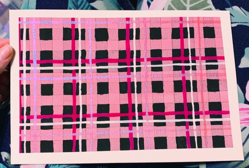
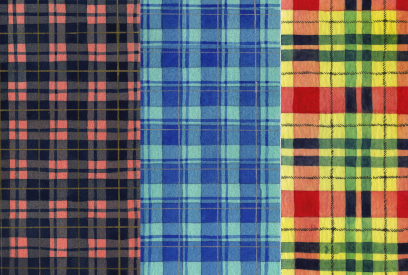
15. Final Thoughts and Going Forward: the Oh, look at all the patterns that we made today, starting with the most basic pattern, which just consisted of two colors in a checkerboard formation. And then our second pattern. We added a little bit more Azaz and incorporated some different with stripes and then our final most complicated, even though it really isn't that complicated once you get the hang of layering down. And I also want to show you a little bit of the patterns that I worked on when I was developing this class, just so you can see the evolution of my understanding of value throughout this projects already showed this little pattern that I did and the darker first try. It's a few late with this color scheme. There's so much variations that you can go with just two colors and then my first buffalo plaid pattern like that. I already showed us well, leading to my second attempt and then this attempt that I showed you where I messed up some of the squares and got a little bit too widely than I had wanted. So I just turned it into a little greeting card. I had a scrap of paper left on my sheet that I thought was gonna be perfect for a bookmark . So I did a red background and then layered the blue, the same shade of blue Thalia blue that we used in all the other patterns. You could just see how different the patterns can look. Even when you're using the same basic color schemes, you can do so many different variations when you play around with the value, then my little Christmas tags that I made. I'm not really sure what I'm gonna do with this. I might make some table place cards and maybe do some, like calligraphy names on um, and then this is one of my favorite patterns that I played around with. I started with a light light opera, pink background, flat wash, and then I had a magenta that I layered even space stripes. And then I went through with blue and purple. We might not be able to see the variation of blue and purple, I think next time I tried this pattern, I might pump the blue or purple up a notch, either one of them, just so that you can see a little bit more contrast and then I also added little sheer pink shimmer, and I liked it so much that it turned it into a little Valentine's Day card also wanted to do a little bit of fall colors. This reminds me of like a fall harvest, like a Thanksgiving checkered tablecloth that you'd have at a Thanksgiving meal. I just think it's really pretty. I started with a light orange wash, and then I went with an Eliza in Crimson and did this smaller stripes. And then I used the same shade of green. I think it's like the sailor green. It just looks different when it's layered on top of the orange because you see the orange shining through the green and it kind of turns down the green a little bit. And then this one turquoise and orange, I think, is really fun, and I experimented with some different order of color. So here I did the orange, blue, orange, blue, orange, blue, and then I stuck with a blue, blue, orange, orange, blue, blue, so it just kind of elongated the stripes. This was one of my first attempts is well, didn't make it into the class, but I used a sap green for the background, and then I mix a little bit of black with it to darken the green. And then I did these evenly spaced stripes. And then I did yellow and red quash on top. Kind of reminds me of like Scotch tape packaging. Just kind of fun. One of my favorite ones that I've done so far. I started with the yellow background and layered in magenta and a halo blue, so I didn't scion magenta yellow combination. I have this idea in my mind that I wanted to do this whole like primary color theme. So with this when I had the background yellow and then my next one, I was gonna have the background magenta or pink, and then build on with yellow and blue stripes. Whoever I didn't quite get the effect that I was looking for quite yet, I still have a little bit a ways to go with experimenting with the different transparency's . I think of my background was a little bit lighter. You could see the intersecting yellow stripes a little bit. You might be able to see it well with this camera, but without all the bright lights, these yellow stripes just kind of fade into the background. I think I might play around with this idea bit more and maybe make one with a light blue background and overlap yellow and pink stripes just to see what that looks like. Really, What I love most about painting these patterns is that you can work on building your patterns and small sessions of layers if you're limited on time to pay. If you only have about 15 20 minutes a day, it's enough time toe throw flat wash on next day, you can come back, do some different color stripes. The next day you can do the finishing washed touches. Or like me. You can go all out and spend an entire day by filling up large areas of space with different patterns and just move from one to the other. It's super meditative and fun. Honestly, I get lost in time whenever I start making patterns, and I hope that you'll really see the value of this class. So as always, reach out with any questions that you might have and feel free to tag me in any of your projects if you post them on Instagram. I love sharing student work in my stories. And also make sure that you post your patterns in the project galleries So all your fellow students can see what you've come up with. Thank you so much for joining me today, and I hope to see you in my next class.
 Ariane Hope, Artist