Transcripts
1. Introduction: Hi, I'm are Anne, an artist and
online art educator from Pittsburgh, Pennsylvania. Although being involved
in many forms of artistic expression
throughout most of my life, it's only been a few
years since I discovered the joy of watercolor
and even more recently, the potential of guash. I have to admit when I began
my watercolor journey, I was not prepared for
the learning curve that the medium threw at me. However, with a lot of practice, it has gotten easier. Finding subjects that I can pay over and over again
with variations has made the learning process engaging instead of
stale and repetitive. In many cases, those
subjects have evolved into becoming safe spaces for growth and exploration
within my art, all while developing my
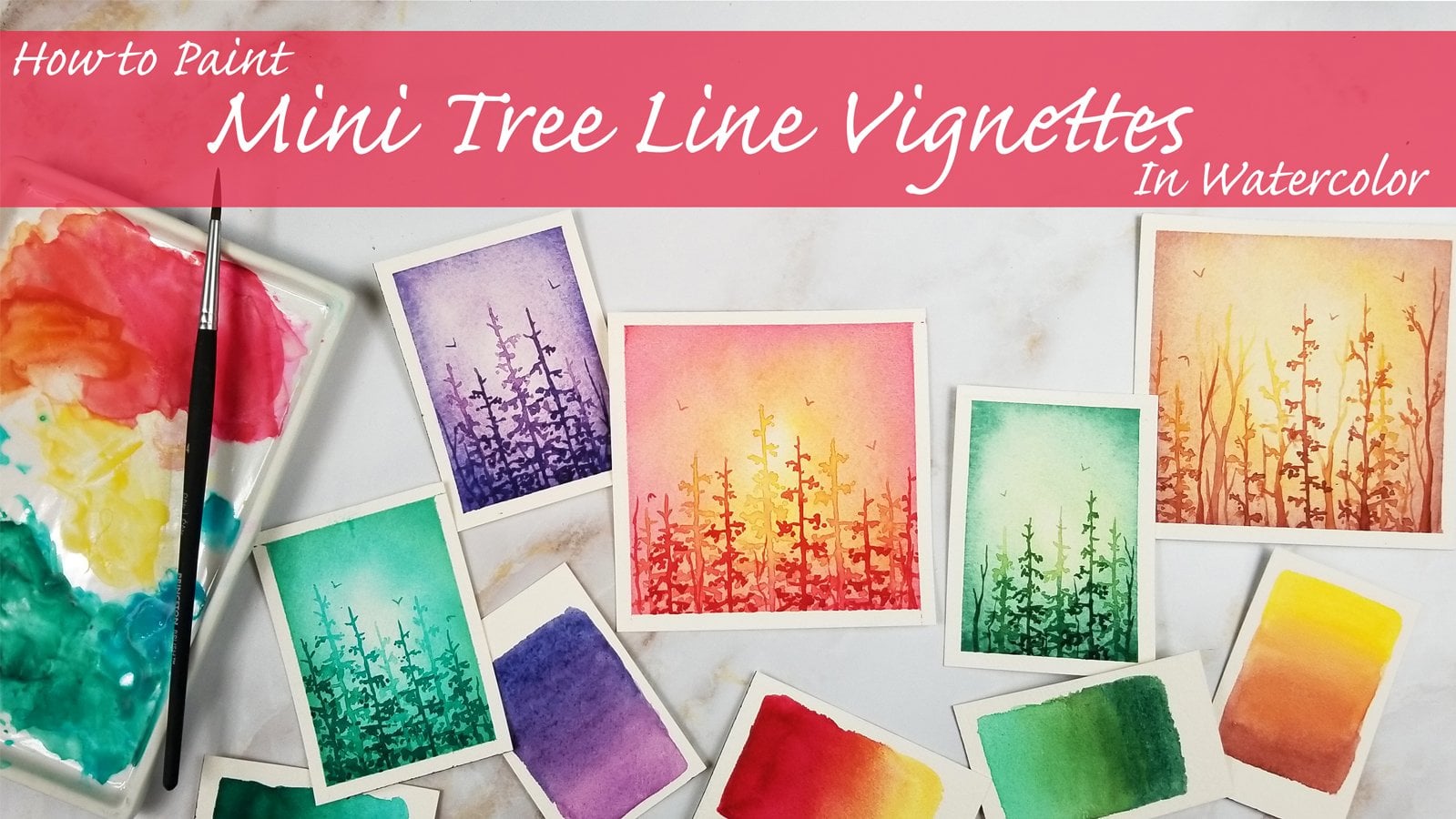
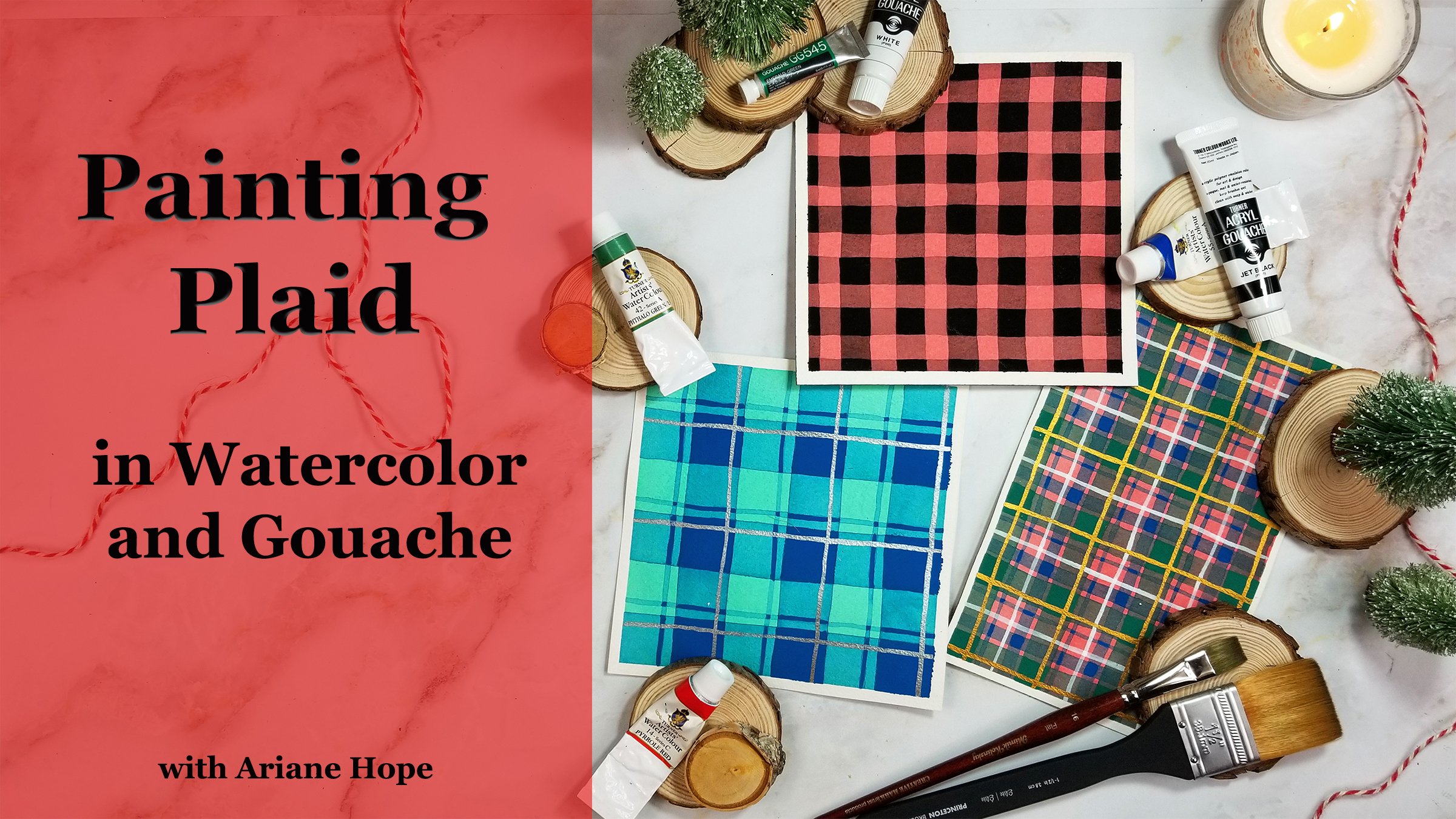
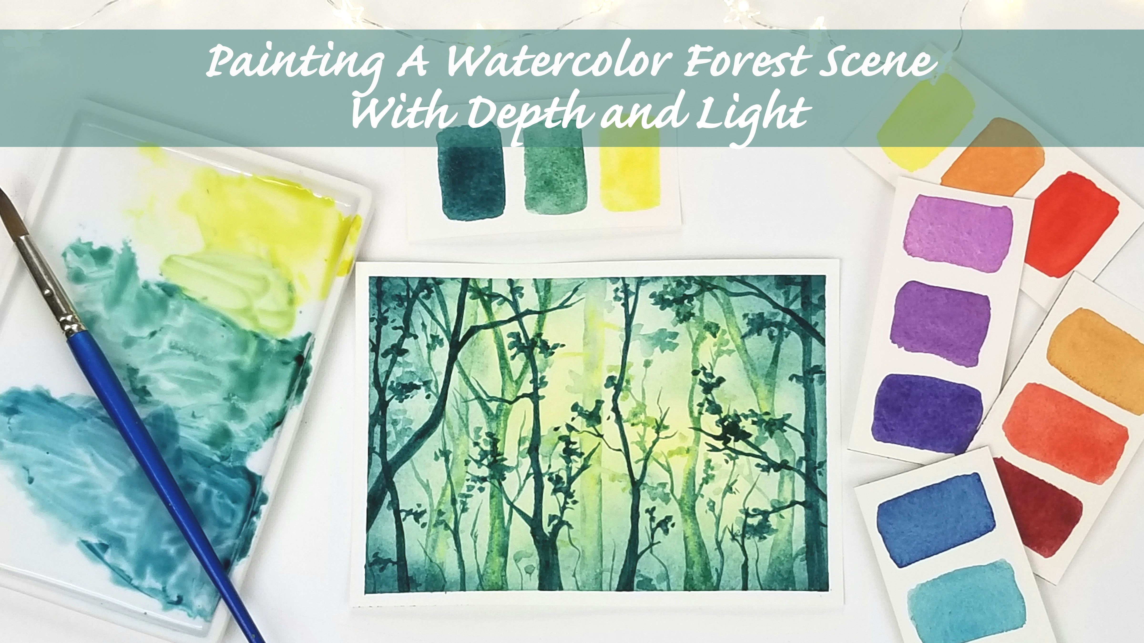
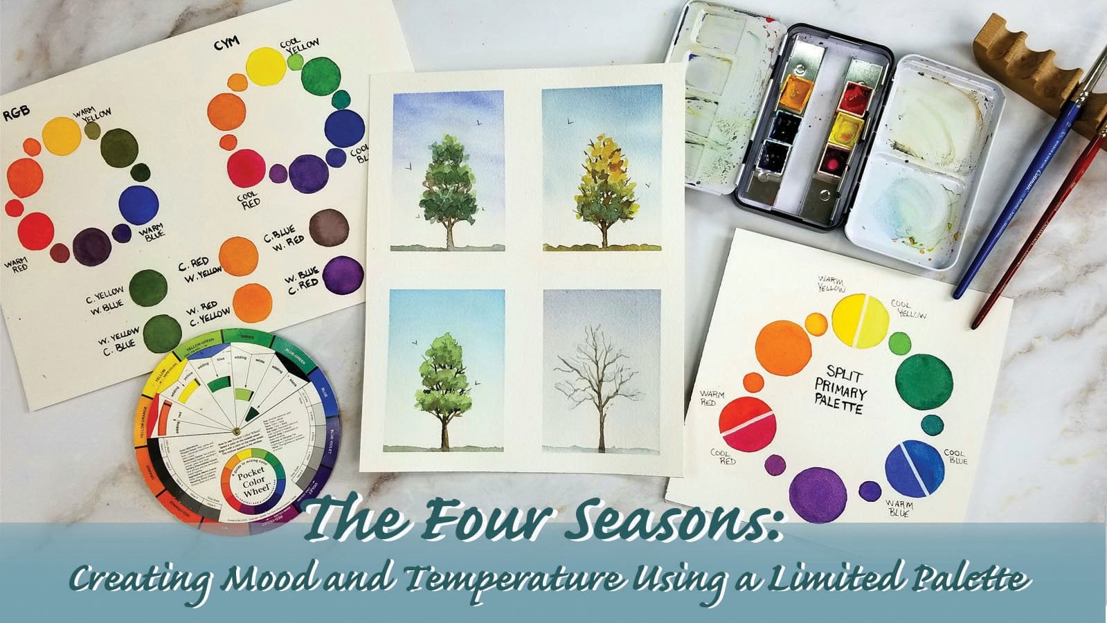
skills with the medium. Themes from my previous classes like ethereal forest landscapes, bright rainbow field skies, and bold plaid patterns
have become just that. Subjects that I can revisit
over and over again when I'm out of ideas or looking for inspiration for the
next big thing. As of late, these
wildflower fields have captured my heart
and paint brush, all while developing my
understanding of layering, and I can't wait for you to experience the same
with this class. This class focuses on basic watercolor wash and gel pen techniques,
including breaststrokes, washes and layering and
combines the skills learned to create modern fun and vibrant
wildflower field designs. Since the fundamentals
of these mediums are discussed and practiced
throughout the process, the class is suited
towards artists of any skill level,
especially beginners. Perfection is not a
requirement for this class. We will learn how
to hide mistakes with layering, and
in most cases, loose and messy breast
strokes can produce amazing results with
this type of project. First, we'll practice
the washes and brush strokes used for
the flower petals and grass fields while exploring the transparent and
opaque qualities of watercolor and guash. After the warm up and
discussing color harmony, we'll paint the initial layer of our field and sky with
watercolor washes, covering up any white
areas of the paper. Then the layering
process begins, building contrast,
depth and perspective. And finally, we'll add modern Dodal details with
a white gel pen. By the end of the
process, there will be so much color and
dimension in your project, and you'll develop the
tools needed to create many colorful and engaging
wildflower field paintings that you can enjoy as is, or can be used to create
lettering backgrounds, greeting cards, and more. The techniques learned
can be applied to many other projects and styles you may want to explore
after the class. But if you're like me, you may find yourself completely
enthralled with the project and want to continue painting endless
wildflower fields. I hope you paint along
with me today and discover this meditative
and enthralling subject. If you have any questions
throughout the class, don't hesitate to reach out. And when you're finished
with your work of art, don't forget to post it to the project gallery or
tag me on Instagram. I love to see and
share class projects. In the next video, we'll go over the supplies needed and then jump right in. So
I'll see you there.
2. Supplies: Here are the supplies you'll
need for this project. A set of watercolor paints. When planning this class,
I really wanted to show that you can make great art
with student grade materials. And when I was looking
through my old supplies, I found this old palette of opaque pan watercolors and thought they'd be great
for this project. I only only ever seen watercolors marketed
as being transparent, but I've been experimenting
with them a lot, and they seem to
provide more coverage than regular watercolors. Because of that, I found that these paints are
really easy to layer, at least for this
type of art style. I'll be also using a
student grade pan set from Arteza that I just bought
on Amazon for about $14. This set pleasantly
surprised me. I was expecting it to
have dull color mixes. But as far as student
grade water colors go, they're vibrant
and easy to blend. These sets, along with
most introductory sets, offer a wide range of pre
mixed convenience colors, like oranges,
purples and greens. But if you only have a few primary colors to
start out with, a color wheel is a great
tool to learn color mixing. There are also a lot of
great color mixing classes on Skillshare as well, including my class on
painting the four seasons. Early in the class, I'll be going over how to
choose your colors, along with discussing some
basic color harmony tips. So don't worry about not having the same exact
colors that I do. This class is
designed to give you freedom in composition
and colors. In addition to watercolors, we'll also be using some
guash for depth and contrast. Guash is a smooth and creamy, water based and water
soluble opaque, meaning not see through
form of watercolor. It can be water down like watercolor for a
transparent look, but is most often used
straight from the tube with just enough water
blended in for ease of use. It has the same texture and often the same heavy coverage as acrylix but dries to a map finish and is able to
be reactivated with water. You can use any set of guash, but if you can't
afford a whole set, I'll be showing you how to
make opaque versions of your watercolors by only mixing
in a little white guash. So, if anything, just invest
in one tube of white. And although I haven't
used them much, and I'm still learning
how they work, I just bought a set of
mm guash from Amazon. I've been seeing these cute
jelly cups of paint all around the Internet and couldn't resist getting a set for myself. I'll experiment with using these in our project
today a little bit, but we'll be primarily using only the white guash mixed
with watercolor technique. But if you don't have any
access to guash at all, you can substitute acrylic
paints or paint pens. Just be careful to keep separate mixing areas
for your watercolors and acrylics as you don't want dried paints crusting up
your pans of watercolor. Any kind of watercolor or
mixed media paper will do. I'll be using arches 100% cotton cold press paper cut and taped onto a clipboard. Now, you don't have
to have the best or most expensive paper
for this project. We won't be using
heavy washes of water. So although you need not worry about the paper
warping too much, it does have to be
thick enough to handle a few layers
of paint and pen. I've tried this project
on hot press paper, which is smooth instead of
texture like cold press, and it behaves a little differently with
certain techniques, but I did really
like the result. So that's definitely an option. I've also painted these
flowers and sketchbooks. So really, whatever
paper you feel most comfortable using
is what you should use. You also want some
scrap paper for testing out total
values and color mixes. A variety of watercolor
paint brushes is useful to have,
but not necessary. I'll only be using a
round eight, around six, and maybe a liner
for the end details, but have fun and experiment with whatever brushes you own. I'll be going over
the brush strokes we'll be practicing
for the flowers. But this project is all about experimentation
with what you have, so you're encouraged to use
any brush styles you like. Two jars of water,
one for cleaning your brush off and one
for using clean water. A white gel pen or
any other gel pens, including metallic pens or even regular black ink pens are great substitutes and can
give really unique results. A mixing palette or plate. Now, we'll be
mixing up different tonal values and colors, so you will need
ample mixing space. I prefer ceramic palettes, but plastic ones are
very convenient as well. And lastly, paper towels
and masking tape if you plan on working with loose
paper tape to a clipboard. And that's it. Even if you have the bare minimum
of these supplies, that's enough to
paint along with me. In the following lesson,
I'm only going to set aside a few minutes to review some common terms and
techniques that we'll be using. Then we'll jump right
into the project. I'll see you then. I.
3. Watercolor Vs. Gouache: Since a lot of this process
is intuitive and spontaneous, we don't have to know everything about proper breast strokes, and since we'll be layering
different tonal values, meaning hues ranging
from the darkest to the lightest and using
some opaque medium, any mistake can be hidden or
worked into the composition. If you're using
pan water colors, just start by misting your pans with water to soften the paint. If you don't have
a spray bottle, you can drop clean water onto the pans to moisten
them with your brush. This is an important
preliminary step to painting, especially when using
student grade paints. Watercolor consists
of powdered pigments mixed in with binding agents, and sometimes you
just need to take a second to thoroughly
blend the water into the pan color just to make sure that there aren't
any clumps of pigment. My general rule of thumb when using pan watercolors is to take the paint from the pan to the palette and then from
the palette to the paper. The first technique
we'll practice is a simple wet on dry wash. I'm going to start by mixing just about 50% water, 50% paint, loading my brush
and just painting a simple rectangle that's
all uniform and color. If we want to deepen this color and increase the
color intensity, we'll just pick up some more of the blue paint from the pan, and we can see that the less
water we use in the mixture, the darker the tonal
value will be. And you can already see how much darker this is compared to the first rectangle
that we painted with about 50 50 paint in water. And one technique
we can practice from here is a
dragging technique, where we can take a brush
loaded with clean water and run it along the edge
of the block of wet color. In dragging your brush down, you can see the pigments
flowing into the clear water, creating a smooth gradient from dark tonal value to
later tonal value. Another way to think
about tonal value is to consider
paint consistency. Mixtures with the least
amount of water are often referred to as
the honey mixture. The consistency is heavy,
smooth, and creamy. If we add in some water
to dilute our mixture, the mid range tone
that's created is often considered
the milk consistency. And the more we water
down our mixture, we get to the t consistency, which can be further
water down to the lightest and most
transparent washes of color. Since these blocks
are still wet, we're going to practice
a wet on wet technique, where we're going
to add wet paint to the areas that
are not yet dry. And just a tip, anytime
you're changing colors, just make sure you're washing your brush in the dirty
water and then rinsing it in the clean water before taking your brush to
a new pan of color. I'm just going to grab some of this green and load my brush up and then just drop it into the areas that
are still wet. And you can see
the pigments from the new color disperse into the initial wash. Any marks
we make are feathered, leaving no hard lines. So I'm just going
to experiment with dropping in some
different colors with varying tonal values into the first wet washes just to see how different colors
interact with one another. And that's pretty much
the basics of wet on wet. And once this is dry, we can layer on top of these colors with our
wet on dry technique. If you're practicing along, you can use a hair dryer to
speed up your drying time. But now that my paper is dry, I'm going to mix up
a honey consistency of this blue that we
had used earlier. And you can see how nice
and smooth it layers over our first wash. And if you're
layering different colors, you may begin to see the
underneath colors shining through since both
mediums are transparent, even when they're used at a
concentrated consistency. And here you can
see the difference between the wet on
wet mark that we made with this orange and the wet on dry mark that we made
with the same color. So, as I said before,
we're going to use the water color for
the initial stages. But to add more contrast and tonal value to our
flower fields, we're going to be using guash. Because Guash is opaque, it allows us to layer
a lighter tonal value on top of a darker color. With watercolor paintings,
you approach them using the lightest colors first and building
the darks from there, making sure to preserve the
light colors and sometimes even using the
white of the paper to represent the lightest areas. If we're using guash, we
really don't have to worry about preserving the lights
and whites of our paper, since the light tint
of guash will be opaque enough to act
as our light areas. So I'm just going
to add a drop of water to this guash that
I squeezed out from the tube and make a nice creamy mixture just so that it's pliable
on the brush. And you can see that as long as the mixture is creamy enough, the coverage is
smooth and opaque. And like I said, guash is
usually used directly from the tube with just
a little bit of water mixed in for ease of use. But just like watercolor, you can add water and dilute
it to get more transparency. Now I'm going to layer
some white guash, and you can see that
the paint is thick enough consistency to cover
all of the blue underneath. But if you don't have
any other colors of guash but white, here's a great technique that you can use as a substitute. I'm going to take some
of this bright green, transparent watercolor
and just drop some onto my palette next
to my white gushe and mix those two together. I want to make sure
that I don't add too much water so that
it's transparent. And I also want
to make sure that I add enough water color to my gouache mixture so that
it's not too pastel shade. And you can see this
mixture is as bright and opaque as the shade that we
use straight from the tube. Next, I'm going to use
some of this my guash, which is a bit more difficult
for me to work with. I feel like the paint sticks to my brush more than it
adheres to the paper, but there's a learning
curve to all new materials. So after this class, I'm going to be
experimenting with using different brushes and paper with this gash in order to
really understand it. First, I'm going to take some of this orange watercolor and just layer it on top
of our first wash of water color just
so you can see the difference when we add
some of it to our white guash. And I think my mixture is looking a little bit too pastel, so I'm just going to add more of the orange watercolor
pigment to my mixture. And you can see
that in addition to being tinted a
lighter total value, the coverage is more
complete on top of the blue watercolor than
the watercolor alone. I'm just going to do one
more quick example of layering I'm just going to take some of this green
water color and layer it on top of this pink
square that I just painted. And you can see that although this green water color is
more of a honey consistency, it's still transparent
and you can still see the pink
shining underneath it. But when we add a little bit of white guash to the water color, it increases the opacity
and lightens the tint. And you can see that I added enough green water
color so that the hue isn't pastel and enough guash so that the
color is opaque. So I encourage you to
practice getting to know the transparent and
opaque qualities within the supplies you own. These simple
exercises are really where your skills and knowledge
will develop over time. In the next lesson, we'll go
over a few brush strokes and talk a little bit
about color harmony before we jump into the project.
4. Brushstrokes and Color Harmony: Now that we've explored the different qualities of watercolor and gouache, we're just going to take a moment to practice the brush strokes will be using for the elements in our wildflower fields. Now I'm nowhere close to an expert on botanicals or floral art, And the terms I'm gonna be using to describe these floral elements are in no way scientifically correct. But that's okay because we're going to be using simplified brush strokes to represent three basic types of flowers. Starting with the largest flower, I was inspired by the shape of a tulip and simplified it into four to five oval-shaped, rounded but upturned petals. With the middle flower. I took inspiration from grape hyacinth or any other cone-shaped flowers that are comprised of small petals originating from a single stem. I use the tip of my brush to create small blobs in a cone or a triangular shape for this one. And the third flower, which will be our smallest flower, is going to act as a space filler between the larger flowers. And it's comprised of small, blobby brush strokes grouped in clusters that are spread horizontally as opposed to the vertical direction the middle flowers grow in. So to practice the first flower, I'm just going to grab some paint, and any color will do for this quick warm-up if you're following along. And you can use any size round brush for this. But just be aware that the larger the brush, the larger your flowers will be. So choose a brush size in relationship to the size of the paper that you're painting on. So for this larger nine by 12 inch piece, I used to large round eight for the flower petals. And for the smaller five by seven inch piece, I used a rounded number six for the flowers. So just make sure your brush isn't too large for the paper you're using. As you'll want to be sure that you have enough room for all the elements in your design. So I'm just going to mix up a milky consistency, bright pink color and I'm using my number 6 round brush. So I'm going to load my brush, and then with the tip of my brush to the paper, just going to drag it upwards in a rounded oval shape and then back down again to where I started from. You can fill in any white gaps if you want. So I made a few loops with my brush, with the bottoms of the ovals connected. And then I'm going to just make some curved lines on either side, just so it looks like the petals are opening up to face the sun. And when you're making these connecting oval shapes, they don't have to be in the same exact size or facing the same direction. Just so that they're similar enough to look like the same type of flower throughout the composition. And that's basically the first flower shape. For the second flower, I'm going to switch to the color purple and just use the tip of my brush to make little dashes and the shape of the tree, making sure to keep space between the dashes so it's not a solid triangle of color. And don't worry about making the dashes uniform or the same size and shape as each other too, just so that they look like they belong on the same type of flower. A technique that we can use from here is the wet on wet technique, where I'm just going to take some deep shade of purple and drop it in on the bottoms of our dashes so that it looks like shadows on the undersides of the petals. Make sure you continue to keep white space in between the dashes and just try to concentrate the shadows on the underside of the pedals. The dashes can be as neat or messy as you want and don't be afraid to add some variety. And just like the larger flowers, these middle flowers don't have to look exactly the same, just similar enough in size and shape to look like the same species of flower. For the third and smallest flower, I'm just going to take some of this golden orange color and just make little, pointed star shapes with the tip of my brush. Don't worry if they don't really look like flowers yet. The layering that we're gonna do is gonna make them look like flowers instead of little spiky blobs. And I'm also grouping these in a horizontal mound shape. And I'm also leaving some white of the paper in-between some of the blobs. And just like earlier, I'm going to drop in some darker orange wet undersides of these shapes. And that's really as far as brush strokes go. And just one more quick thing before we start, we have to choose our colors. Since we have three different flower shapes and sizes, we want to choose three colors that contrast, but still, look harmonious. Keeping in mind that we are going to be using a wide range of different greens for the grasses and stems. I always like to use a color wheel for guidance. And on the back of mine, it shows me different color relationships. I most often use the triad relationship to help me choose colors for this piece, a triad refers to three colors spaced equally apart on the wheel (or in triangle shape) Basically, colors that live directly across from one another are complimentary colors. If we go one space to either side of the bottom color, we get the top split complimentary color, then to the triads. And then we can even go to the tetrads, which are colors that fall in a square or rectangular shape. And now, since we'll be using all ranges of green, ranging from cool green to warm green. We can keep those out of our possible flower colors. You could paint a flower field with just red, orange, and yellow flowers, but it might not give us enough dynamic contrast as we would if we had used some colors from the tetrad or a triad relationship rule. And for this piece, I used a pink, yellowish-orange, and a blue. And for this one, I used coral, yellow, and purple. So they don't have to be exact triads or tetrads, but just close enough so that the different flowers don't blend into one another, and that you include a mix of cool tones like blues and purples and warm tones like pinks, oranges, and yellows. Also, which color you apply to which flower shape can change the look drastically. In both of these, the main flowers are pink, yellowish-orange, and blue, but they look different because the colors correspond to different flower shapes. I also varied the shades of pink, yellow- orange, and blue between the two pieces. So if you find yourself running out of different color combinations, like I was once, change up which flowers correspond to which colors. And you can come up with so many different looks for your flower fields. Here's another pink, yellowish-orange, and blue design that you can see that the slightly different shades of color and making the largest flower blue really changes up the feel of the painting. So although I haven't decided which colors I'm going to use for each flower for the project demonstration. I know I'm definitely going to be using a yellowish orange, a bright magenta pink, and purple. And I also might add some bluish purple. We'll go over the different greens we're going to be using at that stage. And you can use any colors you want to follow along with, but you're more than welcome to use the same colors that I just chose. Now that that's all done, we're ready to start.
5. First Flower Layer: Since I'm working on a loosed 8"x6" sheet of paper today, I'm going to be taping my paper down to a clipboard with some regular old masking tape. This step is not required, but I feel that it helps when using washes and I like the crisp edge that it leaves. When I painted this on a hot press block, I didn't tape my edges because the block keeps the paper secure. I did however tape my sketchbook pages. So it's really up to you. To start. We'll choose our brush depending on the size of our paper. And I'll be using a medium, size six round brush because it will be a good size for my eight by six inch paper. We'll approach this painting starting with the largest flowers to the smallest flowers. And once the flowers are mapped out, for the most part, we'll move on to the sky, grass, then build up the contrast with shadows and highlights with both watercolor and gouache before finishing it with ink details. So starting with the first largest flower, the tulip inspired flower, I decided to mix up a pink color with two of the shades from my palette. So whatever color you choose for your largest flower, make it a smooth, milky consistency, and aim for a little lower than the middle of your paper. For the first petal. Load your brush with paint, then drag the tip of your brush in upward oval movements, connecting at the bottom and filling in the petals. And after we make a few central petals, we can add some curved, thinner petals on the sides. From our first flower. We'll go from there to fill up the paper on either side of it. You don't want your flowers growing in a straight row, so try to keep space in stagger the flowers. You don't however, want to be strict with your staggering. You can slightly alter size of petals and the direction the flowers are facing to add some spontaneity and variety to your flower fields. And as you use the paint on your palette, unless you have very large palette wells, you may need to continuously mix up more paint mixture. We also don't want the flowers to look clustered in the middle of the paper. So we can paint some petals overlapping the borders to look like the field is continuous in either direction. And like we did in the warm-up, feel free to add some darker tonal value to the bottom of these web flowers. So continue staggering flowers down the paper, leaving a little bit of space at the bottom. Next, we can move on to our second largest flower, the cone-shaped flower. I'll be using a bright yellow with some golden orange for contrast. And we should keep in mind to make these flowers smaller than the first ones, if possible, because we don't want the flowers competing for space on the composition. To the side of the flower in the middle of the paper, we can start adding in small dashes with a tip of our brush, varying slightly in size, but growing in the same tree-shaped direction. I'll make sure to keep some space in between the dashes and then I'll add some orange paint to the underside of the petals. If you find your darker shadow colors dispersing too far into your lighter color, you can tilt your paper to encourage the pigments to settle in the areas where the shadows would be. And now we can just start filling in this set of flowers, staggering them between or peeking out from behind the first set of flowers. Now this process is intuitive and each layer of flowers depend on where you place the ones before it. So just have fun with these next few steps and don't get hung up on placement. The more you paint these, the easier it gets to be able to figure out flower placement. We want to preserve the space for all of our elements. But knowing that we have gouache to cover mistakes, takes some of the pressure off of perfection. Before I go overboard with the yellow flowers, I'm going to start filling in some space with the smallest flower, which will be purple in my case. And I also decided to add some blue to my purple mix to increase the contrast. We can start by adding small spiky blobs in the spaces between the other flowers, working them into little mound-like clusters. Feel free to switch to a smaller brush for this flower if you want more control over the size of petals. And as before, we can add some darker paint with the wet on wet technique to the underside of this flower. Now as the bottom half of the paper fills up, we want to add some smaller flowers in the distance. To look like our field is receding into the distance, we want to make our flowers larger in the foreground and smaller near the background. And since these flowers are in the distance, they don't have to be any intricately detailed shapes. Just some blobs and dashes that are representative of our three types of flowers will do. I'll just add a few of each color staggering across the top of the flower field randomly. Now that our base layer of flowers is done, we can work on the sky while it dries.
6. Sky and Grass Layers: While our first layer of petals is drying, we're going to work on the sky. I'm going to grab a bigger brush for this step because I feel like it's easier to cover larger areas of space with and I'm also going to want to have a clean area of the palette to mix on. We'll be painting the sky using a wet-on-wet technique. Only we'll be adding paint to the wet plain paper instead of on top of the previous color. So load your brush with clean water and start wetting the top of your paper so that it's saturated, but that there are no puddles of water on top of the paper. Stop your water line just a little bit about the small distance flower line. And it looks like the top of my paper's already drying out. So I'm going to add some clean water to that area. If you're working with hot press paper or paper that isn't cotton, you may have to work quick at this step because water absorbs quickly on those types of papers. So grab whatever shade of blue you want your sky to be or mix your own shade and mix it up in a honey consistency, so that it's highly pigmented and smooth. Feel free to test out your color mixes. And when you're happy, load your brush with the blue and apply it to the top of the sheet. And you can slowly drag the pigment down in a smooth gradient, but dragging little to no pigment to the horizon line. You want to make sure that the area of the sky right above the flowers is much lighter than the sky at the top of the page, I want to darken the sky a little bit, so I'm going to add some more blue to the top of the page. And I'm not going to drag the color down too far, but rather lift until my page and like gravity disperse the pigment down. If the sky at the horizon line gets too dark, we can take a clean, slightly damp brush and sop up any hard edge or line. And if you find the blue sky running too far down to the horizon, you can tilt your page the opposite way to encourage the pigments to settle further away from the horizon. I like how this looks already and don't feel the need to mess around with it any longer. So if you're satisfied with your sky, we can let it dry and work on some layering and the flowers before we move on to the grass, this will help us flesh out the composition a bit more before that stage. So switch back to the other palette I used for the flowers and mix up a darker toned honey consistency pink flower color. And with my smaller brush, I'm going to add some gestural outlines. Are marks wet on dry to where the underside of the petals would be. Some of your outlines can go all the way around the petals and some could just act as shadows. So just intuitively add the darker tones to the areas of the flower that would be in the shadow. If you can imagine that the sun is shining directly from above. Moving on to the middle flower, I'm going to add some orangey gold color, still making sure that I keep some of the white spaces within the clusters here and there. But using this opportunity to add some dimension and fullness to the piece. And the same with the smallest purple flowers. I'll add some darker dashes to fill the page out a bit and don't obsess over adding too much or too little at this stage. After the grass, we'll have plenty of opportunities to add highlights or shadows and cover any mistakes with gouache. So before we get to the grass, we need to make sure our paper is fully dry. The sky should be almost dry by now, and our wet on dry shadow layer shouldn't be too far behind. I'm going to use a hairdryer to speed up my drying time. A good indication that your paper is 100% dry is when you touch the paper, it's not cold to the touch after the heat from the dryer has gone away, take some time to press the edges of the tape back if they've pulled up. I'll stick to my smaller brush for this step in switch to my palette that has more space to mix, we're going to pick a lighter shade of green. I'll pick this lime green color and mix up a thin consistency. And I'll show you how we can tone these bright, sometimes neon, greens down to a more natural shade of green. This is bright and pretty, but it's really not the most organic or natural shade of green. I'm going to take a bit of reddish-orange color and mix it in with green. And it looks like I added way too much red at first. So I'm just going to add some more green to combat the redness in the mixture. And you can see that we made more of an olive green shade as opposed to the lime green shade. I'm going to go back and add a little bit more green and just to brighten it up a bit more. And I kinda like this. So I think I'm just going to go with this shade and adding enough water to make sure it's a nice tea consistency. I'll start with the right-hand side so that I don't drag my arm into what is wet. And if you're right-handed, you can start on the left-hand side. Load your brush and start at the top of the field. We're going to carefully, but not obsessively, paint around the flowers, making sure to paint up close to and around the petals that we painted earlier, filling in any white spots in or around the clumps of petals. Now don't worry if you overlap the edges of your petals with a grass mixture. And don't worry if your brushstrokes get a little messy. We can cover any mistakes with qouache later on. For me, this is one of the more tedious steps in the project. And I often feel like this is where the brief, ugly stage of the painting happens. But just trust the process and know that everything will come together in the end. And when you do get to the painting around to the horizon line, make sure to not paint a solid line across. You need to make it irregular and bumpy. Continue mixing more grass color is needed, but don't obsess over getting the exact same green throughout the entire piece. It really won't matter once we start layering on top of it. And by now you may notice areas of your grass layer drying before you circle back around to them, creating hard edges where the sections overlap and meet. Now this is totally okay. Any lines or weird paint bleeds will be layered on top of each other at some point. Continue filling the rest of this green mixture in any of the white areas of the paper. Now that the whites of the paper are covered, the rest of the painting will fall into place pretty quickly. We'll make sure our grass is completely dry. Then we'll do the finishing shadows, highlights, and greenery details.
7. Layering Contrast with Watercolor: Before I move on to gouache, I'm going to add in some darker watercolor details to the petals and grass. I'll make it dark magenta, honey consistency color adding a little red for contrast. And just like we did before with a smaller brush, fully or partially outline the edges or bottoms of the petals using reference photos to give you an idea of where the darker colors of shadows would be. If you've got a little sloppy with the grass layer earlier. This is a good opportunity to paint over any overlapping areas with the petal colors at a deeper tonal value. Moving on to the middle flower, I'm going to add some darker, golden, orange colors, but mainly making sure to keep some of the brighter areas still bright. Don't worry if you go overboard though. We'll keep the building contrast as we go. So eventually the highlights and shadows will balance one another out and just continue adding contrast and dimension to the smallest flowers as well. Although some of the petal shadows might still be wet, we can move on to the grass. So although we use toned down mostly natural shades of light green for our initial layer, that can use all ranges of green from yellow-green to cool bluish-green for the blades of grass and leaves. So I'm just going to prepare a couple of different green mixes to have at the ready. These greens can be a creamy, honey consistency. I'll stick with my round number 6 brush, but feel free to move to a thinner liner brush for more control. Starting with the largest flower, I'll grab some of this honey consistency dark green, and make a line from the base of the petals down, stopping just above the flower, below it. And at the base of the large pedals make a little V-shaped notch so that it looks like petals are growing out of the stem and not just a lollipop shape. Don't continue the stems from the middle of the page all the way to the bottom. We don't want to make the flowers look like they're four feet high, rather that there are overlapping layers of flowers from the background to the foreground. For the faraway flowers, short dashes will do. I'll change my green for the cone-shaped flowers. And if you look at any of the reference photos, you'll see that in these types of flowers, there's a central stem or one that connects other smaller stems and petals. So add small areas of stem throughout the flower. And for the smallest flowers stems, they look like small clusters with a lot of greenery. So I'll add smaller intersecting dashes for those paddles right underneath the petal line. And now that all of the groups of flowers have stems, we're just going to start filling in green areas with grass. Making random dashes and lines between the flowers, use a variety of greens and thicknesses of brushstrokes to fill in the areas. You can even intersect and overlap some into the flowers for a more natural look. The closer you get to the horizon line though, try to use lighter colors as colors are less saturated in the far distance and they are up-close. So I'll stick with lighter colors and more watered-down paint consistency the closer to the horizon line I go. So just keep adding a variety of green lines and dashes with the tip of your brush throughout all of the areas in between the flowers. So I think I'll stop here and hop back to the flowers for now. We can always go back and add more grass later. Next, we'll really start adding contrast with gouache.
8. Contrast with Gouache: So I made some space on my desk and on my palette for the gouache, I have my Himi Jelly gouache out and I think I might experiment with some of these greens for contrast in the grass, but I'll mostly be using the white gouache mixed with watercolor technique. Start by squeezing out a little bit of white gouache on the palate next to the flower colors we used earlier. You can grab a smaller brush for the details if you want or keep the one you were using earlier. And with a brush with very little water, I'm going to grab some of the white and mix it in with a pink color so that it's light and opaque like this. So just add some highlights to the flowers focusing on the top of the petals in the petal clusters, just like in our reference photos, where the sunlight is coming from directly above. And they can just be dashes and blobs of highlight layered on top of the petals. We can go further later from here, but I'm going to jump around to the middle flowers first and try to build up the piece in stages. I'm gonna make a really opaque yellow color. And the brighter the better because I went a little overboard with my grass and covered too much light yellow earlier. To just dab the gouache tinted highlight on all of the highlighted areas of the petals. How also layers, some of this light gouache to areas that are too sparse with flowers. And it's really going to start to fill the page up. And I went to my yellow gouache So I'm going to add some of this yellow Himi gouache to my mixture. Before I get too carried away, I'm going to move on to the purple flower and dab in some really light purple onto the tops of the petal clusters and then spread them outward into where there is too much green space. This is a good opportunity to fill out the composition and also cover any mistakes with opaque gouache. I lost some of my dark shadows in that process. So I'm just going to add some more dark areas to balance out some of the lighter areas I added. Keep going back and forth with adding highlights and shadows, balancing out the contrast. This step, along with most of this project is intuitive. And really only you can tell when the balance between light and dark is achieved. I feel like there's too much space in the distance. So I'm going to randomly blob in some colors with gouache. I also want to add some more contrast to the greens, especially adding some darker blades of grass near the foreground. So I'm going to add some of the darker watercolor mixes that we made, along with some of the green Himi Jelly gouache. And lastly, I just want to add a few darker contrasting marks on the large flowers just jutting out from the stem. And all that's left is adding the pen details. So if you feel like there's still something missing from your piece, these details will bring the design altogether.
9. Finishing Touches and Conclusion: Now we're going to doodle a fun pen outline layer on top of our painting. And this step will really bring everything together. Although I'll be using a white gel pen on the main project, to make it easier to see the pen lines, I'll first show you the marks on this practice paper with a black pen. Now these are going to be loose gestural doodles on top of our piece in the pen marks don't even have to actually outline every petal and shape. For the largest flower. Basically, I'm just going to make loopy overlapping petal shapes. Don't fret if they don't actually line up with your petals. Think of this pen layer as a separate doodle overlaid on top of our flower field that we painted. The second flowers' pen marks are shaped like little "M's" stacked on top of each other randomly in a vague shape of a triangle. Don't be afraid to work quickly and loose and don't obsess over too much detail or lining the pen up with the painting. For the littlest flowers, I'm basically making some squiggly flower shaped blobs with some dots in the middle on some of them. So those are our three basic outlines. And like I said earlier, you can experiment with any color of pen. I just really like using the white gel pen for this project. Just like in all the steps before, we're going to start with the largest flower and work our way to the smallest flower. So continue making big, loose loopy and gestural pen outlines. The furthest flowers in the back don't need much detail and you can get away with some vague scribbles for them. And once the flowers are outlined, we can make straight lines and dashes on either side of the main flower stems and throughout the grassy areas. Near the top, the lines can be shorter, choppier. You can disperse them randomly through the grass. And remember that they don't have to be facing the same direction or anything. Just imagine a flower field blowing in the wind. And now that that's done, we can take the tape off and see our final piece. And here's our completed flower field. It's bright, cheery, and modern. And once you get into the layering groove, it's really hard to stop making them. And although I mainly showed bright color combinations, the possibilities really are endless as far as color goes. They make great pieces to frame as is. Or you can even scan them to use them as a background for digital hand lettering. One product I made with these wildflower fields is a greeting card set which I listed in my Etsy shop. I'll end the lesson with the hyper-lapse video of an entire process of a piece that I did recently so you can look back at all of the layers that went into this project. I hope you had fun joining me for this project and are inspired to paint miles of Flower Fields. Feel free to reach out with any questions along the way and make sure you upload pictures of your wildflower fields in the project gallery. You can also follow me on Instagram, @ariane_hope_ which will be linked into the class description, and tag me in any of your projects, I'd love to see them there as well. I can't wait to see you there! Happy painting!
 Ariane Hope, Artist