Transcripts
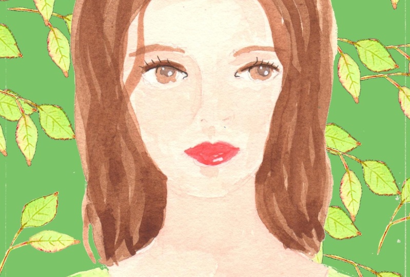
1. Introduction: - I . I'm Alison Kolesar, and I'm an artist and illustrator. A couple of years ago, I started a series of small paintings that I ended up calling pattern ladies because they were all pictures of women, and they all included both pattern on the figures on the patterned background in this class . I'll teach you what I learned in that process and how you can paint your I'll show you some of the ones that worked less well as well as my favorites, because the truth is, we learned by missing the mark as often as and sometimes even more than by hitting it. They were all painted by hand, using a mixture of water color and wash with details added in marker and gel pen. And that's the method I'll focus on here. Of course, there's no reason why you shouldn't choose to work digitally. Working in procreate on an iPad is almost as intuitive is working by hand. But for me, I don't think anything can replace the feel of paint on paper. So let's get started
2. Materials: So here's what you'll need. And I also put this list in the class resource of section first a pencil. I like this kind because I don't have to sharpen them an eraser. This is a kneaded eraser, and I realized they get pretty weird looking after you've used them for a while, but they work really well. Some watercolor paints, either in tubes like this or in a set of pans. Some go wash paint's now. You don't really need to have both watercolor and wash, but I did. I prefer the water color for the faces and, in most cases, the wash for the patterns. You'll need some kind of palate or just another plate to mix your colors on. If you want to make very fine lines for micron pan, if you want to make fine lines and color or other kinds of markers. Okay, and I really enjoy using a white jail pen, which works well on top of paint, you will need the paintbrush. Make sure to pick something with a fine point so you can paint details easily. A sketchbook or just coffee your paper for your initial drawings. It doesn't have to be anything very high quality and some watercolor paper. I have to say that when I first started this Siri's, I was using a pad of watercolor paper that had a bit more directional texture than I really like. You didn't show up in the pattern areas, but some of the faces where I tended to use thinner watercolor rube. It's stripey when you look closely, so my favorite is arches hop pressed right white watercolor paper, where there are lots of other good brands out there. You might also like to use some artists tape or low tech masking tape to outline your image and make clean edges. Who your paint. I painted my little ladies at four by five and 3/4 inches. That's about 10 by 14.5 centimeters, with the paper cut bigger than that so that I could take down the edges. But you could work at whatever size feels most comfortable
3. Proportions of the Face: we're going to be using a photo for reference. But before we start drawing, it does help to have a sense of the basic proportions of a face. If you're new to drawing, people, be aware that because we automatically focus more on someone's features than their forehead , it's easy to think that those features take up more space on the head than they actually do . The basic head shape is an oval, wider at the top, the narrower at the bottom. The eyes on an adult sit just above the mid point. The corners of the nose tend to be in a line with the corners of the eyes, the mouth obviously between the nose and the chin. I think the base of the lips is often the midpoint between the chin and the border of the nose. The years start on the same line as the eyes and end around where the nose does, and then the hairline obviously varies, but is somewhere around there. If somebody's hair is Bushie, it's gonna sit higher up and eyebrows sit over the eyes. The eyes are shaped because, of course, there spherical on the inside, so the eye lids wrap around that sphere and often times you can see the crease. In the upper island, the neck is obviously narrower than the head. They don't want to make it too narrow and the shoulders very a lot. Some people shoulders are quite sloped, and other people's are straighter.
4. Starting to Draw the Lady: your first step is to find a head and shoulders photo you like and make a sketch of it. There's no shortage of images online, and you can search for Portrait's on Pinterest and Instagram. But you could also use a family snapshot, preferably one where the person isn't smiling because it's much harder to draw on open mouth. Do be aware of the photographer's copyright, though. Try searching for vintage images where you don't have to worry about that years. The photo. I used us my starting point for this demonstration, and here's my first sketch Speaking personally, I have to guard against my tendency to coffee to carefully naturalistic drawing comes easily to me, but there's usually more character to your drawing when you play around a little with proportions to get past that tendency to copy, we're now going to put away the photo just looking at your first sketch. Make a second drawing from it, used the original sketch for overall proportions, or maybe the turn of the head, but don't copy it exactly. Feel free to lengthen the face or the nose just a little, or make the lips fuller or eyebrows thicker. When you get to adding color. You can decide to turn a brunette into a redhead if you feel like it. On the other hand, avoid extreme exaggeration, like the enormous eyes of anime characters. If you feel ready, you could make this second drawing on your piece of watercolor paper. Or you could make your second drying on sketchbook paper as you work out just what you want and then trace that second sketch or use a light box, or simply draw it 1/3 time to transfer it onto watercolor paper. Keep in mind that the torso will be covered in a pattern so you don't need to go into detail there, and you won't be doing all the shading to create volume. I didn't even demarcate the arms in my paintings. Use your needed a razor to get rid of extra pencil marks. So and I'm going to start working from my first sketch and make a few changes to make it more appropriate for one of our pattern. Ladies, I like the angle of the head and the mouth. That hair, though, is definitely of its period and something I'm gonna want to change. I wanna have enough space for my pattern on the torso. So I'm gonna make it a little bigger than in the original drawing. I think I may just leave her with short hair, which give space to show some nice earrings. You probably see a little bit of hearing on this side when you're drawing the irises. Almost always the, um not only is the top of the circle covered by the top lid, but the bottom of the circle is also, um, hidden a tiny bit by the bottom lid. So rarely do you see the whole circle of the iris. Another thing I'd like to do is to make the pupil almost more like a semicircle because you're showing that highlight in the middle of the eye that gives it life. Okay, this is good enough for a second sketch. I may refine in a tiny bit more when I transfer it to the watercolor paper.
5. Thinking about Pattern: now to start thinking about pattern. I love pattern, and I've always been intrigued by the idea of having a background with as much or even more interest in the foreground. Here are two pieces I painted quite a long time ago with fruit on a patterned ground. You can overdo pattern, of course, but for our ladies, the face will be relatively plainer and therefore give the I a place to rest. So how do you decide what pattern to draw off? What colors to choose? The possibilities are just about endless, but I've always find it easiest. If you limit your choices a bit. Decide on a few colors that you like together no more than three each for the shirt on the background to perhaps just to each, I think the most successful ones in my Siri's just had two colors each for the background and clothing. These two have a larger range of colors, and I think in retrospect that they have a bit less impact. You can simply draw your pattern and then paint within the lines you've made. It's basically grown up coloring and totally absorbing, or you can put down a layer of paint and then lightly sketch in your pattern on top, painting either the pattern itself or painting negatively so that your coloring all the bits around your drawing In this one, I painted the green leaves in gua sh on top of the black, but in this one I painted the red negatively. I painted the orange first and then painted the red around to create these shapes. You can also draw on top of the paint using markers or gel pens so that you're creating your pattern in lines and you can see here. The bird's were painted with white gel pen and her shirt with markers. Similarly, here, this is white gel pen on tough of the black. You can make a pattern where the same shape repeats or whether lots of different shapes. So in this one, the background is basically all the same shape, though it's their rotated around. I've made some images where I painted the same design in different color schemes on the foreground and background. So this is the same motif, but in different colors, and this is the same leaf shape, but where it goes over the red. It's a darker gray I used some paintings that were very similar in color, like all the shades of gray in this one, and then others where there were completely different in the foreground and the background in both of thes. I used a geometric background and more organic shapes in the foreground, and you could do vice versa with organic shapes in the background and geometric in the foreground. Keep in mind that warmer colors, reds and oranges tend to move forward visually, while cooler ones, blues and greens moved back. That doesn't mean you can't use cool colors in the front on warm ones behind. The more similar, the colors are in foreground and background, either tonally or in color, the more they'll start to blend into each other Visually, I was initially quite excited about this color scheme, but in the end I don't feel it really works. Despite the warm pinks on the clothes. The overall it's just too similar and value and has too much brown. You can also keep one color consistent in both background and foreground, but switch its role. So the pale grey here is on both the leaves in the background and the background of the shirt. All this makes it sound like I was consciously thinking about all these possibilities as I was planning each drawing, and I certainly did some thinking. But I was also experimenting as I went along, and I'm now giving you the benefits of what I learned. You can get ideas for pattern shapes from lots of places. Do you have a plant on your window sill with a pleasing leaf shape? Do you like checkerboards or diamond shapes? Simple flowers are among the most common starting places. Or how about the repeated silhouette of a butterfly or a bird? Of course, you can search endlessly for repeat patterns on Google or Pinterest, though sometimes the amount of choice there becomes overwhelming. Whatever images you decide on, remember that you want to keep the individual elements relatively small so that their space to repeat them. And when you're adding color, make sure that there's enough difference in value. That's the light and dark, so that the shapes don't just fade into the background and become invisible.
6. Painting the Pattern Lady: I don't think it particularly matters whether you start painting the background or the torso or the face. But there are some things to think about to do with materials. If you're using both watercolor and wash, you'll be able to paint wash on top of watercolor, but not really the other way round. For all my pattern ladies, I painted the face and hair in watercolor because for me, that was an easier medium to get some modeling and variation in the skin tones. I love the flatter paid qualities of wash in patterns, but prefer the translucence of water color for skin. What color will dry paler than when it first goes on? But you can add more layers to increase the depth of color. With wash, it's a little more complicated. Light shades tend to dry, darker and dark ones lighter, so it's usually worth trying out a dab of color on each on another piece of paper and waiting till it dries. If you really want a particular shade, so here's my drawing already. I've got my tape around the edges, and I've drawn in the different leaves. I'm planning a grey and pink color scheme and, um, gray in the background here, pink leaves on top. I'm a little concerned that if I simply painted the pink directly on the gray that it would go muddy. So I'm actually gonna paint all around these leaves and paint the leave separately. And then I'll use pink for the background of the shirt and probably a dark pink for the leaves on on top of the shirt. And here she is with the gray background waiting for the pink first round of pink. And here we have the darker color on top. So here we are, with all of the wash painted, all the pattern done, and I'm going to start using watercolor for the face and the hair. I tend to make a flesh tone from a mixture of burnt sienna. And what is it called permanent Rose? I painted right over the mouth because I can paint the color of the lips on top of that once it's tried underneath, trying to move fairly quickly so that get all of the base coat down while it's still wet and it doesn't dry, with any lines going to go in and deep in the color just a little on the cheeks and what is mostly still damp. Okay, I'm going to get a few lines for a minute tackle. Okay, Pretty good. I see I missed a tiny bit of the gray that would come on the inside of the hearing there. Now, while that face coat dries, I can do something about the hair when go pretty dark with the hair. Because a lot of the other colors are light and I don't want the overall thing to be too pale. - Okay , I'm going to stop the tape for a bit. Let that dry. So that's dry. Now start going in with a few more details. - Hair is never just one flat color, so adding some variation to that because light generally comes from above. The upper left is usually a bit darker than the lower lip, and there's often some amount of highlight on part of the lower lip. - It's up to you how realistic you want to make any of the detail ing and the modeling because obviously there's quite a contrast here between the very flat pattern and the face. And you might not want to go too far in the direction of realism as being so different from the pattern
7. Final Thoughts: and here she is. You'll see I added some gold earrings because I like that little pop of something different in contrast to the pink. Thanks so much for taking this class. I hope you've enjoyed it and learn something new. We'd all love to see what you produce, so please do share it in the project gallery. It would also be really interesting to see the photo you work from so we can see how you made it your own. And making it your own is sort of the point. Just because I chose to use watercolor for the face and glass for the pattern doesn't mean you have to. Maybe you could do a pattern and marker and the face in colored pencil. If that's what you're most comfortable with. Feel free to ask me any questions in the discussion section below. But please don't ask a question as part of a review of the class as I can't respond in that space. Goodbye. Happy painting
 Alison Kolesar, Artist and Illustrator