Transcripts
1. About the Class: Have you ever visited
a beautiful place and felt the urge to paint it? But once you looked
at the scene, it suddenly felt overwhelming. There's just so much happening outdoors, like changing light, moving people,
countless details, and busy landscapes
everywhere you look. That's why many
artists hesitate to sketch or paint outdoors.
But you know what? Over the years,
I've realized that outdoor painting is not about capturing every
detail perfectly. It's about learning
how to observe, simplify, and respond to a place in your own
expressive way. Hello, everyone.
I'm Bianca Rayala. I'm a watercolor artist, educator, and
Skillshare top teacher. Over the years, I've had the
joy of teaching thousands of students from all over the
world here on Skillshare. My classes are all
about making watercolor approachable, joyful
and meaningful. I work with brands like Schminka silver Bush Limited
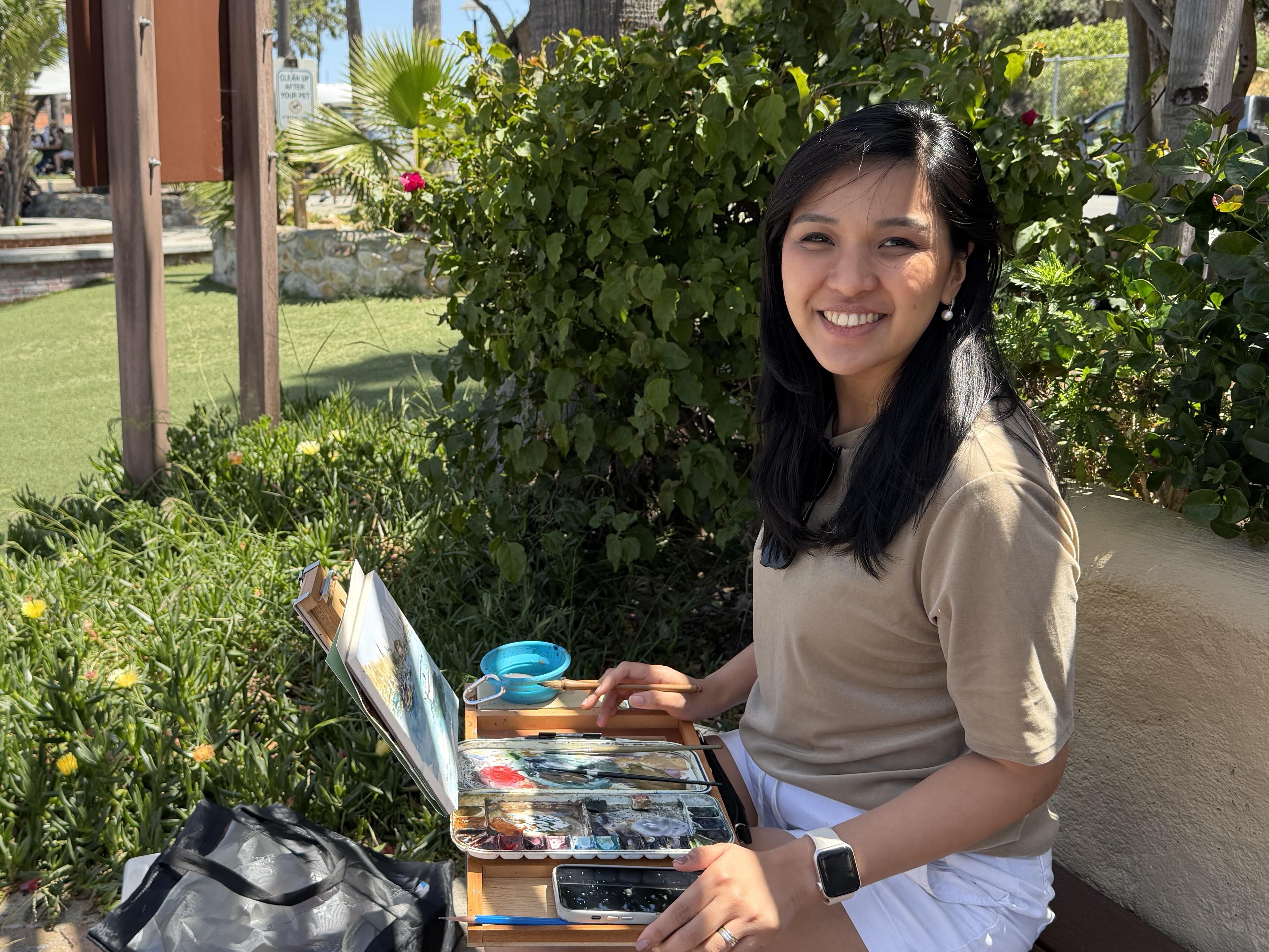
and Arkon Mounts. Recently, I visited Catalina
Island with my husband, and while walking
around the harbor, I was inspired by
the atmosphere. I love the sparkling water,
boats gently moving, warm sunlight, and the relaxed coastal
feeling of the place. So in this class,
I'll take you with me through my outdoor painting
process and teach you practical techniques
for sketching and painting outdoors with more
confidence and freedom. We will talk about the minds
edited for outdoor painting. I'll also share how to
choose what to paint in busy locations and how to gather helpful reference photos
for your future paintings. We will see how to simplify overwhelming scenes
and how to create expressive watercolor
paintings filled with atmosphere and story. This class is perfect
for beginners and intermediate artists who want
to loosen up their style. Gain confidence painting
outdoors and learn how to paint the essence of a place instead of
getting stuck in details. I hope this class helps you build rhythm of
creative practice, rediscover the joy
of painting and maybe even surprise
yourself along the way. I'd love to see your creations and hear about your experience. Share your sketchbook pages
with me on Instagram or in the class project
section here on Skillshare. I can't wait to see how you bring these paintings to life, so grab your brushes
and let's get started.
2. Essential Outdoor Painting Mindset: Before we begin painting, I want to share the most important mindset in
outdoor painting. Outdoor painting is not about painting everything perfectly. It's about learning
how to observe, simplify and capture
the essence of a place. When painting outdoors, many things constantly
change the light, weather, shadows,
and movement around if you focus too
much on perfection, the process can easily
become frustrating. So instead, focus on
capturing the atmosphere, the light, and the mood, and overall impression
of the scene. You don't need to paint every
detail because after all, you can always continue
refining or repainting the scene back at home using
your reference photos. So while you're
painting outdoors, take the time to truly observe, paint freely and enjoy the experience of being
present in the place.
3. Choosing What to Paint: One of the hardest
parts of painting outdoors is knowing what to
include and what to live out. When we visit beautiful places, our eyes see everything
like buildings, boats, people, signs,
shadows, reflections, trees, and endless tiny details. But if we try to paint
everything we see, the painting can easily feel
cluttered and overwhelming. That's why learning
to simplify is one of the most important
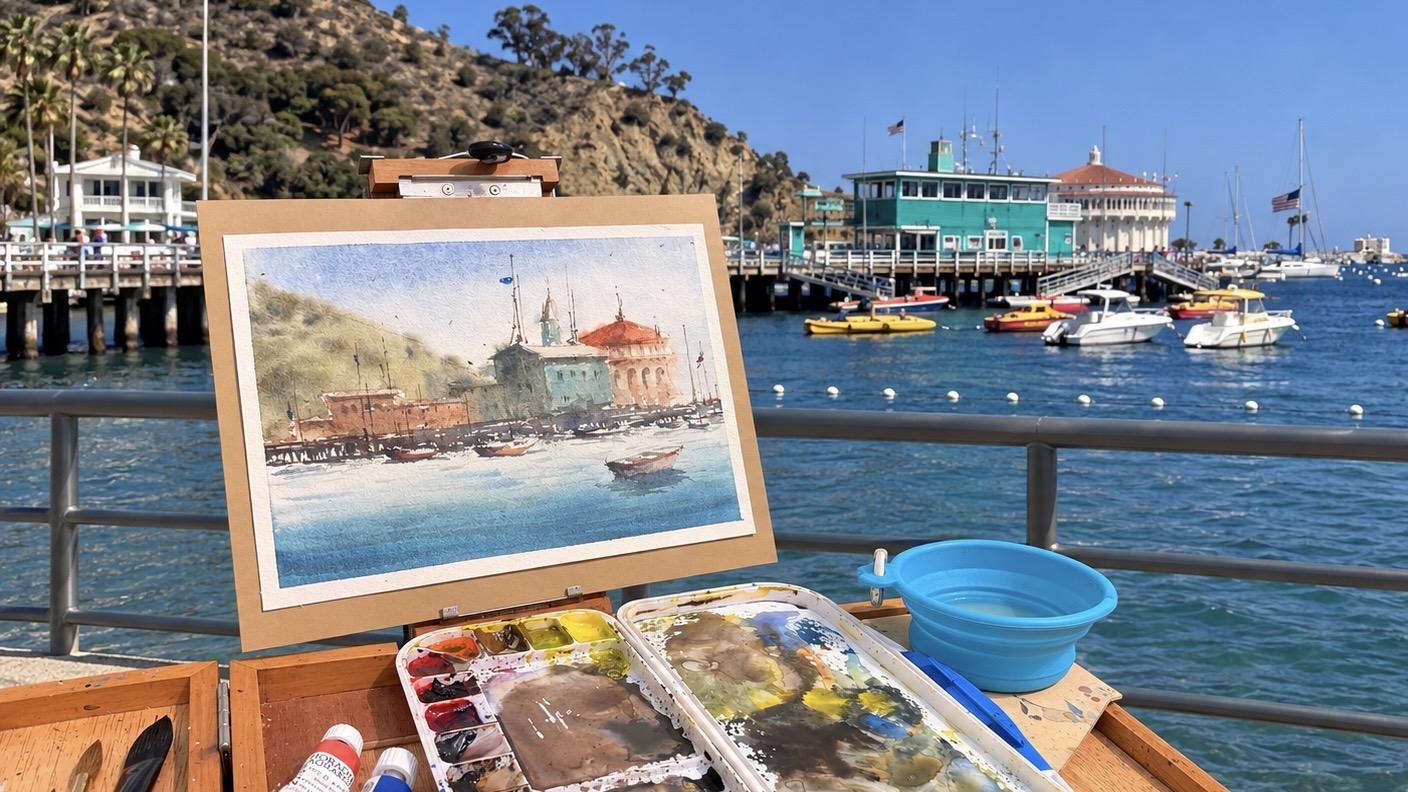
artistic skills. For this Catalina Island scene, the original location
was actually much busier than
the final painting. So instead of copying the
exact scene I asked myself, what drew me emotionally
to this place? For me, it was the
peaceful harbor, the warm sunlight,
the iconic building, and the calm coastal atmosphere. Everything else
became secondary. So I intentionally remove distractions like excessive
foreground elements, crowds of people,
unnecessary structures and overly complicated details. I also simplified the scene into larger shapes and group
details together. This helps create painting that feels more focused
and atmospheric. Remember, a camera
records everything, but an artist chooses
what matters, and sometimes the
strongest paintings come not from painting more, but from courageously
living things out. Another thing I highly encourage when painting
outdoors is to take plenty of reference photos while exploring the place. The purpose is not just
to document the trip, but to build your
own visual library for future paintings. Don't limit yourself
to only photographing the main landscape capture little details that may
inspire you later on. While walking around
Catalina Island, I took photos of palm trees against the sky,
colorful flowers, cast shadows on walls,
bolts and reflections, colorful awnings and
windows, textures, and little details that made
the place feel memorable. Sometimes these
smaller details become the most inspiring parts
of a future painting. Even if they don't appear
directly in the final artwork, they still influence the mood, the colors, atmosphere,
and storytelling. When taking reference photos, pay attention to
interesting light and shadows, pop of color, architectural details,
textures, flowers and plants, and little everyday moments that communicate the
personality of the place. You can also combine elements from different photos later on. Maybe the bods from one image and the flowers from another, and the lighting from a
different moment can all come together into one
expressive painting. Outdoor painting
is not just about painting what's directly
in front of you. It's about gathering inspiration
and visual memories. You can continue painting from long after
the trip is over.
4. Materials: In this lesson, I'll quickly walk you
through the materials I use both for indoor and
outdoor watercolor painting. One of the biggest lessons
I've learned from painting outdoors is to keep your
setup simple and portable. You don't need to bring your
entire studio with you. In fact, having fewer
materials often helps you make decisions
faster and paint more freely. For paper, I'll be using
a Bo hung 100% cotton, 300 GSM watercolor block
in the size ten by 7 ". I personally love using watercolor blocks for outdoor painting
because they're sturdy, portable and help minimize warping while
painting on location. For brushes, I'll mainly use two brushes from
silver brush Limited. The first is the
black velvet size 12, which is my primary brush for most of the
painting process. I love using a bigger brush outdoors because
it helps me paint loose simplified washes instead of getting caught up
in details too early. It also has a really
nice pointed tip, which allows me to
create smaller details and fine lines even
with a larger brush. For smaller details
and finishing touches, I'll use a silver silk
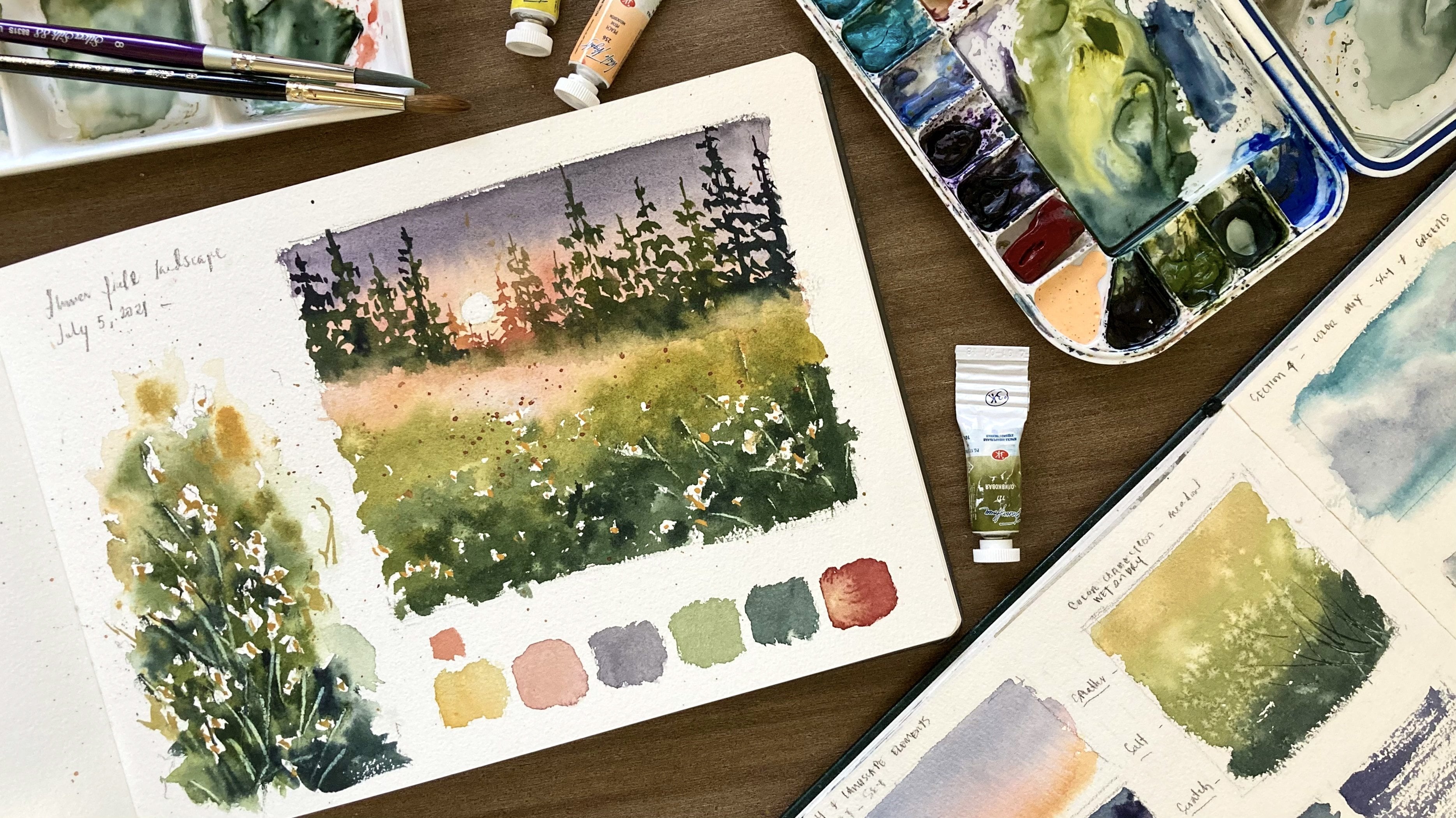
88 ultra round size six. For the paints, I'll be
using Schminka watercolors. I'll share the complete
list of colors in my watercolor palette in the reference section
of this class. I also encourage you to work
with a limited palette. This helps create harmony
in your painting and prevents decision fatigue
while painting on location. You will also need a
pencil, tissue or cloth, watercolor mixing palette,
and water container. Helpful but completely
optional is a poshad box and tripod or portable
outdoor painting setup, especially if you plan to
paint on location more often.
5. Pencil Sketch: When painting
outdoors, it's really helpful to begin with a
simple pencil sketch. The goal is not to draw
every detail perfectly, but to quickly capture
the big shapes and important elements that
support a strong composition. I focus mainly on simplifying
the scene and identifying the dominant shapes
that make the place feel recognizable
and interesting. I'll start by drawing
the horizon line, which in this painting sits around the lower
third of the paper. This line also
represents the port area that separates the buildings
from the boats and water. Next, I draw another
horizontal line to define the port structure. From there, I sketch the
mountain shape on the left side, followed by the roof lines
and the main building shapes. Big at this stage, I'm not trying to copy the
reference photo exactly. Instead, I focus on capturing
the essence of the place by simplifying it into
large dominant shapes. I select the elements that make the location feel
recognizable and memorable. Next, I also sketch the gazebo structure along
with a few important details like the tower and antenna lines that help suggest the
harbor atmosphere. Then I move on to the boats. I don't draw every single boat I see in front of
me or in our case, in the reference photo. Instead, I select a
few interesting shapes and cluster them together to create a balanced composition. Lastly, I add one
slightly bigger boat closer to the foreground to help create depth
and perspective. I also lightly sketch the
reflection beneath the boat. And that's our finish
pencil sketch.
6. Painting Process: Base Wash: Let's begin by lightly
misting the page with water. This helps the washes flow softly and naturally
on the paper. I start painting the sky using a very diluted yellow ochre mix. I paint broad loose washes on about half of the sky area while avoiding the roof shapes. Next, I mix blue with a bit of violet for the
upper part of the sky. I let the yellow and blue blend naturally on
the paper without touching them too much because I don't want the
colors to become muddy. I also make the upper
portion slightly darker in tone to create depth
and aerial perspective. I till the paper a little so the paint flows naturally
in that direction. Now let's move on
to the mountain. I take a creamy mix of
orange with a bit of yellow. Notice that the consistency
is richer than the sky, so the mountain
appears more forward. While the layers still moist, I drop in some
green mixture into the mountain area while still
keeping the roof unpainted. Then I mix a darker
green using olive green, ultramarine and burnt cena. I control the water in my brush, so the paint becomes
thicker and darker. Using dabbing strokes, I create loose impressions
of trees from afar. To finish this section, I splatter a bit of
water using my fingers. These soft blooms create a nice misty effect
in the background. Next, let's paint this
building on the left. I use burn channel mixed with
yellow ochre, and honestly, I like playing around
with my color mixes instead of strictly copying the exact colors from
the reference photo. I even add a bit of red to
create a subtle purple color, so the building won't
look too flat or boring. As I paint, I also try to
leave tiny gaps unpainted. Those little specks
of white paper create beautiful sparkles
of light later on. I continue painting
the next building using a tell like mixture. It's really up to you
if you want to copy the brightness of the
color from the reference. But personally, I prefer slightly muted and
neutral tones. That's why I soften
the color a little by mixing it in its
complimentary color. Now, let's paint the
dome of the gazebo. I use a warm orange red
mix and loosely paint the windows and frame
details afterwards. One important tip I
want you to remember is this focus more on tonal values rather than
exact color matching. Even if your colors are
different from the reference, as long as your tonal
values are correct, your painting will still look
harmonious and believable. Tonal value simply means the lightness or
darkness of a color. It's what creates depth and
dimension in a painting. A simple way to
identify values is by squinting your eyes while
looking at the reference. You'll start seeing
which areas are dark, light or mid tone. So here in our painting, I give the buildings more
dimension by darkening the shadowed walls and the
areas underneath the rooftops. Well, the layers still moist. I paint the rows of windows
using darker tones. For shadowed walls, I also keep the windows dark to maintain
consistency and value. Now, let's move on to the water. I tilt the lower
part of the paper so the paint flows smoothly
toward the horizon line. What we want to achieve is a soft gradent from the foreground going
toward the horizon. I mix a rich steel blue using cobal blue and turquoise and paint the
foreground water area. Mm Then I gradually add more water to
my brush as I move upward to create
a fading effect. Our goal is to make the water closer to the horizon
appear lighter in tone, so it creates depth
and perspective. I also carefully avoid
painting over the boats. Next, I intensify
the darker tones here in the foreground to
create more depth and contrast. Once I'm happy with the wash, I tilt the paper
back the other way. Then I take a darker, creamier blue mixture for
the waves in the foreground. One important thing
to observe is this, in the foreground, the waves appear larger,
longer and darker. As they move farther
into the distance, the waves become thinner, shorter and lighter in tone. This simple detail helps create the illusion of distance and space in the painting.
7. Painting Process: Adding Details: Let's continue
with the painting. In this part, we'll
focus on adding details in contrast to bring
the scene more to life. First, let's paint
the port area. This section needs
to be rich and dark, so it clearly separates the buildings from
the water and boats. I load my brush with dark
brown mixture using Bncena, blues and a bit of red. I try to paint with a light hand so I can control the
thickness of the strokes. I paint the bridge area
in the stilts underneath. And as I look at the reference, I screen my eyes to simplify the seemingly complex details into simple shapes
and dark masses. Next, I paint the reflections underneath using the same color. Notice that I still leave
a few tiny unpainted gaps, so bits of blue water
can still show through. It's very important to note
that as we do this step, the water fragment should
be completely dry. These small bricks help
keep the painting fresh and prevent the dark area from
looking too heavy or flat. I reload my brush with
paint and slightly vary the brown mixtures as I continue painting
across the port. It's okay if the
colors shift a little. That variation actually makes the painting feel more
natural and interesting. As I move toward the right side, you'll notice I intentionally leave more unpainted
spots because we'll later turn some of these shapes into lose
impressions of both. Next, I paint the
shadows underneath the roofs using
simple dark strokes. I also darken
portions of the wall slightly to create more
texture and dimension. Don't forget to paint the
reflections underneath using horizontal strokes to suggest
movement in the water. Now, let's start
defining some shapes by adding contrast
and darker values. I begin with the dome of gazebo using a darker orange red
mixture to bring out its form. I add a few loose lines and marks to suggest the
windows and structure. I also add a transparent
wash for a bit of texture. And at this stage, try not to overdo the details or
outline everything. You still want the painting
to feel loose and expressive. Next, let's paint the boats. Using a similar warm
color from the dome, I paint the outline of the boat. Then I soften the stroke using a damp brush while still leaving
some portions unpainted, so the chapon blend completely
with the port behind it. For other boats, I follow the same process and to show
the backside of the boat, I simply painted darker
than the side facing us. With a few thin
horizontal strokes, I suggest the
reflections underneath. Try to paint the boats using
as few strokes as possible, then soften the
edges where needed. I also add a few marks on the port area to
complete the scene. Just repeat the same process for the remaining boats while we still leave tiny unpainted
bots here and there. Now, for the last boat
here in the foreground, I begin with the backside
using a grayish mixture. Then I take a warm yellow
color for the side facing us and paint it using
a few quick strokes. I darken the edge slightly to help show the form of the boat. Next, I paint the reflection underneath using a darker
tone than the water. Add a bit of orange into the blue mixture to
deepen the color. Then I darken this
side a little more, and instantly the boat starts to feel more alive
and dimensional. I add a few tiny details inside the boat
using light strokes. Uh, Now, for the fun part,
painting the mask. You can use a line
of brush for this, but if you have a brush
with a really fine point, that works perfectly, too. I vary the height of the masks so they don't look too
uniform and symmetrical. O. I also add a few extra
lines here and there to exaggerate the middle ground and to make the
scene more lively. These tiny lines on the roofs
and boats may seem small, but they really help make the painting feel
alive and interesting. Keep your strokes light,
fine and organic. At this point, I slightly darken this wall area
to adjust the contrast. Then I add few final shadows
underneath the roofs. And some finishing touches
around the buildings. Lastly, let's paint
a few birds in the sky using tiny dots
and dabs of paint. I also add a few highlights and small accents
on the main boat, along with tiny flags
for extra character. And that's our final painting. Now it's your turn to paint. Don't forget to upload
your class project in the project section so
I can leave feedback, and so other students can also get inspired by your
beautiful work. Also, don't forget to check out the giveaway and get a chance
to win amazing prizes.
8. Final Thoughts: Thank you for joining me today
for this watercolor class. I hope this session helped you reconnect with your creativity and reminded you
that painting can be simple, freeing and fun. Although painting is not really about creating a
perfect painting, it's about learning
how to observe, capture the atmosphere
of a place, and enjoy the experience of
being present in the moment. Remember, you don't have to
paint every detail you see, focus on the shapes,
light, mood, and little details that make a place feel memorable to you. I hope this class
inspires you to bring your sketchbook
with you more often, explore new places,
and continue building your own visual library
for future paintings. I'd love to see your creations and hear about your experience. Share your sketchbook pages
with me on Instagram or in the class project
section here on Skillshare. Let me know which subject
you enjoy the most or how this practice helps
park your creative flow. If you enjoy the class, please consider
leaving a review. Your feedback means a lot to me. It helps me improve
my future classes and truly encourages me to keep
making more content for you. If you want to keep
going with your journey, I invite you to check out my other watercolor
sketchbook classes or try my watercolor travel
class where we paint scenes inspired by real
places and memories. They are a great way to stay inspired and keep that
creative momentum going. Until then, keep
painting with freedom, follow your curiosity, and I'll see you in the next class.
 Bianca Rayala, Top Teacher | Watercolor Artist