Transcripts
1. A Brusho Masterclass: Shows the easiest
art supply I've either use and believe
me, I've used a lot. And the reason why I say that is because you don't need to know what you're going to paint before you
actually get started. You can get beautiful results in seconds just by allowing
pressure to work its magic and
allowing the water to do whatever it wants to
do with the brushes. And in this class I'm
going to show you some of the magical things
that Russia can do. My name is Lindsay. I'm a self-taught
watercolor artist living in the UK, in Wales. I'm a mentor for
children and also a dog. Now, I'm a watercolor artist, brand new to brush. So if I can create
backgrounds like this, then so can you. Pressure was a really
simple medium to use that even my six-year-old daughter
is obsessed with it. This beautiful little
painting was made by my six-year-old
daughter and pressure was completely non-toxic
and lots of fancy you. So it's ideal for
children as well. In this class, I break the steps down on how to use brushes into bite-size chunks so you
can work at your own pace. I'll be using roadshow
in a fern and Freeway. Just play in an experiment in and not worrying about
the end results. But instead just seeing
what brush you can do and exploring the colors and
effects it can make. In this class, I'll show
you what supplies I used, the colors of the threshold. I'll be explaining briefly what pressure is and what
it can do as well. I'll be giving you lots of
tips on how to use brushes and lots of fun ideas of what you can do with
pressure as well. At the end of the lessons, I'll show you three paintings
you can create on top of these backgrounds that
you've made during this class, I'll leave a line
drawing of the turtle in the projects and resources area so you can go and print that off and then use it for tracing
or drawing over the top of and we will free hands the other two because
they're really simple to do. Let's go straight into
lesson number one way, I'll show you the supplies and the colors of the brush
that I used as well.
2. Colours and supplies: The colors of pressure on
the art supplies I'll be using for these lessons
are, of course, brush. I've got my watercolor paper taped down to my board
using some masking tape. I'll be using 100%
cotton watercolor paper. You don't have to use 100%
cotton for the brushes, but I do prefer to
use 100% cotton. And that's mainly all
I've got at the moment. I'll also be using some
soft watercolor brushes for the three tutorials
right at the end. So I wouldn't use
a soft brush if I was you because stiff
brushes will lift the brush. So I've also got a mini water spray bottle and I got this from Jackson's art, which is a art supply store. And I'm using some masking
tape by you and your brand. And I got this from Amazon. I'm also using a
pencil and an eraser. I'm using a range of things I found around the
home for texture. For instance, some plastic
wrap and also salt as well. This is rock salt, but you could use table salts. I'll be using brilliant reds, lemon, see green, violet, sandstone, black,
which is my favorite, turquoise, and lime
green as well. I'll also be using some designers quash
by Winsor and Newton, so you don't have to use
this particular brand. I'll be using this
on a small area of the forest scene that we're
gonna do right at the end. And actually, what pressure is.
3. What Is Brusho?: Bro show is essentially
a powder paint. It's very vibrant, water-based, non-toxic, so it's perfect
to use with children. And my little kids love
playing with my brush tool. It's also good when it
comes to light fastness, and it can be quite messy, but lots of fun to paint with. Russia is very
versatile and can be used in plenty of ways. The most popular
way are involved in sprint team water
on top of the powder and waiting for the
water to activate the color or dropping
powder onto wet paper. But you can also mix the
colors straight into water and use it as an ordinary
watercolor paints as well. You scrap pieces of paper to test each color and label them. Pressure has 32
colors in its range. So with quite a few colors, there are various pigments
within the powder. For instance, in
the Black pressure, there are orange, blue
and black colors. And some of the colors
that are multi pigmented, that means many colors within
it are the lime green, black sandstone, see
green, and mosque green. And I'm yet to try more screens. So if you've got
any recommendations on good pressure colors, let me know what's your
favorite color because I want to add more
to my collection. The colors mix well together. And even if you use
a limited palette, you could create a range of
colors within one painting. Brushes very unpredictable and lots of friends or paint with. And I love the
surprises that I got when I spritz my painting. It's great for a loose
and expressive style of painting and is much easier and
faster to learn than traditional watercolor
painting as well. In the next lesson, I'll give you some
helpful tips and techniques for using brushing.
4. Tips and Techniques: My first tip is to put a pin in the top of your powder tab. This will help you to only use a tiny amount because
a little goes a long way and I find this much less messy than
and doing the lid, I'm taking the powder
out from the top. Test your colors out on
scrap pieces of paper first. The color comes up different
from when you spray it. So you get a good
idea of how the color reacts on your paper when
activated with water. And you'll also get to see
the wonderful array of colors that may be included
in one little paths. I find it useful to
cut out little squares of scrap paper and
label each color so I could refer back
to them when I'm making choices for
my future paintings, the colors react differently on the paper and that
activated with water. So for instance, if a bottle
of pressure says it's black, it may not only be black, one sprayed are
activated with water. The powder crystals may
release numerous colors, such as blue, gray, and black. And I find it very
useful and lots of fancy create little mini
paintings using a mix of two or three and
sometimes four colors to see how the colors
react with one another. This is also gives me a
good reference to heap, so I can refer back to
them if I ever want to use that color scheme
in my paintings again, one massive tip for you is
to protect your surfaces. Things can get very messy
when you're using brushes. I like to put down an old cloth or towel and then
some extra sheets of paper towel over the top
for extra protection because brochure can be a
little bit staying in at times. I also find it handy to have
a cloth ready for wiping up excess moisture on the edges
of my paintings as well. With brush out, a little
goes a long way and it can be very easy to be
wasteful with pressure. So it's best to just sprinkle a little bit less than
what you think you should put on because you'll be surprised that once
you spray your brush, how far that powder goes. So practice with
sprinkling and spraying the brush to get the
consistency once. You may only want a small
explosion of color, or you may want the color
to bleed across the paper. Or you may want to tip your
papers so the colors run. There are lots of interests
in techniques you can use with brushes to get
interesting results. So it's a good idea to
have a little play around. Use brushes to paint beautiful
and striking backgrounds. My sexual painted the most
beautiful backgrounds. I framed this now
and we've hung it on her wolf or her to enjoy because the code is in this,
uh, so pretty. If you do end up
spraying your brush oh, too much and it ends up quite flooded like this. Don't panic. Just take a cloth or a tissue and just scrunch
it up like this and then use it as a sponge and just allow the tissue to suck
up the excess moisture. And you'll find
that it won't take the paint off it will it will instead just take off that excess water that's
floating around on the paper. And this works
really well for me recently on my recent painting. Lot brush, so dry
completely before working on top with
other mediums, such as pens, pencils, and watercolor itself as well. Because if you apply
that to the worst areas, you're just gonna get
lots of bleeding on. You're not gonna get
a nice crisp results. Next, I'll show you some of the things you can
do with brushing.
5. How To Use Brusho: Russia was such an
interesting medium to use. You can create beautiful
backgrounds like this. You can use brushes to add
texture and interest to your background paintings or for your main subject itself. And one thing that
I'm going to do is start off with some
brilliant red. So I'm sprinkling this down onto my watercolor paper and you can see that my paper
is taped down flat. And then I put some
lemon on as well. And all I'm doing is using my little spray bottle
to spritz the powder. And can you see how that
color is exploding outwards? This is such a fun thing to do. I love seeing the colors
explodes in front of my eyes. You do get some beautiful
little surprises. And then you can also sprinkled dry powder onto a
wet area as well. So I'm just going
to take my black, which is my favorite sprinkle
in a little bit of that on. I'm also sprinkle
in a little bit of turquoise and some
violet as well. And I'm being a bit haphazard with this or not really focusing too much on where the powder
goes because like I said, it can be very unpredictable. And they were also add in
some sea green there as well. I love sea green by the way. Then I'm just adding lots
and lots of water to this. So much so that I can tip my painting app and the paint starts to run on
flow down my paper. So what you want to do is
move your paper around in all areas so those colors start merging are
flowing together. If you want them
to be a bit more flowy and to move a bit more, you can use your
spirits or bottle to spray the paint even further. So, like I said, protect your surfaces
because you can see how messy this
has got in and I actually forgot to protect my surface is just for this
one little demonstration. But it can be very messy. Look at that beautiful result. It actually reminds
me of marble. So I think this is a really
lovely way to use brushes. And like I said, you
could sprinkle down the dry powder on top of
the wet painting as well. So I'm just adding a
little bit of lemon, a bit of sea green. And if you don't
want your color to flow out and run
around on your paper. You could just spritz
your powder a little bit so you get more
of a speckled look. You could also use reshow
like a watercolor paints. So add it to your palette. I'm actually using a ceramic
plate that I got from Tesco. I just sprinkled down
my powder and then added a little bit of
water using my paintbrush. Look at these beautiful colors. The one on the left is brilliant red and the one on
the right is black. And you can use these
like regular watercolors. Then I have to say that they are quite thin inconsistency
compared to watercolors. So it is quite hard to get
a thick and dark results. It's always a good idea
to tape your paper down really well because when
you add lots of water, you're gonna get back Olin. You could use a block
or stretch your paper beforehand and use
regular watercolor paper. I'm actually using
Canson Moulin de re. This is 100% cotton paper. You can use normal
watercolor brushes as well, because if you use
quite stiff brushes, they're going to
lift up the paint. So I would use a soft brush. You can also use regular things that you
find around your home to add texture to your watercolor
paintings with the brush. I like to use Crutzen
birds cling film, and also salt as well. This is just rock salts, but you could use
regular table salt. I'm also going to be
using a bit of ink in this demonstration as well in my other background
demonstrations, masking fluid is a really
good one to use with brushes as well to
preserve areas. Marker pens like paint
pens, and of course, regular watercolor washes and lovely medium to use
on top of brushes. But just be aware that
it is more opaque. So you're going to cover up the underneath layers and
also fine liner pens. So black waterproof pens
are a beautiful medium to use on top of fresco and
also white gel pens as well. I would not recommend this
art history one though. But I do recommend the sigma. You need gel pen,
I love this one. You can also use oil pastels. I've got a few of these oil
pastels send you to use. I also let these two below
pastel pencils and these are the truck vision and also some regular coloring
pencils as well. In the next lesson, we'll
be moving straight on to painting our
first background.
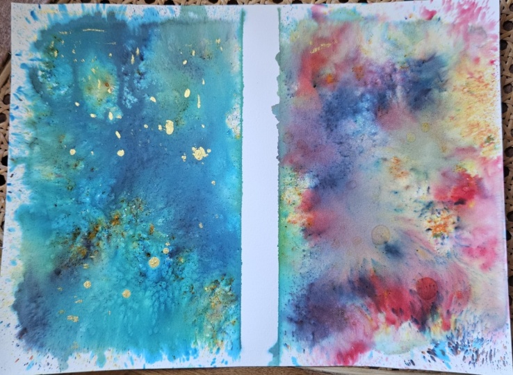
6. Background 1: Tip number one for
this background is to make sure you protect your work surface for this
one because it is very messy. I'm using my A4
paper taped down to my boots and I've got my cloth
ready for catching grips, starting with sea green. I'm sprinkling this onto
the paper in random areas, not worrying too much
about the placement of this and just
having lots of fun. Then I'm going to
add some turquoise. And again, I'm not worrying
about where it goes. Brushstroke is so
unpredictable anyway, you can't control
where it goes as much as you can with watercolor. I'm also popping on symbol icon. I'm concentrating
the block more in the corners and the edges. And you'll see at the
end of this actually produce an interesting results. And then I'll spray the
brush show to activate it. If you don't want the
colors to run together, you could have more of a speckles look with
lots of texture, then just spray
this a little bit. For this background.
I decided to really test out what
pressure could do. And I sprayed this so
much that the paints started to bleed together and run down the paper like this. I tipped my boys in a few different
directions to get the colors to flow
together and merge. Just have a practice with moving your board in
different directions. Keep your spirits
in bottle close to hands because if you're not getting the
results that you want, you can spritz your painting all the more to make it
really wet and make those paint the colors run
into one another more. And then taking my cloth
and just going to take off some excess water that was
gathering around the sides. And then I dropped in a
little bit of white ink. This is your choice if
you want to do this, but I got some beautiful
texture from the ink. Then I sprinkled on my salt. I only use a little bit
of salt and like I said, I'm using rock salt, but regular table salt
would work fine as well. The find it handy to
put a little bit into my hand so I can pick
out one page at a time. And you only want to do this while the paint is still wet, but not when your
paper is so Qin. So let the water evaporate slightly before adding the salt. Then you want to allow
the painting to dry completely before you
rip the salt off. In the next lesson, we'll have lots of fun
painting backgrounds. And in B2.
7. Background 2: I'm going to start with
the green because this is a beautiful mix of bright and dark greens as
well as a bit of yellow. So this is ideal for forests. And I had a forest theme in mind when I was choosing the
colors for this background. So I wanted to find
colors that would be found within a forest. That's why I went
for sandstone next, because this is a
mixture of orange, browns and blacks,
which were lovely together to create a
forest themed background. I also talked a bit of lemon on my paper as well
because the lemon would mix nicely with the greens to create yellowy
greens for lovely, vibrant and sunny feel. Next is some lime
green and I love this color is very
vibrant and yellow toned. So if you don't want too much
yellow in your painting, I will leave this color out. Taking my little water bottle, I started spraying the
powdered pigment on my paper. I'm holding the bottle roughly about 10 cm above the paper, so it's not too close and not more than an arm's length
away from the paper. And I'm making sure that I only spirits and if
water onto the paper to activate the brush
and leave it at that so that we get this
lovely speckled texture, which I think is great
for the field of leaves and flowers within the
forest background. I assume spotted
some white parts of the paper I wanted to
add a bit of color to. So I grabbed the sandstone
and the sea green assorted randomly sprinkled
the sprinkling the uploader, sprinkling the powder
onto the wet paper. Because the paper is still wet, the water help to
activate the crystals. You get instant color
appearing on your paper, which is so much fun to see further into this
class or follow on from this lesson with a forest
painting tutorial that is very simple to do and
super relaxing as well. In the next lesson, we'll paint backgrounds
number three together.
8. Background 3: Now we're going to
paint background three. And I'm going to start
off by sprinkling brilliant red onto my paper. You might want to
shake the bottle ileus a bit if the
powder gets a bit stuck. But I'm using a five by seven inch piece of Canson
paper, Phyllis one. And then I'm going to
add some lemon as well. I'll give it a little
spritz and then spray it some more to get the
paint and nice and wet, but not so much that it starts
flowing around the paper. Then I decided to
sprinkle some more red onto the wet areas as well. Take your plastic wrap
if you use an IT, scrunch it up a little
and then open it back up, place it down onto
your wet brush. You do need to do
this while the paper is still wet or it won't work. Move the plastic wrap
around to the fingers so you get the patterns
that you want on the paper. You can see how the texture
is going to turn out by looking at the marks the
rough is making on the paper. For instance, wherever the rock is pressed onto the paper, this will leave a mark in that
shape if that makes sense, and allow it to dry completely before
you remove the rock. But can you see how this has made some beautiful textures? You may find that your paper dries much more
slowly with the rap. So actually, I left this for goods
couple of hours to dry. If you don't get the desired
effect that you want, you can add a second layer. So you can go ahead and as long as the first layer
is completely dry, I add more paint. And then I just add
is another bit of my plastic wrap and put that
down on the paper as well. And then I started
moving around with my fingers pressing
it down in areas. So you can get a good idea
of the marks that this might make by seeing the marks and
little shapes on the paper, allow this to dry completely. But I love this effect and I love the texture
you can get with this methods that you
could never create with a paintbrush or paint by itself. Some of these marks I
think is so beautiful. This is the second layer
that I did with the green. Next, I will teach you how to paint the sea turtle
on top of backgrounds. Number one.
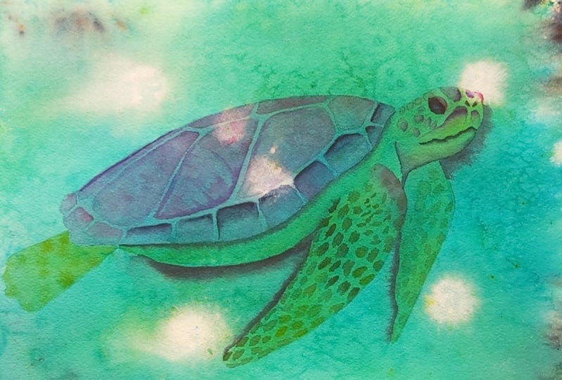
9. Sea Turtle On Background 1: In this lesson, I'll show
you how you can paint a simple sea turtle on top
of backgrounds number one, to transfer the
image of the turtle. I scribbled on the back of the drawing with a
soft lead pencil. I'm using a water-soluble
pencil for this one, but I usually just use a regular graphite pencil
in a tube or softer. Then starts off by laying
your turtle on top of your background and use
a fine printed pencil. I'm actually using
a mechanical when I start tracing over the design, you can lift the paper to
check if it's transferrin well enough and if
you've missed any areas, I start off by sprinkling some turquoise and lime
green into my palette. I'm using a metal tin, but you can just use a
plastic or ceramic palettes. Or an old plate would
work well as well. And then I'm adding
a bit of water to this to activate it. To start off with, I'm
going to start with some diluted dioxazine
violet on my brush and I'm painting are all
over the turtle's shell. You'll notice the brush or
Texas still show through. And that's why
I've kept my paint nice and watery because I want the paint to be thin
enough to still allow that underneath
layers to show up. I'm going to paint the head
flippers under the tummy and the back leg in a light layer of the lime green brushes
that I put on my palette, making sure that I keep this
nice and diluted with water to keep it really translucent
and that is see-through. That is, so we don't lose
that underneath layer with all the beautiful texture from our brush or background. Once thought lime green, whose dreadfully I add a
strip of turquoise underneath the shell to create a shadow
there because of course, the shell is a bit
wider than the tummy and will be casting
a shadow underneath. I'm taking a dump brush and
running it along the edge of that turquoise line just
to soften the edges. Then taking the turquoise
mixed with a darker color, I added a bit of indigo to this. I'm going to draw a bit of that in while the paint
is still wet to create a bit of dimension and bring more focus
to the head area. We're the road darker
areas and crisper edges. Your eye will be instantly
drawn to that area. And then I'm also going to add a shadow around the flippers
using the turquoise. So once again and then softening the edge
with a damp brush to taking them lime green brush, I'm adding some random
marks on the turtles front flipper using
the tip of my brush. I'm making sure to
paint these Marx wrote to the edge
because of course, this flipper will
be slightly curving around and the marks will
be curving around too. So if you paint these
marks at the edge, you'll make the
flipper look more like a 3D object and not so flat. And you can vary
the tone by adding water to dilute,
dilute the color. So in MEOs you got more
of a lighter mark. Then you can also take other
colors and mix them into your original color to
vary the colors and tones. For instance, I'm adding a bit of lime green
to two queries and vice versa to get some
different variations in color. You might notice that
these shapes are not very regular and crisp and perfect. I'm not painting on a perfect
square or a perfect circle. I'm just using the shape
of my brush really just to dab on
some random marks. So in areas I'm just
using the tip of my brush like I am here at
the top of the shoulder. And in other areas
I'm pressing down on the side of my brush or more
with the belly of the brush, get wider marks on. These shapes are very
irregular shaped. So just randomly pop
these marks on hover. Good practice on
a scrap piece of paper if you're not sure
how to make these marks, but they really are so simple. As a beginner, I
painted a Sita so like this and I found these
marks really easy to do. Remember that you can add some water to dilute the
color in areas and add tiny dots at the top
of the flipper for a variety in size as well. Now with my turquoise, I'm going to deepen
the shadow around the back flipper in keeping the color light with
lots of water because I want to push this one
into the background. And I'm also keeping them marks, the green nice and
diluted as well to make sure that it
stays nice and fuzzy. And after focus, because I want the front flipper
to be more in focus. So it's more of a focal point. If you keep your
paints nice and light, your eye is not
gonna be drawn to this flipper and it's going to look further away from you. Coming up to the head area, I'm painting the
tops of these marks in some diluted Villette. Then I'm going to
soften the edges with a clean, damp brush. While that's wet,
I'm dropping in a bit more concentrated violet at the top to add dimension. And this is a bit thicker. I'm adding a few little marks around the cheek area as well, just using the tip
of my brush on this is very diluted
dioxazine violet. Using my size six brush, I'm going to start painting in the mouth area with some indigo. This is a milk consistency. And I'm making this mouth
area very irregular, making sure to
wiggle my brush for this uneven mouth shape and then taking a dump brush
and just blending underneath to get
a nice soft edge. I'm also going to start painting onto the top
of the shoulder with some diluted violet
and permanent rose for a pop of color
there as well. I just felt like it needed
to have a little bit of warmth there to bring
that shoulder forward. Now with slightly more
concentrated violet and this is more of a
coffee consistency. Now, painting the patterns
on the turtle shell, making sure I paint right to the edge because
like I mentioned, the turtle's shell
is going to be continuing on and curving
around where we can't see it. So it helps with
the illusion that the shell is a curved object. If we paint right to the edge, then I'm going to add
some thicker paints. And this is violet
again on top of the wet area that
I previously laid down to create the
texture patterns that are on the turtle shell. Because we're popping
this into wet paint, those those colors are going to bleed out and blend out
and become nice and soft. So we're gonna get some lovely
markings on the shells, the shell there afterwards. I'm also going to add some thicker permanent rose in areas, but only a little as well. And I'm making sure there's
not too much water on my brush when I pop
in this second color. Because of course we don't
want to add blooms to these, these patterns on the shell. Feel free to use whatever colors you want on the
turtle, by the way, because obviously it's nice to experiment with different
colors to what I'm using. As long as you've got
the right values, That's your darks and lights, you'll be completely fine. You're ghetto lovely results. Do remember to share
your paintings with me because I love seeing
your paints and so it gives me new ideas of
colors that I can use. I love seeing your
color palettes. And also it gives the students a good idea of what to expect
from this class as well. One thing I want to
make you aware of is how light I'm actually
keeping my paint layers. And although this layer is
thicker than the first one, it's still nice and
light to be able to see the wonderful textures
that we created with the brush held prior
to this lesson. Here I'm adding some nice
and thick dioxazine violet. And with the tip of my brush, I'm going to start
pulling it over and curving over these lines. And that's going to
create that lovey lines, textures that sometimes
the turtle's shell has a low this to be wet on wet
because then you're gonna get some nice
soft and blurred edges. So continuing to paint the
patterns on the shell, I'm just going to continue
with that sequence of layers. So firstly in down the Villette, and then I'm gonna go in
with thicker paint and just drop in around the
edges on the corners, some thicker paint
in the same colors, and also a bit of
permanent rose. You could always mix two
colors together as well. So if you use in a
violet to start with, and then a permanent
rose on top, you could always mix
the permanent rose on the file it together
just for making sure it's a bit thicker so you get a
variation in colors when you lay this down onto your
first layer of the, if the shell, making sure that you paint
right to the edge, like I said, to make that shell look like it's curving around, I'm going to mix
some failure blue into the permanent rose now. But if you're using
another blue, you could just mix it in
with your pink or use a dark blue or gray
or whatever colors you're choosing to use, just make sure it's maybe
a slightly darker color. I'm going to start painting at the top of these bottom marks. Taken out with lots of moisture
from my brush and just using a clean, damp brush
just to blend the bottom. So this is a clean damp brush. Like I said, I rinse
my brush off really well and then dabbed
it on a cloth to make sure there's
not too much moisture and water in my brush
because if we add too much water to the
paint is going to start pushing the paint
up and we're gonna get cauliflower ears
and backgrounds. So make sure that
your brush is only damp and just blend
it all the way down. And what I like to
do is actually paint the water all the way
down to the bottom so we don't get Adrian, mark, I'm going to
continue to do this. I'm just painting the
dark paint halfway at the top of that
bottom marking. Then I'm just using my damp
brush and blend in the edge. So all I'm doing is
running my damp brush over the edge of the
paint that I've painted. And here you'll see that I'm
putting a darker paint down, so it's ever so slightly darker. And that's because I
wanted the back of the turtle to remain light. So it brings the focus more to the head and the top
of the turtle's head. They're just using a damp brush and you could see that I was feeling my brush
to make sure there wasn't too much water in there. So you can actually feel
that with your fingers. You might be wondering what
color I used for this. And this was just a
little bit of indigo added to the fellow and
permanent rose mixture. But like I said, you could
just use a ready mixed gray or a ready mix blue or pink or whatever
color you're using. I think violet or maybe a dark green or blue is where
it really nice and this area, even a black boat
ferry watered down. Now I'm adding some thick
indigo into the wet areas, so I'm just applying this well, those markings are
still wet and you can see that that paint
is bleeding down. But it's not bleeding as far down as it would if
it was more watery. So I'm just using a damp brush to blend that out a little bit because I felt like
those few markings I want it to be a bit darker, which are closer to the head. And that'll help to bring
more focus to the head area. Then within those
colors are darker. I'm going to use
some clean water on this back fin now and I'm
just using some fairly, fairly diluted lime green. I'm just using the tip of my brush to add a
few little markings. The reason why I'm keeping
these colors nice and light is because like I said a
little bit earlier on, I want this back fin
to look like it's more foci so we don't bring
much focus to that area. When things are fuzzy, it looks like they're a
little bit further away and we're not drawn
to that area, so I don't want to
bring focus there. Now I've got some
more dioxazine violet on my brush and it's
slightly thicker. And I'm just painting around the tops of these
markings on the face. And then using a damp brush
to blend the edges out. Taking some permanent rose, I'm going to paint around
the edge of the eye here and then just blend out the edge
with a clean, damp brush. And I'm adding a little bit more because I felt
like that color really lightened just using
my size six brush for this. And then I'm also
going to paint that permanent rose around the
bottom of the eye as well. I'm also painting the nostrils in some nice thick Payne's gray. And then I'm going
to paint around this eye as well with
the permanent rose. And if you've got a better color than permanent rose
to use on the eyes. Go ahead and do that
because I was really unsure what color to
paint these verse. I knew that I wanted
this to be a nice, warm color to meet
those eyes stand out because last area of the eye is going to be quite
rounded on bulbous and it actually
does poke forward. Now I'm taking my
dioxazine violet mixed with a little bit of
indigo and I'm just going to paint a shadow underneath
the chin and just blending out the bottom here as well with a clean, damp brush. Now I'm going to
take my black and activate it and look how
beautiful that color is. What I want to do is wet
the bottom underneath the turtle around the fence as well with some clean water. Then taking my size two brush, I'm just going to
start painting the black onto the wet
areas of the paper, allowing some of
it to bleed down. So I don't want to take this black too far into the painting because I don't want to cover all that beautiful underlayer
that we've put down. But I could see that the
bottom tummy area and also the flippers were
getting a little bit lost because they're
so light in tone, they were getting a little bit
lost with the backgrounds. The lime green and also the turquoise is
quite similar colors, so worth, it felt like
it was fading away. And I wanted to create a bit of a shadow to make the
turtle pop off the page. I also wanted to bring
focus to the head area, so I was wetting around
the head as well. And I'm making sure that I paint that water further
than what I want this dark color to
travel because I want to keep keep the
edges nice and soft. So if you paint your
water quite far out, then you're going to
remain with soft edges. I'm also going to take
some phthalo blue and I'm just painting the middle
of this eye here. And then you can
allow this to dry. But I didn't allow the
blue to dry fully. Just be careful because if you don't allow it to dry completely than that black is
going to really sort of bleed into the blue area, but I didn't mind it
bleeding a little bit. I'm taking some nice thick and
concentrated Payne's gray. So this hardly any water
in my brush and paint. And I was just painting
around the eye area. Now I'm just going
to focus on adding a little bit more darkness
and detail to the mouth. So you can see I'm not painting
the whole of the mouth. I'm just adding a bit more of the Payne's gray
over the mouth area. And then I'm going to take
my permanent rose and I'm going to darken up
around the eye area. They're also taking the permanent rose around
the bottom of the eye. And I don't know
if you can notice, but my paint brush
is actually dragging over the paper and that's
because this paint brush, I've had it for a while
and sometimes it can be a bit can dry
out really quickly. So if you don't want
that to happen, then just put a bit more
water in your brush. And then I was just blending
around the eye area. But here is our finished turtle. I think you can agree that
this looks beautiful on that blue background that
we put down prior to this. So if you've not got
a blue backgrounds, just experiment with your
background and just have a look at it and think of some inspiration of
what to paint on top. You could always go on to places like Pinterest or Google. Just have a look at
reference folk tales, typing animals or
landscapes or objects. And just have a look at
the background colors. You'll get a really good
idea of what you can paint. But look at these beautiful
textures in this background. I love how the ink tuned
out with the background, and also the beautiful colors in the black on
the edges as well. This is definitely inspires
me to try and move racial backgrounds like
this unused brushing or in my paintings as well. I just left that random texture that you can get from
using the brush. So I'm using the ink on top. I can, I think you
can agree that this has worked out really well and I've also used
a bit of salt in this as well to add lots
of beautiful texture. Next step, I'll show you how to paint a forest on
the background. And number two that we did.
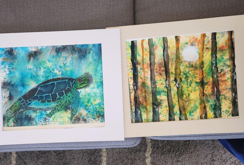
10. Forest Scene On Background 2: In this lesson, I'll be painting some simple trees over the
top of the backgrounds. Number two that we did, this is really easy to do. So grab those paints
and let's get started. I'm going to start off
with quite a large brush. So this is my size
12 round brush. And I'm going to
start off with some very pale, burnt umber. You could use any brown color. So a sepia or Van **** brown or even a yellow ocher mixed with a brown
would work really well. This I found was
quite yellow toned because I wanted
to keep the colors nice and light to start with. And I'm varying the width
of my trunks as well. So some are a bit thinner
and some are a bit thicker and I'm not worrying about being too
straight with these. I'm wiggling my
brush a little bit because trees are not straight. They do have lots of bumps and nooks and crooks and
all sorts in them. So have your trees quite wiggly to make them look
a bit more natural. Then I've got some indigo
on my brush and I'm just running a quite thick version
of that down the one side. I'm concentrating my shadows on the right-hand side because I want the lightest area to be in the middle where
we can put the sun. And then on the left
trees I'm going to put the shadow on
the opposite side. So this is just a
nice thick mixture. And I'm using my size
six brush for this, so it's a smaller brush. I'm working wet into wet. So I'm putting wet paint
onto my wet trees. And the reason why I'm using a smaller brushes to make
sure that I'm not adding too much water to the paint because I don't
want to get any back runs. So you can see that
I'm just being a bit haphazard with this. I'm making sure that
some of the thoughts at color comes out a
little bit more. So it's creating more of a
like a nodule in the tree. And I'm not being completely straight with
these lines either. I'm being very irregular. And then if you're not getting the bleed that you want
and you want to soften it, you can use a damp brush. Now, I'm using a bit
of the black brush oh, mixed in with the burnt umber. So this is quite dark. And I'm adding some
darker trees so that these trees look a
little bit closer to us. Because if something is darker, it's naturally going
to look closer to you. So I'm going to add
my burnt umber tree. And then I'm going to
run down the one side. The indigo, indigo
is really thick, so it's naturally darker and it's not going
to spread too far. You can see I'm not being really strict with these trees again. And by using a larger
brush for the trees, it's going to stop
you from Ferguson and making these trees too perfect. You're also gonna get a
larger amount of paint on the painting quicker as well. I highly recommend using very small pressure with your brush and using
a soft brush as well. Because I did find that the
brush lifted really easily. I'm going to use some
standard sandstone and some lemon and mixing this
together on my ceramic plate, I wanted to add some
trees in the middle, lots or more yellow tones. That is because we're going
to pop the sun in the middle. And I want the lights to
be shining on these trees, on creating more of a glow. Keep your colors nice and light. So add lots of water to your paint to keep your paints
nice and see through that. This allows the brush, your backgrounds
to shine through. I think the magic about painting on top of the brush
or background that we've created is seeing all
that beautiful texture underneath your actual painting. I think it makes it
so interesting on, I can't wait to try brush like this in the future more
with my paintings. Now I'm using some
wounds and again, I'm just using a light version
of the burnt umber and I'm bringing that down the top of the tree and on the
left-hand side as well, and also the bottom. I want this part of
the tree to look like it's got below from
the sun on it. So that's why I've left
the paint from there. I want that to be
the lightest area. Then I'm adding some indigo
down the left-hand side of the tree and also the bottom
as well to create shadow. I'm doing this all wet into wet so we get a nice
soft blurred edges. And then I'm going
to add another cheat on the right-hand side as well. And can you see how
I'm keeping my paint? It's got lots of
water mixed into it. But the brushes, when
you add water to it on your palette is naturally
quite light anyway. So just make sure that you add a little bit
of water to this. And then I'm going to add
some burnt umber at the top, on the right-hand side, and also at the bottom as well. So I'm just running this down
the one side of the tree, making sure that we keep that middle part
and nice and light. I want to imagine
that the light is shining in-between those
trees from the sun. And it's creating a natural beautiful
glow on those trees. And this is going to
make the virus look very mystical and
very eager. Louis. I've got a nice dark mixture
of the indigo again, and I'm just reading
that down the one side. And I purposely painting this little nodule thing coming out the side of the tree because if you have
a look at trees, they usually have little
bumps sticking out. This is going to make
the tree look like a tree and a bit more natural. I'm also going to put some of
that indigo at the bottom. If you want this to
be a bit thicker, you always more welcome
to run a nice dark area on the bottom and also a bit more on the
right-hand side as well. I'm just using my very
thin brush to put in some thin trees and this is with the sandstone
and yellow mixture. Again, I'm just using my
size six brush for this. Also using the tip of
my brush to run down some very light burnt umber
just done the one side. They wanted to keep these
trees Olivia light, so it looks like they're
further away from us. I don't want to draw too
much focus to these ones, but you can see I'm
wiggling my brush to make these look very wonky trees. I'm going to use
some gouache now. I'm just using my large brush to wet this area in the middle. And can you see how
a little bit of the brush or lifted so be
very gentle with your brush. And then just using
my smaller brush, I'm just going to
add some wet wash. And then using the tip
of my brush to bring out these little sun rays. I'm just using the
tip of my brush and it's quite clean my brush, so it's not got too
much gouache in it. I'm just flicking
the ends out to create these little
rays of sunlight. I'm going to take
a thicker mix of the gouache and just pop a
little bit more in the middle. So it looks like it's really
glowing through the trees. Once the gouache dries, it will dry, lighter. So if you put your
brush down and think that's come
up really bright, Don't worry, it's going
to dry a bit lighter. I love how simple
this was to paint. I level the beautiful
textures in the background, the speckled look of the brush. I don't think you could get this using watercolor and alone. And I love how vibrant
the colors are as well. Because I've used my
paints nice and light, just still getting locked
brushy texture showing through. It also helps to add
texture to the trees. And I think this is a really
interesting and fun painting to do, a very simple. So if you're a beginner, certainly give this a go. It really is that easy to do. Next, I'm going to be using my posca pens on top of
backgrounds number three.
11. White Feather On Background 3: In this tutorial,
I'll show you how you can use markers or paint pens over the top of your dry
brush your background to create simple patterns such
as this white feather, all sorts of y using some
simple curved lines and then make those lines
thicker in areas by filling them in with
a white posca pen. I'm trying to make both
sides symmetrical, but it really doesn't matter. I want to do is have fun playing around with your chosen medium and see what results
you can get from using it on top of your
brush or background. I find this super
relaxing actually, as it allows me to
just let loose and do whatever I felt like
doing in the moment. This is a great opportunity to relax in the evening before bed. Or if you're watching
TV and you just want to play with
your creativity at the same time because it's something you can have
on a tray on your lap. I decided this is a great way to test out my new posca pens because I'd held onto them for a few weeks and I didn't really know what to do with them. But when I saw these
backgrounds finished, I decided this would be a great time to play
around with them. I've got a range of
different colors, such as this metallic
blue with a thicker nib, and also this pink pen
that's I choose to use for simple curved lines. This added a pop of color and
playfulness to my feather, but it also gave me a good idea of how I could use these pens and the effects I can get from using pens on top
of brushes as well. So all I'm doing is adding
some simple dots and shapes the sides of my feather. And this was really simple. I was surprised
actually by how well the posca pens worked on
top of the brush shell. So I'm just using
this pink pen here. This has got a finer nib. Then just carefully drawing
a nice little curved lines. I encourage you to get out
those art supplies you hardly use and have lots of fun playing with them
on top of your brush. So now we're coming towards the end of this masterclass and I
hope you enjoyed it. In the next section, I'll be setting a
project for you. So be sure to watch
this to the end. If you're looking to
help me in any way, the best way you
can help me is by leaving me a review
on this class. It gives me a really good idea of future planning and also gives other students
good idea of what to expect from this
class as well. Finally, I carefully
removed my masking tape. When I removed the
washi tape or forgot, I still had some masking
tape underneath. So I did panic at first thinking the painter blades
underneath, but it hadn't. And soon I had this beautiful
white boards are left behind which I think makes
the painting look very clean. Look at this beautiful
texture brushes has created. I don't think you
could get this type of texture by using any
of the medium alone.
12. Project and Final Thoughts: Thanks so much for taking this class and I'm going
to set you a task now. And that is to create a fun and colorful background
using the techniques that you've used in this class. Use your background
as an inspiration on what to paint for
your main subject. You could use the
colors that you've used within the brushes for
your main subject. Or you could use
complimentary colors to really make
that painting pop. You could also use high
contrast in colors such as a dark color on top of
your bright background. But of course you don't
have to paint on top of the background is
completely up to you. If you want to paint
something on top of it, you could always just
leave it as it is and enjoy the bright
and beautiful colors. Because in itself I think that that is a lovely
thing to frame. And you could also use the
shapes that the brush was made to give you inspiration
on what to draw or paint. Remember, you'll find
a line drawing for the sea turtle in the projects and resources
area of this class, some of the things you
need to remember or to use some scrap pieces of
paper for testing your colors and also
testing your techniques onto before actually
popping them down onto your main
piece of paper. That helps you to sort of
know what brush you can do and what sort of techniques you can use on your main painting. Or you simply could just throw all the brush
awhile and just have fun on your main painting
and just see what happens. Because what's the worst that could happen at
the end of the day, you're gonna learn something
new and you're going to have a bright and beautiful
painting at the end of it. If you've got any questions,
please reach out to me. That's what I'm here for and I'd love to see your creations, share them with us in the
projects and resources area, all you need to
do is either take a photo and upload that, or you could scan your painting
and upload the file to the projects area if you've got some use from this video
and you want to thank me, the best way you can do that
is to leave me a review. It helps me to plan
future videos. And it also gives students an idea of what to
expect from this class. Have a lovely rest of
your day. Happy painting. Have lots of fun
with the brushes, and I'll see you
in my next class. Bye.
 Lindsey Dawn Art, Watercolour Artist