Transcripts
1. Welcome to Illustration From Your Photos: How many times have
you been out on vacation and snapped a picture? Because you really want to
paint that when you get home. But then you get
home and you open the picture and you
feel overwhelmed. Or maybe the quality
of the picture wasn't what you
had expected in C, you're not quite sure
how to paint that. Well, this class is
all about taking a photograph and
pulling elements from it to create a
composition of art, paint and feel
really great about. We are going to take a photo that I took while
I was in Scottsdale, Arizona and pull
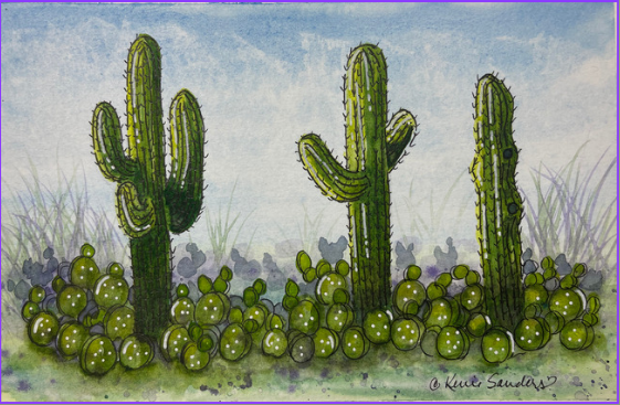
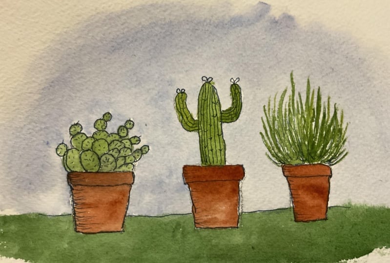
elements from that and create two different
cactus landscapes. That's right, cactus he
made beautiful guys. I live in Cactus country. I live in St. George, Utah, just outside of beautiful
Zion National Park. I have a studio here and
it's so gorgeous with the Red Cliffs and the red rocks that we go out and do
plein air painting. We do urban sketching, and we do in studio painting. And I'd love to have
you join us some time. But this class is
all about taking that composition and creating
something beautiful. Even if your photo is overwhelming or not
quite so beautiful. We are going to learn some great watercolor
elements along the way. This class is for people
of all abilities. If you follow my
instructions step-by-step, clear videos that
are easy to follow. Anyone can do this. We will be learning
some things such as washing in, highlighting, adding some shading
will be doing, some flattery, will be
doing some blazing. All the basics that you'll need for watercolor will be there. And then you can learn
from this and pull from your own photographs and create your own works
of art in the future. Sounds like something you'd
be interested in doing. I would love to
have you join me, so grab your paints
and let's head back to my studio and let's
get started together.
2. How to Isolate Elements in a Photo: So often we take
wonderful pictures on our vacation with the intent to paint them when we come home. And then they just don't seem to look quite right on Canvas. Today, let's talk
about how to pull elements out of our photos and create a nice
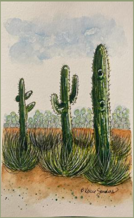
composition for our art. Look at this photo that I
took in Scottsdale, Arizona, and the prickly pear
is clear in the back, but we have taken
that element and used it today in
numerous pieces of art. Also, this tall cactus in the front is facing
the wrong direction. It's not spaced nicely, but we have taken
that element out and switched it around and
used it to our benefit. The key guys is to choose
first-year element and then where you
want it placed and what values you'd like to use. Look at this tumbleweed
section in the front. It's beautiful and we've
been able to utilize that in pots as well as in
the front of our painting. And look at these trees in the background that we
didn't even get to use. They would make a nice
backdrop to any piece of art that was using something that with a
little more greenery. Same with these trees that
are on the left here. They would make a nice filler on the background or on the
side as you're seeing here. Or you could also be utilizing this nice little cactus
tree in the front. That's little stringy looking. And so I didn't
want to use it in the piece we used today. But there's a lot of options
that we didn't use as well. Look at this yellow
background here. It's a nice filler, gives some nice color that can be utilized in many pieces, as well as the greenery
behind that piece. And so as you take a look at your pictures, pull them apart, looking at them as elements
instead of the whole picture. My final suggestion for
you today is to take those elements and keep
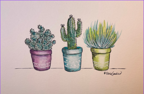
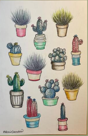
them individualize. Throw him in some
cute cactus pots or planters and have fun with them, like put in some bright
colors and make them pop art. Or maybe some softer subdued
colors for some Beaux Art. Just have fun with
whatever you're doing. Be creative and trust yourself. I'm so happy that you're
here and that you are exploring the world of art and treating yourself
to some self-care. Good job. And thank you so much
for including me in this pathway that you're on. I will see you in
the next video.
3. Cactus 1-Supplies, Sky and Foreground: Hi everyone. I'm so excited to get started
on this cactus piece. First of all, I have gone ahead and sketched this onto
my watercolor paper. You can sketch it on
lightly as I have done. Or if you're not quite
comfortable doing that yet, you can use the PDF that
I have provided for you. It's on this Skillshare
page and you can print that out and apply the pattern
using graphite or a light box. But before we dive in, it's really important for us to review a couple of
supplies and we're going to do some color
swatching because we will be blending
our own colors. I always recommend that we use good-quality
watercolor paper. Now, good-quality
doesn't mean it has to be really expensive. Canson is very affordable, but I do recommend always using 140 pound watercolor
paper or better. That cotton paper
is going to work well with the watercolor
that will you be using. And you invest so much of your time in making
a wonderful piece. And you need that watercolor
to interact well with your paper to get the best
results, so it's well-worth. This is the one thing I say, spend a little the
extra money and get your 140 pound watercolor paper. You will not be sad
that you did that. Alright, for brushes today, I have just pulled a variety
of watercolor brushes. I have some rounds. I've got some flats. Just pull your favorites that
you're comfortable with, and that will be just fine. There's nothing specific. And I always have my
handy-dandy tissue. We'll be using a lot of this. We'll be doing some certain techniques that
will require this. But it's also great for just dabbing off any little mistakes. Or keeping that
watercolor in line. If it goes somewhere,
you don't want it to go. And of course, you'll
need some water and a palette to work with. And you always need
a little strip of watercolor paper that you can
test your color values on. So along those lines, let's talk about our paint and we're going to actually
color, swatch it together. We're going to be using lemon
yellow, light green, sap, green, forest green,
civilian blue, and violet. So we want to be really comfortable and familiar
with what these paints do. I always recommend starting
out with a color swatch. This is full strength of
lemon yellow and then dip your brush into water and just bring that
down so you see the full value to light value that that
paint provides for you. This is the light green, which is a nice yellowy green. It's perfect for
highlighting or for the light side of vegetation
that you're painting. Love it and it's going to
work well with that yellow. This is sap green, It's
a nice deeper green, but it has a yellow undertone, so it works well with the
other colors that we're using. We'll bring that down
to a light value. This forest green, It's kind
of like a phthalo green. So if you have a phthalo
green, that would be fine. It has a lot of blue in it
and you might be going, wait, we just put all
these yellow greens and now we're doing a blue. That's because we are
going to do a lot of blue tones in this painting. If you think about
cactus and sage brush, it has a very blue
undertone to it. So this is surrealism blue, one of my favorite,
favorite blues. It's used a lot for skies
and oceans and blending. It's just beautiful
and versatile. And here is a deep rich
violet, which is beautiful. We are going to use this
for blending as well. Alright, so those are our
main colors for today. We are going to be doing a little swatching,
as I mentioned, if you think about
sage brush and cactus, it's going to have
that blue hue to it. So let's, let's just play
with this a little bit. We've got some wet
surrealism blue. Let's add a little bit of the light green
with this cerulean. And you can see, if
you look at that, you get a nice blue-green. And let's add just a
touch of sap green, which is the darker. And you get a
little darker tone. Mixed with that,
it's really in blue. And so we'll be
using that as well. And we will be using a bit of the sap green with our violet. And that's going to give us, if you look at that color, That's going to give us a nice rich shadow
that we're going to use in the foreground of our cactus here and
there on the background. So that'll be nice. So go ahead and
gather your supplies. You didn't test
this out with me, then please take
a moment to test this out before you start. We are going to begin
this piece by painting. Our sky was really in blue. You can either paint yours in straight and make it a little darker on the top
and bring that bead down and do it lighter
towards the bottom. Or you can follow me. I'm going to make mine
a little wispy cloudy. I'll show you the
reference photo. That's how it is there. I'm going to use a
medium-size round. This is a number eight
and pick up some of that. It's really in blue. And I'm going to start
with a little bit watery. And I'm gonna go right over
the top of the cactus. That's okay because remember our cactus is gonna be in
the blue tones anyway. So it's not going to matter. Now you do have to work fairly quickly because we want to
work with it while it's wet. So first I'm just going
to bring that down. I'm going to stop at
the horizon line. There we go. Now I'm going to start at the top
again and make it darker. Picking up some more paint. You can see it. Now I'm going to say, excuse me, I'm going
to add a little water midway just to lighten
it towards the bottom. Now, I'm going to
take this will blend, don't worry about those streaks. I'm not worried about them. When to take just two
pieces of my tissue, my handy-dandy tissue, and it's going to scrunch
it up a little bit. I do like kind of a smooth
spot that I can work with. And I'm just going to lightly
dab kind of here in there. You notice I'm turning my wrist, turning my hand, and I'm
keeping up towards the top, but not all the way to the top. I do want some blue
up there and it will help distinguish some
of these clouds. Good. And I like having that
distinction like that. I'm going to let
the water and the, the paper do its thing. It's going to soften it. I'm just going to soften this
bottom edge a little bit. And especially the horizon line. We're going to have
our cactus is going to come up over that
line and I don't want a hard edge that I'm trying
to cover with cactus. I'm just going to soften
that a little bit. Great. Alright, And while that's wet, I'm just going to wet it all
the way down to the bottom. Now we're gonna do
a little wet on wet towards this bottom area. And I'm gonna go ahead
and add a little bit of light green. Not much. It's very thin down. And then I'm going
to add a little bit of surrealism, blue. Oh, isn't that pretty?
Because it gives it a touch of blue Greenfield. Remember, we're going to
fill this in with cactus, so we're giving a little bit of a foundation to our cactus. I'm going to put
in some streaks of hello or forest green. That's that blue-green. Going to add a little
more dimension. And because it's
wet, you can see the paint just blends nicely. You don't have to
worry about streaks. And then I'm going to come in with a little bit of violet. Yes, indeed. More towards the back. Not going above
the horizon line. The touch here and
there in the front. I'm liking that. Just a touch more blue, I think. Alright, now we're going to watch this when it
reaches a certain point, we're going to splatter
some water on it. I'm looking just
catch the shine. We don't want it fully
wet as it has been, but we certainly
don't want it dry. That looks about right. So I'm going to It's
not the right brush. What? I'm going to use
my number four round. I'm going to pick
up straight water. And I'm sorry, one more thing, I'm going to cover my sky. I don't want this
to go in the sky. And it's dry enough
that this will matter. So I'm going to just
gently cover that, just lay that on my sky. Pick up some water and tap
that in onto my foreground. And you can see immediately
see what happens. It picks up the
water, excuse me, it picks up the paint and just
add some awesome texture. Don't overdo it because it
will continue to spread. I'm going to bring this
a little bit closer to the camera so you
can see how that is. Pulling up the pigment from our paint and just add
an awesome texture. When it's a little
closer to being dry, we're going to splatter
in some color. Okay. It's not fully dry but
it's not as wet as it was. We had to let those droplets
kind of dry a little bit. I'm going to cover
up my sky again. And I'm still using my
number four and I'm going to pick up some violet, add some water to it. And I'm going to splatter. And because the paper is
still a little bit wet, It's going to tone it down. It's going to spread
out those drops. And that's perfect. We're just laying in some
texture to the dirt, so to speak,
underneath our cactus. I'm also going to do some blue
mixed in with the violet. I'm going to pick up a
little bit fallow green. I'm going to keep it
by itself because we already have those
other colors in there. Awesome. Let's let that dry and I'll see you in the next
video for our cactus.
4. Cactus 1-Basing Prickly Pear: All right, We are going
to keep in mind that the sun is going to be coming this direction on this piece. And with that in mind, let's add our highlights
starting with our lemon yellow. And then I'm going to
pick up just plain water and soften that
edge just to touch. We are going to blend
it with some green. Let's take our sap green. Now I'm using just
water on my brush. Softly blend that. Don't worry, we're
going to come in and add some shadows and whatnot. Watercolor dries,
one value lighter. So keep that in mind
as you're applying. Don't be afraid of it,
just work with it. I think sometimes we have
fear with watercolor. I know I did guys. I first started, I was
like, I can't control it. I came from the world
of acrylics and oils where you have
control over everything. And it was really
hard to let go. But once you learn to trust
and realize with watercolors, so many things can be changed, repaired, kind of tweaked
the way you want it to be. If it didn't come out the way
you wanted the first time. That it's just a lot
of fun because it's a totally different look and
a very versatile medium. Now see that e.g. I. Took off too much, you overwork it or have too
much water on your brush, you're going to lift
off more than blending. So I just picked
up some more paint and we're going to
let this dry now, guys, and come in
with another layer. It's called glazing. You're just learning
all kinds of fun things with this piece. It's such a great educational
piece and it's super fun. So let's let this dry and we will start up again
with some glazing. Okay, this is all dry now. And so we're going to do
what's called glazing. We're going to add a
lighter layer on top. We're going to use
our sap green. You can add some depth to it. And this is where
we'll start to form the cactus shape
and bring it in. I'm going to I'm going to do some kind of Stripe ease
to it. Is that a word? Strike these. If you want something
to pop in watercolor, you don't add a bunch
of light onto it. You could darker underneath it. That will bring it out. Great. How do you do with that? I don't know about
you, but I was kinda holding my breath a little bit. So let's take some deep breaths and we'll get started
with the next. Okay, while that's drying, I've picked up a small flat. This is a number six. I'm going to use the sap
green water down quite a bit because I
just want this to be kind of an indication of where some of these prickly
pear cactus is going to go. And basically it's going
to be kind of oblong. And just here and there. Now saying that it's
going to kind of go up and down and up a little bit. So it's not going to
go straight across. We don't want to fill a
totally in with prickly pear. It will be too much. And I'm gonna leave space to put in some dark ones that are facing us or that
are on their side. And you do want to have some connection
between your cactus. You don't want just a
little blob, blob, blob. So kinda bring them across. And in the background, I'm going to pick up
actually a little bit of violet and a touch of blue. And then lots of water. So very, very light. Maybe even a little
more water in the map. Better, I'm going to light. This is why working on some
spare paper is a great idea. And these, you can see are just kinda look like their
way in the distance. I'm going to make him
a little bit smaller. Okay, while we're working
in the background, I've picked up as scripter, this is a number one. And I'm going to
use some of that. Purple, blue, and green. Whatever is on your
palette that you feel would look great
in the background. Let's test that out. And I'm just going to
pull up some grass. Now again, this is a
way in the background, so I'm doing it super light. Alright, so as a
point of interest, I made the sides
look like they're closer to you while
you're standing there. And so they're bigger
and a little bit darker and then as you go back, they're lighter,
lighter and shorter. It's like a fee for
giving your perspective. Let's let this dry
for just a moment.
5. Cactus 1- Prickly Pear Definition and Shadow : Alright, we're going
to use some of that forest green or yellow, green, whichever you're using. And we're going to do a
touch of shadow input. I guess you could
call it glazing, but we're not going to do
a full coat everywhere. So I just want to
add a little darker. I have too much wider. A little darker shadow. I liked that a lot. Especially down
towards the bottom. Just trying to add
some deeper shadow between these two arms. And then I'm going to
come in underneath. I'm going to leave
this front one catching a lot of the light. I like that. Okay. Take a deep breath. I
don't know about you, but I was holding my breath. Let's do the next one. That was the hardest
one with all the arms. So the next couples
should be fairly easy. Keep those nice highlights. Alright. Last one. Just blending that into
the ground a little bit. Now. I am going to come back
and add a little knob. Like if you look at the photos, you can see that there are
a couple of little holes. I'll emphasize those
a little bit later. I just wanted to
put an indicator so I remember to put them in. Okay, Now, let's let that dry and we'll come and put some more of our cactus in the front. Okay, We want our cactus
to look dimensional, so we're going to come in just using our
medium green again, this is the sap green. Now that we have some
that are laid in, it's a little bit easier to come back and be a little more
serious about placement. Alright, I'm going to actually lift off a little
bit of highlight. And this is what I like to do, is I laid in the
color and then come back and just get some water
and just give it a light. And I'm only doing
this on one side. We're going to, I wanted to add some
highlight with our pens, but this is going
to add dimensions. It's all about adding depth
and dimension to your piece. Alright, this is a
good time to stop and step back from
your painting about 6 ft and look at it and see if you need to
fill in some more. We are going to come in with
some depth and dimension. But I can tell already that I need to fill in a
little bit more, but let's step back
and let this dry. Okay. Stepping back was
exactly what I needed. So I hope it was
beneficial to you as well. What I realized was I didn't
have deepen the shadows. So just to let you know, I came in with some of
my blue-green mixture and deepen the shadows
here and here, and down at the
bottom of each of the base of the cactuses
and a little bit here. Then I added my little knobs in. And so I just wanted
to let you know I did that while I was off camera. Now, the thing that I realized
when I step back, 6 ft, was it was looking flat because I wasn't looking at my reference
photo close enough. Prickly pear cactus
does not grow flat, flat across the ground. It, it grows little ears. If you think, if
you think about it, so you're going to have your base one that goes,
Here's your ground. So it's gonna go
into the ground. But then it's going
to grow another one here and another one there. Well, just kinda
like this guy right here and another one there. And so it grows vertically. And so that's what
we've gotta do, is come now and add some
additional cactus on top of those that are
connected to these base ones. And we're going to make
them a variation of colors. So some of them are going
to be yellow, green, this lighter, and some will
be darker in the background. Great. Let's step back and take a look. Okay, I think what we're
going to do now is add some of our shadows in
here on the ground. This is going to be some
of this forest green. Going to add some water, can add some violet. Don't worry, I know
it looks strong right now. I'm going
to add some water. Remember how when we
did our cars watching when we add water and bring that value out to
a lighter value. Okay, that is
looking really good. Let's let that dry. We're gonna do a little bit
of highlighting and a little more flattering and
we'll be ready to ink.
6. Cactus 1- Yellow Highlights: Alright, if your cactus is dry, then let's pick up
some lemon yellow. And we're just going
to glaze on a touch more highlight if you want to. Okay, Let's let that
dry for a moment. Okay. We're going
to pick up a little more of the yellow and add a touch of
highlight urine there. It's a great time to again
stop and step back and take a look and see if
there's any other yellow highlighting you want
to add to your piece. Alright, we're almost
ready to ink this. The last thing I want to
do is just pick up some of the violet and water it down. I'm going to add some grass on the side that's closest to us. The last thing
we're going to do, and this is optional, but I'm going to add just
a little more splatter. Only to the foreground. Good. Alright, let's let this dry and we're going to come
back and start our inking.
7. Cactus 1-Inking: We are ready to go ahead
and ink our cactus, which is the final stage. I'm so excited to
do this with you. And I just wanted to show you really quick some
options that you have. All pins are not created equal. So be careful what you choose. Since we are inking on
a dry piece of art, it doesn't matter if
it's waterproof or not, as long as you're not
gonna go on top of it again and try to fix
something later. If, if there's a chance of that, then you'll want to
use something that is waterproof and that's
99% of the time. That's what I choose to
do just to be careful. But on top of that, you're going to want to decide what size of a pen
you're going to use. If you're going to use a
micron, they are waterproof. I would suggest an
O3 for this size. It's a nice fine tip for that. And this is another great one, the unit ball, fine tip. But all fine tips are
not created equal. So I wanted to show
you the difference. You can see how this
fine tip is quite a bit thicker than an O3, which is considered a
fine tip on the micron. Another one that I really like, and I'll probably
be using this for the cactus needles is a Muji, it's basically a ballpoint pen. This is also a fine tip. And it's more in line
with what the micron is, maybe even a little bit more
fine, but it's a gel pen. It goes on nice and smoothly. So these are the two that
I will be using today. You can use whatever
you have at your home. Guys. You could even
use a ballpoint pen. You really could be comfortable
with what you're using. For my white highlighting, I'm going to use a white posca. It is a fine tip and it
goes on nice and smooth. Let me see if I can do it on something dark so
you can see it. And it gives a nice highlights. So we'll be using that. Okay, Let's grab your pen and we will go ahead and take
this final step together. I will start this
at regular speed, just so you get the idea. When you're inking, you're going to want to have broken lines. You don't want to have
just a smooth line. I'm just kinda keep it loose and natural looking
and free-flowing. And so that's basically
what I'm going to do. We're going to add
in when you're doing the lines on
the cactus itself. Same story goes. If the line should be curved, then be aware of that as you're going down
and just follow the contour of your
cactus guys in there. So I'll do this one at regular
speed and then I'm going to speed up the camera
so you don't get bored. And hopefully you're just
doing this alongside with me. We're going to put in
those little grooves on the cactus, basically like that. Okay. Wasn't that been how did you do? I hope you could just relax
and enjoy that process. And now what I'm going to
do is use my finer tip. This was probably
the most fine tip out of the three I showed you. This is my pen. And come in and add the little
prickly the cactus spines. These are just hard
to see on the cactus, but it's a little v. So
if this is the there, this is the cactus, then we're adding little v's
of spines all along the way. So that's what I'm
going to be doing. Just like this. I'm gonna go ahead and
speed up the camera. And I hope that you're
doing it along with me. I just I don't know about you guys, but my hand is cramping up. All finished, all finished, and it looks pretty good. Alright, we are going to add in the prickly pear
down at the bottom. And basically we're going to follow what we've
already painted in. So if we have around
prickly pear, have a few that are
next to each other, and then we're going to add maybe just a little side piece to it, so it's dimensional. That's what we're
going to follow. So let me just throw in a couple so that
we can see those. So that would be a base
one side piece to it. And this one has a
little family growing on top of it. And that's
what we'll do. So I'm going to make
those dimensional two. I'm going to bring that
up to the camera so you can see it a little bit better. Basically, that's what
we're gonna do all over on these green ones will leave
the purple ones alone, not touch those in the back. Now, I'm stopping
for just a moment because I wanted to point out that it's important to have them going different directions. Okay, How did that go for you? We should have all
of our prickly pears pinned in now and it's time
to do some highlighting. I'm going to be using
this Posca white. You could also use a white
gel pen that would be fine, or even a brush with some white gouache paint,
that would be fine. But we're just going to
go ahead and add some highlighting and
just an indicator of some of the needles that would be coming out. Okay. That looks good. I'm going to let that dry
and then we're going to come back and add our
highlights to the cactus. Alright, let's add a few of these highlights on our cactus. I'm going to stay, of course, on the sunny side. Follow the contour of
the cactus itself. I'm done with that. Alright. And the last thing we wanna do is always
sign our name. This is a beautiful piece
of art done by you. Sign your name to it,
be fairly proud of it. And I hope you learned something wonderful
through this process that will take you to the next level with your
watercolor artwork.
8. Cactus 2 -Wash and Splatter : For this cactus, we're going to use a couple of more paints. And so I wanted to do a
quick color swatch with you. Will be using the same ones
as we did in our first one. But we will be adding Naples yellow because
we're going to have some groundwork that we'll
be doing, meaning dirt. So Naples, yellow
and burnt sienna. Burnt sienna has
a red tone to it, which I really love, especially since I live
here in the desert. We have a lot of red rocks, Red Cliffs and red dirt, and then some burnt umber. Little warmer tone,
but it's still great for adding some deeper shadows. Will be blending that. You can see it. Okay, Then we'll still be
using our lemon yellow, light green, sap green, forest green. We could use a phthalo blue, violet and civilian blue. If you want to go ahead
and grab your palate, then we'll go ahead
and get started. I'm so excited to get
started on this piece. It's just amazing how you can
use your photographs taken from your vacations
or sightseeing, or just out and
about in your area. And mix and match and turn them into a beautiful piece of art. And this time I'm going to do a little different sky than
we did in our first cactus. I'm still going to pick
ups really in blue, but I'm going to keep it very, very light and delicate. For this. Again, handy-dandy
tissue is one of my favorite tools and it's
really great for this. I'm just going to drop in just
a little indicator of sky. I'm going to keep a lot of white by taking the value down
with water on my brush. And I'm going to keep
it away from all edges. I'm not going to take
it all the way to the top nor to the sides. And I'm going to take my tissue
and just soften that up. Good. Okay. I'm going
to let that dry. Okay. Let's pick up a
little more of this William blue and I have it
quite watered down. We're just going to put
a little indicator here. This is where the cactus is
gonna go in the background. And I'm putting that,
I'm going to dab it off. I don't want it that strong. There we go. And it's I'm
not doing straight across. I'm kind of doing a circular
motion with my brush because the prickly pear cactus that
we put back there is round. Now let's pick up just a
little bit of our Naples yellow and throw in
just a little base. Great. And while
that's still wet, Let's take a little
of our sienna. Let's let that dry. Well, this is now dry and I actually went in and just
add a little extra color. I had too much water
for my liking. Once it had dried,
it was too late. I just went and glazed
in another layer of the burnt sienna with
a touch of the yellow. And now let's go ahead and pick up some of
our lemon yellow. And we're going to
start by adding in the light side of our
cactus, oh, this is so fun. We're going to start
our cactus here. And for this painting, I'm going to have the light
coming from this direction. And you need to choose upfront which
side you're gonna have your light source
so that you know which side to put
your highlights. So I'm gonna go ahead and just add this nice creamy
lemon yellow. Now, let's pick up some
of our light green. And we can go ahead and
put that kind of gown, the middle to the outer edge. And now we can just
kind of blend. I only have water on my brush. And let's go ahead and just
soften that edge a bit. Alright, now I'm going
to pick up my sap green. Now let's just work with
some water for a minute. And when that edge a little bit. And now I'm going to
add a little more, a little too light
for my liking. And as I come in, I'm now starting to put, the stripes are straight lines. These cactus SQL-like. They have this curved
ridges all through them. If you've ever
seen one close-up, there's such cool plants, they're really sturdy and
strong and they feel like wood. Okay, Let's let that dry. Alright, well that finished. This is drying. Let's take some of our
tissue and cover up our sky. I'm going to cover up
above the horizon line. And I'm going to pick
up some sap green.
9. Cactus 2- Details, Highlights & Shading: Let's take some of
our sap green again, and let's mix in
some cerulean blue. And we'll have a nice cg color. The color that you end up with
depends on what you like. Because on how much
blue you want in it. This is going to be for the prickly pear cactus that
goes in the background. And we've already
prepared that area by doing a light
wash of the blue. I want it to be quite blue. I'm gonna do this very light. It's going to fade into the distance and not
make a big statement. So I'm just trying to get
the right color that I want. And I think that that's going to be about it and I'm
going to water that down. And prickly pear is
connected to each other. If you've ever
seen one close up, I'll put a picture up
so you can see it. And they kind of grow, sometimes they call
it rabbits ear. They just kinda grow
on top of each other. So that's what we're going to
put in the background here. Okay, I have picked up some of this forest green or you could also use the
phthalo green. And I've watered it
down quite a bit. As you can see, there's
a lot of water in there. And, um, let's just test it out. I'm also using a fine
script, it's number one. And what we're going to do is start defining some
of our shadows, a bit, little bit of dimension. Trust yourself, trust
your instincts. You're doing a good job. I went hiking in the cactus forest in
Scottsdale, Arizona. If you haven't done that before, It's absolutely beautiful. I recommend it. It's very hot and dry, so take plenty of water, but these cactus grow in
all different formations and some of these arms are
gnarled and twist it and turn and they're all,
they're just spectacular. I'm making the back of that
arm or maybe it's an elbow. Quite dark because it's on the
shaded side of the cactus. I'm assuming it's not really getting much sense
at the moment. Great. How did you do? Let's step back and take a look. Okay, I'm going to let this dry before I deepen some
of those shadows. And while it's drying, let's go ahead and
cover the top and do some splatters with
this darker green. Now, don't let your tissue
on there if it's too wet, but I think I'm okay. Let's let that dry. Guys. We are really cooking
on this thing now. I'm so excited it's
taking shape so nicely. Let's go ahead and pick up
some of our lemon yellow. And we're going to
start laying in some of this foreground grass
because it's many layers. So let's start with our light, which is the lemon yellow. And I'm going to do
123 and then 456, about six bushes, but three
main ones in the front. And they're going to
start about here. So I like to just kinda lay man. In other words, just to get
an idea where I'm going. Probably three main
ones like that. And then a little bit
in the back here, in the back there. Then just filler over here. I don't know how well you
can see that on camera, but you'll understand
when we get there. So that helps me so that I
won't get too far off track. So here we go. We just use our number one. Let's move to our light green. Next, let's take our sap green. Okay, how's it looking, guys? How are you doing with this? Now? You can see that they all look the
same and that's fine. We wanted to kinda base
in those basic colors. Now we're going to go in
and we're going to add a little more yellow to a couple. We're going to add
some violet to some in the back and start to get that variation and depth that we want
in our landscape. We'll also be adding some more depth and
dimension to our cactus. But while we're on the front, Let's go ahead and
stick with that. I'm going to pick up some
lemon yellow and just add a little more yellow to some
of these right in the front. While that's drying,
let's go ahead and use some of
our forest green. We're going to add those
deeper shadows on the cactus. Alright, Let's step back
and take a look at this. We're almost ready to ink, guys. Good job to pick up some of this lemon
yellow and just add a little indicator of highlight on some of these prickly pears
in the background. And then by the same token, we're going to pick
up a little bit of violet and do the same thing. Great. Now add some dimension, even though it's in the
background, it's going to fade. Alright, let's let
that dry step back and take a look and see if
we're ready to ink yet. And the beauty of
stepping back is it gives you a whole
different perspective. And I would like to come in with a little
more burnt sienna. Yeah, I like that better.
Then I'm going to do the same upfront
now I intentionally hadn't done the front yet
because I didn't know where exactly underneath
the plants would be. But now that we do, Let's
go ahead and add in some burnt sienna and then probably a touch
of our burnt umber. I like that. Okay. And I am
going to soften that edge with my tissue. Yes. Okay. Alright. I'm going to stick
with this number eight round. I'm going to pick up
some of this umber. And I'm going to just drop
it in the deepest shadows. Now I'm just going to touch it. Touching it with tissue blends, but it also gives
it a textured look. See how it just lifts
off here and there. Almost like our clouds in the cactus number
one that we did. And I liked that textured look. Great.
10. Cactus 2- Inking: Okay guys, we are ready to
go ahead and start inking. And for this piece today, I'm going to be
using an O3 size, which is in the micron, which is a permanent
waterproof marker. It's fairly in fact it's very fine tip, which
is what I want. And I'm also going
to be using Muji, which is fine tip as well. But you can see it's
even more finally tipped than the micron of three. And I'm going to
be using the Muji to do the little spines. If you did the first
cactus with me, those little v
strokes that we do, I want them to be quite fine. And then I'm going to be doing some highlights with
this white posca. It is also a fine tip. And I will also be
using this Cigna. It's made by unit ball. It's a nice white
gel pen. Love it. It's great, but it's more
finally tipped than the Posca, which I'm going to be needing for some of these bushes here, for some of those marks there. So that's what I'll be using. Use what you are
comfortable with. You could also just
use a paintbrush and white gel or white gouache paint that would be fine as well. So do what you're
comfortable with. I'm not sure if you
can see. I'm going to hold it up a little bit closer. So I did little notches
above and below our holes and then it'll
little circle around them just to bring
out that contour. I'm gonna go ahead and
fast-forward the film and finish out those two cactuses and then I'll stop and
talk to you again. Alright, How do you do? Should be looking
pretty finished by now. As far as these cactus go, we aren't going to do
anymore inking there. We're going to move to
the far background. And just very lightly, I'm using my finest pen and I'm not even
doing full lines. I'm just doing really
light prickly pear cactus, those are the flat round ones. And just a light indicator. Let me move this
up to the camera. Just a light indication. And I'm going to fast forward
and finish those out. Okay, The last step
with our inking is going to be
these bushes here. I'm going to start in the back. Your front stroke should
definitely be going on top of your back winds and
on top of your cactus. Great. Okay, let's step
back and take a look and see if we need to
add any more black ink. Okay, let's bring out
our white highlighting. I'm going to be using this Tosca for the
cactus highlights. And really I'm just
going to extend some of the yellow
highlight that we have now remember our sun is coming
from this direction. Well first let's
step back and see if that's the highlighting you
want to stop with their, Alright, now I'm switching
to my unit ball. It just makes a little finer. And I'm just going
to add a few dots. Good. Now, I'm just going to add some white highlights on some of these front one's
not too strong, but the light is going
to catch some of those. These bushes are the
ones that dry up and become tumble weeds in a big wind storm
down in the desert. One day I was driving
along a quiet road and one of those whirlwind came along and I was caught in a little tornado of tumble weeds and at scratched the
heck out of my car. But there was no avoiding it. This tornado, a whirlwind
of tumble weeds just came right across the road and there was nowhere
for me to go. I got I got tumbleweed. Alright, that is
looking awesome guys. I think that we need to
step back and see if there's anywhere
else we want to add some highlights or
some black inking. And if not, we're going
to sign our name. I think we are ready to
finish this piece off by signing our name and
claiming it as our own. Always sign your art keeps guys. Be proud of what you do. I'm so proud of you for
accomplishing this piece. And I hope that you
feel accomplished. I hope that you learned some new techniques and had
some fun along the way. Thank you so much for
doing this with me. And I will see you in the next video to talk
a little bit more about photos and how
we can turn them into multiple pieces
of beautiful.
11. Cactus Project: This class has been all about how to take a photograph that you took on vacation or you and you were out about town and then you come
home and you're like, Oh, it's maybe not
quite what you had expected or you
don't know how to go about creating a beautiful
landscapes from that photo. And you can just take bits and pieces and create a composition. And today we were able to make two different cactus landscapes. One photograph. And so your class project is to follow along in the
videos that I provided for you step-by-step and create a landscape using the
photo I provided. Or perhaps if you'd like
to do when on your own, that would be great as well. The point being that
you have learned how to mix and match
different elements of a photograph and put it onto your art paper in a nice composition so
that it makes sense. And more importantly, so
that you're happy with it. So after you've created
your landscape, if you could please snap a
picture of that and put it in our gallery below so that we can all see
what you're doing. It would be wonderful for us. Share the joy in the lab
of what you have created. And also it would give us an opportunity to communicate
well with each other there. And if you could also opened up, you do that by clicking on this green Create button that you can find on the page
is very simple to do. And also, if you could click on this button and leave
me a quick review. I know it might take just a moment of your time
and I'm sorry for that, but it really helps me in my progression as a teacher and helps me understand
how I can do better. So thank you for
doing that for me. Thanks again for taking
this class with me. I really did enjoy
doing it with you.
12. Thank You! and Bloopers: I hope you were able to
learn something today. Not only watercolor techniques, but that you are able
to understand how you can easily pull
different elements from your photographs and turn them into a really
wonderful piece of art so that you can enjoy those vacation photos
for many years to come. If you enjoyed this
class and you know, someone that you would
like to share it with, you can click on the button on the patient looks like this, share it with them easily and both you and your friend
would benefit financially. They just pretty cool thing. Also, if you
wouldn't mind taking just a moment and
taking a picture of your artwork and sharing
it on our gallery here, I would love so much to
be able to interact with you and see the fine
work that you did. And it's so fun for
the students to see what each other did as well. And if you wouldn't mind clicking on the button
that looks like this, and leave me a quick review. I would be so grateful it
helps me more than you know, with this Skillshare folks. And if you enjoy
being on Instagram, you can find me there. I carry Sanders arts
or on my website, Harry Sanders com where you
can see more of my portfolio. I enjoy oil painting, acrylic painting, graphite
are all kinds of art. And also on my
website you can see the upcoming workshops
that we have here at Kolkata studios. And I'd love to have you join
us or at least take a peek. Thank you so much for
taking this class with me. I really do appreciate it and I enjoyed spending time with you. I think it means it's
now time for some. Okay. I'll see you in the
next Skillshare class. Bye, bye for now. A class for all abilities. If you follow my
videos step-by-step, you will learn how to do some. You will learn how to do some. You will learn how to do
some washing and pull pieces out of it to compose a beautiful art project
and paint that. Here's the two
that we did today.
 Kerrie Sanders, Artist, Teacher, Creator.