Transcripts
1. Introduction: Have you ever find yourself trying to choose
which bag to use? And they all look the same, brown and dull. So why not to add a little
extra charm and spark into your handbags by making them
more colorful, and more you? So join me in this new class and let's customize our leather bags together. My name is Babi Wrobel. I'm an artist, illustrator and art teacher based in the
beautiful city of Rio de Janeiro in Brazil I grew up surrounded
by abundant nature, and it has always inspired the
aesthetic of my artwork. I have never been afraid of using colorful clothes and one I thought, why not to bring this concept
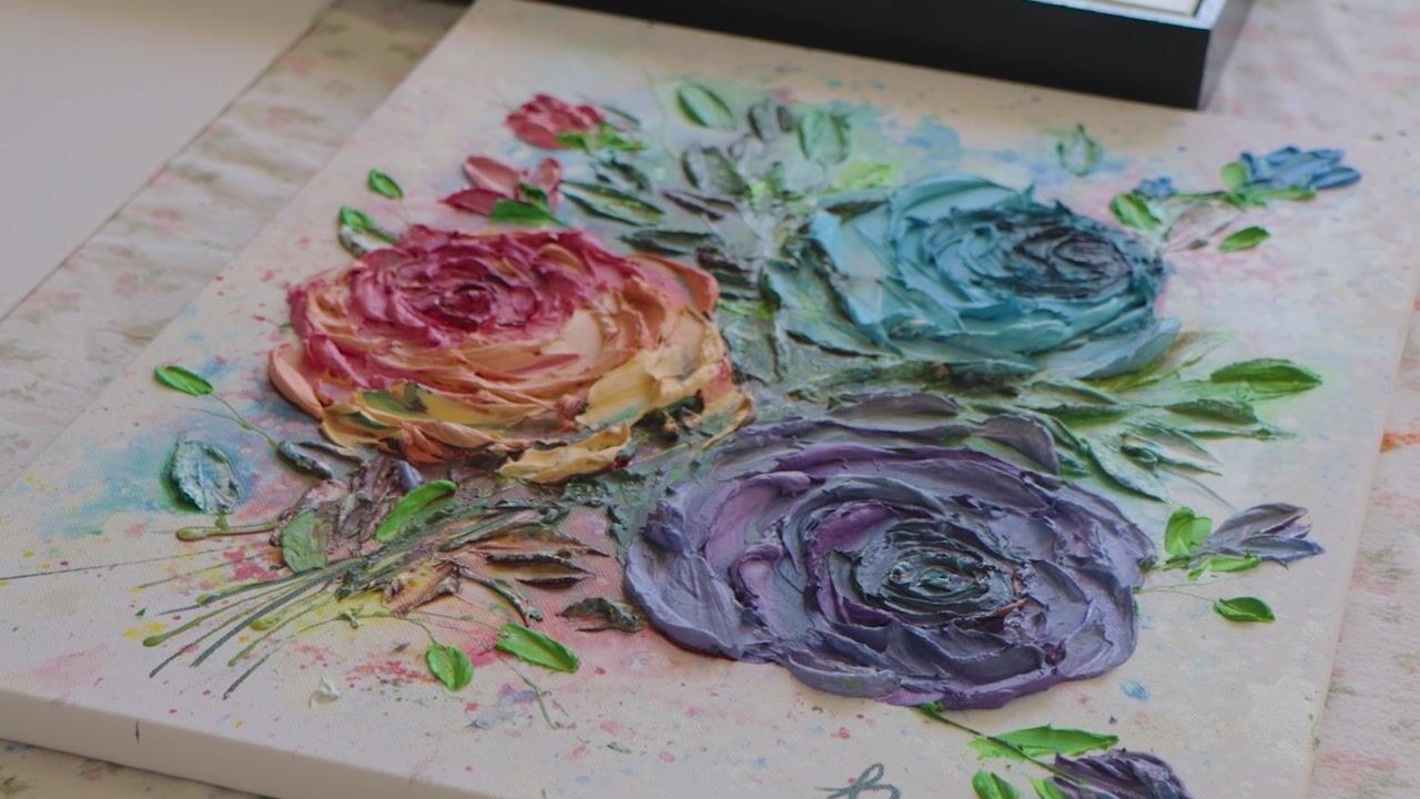
into my own bags. I'll teach you how to make beautiful floral paintings
in your leatherbag, We will go through all the steps
of the process together and I'll give you several tips to make your bag look beautiful. And who knows, you may
even start selling them. So come with me and
let's paint together!
2. Overview and Materials: The final project
of this class is to customize our leather
bag from beginning to end We'll go over several steps. From researching and studying the first layouts, the final varnish finish. You don't need to be a
professional artist but the basic of drawing and painting are necessary
for this class. Although my style is a
little bit more realistic, you can use the tips
learned here to customize your bag
in your own style. For this class, we're going
to need several materials. So, let's take some notes. First of all, acrylic
paint or various colors. It can be acrylic
paint for canvas, but I am not using a
very expensive brand. We will also acrylic pens for outlines and firmer lines, such as: Posca pens, Molotow, Liquitex, etc. Brushes of various
sizes and shapes. Don't forget a very
fine brush for details. And an older one to
put the varnish on Chalk or Pastel chalk to transfer
our drawing to the bag. Photoshop or any
image editing app, to test the bag
before painting it, that's not extremely
necessary but, it will help a lot. And finally, pencil, paper and
an eraser for sketching. You will need some varnish to apply in the end
of the painting. And also a cup of wather and a pallete or a small plate. And that's it. Now that
you have your materials all together, join me
and let's get started!
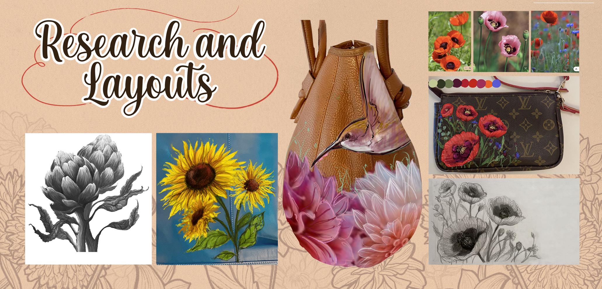
3. Research and Layouts: Welcome to lesson one! In this first lesson, we'll start by
looking at our bag and trying to imagine
what we would like to see painting on it Leatherbags are
long-lasting pieces. So when it comes to
choosing what to paint, try to find
something that really resonates with you
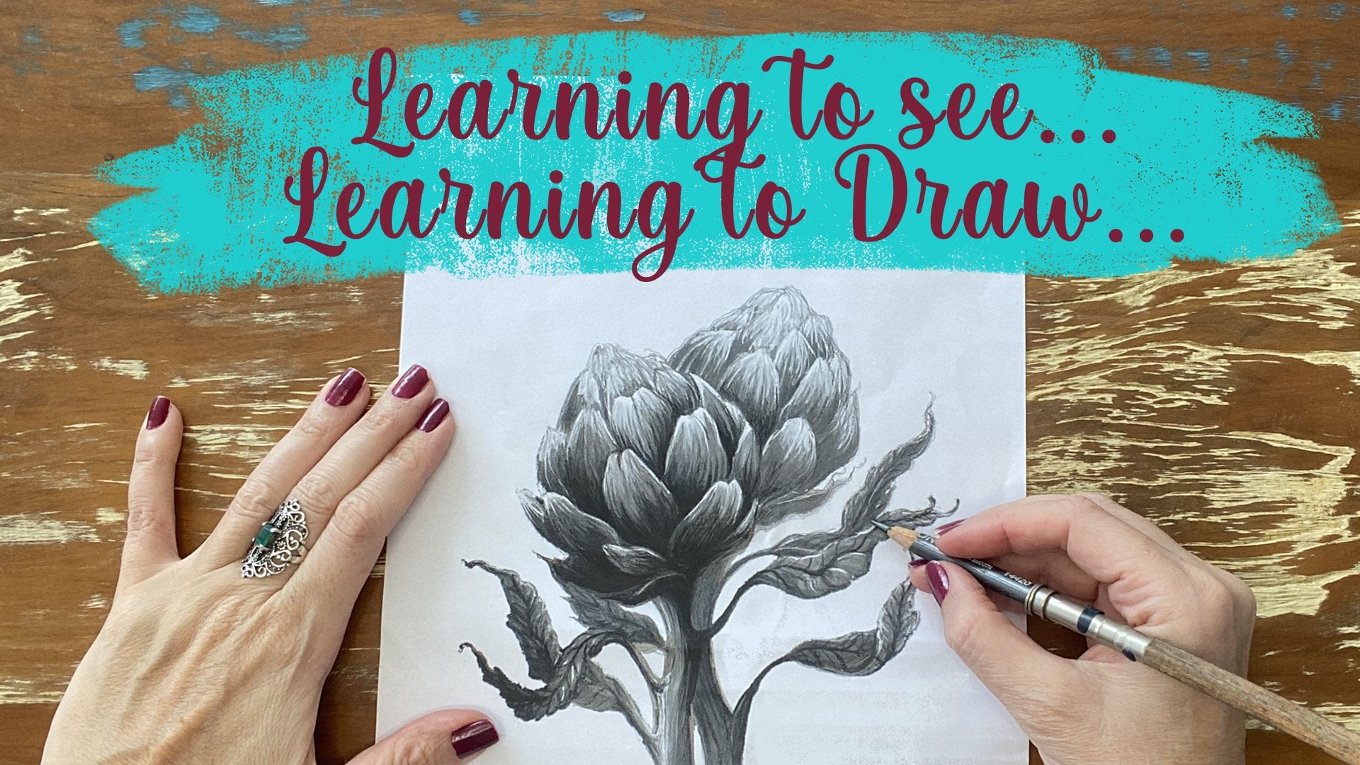
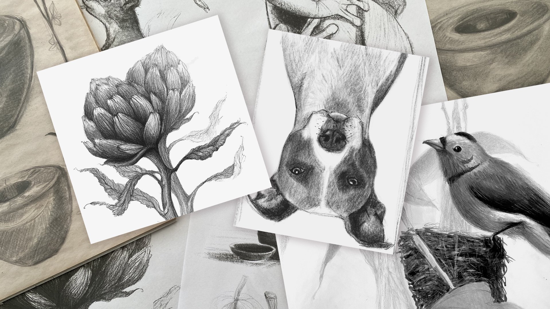
or with your client. I, for example, love artichokes. So, I decided to paint
some in this bag. Not only do I enjoy eating them, but I love their lovely look and color combination. We must also take
into consideration the colors and textures
of the leather itself. There are bags,
like this one, with very thin leather
and little texture. Personally, these are the
ones that I like to work with the most, because I
can add more details. The bags with
rougher textures will need a little
more extra paint. The paint can't be too watery. Otherwise, it will run down into the cracks
of the leather and that painting may look
a little bit blurred. So we must be extra careful with the thick
textured leather. For this bag, I decided to
paint some red poppies. I love their shape and also their color are going to match the bag's strap. And I think some small flowers will be interesting to compose
the look as well. Now let's go to Pinterest and look for some pretty pictures
to use as reference. Now that we have a lot of
pictures as references, let's begin to create
a few layouts. I like to draw few
different layouts until I get the result
that I like best. I start by making small sketches that only I can understand. Then, when I get to a harmonic composition, I start drawing in a bigger
size and with more details.
4. Mockup and Visualization: Because I am an illustrator, I like to visualize the final product before
I start painting it. I do these not only
with my illustrations, but also with the bags
and murals that are paint. I always like to do a
mock-up with my layout applied before I
get my hands dirty. Not only does it help me to
visualize the final product, but it also makes me feel more confidence before
I start painting. Now that I have my
initial sketch finished, I'll take it to Photoshop or Procreate or any other
image editing app. I will also take a picture of
my purse and put it there. Carefully, I'm cutting
out the outline of my layout and applying it to
place I want in my bag. We can increase or decrease
the size of it as we wish. Now, let's put some
colors on another layer. The first layer
will be my layout. The second one will be the
colors I will apply. And the last one
will be the bag. I'm going to leave
my stroke layer in multiplication mode, so that I
can get the blank parts out. When we leave ou drawing layer
in multiplication mode, all the whites
became transparent and we can see the color
layer below it. If you don't have this
feature in your app, no problem. You can simply print
out your layout and color it by hand with your
markers and crayons, or even with your acrylic paints.
I like to work that way too. When you're done,
it's time to print. Now we're going to make two prints. The first one
in black and white with just the pencil sketch in the actual size that we're going to paint in the bag. How do you know the real
size we need to print? Well, I'll go with my intuition. I think this red poppies
will take up almost two-thirds of the
total length of the bag. So probably this drawing
is 17 centimeters long. The second print, It's
just for us to visualize the colors in case you
painted your layout digitally. We can also leave
the computer screen on to use as reference.
5. Tracing and Outlining: Now let's begin to
trace our layout. And by the way, this is the
most delicate part for me. Let's get the black and
white print that we made. First, we're going to
turn the sheet over and color it with chalk
or dry pastel chalk. Notice that I'm
painting carefully, to cover the whole
area behind my drawing. Now, we need to
be very careful. I'm going to turn my paper
over. The white chalk is facing down, touching the bag and
my layout is facing up. Now, I'm going to
place my layout very carefully on top of the bag, in the place I
had defined. We can also use some masking tape to
keep the paper in place. I'm going to use a pen
or a pencil with a sharp point to transfer
the drawing to the leather. I'm beginning to draw
over line-by-line. The careful not to put your hand on the
paper, because it will blur the pastel
chalk on the bag and you may lose the
reference of the drawing. It will blur
a little bit anyway, but then, we can erase it. Okay, I think I'm done. Now. I'll careful
take the sheet out. Congratulations, we
have our sketch placed on the bag! That for me was
the more tense part! Pastel chalk doesn't
stain the bag and comes off easily with a dry
or damp cloth. If your bag is too light, do it with a darker color. Now, let's get our
acrylic pen or similar. I like to use a very thin tip
and I'm using the color white because it contrast more
with the tone of this bag. But you can choose another
color if your bag is in another tone. I'm beginning to retrace every
line of my sketch. Don't worry if you
make any mistakes because you can fix it with the acrylic paint later on. I think that's it! Now that our drawing is
finished and the paint is dry, we can erase
the remaining chalk.
6. Painting the First Layers: In this step, we'll
finally start applying the first
layers of paint. First, let's start organizing our color palette and put it in all the colors we are going to use. Acrylic paint
dries very fast, so, I'm always spraying a little water on it
so it doesn't dry out. First, let me show you my setup. I like to work with
everything in hand. Here on my desk, I have:
my bag, very well stretched and attached with two clamps to a small wooden board. I have my black and
white layout and behind there is my iPad
with the color layout. And on the sides
I have my paints, brushes, pastel
chalks and my palette. I will start by applying the basic colors for each
part of the painting. I'm going to use this tone of red
for the flowers. Notice that the paint is
neither to thick nor to thin. In fact, this first
layers of paint are a little transparent because
the leather is very dark. I prefer to do it this way and enhance the colors
little by little, so I don't overload the
leather with too much paint. But layer by layer, the paint will
start to appear. I'm painting carefully not to cover all my first lines. Later, as the painting develops, this white lines will disappear. The good thing about acrylic paint is that it
has a super coverage. So, if you don't get the colors right the first
time, don't worry. Just wait for it to dry and
apply a new layer on top. I'm applying a reddish purple on the inside of the petals. Notice that I'm trying to make a smooth transition
from red to purple. I'm now reinforcing the bright
red in this two big flowers. These two flowers in front are the main
subject of my painting. Therefore, I want them
to attract more attention. I'm taking care
to make them more vivid and with more contrast than
the flowers in the back. And, I'm already starting to
cover the white outlines. For the back flowers, I'm using the same shade
of red and purple. I'm using now two shades of green for the leaves
and branches. And for the flower buds,
turquoise and a shade of lavender. I'm using a very dark brown for this round shape
here in the middle, and light yellow for
the flower pollens. So lthat's it, this was
the basis of our painting. In next
lesson we'll start by applying new layers and
also light and shadow.
7. Light and Shadow: First, let's take a good look at our painting and our references. And let's ask ourselves, where is the light and where is the
shadow in my initial layout? A good trick to see
this better is to squint your eyes while
looking at the reference. When we squint our eyes, our vision blurs and we can see more clearly where the
lights and shadows are. For instance, I noticed that in the center
of this flowers, the shadows are much
more accentuated. So I will apply layers of
darker colors in those areas. Now, let's begin to paint. After the paint dried, it became a little transparent. So I'll use a more vibrant and lighter red to
paint these petals. Little by little
the light areas of my painting will emerge. Meanwhile, I'm working on other
areas of my painting. The bag is a bit
dirty with chalk. So I'm very carefully
cleaning what is left. I'm now smudging
some bright red with purple from inside the
flowers with a dry brush. Sometimes I like to wait for
the paint to dry a bit to make a better transition
from one color to another. I'm reinforcing the purple
from inside the petals. Again, I'm trying to make
a smooth transition from purple to red. This time before the paint
dries completely. I wasn't very happy with the shade of green
of this leaf. So I'm mixing acqua
marine green on top. I want to make this red strong enough for the flowers
to pop out of the bag. Now I'm applying a darker, reddish purple. I don't like to use
black on the dark areas. I think black makes the colors dirty. I always use an opposite
color in a darker tone, or sometimes Van Dyke brown or an indigo blue to
darken my colors. I'm using now the same purple for the flowers in the back. But I am applying
a thinner coat of paint because, as I said before, I don't want to draw
too much attention to the back flowers. I'm going to mix a little white with red to give
a more pinkish tone. Now I'm painting the top
edges of the petals where the light is shining the
most. With a dry brush I'm dragging my paint
inward so I can create a smoother transition
to the vivid red. I'll do these layer by layer until I get the
effect that I want. I like it when I can see the textures of my brushstrokes. So I won't smudge all
the red areas. This style that I'm doing is
a little bit more realistic, but you can use your own style. This class is just
an inspiration. I have now pick it up a
thinner brush and I'm reinforcing some of the
contours of the petals. I'm also separating better
what is light and what is shadow. I'm making little lines and just giving a hint of the
texture of the petals. But I'm not going
to fully refined my painting yet. I'm
trying to loosen up my hand and
make it more fluid because I don't want this
painting to be two rigid. I want to show some personality and lightness trough this flowers. And if I start to get too
focused into the details, I won't be able to do it. So I need to losen
up a little bit. I need to lose the fear of
this logotypes around here and try to
relax a little bit. And who knows, maybe
have some fun. And if it's not perfect,
that's fine too. There is a saying Brazil
that goes like this: "The Perfect is the
enemy of the Good." I need to remind myself
of this often. For the top flowers. I'll make them a
little less detailed. Notice that my brushstrokes are a little looser
on the back flowers. As I said before, I want the front flowers
to draw more attention. So I'll refine more the
details on them. Notice that the two front
flowers are already, jumping out of the bag. This is my intention. I think the flower
cores are too dark. I'm lightening them a
little bit because they were lost in the
middle of the flowers. Join me next
lesson as we move on to my favorite part,
adding the details.
8. Details: We're almost done. Now, let's finish our painting with our special
and personal touch: Let's add some details. I'm applying here
some yellow green to the flower buds with
a very fine brush, I think it was missing
some warmer green in the bottom part of the painting. I'm doing now some
shading on the steams and I'm also starting to add some textures on these leaves. It's a detailed work and it
requires a lot of patience. But I really enjoy doing it. I think it calms me down
and it concentrates me. And it's not easy to
concentrate this days, right? As I said before,
the detail phase is the one that I like the most. It's where they can put
my personal touch and make my painting
literally bloom. Notice that the way it's looking, we can already see how my painting will look
like when I'm done. With a very fine brush I am
reinforcing the water green on the back leaves and defining better the outlines. I'm continuing to make
the textures of each leaf. Now, I am adding some lime green to these back buds
here as well. Notice that the paint here ended up getting a
little watery. We need to be very careful with the watery paint because this bag has a bit
of a rough texture. And when the paint is very wet, it can spread and get into the cracks of the leather
and smudge the paint. Fortunately, this didn't happen. But if the paint does smudge, you can quickly wipe
it off with a clean, damp cloth, before
the paint dries. I'm using now an acrylic marker to add a touch of
a less saturated light green in some parts of
the steams. With a dry brush, I'm going to spread some of the ink leftover from the pen. I will use the same paint, but in a lighter layer
on the backs steams. I'm now starting to make
the textures of the petals. Notice that this lines that
run along the petals from top to bottom reinforce
the shape of the flower. These lines help to
better define the shape of the flower and make it
more three-dimensional. I'm taking care to
make the lines darker as they go deeper into
the middle of the flower. And I'm also reinforcing the shadows
inside the flowers. It's not often that I like to use contouring in my paintings, but I think this style
is a bit more realistic. So I'll use very fin outlines around the petals to define
the shapes better. Sometimes, when I work with a more modern and graphic style, I like to use thicker outlines But, this is up to you. I keep adding textures
on the petals and I'm using a very fine brush
to do this lines. The brush that I'm using is probably a number 0 or a 3/0. I like to use watercolor
brushes to paint with acrylics because
they are very soft, but I avoid using real fur brushes
because acrylic paints damages the brushes a
lot and they real fur brushes are much
more expensive. Now I'm going to use a
lighter paint, almost white. I like to use these thin flowing lines to give movements
to my paintings. I don't always like to use them, but I think it will go
well with this flowers. We need to be very careful not
to overwork our paintings, use your sensitivity
to know when to stop. I'm reinforcing the contours
of the flowers with white in the brightest
parts of the flowers. I'll do the same for
the back flowers, but with thinner and less opaque lines. And I'm starting
to make the seeds, the pollens of the flowers. I think this dots will give
a kind of magical touch to the flowers and will unify my
whole painting nicely. That it is, I think I'm done but almost! We
still need to varnish. So see you next lesson.
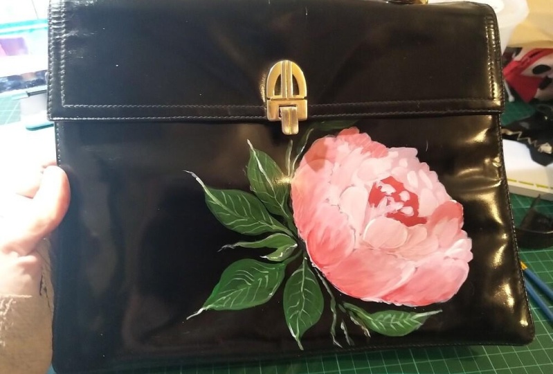
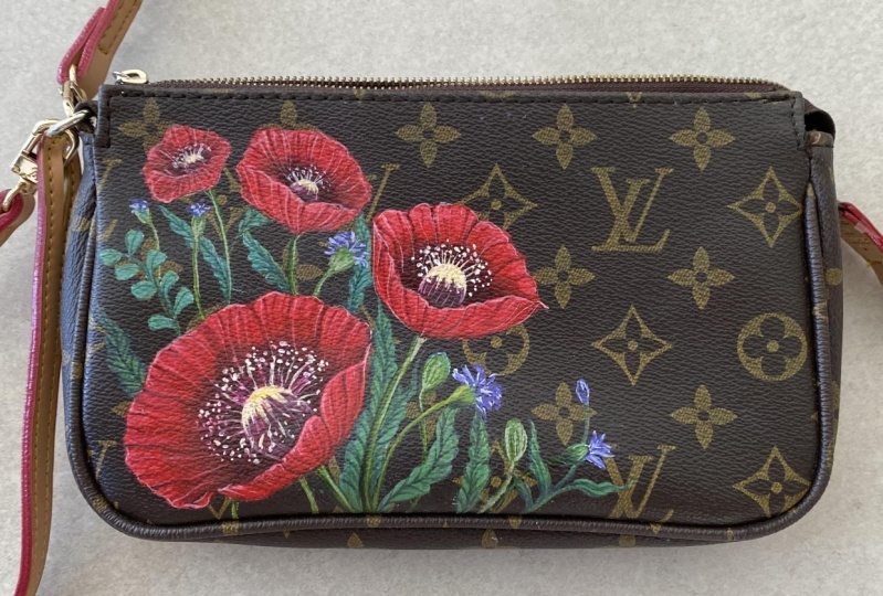
9. Varnish: There are three types
of varnish. You will choose yours according to the
effect you want to apply. For example, in this bag, the client wanted a very
discrete artwork that would blend with the texture of the
bag, as if it was printed. So I used a matte
varnish to give that effect. On this other bag,
the client wanted to draw a lot of attention
to this blue flowers. So I used a glossy varnish, The flowers seem to
pop out of the bag. There is also the
semi gloss varnish, which is the one
that I used here. This is a great option when you want to call attention
to your painting, but not to overdo it. Let me show you how to do it. When applying the varnish, the acrylic paint
must be very dry. Although acrylic
paint dries quickly, I like to wait a little
longer to start varnishing. For this step, I will
use two brushes. I prefer other ones, since the varnish can
damage the bristles. I will use a medium
brush for most of the painting and a thinner
one for the details. Don't panic if the paint becomes whitish after the varnish dries, it will even out the colors. Even so, it's always good to test it first on a piece of old leather. And by the way, if you need to touch up some parts afterwards, you can do it over the varnish
as well, and if necessary, apply some more over it
again. Voila! The bag is ready!
10. Final Thoughts: I hope you enjoyed this class. If this is your first
time painting leather I suggest that you always try on a small piece of leather first
and any questions, don't hesitate to
send me a message. I'll be glad to help
you. And don't forget to post a picture
of your painted bag. I can't wait to
see your project. Thank you very much for your attention, and I hope to see you soon.
 Babi Wrobel, Illustrator - Artist - Art Teacher