Transcripts
1. Introduction: Gouache is a type of paint that falls between acrylic
and watercolor. It's like they got married and had a child. That's gouache. Hi everyone. My name
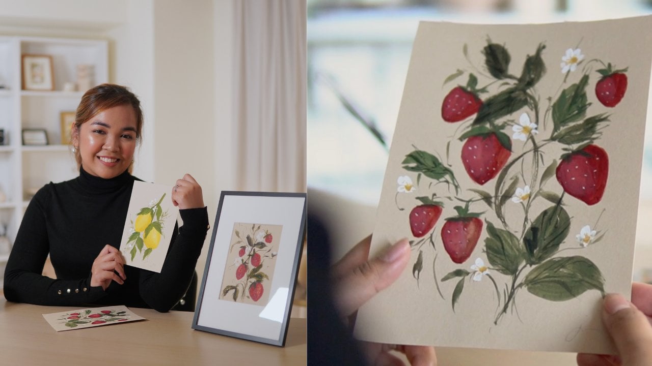
is Jenny Flores. I'm an artist and a creative
mentor from the Philippines. I teach painting, calligraphy, and creative entrepreneurship
both in-person and online. I'm a Silver Brush
ambassador and my works have been featured in various
medias and articles. My work as an artist usually revolves around the
subject of botanicals, bouquets, reeds, and recently
some floral gardens. In this specific class
I will teach you the simple yet
efficient approach in learning how to
paint with gouache. By the end of this class, you will be able to create a sunflower garden composition and this beautiful
chamomile field painting. We'll begin by exploring the supplies you
need to get started. Then we'll go over the
principle of gouache painting, which includes a deeper
understanding of this medium, essential techniques
that you must remember, planning and understanding
the structure of our composition, and ways in adding detail
to finish our masterpiece. We're going to
approach this class in a more intentional yet
creative manner so that you can use the lessons
to paint more confidently. Whether you're a beginner artist who wants to learn how to paint or a seasoned artist looking for a new
medium to play with, you're very much
welcome in this class. I'm so honored that you're here and I hope you stick
around till the end. Can't wait to see what
you're going to create. Pick up your brush and
let's get started.
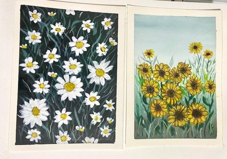
2. Our Class Projects: Today we will be painting two beautiful flora
gardens using wash. We will be basically working on these projects
all throughout the class. We will divide
each painting into sections like background layer, foreground, and subject. Through each section, I'm going to walk you
through my process, share some tips and
insight that you can use on your next
painting session. By the end of this class, you will be able to create a sunflower garden composition and this beautiful
chamomile field painting. When you're done
with your project, you can upload the
photo of your work on the project
section of our class. That way we can give feedback on each other's work
and support each other on our creative journeys. I'm looking forward to see
your work and let's begin.
3. Supplies and Alternatives: In this lesson, I
will walk you through the different supplies that I will be using for this class. I will also share with you
some alternatives that you may use if you find my
supplies unavailable. I use a combination of
Holbein Artists' gouache, and [FOREIGN] gouache, both of these gouaches
are water based, but the main difference is Holbein or Holbein
gouache tubes are professional tubes containing
more pigment than binder. While [FOREIGN] paints are
student grade gouaches, which are cheaper but contain
more binder over paint. For this class, I'll specifically
use following colors. Elm green or olive green, light ocher or yellow
ocher, raw umber, sepia, white, blue
gray, and black. When painting with gouache, I use watercolor paper. Like most artists,
I recommend using a hot press paper so that
your paint will easily glide. Honestly, I find it
really easy to use hot pressed paper for gouache
over cold pressed paper. I use the Baohong hot press
watercolor paper in 300 GSM, and I just got it in
smaller sizes like this one which is
four by six inches. If you don't have
hot press paper, you can also use cold press once or even mix media papers, results will be
definitely similar. For brushes, I'll be using
a couple of brushes from Silver Brush Limited in
different shapes and sizes. But if you don't have
the same type of brush, that's totally fine. Any watercolor brush breaks
well with gouache too, so you don't have to buy new
brushes unless you want to. For background and foreground, I'll be using the velvet oval or capstone brush in size 3/8. For the core of my flowers, I'll be using the black
velvet round brush in size 4. For the petals, I'll be using the silver crystal
filbert brush in size 2, and for the grass trends
and other details, I'll be using the silver silk 88 ultra round brush in size 2, and the silver silk 88
monoliner brush in size 20/0. In painting gouache
it is important to have some tissue
papers handy as well as a cup of water
so you can clean your brush easily
when changing colors. I'll also use a
pencil and an eraser. Another material that I'll
be using is a washi tape, this is just for creating
borders for our painting. If you don't have washi tape, a masking tape or a
painter's tape will do. The last supply is
a mixing palette. I use the ceramic palette because it's easier to
clean and it's cute. But a plastic palette will do. Now that you know the
supplies that I'll use, let's move on to how to
actually paint with gouache.
4. Understanding Gouache and Its Techniques: One of the best things about gouache is that you
don't need to memorize a lot of rules or
master a lot of skills before you can
dive into this medium. In this lesson, I will help you get to know
gouache and help you understand the behavior of this amazing medium
and introduce you to the essential gouache techniques that will surely help you create a beautiful floral
garden in gouache. Gouache is a type
of paint that falls between acrylic and watercolor. It's like they got married and had a child, that's gouache. It's water-based, which is a well-known characteristics
of watercolor, but at the same
time it's opaque, which is acrylic sprite. Gouache dries off very quickly, which is one of its
advantages over watercolor. Plus, it's also a very
forgiving medium. You can build layers
of paint over it making it easier
to cover mistakes, which is, watercolor's
a disadvantage. Having a thick consistency, gouache can create a
very opaque stroke that can fully
cover your canvas. But what's amazing
is that when you mix it with good
amount of water, gouache can also create
a translucent layer of color that mimics the
effect of watercolor. It is truly a versatile
medium which makes it perfect for landscape
paintings like floral gardens. To use gouache, you only need to familiarize yourself with two
most important techniques, the wet on wet technique and
the wet on dry technique. From these two techniques, you can create different
styles of painting depending on your
preference as an artist. The first technique
that we're going to discuss is the wet
on wet technique. In here, we're
going to be mixing wet layer with another
wet layer of paint. This technique is very
useful in blending colors together making ombres like the sky and grass
field and creating subtle shadows like
this love formation and the street painting. Wet on wet technique is
what you must use when you want to avoid hard
edges on your strokes. Let's paint the sky
and a grass field so I can show you how to do
the wet on wet technique. Here's a small piece of hot pressed watercolor paper and a blue-gray shade
of gouache paint. Using a soft oval or
a cat stone brush, I'll be doing some soft glide
of this color on my paper. As you can see,
I'm using a bit of concentrated mixture
of my gouache here. Adding another layer to
strengthen the look of this one. Now I'll get some white
gouache and blend these two colors together to
create the soft sky look. I'm adding more layers of white and blending it
with my blue gray. I'm just creating loose
strokes and blending everything as much
as possible here. Notice here that
there's no hard edge on this guy and that's the beauty
of wet on wet technique. Just remember to work fast because gouache dries
up really quick. That's it. Let's
try the grass field and I'm using black gouache
as my darkest layer. Then moving up, I'm blending
it with my olive green. Using the wet on wet technique, it allows us to add tonal variation on anything
that we're painting, making it more realistic even if it's just a loose
style of painting. Now I'm adding white gouache and blending it
to my olive green to create the lighter shade as we get closer to the horizon, adding more layers
to blend everything. Again, since this is a
wet on wet technique, as long as the layer is wet, feel free to add layers. These are just two of
the many things you can paint using the
wet on wet technique. Feel free to try painting more
objects and explore more. Now let's move over to
the next technique, which is the wet
on dry technique. The wet on dry
technique is when you paint with wet paint
over a dry layer. This technique creates
a very defined lines and strokes that's best when creating details or painting your main subject on
your composition. Whenever you're looking at
the reference image and you find the subject with
a defined structure, most probably that
object will be painted using the wet
on dry technique. Say for example, these
two base layers, both of these are dry already. When we paint over them, some grass strands like this, you will notice that I was
able to create a crisp stroke. They're not blended with the yellow background as what a wet on wet technique does. Both of these techniques are useful in painting
a composition, whether it's a
landscape painting or a floral composition or
a still-life painting. Mastering these two
techniques will help you navigate into the world
of gouache easily.
5. Elements & Structure of a Composition: Knowing the proper brushstrokes
or being able to choose the ideal color palette are just not enough to produce
a great painting. Beyond those things, there's
so much more to learn. On today's topic, I will go over the key elements that must be included
in a composition, as well as the
right structure to design your painting
so that you may produce a piece of art with an appealing and
well-balanced composition. Whether it's a garden, a beach, or a mountain view, a typical landscape composition usually consists
of four elements. A horizon line, a background, a foreground, and
the main subject. Let's talk about the
horizon line first. A horizon line is the line in
which the horizon travels. Horizons are the visual boundary where sky meets
the land or water, forming an extra line that
divides a landscape scene. Horizon line is actually the farthest point in
a scene, so meaning, the more an object is
closer to the horizon line, the more it is far
from us, the viewer. Second and third element are
background and foreground. What is in front of you meaning things that are closer
to you is called foreground and what is behind that is called the background. I'll talk more about this
in a bit, but for now, I'll reveal the last element
which is the subject. A subject is a star
of your composition. It's the main focus of your
painting and it's usually the first thing that
the viewer looks at in a composition. Without the main subject, your viewer will just
wander around your artwork. Now, these elements will be our key identifiers in determining the structure
of our painting. To help you easily
remember this lesson, we will divide it
into three topics, color intensity, size, and form. Let's start with
color intensity. You have to remember that the
closer to the horizon line, the further it is from us. When it comes to color, it must be lighter
or less intense. As the color is going away
from the horizon line, the more intense it should be. Let's use this image
as an example. This is the horizon
line and as you notice, compared to the shades
that we're seeing on the elements in
front of the image, those which are closer to the horizon line
are less intense, and that's the same in both
foreground and background. Now let's discuss the
second topic which is size. Remembering the idea that the
closer to the horizon line, the further it is from us
can help us remember also that as an object gets
closer to the horizon line, it must be smaller, which as you know, just really makes sense. Again, when we do it
the other way around, as the object gets
closer to us it becomes bigger and more defined
when it comes to its form, which is the third point. To sum up everything, here's what you
need to remember. Now that is it for the elements and structure of a composition. This topic may be
short but it will surely be useful in
your creative journey. I'll see you on our next lesson.
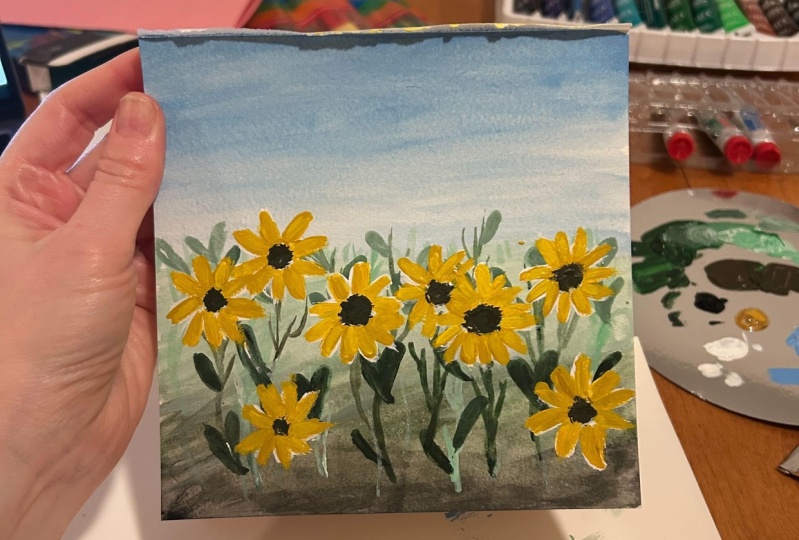
6. Background Layer : Sky & Grassfield: As I have mentioned in
our previous lecture, gouache is a very forgiving and a beginner friendly medium. As we create our
first class project, I want you to be comfy and allow yourself
to make mistakes. You can always cover
your strokes with another layer or even start from the beginning
if you need to. The most important thing here is allow yourself to learn
and enjoy the process. For our first class project, we will be painting this
sunflower garden composition. On this project, we will apply the lessons that we have
learned from our past lecture. We will be using a
postcard size paper which is 4 by 6
inches to be exact, but you may use a bigger
size if you want to. For the colors, I will be using the following gouache
shades: black, elm green or olive green, white, light ocher or a yellow ocher, raw umber, and blue-gray. Now that we're ready,
let's begin painting. As we have studied in painting
a landscape composition, it is very important
to divide your canvas into section to
separate the horizon. For our project. I'm using a pencil to
separate the sky from the grass end and
create a horizon line. Let's begin painting the sky. For this, I'm using a blue-gray mixed with a
little white gouache. Using a custom brush, I'm dabbing the strokes
all over my paper. As I go closer to the horizon, I'm adding more white to
my color to lighten it. In creating the
sky, I'm doing this slightly X mark strokes,
as you can see. This is for me to avoid creating overly flat strokes which
is not ideal for sky. Continue adding white until you've covered the
whole sky area. If you're still confused
where you must add darker tones and details on
your landscape composition, let's have a recap of
our previous lecture. Remember that the closer
to the horizon line, the further it is
from us, the viewer. When it comes to color, it must be lighter
or less intense. As the color is going
away from the horizon, the more intense it should be. Elements closer to
the horizon line must be blurred
or less detailed, and those which are
farther and closer to the viewer's side
must be detail. Now, while the
layer is still wet, it's time to apply some
wet-on-wet technique. Using the same mixture of blue green mixed with a
little white gouache, we will add another layer on
top part of our composition. This is for us to
create an illusion that the sky is really
far from the ground. Blend the layer with
a little bit of white till you create
a soft sky loop. Now let's wait for the sky layer to dry and while waiting, let's work on our grass field.
7. Foreground Layer: Grass, Stems & Leaves: Now that we have
completed the sky, which is the background layer, it's time to paint
the foreground layer. In this project, our foreground layer
will be the grass field. As you notice, there's a
lot of things going on, on this particular composition when it comes to the
foreground layer. To make it easier for us, I divided this layer
into three sections, which are the grass field, the grass stems,
and the flowers. Now, let's start
with the base layer, which is the grass field. Applying the same principle that I have mentioned earlier, let's paint the button
level with black gouache. We'll do the same strokes as
what we did with the sky. Rub the cuts on brush and create random x strokes to avoid
overly flat strokes. We're just doing the same
strokes over and over, so I hope you're still enjoying
this part of our class. Slowly blend the black
with elm green to create a slow transition
on our color. Again, we will keep on
transitioning our colors from dark to light till we
meet the strokes with the sky. As you notice, blending
black and elm green created a nice most green
shade before it fully transition
to pure elm green. That's one of the amazing things that a wet-on-wet
technique can do. Now, for the last section
of our grass field, we will create the lightest
shade of elm green. To create this shade, we will mix elm green, black, and white. We will add more white
compared to the two colors. Dab your custom brush on this layer to create a
soft grass field effect. Continue adding the
strokes until you reach the horizon line
and meet with the sky. To eliminate the
harsh line between the elm green and the
lightest shade of green, we will blend the two
shades of green and apply the wet-on-wet
technique by dabbing some strokes in the middle
of these two shades. To have a better
blend of colors, I'm also adding another layer of elm green in between
these two sections. Using the ultra
round brush and size two and by doing the
wet-on-dry technique, we will now start creating
some grass strands. We will place this batch in between the sky and
the grass field. Since this section
is the farthest from the viewers point of view and closest to the horizon line, the grass strands
should be lighter, less detailed, and smaller. For the color, create a
mixture of elm green and white with a mixture leaning more towards white compared
to elm green. For our next element, we will now create the stems. In creating this, we need
to get a dark green shade, so it's a mixture of
elm green and black, and we will use a filbert brush to do a
slightly curved lines starting from the bottom and add alternate thin
lines on the stem. Use the side of your brush
to create these strokes. When you draw these stems, place them on random areas to create variety and natural look. It is also best to mix small
stems and some big ones. Even if we have a finished
project that you can copy, I also encourage
you to add some of your own created twist
on your projects. That way you can
enjoy painting more and even learn more from
your own experiments. To create an illusion
that there are more big stems around
the grass fields, we will use a light
shade of green and create another batch
of sunflowers stems. Again, we will use a small
filbert brush for this batch. Paint these stems in a
slightly curved direction. Continue adding until you have filled a good portion
of your paper. Once you're done with
the sunflower stems, it's time to fill
more areas with more grass strands to make our composition look more full. We are seeing a nice progress on our work, so let's continue. Since the stem and grass
layer is already dry, it's time to add the leaves. We will paint a heart-shaped
sunflower leaves using a dark green gouache. To do this, we will mix
elm green and black again. I'll be using a size four round brush for
this type of leaf. All we need to do
is draw the heart leaves first and fill
it up with the color. Create small and big
leaves and make them look flowy to add variety and
interests on our creation. Just a recap. Remember that when the object is far from
the horizon line, it must be more
detailed and darker. As you can see here, the sunflower
heart-shaped leaves are really far from
the horizon line, hence, this principle
really applies here. For additional details
using the same brush, draw smaller leaves by
creating random slant strokes. Don't be afraid to do this step. Take it as a way of adding personal touch
on your painting. To finish this layer, let's paint more small
leaves all over the field. This time we will use
elm green as this set of leaves are a bit closer to
the horizon line already. Now, for the last
layer of leaves, pick up your brush
again and paint small leaves with a very
light shade of green. If you notice, we're just repeating the series of
colors that we're using, dark, mid-tone, and then light. Again, that's sums up the
lesson about the horizon line. Let's add heart-shaped leaves
with the same shade too. Now, we are almost
finished on this layer and we are about to paint
the sunflower already. But before we begin
on that piece, let's make our last
grass detail by creating grass strands on random areas using a very light green shade. I use a light shade of green
even if this detail is far from the horizon line because I want it to become a highlight. Yes, you can also do that. Sometimes it's okay
to break the rules as long as you know when
and how to do it. As our final detail
for the leaves, let's add a very thin white line at the center of each leaf. This will give our leaves
more defined look and we'll add a lot of
interests on our painting. Now, that is it for this layer. Let's wait for it dry and proceed to painting
our main subject.
8. Foreground Layer: Sunflowers: It's time to paint the star of our artwork, the sunflowers. To begin this pace, we will make sure that
the colors will pop out given that we have a
dark base layer already. To do that, we will put white markings using our
brush to serve as our base and for us to have a guide for the size and position
of each sunflower. Draw circles for
front-facing sunflowers and oval-shaped markings for
sunflowers spacing side view. Remember to make
big markings for big sunflowers and smaller
markings for smaller flowers. Don't forget to anticipate the distance between
each flower as well. Using the Filbert brush and white gouache paint
the sunflower petals, me doing the site stroke. Again, we are creating
a white base for our sunflowers so that the color will be more visible later on. If you're not familiar
with the side stroke, it is done by using the
side of our Filbert brush, instead of using the
whole body of your brush. Sunflower petals can be pointing or rounded
depending on you. To get around tip petal, you have to do the side
stroke from the outside, go into the core of your
flower, and on the other hand, if you want a pointy petal, your side stroke should begin
from the cord going out. Since we still have more
spaces for more flowers, let's add few more markings. We will let this layer
completely dry before painting the actual
color of our sunflowers. Completely dry because if we create another layer while
this one is still wet, we will mess up our
markings and we will create a very light tone as the white will mix with
our actual color. Be patient and wait
for it to dry. Now that the layer
is dry already, it's time to create
the colored layer using the color light
ocher or yellow ocher, we are now going to paint
the actual sunflower petals. Even if we are just creating another layer on
top over markings, it is still important
to be careful in creating our strokes
as much as possible. We don't want excess strokes or even unpainted markings
on their composition. Pick all the flowers until you have covered every
single one of it. Sunflowers will still look
translucent or light in spite of putting a layer
of color and in that case, you may add another
layer of light ocher and do the same strokes to
make the color more solid. Now that all the
petals are finished, let's proceed with the core. Using the color sepia
and a round brush, we can start painting the
core of our sunflowers. To create the core, draw a
circle and fill them in. The shape should
be big enough to reach the corner of each petal. For sunflowers
inside view the core must be over the shape,
always remember that. Actual sunflowers
have spiky core and to translate
that into painting, we will be adding
some small strokes around the core of our flower. To copy another actual
sunflower in detail, we will be painting a
black round stroke at the center of our core as
our additionally there. As our final core detail, we will be adding some
small dots using our amber. I'm using a detail
brush for this part. To give depth to our subject, we will now add some
shadows using amber. Just a note, you don't have to add shadows to all the petals. You can just pick some petals or a side that you prefer
to add the shadows to. Also don't feel
pressured on this part. Enjoy the process and add the shadows wherever
your heart beats you do. This is not a real essence
style of painting, so you don't have to make your
sunflower look realistic. If you take a look at the
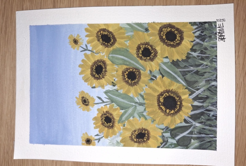
finished reference photo, we still need a bunch of
sunflowers overlapping our sky and since our sky
is light in tone already. We can skip creating
markings of white gouache and go directly in
painting our yellow layer. To do this, we will
use a Filbert brush and paint the sides
strokes for our petals. Carefully add some
dark green stems to these new sunflowers
using our brush. Using the Filbert brush, Let's paint the leaves
to our sunflower stems. Now it's time to paint
the sunflower core. Finally, adding some dots in
the core using raw amber. We are almost done to add our last few details
on our painting, we will be adding some leaves
on top of our sunflowers. I know some of you might feel a little scared to do this part, but you have to trust
the process and allow your hands and heart to
lead you with every stroke. Like the previous
leaves that we did. Let's create a thin
line at the center of some leaves using
our white gouache. Finally, we are done. I know that this
artwork is a little long and quite challenging
for some of you, but I'm sure that you
guys enjoy the process. Also if you think
that your artwork doesn't look the same as
mine, that's totally fine. Because what we're doing
here is practicing and learning how to paint flora
gardens with gouache. You don't need to paint a
perfect work on your first try. You can always recreate
or practice some more to create an artwork that
you guys will surely love. Be patient with yourself and keep exploring and
keep on trying. I'm very excited
to see your work, so please upload
it on the project and resources section
of our class. Thank you so much and I'll
see you on our next project.
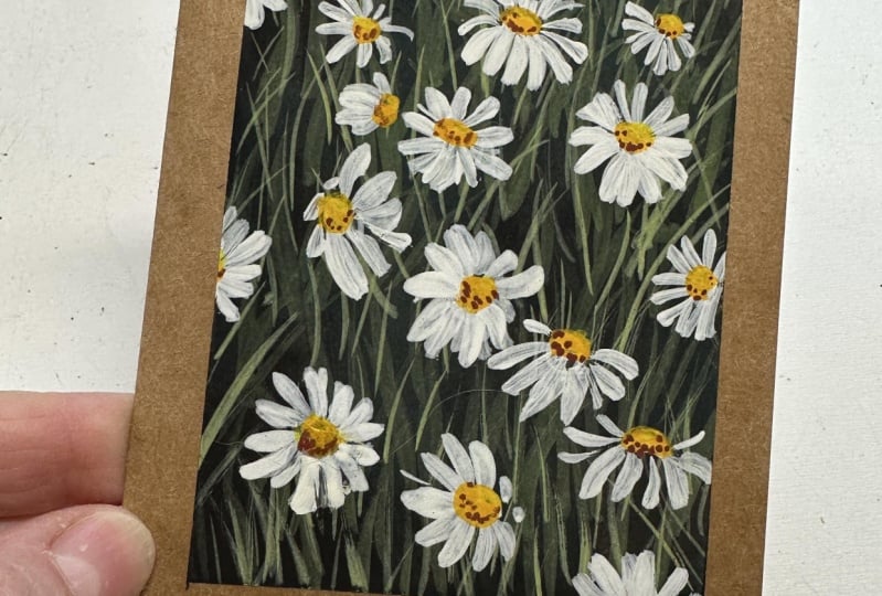
9. BONUS: Chamomile Garden: Hello and welcome back. For our second class project, we will dive deeper
in applying the wet-on-wet and
wet-on-dry technique and gouache on this project, we will paint this
beautiful chamomile field. Before we officially begin, here are the colors that we
will be using for the class. White, black, elm green, light yellow, and raw umber. These colors are just optional. You may use whatever
you have with you and feel free to change
one or two details on this painting so you
can practice creating your own composition and apply the lessons that we have
learned in this class. For this composition, we will be painting the field
in an aerial view, meaning there's no
horizon line involved. Even so, we can still apply the same principle here
as to the details, color, and size of our elements. Now that you're
ready, let's begin. The first step that
we're going to do is establish the background
of our painting. We will do that by painting some areas with
their black wash. We will leave a few
spaces so that we can give some space for
the greens later on. Doing this technique will create an illusion that there is grass at the back part and there are grass in front
of our garden. For this, I'm using the black
velvet cut's down brush. The consistency of the
color that I'm using is also water because I'm
still doing the base layer. Later on we will add more concentrated mixture once this layer is settled already. Now it's time to
paint the areas again with backwash for
a more solid look. For our next step, we will mix elm green and black to create a
dark green shade. We will now fill in
the gaps that we left earlier and complete our
background with this color. If you feel like your gouache is a bit dry when you paint, feel free to add a little
water on your brush so that the color will glide
smoothly on your paper. This time, it is important
not to leave any gaps. Make sure you painted the entire paper and establish
your background fully. Just like what we did
on the black paint, reapply the layer of dark greens so you can
create a more solid loop. We are done with the background. We will let this layer
dry for awhile so we can apply the wet-on-dry technique
on our next procedure. Now that our background
is finally dry, we can now add another layer of gouache using the
ultra round brush. In size 2, we can start painting some random gas strands
in a dark green shade. We will use the same mixture of green and black for this one. In creating our grasslands, we will start by creating a thick brushstroke
from the bottom, then slowly releasing
the pressure as you get close to
the tip of your brush. Note that you can
create this strands on any direction facing the
left or the right side. It is also best to place these grass strands
on areas with black colors so it stands out a little
from our background. One of the best ways to create a pleasing gouache composition
is adding contrast. On this next step, we will add another layer of grass
in our painting. In this layer, we will
use a light shade of green and we will do that by
mixing elm green and white. The portion of white is
greater than the green. Overlap these grass strands to the dark green grasses
that we did awhile ago. There's no exact amount of strength required
for this painting. What they can suggest
with you though, is spread the strokes and make sure that your strands
are free flowing, meaning they will go in different
direction through this, we will create an
effect that our grass is being blown away by the wind. That would be awesome. We will switch our brush to
a small filbert brush and use the side of it to create
thicker grass strand. We will use the
same color for it. This again, brushstrokes
must begin from the button. When painting the grass strands, it is as if you're
doing a check mark. For the final touch
of our grass, we will paint another
batch of strands, and this time we will use
another shade of green. We will mix elm green and white. This mixture will contain
more elm green than white. Using the ultra round
brush in size 2 paint more grass strands
randomly on top of our grass layers
that we have created. This time grass strands
are longer and thinner. This will complete the
whole look of a background before we move forward
to our main flowers. We are finally done
with our second base. We will let this
layer dry completely before we move forward
to our next base, which is the flowers. Now that the layers
are done and dry, it's time to do
our main subject, the Commonwealth flowers. To do this, get a
white gouache and draw circles all over
the grass layer. Create a mixture of
small and big circles. Drawing the circle guide
will help us determine the proper placing our
subject on our painting. You are free to place the
camel miles wherever you want. But if you want to do
exactly what I'm doing, you may refer to our
finished painting in the project in
resources section. Once done with the circle core, we are now going to paint the petals using a
small filbert brush, start painting the petals by combining the flat
strokes, and side strokes. Your brushstrokes must be painted beginning
from the outside, going into the core
painting this way will help us avoid creating
a pointy petal, which is definitely not the
shape of a chamomile petal. Again mixed a flat stroke
inside stroke for your petals. This will create
an illusion that some petals are behind
and summary in front. I know it's challenging to paint petals around the circle. But through practice, you'll get to know your
brushes and your medium more and eventually you'll get used to lighten your
paint on your paper. Always remember that
the bigger the circle, the bigger the petals
and vice versa. For smaller flowers,
there should be more brush control to maintain
the pebbles in small size. It is easier to
paint small petals using side strokes
of a filbert brush. I suggest you do the same. We are done with our
first set of flowers. Since we have more space left, we can add more flowers
or a composition. We're going to do the
same steps that we did on our first set of flowers. Start on creating the circle
core, then other petals. Now that our base
floral layer is done, it's time to check the layers. As you notice here, some petals look a little translucent. That's normal especially that
we have a dark background. To solve this issue, we will add another layer
of white gouache to the petals to make
them look more opaque. Time to add some fillers. To make our composition a
little bit more realistic, we will add some small
imperfect flowers on the empty spaces
over composition. These chamomile flowers
doesn't have to be detailed. In fact, it is best to add incomplete petals
to these flowers so that they won't take away. The focus over audience
from our main subjects. After all, the white
quash layers rise up, we can now start painting
the core of our flower. We will use the light ocher or yellow ocher gouache
for this part. To do this, create a yellow
circle on your flower. Make this circle a little
bit big so they will reach the corners in
between each petals. Also remember that the
bigger the flower, the bigger the core. To add that we will paint
small shadow on the side of our core when the base
layer is dry already. We will use raw umber for this. Just slowly that the
color on one side of your core. That is it. I hope you enjoyed
doing this project and as I always tell you, it's okay if your work doesn't
look the same as mine or if you're not so happy about your work, that's totally fine. You can always recreate it and improve it on
your next practice. I'm so excited to see your work and I'm also happy to give a little feedback
and advice about your creations so we can
improve it next time. I hope you can upload
your project on the project and resources
section of our class. I'll see you on our last video.
10. Final Thoughts: Finally, we are done
with the class. Thank you so much for joining me and well done for
finishing the lessons. I hope you learned and
enjoyed as much as I did and I hope you get acquainted with gouache through this class. I'm very excited to
see the projects that you have created
so please take some photos of your
paintings and upload them on the class project
section of our class. I would love to give
some personal feedbacks on your work so
please upload it. If you find this class helpful, I hope you can also leave a
review under review section. Let me know if this class
meets your expectation, what you enjoyed the most, and what can be improved. All of your suggestions
will be very valuable and helpful to me as I make
my future classes. Also, don't forget to follow
me here on Skillshare so you'll get notified about my upcoming classes
and giveaways. You can also follow me
on Instagram and get instant updates about my
latest work and some events. Lastly, feel free to
share your projects on Instagram and
Instagram stories and tag me @jennyfloresart and tag Skillshare's Instagram
which is @skillshare. I will surely share your work to my audience of over 40,000. I hope that you loved this class and learned something new, and thank you so
much for joining. I'm very excited to see
you in the next one. Bye.
 Jenny Flores Art, Top Teacher | Watercolor & Gouache