Transcripts
1. Introduction: Imagine stepping into an
artistic wonderland where vintage aesthetics blend with the vibrant fruit
of botanical art. Picture yourself
holding a brush, tipping it into a palette
of luscious colors with each stroke bringing to life exquisite
vintage style fruit. Postcards welcome my fellow creatives to a class that
will transport you to a world filled
with nostalgia, creativity, and the
magic of quash painting. I'm Jenny Flores, an
artist, creative mentor, and a proud skill share
top teacher Throughout my, I've had the privilege
of teaching and mentoring thousands of
students in person and online, helping them unlock
their creativity and explore their
artistic potential. Today, I'm excited to bring that same passion
and guidance to you. In this class, we will
embark on a creative journey into the captivating world
of, uh, painting together, we'll discuss the
joy of creating vintage style fruit
postcards to truly come to life on the
page using wash, a medium known for its vibrant
colors and versatility, will unleash our imagination
and capture the beauty and essence of our subjects in a unique and captivating way. Throughout the workshop,
I'll be your trusted guide, providing you step by step
instructions and sharing valuable insights gained through my experience as an artist
and creative inventor. Together we'll develop
the skills and confidence needed to create stunning
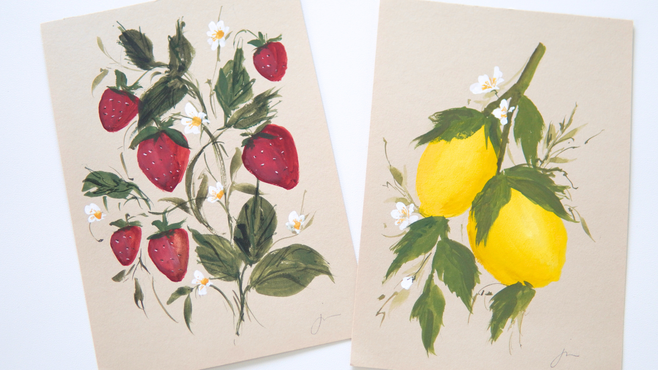
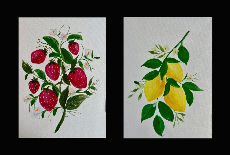
botanical inspired artwork. By the end of this class, you will not have one but two
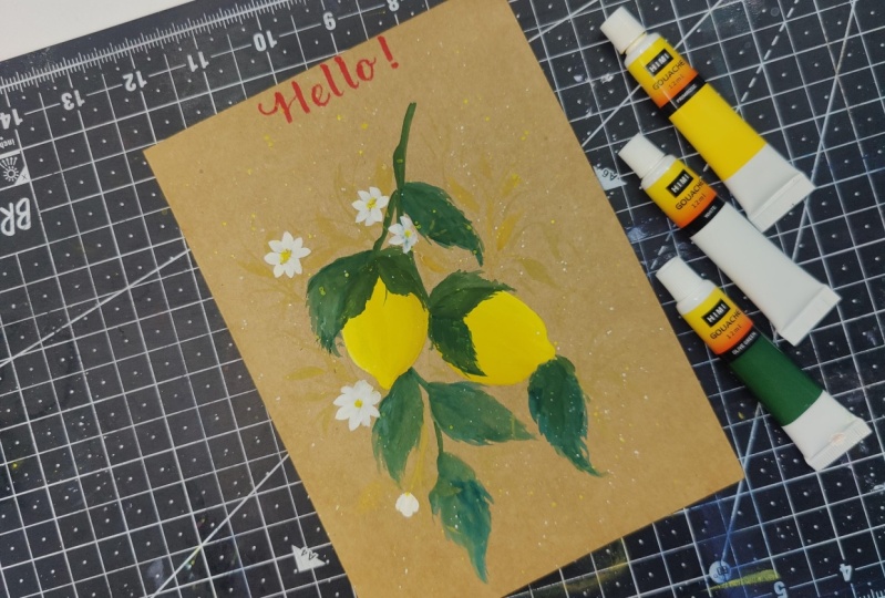
charming vintage postcards to proudly display. We'll create a lemon
vintage postcard and a strawberry vintage postcard capturing the essence of
these delightful fruits. With each brush stroke, get ready to immerse yourself
in a symphony of colors, explore the delicate
textures of nature, and create artworks that
evoke a sense of joy, beauty and story telling. Whether you're a
curious beginner or an experienced painter
seeking fresh inspirations, this class is perfect for you. I'm very sure you're excited. So pick up your brush
and let's get started.
2. Supplies: Now let's go over the supplies that you'll need
for this workshop. Don't worry, if you don't have
the exact same materials, I'll provide alternatives so you can adapt with
what you have. For the paper, I'll be using Clare Fontaine mixed media
paper in a natural color. However, you can use other
options such as craft paper, colored paper, or
watercolor paper. As long as it's over 200 GSM and preferably in
brown or beige color, this will give your
postcards a vintage feel. As for the brushes I'll be using specific brands and sizes. I have silver silk 88
round brush in size eight, silver silk 88 ultra
round brush, size eight. Again, the silver silk 88 oval crescent brush and size 12. And the silver silk ultra
mini brush and size one. But don't worry if you don't
have these exact brushes. You can use any round brushes
in size eight and size two as alternatives for
the oval crescent brush. A filbert brush in size
two will just fine. The most important thing
is to have a range of brushes for different
details and strokes. Now let's talk about the paints. For the lemon project, I'll use lemon yellow, sepia, olive green, and white. And for the strawberry, I use feruline red, sepia, olive green,
yellow, ochre, and white. These colors will
help you capture the vibrant essence of
our vintage postcards. To mix and blend our paints, I'll be using a ceramic
mixing palette. You can use any palette
that you have available, like a plastic one
or disposable one. It's all about having a smooth surface to
mix your colors. Lastly, you'll need
a cup of water to clean your brushes
between colors and tissue paper or cloth to blot excess water or
wipe your brushes. Remember to feel
free to adapt and use similar materials
you have on hand. The most important
thing is to have fun and let your
creativity shine.
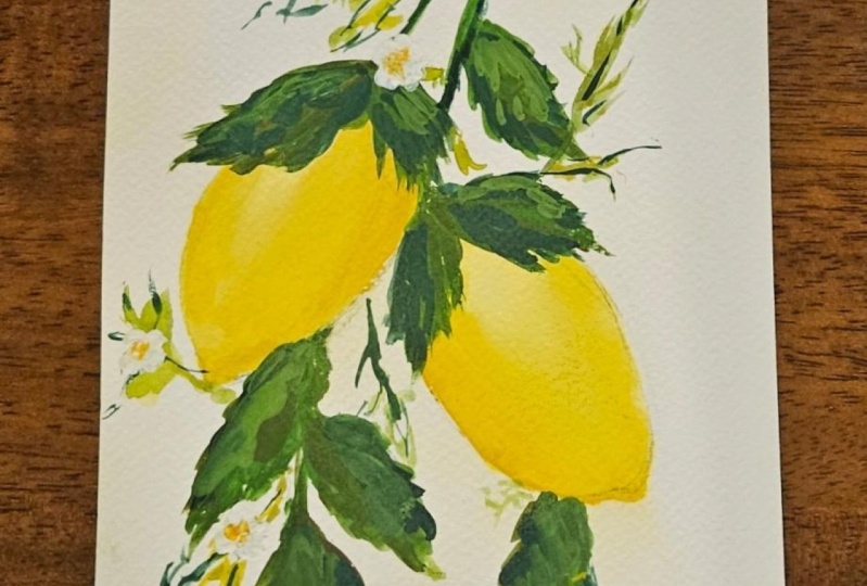
3. Lemon Postcard: Welcome to the first
lesson of our workshop. And this video, we'll dive
into the wonderful word of wash painting as we explore the process of creating a
lemon vintage postcard. Throughout this
lesson, we'll cover the essential basics
of working with guash, including consistency,
various gash techniques, and a bit of color mixing. G is a fascinating medium known for its vibrant colors
and versatility. Whether you're a
complete beginner or have some experience
with painting, this lesson will
provide you with a solid foundation to
create a planning artwork. We'll start by discussing
the importance of consistency in gash and how
it affects your painting. Consistency in gash is vital
for your painting success. It refers to the
thickness or thinness of your paint and how it
behaves when applied. A thicker or more opaque
consistency allows for textured brush stroke
highlights and delis. A thinner, more
transparent consistency is ideal for smooth washes
and subtle transitions. Additionally, consistency
affects drying time. Thicker paint tries lower, allowing for blending, while thinner paint tries more
quickly for layering. By adjusting wash
with water or paint, you can achieve
desired consistency. I suggest you
experiment to develop your style and control
over your painting. Throughout our painting session, I'll guide you through
the process of achieving the right consistency for
smooth and even application. The perfect consistency
for Gh though, can be described as a balance between thickness and fluidity. It should have a creamy
texture that spreads smoothly on the surface without being
too runny or too stiff. However, the term is subjective, as it will really
vary depending on the specific technique or effect that you want to achieve. For detailed work or
textured brush strokes, a slightly thicker
consistency may be preferred. And for washes or blending, a slightly thinner consistency
may be more suitable. As you gain
experience with wash, you'll develop a sense of the perfect consistency for different painting
applications. Don't be afraid to
experiment and adjust the consistency by
adding small amounts of water or more paint until
you find the right balance that feels comfortable
and allows you to achieve your
desired results. All right, now that
you have an idea with the perfect
consistency of Gh, let's continue the discussion of the topics while we
paint our first project, the lemon vintage postcard. So for the paper, I'll be using the Clairefontaine
paper in natural color. And while the perfect size for
a postcard is five by 7 ", or four by 6 ", Don't hesitate to choose a different size if
that suits your style. Now let's go and
begin our project by doing a rough sketch
of our painting. As with any painting, we will start with
the foundation. The sketch lightly
draw two lemons and their leaves on the
clear pontain paper or whatever paper
you have with you. Don't worry about perfection. This initial step is
all about capturing the essence of the subject
and planning the composition. Keep your lines loose and relax as we'll refine them in
the subsequent steps. I'm just adding the main branch here that connects
the two lemons. I'll be adding the big leaves. You need to add big
and small leaves on your composition so
that there will be a variation and there will be a lot of details
on your painting. Again, you are not required to copy everything that
I am doing here. What I'm doing is just a guide. You can still add your own personal touch
to your painting, so you can add the leaves on the other side or
just paint one lemon. It's up to you. What
I'm doing here is just guiding you with a general idea of what we're going to paint. Now, using a needed eraser, I am erasing the
initial sketch that I made so that it won't be very visible when I paint
over it later on. We're not going to
erase everything, we are just going to make it
a little bit less visible. But if your sketch
is already light, you don't need to do
this step anymore. Now let's add some
color to those lemons. Pick up your size
eight round brush. So I am using the silver silk 88 round brush in size eight, and I'm going to dip it into the vibrant lemon yellow gah. Here's where we get creative
with wash techniques. Try wet, un, wet technique
for a soft and blended look, or layering for rich
colors and textures. Wash is incredibly forgiving, so embrace the freedom
to experiment. I'm going to blend the colors
here even more so that it will be very thick
and very vibrant. Now to add depth and a bit
of realism to the lemons, it's time to add shadows with your silver 88 round brush or any round brush
that you have, mix with your lemon yellow and gently paint shadows on
one side of the lemon. In this process, we are going to do the wet
on wet technique. The wet on wet technique
is especially useful for creating smooth
transitions between colors. If you want to add more
colors or details, you can apply additional
wet gush layers on top of the wet surface. Each layer will blend and interact with the
underlying layer, allowing for further
color variations and depth on your painting. Keep in mind that
gwash dries relatively quickly compared
with the deginal water colors gash
dries up quickly. The wet on wet technique is most effective when the
paint is still wet. So work efficiently and purposely to achieve
the desired effects. Now let's brighten things
up with highlights. Grab your round brush
again and dip it into pure white mix with a little
bit of lemon yellow wash. Apply highlights on
the opposite side of the lemons to mimic the
light hitting the fruit. Blend the white wash
with lemon yellow base, ensuring the transitions
are seamless. This technique will
help your lemons look incredibly juicy and realistic. With gentle brush strokes, the colors will
mix harmoniously, giving your painting a soft
and dreamy appearance. You have mastered the
art of painting lemon. Now repeat the process
for the second lemon. Remember, vintage charm
comes from uniqueness, so don't worry if the two
lemons aren't exactly the same. Embrace the beauty
of imperfection. Okay, let's paint the base
layer with our lemon yellow. Just brushing the colors here to cover all the
areas that I want. Remember to smile once
in a while because we are doing this to
have fun as well. Okay, so it's time to add those shadows. So I'm going to add a
little bit of sepia to my lemon yellow to create
a darker shade of yellow. And add it on one
side of my painting. Again, I'm using the wet
and wet technique here. That's why I'm able to
blend the colors nicely, just brushing off
the color here. As you can see, the second color is blending nicely
to my base layer. Okay, just cleaning it off and brushing
some extra strokes. Remember, wash is a
forgiving medium. If you made a mistake, it's so easy to cover it. Time to add the
highlights again. Again, here, mix lemon
yellow with white. So I'm brushing the area
with the color that I mix and I am adding it on the
opposite side of our lemon. With our lemons.
Looking fabulous. Let's shift our focus
to the leaves and stem. Using the size
eight round brush, dip it into the olive
green guash paint, the base layer of the
leaves and stem using your brush to mimic the natural flow and
shape of the leaves. This is where you can play with different brush strokes and techniques to create a lively
and dynamic composition. If you're feeling
extra adventurous, mix a hint of sepia with your green to add an earthy
touch to your leaves. This is what I actually
did for my green here. And this subtle variation
in color will add an extra layer of interest
to your vintage postcard, making it truly unique. I'm adding more leaves here and I'm just
painting it loosely. Again, in this
style of painting, we are not aiming to
paint realistically. We don't want our painting
to look exactly what, how it looks in
photos or in actual. But we want to get
the essence of the botanical element
and we want to translate it in our own
way by painting it. Remember that the key
to loose style is to paint with a sense of
spontaneity and freedom. Allow yourself to explore
and enjoy the process, letting the colors and brush strokes guide
you with practice, you'll develop your
unique painting style and create beautiful
expressive leaves. For now, let's just
drag our brushes and let the tips of our
brushes do the work for us. Again, don't be afraid
to make a mistake because with guash you
can easily cover it up. That's the beauty of gas. To add even more
depth to the foliage, it's time to add shadows
with your silver silk. 88 ultra round brush
or any round brush, add slightly darker green. And you can achieve this by mixing olive green with sepia. By the way, gently brush those shadows along the edges
of the leaves and stem. This technique will create an illusion of light and shadow, making the leaves appear more lifelike but still
loose and expressive. I'm adding some more here. As you can see I'm not really
creating a detailed shadow. I'm just adding some strokes on one side of my leaf
and also my stem. While we wait for the
leaves and stem to dry, let's add some charming
filler details. Mix a very thin gash
mixture and delicately paint small leaves and fillers in the background
of the painting. These subtle touches will create a beautiful
sense of depth, making it appear as if
the lemons and leaves are part of a lush and
flourishing vintage garden. Again, I'm using the size
eight ultra round brush here. The difference between
an ultra round brush and a round brush is the tip. Ultra round brush has
more thinner tip, making it able to
create thinner strokes. Now I'm going to switch
to my ultra mini brush. This is the brush that
I'll use to create thin lines and create
thin branches like this. This is one of the
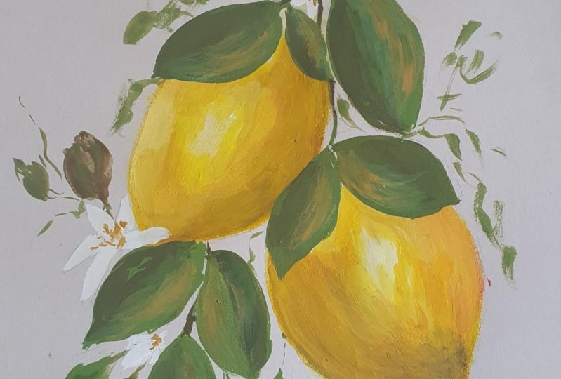
favorite effects that I love adding on my paintings. Finally, the finishing touch. Let's add delicate white flowers to our vintage postcard with pure white quash And your oval crescent brush or
filvered brush paint, dainty petals on your
composition wash is perfect for
creating cute details. So take your time and add those lovely flower
petals with care, adding more petals in here. As you can see, I'm not
creating full flower. I'm just adding a bit of petals because we want to
create an effect that some petals are at the
back part of the composition. For an elegant touch, grab your yellow ochre and add delicate lines with dots at
the center of each flower. This tiny detail will make
the flower stand out and give your vintage postcard
an air of sophistication. Okay, I'm adding some more here. I'm not going to
complete everything because we don't want to
overdo our composition. We want it to look
loose and expressive. Still, for the final details, I'm just connecting
my flowers to the main composition by
doing some little stems. Okay, I'm going to add a
bit of finishing touch. This is just optional. If you have some more space in your composition that
you want to fill in, you can add some small
stems or some small leaves. It's up to you. Okay,
congratulations. You've done it. You have created a stunning vintage fruit
postcard using Wash. Feel free to sign your artwork
and share it with your friends or use it as a charming decoration
in your space. Wash allows for
endless exploration, so don't hesitate to experiment
with different colors, techniques, and styles to make your artwork
uniquely yours. Enjoy the journey and I'm so excited to see you
in the next lesson.
4. Strawberry Postcard: Welcome back to our class. In this bonus video lesson, we'll continue our artistic
journey by exploring the enchanting
process of painting a strawberry vintage
postcard using gash. In the previous lesson, we have covered the
basics of gash painting and created charming
lemon vintage postcard. Now we'll build upon those skills and dive
into a new subject, the delightful word
of strawberries. Strawberries have long been cherished for their
vibrant color, delicate textures,
and nostalgic appeal. In this lesson, I'll guide
you step by step through the process of capturing their beauty in the
vintage style postcard. Just like the lemon painting, we'll explore essential
guash techniques such as color mixing, brush strokes, and
layering together. We'll bring the
strawberries to life with a touch of nostalgia
and artistic flare. Whether you're continuing from the Fibs lesson or joining
us for the first time, I am excited to have you
in this creative journey. So let's pick up our brushes, prepare our guash paints, and let our creativity
flourish as we paint a stunning
strawberry vintage postcard, just like our lemon postcard, We are going to start with a rough sketch of our
strawberry composition. Draw six juicy strawberries
surrounded by a mix of leaves in various sizes and sprinkle in some
charming white flowers. Keep it loose and relax. We want to capture the
essence of the vintage charm. Don't overdo your sketch. I'm going to add
in the stems here. As you can see, I'm not throwing the whole details
of the strawberry. I'm just creating a guide where I will be placing
my painting later on. You can copy what I am doing, but you can also remove a bit of details and add your own
touch on your sketch. There's no right or wrong here. You can paint three, or six, or even ten strawberries, if it will fit your paper. As long as your composition is balanced, there's no problem. I'm going to lightly
erase my painting so it won't be very visible later
on when I paint over it. Now it's time to paint the
base of our strawberries, create a thin mixture of gash by adding a bit of water
to your red paint. This will give us a smooth and translucent layer to work with. I am trying to make
it a little bit translucent because I want it
to dry quicker than usual. So I'm going to do the same here on this second strawberry. As you can see, it's
a little bit through. You can see the brown paper when I'm painting
the strawberry. And by the way guys, I am using the silver silk 88 size eight
round brush for this one. I added a small
strawberry on my sketch, just so there would
be a variation. And there would be an illusion that some strawberries
are at the back part. That's why they are small.
Yeah, it's so cute. And I hope you also added a little bit of details
like this on your sketch. As you notice, in most part of our painting we
are using a round. Round brushes are tile and
commonly used in gash painting because they allow you to create both fine lines and
broader strokes. With a round brush,
you can achieve a lot of control and precision, making it perfect for
intricate details, highlights, and fine lines. Now let us add some highlights
to those strawberries. Mix red and a
little bit of white together and use the
wet on wet technique. Apply the mixture
of wet bass and watch those highlights
blend seamlessly, giving your strawberry that luscious and dimensional look. As you notice, my
base layer is thin, that is why it's a little
bit dry as of the moment. It's not too dry that we cannot
do wet on wet technique, but it's also not too wet that the red will
overpower my highlights. It's just enough and as you
can see, it blended nicely. I'm just fixing some
even strokes here. Now it's time to
paint the leaves. Grab your green and sepia guash and with a loose and
expressive style, create leaves in different
shapes and sizes. Don't worry about perfection. This is where the magic
of vintage vibe comes in. Nature is not perfect and there's a lot of
imperfections in nature. Your painting should also show that imperfection is beauty. So you don't have to make all the strokes
clean and perfect. Allow yourself and
your hands to be expressive and let those
random strokes come in when adding those lovely
leaves, strawberries. Play around with the
arrangement and overlap them to make the composition
interesting and dynamic. I am adding this,
what do you call it, This little foliage
around my composition. Because I want my postcard to
look dreamy and whimsical. I'm adding a little bit of
on this little foliage stem. I hope you're adding
the same details to your painting as well. I'm going to add some
bigger leaves here to distribute the detail. I'm switching brushes
every now and then because different brushes have different tip size
for smaller details. I prefer to use my ultra round brush or my
ultra mini brush because they both have thin tip that can create very thin
and clean lines. Again, add those
little foliage around your composition to add the enchanting vintage
feel to our postcard. Adding the leaves here, I made a lot of strawberries. That's why we are adding
a lot of little details. But if you made two or
three strawberries only, you're probably
done by this time. Last few details to complete the general look
of my composition. As you can see, it now looks
like a vintage postcard that you see on Panthers or on
those old post office. It's so cute and nice. And personally, I am very, very proud of my artwork, and I hope you're proud of
what you're doing as well. Let's go to the next step, which is adding flowers. Strawberries, have this
little white flowers. And for that we are going
to create the petals first. For the petals, we are using Filbert brush or an
oval crescent brush. And using white wash, we will be creating those beautiful petals
on the white flowers. This brush allows softer edges that is perfect for
a vintage touch, as well as we wait for
our petals to dry, let's work on the leaves
shadow and details. Add darker use to the leaves
to get them depth and use finer brush strokes to
create intricate details. Here I am using my
ultra mini round brush. It has a very, very small fine tip that can create
this tiny details. As you can see, I love adding random strokes on my leaves or anywhere in my composition. This is a style
that I super love. And somehow one of the details that my
students love as well. Our petals are dry already, so now I'm adding big yellow circle on the
petals using yellow ochre. This will add a splash of color and make your flowers pop up. Switching to my
ultra mini brush, and as a final touch, add tiny dots on
the strawberries to mimic real
strawberry texture. Remember, less is more. We don't want to overdo this step carefully. Adding dots here,
as you can see, it's not very uniform but
also not super random. Don't skip a strawberry, Complete everything
so that all of your fruit will
have that texture. After the white, I'll be
adding a little bit of shadow to that white dots
that we have created. All you need to do
is add a dot of sepia close to the white dots that you have created earlier. As our final, final details, we will be adding thin lines on the center of
our strawberries. This will create a cute
little detail on our flower and we'll actually add more
color to our composition. If you're like me, who missed a detail on one of
the strawberries, this is the time to review
your work and check if you miss something and it's now time to add those details. Vola, you painted a stunning
vintage strawberry postcard. Embrace the loose and
expressive style. Don't forget to have
fun along the way. And remember that
every imperfection adds to the vintage
charm of your artwork. Enjoy your masterpiece,
share it to someone, post it on your social media, Whatever you do,
as long as you're happy with your work and you're
proud of it, that's good. So thank you so much and I'll
see you on our final video.
5. Final Thoughts: Congratulations for
completing this class. I hope you've enjoyed
this artistic training and gained valuable
skills in ash painting. Throughout this workshop, we've explored the basics
of wash. From understanding
consistency and color mixing to implementing
varus squash techniques. I hope you now feel more confident in your
ability to create stunning vintage style postcards that reflect your
unique artistic ish. Remember, this is
just the beginning of your artistic journey. Embrace your creativity,
continue practicing, and let your artistic
voice flourish. Now it's time to showcase
your beautiful artwork. I encourage you to upload your completed project to the class project
section of our class. It's a great way to share
your creations with fellow students and receive
feedback and support. I would love to see the
unique interpretations and personal touches you've added
to your vintage postcard. Let's celebrate our
collective creativity and inspire each other
with our artwork. Additionally, if you found this class valuable
and enjoyable, I would greatly appreciate
if you could take a moment to leave a review
in the review section, your feedback helps me
improve and provide guidance to future students
and my future classes. I want to express my
sincere gatitude to each and every one of you for
being a part of this class. Your dedication and your passion for art are truly inspiring. And it has been an honor to guide you in this
creative journey. If you enjoy this class
and would like to continue exploring the world
of art and creativity, I invite you to check
out my other classes. Here on skill share, I have more exciting
classes and tutorials available to help you further develop your artistic skills. Lastly, I would love to see your creations
from this class. Share your vintage postcards
on Instagram and tag me at Jenny Flora's Art and skills shares Instagram
at Skillshare. Thank you so much once again for joining me on this
creative journey. Remember, this is
just the beginning of your artistic exploration. Keep exploring,
keep experimenting, and keep honing your
skills Embrace the joy of creating and let your
artistic voice shine brightly. I look forward to seeing
you in my other classes. Until then, happy creating.
 Jenny Flores Art, Top Teacher | Watercolor & Gouache