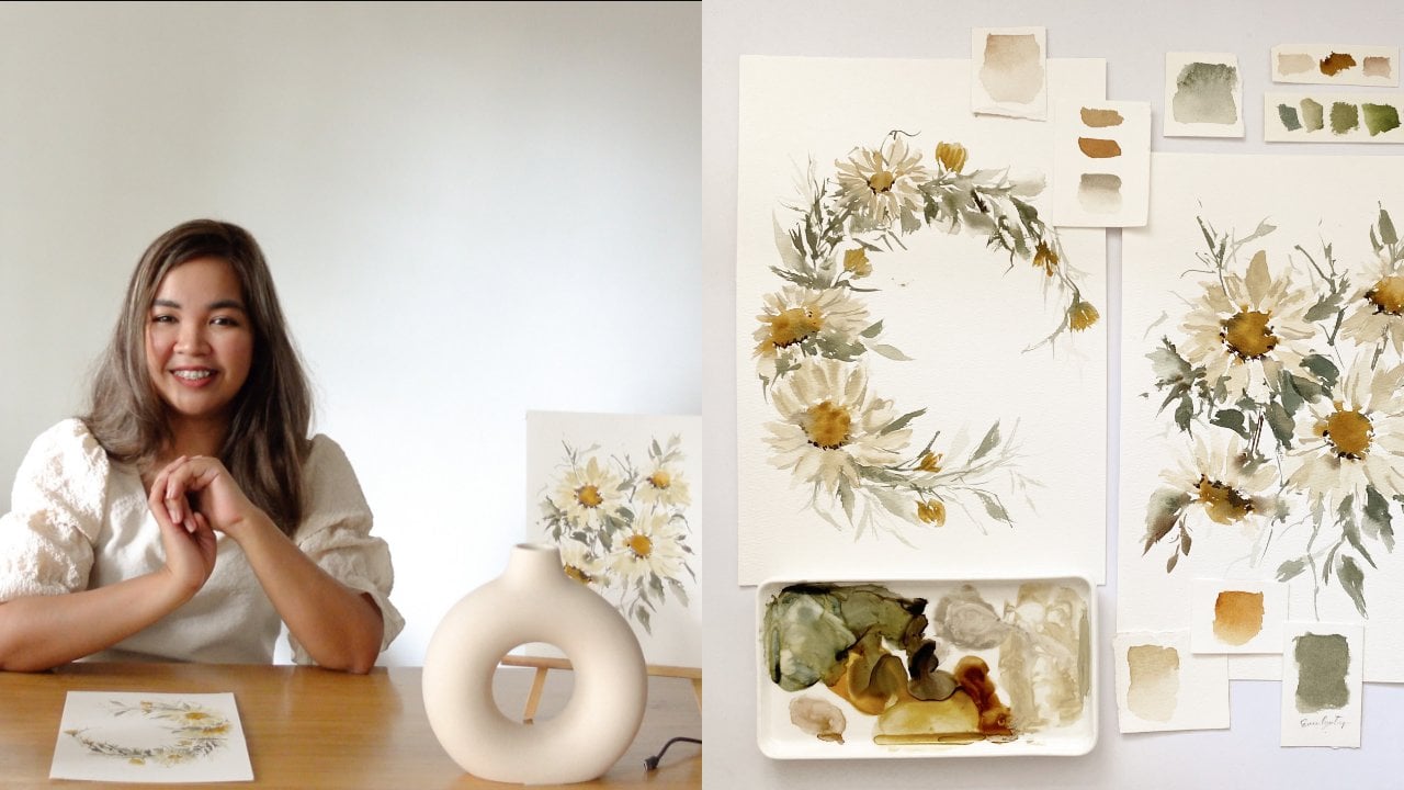
Transcripts
1. All About This Class: Watercolor is the perfect
medium to begin with. Whether you're a seasoned
artist or an ultimate beginner. Watercolor can
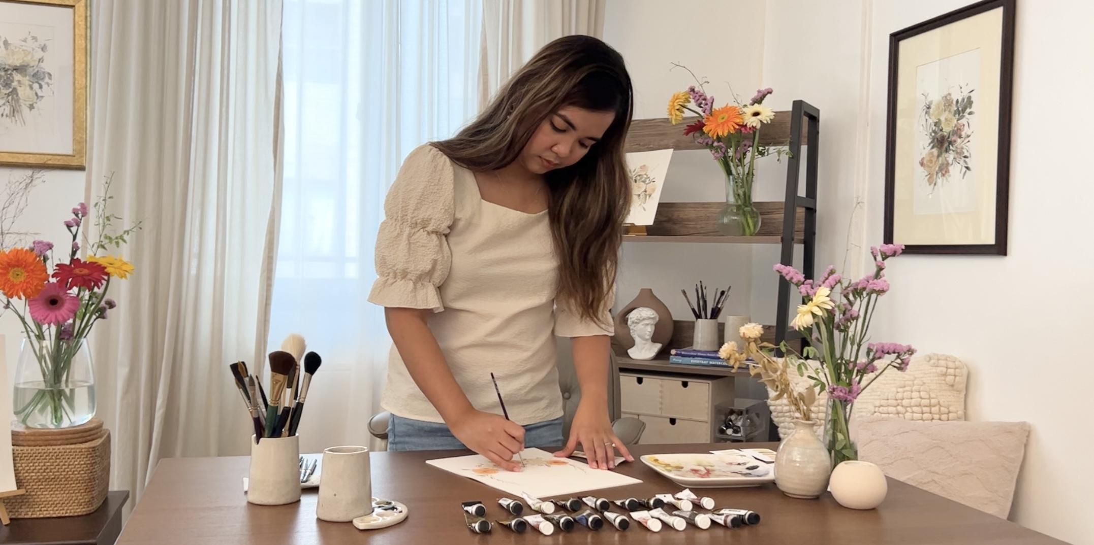
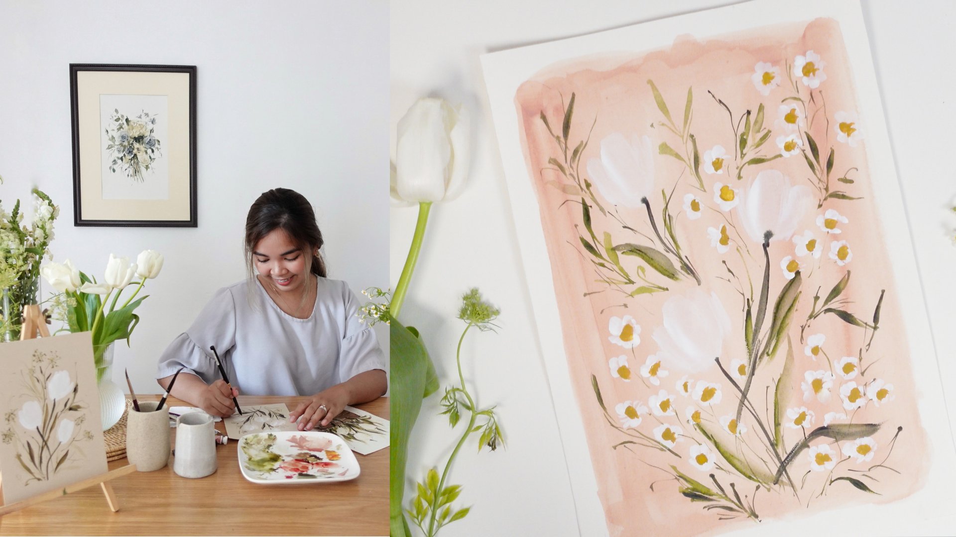
transform your idea into a magical piece of art. If you let it. Hi everyone, My name is Jenny Flores. I'm an artist and a creative
method from the Philippines. I teach watercolor,
calligraphy and creative entrepreneurship
in person and online. I'm a silver brush
ambassador and my works have been featured in various
medias and articles. I really love painting flowers. They're graceful stamps, soft petals and
glowing colors are just perfect match to the translucent and soft
characteristics of watercolor. In this class, I'm going to be introducing you to the
wonderful world of watercolor. I'll share with you
the right tools that you can use to start your journey from paper to
brushes and of course, colors. Then I will walk you through the fundamental
watercolor techniques, color values, brush markings, and apply those in painting loose and romantic
floral elements. After you learn all
those important lessons, we will then move on to
learning how to combine all those techniques to create seven blooming and well-balanced
watercolor floral. It doesn't matter if you never
picked up a brush before, because in this course, we're going to
start from scratch. I'm so honored that you're here and I hope you stick
around till the end. Can't wait to see what
you're going to keep. So pick up your brush
and let's get started.
2. Class Overview: Hello students and
welcome to our class. You probably can't wait
to start painting. But before we begin, I would like to introduce
you to watercolor and discuss with you the
flow of our claspers. As a beginner, I'm
sure you've heard a lot of misconceptions
about watercolor. Some people say that it's
the hardest meet you, or supplies are expensive, or you must learn how to draw first before jumping into it. The truth is, all of these are just myths with proper
foundation and knowledge. You can master this
medium in no time. And yes, they're
learning how to draw can be advantageous but
certainly not required. Let me introduce you
to the beauty of loose watercolor
painting in this style. Instead of coloring the sketch
that we initially made, we focused on the
strokes that are brushes can create with Ginny. I don't even know
what brushes to get, how to use it, how
to control water. Don't worry, because these
are the things that I had in mind when I was
planning this class. We begin our discussion about the supplies that you need
to start your journey. I will share with you the specific materials
that I will use, the brands decisis, all. Of course, I will also
suggest some alternatives. If you find my suggestion a
little beyond your budget. After that, we will
dive into one of the most important lectures in watercolor, the
watercolor techniques. I will explain the
important techniques that you need to know. And I will also show
you some examples on how I applied them
into actual painting. Lesson three is all
about color value scale, which is also a
foundational topic that will help you identify the right shade of color and the right amount of water that
you must load your brush. The last foundational lecture
is the brush markings, where I will introduce you to the different brushes and the brush marks that
they can create. I strongly believed
that actual practice is essential for you to
understand a certain topic. With that, I really
suggest that you paint along with me
and do exercises. So you can translate your
learnings into muscle memory. After learning all
these fundamentals, I will now start
teaching you how to paint actual botanical elements. Bromine leaves, blue flowers. Of course, without
practice and application, these lessons will
just be forgotten. So I prepared a series of
floral wreath projects that we can paint using the techniques that we have
learned from the class. On day one, we will paint this
peach roses surrounded by yellow and voltage
filler is we will apply the wet on dry technique that we have studied on this project. On day two, we will paint this
values and roses frame and focus on combining harmonious
colors on a composition. They tree is for an MNEs and
relentless on this class, we will apply a lot
of brush marks from different brushes that we have discussed on the
previous topics. They four is all about mastering
thick and thin strokes. For this, we will paint a
blooming cherry blossom wreath. On day five, we will focus on different color value
scale and create vintage streets using
minimal colors. They six is quite
different as we will incorporate calligraphy
on already. For the last project, we will paint this beautiful blue and white process sweet, and refresh ourselves with the different lessons that
we have during the class. Make sure to upload
your class project on the class project section so I can check it and give feedback. I'm sure you can do it to learn. So let's begin.
3. Supplies: Knowing the right
tools for painting, it's like knowing your
weapon for a battle. The right supplies. You can step up your game
in watercolor and you can easily understand how
to use the medium property. Today, I'll be sharing with you the essential materials for watercolor and the
specific tools that I will use for the class. Let's begin with
paper and watercolor, the most common types of paper, or hot pressed and
cold pressed paper. The main difference between
these two is derrick texture. Hot press paper is smooth and
doesn't have any thoughts. That's why water
flows freely on it. For the cold press paper, it has a bit of a texture that controls the flow of water, which makes it easier for
beginner artists to use. Both papers have their own
advantages and they are useful depending on the style of painting that you're
trying to achieve. For loose floral painting style, it is best to use a
cold press paper as it will make it easier
for us to control water. For this class, I'll be using this tree watercolor papers. All of them are in 300 GSM
thickness and cold press. So the first one is the Netscape electro
watercolor paper, then the bow hunt Academy
watercolor paper, and lastly, Fabriano artistic
or watercolor paper. These brands are high-quality
watercolor paper that I've been using
for years already. If you're looking
for an alternative, I can suggest the
following brands. For 300 GSM, a 100% cotton. I can suggest the artists, which is in green
cover, Saunders, Waterford, and Canson Heritage for lower GSM and
not a 100% cotton. Here are the brands
that I can recommend. You can use this
while practicing and testing if you want
to invest on this medium, that's it for paper. Now let's move over to brushes. There are tons of brushes
available in the market. When I was a beginner, I really get confused. Which of these hairy toes
should he get for watercolor? For today? I'll be sharing with you the essential brushes
that you must check out if you're learning loose
watercolor painting style. First is a round brush. This is the most
common brush shape and it basically
can paint anything. Round brush have pointed tips and big belly that
can hold water. Another brush shape is a
filbert brush or an oval brush. This one has a
rounded shape that is very useful in painting petals. Lastly is a liner brush. This one has long hair stands that can create long
straight lines. For our class, I'll specifically be using
the following brushes. Silver black velvet,
size eight, size six, and size to silver
crystal oval wash brush, size three over four. Silver silk, eighth, eighth over crescent brush in size
three over eight. Silver black velvet
liner brush in size one. And so Brazil 88 mono line
brush in size 20 over 0. Now those are the brushes that we'll be using for the class. Let's move on to our next
tool, which is watercolor. Watercolor comes in
either pans or tubes. Both of them serve
the same purpose and the main difference
is their case. What's actually more
important is the ingredients. Not all watercolors
are made the same. When you go to an art store, you will notice that they sell either professional grade or
student grade watercolor. The main difference
between the two is the amount of pigment
that they contain. Student grade watercolor
tends to have more binder or filler
compared to their pigment. That's the reason why
there are less expensive, while professional
grade watercolor contains more pigment
than binders. That is the reason why
artworks made using professional grade paints
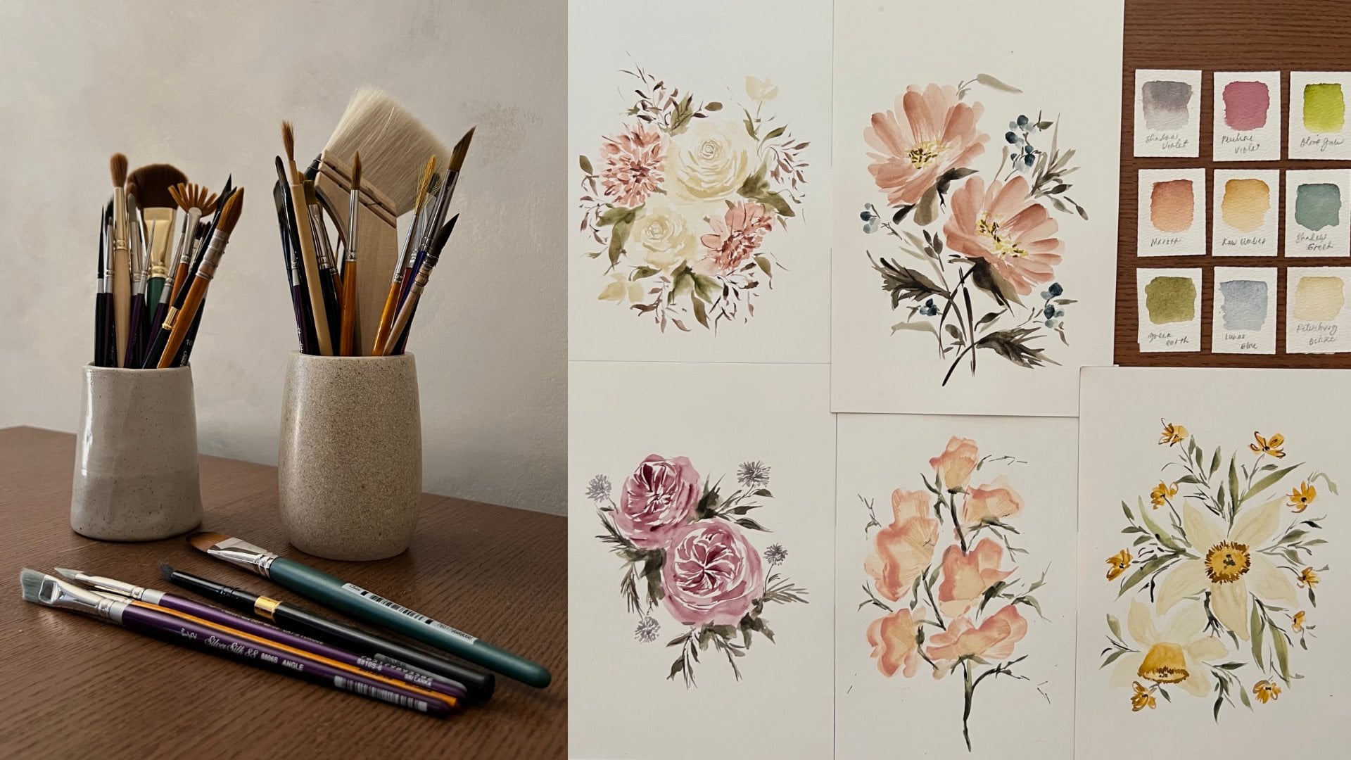
don't fade easily overtime. For this class, I'll be using the following watercolor sheets. Green earth from Netscape, Elektra, undersea
green by Daniel Smith. Olive green by Magellan. Raw, umber, yellow.
Yellow ocher. Number two, by me, jello pearl gray from
Netscape, polyhedra. Sophia from Winsor and Newton. Van **** brown from each yellow. Petersburg occur from
NAB Skype palestra, mocha, from Netscape, Elektra. Martin from lab scale pilot. Quinacridone, permanent
magenta from a jello. Potters, pink from Daniel Smith. Quinacridone, burnt
orange from Daniel Smith. Maroon from Netscape, Elektra. Perylene maroon from mid yellow. Indigo from jello. Shadow violet from Daniel Smith, shadow violet from a jello, and lavender from a jello. Note that you can also
use other shade close to these colors if you don't
have them on your palate. The other supplies that
we will be needing, our pencil, eraser, circle guide, water and cough, tissue and mixing palette.
4. Loose Watercolor Techniques: If you're new to watercolor, it is very important
to understand how water behaves on your paper. In this lesson, I
will walk you through each watercolor
techniques and explain to you how you can apply these
techniques in painting. As I have mentioned earlier, the lessons that you gain
from watching the videos will not translate into
muscle memory of your hand. If you don't join me on
keeping the exercises, I encourage you to pick up
your brush and paper and join me as we discussed, important
watercolor techniques. The first and the
most common technique is the wet on wet technique. When we say
wet-on-wet technique, it means that we
are going to apply a new layer without waiting
for the first layer to dry. Let's say this is
our first layer. While this layer is still wet, we're going to add another
layer on top of it. I'm going to use
a shade of blue, so it will be very visible. You will easily notice that the second layer just mixed on the first layer and that is how the wet on wet
technique behaves. Let's make another wet on
wet technique example. And this time I am going to
use dots instead of lines. This is our first layer. As you can see, it's very
watery and very wet. While this layer is still wet, I am going to add
another shade of blue and put it on top
of our first layer. You will notice here
that same thing happens. The dots are just mixed
on the pink base layer. Here's how we can apply the wet-on-wet technique
on actual painting. Here on this day series, you will notice that
on the core of our day sees I used two
shades of raw amber. So I applied the wet
on wet technique here by creating the
base layer first, which is a light
mixture of raw umber. And then while it's still wet, I applied the more concentrated
mixture of raw umber. So as you can see,
they mix beautifully and there was a nice transition
between the two shades. The second watercolor
technique that we have is called wet
on dry technique. When doing the wet
on dry technique, we apply a layer of paint when the base layer
is already dry. Let's say this is a base layer. Let's create another
one so we can have two examples later on. We will let this
layer dry first. And then once they're dry, we're going to add another
layer on top of them. After a minute of waiting, my base layers are
completely dry. I'm now going to add another
layer on top of these and you will see how the
wet on dry technique works. I got here a very concentrated
mixture of indigo and I'm creating lines on
top of my base. So as you can see here, the second layer that
I made did not mix, and that is how the wet
on dry technique behaves. So let's try it again. On this layer. I'll create dots and lines
and all the strokes. And you will notice
that none of them mix. Unlike the wet and dry
technique, the color faded. So for the wet on wet technique, you can create strong
and crisp lines without letting it mix
on the base layer. Here's what it looks
like when we apply the wet-on-dry technique
on actual painting, I have here my cherry
blossom wreath. And you will notice
here that I created some dots and lines on the
core of my cherry blossoms. You will notice that the petals and the
court did not mix. And I was able to
create crisp lines and dots by applying the
wet on dry technique. Familiarizing yourself with
these watercolor techniques will help you understand how
water works on your paper. And it will help
you know when and where to create
your neck strokes.
5. Color Value Scale: Alright, now that you know the important
watercolor techniques, I want to introduce you to another foundational
elements in watercolor. Color value. As we all know, water is so important
in watercolor painting. It is the one that adjust
the intensity of color, making it dark or light, depending on the amount of water that the load
on your brush. It is very important to know how much water you need to
achieve a certain color value, as well as knowing
when you need to use intense or light colors. On this topic, I
will share with you the concept of
color value scale, and some tips to easily remember the intensity of color that you need for
a certain stroke. In studying color value scale, we need clean water. So load your brush
with water and remove excess water
from your brush. By doing this, make sure to not load your
brush with too much water. We only want it to be wet. Alright, So after that
we're gonna get a colors. I'll be using perylene maroon, but you can use any
color that he liked. What we need to do next is
load our brush with our color. Since our brush is wet, we will be able to get an
intense color like this. As you can see, it's
very concentrated. And that is because we only have a little amount of
water on your brush. So what I want you to do
next is soak your brush with water and load it with a little more water again
and then get the same color. Now, when you do that, you will arrive in
this shade of color. As you can see, it's still pigment it with a
little bit lighter. And then I want you to load it a little bit more water and add more and more water
until you arrive in a very light mixture of color. As you can see, we were able to arrive and different shades of color just by adding
water on our brush. And that shows that
water is really important and plays a
big role on watercolor. Now we will be using these
shades on our patients later on and to help us remember what shade of color should
we use on a certain stroke, we will be labeling these and naming them with
something that's easier to remember for the darkest shade or the most concentrated
and shade of our color, we will be calling
it watery mixture. And then for those colors
which are pigment that but a little bit lighter
compared to the water mixture, we will call it milk mixture. So those are the blue shades
after the watery mixture. And then those lighter ones, we will call it team mixture. I want you to
familiarize ourselves with these shades and
these shades names. So that when later on when we create our paintings already, when I mentioned the mixture, I actually meant this shades. And when I say milk mixture, these are the sheets
that I meant. When I say butter mixture, I meant concentrated, most
concentrated mixture. To give you some idea
and how we will use the different color
ratio for paintings. Here are some examples on how I applied them on our actual rate. For this wreath, I use
different water and color ratio for the lease to represent
some leaves on the back. I use the mixture for those
that are in the middle, I use milk mixture and
those that are in front, I use water mixture. Another example is this
cherry blossom wreath, where I use tea, milk and butter mixture on different areas of
my composition. So for the core, I use butter mixture, for the actual petals, I use milk mixture. And for those that
are falling cherry blossom petals or those
are in the background, I used the mixture. Again. It is so important to
know when and where to add intense colors and light
colors for your occasion. So if you don't know and if
you don't have any idea. The basic rule is if you
want something to be notice like subject or a
detail that is very important, you misuse intense
color for that. And for those details
that you don't want to be visible or you just want them to be added as background or extra details. You can place them
using 18 mixture. That is it for quick lesson
about color value scale. I'll see you on our next topic.
6. Brush Markings: Your brush is your main weapon
when it comes to painting. Therefore, it is very
important to get to know it so you can use it
to its full potential. For today's lecture, I
will introduce you to the different brushes that are essential in painting
loose flowers, as well as the brush marks
that they can create. I have here a round
brush and oval brush, a liner brush, and
a detail brush. Let's begin the lecture
with a round brush. I have here my three
mostly use round brush, the size eight, size
six, and size two. So these are the silver black
velvet voyage addition. There a travel brush version of the silver black velvet
brush for today's demo, I'll be using the size eight, but you can use any size
when you follow along. One of the brush marks that are round brush and create
is the thin strokes. We do this by letting only the tip of our
brush touch the paper. Let it touch and drag it. You can do this
on any direction. You can do this on a
current version as well. Again, only the tip of your
brush is touching the paper. Don't put too much
stress on your brush so that you won't
create a big stroke. The second stroke
that we can create using a round brush
is a fixed rope. You can do this by
pressing your brush against your paper
and then dragging it. You can also lean your
brush a little so it will be easier for you
to drag your brush. The thickness of
stroke that you can create depends on the
size of your brush. If you're using a
size eight brush, you can create bigger stroke. But if you're using a
size two round brush, only smaller strokes
can be created. The next stroke that
your round brush can create is
called flat stroke. You can do this by
dragging the whole body of your brush
across your papers. As you can see, my brush is facing the opposite direction. And you can see that
I can create a very, very big stroke using my size ten round brush
for an extra book, we will be combining our
thick stroke and thin stroke. So we'll do this by
pressing our brush on our paper and then
slowly lifting it, breaths and then lift. So as you can see, I
was able to create a one stroke leaf
using this trope. And not only that, because using this
type of stroke, you can also create battles. So this one is very important. And the secret and creating a perfect thick and
thin combination stroke is by doing it slowly. So don't be in a hurry. Do it slowly and lift
your brush slowly. So the next drug that we have is just the same as the
combination stroke. But this time we'll make
it a little bit curved. So as you can see, I made it a little
curve at the top part. And I want you guys to practice this one in both directions. So going to the
right and going to the left, because later on, this will be useful in creating, again leaves and petals. For our next couple
of brush marks, we will be using an oval
brush or Philbrick brush. The green one is
size three for it, and the purple one is
size three over eight. Just like a round
brush and oval brush or a filbert brush
can also create a lot of brush markings
that are very useful in creating flowers and leaves. For our first brush mark, you will be using a size
3 fourth filbert brush. And what we're gonna do is twist the brush and use the side
of it in creating marks. So as you can see here, I was able to create
this rounded lines. And you can also do this by
creating smaller versions. This is very useful in
creating petals for small flowers like
camomile or some fillers. As you can see when you use
the side of a filbert brush, it can also create
long line like this, and it really holds a good
amount of water and pigment. Another useful stroke of a filbert brush as
the flats stroke. So you can do this stroke by just dragging your brush
from top to bottom. And as you can see, it created another
round shape brush mark. Again, this is also
useful for creating that also for camomile
and some small flowers. Let's try it once more. So just do flat strokes. And later on when we
paint our camomile, you can combine the
side stroke and flat stroke when
painting your petals, but I'll discuss it
more when we're on the topic of painting
flowers already. The next brush mark
that we have for our filbert brush is
called the half stroke. This is very similar
to our flats stroke, but in here we're just using
the half of our brush here. This is not so visible when
you're using a small brush, but if we switch to a three-fourths size
brush or something. Beggar, you will notice that this stroke is very
beautiful as it can create short but
rounded and wide strokes. So this is very useful
in creating battles for anemone and some other flowers
that has big round petals. That is it for our
filbert brushes. Now let's go to our next brush, which is a liner brush. I have here, my
script liner brush from silver black velvet. This one is incised, one. Using this brush you can
create long thin lines because it can hold a lot
of water and pigment on it. This is very useful in
creating details like long stems or some
foliage like branches. I always use this to create random branches on my paintings, especially for
reads and bookcase. It can also create thick stroke, but this is the thickest
and it didn't create. If you're using a size
four liner brush, of course it didn't
create bigger strokes. Aside from thin
and thick strokes, this liner brush can also be useful in creating
dots like this. And again, it can create
a lot of dots because it can hold a lot of
pigment and water on it. The best thing that
this brush can create, its combination
of three strokes, the thin and thick strokes. So again, you can use this to create random
branches like this. Last brush that we have here
is called detail brush. This one is the
monoline brush in size 20 over 0 from silver
silk eight, the eight. And the brush marks
that this brush can create our thin and
thick stroke as well, but it is very
useful in creating thin lines for the
core of your flowers. I use this for the
core of my cherry blossom in creating
dots and lines, as well as creating
dots and lines for the core of my anemone is, of course, if you
don't have this brush, you can use a small round
brush is an alternative. But I would suggest that
you use size 0 or size one. Maximum is size two round brush if you don't have a
mono liner brush. So those are the
brush marks that are essential
brushes can create. You know, it is very important
to get to know your brush, especially if you're
just starting. The best thing that you can
do is to use a few sets of brushes and play and explore
with it while practicing. You'll not only get used to it, but you'll also discover more strokes that your
brush can create.
7. Painting Leaves: Finally, we are now going
to paint something. I know you're itching to
create an actual art and thank you because you
didn't skip the lessons. Leaves maybe the simplest botanical elements
that you can paint, but they surely add a lot
of beauty on your creation. On today's topic, we
will learn how to paint different types of leaves
using different brush strokes. So the first type of leaf that we have is called
The wants to cleave. This is the same as what
we have practice on our brush marking
lecture earlier. So we'll do this by pressing or brush and then
slowly lifting it. As you can see, I
was able to create one stroke leaf by just
doing that's true. Again, Let's do it. Press and then slowly lift, remember to slowly lifted so you won't miss the tip of your leaf. On your first few tries, you will surely not get a
perfect shape of a leaf. But that's okay. Just keep on trying. Also, you're not aiming
for a perfect leaf here, so that is totally fine. If you have a little
bit of extra hair or something stroke beside your
leaf, that's totally fine. We want something that
is natural looking, so feel free to add a little bit of
detail on your creation. Now let's go and do our
second type of leaf. For our second type of leaf, what we're gonna do is create curve is C-shaped using thin, thick, thin stroke as well. So press your brush and then
slowly curve is going up. So as you can see,
it's similar to the first row that
we have created, and then we'll just
give it a partner. So as you can see, using the same size of brush, I was able to
create bigger leaf. We're just doing
two strokes, again, breaths and make it
a little bit curve, and then give it a partner. For our third type of leaf, we're making a filler leaf, and we'll do this by
creating curvy line as our main stem and adding some small leaves on
some areas of it. So I have here my size
six round brush and I'm going to create
curvy stem like this. And then add some tiny
stems and some leaves. You can do one
stroke leave or to stroke leaf version
for this one. And I want you to
not make it perfect by giving each
stem some partner. But it on areas that are not across each other so that
there would be variation. And again, it won't look for effect because nature
is not perfect. So let's do it again. Add some leaves. I'm using a size
six round brush, but of course, you can use
whatever size that you have. And it will really depend on the size of artwork
that you're creating. Let's do it once more. Again. Please do it slowly. Because by doing it slowly, you can control your brush more. For our fourth type of leaf, what we're gonna do is
create a bushy type of leaf. You can do this by
creating one stroke or two stroke leaf and then adding some random thin
lines around it. So this is just a
carefree type of leaf. And I want you to do this
because this really adds a lot of beauty and natural look
on your creation later on. I know it's a bit weird
to look at alone. But when this thing
is on your creation, like your wreath or
bouquet already, this really gives nice effect and texture on your painting. The next style of leaf that
we have is a two tone leaf. What we'll do is just create one stroke or two stroke leaf. And while the base
layer is still dry, we are going to add
another shade of color. Either it's a darker shade
of green or brown or Zapier. And this gives a very nice
effect on your painting. And of course, this gives
a dimension on your leaf. When doing this, you just
have to make sure that the base layer or base
leaf is still wet. So that would be a nice blending
between the two shades. Our last type of leaf is
the leaf of a camomile. So we'll do this by
using a small size of brush and then just creating
thin and thick strokes. It's just actually a combination of thin and thick stroke, which is a little
longer compared to the one stroke leaf
that we have practice. You can also add some
random thin lines around it like this, just to give some dimension and interests on
your underneath. My style of painting, botanical elements
is actually not clean as what other
artists are doing. I add a lot of
random strokes and imperfect shapes because it's my expression of
freedom and art. For me, nature
isn't perfect yet, beautiful and that should
also reflect on my art. Now, that is it on
our quick lecture on how to paint leaves and
loose painting style. I'm excited to see you
on our next topic.
8. Painting Flowers Part 1: We are now on the most
exciting part, flowers, using the learnings
that you have gathered from our past lecture, we are now going to apply them
and paint actual flowers. For this lesson, I
will teach you how to paint floral elements in
loose painting style. We will later on use these flowers to create
R7 blooming reads. I'm sure you're excited. So let's begin. First flower that we're
going to paint is a sweep B. I have here my size
eight round brush and you sing IT team
mixture of mocha. What we just need to do is Jagger brush and create
some teardrops shape. You can extend the size
of the shape depending on what size of better
are you trying to create? There's no right or wrong here. All you need is a
good imagination. If you're not familiar with
the shape of a sweet pea. Here's the reference photo
that you can check on. While the base layer of your
sweet pea is still wet, we're going to add some
concentrated mixture of moca on the edge. This is to copy the actual
reference photo that we have. And it is also best if
you will add stems of your sweet pea while
the main flower is still wet just so there
will be a little bleeding. Let's do it one more
time. Same color. By the way, you don't have to use same color for your sweet b, you can actually use purple
or blue or even yellow. This is just my choice. So you can pick your
own color if you want. If this is your
first time to create a sweet pea flower
and didn't get it. That's totally fine. Just keep on trying and
keep on practicing. Our second flower
is a Canon Law, and we'll be using a small
filbert brush for this. So for color we will be
using Petersburg ocher. And what we're gonna do is
just create flats, true? Remember the flat stroke
that we practiced earlier? Create flat strokes that
will circle around the core. This is the first version, and in here I want you to combine different
water and color ratio. You steam milk and butter. Use butter for the first three
and then add milk or add T. You can also use pure butter mixture or a pure
milk mixture if you like. The second version is by
using the side slope, will use the side of our
filbert brush for this one. And same procedure will create battles circling
around the core. Again, use different water in color ratio for
each of your pet. Once you're done
with your petals, we will make sure that it's dry already before we add our core. So we will be doing the wet
on dry technique for this. For the core, I'll be using
raw umber and butter mixture. This step is very simple. All you need to do
is create the circle in the middle of your camomile. If you don't have raw umber, you can use yellow ocher. But if you use yellow ocher, your color will be a little brighter compared to raw umber. Once you're done with your core, we will let it dry
again before we add an extra detail
for our petals. So mine is already dry. I'm just checking. This time. We will be
using watery mixture of Petersburg ocher and
a small round brush. I'll be adding some
lines in between my petals to separate
them from each other. Our third flower is
an anemone and I'll be using a tree fort
oval brush for this one. All you need to do is create
flat strokes like this. If you have smaller brush, you can combine two strokes
to create one petal. For the color, I'm using pearl gray from them,
scaffold, cetera. All you need to do is
complete the petals. This one is a flat
version of anemone. The second one, I'll be
doing a site version. So I'll be creating three
flat strokes for the petals. And then I'll
combine one bunch of stroke for the
bottom petal test. You can see the
bottom petal is quite flat compared to those
that are on top. Alright, so what we're
gonna do next is let it dry first and then we
will be adding the core. For the core, I'll be using a size six round brush and
butter mixture of indigo. What I'm gonna do is just create a circle in the
middle of my anemone. For the second anemone will just create a half circle
for our core. Because we're trying
to give an effect that the core is a little
bit covered by the petals. Next step are the details. So I'm using a detail brush. I'm just creating
dots around my core. So as you can see, I
left a little space between the dots and
the main circle. And that is because
we will be connecting this using some lines later on. You don't have to wait for your main core to dry
before doing this step, we can do wet on wet
technique for this. Once you have completed
all the dots, it's now time to add the lines. Create lines as thin skin. So it is really better
to use mono liner brush or detail brush for this
part of your painting. Be generous and
creating the lines, create a smudge
lines as you can. But also make sure
that they won't create thick gloves or thick lines. Alright, now let's proceed
to our second and M10. I'll be doing the dots again. For the dots, you can
also create a lot of it. You don't have to
limit yourself. After creating the dots. You can now proceed with
the lines, same procedure. So as you can see,
I only created half of the dots and half of
the lines because again, we're trying to communicate that this anemone is a
side view anemone. Next step is some shadows. So I have here a milk mixture of pearl gray and
size two round brush. And what I'm doing is adding some thin lines
between my petals. So as you can see, I'm also dissolving the strokes
that I'm creating using clean water because
we don't have to create harsh lines
between our petals, so we just need to blend it and add a little
bit of shadow. We're going to do the same
step for our second anemone. Again, let's maintain the
dimension of this flower by being careful when adding some shadows on
the bottom petals. So our next flower
is a cherry blossom. For this one, I'll be using
a size eight round brush. You can use size
than or a size six depending on the size of cherry blossom that
you're trying to create. For this one, what
we're gonna do is to scrape to stroke leaf, just like what we have practice. Create five of it. While the base layer of
these petals are still wet, we are going to add some dots of concentrated color in the
core for this cherry blossom, I'm using quinacridone,
permanent magenta, but you may use any
shade of pink or red. The key like, Let's
try another one. Again. Just create by petals using the mixture of the
color of your choice. And while the base
layer is still wet, we're going to add some dots of concentrated mixture
on the middle. Now for a single stroke, Cherry Blossom, what
we're gonna do is just Jagger brush like this. Then for a side view
Cherry Blossom, what we're gonna do is
just create three petals. Then for the bottom part, we are going to create
flat petal like this. So it's as if creating a
smile on your cherry blossom. Same procedure while this
base layer is still wet, we're going to add some
dots for the core. This one I'm using milk mixture. We will let this base layer
is dry up first before we add the main details
for domain detail, I'm using a detail
brush and adding some dots in the
center for the color. Just use concentrated mixture of the color of your choice. For me, I'm using butter mixture of quinacridone,
permanent magenta. So after adding the dots, you will add some lines as well. For this one, you can spread the dots even in the
middle of the lines. We don't have to limit the dots on just the
outer part of your core. You can put it in the middle on some areas just to
give an effect that the core is spread all over the center of
your cherry blossom. Again, before doing this, make sure that the base
layer is 100% dry already. For the half chair you blossom. We'll just do the same. But again, like the
anemone will just do half dots and half lines. We're not going to cover the bottom part of
our cherry blossom. That's it for our
cherry blossom. Let's move over to
our next flower.
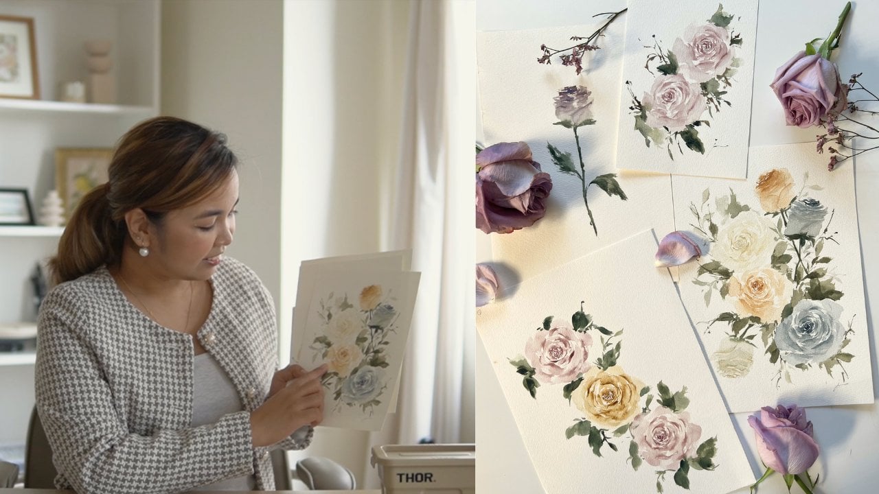
9. Painting Flowers Part 2: Our next flower is no other than the crowds favorite roses. In painting roses,
what we're gonna do is paint or base layer first, using a size eight round brush, we will create soft base layer. Remember not to make the base of your rose perfect circle
and curves and edges. So it will look more natural. I'm using t mixture
for this one, but you can also
use milk mixture. You may choose whatever
color that you live with. For this one, I'm using mocha
from Netscape, a literal. I'm creating a lot of base. So later on I can
show you how to make the delta for a process. We will let this base layer dry first before we
add another layer. Since the base of a
rose is dry already, it's not the perfect
time to add details. We will use butter
mixture of Mocha and for the brushes we will use size two and size six alternately. On this part, we will apply the wet on dry technique
that we have studied. In creating the details. We will apply thick and
thin and C strokes. This is what we have learned
on our past lecture. We'll do the C
strokes alternately until we reach the edge
of our base layer. For the core, we will
be using a small brush, but as we go out of the center, we will switch to our size six brush and make
bigger C strokes. For bigger C strokes, I'm also softening the edge by loading my brush
with clean water. Through this, I can create soft transition from my strokes. This step is actually optional
but highly recommended. If you're still having a hard
time doing this C strokes. This is a refresher for you. Just create thin stroke and then slowly press your brush
and then slowly lifted. So you're dragging your brush while slowly giving
some pressure. I know it takes time
to perfect this row, but it is very useful
when you get used to it. Now let's try doing
our second rose again. Again for the details, we're just doing C
strokes on the core. And as we go out of the center, we're switching to
a bigger brush. Don't forget to add our
extra staff which is softening your edge by loading your brush with clean water. Let's refresh ourselves
again with our details. And again, in creating
your details, just creates C strokes
and apply this thin, thick, thin strokes that we have learned on
our past lecture. We'll do the C
strokes alternately until we reach the edge
of our base layer. And we will also switch to a bigger brush as we
go out of the center. For the extra detail, we will be softening the edge of our bigger strokes by loading your brush with clean water. Arose will never look like a rose if we don't
add leaves, a net. So for extra detail, you can also add some leaves
and some areas of your dose. For our next flower, we are going to
paint a rose again, but this time it's a rose
while for the base layer we will be doing a
cylindrical shape base. And then you can also add some extra stroke on
some side like this. So create the same
base cylinder type and then add some
stroke like this. Now we will let this
base layers dry air first before we add
another detail. So create as much base
as you can so that you can add more details
later on for your practice. Since the base of my rose
buds are already dry, I'm going to add
the details now. For the details,
this is actually the same as our main
roles, but in here, instead of covering
everything with C strokes, we are going to stop
on the top part only. Once you're done. We are going to create a
slightly diagonal stroke for the body of a rose bud. It's just easier right? Now let's go and proceed to our next rose bud will
do the same procedure. It C strokes for the core or the top part of your rose bud. And once you have finished, we will add diagonal
strokes on the buddy. Last one. Let's finish this one. If you're still
having a hard time deciding where to
add your stroke, you can actually
check an actual photo and see where
shadows are located. Those shadows will
be your guide in deciding where to
add your strokes. Let us add some leaves and stems for these rosebuds to
add some extra details. As you can see, once you
add the leaves already, it really adds a lot of details and it makes it more row C. Okay, so don't forget
to add those videos. Next flower is a
relentless in an unclear is a soft pink
flower with the green core. Using a team mixture
of Mocha for the base and milk mixture
of green for the core. Using a size eight round brush, we will paint the core by
creating curved strokes, so calling on each other. The next step is
to add the core. Will add the core by creating
circle of green strokes. In the middle part
makes sure that the base layer is still
wet when doing this, but not too wet, the green will spread all
over your base already. Let's create another,
an enclosed space here and add the green
core in the middle. You have to be a little
bit quick when doing this because if the base
layer is already dry, it will be very obvious
when you add the core. Next step is to add
the folds and petals. We'll do this by creating
long see stroke from the edge of the core until we
reach our besides size, we will leave a
little white space in-between to represent
our highlights. I'll paint one more renin clues so I can prepare you later on. Before we paint our fleets. Again, let's paint
the base layer. You seeing a very light mixture of the color of your choice, leave a little
whitespace in the middle so we can have
space for the core. Time to add the core is
seeing my green earth of adding a circle in the
middle of my base layer. Time to add the
petals and the false. We'll do this by creating
long see stroke from the edge of our core until we
reach our desired size. We will leave
little whitespaces, are little spaces in between
to represent or highlights. Next flower is a dahlia, and we'll do the petals over Dahlia by creating
checkmarks like this. Just press your brush
and then quickly lifted. You can make it longer by slowly dragging it and then
lifting it like this. Let's create our
first Dahlia using a size six round brush and
a milk mixture of maroon. I'm creating small
check marks like this on the center of my Dahlia. And as I go out of this enter, my strokes are getting bigger. You only need to add more and more petals until you reach the size
that you want. For this layer, I'm
using a mixture of tea and milk mixture. While this layer is still wet, I'm going to add butter
mixture on some areas. And since the base
layer is still wet, this will create a nice blend
between the two layers. It is also nice if you will, add random thin lines
on the other part of your Dahlia just to create some illusion that there is
some petals at the back part. And that's it. Let's do another one this time. I'm going to use
purple, the base layer, create the core of your dahlia by creating small checkmarks, and then create
bigger check marks as you go out of the center. Again, use D and milk
mixture for this layer. Remember that
balanced the size of your data yet to the
size of your battles. If you're creating a big dipole, dahlia, petals should
be bigger as well. Again, after creating
the base layer, we will add the darker
mixture of color. Make sure that the base
layer is still wet. When doing this. Not too wet, the base layer will be fully consumed by
your second layer, but still wet enough
for the first layer and second layer to mix beautifully. The last step is to add some thin lines on the edge
to represent some petals at the back part of that
is it for our dahlia? If you want to learn more about painting dahlias and roses, I have a class here on Skillshare that will
surely help you. That is it for painting flowers. I'm excited to see you
on the next topic.
10. Tips on Creating a Beautiful Wreath: One of the best things to bank using loose painting style. This circular floral
arrangement shows nothing but beautiful flow of flour and
other botanical elements. On this topic, I
will share with you three tips on how to create a beautiful and
well-balanced three. Ip number one, create the guide. Creating a guide
before diving into painting is very
essential as this will help you place
your subjects to your wreath in a
more neat manner. Without the guy, you might end up placing your subjects or foliage on areas that will make your whole composition
look imbalance. Basically, you can use
anything as your guide. For circular deeds. I always use my candle
cover and for ovals, I use a plate that
I got from ikea. Again, you don't have to buy an expensive supplier for
you to create the guide, you just need to be resourceful. Step number two is
complementing colors. Whether you're
creating a wreath or a bouquet or landscape
composition, having a harmonious flow
on your color is important so that the whole look of
your artwork is balanced. If you're not sure what colors to choose for your painting, you can always check
Pinterest for inspiration. Yes, you don't have to limit yourself to just checking
floral paintings. Inspirations are everywhere. You can check interior design, color palette, color
combination for outfits, nature
photography, everything. Let Creative Juice
be enhanced by exploring different
sources of inspiration. Number three, create the
flow and stick to it. It is very important to plan where to place
your subjects. Aside from that, you must also decide whether you're
creating a half wreath, a full-width, or frame. And lastly, remember not to overdo your wreath and
know when to stop. Now that you're ready
and equipped with all the lessons and
tips that I serve you. I'm sure you're beyond ready to create your class projects. Before we dive in, I want to remind
you of something. If your work doesn't
look the same as mine or your output doesn't seem presentable in
your own judgment. Don't stop. It takes time and practice
to develop a muscle memory. Keep creating and
focus on your goal. Okay, now let's go and
fainter for sleep.
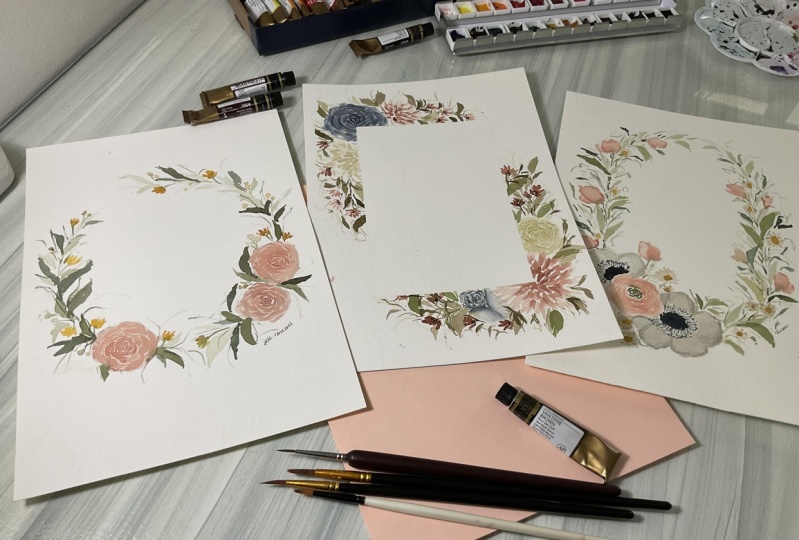
11. Day 1: Peach Roses: Finally, we are down to
our painting challenge. I'm sure all of you
are excited to apply everything that you have
learned from our class. So now let's begin our
loose floral rechallenge. This is the first composition
that we will create. And as you can see, it's a
beautiful wreath consisting of soft peach roses surrounded
with yellow and wage fillers. This is a good start for
our challenge because this painting contains
one type of subject only, which is the peach roses. We will begin this
composition by painting the base
layer of our 0s, followed by adding the details
of our main subject and finishing off by adding
fillers and main leaves. Before we start here, the materials that we
need for this week, for the colors we will be using. Mocha, Petersburg ocher, green, Ernst Van **** brown, undersea green and yellow ocher. For the brushes, I'll be using silver black velvet size 862. We'll also be using silver
black velvet liner brush, which is in size one, and the silver silk
eight to eight mono liner brush in size 20 over 0. Lastly, for the paper, I'll be using the White
Nights watercolor paper, which is a 300 GSM
paper in 100% cotton. To help you create
a perfect grid, we will initially create a
circle guide by drawing it. We will now erase the
initial guide that we have created for it to be not be very visible later when we paint the
watercolor over it. For our main subject, we will use this
beautiful shade, which is called Moka
from them Skype Elektra. Our base layer will
be in milk mixture. So for our first row, we will apply everything that we have learned on our
previous lecture. Using a size eight round brush, we will create a soft
base layer for our rows. Remember not to make the
base a perfect sukha. Add curves and edges, so it will look natural. Now let's move over
to our second row. So for this, we will
apply the same principle. Paid the base layer will
milk mixture of Mocha and then make the shape of euros at G and curvy at the same time. When you're done with
your base layer, you can add a
concentrated mixture of moca on the
center of your dose. This will later on give
depth to the core. On this part, we will
apply the wet on wet technique that we
have studied earlier. Our third rows will be placed on the lower left side of already. Same process will apply, paint the base layer with
the milk mixture of Mocha and add a concentrated mixture of color in the
center of the base. We will let our base
layers to dry first before adding some
details while waiting, let's first add some
leaves on already. So this is the base
layer of our leaves. And with this, we will be using
green earth from Netscape bilateral mixed with undersea green and a little bit
of Van **** brown. For the base leaves. I'm using a size
eight round brush and a milk mixture of the color
that I've mentioned earlier. We will combine the
one stroke leaf and the two strokes leaf. This is the style
that we have studied earlier and it will be nice as well to add a little thin
strokes on some areas. You can always check
our finished painting on the project and
resources section. So you will have a guide on
where to add the leaves. This step is very important, especially now
that we're just on the structure pace
of our painting. Even though I'm using milk
mixture and the base layer, it will be good if you will
add a little water or color on your strokes every now
and then through this urea, it will have a
variety of shades. And it will also
help you practice the art of controlling
water on your brush. We are now done with
our base layer. As you notice, we can now see the whole structure of Verde's. For the next steps, we will focus on the
details and fillers that will make a wreath look
more full and balance. Since the vase over
rows is already dry, it's now the perfect
time to add the details. We will use a butter mixture of Mocha and for the brushes, we will use size to n
size six alternately. On this part, we will
apply the wet on dry technique that we
have studied earlier. In creating the details, we will apply the thin, thick, thin NC strokes that we have
learned on our past lecture. We will do the C strokes alternately until we reach
the edge of our base layer. For the core, we will
be using a small brush, but as we go out of the center, we will switch our brush to size six and make RC
strokes even bigger. For the bigger strokes. I'm also softening the edge by loading my brush
with clean water. Through this, I can create a soft transition
from my strokes. This step is actually optional
but highly recommended. Continue adding the
strokes until you reach the edge of
your base layer. Now this, we are done
with their first rose. Let's go to the next one. Here we will just apply the same steps that we
did on the first one. Start again with the base
layer and apply C strokes. We will do the C
strokes alternately until we reach the edge
of our base layer. Aside from the C strokes, it will be good to add
thin lines as well. These still lines will represent the top
petals on your own. Now let's go to the third
rules over composition. We will again apply the
wet on dry technique and creates the stroke
from core to the edge. Remember to insert
some thin strokes in between to add some
elements on our own. Mastering how to paint
through stakes time, euros may not look
exactly the same as mine, but with the newest practice, you'll be able to develop your muscle memory and you'll get to use to the flow of water. And who knows, you might even get to create your
own painting style. We have now passed
the hardest part of this wreath on the next base, we will now focus on making
a wreath look more balanced, and that includes the
overall structure as well as the color. So the next detail that we will add is the floral fillers. For this, we will use butter
mixture of yellow ocher, but feel free to add some milk and team
mixture on some areas. Using my size six round brush, I will just create
downwards strokes of around three to
five for each set. Remember to add distance on each set so it won't
look too crowded. Spread the filler is
all over the wreath until you covered
almost all the areas. For this step, we will connect the yellow fillers that we have created to our main wreath. We will use a butter mixture of undersea green for this one. When doing this step, you have to make sure that the petals that you
have created that are either dry already
are in cold state. Called means that it's
still wet but not too wet. The color will bleed so much. On this stuff. We are now going to
add our main leaves. We will use a milk mixture
of undersea green, but this mixture is close
to the water mixture. Are there any remembered
the color value scale, we will apply the second shape. From there. I'm using a size eight round brush
for our main leaves. We will combine one stroke
and a two stroke leaves. And I'll also be adding some small dots and
thin strokes on some areas to add little
details on our composition. I change my brush
to a liner brush and get some gains in
D and milk mixture. I will add random thin and
thick strokes with dots, which will look like wild
branches all over already. This is a very beautiful
element to add on every composition notches on. For our final detail, we will add another
set of floral filler. This time, we will
use Petersburg occur and create some small
circular flowers on there. We will connect the beach
fillers that we have created to our main wreath using our undersea green and our
monogram liner brush. This is the final step
on their composition. But if you think that you
read is still imbalance, what you can do a step out
and look at it on a distance. You can add big
leaves on some areas, but use a team mixture colors so the color won't be too harsh. You may also add
extra fillers on some areas that
still looks empty. And we are finally done. I hope you were able to
follow along and I hope you are able to finish
your first project. I'm excited to see it, so I hope you can upload
it on a project section. I'll see you tomorrow for
our next class project.
12. Day 2: Dahlias and Roses Frame: Welcome to day two of our fainting challenge
for today's art work. We're going to paint this
beautiful full bloom Dallas and roses frame. We will use a lot of vintage
stones in this art piece. So your color
combinations skills will be enhanced
on this project. Let's begin the lecture by knowing the supplies that
we need for the class. For the colors,
we will be using. Shadow violet from a jello. Shadow violet from Daniel
Smith, maroon, Petersburg, ocher, green earth,
Van **** brown, undersea green and sap. Yeah. For the brushes, I'll be using the silver
black velvet size 862, silver black velvet
liner brush in size one, silver silk 8281 liner
brush in size 20 over 0. And for the paper, I'll be using the Skype
allotrope watercolor paper in 300 GSM, A4 size in 100 births and gotten to this artwork is quite
different as we will be using rectangular guide
instead of a circle. I have here a five
by seven frame, Matt and I will use
this to draw our guide. We will now erase
the initial guide that we have created
for it to be not been very visible later on when we paint the
watercolor over it. Our next step is to cover the rectangle with
some washi tape or masking tape to preserve
the sharp rectangle shape. This will prevent
the watercolor from flowing over the guide
that we have created. We will now start
our painting session as our first subject. We will paint a rose
and vintage don't. You can achieve this shade
that I'm using by mixing shadow violet from Daniel Smith and shadow violet from a jello. I'm using a milk mixture for our base layer and
for the brush, I'm using a size
eight round brush. Remember not to make
the base layer of euros a perfect circle and
curves and edges, so it will look more natural. As you can see, I'm painting
over the washi tape. And that is because through this technique I can
see the full look of marrows and that
will help me create the right shape and
size of marrows. Now for the next step, you can opt to continue on
the second element beside your purple rose or move to the other
side on my painting, I'll show you first where we will be adding
the main element on the other side so you can
choose which one to do first. For our second element, I will be using the color
maroon from landscape Elektra. We will be painting a
dahlia for this one, as we have studied on
our previous lecture, we will do the check
mark strokes from the core until we reach the
size of Dahlia that we want. While the base layer of
our dahlia is still wet, we will add some butter
mixture of maroon on one side to create
shadow for the battles. We will let the base
layer dry first before we proceed an
adding another layer. For now, let's go back
to our first row spurs. Since the base of our
rose is dry already, it's now the perfect
time to add the details. We will use a butter
mixture of shadow violet, and for the brushes, we will use size to
incise six alternately. On this part, we will apply the wet-on-dry technique
that we have studied. In creating details. We will apply the thin
and thick strokes that we have learned
on our past lecture. We will do the C
strokes alternately. Until we reach the edge
of our base layer. For the core, we will
be using a small brush, but as we go out of the center, we will switch our
brush to a size six to make bigger C strokes. For the bigger C strokes, I'm also softening its edge by loading my brush
with clean water. Through this, I can create a soft transition
from my strokes. This step is actually optional
but highly recommended. Since we are now
done with the rows, let's go back to our value
and add more details. The base layer of our
dahlia is already dry and that means we can now do
the wet on dry technique. You see a concentrated
mixture of maroon. We will add some checkmarks
on some parts of our dahlia. This will strengthen
the shadow part and we'll add more
depth to our subject. And we are done with our dahlia. Now it's time to proceed
to our secondary subjects. For this one, we
will be painting a Waitrose using Petersburg ocher. For this, we will apply
the same principle. Paint the base layer with
milk mixture of the color and then make a shape
of the roast at G and curvy at the same time. Now we will wait for this
layer to dry up first. For now let's proceed to
another secondary subject. This time we'll
paint a rose bud. We will use the same
color as our rows, which is a mixture of shadow violet from both made
jello and Daniel Smith, paint the base layer with the milk mixture
of shadow violet, and add the concentrated mixture of color in the
center of the base. We will let the base layer is dry first before
adding some details. While waiting, let's first add some base leaves
on our frame. For our leaves, we will combine green earth from
landscape Alexa, undersea green
from Daniel Smith, and a little bit of Van
**** brown. For the leaves. I'm using size six
round brush and milk mixture of the colors
that we have combined earlier. We will combine one stroke leaf and to stroke leaves
style for this, it will be nice as well to add a little thin lines
every now and then, to add interests on
our floral frame. You can always
check our finished painting on the project
and resources section. So you will have a guide on
where to add the leaves. Our base layer
dried out so fast. So it's now the perfect time
to add the bigger ones. For this, I'll be using
size eight round brush. I'll be mixing green earth
with Van **** brown and aim for a concentrated milk
mixture for my needs. We will combine one stroke and do so cleaves for this as well. And I'll also be adding
some thin strokes on some areas to add
some little fillers. The next detail that we will
add is the Florida fillers. I switched my brush to an
oval crescent brush to create some small floral fillers
using the color in my ruler. I'm using the sides of my
brush to paint the petals. And just a reminder, remember to add distance to each set so it won't
look too crowded. Since the base of a
rose is dry already, it's not the perfect
time to add the details. We will use a butter mixture
of Petersburg occur and for the brushes will use size
to n size six alternately. We will do this c strokes alternately until we reached
the edge of our base layer. For the core, we will be using a small brush which
has size two. But as we go out of the center, we will switch our brush to size six and make bigger C strokes. By this time, we can now see the basic structure
of our half brain. However, the frame still
looks pale and spacious, so we must add more fillers. I have here, my size two
round brush and using a concentrated mixture of undersea green mixed
with Van **** brown, we will be adding small
leaves all over our frame. This on areas that
needs more dark tones. You can also make
something lines around it to add more beauty. Now let's add the
last few details may add in core to
our floral filler. I'm using sap, yeah, and a size two round brush. We're creating thin
strokes all over the core. For this one. I will change my brush to a
liner brush and get some greens in tea
and milk mixture. I will add some random thin
and thick strokes with dots, which will look like wild
branches all over already. This is a beautiful element
on every composition. So I suggest that you
add this as well. Before we go to the
other half of our frame, Let's add the details over rows. But first, we will do C
strokes for this one. But the difference
is we will create some curving downward stroke on the lower part to show
the body of our rose bud. Now back to the other
half of our UT. Let's turn our paper and now let's begin the second half
by painting are marooned. Dial. Yeah. Just like
what we did earlier, we will do the check mark
strokes from the core until we reach the size
of value that we want. While the base layer of
our dahlia is still wet, we will add some butter
mixture of maroon on one side to create some
shadows for our petals. We will let this
base layer dry first before we proceed in
adding another layer. Now let's go and
paint and other data. This time it's a white one. So same steps will apply. Create the base layer
using milk mixture, then apply some shadows using some concentrated mixture
of Petersburg ocher. We will let our base
layers to dry first before adding some
details while waiting, let's first add some base
leaves on our frame. For leaves, we will combine green earth from that scaffold, Deidre undersea green
from Daniel Smith, and a little bit of Van ****
brown from each yellow. We will use different water in color ratio for this to speed up the process plus to give more dimension to
our frame as well. Also for this part
of our leaves, we will combine different
types of leaves. So I have here one
stroke to stroke, thin lines and even small leans. Let your creative instinct
flow on this part. I now switch my brush, do an oval crescent
brush to create some small floral fillers
using color maroon. For this, I'm combining different water in
color ratio for each petal to add interests and color flow on my painting. Time to add the main leaves
for this section in here, I will use a mixture
of Van **** brown, green earth and undersea green. We will add different sizes
of leaves all over the frame. For this, I'll be using
size eight round brush. But as you notice, even if I'm using
the same big brush, I can still create small leaves. And that's the beauty of a high-quality brush
like the Black Velvet. It has a very pointed tip. That's why it can
create tiny strokes and has big belly that can
create big strokes. To complete the leaf spot, I'm switching again to
a liner brush and add more wild branches using
a tea mixture of color. Now let's go back to our
data and add more details. The base layer of our
dahlia is already dried. That means we can
now do the wet on dry technique using a
concentrated mixture of maroon. We will add some checkmarks
on some parts of our dahlia. This will strengthen
the shadow part and we'll add more
depth to our subject. We will do this same strokes
to our white dahlia, but in here we will
use Petersburg ocher. So you have to use a very
concentrated mixture of Petersburg occurs since
it's a light color. Now let's add the
last few details by adding color to our
Florida filler. For this, I'm using sepia
and a size two round brush. We are creating thin strokes all over the core for this one. As my last detail I got here and my size two round brush and using a concentrated mixture of undersea green mixed
with Van **** brown, we will be adding some small
leaves all over frame. And this on areas that
needs more dark tones. You can also make
something lines around it to add more beauty
on your cation. That is it for our
datas and Rosa supreme. I know it's long, but I'm sure you're
able to create a beautiful floral
frame out of it. I'm excited to see it, so don't forget to upload it on the project section
of our class. I'll see you tomorrow for
our next class project.
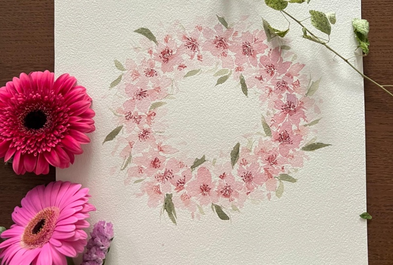
13. Day 3: Anemone Ranunculus: Hello and welcome back to our class for today's art piece, we're going to paint
this oval wreath consisting of anemone
is Andrew Nicholas. We will begin this
whimsical project by painting the base
layer of our eighth, followed by adding the
details of our main subject. And we will finish up by adding the floral fillers like
camomile and sweet piece. Here are the supplies
that we need for the class, for the colors. We need potters, pink,
yellow, ocher, indigo, Petersburg ocher, green, earth, burden, green and
undersea green. For the brushes, I'll be using silver crystal oval brush
in size three over four. Silver black velvet, size 862. Silver black velvet
liner brush in size one. Silver silk 88 mono liner
brush in size 20 over 0, and silver silk 88 over crescent brush in size
three over eight. For the paper, I'll be
using the next guy, but literal watercolor
paper in 300 GSM, A4 size, which is a 100% cotton. To begin our project, we will create an overall
guide with a pencil. I'm using an oval plate
here as my guide, but you will use anything
that has a similar shape. After creating our guide, you can erase it a little
so it won't mean very visible when we paint
over it. Later on. We are now going to
add our first element, which is a pink run-on
clueless as we have studied, or an alkalosis,
the green course. So for our painting, we will use a milk mixture
of green earth for the core. Using a size eight round brush, we will paint the core by
creating curved stroke, circling to each other. Our next step is to
paint the petals. For the petals, we will use
a team mixture of potters, pink from Daniel Smith. We will do the
petals by creating long C strokes from the edge of the core until we reach
our desired size. We will leave a
little white space in-between to represent
our highlights. We will let the base layer of random colors dry out first. So for now, let's proceed
to our second subject. For this, I'll be using brittle gray from Netscape electrons, and we're going to paint
the base layer of money. We will use the three-fourths crystal oval brush for this one. So what we're gonna do is
we will do flat strokes for the petals and then add
some concentrated shades up, Procreate in-between
to add some shadows. Basically, we will
just apply what we have learned from
our past lecture. Let's make another anemone
on the other side, do flat strokes for the
petals and then add some more concentrated shades in between to create some shadows. It's just so easy, right? You can turn your
paper around as it will make it easier
for you to paint. We will add the base
layers dry out first before adding some
details while waiting, let's first add some
base leaves for RD. For leaves, we will use a team mixture of green earth
from Netscape by the TRA. And I'm using a size
eight round brush here. We will combine the
one stroke leaf and the two strokes leaf for this. And it will also be nice to add a little thin lines
every now and then to add some
interests on Laurie. You can always check
our finished painting on the project and
resources section. So you will have a guide
on where to add the leads. This step is very important, especially now that we're just on the structural
base of our painting. As you notice, I also have some whitespaces on Psalm areas. This is to give space for
the other elements later on. We are now done with
the base element. As you can see, we can now see the whole
structure of a wreath. For the next steps, we will
focus on adding details and some failures that will make these look more
full and balance. Let's begin by adding the
details on Ireland and killers using a butter
Mixture, potters pink. Let's now add the details. In creating the details, we will just apply
the long C strokes that we have learned
on our past lecture. We will do the C strokes
alternately in combination with some thin lines until we reach the edge
of our base layer. Now it's time to add some
details for the anemone. So let's start with the
core and we will use indigo from Magellan
Mission Gold for this one. Using a butter mixture of indigo and a size
eight round brush, we will add a flat dome
in the core over anemone. You don't have to make
this area perfect, make it look natural, but adding some
spikes on your core. We will switch our
brush or monoline or one and add some dots
around the dome. Notice that I left some space in between
the dots and the dome. And that's because
I will be adding some lines to connect
them later on. So keep on adding the dots until you have covered
the whole DOM. Time to add the lines using
the same color and brush. Let's connect the dots and the dome by creating thin lines. And now we're done
with the core. We will add more details
for this flower, but for now let's proceed
with the second anemone. We will do the same
steps using a size eight round brush and a
butter mixture of indigo, we will add the small circle
in the core of our anemone. We will switch our
brush to ammonia liner one and add dots
around the core, as many dots as again, but make sure to maintain
the neatness over your core. Time to add the lines using
the same color and brush. Let's now connect the dots and the car by
creating the lines. If you will check
on our painting, you will see that
the petals that we have created earlier
merge or Ledi. And that's why we need to add more concentrated strokes
to separate them. Using a size two round brush and a milk mixture
of pearl gray, we will be adding
some curvy thin lines in between our petals. Let's move to our second
anemone and we will just do the same stroke justice what
we did on our first anemone. Personally, I love
painting anemone acid has a very delicate yet
strong look at the same time. It goes well on any arrangement because of its color and shape. It's fillers time. Our first pillar
will be a camomile. We will use Petersburg
ocher for this one and an oboe cousin brush. In painting a camomile, we will use the side of our
brush to create our battles. We will leave an empty circle in the middle as a space
for our yellow ocher. Later on, I combined butter and milk mixture of Petersburg ocher for our petals. I did that. So there will be an extra detail for
each over further. We will continue to
add some camomile until we spread it
around our main subject. For reference, you can check our project resource
section so you would know where to place the
elements for this painting. Are you guys having fun? I hope you are.
If you're feeling that you're painting
doesn't look good at this moment or your
work doesn't look the same as mine, that's
totally normal. But remember, you must
finish your break. You can only see the true beauty of your creation once it's done. So don't give up easily. Alright, so let's add more
camomile, same procedure. Use the side of your brush
to create our battles. And we will leave
an empty space in the middle as a space for
our yellow color. Later on. For our next fillers, we will surround our wreath
with some dentists, sweet B, we will use a combination of tea and milk mixture
for the base layer, and then we will add watery
mixture for the details. In painting a sweep be
all you need to do is track our brush and create
some teardrop shape. You can extend the size
of the shape depending on what side of the petal
are you trying to create. There is no right or wrong here, so don't feel pressured. All you need is a
good imagination. It's also best if you will use milk and D mixture for
each of the petals. For a third sweet to eat, it will be a little bigger. I'll drag my brush to
create one big bet. For, for Tweet be it will
be placed in this area. And again, we will focus on one petal and just
a shadow of battle. For the fifth one,
I'll make it a little smaller since we already
approaching the end of Verde. For the 61, I'll create one big petal and two small petals on the
side to make it look. So. We will add milk
mixture on one side and some shadow for the flower
for the last week be, we'll make it small, just one and a little
thin line, decided. Using a butter mixture
of green earth, we will connect our sweet
beast and make a stem. We will use the monoline
brush for this one. We'll make the line curvy
so it will not look stiff. As I always tell you. You can tweak the details of the street and add elements
that I'm not adding. You can also change some
colors if you want to. Just make sure that
the changes you make steel compliments
the whole painting. The next step, we will
add some extra details on our sweet BCE using a small brush and a butler
mixture of potters pink, we will add some dark
lines on the edge of our battles to separate
them from each other. And this is also to copy the
original design of a sweep. Just a reminder, you can
only do this step when the base layer is already
dry or in cold state. Then to add some
core for camomile, we will use a butter mixture of yellow ocher for this one. All you need to do is create the circle in the
middle of our flower. They need to fill in
everything until you've finished all the camomile
that you have painted. But make sure that the metals are already
dry before doing this, as this is a wet
on dry technique. The next step we are now
going to add our main leaves. We will use a milk
mixture of green earth, but I'll also be adding
some pops of the mixture. For domain leaves,
I'll be using a size eight round brush and I'll combine one stroke
and two stroke means. I'll also be adding
some small dots and thin strokes in some areas
to add little fillers. For the next batch of leaves, I will be using another
shade of color, which is undersea green. Using a size six brush, I'll add some small
leaves all over dirty. I'll combine milk and the mixture shades for
this type of Lean. By this time, we can now see
the whole look of a wreath. It's so beautiful, right? But that's not it. We will make it look more dreamy by adding more
fillers. Later on. I'll change my brush
to align our brush and get some greens and
D In milk mixture. I will add random, thin and
thick strokes with dots, which will look like wild
branches all over already. This is a beautiful
elements that you can add on
every composition. For our final detail, we will add another
set of floral filler. I will add some
camomile on the sides, compliment our sweet peas. Again, we will use
Petersburg ocher for this one and an
oval cousin brush. So as usual, we are using the side of our brush
to create our petals. We will leave an empty space, an empty circle in the middle of space for our yellow
ocher later on. Please don't forget to combine the butter and milk mixture of Petersburg occur for our petals. I did this. So there will be an extra detail for this filler. While waiting for
the petals to dry, we will go back to the first
match of camomile first, let's add some water mixture in between the petals,
the separate them. This step is optional
but highly recommended. So if you think that your
petals are quite mixing, all emerging already,
you can do this step. But if you think that the petals are already
separated from each other, you can skip this part. It's time to add the
core of our camomile. Again, we will use a butter mixture of yellow
ocher for this one, just create a circle in
the middle of our flower. Last fillers will be some small leaves
around their camomile. We will do this so that these flowers won't look
separated from the whole wreath. Using a size two
and size six brush. Add some small leaves. New York camel miles. Make them look
soft and blurry so they will match the overall
theme of our painting. I notice that some of the core of my camomile
turn so light. So I'm going to
add another layer on top of them to
make it pop up. Again. We always have to make sure that
everything looks balanced. So in this part, I
want you to step back and assess the overall
look of your wreath. If you see some areas
that are empty, make sure to add leaves
are fillers there. That is it for today's project. It's beautiful, right? I hope you enjoyed doing it and I hope to see your projects, so please upload it on our
class project section. I'll see you tomorrow
for our next project.
14. Day 4: Cherry Blossom Wreath: Hello and welcome
back to our class. For today's topic, we
are going to paint this beautiful pink
cherry blossom wreath. We will apply the
techniques that we have learned from
our previous lectures, like the wet-on-wet technique, wet on dry technique, bleeding technique,
and so many others. So before we begin, we will be discussing first all the things that
we need for the class. For the colors, we will
be using quinacridone, permanent magenta,
Berlin, maroon, lavender, and undersea green. For the brushes, I'll be using silver black velvet, size 862, silver black velvet
liner brush in size one, and silver silk 88 mono liner
brush in size 20 over 0. For the paper, I'll be using the bell hung
watercolor paper, which is 300 GSM, 100% cotton. I got my paper
into square shape, but you can still use a
rectangular shape if you want. Let's begin by
creating our guide. I have here my circular
guy and using a pencil, I will create a circle
guide for early. To make my guide not
so visible later on, I will erase it a little and leave a very light shade of it. So the next step
that will do is mix our color for our main cherry blossom albedo,
mixing quinacridone, permanent magenta,
perylene, maroon, and a little bit of lavender. For our leaves, I will be using undersea green
from Daniel Smith. We will mix quinacridone,
permanent magenta, perylene, maroon, and lavender
to arrive on the shade. This shade is the one
that we will use for the whole cherry blossom
wreath later on. Let's paint our first
Cherry Blossom. All we need to do is
create five petals by combining this thin strokes
that we use for ease, add some thin curved
lines on each side of each petal to add details
on our cherry blossom. While the base of our cherry
blossom is still wet, we will add a
concentrated mixture of perylene maroon in the
center of our flower. We will like this color bleed a little and wait for
it to dry later on. For our second Cherry Blossom, we will do the
same as our first, just combined five
petals by creating thin, thick strokes and add some thin curved lines on
each side of each petal. We will now add the more
concentrated mixture of perylene maroon and the
center of our flower. We will continue painting the same process
of cherry blossom until we have completed the whole circle that
we have created a year. This secret in creating
a beautiful cherry blossom flower is
to do it slowly. Each flower requires both wet on wet and wet
on dry technique. So knowing when to add
each stroke matters. Painting that involves
a subject that's repeatedly done can be a
little boring at times. But if we focus on the final piece that
we wanted to create, we will learn to enjoy
the process and discover something new on each
flower that knee pain. Okay, so we'll just continue
creating the petals, adding thin lines on
the side of each metal, and adding the more
concentrated perylene maroon at the center of each flower. What's amazing about
watercolor is that even if you accidentally
pick a dark color, it was really light than once. It's dry. So don't be
afraid to pick colors. Play with your palate. Understand the flow of
water on each stroke, and just enjoy the process. And we are done with
our first part. This is the main wreath
on this painting. For our next base,
we will surround our main wreath with
small cherry blossoms. And we will make these flowers appear
as if they are behind. The main reason for this, what we will do is
create half flowers, three to four petals for
each flower is enough. And we will use this team
mixture of quinacridone, permanent magenta, perylene,
maroon and lavender mixture. You will create 12 petals. It doesn't have to
be three to four. You can actually add just
one petal or to battle. So surround your main wreath, This little flowers, until we have completed
the whole circle. For me, the hardest part
in watercolor is waiting. When I was starting,
I always mess up. We were because I can control myself and wait for the
layer to dry first. Instead of beautiful flowers, I always end up creating blobs. So I want you to avoid that. Remember, beautiful things
comes to those who wait. Aside from doing the half flowers on the inner
part of our wreath, we will do the same on
the outer part as well. So create one or two or
three or four, that does. For each flower and surround
your main wreath with it, we will use the same mixture, which is a team mixture
for this set of flowers. Again, we will continue
painting this half flowers until we've finished
surrounding our main wreath. Using a small brush and a milk mixture of
very didn't maroon, We will now add the core
of our cherry blossoms. As you notice, I use milk
mixture here instead of butter. That is because these
flowers are just feathers. They're not the main subject. Hence, the eye of the
people who will look at this painting should still
be drawn to our main wreath. Our next step is to use the monoline brush to
add the core over eat. So this is the main details
of our cherry blossom. What we will do is add thin lines in the
center like this. This if you can. And we will also add
some dots on top of it. Remember to only do this
step if the base layer of your main wreath
is 100% dry already, if it's still cold
or it's still wet, it will ruin your work
because we will be applying the wet on dry
technique on this part. If you want to learn more about
painting cherry blossoms, specifically cherry
blossoms in vintage don'ts. I have a specific
glass focusing on this topic and you can watch
it here on Skillshare. I have link it down below
so you can visit it. Once you're done adding the
details and the main wreath, we will do the filler
flowers next three days. Instead of using perylene
maroon in the butter mixture, we will use milk
mixture instead. We will do the same process and thin lines and add
dots on top of them. If you feel like your work, this is beautiful or
it doesn't look the same as what I'm doing,
that's totally fine. But please don't give up and please continue and
finish your project. You will see the beauty of
your work, wants it done. We are finally on the
last phase of our class. On this part, we will paint some small leaves
surrounding already. I'll be using undersea green in milk mixture for this part. Add water on your brush
every now and then to create different value of
color for the leaves, I'll be using the one
stroke leaf technique that we have studied. Keep on adding leaves
around the early and make sure to add
distance on each leaf. You don't want to, you're wreath the look crowded and you don't want the leaves to overpower. The main reason. For a second to the last part, we will be adding some falling cherry blossom
and using this shade, which is a team mixture, we will be adding some checkmarks using
our size six brush. Just dab your brush around your wreath and
spread it all over. For the last detail, Let's get a liner brush and get some greens in D
and milk mixture. I'll add some random thin
and thick strokes with that, which will look like
wild branches all over. This is a beautiful
element that you can add on every composition. That is it on our day for read. So I hope you guys were
able to follow along and I'm so excited to see
your project for today. So I hope you can upload
it on our project section. Thank you so much
and I'll see you tomorrow for our next project.
15. Day 5: Vintage Wreath: Hello, hello. Welcome
back to our class. For today's project,
we are going to take a break from those
complicated flowers, like roses and peonies. And we are going
to create instead this beautiful and
simple vintage wreath. So for this one we're going to use leaves and fillers only. And before we begin here, the supplies that we need for
the class, for the colors, we only need three,
yellow ocher, Van **** brown, and green
earth. For the brushes. We also need three. Silver black velvet, size 62. Silver black velvet
liner brush in size one, silver silk 88 over crescent brush in size
three over eight. For the paper, we will be using the Nazca political
watercolor paper and A4 size 300 GSM, 100% cotton. As usual, we will begin this
week by creating a guide. So I have here my favorite
circular guide and my pencil. For our first layer, we will mix a team mixture of green earnest
and Van **** brown. Using a size six round brush, we will paint our
first few leaves. We will combine the
one stroke leave and the stroke leaves that we
have practiced earlier. We will also add
some thin strokes to add a little bit of detail. After painting around
six long leaves, we will add our second layer. We will do this when the
initial layer is already dry. We have to wait a little so that the colors won't create a blob. For a second layer, I am using here a mixture of Van
**** brown and greener. But this time the color is leaning towards
the brown shape. As you can see aside
from the leaves, we are also adding some
lines and this is to give it some more
dimension and interests. On the next strokes, I want
you to take advantage of your color palette
and create leaves strokes using different
water and color ratio. We will do this until we
reach the end over 3.5 dots and lines on top of
your leaves to add interest. This type of wreath
is a great exercise if you want to practice more
of your creative instincts. Since this requires your
creative decision when it comes to choosing the
appropriate water and color ratio for a
certain stroke. Now, on this part we
will be adding in establishing the base
stem over these. For this, we will use a milk
mixture of Van **** brown, and we will use a
size six round brush. We will switch to
a liner brush and add our favorite thin
and thick stroke. This that will create beautiful
effect on your painting. And we'll also add dimension as we will be using
milk mixture, shade of green earth mixed
like Van **** brown. Once you're done, we will turn our paper and paint
the other half overly. Basically, we will just mirror what we did
on the other half. But since we are
using watercolor, we will not be able to control the flow of water on our paper. And that will surely make
each of our stroke kidney. For the base layer, we will use a team
mixture again. We will paint the half
of the wreath with it before we change our color
to a more intense one. Now that the base layer
is done in dry already, I am now adding the second layer and I'm using a more
concentrated color, which is a milk mixture. We would add smaller
leaves on some areas and keeps some spaces open so we
can add more layers later. I noted here reads don't look exactly as mine and
that's totally fine. What's more important is the
look of your whole wreath. Make sure that
it's balanced from composition up to color. On this stage, I want you to add more wild leaves
on your wreath. Meaning you must add
more curvy leaves. Place more foliage outside the base circle that
we have created. We will switch to our
liner brush for this part, but instead of using
a milk mixture, we will initially
use T shades of colors so that we can add
more fillers later on. Just like our half-reaction, we are now going to add
the main stem over e. And this is by using milk
mixture of VR shade. Time to add some filler is using yellow ocher and an
oval crescent brush. We will now add some simple
floral fillers to or read. We will do this by adding three to four sides strokes using our oval crescent brush. We will add this
fielders all over, but we have to make
sure that the distance between each set are equal. Already is almost done. To add some more final touches, we will use our liner brush again and add more
thin branches story. This time, we will use
the butter mixture of Van **** brown to add strong
leader on our composition. To add more intensity
to already, we will use a butter
mixture of Van **** brown to add another
set of Florida fillers. This time, we will
use a round brush in size two and add our strokes. We will add the fluorophore
dealers all over our wreath while maintaining proper
distance with each other. As you can see, our
wreath is almost done. But if you are still
look imbalance, what you can do is add more smaller leaves
in team mixture. This is the safest way
to make your wreath look balanced on
both color and form. Finally, we are done. I hope you were able to
follow along and I'm very excited to see your
project for today. So please upload it on the
class project section. I'll see you tomorrow
for our next topic.
16. Day 6: Calligraphy on a Wreath: Another day, another wreath. I'm very, very excited because today's project is
quite unique as we will combine two beautiful
mediums for today's art, watercolor
and calligraphy. Before we begin, here are the supplies that we
need for the class. For the colors we will be using. Quinacridone, burnt
orange, Petersburg occur, maroon, yellow ocher, green, Ernst Van **** brown and sepia. For the brushes. And Ben, we will be using the
silver black velvet size 86 into silver black velvet
liner brush in size one. Silver sulfate mono liner
brush in size 20 over 0. Silver silk, A2A2 over crescent brush in size
three over eight. And for the brush pen, we will be using the
Tombow Fudenosuke, a hard tip brush pen to paper. I'll be using the Netscape, but little watercolor
paper in 300 GSM, A4 size, 100% cotton. As usual, we will begin by creating our guide
using a pencil. The second step is to erase
the guy that we have created. But of course we
will still leave a little of it for the first
element of our wreath, we're going to add
our main rules using a milk mixture
of quinacridone, burnt orange for this base
layer and for the brush, I'm using a size
eight round brush. Remember not to
make the base layer of your rose a perfect circle. Add curves and edges so it
will look more natural. While waiting for our
base layer to dry. We will do our second
flower forest. This one is a simple
five petaled flower, similar to a cherry blossom. For this, we will use Petersburg occur in milk mixture
for our base layer. So we are just doing two
stroke leaves for the petals. So this is similar to the two stroke leaves
that we have studied. While our petals are
still in cold state, we will add butter mixture
of Petersburg occur in-between each petals to
add depth to our painting. We will take advantage of the
cold state of our battles and add the yellow color
using a small brush. The core is just
small thin stroke circling around the
center of our flower. While we're here, let's
also add some leaves. I'll be using a milk mixture
of green earth for this one. So what we'll do is add some thin lines
beside our leaves. So we can combine one stroke leave or to
stoke leaves if you like. Let's now add some
fillers for this. I'll be using a size
six round brush and maroon indifferent water
and color mixture. You can combine tea, milk and water on the petals
to add some nice sheets. As you can see, you
only need to do some small downstrokes when
doing this type of filler. For the policing,
you can refer to a finished painting under
project resources section, so you can be guided. Now is the perfect
time to add details on arose as its base
layer is dry already. I use water mixture
of quinacridone, burnt orange, and
for the brushes, I am using size to N6. Alternately. We will do C strokes alternately until we reach the edge
of our base layer. For the core, we will
be using a small brush, but as we go out of the center, we will switch to
a bigger brush, which is size six. Of course, as we go
out of the center, we will also do
bigger C strokes. Don't forget to add some
thin lines in-between your C strokes to
represent some petals. After doing the rules, I'll proceed to
the white flower. It's also dry now, so I'll
be adding some extra details now using sepia and a
size two round brush, I'm adding some dots in the
middle part of our flower. I'll also be adding some
extra details on the petals. So using a mixture
of Petersburg ocher, I'll add some thin lines on the petals at texture
on our flower. To make our composition
look full imbalance, you will add another white
flower in the right side. But this time we'll
do it inside view. Create four petals
on top and one flat that all below using
a size eight brush. While the paper is still wet, we will add some dots of yellow ocher on
the center of it. Let it bleed a little. The next step is to add the
more concentrated mixture of Petersburg occur in
between the petals. This will separate the
petals from each other. Let's wait for the
whole flower to dry. So for now, I'll be
adding some leaves in milk mixture using greenery. I'll also be adding
some filters. So same procedure, I'll be using size six round
brush and maroon, indifferent water
in color mixture. You can combine tea, milk and butter on the petals
and add some nice shades. As you can see, you
only need to do some small downstrokes when
doing this type of filler. To complete the main subjects of our youth will be
adding tomorrow says the base layer with the milk mixture
of quinacridone, burnt orange, then make the shape of the rows edgy
and curvy. At the same time. We will place our third
rows and the opposite side. Same color will be used, which is quinacridone,
burnt orange. We will let our base layers dry first before
adding some details. While waiting, let's raise, add some leaves on RV. Debase leaves. I'm using a size six round brush
and a milk mixture of greenery at the
little thin lines every now and then to add
interest on your teeth. It's now time to add
another set of filler is this time we will
make steam extra, Petersburg, ocher and
quinacridone, burnt orange. This is just a secondary filter. That's why it's very light. I added this to give an effect
that there are details on the back part of our wreath will do the same stroke
for the fillers, just downward
strokes, you sings. Size six round brush. For this part, we will
load our brush with sepia and add details
on our white flower. This is the same as
the ones that we did on our first white flower. Just dots of sepia
all over the core. Now it's time to add the
core of our theories. We will use a monogram
liner brush for this. And they are just small
lines around the Silk Road. Use seeing what the
mixture of Sofia. For the core of our leg fillers, we will be using milk mixture of Serbia
and monogram liner brush. Since the base of a
rose is already dry, it's now the perfect
time to add the details. We will use a butter mixture of quinacridone, burnt orange, and for the brushes, we will use size
to N6 alternately. On this part, we
will apply the wet on dry technique that
we have studied. In creating the details. We will apply the thin
and thick strokes that we have learned
from our past lecture. We will do the C
strokes alternately until we reach the edge
of our base layer. For the core, we will
be using a small brush, but as we go out of the center, we will switch to
a size six brush and make bigger C strokes. Time to add the mean
leaves for this section. In here, I'll use a mixture of Van **** brown
and green earth. We will add different sizes of leaves all over the wreath. For this, I'll be using a
size eight round brush. As you notice here, even if I'm using
the same big brush, I can slow create small leaves. And that's the beauty of high-quality brush
like the Black Velvet. It has a very pointed tip. That's why it can
create tiny strokes. And at the same time it has big belly that can
create big strokes. Time to complete
the leaves for it. I'm switching again to
a liner brush and add more wild branches using
Theme mixture of green earth. Our wreath is almost complete, but as I look at it
from a distance, I personally feel like there's no color
popping out of it. So I decided to add
another set of filler. This time, we will be adding
some yellow circles all over a wreath using a yellow ocher
and an oval crescent brush. Let's connect the
yellow fillers. Did the wreath using a concentrated mixture
of green earth. As my last detail, I got here my size two
round brush and using a concentrated mixture of green earth that makes
food Van **** brown, we will be adding some
small leaves all over ODE. Add this on areas that
needs more dark tones. You can also make
some thin lines around it to add more beauty. We're now going to add the unique part of this
re, uh, calligraphy. So if it is your first
time to do a calligraphy, all you need to do
is add pressure on every down-stroke and less
pressure on upstrokes. For this, I'll be using the Tombow Fudenosuke
Brush and heart dip. I'll be writing
the word memories, but you can choose any
word that you like. Let's begin by creating a connection between
arteries and our width. We will create the
soft curvy line, then start doing our
first letter after. As you Andrew word, extend the last stroke and connect it to your read softly. If your word is not centered,
That's totally fine. It really doesn't have to be
centered. On our next step. We will be adding some transition from
our words are read, so we will be adding
some leaves and further on this offline that
we have created earlier. For this, I am using
milk mixture of green earth and a
size six round brush. Aside from leaves,
Let's also add some small fillers
using the color maroon. These are just minor fillers, so you don't really have to
add a lot of details on it. And we are finally done. I'm happy that
you've joined me on today's project and I'm very
excited to see your work, so please upload it on the
class project section. Thank you and see you
tomorrow for our next class.
17. Day 7: Blue and White Roses: We have finally come to the
last day overeat series. I know that seven days is surely not enough to
master this medium, but I'm confident that
through the lessons that you've watched and the
practice that we have made, you can soon start creating
your own art piece. For our last project, we are going to paint this beautiful wreath consisting of blue and white grosses. For this lesson, we will refresh ourselves with all
the techniques that we have learned
from the class. From applying the wet
on wet technique, wet on dry technique, and a lot of brush markings
and different color values. Before we begin here, the supplies that we
need for the class, for colors we will be
needing in the goal. Petersburg occur. Green, earth, Van ****
brown and undersea green. For the brushes, I'll be
using silver black velvet, size 862, silver silk, 88 over crescent brush in
size three over eight. Silver black velvet
liner brush in size one. Silver silk mono liner
brush in size 20 over 0. For paper, I'll be
using the NAEP Skype, a little watercolor paper, 300 GSM, A4 size in 100% cotton. We will begin our composition
by creating our guide. So I have here my
circle or guide. And by using a pencil, I will draw circle. And then after drawing this, I will erase it using my
kneaded eraser just so it won't be very visible later
on when I paint over it. Now it's time to
paint our subjects. I have here indigo from
Magellan, Mission Gold, and I will mix it
with a little bit of water to paint the
base layer of our OSS. So let's get a piece
of paper and tested. As you can see,
it's a little bit darker compared to
the theme mixture. So I'll be adding a
little bit of water. And as you can see, this is the perfect shade for the
base layer of a rose. Now let's paint the base layer. Remember that the base layer of the Roses should not
meet perfect circle. Leave a little bit of
edge and curviness on your base layer so that
it will look natural. Let's now paint the second rows. So again, we will be painting
the base layer using a theme mixture of our indigo
from Netscape Elektra. As you can see, I'm leaving
edges on the base layer, which will make it
look more natural. For our third rows, we will be using the mixture of Petersburg ocher
for the base layer. This is the shade
of petersburg Oh, query that we will be using. As you can see, it's a lie. So I am using the same brush
as what they use earlier. Our third rows will be
placed beside our first row. So as you can see,
I'm still adding edges on the base
layer of this rules. For this one it is okay if you will not create a full rows, we will give an
illusion that the third row's is behind
our first row. So for the fourth subject, we will be placing it on the upper left side
of our composition, and we'll still be
using Petersburg. While creating your composition. Keep in mind that the size of your rules should
be controlled. This I should not be too big, and it also should not be too
small for your composition. So for our last subject, we're going to paint a rose
bud and we'll place it beside our first blue rows so we will apply everything
that we have learned when it comes to
painting a rose buds. So again, we'll use a very light mixture of
Petersburg old gray. Now after that we
are now going to apply the leaves. For this one. I got very light mixture of green earth and I mixed
it with Van **** brown. Since this is just a base layer, you can place it on all
parts of your wreath. Just make sure that the leaves
that you're creating are big and the color
is in the mixture. You can refer to the project resources section of this class. So it will be easier for you to visualize the finished
product over painting. Keep on painting the right
side and then after that, you can jump on the left side. We are almost done
with the right side, and now we are going to
proceed to the left side. So I'll start here on
the first White Rose, going up to the
second White Rose. It will be nice if you will
add random thin strokes on the sides of your leaves to add a little bit of detail. You can also leave
some spaces between each leaves since we will be painting over it later anyway. As you can see, we are
now closing the wreath. And by this time, you can already see the base layer of fern
whole composition. You can add some more leaves and the areas that you
think looks empty. This is where your creative
instinct comes in. Don't be afraid to experiment, especially on the
base layer where everything will be just
a background later on. Now that our base
leaves are dry already, Let's go and paint
the second layer. For this one, we
will be painting smaller leaves using a milk
mixture of green earth. I'll be using size
two round brush, and we'll add a little bit of these leaves on
each of our roses. Even though we're painting
the second layer already, it is better not to use a very concentrated mixture of color so that it won't overpower our subject later on
when we finally see the bigger picture or the
whole picture of our object, we can add the darker shade
of color for my leaves and add something that will
complement our whole composition. We are now here on one
of the major parts. We will now add the phrase
details of our roses. I got here and butter
mixture of indigo. And I know it seems
a little bit dark, but later on when this
layer dries up already, the color will slightly soften. For the details of a rose. We will create small c strokes as we have studied earlier. And just a reminder, you can only add details on your rows once the base layer is already dry so that we can say our artwork from
creating a blob. Keep on adding C strokes until you reach the last
part of your dose. Also, you can mix
the C strokes with thin lines to add a little bit of detail on your painting. I'll do the same
procedure for this rose. And as you can see, I'm creating small c strokes for
the core of my rose. And I'm softening the edge of the last few strokes using
a brush with clean water. So as I go out of the core, my strokes are
getting bigger and I'm combining thin strokes with my C strokes to create a little bit of
detail on my rules. We're almost done on this part. So I hope you were
able to follow along. Now, let's go to our White Rose. We will do the same step. But for this part, you need to make
sure that you have a very concentrated shape
of Petersburg occur because this is a light color
and it requires a very concentrated mixture
for it to be visible. So don't be afraid to add
details on your rows. You will not create
a blog instantly. And it's okay if you create a blog because there's
always a solution. You can always add
another layer of color later on when
it's already dry. If you feel like you
have created a blob, so don't be afraid. Now we are on our fourth rows. So using another
concentrated mixture of Petersburg ocher, we are adding C strokes around our core and we're softening the last few strokes to create an illusion that it is blending. So I'm combining random, thin and thick
strokes for this one. Time to add details
on our rose bud. So this is something that he have to be a
little bit careful because we have created different base layers
for our rose buds. So you have to see
where you should put the layers of darker shades so that it will look
like a thought. That ball, if you feel
like you're lost. You can always refer to the lesson that we
have studied before. Alright, let's go to the next
part of this composition. For this layer, we are now going to add another
layer for a row, says, as you can see. The first layer that
we have created, a lady dries up and it was
a little bit light already. Now I'm adding another layer of butter mixture for this rose. And same thing applies. I will be using C strokes to
add the layers of our rows. But you can also do
this step if you have accidentally created a
blog on your first rose. This step is optional
if your first layer of detail is already strong and you think that
it's already nice, then you can skip
this part and move over to the next part
of our composition. We are now going to add the
main leaves for this one. I'll be mixing Van ****
brown with undersea green. This mixture is a
little bit brownie, so I'll be adding
more green to it. Now using size
eight round brush, I'll be adding the main
leaves of our composition. When adding the main leaves, make sure to add it
first on the subjects. You should also remember
to leave a little bit of space so that you can
still see the base leads, as well as the other fillers
that we will add later on. Through this, we can maintain a well-balanced
composition already that is focused on the subject
rather than the leaves. If you feel like you don't
know where to add your leaves, just remember to add
it near the subject. Leave a little bit of space and let the base leaves
me sin as well. As you can see here. I'm adding some dots and some thin lines on
my composition. This will give an illusion that there are
some small leaves, are big leaves that are folded and cannot be seen in full. It's also nice if you'll do
the same on your composition. Time to add those
small green branches. You seeing green earth mix with a little bit
of undersea green, we will be creating the
green branches that will add a lot of details
on our composition. I am using a liner brush
in size one for this. Also, just a reminder, do not be afraid to
play with your strokes added on the areas that
you think are empty. And you can also add it on
the areas that you think are still not covered
with the main leaves. We are almost done for
the last few steps, we will be adding the voters. For the first pillar, we will add the big leaves in lighter tones to cover the
areas with empty space. We chose a milk mixture, shades of colors so that the composition will still
be focused on the flowers. I know that it takes
a good idea to know when to add the
right tone of color, but with proper practice, you'll get used
to it and develop an eye for a
well-balanced three. After adding the leaves, we will change our brush
into an oval crescent one. We will be adding small fillers using butter mixture of indigo. Using this step, we will spread the beauty of blue
shade on our wreath, and it will really add a lot of personality to our
whole composition. I am adding the
fillers by combining the flat stroke and the side stroke of the
oval crescent brush. This brush is incised
three over eight. And if you don't have
an older cousin brush, you can actually use your
round brush and just mimic the shape of the
oval crescent brush. We are switching
our brush to Amanda liner brush in size 20 over 0. On this step, we will connect the floral fillers that we have created to our main wreath. We will use the undersea
green for a desk one. Just keep on
connecting the lines. And you can also use
this step to add some more fillers and some more random thin and thick
strokes on your creation. We are finally done. I'm so happy that
you're able to complete all the lessons and I'm
excited to see your projects, so please upload it on the class project
section of our class. I'll see you on our last video.
18. Final Thoughts: We have finally come to
the end of our class. I'm very happy that you're able to finish all the lectures, and I appreciate your effort in completing all our projects. I know that watercolor can
be difficult at times and require a lot of patience and practice to be
acquainted with. I hope that it don't
give up on your journey easily and give yourself
more chances to try instead, whatever the result of
your class projects, maybe I want to see it. I can give honest feedback and guide you in a
more personal way. You can upload your projects on the first project
section of our class. I also look forward to knowing the feedback about this class. What are the things
that you like and what are the areas
that I can improve on. You may write your thoughts and the review section
just below this video, your journey Shirley
doesn't end here. If you want to learn more
about floral watercolor, have more classes
available here on Skillshare that I'm sure
will greatly help you. Roses and vintage tones. Earning painting into habits. Anything dried flowers in
the seven day challenge, floral painting for beginners. Creative ways to paint
white in watercolor. I'm thankful and honored
to have you in my class, and I'm so excited to
see you in the next one. Bye.
19. BONUS Day 8: Ikebana: Hello and welcome back. So I know you guys are excited to get some bonus
lecture from this class. I'm so happy that today
I'm going to teach you how to paint this
Ikebana-inspired half-wreath. So if you're not familiar, Ikebana is a Japanese
floral arrangement. For this class, we are going
to use these materials, for colors we have
caput mortuum, mocha, Petersburg Ochre, yellow ochre, quinacridone
permanent magenta, quinacridone burnt orange, raw umber, olive green, Van **** brown, and sepia. For the brushes, I'll be
using round brush in sizes 2, 6, and 8, liner brush in Size 1, detail brush in size 20/0, oval wash brush in size 3/4, oval crescent brush in size 3/8. Then for the paper, I'll be using the Fabriano
Artistico 100% cotton paper. Back to our usual theme. Create a circle guide
for your wreath. Having a guide like
this will still be useful even if we're just
creating a half wreath. For our first element, we are going to paint the
subject on the center, which is a rose. I use a tea mixture of caput
mortuum, for this layer. Remember not to make the base of your rose a perfect circle. Add curves and edges so it
will look more natural. For the next flower, we will paint an
orange ranunculus. To create this, we will
make a base layer again, and I'm using quinacridone
burnt orange, mixed with Van **** brown. In creating the
base of ranunculus, we will just do the same steps
as the one for our roses. For our third flower, we will paint peony, but instead of making
a full-blown flower, we will make it appear as if
it's hiding behind a rose. Using an oval wash brush, create four petals by
applying the flat stroke. We will let this layer dry first before adding
another layer. For now, let's do
another subject first. This time we will paint
ranunculus again. We will use mocha for
the color and we will place it on top of
our first ranunculus. For reference, you can check
our project resource section so you would know where to place the elements for
this main thing. For our next element, we will paint some of
the fillers on the side. For the first floral filler, we will create some sweet
peas in pink shade. For this, I'm using
quinacridone permanent magenta. In painting a sweet pea, all you need to do is drag your brush and create
some teardrop shape. You can extend the
size of the shape depending on what side of the petal are you
trying to create. There's no right or wrong here. All you need is a
good imagination. It is also best if you will use milk and tea mixture
for the petals. Spread the sweet
pea until you've covered about three-fourths
of the wreath. For the next element, we will add some baby ranunculus on the right side of our wreath. Use tea mixture of yellow
ochre for this one. Let's make two of these fillers. Then for our next step, we will connect the fillers
to our main wreath. We will do this by getting a concentrated mixture of olive green and
using a small brush, we will create
some curved lines. Let the colors bleed a
little so there will be nice leading
effect on our wreath. Connect and connect everything
until you've finished. I also added some thin lines and extra detail on our filler. You can also do the same. For the next detail, we will add more floral
fillers to our wreath. This time, I'll use the
quinacridone permanent magenta, and some dots on our wreath. Use different water and
color ratio for this. Again, I'm encouraging you to check our
finished painting on the project resources
section so you will have an idea where to
place the fillers. Time to add some details
on our sweet pea. So using a milk mixture of quinacridone
permanent magenta, add some strokes on one
side of our petals. This will create a shadow
effect on our filler. It's time to add some leaves. We will spread our leaves
all over our wreath. For this, we will combine olive green and yellow ochre with a little bit
of Van **** brown. For the base layer, we
will use tea mixture and then we will add another layer with milk
mixture as you can see. I will change my brush to a liner brush and get some
olive green in milk mixture, and I will add random thin
and thick strokes with dots, which will look like wild
branches all over our wreath. Add more leaves again and use
different shapes and sizes. Be creative and carefree. You can also combine
pure olive green or olive green with Van ****
brown for some other leaves. All these shapes
look complimenting to our composition,
so don't be afraid. For our next filler, let's add some green
dots on sweet pea. You can use a round brush or an oval crescent brush for this. I hope you guys are having fun. So for our next part, let's add the branches
over pink fillers. I'm using a small brush and a butter mixture
of sepia for this. When doing this step, make sure your
strokes are edgy and extended beyond the flowers. Since our base layers
are dry already, our next step is now to
focus on their subjects. We will use size two round
brush for the details. In creating the details, we will apply C strokes that we have learned on
our past lecture. We will do the C strokes
alternately in combination of some thin lines until we reach the edge of
our base layer. The next element that we will
add a detail on is a rose. In creating the details, we will apply the thin, thick, thin C strokes that
we have learned on our past lecture and
what we're going to do is apply the C strokes alternately until we
reach the edge of a rose. For the core, we will
be using small brush, but as we go out of the center, we will switch our
brush into size six. Next in line is our enclose. In creating details for our enclose we will
create C strokes also. However, for this, the distance of each stroke
is closer to each other compared to the ones
that we do for the rose. Also for this specific flower, I placed the core
on top of our base, so on the upper part
of our base to create a dimension that our
flower is inside view. We will do the same strokes
for our pink run and colors. Again apply the
thin, thick, thin, and C strokes that we have
learned on our past lecture. For our last main subject, we will paint the details
for our half peony. Get more concentrated mixture of Petersburg ocher and load
it on your oval wash brush. Create flat strokes of about five to six pieces and add some flat strokes
on the upper part, inside part as well. We will let this
layer dry so for now I'm adding some leaves. Step back and look at the areas that we need to add
more detail on. Add more leaves and wild
branches on those empty areas. For the next detail,
I'm now adding the core of our peony. I got a butter mixture of yellow ocher and I'm adding
thin lines on the core. While the core is still cold, get a butter mixture
of raw umber and add another layer of
thin lines on our peony. For our final detail, we will add some depth to our peony by getting
a butter mixture of Petersburg ocher and having some strokes of
it on each petal. And that is it for
this half wreath inspired by an
Ikebana arrangement. I hope you guys enjoy this wreath arrangement and I am so excited to
see your projects, so I hope you can upload
it on our project section. I'll see you on
our next project.
 Jenny Flores Art, Top Teacher | Watercolor & Gouache