Transcripts
1. Welcome To The Class!: Hello and welcome
budding artists. I'm Will Elston, and
I'm here to guide you through the enchanting
world of water color. Where we'll be learning how to paint beautiful but
simple florals. Keeping it very relaxed
by using just one color. We'll explore how
a single color can evoke such emotion and bring
your paintings to life. What better way to begin
than painting a flower? Choosing a single
color simplifies the learning process
and allows you to truly understand the
nuances of water color. It's a fantastic way for beginners confidence and get comfortable with
their materials. I've been a professional
artist for many years, exploring lots of
different subjects, from wildlife and portraits to city scapes and
countryside scenes. I've always been entranced by the possibilities of watercolor, but when I started, I had no idea where to begin
or how to improve. I didn't know what
supplies I needed, how to create the
effects I wanted, or which colors to mix. Now, I've taken part in
many worldwide exhibitions, been featured in magazines, and been lucky enough
to win awards from well respected
organizations such as the International
Watercolor Society, the Masters of
Watercolor Alliance, Windsor and Newton, and the SAA. Watercolor can be overwhelming
for those starting out. Which is why my goal is
to help you feel relaxed and enjoy this medium in
a step by step manner. Today, I'll be guiding you
through a complete painting, demonstrating a variety
of techniques and explaining how I use all
my supplies and materials. Whether you're just starting out or already have
some experience, you'll be able to
follow along at your own pace and improve
your watercolor skills. If this class is too challenging
or too easy for you. I have a variety of classes available at different
skill levels. I'd like to start off with
a free expressive approach, with no fear of
making mistakes as we create exciting textures
for the underlayer. As the painting progresses, we'll add more details to bring it to life and
make it stand out. I strive to simplify
complex subjects into easier shapes that
encourage playfulness. Throughout this class, I'll be sharing plenty of
tips and tricks. I'll show you how to turn
mistakes into opportunities, taking the stress out of
painting in order to have fun. I'll also provide you with
my watercolor mixing chart, which are an invaluable tool when it comes to choosing
and mixing colors. If you have any questions, you can post them in
the discussion thread. Down below, I'll be sure to read and respond to
ever think you post. Don't forget to follow
me on Skillshare by clicking the follow
button at the top. This means you'll be the
first to know when I launch a new class
or post giveaways. You can also follow me on Instagram at Will Elliston
to see my latest works. So get ready to unleash
your creativity, grab your brushes,
choose your color, and let's dive into
the world of florals.
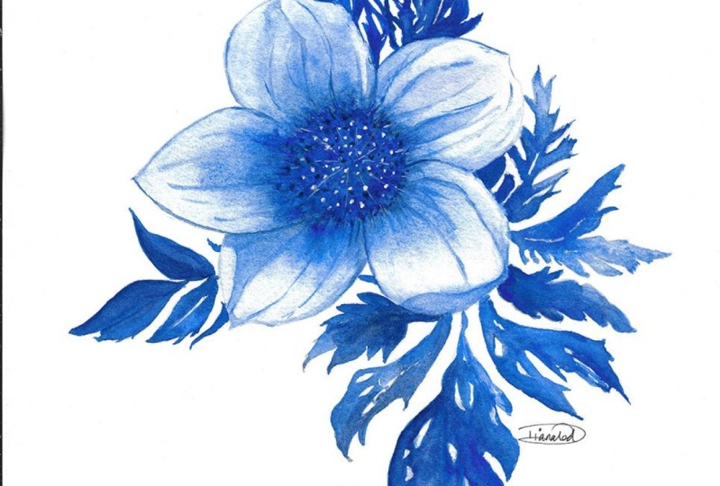
2. Your Project: Thank you so much for
choosing this cloud today. I deeply appreciate it. So the color blue
with its calming, serene qualities, it's
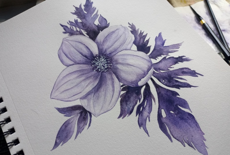
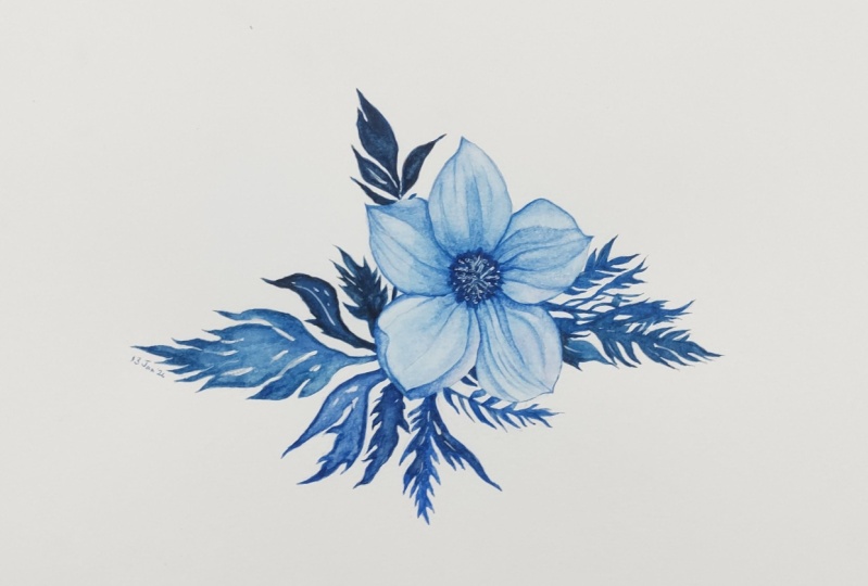
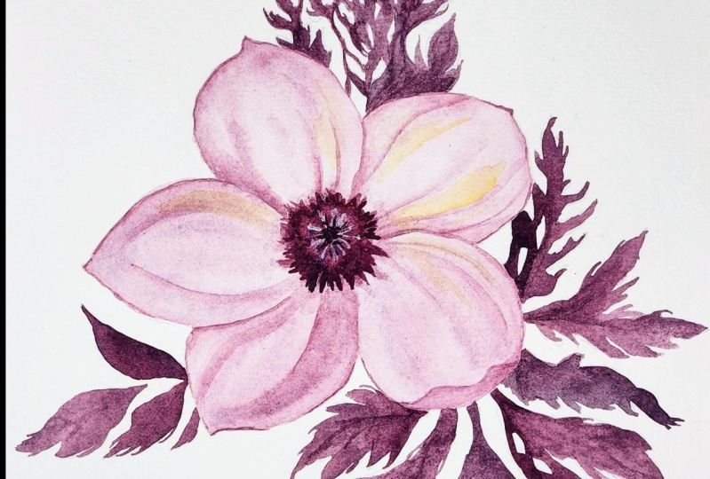
such a good choice for our botanical project today. But here's a little secret. It doesn't have to be blue. The magic of this class lies in the focus on using
a single color. Feel free to embrace your artistic freedom and explore any color
that speaks to you. Pick a color that resonates with your mood and creativity. Monochromatic
painting hones your ability to create depth and dimension with
just one color. It's a valuable skill
that can be later applied to more complex
multicolored artworks. In the resource section, I've added a high
resolution image of my finished painting
to help guide you. You're welcome to
follow my painting exactly or experiment with
your own composition. As we're going to be focusing on the painting aspect
of watercolor, I've provided templates
you can use to help transfer or trace the
sketch before you paint. It's fine to trace when using it as a guide for
learning how to paint. It's important to have the under drawing correct so that you can relax and have fun learning the
watercolor medium itself. Whichever direction
you take this class, it would be great
to see your results and the paintings you
create through it. I love giving my
students feedback, so please take a photo
afterwards and share it in the Student Project Gallery under the Project
and Resource tab. I'm always intrigued to
see how many students have different approaches and how
they progress with each. I'd love to hear
about your process and what you learned
along the way, or if you had any difficulties. I strongly recommend
that you take a look at each other's work in the
student project gallery. It's so inspiring to see
each other's work and extremely comforting to get the support of your
fellow students, So don't forget to like and
comment on each other's work.
3. Materials & Supplies: Before we start the painting, let's go over the materials
to supplies I use. Having the right materials can greatly impact the
outcome of your artwork. I'll go over all the supplies I use for
this class and beyond. They're very useful to have at your disposal and we'll make it easier for you
to follow along. Let's start with the
paints themselves. Like most of the materials
we'll be using today, it's a lot to do
with preference. I have 12 stable colors in my palette that I
fill up from tubes. They are cadmium
yellow yellow ochre, burnt sienna, cadmium
red, Alizarin crimson, ultramarine blue, cobalt blue, cillin blue, lavender,
purple, idian black. And at the end of the painting, I often use white guash
for tiny highlights. I don't use any
particular brand. These colors you can
get from any brand, although I personally
use Daniel Smith, Windsor, Newton Holbein paints. Let's move on to brushes. The brush I use the most is
a synthetic round brush, like this Skoda Perl brush
or this Van Gogh brush. They're very versatile because
not only can you use them for detailed work
with their fine tip, but as they can hold
a lot of water, they are good for
washes as well. They're also quite affordable. I have quite a few
in different sizes. Next are the mop brushes. Mop brushes are good for
broad brush strokes, filling in large areas and creating smooth
transitions or washes. They also have a nice tip that can be used for smaller details, but for really small details, highlights, or anything
that needs more precision. I use a synthetic
size zero brush. All brands have them and
they're super cheap. Another useful brush to have is a Chinese calligraphy brush. They tend to have long bristles
and a very pointy tip. They're perfect for
adding texture or creating dynamic lines
in your paintings. You can even fan them
out like this to achieve fur or feather
textures as well. And that's it for
brushes onto paper. The better quality
of your paper, the easier it will be to paint cheap paper crinkles easily
and is very unforgiving. Not allowing you to
rework mistakes, it's harder to create
appealing effects and apply useful techniques
like rubbing away pigment. Good quality paper, however, such as cotton based paper, not only allows you to rework
mistakes multiple times, but because the pigment
reacts much better on it, the chances of
mistakes are a lot lower and you'll be more likely to create
better paintings. I use arches paper because that's what's available
in my local art shop. A water spray is
absolutely essential. By using this, it
gives you more time to paint the areas you
want before it dries. It also allows you to
reactivate the paint if you want to add a smooth
line or remove some paint. I also have an old
rag or T shirt which I used to clean my brush. Cleaning off the paint
before diving it in the water will make the
water last a lot longer. It's always useful to
have a tissue at hand whilst painting to
lift off excess paint. Also, you never know when an unwanted splash or drip might occur that needs
wiping away quickly. I also have a water dropper
to keep the paints wet. When you paint, it's
important to have them a similar consistency to what
they're like in the tubes. This way it's easier to
pick up sufficient pigment. A hair dryer is useful
to have for speeding up the drying time and controlling the
dampness of the paper. Lastly, masking tape. This of course, is just to
hold the paper down still onto the surface to stop it sliding
around whilst painting. Also, if you plan on
painting to the edge, it'll allow you to create a
very crisp, clean border. That's everything you
need to paint along. I suggest you explore
and experiment with your own materials and work
out what feels best for you. Now let's get on and
start the painting.
4. Tips For The Drawing: So getting straight
into the drawing, I'm just going to use the side
of my pencil just to mark out the most basic shape
of the composition. Filling out the space, I want there to be a bit of a
flow coming down here, and you can come out
a bit like that. Maybe out here, a big flower just off center here. The rest can be just leaves. Keep it very rough at
this beginner stage. It takes a bit of
time to get it right, but it's still quicker than going in with
loads of details now. And then having to rub it out by keeping it loose and soft, you can just rub
out continuously or without it taking
too much time. That'll be where the
central flower is actually, there'll only be one
flower on this one, and then we can put
a few leaves here. I'm just indicating where
the leaves will be. I'll take my time again, just to tidy them up. We'll have some kind
of leaves down here, filling in that space
all the way up to there. Going up here, put
a few petals here. Just trying to create a nice
composition to begin quite loose and then building on
that composition later. Quite organic, Especially
these sections, they don't look
like leaves at all. But that's not the
point of we're just trying to fill in
the space to get an idea of how spatially
the composition works. Then we can then go back
in, for example, us, a tougher pencil, sharper lines, and then really define the leaf shapes bit by
bit, section by section. But I'll do that
myself off camera because it'll take a lot
of time to go through all of it when the
main idea is just to start off soft and then
go back to the details.
5. Starting With A Light Wash: I'm going to try and
make this painting as simple as possible, and a good way to do that is by limiting the
pat to one color. In this painting. We'll
just keep it blue. Depending on how
confident you are, you can choose
whichever blue you want and incorporate
different tones of blue. I'm going to have
ultra marine blue as my base and then
influence some other colors. We're going to start off with
painting the petals because it's the lightest
part of the painting. Let's just get some ultra
marine onto the palette. Maybe I'll mix some Cerlian
turquoise in there. Yeah, that's a nice base color. I think I'm going to
keep it very light. That's the color mix. And now I'm going to clean
my brush and I'm just going to fill out the petals
with water to pin. Don't worry about the little. In fact, I'm gonna paint, wet the whole of the flour. I'm using a number eight
synthetic round brush. The good thing about this is that this stage of filling out with water is
if we go over the line, we can just wait for it
to dry and try again. We won't make any mistakes
by going over the line. At this stage, it's a great way just to practice the brush work without
any consequences. Because without any
pigment on our brush, we can just rehearse
the angle of the brush and the direction
without any pressure. It's a nice way to ease yourself into the
painting process. You can tilt your head to
see which parts are wet, reflecting on the light, and the witch pits are still dry. For this part, you can
just take your time and relax. There's no pressure. Forget about all the other
things going on in life, and just the water
can wait for you. You can just take your time and make sure you get it right. So I'm just going to drop
some color in like that. You're going to spread it around because we
already wet it. It will spread quite easily.
6. Darker Pigment In The Center: Maybe have it a bit
darker in the center because the paper
is just so wet. All I have to do is it, and the pigment just
spreads all by itself. Of course, I have to choose
where I'm dabbing it, but a lot of this is just allowing the water
color to do its own thing. Maybe this is when you can
incorporate some up colors. Like a tiny bit of purple here adds the influence
of another color. But it's barely perceivable. Just adds a subconscious element that's exciting but the viewer won't consciously work it out. Now, we can wait for that
to dry all by itself, or we can use a hair dry if you want to add a
bit of interest while it's drying before
it's completely dry, you can just carefully
test the water, the paper. It's wet. It's damp, moist, it's not
glistening anymore. We can create edges by just picking up a
tiny bit of pigment. We don't want the brush to
be overflowing with pigment, just enough to drop some in and it leaves
some pigment there. And you can do the other thing. You can completely clear
your brush of water and use it as a sponge
to suck up some pigment. And gradually as it's drying, you'll get harder
and harder lines. I keep on going back and
forth with the hair dryer. And this brush, just
to have a nice variety of lines and the
softness of them. They're too strong like that. Silent underst, make the center a bit darker. It's now dry enough that I know this strong pigment
in the middle won't just bleed out
and lose control.
7. Starting The Petals: Now we're going to go
back to the petals and add a bit more depth. Going to the edges of
some of them like this, and then softening them out to create an
illusion of form. We're going to the very edge
of pigment and then using water to bleed it out. And this can go all
the way to the center. Now it can take a bit
of practice to create this nice soft edge, this gradual fading out. But that's okay, just practice.
Everyone has to do it. It just takes a bit
of time to work out the right ratio of water and how much water you
should have in your brush. But after a while, you'll
get the hang of it and you should never
really be soaking full. It should always be
like half absorbed, so you will never have
water fully spilling out Ns tip at the end of this petal. Now I'm going across
each petal and adding these little curvy little
strips just to make it more exciting and for an
opportunity to practice different grades and
shading exercises. I just had another idea. I'm going to re wet
this bit in the center. This is a good example
of going with the flow and changing your plans, and always staying to
your original plan. Because ideally, this would have been a better thing to do
at the beginning. But I'm going to add some salt
right in the middle here. Just nice little
pattern, some fine salt. I find that salt has
a mind of its own and it's even more unpredictable than the
water color itself. And that's because
it just varies so much depending on how wet the paper and how
much pigment there is there and what kind
of pigment it is. Whether there's thick
pigments or fine pigments. It's just there's
too many variations to be predictable with it. A little bit of a shadow
underneath this one. But I do still like
experimenting with salt just because I feel like it's available there for any possible
interesting effects. And if it doesn't
work, it doesn't work, it doesn't take away. And I think it just gives
another opportunity. If it doesn't work for
you, don't worry so much. I really enjoy using these Van Gogh
synthetic round brushes because they have
such a nice point, so you can be quite
intricate with them when you just tap the
fine edge on the paper. But also the more
pressure that you add, the flatter it goes. You can also fill up a
lot of area with it too. You don't need a
tiny little brush. You can still use a brush like this and hold a lot of pigment while still being able to paint small little details
and lines like this. Just going along the
outside of these petals, making it a bit
more interesting.
8. Giving The Petals Form: Now make sure you
don't get hard line. Sent that to clean that up. Just to add a bit more pure
water and spread it out more, but don't agitate it too much, I'm going to drop
more dark pigment into the middle here
where that salt is. I'll go back up
here to this one. I'm doing a similar
thing on each petal. Slight variations
but the same idea, having a little swirly little
strips of different tones. The good thing about using the same color for the
whole of the painting, you can just forget about color and concentrate on these tones. That makes it much
more easy to learn. When you limit your palette, you can get the technique down. And then when you progress
and feeling more confident, then you can explore color. Some areas like this. You don't
need to worry about going over the edge because
we're going to paint darker pigment afterwards. It might take a bit of control, but it's all good practice
making soft edges, controlling how much
water you have on the brush and how much pigment
you have on the brush. Soon you'll work out
that if you have too much liquid on your brush, it will spill out onto the
paper and create chaos. But if you don't have
enough water on your brush, it will suck the water from
the paper into your brush. And that will affect it in
a different way as well. It's about finding the balance. You can just do a few little
dabs to figure out if it's the right consistency and then change it using a
little towel or tissue. Just suck out water or dab your brush in
the water to add more. There's so many things to think about when it comes
to water color. Usually all these things have to be thought about
at the same time. So it can be easy to be
overwhelmed with the process. But it's through
practice that we learn coordination and get
comfortable with multitasking. And the more paintings
that you do, the faster your mind adapts and learns to
these various techniques. Using thicker pigment on
the outline like that, and using pure water to brush it out to create
a nice even transition. Often transitions like this and watercolor don't
happen instantly, like they would with
oil or acrylic. You have to give it time for the water to spill
out with the pigment. Again, that's another thing you learn through time and practice. Just adding these
different layers of swirls just
gives it a nice bit of death illusion of form. We're going to dry that off
and then we're going to paint the leaves as it strips can add a few more thick
dabs of dark pigment. This pigment is so thick
that it won't run. Of course, the more diluted
the pigment is on your brush, the more it will
spread out and run. If you're using
very thick pigment, even if it's a very wet paper, it won't spread out as much. A bit more texture
in the middle. Now that it's completely dry, I'm actually going to re wet just the areas where
I want that texture. I accidentally splattered a bit of water where I didn't want it. That's another good reason
why you should dry it completely before going back
into it like we just did.
9. Starting The Leaves: That is pure water going
to leave it like that for a few seconds while we move on to the next
part of the painting, which will be
painting the leaves. Because I'm right handed, I'm going to paint from left to right so
that I don't have to paint here then it'll be in my way when I'm
painting this side. I'm going to start on this side and move to the other side. We're going to mix that same
color as we did before. Whatever color you went with, opt for a marine blue, you can do it a
pure altering blue. I did add a bit of serilian
or turquoise into that. That's what I will also, if you don't want the paint to be so vivid for the leaves, you can keep the same color, but add a bit of black
to tone it down a bit. Just a tiny bit. Just a desaturate it a bit. I'm being very cautious and
doing a little bit at a time. That's enough. Now, we can do
this the same way. We can wet the leaves and
then apply the pigment. Or we can apply the pigment and then spread it out from there. I'll show you both ways. I'll start with as I've got the pigment on
my brush already. Doing it that way will filling out parts that we roughly want, the same toe and color. The first one always takes a bit more concentration
because your mind isn't ready or is out of practice in painting intricate
little details. But soon after doing about
ten of them, it'll speed up. Actually quite like
that the way it is, I might not even
interfere with it. I'm just going to
go to the next one. Now this is like coloring in. Now, going back to our pencil
lines and relying on those, know what we're going to do, we fill it in, then we dab more pigment into the
areas that we want darker. And then here we're very
careful that we don't go over the line of the petal. I apologize for
the camera angle. Whilst painting some
of these petals, I've explored different
camera angles. But unfortunately, with the set up that I have in my studio, it's difficult to have one
that doesn't get in the way. It takes a bit of time, but as long as you
have patience, it can be done quite easily. You don't need much knowledge of water color to get
this section right. Maybe a little easy here
just comes out there to make the leaves a
bit more interesting. Rather than just have
them one flat color, we can have some sections of the leaves that are darker and some sections of
the leaves which are lighter.
10. Practicing Brush Control: It's important to have a brush. It still has the point. I use Van Gogh brushes and Escoda brushes for this because they have
a very good point. You might have to replace
them every few months. But when they only cost euros or $8 $6 it's a good investment for a few months of painting. Interact with that
a bit to create a bit more texture takes a bit of patience system painting in between
all these lines. But it is a very good
practice for brush control, especially if we're basically
using the same color. As long as we stay in the lines, now, not much can go wrong. Of course, it can take a
while to feel comfortable moving the brush in
different angles in order to cleanly
paint within the lines. But practice more
time spent painting, really help speed up
your brush skills. There's nothing you
can really lose from just having fun
while you paint. As long as you have a
positive mentality, there's nothing to lose at all. I'm not sure what
flower this is. Just having fun painting
a winter flower. Flow hues of the colors, but it doesn't have to
be limited to winter. We could paint this again. In the spring we have
a green or yellow. Then in the summer
maybe we can use red, or in autumn we orange. It doesn't have to be any
specific flower at all, just as long as it
has petals and you experiment with different
tones and textures. Anything that allows you to help learn and
practice the medium. Now, some of these leaves have white holes or gaps in them, but we'll come back
to that at the end. I'll show you how
to deal with those. In the end, it will take too much time to
just go in between them all. And not only that, but it will stop the flow
of the water color. If you have to create
little holes or different sections
within the main leaf, it's important to
control the water to pigment ratio because too much water can
lead to bleeding, while too little may result in a dry,
scratchy appearance. Finding the right balance, it's something that you can
work out with these leaves. They're quite forgiving because all you're trying to do is fill in the lines with
the same hue and tone. Really, it doesn't
matter if the tone is not correct, they're abstract. Shapes are so abstract, it's a perfect opportunity
to experiment with the right pigment
to water ratio.
11. The Largest Leaf: A little bit more
salt to the middle, making this a bit, okay? Adding that ultra marine
blue and Cerrillan blue, it's not so black anymore. Now this one I'll show the
other technique like we did, the petals just wetting
the paper first. The other ones were small enough to just fill them
in quite quickly. These ones are a
bit more intricate, so they will take
a bit more time. But by filling in the
area of water first, we're making it a lot
easier for ourselves. I'll leave that bit
to the top dry, and that's where I'll start with the pigment when I've
finished filling it out. This bit looks boring because you can't see much going on because
it's pure water. But this is just as important
as painting with pigment. I'm still painting
within the lines, even if it's pure water. I'm painting thick
enough with the water so that it remains wet so
that it doesn't dry out. By the time I get
my pigment ready again, I can't
overstate portan of having a good with a
nice fine tip on it. Doesn't have to be expensive. Escoda brushes are
very affordable. As well as this I'm using now the Van Gogh number eight brush. They really help
achieve nice precision. Okay, Now, starting at the top, I'm just going to connect to that petal and bring it down. This is where we
allow water color to create its own magic. We just put the pigment down
and allow the water color to spread out into all the areas we painted with the
water beforehand. It should dry even. The only way it
wouldn't dry even is that we overload it
with water too much. And some areas dry while other
areas are still very wet. And it creates a tension between the dry area and the
wet area as it dendry, uneven washes, connecting is enough so that it
reaches all the areas and then leaving it alone to
dry in its own magical way. Maybe at the bottom it can
be a bit more vibrant.
12. Highlights In The Flower: Sometimes you want the washes to be uneven and you
want it to dry, even intentionally to create more interest. That's
what I'm doing now. I'm adding more
pigment at the bottom. Of course, if I wanted to
paint a clean blue sky, I would want it to
be nice and even, but if I wanted a cloudy sky, maybe I would again
make it uneven. There we go. Now I'm going to use the end of my brush just
to scratch a bit of texture and agitate the
salt going into mouth a bit. I'm just having fun.
Actually, I don't know what the result of this will be, but giving it to go anyway. Now going back to the leaf, you just have to make sure that pigment does breach the
edges when you do it. That water technique, when
you flip out of water, first get the high hair dryer. Now, while this middle bit is close to drying,
very close to dry. I'm just going to go back
with very thick pigment. I'm not sure what this
part of the flower is. The middle center bit of any florists or gardeners
there or anyone who knows, just leave it in the
discussion area. And then could be
very adventurous with just white wash. Do a single thing that dropping in some white lines that there are a few lines
coming from the center. The same thing
with white. White.
13. Smaller Leaves At The Top: Now that it is completely
dry to the touch, so I don't have to worry about tapping it with my hand when
I paint this top bit here. Do take it? I am going
to paint this top bit here before I paint
this bit again, so that I don't smudge it. Mixing more of my blue, making sure I have enough of it to complete the whole area. Important to mix enough
paint so that you don't have to remix halfway
through the process. When we painted the petals, we were practicing
layering techniques to get a bit more volume and
the illusion of depth. But what's easy
about these leaves is that we're doing it
with a single layer, we're not going
back over it again. That's another reason why this part of the
painting is easier. We started off with the
more difficult part, actually painting
the flower itself, But if you're watching
this before you paint, you can always paint
the leaves first and then go back to the
petals afterwards. It can be quite confusing with
these details at the top, but they don't have to be exact. They just have to
look convincing, initial viewpoint, they just have to express
the feeling rather than be completely accurate. Again, it's through time. We learn within
ourselves the nature of water color and how
different rules can be broken. The order in which you tackle different sections can greatly
impact the final result. While some sections
are very forgiving, allowing you to be
very flexible with the order of how you
paint it or the sequence. Some other sections demand a more strategic approach and have to be done
in a certain order. This is basically
the same color. Once you find the
right consistency, try to just keep it like that on your palette and just
go back and forth. But once you learn
how to do that, then you can learn to break the rules and change
the consistencies. May have some bits a bit water, some bits a bit darker. The consistency of
water color paint is a critical aspect that significantly influences the
outcome of your artwork. The ratio of water
to pigment varies, creating different
effects and techniques. If you want to do a
wash or gradient, a higher to pigment
ratio results in a lighter or gradient. This technique is often
used for backgrounds or large areas where
there's a subtle effect. Then with glazing, glazing is
basically using very thin, highly diluted brush strokes. Subtle little changes,
rather than thick pigments. But on the opposite side of
that spectrum is dry brush, where you're using a
minimal amount of water. The thick pigment just
rubs on the surface of the paper and falls off and
adds a lot more texture. If you wanted to
paint some tree bark or any other rough
textures in landscapes, then when we talk about color, if you want more
saturated colors, the lower the water content, the more saturated
the colors will be. This is beneficial for vibrant bowl elements
in your artwork, especially when you
want to emphasize certain details or focal points.
14. The Right Amount of Water: Make sure you always have
your brush well loaded. If your brush runs out of water and you
still try to paint, there won't be a nice even mark. It won't be nice and clean. It will be a bit
more like dry brush, which is useful when you
want to get a bit of texture for this painting in this style we're
painting today, we're looking for a nice clean
strokes and clean washes. If you make a mistake
or accidentally brush somewhere outside the line or somewhere that you
don't want to paint, then you can use a
technique called lifting, which is exactly
what it sounds like. It refers to the
technique of removing or lightning pigment from the paper after it has been applied. This could be useful for
correcting mistakes, creating highlights,
or refining details. But timing is key with lifting. It works best when the
paint is still wet or damp. Once the paper has dried, it becomes a bit more
difficult to lift. You could risk damaging the paper if you're
using cheap paper. Usually it's okay if you're
using cotton based paper. I actually use this
technique a lot once the paint has dried
cotton based paper. But the materials
that you can use for lifting can be tissues. I use tissues. I have one
in my hand all the time. I also have a sponge. If I've got enough space to rub away quite vigorously
on the paper, you can use cotton swabs and I think that
reabsorbs the paint. You can use lifting to add
controlled highlights. You can re, wet
some of the pigment and rub away once
it's reabsorbed, which I show in other classes. I won't be using that in this
class. I don't think today. Sometimes in the very
intricate places, I even hold my
breath just to make sure all my attention is focused because unlike
digital digital painting, there's no going
back, unfortunately. Snatch a bit of pigments from
up here and start it here. I use this technique, a lot of reabsorbing pigment
that's already on my paper, and repurposing it in
a different section. This is a very useful
tip because it helps you balance out the correct moisture so other areas aren't too wet. And you can also
make sure there's continuity by having that
pigment in other areas.
15. Why One Color?: Limiting your palette
to one color simplifies the watercolor process and can achieve a cohesive
and harmonious artwork. When focusing on one color, we've got to think
about the value range, the full range of values
within your chosen color, from light to dark. You can adjust the concentration of the pigment to
achieve different tones, allowing you to convey
depth and dimension, even though I'm not necessarily
using it that often. You can also implement
laying techniques to build intensity of
your individual color. This approach enables you to
create shadows if you want, or highlights within the leaves. Adding a bit more complexity
if you desire That having those nice clean edges, it really makes a difference. We're mainly painting using
the wet on dry technique, but you can also experiment
with wet on wet painting. Wet on wet techniques
offer a diffused effect, especially if you want to imply distance softer leaves
and make it more dynamic. But if you want more refined
details with harder edges, that's when we're
going to use wet on dry techniques like
this one here. This allows you to have a bit more control of the
edges and the shapes. When you use wet
on wet painting, you have to put your faith in the water color
itself and you have less control a few more. This could make a nice Christmas
card or a birthday card. Someone likes the color blue. It could just be a
painting that you put up around the Christmas
period or winter period. I do that quite often
with my paintings. I frame a painting, but I change it depending
on the season, feeling that I'm going for
board of the painting, then I just update it myself. Of course, that's because
I'm painting it blue. And blue is associated
with winter, but you can have other
colors depending on what season you're painting for or whatever
your intention is. Blue is obviously
a cool toned color that evokes a sense
of calm serenity. It's one of the primary
colors in the color spectrum. Shades of blue can range
from the deep, dark navy, reminiscent of the night sky
all the way to the bright, vibrant hues, the
clear summer sky. It has lighter variations. Blue can convey a
feeling of openness, tranquility, and
clarity, cleanliness. Blue is commonly found in nature from the vastness of the oceans to the
heights of the skies. Of course, because it's a cold, cool color, it has its
association with winter.
16. Other Possible Colors : Some other colors
you could use are, that's a warm, intense color. It's probably the most
intense color there is. Actually, it's often associated with passion, energy,
and vitality. It can evoke strong
emotions symbolizing love, power, or urgency. Then of course, there's
yellow, which is the other, the last primary color that
radiates warmth, positivity. Yellow is linked with happiness,
energy, and optimism. It can range from the
subtle ochre tones all the way to bright, vivid hues such as lemon yellow. Another color you
could use is green, which is obviously very
abundant in nature. It signifies growth. It can sign or
signify renewal and harmony from the
deep forest screens all the way to the
vibrant lime shades. It evokes feelings of
balance and tranquillity, making a lot of contrast. If it's already dark, you have to make it even darker
to create that contrast. Because having that
high contrast creates a very dynamic and
visually striking effect. Tilting my arm to make sure
I get the tip of that brush. Let's go through a
few more colors. You may want to use a
few secondary colors. Purple is obviously a
combination of blue and red. It has the stability, but the energy of purple, it has the stability of blue. But the energy of red purple
is associated with mystery, luxury, and also creativity. It can convey a sense of
sophistication and elegance. Moving on, we can use orange, which is another warm
and energetic color mixed from yellow and red. It exudes enthusiasm,
creativity, and warmth. It can symbolize a vitality and evoke a sense
of playfulness. You can also paint in pink. Pink is associated
traditionally with femininity, and it ranges from the soft Pascal colors
to bold and magentas. It represents love,
sweetness and compassion, and it can bring a gentle
touch to a composition. Then we have brown, which is technically an orange
but desaturated. That's an earthly grounded hue. It's very connected
to the natural world. It can bring warmth and sometimes a cozy
atmosphere to art works. If you want to not
use any color at all, technically you can use
gray scale or black. Gray is very versatile
and sophisticated. It can be nudged towards
a cool hue or a warm hue. Warm grays and cool grays
depending on the undertones. Black adds a kind
of mystery as well. It adds some depth
used thoughtfully. It can even impact other colors.
17. Embracing 'Mistakes': I heard a really nice
quote the other day, which goes, creativity is allowing yourself
to make mistakes. Art is knowing
which ones to keep. I just think that's a
great quote because it points out the relationship between creativity
and making mistakes. That's the essence
of artistic growth. Creativity thrives in a place that's free from the fear
of errors or mistakes. It's the willingness to explore, take risks, to embrace
imperfections. Mistakes become stepping stones with that mindset
rather than roadblocks, and they offer valuable
lessons and insights. Then the artistic
side comes into it, which is the unique
perspective of yourself that decides which mistakes or happy accidents you should keep, or rub out, or change, or edit. It's still part of
the creative process. It involves a
thoughtful selection of the elements that either contribute to what
you're trying to portray or aren't exactly what you want. This helps develop
your artistic vision. Basically, it of course, a lot of people starting
out same as me, they have a aggressive
relationship with mistakes. But really they shouldn't
be seen as mistakes. Because true mastery doesn't
lie in the absence of mistakes in the deliberate
and meaningful integration of those mistakes
into the final piece. Because it's those mistakes
that add a unique quality, a deeper meaning to them, Rock and pigment. That with most of the leaves, I kept them quite flat. Some are darker,
some are lighter. But individually,
they're the same tone. With this leaf I'm
painting now you can see it's got a bit more to it. I'm adding some gradients, a bit more depth or
layered effects to it. I do this because it's the largest leaf,
Because it's larger, I feel it needs a bit
more going on to be captivating time to dry off. And then we'll just add a few
highlights into the leaves. Just get added Sully's tips, just make it slightly darker. Just put that needed to contrast against the white a bit more. You have to make sure that this white guash water color isn't too diluted
because when it's wet, it looks very white. But as soon as it's dried out, it starts to become transparent. We're looking for a solid white for this part of the painting because this saved us from having to avoid
these little gaps. Previously when we
were painting it with the blue lines in the middle
of some of these things. Not many. Just a few Abs. We're getting close. I don't
want to overdo this white. Just a few little touches. I don't want it to even look like we've applied white paint. I want it to look like there's just gaps in the paint
that we painted earlier. So I don't want it to be obvious that we were applying
this white paint. So I'm trying to keep
it quite minimal. I think that's it.
18. Final Thoughts: Welcome back and congratulations
on completing the class. I hope you've enjoyed
discovering the magic of painting with a single
color as much as I have. Let's look at what
we've created. Painting with a
single color is not just about creating a
stunning piece of art. It's a journey of self
discovery and skill building. By focusing on a single color, you've honed your
understanding of that hue, mastered techniques, and
unlocked the potential to apply these skills
to a whole spectrum of colors in the future. Remember, watercolor painting is not just about technical skills, but also about expressing your creativity and
personal style. I encourage you to continue
exploring, experimenting, and pushing your
boundaries to create your own unique
watercolor masterpieces. As we come to the
end of this class, I hope you feel
more confident and comfortable with your
watercolor painting abilities. Practice is key when it comes
to improving your skills. So keep on painting
and experimenting. I want to express my gratitude, each and every one of you. Your passion for watercolor
painting is so inspiring. And I'm honored to
be your teacher. If you would like feedback on your painting, I'd
love to give it. So please share your painting in the Student Projects
Gallery down below. And I'll be sure to
respond if you prefer, you can share it on Instagram, tagging me at Will Elliston
as I would love to see it. Skillshare also love seeing
in my student's work, so tag them as well at Skillshare after putting
so much effort into it. Why not share your creation? If you have any questions
or comments about today's class or want any specific advice
related to watercolor, please reach out to me in
the discussion section. You can also let me
know about any subject, wildlife or scene you'd
like me to do a class on. If you found this class useful, I'd really appreciate
getting your feedback on it. Reading your reviews
fills my heart with joy and helps me create the best
experience for my students. Lastly, please click
the follow button up top so you can follow
me on skill share. This means that you'll be
the first to know when I launch a new class
or post giveaways, whether you're a seasoned artist or just starting
April Watercolor, I hope you leave today's
class with a new found sense of confidence in your abilities
and until we paint again. Goodbye and happy painting.
 Will Elliston, Award-Winning Watercolour Artist