Transcripts
1. Welcome To The Class!: Hello, everyone. My
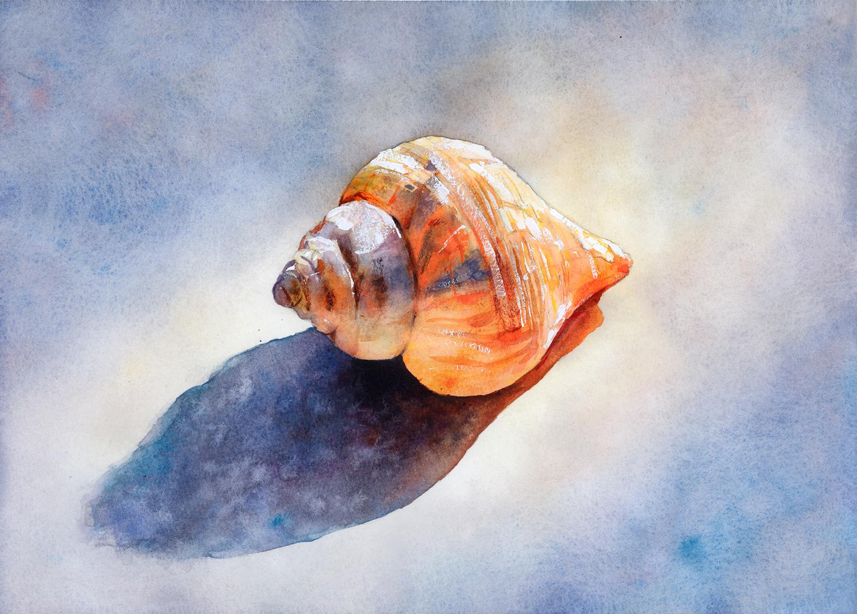
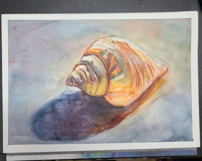
name's Will Elliston. And today, we're painting a shall still life
in watercolor. What makes this subject so rewarding is its quiet elegance. A single form, a
clear light source, and a beautiful
interaction between warm sunlit areas and
cool surrounding shadow. The spiral structure
gives us rhythm. The ridges create
subtle texture, and the long cast shadow anchors the whole composition
with drama and simplicity. We'll explore gentle glazing, soft transitions, and
a limited palette that lets temperature
and value do the work. It is calm, focused, and deceptively rich in lessons. I've been a professional
artist for many years, exploring lots of different
subjects from wildlife and portraits to cityscapes
and countryside scenes. I've always been entranced by the possibilities of watercolor. But when I started, I had no idea where to begin
or how to improve. I didn't know what
supplies I needed, how to create the
effects I wanted, or which colors to mix. Now I've taken part in many
worldwide exhibitions, been featured in magazines, and been lucky enough
to win awards from well respected
organizations such as the International
watercolor Society, the Masters of
watercolor Alliance, Windsor and Newton, and the SAA. Watercolor can be overwhelming
for those starting out, which is why my goal is
to help you feel relaxed and enjoy this medium in
a step by step manner. Today, I'll be guiding you
through a complete painting, demonstrating a variety
of techniques and explaining how I use all
my supplies and materials. Whether you're just starting out or already have some experience, you'll be able to
follow along at your own pace and improve
your watercolor skills. If this class is too challenging
or too easy for you, I have a variety of classes available at different
skill levels. I like to start off with a free expressive
approach with no fear of making mistakes as we create exciting textures
for the underlayer. As the painting progresses, we'll add more details to bring it to life and
make it stand out. I strive to simplify
complex subjects into easier shapes that
encourage playfulness. Throughout this class, I'll be sharing plenty
of tips and tricks. I'll show you how to turn
mistakes into opportunities, taking the stress out of
painting in order to have fun. I'll also provide you with
my watercolor mixing charts, which are an invaluable tool when it comes to choosing
and mixing colors. If you have any questions, you can post them in the
discussion thread down below. I'll be sure to read and
respond to everything you post. Don't forget to follow
me on Skillshare by clicking the Follow
button at the top. This means you'll be the
first to know when I launch a new class
or post giveaways. You can also follow me on Instagram at Will Elliston
to see my latest works. So, let's get
started and uncover the beauty hidden in
this simple shell.
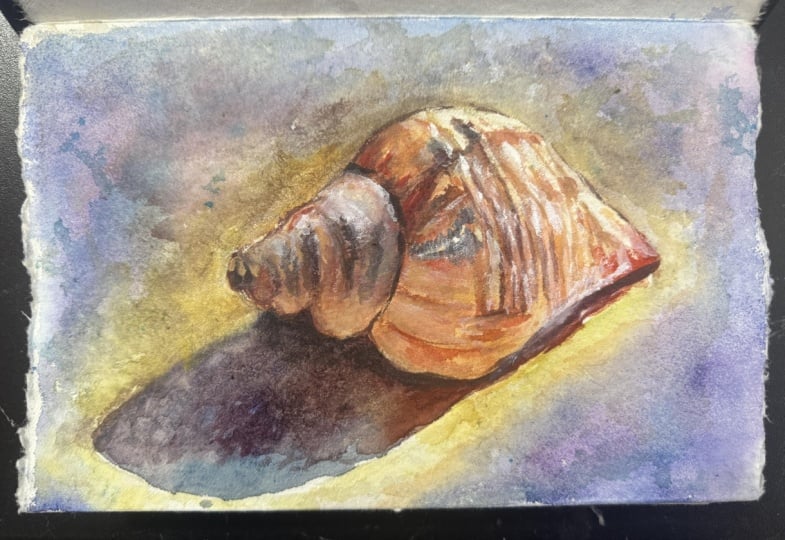
2. Your Project: Thank you so much for
joining this class today. This painting is a great
opportunity to slow down and enjoy the quieter
side of watercolor painting. Rather than relying on lots
of objects or dramatic color, we are allowing small
shifts in tone and temperature and texture
to become the focus. The shell has a lovely sense
of movement in its spiral, while the ridges catch
the light in a way that feels both natural
and sculptural. Around it, the soft
surrounding wash and strong shadow create
contrast without noise. The aim is not to
overstate ever, I think, but to let subtle
decisions build a painting that feels calm,
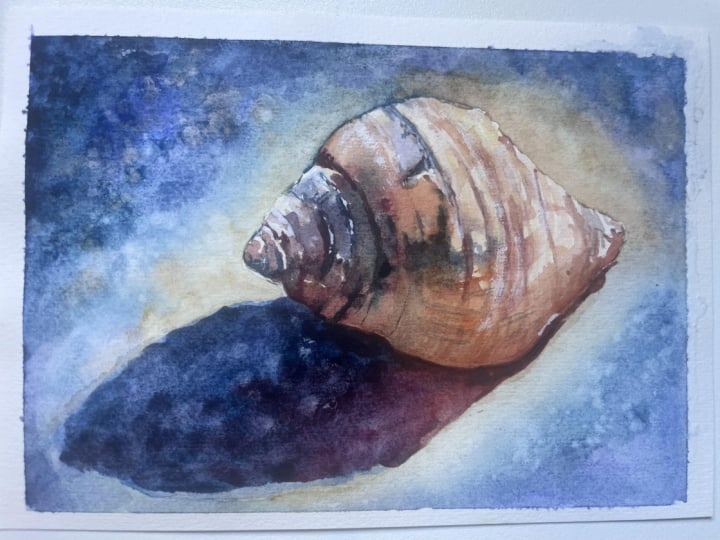
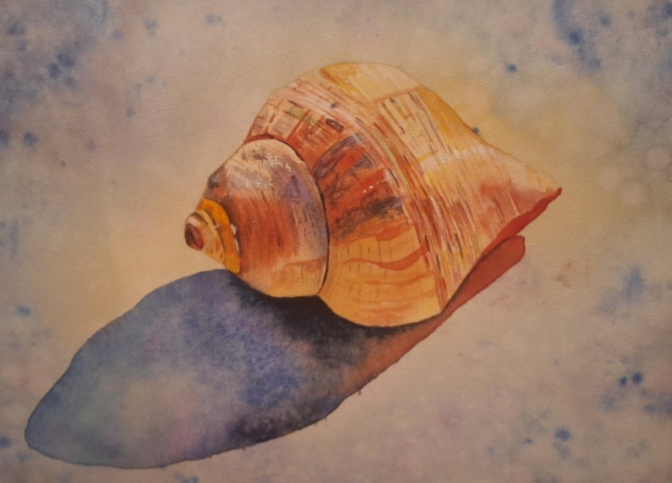
luminous, and complete. In the resource section, I've added a high
resolution image of my finished painting
to help guide you. You're welcome to
follow my painting exactly or experiment with
your own composition. As we're going to be focusing on the painting aspect
of watercolor, I've provided templates
you can use to help transfer or trace the
sketch before you paint. It's fine to trace when using it as a guide for
learning how to paint. It's important to
have the underdrawing correct so that you can relax and have fun learning the
watercolor medium itself. Whichever direction
you take this class, it would be great
to see your results and the paintings you
create through it. I love giving my
students feedback, so please take a photo
afterwards and share it in the student project gallery under the project
and resource tab. I'm always intrigued to
see how many students have different approaches and how they progress with each class. I'd love to hear
about your process and what you learned
along the way, or if you had any difficulties. I strongly recommend
that you take a look at each other's work in the
student Project Gallery. It's so inspiring to see
each other's work and extremely comforting to get the support of your
fellow students. So don't forget to like and
comment on each other's work.
3. Materials & Supplies: Before we draw this child out, let's go over all
the materials and supplies you'll need to paint
along in today's class. Having the right materials can greatly impact the
outcome of your artwork. So I'll go over all the supplies I use for
this class and beyond. They're very useful to have at your disposal and will make it easier for you
to follow along. Let's start with the
paints themselves. And like most of the materials
we'll be using today, it's a lot to do
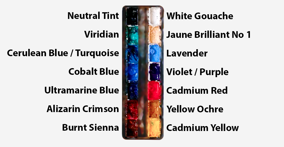
with preference. I have 12 stable colors in my palette that I
fill up from tubes. They are cadmium
yellow, yellow ochre, burnt sienna, cadmium
red, Alizarin crimson, Opraarne blue, cobalt blue, serlean blue, lavender,
purple, Vidian, black. And at the end of the painting, I often use white gouache
for tiny highlights. I don't use any
particular brand, these colors you can
get from any brand, although I personally
use Daniel Smith, Windsor and Newton
or Holbein paints. So let's move on to brushes. The brush I use the most is
a synthetic round brush like this Escoda Purl brush
or this Van Gogh brush. They're very versatile because
not only can you use them for detailed work
with their fine tip, but as they can hold
a lot of water, they are good for
washers as well. They're also quite affordable, so I have quite a few
in different sizes. Next are the mop brushes. Mop brushes are good for
broad brush strokes, filling in large areas and creating smooth
transitions or washes. They also have a nice tip that can be used for smaller details. But for really small details, highlights or anything
that needs more precision, I use a synthetic
size zero brush. All brands have them,
and they're super cheap. Another useful brush to have is a Chinese calligraphy brush. They tend to have long bristles
and a very pointy tip. They're perfect
for adding texture or creating dynamic
lines in your paintings. You can even fan them
out like this to achieve fur or feather
textures as well. And that's it for
brushes. Onto paper. The better quality
of your paper, the easier it will be to paint. Cheap paper quinkles easily
and is very unforgiving, not allowing you to
rework mistakes. It's harder to create
appealing effects and apply useful techniques
like rubbing away pigment. Good quality paper, however, such as cotton based paper, not only allows you to rework
mistakes multiple times, but because the pigment
reacts much better on it, the chances of
mistakes are a lot lower and you'll be more likely to create
better paintings. I use Arches paper because that's what's available
in my local art shop. A water spray is
absolutely essential. By using this, it
gives you more time to paint the areas you
want before it dries. It also allows you to
reactivate the paint if you want to add a smooth
line or remove some paint. I also have an old rag or t shirt which I use
to clean my brush. Cleaning off the paint
before dipping it in the water will make the
water last a lot longer. It's always useful to
have a tissuete hand whilst painting to
lift off excess paint. Also, you never know when an unwanted splash or drip might occur that needs
wiping away quickly. I also have a water dropper
to keep the paints wet. When you paint, it's
important to have them a similar consistency to what
they're like in the tubes. This way, it's easier to
pick up sufficient pigment. A hair dryer is useful
to have for speeding up the drying time and controlling the
dampness of the paper. And lastly, masking tape. And this, of course, is just to hold the paper down still onto the surface to stop it sliding
around whilst painting. Also, if you plan on
painting to the edge, we'll allow you to create a
very crisp, clean border. And that's everything
you'll need to paint along in today's glass. Now, let's get started
and draw out this shell.
4. Preparing The Composition: When I draw a subject like this, I want to keep things very
simple to begin with. I'm not trying to describe every ridge or every
broken texture on the shell straightaway. Purely starting with
a simple oval shape. To establish the
big shapes first. Because if the larger
structure is correct, the smaller information
has somewhere sensible to live and an
easier way to organize it. And if the larger
shape is wrong, then all the little details that we spend time putting
don't save it. In fact, they'll be
incorrect by their nature. So I begin by looking
at the outer contour, the overall silhouette
of the shell, and it helps to think of it as a few broad sections rather
than one complicated outline. That's why I'm inside of
doing a few big shapes, I'm connecting it
with swirly lines. There's a kind of pointed
opening on the right, a larger rounded
body in the middle, and then the spiral
tapering towards the left. If I can place these
three ideas correctly, I already have a
strong foundation. And this is one of
the useful habits in drawing in general. But especially in still life, you might be thinking how light I can barely see the
lines at the moment, and that's intentional
because I am drawing light, and I'm doing that so that I can easily rub out or correct. I'll come back later with harder lines using
a different pencil, and then they'll
be much clearer. See now I've swapped my pencil, and now I can go into
a bit more definition. Even with this, the temptation with a shell in particular
is to go straight into the spiral and
all the little grooves because that's what
the eye catches first. But really, it only catches that section because it sits inside a bigger shape. So once I've established
that big shape, then I can go into
the subsections. Also, I want to think
about that tilt. The shell isn't
sitting perfectly flat or mechanically horizontal. It has that slight
diagonal movement through it that
follows the shadow, that directional pull that gives the composition
some kind of flow. So I'm keeping
aware of that angle because if I
accidentally make it too upright or too level, the whole painting can feel
a little less natural. So now that the outer
shape is in place, I begin to suggest the main
divisions within the shell. I'm still not drawing
every ridge in full. I'm just trying
to understand how the larger forms wrap
around the body. The shell is really a
sequence of turning bands. Some are catching
the light. Some are moving into shadow,
some are overlapping. And the drawing is
simply there to help me understand that structure when I come in with the paint. So some details I'm
not even going to draw in only what's
relevant as a guide. I've already drawn in my
shadow shape, nice and loose, but still there's a
moment when I need to be conscious about placing
that cast shadow because even though
it's only a shadow, it's a major shape design. And I don't want to leave it as an afterthought because it
helps with the composition. So I place it fairly early and lightly and quite
simply as well. It stretches out to the left in quite a broad triangular kind of sweeping shape and then softens and widens
as it moves away. I don't need to draw every
edge perfectly at this stage. I just want to know where
it sits in relation to the shell because
that relationship between object and shadow
is very important. It's not just an empty space. It's part of the design and
architecture of the painting.
5. Starting Very Easy: So starting the painting in
the easiest way possible, I'm just going to
take a large brush and use pure water just
to wet the background. And I'm painting everywhere,
except the shell. You can even paint
the shadow area. I'm doing this because
we're going to start off painting
the background. The background is
going to be darker in some areas than the shell. We want to convey a nice
sense of light on the shell. So in order to do
that, we need to make some areas of the
background darker, so we're negatively
painting the shell. And why wetting the
paper to begin with, it allows us more freedom. It's more forgiving,
and there's less of a time pressure with the brush strokes drying
before we're ready. It's still technically
possible to start painting the background with pigment
and paint straight away, but I would struggle to
do it because we've got all these little intricacies, ridges that we have
to paint around. So just by taking our
time using pure water, we can do it this way. And then once we dab in
pigment on to wet and wet, then the pigments
find their way there. And if we were to paint over the little ridges right
now or go over the line, it's just water so we could use a hair dryer and cancel
it out and try again. So it's definitely the
easiest way to start. I'm not getting it
absolutely sod and wet. I just got a nice
glitten on the paper. You can see the reflection
of the light there. So some areas might
start to dry. It's fine. It just helps
for a little shortcut. So the colors that
I want to use for the background are going
to be quite neutral. I don't want them
to be too vibrant. I'm going to start off
with ultramarine blue. That's a nice base,
maybe some serlean. These are just
little preferences, nothing but in a
strict rule book. I'm using neutral tint or black, if you have that to
neutralize it a bit. I just took a bit of
a sarin crimson to turn this blue into
a more purple color. And that's what
I'm going to start off with to begin with. I'm dabbing in my
cobalt blue there too, just messing around,
having a bit of fun.
6. Applying The Background Wash: So now it's time to apply that pigment onto
the wet background. I one, of course, use this large brush
because it saves time. And we're not doing
any pinily details. This brush does
have a slight tip. But even then, we're starting from the outside
and working our way in. Like I said, I'm starting to
paint the background first because it just makes more
sense, technical wise. You could technically also paint the shell first and then
carefully paint around it. There are ways to do that,
but I often like to think about the surrounding
atmosphere fairly on because atmosphere and watercolor is such
an important part. Note how I'm just applying some yellow and a
bit of orange there. It could be yellow
ochre, cabby in yellow. You can have fun exploring
your preferences. Those are natural compliments to purple. That's
why I chose that. Purple and yellow
work well together. I'm using yellow closer to
the shell as it blends out, but we're going to be building on this bit by bit.
We're going to have fun. We're not going to stress, so we could paint it really
fast if we want to. But I'm just having
fun exploring colors, feeling my way through
it. The paper is wet. There's no sign of it
drying anytime soon, so I'm just taking my time
getting those nice blends. And you can see some of my
paper is pocketing up a bit, creating a bit of valleys and buildup of
water, that's fine. We'll deal with that
when the time comes. We can redistribute that water. I'm adding quite a
lot of this yellow now because that gives it a
sense of warmth and light. My general idea is to have
soft shadows on the side and warm light coming in the
middle, diffused shadows. It follows that general kind
of flow of right to left. So I had to add more
of that blue now. The blue that I'm using is just a complete
mixture of my serlean, my cobort and ultramarine. So when I say blue, it could be a mixture
of any of those, and it's what I'm
feeling at the moment. I'm not calculating it so much. And likewise, with the red, I'm using a zarine and cadmium red. I'm just
dropping that in. It doesn't look like
they're that well, mixed in at the
moment, but as I said, I'm going to build
on it again and again and there'll
be a nice flow, and the pigments
will granulate and blend together as they so beautifully do
when it's wet on wet. I'm avoiding that cast shadow
section for the time being.
7. Adding Some Warmth: So as I was saying, even
though it's still life, I still want there to be
a feeling of atmosphere. And I need to think about that
early on because it helps me judge the shell in
relation to something. If I leave the shell floating on completely untouched
white paper for too long, it can be hard to judge how
luminous or how warm it really is because
the main coolness in this painting is
this background. It's like a kind
of muted coolness. So I like to establish at least some of the
surrounding environment. Of course, I'm just using a random shell with
a lamp on the table, so I'm not even doing it
on a white piece of paper. The background here
is soft and cool, mostly blue gray, violet grays. But see how I'm using
the tiff my brush. I'm going a bit stronger
along the edge here to increase that contrast because I'm looking and
observing the shell, and on the top is
where it's lightest, where it's catching the light. So I need to negatively paint around
there to make it pop. So I definitely need
to make this area at the top a bit darker. Starting to look
a bit brown now, so I'm going to add a bit
more blue to neutralize that. That was a bit of
took away, actually. Now it's looking a bit
green. That's fine. It's kind of muted green. It's not meant to be busy. It's just there to
create a bit of atmosphere to support the shell, and to provide
enough contrast for the warm light on that shell to make it feel a
bit more radiant. It's still very
light. So I'm still going to add more and
more pigment, I think. You can see the buildup
of water. That's fine. We can agitate them a bit, redistribute them,
even it up a bit. So I began with a
very light wash, as you can see on paper
that was already wet, very gentle, very
diluted and quite broad. I'm not trying to paint a textured wall in
a literal sense. But because of the
nature of watercolor, the pigments that I'm
using are granulated. So when it dries, we'll see some lovely
effects, hopefully. Just trying to create that
ambient field of color because there's no color and reality that I'm
using as reference. I'm kind of making it up myself. And it's these early
background washes in watercolor that do
two jobs at once. They establish color, but
they also establish the mood. And in this painting, the mood is cool,
spacious, quiet. And that's the kind of that's
what's guiding me with my decisions here rather than the names of the
pigments themselves. So I want that subtle warmth
of the yellow in the center. It's not a strong yellow. It's like a cream kind of color. Because we've got that
yellow, I want the purple to harmonize and
complement that. Those kind of things are
going through my mind. As I move the wash
around the shell, I'm careful not to make
the edges too mechanical. I want the background to
feel soft and organic. Not like carefully cut
silhouette all the way around. So that's why I'm creating
a bit of variety.
8. Moving The Pigment & Water Around: In some areas, I let the wash approach the shell
a bit more closely. In other areas, I allow a
little bit more breathing room. You can see how I'm
using my brush to redistribute the pigment that's
pulling up in some areas. And you can see the texture
that's being created on that left side because
I use rough paper. Cold breast paper, basically. I don't use thick paper. Thick paper obviously
wouldn't bump up or be as uneven as
this, but that's fine. I like to I don't see it as a
problem because it all flattens out
in the end anyway. And I'm redistributing
all the puddles and having lots of fun, and that's what counts. And by redistributing all this
pigment around the painting, it makes it more cohesive
as to the unity. And maybe there are a few
tiny little variations to stop the painting
feeling stiff. So now we're starting to
build up the pigment. I'm already thinking about the lights area behind the shell. That'll be on the
right hand side. You see it little
bit of lighter there with the yellow behind it. We'll be painting
over that area, of course, over the shell. And that's where the
light seems to gather, of course, the other
side is the shadow. And the background is a little
paler and warmer there. I want to preserve that
subtle sense of glow, so I'm trying to be
careful not to make that area too dark or
to lose those yellows. I'm not treating the background as one flat tone, of course. I'm allowing it to shift
gently cooler areas, warmer areas, and slightly
darker on that left top area. I'll make it more luminous
around that side of the shell. It's a useful idea in
still life in general to think the background doesn't need to be a passive
after thought. It can quietly support the whole light design
of the painting, the logic of the
light and shadow. If the object is strongly
lit from one side, it makes sense that the
surrounding background can help reinforce that by becoming slightly
brighter or softer in the appropriate ways. And the texture in the
background is also important. I really like the
pigmentation that I'm using.
9. A Few Splats: I think I want to
increase that texture. I think the tone is
fairly okay now. Of course, it's wet
and it will dry a lot lighter than it
looks at the moment. And I can see the pigmentation. I won't be able to say
which pigment is creating that granulating effect because I've mixed so many random
pigments into this. It's probably a bit
of the serlean and maybe a touch of
the burnt sienna, but it's most probably Oh, it could be also
the cobalt blue. That's very heavy
granulations and pigments. If you clean your tub
of water at the end, it's usually always the
cobalt blue that you see residue at the bottom. I'm just flicking more blue
and also pure water splats onto the outside areas to
increase that texture. Because as I said, the
texture is quite important. I don't want it to feel too smooth or polished because that could make the shell
feel just pasted on top. So I allowed the wash
to break a little. I add a little bit of
splats here and there. I allow the color
to mingle rather gently instead of blending
it into complete uniformity. It gives the background just
enough life and variation without it becoming too
distracting from the shell. And there's something
quite pleasing. This is certainly
my favorite part of painting these large
expressive backgrounds. I could easily take half the
amount of time to do them, but there's just something about this part of watercolor that I find most ethereal
and interesting, like, the blends that you're
kind of manipulating. But it's the watercolor
that's doing it itself. You just see it appear,
and I could do it again, and it might look similar,
but it won't be the same. It's completely unique. It has its own identity. And it sets the pace
of the painting. Well, I'll have instruct how I want to do
the shell later on. Starting with looseness,
taking it easy, warming us into the
painting rather than starting with details
straightaway. Using that broad,
generous handling. It helps us or it helps prevent us from becoming
overly precise too early. We don't want to begin with
tiny details straightaway.
10. Starting The Shell: Now I've completely
dried the paper, and you can see how
all those values have pretty much smoothened
out. It's completely flat. And also, it's much lighter. It has this sense of air and the glow from the
inside coming out. Just enough variation, but
not overly distracting. So now working on the shell, I'm just using the
leftover colors on my palette from
the background, those kind of brownish, yellowy colors on
the bottom half. And I'm just blocking in the lightest areas I could
see other than the white, of course, there's some harsh light
reflections on the top. But I'm chiseling
away at the tone, starting from light
rather than dark. Using my pencil lines
as a kind of guide. I can always scrub
away if I get too dark or lift off if
it's not already dry. I'm trying to be a
bit patient or at least taking it slow
because I don't want to lose the sense of light because this is a
fairly pale object. I think it's a good
moment to talk about something that comes up
quite a lot in watercolor, how to paint pale objects or objects that appear
white or close to white. It's a really useful
question because so many subjects fall into this categories whether
it's shells, ceramics, drapery, light flowers or
in landscape paintings, I paint a lot of white buildings or light buildings in sunlight. All of these ask the
same thing from us. How do we paint something
that is mostly light without losing it completely
or making it too heavy? The first thing, I would
say is that white objects are never really actually
painted with white paint, of course, in watercolor. The passages come from
the paper itself, and we work our way using that luminosity of
the paper and the pigment. So painting a white object is really about deciding
where not to paint, and then using delicate color and value shifts to describe the form around those
preserved lights or even within it, very subtly. That's why observation
matters so much. We have to notice that the
object is not just white. It contains creams, soft
grays, cool violets. Also, some subtle warm reflections like hints
of yellow ochre, maybe a touch of blue on
the other shadowed side. And it's those subtle notes that allow the
object to feel real. If we paint it as a blank
silhouette or leave it at that, it tends to feel flat and empty. So when I look at this
shell, I'm not thinking, how do I paint a white
shell or a light shell. I'm thinking where is the shell warmer?
Where is it cooler? Where does it move into shadow? Bit that I'm painting now
is basically in shadow, so I know I can go
quite strong there. We've already covered the
lighte areas at the top, and now we can start blending it where it moves into
shadow bit by bit. Where does it catch the
reflected light as well? Which bits do I need to save a bit more with the
untouched paper? Where does it stay closest
to the untouched paper? And that shift in thinking is really helpful
when observing. I'm just softening up
that bit of yellow now, even though I'm going to go
darker with a shadow later. I don't know how
dark I want it yet, so I don't want to have
a hard edge underneath. This is a kind of orange yellow. It's still technically orange, but it's more yellow than red.
11. Building The Tones: Another useful thing
to remember is that pale objects depend heavily
on their surroundings. So a white shell feels
brighter when it sits against a cooler,
slightly darker environment. A pale ceramic
bowl, for example, feels more luminous if there is a dark
shadow underneath it. So we often paint
light indirectly. We make it visible by
what we place around it. And that's happening very clearly in this
painting as well. The shell looks luminous, not because we painted
over the shell itself, but because the cool atmosphere, the background behind it, and the cast shadow that
we'll add later on, it'll allow those pale
passages to really glow. It's difficult to fully assess it without thinking of
that dark shadow later, even though it's not
there, we need to be aware of it in the
back of our minds. Especially at this early
stage when we've got no other kind of context
for the darkness. There's also a temptation
with light subjects to overcompensate because they
may seem so faint at first, we may feel the urge to
keep on adding more color, more modeling or more contrast. We do need enough
information for the form to turn and
to describe the form. But often the better approach is to stay a little
lighter than we think. And at least at the early
stages, build slowly. We don't need to
feel like we have to rush. It's time to relax. Your time to relax and have fun. It's really should be the time
that we stress the least. A really good time to
disconnect and relax and observe watercolor
rewards patients here. It's much easier to
deepen a pale object gradually than to recover its freshness later on once it's become
muddy or overworked. Because some pigments are
highly staining as well. I might not even be able to
recover the very light parts. Edges also play a huge part with painting pale objects too. So you can see some edges
are soft and some are hard. Edge control is actually more important than
strong color because a gentle value shift
with the right edge can say so much more than a bold
stroke in the wrong place. So I'm always asking myself, does this edge need to dissolve a little bit or does it need
to be harder and clearer? Where does it catch the light? Is it sharp or does it
soften into the next plane? Thinking of the
lightest color and then what comes next and then does it need to merge
or is it separate? If it merges, then I can
do it now wet and wet. But if it's got a higher edge, I need to wait until the paper's a bit dry
and do it later on.
12. Adding Some Cool Tones: And then finally, I'd say, we're painting pale objects, it's an exercise in trust. Watercolor requires
a lot of trust. And we have to trust that these small shifts matter
because again, as I was saying, it's hard to tell in the early stages what's
important or not. I got all these pencil marks, these brush marks, and they might not feel like enough
in the early stages. It might seem off or wrong, but we have to trust that when everything else is together at the end, it'll look okay. So really don't give up if
you feel like it's off. At least for this painting,
see your way through it, see what it's like at the end. You have to trust that
these small shifts matter, these small little details. They're not details. Small
tones, these subtle tones. Even if you feel uncomfortable
often, the viewer, the audience who sees the
final piece without seeing your initial stages will read the form in a more unified way. So we have to trust
the paper and the pigment and the restraint
of this early stage. It's definitely not easy
because the mind obviously wants to explain more
than the painting needs. But when we do trust these
small little relationships, breaking tones down
into highlights, mid tones, because basically the washer that I'm painting
now is all the same tone. It's very subtle. There's a few different
colors going on involved. I've got the yellowy orange
on the right on the bottom, and then it kind of
blends into a kind of muted brown up towards
cool, blues, purples. It's had a bit of
time to dry off now. So when I apply
this burnt sienna, it's going to blend out. I just drop it in there and allow the water to
flow the way I want it to or the way I hope I want
it to the way it wants to. It's these little drops, these wet or wet drops
that become some of the most nice effects
in watercolor. And creates that
luminosity as well. So whilst painting the shell, that is the spirit
I want to keep that we're not trying to
fill everything all at once. We're trying to preserve light and quietly model
the form around it. Thinking more in
terms of the light than the shell itself, because that's how we create something convincing by conveying the form and
the shadow across it. Because without
light, we wouldn't be able to see the shape at all. And when I look at the
shell or the reference, I'm seeing an endless range
of tones from light to dark. But of course, I don't
want to convey that. I can't convey that. It
would be impossible. So I simplify it
and minimalize it. So some of the tones
I have to decide, do I make that lighter
to match this one? This wash them painting
now or do I make it darker to add on to the next one we'll
do on top of this? I'm thinking about broad areas
rather than small details, even though I have a few small
strokes connected to this. First of all, I think of the
broad areas and then how to attach them with the
little strokes afterwards. Introducing a bit more brown
on this right hand side.
13. Experimenting With Texture: I'm looking at the overall
temperature zones first, where the shell is warmest, where it's coolest, where
is the light strongest, and where is the form
beginning to turn away? So we've got a lot
of warmth going on at the moment,
especially at the bottom. And then a bit more
coolness on the left, but not too much, just a
slight influence of coolness. I think I need to make it a
bit lighter down the bottom, so I'm just taking some pigment that's on the painting itself and
redistributing it up. And these little lines
follow the contours and the curvature to give it that
rhythm and sense of form. And it distributes
the pigments around. So the shell really
has a nice range of color within what is essentially just it's basically
a restrained palette, really, a limited palette. Not too much going on. There's no bright greens,
no bright purples. Maybe subtle influences of
these things happen to occur, but it's mainly just
a limited palette. We've got the pale creams and the off whites in the
lightest passages at the top. They look like pure
white at the moment, even though they're
technically not We're really having
fun with that kind of warm peach note
at the moment. The orange passages
there in the kind of sunlit ridges as it
curves around the shade. The subtle violet grays and muted blues in the spiral
shadowed sections. So it's not a huge, like, it's not a huge
celebration of color, but not in the way that we're using every color
or pigment available, but we're making the most
of what we want to use. We're also choosing colors that complement the background. Of course, I chose the background colors because I knew I'd be using these
colors on the shell, but the yellow, as I said, said when painting
the background looks so nice with purple because
they compliment colors. And the orange goes well with the blue tones that
are also in the background. So there's enough variety
for it to feel alive. But it would also be interesting and useful to paint this
using black and white, just sapia or burnt sienna
or just a single colour. Maybe just neutral
tint and black, just to focus on the tones. It would still look very pretty because we were creating
that sense of luminosity, you can still create a feel of light without any color at all. It's a good practice to do. Of course, I think if
I did a whole class on a black and white painting of a shell, it wouldn't
be so popular. But if you really want to learn how to create
that feeling of light, it would be a
fantastic experiment and practice to give a go. Now that I have begun or began with the warm washes
in the sunlit areas, I'm starting to go in
with a few cooler colors, just dropping bits in. You can see it's a bit
more turquoisy or blue. It doesn't matter,
it could be violet. Just the contrast
from warm to cool. At the end of the day,
it doesn't matter what cool colors
or warm colors you use because it's just about the temperature,
the playoff temperature. Around the larger
body of the shell, there are sections
where the light catches and turns warm very gently. I don't want to overstate
them quite yet. I just want to tint
those areas and begin setting up the
temperature relationship.
14. Some Darker Tones: Then you can see the
more shaded part, especially around the
spiral on the left, I started introducing that cooler gray violet
note or a touch of green. I didn't actually add green, my blue mixed with that reddish, kind of burnt sienna on the
paper. I created itself. These are actually
still quite light. They're mid tones at the moment. I'm not going anywhere near
the deepest darks yet. Those will just be little
accents at the end. I'm simply establishing
that first conversation between warm and cool
across the form, trying to create that feeling of airiness and
atmosphere as well. That's another good thing about watercolor. Why I like it. You can create
atmosphere in an object. Like it has, like it has
breathing space to it. It's one of the
useful things about a shell that its structure helps us understand the
movement of these washes. The ridges are not just random. They're quite structural.
They curve and they wrap. So when I lay in
these first washes, I can let the brush
follow that movement. I don't want to paint across the form in a way
that flattens it. I want the marks to
already begin supporting the spiral and that
turning structure. And then within within that structure and those brush
marks, it's quite random. There's a lot of messiness and backwashes and
inconsistencies, but it's somewhat anchored by these spirally
directional touches. It's influenced by that. I want the marks to
demonstrate that. So I'm still leaving
plenty of room for glazing later
because glazing is something I like
to do with still life to build up that illusion of
detail in a more controlled, relaxed way, especially with this kind of subject that has lots of little
textures and layers. There's quite a lot
of layers involved, and basically
glazing is a layer. So it's very important with a subject like
this in general, how to build up richness
through layers. If I try to achieve the
whole shell in one go, I will definitely
lose that subtlety. So I'm thinking
of these as first passes that establish
the groundwork. They are setting the atmosphere of the shell, not completing it. And the paper does so much of the work for us in
these early stages. That's where the beauty
of watercolor comes in. We're placing a warm note
here, a cool note there, letting them settle and do what they want to do,
letting them breathe. And already, their
child begins to emerge. It begins to feel not
just drawn but lit. I'm looking back
and forth between the shell and the shadow area, even though I haven't painted that shadow area yet
because I'm starting to add a few darks, whilst they're wet, they look very dark,
but they'll lighten up, especially as they're curving
into the more shadowy area. That's the reason
I want to preserve a sense of hierarchy. The shell must remain
lighter and more delicate while the shadow later
will provide that weight.
15. Dry Brush: Now I've allowed it
to dry completely, and I feel like I've created that feeling of atmosphere and
spaciousness and airiness. So now we can start
working on glazing it, basically, adding
little layers to build up the texture rather
than doing it all in one go. Many of my paintings don't really use the
glazing technique. It's all about being
bold and expressive. But glazing is one of the
quiet strengths of watercolor, especially in still life
painting like this. Sometimes people think of
watercolor only in terms of the first wash as if the medium is all about
the immediate freshness, and then whatever happens
happens, which is fun. And I've got most of my
classes are like that. But one of the beautiful things
about watercolor also is that it can be built very
delicately over time, and not necessarily a long time. This is actually a
shorter painting than my usual classes. Usually my classes
can take 2 hours and I have to speed it up or
chop it up or edit bits out. But this is all of my footage, and it's all normal time,
not sped up at all. So it's actually quicker
than my regular paintings. Transparent layers
can deepen color, and that's what watercolor is. It's a transparent medium. It refines the form. It creates a sense of richness
without losing luminosity. But as long as we're patient, and that's really the key
patience because patience, funny enough, isn't so
much to do with time. As I said, this is a
fast painting, actually. But it might feel unpatient to some people because we're painting in layers, and a glaze only really works when the layer
beneath is ready for it. So if the earlier
layer is too wet, the new passage can disturb it or turn the surface a bit muddy. And if we become
impatient and keep working back into that
area before it's settled, we often lose the clarity that makes watercolor so special
in the first place. So glazing teaches us
more than technique. It teaches us timing, it teaches us restraint, and it allows us to pause when the painting
needs to pause, not just when we
feel like pausing. So in practical terms, a glaze is simply a
transparent layer placed over an existing dry layer
in order to adjust it. It's the opposite or
wet or wet, basically. But the effect can be
incredibly subtle and powerful, especially with all these little details that you get on a shell. A pale, warm glaze can make the shell suddenly feel sunlit. A cool glaze can send a little plane gently
backwards into shadow. A deeper transparent layer
can clarify shadow even more, but without making it feel dead. And that's what makes this
so beautiful in watercolor, is that the layers remain optically alive and
they're intermingled. We're not thinking
of first layer, second layer, third
layer, and then done. Each brushstroke is
technically its own layer, depending on where it lands.
16. Some Refinements: So light still moves
through these layers. The early layer still participates
in what we're seeing, even if it's buried
under other layers. Instead of one opaic
correction covering another, like we would do
in other paintings when we were only using
basically two layers. This is more of an
accumulation over time. The surface becomes richer
but breathable, of course, it means we're doing a lot
more of the work ourselves, but that's why we created that airy atmospheric
layer to begin with. Now we're doing the
glazing on top of that. Of course, these
kind of techniques, these glazing techniques suit some subjects
better than others, like still life or
some portraiture. It depends on your style. When I paint still life, I tend to like this kind
of layered glazing style. Bit like my pumpkin class. I painted a while
back ago on my glass, my transparent glasses class. It's still life often
rewards this careful, gradual building because it's
all about it's more about um perception and observation. With other paintings, we can
be a bit more ambiguous. With still life, we
are rarely forced into the speed of
changing the subject. We have the opportunity to say, Okay, I'll just let this dry, then I'll come back,
maybe have a cup of tea, change the song on the radio. Then I'll just
that warmth there. Then I'll deepen the shadow. Each pass refines the
harmony a little bit more. Especially in a limited palette, it's maybe not hard to go wrong because we're
within that color. We're not going to pick a
color that's odd because we're sticking to the colors that
we've got yellow ochre, burnt sienna, the worms, then violets and
blues for the cools. Of course, glazing can go
wrong if we are too heavy handed or there's
too many layers or if those layers
are too strong, I can just make a painting
feel a bit too tired. So glazing is not just
an analyst correction, just another tool in our
box that we can use. Each claze still needs a reason. We're not doing it randomly. Perhaps it's warming some
areas or cooling, unifying. And I'm still experimenting
with other things. Like I just scrubbed the
brush there to lighten a bit. That's not glazing at all. So I'm still incorporating other tools as well as glazing. But I don't often talk about
glazing in my other classes, so I feel like I'm talking
a bit more about it now because it's still useful
because in other paintings, we can still use bits of it, even though I don't necessarily talk about it for 5 minutes. If it has no reason, it's
probably not needed. That's a good philosophy
to have when glazing. I also think glazing
becomes easier when we stop expecting each
layer to do everything. We're chipping away
at the sculpture, so to speak, rather than
doing it all in one blow. The fur layer definitely doesn't need to
finish the shell, and the second one
doesn't either. Each layer only used to carry a little bit
of that burden. And it's a very calming
way to paint, actually. So it's not so much
about impatience.
17. Pre Wetting The Shadow: So when it comes to observing my painting and trying
to recreate your own, I'd encourage you
not just to judge, it's only whether the ridges or the details match exactly. Whether the shadow is
exactly the same shape or the background has the same
kind of texture or colors. I want you to look at the bigger experience
of the painting. Does it feel luminous? Does it feel balanced?
Does it feel calm? Does it feel anchored? And if it does, then you've
probably said enough, you don't need to
overwork it with details. And that's one of the nicest
things about painting a subtect like
this is it teaches us that completeness can come from harmony
rather than quantity. The relationship to all
the elements rather than the full explanation and
sometimes the subtlety of it, there's some areas
that I think I've overworked in hindsight, but I've forced my
way through it. So sometimes subtlety is
more powerful than force. So just before we start
painting the shadow, which is what we'll do next, I'm going to look for places in the Shalit South where maybe a few firmer accents will help crystalize the
form, define it a bit better. This is always an important
stage because a painting can remain slightly vague until the right
dark notes arrive. But it's also a
delicate stage because the wrong dark accents can make a light painting
feel suddenly too heavy. So I ask myself, where are the deepest
notes truly needed? Usually, these are around the
core shadows in the spiral, the contact points near
the shell and the surface, and perhaps a few narrow
passages where overlapping forms need clearer separation because I don't want
darks everywhere. I only want them where they'll
create the most meaning. And that's one of the most useful principles
about dark accents. They are strongest when
they are selective. If every shadow is pushed to the same intensity intensity, the painting can
lose its hierarchy. But if a few dark
notes are reserved for the most important
structural moments, they can sharpen
the whole image. So let's start painting
the shadow now, and I'm starting
off by pre wetting the whole of the shadow area just to get things
nice, wet and wet.
18. Bold Shadow Wash: So now that we've pre
wetted the shadow area, the cast shadow area, I'm going to start applying
that kind of violet purple, start with that
that was already on my palette I want the shadow to be cool in general to contrast with the warmth
of the shell itself. This cast shadow is one of the most important
parts of the painting. And I say that because the shell itself is delicate
and intricate, but the shadow is
broad and simple. So that contrast is
extremely powerful. It gives the painting both
elegance and structure. So my intention with this is
that the shadow stretches down and left direction in
one sweeping kind of shape. And it's soft on the
far edges on the left, and then darker and
firmer near the shell. And it's full of cool blue violet tones,
as I just mentioned. In many ways, it's the visual counterweight
to the shell itself. Because without it, the shell
will feel like a study, and with it, the painting becomes more of an
artistic composition. So when I paint the shadow, I try to first think of
the main unified shape. It's basically an oval. I don't want to break it
up too much too early. Maybe experimenting
with a little bit of that broken edge
on the left side. Even though there are slight
variations within it, perhaps a slightly warmer
reflected note near the shell or a deeper darker where the
object meets the surface. Where hardly any light gets to. The shadow still needs to
read as one connected mass. And like with most things, something worth remembering
more generally in painting, shadows are often strongest
when they are simplified. The moment we overdescribe them, they can lose their power. Much like the dark accents
I was talking about before. They can stop feeling
like a shadow and start feeling like
separate patches of paint. So I want to preserve
the overall silhouette and the overall
unity of the shadow. Even as I allow a little
variation within it. The color of the shadow is also something fun to play with. There's a nice lesson in
temperature because the shell is carrying all the
warm sunlit notes. The shadow naturally
feels cooler by contrast. So I'm leaning into
those blues right now. Purples in the center. I use blue on the edges because I'm
going to transition to it into a warm as it reaches
the right hand side. But I don't want it to
become dead or monotonous. That's why I'm encouraging
all these different colors. I don't want it to
be flat. You can see now I'm adding
more and more tone. And in five, 10 minutes time, maybe I go over it again
to correct the hues, but I'm just starting
off this way. I still want it to feel alive. So I start off with
that expression and work my way that direction. You can see I'm experimenting with temperature chits within
the cool family itself. It's a nice clean transition, or at least a fun transition. It doesn't have to
be clean. I'm not trying to achieve clean. And that's usually
enough to keep it interesting without it turning into anything too
noisy or distracting. The edge nearest the shell
is especially important one. It's kind of a hard edge
right underneath the shell. It needs to be tight and it darkens a bit as
we go across that area. And that closeness tells us the object is sitting
on the surface. It grounds it. Then as
the shadow extends away, it softens and opens
out a bit more. A
20. Shadow Splatters: So this part of the
painting, again, I'm really looking at
the painting as a whole. I'm just splatting a
few pure water droplets onto that wet shadow to make
it a bit more ethereal. I find when the wash is almost dry and you
splat some pure water, it creates these marks that are impossible to
recreate any other way. So we have the show, the shadow, the background,
the warm notes, the cool notes, the softer
passages, firm accents. We have a nice range and
contrast of things going on. And I want them all to feel like part of
the same atmosphere. Even though there's
clear distinctions, they're all working
towards each other. So kind of relationship
is going on, whether it's contrast or unity. And if one passage feels a bit
too isolated in the shell, maybe unify it with
a very gentle glaze. If one edge feels
a bit too abrupt, maybe I'll soften it or if
one shadow feels too weak, maybe I can deepen it slightly. But these are now final
balancing adjustments rather than major changes because we're so
close to the end now. The Charlotte itself
should feel as though it's emerging
gently from the light, not in a dramatic
theatrical way. But a luminous
quiet kind of way. The spiral should feel
convincing enough, and the shadow should
give the object, the shell enough gravity, enough kind of
groundedness to it. Otherwise, it's just floating in space because there's not much description in the
background for how the form is. So that shadow really helps with the sense
of perspective. And the whole image
in general should feel stable and calm. I also want the painting to
preserve a sense of air. That's how we create
the atmosphere. Something I value
most in watercolor. That's why I added those flats, and I'm doing these little
droplets wet on wet now. Even when an object is solid, I don't want the painting to feel sealed off or,
like, blocked out. I want there to be a feeling
of atmosphere around it, a little bit of space,
a little softness. That's what makes watercolor
so special to me. And when I look at still
life like this shell, what I really want to end with is not just
a correct shell. I want a painting that
feels quiet, complete, and observed with
care and intention. So a painting that gives
the viewer a chance to slow down a little a painting that lets them feel the
warmth of show against the cool shadow
in the background and the stillness of
the whole arrangement. And that stillness matters. It's part of what makes the
subject magical, really. It's what the subject offers us. So the shell does not need a dramatic story like
other paintings. Is story is already
there in its structure, in its weathered surface, and in the way the
light rests on it. Our job is simply
just to notice it deeply enough and paint
as honestly as we can. And hopefully, those
things will come through.
21. A Few Highlights: What I love about a shell study like this
is that it reminds us how much can live inside a simple shape because
at first glance, it's just a chow and a shadow. But once we slow down and
really engage with it, we find form, rhythm, light, color, temperature,
all kinds of things, texture, the edges, the glazing, the
compositional balance. There's so many
different things, all these quiet
little relationships that make painting so rich. So this class is really an invitation to trust those
quieter relationships. To trust that warm against
cool and how it can be enough or that long shadow and how it can carry
drama without noise, that simple object
can still feel complete and deeply satisfying. And perhaps also that we don't always need complexity in order to paint
something meaningful. In fact, still life painting has always been
that way, really. It takes ordinary objects and gives us a way to look at them more carefully
than we usually do. And in doing so, it often gives us something
more than just practice. It gives us a different
pace of attention, a different way of seeing a
chance to appreciate things that would normally
just pass by unnoticed. And this shell is one
of those subjects. It's very humble and quite simple, but
it's full of beauty. The spiral carries movement and the ridges catch the
light beautifully. We have that strong cast shadow that gives it some
boldness and weight. The background lets it breathe because it's
very soft and light. And within all of
that, watercolor gives us the right kind of language, that transparency,
the luminescence. I'm just applying
the final touches now with the white guash, and I'm making sure it's
a dry brush mark because I want that texture
on the ridges, because some areas are smooth, but some areas have that
texture on the shell itself. So I'm trying to imply that movement using
the dry brush texture. So I hope you keep practicing still life after this class. Of course, I have other still
life classes available. I think shells are a
wonderful subject to return to because you can try painting
one at a different angle, maybe a slightly smaller one, slightly tighter, or maybe you can do one with a lighter
shadow, not so bold. Maybe you can switch the
color palette a bit, make the background warmer
and make the shell cooler. So there's lots to experiment. Maybe you can practice painting with two
or three shells or switch it to a different
simple object. But I would still
encourage you to keep that same spirit of simplicity and careful looking because once you start
to see things this way, you begin to notice how
much painting can emerge from all these simple things
like a limited palette, a clear light source, and it changes how you
look at everything, whether it's a stone, a cup, a folded cloth, a leaf. All of them begin to reveal quiet lessons that
you can learn and contribute to all your
future paintings.
22. Final Thoughts: Welcome back and congratulations on completing this still
live painting of a shell. In this class, we explored how simplicity can actually
sharpen our attention, inviting us to look
more carefully at edge, shadow, texture, and the
gentle turning of form. We used a limited palette
to keep everything unified and allowed the light
and shadow pattern to do much of the storytelling. The lessons here extend
far beyond this shell. They can enrich any still
life where observation, atmosphere, and thoughtful
restraint matter. Remember, watercolor painting is not just about technical skills, but also about expressing your creativity and
personal style. I encourage you to continue
exploring, experimenting, and pushing your
boundaries to create your own unique
watercolor masterpieces. As we come to the
end of this class, I hope you feel
more confident and comfortable with your
watercolor painting abilities. Practice is key when it comes
to improving your skills, so keep on painting
and experimenting. I want to express my gratitude for each and every one of you. Your passion for
watercolor painting is so inspiring and I'm honored
to be your teacher. If you would like feedback on your painting, I'd
love to give it. So please share your painting in the student projects
gallery down below, and I'll be sure to respond. If you prefer, you can
share it on Instagram, tagging me at Will Elliston, as I would love to see it. Skillshare also loves
seeing my students work, so tag them as well
at Skillshare. After putting so
much effort into it, why not share your creation? If you have any questions
or comments about today's class or want any specific advice
related to watercolor, please reach out to me in
the discussion section. You can also let me know about any subject wildlife or scene you'd like me
to do a class on. If you found this class useful, I'd really appreciate
getting your feedback on it. Reading your reviews
fills my heart with joy and helps me create the best
experience for my students. Lastly, please click
the follow button Utop so you can follow
me on Skillshare. This means that you'll be
the first to know when I launch a new class
or post giveaways. I hope this class
reminds you that even the quietest subjects can offer some of the richest
watercolor experiences. I look forward to seeing you in future paintings until then happy painting
and bye for now.
 Will Elliston, Award-Winning Watercolour Artist