Transcripts
1. Introduction: Are you ready to learn how to
paint a standing upon sure. Flower with gorgeous fire
like petals and as smooth, beautiful background
in watercolors. I'm thrilled to show
you how to create this beautiful
painting step-by-step. Hi, my name is Chris and I'm a professional watercolor
artist and teacher. Back in 2012, I
discovered my love for watercolors and error since it has become my
greatest passion. In fact, I love it so much that I turned my passion
into my profession. Since 2019, I've been
teaching online, sharing my knowledge and helping others understand the
beauty of this medium. In this Skillshare class, we'll be focusing on
painting a blooming, a puncher with a radiant
light field flower will be using most of the wet on dry technique and
learning how to soften the edges to give our
painting a natural look. But I will also show
you how to paint the background using the
wet on wet technique, which is the best way
to achieve a smooth, beautiful background with stunning colors that
blend seamlessly. Throughout this
tutorial, we'll work on capturing the
intense light and shadows of our flower will be working gradually
with a few layers. Slowly building the
depth of colors and tonal values to create a
truly impressive result. This project is
perfect for anyone looking to improve their
watercolor skills. If you're ready to start
creating something beautiful, Then let's jump right
in and get started.
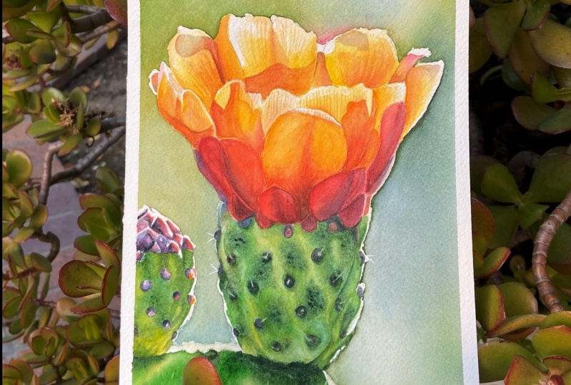
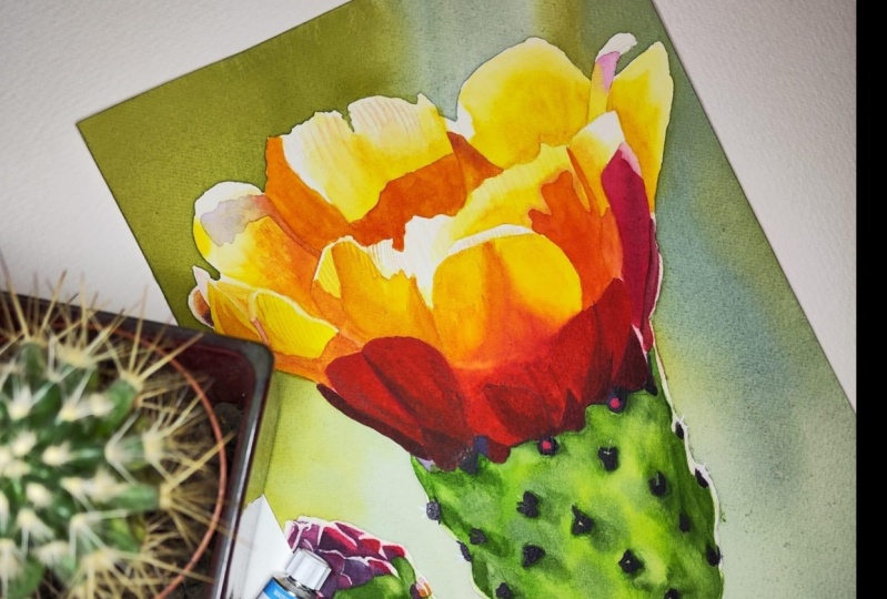
2. Class Project: Our class project
is this gorgeous, a punch of flower? This is an excellent
painting for practicing smooth watercolor washes
wet on wet background, and achieving deep
vibrant colors. What I really like about this flower is how the
sunlight illuminates its features with backlit petals adding a unique touch
to its appearance. The color composition of this a bunch of flower
is also striking, showcasing a complimentary
color scheme with vibrant reds and greens that
create an energetic look. To help you get started, head over to the resources area, where you'll find
a helpful PDF file with our list of
all the supplies I used for this painting. Feel free to use your
favorite art materials. You don't need to have the
same supplies as I have. You'll also find
a reference photo and my finished painting
for your reference. And most importantly, you will
also find a line drawing. The line drawing comes as a JPEG file so you can
resize it however you like. But I've also prepared three PDF files with
the line drawing three different sizes
so that you can simply download the file with the
size that you want to paint, printed out, and transfer onto your watercolor paper using
your preferred method. Of course, you can
also draw a free hand. I painted my flower
in nine by 12 size, but you may want to paint
it in a different size. If you have any
questions along the way, feel free to ask anything
in the discussion section. I'll be happy to answer
all of your questions. And when you finish
your painting, I encourage you to
share your results in your project section to get appreciation and feedback
from other students. And for me, of course, I also strongly
encourage you to first watch each lesson to
get familiar with the subject with
what we're going to do just to be better prepared
for what you will expect. It will help you to paint with more confidence and comfort. In the next lesson, I'll show you how I generally prepare my drawings
for paintings based on reference photos and how I prepare my paper before
I start painting. So let's move on to
the next lesson.
3. Sketch and Paper Preparation: Hi. So we're going to start
the upper punch at today. I'd like to show you the
process from the beginning, including preparing a sketch. Also, I have printed
out my reference photo. The size is 12 by nine
and it's on two sheets. To split the image into two sheets and have it
in the desired size. I used a program called split
print available on Mac. It's a very user-friendly,
simple program, very helpful because the
image is on two pages. First I have to combine them. So I'm using taper that. Now I'm using a fine liner
to draw lines in places I think would be difficult to see through the
watercolor paper. I'm going to use a light bulb. Areas which don't have big contrast may be
difficult to see. Some drawing distinct
lines to make sure I will clearly see
where to trace. I am placing the printout at the back of my watercolor paper, and I'm attaching it
with tape just to ensure that it won't move
around while tracing. I'm turning on my
light pad and I'm placing my paper with the print attached
to the back on it. I'm going to use a regular
HB pencil for the sketch. When the lights are off, I can clearly see the image
and I can easily trace it. My additional fine
liner lines helped me to see even better
where to trace. I like to place a piece of paper towel under my
hand at this stage. I do this for two reasons. The first one is that
I don't want to leave any oils from my
hand on the paper. This could result in uneven
washes at a later stage. The second reason is that I don't want to smudge
my pencil lines. In the end, I'm
marking four corners. This is really important. Thanks to those marks, I will know where I should
attach masking tape later to form the exact rectangle
that measures 12 by nine. I'm making sure that I traced everything and I'm making
appropriate corrections. When the sketch is ready, I remove the image
from the back. I'm going to use a gator board
as my paintings support. Don't confuse gator
board with foam board. Gator board is much stiffer. It's more sturdy and
it's waterproof. Before I stretch the paper, I have to make sure that
my sketch is correct. If there is anything I
would like to erase. This is the time
to do that because applying water will make
the graphite permanent. So later, I will not be able to remove any lines,
any pencil lines. I also use a kneaded eraser
to make my sketch lighter. I just roll it over my drawing and it catches
the excess graphite, making the sketch lighter
but still visible. Now using clear water and
a big 1.5 inch flat brush, I'm applying a water layer
at the back of the paper. First, I make sure
it's covered evenly. Then I turn it over, place it in the
middle of the board, and wet the front. If I can see any air bubbles
under the paper and bulges, I leave the paper and wet both the paper and the gator
board again in that place. This way I removed the warping
and the paper is flat. I leave it for about
a minute or two. And in the meantime, I cleaned the board around
from the excess water. After around 2 min, I staple it down to
the gator board. I use a regular office stapler and place staples
around 1 " from each other. I leave this stretched
paper to dry overnight. The next day when the
paper is completely dry, I tape it on foresights. I use a scotch masking tape for the delicate surface,
the lavender one. Thanks to the marks
on four corners, I know exactly where
to put the tape. And I know that my painting, we'll measure 12 by nine. Let's check if it's
really 12 by nine. It looks like it is. So now we're ready
for the next step, which is applying
the masking fluid and painting the background.
4. Masking and Background: We're going to mask
out the main subject. I will use a Winsor and Newtons masking fluid with
a yellow tinge. This is my favorite
masking fluid. I also need an old cap, a piece of soap, and a brush for
applying masking. This is an old
synthetic brush that I use only for applying
the brisket. Never use your good
brushes for that. I'm pulling a bit
of masking into the cap and I'm quickly
closing the battle. We don't want the oxygen
to get into the bottle. I'm wetting the brush and
rubbing it on a piece of soap. The soap will prevent the bristles from
sticking together. And now I'm ready to
apply the masking. I'm applying it to the
edges of the flower. In the illustration that you can also find in the
class materials, you can see where exactly
I applied masking fluid. If you accidentally spattered the masking somewhere
where it shouldn't be. Like here I got a drop of masking in the
background. Don't panic. Leave it to dry completely
and just remove it when it's dry and
before you start painting. When the masking fluid is dry, I can remove that unnecessary
spot from the background. I also like to make sure that there are no holes
in the masking. If there are any. I feel them with
the masking again. If I didn't, the paint would
make spots in those places. When I finish
applying the masking, I rinse my brush, rub it again on a piece of soap, and rinse it again to clean it. Thanks to soap, the bristles are clean and they are not
glued by the masking. Let's prepare some nice juicy
colors for the background. Remember that you don't need
to use the same colors. Use similar colors if you
don't have the ones that I'm using or use the colors that you like and you
think will look nice, make it your own. I think I'm going to
start from green gold. If you don't have this color, you can also use a
mix of transparent yellow with Winsor
blue, green shade. The result would
be very similar. Green, gold is my
starting point. I'm adding a Winsor
blue-green shade to make it more
lively and fresh. On the other side
of the palette, I have a puddle of Windsor blue green shade mixed with a tiny
touch of burnt sienna. Winsor blue and the
burnt sienna create a nice slightly muted
down turquoise, which I am going to use in the bottom-right corner
in the painting. We'll also need
something really dark. I'm mixing Payne's gray
with a Winsor blue. Perhaps my main green is a little bit too light
and too saturated. So I'm going to add a touch of burnt sienna and
Payne's gray to my mix. That combination of
burnt sienna and Payne's gray will mute down my mix, my green mix, and
at the same time, it will darken it. So this green is a
mix of green, gold, Windsor blue, burnt
sienna, and Payne's gray. We can shift this
color to any of those four ingredients anytime. Now with a big brush size 12th, I'm applying a water layer
on the entire background. Make sure that you are
using a big brush for this. When you paint wet on wet
backgrounds like this, it is best to use the
biggest brush you have. This way you make as few brush strokes as
possible, which is crucial. Apply clean water
to the background. Make sure you cover
every square inch. You shouldn't see any dry spots. Can you see the
difference in wetness? On the left side, we can see a high sheen. On the right side
there is a low sheen. So we have a
difference in wetness. We aim to wet the paper evenly. When you apply the first layer, don't hurry, clean the edges, and wait until the first layer settles down and soaks
into the paper a bit. Because I'm filming this. I know that I waited 2
min after that time. Apply another water glaze. We're applying two
layers of water to ensure that the paper will
stay wet for a bit longer. We'll have more time
to work wet on wet, and we won't have to worry about paper drawing in some areas. Think about it this way. The first water layer
soaked into the paper, making the paper wet
from the inside. And now the second
layer will stay on the surface because there is
no room for it to soak in. Now we can see a high sheen
on the entire background. This gene is not
disappearing quickly because the first water
layer prevents that. Now we can start
applying the paint. I'm starting from the
upper-left corner and I'm moving downwards. It is essential
that you can move around your painting
at this stage. When you apply the paint, TLT or painting to
get the paint moving, let the colors mingle on the paper without the
help of your brush. That's the key to a
successful wet on wet background with
smooth color transitions and no brush marks. Of course, change the
color along the way. Try to use similar colors
as in the reference photo, but remember that it doesn't have to look exactly the same. More important are
always tonal values. If you still see a high sheen on the paper and you should, because now we have a lot
of water on the paper. You can add more paint to
make the color darker. I aim to paint the
background in one go. So I have to make sure that
the colors are dark enough. Now. Keep in mind that the paint
will dry much lighter. So now it should have a darker tone than in
the reference photo. I added a touch of permanent rose here to add some interests, but also to reflect some
colors from the main flower. Now I added enough
paint everywhere, and for the next 5 min, I'm going to tilt my painting and forced the paint
to move on the paper. I'm doing this until I can see that the paint is
not moving anymore, that the paint settles down. Before we leave it to dry, let's clean up the edges. Remove any blobs of paint or
water from the masking tape. When I do this, I also
like to catch wet edges of the painting with my paper towel and soak up the excess
paint from those edges. This prevents forming
any blooms at a later stage while the
background will be drying. I left it to dry overnight. As you can see, my
painting is super flat and that's thanks
to stretching the paper. We can remove the
masking fluid now. And I'm using a rubber
masking pickup tool. It's a very useful tool and we're ready to paint the cactus. So see you in the next part.
5. Initial Green Layer: We'll paint the green parts of the cactus in a few stages. I think we can start by applying the green on the main
body of the cactus. It is divided into
three main parts. One on the left with
the purple bud, the main part, and
the bottom part. Let's focus on one
part at a time. I'm going to use a
brush size 12th. I still have my colors
on the palette. So now I'll just add more
paint to have a bigger puddle. Again, I'm using green, gold, and Winsor blue. The darker green
is a mix of green, gold, Windsor blue,
and Payne's gray. This part of the cactus
has this nice sunlit edge. While applying the paint, we need to leave
that edge weight. We could apply
masking fluid here, but I think it's not necessary. We can just not go
up to the edges and leave that gap between the
main body and the background. My pencil drawing
is not correct. I can see important lines, so I'm adding them now. Let's apply a water
layer to this area. I'm not sure how those little things
are called correctly, but let's call them
spines for our purpose. While applying the water, tried to go around those spines. Don't forget to leave an
edge that should stay white. I hope that when I tilt
the painting you can see where I apply to the water. The surface of the
paper is now nice and wet so we can add
some colors to it. I'm using our basic
green and I'm adding more pure green
gold in a few areas. The idea is just a
very the green color. I'm changing the brush to a
size six because I want to paint a bit more precisely
close to the right edge. Now I'm using my dark green, so a mix of green, gold and Winsor blue with the
addition of Payne's gray. I'm dropping in the
dark in a few places, may make close to the spines. The surface is still wet so
I can drop in more paint. Now tilt your painting, allow the colors to move in, blend, give it a few
minutes to settle down. When the paint stops moving
and the high sheen is gone. We can repeat the process
on the bigger area. We need to do exactly
the same thing. So I'm starting by
applying a water glaze, which is not clean anymore. But that's fine because this area will be
much darker anyway. I remember hearing about
not painting up to the edges and leaving that
white stripe on the edge. I'm not painting around
this spines this time because they are much darker
than the green anyway, in the previous area, the spines are purple
and a bit pink even. So we had to paint around them. Here. They are almost black. So we can apply the green
to the entire area. I'm preparing more
of my main green, green, gold, and Winsor blue. That is a very
lovely fresh green. I'm starting by covering
this whole area with green. I keep tilting my
painting to move and distribute the paint evenly. On the wet surface. I can see a touch of
blue on the left side. So I'm using a Winsor
blue there on the edges. I'm using again a
brush size six. Once this layer
has been applied, use a big brush size 12th. Pick up the dark
green and drop it in places where we
have those spines. Let the green spread a bit. Those dark spots are indications of indentations in those places. Those dark green spots
don't have to be exactly around the
center of the spines. More important is to create a more or less
regular pattern here. Here is how this pattern
should look like. This helps me to judge where I should drop in the dark green. Now, tilt the painting and
let the paint settle down. Before moving on to
the bottom part. Both upper parts
must be bone dry. I didn't leave it
to dry overnight. I let it settle down. And when the machine
has gone off the paper, I used a hairdryer for about 10 min to dry
those two wet areas. The bottom part is the easiest. First we need to
apply a water glaze. Remember about leaving
that white edge? And then we can
drop in our greens. I'm starting by
applying the water. I'm observing the
reference photo and I'm leaving the white edge
where the highlights are. We don't want the
paint to go there. And first applying green gold. And then I'm adding
darker colors close to the edges. I'm using a brush
size six to carefully create that nice
irregular green edge. Finally, with a bigger brush
and a very dark green. I'm dropping it in, in places where I
can see shadows. Finally, I'm tilting
the painting to get the paint moving again. And I'm leaving
everything to dry.
6. Left Bud: In this part, we will
finish the little fruit of the OpenShift on
the left-hand side. Make sure that everything
is completely dry. And let's prepare some colors. I'm cleaning my palette because we need a different
color family. So I don't want to mix the
colors on the palette. I'm picking up Permanent
Alizarin crimson. We'll need this red to
create deep purple tones. I can also see some
pinks on the spines. So I think we'll also
need some permanent rose on a separate palette. I want to mix a
deep dark purple. I'm mixing a Winsor blue with
Permanent Alizarin crimson. This gives a very
nice deep purple, which is muted down because Windsor Blue has a
green undertone. So when it's mixed with the red, it meets down the mix. I'm also trying a combination of alizarin and Payne's gray. This gives an even
darker and deeper purple and it may come in handy too. That's a really nice mix. When I mix two colors, I like to leave pure colors
on both sides of the petal. This way, when I'm painting, I can pick up more
reddish purple or more bluish purple depending on what I need that
at the moment. This time I'm switching
to a much smaller brush. I'm going to use a
spotter brush size to the unfolded flower. Here is a small area, easy to paint wet on dry. We don't need to use wet
on wet technique here. I'm starting slowly by
applying a light tone of pink. I'm using a mix of permanent
rose and alizarin crimson. I'm now trying to apply this
color on every little pedal. More light is going
through the petals. On the right-hand side. They just catch
more light there. So they are lighter
in tone and also warmer when it comes to
their colored temperature. While I'm going more
towards the left side, the petals are more
in the shadow. They are darker and cooler. On the left I'm using
more purple sign, either mixing permanent
rose with Winsor blue, or I'm even using my
dark purple mixes. Those petals will be
very dark in the end. I can be braver in
tonal value because eventually I'll have to darken
all those places anyway. Now I'm mapping out the
colors using a light or middle values to get a sense
of what color goes where, and to create that underlayer
for the next layer. Notice also that I'm leaving all white areas lit by the sun. If it's difficult for you
to assess where you should apply paint and where you
should leave white paper. Take a break and look
at your drawing. Make sure it's accurate. Feel free to make a more
detailed drawing if you need to. You can clearly mark
where the highlights are, where you should not
apply the paint. A good drawing is
always a huge help. Apply the purple on all spines. Now we have to leave it to
dry because we are painting wet on dry and we're using
a small amount of paint, it should dry quickly. In this case, I'm using a hairdryer to speed
up the drying time. We have a nice foundation, so now we can build
more layers upon it. When at least one layer
is already applied, it is easier than to build
the colors and tones. It's nice to have
that foundation. It gives a sense of completion. We just need to darken all colors with the
second and last layer. I'm now using dark tones
and intense colors. I want to achieve this same tonal value as
in the reference photo. We can start from the
darkest down first and then add a lighter tone
and blend both colors. Or we can apply a
lighter tone first, e.g. Alizarin crimson,
and then dropping the dark tone on top
and blend those colors. Sometimes it's
easier to start from the dark tones because
they are more prominent. And it's easier to determine
where we should paint them. But on the other hand, there is a risk that
we can go too dark. So we have to be careful. Don't worry about
colors to match. Always focus on tonal values. When you know that there must
be something really dark, then you'll naturally choose the right colors to
get the dark tone. It doesn't have to be
exactly the same color, but when you get the right tone, everything will look fine. I'm leaving the edges
of those petals white. But then while the paint
is still slightly damp, I'm pulling the
paint from around to cover those edges
with some colors. Not all of those edges
are totally white. Here I'm starting from
Alizarin crimson, and then I'm switching
to the dark mix of Alizarin crimson
with Payne's gray, or alizarin with Winsor blue. If I need a different, a bit lighter shade of purple paint also, all of those spines start from this strong red accent and then build a darker
purple tones on it. The red underneath show through creating that
lovely warm glow. I can see here that a dark circles
surrounds those spines. Some first painting,
those dark circles, painting around the
triangular shapes. And then I'm adding reds
and purples on the spines. On the right-hand side
where the spines are more lit by the sun and warmer. I'm dropping in just
a tiny touch of Winsor yellow deep to add
a bit of that warmth. Finally, I'm working
more on the green parts. I'm adding shadows
here and there with a darker green tone
to create the form. I'm applying the
paint wet-on-dry. Then I'm rinsing and blotting my brush with a
clean, damp brush. I'm trying to soften one edge
of the mark. I just did. This way. I'm creating a kind of a fold that is
present in the form. I'm also using a big
round brush size 12 to darken some green areas. I'm applying the paint and then I'm quickly trying to soften the edges before the paint
dries and creates hard edges. If the green part
is completely dry, you should have no problem
applying more layers. But if you didn't make sure that the previous layer
is completely dry, you may disturb the pigment from the previous layer
and make a mess. You can make an even washes and weird spots here
and there may show up. So always make sure that the previous layer
is completely dry. The bottom, I'm adding a very dark green to paint the shadow. Of course, I'm softening the edge with a
clean, damp brush. I'm also adding the
dark green into other places to indicate
possible spine spots.
7. Main Green Part: In this part, we will
focus on the main part of the second bigger
arm of the cactus. Our objective now
is to paint all of those dark spots which are
placed where the spines are. And perhaps add a
bit more form to this part by adding
more shadows. The green paint I
applied earlier covered my pencil
drawing entirely. I can see where to
paint those dark spots. So before I start painting, I want to make sure I will add the spots in the right places. First, I tried to draw
helpful marks with my pencil, but I noticed that
I couldn't really see my pencil lines
on the green paint. So I decided to use green
color to mark those spots. Again, I keep in mind the
pattern that they create. I can use much darker paint. When I know exactly where
I should paint the spots. I'm picking up my dark mix of Permanent Alizarin
crimson and Winsor blue. I'm starting by painting the
dark shadow on the left. I'm painting now wet on dry. And after applying the paint, I'm softening some of the edges. If there is a neat a majority of those dark spots
have round shapes. I'm not trying to paint
a perfect circle. Those are organic shapes. They don't have to
have perfect shapes. More important is
their distribution. So make sure that those dots create a
nice regular pattern. The air placed slightly closer to each other
on both sides. And the distance between the dots is bigger
in the middle. That is also important
because this helps to create that
impression of a round form. I'm using a spotter
brush size two. In the upper part, I can see some lighter colors in
the middle of those dots, sam leaving the centers
and painted now, and I will fill them with some
purplish red in a minute. I also think that we can now
add a shadow at the bottom. I'm using my darker
green mix of green, gold, Winsor blue,
and Payne's gray. I started with a
small brush size to, but a big brush will
be better for this. I want to suggest some
organic shapes at the bottom, some round forums
of the characters. And the shadow beneath. I'm applying the
paint wet on dry. And I'm quickly softening
the edges where it's needed. With a small brush. I would make too
many brushstrokes. I could scratch the
paper too many times. And I could easily get an overworked look
with a big brush. It's just a matter of a few brush strokes
and quick softening. Also a big brushes,
more delicate. It's softer, so the
brushstrokes are more gentle for a delicate
paper surface. There is one more
thing I want to do. I feel like the green looks
a bit flat and the cactus lacks the forum and also
a little bit of texture. I'm going to use a dark green
tone to add some shadows which will help to create that way the surface
of the OpenShift. I'm a wedding, a
very small area, and I'm applying a dark green to allow the paint to spread. If we placed a clock
on each of those dots, I could say that I'm trying to paint the shadows at 05:00. I'm adding the
shadow diagonally, Starting from the dot and going down to the bottom right corner. I want to create a bit
more distinct form, a width, some indentation
on the right-hand side. So I'm adding stronger shadows and softening the
edge on one side. The other side remains
a bit lighter. That gives me an
impression of a fold. Finally, I want to add more dark green around each dot with a smaller brush to create a better illusion of
shadow and indentation. I'm using the brush as if
it was a colored pencil. I'm pretending that I'm
drawing with the brush. I don't mind getting any
texture or irregularities in washes because the surface
is not perfectly smooth. So any imperfections on the add more interest and
a natural look.
8. Softening: Before we move on to
paint the petals, I would like you to
do one more thing. When I paint anything
with a strong highlight, I like to soften the edges. This is something that
I do almost always. There are two main
reasons why I do this. The first one is that this
process helps to achieve smoother edges and get rid of the edges
that are too dark. Sometimes pigments
are pushed away from the center of the shape
during the drying process, and they gather on the edges. As a result, the edge may have a darker color than the object and it may
look like a contour. Softening with a scrubber brush, lightens that edge and makes it smoother if it's too rough. The second reason is
that the softening also helps to create that nice
soft glowing effect. After every brush rubbing, Irene's it in the water to remove the paint I
just lifted off. If I didn't do it, I would just transfer the paint from one
place to another. We don't want to do that. We want to keep everything
clean. Every time. I'm also dabbing that
place with a tissue to get rid of the excess paint
and clean the edge. There are spikes on the
edges and I'm trying to create an even sharper
tips of those spikes. I'm also lifting out the
paint from the dark spots. I'm imagining that there are
small spikes sticking out. I'm very gentle because the dark color is
very easy to lift. I'm keeping my brush at around a 45-degree angle and I'm just touching the paint with
the edge of the bristles. I'm creating a few lighter
marks, very irregular. Each of them is in different direction to create
that natural organic look. I'm also lifting
out the paint at the bottom side to create
more imperfections. Now we can move on
to paint the petals.
9. Initial Layer on the Petals: The petals of the flower have a beautiful range of
analogous colors. They go from light
yellow to orange to red and very deep dark
red and even purple. To achieve those rich colors
and light on the petals, we need to keep in
mind two things. First of all, we need to
preserve the highlights. The lightest areas on the
pedals are pure white. I didn't apply paint
to those places. In other areas where
the yellow is light. I just used the
watered-down paint to keep the light
tone of the color. In contrast with very dark
petals in the lower part, we can achieve a sense
of strong light. The second key to achieving rich colors is to paint
everything in layers. We're going to start with
the lightest tones and then will be slowly building
up the depth of color. Let's first prepared
the colors will need. I'm preparing a Winsor yellow. Winsor yellow deep,
Permanent Alizarin crimson. I'm also mixing Winsor
yellow deep with Permanent Alizarin
crimson to get an orange. And finally, I'm also
preparing Winsor red. I think I'll drop
it in somewhere. In this part, we will focus
only on the lightest tones. I'm going to use a
brush size eight. I usually start painting
from the upper-left corner. So I'm choosing the
first petal on the left. My main yellow now will be a mix of Winsor yellow and
Winsor yellow deep. I mix of those two gives
a very nice sunny yellow. I think it will be perfect here because we are working
with yellow color. I don't worry about
uneven washes. Yellow is a very nice
color to paint with because any imperfections
are not really visible. That's why I'm going
to paint wet on dry. This technique is also
quicker than wet on wet and the paint dries faster. I'm observing the
reference photo, keeping an eye on the area
that should remain light. I'm applying the yellow
in the darkest part. I'm rinsing and
blotting my brush. And I'm trying to
create a gradient from dark to light with a
clean, damp brush. I'm pulling the paint
away from that yellow. After every brush stroke. I'm cleaning the brush to not drag the paint from
one place to another. I just want to make it
lighter towards the edge. I continue applying the paint on every petal. I don't paint. Alternatively this time,
normally I would skip one petal, but in this case because
it's yellow and yellow washes usually look
relatively even. I don't worry about
any imperfections. I only keep in mind how
dark I can go and the word the places where which
I should leave white. In darker areas, I'm
applying more yellow, more concentrated paint
in lighter places. I'm using a moral
watered down mix to make the tone lighter. Or I leave the
whiteness of the paper. When it comes to the edges, I follow the reference photos. On most of those petals, the edges are smooth. I need to create a
tonal gradient from dark to light with
no hard edges. But there are also
some dark cast shadows that have hard edges, some indicating them by
painting a hard edge. I will darken them
at a later stage. This little petal, I'm
adding permanent rose in the upper part and my
yellow in the lower part. We have to create that
transition from pink to yellow. Continue applying the yellow on the lower row of the petals. Remembered to leave
the whiteness of the paper in the whitest areas. The only pedals that are left are the ones
in the third row. Those are the darkest petals and they are more
red than yellow. We can suggest a
different color here. I'm using Permanent
Alizarin crimson with a touch of my yellow. Before I go to the
bottom row of petals, I want to make sure
that the yellow is dry. I'm using a hairdryer to
speed up the drying time. I'm using a hairdryer
to dry the paint. I'm covering the rest
of the petals with mainly a light tone of
Permanent Alizarin crimson. But I'm trying to
vary the colors in the areas where
the red is lighter. I'm also adding yellow. You will see that I'm not
applying a flat red wash, but I'm shifting
from red to yellow. This is only the base
layer will apply at least two more layers here to achieve those rich dark reds. There are two
highlighted edges on the right-hand side that I'm
going to leave unpainted. Later. I'll probably
add some colors there, but I'm leaving
them white for now. Let the paint dry completely. And in the next part, we will apply another layer
to deepen the colors, will focus on the middle tones.
10. Petals - Middle Tones: The first layer is
completely dry. Now we're going to develop
the colors and tones and make the petals more orange or
red where it's necessary. I'm starting by mixing
Winsor yellow deep with Permanent Alizarin crimson
to get a nice orange. I'm applying it in the darkest
areas on the first petal. I'm painting wet on dry. After applying the paint, I'm rinsing and
loading my brush. And I'm trying to soften the paint towards the
edge of the petal. I'm dropping in more
permanent Alizarin crimson to make the color richer. Moving on to the next petal
and using the same colors, I'm trying to build up the
rich orange and red shades. Because this is the second
layer of the paint. The colors are
already very vibrant, but I keep in mind that they may look paler when they dry. So one more layer may be needed to achieve the
desired depth of color. I'm just adding more
yellow to make it deeper. In some areas. Even though we could
apply one thick layer to achieve the deep dark
tone we're aiming for. It's always better to
build the colors and tones with at least two or
three thinner layers. This way we don't lose the
transparent properties of watercolors and the painting looks fresh and not overworked. I'm painting now mainly
way the Winsor yellow, deep and Permanent
Alizarin crimson. I'm shifting from one
color to another. Here on this big petal, I'm starting by applying
yellow on both sides. Then I'm adding Permanent
Alizarin crimson in the middle. And I'm also dropping in
that reach, Winsor red. I left the upper
edge of the petal white because there
is a highlight. This time before moving
on to the next petal. I'm allowing this
big petal to dry. I don't want to run the
risk of paint flowing from one petal to another
and creating a bloom. The next petal is
darker in town, so the dark paint may flow into that lighter middle pedal. Here I'm starting from permanent
rose because they think this petal needs a bit of
that color row starch. Apart from permanent rose, I'm also using Permanent
Alizarin crimson. The darkest petals
are really dark. But again, we're slowly
building the depth of color. I am now applying the
middle value of a mix of permanent rose and
alizarin crimson. The right side of the petal. I'm adding orange to shift
the color more towards red. We just have to cover all those petals with
the middle value. Later, we'll make those
petals much darker. Now we'll leave everything
to dry completely. I use the hairdryer for about 10 min and left it
to dry for another 20 min. In the next part, we will add the
details and we'll deepen the colors of the
first two rows of the petals.
11. Dark Tones and Details: We can say that we
are painting from the general to the specific. It's a top-down approach. We paint with more
and more detail with each subsequent layer. Now it's the time to
finish the pedals. We're going to assess each petal individually and think about what we can do to make it look better and closer to
the reference photo. When I'm looking at
the first petal, I can see that I need to add a shadow and create a
texture on the pedal. I'm going to use
a brush size six. I'm mixing three primary
colors, Winsor blue, Permanent Alizarin, crimson,
and Winsor yellow deep. I'm trying to get a neutral color that it can
use to paint the shadow. This shadow transitions from light neutral color
to a very dark red using a mix of Winsor yellow, deep end, Alizarin crimson. I'm also adding a
texture to the petals. I'm just playing
many small dots, one next to another. I'm going back to the shadow to add more color if I need to. I'm moving on to another petal. Now. I'm focusing on the on a small area and I'm
trying to finish it. I want this to be
the final layer. So I'm trying to
achieve the end result. Now. I'm observing the
reference photo and I'm trying to recreate
what I'm saying. If there are lines,
I'm painting lines. If there is a shadow
that is not dark enough, I'm adding more paint
to darken the shadow. I may come back to
the same place a few times to make sure that I
achieved what I needed. I'm also comparing the
petal I'm painting now with other petals I
have already painted. I need to keep the
color and tonal harmony by comparing other areas with the one that
I am working on. I know how dark I can go and how reached my
color should be. There are many of those lines close to the edge of the petal. These may be creases
on the pedals or perhaps statements in the
center of the flower, casting a shadow on the petals. So now continue
working on each petal. Think about what
each of them needs. Sometimes we need to paint a cast shadow with a sharp edge. Other times we need to
apply another layer of paint on the entire pedal
to deepen the colors. Use wet on dry
technique and soften the edges where the transition
between colors is smooth. On this petal, I'm starting
by applying Winsor yellow deep with a tiny touch of
permanent alizarin crimson. And then I'm adding
permanent rose to this mix to get that
vibrant red in the middle. Now to blend those colors, I'm picking up
yellow on my brush. And I'm trying to
pull that red a bit towards the upper part to
make that transition smooth. Because I have
yellow on my brush, the yellow gets another layer
and becomes even deeper. While at the same time, the transition between the
red and yellow is smoother. At the bottom part, I'm adding Alizarin crimson
to make it slightly darker. I'm preparing now a mix
of Alizarin and Winsor blue will need this mix
to darken the next petal. I'm loading my brush
with permanent rose. And I'm starting by
applying this color. At the bottom. I'm adding my dark mix
of Alizarin and blue. And I'm trying to
blend those colors. I'm applying one more
layer to this cast shadow. I think it's too
light now compared to the dark pedal
I just painted. The dark petal is
almost dry now, so I'm painting another
shadow close to that pedal. The Yellow Peril
looks too pale now. And two yellow, I'm adding
a bit of orange there, and I'm blending it away. Finally, I'm adding the
details on the petals. I can see some short lines
here in the highlight. And the more elongated
lines on the other petals. I'm painting them to add more texture and
interests to the petals. They also help to determine
the shape of the pedal. When the lines are
slightly curved, they suggest that the petal
is a little bit bent. Here. Those short lines are irregular and I'm
trying to avoid the temptation of placing one line next to another
in a two regular manner. They're curved shapes
also suggest that the petals are slightly bent towards the center
of the flower. The main petals are done. Now we can move on
to the next part and paint the remaining
darkest petals.
12. Darkest Petals: We've already applied two
layers on the remaining petals, but of course, those petals
are not dark enough. So we will add two more layers to achieve that deep dark color. We also have to
make a distinction between the big petals
and the smaller triangular shaped sepals
beneath them will apply a layer of paint on all
of them in the first goal. In the second round, we'll paint the smaller sepals. And in the third round, we'll finally dark
and the petals. Okay, so let's start by mixing permanent rose with
Winsor yellow deep. I will need this
read in some areas. Start by applying
Permanent Alizarin crimson on the left and going
towards the right side, change the color to our
red and mix of Winsor, yellow, deep and permanent rose. At this stage, the bigger petals and the sepals are united. I treat them both as one object and I'm applying
the paint on both of them. In the next layer, we'll make a distinction
between them. I'm mixing more Winsor blue and Permanent Alizarin crimson. And while the paint
is still wet, I'm adding this dark purple
color on the first petal. I'm running along
the middle part, trying to slightly curved the line to suggest the
shape of the petal. Then I'm adding more
Alizarin crimson and read on both sides. I'm comparing this petal width, the petal behind it. And I can see that they are tonal values are very similar. So this tells me
that I will have to darken the one in front
with one more layer. I'm darkening other petals with Alizarin crimson and
my dark purple mix. We need to leave it to dry. Now. We can clearly see that the color is not dark
enough yet when it's dry. Let's now paint the
darkest sepals to judge better how dark we
can go with the petals. I'm using my dark purple mix of Windsor blue and Permanent
Alizarin crimson. I like to use a
mix of two colors because I can always shift the hue more towards one of those colors when
I'm applying the paint. If I need more red, I'm using more Alizarin. If I need a darker purple, I'm using more Winsor blue. I'm applying this super
dark color on all sepals. When the sepals are dry, we can finish the
painting by applying the ultimate layer
on the dark petals. I'm starting by applying
Permanent Alizarin crimson. And then while the
paint is still wet, I'm adding the dark purple mix of Alizarin where
the Winsor blue. I do this on other petals to the dark purple
is almost black. And mix of Alizarin crimson and Winsor blue actually
creates black, but it has that purple shade. I'm also darkening the
pedal in the middle. I think it's too
light at the bottom. I'm not applying the paint on the entire pedal on the
bottom part and on the left. I'm trying to smooth
out the edges. Finally, I'm softening
a few hard edges with a clean damp scrubber brush
and the painting is finished. Okay, thank you very
much for watching. I hope you enjoyed
the tutorial and I hope you'll be happy
with your result. Of course, please share your painting with
others and with me so that we can all
admire your artwork. Happy painting.
 Krzysztof Kowalski, Watercolor artist