Transcripts
1. Preview: Hi guys. Welcome to my skillshare class on
painting a blue jay. I'm Chris a watercolor and digital artist as
well as a teacher. In this class, our focus
will be on painting a blue J perched on a twig
with some lovely flowers. We'll have fun experimenting
with various shades of blues and using an
analogous color scheme to bring this beautiful
painting to life. I believe this
tutorial is suitable for artists of all skill levels. If you're a beginner
looking for a challenge, you will be able to follow my instructions and create
this artwork with ease. The tutorial is broken down
into short, manageable parts. I guide you step, step through the entire process to
help you get started. I'll provide resources such as a list of the
supplies I used, ready to print line drawings
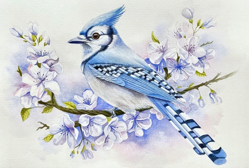
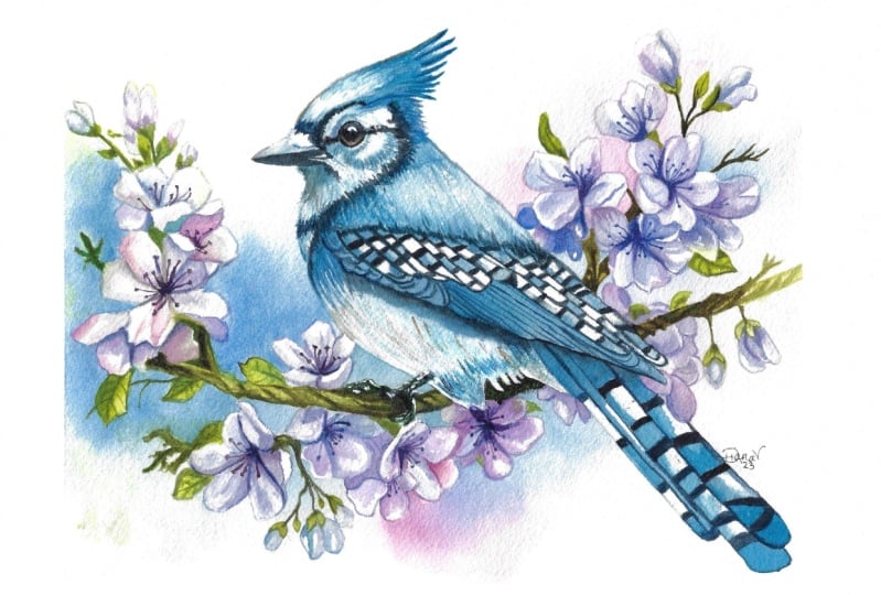
in different sizes, and the reference photo. You can also refer to my
finished painting for inspiration and guidance as you work on your own painting. If you're ready to create
something beautiful, let's dive right in and begin.
2. Your Project: For your class project, I encourage you to follow along with my entire process
and paint with me. However, if you find the entire painting to
be too much at once, feel free to focus
on just one section. You could choose to
paint a single flower, a cluster of flowers, or even just the bird itself. The main goal is to apply the concepts and skills
you've learned in the class and create a unique artwork that
reflects personal style. Please don't hesitate to share your progress shots and the final painting
with the class. You can upload them to the
Projects and Resources section by clicking on
Create Project button. Providing a brief description of your process and any
challenges you faced during the creative
journey can be helpful for both fellow
students and me. This allows for valuable
feedback and support. If you encounter any questions or concerns during the process, feel free to ask in the
discussion section. I'm here to assist
you in any way I can. Lastly, I highly
recommend watching each lesson before you
start your painting. This will help you become
more familiar with the techniques and better
prepared for what to expect, leading to a more confident and enjoyable
painting experience. If you find this class helpful, I would greatly appreciate it. If you could leave
an honest review, your feedback will
help me create better content and assist other students in deciding whether to take this class or
not. Thank you in advance.
3. Resources: I've prepared some helpful
resources for your project, which you can access in the Projects and
Resources section. In the resources, you'll
find the PDF file containing a list of the supplies I used
for this painting. While it's not necessary to
use the exact same supplies, I recommend using
100% cotton paper. For the best results, you can use your preferred
paints and brushes. You'll also find
a reference photo and my finished painting, both of which can provide inspiration for
your own artwork. Additionally, there are
line drawings available in different sizes that you can print and transfer to
your watercolor paper. You can choose the size that
suits your preferences. Feel free to explore
these resources and use them to create your own
unique, beautiful painting. If you have any
questions along the way, don't hesitate to reach out
to me. Enjoy your project.
4. Introduction: Hey there. Today we're diving into the colorful world
of watercolor painting. Together, we're going to create a beautiful portrait
of a blue jay. Blue jays are known for
their vibrant beauty and I'm excited to help you
bring one to life on paper. Before we dive into
the painting process, let's chat about the
preparation process and the ideas behind
this artwork. First off, I wanted to paint
a bird as my main subject. After browsing through
various bird photos, I stumbled upon blue jays. They caught my eye because I hadn't painted anything
blue in a while. The hot weather outside made
me crave some cool colors. I chose a stunning blue jay
photo as my inspiration. Next, I worked on the
composition for the painting. I tried a few quick
thumbnail sketches, but nothing quite clicked. That's when I turned to Pinterest for some
creative inspiration. Vintage illustrations
and postcards often have fantastic
composition ideas. Birds sitting on twigs with delicate flowers around them seemed to be a recurring theme. I decided to incorporate some
flowers into my painting, drawing from a similar concept I used in a previous artwork,
Spring Twittering. My first thought was to
paint cherry blossoms to get a better idea of how they looked and
how to draw them, I researched cherry
blossom photos. With that in mind, I sketched
out a composition that featured a blue J inspired
by my reference photo, but not an exact copy. And a twig with flowers
which I put together from my general understanding
of their shapes. Once I had my composition, I refined the drawing. I printed it out, and I used a light path to transfer it
onto my watercolor paper. I decided not to wet
the paper this time. Usually I wet both the front
and the back of the paper, staple it to my Gator Board, and let it dry overnight. But for this painting, I skipped the wedding
step because I didn't want to paint a
wet on wet background. I knew there wouldn't be
too much paper buckling. I only stapled the paper to my Gator board and I taped
it down on four sides. And with that, I was all
set to begin painting. I had a clear idea that
the bird had to be blue, but I was pondering over
the colors for the flowers. Initially, I thought
pink might work. Then I considered orange
to complement the blue. However, I decided to try
something different this time and go for an
analogous color scheme. I settled on using Windsor
blue green shade as the primary color for the bird touch of cobalt
blue for the flowers. I wanted a warmer shade of blue. I chose cobalt blue
and ultramarine blue. But I also added permanent rose to give the
flowers a purple hue. This way, I kept a harmonious
analogous color scheme. Then I thought about adding a subtle background to
tie everything together. Instead of painting
the entire background, I opted for a soft cloudy shape. To achieve this, I used
cobalt blue and permanent rose to create a connection between the background
and the main subject. The overall concept
for this painting is an analogous color scheme with a cool greenish Windsor blue
for the bird purple flowers, a neutral middle blue and
pink for the background. I also included tiny
green leaves as an accent color to add some
extra depth and interest. I'm quite pleased with
how it turned out. I kept it simple
with basic shapes, straightforward
color application, and used a lot of wet
on dry technique. Which I know is generally more enjoyable and
easier for most of you. I believe it will be
a painting project. We're going to
break this painting into a few stages
to make it easier. We'll begin with the background, then move on to painting the
first cluster of flowers, followed by the second cluster
and the third cluster. After that, we'll
add the dark twig, and finally we'll paint the bird if you're all
set, let's get started.
5. Background: Now let's start working
on the background. However, if you prefer not
to paint the background, feel free to skip this step. First, let me explain
the general concept. I don't want the background
to dominate the painting. I want the bird and the
flowers to be the stars. We're going to add a subtle
hint of a background, like a soft cloudy shape that complements
the main subjects. To achieve this effect, we will use the wet
on wet technique. Which creates those
lovely gentle shapes that fade seamlessly. Usually, I mask off the main subject to
paint the background, but in this case, I don't
think it's necessary. The areas we'll be painting
are relatively small. We can easily work
around the flowers, even if we accidentally go over the flowers or
the bird. That's okay. We have a secret weapon, which is a scrubber brush to remove any unwanted overlaps. Before we start painting, I'll use a needed eraser to lightly roll over
my pencil sketch. This will remove excess graphite and make the sketch lighter. Normally, I would make
the sketch very faint, but for this tutorial, I'll keep the lines a bit more visible so you can
follow along easily. Let's begin by preparing our
colors for the background. We'll use cobalt blue
and permanent rose. I really like cobalt blue. It's a calming natural sky blue. Cobalt blue is my go
to color for the sky. Sometimes I mix it
with Windsor blue or ultramarine blue to get
different shades of the sky. But for this painting will
stick with cobalt blue, grab a good amount of cobalt
blue and permanent rose. You might have noticed
that I usually use a flat brush for
preparing my colors. I use a cheap flat
brush for this purpose because it allows me to
pick up more paint quickly. Also, when the paint
dries on the palette, you sometimes need to rub it several times to get
it onto your brush. And I don't want to damage
my good brushes doing that, so I use this flat
brush for mixing. Now use a size eight brush, dip it in water, and apply it to the first
area on the left. Now let's pick up
some cobalt blue and drop it in close
to the flowers. The idea here is
to apply the paint near the flowers and let
it spread in the water. This will create those lovely soft edges
we're aiming for. The crucial thing is to
use enough water and apply it over a larger area
than you intend to paint. Take a look, the
paint will spread in the water and it
needs room to do so. We can't just apply
water to a small area, because when the paint reaches
the edge of the wet area, it will create a hard edge. As it dries. By applying
water over a larger area, the paint will have more
space to spread freely, resulting in those
soft edges we want. I hope that makes sense. I'm switching to a
smaller brush as I seeks to carefully paint
around the flowers. Additionally, I'm adding
more water towards the upper part to give the paint even more space to
flow just in case. Keep going and continue painting the background
under the twig. Now I want to point out that I intentionally created some
shapes with hard edges. In this step, I applied
the blue close to the flowers and used more water to pull
the color downward. Below, I shaped some areas resembling petals using
lightly tinted water. These are very subtle
indications of flowers adding more
interest to the background. By combining soft cloudy edges with some subtle sharp edges, I think it adds a nice touch. There are also some small areas in between the flowers
that we need to fill in. Notice that I'm not trying to paint around a tiny
twig in this area. Instead I'm applying the
blue over the whole area. The reason for this is because I know that the
twig will be much darker and it will be easy to apply the dark
paint over the blue. Here we have another area. What's great about
this background is that we can divide it into smaller sections and work on each section separately. I've also decided to add some permanent rows for
a little extra flare. When you look at
the final painting, you'll see that this wet on
wet technique allowed me to create those super soft cloud like shapes in the background. It's very subtle, but it adds so much more interest
to the painting, of course. Feel free to use different
colors if you would like. You don't have to follow
my choices exactly. Use your creative freedom to
make this painting your own. We don't have a reference
photo for this, so we can truly
paint as we please. Even if we did remember, we have creative
license to paint it in our own unique way. At this stage, this is
how the painting looks. I'm going to let it dry now. One or 2 hours should be enough. Normally, if I were painting the entire background
wet on wet, I would leave it
to dry overnight. But these are just small areas, they don't need as
much time to dry. You can also use a
hair dryer to speed up the drying process when you're ready and your painting
is completely dry. Let's move on to the next part.
6. Cluster 1 - Initial layer: Before we dive into
painting the flowers, let me explain the
steps we'll be taking and some basic principles
to keep in mind. We'll paint the flowers
in three main steps. In the first step, we'll apply the basic
colors to the petals. Here are some key
ideas to remember. Use a lighter tone
of the final colors. Leave some white areas
to represent highlights. Create the impression
of curled petals by leaving white edges
on some of them. For the flowers, use
primarily cobalt blue, ultramarine blue,
and permanent rows. In the second step, we'll define our colors more distinctly and add
shadows to the petals. In the third part, we'll
focus on the finer details. We'll paint filaments
emerging from the center of the flower and may darken
some areas if necessary. Before we begin
painting the flowers, I'd like to tighten
up the edges a bit. As you can see I accidentally overlapped some petals
with blue paint. I would like to remove
those overlaps this. I'll use my scrubber brush now. Let me show you my scrubber brushes as I often
get asked about them. My main scrubber brush is the swindsor Newton's
galleria brush, in size four. I've had it for several years. It's a bit burn down now. But that's actually good
because it's become a bit softer When it's new,
it's quite stiff. After some use, the
bristles become softer. This brush does
everything I need. I use it for almost
every painting. I also have a smaller
Princeton snap shader brush. This one is really tiny and
the bristles are much softer. I use it occasionally to lift
off tiny areas of paint. For instance, to create
lighter veins on leaves. In general, you will
need to experiment with different brushes to find the one that works best for you. A scrubber brush for me is
essentially a flat brush with slightly stiffer
bristles compared to my regular
watercolor brushes. Brushes designed for
acrylic painting often work well as
scrubber brushes. There are brushes specifically labeled as scrubber brushes, and they might even
come in round shapes. However, I found
that flat brushes, especially those
labeled as flat, bright shader or bright shader, work exceptionally
well for my needs. Now let's get back
to our painting. I'm going to dip
my brush in water, remove the excess water
on a paper towel. And then with a
slightly damp brush, I'll gently rub the area of
paint that I want to remove. Afterwards, I'll dab the spot with a paper towel and the paint should be removed or at least I'll get rid
of any hard edges. Softening the edges like this is the main purpose of
my scrubber brush. Once we've cleaned up the
edges of the flowers, we can start painting. I'll be using a size six brush. We're currently in the
first step of the process. Our goal is to apply the
main colors to the petals. I'll begin with cobalt blue. And using the wet
on dry technique, I'll apply the
paint to the first. But since we don't have a reference photo
for the flowers, we'll need to figure out
where to apply the paint. What I'm keeping in mind is that the light source
is somewhere above, slightly to the left perhaps. This means that the upper
and left sides of the petals should be lighter
and the shadows should be on the right and
more towards the bottom. That's a general guideline case. We have two buds. The one above casts a
shadow on the one below. That's why I'm painting
a shadow there. I also believe that the
bud should be darker, close to the green parts. I'm using a stronger color, closer to the sepals. After applying the
paint, wet and dry, I quickly rinse and blot my brush with a clean,
slightly damp brush. I'll soften the edges for
the next set of buds. I picked up a slightly
more pink tone, making the color just
a tad more purple. I'm also leaving a highlight. The upper edge of each petal. Then there's a shadow below, followed by a lighter area. This helps to convey
which parts of the petals are more raised
and which are more concave. The darker parts are those in the shadow receiving less
light and appearing concave. We need to play with
lights and shadows to create the impression of
three dimensional form. In this case, our illustration
is straightforward. We are not following
a specific photo. We have creative freedom to
do what we think looks good. I also believe that
varying the colors of the flowers will make
them more interesting. In some areas, I'm
using more blue, while in others I'm
leaning more towards pink. This variety will add
visual interest and create a nicely balanced
color composition along with our pink
blue background. Now I'm mixing green gold with ultramarine blue to achieve
a nice neutral green. I want to apply this green to the leaves to see how it looks. There aren't many green
areas in this painting. If you prefer, you can leave the greens until the end when you've finished
all the flowers. I am just curious to see how my favorite color green
will fit in here. I'm applying this initial
layer to the leaves as well. Now let's continue
painting the petals. Notice that we're working on really small areas and using
the wet on dry technique, which means the paint
dries fairly quickly. You won't have to wait
long for the paint to dry, to paint the petals that
are next to each other. Normally, you might
skip one petal, paint another, and
then return to the skipped one when
everything is dry. But here it's not necessary because the drying
time is quite short. Describing the process
can be a bit challenging here when we don't have a reference photo to
follow precisely. What I'm doing now is
just experimenting with colors and painting the flowers in a simple yet convincing way. You can follow along
with me if you like. Or you can choose to paint
the flowers differently, perhaps with more
intricate details. Or maybe in a loser style, if you want to
follow my approach, I recommend watching what I do first and then
posing the video. Looking at the painting in the corner or a print
out, if you have one. Try to recreate what
you see in my painting. Remember that this is
just the first step. At this stage, we're
applying basic colors, leaving highlights, and
suggesting some shadows. Once you finish this part, let's move on to the next step and add more definition
to our flowers.
7. Cluster 1 - Shadows and Details: Okay, great, so our
initial layer is now dry and we're ready to refine our colors and add some shadows. In this stage, we'll
continue using the same colors as in
the previous part. Our goal here is to darken certain areas and intensify
colors where needed. Take it step by step, focusing on each
petal individually. Think about which areas
should be darker. For instance, consider
more pronounced or areas closer to the leaves. Perhaps you would like to make certain areas more
vibrant with color. If so, go ahead and add a
deeper shade of blue or pink. As you can observe,
I'm adding more colors to enhance the definition
of specific areas. It's important to
note that I'm not necessarily using a
darker shade of paint. I'm maintaining the
same paint consistency as in the previous layer. However, because water
colors are transparent, we are building up
layers of color. The second layer may appear
darker than the first one. Take your time and don't rush
to make things too dark. Apply the colors gradually and assess how it
looks as you go. If needed, you can always add
more color after it dries. For instance, I'm not entirely certain where
to place shadows, or if I should add more
details to the petals. I'm testing the
waters by applying a lighter version
of the color first, then returning to the
same areas to apply darker colors if I think it will enhance the
overall appearance. Importantly, I'm looking
to define the centers of the flowers and the shadows
between each petal. Some petals may be
slightly further back. I want to paint them
a bit darker than the others to create the impression that
they are tucked behind. I'm also applying the
green mix to the leaves, which consists of green
gold, and ultramarine blue, to create shadows on the leaves, I'm using more
ultramarine blue to my mix to achieve a
darker green tone. I'm keeping it very simple
by using the wet on dry technique and not softening the edges as
I would typically do. This time, I'm aiming for a
slightly different effect. Something like an
illustration with a more watercolor like
appearance that includes both. Soft and sharp edges. I'm painting a shadow on
one side of a leaf and on the other side just three simple lines to
suggest the veins. Later when the left side is dry, I'll also add veins
to the shadowed area. As you can see, this is a very
straightforward painting, nothing too complicated at all. I hope you'll agree
with me at this stage. The flowers might not look
particularly impressive, but I'm quite confident that the final result will
turn out beautifully. What makes me think this way is my appreciation for
repeating patterns. I know that whatever you repeat it tends to look lovely
in a repeating pattern. While we don't really have a
repeating pattern here we do have many flowers and they
all follow a similar process. When you have many
similar flowers, they will come together
nicely in the end. What we really need at this
point is just patience. And to keep progressing step by step until we
finish everything. Now we are moving on
to the third stage, which involves adding
the finer details. I'm switching to a size
four brush for this part, I'm picking up some quite dark and concentrated,
ultramarine blue. With this color, I'm painting the dots around the
centers of the flowers, which will represent our anthers to add some variation in color. I'm also mixing in
a bit of pink next, using just the tip
of my painting, the filaments that connect the center of the
flower with the Ers. It's a simple and
yet effective way to paint these flowers. Repeat the same process
for the other two flowers. Take a moment to look
at your flowers and consider if there are any areas
you would like to darken. For example, I want to add a bit more shadowing,
but not too much. Don't forget about the leaves. Let's finish them by adding some simple veins using
our green mixture. I think that these little
leaves look very simple, but they are really cute.
8. Cluster 2 - Initial Layer: Our first cluster of flowers is complete and now we can
move on to the second one. In this part, I want to
show you the process from a different perspective so that you can see
everything clearly. I'll be using a size
four brush this time for these flowers. I'm using ultramarine
blue as our primary blue. That was my original plan, since I wanted to use
a warmer blue for the flowers Using ultramarine
blue and permanent rose. Alternately, I'm applying the
main colors to the petals. Once again, I'm leaving
some white gaps which will serve as
highlights or on some petals, these white areas
represent curled petals. At least that's the
concept in my mind. I believe that varying the color and
transitioning from blue to pink is crucial because it prevents the color
from looking flat. While we could use purple, just pure purple for this, I think that this approach
adds more visual interest. On the last flower, I'm using a slightly darker
tone because this flower is situated in the back
and is under the bird, it's more in the shadow. In this step, you can
also see how important it is to maintain consistent
paint consistency. Take a closer look, I'm painting the petals, the left, and then I go back to my palette to
pick up more paint. However, in doing so, I also picked up more water. Now the paint that I'm
using is much wetter than the paint on the paper which is
already starting to dry. This inconsistency
in paint wetness can lead to the
creation of blooms. When I touch the paper
with the wet paint, the water released from the brush pushes away
the drying pigment, resulting in the
formation of shapes called blooms, cauliflowers
or backgrounds. This effect is characteristic
of water colors. Some people love
it, some hate it. Some see it as a mistake, while others intentionally
create them. It's something that adds a
unique touch to your painting, but it can also spoil it if it appears in
an unwanted area. To avoid this, you should
always make sure that you're using paint with
the same consistency. If you apply weather
paint to a drying area, there's a significant
chance that a bloom will occur To rectify this, you can either
paint over it with a darker color possible. Or use a scrubber brush to gently remove the paint from
the edges of the bloom, making them less noticeable. And then possibly apply another layer of paint
to cover them up. Personally, I never fix them. I think they are unique and even if they appear in
places I didn't intend, I accept them and I
don't worry about them. There are more important
things to be concerned about in this world than
a bloom in my painting.
9. Cluster 2 - Shadows and Details: The initial layer is
now completely dry, so it's time for the next step, darkening the colors
and adding the details. I'm working on painting
the shadows in a way that I believe
will work well here. I'm aiming to leave lighter
areas on each petal, except when I want to hide
the whole petal in a shadow, in which case I darken
the entire petal. For instance, I've
left this white area, which represents a curled petal. I think that if it's curled, the inner side of this petal
should be in the shadow. This petal appears
darker than the others. I'm also focusing on painting the shadows in the areas
where the petals meet. I believe it adds
more dimension by indicating that the petals
overlap each other. At this stage, the flowers don't quite look
like flowers yet. Each petal might seem
like a random shape. However, it's important to have a clear mental
image of your goal. You know, these are
petals that come together in the center
to form a flower. Some petals might appear
random from different flowers, and that's perfectly fine. Just remember that you're
painting the flowers and keep in mind where you're
heading with your painting. This will help you
find meaning in the apparent chaos of petals. I'm trying to envision
the main flowers and think about where
their centers are, where I'll paint the filaments, and the rest is just an
addition to those main flowers. Don't forget about those
little buds at the bottom. I've used a bit more
ultramarine blue to paint them. Once you've completed this step, let's move on to the next stage. Everything is now completely
dry so we can start adding the finer
details as before. Begin by painting lots of
dots around the center. These represent the
ans of the flowers. Then add those delicate
thin filaments to complete the flowers. Repeat this process for
the other flowers as well. Once this step is complete, take a moment to compare this cluster of flowers
with the previous one. Do they look similar? Perhaps you need to darken some shadows or adjust
the tonal values so that all the flowers
you've painted so far appear similar in terms
of light, dark in color. After all, they all grow on the same tweak and
should look similar. Add a darker tone of blue to the buds to define
their shadows Further, we can also paint those
tiny leaves at this stage. These are just small
additional elements and don't require too much work. Start by applying a
lighter version of the green mixture of green
gold and ultramarine blue. Once the first layer is dry, use a slightly darker tone
to add simple shadows. Try not to overwork it. We're not aiming for
hyper realism here. I want you to have fun and not stress too much
about perfection. Also paint those tiny
green sepals of the buds When you finish this stage, let's move on to
the third cluster on the right hand side.
10. Cluster 3 - Initial Layer, Shadows, Details: In this part, we'll
continue painting the flowers just
as we did before. I want to break this
section into smaller steps because you should already have a good understanding
of the process. The main challenge you might encounter is deciding
where to apply the colors, where to leave highlights, and where to add shadows. Trust me, I didn't have
a clear roadmap either. I wasn't using a reference
photo as a guide. Sometimes we have to
rely on our imagination. I understand it may not be easy, especially if you usually
base your painting on photos. However, why not
to give it a try? You can use my painting
as a reference now, which should make
it easier for you. Still feel free to paint your flowers differently
if you prefer. This is how the entire
painting looks after applying the initial layer to the
third cluster of flowers. Now we can intensify the colors at shadows and increase
the tonal contrast. It's crucial to have
a broad range of tonal values from highlights
to deep blues and purples. This will give your
flowers more dimension. The absence of dark tones can result in a
washed out effect, making something feel
lacking in your painting. Dark values are essential. I'm not suggesting using black, but incorporating clearly
darker tones in some areas, especially in the centers
of the flowers and on the petals that are in the
background and in shadow. After adding some darker
tones to the petals, we can apply the base green
color to the green elements. Once the initial green
layer has dried, we can add shadows using
a darker shade of green. Keep everything
simple, try not to overthink it and
avoid overdoing it. Sometimes less is more. At this stage, our painting includes the background
and the flowers. Now let's add the dark tweak to connect all the
flowers together.
11. Twig: I plan to start with a brush
size six for the twig. It's a good starting
point for the twig. We want a darker color. I suggest using ultramarine
blue, green, gold, and permanent rose, which we've already
used in our painting. To darken this mix,
add some paints. Gray, gray will make it darker quickly and maintain color
harmony without using black. The mix is versatility, allows us to shift
it towards blue, green, or pink for
added variety. Begin by applying
an initial layer with a middle value mix. The tweak can pick up colors
from its surroundings, blending some pink, green, or blue in a few places. To mimic that effect, don't forget to paint those tiny decorative
twigs and leaves. There is a small area under the bird and some twigs
on the right side. Consider using a lighter tone to suggest that the twig
disappears into the background once the first layer
is dry at texture, use the same colors as before and imagine
creating irregular, shaky diagonal lines darker at the bottom and
lighter at the top. This technique will create
an impression of the lines, don't need to be parallel enhance the shadow areas at the bottom of the tweak
with a darker tone. This adds character and
makes the flowers stand out. These dark tones give the
painting depth and dimension. The flowers now look
more defined against the dark elements and the
painting is coming to life. Take a moment to
admire your work. I think it looks great with
flowers around the bird, subtle green accents, and a well defined branch
against the soft background. I'm pretty happy with my
painting so far. I hope you too. Let's take a short break
and when you're ready, we can move on to
painting the bird.
12. Bird - Initial Layer: Now let's dive into the enjoyable part of
painting the bird. We'll paint the blue
J in four steps. In the first part, we'll
apply a lighter layer over the entire bird using a lighter version of
the final colors. In the second step, we'll add the darkest tones, providing us with a
reference for tonal values. The third part involves adding middle values to
deepen the colors. In the final part, we'll add the finishing
details to complete the bird and the entire
painting. Let's begin. For the bird, we'll
need two blues. One is cobalt blue, which we've already used. The second one is Windsor
Blue Green shade a strong, cool blue leaning towards green. Now, grab your brush size six. At this stage, we're
creating a roadmap. We want to apply lighter
versions of the final colors. Go easy on the dark tones. Dip your brush in water and pick up a watery consistency
of cobalt blue. Start by applying the
paint from the beak. Leave a small white, high light on the beak, then move on to the head. Notice that I'm using a very light tone and a
watery paint consistency. This allows for smooth
layering of colors. We're painting wet and dry, so make sure that the
paint is watered down. This prevents it from
drying too quickly, resulting in hard edges
and unsmooth blending. Gradually transition to
winds or blue green shade. You might notice that
the bird in my painting doesn't exactly match the
one in the reference photo. That's because this time
I didn't trace the bird. I use the photo as a reference to understand where
the lights and darks are and how the colors are distributed
on the bird's feathers. For the upper part of the
bird, including the beak, head and neck, I'm
using more cobalt blue. As I move down to the wings, I shift my colors to
Windsor blue green shade. I mentioned using a
watery consistency of paint to achieve
smooth layers. While this is true, remember that we're painting nature and nature has
lots of textures. The bird is covered with
hundreds of feathers, so its surface is
perfectly smooth. Don't worry if you
get some blooms, Imperfections, odd spots, or
unexpected streaks of color. It doesn't have to be flawless. Don't stress if your washes
aren't perfectly smooth. Now, for the belly, we
need a different color. It's somewhat neutral,
like a gray beige. When you come across a
color that's hard to identify a color and then
adjust it as needed, I'm mixing cobalt blue with burnt sienna to create
a neutral gray, which we can start
applying to the belly. Depending on the area
you're painting, you can shift it
more towards blue, pink, brown, or any other color. Now add just a tiny
touch of permanent rose. The subtle touch connects
the bird to the rest of the painting and
maintains color harmony. I'll take a short break because I forgot to draw the
details on the feathers. Adding lines to
define the boundaries of each color on the
feathers can be helpful. All right, now that I'm back, I'm picking up Windsor
blue green shade and starting to paint the wings. Let's stay focused on
the goal of this stage. We're applying the
initial colors. Use the blue color on
the entire wings and tail feathers covering everything
except the white spots. Don't worry if the white
spots in your bird aren't in the exact same
places as in the reference. What matters is the
overall impression. Whether the white spot is at the feathers tip or
not isn't a concern. There are thousands
of birds like this and each of
them is different. We're aiming to capture the general arrangement of the three main colors
on the feathers. White, blue, and almost black. Now take your time and
apply the blue paint slowly to all the
blue and dark areas, excluding only the white ones. The darkest parts will be
much darker than the blue. You can apply the blue
in those areas as well as the dark paint will
cover those spots later. Once you've completed this step, take a short break
and then we can move on to the next enjoyable
part of this painting.
13. Bird - Dark Tones: Now that the initial
layer has dried, let's focus on the dark tones. You might be wondering why I'm starting with the
blue on the head, instead of going straight to really dark tones as
the title suggests. While I'm doing this to demonstrate the
importance of dark tones, and to first show you what
it looks like without them. In watercolor painting, we typically work from
light to dark, with each subsequent layer
getting progressively darker until we achieve
the desired tonal value. However, how do you determine
how dark you should go and whether the area you're
painting is dark enough? One method is to take a photo
of your current painting, convert it to gray scale, and compare it with the black
and white reference photo. This way you can assess
whether the tonal values in your painting closely
match those in the reference. It's a valuable technique
to use from time to time. Another approach is to
compare the area you are working on with other areas
you've already painted. For example, you can see that the flower petals are relatively light and the bird's head
should be much darker. That's why now I'm
applying a darker tone. If it's still not
dark enough and appears similar in
tone to the petals, you can add more paint
to darken the color. This method involves comparing
one area to another, sometimes even across different subjects
in your painting. Get a better reference point. It makes sense to focus
on the bird itself. Since we're painting the bird, there's nothing closer
than the subject itself. The solution is to apply the dark tones to
the bird first. By doing this, we establish clear boundaries for our tonal
values within the subject. Think about it this way. We already have our
light tones in place. Nothing in our painting will be lighter than those light tones. Now if we paint the
darkest parts of the bird, will establish the other
end of the tonal scale. We will know that nothing can be darker than these dark tones. This leaves us with
middle values which will fall between our
lights and darks. Now take a look at the painting. The blue feathers on the top of the head might
appear pretty dark. But are they as dark
as they should be? It's hard to tell without
a good reference point. The best reference point is
always the darkest tone. You can add slightly darker, more concentrated paint
to create some shadows, but you might still be uncertain about how dark these
feathers should be. Next, use short strokes and a light blue tone to paint
the feathers around the eye. As you paint, you
might be adding more and more paint to create texture. But where is the limit? At what point will the
blue be dark enough? Unfortunately, it can be challenging to determine
at this stage, especially if you're
not very experienced. I've been adding lots of short brush strokes under the eye to suggest
a feathery texture, but it feels like
something is missing as if I'm lost in a sea of color
without a guiding light. It might even look messy
with those random lines, not really resembling feathers. But there are two important
points to remember. First, we're not finished yet. Second, we lack a good
dark reference point. No, let's make a change. I'm switching to
a small size two spotter brush, but you can use. Small er, regular round
brush if you prefer. In fact, I'll return to using
my round brush shortly. Let's prepare a
dark mixture Now, take Windsor blue green shade
and add paints gray to it. This blue should be strong
and dark, but it's not black. It's a very, very dark blue. But our brains will
interpret it as black. In the final painting, with a smaller brush, start painting all the
dark elements on the bird, beginning with the head and the feathers
close to the beak. Now let's work on the eye. It's important to
paint the eye at an early stage because eyes
add life to the painting. And you will feel better when the subject you're
painting seems to be observing you apply
burnt sienna to the eye, leaving a white highlight. It's not a pure burned ciena. It's mixed with some blue, so it's not a clean brown. Allow the eye to dry
and in the meantime, continue adding more dark areas. No, let's return to the eye. Add our dark color
to the center of the eye and paint
a ring around it. Enhance the iris with
more burnt sienna. And add tiny feathers
around the beak. Use the same dark blue to paint the bottom
part of the beak. I switched to a round
brush size for mainly because it holds more water
and creates a sharp point, which is what we need. Now we want to apply many tiny lines to create
the impression of feathers. Continue using the dark blue to paint the darkest
elements on the wings. Try to recreate that beautiful
pattern on the wings. Feel free to switch
between brushes as needed. Carefully paint each feather. Notice that the dark
spots are usually around, the white spots between
the dark spots, there is a clean blue color. Define each feather by painting its edge
with a thin line. For painting long,
thin lines like this, you can also use a designer's brush such
as a gold for example. A designer's brush is similar to a rigger brush with
long, thin bristles. But as long as riggers,
it's not necessary. But it's good to know
that this type of brush exists in case you want
to try it some day. I feel comfortable painting these lines with my round brush, with a sharp point. I'm switching back to my
black velvet size for once. You've finished
adding the dark areas, let them dry completely, and then we can move
on to the next step.
14. Bird - Middle Values: I hope you will agree
with me that adding the dark parts of the bird
really brings it to life. Though it's not
quite finished yet. There's a stark contrast
between the darks and lights. Now we need to add
the middle values. Take Windsor blue green
shade mixed with a touch of cobalt blue and apply it to
the upper part of the wing. Aim to create a gradient with darker blue on the left and
lighter blue on the right. Now use Windsor blue to paint
the feathers on the wings. Go over the blue areas to deepen blues with the second layer. Notice how much
easier it is now to assess how dark we
should go because we know that we
cannot go darker than our dark tones that we painted
in the previous layer. Winds or blue is
a staining color, which means it's not so easy
to remove from the paper. This works to our advantage because when we paint
over those long, dark lines, there's less risk of disturbing or smudging the
lines from the previous layer. They should stay in place when dealing with feathers
that have white spots. Notice where I'm
applying the blue. Now I'm imagining that each
feather casts a shadow. On the next one, I'm applying the blue along the left side of each feather. Right now I'm focusing only on the blue areas and leaving the white
spots for the moment. Next, you brushing water, remove the excess water
with the damp the paint, from the spots to
the white spots. On the white spots, we want subtle shadows. We activate the
dark paint and pull it slightly to create
those delicate shadows. The feathers are
starting to take on a more three
dimensional form now. Since the wings cast
a shadow on the tail, the upper part of the
tail is in the shadow. Begin by applying Windsor blue and then add paints
gray to your blue. And introduce this dark blue under the wings to
suggest the shadow. Continue painting the feathers. By applying blue along the
left side of each feather, paint the blue spots with a
darker shade of Windsor Blue. Stage is now complete. We can move on to the
final stage where we will add the details
and finish the painting.
15. Bird - Details: The bird is nearly complete, but there are a few details left to add to
finish the painting. To begin, let's paint the
feathers on the belly. I'm switching to a brush
size four for this part. For the belly will need
a neutral color mix. Cobalt blue with burnt
sienna and permanent rose. This will give us a
lovely beige color that we can adjust to
lean more towards blue, pink, or brown as needed. Start lightly with cobalt blue in the upper part of the belly. Use the tip of your
brush and create a feathery texture with
many short brush strokes, as you progress, adjust the color by shifting
more towards pink or brown depending on what's required for the
area you're painting close to the leg, we'll use a negative painting technique. There are lighter feathers above the leg that cast
a shadow below. To recreate this effect easily, we can paint the darker
feathers underneath, forming the shape of the
light feathers above. Essentially, we're painting
the negative space between the light feathers. I started with a light
tone to establish the shapes and see where the
darker colors should go. At the same time, I added a dark blue shadow
under the wing, which is crucial for giving the bird a truly three
dimensional look. As I darkened the feathers, I did it a bit too quickly
and made a mistake. I don't like how it turned out because I wasn't careful enough. I ended up with random lines without considering the
lighter feathers in front, creating a messy area.
But that's okay. It doesn't draw
too much attention when I look at the
entire painting. I'm accepting it now. I'm moving on to paint the leg, but I won't spend too
much time on it. Oh, no. I must admit that legs are the most challenging parts
of the bird for me to paint. I really don't enjoy
painting them. I don't like them often. If possible, I try to hide
the legs with flowers or leaves just to avoid having to paint them
here on the legs. I'm starting with some blues and then adding darker blues. With more paints gray, I want to leave
some white spots to create the characteristic
rough texture. I don't consider the leg
to be super important, It's a small element. I believe that the bird itself, its eye, and the flowers
draw much motion. I often assess whether
certain elements are crucial or if they are not. I pay less attention to
painting all the details. I also want to add some
blue short brush strokes in the upper part to suggest a feather texture
nothing too pronounced. I don't want to add
too many details, I just want to suggest
the direction of the feathers and add
just a bit of texture. Finally, with a darker blue, I'm darkening the lines
of the longer feathers. And I may add some
shadows as well. Before signing the painting, I'm giving it one last look to see if there are any areas
that need improvement. Often, there are some areas
that need to be darkened, like the shadow under the wing or the dark tones on the leg. I also decided to
apply another layer of cobalt blue in a small
section of the background. I felt that the tonal
value of the feathers on the belly and the sky
were too similar. I needed more definition
and contrast, so I applied a darker tone of cobalt blue to
create that contrast. And now the painting
is finished. When I sign it, it feels
like closing a chapter. I rarely make changes to a
painting after assigning it. Even if I spot some
potential mistakes, I tend to avoid
making adjustments or fixes because it's very
easy to make things worse. I view each painting as
a learning experience. This brings us to the
end of our tutorial. I hope you enjoyed the videos and that you will give
this painting a try. It was a fun exploration of
different shades of blue. Give it a go. Thanks for
watching and happy painting by.
 Krzysztof Kowalski, Watercolor artist