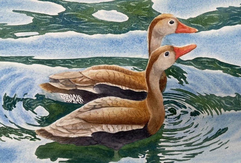
Transcripts
1. Preview: Hi, in this tutorial, I'd like to show you how
to achieve this effect of repose and the water,
and water reflections. I thought that the ducks would
be great for that as they create really nice color
composition with the water. It is surprisingly easy
to paint water like this. And I think that the result
is quite impressive. I think anyone can try to
paint this and perhaps use this technique in
your own paintings with water like this. We're going to practice a
bit of wet on wet technique, but this time it's really
more about wet on dry. You will learn how easily
we can paint the water. How to create those
nice reflections. How to paint the
feathers and create those nice patterns without
going too much into details.
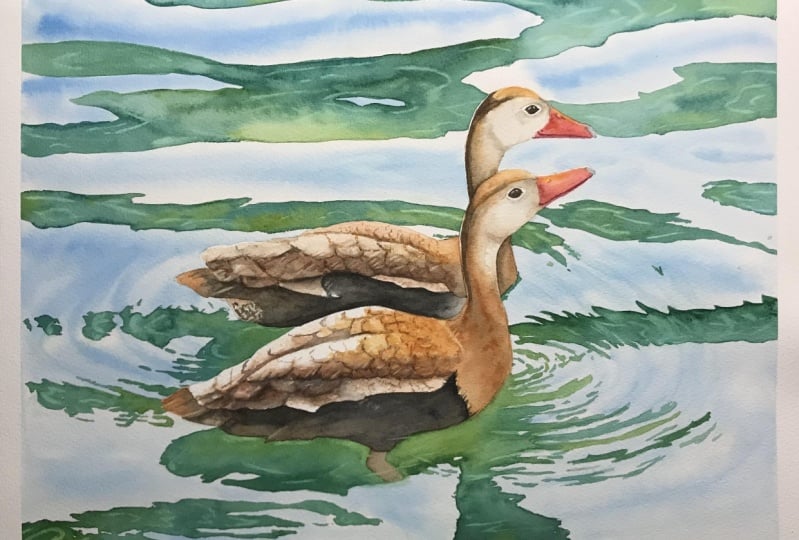
2. Masking: Hi, in this tutorial, I would like to show you
how to paint ripples on the water, water reflections. And of course, these
two lovely ducks, you will see how we can
easily paint such water. I think it's quite impressive, even though it is not
really difficult to paint. I'll guide you
step-by-step as usual. I hope you'll give
this painting ago. Let's start by
masking the ducks. If we do that, it will be much easier
for us to paint water. Because we're going
to paint water first. I'll be using Winsor and Newtons masking fluid with
a yellow tinge. Here. I also have a cap from
the old masking fluid. I'm going to use it to pour some of the masking
fluid into it. We'll also need a piece of soap, and that's really important. And the brush for
applying the brisket, gently rotating the
bottles so that the yellow pigment dissolves
well in the liquid. Never shake the bottle. Shaking will create
foam and air bubbles and we don't want them. I'm pouring some
masking fluid into the cup and I'm
closing the battle quickly so that the
remaining liquid doesn't come into contact
with air for too long. First, dip the brush
in clean water, then rub the bristles on a
piece of soap a few times, dip the brush in
the water again, and scoop up some soap again. This cell player prevents the bristles from
sticking together. I always use soap if I use a brush for
applying masking fluid. Now we can dip the brush in the masking fluid and start
applying it to the paper. Our goal is to apply the masking to the
edges of the ducks. We don't have to cover
the whole ducks. We can just apply the
masking on the edges. When we will be painting water, the paint will not flow
into the ducks shapes. The heads up, the
darks are quite small. So I decided to put the
masking all over them. So this is what masked
dogs look like. Now that the masking
dry completely, we can move on to the
next step when it's dry.
3. Water - First Layer: We'll paint water in two steps. In step one will apply the lightest shade of
blue all over the water. Then in step two, we will paint the reflections. Let's first prepare blue paint. Prepare a large
amount of cobalt blue mixed with Winsor
blue green shade. Why am I using these colors? Well, in this step, we want to paint the basic blue shade
we see in the photo. In fact, this blue color is the sky reflected
in the water. Therefore, I want to
use the colors that I would probably use
to paint the sky. Cobalt blue is my go-to color. When it comes to sky color, it is neither cool or warm. It is just a neutral blue. Here however, we paint
the water, not the sky. And I want to keep its color
scheme in turquoise tones. That's why I'm also adding some Windsor blue green shade as that will shift the blue
a bit towards green. And later, when we add
green reflections, everything will harmonize nicely and we will get a beautiful
color composition. Now we are going to paint with
the wet on wet technique. So we have to start
by wetting the paper. Use a large brush for this. I just remembered that I have pure squirrel mop
brush by Winsor and Newton that holds
a lot of water. I decided to use it this time just to quickly put
a layer of water, wet the entire area, apply a plenty of water and give it about 30
s to settle down. Make sure the entire
surface is wet. Now we'll paint the
blue reflections with brush number 12. Know that the blue color
is intense in the center, but close to the
green reflections. The blue is much paler,
it's almost white. This tells us that
we need to create smooth gradients from
blue to almost white. To do this, first of all, we're using the wet
on wet technique, which allows us to obtain
smooth gradients easily. Secondly, I'm applying blue
paint in the middle between the dark green reflections and
I'm allowing it to spread. In this way. The blue is intense
in the middle, but it spreads creating lighter shades close to
the green reflections. Notice that as I'm
slowly moving the brush across the paper and finally
lifted off the paper. A larger stain of paint appears at the end
of the brush stroke. We don't really want
this effect here. To avoid this tried to make the brush stroke in the
opposite direction. Paint from the
inside out so that the end of the brush stroke
is outside the painting. Also remember that even
if you have such a stain, we can get rid of it
either by dabbing it with a paper towel or simply lifting off the paint
with a clean brush. On the left and right
sides of the ducks, we can see some ripples in the water in the
shape of circles. Now, let's mark these shapes. Paint these oval shapes, leaving a little space
between them for highlights. Tilt your painting in
different directions to get the paint moving and
creating soft gradients. Now we have to do a
very important thing. Weighed about two to 3 min for the paint to
soak into the paper. You should see a low
sheen on the paper. Now rinsed brush in clean water, blooded on a paper towel. And then with a
clean damp brush, try to lift out the paint, creating highlights
in the oval shapes. This way we will create the effect of ripples
on the water. Run the brush several times in the same place until you
see that light oval shape. To enhance the wavy effect, add a bit more blue
in-between these light ovals. Do the same on the
right-hand side, create blue ovals imitating
ripples on the water. I'll leave everything
to dry completely.
4. Reflections: The blue layer is completely dry and we can start painting
the reflections. This time we will
be using the wet on dry technique because these
reflections have sharp edges. If we use the wet
on wet technique, the edges would be blurry. Thanks to the
wet-on-dry technique, will be able to keep the
edges of these shapes sharp. I want to keep the colors of the water in turquoise,
green shades. So now let's use a
mixture of Windsor blue, green shade and green gold. Windsor Blue has
a greenish shade and green gold will hours to get that gorgeous juicy greens when mixed
with the Winsor blue. Prepare plenty of Windsor
blue and green gold. Also prepare the green
gold in a separate puddle. I'm going to use
a brush size ten. Now, start painting
from the top. Notice the consistency
of my paint. The color is dark but the
consistency isn't thick. I would say it's a
milky consistency. The paint should not be thick
as we would not be able to obtain a relatively
uniform layer and smooth color transition. Our goal is to fill
the shapes with different shades
of blue and green. But we want to achieve a relatively uniform layer
with smooth color transitions. Now I'm replacing the brush
with a slightly smaller one. I'll be using the
number eight to paint smaller, more
precise shapes. Try to paint what you
see in the photo. At this point, we need to create the effect of oval
ripples on the water. Paint these shapes as if you
were painting on the water. Under the dark, we can also see its reflection in the water. Then think about what
you are painting. Forget that it's the
ducks reflection. Focus on shapes,
colors, and tones. If you focus too much on the fact that it's
a dark reflection, you may get stressed too much. Treat this reflection
as a regular shape. There you just have to fill
in with some nice colors. Apply these colors, make
sure they are dark enough. Pay attention to the hues. Noticed where it's more green, where it's more blue, where the shade is lighter
when it gets darker. But don't go into details. Our goal is not hyper realism. Simplify what can be simplified. Paint basic shapes, filled
them with beautiful colors. Later, we will add some details. We have even more reflections on the right-hand side that
create those oval shapes. Tried to follow the
oval blue shapes you painted in the
previous part. Let everything
harmonize with each other and create one hole. Use a smaller brush to
paint fine lines precisely. But again, you don't have
to paint every single line. We're just trying to create
an impression of ripples. Finally, paint a
reflection of the head. The color is really dark around the neck to make
our color darker. Payne's gray to it. Remember that the colors
will be paler when they dry. So now we can use darker shades than we
think we should use. As you can see at this stage, it doesn't look very special, but we don't worry
about that at all. There is always a stage
in the process of painting when
something seems ugly, it's called the ugly stage. Don't worry about it and
just keep painting. Later. Everything will start
to come together beautifully and it will
all create great result. After painting, the reflections leave everything
to dry completely. And then we can move
on to the next stage.
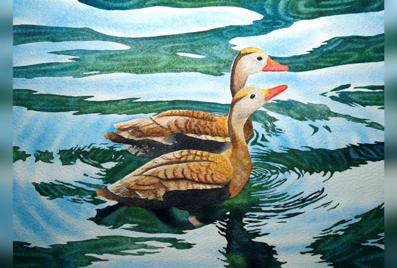
5. Highlights: If we look at the
reference photo, we can see that there are some lighter lines
within the reflections. There are a few ways
we could achieve them. For one of those ways, it's already too late. That would be painting around those lighter lines when we were painting
the reflections. But that would be really
tricky and it would take ages. We could also mask
them out too bad. That will leave us
with two hard edges. We could also paint them
now with white gouache, maybe mixed with some blues
so that it's not so white. That might work out. But there is one
more simple way. We can just simply leave them
out with a scrubber brush. It has a few benefits. We can be more or less
precise depending on what we need and
what brush we're using. The edges won't be super sharp, so that's what we really need. And finally, the color will
not be two distinctive. When we lift out the paint, we won't get a
really white color, which is totally
fine in this case because these highlights
are not pure white. So now with a scrubber brush, I'm just lifting
out the paint to create those lighter highlights. I'm using my tried
and tested Winsor and Newtons Galleria
brush size four. But later, I will also
switch to a different brush. I'm trying to create
longer lines and some oval shapes to reflect more or less what I
can see in the photo. Of course, we don't have
to be super precise. We don't have to precisely
recreate every single line, every highlight, every shape. Photo is just our inspiration. We know more or less
how those shapes look. We tried to create
them in our painting. It's not hyper realism. We're creating just
an impression. I changed my brush to Princeton
snap shader number for this brush has much
softer bristles allowing me to leafed out
really thin lines. If I want to be precise, I'm using it now because
it's just smaller and the other brush was
too big for these shapes. Here I'm lifting out
more paint and I'm going to apply a lighter
green to this area. I think I went too
dark here earlier. We can also bring out some highlights in the dogs
reflection in the water. Remember that when we
leave out the paint, we can apply some
color to that place. Sometimes those
highlights are just too pale when we lift up the paint. So a thin layer of paint off some color might be necessary. When you're happy
with your highlights. We can move on to the next step and start
painting the ducks.
6. Ducks - Initial Layer: When everything is dry, we can remove masking
fluid from the ducks. I'm using a rubber
masking pickup tool. It's always better
to make movements from the inside
towards the outside. If we did it the
other way round, we could drag some paint
to our masked area. I like when masking
comes off like this, when I can pull it
off in one piece. It usually happens when masking
fluid has been applied in a thick layer and the masking is still
fresh and good to use. That's nice.
However, here maybe, maybe you can see this. I don't know if camera
we'll pick this up. But my masking fluid left a very light yellow
tinge on the paper. This is a sign that I
didn't mix my masking well and the yellow pigment
was too concentrated. That was the case for sure because I didn't use
that masking for over three months and the yellow pigment just
settle down in one place. I saw that in that battle. I didn't rotate my battle long enough so the pigment didn't have a chance to dissolve well in the
masking in the fluid. So that's a lesson for us. That tinge is very, very pale and the color is
not a problem in this case. But it could be a
problem if it was something that should
remain white, e.g. let's prepare some
basic colors that we're going to use for
this initial layer, we need a few colors here. The first one will be
a very pale brown, a mix of burnt sienna, touch of permanent rose will also need a very
orangey brown color. I think that a mix
of burnt sienna and Winsor yellow deep
will work well for that. It will be our golden color. Another mix will be
the shadow color. The shadow area on the DAG
has unusual color really. We don't have to mix
exactly the same colors, of course, but we'll try
to match something close. I think it looks like a
very, very dark purple. I can see some browns
and Violet's there, but the saturation is very low. Let's start with burnt
sienna as a base. Let's add permanent rose to this and then Windsor
blue, green shade. My thought process
goes like this. The base hue is brown, but it's leaning towards violet. Afford the violet,
we can use blue that we already have
used for the water. So Winsor blue. But to get violet, we also need red. So we can add permanent rose, which we already added
to the first mix. And I'm also going to
use it for the beak. So this way I'm trying to use the same colors to keep
the color harmony. Because Windsor Blue
has a greenish shade, the resulting violet
will not be saturated, and the burnt sienna will
dial it down even more. Also because brown and blue
are complimentary colors. I'm also going to keep more
Winsor blue on the side and the burnt sienna just
in case if I need to shift the color more
towards blue or brown, or if I just wanted to use
cleaner blue or brown. I'm going to use a
brush size eight now, and we'll be
painting wet on dry. So we don't have to apply an
initial water layer first. I'm not using wet on wet
technique because with this size of the brush
on such a small area, I can play around with
the colors without worrying too much
about hard edges. Besides, this is just an
initial layers so we can make some mistakes that we can cover later with
the next layers. Now, our objective at this stage is to cover the ducks
with basic colors, but leaving some unpainted areas in the lightest parts
for the highlights. I'm starting with my
brownish pinkish color, our first mix, and I'm applying this color to the
tail and the wings. Notice that my color is
really well diluted. It's quite pale and very watery. I would say this
is like a T wash. So it's almost like water just changed with
that brown color. Close to the neck,
I'm dropping in that nice golden brown mix of burnt sienna and
Winsor, yellow deep. I'm not very precise
when it comes to colors. I'm looking at the
reference photo, of course, but I'm trying to pick up the very basic information
about color and tone. So I'm thinking, Okay, so here this area is very light, so I cannot go too dark. Close to the neck. I have to throw in some
of that golden color. And at the bottom, I want to suggest that shadow with my shadow
color. And that's all. As you can see, my
colors are blending with each other and that
is totally fine. They create new
colors on the paper, New mixes, and that's
absolutely fine. I'm focusing on the lightest
colors at this stage. I want to lock them in. If I can say like this. Here I'm dropping in our
golden brown by just tapping the brush on the
surface of the paper. This way, I'm also starting to create some basic textures. When all colors are
mingling on the paper, it adds some more interest. Remember that
nobody's going to see the reference photo
and nobody's going to compare your painting
with the reference. So we can be creative. Again. We're not painting
in hyper-realistic style. I'm starting with
the golden brown on the head and then I'm
adding the neutral gray. For that gray, I'm using our shadow color with
slightly more Winsor blue. We could even add cobalt blue to make this color
even more neutral. I think I will add some
cobalt blue later as well. The idea is just to stay within the same color range all the time to keep
the color harmony. That's why I don't
want to introduce e.g. ultramarine blue, which makes perfect neutral
gray with burnt sienna. Just because I won't use it anywhere else
in this painting. And I don't really need
to create gray with that blue if I can use other colors, other blues that I have
already used in the painting. There is more brown
on the chest. My base brown is burnt
sienna of course. But I'm using also
my shadow color in the darker and more
neutral areas. Now leave this layer
to dry completely. I just want to do
one more thing. In this part. I'm
softening the edge of the green paint in the place where the leg goes
under the water. We can now move on
to the next step.
7. Dark Tones: Make sure that everything
is totally dry. I'm going to use a
smaller brush now, a size four because now will have to be a bit more precise. We're going to paint
the darkest areas. It's always good to
paint the darkest areas, darkest tone as
soon as possible. Because dark tones are always great reference points
for other areas. Thanks to them, we know how dark we can go
with other colors. So they are very helpful. Remember that towns are
always more important than colors at this stage
will need black color. To achieve that, Let's mix
burnt sienna and Payne's gray. This makes, will give
us a great black color. We could mix burnt
sienna with Winsor blue, which we have already
used in the painting. However, I think that the resulting black
would be slightly too greenish because that blue
has a greenish green shade. Payne's gray is more
neutral and the black it creates is
more neutral as well. And it can go
really, really dark. I'm starting by applying
burnt sienna on the tail. But as I'm approaching the
darkest parts of the dark, I'm switching to our black mix. We want to create that nice transition
from brown to black. Notice again that my
paint is not thick. It's very dark, but
it's still watery. Thanks to that, I have more time to mix
colors on the paper. And they also create
smoother transitions. Here we can create a nice one and using irregular
brushstrokes. Again, we're just
creating an impression. We don't have to
recreate each and every dark feather here exactly. Now fill the rest
with the black, leaving some lighter
areas here and there. Repeat the same process
on the other duck. Start with Brown and
transition to black. The neck start with a
dark brown on the left. Use burnt sienna with a touch
of black to make it darker. Notice that on the
left side of the neck, there is a highlight. Tried to leave an unpainted
stripe on that edge. I'm adding more
brown on the chest. Let's call this area like this. And I'm trying to
soften the edges. This is what I call
a forgotten edge. I'm not sure yet what
to do with this area. And I'm going to take
care of it later. So now I just want to smooth everything out and I can
forget about it for now. I'll come back to
that area later. I just noticed little
reflection in the water. So I'm again using that turquoise mix to
add the reflection. I'm changing my brush to add triple zero spotter brush now because I want
to paint the eyes. The eyes are really small here, so I had to switch to a
smaller brush I'm using are black mix and I'm just feeling
the eyes with that black. You can see some
reflections in the eyes. We will add them later
with some gouache.
8. Initial Details: In this part, we're going to add some initial details
on the wings. I'm going to use a
spotter brush size to, because I like to use
powders for details, but it can be any brush really. With spiders, I just have
more control over the paint. I'm preparing some dark
neutral brown and mix of burnt sienna
with Winsor blue. If you find it too greenish, you can add a touch of permanent rose to neutralize
that greenish shade. Now the general idea at
this stage is to create a clear distinction between
individual feathers. So our aim is to paint some
suggestions of shadows under the feathers and mark
the edges of the feathers. Additionally, we can start
adding some patterns. Here on the longer feathers. I'm using longer brushstrokes
on the edges are actually under the edges because I'm thinking
about the shadows here. It's actually the shadows that create the feather shapes here. And in the shadow area, I'm using some browns, black, even blue, just to introduce some
variety in color. For a smaller feathers
on the wings, I'm using short brush strokes
to suggest more texture. I'm also trying to arrange
my brush strokes in a way that resembles
edges of the feathers. Notice that these aren't shapes are the edges
of the feathers. I'm also starting
with light tones. And then I come back to the same places
with darker paint. So the first
brushstrokes are alike. A test, I'm testing whether I'm placing them in the
correct position, in the right place. And if it looks good and
I'm sure that it's fine, I go back with a darker color and make the marks
more distinct. Repeat the same process
in the other duck.
9. Finishing the Ducks: This will probably be
the most chaotic part, but it was really
hard for me to divide it into some reasonable parts. It's just how the process
of painting goes. I suggest that you
watch this part, this whole part first to
see what you can expect, and then come back
to follow my steps. Let's start by preparing
a basic shadow mix, a mix of burnt sienna, Winsor blue, and
the permanent rose. Apply this color using wet on
dry technique on the wing. In the dark area with
the darkest shadow. Use a light tone. Don't go too dark yet. Applied at the bottom of
the wing where there is that sharp edge and soften
it towards the upper part. Now, add Payne's gray
to your shadow mix and dropping that darker tone at
the bottom of that shadow. While the paint is still wet. Let this dark colors spread
into wet paint on the paper. Now, use burnt sienna and
added in the upper part. Make that golden
area more intense and dropping some yellowy
brown color there. I'm using now a
brush size eight, so it's not a small brush. Thanks to that, I'm not focus
too much on the details. Our aim at this stage is to add middle values entered paint the final colors on the ducks. We want to think
in big areas now. We want to cover big areas. Think in terms of
light and dark. Don't be too focused
on the colors. It's much more important
to leave light areas light and dark and areas
that need darkening. Don't worry if the
paint spreads too much. If it mingles with other
colors, that's fine. The result will be
more painterly. We don't want to
be super precise. Repeat this on the other duck. Start with some light tones. Test the colors, test the town. And then while the
paint is still wet, drop in some darker tones. At this stage, we will lose some details from
the previous part, but we don't worry about that. We will add more details later. Make the colors richer,
more saturated. Here, I want to add
more golden brown. Add darker brown to the neck. Use burnt sienna
with some blues. The upper part of the
neck and the head have more neutral grayish
brown colors. Use burnt sienna with some blue. Try Windsor blue, Payne's
gray and cobalt blue. Test them all with burnt sienna and see what makes
us you're getting. With cobalt blue, they mix is the most natural and neutral. With Winsor blue,
it's more greenish. We have Payne's gray. You can create a very
dark neutral brown. Play around with the colors. Always start with a light
tone and then drop in darker and darker tones until you get the
right color and tone. It's just a process of
constant adjustments. Notice that there is a subtle shadow close
to the cheek area. It helps to create that
rounded form of the cheek. There is also a darker
tone close to the eyes. The more yellows and browns
at the top of the head. To make the colors more intense. I noticed that this part
of the wing is too white. So I decided to drop in
some of the golden color. When it comes to the beak, start with a Winsor, yellow deep first, and then
shift to permanent rose. Notice that there is a highlight in the upper part of the beak. So leave that upper edge white, covered the beak with that pink. This is just an initial layer. Add slightly darker
tone on the neck, just below the cheek to
make it more distinct. I'm coming back to the neck area and I'm
adding even darker brown. I'm also playing a neutral grayish brown
color on the leg. Paint the head of
the other duck. Notice here a very
important thing. The neck of the dark
is dark brown at the bottom and it gets
lighter towards the head. But more importantly, the
tone at the bottom is much darker than the tone of the
head of the dark in front. So make sure that there
is a clear distinction between the dark tone of
the neck in the back, the light tone of the
head in the front. This is crucial if you want
to create that impression that one of the dark
is behind the other. Again, make sure
to add darker tone close to the eye and
under the cheek. And also apply more golden color on the head to make
it more intense. Again, under beacuse, a Winsor yellow deep and permanent rose. Now I squeezed just a tiny bit of white gouache on
a piece of paper. I'm mixing cobalt blue
with white gouache. And I'm using this
light blue opaque color to paint some SKY
reflections in the eyes. Just a few simple dots. Now it's time to
add some details on the beaks and also make
the colors more intense. To paint the line between the upper and the lower
part of the beak. Use permanent rose mixed with
any of our shadow color. It doesn't really matter
which one you choose. We just need a little bit
darker, permanent rose. Draw a line at the bottom and paint a shadow on the
lower part of the beak. Now, use again permanent rose with the
Winsor yellow deep. And add those colors
to the beak again. This time making sure that
the color is more intense, permanent rose when it's mixed with yellow, it creates read. We can use it to
intensify the colors. Finally, there are a few
more details that we can add to make the feathers
look more interesting. First of all, I'm starting by lifting out the paint
from the highlight areas. I'm smoothing out the highlight on the left side of the neck. And then I'm lifting out shirt, lighter lines on the feathers. Now with a darker color. I'm adding more darker lines to create an impression
of feathery texture. In the golden brown area, I'm using burnt sienna to create those tiny
little feathers there. It almost look like
scales on the fish here. I've lost that
pattern on the wings. So now when everything is dry, I just want to add
those lines to suggest more individual feathers and
the pattern they create. Finally, I decided to apply one more black layer here
to make the black darker. And that was the
last thing I did after that, signed the painting. And I could call it finished. I really enjoyed this painting. I think that the water
looks quite impressive. And it was actually easier to paint than
I thought it will be. I hope you'll like the videos and you'll give this
painting and go. Thank you very much for watching
and happy painting. Bye.
 Krzysztof Kowalski, Watercolor artist