Transcripts
1. Brief introduction: Hi there. If you're looking for an absolute beginner
watercolor lesson, then you have come
to the right place. Don't worry if you're just
starting out in watercolor. This is an easy lesson
that I have made, especially for you with no
drawing or painting skills, you can still create a
lovely watercolor landscape. And I have kept him
materials simple to follow me step-by-step. Or maybe you'll want
to watch through first and then get
your paints out. Either way, I'm certain that
if you follow this lesson, you will get a good result. Even if it is your first time. Try and watercolor painting. I know how it can be as a beginner when you
really want to paint, but the first results don't
turn out how you expected. It leaves you disheartened and you may even
start to think that you don't have what it takes
that you should give up. Well, anyone can learn to paint, you just need to be shown how take a break and
get your paints out. Now, come along and jump into my easy lesson and take the first steps to becoming
the artist you want to be.
2. Beginner Landscape: Gathering our Materials and Setting up: Hi there and thank
you for coming to join my lesson today. It's going to be a really
no stress easy landscape. For beginners. I have lots of more lessons for intermediate and
advanced levels. But today I thought I'd
dedicate this lesson to those of you that
are just starting out. And would like to be
encouraged by having created something that's worthy of framing and
putting on your wall. So I really think this lesson is going to be easy for beginners. In fact today because
it's aimed at beginners, this is all I'm
going to be using. As you can see, I haven't got my usual customized palette with my colors that I
choose from tubes. I've got this cheap and easily accessible Winsor
and Newton Cotman travel box with half pans. So these come already filled. You don't get to choose
your own colors, but there is a good selection
of colors in there, so I'll just tell
you what they are. So we have these 12 half
pans of lemon yellow, cadmium yellow, cadmium red,
pale, Alizarin crimson, ultramarine, phthalo
blue, viridian, sap green, yellow ochre, burnt sienna, burnt umber, and Chinese white. Usually when you buy these
pre-prepared pallets, they provide you with a transparent and an opaque
version of each color. So that's exactly
what we've got. As I said, we're
going to make do. I am using my usual paper, which is Arches. It's cold pressed and it's 300 grams or in
non-metric, 140 pounds. I think you definitely need
to invest in some good paper. If you don't have good paper, you won't get a
good result and you might become a bit disheartened. Because if you don't have
a quite heavy paper, then the paper will buckle and you aren't going to be able
to do as much brushwork. Everything will just run off, the paper will start
to become granulated. And I think you would just
get really frustrated. So if you can, get a
whole block or if you can't, just buy one sheet and cut it up into different sizes. So as I said, it's going to be a
very simple landscape. I've got my little palette, I've got my pot of water. I've got some
grains of salt that we're going to be using later. I'll put that aside. And then I've got
just two brushes. So I have squirrel mops here. The pan I have actually comes
with a little travel brush, but to be honest, it's only good for doing small details work or
sketches on the go. So I think you really do need to have a couple
of good brushes, even if you can only choose two, then I would recommend squirrel mops because
they hold a lot of paint, but you also get fine tips when they're
loaded with paint. Just to tell you the numbers. I have a number three which I bought from Rosemary online. I have a number 14 from Jackson's, which again, I bought online. I have my paper taped
with white masking tape. Don't use colored
masking tape. The color will distract
you from your paper. Always use the
white masking tape. And I've put my paper
onto my usual board, which is just an odd scrap
of quite sturdy ply wood. In Italy, it's easy to
come by birch plywood, so that's exactly
what I'm using. I'll also have to hand some kitchen roll or a
paper towel to mop, up any accidents
if there are any, but we don't want to stress
I'm not doing any drawing. We're going to make
it up as we go along.
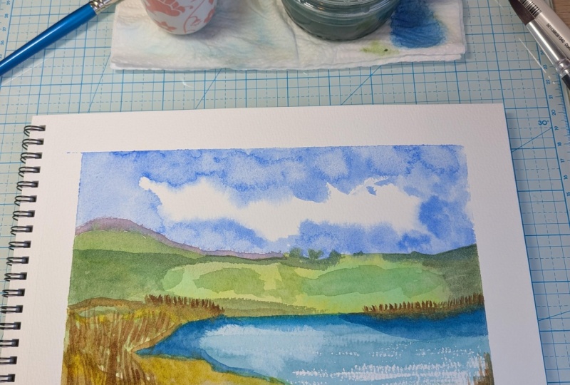
3. Painting Our Simple but Effective Sky: Let's get started. As I said, this is going to be very simple. We're going to make
it up as we go along. We're not drawing anything, we're just gonna
see what happens. I have a rough idea of the type of landscape
I want to do. I'm quite inspired by the way American tonalists landscapes did their composition They were usually made up. They had some sort of
water feature in them. I'm going to have
maybe a nice sky. We're going to do some clouds. We're also going to
have some hills in the background and some
water in the foreground. So first thing when you
are doing a landscape, you decide where you're
going to have your horizon. The horizon is very, very rarely straight in the
middle across your page. If the sky is the main feature, you want to have the
horizon lower down. If the foreground
is the feature, then you want to have
the horizon higher up. I think because
we're going to be having hills probably
around here. I can do my horizon probably
just under halfway down. But as I said, Let's
just make it up. First thing I have
my clean water. I'm going to wet the
paper from here upwards, just putting in my horizon line. But I'm not going to try to
get all of the paper wet. I'm going to go over
rather quite roughly, probably be some white patches
of dry paper in there. And that's going to
come in handy for given us highlights on our clouds. I can have a look against the light to see where
my paper is wet. More wet up there. I think that's fine.
Now we're going to be getting some of
this ultramarine blue, which is really quite bright. But to be honest, there's no cobalt blue in here, which would probably have
been the ideal color. But we're going to make do. Ultramarine blue
tends to granulate, so they'll probably be a bit
of granulation going on. But that doesn't matter. I'm sure we can do something decent even with the ultramarine. So just going across one way I do clouds is by
rolling my brush around. There's quite a lot of
water on the paper. So even though this looks
very bright as I put it on, it will probably soak into
the water on the paper. Actually become
really quite light and pale. Get some more. I'm just squeezing a little bit of color off the tip or I'm going to get the
paper really quite wet. That's already
looking like a sky. Usually clouds are lighter on the top and have
shadows underneath. So if we put in some shadows
underneath the clouds, then it's going to give
them some form. Also where I have these whiter, lighter highlights on the Cloud. If I put some more darker
paint behind there, then the white is going
to stand out even more. And skies are usually darker at the top
than at the horizon. Obviously depending on the types of clouds that are present. Just dropping in some. If I go over where I've already
put in some darker paint, then of course, it
will get darker. We can add texture. We don't want the sky flat. This is already looking
like a really nice sky. Can see the blue granulating. But it doesn't matter. We don't want to stress
over this painting. We want to have a nice
relaxing session. Quite liking that. A little bit more
here. Just to make these clouds have
a bit of volume. Because most of the
paper underneath is wet, then the colors are
going to mix in and I'm going to
create soft edges. Here you see where the
paper underneath was dry. We get harder edges,
but that's fine. It's just going to add to
the texture of the clouds. Every now and then stand
back from your painting, have a look at it from
a distance to see if there's anything that
you would like to change. Change it now while the
paint is still damp. I think I want a little
bit more blue in this. The paper here is dry. So to avoid that hard edge, I'm just going to soften
the edge with a damp brush.
4. Painting Some of our Foreground: I use my fingers to
squeeze my brush off. And I'm going to be mixing
a light green color. For some grass. This is sap green with
this lemon yellow. I'm just going to go
straight across here. Don't worry if the green mixes with the sky on the
top because we'll be going over anyway and doing some hills
in the distance. Just thinking where
I want my 'water'. Here. I think we'll have a lake, or maybe it will end up
being the sea. Who knows? This Green is very lemony. In the countryside, of course, the light coming from
the sky will not fall evenly all
over the landscape. While the paper is still damp, I'm going to drop in some
other green and just make it look maybe like fields or get some sort of form. The land. Just desaturate some of the
green with the burnt umber. And there I have yet
another shade of green. Start putting in some hills
here. For the hills. I don't want my
paintbrush too wet because the sky is
still very damp. Doesn't matter if it does
run in a little bit, but I don't want this color
to shoot up into the sky. So I always have to
add paint on top of the paper that is
a little bit drier, at least, then the paint
and paper underneath, because then it
will stay on top. Remember in watercolor,
you work from light to dark and light areas
of the painting. You have to think
about that from the earliest stages and
leave those parts white. You can put white paint, opaque white paint
onto your painting, but you would lose the
translucent effect, which is so lovely about
watercolor painting. I'm not doing anything
in particular, I'm just breaking up that
rather boring surface. Now I'm going to mix the turquoise color
here for my water. I don't want it the
exact color of the sky. And another piece of
advice I can give you is to always mix
your own colors. Have you ever looked
at a painting and thought that looks really fake? Or the colors are
garish and too bright. Well, that's because
the painter has used the paint straight
from the tube. So make your paint colors sophisticated
by mixing colors together on your palette and finding something that
is original to you. You've mixed it so it's going to be a color that
is pretty unique. You can buy turquoise of course, but because we using our
economical set of half pans, we don't have that available. And in fact, some of these tube paints can be
very, very expensive. Cobalt turquoise
is very expensive. We're going to try and mix
our own turquoise here. Everybody knows that yellow
and blue make green. How can we make a turquoise
with what we've got? Well, if we had had a
Naples yellow in here, that would've been perfect. But we don't. I'm going to use
some of this yellow ochre, which is a little bit dirty, but that just means it's
going to desaturate too, a bit. Getting very dark. Now we're going to add
some of this phtalo blue, which is a more intense
transparent blue. And you can see it's already getting a little
bit more turquoise. This is where I want my water. My brush is pretty
dry, I'm afraid. So let's add some water to that. Drag it across where we
already put our brush mark. Can mix a little bit more
and a little bit greener. I've made the paper underneath damp by adding that first color. This is going to run
in together and it's not going to give
us a hard edge. This effect, is because
my brush was dry. It skimmed across the semi- rough paper and left
those little white flecks, I actually quite like that. It could look like light
bouncing off the water and give us that nice
effective of ripples in the water. Now, this is really quite boring because it's
all one color. And also remember we
have the sky here. I want some of that sky to reflect in here because
it's above the water. Of course, when we look
at any body of water, it acts as a mirror. We would get the reflection
of the clouds in here. So whilst this paint
is still damp, I'm going to lift
off something of the color hair in correspondence with the whiter parts of my sky. Let me take off some here. I could also do this
with a damp brush. I can squeeze out the paint, the water, make that
a little bit wetter. It all depends how dry
the paper underneath is. See, I'm lifting off
an awful lot here. Some of this might
reabsorb into that area. So that would be nice. Then. If it ends up being two white, once everything is dry, I could go across with a wash to break up
some of this white. I'm just going to get
my brush which has this quite dirty water on it. Just squeeze it out a bit. And I'm just going
to drag across. Want to put some more back in
there a little bit darker. The banks will be a bit darker. Desaturate. Want to try and do this without
getting too much water on my brush because I already
have wet paper underneath. So if I add paint that's wetter than
the paper underneath. I'm just going to
push the color away and end up with a pale bloom. Mixing this muddy color. The blue on my brush with the burnt umber is going
to make this gray color. This is still damp, quite damp. Put it in some more green over here, the same green here. If you have a
restricted palette, then your painting will
actually turn out harmonious. Because if you're using the same colors in every
area of your painting, then it's going to
be more harmonious. You don't want to suddenly add another color that you haven't used anywhere else to your painting or it's not going to look as if it belongs there. Remember that the color
always dries lighter. This might look quite in contrast with what's
underneath it, but it will dry, lot lighter than what we're
seeing at the moment. Just having a look to see
what else I want to do. I'm just squeezing off
the color from my brush. While this is doing
its own thing, I'm going to mix a color
for the foreground.
5. Giving our Foreground a bit more Depth: I'm having my yellowy
color here with my burnt umber desaturating with the blue that
was on the palette. I don't want to just
wipe a strip across. We're putting down the
base at the moment, then any details will be done. Once the paper is dry. It first you have
to get everything onto the wet then damp paper. And afterwards, once
the painting dries off, you will put in finer
details if there are any. I want this to blend in. So I've just gone across
with a dump brush. As you can see,
dry brush strokes leave these white flecks, which can be helpful when
you're doing scenes where light is reflecting
on the water. Now while that's wet, I'm going to put some
of this yellow on top because it will push
the other color away and leave a nice
yellowy highlight as if the sun is catching on the plants in the foreground. I'm going to change
my brush size. Always try to use the biggest brush you can get away with for doing
a certain task. That way you're
painting is looser. I'm just thinking about
using this damp paper. Do a darker rim to the lake? Or is it a river,
or is it the sea? Who knows? I can also use the back of
my brush to scratch. Put in reads, break up any
lines that look too harsh. That looks like
the reflection of the bank seems to
be missing here. So let's see if we can drag
some of the color above. This is another type of green that I mixed
in with this brown. Just curious to see
what color comes out. Mixing with something
that's on my palette. Variation of colors. This as long as I keep
within my palette, then they're all
going to go together. Just to make it look less flat. There could be all sorts
of plants in here. Like to have this water a
little bit more intense. I'm going to make small blue. Use this yellow to
recreate a green color. Just want to have it a
little bit more in contrast. To break up this edge because
my paper underneath is dry, I'm going to run a damp
brush across the edge that's going to lift some off and
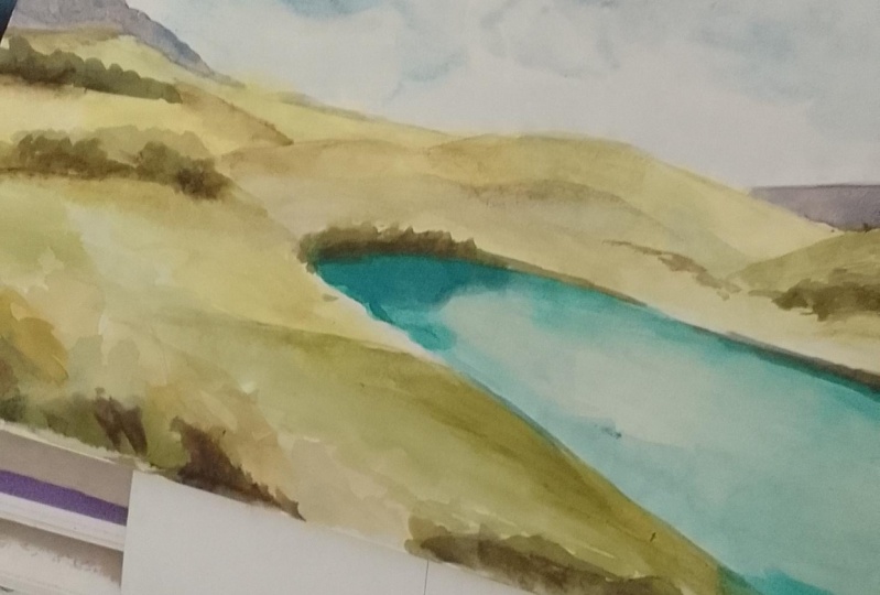
spread some of the paint out as well. Drawing it off. Have it more of a round shape. Reminded me of a volcanic lake
not far from where I live. I want to break up this as well. Seems a little bit boring. Bit wet or dry enough to put in the
background mountains.
6. Carrying on with more Contrast in our Foreground: For these, I want a
lilac-y color. I don't want the lilac
contaminated with this green, so I'm going to take that off. Wipe, my palette. A grayish sort of lilac color. I've taken some of the
liquid off my brush. It's a little bit too dense, I'll wet my brush, I
can correct that. Then to make it lose
itself beyond the Cloud. I can just break up the edges
by lifting off some paint. While that is wet, I'm going to put in something
darker at the base. Don't worry about any bristles
coming off of your brush. We can get those off once
the painting is dry. Don't touch it now. Otherwise, you'll just end up taking off some of the paint. Okay, So this is just damp. We can do some more foreground, slightly denser, but I
don't want it too dense. Otherwise, I'm just
going to leave the footprint of the
brush on the paper. Medium consistency, a bit like the density
of a cup of coffee. When that's dried off slightly. We're actually going to
sprinkle salt on there. This color. I'm going to
join things together. We're having a couple of
highlights in here as well with that same
yellowy brown. Because we presume that
the same vegetation that's around here
is going to be around the other side as well. Even make it a little
bit darker under there. Have you noticed how
I hold my brush? I'm holding it at the back. That's because I'm not drawing. I don't want to hold
my brush right there. Otherwise, we'd be making really tight contrived marks. If I hold my brush further back, then the marks are looser and they just
look more natural. Gonna stop fiddling with that. Now, I think this is almost at the right
stage for adding our salt. Just wait two seconds longer. If you have a look at the
paper against the light, then you'll be able to
see how wet the paper is. Still quite damp, but we
can try adding some now. This is going to absorb
some of the paint. And once the painting is dry, will leave
little white flecks. And I'm going to leave the
painting to dry a little bit more and then add another
little bit of salt. Good idea to stand back. There's one thing I'm not particularly liking at the moment
about the painting This. Going to make it
darker along here. All I'm doing is trying
to add some variation in color to add a bit of texture. Otherwise, everything is
going to look pretty flat. I'm not trying to make
it look like anything in particular because I don't
have a photograph to copy. Just imagination, what there might be in the
background there. Then if you want to vary the
colors, of course you can. You could use some gray colors to make the weather
seem different. Just playing around with it. I'm going to try some more salt And the paper needs to be
just damp for this to work. We're going to wait for
the painting to dry. And then I'm going to
take off the salt.
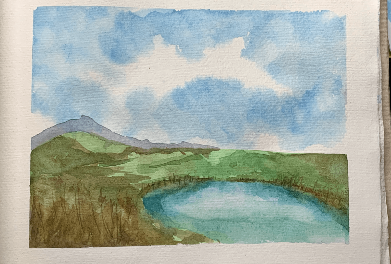
7. Final Details to complete our Simple Landscape: Standing back is
always a good idea. And while I was waiting for the paint to dry here
with my salt on, I had a good look to see if there's anything I could change. And in fact, one thing I don't like is the triangular shape. It's not round enough
to reflect the clouds. So I went to get
some clean water. I'm going to make a correction. So again, we're debunk that myth that you can't
correct watercolors. I'm just going to break up these edges here
with my damp brush. My need a little bit
more but I don't want to put too much water on that. It's just going to bloom. Now you know why I love
this 300 gram paper. It can take some quite
hefty brushwork. You can see already
that is lightening up and breaking up these hard edges that it formed in that
triangular shape. If I add even a little
bit more water here. See if we can also
lift that off. Let the water seep
into the color first. Then with our rag
or a paper towel, we can lift off just
enough to create a nicer shape or
so this hard edge here, not particularly keynote. And again, we'll do the same, Leave it to seep
in a little bit. That's much better. You could go on forever. So another thing with painting
is knowing when to stop. Can you see anything
else that I should do? Let's take this so-called
look slept that nice texture. We could add some
splatters here. If we wanted to add anything
that resembles flowers, I'm not too keen on flowers
in paintings like this. I think it's a
little bit cheesy. One thing I think I want to do is change this line is a bit too fine there I went a little bit more volume
to that edge of the lake. So just pick up
one of my colors. I'll go for the lightest one. It's quite watered down. I just want a little
bit more difference where the plants and the
banks are reflecting. Much better. There we go, fill in again. Part of the fun. Just let your
imagination wander. Have a look, see
what else do you think you might want to add? Something darker
in the foreground, maybe just over here. You could do practically
anything you like. You could probably add even
a branch of a tree here with the leaves that would become
the foreground obviously, could be very nice. We could add some
little buildings in here if we wanted to say, I'm not ready to give up
painting that yet today. I wanted to carry on because
I'm having so much fun. And while I'm painting takes
my mind off everything else. So many problems at the
moment in the world. Painting is a great therapy. So paint, paint whenever you
can get out your paints. And let's call it a day showing. The last thing to do is to
take off our masking tape. We put this masking
tape on that we get this nice clean edge
around our painting. You could actually put this
directly into a frame. We go, don't forget
to sign your work. I usually say mine down here. I'll do that in a second. And if you enjoyed this lesson, I would really appreciate if you take a look at my
other lessons as well. Don't be put off if
they look difficult. If you think they're not for your level of
knowledge by trying, you will probably
learn so many things. And sometimes it looks
harder than it is. If you follow step-by-step, then I'm sure you will produce some lovely works and
better your results become, the more you have the courage to try things are a little
bit more difficult. Keep pushing yourself. Something's when they're done. Look really complex
like the sky. If you wanted to copy
this guy exactly, you would think, oh my goodness, where do I start? But did you see how cache
warm, random, that was? The blue granulating here
gets some amazing textures. I think that's a really nice sky and it really is something
that a beginner can do. Thank you for following
my lessons on Skillshare. Please check out
my other lessons. If you enjoyed this lesson, I'd really appreciate
if you left a review and if you want
to communicate with me, There's no direct
messaging in Skillshare. But if you add your
paint into a project, then I can answer all
of your questions. I love to answer and
communicate with my students. I have quite a lot
of students now, which I'm really pleased
about because Skillshare has been amazing over the
past couple of years for me, the more you watch then the
more lessons I can create. So thanks again and happy
painting everybody.
 Michelle Smith Watercolor, Watercolor Artist-Sommelier in Rome