Transcripts
1. Introduction: You've been in digital
art for a while. You might have heard
about painting in gray scale first and
then start coloring. It's a popular method to
paint among digital artists because it tell us to focus on the values of your
painting first, which is an essential
component for an impactful and
accurate artwork, and tackle the complex task
of coloring separately. Hi, I'm fans. I'm an
artist who was originally educated in contemporary art
and illustration for comics. I have been going
on learning and experimenting with
different drawing techniques over the years. I've seen a lot of
tutorials online to explain how to go from
gray scale to colors. But I've also seen a
lot of the question, okay, but how do you
paint in gray scale too? This is a question
I want to answer to this class has the goal of
taking you from starting from zero to gradually
building up your artwork by giving you all the tools and techniques that will make
your process easier. My hope is that with this class, creating complex artworks will feel a lot more
achievable for you. Your project for this
class will be to follow along with me by creating
your own artwork. With that said, I wish
you a great lesson.
2. Class Project: Your project for this
class will be to follow along with me by creating
your own artwork. I will use clip studio paint, but you can of course, use any similar during software. The first step will be to create a moodboard to find the
references that you will need. During the second
and third steps, I will show you how to use
three D models to build your own reference and
how to sketch from it. This is optional, even
though I encourage you to give it a try because
of how helpful it is. Then I'll show you
techniques and tools to paint in gray scale. For the fourth step, then the last step will be to
add color to your painting. I suggest that you share your work twice in
the project section. Once when your gray
scale version is painted and then
your final artwork. I can give you some feedback
to help you improve. Now let's dive into the lessons.
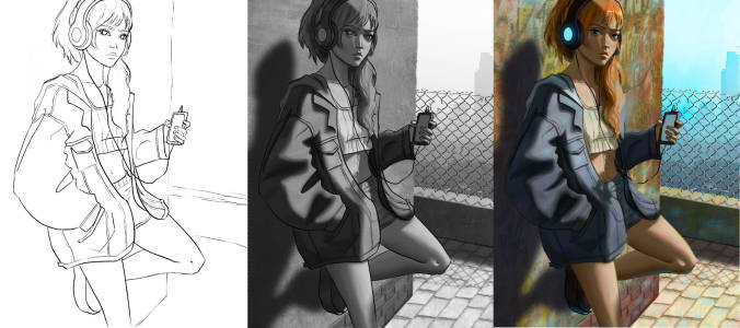
3. Prepare Your Project: In this first
lesson, we are going to see how to prepare
your project. The first thing I did is doing
a rough sketch of my ID. And now I'm jumping right onto Pinterest to find some reference
and make a mood board. I know the character will be the center point of my artwork. The first thing I'm going
to do is finding some refers to help with the
posture of the character. My character is leaning
against the wall, so I want to see exactly how we look when we
lean against the wall. This is exactly what I'm
typing into Pinterest. I'm trying to find some
refunds that will help me building some
believable posture, and then I'm saving everything into a new Pinterest board. Then I'm scoring a little bit more through interest to try to get inspiration for the
atmosphere of the piece here. I'm really liking those
bandaged sort of walls. This is what I am
saving into the board. I might come back to it later, but for now, it's
enough to start. Now it's your turn to
start your project. Start by doing a
thumbnail and make a moodboard which direction you want to take
for your artwork. During the next lesson, I
will show you how I use three D models to help me with the structure
of my painting. But this is completely so you
really don't have to do it. If you don't want to, you can
simply keep the lesson and sketch like you
would do normally see you in the next lesson.
4. 3D Model: In this lesson, I will
show you how I use three D models to help me with the structure
of my painting. As I said in the
previous season, this is completely optional. You can just watch this video
and if you don't like it, just catch like you
would normally do. The app I will be
using is Magic Poser. It's around $10.01 time payment, but if you don't
like it, there are other options like
Pose or pose it. But I didn't try those apps, so I can't tell you
anything about them. For background modeling,
there is also a sketch up which has a
completely free version, which is fully functional. Of course, if you know blender, I guess it's even better. But I don't know blender myself, so I can't really
guide you about that If you're using
clip studio paint. The software has a three D
model building system as well. I will stick to
magic poder though, because this is
what I'm used to. This is a tutorial on how to
use magic per I learn to use magic poder only by watching the tutorial that appears
when you install the apps. I suggest that you do the same. But I will show you
what I use it for. Maybe it can inspire
you to begin. Just a quick overview about
what magic pozzer does. Magic pozzer will give you three models of
characters and props that you will be able
to manipulate and transform to give you a
base for your painting. As you can see
here, I'm starting by switching to the
female character. There are several
character types available on magic poser, but only this model has presets. I like to use this model only even if it doesn't
match my style. As you can see, I'm not really going very technical
with magic poser. Usually I'm just
using the cube shape and placing it to
have some benchmark. I wanted to see if there was some presets that could
match the posture I wanted. But there was
nothing even close. So I will have to do
it all by myself. Nagi poster has more presets with the subscription
based plan. However, it's good to know
if you're interested. What I'm doing is that I am adjusting the posture by hand. And this is where the
mood board is important. Because I want to
build a post that is realistic and the app
won't help me with that. It's a literally bit tricky, So a lot of people don't like
this app because of this, because it's pretty hard to get in the posture
that you want. But the key point I would
give you is that if you want to move a certain articulation
and it's not moving, sometimes it's another
articulation that you need to make your character
move the way you want. For instance, if I want
to bend the elbow, it's actually the wrist that I need to move to make
the entire arm move. It needs a little bit of playing around and getting used to it, but I think this is
really worth the effort. There are a lot of hands be
said that convenient though. If you want to make your
character hold an object, you don't have to move each
finger one by one once. I'm happy with the posture. And this is really why
I like three D models. It's that I can play around with zooming and moving the
point of view around. I can try to find the best
composition already right now, instead of having to sketch a character in many
different angles. Usually I won't sketch a character in many
different angles. While here, I can
really play around with very small changes in the perspective and point of view to see what looks the best. Why I like three
D models a lot as well is that when you are
searching for references, you won't necessarily find
exactly what you have in mind. Sometimes you might
just spend a lot of time searching for references where when you use three models, you can just build
what you want. And in the end it
takes a lot less time. Another way thing is that you can add the light
source where you want. It's really great
for reference and knowing how the light
hits your character. I actually like the default
lighting very much here. I won't change it a lot. But you can also add other
sources of lights if you want, even though I find it not
very readable, actually. Here again, I think photo
references are important to see how the light actually
interact with a person. Because I would say this is
the limits of three models, or at least on magic poser, that sometimes it doesn't
look that realistic. So it's just more of a guide. You still need to use your
knowledge to fill the gap. You can see that I'm quickly
placing another cube. But once again, it's
just to have a benchmark for how to place the
elements in my background. It helps a lot with perspective. Okay, so I had to
move a little bit the posture of the
back of screen. But another tip I want to show you here
when you have stylized characters and you're using a three D model that is
quite realistic like this. A good tip that I
like is to modify the body morph by
making it very skinny. I actually see the
structure of skeleton. I know better how to
stylize my character. After that, it gives more of a body template instead
of a whole body to copy. Or twice, if you
know what I mean. Once you're happy
with the result, you just have to export it. We can export it with or
without the sky and ground, which I find very convenient. Just like that, you
have your three D model template to recap. Using a three D model
can help you with having the exact pose reference
that you have in mind. It also helps you with having a better structure
for your painting. It's great for
lighting reference and can help you
with perspective. And perhaps as an
optional homework, you can try out magic poser or another treed
model app if you want. But once again, that's
really up to you. During the next lesson, we will start to do a rough sketch. I will show you how you
can use the street model and also how you can come
back to your style using it. But if you don't
use treed models, you can also just sketch
with your references. See you in the next lesson.
5. Sketch: In this lesson, I will show you how to sketch from
three D model. Especially how I come
back to my style, even though the three D
model doesn't match it. But once again, if you didn't
use the three D model, you can just sketch like
you would normally do. The first thing that
I'm doing is that I am opening my three D model image
into clips to your paint. You can of course, use any
software that you have here. I'm satisfied of the dimensions of the three D model file. I'm not changing
it, but it depends. Sometimes I can adjust it. Afterwards, I'm first creating a white background underneath my three D model and
I'm creating a file for my sketches so I can
keep everything organized. Then I'm just lowering
the opacity of the three D model on a layer on top of the three
D model, I start sketching. The only thing I'm doing for now is tracing over
the three D model. The main downside of it
is that I am tracing over a model that doesn't match my style as I mentioned earlier. But I still like tracing
better than copying. Because like this, I'm
sure that the perspective is right and I really don't
have to think about it. But the main takeaway is that to be able to come back to
your style after that, don't just trace
mindlessly but really try to understand how
the model is done. I'm mainly using it to take benchmarks of important
elements and I'm not really trying to get a very clean and
accurate silhouette of the overall manakin. If I'm taking too much, I know it's going to be
hard to transform it afterwards on a separate layer. I also trace the main
contour of the background. Once I took what I wanted
from the three D model, I start modifying my sketch. Usually when we stylize, we want to exaggerate
the course and create interesting shapes and lines and have overall a nice
flow of the lines. This is what I'm
doing here because I find the three D
model very stiff. I also modify the proportions
for ones I like better. As you can see, I have separated
the head from the body, so I can select one or the other to modify the size easily. But you can of course, also just use the lasso
to work as well. Then I just start adding details and stylize
it the way I want. There's really nothing special. I'm just sketching regularly. I'm doing her first
rough sketch and then I'm doing a cleaner
sketch on top of it. Oh, no, I'm only working the character for now. I'm leaving the
background as it is. It's secondary in my image, so I will work on it later on. And that's it lesson. So to recap, you can use your three D model as a base for sketching and
tracing over it, but don't take too
much information. Otherwise it will be harder
to come back to your style. But in the end, our first
step is to make a sketch. No matter how you
end up doing it, I just advise that you try
to make it clean enough or you can even just
do a very clean line out if you are up to it. Now it's your turn.
Make your own sketch, either by using a three D model or by sketching regularly. During the next lesson, we will start painting in gray scale. Be sure to have your sketch and an idea of your lighting and
see you in the next lesson.
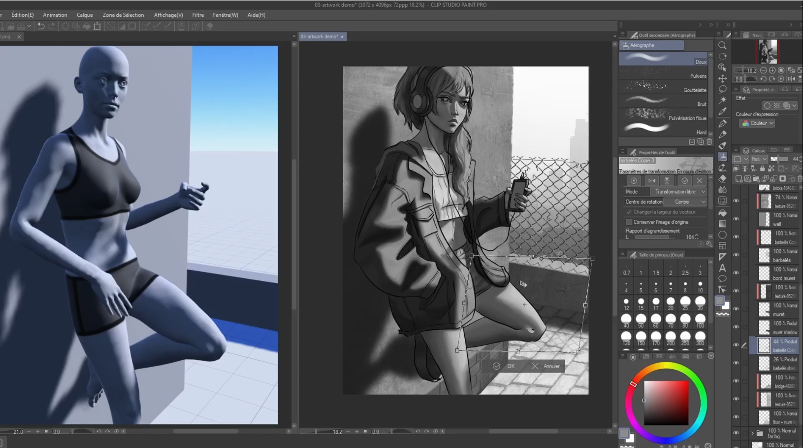
6. Character In Grayscale: During the next two lessons, we are going to see how
to paint in gray scale. We are going to do it in
two steps for this lesson. We are going to paint the character during
the next esson, we are going to paint
the background. It's going to be more
digest this way. The first thing that I'm going
to do is that I'm going to put my three model on
my sketch side by side. To do so on the studio, you just to open both files. And I'm taking the
three D model file and snap it to the
left of the screen. I have a big drawing tablet, so it's more convenient
for me this way. But just try to arrange your setup so you can
see reference very well. The first thing I'm
going to do is to put a flat gray color
on my character, just to isolate
it from the rest. I'm not a very big
fan of the Lasotl. I'm just painting the contour of the shape of the character
to fill it afterwards. But just do like
you like the most. I don't really care about
the value of the gray yet, I just want to
isolate the shape. But we still can
change the color afterwards even if we're not going to render
the background. During this lesson,
I'm still already defining the shapes and
values of each element. Like this, I can already
start to work on my character depending on surrounding
for the background. I'm just isolating each
plane on different layers. It's going to be easier
to work on it afterwards. Planes that face
the same direction can be on the same layer. I'm also putting all
the background elements into a different file. I keep everything organized. Now that this is set up, we can start painting
on the character. I start by creating
a clipping mask on my color base layer and
set it on Add mode. What I am going to
do as a first step is painting the
main light value. At the end of this first step, I want to have two main values. Sometimes I paint
three main values. It really depends on what you think is the most appropriate
for your painting. But I'm trying to be
really precise with it. A little bit like if I was doing some cell shading
When you're doing it, the main thing to keep
in mind is to make sure that all your shapes are very
graphic, very beautiful. Of course, the three D model is there just as a guide
and won't provide all the information that
I need as I stylized my character in a way that can't be represented
on the three model. So I still need to think
about how the light would heat depending on the changes
I have done on my painting. But the three D model is still a very good base to understand how the
light would be heating. Don't be too worried about the intensity of the
light yet either, because we can still modify
it afterwards as well. All you have to
focus on for now is the accuracy of where the light is heating and the
beauty of your shapes. Don't hesitate to correct mistakes that you can see
on your lines as well. Having a process in
several steps is also an opportunity to
spot more mistakes. Okay, here you can
see I'm adjusting my base as I thought
it was too light. And I'm also lowering
the opacity of my key light layer to
adjust its intensity. Once I'm happy
with the lighting, I'm just changing the base value of the different elements
of the character. I prefer doing this after
painting the lighting because I find that it helps me focusing on the
lighting a better. But that's just my
own preference. I'm doing it on a
separate layer, on a clipping mask just to make it easier to correct if needed, but I will merge it
afterwards with the base. I don't want to have too
many layers at this step. Once the flat colors are done, we can start searching
for the mid tones. The mid tones are all nuances in values that exist in the
flat areas we just painted. The most tricky part is
of course, the face. If you're not familiar with it and you don't really
know how to take it, what you need to study first is the Asaro head to find
a great tool for it. You can just search for
SRrohad on Google and go onto the sketch fab website and you'll find a three D
model of a Nassrohad. The SRrohad helps with showing the different
planes of the face. Once you know it properly, you'll know how to
shade faces with nuances and understand
what's actually going on. On three D models, like the ones of magic poser, the face is particularly
important in a composition like that because it's the main point of focus. Eventually, you can
be a little bit more rough with other parts
of the painting, but you need to give attention to details in the face area. The intensity of
your helite will be exactly the same
everywhere as well. So now is the moment
to adjust it. The difficulty of the
exercise is that sometimes the contour of the light will be sharp and at some places
it will be more blended. You'll need to pay
attention to how you'll render each little
elements like this. Another thing to pay attention
to is that the values in the dark areas and the values in the light areas should
never be blended. Meaning that the darkest value in the light area
should always be lighter than the lightest value on the dark area,
and vice versa. Don't hesitate to adjust your lite shape as
you paint as well. Once you're happy
with the whilst, we can go to the
next step to recap. We start by painting the two or three main
values in gray scale. As flat colors, the
focus must be on getting accurate and
beautiful shape. Once we're happy with
the main values, we can start painting
the midtones, when the face is the
main point of focus. Knowing the assur head is a
usted to paint it accurately, but to paint the
rest of the body, you can use your references
and your knowledge. Now it's your turn. Paint your
characters in gray scale. First by painting two
or three main values and then painting the midtones. During the next
lesson, we will start rendering the background
in gray scale. I will show you a few tricks
to add details quickly and make your background looks great without spending
too much time. See you in the next lesson.
7. Background In Grayscale: In this lesson, we
are going to see how to create our background
in gray scale. For this painting, I will show you a few tricks
that are used in the industry to add some
realism and save a lot of time. But feel free to paint your own painting
however you like. As long as you apply the
basic art fundamental in gray scale that we will see during this lesson,
You're good to go. The first thing I'm
going to do is that I'm going back to my mood board to search for inspiration for ground texture and wall texture. I'm just examining
some pictures I find interesting to see
how things are done. In the end, I'm planning to put some concrete texture
onto the wall, on some pavement, onto the floor for that big white space on the right side
of the painting. I want some far city escape as if our character was onto an
elevated spot into the city. The first thing I'm going to do is that I'm going to search for some photos stock
for my far away city. For this, I'm going on Pixels, which is a great website for
free photos, stock images. I'm starting to search
for images that looks like what I want and
save them into a folder. Then I'm going on to Pix Be to find some concrete texture. Pix bee is like pixels, a free photos stock website. But I find better than
pixels for textures. I'm also saving different
concrete textures. I'm trying to find some with some nice details
like this as well. Then I'm trying to find
just one payment texture. I'm just going back
to my mood board for more inspiration for what
I want it to look like. I'll just take that one texture. It's enough for my needs. Now let's go back
to the drawing. The first thing that
I'm going to do is to apply some texture
on that wall. I'm just starting by renaming
my files for more clarity, and then right above
my wall layer, I start by placing some
different concrete textures. I will just tack
different ones to make the texture of my
wall more interesting. I'm also making those
texture layers as a clipping mask on my wall layer just so it doesn't
go past my wall. I'm really just taking those
different textures and trying to organize it in a pattern that
looks interesting. Once all the surface
of my wall is filled, I just merge all
my texture layers. Now I will start to
blend it to make it one big cohesive texture. To do it, I will done it
between going over with a texture brush and the smash
tool on a textured option, my main goal is really to erase those sharp edges while
still keeping some texture. When I'm done, it has inevitably erase some texture in
some part of the wall. What I'm going to do to
correct it is to put another single concrete
texture over all the wall. And put it on soft
light blend mode, so it blends with the rest. I also lower the opacity, so it just uniformized
everything while still showing a lot of the different texture under it. Now I'm going to place
the pavement for this. I need the perspective to be
a little bit more accurate. I'm going to reopen
my thread model here. Again, I put my pavement
texture above my ground layer. The tricky part is
also to make sure that the pavement texture has a realistic size compared
to the character. Then for that low wall, I'm just duplicating
my big wall texture and put it over it. I'm putting it as
a clipping mask on my two different layers, one for each face of the wall. And I'm just correcting
the value with the color adjustment
tool to make it accurate in regards
to my lighting here. Again, I'm lowering
the saturation of my pavement layer to make
it purely gray scale. Sorry, I just saw that you can't see my color correction window. I don't know why it's
not recording it. Then I'm just placing
my city image. I'm really moving it around
to see what fits the best I thought I would have to play
around with more photos. But in the end, I
like this one a lot. It already has some
atmospheric perspective in it. So if you don't have, you just have to add your one atmospheric
perspective by hand. Once I have placed it, I'm just painting over those
dark buildings because elements in the
foreground can be darker than my elements
in the foreground. This is really what you
need to pay attention to when you're using
photos, stock images. It's that you still
need to make sure all the fundamentals
are in place. I'm also painting a little
bit more of that gray sky because the image didn't fit completely the
size of the painting. Now that the main
textures are in place, I will start to add
details with that wall. I will start to chip
away some part of the edge of the wall with
the textured eraser, I'm erasing the base layer, so the texture layer
follows along. I really want it to
look like a real wall. It's never going to be
completely straight. I'm really paying
attention to mimic the pattern and wisdom
of a concrete wall. Then I'm doing the same
with the low wall. I'm really making sure it
looks realistic when I'm shipping away a little bit
too much. I just repaint it. Then at the corner
that is facing us, I'm just adding
that meet tone that you can find when
two surfaces meet. And I'm making it
quite irregular and textured to match
the concrete texture, I'm adding some darker details to paint the irregularities
in the texture. Then I'm just starting to add the shadows for the low wall. I'm just copying and pasting the wall layer, putting it on, multiply and placing
it so it matches the right perspective and the position on
my selling model. Then I'm just trying to do
the same with the character, but it doesn't really work, so I'm just painting it by hand. In the end, I'm just creating a layer underneath
my character layer, putting it on multiply and
start painting in the shadow. As you can see, I started
with a soft airbrush, but in the end, it's
better to do it with a hard airbrush
and then grow it. There are actually no hard
airbrush. Eclipse Studio. For those of you who
are using the software, I have added my
own as a resource. Then I just found that my word lacked a little bit of details. I just decided to add
some brick pattern here. Again, I'm just
paying attention to put it into the
right perspective. I'm just selecting
part of it with the polygon lasso tool to remove the part
that I don't want. I lower the situation again then while I want
it to be quite realistic, I don't want to have too
quick detail either. Or it will take away too
much from my main subject, which is the character for
the bricks on the wall. I tried to change the blend mode to see if something
works, but nothing did. I just ended up taking a big airbrush and brush away a little
bit of the details. But for the floor pavement, I got away with putting
the layer on over a mode. It just often the
texture very well. I also wanted some barb wire
on the wall to separate the elevated place where the characters stand
from the far away city. I just start hand painting it. It's digital art, so don't
make it too hard for yourself. You can just start
painting the main shape and then you just have
to copy and paste it. A lot of things in cityscapes are actually repeated shape. You can use the technique in a lot of different scenarios. You copy and paste one small element and
then you merge it, and then you copy and paste your bigger element
and merge it again. You can do it as
many times as needed so you can really
save a lot of time. I'm just aligning it facing me, then I'm distorting it in
the right perspective. Then I'm adding details again, like that big wire at the
top and chipping away some part of it
and withdrawing it just to make it
used by the time. It just adds a lot
of realism with really minimal efforts to
make it shadow here again, I'm just duplicating it. Putting it on multiply, lowering the opacity and placing it in the right
perspective on the ground. Then I'm just erasing
away the surplus. Then again, you need to
remember the fundamentals. Bricks and pavement
are not flat, but volumes that will interact
Depending on the lighting, I need to shade it accordingly. The lighting come from the top, everything that face it
will receive more light. The planes that are hidden
from it will receive more shadows for the barboire instead of lighting in my hand, which would take forever. What you can do is simply
duplicate it, make it white. Make it as a clipping mask on top of your dark
barboire base. Just move it slightly
in the right direction. I forgot to put the wire shadow
on the low wall as well, so I'm just correcting it then. I'm just going on with shading
the bricks and overall, trying to think about where
to add shadows and lights. It can take sometimes to
figure out that type of thing because we're going
without any reference here. It's only with our knowledge
that you have to deduce it. Once you think everything
looks cohesive, you're done with that step. To recap, there are actually two main
steps in that phase, which are placing the main
textures onto your base. You can do it either by using photos stocks or by
painting it by yourself, or using texture brush. It really doesn't matter, the process is the
same at the end. The second step is to
adjust your lighting and shadows accordingly.
Now it's your turn. Paint your own background
in gray scale, either by using photos stock
or by painting it by hand. Don't hesitate to
share your work at this step so I can give
you some feedback. During the next lesson, we are going to start
coloring our painting. The lesson will focus on adding some local colors before
we move on to the rest. See you in the next lesson.
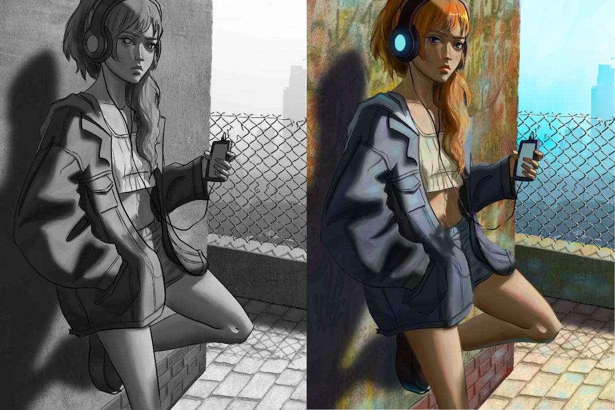
8. Color Base: In this video, we are
going to see how to apply your first
base for our colors. The goal will be to
get out completely of our black and white painting
and define our main colors. So the first thing that I have done is that I have searched a few images to
complete my mood board. I want the scene to take place in a very beautiful, sunny day. I've searched some references with a similar lighting
as what I want. Like this, I can see how the light and colors behave
in such an environment. Then back to my
Cliff Studio file, I have made a copy of all the work that I
have done like this. I can come back to my
gray scale version if ever my coloring doesn't
turn out that good. Then before starting coloring, I have also re
organized my layers. So I have merged everything
that could be merged. So as you can see, I have
kept mainly the main plants, a little bit like what I had at the beginning before
starting to add textures. I have just kept the
shadows separated and the barboires and its light, as well as it would be too hard to color them if
they were merged. And I also have kept the
shadows separated so I can tint it more easily
for the character. I've merged everything
except the shadow. I don't want to have too
many layers at this step because we are going to add
a certain number of layers. Now how you organize it really depends on
your own artwork. So I'm just showing
you my organization so you can have an idea
of what I'm doing. Basically, what we're going
to do from now on is creating a new layer for each element
on colomode to color it. Colomode is really
convenient because it won't change the value
of what is under it. What I'm starting to do
is coloring my blue sky. The blue sky understand
are what will determine the tint
of everything else. So this is why I'm
starting with it. As you can see, I'm already starting with some
counter example. If I can say, as I'm struggling
to put the right color onto my photos stock
image for this one, I exceptionally need
some adjustment layer. I have just played around
with a new layer and different bending mode until I find one that can
correct my color base. I think this is happening
because the photos stock and my painting are reacting
weirdly to my layer mask. The main point that you
can take out of it is that when something is not
working as you would expect, just don't worry and
play around with different method
until you can fix it. This is just part
of the process. Then I start to paint the direct surroundings
of my character. I put the color layer on a clipping mask for each
one of the elements. It makes the coloring
process a lot quicker. As you can see, I'm
not only putting one single color
for each element, but I'm painting
a blend up color. Because when you look
closely at the, well, you'll see that we never see only one color in
our environment. But there are always a
lot of different shades and hues for what we
perceive as one color. I've all painting the local
color of each element, keeping in mind that
it needs to be really one colors because it's directly
exposed to the sunlight. But for the shaded
part of the Lol, I put a cooler version
of the local color. I also have some blue in it that the ambient light under a
blue sky will tint blue. The shadows for the Babore, I just put the light
layer on color, Dodge mode or hard
light mode as you wish. And paint it with a quite warm, white yellowish color just to show very easily where the
baby is catching the sun. Then once the
environment is painted, I jump onto the
character silhouette and here again create a clipping
mask on color mode. Start by painting the skin of the character even if the character is
half in the shadow, for now in the skin as if
it was directly in the sun. So weather bright and warm. I will handle the
shadow tint later. I'm doing the exact same thing for the rest of the character. Just painting the
local colors but slightly warmer considering
they are in the sun. Here, again, like
for the background, I paint a blend of colors. Now for the shadow part, I create a new layer
as a clipping mask. I put it on multiply
mode and I fill it with blue as my ambient light
is the blue of the sky. I also lower the
opacity to adjust it. Then I start to erase all the parts where
the sun is heating. Then for the shadow of the low
wall and of the character, I kept them separated so I could correct their
color more easily. All that I'm doing is opening the curves and tinted
slightly blue With that, you're done with the first
coloring step to recap. The first step to get out of
a gray scale is to create a new layer for each
element on color mode. And to apply the local color
of each element one by one. Remember to take the lighting of your environment
into consideration. Four characters are
complex elements that are half in the shadow
and half in the sun. You can first paint their local colors and then
add a new layer on multiply, fill it with the
appropriate color and erase the paths
that are lit. Finally, for the cast shadows, it's easier to use the
curves to taint it slightly. Now it's your turn
add some colors to your gray scale painting by using new layers
on color mode, or using any other techniques that you saw during this course. Choosing the ones that are the most appropriate
for your painting. During the next
lesson, we will polish our colors and add final
details to our painting. See you in the next lesson.
9. Final Details And Adjustments: In this lesson,
we're going to add some details and posh artworks. This is the last lesson of
this course, so keep going. You're almost there. For now. Colowing is pty boring, so we're going to address that. I don't know if you remember, but at the beginning
of the course, when I was making my mood board, what I was looking
for as a thing was, was covered in graffitis. I didn't put it before during the grey
scale phase because the colowing part is the main component
of type of details. We don't really care
about the values here. It's more cohesive to keep that type of details for
the end of the process. Here, again, to
put that amount of details instead of
painting by hand, I prefer to simply
use some texture. This time I found a photo
that I like on Splash, which is another free photos
stock images website. What I'm going to do is
placing that image on my existing wall on top
of my existing texture. Stacking different textures
is a really great way to achieve the look that you want and really personalize
your artwork. Because it can often
happens that you don't find the perfect texture
that you're looking for. So here again, I'm putting
it in as a clipping mask, even if it's quite
abstract patterns. I'm still trying to pay
attention to the scale. This is why I'm
stretching it quite far away from the canvas size. And then I'm testing
different blending mode to see what looks the best. And here it's soft light. Then I don't want my line
art to be too apparent. What I'm going to do is to create a clipping mask
on my lineart layer. And then I'm just
recoloring my line art to have a color more
subtle and black. The main thing that you
need to pay attention to is that your image still
needs to be readable. So be careful mainly when your line T serves
as an oxygen shadow. Sometimes when you
see the colors, you might want to still change a few values in your painting. So you don't have to
be scared to do that, just to be very careful to
what you're doing here. I wanted the jacket of my character to be a
little bit darker. So what I'm doing
is I'm creating a new adjustment layer
on top of my character. And I'm putting it on
the bending mode that allows me to darken my color. So here I choose overlay, because with overlay you can adjust the value in
both directions. So I don't have to create
several adjustment layers. But overall, you just
have to experiment with your own painting and see
what works the best overall. That can make quite a lot
of layers at the end. I would say that this is probably the main
downside of this method, especially when you
like to work with fewer layers in the end. In my case, I had
many layers mainly at the end to correct things
during most of the process. I don't have that many layers, so I'm not too confused. This is also the
moment where I'm adding the very bright touches, like the very hard lights. I prefer to do it now too because this is really
the finishing touches. And I find the very subtle
coloring very important. It's easier to add details like a glow around the main light. I'm over all trying to put more lights around the
character face and darken what is away from the character face to
guide the eye towards it, as is the center
point of the piece. This phase is also
the moment where you can add more subtle
light sources. Like here I'm painting
the bond light. My scenery happens under
a bright blue sky, so it will reflect
a bit everywhere. I'm just dabbing blue touches
on the different surfaces. And silver wall, the
color of the sky, that will serve as a bond
light on the character but also on the shadow
part of the low wall. The color of the wall
reflects on the hair. This is also now that I'm dealing with the
color of the eyes. It's just a finishing touch
that it's easier to handle. Now this is also now that I'm adding
some hair strengths. Doing it now means that I
can simply coop pick from the main hair mass and draw
simply a few strengths. It also overlaps my line art, it hides it a little. I like to create a
correction layer on top of all the rest so I can simply
correct everything at once, the form, the color, without being bothered
by the layers. And I'm just keeping
on adding details and correcting mistakes here
and there as I see them. It's also the white time
to add some highlights. I'm adding some details
like freclls on her face. Once you're happy
with the result, you're done with your artwork. To recap, this last step
is the F of all the steps, where you will just
do everything you want to make your final
artwork look better. A few examples of
what you can do a add some more textures
in color this time. And use bending modes to mix
it with what's underneath. Create correction layers
to adjust some colors, add more subtle light sources, and have some more of
your ambient light color. And of all, just do
your color corrections. Once you're done, don't
hesitate to publish your work. I'd really love to
see what you've done. Thank you for taking this class.
10. Conclusion: Thank you so much for
taking this class. I hope you found it useful and
that everything went well. During this course, you
learned how to prepare your project by searching relevant images to
create a moodboard. How three D models can
help you with composition. Perspective and
lighting, to name a few. How to come back to your style after tracing your
three D model. Then when painting
in gray scale, you learn to begin with
two to three main values and to search for the intones. Afterwards, then you learn to add color colors with
color blend mode. Lastly, you learn to make other color adjustment by using a bunch of
different techniques. It was a rather
advanced class that required a lot of
fundamental art knowledge. If you see that you're
struggling with one subject, I advise that you search for
some class to fill the gap. Also, don't hesitate
to ask questions in the discussion section and eventually leave some
class request if you wish. I would also appreciate a
lot if you could leave me some review as I'm looking for your feedback to
improve my classes. Lastly, if you want to
follow me on social media, I'm mainly active on
Tiktok and Instagram, even though I have taken
a break lately now. With that said, I hope you enjoy the class and wish
you happy. Creations.
 Fanny Richard, Illustrator & Concept Artist