Transcripts
1. Introduction: The artists choose to
use procreate when they want to learn digital
art for the first time. It is an ex in my opinion, because the simplified interface appropriate and the simplicity
and comfort of the Pip make the digital art easier
to approach than getting your first steps on a
more complex software on a classical doing tablet. If you are traditional
artists that want to transition to digital
art with procreate, you in the workplace.
Hi, I'm Fania. I have started my art
journey by studying in different art school and by getting trator for
comic certificate. Since then, I have been a
French artist for six years. Even if I've always loved the
look of digital artworks, I stuck to traditional
art only for a very long time because the digital tools seemed
too complicated for me, and just applying pat on paper was more straightforward
for my understanding. Back then, my first steps with digital artwre on Photoshop
on a tabet without screen, which discouraged me right away. But, luckily, we have procreate
on the PD pour today, which are a lot more
beginner friendly. The digital art process and audit feature can still
feel intimidating, though, so my hope with
this course is to demystify it and make it
as digestible as possible, so we can enjoy drawing and
painting digitally right away by getting all the key concept that you need to
start off at once. This class will give
you an introduction to all the main digital art
features while working you through an effective
process to handle illustrations and procreate,
even complex ones. The course can be tailored
to any art style. You will be given information
about digital art and Procreate bit by bit and suggested to
practice right away, what you just do to make the information easier
to digest and retain. I wanted to emphasize complex illustrations
because procreate can be quite hard to deal with when doing complex
illustrations, and I didn't find any other cost teaching how to deal with it. Artists preferring to use photoshop or other
similar softwares for it. That a lot of people have
only access to procreate, and it was also my
case for a while, and either way, the app
is too good to ignore, so it would be a
shame not to take advantage of all
its possibilities. If you learn how to handle
complex compositions, it will be even easier for
you to handle simple ones. This course will give
you a toolkit to go through a maximum of
different situations. Now, if you're ready, let's see what your project
will look like.
2. Class Project: Your project for this class will be to create your own artwork, composed ideally of a
character and background. Now, if you want to take
this course only for the character part or only
for the background part, feel free to do as you please. You will still need to
watch all the listen though to get all the
information that you need. You can also add
as many characters as you like if that's
what you want, but I'd recommend
sticking to one for your first try to avoid over
complicating your task. We'll be given different options to match your style
and preferences. But this is what
your project could look like if you choose
to do all the steps. Draw a sketch of your character, do the lineut, paint the flat colors, sketch
your background, add decorative details
to your character, shade your character,
detail your background, and then merge your
character into the scene. This project aims to give you
an overview of a maximum of situations that
you can encounter while creating digital
illustrations. Creating an illustration is in the end a succession
of problems to solve. This course will give you a toolkit to use for that purpose, and this project
serves to put you in different situations that you might encounter while
drawing on your own. I recommend that
you already have a drawing project in mind before starting
and terminate it. Or to make things easier, you could choose
to recreate one of your existing
traditional drawings. Now, if you're ready, let's
jump into the lessons.
3. Introduction To The Basics: During this first
lesson, we will have a quick overview of Procreate
and digital art Engineer. The goal will be that
you know what to do when you open the
software basically. We will also see the most
basic tools that you will find procreate and
digital art Engineer. Let's jump right into it. When you open Procreate, the first thing that you
will see that gallery, you probably don't have anything yet if it's your first
time opening procreate, but this is what it will look like when you will have
created a few works. When you want to
open a new file, you go on that little plus here. Procreate will let
you choose between a few different canvas
sizes and mode. But if nothing is right for you, you can open a new canva. We will be mainly interested
in the dimensions, color profile and the rest, usually, I don't even touch. So for the dimension, you can
choose between millimeters, centimeters,
incheese and pixels, and I will stay on pixels. What you need to know
about Procreate is that it has a maximum
number of layers. Depending on your canvas size. The bigger the canvas size, the less layers you will
have Procreate does it to prevent your iPad to
lack, so it's pretty cool. But at the same time,
it's a big downside for a lot of artists, so be careful to your
number of layer. Usually go by 2000 503,000. I wouldn't recommend going
too low either because otherwise your drawing
will be pixilated. Now for your color profile. Usually what is said is that
RGB is for screen display, and CMYK is if you want
to print your drawing. Once you're ready,
you can tap create. The third thing that you
might be interested in when coming here is probably
where is the brush. So this is here. We'll have a lot of
different brushes. Well, these are
different categories, and each time you select one, you will have different
brushes inside. For example, here we have
the sketching brushes, which are basically
the pencil brushes. If you're trying here, Here you have the inking brush
so that will mimic inks, and you will have some
painting brushes, which will mimic different
types of paints. Here you are. You can change the size of the
brush which is here. You can go smoother, wider. You can change the
transparency of the brush as well,
which is here. Or completely opaque here. Now, if you want to
do what you just did, you can just tap this
little hour here. If you want to redo, this will be the hour just underneath, you can go with the shortcut, which is take two fingers
and just go there. There it goes backwards. Then if you want to change
color, it will be here. First, a little explanation about the color wheel
because you might be a little bit confused if you come from traditional paint. So that big circle
are the hues and inside are the values and
saturation, basically. If I want a redisu I
will go over here. And depending on where I place that little
round shape here, I will have it more or less saturated or lighter or darker. This is basically how it works the color will, but don't worry. I will guide you a
little bit more. Let's go back with a
little shape here. You have an eraser here, which will work the
same than the brush. Actually, you can choose the type of eraser
that you want. I say here. You can choose
the size. I'm here. If I want it bigger. If I want it a little
bit transparent. And of course, everything
is pressure sensitive. If I go, if I go light. And here you have
the smdge tool. So it's like if you had
pastels for instance, and you smdged it
with your finger. The same thing as for
the brush and eraser, you can choose what type of shape you want
to smudge with. Don't worry, we will see how
to use everything later on. This is just so you
have an overview of what you can find here. Here on the top right corner, you have the layer panels. We will have to have
an explanation about the layers in digital art. This is something
that you will find in every digital art software. Digital artworks with layers. To explain how the layers
work, the basic principle. Let's say you have
a drawing here. You want to put another layer
on top take another color, everything that you will put
on the layers that are on top will hide what is on
the layer underneath. This is useful for many
different things and we will see how to use it later
on during this course. Now, if I can
reassure those of you that might be a bit
scared of the digital ad, I would say that with this, you actually know
everything that you need to know to actually
draw digitally. Please that point in by the
complexity of digital art. Contrary to popular
belief, actually, a lot of things are not so different from the
traditional art. It's just another medium, a bit more flexible and with more option than
the analog ones. But please consider that all the ways that
we will see during this course are non
mandatory tricks to make the process
more optimal. Then if you want to come
back to your gallery, you just have to tap here. And to come back
to your drawing, you just have to tap
your drawing again. To recap, just remember
that MY K is for printing, our GB is for screen display, and once you have
opened your file, your brush is here,
your eraser is here. The Much tool is here, and the layers are here. Of course, don't forget the do option that you can find here alongside
the redo button. Now it's your turn. As homework, we'll have to play
with your new toys, please just play one
without thinking too much. Okay. During the next lesson, we'll talk about
sketching digitally. What are the similarities
with analogue sketches, and what are the
digital tools that can be useful to make your
work flow easier? We'll start with sketching
a simple character for the exercise without being concerned about the
background yet.
4. Sketching Digitally: In this lesson, we are going to see everything
about sketching, what brushes you can use, what options can help
you in your process. I will also suggest
a process that can help you navigate
procreate specifically. As beginners, the most natural
for you would probably be to take the sketching brushes
or the pencil brushes. You can try them out to see
if some are to your liking. Appropriate offers
many by default, so you can really play one with them to see what
you like the most. Now, it's great with
digital art that you can basically sketch with
all sorts of brushes. If you want, you could
take a painting brush and lower the size and sketch
with it if you wanted. One that I would like to
use is also an air brush, like a hard airbrush,
for instance. I actually prefer
to do everything with the same brush
painting and sketching. The bush that I use is
actually my own brush, which is a square air brush. I've put a few brushes as an attachment file
for this course. So we can find this
brush among them. That gives me the
occasion to show you how to import
brushes as well. Once you've downloaded
the bush set on your iPad or on the cloud
service that you use, you just have to open it or save two device and choose to
open it in procreate. I import the bush set
automatically. This is the one. The word that I will
use is this one. Feel free to use it as well
or another one as you please. Now let's start sketching. I like to use a brownish
color to sketch, but that's just my
own preference. Don't hesitate to
do several trials to find the color and
side that you like. One thing you might want
to know before starting is that you can zoom in and
zoom out your canva. Instance you have a sketch here, can zoom Zoom in
squeeze in your canva. You can also turn your canva around with your two fingers. Another good tip if
you want to draw a perfect circle for the head
structure, for instance, is that you can draw your circle like this and maintain the pressure
of your pen. That will give you a
perf geometric shape. If you want a perfect circle, you just have to tap with two fingers and
release your pen. Another trick to begin with, if you're not happy with
the size of your circle, you can modify it by
tapping the arrow here. And it will select
automatically what there is on the layer
that you're in. So in this case, there is
only one, which is this one. When you tap the arrow and
want to resize your circle, you just have to check it. It's the uniform option that is selected and you can resize
your circle like this. You can also move it around. To resize, you have to tap
the little blue corner here. And to move it
around, you have to be outside of the blue dots. But honestly, it's optional, you could just trace your cycle like you would do traditionally. What I'm doing first is that I'm basically sketching roughly like I would do traditionally. The main difference is that
you don't have to worry about living pencil traces. We can put as much
pressure as you want. Also, you don't have to worry about the space you're taking on the canva because you can
always restyle everything. Also, sometimes instead of erasing and redoing
what you can do to is using the transform
tool on specific areas. This is the selection tool. You can select free
hand rectangle leaves here I'm on free hand. So I will select just
a part of the drawing. Then go on the transform tool and I can do several
things here, so I can just before
resize or turn, I can turn with the
little green dots here or I could
distort the shape. The main takeaway is
that everything can be a lot more lot than
with traditional art. Another option that
I really like. When it's like this, it's
probably because you made some encelts
with your hands, so you just have
to take the eraser and try to ease fully, so it removes all the
dots that you don't want. Another option that I
really like here is the rap what it does is that it can
move your doing around. I can reg posture around as
I want and see it like this. Here again, if you want to
do it on a specific area, you can just select
and transform. I'm just showing we're
free for the demo, but what I will do is just refine everything until it
looks something like this. It's just a sketch
for the structure, basically, but I can start
to add details from there. What I will do at this point
is duplicate this file. I make sure I can
come back to it if I'm not happy
with what I do next. So I'm going back
to the gallery. I tap select I tap my file. And I tap duplicate. Then I select with a
little cross here, and I slid my new file
onto the first one, and I create a folder
for my project. You can name them if you want. Naming them will help
you, especially if you want to explore
them to your computer which I recommend
highly because if you lose your ipad, you'll
lose everything. Now to work from this base, what you can do is create new layer and you can make
that first layer transparent. Go on your first layer,
tap that little n, and then you have
an opacity bar, so you just have to slide the
bar a little to the left. Now you can start drawing on your new layer and actually
see what you're drawing. Then basically, I'm just
refining until I get this So what I have done here is that I have separated
a few elements on the sketch to make things
easier for later on. So I have the hair pin on its own layer and
those little props on their own layers as well, and the rest of the body
is on its own layer. But that's really
my own preference. The main takeaway
is that depending on your project
and your workflow, sometimes you can
make your process easier if you separate
some elements, but you will learn
this with experience. Now, another thing is
that you can see that I have sketched with
different colors. I did this to make
things clearer when elements were a little bit too confused
with each other. One thing that is essential
is that when you've changed your color and want to go
back to your original color, you can just tap that little square here that will give you
the hydroper tool, and then you can select
whatever color is on the Canva. And here you have
your previous color. Another important thing to
check if your drawing is correct is the flip
horizontal option, which is like when you put
your drawing in front of a mirror to see if
there are any mistakes. You go into the
little tool here. Go onto the Canva option, and there you have the
free horizontal option. You can check if
there are anything to change. Let's go back. Now I would just
like to have a word about some procreate flow tip. I made you sketch
a character first to make the exercise easier, but there is also
another reason. You could sketch your
overall composition like you would do
traditionally here. But the reason why I
oriented this course towards complex compositions
is that it's really tricky procreate because
of the layers limitation. You might not go for yet, but believe me, you will very
soon during this course. But in in digital art. If let's say you want to paint a complex character design and make a whole scenery
for your character, you will want to use lots of layers for the character
and the environment. At least, it would make your workflow a lot more flexible. What I found useful
in such cases is to work on your character and your background separately. I'll show you all
my tips to make everything cohesive
along the way. It doesn't prevent
you from working on your composition beforehand. You can just do a stand or a
quick sketch on another file to have an idea of
where you want to go like you would do
traditionally actually. I also want to add
that with practice, you might choose to paint
on very few layers. But for learning purposes, I suggest that you follow
my lead during this course. To recap for sketching, you can use the pencil brushes, but you can also use any type
of brush that you prefer. Also, a few options to remember
are how to zoom in and out and move the canva around
by pinching your canva. Then when you sketch,
the transform tool can come in really and need
to make you safe time. Don't forget the
color picker tool. Now to create folders
in the gallery to keep your file organized.
Now, it's your turn. Sketch your character
and take the time to wrap your head around the
tool that we just saw. During next lesson, we are going to see how to
do the line art. Not everyone is doing a lineout
this is really optional. But for those who want to do it, we will see what washes to use, and what are the specificities
about digital lineout. Even if you're not
a lineout person, I still encourage you
to watch lesson though. My final artwork will have
lineout and yet I'm still doing some lineu to simplify
my process afterwards. That might still interest you. See you in the next lesson.
5. Line Art: This son, we're going
to talk about neut. So digital lineut is not that
different from the alg one, but there are still
a few useful things to know to get the best results. So let's get started.
Procreate has a lot of different inking
brushes available per difat I think the main criteria to choose one would
be the line variation you want in your drawing and also how much texture
or smoothness you want. You have a preview of what your line will look
like over here. But the best is that
you try them out to see which one
you like the most. For example, the mercury
one has a bit of line variation and
also a bit of texture. If we can o in While the sip has a lot
more line variation, but is very smooth. The fine tip is pretty
much self explanatory. That's really the main
differences I can see, but really try them out, play one with them, so you can choose which one
you like the most. I s for the pencil sketching. You can use whatever
brush you want. I will here again
use my own brush. Feel free to use it as well or use whatever
brush you prefer. Seriously, even the pencil
brushes can work well. That's what you're looking for. It's not like traditional art. You don't have any
technical constraints. It won't bleed if
you paint over it. Oh, and now that I did it, I will just show you also I did that little
mo on that layer. To delete layer, you
just have to slide it to the left and press delete. You will see that
even if your hand is really stable when
you do traditionally, the iPad screen is a lot
more slippery and sensitive, you might struggle with
getting a smooth line. To help with that, let me introduce you to the
brush properties. Digital hand brushes are made up a bunch of properties
that you can modify. To access those properties, you just have to tap on the
brush you want to modify, and there you see a menu with
a lot of different options. The one that is
interesting us right now is the stabilization option. So go there. And it's the stabilization option
that we want to modify. Here, you can see I've
already modified this one to have 30% of stabilization. This parameter on this push is replicating the sensation that I have when I in traditionally. This is really the
sensation that I encourage you to try to get. If you put a high percentage
of stabilization, your line will certainly be very controlled and
smooth and stable. It's really lies, and you don't have an actual control
of your brush. Really, I encourage you to use the stabilization just to mimic the traditional feel and not to compensate a skill
that you don't have yet. If your hand is not stable yet, it's just better to train
until you get there. Or at least just
try to not go too crazy with the amount
of stabilization you put and try to decrease until your hand gets better
at being stable, I mean. So, yeah, that's just
about my own sensitivity, try around for yourself,
see how you feel. When you've modified it,
you just have to tap done, so it has taken the changes
into consideration. Also, if you don't want to modify the original
propate brush, you can just slide your brush to the left and tap duplicate. You can keep the original brush as it is and modify the copy. Now let's get to business
and do the actual lineout. The first thing I'm going to
do is duplicating my file. Just like before select, tap your file, duplicate. And select. And we name it. Okay. Now the first
thing I'm going to do is merging all my pencil layers. There are several ways to do it. The first one would be to tap your layer and tap merge down. That's merging your first layer onto the layer that
is underneath. But when you want to
merge everything, there is something
even easier than this, which is to pinch all
your layers together. Here you left with
one single layer. I will do the same as when I
was making a cleaner sketch, which is making a new layer and lower the opacity
of my sketch. In the end, it's like if
you are using a table. There is nothing really
different here compared to traditional lineout
except that you can undo your line and erase your
ink and that you can move your canva freely
around without being scared of making things
bleed with your hand. Otherwise, I won't keep
my lineout at the end, or it will be verbally visible. So I'm not making it too
pretty or too detate. I'm just going to use
it to clean my sketch. But if you want your final
work to have lineout, you might want to put more
attention to it than I did. Please just do as
you used to do. To recap, the first
thing is don't forget to draw your line out
on a new layer above your sketch layer. Drawing on the one layer is a
common mistake that can run your work and make you waste a lot of time, so
be careful with it. Also, try round brushes to
see which one you prefer. You can choose a
traditional in brush, but you can also try
out other types of brushes to see what
fill the best for you. Lastly, play around with
stabilization to see what the most comfortable
for you. Now it's your turn. Duplicate your sketch file, rg your layers if you have
several and do your line art. Then share you in drawing if
you want to get feedback. During next lesson, we will
start talking about cooling. There are several ways
of cooling digitally, but I will show you
a method that covers a vast variety of
labels and art styles. See you in the next lesson.
6. Color Filling: To prepare you for coloring, the first thing you
need to know is how to simply fill a
shape with the color. This is what we'll
receive during this lesson and we will use it during the next to do
your first coring step, which is the flat colors. I just prefer to separate both lessons to make
it more digestible. I don't need my
sketch layer anymore, so I will start by hiding it. To do so, you just have to
select that little box here. Now, what I will do is create a new layer underneath
my line out layer, which would be the
colorwing layer. Just to precise this
course will just be a demo on how to fill colors, but not yet the actual coloring. So you can follow
wrong just to train, but wait until you have seen all next lesson before starting actually
cooling your drawing. I will have still quite a lot of things to tell you
before you start. The first thing here again is really to check if you
are on the right layer because just don't
go and start crowing a new lineout layer
or something like this because you
will just at work. So just so you know what will be the goal of the
next two lessons. It's to make your
first coloring step, which will be the flat coloring. This will be just your base, so don't worry if this is
not what you're going for. This is just the start
that you will be able to work the way you want to have the
rendering that you want. So this is why the first step
will be that you learn how to simply feel a simple
shape with color. To do it, there
are several ways. The first way would be to
simply fill your shape like you would do with color
pencils, for instance. This leads me to
what we're trying to achieve actually when
we are feeling a shape. Is that we want an
actual solid shape. A brush like mine is not that ideal because
as you can see, it's very blurry on the edge. If you're doing
this, it's better to take just a hard airbrush. That is available per depot on procreate or usually
on any software. Like this, you can see
the edge are very solid. The second one
would be to select your shape with the
selection tool. Procreate has the great
advantage of offering a selection tool where
you can actually release your pen and
go on with your line, and it just starts your
selection where you ended it, which is great because the
other software actually close the selection as soon
as you remove your pen. Just take advantage of
procreate for this. Once you've made your selection, you just have to drag and drop the colors onto your selection. This is actually a
very efficient way to get very crisp edges. Another method would be
to cover your shape with big brush strokes and then
erase to cabin shape. And the last method is actually a little bit like the
selection method. You can just outline your shape and drag and
drop the chose recorder. One more thing is that once you have your
flat color in place, if you want to change the color, you just have to
drag and drop the chose onto your existing color. To recap, you can simply color your shapes like you would do
traditionally with pencils, or you can cover your shape with big brush trucks and
cup with the eraser, or you can use the
selection tool and drag and drop the colors cool you can outline your shape with your color and drag and drop the
color scal as well. Now it's your turn. Simply try out all those methods either directly on your drawing or just do bloves of colors so
you can remember them. During the next
leson we will see quite a few more things before
you color your drawing, like how to choose your colors and how to manage your layers. Seeing the next lesson.
7. Color Base: There are several ways
for coloring digitally. I will show you a technique
that you can decline to adapt to your favorite style during this lesson
and the following. The goal of this lesson
is to present you an easy and versatile way to
start coloring a drawing, which is applying flat colors. A good tip to start to not
keep your background right, but instead selecting
a gray color. For this, you just have to tap the layer panel and then choose the background layer
that is at the bottom. Then I advise that you
choose a gray that is toward the left
side of the circle. No matter the selected, if you are completely on the
left side of the circle, you will have a
completely neutral gray. We're doing this because
having a gray background will help you perceive the
value of the colors better. As I said in the intro, a good w to start coloring
a digital drawing is by applying what we
call the flat colors. The name is pretty
self explanatory, but what you need to
do here is simply to fill your characters
with its local colors. With one of the methods we
saw in the previous video, without caring for
lighting or shadows yet. It's pretty straightforward,
but there are still a few points to
take into consideration. The first is that keep
in mind that we will have to apply lights
and shadows afterwards. When you select a
color, in most cases, it's better to choose
the value that is situated around the middle
range of the color wheel. That little bit
like the gray color that you use for the background. There are enough tighter and darker values around that color. I made an exception here
for the hair and shoes of my characters because I will only work on the reflection
starting from black. But otherwise, the
rest of the drawing is situated in the middle
range of the color wheel. You don't have to be exactly
on the middle of course, but be sure they are
still a few values above and underneath
your curan color choice. I mean, even if you have white, of course, it should be
torn down to a gray color. Also, keep the majority of your color choices to the
left side of the wheel, as it's where you can select
less saturated colors. You will want to choose the
most saturated colors as exxam color that we will
apply during the next steps. Also, just a little
bit more guidance for skin color choices, as I know it can be tricky. If you select an arrange to rede and stick to
the middle range, not too saturated
part of the width, you should find the color
that you're looking for. Don't hesitate to do
several tos until you're happy with
the color you found. If you're going for a
realistic style like me, try to choose a rather dull
color because remember that we will add some accent
colors and reds later on. But overall, your color choices will depend
on your style, so just choose according
to your preference. Now, the last important
thing is that separating elements on
different layers can make shading and adding
details easier as you would be able to handle
each element one by one. But as we are appropriate, be careful not to
abuse it because you will hit the
maximum layer allowed. So to handle this, you can group different
elements that don't touch each other
on the same layer. You can quite see
how I did it myself, so you can take some
inspiration for me, maybe. I don't worry if you don't know yet how many layers you can use. You can still merge
a few of them later. Which is what I had
to do if I recall. I don't think I could
keep that many layers. Now another optional tip to make your colors a little
bit more interesting. Especially for those
of you that will be some semi realistic drawing is to add some color
nuances to your flats. A little bit like you would make a first wash with water colors, but instead of using
a single color, you use a blend of colors. A good way to do it
with digital dart is sliding the hue to
one side or another. If you don't want your color
to bleed out of your flat, you can just select your layer. So you just have to tap on
your layer and tap select. And I will comp paint
outside of your selection. I will take it the other
way as well like this. I just have to be careful
to this area because the white of the clothing is on the same layer at the wet, so I don't want it
to go past the red. It won't make a
dramatic difference, but it will add some interest
to the final result. You can do it for the different
parts of the clothes, but you can also do it a some
blush to your character. To choose the color
of the blush, you can just color pick the
color base of the skin, and then you slice the cursor
a little bit to the right. Eventually, you can also
make it a little bit red. Like this, you should
find a nice blush color. I'm using my usual brush here, but if you're not
comfortable with it, the soft brush does
a job very well. We will stop here
with the character coloring for now and move
on to the background. The interest in doing
so is to still work on the overall composition at the same time as
much as possible, even though we're
using a few tricks to manage our layers. Now, if you don't
know what gross to choose for your character
yet because you wait to know your background close just fill your whole character
with a medium gray color. In that case, you can keep
your background right. You can then work on
the background and come back on coloring your
characters afterwards. This is actually what I
did for this painting. A convenient tool, in that case, is a layer selection. Because afterwards, it would be a shame to spend a lot
of time re selecting every area one by one
because the silhouette is the most time consuming
thing to select. You can tap your layer
and then tap select. Then when you create new layers, no think that you paint goes
outside of the section. You'll just have to be careful about the edges inside
the silhouette. You can of course create several layers to separate elements. In the end, you'll just
get the same result as if you did the
flat right away. To recap in digital art, applying flat colors first
is a good way to start your coloring process that will allow you to
work in many styles. Also a reminder from
the last lesson. Make sure your color
base has a solid shape. Also, keep your
color choices mainly on the left center
part of the color way or at least not too much to the right to avoid using
two saturated colors. Also remember that you
can separate elements on different layers to make the
rendering easier later on. Finally, you can choose to
postpone your choice of colors in this process by spilling your
character with gray. So you'll be able to color your character once you've
worked on your background. Now it's your turn. Feel
your character drawing with flat colors or flat gray
depending on your process. During the next
son, we will start working on the background
of our painting. We will keep it
12 to begin with. See you in the
next lesson. Okay.
8. Rough Background: In this lesson, we will start working on the background
of our painting. I want to jump on the occasion to show you another
painting method. When you're painting, you have two ways of approaching it. The first one is as
we just did to first draw the outline of your
shapes and then paint it. The second one that we
will see now is to paint rough shapes and then carve them until you get
the desired result. The first thing
we're going to do with our project now is to create a new canva of the size that we want at the
end for our painting, and then I'll drag
and drop my character from the other file
onto my new Canva. So, what I'm doing is first, I take my character of fine. I merge everything by first pinching all the
layers together, so I have only one
single layer left. And then I select my layer by keeping my finger
pressed on it, and then I drag and drop
it onto my new cana. Like this, I can work on
my background composition while knowing what space
my character will take. Before we start, I
just want to say that you can absolutely work on your background the same way that you worked on the character by doing the lined first and
then fill it with colors. But for the demo, I
want to show how to carve things out of
blobs of colors. So you'll just have a bunch
of different methods to spum. By the way, it works also
in reverse, of course. You can also carve out a character out of
blobs of colors. I'm just switching to a
screen record like this, you can see the whole time lags. For the brush, I'm still
using my same square brush, but you can of course use a
hard air brush if you want. It works very well as
well for this work. The first thing that
I'm doing is placing roughly the shape of the
land with big brush talks. Just notice how I apply what I said before
about the situation. Of the color that I choose. So I choose a very
desaturated green photograph because I know there will
be axon colors afterwards. And then I'm placing
right away my toy, which is a center element of the composition that
frames the character, which is why I place
it right away. And here again, see how
rough my shapes are. I'm not trying to
make it pretty yet. Just to define and think
quickly of my composition. I'm painting different elements on different layers like this, I can modify it and resize
it and erase very easily. On a layer underneath
my grass layer, I'm painting the
color of the sky. And then I start
painting my first tree. First, I make a rough shape, and then with the eraser, I try to have a
more precise shape. As it's an important element
for the composition, I try to have an accurate
silhouette already. I see in roughly the
shape of a path. And I'm not happy with
the color of my path. So let me show you
a very cool time saving trick for this
type of situation. There are several arrays of adjusting colors in digital art. On procreate, you need to go
onto the adjustment menu. And the color adjustments
are the first four options. They can be a little
bit hard to understand, so I will just stick to one
today, which are the curves. So I'm not going into two
technical explanations to keep it simple, but you can quite see how it works by just watching my demo. So when you are on
the first option, the Gamma option, it will alter all the
color channel at once. Concretely, that means that depending on how I
state my grosor, my color will be lighter or darker or more or
less saturated. Then underneath, you can see that there are three
color channels, red, green, and blue. This will allow you to change the hue of
the color itself. I'm demonstrating
some changes on the screen so you can have
an idea of what it does. But the best is that you try it for yourself and
play one with it, so you can take the hang of it. Back to the painting and demo. The first thing I'm
doing is to make sure I'm selecting
the right layer. As usual, if you want to modify an element that's not on its
own on a separate layer. You can just select it by
hand with a selection tool. Here in my curve, I start by making my path darker by sliding the cursor
on the Gamma channel, and then you can see that I'm playing around with modifying the different channel until
I get the desired result. I really don't have any
particular technique. I just play around until
I'm happy with what I see. So I'm modifying the
color of my path. And once I'm done, I'm
adding some blobs of water. Now I want a forest
in the background. Here are the moment
where you might try out the magic of some very
convenient brushes. I want a forest filling
in the background, so I won't draw the
trees one by one, but use a tree brush
and leave brushes. The tree brush doesn't belong
to me, so I can't share it, but you can simply search for tree brush procreate or tree
brush photoshop on Google. They are very easy
to find for free. If you search for
photoshop brushes, be careful to get a brush
with the ABR extension. As it is the one that is
compatible with procreate. The least brush
are my own though, so we can find it in the
resource section of this course. I'm making several rows of
trees on different layers, and I'm making sure the trees in the back are less saturated than the trees in the front because of
atmospheric perspective. I'm adding a mist effect
with a very soft airbrush. A little tree here as well. To cup the shapes
of the tree leaves, you can select the leaf brush on the eraser and then erase it. So, here is the
final result for me. I'm just showing you my layer Pi so you can see how
I organize everything. To recap this
course, I would say, just place big brush
strokes and card. Separate the different
elements on different layers, so we can move them around
and rework them easily. If you didn't plan all
your composition ahead, now is a moment to
decide on what your work will look like at the
end. Keep it for now. We will refine things once the character is
completely done. I just want to insist on the
fact that in digital art, there is not one rigid process. Your process will
highly depends on your preferences and
on your project. This is why I love digital art. While with traditional art, you need to plan
everything up front. With digital art,
you can really paint loosely and define
everything along the way. So now it's your turn. Paint your own background, either by carving
out shapes like I just did in the demo or by drawing the line out
first and then filling it with flat colors like
we did for the character. During the next
lesson, we will talk about material information
and decoration. I will show you how
to use mask and bent mods to enhance
your painting. See you in the next lesson.
9. Material Information and Decoration: During this sesson
we are going to add material information and
equation to our character. This will allow me to introduce you to masks and band modes. These are options that can look a little bit
intimidating at first, but I will keep it as
simple as possible. Now, if it still feels too complicated or abstract for you, don't hesitate to skip this step and come back when
you're more comfortable. These options are
still big staples in digital art, though. I advise against
ignoring them forever. Now let's begin by a
little bit of theory. There are several
types of masks in digital art that you will
find not only appropriate, but on any digital art software. But I don't want
to overwhelm you by showing you
everything that exists. I will just show you the
one that I use the most. And I will use almost
only this one. It's just to say that
you don't need to know all the complexities of the
software to do digital art. I will do my little
explanation on my character that is on
a single layer here. But it's just makes things easier to understand
because it's not the file that I
will use afterwards to do the final painting. The mask I'm going to show
you is the clipping mask. To use it, I will create a new layer on top of
my character layer and you just have to
tap that new layer and then select the
clipping mask option. So what it does is that when you paint on
the clipping mask, the paint won't go outside
of the character shape. Clipping masks are very useful
combined with blend modes. To access bland modes, you just have to tap that
little n on the layer, and there are many
different bland modes, so you can play one with them. But I will start by introducing you the ones that
I like the most. So to show you what it
does under painting the neutral gray color
on my clipping mask. I will start by selecting
the multiply blend mode. To explain from there, blend modes will allow you to show the painting that is
underneath the details. It won't completely
cover your painting, but just a its color and multiply will darken
everything that is underneath. It's very used for shading, for instance, but we will
see it in the next lesson. Other very used one
is color dodge. It's a very powerful mode. It is used to bring very
bright touches of light. You need to use it with a
lot of moderation because it can really make or
break your painting. Then another one I find
very useful is overlay. As you can see here, it doesn't change a lot of
things with my neutral gray. Because every color
that will be lighter than neutral will
lighten your painting, while everything that is
darker will darken it. I find it great, especially
on appropriate if you want to use only one layer
to make shadows and lights, especially if you're close
to your layer limitation. Then the last one I will
show you is soft light. It's pretty self explanatory,
but color dodge, it will lighten your painting, but a lot more softly. It's going to be
convenient to do your ambient light,
for instance. That's it for the theory. Now I will show you how to use it in a more
practical way. Switching to screen
record again. The first thing you
need to do, I recall, so no one will progress is
to duplicate your file, so you can still
come back if needed. As you can see, I'm going
to work on my file where I separated all the elements
on different layers. You can work with your character on a single layer, of course. But that means that
you will need to select manually each
element one by one, each time you will want
to work with them, which I'm way too lazy to do, especially with a
design like this. But again, it depends
on the project and on your preferences. So the first thing I'm doing is creating a clipping mask on
the part of the clothes, and I want to create a
shiny silky golden fabric. So I start by brushing a
little bit of a gold color. And then I'm erasing the part that shouldn't
have a goal on it. I also want to show you how you can make some
designs a little bit complex by layering different
decoration and effects. So I want to make some
patterns on the kimono, so you could paint
in by hand or just use a pattern brush and
I will do the latter. So I create a new layer and brush in some leaves
on the right sides. Don't hesitate to
do several trials until you're happy
with the result. And then I'm making a
clipping mask of that layer, so it doesn't go
past the cloth area and look how you can use the
different tools that we saw. I'm using the transform tool
wrap tool and distorting it to follow the movement of the fabric to make
it more realistic, and then I erase all
the parts I don't want. Then here I don't want it
to be that bright white. I could use bland mold, but I think it's just easier
to just lower the opacity. Then I'm just merging my pattern layer with
my gold layer. This is something
that I will do a lot, create an area with
different layers and merge it as soon as
I'm happy with the result. To manage my layer limitation aprocriate but even
on other softwares, too many layers can
be way too confusing. Then I want that
golden area to have a soft silky fabric.
Type of feel. I'm just selecting my
clipping mask by tapping on the layer with the
pencil tap select. Like this, nothing
I'll do will go out of the selection
on the clipping mask. And then I'm just
going to select a very soft tip brush and
brushing very gently, some white and some brown to make that soft
shiny fabric look. I don't want anything
too harsh because I don't want it to look
like actual metal. And then I will show you how you can make some things similar more easily an area that
are less complex to wonder. Like I'm just selecting
the bby or the belt layer, and I won't use
clipping mask but only brush the different colors to make it look like shiny gold. And you can see how
convenient it is that I have the rope and the flower
on a different layer. So everything that I
do don't touch it, and I don't have to select out such a complex shape either. And now I'm doing a
clipping mask on top of it. I'm just doing the same as
before to make the pattern. And then merge it. It doesn't necessarily have to be
complicated. This is my point. And I'm just brushing some more pattern on
top of the k model, but doing nothing
very fancy here. Here again, I could
play with blend mode, but in the end, it's not that
relevant for this project. I hope that we can see
all the possibilities that the option offer you. So to recap during this lesson, we saw the clipping
mask that you create by literally clipping a
layer on top of another. I think that you will paint
on your clipping mask will go out of the section of
the layer underneath. Then you saw band modes
that allow you to modify the color of the painting underneath while
keeping the details. We haven't seen any
concrete example yet on how you can use them, but you can already
try them out for your decoration of your
character, if you wish. Otherwise, we will
see more concrete examples during the next lesson. Nastly you saw how to use
clipping masks and transform tools to decoration and material information
to your character. Now it's your t. Play around with clipping
masks and n modes, either by adding some effects to your painting if you wish, I'll just do it and you can to have the first
feeling about it. The next son is the direct
following of this one. We will see how to
use clipping masks and n mode for
shading and lighting. You'll just need
to be happy with the design of your
character before you go on. See you in the next lesson.
10. Shading: In this essen, we are
going to talk about shading using masks
and blend modes. Applying shadows and lights
by using a clipping mask and bland modes
are a classic way of painting in digital art, so I thought it would be the
best way for you to learn. I will start by breaking down
this course very simply, so you can have an overall idea of what this is all about. Let's say I want to
shade this bowl. That is basically a random
shape on a single layer. I will create one
flat clipping mask on multiply blend mode. That will be my shadow layer. And then I will create a second clipping mask on so
light band mode this time, and that will basically
be my light layer. This is basically what we will do a few times to
shade our character. And so it doesn't block you, you can totally shade anything without using
masks and bend modes, just by selecting
the white colors and applying it to your drawing. But the big advantages of
using clipping masks and bend modes is that it will still show by transparency
everything that's underneath. And also, you will still be
able to modify your flats, shadows or lights separately. Now during this lesson,
I will demonstrate some ambient shading
onto my character. Ambient shading is meant to show the forms and volumes
of the character. So it's more for the
rather realistic styles. If it's not your
style and you're more into cell shading, for instance, it will be more relevant
for you to simply shade your character once you've put it in
its environment, which we will do very soon. Now I'll jump into the demo. It won't be ideal to make
clipping marks for each layer. That would be too laborious and you'll hit the
layers limitation. But keeping a few
things separate can still make your
work probabit easier. There's no or here. Just try to see what would be more convenient for your work. Here is how I organize my layer if you want to take some
inspiration from it. So here we go for
the screen record. I created a clipping mask on multiply on top of
the face layer. And this time, I'm not using my usual square brush
but a soft brush. Because I don't want appearing brush strokes for
the color I'm using. I usually color pick
the base color of the skin and make it slightly darker and eventually
slightly weather, and it usually works well
on the multiply layer. That should work
for any skin color, not only the fair ones. And so I'm just starting to apply some form shadow
on top of the face. Then I'll move on
onto the rest of the skin layer and
repeat the process. And then I move on
onto the clothing. And this time, I'm
going to use a sort of that blue color
because I know that the overall light of my
environment will be blue. And this time, every
edge won't be separated, so I will need to use the to separate each
area while I'm sing. And this time, I'm
using my square brush because like for the skin, I like to have a
little bit of texture for the rest of the painting. But once again, that's
just my own preference. You can just do as you prefer. I just supply the shading
with big brush strokes, and then I take the eraser and remove it where
we don't need it. I really encourage
you to use the eraser a lot to carve your shadows
in the right shapes. Also, don't hesitate to make several triol for shading
with the right size of brush. Having the right size will make a massive difference
on the end result. And then I'm moving on onto
the accessories layer. And this time as I am
dealing with moolar details. I'm not going to bother with a multiply layer on
the soft light layer, but I'm just going to
use a clipping mask on overlay so I can make the shadows on the light
on the same layer. You will see that from one
land mode to the other, the color that you use
won't appear the same way. So you will need to
play around with different colors to have
a hue that you will like. And now that I have
dealt with the shadows, I will move on to the lights. I thought I had used soft light, but I think I in the
end used a blend mode, which is a bit stronger
and more like color dodge. But you can try around different blend modes and
see what works for you. The thing with lighting with ad or color dodge is that
you will need to go very, very light on the brushes
contrary to soft light. And when you hit your
layer limitation, don't hesitate to duplicate your file and start
blending your layers. This, you can still take back your older layers if
you made a mistake. And so for lighting the
clothing I'm using color dog, there's no particular reason simply that it looked
better after trial. And once I'm happy
with my shading, I just merge every layer except the hair layer
and the lint layer. And to wrap up this step as I don't want to
keep the lineout, I just erase it where it's without and where there are ocldion shadows,
I just leave it. But that's just the way I
want to do things this time. Here again, just
do as you prefer. To recap for shading
and lighting, you put two separate clipping
masks on a flat layer, one for shading and
one for lighting, and you do it for as
many flat layers as you need to handle
the layer limitation, you just have to duplicate your file and merge
little by little. And you will and repeat
the process until you've rendered each element.
Now it's your turn. If you have a weather
realistic style, you can do the ambient
shading of your character, and otherwise, you can jump
right to the next lesson. During the next lesson, we
will see different techniques to correct your character
if you made any mistakes. See you in the next lesson.
11. Corrections: At some point in your workflow, you might notice some mistakes. While with analog tools, you just have to enjoy
the happy mistakes. With the digital tool, you still have some
leurage to correct them. So during this lesson, I will demonstrate
some corrections. I will mainly use tools
that we already saw, but I still want to introduce you to one more option
that is very useful, which is the liquify tool. As usual, before showing you
how to do on my drawing, I will show you first, very simply the principle
on this simple shape. To access the liquify tool, you need to tap the
adjustment menu first and you'll see the liquify
option at the bottom. Once you select it, you'll have that menu appearing
with different options. The ones that I find the most useful are the push option
here that is already selected. And what I will adjust mainly
in the size parameter, and what it will
do is that it will push your overall painting as
you can see on the screen. As you can see, the bigger
the size of the option, the more paint it will
move around and logically, the smaller the size, the more you can work
on smaller details. Then when you tap on
that push button, you'll see that
there are actually quite a lot of different modes. But the other ones
that I use the most are the pinch and
the expand modes. Here again, I will
show you what it does. I'll take the pinch first. Here again, you can see
it's pretty self explatory. It's a pinch your painting. Here again, you can adjust the
size of your pinch option. And it's pretty much the same
with expand but in reverse. It's very convenient when you
want to make an element a little bit bigger
or a little bit smaller with very low efforts. That's it for the new tool. Now I will show you how
I correct my painting. The first thing I'm
doing is flipping my Canva orzonal as we
already did before. And from that, I can
already see that the face is not
exactly symmetrical, so I will already use the
liquefy tool on the face. So I use the push option and adjust the size
of the option. And these options are really why I am not too worried right at the start to make everything
right on the first try. Because unlike with
traditional art, there are many collections
that can happen later on. And now that I have everything
on the single layer, I simply adjust my painting, detail the features
a little bit more. It's a lot easier
to do it once you merge everything than to do it when you have a lot
of different layers. I just kept the hair
separated because of all the little elements like smaller strands
and fly one hair. It would make things
too complicated to handle on a single layer. And then I'm using
the selection tool to adjust the position
of the eyeballs. So you can see you can use the selection tool not only for sketching, but
also for painting. The only trouble
here is that I'm just leaving big holes
in the painting, so I just have to repaint
where I move my selection. I'm also painting where
there are holes in my painting and straightening places and adjusting details. That of it is just
regular painting like you already familiarize. I'm just using what
is relevant for me, but the point is
that you can use whatever tool you already saw previously
during the lesson. Just use what seems
convenient for you. That was a very short
lesson, but to recap, just make sure at some
point in your process to make some correction on
your painting by using all the tools that you already saw and don't hesitate to use the liquefied tool
because this is a very powerful and useful tool. So now it's your turn. Make the correction that
you think are relevant to your character
because we will need it clean for the next lesson. During the next lesson,
we will go back to our background and
start detailing it. We will include our
character in it. This is why we need it
clean before we go on. See you in the next lesson.
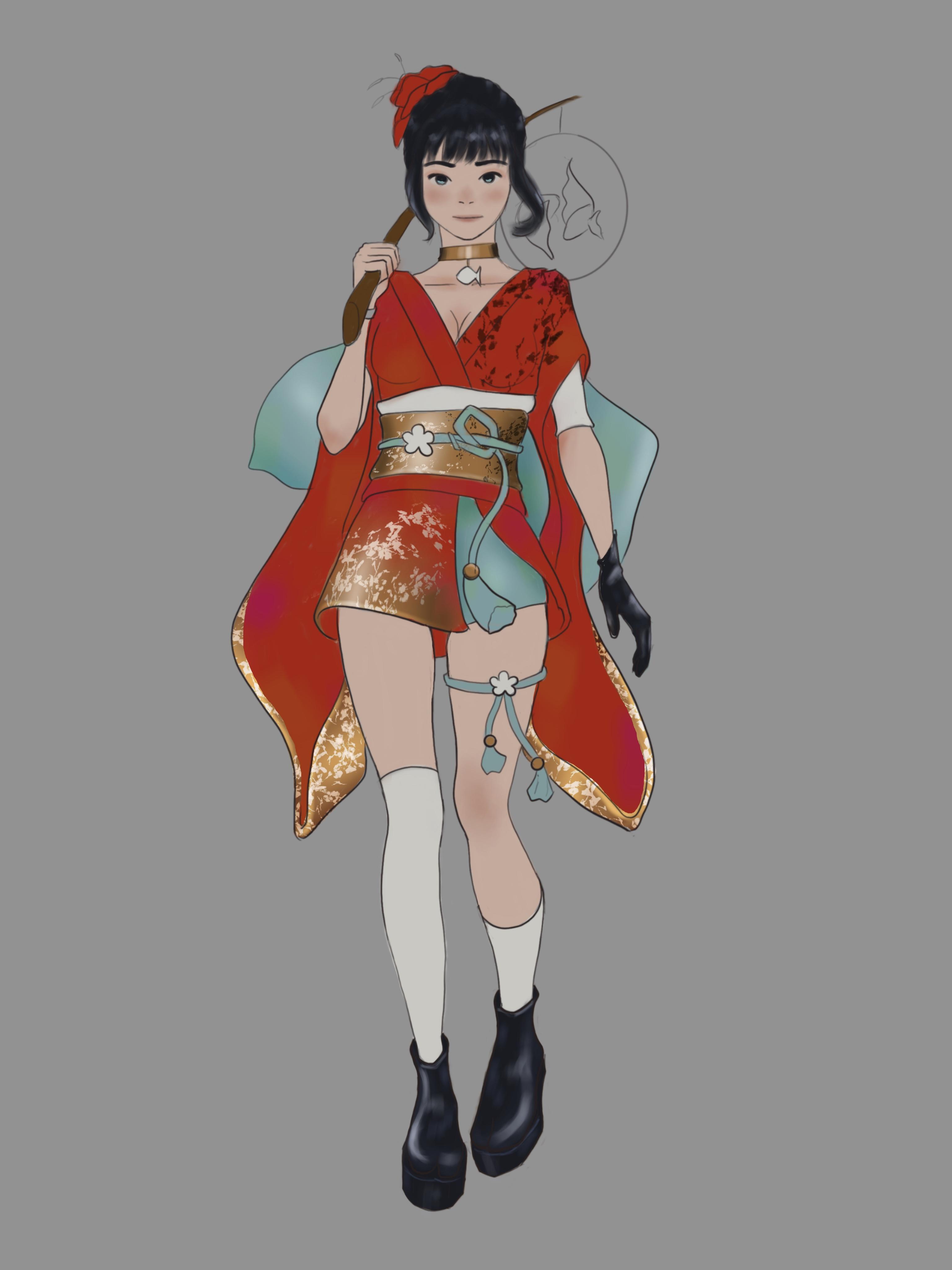
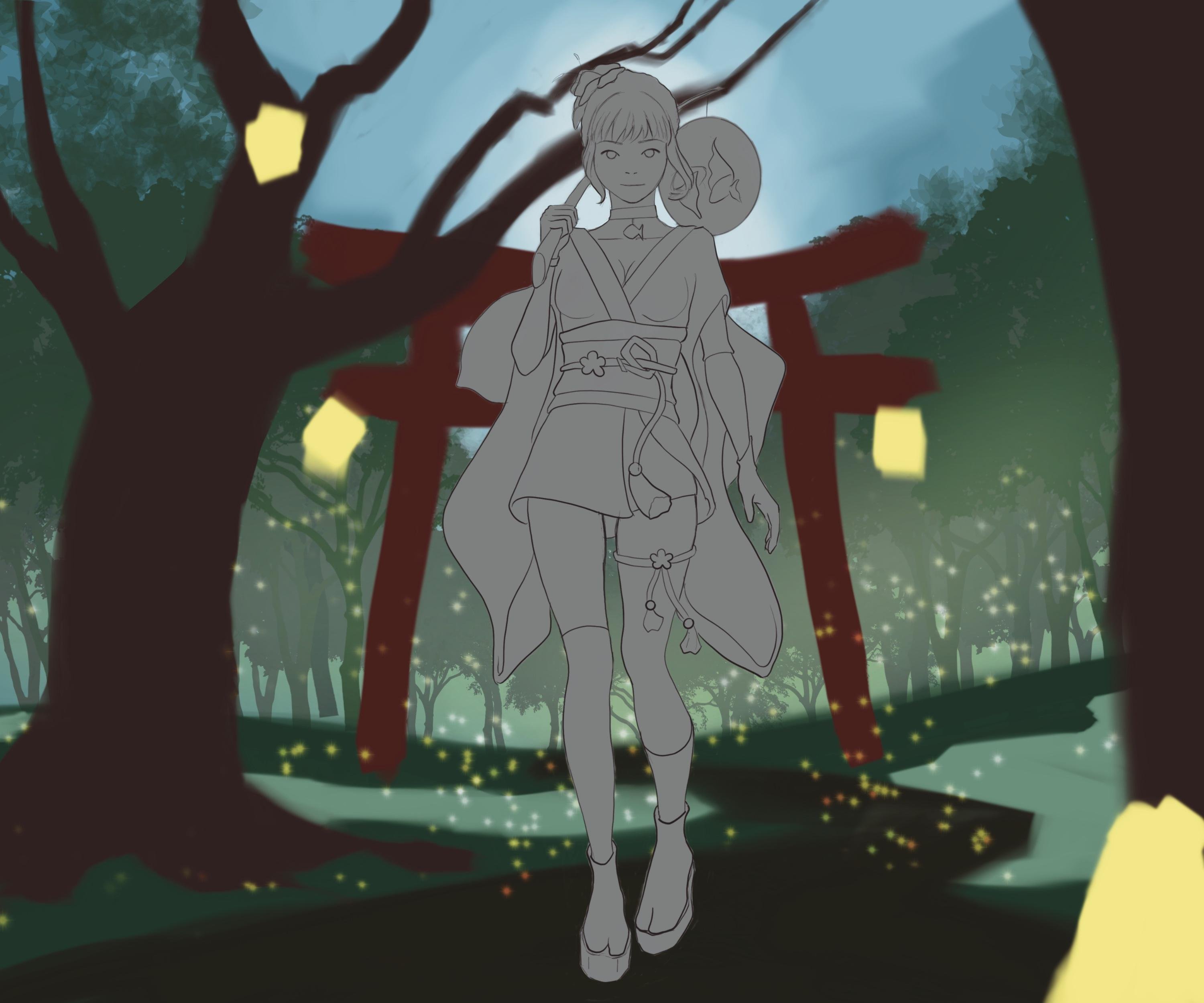
12. Background Detailing: Now that our character is done, we can finalize our
background as well. So this lesson will be about
detailing our background. I will demonstrate how I'll
do it on mine and give you general tips and tricks that you can apply to
your own painting. So to begin, go onto your
gallery on procreate, make a copy of your composition file and
bring it to the top. Now we will need to take
our current version of our character into
our composition, so you can see I have
completely merged my character and I advise
you to do the same. And I just drag my
character layer into my composition file and place it at the same level of my previous
character silhouette, and I adjust the size to match. And then I just did all my
previous character layers that I don't need anymore. For now, the character doesn't
blend in the gal painting, but we'll handle it later. In this lesson, we will focus
solely on the background. So now let's Jimmy do it. So overall, this whole step will be all about
purely painting, refining shapes and
adding details. So I'm starting with the story as did the center
part of the piece. You'll notice that it's very convenient that it's
on its own layer. Because I can simply erase the pins to shape
it the way I want. Once I'm happy with
its silhouettes and moving on to the tree. I'm starting by simply refining the silhuettes before
carrying about the details. Here again, the tree
is on its own layer, so it makes it easier
to handle it on its own without carrying
about its surrounding. For me that story
and that tree on the left side were the main shapes to handle
in this composition. Now I'm starting to
detail the tree. I start by selecting the tree. Remember, you just have to tap the tree layer and select
the select. Option. Like this, I can
paint on it without worrying of going
outside of its shape. Here again, if you have stable elements on the same layer, you can still
select it manually. It's just more time consuming. Then I start rendering the
tree directly on that layer. Here you could choose to work on a clipping mask or just
on a separate layer, but there are a lot of elements and it doesn't require
such a precise work. I prefer to render
on a single layer. I'm still using my same
square brush by the way. For the color I'm using, it's just the same
brown as my base color. That's a little bit lighter
and a little bit more yellow. The yellow is to match the yellow light
source of my painting. When rendering
elements like this, don't forget to use references. It's really like
traditional painting. I'm going with big brush talks to place the main
light source first, and then I lower the size of the brush and add
smaller details. Then I'm just rendering
the second tree. That's on the foreground. Now, back to the toy, I start to add a few more
light sources from the lamps, and I just start placing
the shadows as well. I'm still adjusting the
shape at the same time. This is why I haven't
selected my toy shape. I'm adding a little
bit of light, which comes from the sky. Now, for the little spot of waters to make it
look more like water. I just select it. They are both on the same layer, and I just add
some reflection to it with brush strokes that I apply very gently
to make it quite transparent and I add
some water wave details. I also add a few
more trees behind my existing trees to make
it like a denser forest. I'm just doing it by placing the same tree brush as before
underneath my forest layer. And then I start to
take my leave brush, the one that you can find
as an attachment file, and I start painting
a few leaves on top of my tree leaves, just to add like more trees, but ones where we
can't sew the trunks. Just a little precision when
using that type of brush, you still need to use
them as painting brush. Meaning that make sure
your brush size is right. It needs to be smaller for the further leaves and make
it bigger and bigger as the leaves are closer
to the viewer and also work with different
layers and different colors. And then I'm starting to paint some grass with a grass brush. Again, this is not mine
so I can't share it, but they're easy to find
with a simple Google search. And for brushes like this, the leaves are the grass. Make sure you're painting
the ones that are the furthest first and the ones
that are the closest last, so you can cover
them up each time, just like you would
paint traditionally. I just shapes here and
there when you need. B When the main background
is overall done, I will start to
render my lanterns. This is where the digital
at magic comes in handy because I will just
paint one lantern once, and then I will duplicate it and place it at several places. I'll just interrupt
the D more quickly to show you how to
duplicate an object. So you can either go directly
onto the layer panel, slid the layer that you want to duplicate to the left
and tap duplicate. But that works only if you want to duplicate a non
dire layer, obviously. A second option would be to select the object that
you want to copy. Go onto the menu that is on the bottom and select
copy and paste, and it will copy only your
selection onto a new layer. Okay, let's go back to the demo. Don't titate to
use several layers if needed to make it more
convenient to paint. To make the different lantern look a little bit different. Don't heedtate to use
the transform tool and to paint them a little bit differently each time once
they are copied and paste. Another cool trick
that I will show you is when you
have something in the foreground that
is very close to the viewer to make it more
realistic, you can blow it. To access it, you just have to go into the adjustment layer, select Gen blur and slide your pencil onto the va and adjust the
blotit as you wish. You can use the same
technique to make a how around the lens
to make them glow. And then I'm just
finalizing this step by painting some luminescent
fish for my my character. These details belong
to the character, but it's a lot easier
for me to paint them now because considering how
the light will interact, it's better to add those
details at the end. But that's just for my
particular composition. So here again, I'm using several layers to paint
it because it's easier. As you can see, it's a bit complicated for me
to get what I want. I'm just doing several trials until I get the
result that I want. When you're trying to
get some special effect, don't hesitate to make several trials yourself until you get the result
that you want. This is why digital
art is so convenient. With this, we achieved
the background step. To recap, first drag and drop
your character that is on a single layer onto your composition layer
or background layer, and then to render
the background, first work on the silhouette
of your different elements, and then you can start
rendering each element. So we is your turn, render your own background by using the advice that are
relevant for your painting. Recall that this is
not a rigid process. Just take what is
useful for you and walk the way that
seems more convenient. If you find it confusing,
it's very normal. Don't worry, it will get
easier with practice. The next lesson will
also be the last. Keep going, you're almost there. It will be about merging
the character into the scene by adjusting
its color and lighting. See you in the next lesson.
13. Merging The Character Into The Scene: We finally had the
last step of the cost, which is merging the
character into the scene. For now, the character is only painted with its local colors, but is not yet affected
by the ambient lighting. This is what we are going
to do during this step. You will see that
this is actually pretty easy with digital art. The first thing that I'm
going to do is to create a clipping mask on top
of my character layer, and this is for covering my character silhoutte with the ambient lighting
of the scene. So in my case, I
think it's mainly the dub blue sky that will affect the color
of my character, so I'm picking a dub blue. Of course, you'll
need to adapt it to your own ambient lighting. Then on my clipping mask, I'm sliding the double color on my character to cover
up its silhouette. Then I will select
a blending mode. In my case, overlay seems to be the one that
works the best. Like this, you can see that all the local colors of the character are tinted
with blue very easily. If your tint is too strong, you can lower the opacity
of your clipping mask. Now I will start to erase
where the light is heating. In my scenery, the
lantern should cast a very warm light
on my character. So I'm creating a new
clipping mask that I put on the play mode and select a bright yellow color like
the color of the lanterns, and I apply my light
on my character where I erased the
ambient lighting before. And you can do the same thing
for every light sources. So in my case, I have a second light source
which comes from behind, so I'm creating a
second clipping mask on ad to paint some rim light. I don't have to erase
my ambient light layer this time because rim light
happens in the shadows. Here again, you can
apply your light with big brush and then c it more
precisely with your eraser. So now you know everything
that you need to know. The rest of the
process is simply refining everything until
you're happy with the result. So I'm just showing
you my final artwork. I have simply refined the
lighting on my character. In the end, you can
see that I have changed my light blend modes. My lantern light on to
soft light this time. My ambient light is on multiply, and my rim light
is on color dodge. I think it's interesting
to show you those changes because it just illustrates that there is not
only one solution. You really just have
to play around with the different blend modes to see what looks the best
in each situation. Also, don't be afraid to
experiment and change things up. This step is also
the right moment to add some cast shadow
from your character. Or if there are some
things that are covering the character like some glass if it was standing on the grass. That would also be the
right moment to put it. And then what I have changed is the little specks of light that I just placed
before in a sketchy way. So this is just a brush
that mimics dust or what you could get
if you sprayed paint with a tooth brush. But I've put it in different
places on my layer panel. So bigger ones at the front, medium ones in the middle
and smaller one all the way to the back just to give
more depth to my painting. This would work with anything
that adds texture all over the painting like a rain
brush or a snow brush. You just have to
think about putting different sizes for perspective
for that type of brushes. Then the last thing I added
is that haze to brighten up the scene and
make it a little bit more yellowish or warmer. Really, everything is still
possible as correction. You could use color
adjustment as well. This is something that is
very used as a last step. That's it's congratulation. You made it to the
end of the class. To recap the last step
of the process is to merge your character into the scene on a color
point of view. All you have to do is to put
a clipping mask on top of your character layer and cover it with your
ambient light. Then just erase where your
light heat and then add as many light sources as you
want on different layers. Don't forget to play around with the different bled modes
to see what fits the best. Then all the rest is only
making some final corrections. This is entirely up to you on your feeling
about your painting. I'll leave it here and give
you your final homework, which is to merge
your character into the scene and give the final
details to your painting.
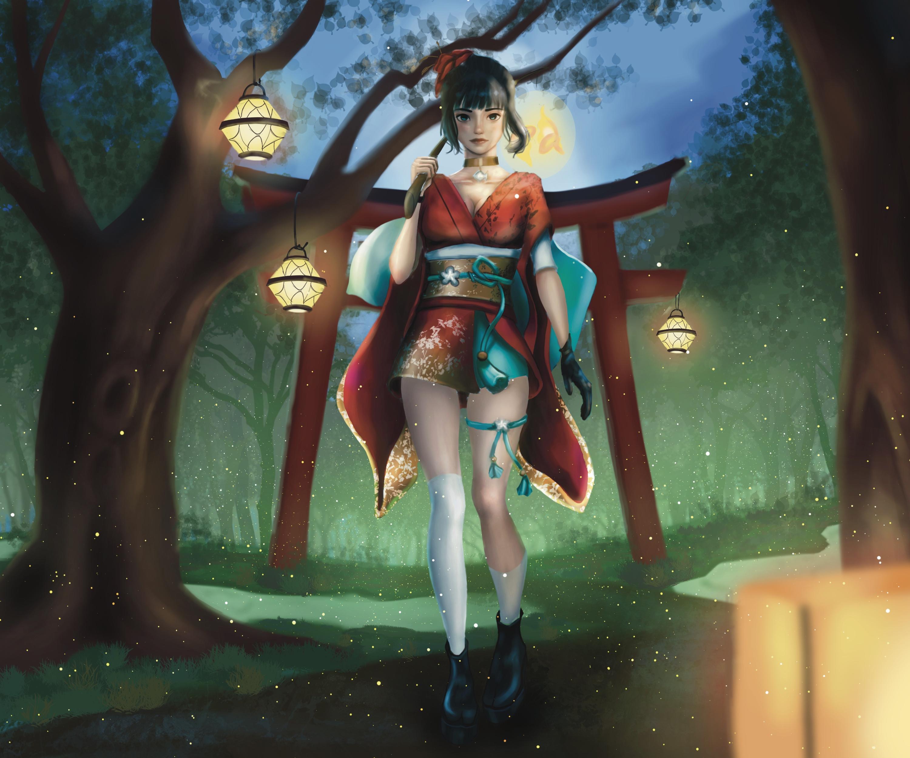
14. Conclusion: Congratulation for making
it through this sys course. During this course, you saw everything from
drawing, coloring, as well as using layers, masks, and all the transform tools, and other options that can
make your life easier. You also saw a very
detailed process of how you can create your
illustrations step by step, but you can adapt
to your own style. Process is something that is
very personal to an artist, so I hope this course gave you a good understanding of how
you can use the digital tool. Now, please remember
that everything that I showed the only
suggestion and that it's only through practice
and experimentation that you will find a process
that really suits you. Now, if you have questions
about this course, please let me know
in the commenton I'd be very happy
to answer them. Also, if you have suggestions
about how to expand this course or
about other courses that you'd like me to
create, please let me know. I'd be very happy to add them. I'm very grateful that
you took this class. I hope I served you well, and I'm excited to see you work. I wish you were happy drawing and I'll see you in
the next course.
 Fanny Richard, Illustrator & Concept Artist