Transcripts
1. Welcome to Crazy About Flowers: Hi everyone. Welcome to crazy about flowers. I'm so excited you're here and I can't wait to get started sharing my techniques with you. Painting from imagination is so much fun and so freeing. And the great thing is you get to create something that is uniquely yours. So all is you need are a few supplies, your beginner's mind, and your inner child. So if you're ready, let's get started. I'll meet you in the classroom. Hi.
2. 1 All About Brushes : Hi everyone. I
thought I would take a moment to talk to
you about brushes. It's a big topic and
somewhat controversial. Lot of artists believe
that you should invest in the best quality of brushes that you possibly can? Am of a different camp on that. I don't use the most
expensive brushes. And I don't use the most expensive brushes because I tend to
be really hard on my Brushes both how I use
them and how I clean them. So I would rather not buy really expensive
brushes for that reason. So basically brushes fall into a few different categories. One being your brushes from the paint store or
the hardware store. So you can get some
great brushes, especially larger brushes for doing your gesture drawing
or big backgrounds, that type of thing. So those come in handy
as does this type of brush that can be
nice for making, making marks and lines? Those are from the
hardware store. The other thing I use from the hardware store
is the roller. And so this is a foam
roller and on a cage. So I like to use that to apply gesso or to
paint my edges. One thing you have to
watch with these as you can get bubbles
with acrylic paint. So we have acrylic brushes. And acrylic brushes tend
to be synthetic fibers. So the synthetic
fibers bounce back. They have a nice spring to them. This is a three-quarter
inch or so flat brush, just straight up and down. Flat around brush. Bigger, flat, slanted brush, filbert brush with a little
bit of curved edge to it. Then we also have a fine
liner type of a brush. So those are kind of
the basic categories of brushes for acrylic
synthetic brushes. Then we have our
natural fiber brushes, which are usually
hog bristle brushes. These are used a
lot for oil paint, but you can use them
for acrylic to, especially if you want to do things with more texture and brushstroke because
they will leave their brush marks behind. So that's a consideration. And then there's these
small tip brushes which also come from either the paint store or the art supply
store, hardware store. They're really inexpensive.
They're around a 1.50. Those can be good just to
put a lot of paint on. I liked them using
whom for oil paint because I'm not too keen on having to clean
oil paint brushes, so I don't get too
bent out of shape. When I kept clean them. We have watercolor brushes. Watercolor brushes are softer. You can use these
in acrylic as well. When you use them in acrylic, you're going to use them on wetter type applications where you're making your
paint more like an ink. Maybe you're using
acrylic ink or you're using the
high-flow paint, which is an ink
like consistency, or you're adding mediums to
make your paint thinner. There's also Chinese
painting brushes. So these again are
very, very fine. When you get them wet. They can form into a point. These are good again, like watercolor brushes for
really thin ink like stuff because that's what the
chinese calligraphers do use. The other brushes that I
have are stencil brushes. And I'm gonna be
showing you how I use these stencil brushes are very firm and their cut
pretty straight off. And the reason for that is when your stance feeling is you're actually pouncing on
the end of the brush. You want it to have a good Hair accounts so
that you can load up your paint in there
and it's going to be able to stipple on there. So those are stencil brushes. The other brush I do use is the foam brush from
the paint store, hardware store or even some art supplies
stores carry these. I like using them for
all kinds of things. Painting edges on
smaller Canvases. Sometimes I not
show it some marks, cut out some shapes in it to make an interesting brush mark. Use it to apply brushes, and I'll show you
how to use that, but it's just an
inexpensive brush and it works really great. The brushes that I buy, and this might surprise you. But I actually like these children's paint
brushes by Crayola. They're super inexpensive
and they don't drop their hairs so they have
a good spring in them. They come in and sorted sizes in a container for different sizes. They come in the flat
and they come in that rounded one that
I showed you earlier. So in this particular one, they come in four sizes. In this, they're really
inexpensive, they're round $5. So you can find them
at craft stores, Michael Staples, walmart,
places like that. Then we go on to these liquid
tax-free style brushes. Now these are paddle brushes. And this again, you can
get a smaller size, but these are really good if you want to make big broad strokes. And the other way I use them, it come on a handle as well. I use these for applying
varnish is and I just kind of keep a brush just for that so that it stays
nice and clean. Other brushes that I do like
using, these are expensive. The silicone brushes, so I have the
collection of them and the silicone brushes are
kind of like plastic, but they're silicone so they
are somewhat pliable on the end and you use them
like you would a scraper. So they're basically a
scraper on a handle. And they come in
different shapes. I like this little
pencil shaped one for making marks
back into wet paint. And these ones are
great just as scrapers, but they are expensive. An alternative to that
is these catalysts, wedges, which are a scraper
that fits in your hand. And they're really comfortable and again, they're silicone. So this particular one
is probably my go-to. They also come in
different colors with different notches in them for
making interesting marks. The same color coordinated
ones come as a blade. I think they call
these ones blades, so they're on a stick. These are fun if you're working farther away
and a big piece and you want to make a lot of
marks or maybe you just prefer having something
that you can hold, like a brush opposed
to a scraper. So either way, they come in a few different colors with different types of
notches in them. But you could also just
use an old bank card, credit card, membership card, whatever for scraping that's inexpensive alternative as well as would be a chunk
of mat board. Another thing that
comes in handy for spreading and
scraping paint is just one of these inexpensive
squeegee from the dollar store or
the hardware store. The other brush that
I do like using is this freestyle brush
from liquid techs. And it's a plastic
type of a brush. But it's great for splattering. So that can be fun. But you don't need
that necessarily. He who could just use your trusty old paintbrush
and you can get splatters with that two palette knives. This is just a plastic when
I do prefer metal ones, but the plastic ones are super inexpensive and they can be
good for mixing your paint, but also for paint applying. You have a little less
control than with the brush. Breyer. This is a soft gray or these
are made for print makers. But mixed media artists
use these all the time so you can use them at
anytime in your painting too. Move your paint around. They, they really give a
different effect than a brush. And you can just experiment
with them if you have one. The other tools, these
aren't really brushes, but the other things
I do use a lot are mark-making type
tools and that would be bamboo skewers or
a knitting needle. If you don't have these
items, not to worry. You could use the
end of a brush. So I do that often too. If I don't have
one at the ready, I will just dip my
brush the other way in, Scratch back into it. So you certainly can get
by with a few things. One thing you want to make
sure is you have as big of a brush as you can possibly
use for the size of Canvas. So bigger is better. You want economy
of brushstrokes. So try not to use a tiny
brush to do big job. That's it on brushes. If you have any questions,
please let me know.
3. 2 How to Use the Brushes : In this lesson, I'm going to show you how to use the brushes. Now we've discovered the difference between the brushes. Let's take a look at what you can do with them. So I'm going to start with this inexpensive flat brush has a few hard hairs in it too. I'm noticing this has heavy body paint. And you're going to notice you get a bit of an edge when he put this on straight. And also with heavy body, you're going to get some brush marks when there's very little paint on it. And I'm going like this. That's a technique that's sometimes you want to do called dry brushing. So next I am going to try this filbert brush. So it's a little bit different in the sense it's rounded on the edge. What you're going to notice with this one is you don't get as hard of an edge like you do on the square brush, the flat brush. Still, you can get the same dry brush techniques. And the edge of this as different as I've got a rounded edge if you're doing strokes like that. So it really depends on what you end up liking. A palette knife. Okay, I know this isn't a brush, but it's another way of applying paint, especially if you like thick juicy paint. So you can bulk your paint up by adding some gel medium to it as well. So I'm going to also show you a foam brush. So when you wet your brush, before you start, you always should weapon just so that the brushes and absorbing paint and that goes for all brushes and just squeeze it out so it's, it's fairly dry. And I'm going to in this case use some fluid paint. And so this is a sponge brush. And I like it for doing various mark-making to you can get a great types of marks happening. So it's a way of making pattern circles. So that works really well with a fluid paint. Okay. What I didn't show you was when you're using a flat brush. You can also use it to get a nice line. So again, this works with thin down paint. So if you're thinking of flower stems, That's a good way to go about it. So alternatively, you can use a small, tiny brush called a liner. And again, you need to either water your paint down or use a fluid paint. Don't be afraid to also wiggle your brush around. I dipped it in purple too. So you can get some interesting marks and lines by doing that. It's a great brush to sign your name. So let's see. Let's try putting some on with the scraper. So the other thing we can do with that is we can scrape some off. So sometimes if there's color underneath that would reveal some. Also with the scraper, we can get really, really thin coats of paint with it. So you can see that that line is, whoops, just revealing itself slightly under there. So scrapers, a nice way to to get a lot of pain down quickly As you see. Okay? Other things we can use, of course, is the silicone brush, which is going to basically work like this gray paper, but it's just going to be on a brush. So it depends how you like to work. But the other thing with these tools, you can also use them for getting some vertical marks and taking paint off again. Now, bristle brush and natural bristle brush. Is going to act a little different than your synthetic brushes. So you may get more brushstrokes. I picked up some purple layer two. Although this is, this is going down pretty good. One way I like to use the natural bristles or any my brushes really is just kind of blending across. Smoothing the colors together. No, That's a real technical term, but we can also use a brush up and down and get some textural effects. Go on like that. So I have a couple of colors happening in there. So I'm getting a little bit of pull back with that. So using a tool to take some paint off can leave marks in your paint as well. My paint is already actually set up and dried here. Well, all right, I'm going to show you this brush because it's a lot of fun. And for that, I like to use a really watered-down paint or an ink or high-flow paints. So this is from the liquid techs pre-sale brush series. And I'm dipping it in this high-flow ink paint. It's quite Massey. Make sure you have lots of space around you. And you can get some nice glass. Now if you don't have one of those, because most people don't use a toothbrush. So you can get some pretty good spots with a toothbrush to sometimes adding a little bit of splatters around can unify painting as well just by adding a little bit of color here and there, but not actually a brushstroke. So one thing I notice is people don't use enough paint on your brush. So really be aware of that. And when you run out of paint loaded up, I see a lot of people making extra strokes on their paintings without paint, so demonstrate that. So I've got some paint. I'm painting away. And I'm still painting. And I'm still painting. And I'm painting over here. Well, now it's to the point I am dry brushing. So you want to keep your brush loaded up. You can use each side of your brush, play with your brush to see what it'll do. A lot of times I put it on the edge. This is why I don't like buying expensive brushes because I'm hard on them. And I like blending my colors in together like that. So so this, when he put one color over another, that is called the optical mixing. So you are actually mixing right on your painting. So red and yellow make orange. So that should give me a bit of orange, yellow. I think I had purple in there, so it's not very clean. Okay. We didn't try this particular brush. So a pointy brush is also going to be great for flowers, stems, any kind of line work. And be free with your brush. So the other thing I noticed is a lot of people hold their breath like a pencil really close to the feral. And that's great if you need a lot of control. But if you want to paint loose, you want to hold your brush back further. And if you have short handled brush and you wanna get really loose, sometimes I even tape a dowel or a twig on to the end to extend it. So get in the habit of seeing what your brush will do. Twirl it around, see how it will leave some interesting marks. So those are a few ways to use your brushes and try different brushes in your paintings. So I hope that was helpful and I look forward to seeing your marks.
4. 3 Working with Stencils: In this lesson, I am
going to show you how to add pattern
with stem cells. So I think stencils are
a great way of adding some marks and repetition and pattern in your composition. And it's just another
thing that adds interests. So you can start with
premade stencils. There is lots of these small six-by-six inch ones that are not that expensive. And I think they also make
great collage papers, especially if you
have a jelly plate. So they're fun for making
your own collage papers. You can also scale up to a
bigger size of stem cell. So at 12 by 12. And as you scale up, the pattern generally
gets bigger as well, which is good,
because usually on a bigger surface we
want a bigger pattern. So one thing you
have to remember about stencils is
the pattern you are getting is the positive
and negative space. So the cut-out space, not what you see, so it's the opposite. So keep that in mind. But there's some really
fantastic patterns out there that you can get. Other things you might
find for a stencil are things from a home, home or hardware shop. So this is a kitchen sink mat. And I love the little squares. So there's all kinds
of things like that that can act as a stencil. And you can also find architectural stem cells in
the drafting department. So something that's geometric or like all squares
are all circles. That can be fun. You can cut
your own stem cells as well. You just need some transparency
film or you could use lightweight cardboard like from a cereal box and just give it a couple of
coats of clear medium. So there's lots of ways
that you can come up with making your own stencils of your own unique patterns. Now I'm going to show you how to apply the paint through
this stance health. Though I've selected this
stencil with dots on it. That's going to repeat some of the shapes that I have in here. And I'm going to be using this stencil brush and
some dioxazine purple. So something really dark. I'll just use the
live paint here. So what do you want
to do is just dab. I like to keep this a
little more random, not making a square
full of dots. If you were doing
this on a boss, then maybe you want to
say within the shape. But for this, I'm just going
to do a little bit random. Know, I could also turn this upside down and
maybe get a bit of a relief pattern going with
what was left on there. So we don't want to
just put a stamp necessarily are essential in
one place on our painting. We want to repeat that. Because repetition again is one of the elements of design. I got a little
heavy-handed there, so we don't want to have too much paint or it's
going to seep under. There we go. If you don't have
a stencil brush, I'm going to show you
another alternative. Again. Now, if you didn't want to use
the pattern on this piece, you could have a separate
piece of paper beside you to put the pattern on and you'd be making
some collage paper. If you don't have
a stencil brush, just go to the dollar store and get a bunch of
makeup sponges. And these work really well too. So again, you just Pound's. The problem with using
a brush is that you end up getting paint
underneath the stencil. So this prevents that from happening and you get
a nice crisp pattern.
5. 4 Applying Pattern with Stamps: In this lesson, we're going to take a look at using stamps to add pattern and optical texture. So the illusion of texture. So pattern is one of the elements of design and it can make a painting that is maybe feeling kind of flat and boring look interesting. So stamps are different than stem cells in the sense that what you see on the stamp is exactly what you're going to get on your substrate. So I think there are a great way to add some pattern, whether you use stamps that you buy or stamps that you've carved yourself, or unorthodox sounds that maybe you found in your recycle bin or at the hardware store. So have an open mind about things that you can stamp with to make texture. So here I have some rubber stamps of various types. This one is actually not rubber. It is a Indian block cut for textile printing. But it works basically the same. This one is a nice font as like all world letter. And this one has a bunch of different patterns around the block. So it's great to have a variety of sounds. And traditionally they would have been used with a stamp pad. But with acrylic, I prefer to actually paint them. So that's what I'm going to show you today. So I'm going to use a dark color. Let's use this dioxazine purple again. So I'm going to paint not unnecessarily covering up every little bit of it. You don't have to because it is going to give you a square image. And if you felt you put too much paint on there, which I may have, I am just going to use a paper that I have on the side and take a little bit of it off. So let's go ahead and see how this looks. It's a way of adding another layer on. And these start to become like ghost prints. And I like to have that variety because it makes it more interesting. Also, when you're stamping on a paper, that's going to be a future painting. You want to make sure that you use your stamp around the whole painting and think of it as shapes, sizes. So don't just stamp as if it's a repetitive pattern of wallpaper, but make it a little more interesting. And you can even take it off on the edges as well. So you just don't want to end up having it like a cat ran across your page there. Yeah, so that's how that Sam would work now to clean your stamp, I just like to use a baby wipe and get that excess off rather than dunking it in my water. At the end of the session, you can try and take soap and water too. But I find this works really well. Okay, so that's how you would use a rubber stamp and the batik Sam for the textile sample. But then there's a whole range of other things that you could use to get pattern. And these are things that you would find around your house in the hardware store, maybe a shop to the dollar store. You can find various things that have a pattern on them or would give you some kind of a raised edge. So Recycle Bin is great. This is just of course inside of a paint roll. It's going to put a bit of paint on there. It's hard to see how much I have. And again, we can get some nice circle motifs going on. This would do the same thing with a bigger circle happening. The brush. Interestingly enough. You could also have some paint out and just kinda dip this in. But this can give you an interesting stipple effect or you can use it like that. I like using a brush in places. If I'm even doing graphs and those kind of textures. So that's great. I like this insulation pipe as well because I can get it to make different forums just because it's cut in half. And of course a court can always be a good stamp. Just gonna take a little bit of that off. K. This cork isn't working as well, I guess just the way it is formed on the end. It's not quite flat enough. It gives some interesting shapes. This is a grid pattern that I often use, especially if I want to do something like window panes or cityscapes that have a lot of windows in them, or buildings, that kind of thing. But you could use it to, in a still life on a tablecloth. This is from tiles, the underlay of tiles. So you get this from a construction site or from your hardware store, they sell it by the foot. So Yes, so many things that you can gather up and use. Another thing I like to use. Oh, okay, so have fun with sounds and seeing what you can come up with if you don't have rubber stamps, I'm sure you can find some opportunities in your recycle bin or around your house. See you on the next lesson.
6. 5 Adding Collage Paper : In this lesson, we're
going to take a look at collage paper as an
element in our work. And we can put it in at anytime. It can be part of the
background or it could be added during your painting or near the end of
the year painting. It doesn't matter. So I have
a collection of papers here. I like to use black
and white a lot. So this could be either
something that you buy these origami paper or you could just make black and white photocopies of something that you've done. That works well too. This is painted tissue paper, which is nice
because you can get it's the same color
as your palette. And I like upcycling old
music books and dictionaries. That works well. This is a piece of handmade
paper and patterns. These are great tissue paper that you can use in your work. So I'm going to show you
how to put them on now, these are either like tissue
paper or the weight of, I would say computer paper, not maybe not quite
similar to computer paper. Wait, so the heavier the weight, the heavier the glue. So I like to use gel mediums. So this is soft gel. But you could use regular gel
would work as well or yes, paste would be another thing. Don't use your best brush necessarily for this
because it is glue. And if you forget to put
it back in your bucket, Well, you know what happens? End of that brush. So I'm just going to
put some on the back. Now, a really good tip is to use a magazine on the side so that you get glue
on the magazine. Now what I like to do is to
use a scraper to put it down. Or your hand works good to
miss a little in that corner. We want to make sure that it has good marriage and it
doesn't have air bubbles. So again, with paper, I would use the same
pattern in several places. But what I'm most interested in is showing you
different weights. So this is tissue paper. And tissue paper is a
lot harder to glue, like I did that one. So what I tend to do instead is use a medium
that is more fluid. So this is going to be
runny like our fluid paint. I like to stick to a more
glossy medium just so that it it doesn't distract from the color
and Matt it down. Oh, that's not how you do it. Sorry guys. Let me put this on instead. So I've got that glute. So also ripping,
I like group Torn Edges a lot that has a
straight edge, which is okay. So let me show you
with your scraper. And that's gonna get
any excess glue out. And if someone goes over top, That's totally fine too. Just seals that in. In fact, he should seal it in. Otherwise it's going
to be super absorbent. Okay, Now onto the tissue paper, what you're going to
notice is this is quite transparent,
which is cool. And rather than painting underneath or trying
to glue it on, I am going to paint
through the paper. So the paper the tissue
should be absorbent enough. Hopefully this is because
it has paint on it. It certainly works with
patterns really well. So this is by far
easier than trying to glue the paper
and then put it on. So again, using a scraper and this will probably
get wrinkles in it. It had a few anyway, but they're so fine and thin that it just kind
of adds to the texture. So again, with your
pattern pieces, these ones definitely take
look to painting through them. So I like using these
small squirt bottles. They're handy any kind of squirt bottle just to
keep your glue in. As in, I said glue, but it's, it's acrylic medium, which
is acting like our glue. Now it dries totally clear. And that's what we want if
you actually use glue like maybe Elmer's glue or
something like that, it may not dry as clear. So I just stick with
my acrylic mediums. So you can see these
are transparent and that just builds up some
extra interests for us. So again, I've got a lot
of random pieces on here, but you would want to have some repetition happening
so that it doesn't look. So hodgepodge, right? Like you went to
the thrift store and you want it
some cohesiveness. So one of the, um, elements of
design is repetition. And again, when
we're doing collage, you also want to
think of variety and variety in
sizes of shapes and also edges are
interesting to have some Torn Edges and
some straight edges. So I'm going to show
you with a credit card. You gotta keep it fairly flat. I don't like it as
much as the wedge. The wedge is a
little bit softer. So it tends not to
pull it back the same. Just grips a little different. So if you want
invest in a wedge, These are, I think
around $10 and they're certainly worth it for
lots of applications. So that's how I apply
various collage materials. If you were working with
something heavier than say, computer paper, like maybe cardboard,
corrugated cardboard, you might need to step up
the gel to a heavier gel, but this covers most papers
that we would be using. So go ahead and try adding
some collage interior work. And it can offer some interesting surprises
if you put it on first, or you can do it deliberately
as you go along, have fun.
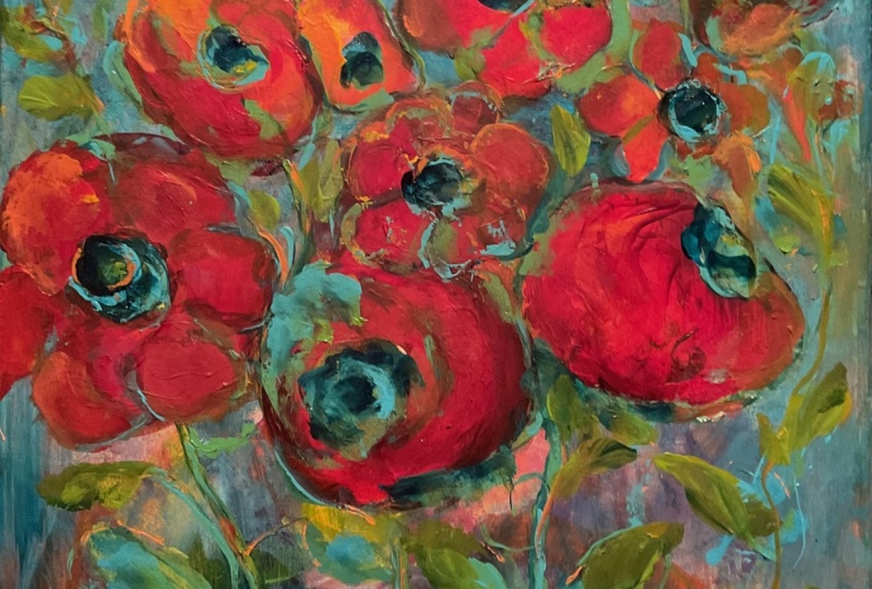
7. 6 Paint the Background : Hi everyone. We're going to get started in this lesson by
painting our background. Today I'm working on the Strathmore mixed media paper and I'm working in
a smaller size. Just because I'm filming. You can work on as large
piece as you want. You can either use
paper or canvas. The tools we're going to
use for this are a scraper. Now, I like the catalyst blade. The catalyst blade is ergonomic, fits nice in your hand. It's made of silicone
and it cleans up nicely. So that's one of my favorite
ways of applying paint. If you don't have
a catalyst blade, you could use a bowl scraper. That works nice as well. Or he could just use
an old credit card, bank card, hotel card, whatever. You may also need a pallet
knife or want to use a palette knife or
spreading or for decanting your paint
out of the containers. A brush not necessary, but sometimes you may want
to just finish the edges. For this method. I prefer to, to actually
scrape it on and you'll see why you get such a
different effect than if you are brushing. So those are the tools now, as far as the paint, you can use any kind
of paint you want, student grade or
professional grade. I'm going to use Museum, which is a student grade
paint in the bright red. I'm going to use a
golden heavy body paint, the cadmium orange. And this would be similar to what you
would get in a tube. Then I'm going to
use some fluid. A paint from Golden in
the dairy light yellow. Now all these colors
are pretty transparent. That means one is going to show through the other
and they're gonna, they're gonna mix together. With that being said, we want to stay on one side or the other,
the color wheel. I'm like you've seen
staying on the warm side. But you could stay on the cool side and pick
blues and greens. What you want to remember
is when you mix the two, if you put red and green down or yellow and purple
or blue and orange, any of the opposites, what you will make is brown. To ensure that doesn't happen. Less, just stay on one
side of the color wheel. Now you want to choose
the color that you want your flowers
to be in the end. So I'm going to have reds and yellows and orange
showing up in my flowers. This is going to be my
predominant flower color. I'm going to just start
now by squeezing some of this out onto the surface. For these ones, I'm going
to use my palette knife and put some paint
around in a few places. This is very random. Scrape that off or wipe it off, I should say so I don't end
up contaminating my paint. Sometimes I do. Try not to put an
over amount on. You can always put more out, but it's harder to put it back. We're just going to
use a scraper now and look at how beautiful
that blends out. You want to hold
your scraper pretty flat on quite an angle. If you hold it up right, you're gonna get a
different scrape and you're actually
scraping the paint off. We want to keep
the paint on there and we want to mix it as we
go as you can see there. Because I'm thinking
of flowers that may inform how I move my blade. I'm not going to go up
and down, back and forth. Flowers tend to be more
organic and round. I'm going to maybe
keep that in mind. Again. We don't have to cover up every little bit of
white. Right now. I'm just going to the
edges to try and use up what's on my my blade here. If you have a lot
of extra paint and you're picking way too much up. You can have another
piece of paper beside you and just wipe it off
on that or have some deli, paper that you can make into
collage papers for later on. So don't waste the
paint by wiping it off in a napkin or rag. Go ahead and do this. Remember to say on one side or the other,
the color wheel.
8. 7 Add Visual Texture : Hi everyone. Welcome back to the second layer of making marks and optical texture. So for this lesson, we're going to use a brush to apply our paint onto our various mark-making tools that we've collected. So I'm going to basically use these like you would a stamp and you can use a rubber stamp as well or a stamp that you've cut yourself for this because we're going to be doing flowers. I like to pick things that have circles. Reminds me as centers of flowers later on. So you want to start with a damp brush and just put it in your water, take the excess off so it's not too wet. And I'm going to be using teal and ultramarine blue. So we're working on the opposite side of the color wheel. If you started with blue, you're going to be working with red and yellow. Now this teal color is trans, is, pardon me, is opaque. And it's going to act like a sponge does. Pulling back a little bit as we go. So I'm going to do a little bit more with this one. Repetition is a good thing. I've changed the shape slightly with this by just pushing it in. Okay, that looks pretty good. I'm going to try some other tools. So I have this, which I showed you earlier, the lovely soapy folder. So let me go ahead and put a little teal on this again, I'm not going to cover every little dot on here just so it's a little more random, not looking like a soap folder. And I'm going to put a few these dots around. Other things you can use, of course, would be a cork. Works really well. Let me change up the color here. So I've got some ultramarine blue. Let's put a little imprint of the stamps. Sponge stamps, these are from Martha Stewart scrapbooking. So you can try those two. Anything that you really have are confined in your Recycle Bin works out to be great for mark making. So we don't want to totally cover what we did before because we do want to end up having the bottom layer be the top o the sponge had quite a bit of water in it. So the last thing I'm going to use is this perfume, lead. And it has a nice kind of oval, almost like a leaf shape. So I'm going to paint that edge and start placing these around. So there's no limits to what you can use for sure. Anything that inspires your imagination and check out your recycle bins. And I'm sure as you go along you're going to get more and more ideas. And if you feel like making something intuitive, like I did there, but you certainly don't have to. This is just a shape, but it does kind of inform a flower. And I like that. So again, we want some repetition. We want some variety of shapes as well. And do you can even use something as small as the backend of a ballpoint pen can work well to make some small shapes. So go ahead and pull out your toys that you've come up with and make some marks on your substrate and just have some fun. Don't worry about where it's going to go. Just play, have fun. And in the next step we're going to look and find the negative shapes. So I'll see you in the next lesson.
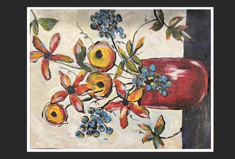
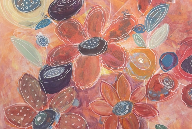
9. 8 Finding Flower Shapes : Hi everyone. Well, now that we've made our optical texture with all our mark-making tools, we're going to get started finding shapes. Here's an example of one I did earlier. And you can choose to either put your flowers in a vase, um, and set it on a table like that. This one's kind of a big piece. Or you could make it as if they're just growing with stems coming down to the bottom. Your shapes can be as realistic as you like or as whimsical as you like. So the one thing to determine is the orientation of your paper. If you've worked on something rectangular, you may want to work on it more in the portrait orientation rather than the horizontal one. But entirely your choice. You can find shapes. Of course I've got one there that became a very strong flower shape. It's kind of a little bit towards the center, but being a flower and other flowers around it, I think I can make it work. So what we're going to do is try and find some shapes that are already there, or at least a starting point. And we're going to use chalk or I also have a charcoal pencil. So anything that's going to be able to just wipe off if we don't like it. So I am going to use this shape. I don't really have to mark around it, I don't think because it shows up anyway. So the shapes we're going to leave the colors of. And so we want to leave as much as possible because we can always get rid of things later on. So I'm going to start as that being my dominant shape right there. And then I'm looking for shapes around it. So I like the idea of maybe using this here for my center. And then there's a nice petal there. I don't necessarily have to fill out the whole flower. I can give the illusion of the flower. So that is getting me some repetition. We want to have repetition in our inner shapes, but they don't all have to look like the same flower. Also, we want to have some variety in shapes. So even though the flowers in the garden might all have grown the same shape in our bouquet. We want to make the flowers feel like they're different sizes. It just makes for a more interesting composition. So I'm thinking that I may put this in a container opposed to just having flowers growing on this piece. So I would look for a container. Start of a container vase type of a shape in here and see where it goes. But the one thing I probably don't want to end up with is putting it smack dab in the middle is not the most interesting composition. So a little bit off to one side or the other. So with that being said, I'm going to look at this and see where the most interest lies. And I think I'm going to go on this side. So let's see what do I want in there and I can always erase it. Let me work with a stronger chalk here. So maybe it goes like that. I'm going to put a little table top on the bottom there. So this can be as whimsical or real looking as you want it to be. And now I know that my stems need to come in and where my stems go. So I think I'd like to have a flower coming down here. And then I usually like something going out of the page. So maybe this looks like it could be a nice center, but then I could also use that as a pedal, or I can use it as a leaf. So many choices. These three shapes here. Could maybe be a branch. So let's see how about if I tried this. I'm thinking that flowers kind of big four down here. So I'm just going to take a wet, damp paper towel and see how easy it is just to make corrections at this stage and just gonna take that off. Think about that for a minute. So I go up here and use that for a shape. I think I'll do a different shape of flour. So maybe something whimsical, an interesting lead, a stem. And then what if I go back in here? All righty, So I got that going on and be good to have, repeat this shape again. So where do I want the centered via kinda like this too. What if we leave? That is the kind of a flower. And then maybe put a smaller one of those down over here. Maybe I'll use that as my center. Yeah, I don't want to make this as big like I said before. So this is a process we want to get this part kind of right. Not sure. I like that curving into the was there. Maybe I'll just make the single, thankfully kind of little flowers. And then what about this side? Can leave that as a leaf or something going over top of my vase here too. So the thing with flowers, they often have odd number of petals. I end up with six on that one, but often they do have odd numbers. Sometimes that can look better, especially five is better maybe than six, but it doesn't matter all that much either. We're just painting from imagination. Okay, So that gives you an idea. I didn't end up taking too much off the page. So let's see, maybe I'll put a flower and just going out of the page, we can also add stuff back in later. I think I'll leave leave a shape in there as well. Like I said, it's better to leave more because you can take it away easier than adding it back in. Okay, So that gives you the general idea. And when we come back, I'll start painting in around these shapes and you'll start to see it come to life. So go ahead and have fun. Try and get your composition figured out before we start the next step, because that's going to make your good painting if you do good sketch at this point. So you're not going to keep everything, but I'm going to show you how it's going to relate to each other because this may become a pattern vase. The pattern can be also in the tablecloth down here, but we'll change the color. So you'll see it all pulled together in the next step. So go ahead and make your composition and we'll come back and work on the negative painting. Have fun.
10. 9 Negative Painting Around Flowers: Hi everyone, Welcome back. I hope you enjoyed finding shapes and making
your composition. Now we're ready to get
started painting around these shapes with white paint. You could use a color, but I do like to start
first with white. There's two whites. One is zinc white, which is more transparent, and the other white
is titanium white. And titanium white
is high coverage. And depending on what and
how much he wants to cover, that is good for
totally obliterating. But if you want to leave some of these bits kind of
peeking through, I like to start with
the zinc white first and sometimes I mix the two. So I have a combination. So we're just going
to start by putting a coat around these shapes. We don't have to be
too fussy about this. Sometimes you might want to use a smaller brush just to
get close and in around. So you just keep working
at painting this. You can start to see your
composition come together. So you can see that some
of the under color peaks through, which is nice, but we will continue and
put a little bit more color and paint over this as
we build up our layers. Right now we're
just trying to come and find these shapes so we can start seeing
our composition. Okay, now you can see that
I've got the white finished. There's the shapes. I've lost the stems. Don't worry if you've
lost your stems because we're going to put
those back in later with, with pens and a fine brush. But I painted around the
vase. I left the table. So now what I'm going to do, I'm going to come into
these surfaces and I'm going to use some
transparent paint, but in a color. So I've chosen two colors. One is Othello Turquoise, and it's pretty transparent. And then the other one is
quinacridone, magenta. And so a pink and turquoise. I'm going to do the table, dark. I'm going to try the
turquoise on the table. And I'm adding a little
water into it because it is quite pigmented. So there you can see I'm
adding a little water. I'm going to now
paint around my vows. And this is giving
you a darker value. But it's also leaving some of that information
from underneath. And it's optically
mixing colors. So now we're getting some, some different
shades showing up in this tablecloth idea or table. And we can also
go back in later, add more things on top. Change it around a bit. But right now, think of
this as your underpainting. So we're just trying to get our values in and start to
see your composition more. So I'm liking how
that's bringing some of the shapes up and
there's still there, which gives us some repetition. So now I'm gonna go
ahead and do the boss. And you can see I have a
flower draped onto the bus, so I'm going to try and
stay away from that. But if you paint over it, it's okay because we can come back in later and put new
pedals on if we need. So don't get too fussed. At this stage. There'll be lots of
corrections to be made. So I'm just going to paint
in the vase and you can see how that's giving it a
nice dark value as well. Okay, so that's already
starting to change it. So because I added some pink and into here, quinacridone magenta. I'm gonna go ahead
actually and add a little bit into
some of my flowers. So just to give a little bit more definition
in some of the flowers, I'm going to start adding a little bit of color in places. So that's going to
attach my vows as well to the rest
of the painting. So I'm not really
seeing this pedal much, so I've put a little
bit of color into that. Because this is transparent. It's not going to hide
what's underneath. You're going to see those bits of texture and color
shining through. So that's gives us the
depth than the interest. So I'm not worried about
making each flower one color. I'm splashing a
little bit of color around on the various flowers. So that composition,
the color is carried around a little
glazing over a few of these. So I'm not covering the
whole flower anywhere. Now I'm starting
to get a feeling of that this is being
more connected. And did you see what
happened when I put that pink over the teal, I got a lovely darker shade
of purple happening there. So I'm gonna go onto
this petal now. So the next thing I
think I will do is go and put a little bit
of the teal seen as I've used it into the centers of some of
these so that we have a darker center that's
going to pop the flower up. And I'll, I'll do a little bit more detail
on these later on, but for now, I'm going to
just put a bit of centers in. That's starting to change
the whole look of this. Okay? So go ahead and try a couple
of transparent colors, adding some more depth
into your painting. And we all start obliterating some more of the background and adding
some more petals in. And maybe some more opaque
color as we go along. And then we're gonna do a little bit more line
work in the last step. So go ahead and work
on your painting. And I'll see you
in the next video.
11. 10 Refining the Design: Okay, now I'm going to come back in a bit and do a little bit more obliterating. And this time I've mixed a little bit of my teal, yellow teal in with white to give it a soft blue color. And I'm going to start coming back in and just soften some of this and highlight around my flowers a little bit more. So I'm not a big proponent of a lot of brushstrokes. So I try and get my brush strokes to lie pretty flat. And just trying to get my flowers to pop up a little bit more in places. So I'm going to continue obliterating. And you can see now it's starting to push my background back down even more. And you don't have to do it everywhere. But enough that your flower shapes are going to pop up even more than they, they were before. So now you can see that they're starting to become more contrast and the shapes are popping up more. So that's what we wanna do is provide a little bit more contrast in some areas you don't have to take it all away. And you can stay working in, in white if you wish, or you can mix a color that just a tint. So a lot of white with a little bit of color. I do like to use a contrast on my background. So a contrast would be an opposite. So I've got quite a bit of orange in here. That's why blue tends to work nice. And I've used, say, yellow, blue down here and in my centers. So by putting it as a lighter tone tint, it gives a nice combination and it works color wise. So that's what do you want to keep in mind? Is that the colors that you use a limited palette. And he keep mixing your colors out of just a few colors. And that way you're painting is going to be cohesive. So there that's starting to look better already. So go ahead and work a little bit more on making your shapes come alive stronger. And then we're going to start accenting the flowers some more. So I'll see you in the next video.
12. 12 Adding Stems : Hi and welcome back. You probably noticed that I've added a little bit more detail. I put it in Benny, the yellow around these petals because they were filling a little detached from each other. I used a bit of opaque yellow in this to just create a better pedal that would show up on the vase. And now we're going to start adding some lines into, have these flowers coming out of the vase. And also, I thought I would use a white, just a jelly pen and put in a few little white dots into the center of the flower to give it some interest as well. So you don't have to do this, but it gives it a little more interests and makes it kind of fun and funky. So I'll go ahead and work on those. And I'm going to use some variety of lines here. So if you like, before you put your lines and you could take chalk again and just draw where you want them. Or you could do it with a pencil. Just so you have an idea. So basically to make things look right when they're in a vase, it kind of needs to feel like things are coming into the center and that's going to make it feel, feel appropriate opposed to them coming maybe off straight into the side. Also think that stems are kind of whimsical. They don't necessarily grow poker straight. A lot of times are Benton curved and so you want to think about that when you're adding, not everything necessarily needs a stem either. So that's up to you. I'm definitely going to put a stem on this because I'm feeling like it's It's just hanging down there with, without anything. So this is a black pen is not working actually very well, but you could use other colors as well. These are color pans from the scrap booking section with two different nibs on them. So maybe coming in with some green, maybe some tendrils on that would be cubed. So just let your imagination go and think about how flowers luck to you. All right, so this one, I think I'll have the stem coming from here. It's a bigger flower, so it probably needs a bigger stem of you end up having a stem that you don't like. You can always go back and paint over that, so don't be overly concerned. So you could continue this stem in here, but you wouldn't necessarily half did. So the imagination can fill in some of the stem for sure. But already what you notice is that the bouquets starts to come a little bit alive when it's got stems attaching it. So that really helps. So this flower, I'm not feeling, so I'm not feeling so happy with it. I'm feeling like it feels a little bit too big. So I might adjust that a little bit and make it a bit smaller. But what, the other thing I wanted to show you is the acrylic pen. So I have this one and teal, which there's little bits of teal in here. It's going to shake it a little bit. So it's always fun to do a little bit of edging and places to highlight the petals. So this is acrylic paint. So that's another thing that you can use. And again, keeping your colored pants happening here. So the orange one. So also you don't have to like outline right around the flower. You can embellish the shape even beyond that, which is kind of nice too. So drawing around your shape. So go ahead and play with this idea. Make your flowers your own. And just have some fun embellishing and adding some details, adding some stems and lines. And I'm going to make some of these little thicker and more solid. Now if you don't have pens, you can use paint. It's just a little bit harder to do. So you want to have something fairly thin on your brush now I'm just going to make a little bit of green from my teal and my yellow. That's gonna give me a nice lime green. So you can use a brush as well. So I can do that. And this is a point in brush which is nice. Do you want fairly thin paint to do this? But then we can get a little bit heavier of a stem and places. So go ahead and have some fun with that. And when we come back, I'm going to show you another tool that I like to use. See you in the next video.
13. 11 Enhancing Petals: Hi, Welcome back. Now you can see that I've obliterated quite a bit, cleaned up some of my shapes, changed a little bit of some of the shapes. And now I'm going to come in with some other colors. And so I have some dairy light yellow that I used in here in the beginning. I have some cadmium orange, which is an opaque. So that's going to be good to define some shapes. And I also have a cadmium red. So I'm just going to go ahead and go on to some of these shapes and brighten them up a little bit more punch of color into them. But without losing everything that's underneath. I also may add some other petals to fill out my forms more. Now and over here I lost some of my petals because I painted over it. Oh, that was a little bit wet. I'm making a green leaf there. So I like if I put a color somewhere, I like to put it other places so that my eye keeps floating around onto the painting. So that's kind of a good rule just so that you have a little bit of the same color everywhere. Now I'm going to go ahead and add a little bit of my humble. Let's see, I'm going to add a bit of orange in places. So this is more opaque. And add a bit of this, again, putting it around in a few places. So now basically what we're doing is kind of filling out our shapes that we found and adding a little bit more color and interests to them. But keeping some of that nice underpainting that we had to show through and livening it up a little bit. So I think I'll add a little bit of red in places here to maybe maybe not, maybe that's too many colors, so well, I have the chance just going to wipe that out. I think I will stick more with the quinacridone magenta. Again, if you end up with too much paint, don't be afraid to blot back. This paint is very pigmented, so sometimes a little bit goes a long way. I like to get my finger in there too. Sometimes you can get a nice shape and a little softer touch then he can with a brush. Okay, so that's the next thing that you want to do is just finesse some of your flowers. And then we're going to start, this has to be absolutely dry. And then we're going to start adding some stems so they look attached to the vase and maybe adding in some other little buds and things to give it a bit of a fill out the forms and the shapes you can add leaves and as well if you like. So that's going to be our next bit. So go ahead and get your flowers. Looking a little more pronounced and a little more colorful by adding some opaque and some transparent paint to it.
14. 13 Finishing Details : Hi everyone, Welcome back. So I'm going to continue working on this some more. I've done a little bit adding a little bit more teal in places around some of the flowers. Coming back in. I change the shape of this a bit. Still not happy with, with this being maybe quite as dominance. So I'm going to show you how to kind of push this back into the background a little bit more just by putting a little coat avail on it. So again, I'm going to go back and use the zinc white so more transparent and I've got some water in my brush tool and I'm just going to take and glaze over this. Still going to be there but not as prominent and same with this flower and she's going to push it back a little for now. I might totally changed my mind and decide to get rid of it. For now. I'm just going to push it back into the background. So the other tool I want to show you how to use the fine liner. This is the nib that goes on top of the bottle. And just this white part comes off to expose this. Now, I have in here fluid, acrylic or high flow, I think, and it's a bit runny. So kind of a combination of high flow and fluid works nice. So I'm feeling like I want to pop something up. I'm thinking about my focal point now. And I'm really thinking I want this flower to be the focal point for two reasons. One is it's the biggest flower, but also the placement of it nowadays a little close to the center, but it's also part of it is kind of in this right quadrant. So I'm really going to accent on, on that to bring your eye to this particular flower the most. So I'm going to start by putting some white to surround the center to bring, bring some attention to that. And then I'm going to go a little bit around some of the petals. The reason I like the white light on this too, is because it's a little dimensional. It, it different than a pan in the sense that it kind of stands up a bit. So it gives another layer of depth. Now we don't have to go around every single petal and make it look very contrived, but a few petals, parts of petals kind of sketchily is nice rather than totally outlining every petal. So this flower is above this flower. I'm going to say this flower is going to be above two and white is going to make it feel like it's doing that. On this one too. I'm going to highlight some of the stems as well with white just to bring them into the vas more. This is also great to alter, Right? If he liked to write some words, you can go ahead and do that. You can add collage elements. You can just kind of keep playing with this until it feels right and feels finished to you. So not right. Happy with that. Soften that off a little bit. Okay. So I wanted to separate this a little bit as well from the vase. So it looks like it's sitting on top of it, not part of the vase. Okay. Now you do have to be careful that you don't work over top of something you've already worked because he will rub rub into it and this takes quite a while to dry because it's fairly thick and dimensional, but you can see that this creates a really different field by adding some white to this. And I think I'll put a white line across the table that too, just to accent that. Okay, I've done a bit more on this, added some little buds and to fill it out, I use the same stamp that I had originally used the top of the perfume bottle just to put a couple of shapes in. And then I also cut a leaf stamp. This is just kids fun foam glued onto a Styrofoam Delhi caret and used as a stamp and a couple of places just to give the essence of a leaf. So what I like to do is seal it with a clear gloss medium, at least at this stage. And you can do this at anytime during your painting. Make sure everything is completely dry before you do this. And I'm just going to spread a bit on here. And with a wet brush, I'm going to go ahead and just smooth this over the whole surface and give it an even sheen. And then I can still go back. This is acrylic, so it's totally compatible to go back over top of this and paint some more. So no need to worry about not being able to continue because you certainly can. And I'm still making decisions myself, whether I'm going to keep everything in here. And sometimes you need to look at this for a little bit to just make sure that you are finished or if there's something that's not settled with you. So this is going to also look a little bit and milky, but it will dry clear and it'll just give a nice sheen. And if you don't like it as glossy, you can also do another code and take the gloss down by adding a bit of matte medium to it. But I don't like to do the mountain it to the very end layer because it will DO your colors down quite a bit. Okay, So I think that looks good, flattened the brushstrokes. So I'm going to let that dry and then I'm going to make any last minute changes. And then I'll put another sealer coat over that because it will be probably a different sheen if I start painting on top of this again. So I like to do this though because it creates also a barrier. And if I try something on this and I don't like it, I can quickly wipe it off. It's not going to grip onto the paint as much because of this barrier layer and I'll be able to wipe it that. So just experiment and play and see what you can come up with. So it's been great. I hope you enjoyed the project and hope to see you again soon. Take good care.
 Patt Scrivener, Award Winning Abstract Artist