Transcripts
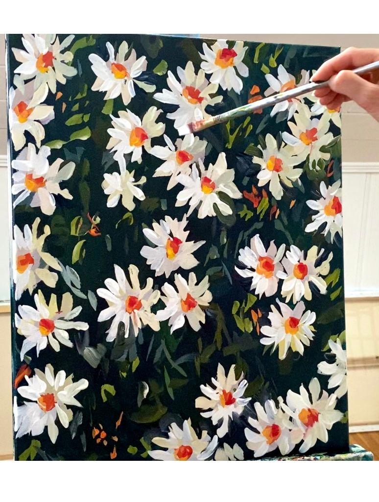
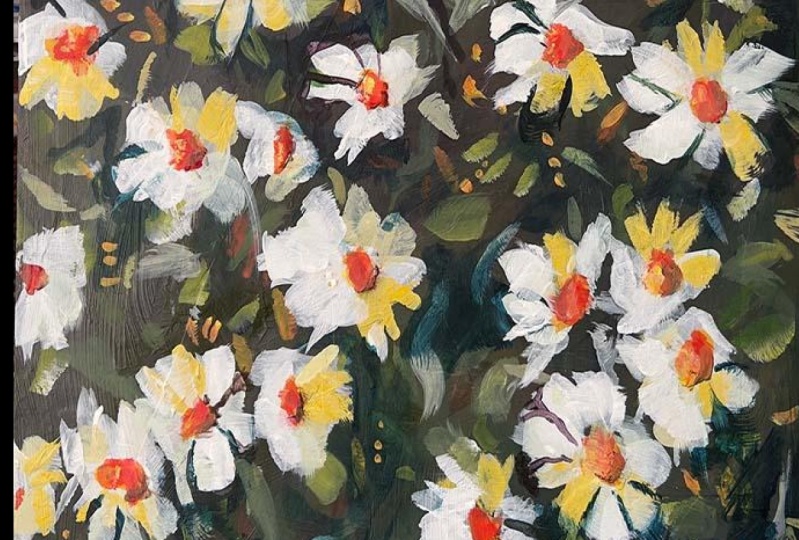
1. Introduction Supplies: Hey everyone, My name is L. In this class, I'm
going to teach you how to paint a large canvas, 12 daisies, just like this one. My canvas size is 16 by 20. I'm using flat long
handle paint brushes, and I'm using golden fluid
acrylics for my paint. I will list all of my exact pink colors and
supplies below the video. For your class project, I would love to see your version of a large daisies painting. You can take a
photo of your work and upload it to the
Projects and Resources tab, which is located
below the video. Alright, let's get started.
2. Tone the Canvas Dark: Okay, So I have my palette
off camera for a change. Since I'm using a large canvas, I have to use my easel instead
of painting on the table. So I have a mixture
of Payne's gray, turquoise, Hansa yellow
medium, and quinacridone, red. Some of my usual colors. So you have all three
primary colors so that I can mix something
close to black. When you mix all
three primary colors, you should get black or
something very close to it. So I'm trying to get some
greens and blues and blacks. Just want a nice dark
background to start on. To help me create my shadows. I'll give my painting
a nice sense of depth. Using this two inch brush
that I got on Amazon. Just a cheap brush using my fluid acrylic paint. So it's going on nice and thin. If you're using a really thick
paint or heavy body paint, you might want to use a
little bit of water or a medium to thin it out. So you can get it to spread
a little bit better. You want to get my
whole canvas covered. I don't want any of
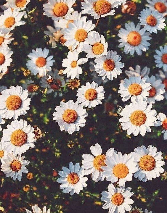
these little white parts of the canvas to show through. I attached a copy of the
reference photo that I'm using. I'm going to just do a loose
interpretation of the photo. Really just using it for
composition and color. I'm not going to
follow it exactly. Alright, so I'm going to
let this dry completely. And then I'm gonna
get started mixing colors for my flowers
and for my leaves.
3. Block in Flowers: On my palette, I'm
mixing Payne's gray with yellow and a little red
and a lot of white. To make a gray tone. I put a lot of red and
yellow more than the blue, so it's a little bit warm. And these are gonna be the
shadow areas of my flowers. I have a number 12 flat brush. And I'm not not trying to
paint each petal exactly. What I'm doing is squinting my eyes at the reference photo. And where I see the flower
petals that are in shadow. I'm putting down some
of this warm gray. Don't worry about the sheeps. Always go back in and reshape things later
if you need to. But I want my flowers
to be nice and loose. I'm trying to pay attention
to the placement. Not so much the
shape of the flower. Make sure I have
enough dark area in between the
flowers so I don't want them all to be right
on top of each other. I want to have some
large chunks of space, just like I'm seeing
in my reference photo. Holding my brush nice and loose. I'm going to just add a
little bit more white paint to my palette. And add a little bit
more blue this time. Still give it a
slightly different hue. It's a little bit cooler. I'm not sure if the
camera picks that up. That's going to be the
base of the flowers. And I'm going to mix up some, some of the little
leaf colors that I see in green and orange. I'm going to just keep
using the same brush. Take some yellow and Payne's gray to start with the
white on the brush, it makes a nice
subtle green color. I'm going to put in some
of the flux of color. Loosen up my grip on the brush. Just make some nice loose marks. You can paint over any of these marks that you
make that you don't like. So don't worry too much about something
that might go wrong. Going to take a little bit
more of the Payne's gray. Still using the same brush. I'm just working in a
little bit more gray. Just for some variation. Try to make different shapes going in different directions. I'm standing a little further
away than normal because I don't want to stand in
front of the camera and that might actually be helping with the looseness. So I would try if you're
working on an easel to stand stand as far back as you can and
really extend your arm. Overlap on some of the flowers. The flowers won't look like, they're just kinda floating. I'm going to grab a clean brush. This one's a number ten flat. I don't have another number 12. So I'm just grabbing this one. I'm going to mix some orange. That's why I'm using
a clean brush because that green would have made
my orange very muddy. See a little bit of orange
in places in the background. They don't want to overdo it
with the orange just yet. Because the middle
of my flowers are also going to have some orange. Going to leave that
for right now. I'm going to keep
using the same brush. And I'm still mixing
my red and yellow, going a little bit darker, so a little bit more
heavy on the red. I'm going to start to put in some of the marks and
the center of the flowers. They're going to have a mix of light orange
and dark orange to help us create the form of the flower is in
order to create form, you need some
highlights and shadows. You need that contrast
of light and dark. I'm just making blobs with
the side of my brush. I don't want them to
be perfectly circular. Just want a nice
loose look here. We're going to be
painting more white and gray and probably adding
some more flowers. So don't, don't worry if you're painting isn't
looking ideal yet, doesn't for me, most
paintings don't really come together until
the very end. They stay pretty
awkward looking through most most of the process. Okay. I am. And let this dry for
a few minutes and contemplate what my
next steps will be. I think once it's dry, I'm going to add a
little bit more gray and white to my flowers.
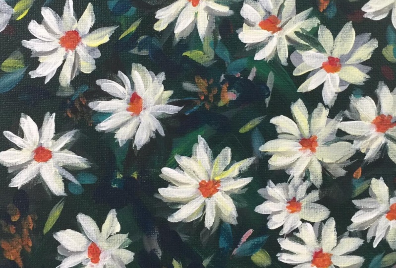
4. Layer the Flowers: So I'm mixing more gray with
my three primary colors. It's okay if it's not the same shade of gray
that you mixed before. Those subtle variations. They're gonna make your
flowers look more dimensional. If you paint everything
in the same gray color, and I'll end up in your flower, flowers, there'll be
a little bit flat. It's why I'm not
using white just yet. Because I want white
for the very end. If I just used pure
white on all my flowers, my painting will be
very flat looking. So I'm using my number
12 brush again. I just cleaned it out to
write it a little bit. Now I'm putting some shapes that are a little bit
more like petals. Just with the flat
side of the brush. Nice and loose. Nice, loose grip on the brush is helping to make my
shapes more organic. Remember anything
you don't like, you can paint over later. I'm gonna go in probably
at the end if I need to. Use some dark gray to correct
any mistakes on the flowers or leaves anywhere
that I overdo it. Which is my flaw in painting. I tend to overwork paintings. I'm going to add a
little bit more yellow. I want to get some a little
bit more variety in here. That might be too much. It's okay, I'll just keep
mixing things on my palette. I just mixed in a
little bit more blue and white to tone
that down a little. It's still leaning yellow
but has more gray in it. Now. Use all the different
sides of your brush. Can use the flat
side, use the tip. You can push the
brush in a little, make some nice bigger marks. I don't like that mark, so I'll probably
correct it later. Sometimes you don't
if you just leave it, just try to put the brush
strokes down and leave them and let it dry, step back. Sometimes you think
something's a mistake, but it ends up looking
fine in the end. Try not to focus too much
on each little detail. Because when you're
looking at it later you're going to look
at the whole painting. Not you're not going to examine every little
inch or you might, but other people who
are looking at it won't examine every little intro of the painting like you do. I'm going to put one
more flower in here. Maybe a couple of coming off the sides in different places. That's probably going to need
to be fixed a little bit. Right? I think I'm going to need
to step back for a minute, kind of evaluate
what's going on. I'm going to let this
dry and clean my brush and then I'll work on the
background a little bit more.
5. Build up the Background: He washed and dried
my number 12, and I just loaded up
my palette with all of my primary colors. Payne's gray. I did add turquoise. I don't know why. I'm probably didn't need
it, but that's okay. I'm mixing kind of
an ugly dark green brown with my Payne's gray and my yellow
and my turquoise. And I guess that's too dark
to see in this bright light. Maybe if I add a little
bit more you hello. I wanted to just add some
more noise in the background. And I also want to reshape
some of these flowers. So I can do that with the dark paint. If I want to add some
space in between, or if I got a little too
ambitious with my brush strokes. I think that wasn't
completely dry, but it's okay because
I'm fine with adding noise to the background. And I'm gonna be adding
white to my flowers also. So if you take too much away, don't worry, you can
always add more petals. I should be careful and put
all the petals on carefully. But for my personal taste and I know that everybody
has their own taste. It comes out a little
too neat looking for me. This to me is a look that
I prefer and I'm painting. The petals are not
all perfectly shaped. They're a little jagged. That's why I kinda blob
everything on at the beginning and then refine it a
little as I go along. Adding a little more yellow so that it's more of a dark green, which is helping
with the background. Adding more colors and shapes to the
background but dark so that they're not distracting. But hopefully they're
adding to all that kind of brush and foliage that's
sticking out in the background. You can even overlap what
you already put down. Make those marks a little
bit more abstract. Maybe all of my layering
over complicates things, but I can't I can't help myself. It's the only way I can paint. It's also helpful to
take a couple of steps back and get a different
perspective on your painting. Also, I'm working
the whole painting and I'm kind of jumping around, which helps me to be looser. If I just focus like
this is messed up to me, but if I just focus on that, but I'm going to overwork that one area and then they'll have other areas
that are under worked. So I kinda like to jump around unless I'm at the very end and I'm just doing final touches on certain areas. All right, so the
flowers are looser now. They definitely need more paint. I'll have to wait for
the background to dry. I'm going to put some more. I keep calling it noise
in the background, so I'm adding in more yellow. Add in a little bit of weight. You've got a nice screen. I'm just dipping my brush in the dark areas on my palette. Now I also am trying to make sure that the
background is varied. So I don't want
every single mark to be facing in the
same direction. I want some going sideways, I want some longer, some shorter, some thick sum. Then I'm just trying to step back and
evaluate a little bit. Mixing a little bit
of white into my Payne's gray with my
same dirty brush. And just put a little bit
of lighter gray, blue-gray. I feel like I'm overdoing it. So I'm going to let this whole
painting dry completely. And then I'm going
to lighten up, do some highlights
on the flowers. I'm going to do
some highlights in the middle of the flower by adding more white and
yellow into the orange. And hopefully that'll make them look a little bit
more dimensional. And that might be my last step, or I want to tone down
some of the background, but I'll see as the
flowers progress. Because I'm gonna be working in Whites and light
grays and yellows. I want to make sure that
all of these greens are completely dry so that I
don't muddy up my colors.
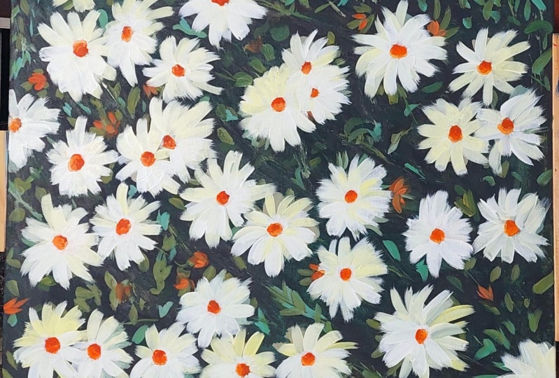
6. Adding the Details: Hope everything is dry. I'm grabbing a clean brush, a number eight flat brush, and going still
with a light gray, but much, much lighter. And I'm going to try to
focus the highlights more on the left side of the painting
as if the sun was shining and casting a shadow more on the right and the left is
a little bit more lit. Some layering, some much lighter petals on top of the ones that
are already there. Really just to add
some highlights. Don't want to cover everything. Because we need that. Those grayish tones and the background to help
bring out the highlights. I'm just still trying
to make them all different shapes and sizes. Standing back with a nice
loose grip on my brush. I liked the long handle brushes. I feel like I can
get a looser mark with the long handle ones. Yeah, I kinda overdid
it with this one, but if I want to, I'll probably go in with some
dark paint and fix that up. Hopefully you can see
the subtle shifts in the gray tones on the camera. I'm sure you can see
more of them in person. I'm going to just
keep going around. And I'm gonna go, I'm mixing a little bit more, a little bit darker gray again. And I'm gonna give
the other side. A little bit more of a shadow, maybe not on all of them, but just where I feel like it could use a
little bit of a shadow. I don't want them all to
be perfectly symmetrical, so I'm trying to
be aware of that. I think I overdid
it a little bit, which is what I usually do. So I'm going to take my dark. I'm just nitpicking now. But that's okay. Trying to take a slower look now at
any of the ones that I might have missed. Okay. Since I'm gonna be
mixing a lighter orange, I'm just going to
wipe this paint on a paper towel and then
keep using this brush. And I'm going to pick up
yellow and red and white. And I want to add a
little bit of highlight to some of the centers of the flowers to help them read a little bit
more dimensionally. So I'm trying to put
the lighter tones on the side where I put a white I'm just trying to
dab it in there. Nice loose grip. Hopefully that helps to give them a little bit more shape. Can pick up a little bit of red and put some darker red if you want on the dark side and get three different
tones in there. I'm going to pick up a little
bit of the lighter yellow. Maybe add a little bit few
spots into the background. Nothing crazy. I'm going to put
a dot of yellow. Just done a few of them. Because we like variety
in the painting. If everything looks the
same, you're painting. Just gonna be a little, I guess, boring Visually. We want things that
are different. We want different colors
and different values. Alright, I could stop here. I'm going to tinker
with it a little bit more by just fixing a
couple of the flowers. I totally missed petals
right there and I can't I don't know if I
like it or don't like it. I'm going to leave
it for right now.
7. Final Details: What I'm going to do
is use the same brush, just wipe the excess
paint on my paper towel. And I didn't let it dry. So this could be a little risky. I'm going to correct some of the flowers where I got
a little too ambitious. I want to try to
make those flowers, some of them a little bit wonky. On purpose. To add some visual interest. Mostly dipping my brush
into the Payne's gray. This is where I could
get lost in my painting just going back and
forth a million times, fixing the flowers and
then reshaping them. I'm picking up a
little bit of white, but I don't really mind
because that just makes gray. Just make sure if you
smudge with your fingers, you don't wipe your
fingers on your clothes. I have a bad habit
of doing that. Stepping back, trying to be mindful
of not overdoing it. Sunlight's crazy
today it was raining. It's messing up my filming. Alright, I'm not
gonna make you watch me tinker with this
or another hour. So I'm going to
try to wrap it up. I'm just grabbing a
clean brush, pure white. And I know that that's not dry, so I'm getting some getting a little Payne's gray
in there, but I don't mind. I'm gonna touch this
one up a little bit. This was fun. I'm glad I broke
out the easel to do this because I feel
like I've been in a painting and I really
needed to try something new. See, this is what I mean. Just some final touches. All I'm really
doing is just kind of quickly trying to evaluate each flower and see
if it needs anything. I really liked the yellow
spots on some of them and I have a little bit
of yellow on my palette. So dirty yellow. Put down a little
bit of clean yellow. I'm sure once I turn
the camera off, I'll find things that
need to be fixed. But, you know, I kinda like it. Turned out a little different
than what I envisioned, but I used that
usually happens to me. Case you were wondering, do I know what the painting is gonna look like when I start? No, not really. I know what
I want it to look like, but it doesn't usually end
up coming out like that. Alright, calling
this when finished. Thanks for watching. I hope you enjoyed the tutorial and please let me know if you
have any questions, and I would love to
see what you painted. So either tag me on Instagram or add it to
the Facebook group. I would love to see it. Thanks for watching.
 Elle Byers, Artist and Teacher