Transcripts
1. About The Class: I dreaming of painting realistic
watercolour portraits, but don't know where to start? In this beginner friendly class, I will guide you through all the essential
art school basics. You need to draw and paint lifelike faces with confidence. Hi, my name is Alexandrina, and I'm a watercolor
artist based in Poland. I will be your guide through
this artistic journey. I will share my knowledge from the art school and numerous
portrait classes I took over the years to make the process of painting
portraits simple for you. We'll begin by breaking
down the structure of the face in the frontal view and learning the
key proportions. Next, we'll explore mixing natural skin tones with
watercolors step by step. We'll also practice painting facial features
separately, eyes, lips, and hair so that by the time you start
the class projects, you feel confident
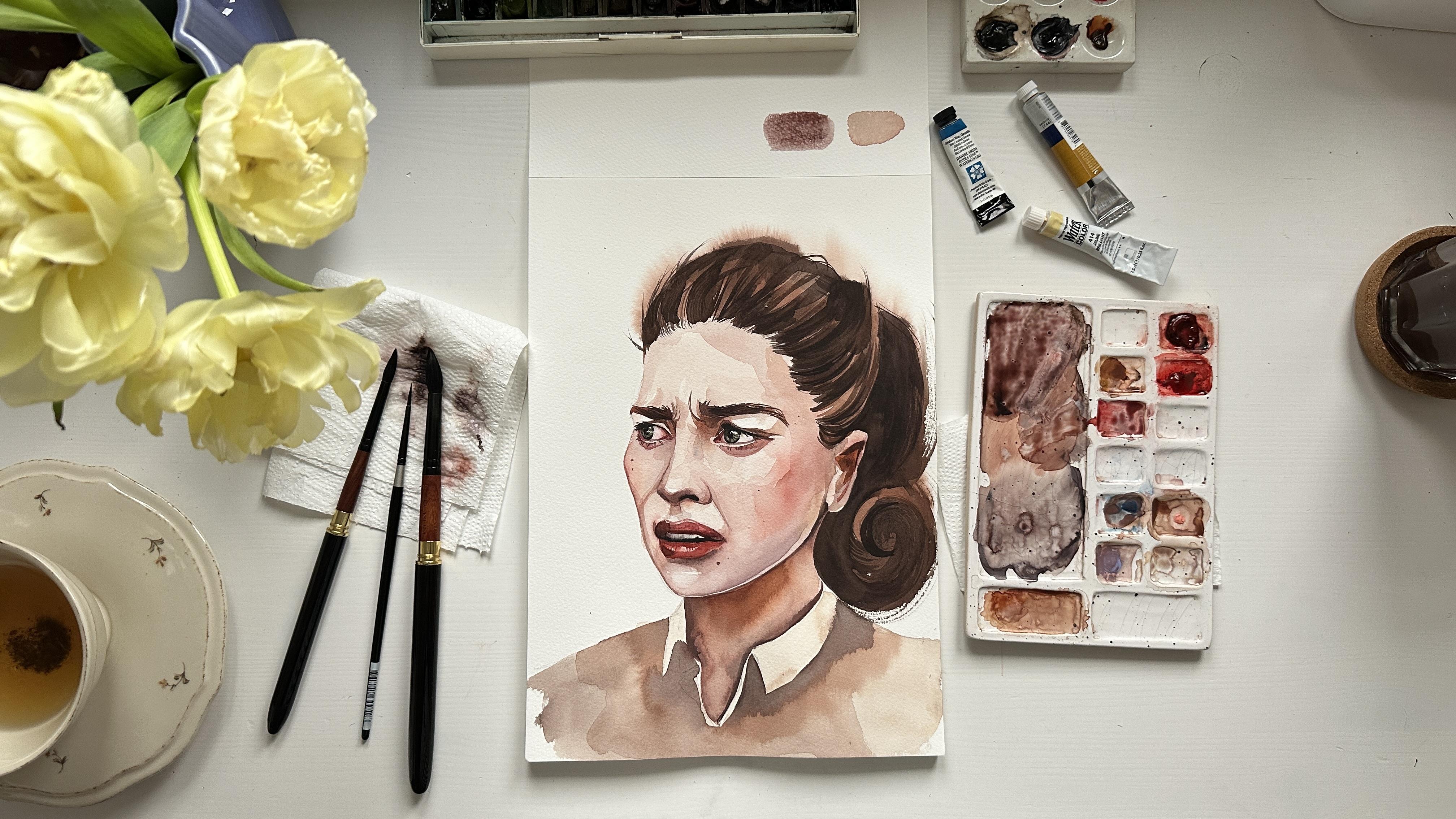
with each technique. This class includes two
full portrait projects, one with a straight on
portrait and another with portrait in three
quarter view and emotions. Now, let's dive into
the creative journey. I can't wait to see
you in the class.
2. Art Materials: Let me show you the
materials I will use. I will start with the most important one watercolor paper. I will use cellulose paper for little sketches
like eyes and lips. This is a glued pad, so I don't have to worry about paper got warped
because of water. Quite cheap one and perfect for practicing
with watercolor. Min project, I will paint
on 100% cotton paper, Kansan moulin duroy
called pressed texture. This is a four format, and it's one of my
favorite paper. It's more expensive, but the
quality is really great. I recommend you to
use cotton paper for your portrait because it
really affects the result. Will use two main
brushes by Fu Mui. It's natural round brushes, number 12 and number eight. They are actually
travel brushes. It's not important
for our project, but it's just useful. If you have these brushes, you can always take them
with you on the trip. You can order these brushes with 10% discount with my personal
code in the description. I will also use two
additional brushes, one also by fu Moi. It's a mop. Brush number eight. It's very good for covering big areas with water
or with color. And also, I will
need a small brush, number two, silver
brush, black velvet. I'm using ceramic palettes. It's perfect for mixing color, but if you have plastic ones, it's okay, or you can even use just ordinary plate or
something like that. I have also ceramic palettes for the colors because I'm using watercolors in tubes and also I'm using
watercolors in pens. And I have this watercolor set. And actually, it comes with
this plastic palette that you can also use if you have this plastic palette in
your watercolor set. For the watercouring pans, I suggest to use water in spray to rewet them
before painting. I have two glasses of water. One I'm using for
cleaning my brush, and another with clean water, I use to cover the
paper before painting. I also have kneadable eraser. It's an eraser that helps
to carefully remove the pencil lines from
the paper without damaging it and ordinary
eraser as well. I use a mechanic
pencil pentel with 0.3 millimeter lid and
a softness of H B or B. Okay, I guess that's it. The most important things. And now we can move to
discuss watercolors. So main four colors you will need it's
paints gray, yellow, Oca, Alizarin crimson
and lavender, while also some blue
shade cerulean blue. These colors are
most important ones, but I will use also
some other shades. I just love using these
colors for mixing skin tone, Sepia coral reef zinc white for the final
details as well. Also Jean Brilliant by PVC is a very nice shade
for painting skin tone. You don't have these
particular colors, you can replace them with the colors that you have in
your palette by other brands. In the next lesson, I
will show you color watches for all the
colors I will use. One thing I almost forgot
it's paper towels. It's very important
to have them to dry your brush or sometimes
even create the highlights. It's very useful. Now you one step closer to the main class project and the main portrait we
are going to create. Let's move forward
to next lessons.
3. Skin Tone Color Mixes: Let me show you
main color swatches and color mixes I use
for painting skin tone. First color I always use for painting skin tone
is yellow Oca. It's essential color in any limited palette for
painting basically anything. Next color is Jan Brillian and it has white pigment inside. Next one is a new
color by Daniel Smith, which is called Coral Reef. It's more pinkish and it also
has white pigmentt inside, and it's quite similar to the
color I love to use before. It's Red Brilliant number two. You can check names of the colors I mentioned
and links to the products in the attached
file to the class resources. Here is Jean
Brilliant number two, I mentioned before by PBC. If you don't have this color, it's easy to mix it
with a azarin crimson, yellow oca and zinc white. And our next stop is
a lazarin crimson. It's one of my
favorite red pigments, especially for painting
the skin tone. Next one is a perfect
warm red shade, which called Venetian red. This color is by white knights, but also it's very similar to
the moda brown by Schminke. There are three main colors
that make perfect skin tone, the yellow shade, red shade, and blue shade, as
in the color circle. This class I will use erleanblue chromium
by Daniel Smith, but you can replace it with other color like
cerulean blue, by Vang. And let me show you the
difference on the paper in the swatches because cerulean
blue by Daniel Smith, it's a bit more granulating
and cerulean blue by Vang, just pure, but more
bright blue color. Another color I love to use for mixing skin
tone is Lavender. I'm using Lavender
by Daniel Smith, but you can also use
lavender from other brands. Now we are moving to the dark
colors that help to create a dark skin tone or a color mix for painting
shadows on skin. The first color is hepe. The next one is pains gray, and it's also essential color
for any limiter palette, and you basically can mix
hepe from pains gray, azarin crimson and yellow Ocha. The last one is purple
color that I will use for mixing the
shadows for the skin. I use just ordinary
color white knights. Now let's move to the color mix and explore how we
can mix skin tone. First and my favorite color
mix is A lazarin crimson, yellow ca, and lavender. This creates a very nice, neutral skin tone
for the light skin. Next color mix that you can use, it's yellow oka, a lazarin
crimson, and cerulan blue. We can use just yellow oka and a lazarin crimson because the
color will be just orange, so we need to mute it down
with some blue shade, like purple lavender
or cerulean blue. If you see that the
color is too dirty, you can just add once again yellow
Oca sarin crimson until the color will
get the shade you want. This color can go more dark
than the previous one, so it's good for mixing the shadows for the skin
tone or a dark skin color. You can also control the
intensity of the color by adding more or less
water to the color mix. Now let's explore the
color mix for the shadows. I'm using Venetian
red by white knights, yape brown, and violet. It's basically the same colors as I used for the
lighter skin tone, but just one shade daca. These colors, by the way, will be also perfect for
creating the color for the hair. I can use coral reef, cerulean blue and yellow aka for mixing the color
for the pale skin. Try to experiment with the colors you have
on your palette. I haven't show you
the color mixes with Jan Brill number two, but it's also similar to
color mixes with coral reef. So I will use all
of these colors. And basically, if you
have just yellow oka, red shade, and blue
shade, that's enough. If you want to learn
more about color mixing, you can join my other
class on color mixing.
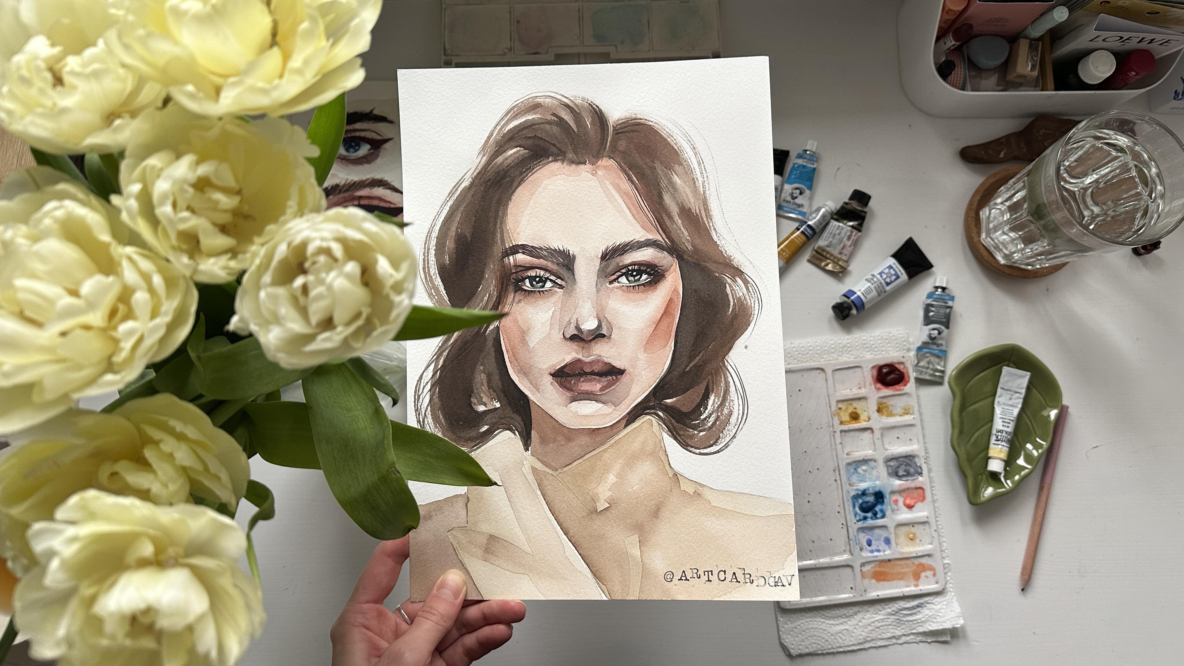
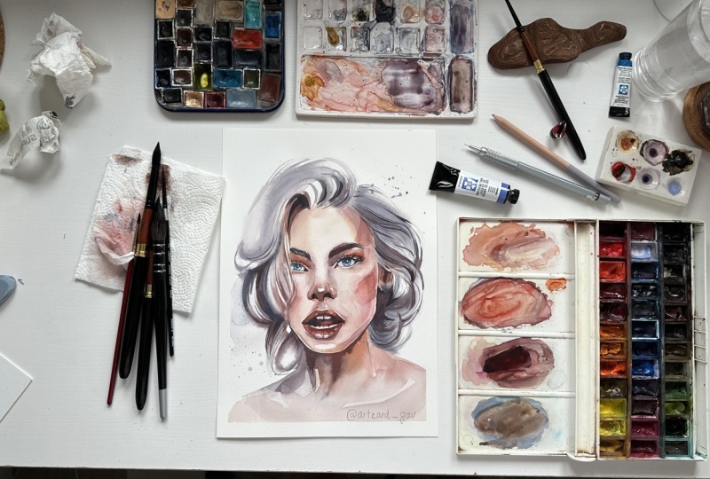
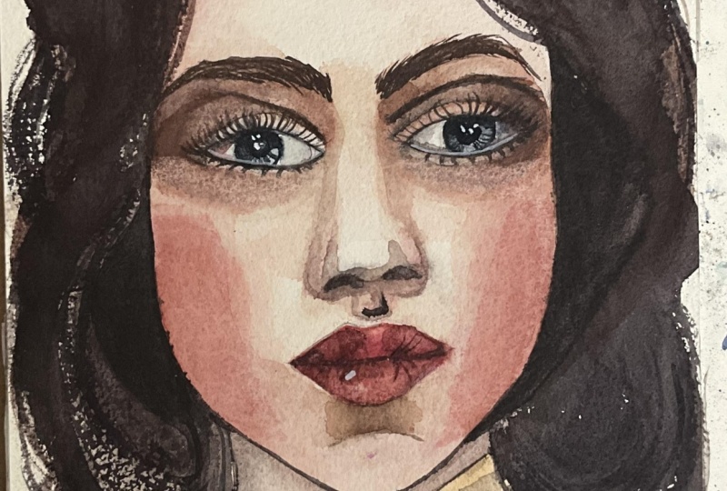
4. Inspiration: In my portrait journey, I've taken several classes from other artists to keep growing
and improving my skills. I'd love to share with you some of the portraits
I've created over the years and the
amazing artists who have inspired
me along the way. These portraits were
painted during a class on fashion portraits by the
Belarusian artist Nika. Beautiful portrait
class on Skillshare by Hazel Carsa which helped me
better understand light. The amazing thing is
that after the class, you get inspired to create
something of your own. This portrait, for example, you can find in my free
tutorials on my YouTube channel. Another portrait artist
that inspires me is Jane Bilata who has class on Skillshare
that I'm going to take. Sol Barris is another artist
that I took class from, and I really enjoyed
her technique. Rabia Ava is another artist that has a very unique style
and inspires me a lot. To be good at painting, you have to practice a lot. Practice matters the most. When I look at my earlier works, I can really see the progress and it motivates
me to keep going. Little by little,
painting after painting, you will become more
confident with watercolor. It just takes time
and some practice. Share your favorite artists in the discussion
under this class, and let's move to
the next lessons.
5. Face Proportions: In this lesson, we will explore
proportions of the face. To begin, mark the top point of the head and the bottom
point for the chin line. Measure the halfway point. This will be the eyeline. Next, move slightly down
from the top point. This will be the foreheadline. Now we will work only with the facial area between the forehead line
and the chin line. Divide this section
into three equal parts. These lines mark
the positions of the eyebrows and the
tip of the nose. Then divide the
bottom third in half. This will be the lip line. If we draw a line along the
upper edge of the eyes, we'll get the top
line of the ears. The line from the
tip of the nose marks the bottom of
the ears, ear lobes. If we draw lines from the
inner corners of the eyes, we'll find the
width of the nose, and if we draw lines from
the inner edge of the iris, they will indicate the
corners of the mouth. Also the line from the
inner corners of the eyes upward will roughly mark the inner starting
points of the eyebrows. The distance between the eyes is equal to the width of one eye. The distance from the out
corners of the eyes to the sides of the face is slightly less than
one eye width. Of course, all the
faces are different. So after we build up
these proportions, we can check how particular face differs from these proportions.
6. Hair Texture: In this lesson, we will explore how to make a brush strokes for the hair texture using bigger brush
and smaller brush. Prepare your art materials, and let's get started. First, let me show you the
things I have on my table. I have two glasses of water. I have more brush and small brush and also two
round brushes, middle size. I have watercolors in pans and
also watercolors in tubes. You can use either of them. I always have a
cup of tea because I'm a tea addict and I
have ceramic palettes. I will prepare some brownish
comic using yellow cha, maybe a little bit of orange just because I have
it on my palette right now and will add ape
to darken this carmix. I'm using brush number 12 by fumoi from
natural squirrel hair. This brush is more flexible and it holds a lot of
water and pigment. Let me start with one thing I see often in the
projects of my students. When you want to make a
smooth and straight line, make sure that you have
enough water on your brush. So if you press
your brush and make the brush stroke and the
edge looks like this, it probably means that you don't have enough water because if I press my brush and
I have enough water, the edge will be very smooth. You see how the color ends up in some corners of this spot, and it looks darken. So you can also use it for your advantage while
painting the hair. Also with even big brush
like a half number 12, I can make these very
thin brush strokes using the tip of the brush, and I can also drag the
color around and apply some more color in some wet areas of this
wet spot to increase, for example, the shiny
texture of the hair. I now the most impressive
brush technique that I use for
painting the hair, first, we need to
create a wet spot, and then I'm pressing the brush on the palette
and twisting it around. So the brush would have
a very separate hair. With brush like that, I
can drag some color from the wet spot and create very thin and quite
chaotic lines. Also, I can use this
technique without any wet spot just with
brush with color on it. I hold my brush vertically, and I just move it around
creating wavy shapes, and you can see that the
texture is very interesting. I use this brush for creating also grass texture for painting grass
in landscapes. And if you joined my
landscape classes, you already know this technique. Take your time to practice
because even for me, sometimes it's a bit
hard and I have to. I have to practice
before I apply these brush strokes on
the final painting. Also, I can use mix of
this twisted brush and very thin lines with
the brush number two using the very
tip of the brush. It also takes some
practice to control your brush stroke and to make
a consistent and wavy line. You can change from the thin
line to the more fat line by pressing the brush
in some areas and creating more bold brush stroke. The twisted brush
technique can be hard to make with the
synthetic brushes, so try to get a natural one or imitation of natural
hair, for example, the smaller brush silver
brush black velvet, it's imitation, but it behaves very similar to natural
squirrel brush. You can also practice in
painting the eyelashes with a smaller brush by making a one thin line and then
drag the color from it, creating the thin lines
for the eyelashes. Don't forget about perspective, so the lines won't be straight. They will be curved
around the eye.
7. Eyes Sketch: Let's start with a
sketch of the eye. First, I draw a horizontal line that will be the main
line for the eyes, and I'm measuring
three equal parts. So if you remember, the area between the eyes
equals to one width of the eye. I'm measuring this
distance using just my fingers and
pencil as a unit. Remember that in all
of our sketches, we press the pencil
very lightly because we don't want to leave any hard
pencil marks on the paper. I start sketching curved line for the upper pot of the eye. At this stage of the sketch, I can analyze on the reference
the comparison between inner corners of the eyes
and out corners of the eyes. All eyes are unique and
we need to understand is the inner corner lower than the outer corner or
not, for example. It also depends on the position of the head
and how we see the eyes. I'm sketching a lower eyelid. And now I'm drawing
the upper eyelid. This shape is also
very unique and you need to understand
where the angles are, how wide it is, and try to repeat the shape that you can
see on the reference. I can draw the parallel lines from the inner
corners of the eyes, and that's where
the inner corners of the eyebrows will be. Sometimes the eyebrows go a bit closer to each
other than this area. But for now, we are just
sketching it as the skin I see that on the reference, the eyebrows are a
bit closer to each other than just
from inner corners of the eye so I
can draw some hair of the eyebrows
closer to the center. There are normally shadow
parts going downwards from the eyebrow and on
the sides of the eyes, creating the area for the nose. And now I'm sketching the iris. Iris will be a round shape and a bit covered with
the upper eyelid. Basically, you can just
draw a round shape and then remove the line that
goes on the upper eyelid. I'm sketching the
pupils and there are always highlights in
them, not always, but normally they appear
to be white little spots, and I also like to place them
at the stage of the sketch, so I won't forget to
leave this area white. And also, I'm sketching
the eyelashes, placing them around the eye because the eye has round shape, so the eyelashes will be
curved around this shape. I can also sketch very
lightly the areas I need to make darker or lighter. For example, the area
under the e will be darker and this area under
eyebrows will be light. So I will have to keep it in mind when I'm painting
with wet on wet. Now I want to sketch some
eyelashes at the lower eyelid, and they also go around, and my sketch is done, and I will see you in the next part where we will
prepare the color mixes.
8. Eyes Color Mixes: Now I want to prepare everything
I need for the painting. I always have paper
towels next to me eraser, ordinary eraser, two
glasses of water. Before I start painting, I also want to use water
spray on my watercolors in pens to rewet them and to get them ready
for the painting. And now I'm placing the colors that I need from the
tubes on the palette. Get comfortable, prepare
your favorite beverage, and let's get started. Base color for the skin tone
is always yellow Ochre, at least for my color
mixes and my technique. So I'm placing a lot of
color on the palette, using quite a lot of
water because you can see that now the color
is pretty dense. And now I will just create the color mix and will
later add some more water. Apply some more zarine
crimson to this color mix, and now it looks pretty orange, and I need to mute it
down using lavender. If you don't have lavender, you can just use cerulean
blue or any other blue shade. I also add a little bit
of Jan Brilliant because it also has this
cold white shade. I add colors little by little, and if I can see that
the color is too cold, I can again, add
some red shade and yellow shade until it will
get the shade I need. And now I can just swatch a little bit of
color on the paper. You can use just scrap
paper because sometimes the color appears on
the palette a bit different than it will
appear on the paper. So it's better to check
it before you painting. Now I'm mixing erlean blue, Alizarin crimson and yellow Oca, creating some more dark shade for the shadows on the skin. Now, I want to make some more warm shade
for the under eye area. I'm picking up some orange
color mixing with yellow ocha, a little bit of lavender. And a little bit
of Jan Brilliant. I can also add a bit
of Venetian red shade. A little bit of sepia to darken
the shade and it's done. I clean my brush, and that's why I have
two glasses of water. One is a bit muddy and another one is transparent,
just pure water. Before we move to painting, I'm using needable eraser and remove the
strong pencil lines, leaving a hint as a guideline
for my future painting.
9. Painting Eyes: Let's start painting. I load my brush with a light
color mix for the skin tone, and I cover the whole area around the ice with
this very light mix. I use quite a lot of water. And since I'm painting
on cellulose paper, it will get dry pretty fast, so I have to work fast. Using brush number 12, quite a big brush with
natural squirrel hair. You can find a link to this
brush in the description of the class or in the touched file with my
favorite art materials. I dry my brush, and I remove the color from the lightest areas
under the eyebrows and in the middle of the nose and also in the middle of
the upper eyelids, where the highlight is. Uh I clean my brush and I load it with a little
bit of dark skin tone, mixing it on the palette
with the lighter one, creating some middle color tone. And I apply this color
under the eyebrows, and I start building
up the color for the shadows which are under
the eyes and above the eyes. But I keep the area of the
upper eyelid unpainted light. I want to apply some more
cool shade next to the nose, so I add some lavender to the
color mix of the skin tone, and I apply this color while
the surface is still wet. I can also paint some areas of the
eyebrows with this color. So Now, I will load my brush with a bit more warm shade
for the under ice area. This is too dark, so I will mix it a little bit with
lavender and yellow cha. And if I want to make
this color a bit lighter, I can also place it on the palette where the
light skin tone is. I apply this color around the
outer corners of the eyes. Now I will mix some
zarine crimson, yellow oche and cerulean
bloom to create some more intense dark
mix for the skin tone. Maybe a little bit of
champrillne to make it lighter, and I will apply it in the
corners under the eyebrows. Now, I renew my mix of
orange, venetian red, and a little bit of lavender to continue working
on the outer corners. In some areas, I can
drag the color to the upper eyelid to avoid this
rough edge of the shadow. I switched to my
brush number eight. It's also natural brush. So it's very flexible
and it's easy to remove the color from the paper or
to drag the color around. Now I'm placing the
cerulean blue to a little bit of the
color that left on the palette creating
this gray shade, very light one, and I started painting the
inside of the eye, the white area of the eye, which is not white. As we know that we cannot
leave any white areas. So we have to paint it with
even a very light color. I'm mostly placing this
color into the upper pot, where the shadow on the eye
is from the upper eyelid. And also outer corners
will be slightly darken. I'm trying to keep this mix
very transparent and light and maybe even clean the brush and drag it
with just pure water. In the inner corners of the eye, I will apply some reddish shade, leaving some white spot
for the highlight. It mixes with the blue
shade already applied and creates this
muted purple shade. I apply some clean water to make the edges not so rough
and just to blur them. And now I can apply
even more red shade. Now, I switch to even smaller brush number
two to paint the iris, and I'm mixing just
more blue shade, more intense blue with
the same core mixes. If you don't have color
mixes on the palette, you can just mix it
with a little bit of yellow oca and a little
bit of lazarin crimson, but keeping the blue
majority in this car mix. I applied the color
around to the iris, and then I can just
clean my brush and drag the color around to
create lighter area in the middle of the iris and
apply some more blue shade on the edges because
normally the eye will look darker on the edge
and lighter in the middle. Now I mixing paints gray
and cerulean blue and apply this darker shade at the
upper part of the iris. Don't forget to keep
the highlight in the eye in the pupil
to be precise white. I can paint some vertical
lines from the pupil to the bottom part of the iris, creating the texture of the eye. And now I can apply
dark black color into the pupils and let the color
blend with this blue shade. So we won't see any rough
edges on this pupil area. I'm placing some of the pin's green color
to the palette to the red shades that
I have because normally we don't use
pure black color, and I draw, paint the eyeline, a very thin line,
and the uperpot. For now, it will be like this, and then we will come
back to this area. Now I'm mixing some yellow
oka azarin crimson, lavender, maybe a little
bit of cerulean blue. I'm just using the colors
I have on the palette. It helps to create
more unite image. Now I will create a dark color mix for
painting the shadows. I'm using Venetian red, sepia, and a little bit of purple
to create darker shade. I can place this color
on the palette to the existing color mixes if
I see that it's too dark. And I will use this color
mix to paint the area above the upper eyelid to highlight this line that shows
the upper eyelid. No And we don't like rough edges, as you can guess already. So I'm cleaning my brush
and using more water. I drag the color around to create this shadow
under the eyebrow. I can use the color mix
with cerulean blue, more coal shade, and drag
the color towards the nose. Now I can also increase the shadow under the ice because it's quite
dark, as we can see. And also, I will need some more orange shade because it appears
to be quite warm. When I'm painting, I'm trying to mix the colors on the palette. It helps to create
more natural shade and not just pure orange or
pure red or blue color. So it helps to create
more muted shades. And now I want to add some color into the inner and
outer corners of the eyes. So I mixing the colors
on the palette again, and I apply this color to
the corners of the eyes. The inner corner will be
darker than the out corner, so I will have to maybe blur
the edge of these areas.
10. Painting Eyes Part 2: We continue working on the other eye using
the same steps. First, I will apply
dark color to create the line for
the upper eyelid. And then I will just blur this line into the shadow
under the eyebrow. And then I will move to
painting the under eye area. When I'm painting
the under eye area, I keep in mind that the dark area will be
next to the light one. So basically, I'm painting the dark area right
under the eye, then will be slightly
lighter area that I keep unpainted
or almost unpainted. And then I again
apply the dark color. I can apply dark color
mix once again to the area of the upper eyelid
to increase this contrast. I add some more purple shade to the color mix of
Phoenician red and yep, and I will use this
dark brownish color to paint the eyebrows. But it's better to not
use just one color, so I will add some more orange and
more erlean blue maybe to this color mix. And I create the brush strokes imitating the hair
on the eyebrows, just like we learned in the
lesson with hair texture. I'm holding my brush
almost vertically and doing very light and
thin brush strokes. I can add some paints gray to the color mix and apply
some dark shade while the area is still wet closer to the inner
corner of the eyebrow. Now I'm mixing
some purple shade, using a zarine crimson, cerulean blue, and mixing with colors that
are on my palette. And I want to apply
this color into the corners of the eyes because it's also
quite dark part. But I will have to drag this color with clean water
to create more smooth edge. Now I move to painting the
other eyebrow, and by the way, we can use not only small brush, but also a twisted, big brush. I'm using brush number eight, and I press it on the palette and twist
it with the colour. It also helps to create
this very random and quite thin hair
to the eyebrows. And again, I can apply some
paints gray to the color mix already have on the palette
and create some dark shade. Using this color, I will come back to painting
the eyelashes, maybe with a little bit
more paint gray in it. I will repeat
painting the eyeline. And then from this line, I will drag the eyelashes out. And they are not straight. They grow around the eye, so we have to repeat its shape. So the eyelashes in the center
will be almost vertical, and then they will go
around the eye like sphere. And with this color a
little bit lighter, I can darken the
edge of the iris, because normally, as I told you, it's quite dark and
darker than the iris. And I can also drag some of the lines from the
pupil to the edge, highlighting the
texture of the eye. I also applied some
pure paints gray color to the pupil and area below the eyelashes at the top of the iris because it's the
darkest part of the iris. And I will do the
same with another eye Now, I will use
slightly lighter mix, mix of paints gray venetian red, and I will paint the
lower eyelashes. They are shorter and
there are less of them. So I'm just trying to
add them in some places. In some eyes, you
can't even see them, so you have to analyze
your reference. And now using light
mix of lavender and some skin tone
and a lot of water, I want to create some more
smooth transitions between the dark areas and the light areas because now they are look quite artificial. So using big brush, I'm just applying this
light layer of the color. And our eyes are done. I will see you in
the next lesson.
11. Lips Color Mixing : In this lesson, we will
draw a sketch for the lips, and I start by drawing
a horizontal line. It's the middle of the lips. Then I'm sketching
the upper lip, trying to recreate the shape
that I see on the reference. I also place in the middle line, so the lips would
be symmetrical. I'm drawing the curved
line for the upper lip. This reference, I can see a little bit of the
teeth between two lips, so I'm sketching it. While we are working
on the sketch, we can also analyze reference
in terms of color values. So I'm trying to
understand where are the darkest areas and
where the lightest are. I see that there
are highlights in the middle of the lower
lip that is very visible. And also, there are
some highlights around the cupid's bow and
above the upper lip. Now, my sketch is almost done. I want to remove unnecessary pencil lines
that I don't need. And I can also
sketch a cupid's bow and the area for the
shadow below the lips. I can also sketch some lines to show the texture of the lips. Don't forget about perspective and that the shape of
the lips are curved, so you need to make these lines not straight
but also curved. Once my sketch is done, I will use kneadable eraser and remove the strong pencil
lines just keeping the guidance of the
lines that I can see but make them as
transparent as possible. Now let's prepare the
color mixes we will use. First, I'm mixing the skin
tone using yellow oka, Azarin crimson and lavender. I need a very light tone
and pretty neutral. So it shouldn't be
orange or pinkish. It should be very neutral. So if I add more Azarin crimson, I need to mute it down with
yellow oka and lavender. Okay. And try it
out on the paper. You can use just
some scrap paper. Now I want to prepare a
color mix for the lips. I'm using a lasering
crimson, yellow cha. And also, I can add some venetian red to
make it more warm. In another puddle, I want to prepare a light
mix for the lips. So I'm using already mixed
color, this red shade, and I add some lavender and water to it to
make it pale pink. I also want to make a color mix for dark
areas on the skin. So I'm using this red shade
that I mixed for the lips. I add some shape, lazune crimson and a little
bit of purple or lavender. So basically for
the dark skin tone, I just use more chape instead
of yellow oche and I use a little less water than in the light color mix for the skin tone where
color mixes are done, and now let's move
to painting. But
12. Painting Lips: Et's start painting the lips. I'm using the skin tone, and I cover the area around the lips with a very
transparent mix of yellow, oca, azarin crimson, and
a little bit of lavender. I use a lot of water, and I move my brush very
consistently with a big wash. Right now I'm painting
on lllose paper, so the paper will
get dry pretty fast. While the area is still wet, it's good time to
make highlights. I clean my brush dried on the paper towel and making
my brush very flat, and I remove some of the
color above the upper lip. Now, I use slightly
dark color mix for the skin tone and
apply this color to the cupid's bow
in the corners of the mouth and under
the lower lip. And now using the color
mix for the lips, I start by covering the upper
lip with this light mix. I let the color
travel in some places to the skin tone
if it's possible. And I leave some very
thin white area of the highlight above between the skin tone and the lip color. I can apply some more color to the corners of the mouth
because it's the darkest area. And also, I can reapply
some more dark color to the cupid's bow while
the paper is still wet. Now we continue working
on the upper lip, keeping the light
area in the middle. I drag some color around. And also, I try to recreate
the texture of the lip. I switch to the smaller
brush number two, dry on the paper towel
and lift some color creating the highlights and
also around the cupid's bow. I add some more dark color to the bottom part
of the upper lip. I keep some areas unpainted, especially in the middle of the lips to create
the highlight. I mix some more dark shade using Venetian red and a
little bit of orange, creating more opaque color. Now, using the first
light pinkish color mix of lazuen creams and a
little bit of lavender, I paint the lower lip. And I also remember that in the middle will
be the light area, and at the corners of the lips
will be the darker areas. But first, I need to cover the whole lip with
this light color. Now I can use mix of
zarin crimson and Venetian red and apply it on the top part
of the lower lip. Venetian red is actually very nice warm color that also can be used
for color mixes. Now I will prepare a dark mix of shape Venetian red and purple. Using this color, I
will paint the area between tulips and
below the teeth. We will darken this area later, but now I can just
apply the first layer. I can apply the same
color in the corners because they will be also quite dark and I will switch
to the brush number two. I add some more Venetian
red to the color mix, and I will use this
more dark color and create this dark line between the upper
lip and the teeth, highlighting the
contrast between them. I add some more purple shade
to the palette and mixing this color with a little bit of yellow ka and the colors
left on the palette. Using this color mix, I will paint the area
under the lower lip. There is normally
quite dark shadow, so we can apply this darker color and also use this color for the cupid's bow. Now, I want to paint the
area below the teeth, the darkest area
in this painting, and I will mix paints gray with some red shades
that are left on my palette because normally it's better to not
use pure black color. And I carefully paint this
area around the teeth. I will use this color to paint the area above the teeth
between teeth and upper lip. I will use this color and darken the shadow
below the lips. Can't leave white
areas in our painting, so I mix in a little bit of lavender and cerulean
blue with a little bit of colors that are left on the palette creating this
light grayish shade. And I paint the teeth
with this light color. We can create some
vertical lines on the teeth to show
the texture as well. Now I can increase the
texture on the lower lip. I place Venetian red again on the palette and add a
little bit of pink gray, creating darker shade,
and I'm creating these very thin lines
on the lower lip. Mm And our lips are done. I hope that you
enjoyed painting them and you feel excited about
painting the portrait.
13. Class Project Sketch: Now when you already know the basics of the
portrait sketching, we can move to our
main class project and paint the portrait
with watercolm. And I will start by
building a sketch. I'm placing the highest and
lowest point of the head, leaving some more space at the bottom for the
neck and the jacket. Then I'm drawing a vertical
line in the middle. Now using my pencil, I'm measuring equal parts and drawing a line in the
middle of the head. That's our main
line for the eyes. I already drew a line
for the forehead. It's a bit lower than the
highest point of our head. And now I'm starting to draw
the oval shape of the face, trying slightly to repeat
the shape that I see on the reference
and also trying to remember that this
oval shape will be wider at the upper part than at the bottom
where the chin is. The model on the
reference photo has a very specific jaw line
with sharp corners, and I'm trying to repeat it. I measure equal parts where these corners will be from both sides of our
main vertical line. It will help me to create more symmetric shape
and oval of the face. From now on, we will measure all the parts of the face, eyes, nose, and lips based on
the height of the face. So not from the highest
point where our head is, but from the highest point, where is the forehead. And now I'm trying to
measure three equal parts, and I'm marking these lines from the bottom of the chin to
the top of the forehead. Now I'm splitting
the bottom part in half and right in the middle, there will be the
line of the lips, the middle line of the lips. Now our main lines are done, and I'm moving to trying to measure the
distance for the eyes. And you remember that
the area between eyes will be equal to
the width of one eye. At this point, I'm
trying to analyze the particular shape of
the eye of this person. This is what will
help me to make this portrait look more similar to the original photograph. I'm sketching the
corners of the eyes and the lower eyelid. Inner corners of the eyes
always will have dark areas, leaning to red shade and
also a very light highlight. So I'm splitting this
area in a few pieces. I'm sketching the iris right
in the middle of the eye, and I can see that
my eye on the right, I will call him that. It's a bit bigger and I'm
trying to correct the shape. And about iris, it
should be a round shape, and we don't see the upper part because of the upper eyelid, but it still should
be very round. Now I move to draw
a upper eyelid, and I'm also trying to repeat the shape that I can
see on the reference. I'm drawing pupils
right in the middle, and they should be at the
same place in both eyes. So you can even draw a line to check their
parallel placement. Now, I will sketch the eyelid margin where
the eyelashes grow, and I repeat the
shape around the eye, so it's not a straight lines, but it's curved ones, like we explored in the lesson
where I painted the eye. Now, I can move to
drawing the eyebrows, and it's very
important to repeat the shape that I can see on the reference with
the same curve. And I can see that the model
has a pretty big eyebrows, and the outer corner of the
eyebrow goes very high. So it's upper than the inner
corner of the eyebrow. Also, I want to sketch these dark areas below the
eyebrows between eyebrows and the eyes because it
will help me to not lose these dark shadows when I will start
painting with watercolor. And now I can move
to drawing a nose, and we remember
that the width of the nose goes from the
inner corners of the eyes. So I'm just creating the
lines from inner corners and there where our
nostrils will end. I also sketch the highlight
in the middle of the nose. It will be white area that we
will not paint with color. Right under the nose, I'm sketching the cupid's bow. From the inner line of the iris, I draw lines downward toward
the line of the lips. This is usually
where the corners of the mouth are located. And now I start
placing the lips. I'm trying to also
analyze the curves and the shape of
the lips of model. I'm also sketching
the chin crease, the darkest part below the lips. And I can see that there
is no space for the chin, so I want to extend this
line a little bit lower. Now when all the
elements are placed, I want to refine
some of the lines. For example, I want to refine
the lower part of the eye. I'm also placing the areas of the shadows below
the cheek bones and also the areas where the
lightest or darkest parts are. And, for example, this is
the area under the ice. Now it's time to sketch hair, and I'm trying to
repeat the shape of the waves on
the hair as well, trying to keep in mind where the darker areas are and
where are the lighter areas. And you can even mark
it on your sketch. I'm sketching the
jacket, as well. You can just draw a line of
the neck and the shoulders. And now our sketch is done, and we can move to
the painting part. A
14. CP Color Mixes Preparation: Before we start to painting, I want to show you some
preparational steps. First of all, I use both
paints in tubes and in pens. And for paints in pants, I use water spray to wet
them before the work. So this is what I
have next to me. I have a glass of water need
eraser, watercolor in pens, watercoling tubes, ceramic
palette, and paper towel. Before we move to painting part, I always use
kneadable eraser and remove the strawn pencil
lines from the sketch. I will help me to keep my final painting
clean and transparent and show the main features of watercolor to be
transparent and light. Now, I'm placing my colors
from the tubes on the palette. If you don't know what to use
but the pens or the tubes, you can join my color mix in class where I explain
the difference. And basically, it's
the same paint, but colors from the tubes
are more wet, more liquid, so it's easier to use them, especially if you need a bigger
buddle of the color mix, it's better to use
color in tubes. For me, it's just
a matter of habit. And for example, I
have leftovers of my azarin crimson
color by Daniel Smith. So I'm just cut the tube, and I use this color
just like from the pen. So the color inside is dry, and I just apply some
water to re wet it. Because, you know, the
Daniel Smith watercolur is not cheap and who am
I to just waste it? So I will use the last drop of this watercolur
until it ends finally. So now I'm mixing
on the palette, the color for the skin tone. I mix in yellow ocha
alzarin crimson, lavender, and also I can add a little bit of pinkish color
with white in it, coral reef to make it more pale. I will also need a lot of water, so the color mix would
be very transparent. And if you know my
tutorials and classes, I'm a very big fan of limited palettes and
using just a few colors. But this time, I decided to go unhinged and just use
quite a lot of shades. So now I'm mixing
slightly dark color, which is a bit more opaque. So I'm using a bit less
water and more pigments, and I'm mixing yellow, oka, Azurin crimson,
and cerulean blue. Now it's too red, so I we down this color
mix with cerulean blue. And you can also
add, for example, sepia to this mix
to make it daca. And I decided to add a
little bit of lavender. I want to create one more
paddle with more cold shade, so I'm mixing yellow oche, cerulean blue, a little bit of a lazarin crimson lavender, and I'm just trying to add
a little bit more blue. So the mix would be very cold. I will need this color for painting the sides of the nose. And now we can move
to the painting part.
15. CP Face First Layer: Let's start with our portrait. First, I load my mop
brush with clean water. And once again, I have
two glasses of water, and one is just pure water. I cover the whole
area of the face, avoiding the area of the ice. And also, I will leave
unpainted uncovered by water, the white highlight in
the middle of the nose. I'm using mop brush because it allows me to cover big areas, and also I don't use this
brush for painting part, so I could keep it clean
and apply just pure water. Otherwise, you have
some leftovers of the color on the brush, and it might get muddy. I also cover the
area of the lips, and I make sure that there is
enough water on the paper. Once I'm done with it, I will switch to the brush
number 12, round brush, and I will load it with a skin tone color that I have on the palette and we start
painting the first layer. I need to make it pretty light. So if I see that the
color is pretty dark, I can just add some more water and just
drag the color around. I also cover the
area of the neck. And once I'm done, I
will clean my brush, dry on the paper
towel and remove the color from the highlights
on the face right away. It will be the area
above the eyebrows, above the upper lip, and on the outer corners
of the eyebrows, under the eyebrows
and on the chin. I'm creating a bit more intense
color mix on the palette, using yellow oca cerulean blue, and a little bit of pinkish
color like coral reef. And I apply this color into
the dark areas of the face under the eyes above
the eyes and under the eyebrows, under the nose. And I gradually start
building up a color. We're working in wet
on wet techniques, so it's normal that the
color travels on the paper, blending with the
existing first layer. And that's why we didn't
cover the area of the ice, so the color won't travel onto the area of the ice
because this area is dry. And basically, now we
are sculpt in the face. I apply more pinkish color
with a lazarin crimson to the cheeks and cheek bones and also on the sides
of the forehead. For the sides of the nose, I can use slightly
cooler shade where the lavender is
or cerulean blue, and I also let the
color travel around. Also, I keep in mind that
the color will get more pale and less intense
once the paper gets dry. It's the ability of the cotton
paper, watercolor paper. And now I try to analyse what are the
areas that are still wet, and I continue apply some color, moving some color around. But be careful because if
the area is already dry, it will be hard to
apply more color. Now I add some more
zarine crimson to the color mix of the skin, and using this color, I will paint the lips. I will use this
color for painting the bottom part of
the nose as well, keeping the highlight
in the middle. And I drag the color
downwards to the cupid's bow. I see that it looks too dark, so I clean my brush, dry on the paper towel and just drag the color a little
bit to the sides. I add a little bit more lazarin
crimson to the palette, and I use it to
paint the upper lip. I leave it to dry now and I switch to the smaller
brush number eight, and I mix in the blue color and the colors on the
palette that I have, for example, a azarin crimson and yellow och just
to mute it down, and I start painting the
white area inside of the eye. I will add a little
bit more pink color to the corners and let the color blend with
the existing mix. I see the rough edge on the
nose and I want to smooth it. So I just clean my brush and with a wet brush
with pure water. I'm just trying to
smudge this edge. And also, I can create
the highlight on the lips while the
surface a little bit wet. Now I prepare a bit dark
color mix for the skin tone. I'm using shape, azarin
crimson, purple shade, maybe a little bit
of hensian red, a yellow ocha if needed. And also, I can add
a little bit of coral reef to make
the color more cold. But now it's too cold, so I want to add a little
bit of venetian red. So it's a very long process of mixing color until you
get the shade you like. And also, if it's too dark, I can just place it in other area of the palate and
add a little bit of water. Here on the palette, I want to create more warm mix. So I mix in Venetian red, yellow ca, and lavender. I clean my brush between
every load of each color, so the colors would maintain pure in the
pens and on the palette. Now I can clean my brush
a little bit and start painting with more watery mix
than I have on the palette. When I see that the
color is too dark, like on the left side right now, I can just drag the
edges of the color with clean brush and just
create more smooth edges. And now I can darken
the area under the ice using this dark color and carefully applying
it to the wet surface. The color will seamlessly blend in with the
existing layer. Now, I will add a
little bit more lavender and cerulean
blue to the color mix of the skin to use this more cold shade for the
shadows around the nose. I see that they are too dark, so I clean my brush
and drag the edge of the color with pure
water downwards. Now, I continue
working on the eyes, applying more and more
dark color under the ices. And also, I can start
painting the upper eyelid. Now, it looks not very pretty, but you have to overcome the stage of the ugly painting
because first layers, they are normally very strange
and they don't look good. But you just have
to keep working. It is better to avoid these
rough edges of the shadow. So if you see that
the paper is too dry, you can just drag the
edge of the color, but try to not drag the whole area because
otherwise you will lose this darkness of the shadow and just carefully drag the
edge of this color.
16. CP Painting The Eyes: We continue building
up the layers using this light skin tone and just
layering the water column. I see that I want to increase the intensity on the
shadows on the nose. Once I applied the color, I can just clean my brush, tap it on the paper towel, and drag the color around, creating more smooth,
natural edge. And I will also apply this
color to the cupid's bow. Now, I will switch to the
smaller brush number eight and I will mix a little
bit of gray shade using mix of cerulean
blue and some colors on the palette and I will apply this color at the top part of
the white area of the eye. I'm applying this pretty dark
color for the white area, but now I will clean my brush and just move
the color around. Then I will mix a
zarine crimson and a little bit of
cerulean to create this purplish shade and we apply it in the corners of the
white area of the eye, highlighting the
difference between the lower eyelid
and the white area. It's too dark, so
I can just lift some color from the
surface using clean brush. I will apply this color in the
inner corners of the eyes, leaving some little
unpainted area in between as a highlight. Now, I want to create
the shade for the iris. It has green color, so I mixing cerulan
blue and yellow Oca. I'm using still my
brush number eight, but you can switch to the smaller brush if it's
more convenient for you. I started applying this color, keeping in mind
that in the center of the iris will be lighter
area and on the edges, it will be darker. An Now, I will switch to the
small brush number two to make the eyeline, and I will use paints
gray color mixed with some of the red shades or
just pure paints gray, but it's better to mix it
with some color a little bit. And I'm just painting
the island carefully. The iris is still wet so the color can
travel to that area, but it's not bad because I actually want to paint
dark areas on the iris. I mixing paints gray with the
green shade we mixed before and apply this daka color at
the top part of the iris. And also, I can paint some lines from the pupil
to the edge of the iris, creating the texture of the eye and showing
its radial shape. You can lift some color from the surface if I need to
keep some light areas, and now using just
pure paints gray, I will paint the pupils. And don't forget to leave some little white spot unpainted as a
highlight in the eye. F.
17. CP Lips: Now I will move to
painting the lips, and I'm preparing the
color mix on the palette, yellow oche, coral reef, and a zarine crimson. If you don't have coral reef, you can just use
zinc white color, organ Brillion or even lavender, some color that consists a
little bit of white pigment. I apply some dark color in
the corners of the lips, and then I can just connect
these areas with a pure water on just cleaning a little bit my brush to have more
water on the brush. And I'm trying to leave some light area at the top of the upper
lip as a highlight. I will add a little bit
more a lazarin crimson, maybe a little bit of
paints gray to apply this dark shade at the bottom part of the upper
lip and in the corners. Now I will move to
painting the lower lip. And if I see that there is a
lot of color on the brush, I can just tap it
on the paper towel. Now I want to mix
cerulean blue and a azarin crimson to make the dark shade for
the corners of the lips, add a little bit of yellow
oka and paints gray, and apply this color
to the wet surface. I will add some yellow oka, cerulean blue and lavender
to this mix to make the dark skin tone and to apply
it under the lips shadow. Now we want to make
more smooth edges. So I clean my brush, load it with light skin tone, and I just apply it
next to the shadow. It's too dark, so I clean my brush and make the
color more transparent, leaving the highlight in
the middle of the chin. I want to mix a azarin crimson, yellow Ocha lavender to create some more pinkish skin
tone for the checks, and I will apply this
color right away. If it's too dark, as I can see it, I will just clean my brush
and make it more transparent. I leave a little line
of reflection on the edge of the face
trying to keep it light. Now I mix in blue,
lazaren crimson, and a little bit of epia and just a little bit of finish and red to
make it more warm. And I will use this color
to paint the upper eyelid, the line that indicates it. I can even add a little
bit of pink gray, yellow ochre trying to
create darker shade. I will add a little bit
of water to this mix and blue color and will create the
shadow under the eyebrows. I'm connecting these areas
to the shadow under the ice. I renew my color
mix on the palette, a azarinGrims and Shapia
blue shade and lavender, and a little bit of yellow oka. Basically all the colors
I use for the skin tone. And I will paint the dark shadow under the
nose and on the nose. Now. Darkening the shadow once again under the
inner corners of the eyebrows and out
corners of the eyes. Face looks pretty strange
without eyebrows, but we will get there. Also, don't forget that in
the middle of upper eyelid, we will keep the highlight. I also use this shade to darken the upper lip because normally upper lip will be
darker than the lower lip. Add some leftovers of
the blue colour to the mix and increase the
shadow under the lips. I work simultaneously on
different parts of the face, and also I can apply this
shade to the eyebrows. Now, I will switch to
the small brush number two and will mix some gray
shade using lavender, cerulean blue, a little
bit of paints gray, and a little bit of the colors
that are on my palette. And I will use this
color to highlight the difference between
lower lid and the eye I will add some cerulean blue to the colored skin tone that
I have on the palette, creating it a bit darker
and colder and we apply it on the bottom of the nose
and to the cupid's bow. Now, I will mix venetian red, a little bit of paints gray, a little bit of coral reef to create more intense shade
for painting the lips. I apply it to the corners of the lips and at the bottom part, creating the texture
of the lips. Now I will add a little
bit of paints gray to this color mix on
the palette and to paint the area between
two lips, the lip line. It will be the
darkesteria of the lips. Using this dark color, I can paint the nostrils. Now I will mix this color
even more on the palette and will paint again the
line of the upper eyelid. And using the same color, I can start painting
the eyebrows. I'm trying to
repeat the shape of the hair that I can
see on the reference. I have this nice
color on the palette, so I will come back to painting the lips and to
paint the lower lip, applying this color to the corners and creating
the lip texture. Then I clean my brush
and using pure water, I'm connecting these two
areas in the middle, keeping the light area
where the highlight is. We'll add a bit more Azaren
crimson to the mix and we continue increasing
the intensity of the color of the lips.
18. CP Eyebrows and Eyelashes: Oh let's move to painting
eyebrows and eyelashes. I mix brownish shade using epi, venetian red, and a
little bit of purple. I'm using the same shades
I used for the skin tone, just a one shade daka. I can also add a little bit
of paints gray to darken it, and I mix until I will get a pretty neutral
brownish shade. First, I want to
increase the contrast on the upper eyelid again
using this dark color, and then I can move
to painting eyebrows. I don't normally use just
one color from the tube, and I mix it with
different shades, and a lot of arches do
because it helps to create more natural
and interesting shade. It adds some depth
to the painting, and also it helps to unite all the elements
that you are painting. So that's why you have
to jump from one area to another using the same
color because in the end, the painting will look
like a one piece, and this one color or color mix that you are
using will help to achieve it. Once I created the
line for the eyebrows, I can add some dark areas using more paint
gray in the mix, and also you can add
some different shades. For example, add a little
bit more purple or a little bit more Venetian red if you see it on the reference. This diversity will also bring more interesting hues
to the painting. I'm just using one color mix to make it more simple for you. Now I can clean my brush and load it with some
color on the palette and create some middle tone above the line of
the upper eyelid. Also, I want to add more
darkness in the corners out corners of the eyes
because the model has makeup, and I can see that these
corners are pretty dark. And once again, since I have
this cover on my brush, I can darken the shadows, for example, in the nostrils and in the middle
line of the lips. Now it's time to move to
painting eyelashes and I don't use pure black color for the reasons
already explained. I'm trying to mix it
on the palette with some leftovers of
the previous colors. I create the eyeline, and then I drag the
color from this line, creating shapes
of the eyelashes. Normally they grow in small clusters rather
than individually, so you can connect them at the tips to create a
more natural look. They aren't positioned
in a straight line. Instead, they follow and curve around the
shape of the eye. For the eyelashes at the bottom, we will use slightly
lighter colors, so I'm mixing a
bit more pink gray on the palette create
a more brownish shade, and I'm trying to create less eyelashes than
on the upper eyelid. I also see some shadow on the lower eyelid from
the upper eyelashes, so I create in this shadow as I can see
it on the reference. Now, I want to
increase shadows on the check bones or
under check bones, so I'm creating the shade of yellow ocha, a
azarin crimson, a little bit of lavender, maybe some colors that I
already used for the skin tone, but using more pinkish
and reddish colors. And I will just apply
this color once again to the area of the
checks and we try to blur them a little bit
because the model has a pretty characteristic
shadows on the cheek bones, so we have to repeat them. And I want to add this color to the area above the ice because it looks
quite cold right now, and I want to make it warmer. Well, I think we're almost
done with the face, and we have to pay
neck and the hair.
19. CP Painting Hair: Now let's paint the
neck and the hair. I'm using same mix
of yellow oka, azarin crimson and lavender and placing them on the palette. There was a color mix for
the skin tone before, so I'm not afraid of
mixing the colors, but if you want to
have more pure mixes, it's better to clean
your palette first. Once I'm done with my mix, I place it on the
surface of the neck. So the neck should
be darker than the face and then the jacket. So I'm carefully
applying the color, highlighting the
line of the chin. This is our opportunity to check if we need to change
the line of the face. If wear your colors just
went out of the contour, it's a good way to fix it. And since this area is not flat, it also has shadows
and light areas, we need to apply some
more color right under the face and maybe lift some color from the
surface in the middle. Now I will prepare color
mixes for the hair. I mix in shape, yellow Oca, a little bit of venish and red, and I have this pretty
light brown color. I can mute it down with a
little bit of lavender, but I will keep it
that way for now. And I will mix some dark shade
with sepia, paints gray, and maybe a little bit of
purple to make it more cold. So these are two shades that I will use for painting the hair, the light area, and dark areas. I'm working with a
pretty dark color mixes, so the water will get
dirty pretty fast. So I want to change water
before we move to painting. Before we move to painting hair, I'm mixing color of the skin tone with yellow oka zar and
crimson and lavender. I use my brush number
eight, and first of all, I want to paint the sides of the forehead because they
are also in the shadow. It will also help me to connect it with
the area of the hair. In the middle of the forehead
will leave the highlight. So light area
maintains unpainted. Now, I use my mop brush and covering the hair area
with clean water, going slightly beyond
the outlines so the color can spread and
create a soft blurred edge. Once I cover the whole
area with water, I'm using my round
brush number 12 and loaded with mix of light
shade and dark shade, and I apply it in the middle. And I will create the brush strokes repeating
the shape of the hair. Don't worry that color
travels around the paper, we will later add some more precise brush strokes imitating the hair texture. As I move closer to the face, I can apply dark color. It will help us to increase the contrast between
the face and the hair and to frame the face and this shape of the cheek
bones and everything. Because now we can just use this dark color as a
outline for the face. So be very careful and precise
with your brush strokes. I extend this line to the area of the neck
because the hair, they are going into the jacket, so I can easily highlight the face even on the
area of the neck. And now I start applying
more dark colors. Keeping in mind that
somewhere in the middle, I will still have the
light area because normally light reflects on the
shiny surface of the hair. So we start with the dark
color at the area of the face, and then we can keep some
light areas in the middle. I run out of the
color very fast. That's why we have to prepare
a pretty big puddle of the color mix because now I have to work on wet
on wet techniques, so work pretty fast, and at the same time mix
colors on the palette. Once I apply the
big spots of color, I press the brush
against the palette and twist it around to make
the bristles spread out. This way, it's easy to create
realistic hair texture. I'm mixing again some sapere, paints gray and purple shade on the palette creating
dark brown mix, and I want to darken this area right around the
face, framing it. And also at some of the
wet areas of the hair. Now we have to work
simultaneously on different areas while the
surface is still wet. And in some places where
the paper got already dry, I'm just twisting my
brush and creating these brush strokes
on the dry surface. Some of the hair
goes on the face, so I can create
these brush strokes also on the face area next
to the eye and the eyebrow. Now I can cover the unpainted
area with a dark color, framing the face once again. Mm. I applied a big spot
next to the face, and now I want to create a hair texture and
connect these edges. So I will twist my
brush on the palette, and I will just connect these areas with
thin brush strokes, carefully touching the wet area and repeating the
direction of the hair. Now, I will switch to the
smaller brush number two, and with the same color mix, I will create some
separate hair that maybe goes in a bit
different direction or just placed on the face. With this thin brush, I can also highlight the tour of the face using this dark color and
very thin line. I'm connecting these
dark areas around the face and just
creating this outline. Now, I add a little bit
of finish and red to the color mix to make
this shade more warm, and I can apply some
more brush strokes. And that's it hair is done, and now we can move
to the final part, painting the jacket. Go.
20. CP Painting The Jacket: Now let's move to
painting the jacket. I'm mixing yellow
Ocha on the palette and a little bit of
lavender and coral reef. You can just mix yellow
ocha and a little bit of zinc white and a zarine crimson if you don't have coral reef. We need to make
this pastel color. And to make it very light. Now, I will clean my brush and cover the area
of the jacket with a lot of water and some leftovers of the color
that are on my brush. We need to remember
that the jacket will be light than
the area of the neck, and at the same time, we need to diversify two different areas of the jacket right and
left to make one Dhaka. While this area is
getting a little bit dry, I will mix some color for
darker areas on the hair. I mixing paints gray, sepia, and a little
bit of purple. Using this color, I want
to darken some areas on the hair to increase the contrast between dark
hair and light face. And as I told you already, the cotton paper absorbs color, and it gets very pale
when the paper got dry. I want to twist my
brush once again to let the bristles spread out to
create the hair texture. Sometimes it's not
even easy for me, and in these cases, I switch to the smaller brush, and I just drag some
color from the spot, creating this hair texture
with a small brush. I renew color mix of
purple, venetian red, sepia and paints gray
on the palette and continue working on the
dark areas on the hair. And again, I can
add one dark spot, then skip the area and
then add dark spot again and connect them with a small brush and create
in the hair texture. H I switched to my big brush number
12 and I'm mixing yellow ca with some colors
that are on my palette. And with this
slightly dark color, I want to darken the
right side of the jacket, creating the difference
between left and right side. I can use more watery mix closer to the shoulders and a
little bit dark color, closer to the edge
between two parts. Now, I load my brush with
slightly darker color, and I will paint the
shadow under the color. So I'm trying to
create the shape of the color and to cover this left side
with pretty dark color. I can add some water to the color mix, creating
lighter color, and paint the middle
area of the color, but not going to the edge. So I'm keeping the edges dry so the color won't blend
with the other areas. Now I want to darken
the area of the neck, so I add a little bit of
venetian red to the color mixes I have on the palette
because I have purple habe. It's the same colors I use
for the dark skin tone, and I just apply it
right under the chin and drag the color around
using more clean brush. The area of the
coat is still wet, so I can apply dark
color at the bottom, separating the lighter area of the color from the main body. I'm mixing some dark
color using shape, pink gray, and a little
bit of lazarin crimson, and I highlight the shadow below the color and creating
the hair texture once again. I didn't wait enough
to p get dry, and now the color blends
with the color of color. It's easy to fix with
the dry and clean brush. So be careful and wait until all the surfaces that you want to keep clean
will get fully dry, so the colours won't blend.
21. CP Final Details: Now it's the time for
the final details. I place some of
the white color on the palette and use my
little brush number two. I will add some highlights into the ice and anulte areas that I didn't manage to
keep while I was painting. The highlights always
bring painting to life. It looks more alive and shiny. Even though the
white color is not allowed to use in traditional
watercolor painting. And actually, you can keep your painting as it is without
adding any white color, especially if you
don't have one. It's just optional,
and it's up to you. I like to add some light
brush strokes in the eyes, also in the eyebrows, maybe in the eyelashes
and also on the lips. I want to create second
layer for the coat and to make it more three dimensional because
now it looks flat. Which to the bigger
brush and again, use color mix of yellow Oca and some colors that are on my palette paints
gray nisi and red, yape maybe purple, some colors that help
me to darken the shade. So and that's it we are done. Now, the only thing
left is to add some separate brush strokes to the hair with
a smaller brush, and we are done. I can wait to see your paintings in the class project section, and also please leave a
review about this class. It will help me to improve
my future classes and for other students understand if this class is a
good fit for them. If you decide to share your
painting on Instagram, please don't forget
to tag my account, and I will share your
painting in my stories.
22. CP2 Emotions Sketch: In previous lessons,
we learned how to draw a face from
the front view. And now we will try to capture emotions and draw a face
in a three quarter view. We are starting our
second class project. You can find the copy
of the sketch in the class resources if you don't want to
draw it yourself. The main line in the center of the face will have a curve. We sketch a pencil
line that will serve as a guide for replacing
all other facial features. We keep in mind that the right side on the paper will be bigger
than the left side, and also it affects the center of the line in
the hat because you see that I keep less distance on the left than on the right
because this middle line, it will be not in the
middle of the face, like when we painted the
straightforward line. And all the elements of the face will also be placed
on the curved lines. They are slightly
looking downwards, and I'm placing them like this. Using citing method,
you can check if all the elements are placed
in the right positions. And basically, I'm
placing the eyes, but I keep in mind that the eye on the left,
from our hands, I will talk not from the
head in the reality, but the head as I
see it on the paper. So now I'm sketching
the left eye, and it will be a little bit smaller than the
eye on the right. Since we are drawing emotions, I have to analyze all the
features on the face. For example, I see
that the eyebrows are going down and
then they rise up. And also the ellips they also
have very specific shape, and the corners of the lips
are placing downwards. So I will have to sketch all these little features and the eyelid above the
eye on the right, it's almost not visible, so I can see that eyebrow goes straight to the
corner of the eye, and I'm also sketching all the little wrinkles on
the forehead or especially next to the eyebrows to make this look very similar to the
one I see on the reference. The breech of the nose aligns with the inner
corner of the eye, and that's also where
the shadow appears. I'm not looking for the
portrait likeness in this case, because I want to show
you how to paint motions, and that's why I will
not check precisely if the face features are similar to the ones that person
have on the reference, so it won't be much alike, but we will learn how to
paint all the motions. Now, I'm sketching the
teeth and the lips, and I just repeat the
shape that I see on the reference because all the
faces that you will paint, they all have different
features, different emotions. And that's important
just to place these elements in the
right positions and then just analyze every single detail and try to just copy
it on the paper. I'm trying to catch the shape of the face correctly
as much as I can. And in this case, as I told you, I'm not checking all the
measurements with a pencil, but if you want, you can use site and method and compare all the
areas to each other. For example, area from the
corner of the eyebrow to the ear how much does it take in the height of the face or, for example, area from the bottom of the chin to
the bottom of the nose. How much of these units are in the height of the face or
in the width of the face. So you can just compare different
elements to each other. Now, when our sketch is done, let's move to the painting part.
23. CP2 First Layer: Let's start by covering the area of the face
with clean water, avoiding the area inside the eyes and the highlight
on the tip of the nose. Also keep the area of
the teeth unpainted. I use my mop brush
number eight for more convenience
for the vast area of the paper that I can cover
with water all at once. Besides, I don't use
this brush for painting, so it helps me to keep
it clean and to not mix any color onto the
brush, use clean water. I cover the area of the neck
as well and area of the ear, already prepared color
mixes on the palate. As always, I have
a light skin tone and middle skin tone and a warm color for the blush on the cheeks and maybe
for some warm areas. Once I covered the area, I switched to the brush number 12 and loaded with
a light skin tone. I remind you that it's normally the mix
of zarine crimson, yellow Oca, and lavender. I start placing this color on the forehead and in
general on the face. While the surface is wet, I will be able to
create the highlights, very soft ones by just lifting the color
from the surface. For now, I'm just covering the whole area of the face
with this light color. Now I can clean my brush dry on the paper towel and using
this clean and dry brush, I will remove some color
from the wet surface. For example, from above the eyes because I
see that these areas under eyebrows pretty
light and also between the eyebrows
on the forehead. Also, normally, I create the highlight above
the upper lip. And also there is some light reflection on
the edge of the face, but we can create it later if it's hard to remove this
highlight right now. I also remove the
color from the chin. And if you see that it's
hard to remove the color, you can just use
the paper towel and just carefully tap
it onto the paper, and it will just remove the
color from the surface. Now I want to apply the color
for the checks right away. So I'm using mix with orange. I had mix of orange
and venetian red. I mix it with some
colors on the palette, and I apply it to the area of the checks and also to the lips. This red color blends with
the existing skin tone, but it's okay because it creates a nice watercolor
effect that we want. And besides, it's
the first layer, so anyways, it will be light. And then we just create
more and more layers, creating depth in the
areas where we need it. Now I will create more
cold skin tone by mixing skin tone with a little bit of a lazarin crimson
and cerulean blue. And I will apply this
cooler skin tone under the eyes and on
the further check. Also, I can start applying
some dark shadows above the eyes creating
these dark areas that will show the emotion of the person because you see
there are some wrinkles and it's very specific position
of the eyebrows and the wrinkles that help us to copy this emotion
that we see. W While the paper is still wet, I will jump from one area to another building
up the color, applying more and more
colors to different areas, increasing the contrasts
and building intensity. So now I come back to the lips. The main thing is to
keep some areas light, so we won't miss our
highlights, for example, on the lower lip, the highlight in the
middle of the lip. Now I want to mix
some more cool shade I use against rule and blue, and I place this cooler
shade on the very edge of the face and also
under the lower lip. I clean my brush and drag in
the edges of this shadow. I don't drag the whole area. I just drag the edges, so it helps me to
keep this shadow in the middle but create more
smooth, transparent edges. I see that blush blends too
much on the area of the skin, so I decided to
remove the color. But it appears that paper
is already got a bit more dry and I have some
difficulties with smooth edges. So it's very important
to know your paper and to understand when
it's the right time to stop working on
the painting and just keep it dry and start
with the second layer. I can see that area above
the upper lip is still wet, so it means that I
can lift some color, creating the highlight
in that area. Now, I can mix some
slightly pink shade and apply it under the ice. The area is already
dry, but it's okay. I just use more transparent
color as a second layer. I can also mix some more cold shade using cerulean blue and the skin
tone from the palette and use this color as
well because normally the area under the ice
will be pretty cold. And to make more smooth edge, I just clean my brush and use even more transparent color and drag the edge of this
shadow area down. Now, I will mix cerulean
blue, yellow Oca, a little bit of the
skin tone that is on my palette and
using this color, I will paint the shadow
around the nose. Since this area is already wet, I can apply some
color for the blush. I use orange color
and lazarin crimson, mixing it with some skin tone and apply it to the wet surface. While I have this
color on my brush, I will paint the
bottom of the nose and will also add some more
cochte using cerulean blue. I'm also painting the
shadow around the nose, go to the corners of
the mouth because it also helps us to recreate
the emotion of the model. And once I applied
this dark shadow, I can clean my brush and just create more smooth
edges a little bit. I can drag some of this color
down to the cupid's bow. Don't forget to leave the unpainted light line above the upper lip between
the cupid's bow and the lip.
24. CP2 Second Layer: We continue building
up the color and now I will mix
some dark skin tone. I'm using yellow cha, venetian red, rulan blue. Using this color, I
will start painting the shadows above the eyes
and under the eyebrows. They have very
particular shape that helps us to recreate
this emotion. We have to just repeat the shadows as we see
it on the reference. Now I can clean
my brush and drag the edge of this shadow to
create more smooth edge. And in this area, I will add a little bit of cerulean blue to make
this shadow a bit colder. Doing the same
with another side, and also I can drag
this shadow downwards, creating the shadow
around the nose. Using just pure water, I will connect the
shadow to the area under the eye and carefully
drag it more downwards, creating the wrinkle
and shadow around the mouth and from the nose
to the corners of the mouth. I will use a little
bit more water, and I will apply some light areas between
the eyes on the nose, between the eyebrows, and
also on the forehead. D. We have to make these brush
strokes very transparent. Now, I want to mix
some dark shade, and I'm using Venetian red, cerulean blue, and a
little bit of sepiam. And I will apply this color
to the wet surface of the shadows that we
already painted and also to the shadows
above the ice Now I can apply some lavender to the color mix and
using more water, I will continue
building up the color, and I will just create a bit colder reflection
on the edge of the face. Now I mixing orange
and a lazarin crimson, and I will apply this bright
color to the check bones, and then we can clean
the brush and drag the color around creating
more transparent edges. I apply some more
lavender to the palette, and once again, I create this reflection on
the edge of the face. Now I can add a little
bit of yellow Oca, and I see this hue
next to the ear. Now I will increase the shadows under the
yes with the same color. And now I will clean the brush
and with just pure water, I will cover the area of the shadow around the
mouth on the chin, keeping the highlight light. And after I covered
it with water, I can carefully start
applying the color. Now I can apply dark skin tone for the shadows right
under the lips. It's color mix of nisian red, cerulean blue, yellow,
Oca, and sepia. And I'm dragging this
color a little bit to the sides with a clean brush
to create more smooth edge. There are some shadows in the corners of the mouth
that are going upwards, and I'm also painting them
with the shadow color and just making them more
light with a clean brush. Now I can move to
painting the ear, and first, I cover the area of the ear
with a clean water. Then to the wet area, I can apply the mix of orange and lazarin crimson with a very transparent
consistency. And now using dark skin tone, I will increase darkness
in the middle of the ear. Of course, the surface is
wet and color travels a lot. But now we just need to
apply some dark color, and then we will
make it more sharp. Also, I can use my clean
and dry brush and remove some color from the areas I
don't want this color in. Using this dark skin tone color, I decided to apply it
to the cupid's bow, and I see that
color is too dark, so I can just clean
my brush and drag the color upwards to
the area of the nose.
25. CP2 Painting Eyes: We continue working
on our portrait, and now we will move
to painting the eye. I switch to the
brush number two, and I mix in cerulean blue with the colors of the skin tone
that I left on the palette, creating very light mix. I add a lot of water to have
this transparent color. I start by applying the color at the upper part of the
white area of the ice, and then I just drag the
color down with a pure water. Now I can mix some zarine
crimson on the palette, mixing with this blue, and I will apply this red shade in the corners of
the ice inside, leaving some areas for the
highlight in the inner corner. Now I can clean my brush
and just drag some color around creating more transparent
and consistent layer. Every time you use just clean
water to create soft edge, you lose intensity of
the color on the paper, and that's why we
have to go back to that area and repeat
the same color mix, for example, with the second
layer or third layer. This time, I want to create
a bit more warm red shade, and I'm using venetian
red and apply this color to the inner
corners of the eyes. Now I will mix the
color for the iris, colored area of the eye. I mixing cerulean blue and yellow cha and a
little bit of paint gray to create a very
natural green shade. It's more like a muted green, but it looks very natural. And I apply it at the
upper areas of the iris, letting the color blend a little bit with the
existing layer. Of course, I don't forget about little white areas that I keep unpainted for
the highlights. Now I will clean my brush, load it with a red shade, some venetian red and
some lysriin crimson, and I will apply
this red shade to the corners of both eyes. Then I can darken
the color mix for the iris and add more
paints cray to it. Using this dark color
but not pure black, I will paint pupils and the shadow in the upper
part of the iris. I can also create a line inside of the
eye in the upper part, creating the dark shadow from the eyelid and also
from the eyelashes. It's the line for the eyelashes that we
will create later. Using dark color,
almost pure pins gray, I will outline the iris
because normally iris has more dark area around
and more light color inside. I can also make
some straight lines from the pupil to the
edge of the iris, creating the texture
of the iris. Now I'm using leftovers
of the painscray on my brush and I mix it with
red shade that I have, venetian red, yapia
and yellow cha. And using this dark color, I will increase the
shadow above the ice. I'm trying to repeat the
same exact shape that I see on the reference
because with these shadows, I will not blur them and I
will not smudge the edge. I will leave it as it
is because it should be very dark and clear. Only after I've done the
dark shadows on the eyelids, I can paint the eyelashes, and first, I will create the dark black line
for the eyelashes, and then I will create
the eyelashes itself. Now, I'm mixing Venetian
red and cerulean blue to create dark color
for the nostrils. And using this dark color, I will create shadows
on the nostrils. I don't use pure black colour because normally we are
mixing some dark shade, and it helps our painting
to look more natural. And using the same color, but I add a little bit more
pink gray to darken it, I will paint the eyebrows. I'm trying to add some
more different hues, for example, venetian
red and yellow ochre, because normally the
hair in the eyebrows, they are slightly
different in the color. So in some areas, they will be darker and in some areas they will be lighter. Now I'm mixing again, some dark red shade,
mixing Venetian red, azar and crimson, and some
colors on the palette to create darker inner
corners of the eyes. It looks like I already lost the white highlight in the
inner corner, but it's okay. I can just use the white
watercolor in the end. I'm also creating
the dark shadow between the lower
eyelid and the eye. And now I wanted to add some red shade on
the outer corner, but it's too bright, so I'm using just
clean water and some more muted shades to combine it with the
shadow under the ice. Now, I see that the area on the nose is too light and flat, so I want to add one more
transparent layer of the reddish shade to the areas around the top of the nose. I keep this white highlight. I avoid painting on it, but I just apply some very light, almost transparent color. Though you can add some of the transparent color over this highlight to
make it less white.
26. CP2 Lips and Ear: Now let's move to
painting the lips. I'm mixing a azarin crimson
and a little bit of finish and red to
create this pinkish, but not too cold shade. And using quite a lot of water
and my brush number two, I cover the upper lip with this light color,
pretty transparent. I will also leave a white, unpainted line above the
upper lip as a highlight. And now I start
building up the color, applying more and more
color to the wet surface. Especially in the corners of the lip and also at
the bottom part. Just try to keep the middle area pretty light because
there will be a highlight in the
middle of the lips. Now, I will move to
painting the lower lip, but I will first create the texture and connect
this upper and lower line. And then I will create some
lighter areas in the middle. So basically, to make
the lip texture, I create very thin
vertical lines repeating the shape of the lip. Now I can apply
more and more color to the wet surface and create more dark area at the upper part of the lower
lip and in the corners. Now using the clean brush, I can just smudge these rough edges of the
highlights in the middle. I can add a little
bit of paints gray to the red color mix to create
dark shade and apply it in the corner
of the upper lip because there will be
a pretty dark shadow. Now, I will mix
some Venetian red, cerulean blue, and epi. Probably I have this
mix on the palette, and I can darken this
shadow under the lower lip. Now, I can use some colors
that are left on my palette, some pinkish colors and increase the shadow
around the nose. So I will just apply a pretty transparent
color mix creating these edges of the nostrils and the shadow on the
bottom part of the nose. Now I will add some
paints gray to the color mix that I used
for the shadow on the lips. Basically, some Venetian red, yep and cerulean blue. And I will use this
dark color for painting shadow inside the mouth
and around the teeth. So about painting the
teeth, it's pretty simple, but you just have to
keep this shape as one, not separate teeth and just more like one big shape
with different edges. I messed up a little bit, but I will try to make it
as realistic as possible. Now I can also work on the
darkening shadows on the lips. So I will just create some dark areas using Venetian red and leftovers of this dark shade on my brush. I keep light areas in the middle because it's the
highlights on the lips. I can just create some thin
lines as a lip texture. While I have this dark
red color on my brush, I will increase shadows in the corners of
the eyes, as well. I think I'm done with the lips, and now I want to move
to painting ears. So I add a little bit of
yellow Oca to this red shade, and I will start placing
the shadow in the ear. Let's darken eyebrows
a little bit. I apply some more pains gray, and I add this dark shade at
the bottom of the eyebrow. We can't leave the teeth as
white as they are right now, and I will load my brush with
some color on the palette. It's basically a
little bit of cerulean and a lazarin crimson
or pinks gray, but still a lot of water
and very transparent color. I apply this color to
the area of the teeth because they are in the
shadow inside the mouth.
27. CP2 Neck and Hair: We are done with the face, and now we can move to painting
the neck and the hair. Now I'm mixing azarin
crimson, ceruleant blue. On the palette create
in some dark shade, I will add yellow och as well. And I'm creating a
pretty intense shade. I add a little bit
of coral reef. You can use other color with
white zinc white inside. I add some water
to this color mix, and using this carmix, I will build in a color
on the face first. So I'm creating a pretty transparent
layer at the bottom part, leaving some very thin line between neck and
the face unpainted. It will be the reflection that we always see on the
bottom part of the face. I see that it's pretty cold
shade on the reference, so I can add even a bit of lavender to the color mix
to make it more cold. And using this color, I will apply to the wet surface. Now I will mix a
azarin crimson and a little bit of yellow
ochre and we apply this color to the area of the blush to create
more intensity. And again, I'm trying to
avoid the rough edges. So I drag the color upward to the forehead
and I will apply this transparent color on the area where the forehead
connected to the hair. I also want to apply
some of this color to the area of the
ear to connect the area of the ear
with the face so it will not look like it's
separate thing from the face. Now I'm mixing, again
yellow Oka, azarin crimson, a little bit of coral reef, and maybe some color that I
used for the dark skin tone. I'm mixing the color for
the area of the neck, and we have to remember that normally the
neck will be darker than the face because it's
in the shadow from the face. So I apply this color, and I control the
intensity of the color by applying more water if I see that the color on
the paper is too dark. The darker areas will
be right under the face and around the
collar on the shirt. First, I'm creating a very basic layer
of the wet surface, and then I slowly apply
some dark color to the areas that I mentioned before under the face
and around the color. I mix in cerulean blue
and venetian red, and I will apply this color in the right up corner of the neck. Now I want to add some bright
and warm color to the neck, so I use orange color and mix it with yellow Oca and a little
bit of lyserin crimson, and I apply this color right
on the wet surface under the face and maybe a little bit on the ear just to
connect this area, so it wouldn't be one
area with this color. So normally if you
introduce some new color, try to use elsewhere to connect the whole
painting in one. Now I'm using my mop brush, and I cover the
area of the hair, and I go around even above
the borders with clean water. Because I want to create
some more blurry lines, not with rough edges. And now I will mix some dark
brown color using sepia, Venetian red, maybe
a little bit of purple for another shade
and orange as well. So I need to create two mixes. One is more warm and
light like here. I'm using orange,
sepia, venetian red, a little bit of yellow Oca, and another one will be daka
with a purple color inside. Now, I use this light
and warm brown color, and I apply it to
the wet surface. Actually, it's too wet and
the color travels too much, so I might just
wait a little bit, but now I can just create these brush strokes
around the face. And closer to the face, it's the dry paper, so the color stays exactly
where I want it to be. Now I can slowly
introduce darker color, especially behind the ear, and I use a little
bit more paints gray added to the mix to make it dark and I apply this color behind the ear because it
will be the darkest area. And this area will
help us to highlight the contrast between the ear and the hair on the background. So the hair works as a dark
backdrop for the light area. I'm trying to keep
some light areas to show the direction
of the hair, how they are curled
in this ponytail. And now I can apply some
dark color at the upper pod, and the paper got
already almost dry, so the color doesn't
travel so much, but still I can be very careful because if you can see
that the paper is too wet, you just have to wait
a little bit longer. So now I'm just mixing the
light color and dark color, and I apply these dark areas
in between the light areas. And I might wait a little bit more to create
the second layer.
28. CP2 Hair Second Layer: One Now, let's prepare the
color mixes for the hair again on
the clean palette. First one will be light
colour and more warm. It's happier brown
and venetian red. And the other color
mix will be more dark, and still, I cannot
use just pure black. So I mix in shaper brown, purple color, and a little
bit of paints gray. And I will just use this
color for the dark areas. I start from the darkest
area on the hair. It's the area behind the ear, as I told you already
in the previous lesson. I applied this color, and you see that the
shade is pretty dark. And actually, I use
a lot of colour, a lot of pigment, and
not a lot of water. So the consistency, if you know the three consistencies
of watercolor, tea, coffee, and butter, this would be like
coffee consistency. Something in the middle, not too watery,
but pretty dense. Now I can twist my
brush and create these brush strokes in
the middle of this curl, repeating the shape
and the hair texture. When I move to painting the
rest of the hair on the hat, I remember that there
will be a light area in the middle where
the hair reflects the light because hair
normally have shiny texture. So it means that we have to show this shiny texture with a lot of reflections and highlights. So try to not cover the whole
area with a dark color, leaving some of the areas unpainted with just the
first layer underneath. Now, when I apply main spots, I can switch to my
brush number two, and I will create more thin brush strokes to
imitate the hair texture. I'm holding my brush almost vertically and carefully with
the very tip of the brush, I'm painting this hair
connecting two watery spots. The hair don't grow very
strictly and straight. So there are some
separate hair that goes, like in a chaotic way. So I'm painting them
as well to show this very realistic
hair texture. Yeah. I also want to add this dark color
to the inside of the ear to highlight
the dark shadows. And I will just clean
my brush and add a little bit of water and drag the color because I see
that the color is too dark. At this stage, we can add some more contrasts
to the dark areas. For example, I mix and paints gray with purple
and some color on the palette and I
apply this color to dark an area
inside of the mouth. Now, I will add a little bit of finish and red
to the color mix to increase darkness on the
lips in some areas as well. First of all, I want to
separate the teeth from the upper lip by a very
thin and dark line. Then I want to apply this color
to the corner of the lip. It's too dark, so I will clean my brush and drag some color and also the lower lip and
some corners as well. I can also darken this area of the nostrils
at the bottom of the nose. And very carefully, I can
outline the edge of the face because in some places the color traveled beyond
the edge of the face. Just be careful with
this outlining because your brush stroke should be
very precise and consistent. Now we're almost done, and we can move to
painting the shirt.
29. CP2 Jacket: Let's move to painting
the jacket or a shirt. I'm not sure what it is. I'm mixing yellow Oca
engine brilliant, creating very
pastel light color. And I start by
applying this color to the whole surface
of the jacket. If you don't have this color, you can just mix yellow oka with a little
bit of lavender and a lazarin crimson or yellow Oka with a little
bit of zinc white. I take some brown color from
the palette and mix in with the existing beige
color and apply this color to the
shoulders of the jacket. And this is just first layer, so it should be very light, and we will add some more
intensity and depth later. While I'm waiting for
the jacket to get dry, I can make some dark
areas on the hair. I'm mixing Shep, purple, Venetian red, and a little
bit of paints gray. I'm twisting the brush, and I'm making these
dark brush strokes on the area of the hair. Now I will prepare a color mix for the second layer
for the jacket, a mix in Venetian red, a little bit of yellow Oca, a little bit of
brown shades that are left on my palette
because the second layer should be slightly darken and also coral reef that I
also have on the palette. It's not necessary. Again, you can replace
it with the zinc white or just don't
use it at all. You see that the surface is still a little bit
wet on the shoulders. But on the color where I need very precise
and rough edges, it's dry, so I can
easily continue working. Oh. Meanwhile, I can also add
some shadows on the neck, so I will add some venetian red to the color mix and apply this color around the color because we will see the shadow from the
color on the neck, and it will also help us to separate the neck
from the color. Contrasts always help us to visually separate different
parts of the image. And again, I want to darken
the area under the face, so I'm using a little
bit of orange, yellow oak venetian
red and cerulean blue to create some warm
but pretty dark color. Now it looks very dark, so I will have to clean
my brush and drag some color from this area. Now, I use dark mix that I have on the palette
with paints gran it, and I will apply this dark
color under the color because there will be the
dark shadow on the jacket. I can mix the colors
that are on my palette, which is slightly
lighter and skin tone and dark for the color. And with this mixed color, I can darken the area behind
the color on the neck. While the surface is wet, it's easy to apply color that will just blend with
the existing one. And we are almost done with our second class project and only some final
details left, which I will show you
in the next lesson. H
30. CP2 Final Details: Let's move to the final step
of this big class project. Now I mix in the
very light skin tone using lazarin crimson, yellow Oka lavender and some colors that are
left on the palette, but you can also just
use a clear palette. I just decided that I didn't want to clean
it at the last stage. I will use a lot of
water for this mix, and I will just
start applying it on the further check because it looks very flat to me right now. I'm using my brush number two, and now with this
transparent mix, I will just increase
these shadows to highlight the wrinkles that are going from the
nose to the mouth. Also very specific
corners of the lips and wrinkles that are going
from the lips upward. So now I just increase in this emotion that
I see on the face. But it shouldn't be so
dramatic and dark like joker, so I will clean my brush and just reduce some
color from the paper. I will just drag color
around with a clean brush, and it will help me to make this shadow more
seamless and smooth. I want to add some freckles, so I'm mixing a azarin
crimson and yellow Oca, and I'm placing
some random dots. Just make sure that
you don't use a lot of them because they just
have to be a few. And I didn't use
splashes from the brush because I want to control this application
of the freckles. But also, you can
just carefully cover the area of the face and
apply some splashes. I want to darken this wrinkle and this shadow on the forehead
and between the eyebrows. And also, I'm analyzing
if I should make it less visible or if I
should leave it as it is. I'm darkening the area under
the jaw and next to the ear, also, I can darken the
ear itself a little bit because normally ear also
in the shadow a little bit. And with these last stages, I'm done with this portrait. I hope that you like the painting you got and you
like the painting process. You didn't stress too much, and just remember that the most important thing about painting
portraits is practice. All you have to do is
practice, practice, practice. Thank you for joining the class. I hope you learned
something new, and I will be waiting for your paintings in the
class project section, and I will give you my feedback. I hope to see you
in my other classes and to see more of
your paintings.
31. Final Word: Congratulations. You've
successfully completed the class. It wasn't an easy one,
but you've done it. Now it's your turn to share your painting with other
students and with myself. Please submit your paintings
as a class project. Attach your painting, and also I would appreciate if
you could leave a review. It will help me to improve
my future classes and to get a feedback from the students is very important and inspiring. Thank you for joining the class, and I hope to see you
in my other classes.
 Aleksandryna Gromyko, Watercolor tutorials for everyone