Transcripts
1. INTRODUCTION: Gosh, my look like an
intimidating medium, but it is in fact quite
fun to work with. I work a lot with gouache and I loved the worst
reality of this medium. The fact that it dries matte
and write attracts me to it. One of my favorite
quality of gouache is that it can hold
multiple layers. In today's class, we
are going to learn about gouache, It's techniques. And we're going to
make seven beautiful, loose floral compositions
using this medium. These projects, you
will get a start with making different floral
arrangements are patterns. And also these
projects will ease you into using wash regularly. I everyone I'm need
help with that. And I'm from buying there. I go by the handle, the Doodle, keep her on Instagram where I share a lot of my art
works in different mediums by style of painting
is mostly centered around lose freehand florals. I love to use bright colors
and my compositions. And I even love to explore
new videos and techniques. If you're a beginner and
want to know more about, gosh, then this
course is for you. Even if you're familiar
with this medium, then also you can
join this class. We will be delving deep into gouache compositions
and techniques. Through the seven-day course. We'll be learning about
water control and how to layer our gouache colors
on top of each other. We'll be learning
brushstrokes and also do a blending exercise. The application of this
project is numerous. The final projects can be used for cards or
print purposes. You can also use them as
patents for various surfaces. After the seven days are over, I'm certain that you will
be tempted to continue painting more florals
using gouache colors. I'm even certain that
I will be seeing variations in your
class projects. So join me in this magical
journey and let's get started.
2. OVERVIEW OF GOUACHE: Gosh is said to be
opaque watercolor as it shares a lot of its
properties with watercolor. With that being said, it is extremely
different from it too. But that's not. It was also shares few unique similarities with
acrylic colors as well. Hence, it's somewhat
bridges the gap between watercolor and acrylics. And yet it is
different from them. Gosh, is water
soluble and can be vetted on paper even
after it dries. Because of this property, you can blend it
well even on paper. Gouache is a fast drying medium, unlike watercolor, and hence, it can be laid multiple times. So this layering
of multiple times, it's quite similar
to acrylic colors. This property helps in adding a variety of details
to wear at work. It is opaque and dries matte and often does velvety
to this quality, gives vibrant illustration
look to our artwork. Wash color comes in a
variety of packaging, like tubes, dubs, and even jars. I've talked about
different gouache colors in my previous class. So you can check that out
for more information. I have structured the project in such a way that even while
painting fun florals, we are in fact
learning new concepts. The projects are based upon either techniques like layering, color control or based on color theory like monochromatic, warm, cool color palette, or split complementary
color scheme. You will learn new
concepts in each class while having fun
painting florals. So now let's move on
to the next section. That is the materials
required for these projects.
3. MATERIALS REQUIRED: So now let's talk about
the materials required. Essentially while using quash, you don't require very
expensive materials. You can use what
you have or you can go for raw student
grade materials. Also. In case you are a beginner, you can start with
primary colors, red, yellow, blue, along
with white and black. These five colors can be used
to mix most of the colors. I generally tend to use
direct colors are pistols, which has a lot of white in it. Hence, I have invested in a variety of colors
for this series. In case you do not
have goulash colors, you can go ahead and
use booster colors, acrylic wash, or
even acrylic colors. I have shared a lot of varieties of gouache colors in
my previous class. Adventures with gouache,
painting fun florals. You can check that
out. In this class. I'll be using different
gouache colors from different brands. This is just to show
you a variety and how most of the time
brand doesn't matter. What matters is to get the
basic techniques right. Now, let's talk about the paper. Gouache can be used on a variety
of papers as a big meal. You can also start
with a lesser GSM, people of 180 to 200 GSM. It should just hold the
water and not bend. I personally like to
use watercolor paper of 300 GSM, 100% cotton paper. I also mostly use
cold press as I liked the texture that is there
on the cold press ones. You can go for any watercolor
paper for your projects. I'm going to use
Arches cold pressed, 100% cotton, 300 GSM paper
for the entire series. For all my projects. It holds a lot of
water and it is convenient in layering
of the colors. But believe me, go wash
doesn't need any fancy people. You can actually go for anything between 18200 GSM paper also. This now talk about the
brushes that we are going to require
for our projects. For your projects,
you are going to require a flat brush for
all your backgrounds. Also, one of my
favorite brushes, which is a filbert
brush or an oval brush. You can go for any brand that
you are comfortable with. We will require fewer
round brushes in different sizes, like 468. We'll also require some
many toothbrushes, along with a rigger brush. Rigger brush for our stems and the minutiae brushes
for a finer details. In case you're taping
down to people like me, use masking tapes or paper tape. You can also go for
scotch tape 3M, as it also gives very
crisp and good edges. Please don't judge me, but I use these
toothbrush holders for all my projects
and they don't spill. And I use two jars of water
for all my wet mediums. We will also require a clot or few tissue papers. For pallets. You can actually
go for anything. It can be ceramic, it can be plastic. It can be like just a
plate or just to recap, you can go for
anything as a palette. So now let's move on to
the techniques of gouache.
4. GOUACHE TECHNIQUE - WATER CONTROL: So a lot of questions
that I generally get from my students
is how to use gouache. What is the right
consistency for the gouache? How much water should
be mixed into it. So let us see how we can control water and what is the right consistency to
use y using the gouache. So this is called water control. So I've already put some
red color in the pallet and this is straight
out of the tube. I've not missed anything. And I'm just taking
a brush which I've dipped in water and
I have PAD dried it. So right now I have almost none or very
little water on my brush. Consistency of the
paint is very dry and it is take and it does not come on the
brush very easily. So I have to take a lot of strokes to get the
paint on my brush. Let's start with our swatch and there can you see how we can see
the paper underneath? That's because we have
not used any water in the color and there
was a very tiny amount of water on the brush. And since this is a
cold press paper, it has this rough texture
and the Pinto has not gone and the ridges
that is there on the paper. So now let me add
a few more drops, like just one or two drop more. And we'll try with
the second swatch. So as you can see, it is become more creamy and now it's coming onto
the brush quite easily. So you can see now how this has more opacity and
it's much creamy on it. So easy to swatch on the paper
than the previous stroke. And by just adding a
tiny bit of water, the property has changed
from a very dry stroke. It has gone on to a
much smoother one. Oh, let's move on to
our third stroke. And I'm just adding one or
two more drops of water. And let swatch. Wow, Can you see
the consistency? So as we keep on adding water, they come a time when
our pain becomes extremely transparent and we
can see the paper through. So at the end, it will
give like a wash effect. And it will be almost
like using watercolor. So now let's just keep on
adding some drops of water. And let's keep on watching. So as we keep on adding water will soon start to see
the people underneath. See in this one we can actually see the white paper
from beneath. This last swatch has
the least amount of color in it and it has
more water to we can see from these swatches
that we can go from a very thick consistency to
a very light consistency. There is in fact no
right consistency. You have to see which
one works for you. Like the last one, this one, I would probably use it to make a good, very diluted background. And the top fund, this one, I can use it to make textures. The consistency that I generally like to work with
is this third one. For all of these have
their own users. But for this project, I would recommend that
you use this third one, or in fact, even the
fourth one is okay. So let me show you a close up. As you can see that this one has the least amount of water
and hence it has got, it is taking the
texture of the paper. Then as I've added
more water to it, it has become
transported to this one. The last one is almost
like watercolor. I use this last
one sometimes for my paintings as this
is quite diluted. And when we have to
do a lot of layers, what happens is while I'm
making some petals or leaves, we can accidentally scrape
off the layer beneath. So I will sometimes use this as this comes in handy
to solve that problem. Another thing which I
would like to highlight is in order to achieve
a lighter color, they took wash. You
don't need to add more water because that
will make it transparent. So if you want to continue using the same
opaque that you want, then you have to
add white to it. So unlike in watercolor where we diluted move with the water
to get a lighter consistency. So I'm taking some
white in order to demonstrate this
example to you guys. I'm going to use the
same red as before. And I've not missed
any white in this one. So now let's add just a tiny
bit of white to this read. So this is attend to the previous color and we're not losing the
opacity like this. Now let's keep on adding more white to this red so that we keep on getting go one then lighter than
the previous one. Just remember during
this exercise that we do not have to
add a lot of auto, refrain yourself
from adding water, just put that much which is required and you're good to go. You can see how I've
just added white. So this is not making it transparent because I'm not I'm not adding a
lot of water to it. But to get tents or
even she do for shades, you can add a tiny bit of black. But in order to get
the lighter tones, you have to add
white and not water.
5. GOUACHE TECHNIQUE - LAYERING OF GOUACHE: Another property which
I love in gouache, since it makes my compositions
look so beautiful, is that the way that
I can layer it up? So I can layer multiple
layers of gouache on top of each other and
still get a good, opaque and really good
vibrant compositions. Let's move on to some
exercises of layering wash. I'm taking the same
rate as before. So this is how I do
my background also, I go from left to right. I tried to even out as I
go along and paint along. Just look how beautiful and vibrant or this color is coming. And it is opaque and Matt, which is to my liking. So I'm just evening a
doubt my background as I really liked them
that not so many strokes, but it's okay if
you don't get that. So I've just put down
a very vibrant color. Now, let's go for
a lighter base, maybe like a yellow. So this is a nice bright yellow. Let's use this. Just remember to mix it to the right consistency
and then use it. This looks so gorgeous and
I loved the matte finish. And this red one has
almost starting to dry. And it's it does also turning out to be a good Matt Galla. Now, let's start layering
our gouache colors. So one of the basic rules
that we have to follow us that that the layer beneath
should be completely dry. They should not be any moisture
on it should not be wet. Otherwise, what will
happen is that it will, the new color will
reactivate our old one. And it might even scrape
off the layer beneath. So let's use the white
for our first layering. So I've loaded my
brush with white. Let's just put a stroke. This white color has
come on so beautifully on the red color
and it has come, come out completely opaque. So another rule
that we follow and squash is why layering it up. You should use
very less strokes. Because if you use a lot
of stroke, what will, what will happen
eventually is that we will end up tripping up
the layer beneath. So I'll just show you
an example of this. I'm just putting the
stroke again and again. And what is happening is that my white color
and red color, it's mixing and it's
giving me a pink color. So this particular
technique can also be used like while
we are blending. So in case you want to blend particular color
from one transition, a color from deep to light, you can use this
technique, go for that. So just to summarize, when we're using
multiple strokes, what it is doing is it is
reactivating the layer beneath. So just avoid it if you're not
going for a blending look. So now let's put a deep
color on top of this yellow. Since I have lot of
red on my palette. So I'm just using it up and I'm not putting a
lot of water in it. I'm not diluting it. So it will probably come in
this second number category. Just to check before
being think if the surface is
completely dry or not. And since this is good
to go, Let's paint. So now can you just see that
this is all to come out quite opaque and we cannot
see the yellow underneath. Now let's take a deep color and see how we
lead a deep color. So dark color will be very
opaque and it is going to hide the color beneath much more efficiently than
the lighter one. Now let's put the same blue on yellow and see how it does. So now let me show you something interesting, blue and yellow. When we mix, we get a green. So I'm diluting my blue quite
a bit with a lot of water. And what I'm going to
do is I'm going to use multiple strokes on
yellow with this blue. So can you see how
it is turning green? Just see how magical it is. And this thing you can
use, this technique. You can use it for your composition while you're
making leaves and all. This comes quite handy and
just use it to your advantage. So till the time our
layers are getting dried, let me show you
another technique. Of course. Let's do a small
blending exercise just to see how the
color they mix together. Let's use up the red, which I already
have in my palette. This blending technique,
it comes in handy, like go when you go photo,
blended background, or you want to blend
your leaves or flowers. This especially comes in
handy when people are into landscape and they are
making a gradient sky. So now let's make this
gradient with a blue. I've taken very less
color on my brush. So just make sure that
your brush is loaded. You have enough color
and the consistency is good while painting backgrounds
or larger surfaces. Now, I have put in both
the colors red and blue. So what we can do is either we can blend
it in-between with some white light right
now what I'm going to do with since lake red is the lighter of
the two colors, I'm going to take a pull down the red towards the blue side. The point to remember
while blending is that gouache
is water-soluble. So it can be
reactivated on people, which means that even if your colored had dried right now, you can still blend it. To get a smooth blend. Just keep blending
from left to right. And you'll see that there
comes a point where would the colors have started to merge and you're
getting a new color. So right now, blending might
look a little bit difficult, but in fact, it just needs some practice and you
will get the hang of it. With experience, you will
know that whether to pull the color down or do you
have to take the color up? And our blending is done? It's come out fairly
okay, I would see, and let's hope we can do an exercise where
we are using this. Let's come back to our
lettering techniques. Since our colors are all dry and I'll be sharing it with a light color,
which is white. We're going to put
some lines and dots. These lines and dots that we do. This particularly comes in
handy way making tiny stems or when we're giving those veins on the
leaves and the dots, how we do the
center of a flower. So all these, they
come in handy, so it's good to
practice them out. I'm putting white to color
on top of the green one. And as you can see, I use the two strokes
while doing it. So sometimes when
you're layering light color on top
of a deep fun, you might have to go
for a second stroke. By layering, it is
important that we go at least for the
second or the third. Color consistency. Eating go deeper colors
on top of light colors is easier than painting light
colors on deeper tones. With the light colors
you will generally see there is translucency. And you might have to go
over it again sometimes. But that is not the case
with deeper colors. I love the translucency that
we get using these colors. So I use it to my advantage
for my petals especially. So let me just summarize
this section for you. So we learned about
water control. So in this we started
with dry stroke and we kept on
adding water till we get started getting
very transparent color where we can see
the people beneath. And so we understood that these three are the best
consistency to work with. But as I said that you can go with any of these for
your backgrounds, for layering up a lot of these, you can use it for
different applications. Then we learned
that how we can put two white color and
we can just get tense without losing
the opacity of gouache. And we also saw few lettering
exercises in which we laid light colors on top
of the deep funds and deep colors on top
of the light ones. We'll disorders
blending exercise. And you can use this
blending technique for your compositions, for a lot of backgrounds
that you can create with it. I hope that these techniques
are clear to you. Now see you in the next section.
6. IMPORTANCE OF BRUSH STROKES: My friends, let's talk
about brushstrokes. So different brushes, they give different
types of strokes. So let us start with a
round brush number six. And I've already put the
color in the pallet. Let me just mix it. So I always recommend this
exercise to everyone. And it especially beneficial
to you if you are a beginner or do you want to
practice your brush strokes? So I've loaded the brush
and the first thing that we're trying going to do
is meet lines with it. So just the tip.
I'm I'm holding it at an angle of probably a 45-degree and I'm just using the tip to to make this line. So another one. So this just gets you into the groove of knowing your brush
more accurately. And I'll show you another
exercise which is, which is Lake really
important while doing petals and leaves. And that is the tip and
the belly exercise. I know it's funny but
still it's like, Oh, this is the tip of the brush
and this is the belly. The factor part is the bunny. And so we'll try the first step. So you go ahead and start
making a tip, you know, a little bit of tip and then
you put in it's like dip. And then you slide in
the full pressure. That's the belly and then you lift and then that is the tip. Let me just show you a close up. The belly. Then again, dip, barely
dip, bendy, bendy. So this, this exercise, this kind of helps us in
making floss Betty's. Then this is something that you can use to make your stem. Then another thing that you
should always practice is, you know what kind of
spots your brushes making. So this is like sideways
that I'm doing. Then you can use the actual
dip to make more rounded. Dots. Vary the pressure. You just vary the pressure in on some veritas light
somewhere it is little d. So just see what
the brush is doing and how you can utilize these strokes further
than European doing. Now, I'll just show
you an example of how we can use these to make a very small composition of Florida with some
petals and leaves. ****, barely remember to
twist and turn your hand, your wrist to get
the perfect leaves. But even if required
your people, you can use the spots
exercise for the center. And then you can use the line exercise for
the stems of the flower. So for a stem probably you will require lesser number of brush. I'm using a brush number six. Yes. And you can go for brush
number two or four. Keep fine-tuning your
leaves as you go along. Another brush that I absolutely love using
as a filbert brush. So this is an oval wash, so it's like a flat brush
with a rounded tip. So go for a filbert
and oval brush. Anyone with will do. So. This is it. This comes very handy
when we're making flaws. So again, let's practice
some lines with this brush. First. Since this brushes thick, it is giving me thick lines. So this vary the pressure and see you will get different
types of lines with it. So I'm using it sideways. You tried to bend
the belly exercise so with a brush what
Frank and sideways. So again, let's do
step, belly, the belly. You should definitely
check like, you know, what kind of strokes
the brushes making. So this is like a full belly. This is like
something like this. And then you're giving
the lake a full belly. This particular brush. It holds, it takes
a lot of color. So that is why I keep
running out of the color. So as you can see, it will give you different
types of sports. Also. See how it can be used for fishes scale, or maybe like giving
texture to your flower. So just see how we use the
full belly of this brush and we get like big petal. You can use this to
cover more area. Also, when this brush
is you sideways, it gives it gives
such pretty strokes. And then maybe you want
some spots in the middle. You should definitely practice more strokes with your
brushes, different brushes. Your favorite one round, flat, then your spotters. So this is a miniature
rigger brush. And just show you like
just load your brush. And then you get the
thinnest lines over your. And then you can even practice your belly and the DIP exercise with your spotter and see
how many leaves forming. One thing you would notice is while I'm painting
with gouache, it is not 100% opaque, but there are places
where it gives this translucency feeling
and the color beneath, like in this case, it's white. The color beneath SP
is like a beeping. And I kind of liked that
feeling while I'm painting. And it just gives it
more natural feeling and has this shadow
effect of deepened light. And I kind of go for it. So use this to my advantage, and I hope you use it to
practice your brush strokes. And now let's move on
to the next segment.
7. TAPING THE PAPER: So let's start with
taping the paper today. So I'm using this paper tape and I'll show you how
I take my people. I like clean edges and hence, I always use paper tapes. Lake 0.5 centimeter. And we just measure the
how much steeper I want. And then I just put it lightly and then I press
it with my fingertips. So just putting a
little bit effort and then come out nicely. Came out crooked. So
I'll just put it again. So in case you're also a
person who likes clean edges. So you can go for a
variety of tapes, lake or washy tapes, paper tape, scotch tape, 3M,
if even that gives wonderful clean, crisp edges. Let's do it for
the sale as well. So again, I've just placed it just placed it and
now from the center, I'm just putting pressure
with the fingertips and then just swiping it across
the tip. That's it.
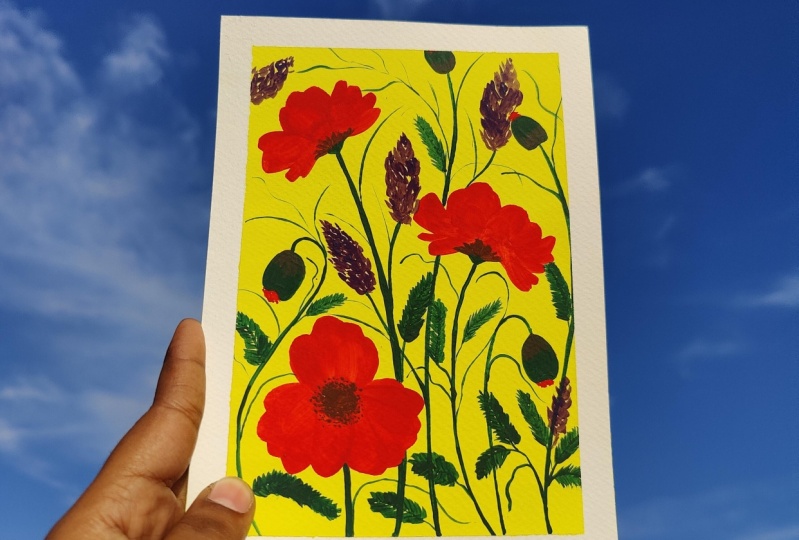
8. DAY 1 - PAINTING FLORALS: So for the first-class, we will be requiring
three brushes. Flat one, I'm using a
number 10.1 round brush. This is number six. And I'll be using
one line or you can use another mini
liner for the project. So for the first project, Let's start with a violet color. So I've taken some
color in my palette and I'm just mixing it to
the right consistency. And then I'll just check
whether it's good enough. I think that's good
enough, but I will require more than just putting
it some more paint. Now let's start painting. I'm painting this horizontally. As I feel that it gets less
stroke and I can even adult. So the background depends
entirely upon you. Whether you want it even or
you wanted a little patchy, or you want to do
two backgrounds, two colors in the background. So the background to be
quite contrasts quite deep. I want the background
to be very deep. I mostly like to put
the color force, like even in sections. And then I go about and even now to the
gallows, my strokes. So in case you want to touch up some places that
you feel is light, you can go ahead and do it. The deep color will tend to
dry out a little lighter. So what you're seeing,
which is so deep, it will turn out to be a
little lighter than this. I think this looks good. Let's wait for it to dry down and then we'll start
with the composition. So now my background is
completely dry and it has turned out very opaque
and it is very vibrant. So let's start with a
very easy foliage on it. I'm going to use a
titanium white color for the plant or the leaves
that I'm going to make. Just put in some
color on the palette. Let's mix the paint to
a good consistency. Since a background
color is so deep, you have to be extra careful while being done
with a light color. On this. I will use a rigger brush for
the stems and branches. So make good line. You have to practice
your line exercise and just make a beautiful
thing the line. Now take out some branches and then go for more branches
coming off from those branches. So I think that's it for
the stem and the branch. Let's start with the leaves. And in case we require some
more branches, will do it. For this, I'm going to use
my round brush number six. So let's start from the top. So what I'm basically doing
is that I'm making leaves, which has this rounded edges. Just take out a
tiny bit of a stem and then just please the tip and the belly part of the brush. So we're not swiping the brush with just
placing it on the paper. In order to get your
shape, your desired shape, just to keep adding
more branches, as in when you require it. So we have started with
a very simple exercise. And the basic purpose
of this exercise is to get to know your
colors much better. Hence, I've just started
with two colors, deep and a lighter one. The best part about
this project is that I'm just showing
you one way of doing it. So just to practice your colors, you can go about making
a elongated leaves. Also, even that is fine. You can practice with
different round brush or any other brush that
you are comfortable with. Go with the filbert brush also. So this is just to
get you started. In this exercise. It's really simple. So just to put dip in the
belly and you're good to go. Enjoy what you're doing
and try to come up with natural shape and keep modifying your flower
as you go along. To make it look more organic. Just to keep changing
the shape of the leaves. Some can be bigger, some can be smaller. Since we're just
placing our brush and we're not putting up
of lots of strokes. What is happening
is that we're not activating the color underneath. So hence, we are easily able to put a light color on
top of the deeper one. Just see how beautifully our
composition is coming along. And if you want to take
in those centers stem, you can go ahead and do that. Even that look good. Don't dilute the color in case your color is
getting finished. Add some more color
to it and some water. Don't just keep on diluting
the color with water. Adding some of the stems
as I'm going along. And I feel that the space
needs to be filled up. So I'm doing it
very instinctively. I have used a violet color
background. In case you want. You can go for the deep red. We can go for a navy blue. You can even go for a black
in that will look good. So experiment with most of my floral artworks
are very instinctive. But in case you are
not comfortable, you can go ahead
and do a template or a structure which you
can follow for the leaves. They're just about
to finish this. Let's just finish it off. Just put in some more. Just filling in for most
people that we have. The points to be noticed in this exercises that they will be few petals or leaves which will take
on the background color. So always try to
work into advantage. And while working with
the deeper layer, there's a high tendency
that it can get reactivated fast while
using a very light color, like white or creams, your yellows and all. So it's good that we do fewer strokes are just
one through painting. So now let's just take off the tape and see
how the artwork has come. Always build the
tip at an angle. While this looks so gorgeous. So this is our first painting. I hope you like it and see
you in the second class now.
9. DAY 2 - PAINTING FLORALS: So for the background or we start off with the
lightest of the greens, and I'll just take
some of the ballot. So let's get started. I have done been my
brush a little bit and also wiped it
all know, clot. And I'll just load up my brush. Now, started horizontally. So I just add some water so that it doesn't come
out to streaky dry. You have to come up towards the right consistency for this. For the background,
you can even have a little watery background as
you will be layering it up. And I'm having a very, very thick background
also means that there's a very big chances of
reactivating the layer beneath. I just smoothing it
out as I go along. So keep going and make sure to smooth that
out as you go along. Even when you have two mics, like very tiny amount of color. Then also just make sure that you're getting the
consistency right. So don't dilute your
wash colors with water. Okay. Just add more
color to it and then add only that much water
that is required to get it to the
right consistency. Now let's just even adult. So that's it. A background has done. So let's wait for this to dry and we'll come back with the
first layer of the leaves. So now we're going to
start with a second layer. And for this, we'll
be using this green. This green is a little darker
than the previous one. So in case you're using a light ranges go
for a dark green. Just add a little bit of white to black to your
color to get this. So you can use a viridian green and just add a little
bit of white and black, more white and a little black. And you'd probably
get closer to this. So I've already makes
the color in the pallet. And let's start with
the second layer. For this, I'm using this
round brush number six. I've mixed my pin to the right
consistency. It's creamy. It's not watery and
it is not very thick. But let's test it out
on the paper itself. So this scattered leaves, and let's start here. Just use the tip of your brush. So now we just use a
single brushstroke, one or two brushwork
and make the leaves. This is the first one. I put in the full belly
of the brush on it. And it gives you one that it looks a little flat
on the other side. Just go ahead and
give it another one, another swoosh and
make a point as well. And then let's go
about doing this. Let's take out a stem and leaf. So give me a leave some sheep. You can definitely go
with little downward and give it does not have
to be stunned as well. So some can go
downward like this. Let me just take
in this stem out. So since we have put borders, it is okay if the leaves
are going out a little bit. I'm not overlapping
these leaves. I want them team. And then Casey
want you feel like that maybe the leaves should
be overlapping each other. You can go ahead and
do that as well. So now you're just being silly. Little leaf is going out. So this is the first leaf. Let's make another one here. Making this a little
smaller because I want to put another
leaves as well. It started making this big. See how different
angle like this is. I'm taking my leaf from
upward or downward. So it's gotten the
full belly and the leaf as turnout, so
organically beautiful. So just keep going and give the leaves
different directions. As you go along. You can see how I've mixed all
to the two colors. They are quite two
beside each other. As they are from
the same family. It doesn't matter if you put the deeper one and
mix it with though. We know that we
have already done. So now we're done with
this layer off and on. We wait for this to dry. Now, our first layer off, the knees that is dried. And the second layer that I'm
going to put as this one, and I've just put some in the palette and mix it to
the right consistency. It's okay if you are mixing your previous color
also into it. It just takes one that
shade a little bit. I feel, and you can do that. So now let's plan or rod book. Since you've already
used are these two. So I would now like to put
in this one from here. Although color and then the third layer will be
overlapping it more. Let's start and I think both
legs go from top to bottom. Just use the tip to make this in case you're
not very comfortable. You can go with a rigger brush or the smallest size brush. So it's put in. He sends up previous layer
has completely dried out. It's so much easier to
put in the next layer. The key takeaway from
this project is how we are layering different
layers on top of each other. So you can see how
they are overlapping each other and the
layer which is blue, it is not getting activated. It's essential that the land
below is completely dry. Otherwise you will
not get consistency, will not get this opaqueness. This is one of my
favorite books to do it. So meditator, actually, very
easy and it looks pretty. I just put my hand over there so I'm just detaching that leaf. So just be careful
while painting and where you're placing
your palm or your wrist. Hence, it's always good to
come from top to bottom. But that's not the case for
the first leaf that we drew. But that's okay. Sometimes forget that
and Let's move forward. Also, making these
overlapping leaves is like an icebreaker to me. So whenever I have an odd blog or I don't have a lot of
inspiration to go for. What I did was I just
make overlapping leaves in monochromatic color palette
or even a lot of times. It also helps me into testing different colors combinations
with each other. Now let's go ahead and paint another one in this
right hand side corner. I think the stem is little thin, so let's just even a doubt. So use the full belly of the
brush and make sure that you lift the belly up for fast and do not elongate the leaves. So in this batch, a lot of overlapping is not going
to happen only this leaf, I feel really good
overlapping, but that's okay. We will be putting in
another color after this so that we get that
overlapping effect. Much more pronounced. Just extend your
stem a little bit outside and then you can come with few leaves from outside to inside so that it
looks continuous. So I think this is done and
in case I feel that I require or not this time
maybe I'll just add some random leaves over
here or some hill. So let's first do
the blue layer, and then we'll see if
some motors are quiet. So let's wait for this
layer to dry again completely and then move
on to the next layer. So now our second layer of
leaves are almost dried. Only few parts are a
little bit better, Better. Cotton was probably
a little thick, so it doesn't matter. We can go ahead and start
planning our composition. I've already put in the color. And this is a blue-gray. So this is a grayish blue. And you can mix this color also with your Prussian
blue or your indigo will also go well with
this and just put in some white in it and
very, very tiny black. So you will be good
to go for this color. Now let's first plan
again as to where we want to place next door
layer of the leaves. I think we can start with til, where we can cover both of these lead and maybe
one from here. And let's see if we will
require another one. And we do that too. I just love this part where
it is just overlapping all the previous layers and
it is still not smudging. The beauty of this project
is that you can go ahead and just experiment with
any color that you like. You can go monochromatic, you can go with contrast colors. You can go into shades of
reds, yellows, oranges. So there's no limit to what combinations
you can come up in this In your projects. I would love to see your
imagination go wild and show me different colors
and just express yourself. There. See, it's come out really nice. Now let's give another
one over here. Nice. Really light with the light
hand, you have to do this. I have been doing
overlapping leaves for quite some time now. And I've been doing it
with a lot of mediums. Whatever mediums I
get my hands on. I think I start with leaves, so I've done it with
acrylics, watercolor. I've also done it with
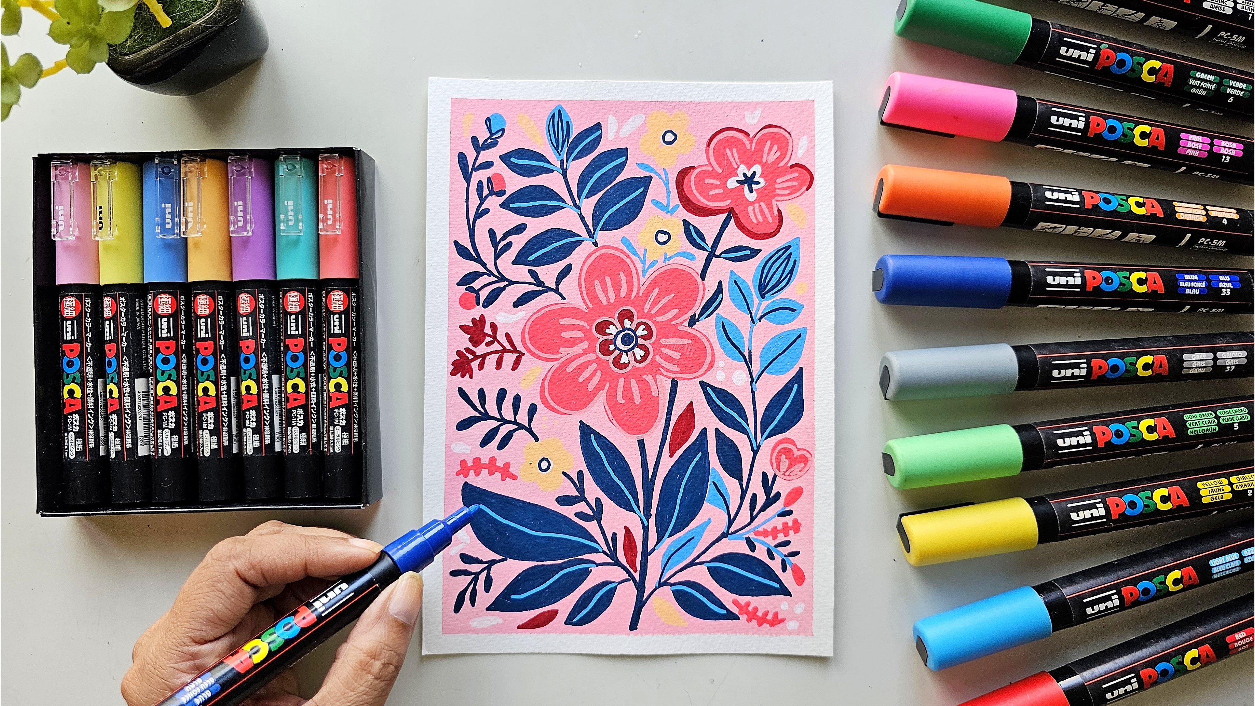
brush pens and markers, posco pen, so that I don't
think so that I have left any medium which I have. So go ahead and experiment. This is quite fun. Actually. Don't be afraid to go out of your
frame so that you get that perfect leaf. That's it. Now, let's go ahead and give, let's give another
olive green leaf OVO. So it's okay if it's overlapping your previous leaves,
it's completely fine. I guess he warned you
can even mix these two and put in another layer. So that just gives you more
dimension to your art work. This is turning out really nice. I hope you're liking it to. I think go away, just give another leaf over here and
this will be the darker shade. Just a tiny one coming out. I didn't want this
one to touch this. So that's why I got shot though. Stem. I think we've pretty much done Let's do a tiny one in the corner
just to fill up that space. This blue layer is
the top-most layer, and hence it will be
visible the most. I just wanted to give an overall
balance to this artwork. And hence I'm going for
1 mol in this corner. So I think that's
it. We're done. The composition looks
so beautiful now. It has a few places where
you can see the background. And also it has those areas where it's so dense and the
layering can be seen so well. So I think we're done with this. Now let's remove the
tape is going off my best spot just to see my artwork framed because
it gives instant framing. Beautiful, crisp
edges have come. There's a painting is
complete and you can see it's looking gorgeous.
Somebody loving it. It gives you want to give one more layer of
more darker blue. You can go ahead and do
that as well on this. It's like going
from green to blue. But it's come off nice. So I hope you enjoyed the class. See you in the next class.
10. DAY 2 - COLORS AND BRUSHES: Hello everyone and welcome
to day two of my class. Today we'll be doing a
monochromatic painting. And this will be only leaves and the colors that we
will require for this. So I'll be using this. He made me a gouache set and I'm taking colors
directly from it. So this is the turquoise. And in case you don't
have this color, I'll just do a
swatch and show you. This is a turquoise color. In case you do not have, you can definitely
go for a green and mix a little bit of white in it to get the background. So go for an emerald green
or a viridian green button, a little bit of white, and you can come back to a little bit of
similar color to this. So this is the first color that we will be requiring
for the background. Then there is this
another color, It's a little grayish green, quite similar to the
background itself. But let's do this. Similar to the one that
I have used earlier. Only. The difference is that
this is a little deeper. So that is why it
is monochromatic. So in case you want
to go and do this, you can add a little bit of
a little bit of black to it. There are similar tone. So just add a little bit
of black to your color. And of course, a white will be required to get
that piece to look. So this is the third color, and the third color is actually
a bluish, grayish shade. And you can easily get
this by just putting a little bit of white and a tiny bit of black to
your Prussian blue. Oppression or indigo. You can also go for
indigo for this. So as you can see, this is the third color
that we'll be using. So as you can see that these three are quite monotone
as they are quiet. They look like as if they're just ends and
shades of each other. So the fourth color that is
there is an olive green. So does he need not mix? You will probably have it
and in case you have like, you wanted to tone
it down and make it a little bit off base still, then you can just
add a tiny bit of white to your olive green, green so that it just gets the space delay loop
that is there all alone. The other colors. These four colors we're going to use. Also the brushes that
we're going to use is this round brush number six, I'll be using this
Princeton Neptune one. And for the background
I'm using an oval wash. This is a half-inch oval wash and this is from Dallas County. So let's get started.
11. DAY 3 - COLORS AND BRUSHES: Hello everyone, welcome to
day three of our class. And today the painting that
we are going to make is this. So this looks like a
classical painting. The classic colors like red. Then there's yellow, There's brown, and then there's green. So this will be
our color palette. We're going to start with the
Naples yellow background, and then there'll be red. You can go for vermilion, scarlet L, good, bright red. Then we'll be having
a burnt umber for the centers and older
for our leaves. And I generally tend to
mix two of my colors. So red and amber mix, I get this color and
you can go for this or just slightly just put in a
little bit of flack for it. And you're good to go. It
just swatch out some of the colors so that you get a hang of the colors
that we're going to do. The first one is
this Naples yellow. I'm using heavy Mia
Gua Sha for these. So I'm directly
using the colors. So this is the Naples yellow. So in case you don't
have Naples yellow, what you can do is you can
go for a yellow and you can put in white in it and
you will get this color. So don't worry if you
don't have Naples, yellow just to mix these two
colors, yellow and white. The second color that we
are going to use is a red. So you can go for
any bright red. I'm pretty sure
you must be having a good read in your row colors. So just go for a scarlet, red and you are good
to go for this. So I'll just watch this
so that you get a high. This is a little bit
of orangeish red. It has, I think a little
bit of yellow in it. But you can just take a good read and just
go ahead with that. We're going to use
a good bright red color for the flowers. And the third color that we
require as a bond, umbo. And just do a swatch
that a bit for you. So go over the very
deep brown color. Further deep brown color. You can, if you have
a lighter brown, just add a bit of black to it and you will get this color. Or this is too dark for
you just add a tiny bit of yellow so that it tones down. So these are the three colors. And then the last color that we require is an olive green. So we use the olive
green for the leaves. I believe that this olive green, it's a little bit, it has a
little bit of white in it. So just to get the
space to consistency, you can definitely add a little bit of white
to your olive green. That's it. So we're going to use these four colors and like go just for the leaf center part of the leaders center line. So what I will do
is I'll probably just mix a few of my
colors and see what I get. And I will use that
for the leaf spot. For this project, we
require just three brushes. One is this flag half
inch flat brush, and this is from around me. You can go for any flat
brush and filbert brush. Then the second brush, which we are using is a six
number Princeton brush. I really loved this brush. I think it makes the
most beautiful petals. And the third brush is this bruce role to by
zero rigger brush. This is just to do
the center line of the flower, the petals. So let's start the painting now.
12. DAY 3 - PAINTING FLORALS: I'm going to start though
with the Naples yellow. And now I'll just
make some pallet. So let's start now. I'll just do I've
loaded the brush and I like to go for
the medium consistency. And I always prefer
to start horizontally as the smallest strokes and I
don't get a lot of streets. So in the background, make sure to cover your corners. It's very, very important. It has happened to me that
when I'm actually in a rush, I miss out a few spots just to even it
out when it's wet. So this Naples yellow
is such a soft color. I feel it just gives the right amount of it just gives the
right amount of color. And some red spots. That is, they must have fallen. This yellow gives a dusty yet bright look
to the background. It has little b still feeling. So there are background
is complete now and we just wait for it to dry and then we'll come back
for the first layer. Now we are back. Our layer is completely
dry it out and just see how much it is and how even out. It looks like this, even though feeling
in my paintings. So the next value that
we are going to use, this, this bone Dumbo. So we're going to meet the center of the
flower with this. I start by generally
just giving some random, so good uneven circles. And I start with the top of
the page left-hand side, and just put in
uneven, round shapes. And it's not necessary
that you have to come here only for another one. It's just random, so just
give it to her in there. And it's okay if it is not in the perfect
so-called something. Since we have taped the paper or painting will go out a bit. So try not to be in the street line and give the
dots a little upward down. You'll see that eventually it does Don't out into
some sort of line. But that's okay. I think we're good to go. And now let's start
with the next color. The next color that we are
doing is the red color. I've already put some
in my palette so that we can go ahead
and start painting. So I'm using the, so I'm using this
round brush again. See what we're going to
do is that Toby will be Angus six or seven
petty flaws and this. So let's start
with the top-left. So what we're doing, we're
using the tip and the belly. And we're forming, we
are trying to form a tip and the end also not overlapping the petals and just giving digging
another petal beside it. This will generally come to
around six or seven petals. So I'll just leave it like this. I will not fill in
this gap. It's okay. If I start filling
this gap, I will. It will overlap. So that's EBIT. And then we'll do
another one here. We'll just take it slowly. You can give it a full
belly or if you don't want to give a full belly, you can just lift it and it's okay if it
overlaps your brown part. You can very well go ahead and finish the brown part again. Since this will not
turn out to be full. So I'm just still making
a half for flower, we'll just giving
it full petals. Maybe a tiny one over L. So I'm avoiding touching the petals together.
I'm just avoiding it. But then it becomes
necessary then definitely overlap your bed to come out. So pretty I guess this
one, no, overlap. This. Remember that we
are making fun petals. And you really don't
have to be very serious. So with how these go. So made some smaller petals
over their female do we'll, I'm doing this one so that
I get the full flower over. Yo, I want this flower
to be and not a half. So that is then going
ahead and doing this one, forest main Daniel obesity. And since we're doing
it on a lighter color, it will not matter a lot. Let's do this. Is you feel that it needs
an intimate off refinement, then definitely go
ahead and do it. So I'm going to
leave this piece, probably will come back
later and put a leaf. This one again has a good space. So generally try to utilize the space as
much as possible. Instead of putting a very diagonally e to
each other, you know, try to put one battling between the others so that you
can just do overall, the painting will
look good like this. So again, we have another
one which is food. So let's make this one half one. Again. I'm trying to place a
bet in-between the gap. So now we just have
the last two ones. This one will definitely. Gum as a full flower. So again, I'm going to go first. I'm just trying to
fill in the gap. Now this last one is there and I think Let's give
this a half, Betty. And since this is
going this way, Let's do it the other way. So I guess we're finished
with our red part. Now let's do the green part. Since we will not be
overlapping. Go much. I think we can go ahead and
start with the Reyn-Bardt. The next color that we are
going to paint is olivine. And I've already mixed some of my palette so
that we don't waste time. So let's go ahead and
start painting our leaves. Again. I'm using my
round brush number six. So like go for leaves. It's basically to
fill in the gaps. And let's start with this OVO. So what I'll be
doing, I'll take out a tiny bit of a stem and
then I'll go ahead with the nice thing goes for this. Consistency looks a
little watery Yo-Yo, as we can see, quite a
bit of the background. So it will just kicking it out. Yes, This is much better. See how I do like since these
have got the leaves now. So I'll give this one leaf. Just remember that it's
not necessarily all the leaves have to look
fairly similar to each other. Just so you know what,
just get this shape and have fun might be single use SAML going left, down, up. This makes sure that these
are not unidirectional. They're scattered everywhere. So it's important that
you plan the leaves. Just think a little bit before putting in the
colors like how and where, like which flowers
should have the leaves. It's important that, you know, you don't want to make all the leaves come out
from the same flower as, you know, that will
not look good. So try to see mix-and-match. This one already has two. Now let's give others. So I guess so we see
this is a full flower, so this might have more leaves. And this, these
are the half-life, so let's give them a little less leaves,
it doesn't matter. So see these two,
if I give a leaf, look very similar
to how these are. So, you know, let's just
tried to extend some leaves. This remember, some leaves
can also come from outside. So now this basis there, and I'm just thinking, oh, how to go about
putting the leaves? So if I put a leaf from your TA look quite
similar to this one. So I don't want it to
look very monotonous. So I'll have to plan it. Maybe, you know what
can come from below. And so somebody. So even little part
of the leaf mottos, so don't leave it out. I think we are now almost done. I don't see a very specific
space which is in D, but let's fill out some species. If we have left out any. I could see this one. So I've just filled in that one in case you feel that yeah. Maybe that is a blank spot and just store it will not look
empty when it's finally done. So this is the time. I don't know, I feel like maybe this one heel
and acquires one. So yeah, I think
we're good to go now. I've fulfilled in
most other places in case I feel like
there's a gap. I come back to it again
and I'll do that. So now let's go to
the next fellow. Now start with a rigger brush. Let's mix the red and the green. Olivine. Taken some brown also. We are going to do the dip in the belly exercise
over here also, but not the full belly. We need to try to have
a light and then it just feeds into a tip. This one is a little
thicker than I wanted, but it's okay. So try to just lift up the brush in the end
so that you get, oh Good. Find that. How would the
center of the leaf, this line is deeply. So you have to lift off your
brush to get that effect. I'm not dividing the leaf. And just to live
in the top part. See how it just gives you
the dimension to the leaf and the leaf is now
not looking flat. I don't want to complicate
my design months. Hence, I'm not doing, you know, giving the veins of the leaves as soon as possible. This one don't know
the little tick, but leaves are not
equal, so that's okay. So I haven't left any leaf. There is one. I think we're done. So yeah, the painting
is now complete in case you want to add
some more details. But this is like a
full-color painting and I would like to
keep it that way. So now let's take the tape off. Before taking the tape off, I just felt that if there are few connections that
needs to be done, you can go ahead and do that. Like this petal is
completely coming above the center part. So just make the center part
a bit more, a bit bigger. So just to finish your
finishing touches, a few have this to do the
finishing touches just so that the painting looks how
you want it to look. Now, let's take the tape off. So this is definitely one
of my favorite part to do. So always take the
tape off at an angle. Always take, take it
up. Don't go like this. Just try to be like, Wow, this is how lobbying
thing has turned out. I love each and
every part of it. This is like a
classical painting with red flowers,
green leaves, browns. So there's very less chance
of us to get wrong with it. But this is actually turned out way better
than I had imagined. And I hope you enjoy
though, making this. So see you in the
next class now.
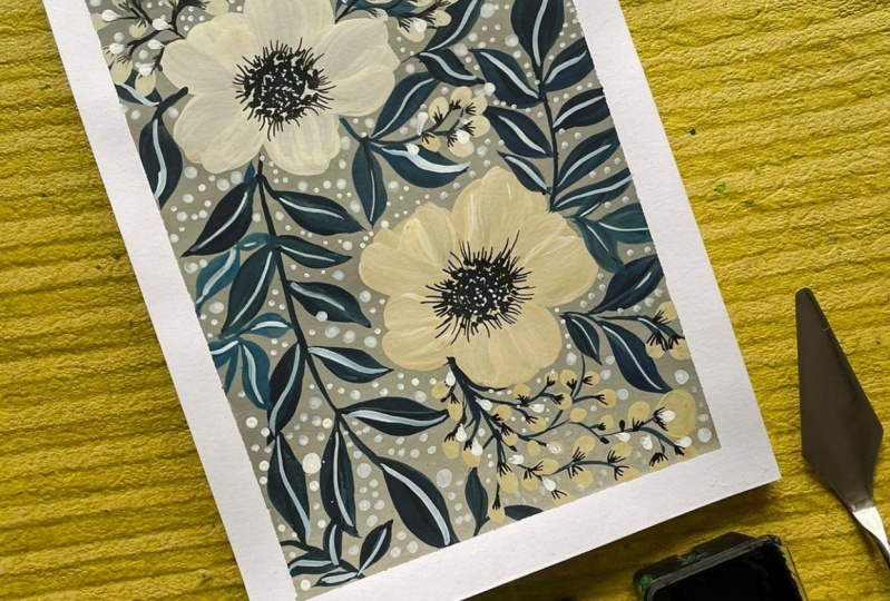
13. DAY 4 - COLORS AND BRUSHES: Hello everyone and welcome
to day four of a class. And this is the painting
that we will be doing today. So this is the
practice sheet again, and I thought that let's do
a neutral color palette. So till now we have
been doing mostly like a cool color palette or bright color palette,
warm color palette. So I thought let's
do something which is a neutral and width, some bits of a
cool shades to it. So this is the painting
that we'll be doing. And the colors for this that we will be requiring is gray. So you can mix in your
white and black for that, or even a little bit of
yellow to get a warm gray. And then there is a cream. There's a Prussian blue. Then there is a grayish blue, which you can mix the
Prussian blue with the white and a little
bit of black to get this. And then there is a tan sheet
which you can get my mixing brown and white or as just put a little bit of brown in your cream and you
will get the shade. So this is the painting. So let's get started. So let's start
swatching the color. I'm using hemophilia
gouache set, and this is the gray. And let's start with this. This is the first color
that we'll be using. So you can mix this Carlo with lots of white and
a little bit of black. And if you want, you can just put in a tiny bit of maybe like tiny
bit of yellow to it. And you will get a
warmer shade of gray. And in case you want like
cooler shade of gray, just put in a little bit of blue so that you get the cool shade. So the second color
that we need is a green and just makes it
to the right consistency. And let's try this. So use a cream if you
have in your colors. Otherwise, just dilute it with dilute your yellow
with a lot of wider, even for that matter. Take your white and just a bit of brown to it and you will get
the cream color. So this is the color that
we'll be using for our flower. So the next color that will be requiring this, this tan color. And for this, I am taking
it directly from the tub. But you can very well add
a little bit of brown to your cream to previous Gallo and you will get this tan color. So this has more brown to
it than the previous one. So these are just like tints
and shades of each other. And you can see how neutral the color palette is
looking till now. Then the next color that will be requiring is Prussian blue. So this is the color, and I'm sure you must be having a Prussian
blue and your ballot. So this is a very, very deep color of blue. And this is what we will do the center and
leaves with this one. So this is the blue. I hope you can see the blue. This is the fourth color. Let's come to the final color. So this is like a grayish blue. You have used it earlier also. So in case you want to mix this, then you can very well
go ahead and make some Prussian blue with
a little bit of white. And in case it's required, then give a little
bit of black to it. Just a tiny bit. Well, just got it. So pretty
and just love this color. So these are the five
colors that we'll be requiring to make this art book. And these are
unusual color tones and then these are a
little cooler ones. So just like Coventry neutrals
that we are going for. So now let's talk
about the brushes. I'll be using a half-inch flat
brush for the background. And then we'll go for half-inch oval wash
or you can use a filbert brush also for this. Both are from Dallas County. So these makes wonderful petals, as you know by now. And then I'm taking a
round brush number four, which is from the brand silver. And with this, I will
be doing the leaves. And then I'm going for
long rigger brush. And with this, so
we'll be making the stems and little
details with these ones. So now let's get started
with a painting.
14. DAY 4 - PAINTING FLORALS: The first color that
we'll be using is this tree I've just mixed
the right can sustain the tub itself as requiring a lot of grief
for the background. So that's why I'm not
putting in the palette. I'm just using it from the dub. So again, I'll be going
for horizontal movements. I'll be painting from left
to right and right to left. Just even out as we go along. And it's even a doubt that it is. The top part is already
started to dry as well. Again, the corner don't
miss all the corners. Very important. Then just
one final evening out. And that's it. Now let's wait for
this to get dry. And then we'll put
on the next layer. Now let's stacked
over the petals first and we're going
to use a cream color. And I'm going to
use this oval wash all the filbert brush
for the petals. So just dampen my brush. Dry it and I'm, I've already mixed
the color over. Yo I'm soaking in the
color with my brush ovale. As you can see. I
wonder to be loaded. The belly of the brush plays an important role in
this composition. So load up your brush properly. We're going for a
five petaled flower, and this will be one stroke or maximum two
strokes that we're going to do. So let's start. A lot of time, goes
into mixing colors, so I'm skipping those paths, are forwarding
those parts a bit. So first just place it dip and then swiping the full belly. So I liked the translucent
fluid that is coming from underneath and it gives you feel that you need
to give you a better one. Most definitely go for it. Just wanted to give the petals
a little bit more body. So that's why I'm just swiping one more time that I'm happy with this look. So now we're going to paint
another flower over here. And that will be the Don Carlo. I've just put some on the ballot and mixed it
to the right consistency. Again, we're just going to load our brush with this.
I'll make sure your tip. And I also alluded quite nicely. I'm going to put it over here. Got it is so rich. It's okay if you're
Florida is going outside. So I think that's it. The second part is also done. Now, we'll go ahead
and do our leaves, but now let's put
onto another color. And we are going for
our bluish gray. For this one, I will
be making leaves. Now. Let's fill about the empty
spaces so we can go for like maybe one stem over
A0 and then another y'all. And probably one
can come from Hill. So now let's start
with the leaves. I'm going to use this
round brush number four. So let's go ahead
and stop the leaves. So giggling to use
the dip in the belly. Dig out a little bit of depth. And then we'll paint. The leaves will have a
little bit off stemmed. Do it. See how I'm using? First, I'm just
taking out the tip, then Ms. Patina and the tip. And then again to get
the shape of the leaf. You can go for a
bigger brush size and gives you warned
leg bigger leaves. Dr. to date different directions and different shapes
for the leaves. See how well it is coming
along the gallows and on. So keep on with the
dependent Valley. Go out of the frame
as it will just give you a seamless pattern. Notice seamless artwork. I personally love the leaves. They are going out of the frame. I just put it over the
petal and that's okay. In case you want to go
that way, you can do that. So I guess so for right now, the scattered is done in
case I feel like maybe you want some overall. I do that a little later. So now let's move on
to the next color. This is the Prussian blue. I have already
filled it over here, the ballot, and we first
start doing the centers. So doing descenders pretty
much are very easy. You just fill in,
in a, in a circle. You have to be very
careful of these. I just put some on my hand. So just be careful about the
leaves that, that is wet. So go about it organically
and don't just put dinosaur. Make sure that there are
some VV edges to it. We lose them over. I think that's it.
Don't go overboard. And now let's put in
some dots around it. Just have to do
just have to use it to very light handed,
very light handed. Just have to do like bom, bom, bom, bom, bom, bom. Make sure you hold
the brush street almost like perpendicular
to the paper. Be patient while you're
making these dots. As we don't want a lot of
model two dots together. I think we are good to go. So now let's start with
the second flower. I'm varying the size of
the dots that I'm doing. Some big ones scheme your butt. I'm just trying to show you. We'll let it get to love the tip of the brush properly. We don't require a lot of paint in the belly of the brush. I want to share a close up look of the center of the
flower that we're doing. So in case you feel
like you can just put in some dots over yours
so that when it dries, no, maybe it will not look flat and nice dots will come up. So now we're going to make
our lives with Prussian blue. I've made some more. And first door, let's go
about the places where the leaves are not there
and then we'll overlap these also because they
are still not dry. I'm waiting for them
to dry so that I can overlap them with
the deeper blue. Just be careful whenever
you're painting on the sides, just to make sure that there
is some element of the day. So this is money owed
is almost drying up. Just this leaf has left. So what I'll do is just put
in one more stem from you. So I'm making the
new stem a little away from the previous one. It should not cover
it up completely. Let's wait for the
previous layer to dry. And meanwhile, let's
do some twigs. This take out some
branches of it, the Prussian blue color. With this twig.
I'll just cover up the water drop and
paint over it. Let's do one on the top as well. Let's make one more
trick over here. This is almost completely dry. So I think we're done with
the twig bud and case. I think I will
require one over u. We will definitely go
ahead and do that as well. Just leave as Dr. Phil, let's go ahead and leave. You can use one or even
two strokes to make the leaves and adjust what
you're comfortable with. So sometimes with the top leaf, I generally go for
a two stroke leaf. They go, do another
one over here. This bit of leaf has done. I want to overlap
this one as well, and I'll go in the
opposite direction. And just being
done a few leaves. I still feel like there's some space over
here and over here. So what we're going
to do is first, let's fill in our other small, small bits and then see how we're going to
use this space. So I'm going to now put on some tiny bugs with this
green that we've used audio. Just don't. Some flat belly
dots to give the buds. Now with some Don Carlo will
do the same for this branch. So I didn't want
to do a free meal as some of the branch
will go on this flower. And if the color theme, then you need to just merge. So that is why for this one, I will go in for tan color so that it's
visible on the background. So keep going with these dots. It gives you one to
introduce another color. Then you can go for a
very deep brown also. You can go for a very
muddy red beans, some extra Basel two. We can just link them to
the branch a little later. Let's give another one
at the bottom part. For this one will be all. Let's go for a cream color. Don't put it on all the stems or the way that look
very monotonous. Since there's branches
coming go onto do badly. I'll just put in a little bit
more of the stems over Yo. I think that's it.
This was done. Really don't like to leave
all these empty spaces. And we just put on some
leaves over there. These leaves the eye just
like as if they're going out. So that's it. I
think this is done. Now let's do some detailing
part on the leaves. For this factor will be
doing some detailing line. And what we're doing is we're just doing a deep blue or
Prussian blue or yellow. And then this blue-gray
on this leaves. Some start to go with
the Prussian blue. You can do this
step earlier also, but kind of like go that
they are not joined. There. They have a
little casual effect. Just use the PIP. Rigger brush. Now let's finish this and redo
the lighter blue gray. Make sure that your
color is not very runny. Since it happens that when
you are using a rigger brush, it tends to gone a lot of water. To make the center
part of the leaf you have to be
really light handed. So just use the tip
of the brush, show over the shape of the leaf. Okay. I think that's it though
we're almost done. I hope I've not missed
out on any bud. I'm just double checking
it and feel like maybe I can give 1 mol by hill. That's it. I know I keep
on saying that that's it, but I kind of get carried
away a little bit. But I think the stem
would be the last one. Just joined us. And that's it. I think we're done. Just wait for rho. I think they had done. No,
we don't have to wait. Let's just be the tip. So this is just the dry bean. Don't worry. You can
just dust it off. It's come out so beautiful. I'm just loving go the
entire feel of it. I would have avoided
this time probably. So. So in case like go when
you're going for it just a wide this time it's okay. Otherwise it's come
out really nice. I hope you enjoy the painting and see you in the next class.
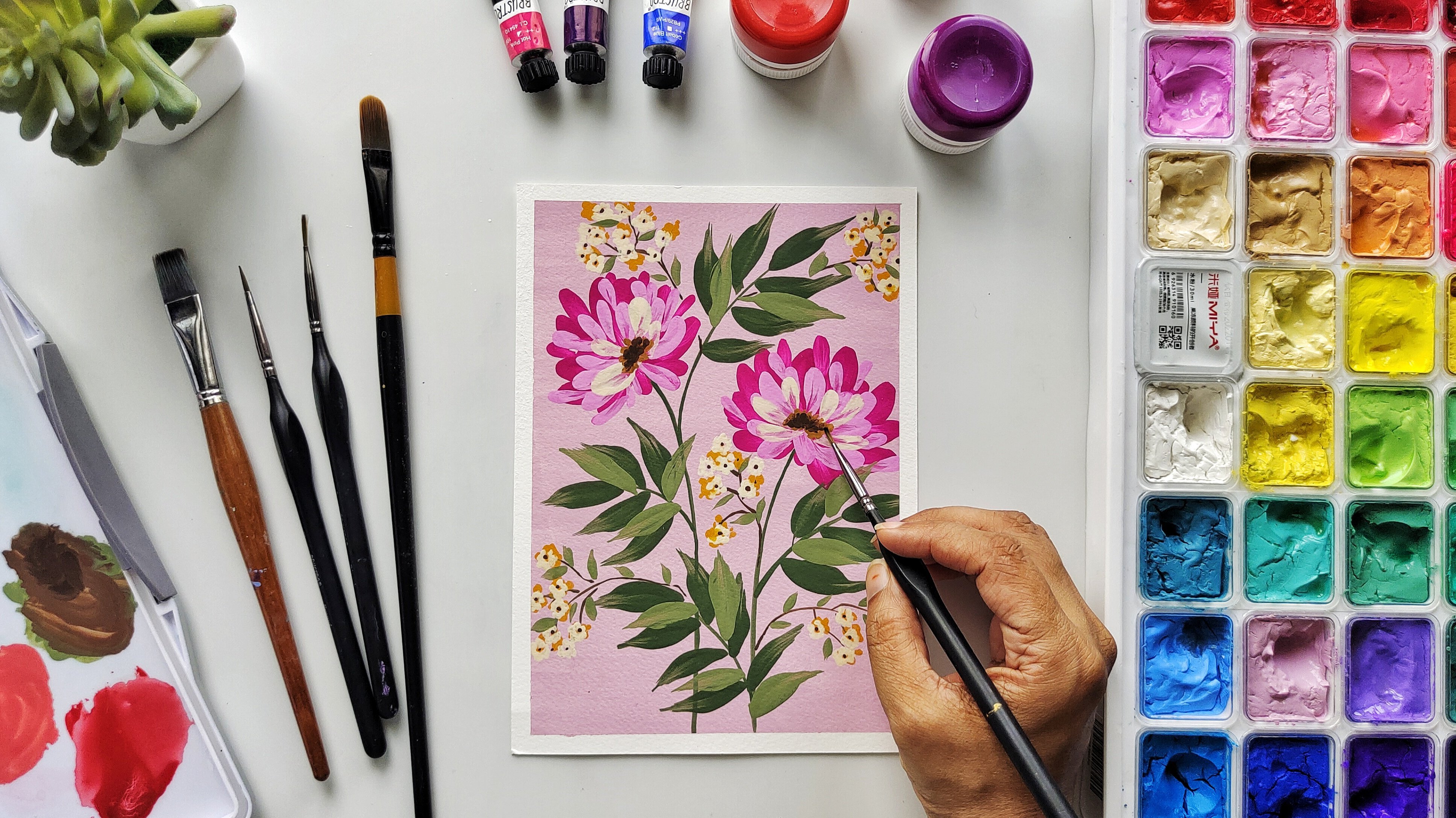
15. DAY 5 - COLORS AND BRUSHES: Hello everyone and welcome
to day five of her class. And this is the painting
that we will be doing today. The colors that we require for this artwork is light green, deep red, burnt umber, olive green, and violet. And maybe you can mix these colors to form
some more colors. Like I tend to mix these two, these two to get
different shade, variation in the
leaves or the petals. So let's get started with
the color swatching. Let's watch this. This is the lightest green. You can go with the
cream color background as well for this one. The second color that
we'll be using is this red, deep red. Since we're doing a variation of a puppy or a loose puppy. So you just need to
get that color right? And this is how the color looks. So coaches as cutters,
really pretty. So this is a second color
that we'll be using. The third color that we'll
be using is a bond Dumbo. We've used this before also. So we're going to
use this again. This is the third color. Using this color for the center and this center
part of the flies. And in case you want
to go for orange, you can just put an, a little bit of orange. Yellow are cool for
this part as well. So the next color that we
require is an olive green. You can actually go for any other green light
go forest green. The green, anything will work. Just make sure that you can
make two shades out of it. And you're good to go. Next color that I'm going
for as this violet. And this is just
an accent color. It's just to give a pop color to the entire painting
using a violet, because this is like
the violet and the red. They get there like a
split complementary color for the greens. So that is why I
wanted to go for a split complementary color
composition in this painting. And let's do violet in case you want to
give a little warmth. Then you can go for
orange color as well. Then the pseudo violet
color that we're going for and we're
going to keep it as an accent color
or a contrast color. Now that all our
colors as Watched, Let's start with the brushes. So essentially there
are just four brushes that you require
for this project. So there's a flat brush, you can use a filbert
also for the background. Then I'm using dollar roundly, half inch flat brush. And the next brush is, of course, my favorite filbert. This is six, It's from rostral. And we'll use this
to make the petals. I'll be using a rigger brush
and a miniature brush, rigger brush for the stems and the miniature brush for
some final details. Now, let's start
with the painting.
16. DAY 5 - PAINTING FLORALS: So the first color
that we're going to start with, this light green. I've already put
some in the ballot. So Dan, I'll start with
the horizontal strokes. Don't forget to
paint the corners. Also flatten the background
as you go along. In this composition. I'm mainly going for a little
diluted the background. It's not like a very
thick consistency. Having a watery consistency
of your background, it just helps in putting up
more layers on top of it. You can also go for a
two color background. Like it just gives that ground
feeling like in this also, you can go with a
light and a deep green or some parts of it is brown. In case you're a beginner, you can definitely
try going for, at least in one
of your projects, that your background
is a little watery. Let's just even it
out one more time. There. I think a background
has done on, Let's come back to the next
Carlo after this dries out. So now our base is completely
dry and we're going to take filbert brush and
VBP painting the petals. I've already mixed the red colored if you're going to use. And this is the composition. So there's one main
Florida and then to medium and one
small, small flat. So they do small flowers and one big flower which is the
center of the attraction. Always try to keep the
composition in mind. So this one here is an oval or you can see a
semicircle. You can put. And this is like a circle and some petals are
coming out of it. And this is again a semicircle. So keep the shapes in mind
and then put your petals. You can even draw a line, the shapes on your
people for guidance. So we're going to use it flat and it's loaded,
completely loaded. And it is, the
consistency is medium. So let's start. So this is just one petal, since these are puppies. So you'll see that Bobby's, they generally have
the petals are wary. Like if you're making
them than they are continuous and they are not like these ys are that way, so just don't put in
like a smaller one. So twist Antonio filbert brush. That's the beauty of this brush that even when you
use it sideways, you get a different
type of petty. Now let's make another flower. And this one also will
be a side view one. Keep refining the
shape of the flowers. Just fill in any gaps that you see are elongate any better. There you go. I think both of these flowers
are looking good. So these both are
the side view once. And now let's do one big one where the Florida is showing
its face. So let's do that. One. I'll be making like
three bigger petals. I'll mix some more
red and do this and my brush is loaded. I really want a
very thick Gallo. I'm using the flat part of the
brush and I'm just putting in some intermingled
brush strokes with it. So this can be the first flop, the first button, sorry. The shapes of the petals can also be achieved with a pencil. You can just outline
the pencil mark and then fill in with
the brush strokes. So our third flower
is also done now. So now let's go ahead
and use, are born Dumbo. You can use a deep
brown for this. And I've already put
some of the palate. So what I'll be doing is
I'll be finishing these. But it's attaching
the brown stem from Yogi take some, will need to put
some green as well. Seem to be doing over the hill. I'm just using like
really small strokes. Really, I'm using
really small strokes and just trying to get it to a point where from
where I can start the stem. You can see like God at two
points which are coming. So that will be
used for the stem. To put in the center
part of this flaw. It's a little
parenting just filling it with the dot dot motion. I wanted to show you
the close up of this. So now what we'll do
is we'll just put in some tiny dots around the
same TO make it very random. Just the tip of your
miniature or rigger brush. So now let's start
with olive color. Wheel. We have to make
the buds of the flowers. So let's put in some
which are going out. So the puppies, they have like very roundish ovalis Chabad. They are mostly
facing downwards. They are in random directions. I'm using a round brush. I didn't mention it earlier. But you can go for the
round brush for this one. Now let's continue
making the stem. And I'm using the rigger brush. So let's give stem to
these beautiful size. I don't want to overlap
the main flower. Hence, I'm just putting the
stems behind the flower. So at three or four main
flowers, they are done. What I'm going to do is
now let's do these ones. So it gives you seen the scene. Bobby's some, a
lot of the stems. These buds, stems. They, they are like going
as if it's just tiny. So make sure that
you're covering the covering this piece. I'll making these stems, just plan them and see that it's covering the blue part
of the page properly. So we're done with the stems. And now let's put in
some details on the bud. And I'm mixing my bone Dumbo with the green
with olive green. And I'm putting a
little stripes, so little shaded
effect on the bud. What I'm doing is
I'm just mixing the brown and the green and just putting some shading
or you can see the, how we put this stem, but it's just somewhat
similar to that. Now since these are bad, I just wanted to put like little dots so that the flowers, flowers or petals are
bursting out of the buds. I'm using the red color
that we used for the floss. Now let's move forward and make the leaves of the flowers. I'm using the same olivine that we had used
earlier for a buds. Consistency of the
paint is medium. I'm using a rigger
brush for this. You can go for a mini liner also and just take out some tiny, tiny strokes from outside to inside or even inside to
outside is also okay. Since this is like a
loose representation of a poppy flower. So if you'll see the leaves
of the poppy flower, they are generally
in a bunch of three. Or even to keep putting up more leaves, especially on the lower
part of the page. Show you a close up. We're doing this just
near the center. So me coming from out to in like this. I went ahead and made
few more leaves and nbsp require we'll
come back to it later. Now let's move on to next color. And this is this
bright violet color that we're going to use. I'm really excited to use
this vibrant violet color. And I'm going to use it in places where I can see
lots of spaces there. I'm using like really tiny
strokes or you can say dots and forming this
elongated flower. This is in fact a very
loose interpretation of a lavender or Wildflower. I want to show you a
close-up of what I'm doing. For this step. You
can even go for a little diluted
consistency of your color. You can vary your brush
strokes in between like having a very thick
consistency and as well as a little transparent
consistency of your paint. Doing this will give
you a dimension. This lightened shadow
effect with the same color. Tried to dispose it all over the page or
in case you don't want just go for just two or three at the top of the page. I think that's it.
Enough in case we need more overlap it with a lease
and we'll put some more. Let's come back to olive green. I can see like an
unfinished leaf and few empty spaces where
we can make more leaves. So let's start. Right now I'm just filling
the gaps that I can see. And I don't like like
leaving a blank spaces are just makes my
artwork of unfinished. So let's go ahead and do it. I want to like
really thin blades of leaves coming
out from the stems. So let's go ahead and make that and fill in any space that you feel that it
is required over there. Also, let's go ahead and attach these white lavender
to some stems. What we're going to
do for these flowers, just pick out some
tiny branches. Now let's go ahead and just give some finishing touches
wherever it is required. Let's just put one last
lavender color flower on the right side. This is just to balance
out the overall artwork. Third, I think we're
done with this. Let's just build the tape
and look at the final piece. And our artwork is complete. I love the look of it. I hope you liked it too. So there's this
bright red poppies, some pop colors
with this lavender, and then of course
there's green. So I hope you liked it and
see you in the next class.
17. DAY 6 - COLORS AND BRUSHES: Welcome to day six of our
gouache floral class. And I'm so glad
you're still here and I hope you're enjoying it and will
continue to the D7. And today what we're going
to paint is this one. So this is my
practice sheet again. And so this is like, this has a very
Van Gogh feeling. I've tried to pick a
few colors from there. And as you can see, like we are going for a very
lavender pistol background. And then we're going to use an ocher color and we're
going to add white to it, maybe some yellow and continue giving it tense
like we discussed. And then there's another
thing that we'll be doing is of course we'll be using this burnt amber for AI centers. But these greens,
as you can see, will be making the greens
lighter using yellow. So we have already, in the techniques section, we had already
discussed how adding white and giving things
too, I'll color. But what happens
when when we are using a yellow or a warmer
shade to get the things. So let's start with
our color swatches. So I'm basically trying
to mix a good background. Taken white, blue,
and violet light. So now let's start swatching. The first color. I mixed violet, Prussian blue, and white. So now let's move on
to the second Carlo. And this is yellow ocher, and I'll be putting some
white to it because this is a little bit
more volume for me. This looks good. Let's try with this. This is the yellow. So let's go for this yellow color now. So I've used, I've put in a little bit of yellow
in my yellow ocher and white mixture to get
this bright yellow. Now for the highlight spot, we can use this color that
we had earlier mixed. Can you see how I'm mixing white and we're
getting different tense or I've added a little yellow to it so that
I get more warm, shallow, but eventually we are adding white to
all of these colors. So for the center part, we are using burnt umber
and I'm using it directly. I don't have to mix it. Such a pretty color. So now comes the interesting
part for using greens. So what I'm going to
do is I have this deep green and I'm going to
mix it with my brown. This is our deep olive green. If you have a deep olive green, you can go for it. I have mixed to my deep green
with my brown bone Dumbo. So this is a main color and now we'll lighten it by
adding yellow to it. So I get B still affect, it will give me a
more warmer green. So let's try this. So I'm mixing yellow, the green. And you know, it's quite, There's that I generally take the yellows which
I already have in my palette and use it
to make another colors. But it will look
all muddy over A0. So I'm not doing that. This is a deep green
and this is the medium green that we will use. You can use this
method of adding yellow for more colors
like even with brown, you can achieve this sonata. Finally, let's add some
more yellow to green, and let's make it a
much lighter one. You can go for even one
more light TO lambdas. So you can keep on
adding yellow to it. They come a point where
the green is almost not there and you will
get very good yellow. So this is a good example of
how to lighten your colors. So now let's go to the
next segment and we'll talk about the brushes that
we are going to require. But this exercise, I'm using
all of this data around me. I couldn't find Series brush. And we're going to use this
flat one for the background and the long round or which
is six in the cities. And we're going to use this
for petals and use this one. This came from set those
probably a size two. And we'll be using
this to make leaves. And I'm just keeping this flat brush with me so that in case I require a little bit extra
help for my petals, I'll be using this, but I
think we will not require it.
18. DAY 6 - PAINTING FLORALS: So our background colors
there from before. So I just don't react if we did it with the
tiny bit of water. So let's start painting now. So nice smooth strokes. Just makes sure
that the whiteness of the wall paper is not seen. Smooth strokes from
left to right. Then just even a doubt. These white stroke that
you see right now, they're not like
the paint is dry. It is because the color is
getting finished on the brush. Because you're using it
on such a wide surface. Tend to put my
background real fast as I as I just like to even it out when the paint is still wet. There. Such a pretty background. I think we're done for now. So let's wait for it to dry so that we can start
with the petals. So this is still getting dry
it or not store dry, windy. So let's mix a color. So I'm using yellow. Cool. Let me just take some from the
previous sunlight, from the previous Gallo. Yes. So this is the color
that I'm looking for. My colors mixed and now let's
start making the petals. So I've loaded my round brush. And I mostly required
though color on the tips. And you have to think of
imaginary round over you. Or else if you want
a guide do you can make a circle with a pencil
or a circle or an oval, whatever you want, you can
do it like that as well. So now what we'll
do is we'll go from outside to inside
to make the petals. And we're going to use a
very light hand for this. Just flicks that we're making. So keep on changing the
direction of the petals. If you want, you can, if you're not dipping, it will be, but you can
rotate the paper as well. The board that you're
using, you're done. You can even go over it, a petal that you've
already done. Let's put another one over here. So one would keep it
a bit more crowded, so not giving much space to it. I'm just loading the
tip of the brush. So now let me show you how
we can make a similar kind of petals by using
this small flat brush. Just don't your brush sideways and then use
it to make the petals. So in case you're a big node, definitely practice
a lot for lines and dots and different type of strokes with all the
brushes that you have. We've done three
almost full flowers. So I would like to put
in some more over here and maybe he'll know, let's paint the partial ones. Ovo. So again, think of an imaginary
center and just start placing your battles. Let's make some
Julio little tool. So in case you don't
need a quiet like some strokes over
your Go for it. Just leave your corners. So the second color
will have more white. So I'm just mixing it
with the previous one. I'm also mixing some yellow in it as I want it to be bright. With this color. We don't
have to cover all the petals. So I'm making these new ones in-between the previous ones. And I'm also overlapping them. This glaring, it will start
giving a rod work more depth. So remember to
make these petals, you just have to load
the tip of the brush. That's the most important part. To be a naught using the
middle part, the belly, but we're just using the tip and we're
just making flakes. While making these
Betty's just fill in the gaps between the two
petals that's already there. I just don't mix
some more Carlo. So keep mixing more when
and as you require it. So we just fill in
the gap and just make sure that you're
following a sheep. Wow, can you see how beautifully the depth
can be seen now? By painting from deep
color to light color, you can get a
perspective and depth, even if you're using post two
colors or acrylic colors. I think we're done
with this color now. And now we'll add
more white to this. Now with a final
layer of the petal, this will be even less so. Soviet button like a lot of strokes for our
first yellow color. And then the second one, the medium tone, was
lesser than that. Now this one will be even
lesser than the first two. It will be more
like a highlight. So spreaded nicely, it
should look natural. You can also add another layer
and add more white to your yellow and just go for it
another layer. If you want. Just one or two strokes. This will be the top players. So make sure that the
petals are looking really fluffy and free-flowing. Also keep maintaining
the shape of your floss. I think I need a tad
bit more highlight. So let's add a little bit
more white to the mixture. This lightest to make sure
I don't put it a lot, just do three or four petals
is enough in a flower. Can you see how
this highlight is just making the floss bop? That's it. Yellow
for the petals, is done with, and
now let's move on to the leaves and the
center of the flower. I'm going to use burnt umber as usual for the center
of the flowers. And I'm going for
the dry consistency. I'm not putting in a
lot of water in this. Now, just use the tip of
your brush to put in dots. We have done this in our
technique exercise and just scatter them randomly and try to cover your center
packed nicely. Try to put in the
spots and connect all the petals end the thinner part of the petal
that is inside the circle. So try to connect those dots. Again, the water
consistency that I am taking is not very wet. It's almost to just lower
to the most dryer one. It's in fact drier than the yellows that I
had used earlier. The reason to use a
dryer consistency, the color is because I want these dots to come out
more distinctively. I don't want it to
look muddled together. Don't forget to put the spots on the incomplete flowers
also on the side. I generally tend to forget them.
19. DAY 7 - COLORS AND BRUSHES: Welcome to our
seventh and final day of our gouache florals journey. So today we are making
something similar to this. And it's a very simple one. But we're going to
try a new technique. And this, which we have
done in a technique class. And I would like to show you how we do a
gradient background. Do it's not dead, but still. Let's do it on our main paper. And the colors for this is, we're going to use a
light blue. For this. I've mixed a Prussian
blue plus white, and then a yellow color will be going for a
good bright red color. But in Dumbo, dark
green plus dark blue, I want the leaves to
be a little colder. So that's why I've just stopped putting a little bit of blue. And then in case we want to
go for another deeper color, then maybe we can make
the dark blue and brown together to get some
more shade variations. So let's start with
our color swatching. So as I said, we'll be doing
a gradient background. So let me show you. We start with a deeper blue and then go and add
some white to it. So that's how we'll do
a gradient background. And the second color
that we're going to use is a good bright yellow. Third color that we are going
to use is beautiful red. Good bright red. Then, as usual, we'll be using burnt umber for the center
part of our flower. So this is generally
my go-to color and I mostly use a burnt umber
to make the centers. Now, the next color
will be a cool green. So to make this color, I've used deep green
with my Prussian blue. And you can get this color. So just a pro tip like go since I'm making a
cool background. So that is why I want my
leaves to look a bit cooler. So hence, I mixed
a little bit of the background color
to the leaves. Now, just to go for
some shadow effect, or just to go more deeper
than my burnt umber, I'm mixing a deeper brown
and I'm using burnt umber, and I've mixed my Prussian
blue or a deep blue. And this makes
sure. So with this, I can make the center part of the flower and go
for finer details. So you can mix
this or you can go for direct color or just
mixed tiny bit of black. So this is our final color
chart for this project. And now let's move on to
the brushes that we need. So the brushes that we'll
require is a flat brush. We will use this for our background color
and one round brush, those round brush number six. And this is a little
longer round brush. So we'll use this
for our petals. And I'm keeping my rigger brush. This is for all the fine lines, the stamps that
we'll be doing and a round brush number four, you can go for even your six round brush, even that'll do. But I'm just keeping one more
round brush for the leaves. So let's start with
the painting now.
20. DAY 7 - FLORAL PAINTING PART 1: So I've mixed a
deep blue over here and I've kept some white over
here for the shading part. So let's do a gradient
background for this. So I've loaded the brush and my consistency
is not very thick. It's somewhere around
the number will fall. They want it to
blend very nicely, so I'm not keeping
it very thick. As I'm moving down, I'm adding more white. So just remember,
just go to and fro where the colors are meeting. Adding some more white again. So put down your color for us to fill in all the
spaces that is there. And don't worry, we
will be blending it. And now I will start taking
my brush strokes up foot. And I will take it all
the way to the top. Slowly start coming back down, maintaining the left and
right movement of the brush. So again, I'm using the lightest of the blue and I'm filling
more space with it. I will be doing a much lighter shade
of blue at the bottom. So after this, I will be going for more white on the blue path. So what I will do now is
just filling the gaps and then I will go upwards
and try to blend it more. Go up, go up. Since our color is still
wet, nothing will happen. And then come back again down. So keep blending
as you go along. Now, let's paint the
last part of the people. And since my colors blue and I don't want
to add white to it. So what I'm doing is I'm directly taking white
and painting with it. So before blending it further, just to fill the space
with the white first, make sure to mix it to
the right consistency, which is to your liking. Also, don't worry that in case your layer above the light
blue layer is dried. So don't worry, we will not have any problem with blending. Since we are using
wash color, though. One of the best
quality that it has is that it can be reactivated
even on people. So we're done with
the white nodes. So let's start blending. I want the light blue to
come down, and hence, so what we're going to do is we're going to
load up our brush. Light color that we had used
and will blend on the line, the line where the white and
the light blue is meeting. And we'll start blending
and we'll first try and come down
while blending. So in this way, we are kind of pulling the
light blue color down and not having the whitest white color which we had placed at
the bottom of the paper. Now I want to blend it further. So what I'm doing
is I have cleaned my brush off any color and
I have almost bad right? It it still has some
moisture on it. I am again blending
it and I'm taking my white further up towards
the middle of the people. So just remember,
like for blending, it is really very instinctive. And you have to know
like which color you want to pull up or which
color you want to pull down. So I hope you use this
in one of your projects. Just check before painting
that the background is completely dry and
it completely dry. So let's start with
the next color. And we're going to
use a yellow point to remember is that the
in color theory, like how we use yellow with
blue and we get green. So there's high chance
that when we use yellow, it can turn out
slightly greenish. Let's paint and check this out. Another point that I would like you to know is
that when you're painting a lighter color
on top of a deeper color, then just make sure that the color of the paper
is completely dry. You can even read for an hour, or sometimes they wait for an
entire day to paint on it. So just make sure that
it's completely dry. I will not matter much
today as the yellow is just just in the background
so it will not be seen much. So you can go ahead in today's class and
just use your yellow. So I've mixed a
yellow to my liking. And what I'm going to do is
I'm just going to lay down yellow in circular
sunrise sort of way. I'm using a round brush to
lay down the yellow color. I can see slightly
greenish color coming through the yellow. So it's like a way transparent,
translucent and fact. And it is because the layer is a little thin and
the blue and yellow, It's mixing up to
give me a green. It is like a wash, like go a whole we give
wash and watercolors, so it's almost similar to that
and it's very interesting. So you can use this method
when making leaves and all. It will come in handy. I'm putting in some just
random petals strokes because this is going to be the background layer as I'll be painting a red color petals
on top of this yellow ones. One way that you can hide
this translucency effect is once your layer
is completely dry, you can come back to it and then again put another layer
of yellow on top of it. So now let's go for
another flower. And just to put in
random strokes, it really doesn't have to be like really beautiful looking because this yellow color will be peeping through
the red petals. So it's more of a
background colors, so don't be serious about it. Have fun with it. Since I want like
a seamless look. Let's go for another
one in the corner. Oops, I I just activated
the layer beneath. So can you see there's a green, no, blue and yellow
mixed into green. And don't worry, what you can
do is just leave the layer, just put in few strokes and
just leave it and let it dry. Go for more color
and less water. I think there was
slightly more water too. My color. That's why the
layer beneath got activated. Since this was like
the deepest part, hence like putting on a lighter color, it
got reactivated. But we're not face this
in the lighter color, like the North Face it below. It is so much easier to paint a lighter color on a lighter
background in wash. Now, let's wait for yellow to get dry because I don't want
it to be wet when I'm putting the red
color on top of it as it will just get muddled together
and it'll form orange, which is not my motive. Our yellows are
completely dry now. So we can move on
to our next color, which is this red. And the name of this
red is madder lake red. It is a beautiful,
deep, bright red. So yeah, you can go for
any red that you have. So the petals that we're
going to make is more or less similar to our row
sixth day project. Use a round brush like we did in the last exercise and make a really long thin petals and come from outside to inside. You just have to load
the tip of the brush properly and make
few strokes with it. So we don't require
to use the belly of the brush in this, but just make sure that the tip of the
petals are rounded. And in case you don't get it
rounded, just overlap it. To get a beautiful
rounded tip of the petal, It's quite necessary that your tip of the brush has
to be loaded properly. So I'm just putting in more row. But wherever I'm seeing gap and I'm overlapping
the low ones, as will not be going for another color on
top of the red one. And I don't want the outer edge of the yellow color to be seen. So just go ahead and make
a lot of petals over here, but make sure that they're
thin and they are long. Now, let's move on
to our next flower. You have to be
extremely light handed. While making these petals. I'm mixing my red
as I'm going along. And the consistency
is quite close to number two from
a technique class. Oh no, by mistake. This just came out
a little longer. But don't worry, we'll be doing the center part and
I'll cover it up. When I'm doing that. Our petals, they are
thin from the insights, so it gives them a
little petty look. So make sure that they are a
little thin on the inside. Just remember to load the
tip of your brush properly, as this gives us a
really good round. So this is where the
color should be. Made sure the petals
are really light and fluffy and following
a natural direction. This see how the color on
my palette is finished. And I got like really thin
line as the tip of the petal. So I'm putting in more color
and loading the brush up. Now, let's move on
to our last flower. I'm just so happy making
this last flower. It came out so effortlessly
and really pretty. Just fill in the
gaps if you see any. Can you see how the
yellow color is? Just WE been through our red and just making the center glow. I'm just loving the look of the gradient background
behind our flowers. We don't have to wait
for this Les to get dry. And it's due a center
with a bone Dumbo. Who I love painting the center. This try to cover up the blue and use
like dot dot method and cover up the center. So I'm finally
hiding that though. Extra read that came into us and don't forget
the finer details in your smaller or
the corner flaws. So I want to give this
burnt amber or red outline. So I'm taking the red that
I've used in the petals. And again, just using
dot dot method, I'm just connecting all the dots and giving it an outline. While doing this just to make sure that you're not
covering up all the yellow.
21. DAY 7 - FLORAL PAINTING PART 2: So now let's go for
our stems and leaves. And I'll mixed green and
blue that we already had. Since I want like
a cooler green. So I've taken blue in it and I've mixed more
green and less blue. So that for me it's like
it matches the background. My background is cool. So I like to go for
row Hulu leaves. Let's start placing our stems. I've taken a rigger brush now. Just connect your
floss to the stems. And it is also key that you go out of the
frame with their stems. So while planning your stems, just stand back and
this vectorized way you want or which stems to be and how the flow
should be going. So we're done with the stems. Now this will be a framework and we'll be putting on leaves. So in case we
require more stems, we come back to it later. I have taken my round
brush number four, and let's make some
heart-shaped leaves. Let's start from here. I'm just making an outline, heart-shaped outline
and filling it in. And now just take out
the tip of the leaf, just elongate it a little bit. I just feel that the leaf
should be a little bit more bigger as we have made
a really big flowers. So in comparison to it, Let's make a little
bit bigger leaves. These two full floss is like the focal point of our artwork, will not be putting any
leaves on top of this one, but you can overlap
your leaves with the plaza like partial ones. Since these leaves are bigger, so it's okay, they will be
going out of the frame. So make sure that the few of the leaves are actually
going out of the frame. Let's do a big
partial leave OVO. Now, let's make another
one at the top. And maybe that's like stem is coming from
outside to inside. And there we can have
a leaf over there. I'm absolutely loving
these heart-shaped leaves and they're just so fun
to make and just looked like they just changing the entire artwork while making your outline, try giving it a good shape. Right now I'm trying
not to overlap my leaf over the
flower that is there. So I'm trying to get it like it's as if it's
underneath the petal. Now, I've tried to fill in the spaces with the
really tiny leaves. There. I just failed that it
required another layer. So in case you feel that the
color is light somewhere, just to put another
layer of your colors. Can you see how the
yellow color is making a huge difference
on a red petals. Parts of the red petals
which are falling on blue color is like is
having the shaded effect, whereas the center part, which has the yellow, is giving it a glue. It's like almost
oranges and it's giving our flower of glue and
utilize this space. It can give us a like a
full heart-shaped leaves. So go for it. Just make sure that you extend the edge of the tip of the leaf. Let's go for another
big leaf over here. I'm going to go
ahead and fine tune the composition and
just fill in the spaces where I feel that
maybe I could put a tiny leaf or even
stems if required. Now I'm just giving some extra streams and
also linking the leaves. Do the main stems like go, this one is floating, so let's give it a stem. I think they've done
with the leaves now let it dry the land. Let's do the center part. So I wanted to give
more depth and a little dark color
in the center. So I have my burnt
amber and I'm mixing the deep blue in it to
make it like a cool brown, a little much deeper brown. It's, it's almost
close to black. So what we're going
to do is that vehicle just going to place some tiny, tiny spots in the
center of the flower. Also, can you see
how the two reds are just merging the petals and
the center of the flower. So now we're going to
please really tiny dots on the outline of the red circle
that we had done earlier. This is how our center is going to look
when it's finished. So can you see how previously
it was looking unfinished? And now you're adding these
finer details and Making go. The whole composition
come alive. So friends just remember
something like always push yourself to do more finer
details or add more details. Like sometimes I just come back to an artwork the next day. And I feel that it
requires that a little bit extra effort in
giving some more detail. So don't just leave your artwork
in a very primary stage. So don't forget to add details
to the corner floss or the incomplete ones because
you don't want they just do add to the overall
beauty of the composition. And they just pull the
art work together. So now let's solve it for
this to get completely dry, I want to add some more
details to the leaves. The leaves dry and then
only we can work on it. So now the green is dry. I think just a tiny bit
of red part is left to. But we're good to go. And we'll be using a
Posca unit, Marco, we can go for any Marco
good marker pen for this. And we'll just put
in some veins of the leaves, so forth. I think for Posca markers
to work really well, the base has to be
completely dry. And I think still some are
really not entirely vent, but they are not dry as well. So that's why I'm having some difficulty with
the Bosco Marco. Using a mock-up n is
completely optional. You can just go ahead
and do these fine lines with any detailer
brush that you have. Just don't mix the deep color that we had used in the
center of the flower. So I think my boss come, I couldn't live, broke. So I'm going for another
Marco to finish it off. So remember to fill in the smaller details even
when you're going outside of the bow lake over
hill so that you get the full details
even the last bit. I've not left any leaf
because I generally tend to, but I think we're
good to go and do. Now, we can take the tape off. This is actually one
of my favorite part. So can you see how the shading effect
is giving it to like a sky feeling and you've
made your floral designs. Let's do this guy
in the background. They are final and the
seven painting is complete. Can you see how
vibrant it has come? The shaded background
is looking really nice. It's coming from very
light to go into deep. And you can do this
with your oranges. That'll give you a
good background. Lake from yellow to red. Orange, you're coming. Wow, this has come out nice. I hope you've enjoyed all the classes and I hope
to see your projects. And any questions you
have do let me know. So that's it and see you
in the next class. Bye.
22. CONCLUSION: I'm so glad we made
it to the last thing and completed all our classes. Thank you so much. I hope
you enjoyed the class. In this class, I've
shared a lot of techniques and a lot of
compositions with you. I'd love to see what
you come up with. So run your imagination
wild and try something new. You can, you know
the basics now. So go ahead and experiment and come up with something
really interesting. Don't forget to
upload your projects. The project upload
section on Skillshare. I'm already looking forward to what you guys are coming up with and looking at all the projects and giving my
feedback over there. I would be delighted to see your feedback in the
review section on Skillshare so that
even other students can benefit from your review. You can tag me in your projects
which you're uploading on Instagram and I'll
share them on my stories. Don't forget to follow
me on Skillshare to get new updates on
my new projects, new classes that I'm working on, as well as discussions
that's going on. You can try a new medium
in the next class, like acrylic colors are poster markers or
watercolors and brush pens. So I would really like to know
what you want to try next. And it will be really
helpful that you give your opinions and the
discussion section and also follow me on Instagram, Pinterest, and
YouTube when I post regularly with different
mediums and techniques. I hope you enjoyed this class and I hope to see
you in the next one. Till then, take care and bye.
 Neha Poddar (The Doodle Keeper), The Doodle Keeper