Transcripts
1. WELCOME: Oh, The workshop runs through the process of painting and expressive flower painting, using acrylic paint and paper which has been just so So I give you a with the details on that. The what you achieve will be pretty much dictated by the various random brushstrokes that you make. You can follow along with me and emulate what I'm doing, you know, slow it right down or speed it up. If it from driving you nuts. I often listen to things on to speed. Watch it again and again and again on. I hope that what you get out of it, though, is a sense of freeing up and creativity, a feeling that you can just let go. And every time you have a go it painting something like this with this method, you'll achieve a new result. I'm less interested in teaching you how to paint exactly this painting and Maura interested in you getting the feeling of how it goes in a painting. So I've left you know, all my mumblings and carry on and mistakes and ramblings and discoveries in the actual workshop, because that's what happens even though I must say, I don't talk that much to myself when I'm in the studio on my own, like I assure you that So I hope you'll join me and have some fun and let's get going.
2. WHO AM I: Hi, It's Helen Norton here, and I guess I better tell you who I am. Uh, I've seen an artist for 30 years, and I live in Perth, Western Australia, a lovely, sunny Mediterranean climate, and I have painted all over the world. I've mostly bean in Australia, living in different places. I was in the Northwest where I established my career for 13 years. I'm known as a narrative painter, are painting oil, acrylic watercolor. I make sculptures, whatever gets the creative juices going. I've come to teaching only very recently after having a successful Korea as a selling artist, and that's kept that kept me very busy, and I made a good living, raised my two Children by myself, paid off a house. So I've done very well as a professional artist. But as I've gotten older, I've had a feeling and need to do something that I know. This sounds crazy cause a lot of people aspired to be a painter and artist. That's their dream come true. But I've done it, and what I want to do now is passed. What I know onto you. I'm not all that interested in really the deep, fine detail in painting this lots of people that will do that a lot better than may. I love the philosophy off the joy it can bring to you the healing that it can bring. We talk about art therapy, but I think all our is therapy and, you know, my friend, who's not therapist agrees, because she's also an artist. So if you could get anything like that out of anything I teach you, I'll be delighted. If you can feel like, yes, I can do it. It's not as hard as I thought it would be. You don't have to be, ah, perfect painter to be a painter or even a good painter. There's lots of painters, as you know that certainly don't you know, have there not not copyists. They're not copying nature down to the perfect structure in the workshop that we're doing today. It's all about expressing yourself, as I've already said. So hopefully this gives you a bit of I want you to have the courage to step forward and grab. If you're not already an artist to paint with all your gear, go on, grab yourself a little kit from the Chief O Shop and stick it under the cabinet in the kitchen and get it out now and again and knock out of painting really fast. Just like what? I'm going to show you.
3. INTRODUCTION: Now what I want to teach you today in this mini course is how to paint flowers in acrylic paint in a pretty easy, flourishing, expressive style. He didn't get old time. You can be all loose, whatever you like. He can sort of hone in at some point or just, you know, just stay loose the whole way through. The idea of this course is to be fairly loose, because that's how I paint when I do flowers. But I can also paint in great detail. So as we go, I'm gonna teach you some of the very fundamental things about color and paint as part off the course. So, you know, move along at your own pace and you can pause, slowdown, stop rewind, which is what is so great about online courses. So let's have a look at what material's I'm going to be using today.
4. MATERIALS : I've opted for the basic colors off, not the primary colors of added things in but blue, yellow, red and green. And I've actually included a couple of special bonus colors if you want to use thumb. I'm not choosing any specific flower for this workshop because I just want you to loosen up and really feel comfortable with the paint. That's the idea of this workshop, so have included these others. And I've used a watching a black as well. So it's not an ordinary black. It's actually a green black. So let's go through what I've got. And you'll have to excuse all my funny or hodgepodge pots because I I paid so much and, you know, sometimes I Bye bye, big ones. Sometimes I can't I get these differences. I've actually got a couple of brands here. These are artists quality paints. You don't actually need those at all. Just go down to the cheapie shopping. I think I've got a couple over here. These air, just some of the real cheap ones. I think they're like $4 each, and they're just as good for this particular exercise. If you kind of loosen up and go nuts. Just, you know, do that. That's fine. Use cheap stuff. It doesn't matter. It's all about loosening up and just having fun. That's what I think. So let's have a look at the colors I've got here warms and cause I've got a warm everything and a cool everything. So let's go through them. And they're not necessarily the traditional colors I've picked ones I feel like using. I've got this thing fellow green, which you can barely read. This is I have a Telia and I have Matisse, mostly in Micronics again. Pretty expensive, but they've got very strong pigments. So Attilio is a really good you can get it in different types of bodies, and we're not going there for this one. So these tubs, they're a bit of a pissed to you. So I said, you should just get tubes when you're starting. Because, you know, you've got to get your palette knife in there and and scoop it out. And it's not as quick is just square to you to, but because I use so much. I buy it in bulk like that and it makes it much more viable for May. Still very expensive per pot, so this is probably you'll get the feeling for this. This is what you call the warm green, and in this case it's just a beautiful one called Australian Yellow Green. And that's quite warm. And this is a cool green fellow green. So that's traditionally knows that nine is a corporate. What I do with all my pots because, you know, I'd like to see what color it is at. A glance from the top is I just use some of the paint on the top, and often I'll put a shade off white here to just identify it. And then I'll write the color that one needs a bit of reinforcing, but that helps me to see at a glance. So I've got a warm red and a cool red. So cadmium red light is my warm red. But you know, you could look and see on the shelf what you'll be able to see it the warmest sort of hot, and you're like the reds moved towards the orange and the the cooler ones, maybe a lizard in crimson or something. They go towards the magenta or the movie purple color, so I'm actually using a bureau truffle brilliant magenta, which is basically just magenta, mixed with white. So, you know, those mixes are really just added filler and the heavy colors Onda. Also this cadmium red light, which is a very warm color. Okay, and then this is if you've got something like this in your talk it, you'll be pretty set to paint most things and get lots of variety. Ah, cool yellow could be a lemon yellow. I've got academy and yellow light. That's a very expensive little bucket of paint there, and this one is a warm yellow, which is an Indian yellow. It's a beautiful, transparent yellow, which you can use gorgeous layers. Ah, warm blue is a thoroughly and blue, which is a lovely, gorgeous color that you can use for, you know, skies and and what not? And now this is what I call a call blow. But there is some debate in the art industry, but just who cares? This is ultra marine blue. Some people say that's a warm one, but what if that that is excellent. Four skies and distance and things like that. I haven't got a fellow blue, but that's another really good one to use. I'm going to add to it with just this lovely move. And I've just mix that up with a purple with white, and I do that. It's actually a really cool little tip is you. Mix them down with some water and you can make a a nice runny mixture. And that's really great for just doing lovely, drippy things, you know. And these are just little cheapo jars from the $2 shop, and I've just painted the color over the top so I can see what it is. It just looks so delicious, and then this one I'm going to use at the start for an under painting, etc. Australian Sienna, which is really just a very warm kind of yellowy orange. But it just creates a gorgeous under painting. Another lovely under painting color that I can use often is trance rate oxide. That transparency is the key. You know, you'll find that some of these paints are opaque and summer transparent. Easy to work that out by looking on the on the jar or the tube, and you'll see that the opaque ones have a black square. It's a lot blacked out the transparent ones have a clear square, said is a clear, nothing filled in and the semi transparent ones. I'm just saying if I've got a semi transparent, I don't think I have there we go look at that. So that's a semi transparent. So it's half and half go figure, so so that's the colors I use. Look, there is another one I love. And more recently, we started to use it. Is this corn Ackroyd clinic? Let me just say that Jack Quinn Ackroyd help red, and this is just beautiful again. Some of these colors is so intense it's a Siri's four, so they're quite expensive. The higher the Siri's number, the more expensive the pigment is that is absolutely superb, with white. Thes colors might be expensive, but they're very. It's very strong pigment, so we knew. Mix them down with white you get it goes a long way. They're very intense pigment. All right, so, and the cabin's also always really expensive. They're usually a Siri's five. Your cheaper colors of the whites and usually the earthy colors and some of the simple blues ultra marine blue always have a wonderful story about that. How that used to be so expensive. They would only use it on the Virgin Mary's or the Virginia, the Virgin Mary's robes, because it was made from Leptis Lazuli. But But they managed to make it synthetically. And now it's just a serious when it's cheapest chips. So hallelujah, because that's a gorgeous color. All right, let's get on with painting. Oh, and we've been looking at brushes. So let me just clear my decks for you and then I can show you my brushes, Just everything out of the way. Oh, sorry. Green Black. That's I'm not gonna use ordinary black. I'm going to use this green black. It's just got a little tent towards green in it, and it will just make it a little bit more interesting in the docks in the leaves. So I don't mind using black use. Whatever it's, it's just painting, all right? And I've got some white. This is just titanium white that I have in little tub because my tub is massive. So this stops the other one from drying out every time I open it here, the brushes I'm going to use a very simple These are good quality brushes, so you know, play around. Use the cheapo ones to stop, but you'll soon find that if you do a lot of money, you'll actually find you just want something that doesn't owe, You know, go everywhere. But when you're doing loose painting, you can actually really get benefits that a using being, you know, crappy brushes. Eso don't hesitate to do so. You might want to invest in some of these later on. If you really do get interested in painting mawr, these are beautiful Thor bits, and these ones in particular define Er's. So there are two spectrum brand, and I think I've got the things is the number 12 and number 10 and I ate all quite large. They hold their shape beautifully. They're worth every cent that you pay something like about 25 $30 Australian. So you know, and they hold the shape. It's only to look after them properly, so you know that's washing them in pulling them back into shape. When you finished, they also use a little just a little chippy small brush. That's the number four, so it's not exactly tiny, but it's good enough. I don't want to go right down into the mine, you sha That'll drive me nuts and just a nice bendy palette knife. Make sure they're not stiff. A lot of them are really stiff and tight. But this is fun. I love it. It can move right. Just make sure that go into the art shop and feel them. I tend to use dis rags. I find them farm or responsive to wiping things off than paper tell. But I'll leave it up to you on the pretty messy kind toes. The way I've set this up for you today is apart from putting growth allies it here because my dirty pots, I've actually made it so you can see you'll have different angles to look from the side. So you get that view here and we've got the overhead camera animal so going to check to you occasionally so you can see my face. I've made it so you could actually see my power and the overhead here. How about we get started painting
5. UNDERPAINTING - First Layer: Okay, I'm gonna load the palate up now. I'm just gonna put various colors on there and just see where it takes me. I'll start with my transparent drop. Smart, transparent color. Thank you. Just put a little squawk off that on the you see what I mean about having toe open the lead shot, the lead. That's why when you've got just chips, it's like, squirt and it's all done. All right. Now, I think what I might also put in my under painting is a little bit of, uh, green. We put everything on the palate is now That's my blackie green color. Maybe just a bit more. And don't be frightened of black. You can actually control it quite easily. And also never be frightened of money. You'll learn that as you go with me, I just love mud. You can use it so constructively, I'm gonna put a little bit of that beautiful golden yellow, which is the Indian yellow color. I'm not gonna tell you what that's made out off something to do with cowls. And that's a fact. Okay, now I think that's enough for now. Just to get me started. I haven't got any drawings or anything in mind. And nor should you. Don't worry about that. Just let's just stop. I'm just going What? That off or here we go and let's get cracking. I'm going to use my largest brush I have. So I don't get too tight. This one's the 12. Number 12 Filbert. Define er the er spectrum. So off it's just get a bit of water. I'm just putting water and they can't see my bucket because I get everything in the screen and I'm just thinking, Well, I might just sort of map out something like a vase or something. You know, I could have it coming up there on a table. I think I might just have it coming up from the No, maybe yeah, maybe I'll have a table. So I put it, Just give myself a shape, and then this is the beauty thing. But that's probably not quite no. Yeah, this is how I think it is. I just make it up as I go. I'm gonna I'm gonna have it coming up from below. Yes, that's right. That's what I'm gonna drink. Now that looks like it's pretty high. So no, see, you could just do this because it's just transparent. And I just want to show you if you just wipe it off like that, Okay? I'm just mapping this out in my head. I decided deliberately not plan, because I want to show you how you don't have to. I'm just thinking that I'm gonna have this vase with this kind of just something like that . Maybe, you know, coming up and then you will make it straight, not curved, perhaps and then not have a table. So get rid of that and then just have, like, a big head of flowers. So if I did a big head of flowers like that, I just around the outside shape for you. This is the composition will bring that back a bit. This sort of is called a steel yard. It's like where you have a big shape coming over here. And then we might have a little shape here with this great, big, strong shape here. So I'm gonna watch that back a bit and again just mapping it out. Composition is one of those things that you know. I mean, there are rules about it in compositional rules, but you can't. You have an instinct on whether this looks right. I'm just brought in a bit of the green black just put there and make myself some just loosen like these colors. Airil, sort of Philly transparent. So they are transparent, fully, actually. So it helps me to be able to get the light of the white paper to shine through underneath. Right? So, yeah, that's fine. Now just get a bit more. Need to really wash that blackout. That's a victory bright. So let me just Yes, that's good. And you'll be needing to sometimes dry between your layers. So, you know, if you got a sunny climate, just take it outside and and sit in the sun for a few minutes and it'll be good to go. So yeah, I think that's that's what That's it. That's an under painting. It doesn't take long, does it? Okay, you can watch apps back. Appeared to get a look at that. So you get different textures. When you do that, you can throwing a bit of water. Look beautiful. Say it. Just this paper, by the way, in case you're wondering, because I didn't mention that all it is is. It's just a watercolor paper. Just sum. It was actually a cheapie one. And I used some Jess Oh, on it. And I did a whole lot of to stall at once because I knew I was gonna do lots of little paintings, and it just makes a gorgeous texture of the jets are I'll put that in the list of materials that you need. So if you look really closely here, you'll see that something really amazing is happening. You're getting these little clouds, but there, we'll show you what made you ready. You don't need to probably have something to catch it on. Chip it off. You can see that, tipping it off to back this way for the other camera, tipping it back. And you start to get these gorgeous Ghostie sort of, you know, they just actually marks. It's absolutely it's gonna drop a bit more water in. This is what I probably should have had some type of tail underneath. But, well, you know, it's just paper. So you kids look at that. See that texture? Do you see what I mean? So it's at this point, you can do all sorts of things just keep it off and start to get. Basically, you're creating texture really quickly and easily. And that will be underneath the painting. You put a little bit more. Just trust the actual pint. That's what I'm doing here. I'm just trusting the pint, um, to do its own thing. Okay. Just like I need a bit more amusing. A bit of the DACA. Uh, we tried to set the sea, and, uh, yeah, See, I'm just playing. It looks crazy, doesn't it? Now, I really didn't need. In order to retain this texture, you can see this vase. Yeah, and there's just gonna be a whole bunch of flowers there, but it just looks like a big mess right now. And that's exactly what I want. Right? That should do not just put those dark areas in
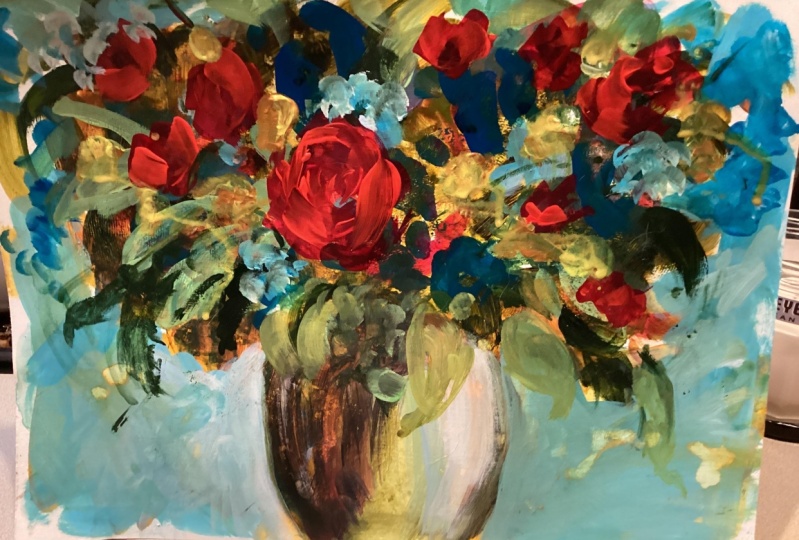
6. COLOUR AND TONE - PART 1: So I got my trusty hair dry, but it's a bit of a rainy day today, so I come put it outside. This is good as anything, but I'm probably gonna turn the sound off while I do it and a tip fear. If you want to get some interesting runs and drips before you do that, it's been drawing for a little while. I've bean fixing liking. You'll see that there's some wet parts here where it's sexually run if you just death them off. Now you these thicker parts of panky get texture. I always keep on hand a little spray bottle. If you want to amplify that, re wet it again and you'll see you can actually pull it out. And it just makes more text up, which will kind of make a bit of an interesting under painting. All right, so I'm gonna hit the dryer now so I can actually get ready for the next layer. You don't have to. You can just paint over it, but I want to have that Colorado me, that transparent color really locked down. It's still little them, but it's good enough for May. Right now. Let's head off to the next load of colors. Let's put on hand more shiny, bright ones. Just give my pellets a little walk down. It's pushed the pain back of it, okay? And I'm going to use my gorgeous, brilliant magenta. Put a little blob up there. Just fast forward past this because you'll be sitting here forever. - And just remember, you can mix any of those colors with white to make even more colors. But my plan is through the mixing on the paper, right? Let's just dive in. And I think I might just go for something. Some queen just put some queen raid you. This is a transparent color, so it's using it very loosely, washing it off. I'm need some greens again. This is another transparent color. So you're getting all this lovely texture underneath. If I had want to, these colors will become opaque. I'll just give you a little quick demo. So putting a little bit of watching to this. That transparent green, which was the Australian great great s Australian, you'll agree, and bang it becomes opaque. So just remember we couldn't do that and you could mix, of course, the basic mixes yellow and blue makes green and so on. It's just a ZR if you can afford to buy the Preakness colors to do it. But it's also super fun to mix colors and see what you can create. So you know you choose. All right now I need to get started on making something happen here. I feel like I'm missing dark, so I'm gonna go in with the ultra Marine and the purple just to mix up a bit of a Well, that's not dark, is that I think we need some blacking that there we go a nice, rich, muddy sort of green. Get some black into the seem to the It's gonna be age of my barbs. I'm thinking I might get a bit dramatic right now. Put some wiping off that brushing between really the secret if you don't want mud, and I think it muds useful is just toe wipe off and wash your brush in between. That is the case. It's very, very simple, and, you know, I have a clean palette. What creates mud is the complementary colors. You know, the three colors mixing together, you know, your red, green and yellow whatever. So we all know how much forms is just when you mix all the colors up right. But you can use my because it is a dull color. And it is an absolute imperative to have dull colors mixed inside your painting because they create the contrast to the really bright colors when you put them on. If you have all bright colors, it just can be a little bit overwhelming. And you could see here. I've got quite a dull business going on here, and I'm quite happy with that. I'm just gonna even try and make a bit more greening mud, trying really hard and take some of that to do it actually, deliberately. Might not. He's a bit of the pink. I used some of the green. I mixed with one of the yellows and the blues. I'm not being specific because you don't have to be. I don't get all, you know, worried about it. Just experiment and have fun. It's just muddy. Color is good, especially with acrylic, because acrylic is the beauty thing about it, is that it? It draws really fast, and you just you can look at all. The lions were already creating so I'm just gonna throw in some of that like green. I'm thinking, How is this gonna look? What is the background color gonna be? I have no idea. What a little bit of green in the files. Perhaps advisor. Just brighten it up a bit with some white Seiken started to find it and then wipe that off , Wipe it off. So I still I didn't wash. It just wiped out because that's still wet. Just rubbing into it and easing it around. See what that looks like? I might need to get some sort of, you know, something happening in here. So going to the this is a very strong green, The fellow green. I'm focusing, as you can see on the docks first, trying to leave a little bit of those textures coming through, taking that right across the texture from the under painting. And I just want to show you this Just a minute. I look like I'm going all over the place, and it's because I am right. So if you feel like you've gone too far, the good thing about drawing your painting first is you can actually rub back. So I've just got the rag. I've put it in a bit of water and look at that. Look at that. I've taken it right off altogether, but you can actually rub back and start to get more texture. It's not too much water if you don't. If it's just damn, that's not soaking with their You see what I mean? Look at that. More sorry. Repeating myself. I get a little bit excited. Okay, there we go. Just said and some more texture and they will come back again as the wayside. You don't know it off. Put. It seems like insanity. OK, so what about if I take some of that limb and well, I'm calling it limit, but it's the cad. Yellow lot. You know what? I can't see it because of their background. Izabal. Same color. I need to change that. Let me say I don't want that background to be that color. I want that to be underneath. I think a nice background. What could it be? Why don't we make a sort of a Yeah, I don't want it to be too bright. So a bluey sort of color. What about use the cerulean blue with a bit of white. Get up a bit. Let's That's too broad. Let's have a look now Put it on loose. Don't be too tight. Don't make it'll block. Even like a big blank slate. This is opaque color. But see how I'm moving the brush around and keeping it all loose and loosey goosey like that because that adds bit of fiber and see, and you're also letting the color shine through from underneath at some point, sometimes you have to blank things out. But right now we wanted to sing. We want those little colors to pop. I'm blurring my eyes so I can actually get a feeling of what I need to do here. It feels like it's all to blanked out there, So I'm popping some gluing there, and I'm thinking, Oh, something not right here. Need some blue. There's if the skies shining through on this vials, which is sitting in the middle of the way, and you can always pop a little bit of blue in afterwards. So you see, it's got lovely texture, and I don't care about my fingerprints. Bring you Put a bit of blue in there, all right, and this is layering and layering and layering. You know, I don't call. I don't like that shape. Let's get rid of it. I couldn't go in the dark blue. You just need to be black. Put that What? That's just a bit of a curve. Viciousness. And then on the other side, I didn't do similar with the same color and then all coming with some highlights That's given me an idea. Look, and look at that. Oh, how about that? Okay. Uh, yeah, us. Oh, yeah. So we actually now wiping the pain off again. I take that back a bit there. That has to get darker because I'm thinking that the lights started coming from this side. Okay, let's just take that back. Our use the white of the paper. All right. Nice. Yes. So I need to I need to get a pink in there. Just going to pull that out of it. Very rough. I think I went a little bit too roughly. I'm sort of painting on a bit of an angle here, right? I just think that they have been now on again. It looks very rough. Just put people pinky blue. We're gonna be the the agenda and a bit of the old train blew. Just bring it underneath. There is. If it was a shed are coming down. You can leave that. It's overdone on my happy about that right now because I wanted to be dramatic. Then I can adjust it. Leave that there. Now, what are the little tricks? So I'm gonna show you here. It seems a bit early, but I just want to do it because I'm thinking about the stock I've got. I've got some white here in that the cerulean blue. And I'm trying to make a nice A really light lovely blue, and I'm gonna mix it properly. And if you put your really like color against a very dark color off course, naturally you're going to get a lovely a lovely eye catching contrast. So again, still stained loose going is on the way out there. But you get a lovely contrasts. And these are the kind of things that take your painting from being really Ah, just sort of nothing to having eye popping qualities. Uh, I'll stay with it a little bit here, but I'm gonna bring in a little, a little bit more of that cerulean color when I get on this site, because I'm imagining that the lights coming from here. So it kind of hit this part here and then on the back wall say, if it's a wall, I don't know if it's a war, but if it's a wall that it will just be filtering out and sort of putting a lot of bright over here even more, just just to emphasize that we might drop it back in a minute. We're back going over the lines. We can fix all that. That's not important right now. What's important. You should just keep your keep blurring those eyes. They can get that feeling. Are you on track with this Blow your eyes blow, blow blow. That's all I can say just blue because you get lost in the mine, you shop. It's some, I mean, if you below your eyes and have a look at this painting now it looks like I I was feeling a minute ago that I was completely lost and totally ruined it, and that happens about 1000 times through the course of a painting. Believe me,
7. COLOUR AND TONE - PART 2: I'm gonna progressive it further now while I'm painting. It's drying Philly rapidly. So if you need to stop and have a blow dry with your hair dry, go for it. But you probably find that you know you can keep up with it pretty well. What can I do in this Mummy's? I just feel like it needs some or cohesive greens or blues or something. So I'll go blue and green, even though it doesn't look right. When you put it on, It kind of comes together again. I'm trying to remember to keep some of the color underneath. Okay, this would probably be covered down the arm edging off. Got leaves a doctor underneath. So I'm using my green and black here. All the greeny black. Try not to define anything two months and I'm trusting the mace because eventually I actually gotta make sense of it. And it's probably time to do that, very certain. All right, so we'll put a step of green. I'm just dipping back into the different greens. I'm remembering that because I've got transparent greens in here and getting different effects because I rubbed off their for example, the white came through Then when I put that, uh, straying yellow green, it's actually a really brought yellow, so just just amplify that for you so you can see what I mean. So you getting texture, I can wipe it back again if you like. And your Yeah, it's just endless. It's really good for fun. I mean, look, I just want that off there. And I ended up with a little shape, which is beautiful. I love it. So by all means play. They play with this kind of painting, and I've got a squeezy bottle. It's just that over there, just maybe I wanted do a bit more wiping. So this is why not just go for tissues? Not so much paper tell, because T shoes just a little bit more sensitive. Let's see what I mean. That's what we use them on their noses. Looks like that issue on the page. So what I've got here, I know people use alcohol for all these effects, but I don't drink very much. So look at that because the pain have a look at that. Isn't that gorgeous? It's left these gorgeous little dots. If I wipe it off hopes black That's what I'm after. Or dab it. I get those little spots. Hopes don't leave the tissue your tissues behind that. They get off their Excuse me, right? And look at those little dots. And that just looks so gorgeous on your leaves. You've got text to their that. It has to be a really light spray. I just want it over with. The key with that effect is you put a little spray on and you just wait. Gosh, probably a few seconds. Or maybe 30 seconds or 20 seconds. Okay. How long was it being since I just did that? That's not right Hand start. Do that. Maybe this is where Piper tell would be handy. Okay, so it's still not coming off. But if you go here, let's just go back to my wreck, shall we? Okay. See, the little dots are coming off because the pint is just coming off from the top. I really feel like right now I need a different talk rag. There. We Ah, that was what was wrong. This is more of a T shirt. They're so it can lift the paint off and give you a gorgeous textured effect. But as they say, Don't get too much or it looks a bit, you know, corny. Okay, I just put a bit here. I think that's enough for May. Let's go. I'm still just using this one. Brush only one brush. I feel like it needs to now get into the actual painting process, but I'm inspired. Unlike what Conceicao I feel like I'm just sort of wanting Davadilla 1000 cup of Tea's while I prick rest tonight and it is worth while stopping. If you're just feeling like Oh my God, I don't want to ruin it. Just stop and reflect and maybe just go and have a cup of tea and sit it, prop it up somewhere a little bit away from you and look at it and turn it upside down like these and, you know, blue, turning it upside down or looking at it in a mirror. Blurring your eyes really helps you to get perspective on what's going on. You can see the composition, meaning you know how the painting is laid out. You can see the light in the dark's better when you blew your eyes or you look at it from a distance or upside down. Whatever. We're in a mirror on git the mirror Things really good? Because it actually disconnects your thinking brain and your analytical, You know, the critic in you from actually seeing what's actually there. And that is the probably the single best tip I could ever give you on painting. I can already say I'm just looking it on one of the screens and I'm thinking, Yeah, I'm liking this, but, you know, we need some definition now. You don't have to fun. Yeah, I think I don't. All right, so let's get on to the next fix, which is getting more specific.
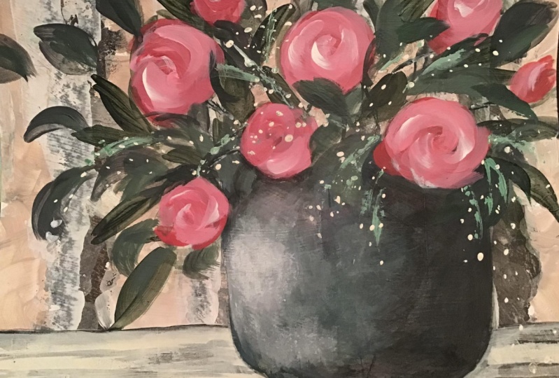
8. MORE SPECIFIC FORMS - PART 1: I just wanted to mention that I use lots of water. This great big bucket. Here it is. It's huge. And you really should empty it out occasionally. Get some fresh water. But a nice big bucket is definitely worth You're waiting golden. Just pop it or to the side over here. Right. Okay, Now I've had time to I went off and had a cup of tea, and I want to now get really serious about my flowers. I'm gonna make some sense of it, as this is a, you know, creative expression painting. I'm just gonna kind of imagine on I'm I've got something in my eye. I could just make a flower up, but I might just sort of kind of molded on a ready, sort of kind of flower. I don't actually have any What I could do with this some really dark rating here, but I'm going to use the queen the queen raid. But I listen a little Eliza, red and crimson, Repeat, but because this is a transparent color, I think it'll be arrived because it's just a little docker over the trouble. The other dark colors. You really need a hero or a focal point in your painting. You know something quite large. Well, we've got different things going on here, but it's always good to put it sort of off centre bit. But see, we've already got that. So I just feel if it really needs to go sort of here, So I'm just you can see I'm not too worried about that. Putting a split drive there and say, That's my hero, Flower. Just imagine I've got a few others around, you know, not too orderly. It was just to say that treat don't make him look like a pine plantation. Now, don't worry too much about this, because thes well, dry, quite Doc, and they're not going to pay what's going too far. Now rates probably needs to draw with. You're free. Look at what's going on here. You can see that the doc already gives it a impression. Being a rose, you could go in. And really, I'm just learning up my brush, see? Quite sick pain and boom, Look that boom. Just load it up and put a little bit of that. You want to study with that lovely pink on my hero? I'm going to do that, and it already looks like we're on track. I've just put a little swirl. Boom. It's a big rose, remember, it will drive it darker, so just stay put for that. I think I'll just have a little play. I've gone in for the good stuff. First a red. I've got the warm Rid the cab. Me in red like that. I could just get so carried away with this. Okay, I think I'm going roses here. I don't know. So the curl on the curl and the curl It's a little bit of a funny little brush movement where you just occurring around like that David thing, and you can have another one room in the middle. Pretty nice. I think I will put it a little bit of a highlight on the top there. And actually, just a little thing in the top pick, just as if it's catching the light. Maybe this one's peeling back. So you look how simple Betty's. I could just leave it right there. What do you think? E probably, but we'll keep going. And if we make a miss, it doesn't matter. All right. So I just feel like we need to have something kind of yellowish like a daisy feeling, you know, like something. So I'm gonna get the warm yellow, which again is transparent. So we're not gonna get much joy was gonna put a little bit of those kilos. Just put little deeps and dams here in there as if there were sprinkled through your bouquet. I have one over the back there. It's nearly date. Okay, so we've been here in there, and I'm not concerned that this is the dark yellow because it's the under painting. It's It's okay. Transparency is good and that the transparency actually picks up the under painting, and it gives the illusion off shadow and all sorts of different textures. OK, that's enough of that brush. A good wipe out and go for the lemony one, which was the kindred line. Just a little bit. I could probably switched to a smaller brush. What do you think I'm still on a number 12? Just to show you couldn't do it? Now let me think. Daisy said about the yellow center. What am I doing here? Making your fellows like I so yellow. OK, so do some yellow, right? So put a dash on the top. Just always say it's a gesture. Don't state it. It's just a Justo don't just sort of make it like a cool again. Might be easy with a small brush. But I'm gonna just be stubborn about this. Surely a flower that looks like that. What's that? Flower? Lucky. Something like Armenia. Okay, whom now? A daisy. Maybe there's one down there that's just sort of coming out on a branch, Maybe. Okay, just different textures and sizes. You'll see. I think I'm going to switch to a smaller brush. Sure, this one is the number eight, but you really could not do that. Now I might go green again. So I think my green is just about all dried out. So going into the dark green looks like my paints tried out of it. I have to reinforce it, and I just need to kind of pull out a few more distinctive shapes cause it's a little bit crazy in there. My needs more of my lighter green or owner. Hang on. I'll just put. And this is what you should go grab something on your palate and bring it in and use it up So just a few greens with a bit of that. This is what you get. Okay, so that's made me and loss. Let's have a look at it. Oh, yeah, that's so the second green, but that there were no scraping it up. A bit of a look. Such a natural green. Let's do some more. So we have some of that. Do you see it? Just get rid of it. Um, a beautiful to sell a green with the warm yellows. That's a bit Mixi and Mobley, too. It's just delightful. Boom. We will sort that out in a minute. You can see how I'm doing, less less work and more fiddling like isn't just not really painting much. Okay, it's not quite right. It's just painting itself. That's what I love about this kind of finding. You barely have to touch it. What if it's just lay is coming through that it's almost like you're conjuring it up in your mind? Let it get into a vase of flowers. I feel like this just needs more light. So being careful not to overdo it with my brash because I've already got this really loose liking this white, it's going up here, but something No, it's just needs a little just some of the shapes, I think, or even some more darks. So I've taken needs more that black. Let me get that. Even though it looks really Doc, believe me, it's a really important thing to do is get the strong docks in what I said about the times . So the turns are the light in the dark. Can you just put a bit of focus on eyes so gently? That's why I'm using grain black, which is a transparent black by a tilea, because it's not as dead flat as just a sort of a lamp. Black was something like that. It's actually quite like it's gonna be singing it. And if you finding that something's a bit flat, you know, in an area just if you put a a really dark colored next to a really like color, like you'll see it just jump out. I think it's time for me to put some, so I'm just using some little sort of sticks and things. This is the number I and it's just a good brash. It's quite sharp on the end, so I've just got some of that Blackie, The grainy black in there and was Well, that's cheesesteak, isn't it? Put some of their You don't want to look too structured. That's to think I'm gonna go to my little brush. Where is it? A little bush. Somewhere in here, There. So little one. This is the number four. Just the little round. I don't want to be true structured. So look at me. Holding my brush will silly because in a good bit more natural just pulling along, not controlling it too much, dragging it through some of the whipped cream. Well, water. And then just get this and again, I'm not I'm not drawing with it. I'm just gonna, you know, because dragging it around, speak random. You do that with a pass stolen or something like that as well for this. What? Just up. Just down again. I'm sure you know this, but just get your water bottle if your palates getting with fry and for lights, kids away from home time connection. Diving into the wind. It's just green. All that's left on the brush to see what happens if I put a little bit of a life because we need some light in here. I know. Deliberately stay dark and mysterious. For now, that's just a like green. It's running those little Jake ID. Do you want us around? Just okay, Jock and Doc, Doc and Dramatic. I think it's time for a little bit of something light. So back to the number I eat, which is just a bit smaller. And I really feel like I want some daisies. And those daisies, like the ones that have got Why so thinking about that I'm not using just straight white yet. I've got the ultra marine blue which are mixing of it a wide hidden to make a lovely, shadowy color. Now, I haven't been using that move color very much, by the way. But let me just put this little a tainted. What? This needs something, right, Mr. Big is if it was a little cluster. Yes, maybe something over here, like little clusters like riel flowers. Just a little costa much. Yet. Just trust how the paint is picking up the under under story of the painting. Because that's where we're going to get that lovely illusion off texture and dips. I just work. Well, thing is very dark. So going here with little pretend Acosta's just to start? Uh huh, really easily. Just like a bit of some sort of nice green to come out of here. It's very loose, isn't it? You know it's not tight, and I get worried if I get you even. This feels a little tight to me and you know, it looks too much like a leaf. Sounds inside. I will send up doing. They send themselves bad Kurt. Now let me think. I need the white side being to saving to last. Should I use a small brush? I could almost do with something a bit in between, but I'll try with this bigger one. So this is number eight straight into the pure wine. While it's still a bit Wait, it's sort of definite woman. You could just if you get into the detail, it'll change what you're doing. You know, it's a different type of painting, so I'm not doing that. I'm just, you know, I'm not painting every single little little spray, but you can actually do a few just a little suggestion social here that in a minute put a little a little swath of point. It's my terminology. And then there's that Brushed, trusted in the water. I think it's okay. So you get white line escape a little bit of one point. I just I'm just undertaken. See that right over on the palate? So just get over here, got some woman and mixing some watering to get juicy. Notice. I haven't used any mediums except just good old H d. O. Now thesis way. You could just put just a little suggestion just here China to be too obvious. And if you pick up other colors, it's kind of good, because look like a daisy to make that I don't care. It's changed and you can, too. No, I don't want whatever these are. They look good, but I'll make the more like daisies in a minute. Don't worry. So now you could get that white and just you just have a little Actually, that's not the way to do that. Get your palette knife. Just get a bit on it. Just sort of a few turtles X like that, just sort of really using that picks up. So just Oh, what have I got to be the pink just picking it up and pop it split up. Okay, that's no the a little Russian just looming and just get a really thick blob of yellow. Actually, just like it needs to be more that golden yellow. So I'll bring in some golden yellow into the cadmium to just make it not so cool. And that's a bit, too, which just let me try, kid. Actually, it's just No, um, maybe it wasn't weight enough. I needed to, sort of really just want to leave the little, very good. The little blobs on top, just bringing in clues that there's something going on. Okay, it's almost time for me to stop and have a little bit of a reflection on how it's going. Get a little curly Wellies with you if you just makes a bit of water in quite docks, killing him and bring that up just fixing in a bit of green. I'm describing whatever's on the palate. Just put a little around a Greenleaf there. It just needs a bit of light, so yellow. No way we can do it now because it's just an expression. Now let's sort these vials that just doesn't
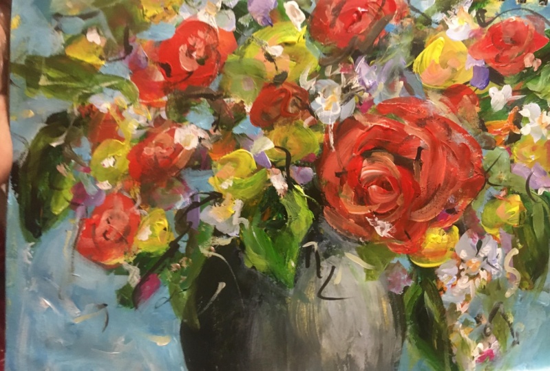
9. MORE SPECIFIC FORMS - PART 2: gone over. You actually keep going with that. Let's just move of it. You can leave a rough like this. It's gorgeous like that. Like it myself. But it's this just doesn't quite look right. So let me see. You know we didn't use. We don't use that move and that's what's me. See what happens when you put a bit of my If I need to get people blew into the mouth. So bringing in a bit of ultra Marine blue Oh yeah, that's it. That makes it nice. Mr. Scary that it's like a really colorful. Okay, more bring something else. Speaking to that in a minute. Like just say all right, Kushner. What's among flower terminations or something? And then I want to go into here. So have you ever think about this? Somebody use a bit of the flag and a bit of the blue. You're the coach Marine because I wanted e wanted to be traders least interesting. Just that you stri I shudder of relief will come down, and probably that is just way, do something or other. OK, so I think you need a bit of shell are around. She's a friend of my brush. I need to bring that shadow around from the other side here. That's more help works. You know something spherical? Um, the If it's alive, it will come around. Or if it's the doc, it'll come around because it's very cool. It's a circle that's not working. What to see if it works and way Make the rules. We have created that for me. Just using water, too. Uh, get out of it. He's it around. I do quite like with warm lot that are putting their try and retain that I'm not from blamed. It can actually brought it back. So I'm using that soft T shirt whose is getting the grody. It's damn not necessarily soaking and look, just walking it back. Getting text up takes your because we've put some paint on it. Just needs a tiny bit. Maybe thinks that Let's just take it back a little bit more. So it's like I said, wiping off, putting on, wiping off, putting on Doc. We'll go in now with a big spackle off. What? That's just glowing off that little corner. All right, now, perhaps I need a bigger brush because a bigger brush stops you from? Well, it's just because it gives you a nice wolf feeling. It's not some things you need to be. Brush something and in this guy's bigger brush allows me to blend just more quickly. Yeah, exactly done. A very good Children just die with me about learning and you say process. This should be Doctor. And I don't mind that I've got different colors because I'm thinking, What is this, Father? I don't know. It's Ah, it's opaque. It's all right And I'm just bringing in some of the greeny black Still got some of the blue Have been shadow the picture that number h so just shed over Just using the ultra Marine and the greeny Black just to be depends on a hang on. Lots coming like that. Science is probably show is here. I don't worry about too much keys. Just recognition. This is why I love expressive right goes dark after I get really date tiled and think about all the technical stuff. We have enough of it and I got a lot. It's even now suddenly drive myself nuts because honing down and it's off driving. Grazie. So I'm gonna stop that swing that out and I'm gonna go back to that little green. I'm running at a green, so I'm having to Duyvil over the palate. Now, toe. Make it. I'm making green out of blue and yellow and wait. That's a bit greens and it's a green green. I'm gonna put it there. Put it everywhere. True, that's right. Now that we see, let's have a review of what we think I need to do the I blur thing, I need to stand back. Oh, I need to do come back now with the delish ride. Just needs a bit of strengthening up. That's around the that's around. They interesting, a better Roy's no made such a good job of that, so don't worry. That's what we do. We fix it, make a miss me fix it now that I feel like I ruined my rise, just like I don't think it too much light on the bottom moments. That really cool. Oh, you know what we didn't use and why? No, we didn't use out Magenta. We're just doing a rainbow bars. Let's do it again. You have to have all these colors, but I love a rainbow bouquet. So Here's a big pink flower over here. Maybe that's too distracting. Always do it and then go. That's too distracting over there like that out. Just breed. Do something else. He'll put a subtle something yellow and subtle. They just know that back. And perhaps if we're going to have the focal point sort of here, it might be better. Just sort of have a little pink. Just a little Tony peaky. Think getting to see if we just It was just a Philly, uh, watery mix you get the impression of dips from thing is deliberately being crazy and psychedelic. Hi, Peter Bond. See, if you want to. You can now come in and do the around the sites of the vials to make it stronger. So perhaps will do a little bit of that. So you get the idea, and then you can choose
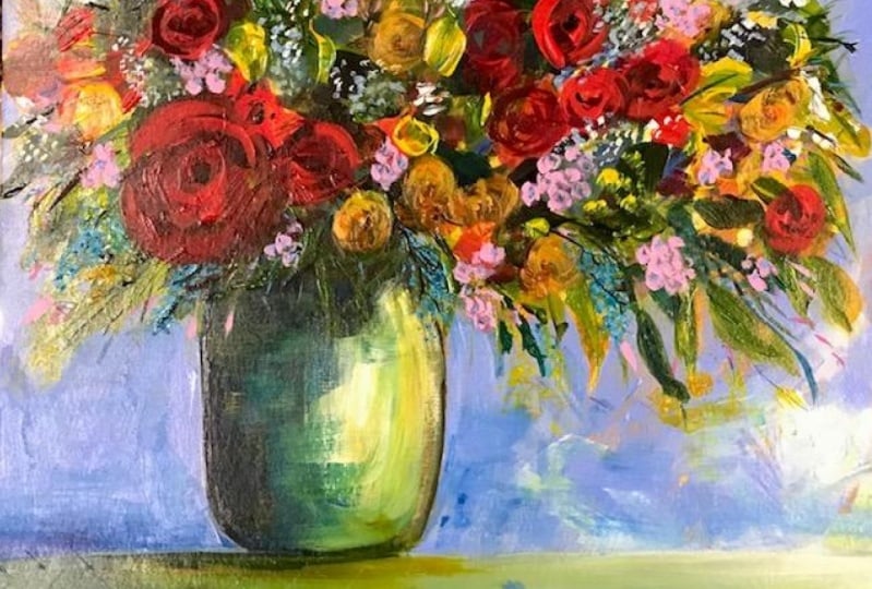
10. FINAL TOUCHES: Okay, well, let's have a crack at this. Be the blue here, so I'm probably going to need some more blue. It's pretty yucky there. Oh, maybe I couldn't men each. Let me just scrape it out. And my pal, it's getting busy, but I'll bring No, no, that see, It's getting polluted, so to say, And I actually wanted a fairly clean I might just turn my pellet around here and mix this blue here, just grab something. I shouldn't do it like that. Should I get using my palette knife? Alright. Starting to put that you and bring some white and and some water now depends on what I want here, darker in this corner. Maybe so. Just get some more strikes again. I don't want to make it to flat. It's got a really light and fluffy feeling, but where it makes a difference is sort of where you hit the ages of things. It's like I was saying before, it's the edges that matters. Make sure it doesn't look like I'm during around the ages by making the color more sweat, saying died flatten your color. But at the same time, if you look like you've got a line around there will look flat. You could just rough that up if you like. It doesn't have to be perfect. Just occasional passage of type is good. I'm making this look more like it's, um, got shapes now. Little TPL Yes, to get the sense of light coming through, make sure this is dry and then come in ports in Philly. Thick pain that's going to stand up, be counted my pipe paint. And just think about where you're putting it, though, because imagine you're going. You're making, like, a lot. There's light shining through somewhere when you're doing it. Think about what's behind him again. You don't have to be really perfect because you've got an expressionist time, but it just makes it look like this. It's rather than sort of paint things around it. This is a better way to go. Thank you, Scott. And just put little stamens anything coming across them just so much easier. You're gonna run out of blue again. OK, so I've got the blue lighter on this side. That's really quite Doc in there. Quite happy with that. All will fix that in a minute. This is really just us finishing off just during the little finishing touches. This is light on this blow so more white into that blue. Okay, keep it loose and you see the shed over here. We could leave it. But if we just go around it quite, Nate and just pull it out So it doesn't look like Trinity, and you get a nice cut out of faith. Bit of a foreign line between coming together for just four to see. Lovely, Lovely, easy, easy. Just walk it back, okay? You can see the shape. Just move that brush back and forwards around. Don't just go one way, because then you get lovely texture. It's be really generous with paint at this point. It's just liking up. It's putting light and atmosphere into the flowers. If that's the sky, it's been rough. But get the idea actually gonna what darker than before? Here, to your health. You know you can go nuts with data, and you do go nuts with the title I do. Some people are just naturally, their nature is really good with detail. That's the preference. And if you're one of those people, thank heavens for you, because without you we'd never get anywhere in life. I'm a big picture person, you know, very much so. So this kind of painting is just joyful for me because I could just play and not worry too much. But I do go down that rabbit hole. All right, So what I want to do now, we could just keep going with that refining and do the rabbit hole. Last step is I want to find my little brush, which I have lost somewhere, which is typical of May, Um oh, it's in the water, but here it is. And I'm just going to do that little you know, this is where some people would use what's called a rigger brush. But this is where we can go back or first of all, just go back. Like I said, and where it looks a bit cut out, you can just come back with some of the colors. Whatever you've got left on your palate that works, my palate is almost exhausted, and that's a good thing, you know, and just sort of cut back in. That's not quite right there. I think I have to make it a bit more, you know, just sort of cut back in. So it looks like you've got the volleys on top of the sky where it's peeping through. You can just a little bit here. I really do need. So I'm gonna bring some rate into the green to Micah. God. Okay. It's just a nice kind of brown color cut out feeling is actually quite. It's a look and you see it sometimes it's some deliberately painted like that. I think the best way to sort those little gaps Ari's to just get your little brush lots of water on it. Is that brown in color And, you know, just come back across like we were doing before. Probably doesn't need Athena brush or just a line marker of some sort. You can just use a text or if you want, and perhaps we need a little something going down here. Do what? That curly bit here in the year. A little touch up, see a little highlights. Good night. Things that little brand cheap. It's We're just about there. Put some light ones there. I O Watson. I'm just gonna be the y mixed with green yellow, which is now put a like here in the If you run a pale one over a dark area, it stands out more. That may be something coming out of here, and, you know, like you could do little details and things on them. But I think that's actually just fine. Lucky's. And when you've done that, just sign that. Use a color that's a little bit darker than everything there and head down to the right of the left side. Usually you do it to sort of balance the composition. There's more space over here. If I put it there, it just looks like everything is hidden over that way. And, yeah, I think my good. I'm sorry. Just doing the last little chick. Sometimes I have little last minute ideas, so I just I just saw it with my water. Right, Done. Don't have to put the data. Don't put that on the back if you want. It's really good to do that, actually, cause imagine if someone found your painting in 100 years and they got a when was this painted turned over on the back? I think that's pretty much done. I made a huge myths I've got I just lift it up and see if you can see that a little bit closer. There we go. And I've got almost all my paint is used up Fantastic. And we've had a lot of fun, And I think you know it won't take you too long to do that at all. I hope you've really enjoyed that. And don't forget to look out for me on Instagram Helen Norton are everything's Helen not nine or Helen Norton Argus YouTube. So follow me. Subscribe to me. All right, guys, I hope you enjoyed it. If you've got any questions, just, you know, send them through, so yeah.
11. WHAT NEXT: So how did you go? Did you get it done? Do you want to do it again? Hope so because this kind of painting is the kind that really I want you to feel like you've just finished. And then you think I want to try that again with a different flower or a different image or a different color. If I have evoked that, he knew I would have succeeded in my mission to stoke up the golds of painting. So what's next? Well, I'm busy making more courses, and I hope you can stay tuned with me and follow all the social media things. As I said before, you know, blah, blah, blah, and keep up to date with it because I intend to give you a lot more and send me and whatever your ideas are. You know, if you've got some things that you know some challenges or fears around painting, let me know. It'll be helpful to me to understand that and perhaps liken, abate some of your fears with some quick instructions or slow instructions. Okay. See you in the next one.
12. BONUS LESSON - Gesso Paper: has promised he is the little barn ISS module, where I'll show you how I just so my paper, so that when you're painting your paintings on paper, you get a really nice texture, and it really makes the paper. It's waterproof, so you can wipe off and rub with a rag and things like that. It makes it just much more durable. I've used various papers. He just scrap papers. I've got some of the print papers on do some water color papers and that those papers are by nature, very absorbing because they meant for water colors or even printing. We publish all my artwork here, so we have printing paper now. Thesis is the sort of stuff he can use, even probably a really heavy, quite thick bond paper can be prepared this way, but the key thing is, is that it's heavy enough is in a least, probably 300 GSM, so that it doesn't walk when you put the paint on it. So that's pretty important that it's quite, you know, reasonably thick. So let's see how this process goes. I've got some canvas here as well. This is just an off cut because I stretch some of my own canvases, so this is already primed with Jess. So I just brought this out to explain that if you know if you're new to painting eso, you don't actually have to do anything to that. But if you want to get like a built up, quite smooth surface, you can guess. I canvases well, even if it has been primed already. So as the paper I've got, this is just printing paper that we use on our big printer. This is a 300 GSM, so it's quite suitable, really. It's some. It's just a thin strip, and this is ideal for some playing around and test runs. Uh, this is a think this year's Let me just have a quick look. I think that's printing papers world, but just a thin watercolor paper would be OK. So let's just do a couple of these and then you can get the idea with this one. I could just tear it into little little pieces that I can do a little demo Jobs on really should do for this purpose out of there, I've got these huge big tubs of eso that, um, I get from the arch I use Jackson's were in West Australia, and they're one of our great supplies. We can get your so anywhere it's the's just stuff, spilling it everywhere. Thes are massive buckets. You can buy them in little tubs as well. What I don't really do is dole out some into a small top because they're so big. And I also find that this so it's so thick that it's just almost too thick and you can water it down almost half and half of import lots of layers on instead of just, you know, struggling for getting a thick layer on. And he's a nice speak full one who told just opened up. I can see the consistency of that this quite thick. So in this case, oh, just taker. A spoonful. It's like delicious cream. Put that in there. Normally, I'd have that in a little close tub so I could seal it up afterwards. But this will do it for the job now that on properly mix in just a bit of water. Actually, I didn't just chip in a bit clean water. It just makes it a little bit more pliable, like some spice here right of things that a Sarah's brushes are concerned. Just probably a bit more of a course hog hairy one. That's just a great big bristly one that I've got or one of these paste brushes is good enough. Not so much a really smooth, soft watercolor brush that's a household paintbrush. Perfect. So I'm just going to use this little guy here and you look, it's just a simple, a very simple process of just putting it on. I like the texture that I get. We're not. Put it on thick. Well, you know it's painting down, but it's still think I just love that lying texture because it comes through when you're wiping off when you're painting with your chronic. Later on, when this is all dry, of course, you've gotta have this bone dry, and you get these lovely textures as you're wiping off, you'll see in the when I'm doing the flower workshop. In the beginning, you'll see those where the paint gets stuck in the grains. So I would just go through and and, you know, put suggests I want it'll one after the other. You're so both sides. If you want, that will actually hold it flat, but you just gotta wait till it dries. And then just repeating the process very fast. Big run. Some people roll it on. But I as I said, like the the actual brush textract clean the spring problematic. Oh, gosh, I make more mess myself. This is just the best ground for Croelick. On paper, go. Let's make sure you levels out a favorite, and then they just go off into the sun. Make sure you wash your brushes or in between coats. Just stick them in a plastic bag and what wind them up. I'll just show you has promised plastic bag orbit a glad rep. Good enough. And in you go like that, and then you don't have to. Why should every time you just leave it? Not for too long, you know, Just keep like that for a day or so. Just make sure it's will wrapped up with a rubber band or something. And then that way you're already to just continue on to the next coat, um, one after the other. And how many coats saw put on as many as you like, So I know some people who did it. Prime their canvas with just so. And I think that's like 10 coats and they send paper and in between, you can do that, too. But in this case for this particular workshop, the effect you'll get that lovely, coarse textured effect will be better gained through, not saying papering it. And, you know, maybe two or three coats is well and truly enough, so hopefully that gets you through so you can make your paper. If you don't do that on your you know, you don't buy all this stuff to start. You can just by a little canvases or a piece of canvas. Just so that's just a little canvas really, really cheaper. One. I think I got that from one of the $2 shops for about $2. I can't remember. They're just fantastic. And again, if you want to get that textured effect that you know with the street, sort of like the streaky bits of the paint leaves, then definitely, even though these air already primed off you go put it on there on the canvas and you'll still see the canvas texture through it, and that's fine. But if you want to get rid of that canvas texture and get, um, you know, like a kind of a streaky. So look, that's what you don't. But you'll probably need quite a few cuts to build that up, and that's that's your little canvas. Look, I
 Helen Norton, Creative Artist and Instructor