Transcripts
1. Welcome to the Watercolor Marker World!: Hi there, I'm Marie Wally, and I'm an artist from the
Northeastern United States. My love of art started many
years ago with graph Lite. And then eventually I started dabbling in watercolor
brush markers. Because they were gifted
to me by a friend. I quickly realized that these markers mimic
regular water colors. But they have several
unique advantages over regular
watercolor advantage. Number one is that they don't
require much set up at all. You can just start drawing
and blending immediately. No need to get a cup of water or squeeze
paint out of tubes. You can just pick
them up and even take them with you if
you want to draw in nature advantage
number two is that they're much more vibrantly pigmented than
regular watercolors. So you can really
create drawings that pop Advantage number three is that
they're better than regular watercolors
for finer details because of their tips. But you can also use them for covering large surfaces
with the right techniques. These pens are great for artists who are perhaps
already familiar with regular watercolors and you want to incorporate
something new into your art supplies if you're just starting
out as a beginner. These are super simple and
easy to learn how to use. You can even mix them
with other mediums like colored pencil and
watercolor pencils. This course contains
a variety of lessons. In each lesson, we're going
to cover the materials you'll need and we're to get
them blending colors, gradients, highlights,
and stipling. We'll utilize those techniques
in several nature inspired subjects to improve
your art skills and get in touch with
your inner creative. They're a versatile
art medium and you can create quite a variety of
different art pieces with them, such as landscapes and
everyday household objects. Nature drawings like flowers,
animals and insects, abstract paintings, water
and even human skin tones. By the end of this course, you'll have a
colorful collection of paintings and tools and techniques that you
can carry with you into further exploration
of this medium. At the very end of this course, you'll paint a
subject all on your own using the techniques
from this class. There will be some reference
photos provided in the project description
that you can choose from to base
your project off of, and then you'll upload that
project to the class gallery. Let's get painting.
2. How to Paint Color Washes and Mixes: Welcome to this first lesson in using watercolor brush markers. Today we're going to start
off with the basics of color washes so you can get comfortable using your markers. We'll also go over
the materials used in this lesson and where
you can purchase them. First off, I'm using two different brands
of watercolor markers. The first one on
the left here is the Chromatech brand which
is designed in Japan. The Master's touch here on the right is a USA
based company. You should be able to
find both at Amazon or an online vendor if you
live in the United States. You can also find
these at Hobby Lobby. You should be using
watercolor paper. I recommend using
cold press paper with a minimum of 90 pounds. Pounds refers to the
thickness of the paper. Most regular watercolorists
use a minimum of 140 pounds. You can see how
many pounds it is, just by looking at the cover of your art pad to get started. The first type of wash we're
going to do is a flat wash. I'm going to lay down a
swath of this red color straight onto the paper and then I'm going
to smooth it out. You just want to
blend it out with the water to make a
nice even flat tone. You are going for that
consistent color value all throughout the Swatch, just pulling those
colors across the paper. Then we're going to
clean that with a tissue before we move on
to our next color, because we don't
want to mix them. As you can see, it's a
nice, consistent color value overall and it's
drying pretty quickly. Next we're going to do
a grated graded washes demonstrate a gradual change in the intensity of
the pigment as it transitions from light to
dark, or dark to light. The graded wash
technique is very important in art as a whole for shading and creating
smooth transitions such as in landscapes, skies, and bodies of water. Here I'm demonstrating
with blue. I'm using more water
to pull the color across the page to
create that gradation. As you can see, I just
laid down about halfway across compared to the
red swatch with the blue. And then I pull that pigment
all the way to the right. If you want to make
a darker gradation, you can add more blue on top of the already wet wash and just pull it towards the right
with the water pen. To create a smooth transition, you might need to clean your
brush a couple of times to get the pigment out of it
to create that lighter, lighter wash as you go. As you can see it's creating
a really nice transition. You also want to make sure that you get it before it dries. These water color markers have a tendency to dry
pretty quickly. Just keep that water
brush filled on hand. Next we're going to do what
is called a variegated wash, which is two or more
colors merging together. You can apply one color
on top of another or let them bleed organically into each other
through the water. You can pick any colors. For this demo, I'm going
to use a yellow and green. I'm just adding the
green to the paper and I'm going to blend it
with a little bit of water. Be careful when you're squeezing out from the water pens because they can squeeze out too
much and then blotching, I'm just pulling the
green towards the center. And then I'm going
to add yellow to the right hand side and blend
that towards the center. To merge it with the green, it will create a nice mix
of the two, a yellow green. Another way to do this
variegated wash is to simply add both pigments and
then blend with water at the end instead of
blending them out separately. And I'll demonstrate
that here with a coral orange color
and a deep yellow. I'm just laying down both
patches next to each other. And then I'm going
to get my water pen and mix the two together, this overlaps them more instead of having them
only merge in the center. Another very common
variegated wash that I use all the time in my art is three or more colors
of the same shade. And you can merge them
to create a lot of rich colors In depth for this, I'm using carmine,
fuchsia, and pink. This time, I'm not adding
the water until after I add all three colors
to the paper. Depending on the paper, you'll
get different reactions. You can test your
paper and wet it before you add colors
to see if it blends. But with this paper,
it's high quality, so you can just add the color
and wet it out afterwards. All right, So I have one last tip for
creating a lighter wash, and that is by
adding some pigment from your watercolor pin onto a slippery surface such as a plastic lid
like I have here, or any water resistant surface. Just wash that pigment
out into the lid. Try to get as much as you can or as much as
you'll be using. And then you're going to get
your water pen and squeeze some water in there and pick that pigment up
with your water pen. You want that on the tip so that you can apply
it to the paper. This is useful when you want to create a very subtle
color in your art. We're just going to wash
that down and you can pick up as much pigment as you
want from your surface, but as you can see, it
creates a nice light tone. So there you have
it, six different washes that you can
practice as many times as you'd like with as many
different colors to get a good handle on these
techniques for our next lesson.
3. How to Blend and Layer a Sky: Welcome to lesson two. This lesson will build on
our previous lesson through a focus on gradients
in blending colors. And we'll do that
through a sky painting. I've picked a relatively
simple photo that you can download in the
description of this class. It's one of my own
reference photos. Taking your own is great if you don't want to use
someone else's photo, the first thing you want to do when starting a painting is to pick the colors that
most match your reference. These markers are so
vibrant and not as earthy toned as regular
water color pigments, our painting will look a
little bit more colorful. You can test out which
colors you think match the reference photo by doing a test swatch of colors
with your markers, I picked several different
colors that I want to test and see if they match the
reference photo hues. You can essentially create a color directory
with the names of all the colors in
your watercolor pen set and their respective
color swatches. It's a fun exercise
to do as well, to familiarize yourself
better with what you have on hand for this painting. I'm testing out purples, blues and yellows,
and a few oranges. I think I'm going to go
with a dark blue pink, two different yellows, and two different
oranges for the sky. I'm also using the flat
brush that came with the set as it will work
best for blending sky. To start out, I'm going to lay down that purple blue color and just continually add more water and pull it down on the paper. Also, I just want to note
we're leaving the moon out on the reference photo so that you can focus on the gradients. Next, I'm just blending
a pink in there. And just merging it with water, then I'm going to add some
yellow on top of that. Basically, after I
layer each color, I'm adding water to blend it
into the following color. Here's a tip in case
your pen loses pigment. Sometimes that happens with
these watercolor markers. You just need to take
that marker and do a test scribble on a blank
piece of paper to get the ink to flow
back into the tip. We're going to let
this sky dry a little bit before we move
on to the foliage. These markers tend
to dry quickly. It's a fairly fast process. All right, to do the trees just create quick
little shapes with the tip of your pen to mimic the outline of leaves
and the tips of trees. I'm just adding little
squiggles and I'm only using black in this
demonstration. If you think you see colors in your reference photo though, feel free to add dark
greens if you want to. All right, and
there you have it. Feel free to practice the sky using any of the different
sky references in the class resources until you're comfortable
with this exercise. Our next lesson, we'll
go over more ways to build on blending through
a fun fruit drawing.
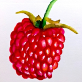
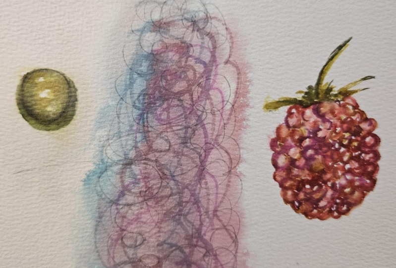
4. How to Paint a Raspberry: In this lesson, we're
going to explore blending colors
within a raspberry. I picked something rather
simple and repetitious with just a few variables you'll need to keep in mind
while painting. To start, we're going to sketch a simple outline of
the shape as a whole. And I'm sketching
the left raspberry, we'll ignore the
one on the right. For now, sketch slightly following the curves of
each raspberry bump. Don't stress about creating every single bump
on the raspberry. You just want the gist
of what it looks like. It's fine if you add more or less bumps than
there actually are. Next, you'll need your
colors for this drawing. I've picked yellow, light pink, Vermilion Carmen, and Red. Remember that you can
do a color test to see which markers will best work by looking at your
color directory. We're going to start
with our lightest color. In this case it's yellow. We'll eventually move on
to the darker values. But it's important
in this case to build up with our
lightest colors first. As you can see on the left
side of the raspberry, there are no direct highlights because that part
is in the shadow. So we're not going to leave
any white highlights there where the sun hits each raspberry
bump on the right side. However, you can see those white highlights
and you want to leave those areas untouched. Also, don't worry about seeing the pencil lines
through the color. If you want, you can erase them, but we'll go back to that later. As you can see, I'm going
over each bump now with the light pink and I'm adding water with the water pen
and blending out each bump. The gradual building of layers
adds a realistic touch. It may not seem like
all these colors are actually in the raspberry, but through careful
study of the color, you can see there are actually other underlying tones of
yellow, pink, and orange. Right now, I'm going over the left side with
the vermilion, just building over the p
and the yellow layers. It's definitely helping
it to pop out more. As I paint, I'm continuously dabbing out the water
from the pen Since we're working on such a
detailed drawing and we don't want too
much water on the paper, we also don't want to pull the dark values onto the
lighter areas of the paper. I'm also dabbing up color with the pen and wiping
it off at times. All right. Our last
color is this red. And I'm doing the
left side first, working towards
the right because we don't want to
smudge the painting. But if you're left handed, you can start on the right
and move towards the left. There is one more
thing you can do to bring some more brightness
to this drawing. That is to take
your yellow marker and go over the raspberry
bumps individually, where the middle tones are. This will just help bring
out the brightness where the sun is shining on
those raspberry bumps. Next we'll do the stem. For the stem, I've chosen
yellow, yellow green, pare, yellow, olive golden
brown, and dark green. I'm going to blend
the yellow onto this lid to do a very
light wash over the stem. I'm picking up the
pigment from the lid with my water pen and
layering it down. Next, I'm going to do the
same with yellow green. Then I'll use olive to add areas of dark shading near
the base of the stem. Just go over the darkest
areas until you're satisfied, making sure you leave a few
highlights and we're done. I hope you enjoyed.
And our next lesson, we'll cover highlights with a focus on a water
droplet drawing.
5. How to Paint Highlights: Water Droplet: Welcome to lesson four. Now we'll explore
highlights with a specific focus on
a water droplet. Highlights are the areas of concentrated light which bounce off the subject matter and we can better perceive
the light source. To begin, we're going to
sketch the outline of the main droplet in the
center of the photo. And we're also going to
outline the white shapes, which are the highlights
within that droplet. You can draw the
shape of the droplet as large or small
as you want to. Next, we're going
to pick our colors. Here I have a
fluorescent yellow, fluorescent green,
regular green, bottle green, and dark green. Again, I'm starting with our
lightest color and it will be the undertone for
almost the entire droplet. I'm making sure to
avoid going into the highlighted areas
as much as possible. I'm just going around
dragging the pigment with the water pen
closer into the center, but outlining that highlight. Next, I'm taking the
fluorescent green and adding it on
top of the yellow, trying to make the green go around the edges of
the oval droplet, and then merging it into the
center with the water pen. Next, take the
regular green and do the edges blending
slightly inward. We don't want harsh
edges on the droplet. We're going to blend
it out with the water. As you do that,
just slowly blend it towards the yellow
and the center. Now take the bottle green
color and do the same, being careful just to do
the edges and blending it inwards so there
are no harsh outlines. Now we're going to erase the highlight area lines since we don't need
those anymore. And we're going to blend over again the green with
a yellow marker. Then I'm also going
to go over that with a fluorescent green and
just blend it out with the water pen here. I'm just adding more outlines
to really make that water droplet pop with the
dark green and then just continually blending
it out with the water pen. All right, now
we're going to add some details to the
highlight areas. If you inspect closely, you'll see there
are reflections in the highlights of
very pale green. They're like little dots. We're going to dab
tiny bits of pale, fluorescent green
mixed with yellow on this lid and then apply them
lightly in certain areas. Lastly, we'll do the
shadow and outline the bottom edge of the droplet where most of the shadow is. For the shadow, I've
mixed fluorescent yellow, fluorescent green,
and regular green. And I'm layering the
shadow color by color. Now that the shadow is complete, we're going to move
on to one final step. Just take your dark green and go over it with
the water pen. You'll also want to use the
regular green to help blend the dark green into the droplet so there are no
harsh transitions. There's our water droplet. The following lesson
will dive into a fun stipling project by drawing a red headed
beauty beetle.
6. How to Stipple: Beetle Insect: We'll now examine a fun
technique called stippling, which uses small dots to give your painting a
unique appearance. A lot of stipple drawing, such as the following portrait, utilize the technique
throughout the entire drawing. However, in this lesson,
we are merely going to use stippling to
complement our drawing. As you can see, upon close inspection of
the back of the beetle, it is comprised of two
oval shapes and you can see all the shiny
highlights of white and green. This is where we'll
focus our stippling. Go ahead and sketch the
beetle lightly if you'd like. You can use tracing
or transfer paper to copy the outline
of the beetle. Instead of free handing it. Take your pencil and
lightly outline where the groups of the most
highlights are on the back. Next we'll pick our colors
and we're using a lot. In this lesson, we're using fluorescent yellow,
green, regular green, bottle green,
emerald, dark green, Persian green, sky blue,
azure and turquoise. As with our previous lessons, we start by layering
colors from lightest to darkest and going
over again as needed. I'm going to start by stippling with the fluorescent Yellow. It's so pale. You
may be tempted to overdo and add a lot of
yellow dots, but don't do it. The temptation to
rush is also real, but this technique
requires patience. Move on to the next color, putting the most dots on the
darkest areas of the beetle, and then just
slightly scattering a few as you add them
near the high lights. I'm building the
layers by going from fluorescent yellow to
fluorescent green. Then sky blue, turquoise,
Persian green, emerald azure, regular green, bottle green, dark green. Then I'm going over again
in certain areas as needed, adding darker values
to the shadow areas. You can also blend with
the water pen to help bring out paler pigments
near the high lights. Right now, I'm
mostly going around the edge of the Beetle
with the different colors. Just building up the
layers and working towards the center where
the light hits the beetle. I'm trying to only add the lighter colors
such as sky blue, fluorescent yellow,
fluorescent green, and azure near the
concentrated highlight areas. For added realism,
the darker greens and blues form the main
colors of the shadow area. What's really going to make
the stipling pop is when you put darker values
all around the beetle, so that it contains the lightest values and
highlights in the drawing. Viewers eyes are naturally drawn to the
greatest contrast in a painting that will be wherever your darkest and
lightest values meet. Finish the beetle by defining the beetles edges and the division down its back
with the darker greens. Next, I'm going to show you
how to stipple the head. First let's outline the
groups of highlights on the head for the colors still
need fluorescent yellow, coral, orange, sky
blue, red and black. To start, we're layering pale yellow in the darkest
areas of the head. Then layering coral on top and blending it
out with a water pen. Next we layer orange and
just add blue wherever we see those reflected
highlights of the surroundings. After that, add red on top
in the darker shadow areas. Lastly, I'm adding black to the crevices where the
beetle's head is in shadow. Mostly the edges in the center where the two
circular shapes are. I'm adding a bunch of
black and blending it with a water pen so
it's not too harsh. You can use the
water pen to layer the pigments more
lightly as well. Then I'm just darkening
the values with red. And lastly adding yellow to
put some brightness into it. Add those finishing details
wherever they are needed. Okay, now I'm just going to
attach the head and body by finishing off with the
neck using the same colors. Add the dark line that connects the two wings in the
center of the beetle, and then build the
colors within it. Just remember to leave
a few small spots empty where the highlights are. We'll end with that. But feel free to finish the
rest of the legs and antenna on your own using the techniques
learned in this lesson. In our next lesson,
we'll focus on a study of texture in tree bark.
7. How to Paint Tree Bark: Now we'll examine
painting with tree bark. Specifically, this
reference photo of Pixabay begin by noting the contrasting light and dark
patches on this bark. The dark values in shadow
look almost black and the lightest values are where the mossy green and
whitish areas are. Let's start by sketching some of the central area in the
middle of this reference. No need to sketch the
entire tree trunk. We're just going
to zoom in where those two sections with
the mossy green color meet the colors we'll
be using to paint. This will be a light
gray, dark gray, black, light brown, yellow green, olive green, and golden brown. Oftentimes when
drawing, it's easy to get overwhelmed
by the details. It's best to start by
outlining the larger sections, capturing the big picture, then breaking it down
into smaller pieces. By gradually working
over the subject, you can omit unnecessary
details because this is your art and you can put the focus wherever
you want it to be. Make sure you delineate
the lines wherever the bark separates
from light to shadow. Add the values in
layer by layer. I'm going to put down
where the shadows are first using the grays and black and move on to the
layer areas with the greens. The greens will be the
undertones, lighter mossy areas. Keep in mind this is
a loose depiction of this bark and we aren't going into great
detail layer in the colors. Remembering to leave
the highlights alone, I'm essentially using
squiggly lines, stippling and other
random crevice like lines to create
the bark texture. And then I'm going
over those sections, blending them out
with the water pen. Add as many details as
you think your tree bark needs and just continually
build up those layers. The more colors and
crevices you layer in, the better your tree bark
will look because it does contain lots of different
shades of green, gray, brown, and black. I'm adding the
finishing details, but I encourage you to
continue practicing this and add even more
bark on your own. We'll look at a fun method for painting abstracts in
the upcoming lesson.
8. How to Paint an Abstract Watercolor "Splash" Backgrounds: For this last lesson, we'll finish with a fun and easy technique you
can play with. You'll need a small spray
bottle like this one. I have here one of your water pens and a handful
of watercolor markers. You can choose any
colors you want, just make sure they
compliment each other. Here, I've chosen
a mix of greens, pinks, and yellows.
With a coral orange. You'll also want to do this on a surface like a craft table where it doesn't
matter if it gets the inky water
color on top of it. Go ahead and grab your markers
in one hand like this. Make sure all the tips meet evenly and take
all the lids off. Then you're going
to drag them across the paper in whatever
direction you'd like. You can do swirls,
circles, lines, squiggles horizontal
and vertical lines or whatever shapes inspire you. Then grab your spray bottle and spray a couple of sprays all over to wet the pigment and get it flowing
into each other. You can also use the water pen to pull the pigments
in any direction, then let it dry and voila. You've just created a
very unique abstract in watercolor brush markers.
9. What to Paint for Your Class Project: For your class project, you'll choose one of the
references provided in the resources of this class to be the reference of
your project painting. I suggest you start by examining the reference photo
and picking out the colors you'll
use and testing them out to see which ones match
the reference colors. Then you can go ahead and sketch the outline or just
start painting. Keep in mind your
art doesn't have to look exactly like
the reference photo. Everyone always has
a different style. Don't be afraid to be unique and change things
up a little bit. You can even jazz it
up with extra colors that aren't in the reference
photo if you feel like it. Just keep in mind where the shadows and
highlights are as you go and be sure to utilize the techniques that we've
covered in these lessons. Once you finish, you
can upload a picture of your class project to the class gallery and
hit Submit Project. I can't wait to see
what you create.
10. Thank You for Taking This Class!: Congratulations on
completing this short course in watercolor brush markers. I hope this course has given you the confidence to go and
explore even more with these markers on your own and to continue building
on the skills you learned, such as color washes,
blending and layering, gradients, highlights,
stipling and textures. These lessons have demonstrated just a few ways to use
these watercolor markers. There are so many other subjects that you can try
painting with them. Now you can complete the
project for this course. Once you finish, just
take a picture with your camera and upload
it to the class gallery. Thank you for sticking
through with me to the end and I hope to see you
again in another class.
 Marker Girl Marie, Artist and Illustrator