Transcripts
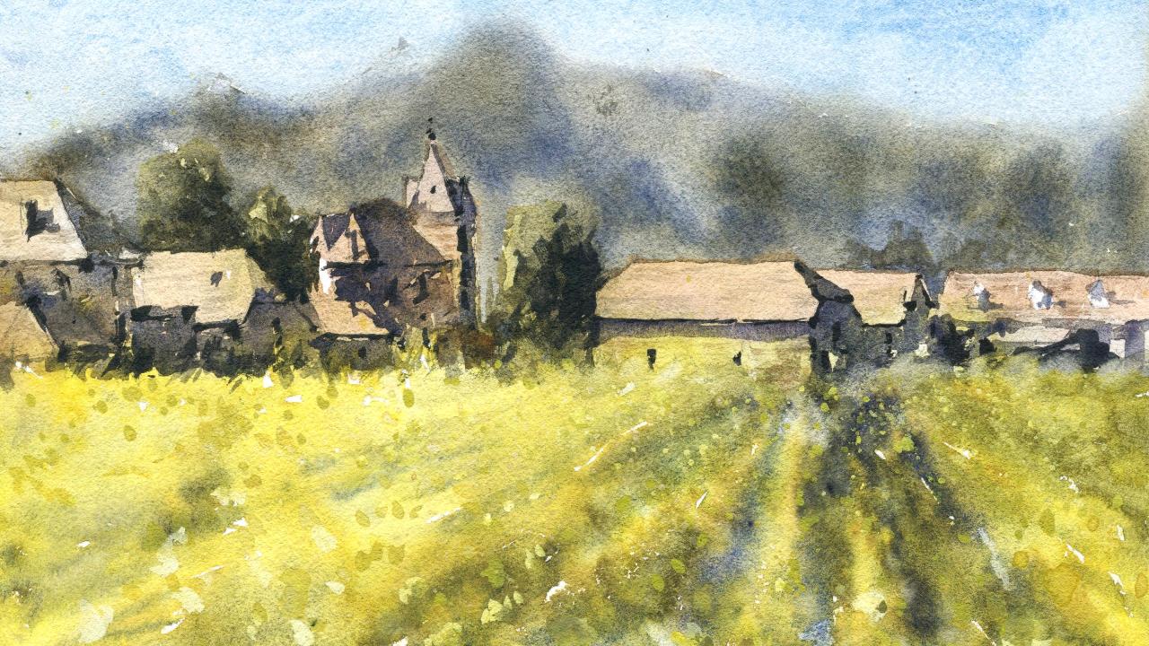
1. Introduction: In this class, we'll be painting a beautiful sunflower
field in watercolors. Watercolors, the perfect
medium that allows you to produce spontaneous
and expressive paintings. On the go, we'll be using some special wet-on-wet
techniques to slowly build details
and softness. I'll go through my
entire process in real time so that
you can understand my mental process as well as the exact colors and
mixes that I'm using. It's easier than you think. So join me in this class. You'll see just
how easy it is to paint this landscape
in no time at all.
2. Materials Required: So for this class, I want to go through a bunch of materials that
you're going to need. And hopefully this will give you any indication of
what ones you may have or which ones
you may want to pretty purchased
or get a hold of. So I will go through firstly, just the lighter
and warmer colors. So as you can see
in the foreground, you've got so many of these warmer yellows and the mainly yellow that I'm
using is this one here, which is hansa yellow light. You can also use
Hansa Yellow Medium. You can use cadmium yellow. Any of those brighter
saturated yellows works very, very well and gets
you that impression, that same level of
saturation as you do with that sunflowers. So that's a good one to use. Another one I use
as well as a bit of yellow ocher sometimes if I wanted to just dial off an area, if it looks too bright and
out there, we do that. Yellow ocher works
quite well too. Now, on the buildings that's
where I've used most of that yellow ocher here and also little bit of this color here, which is burnt sienna. It's kinda like a reddish brown. And I've used that on most of the buildings to get in that. I guess that Let's shade
that I want out of the back. They're not too, not too
saturated but still warm enough. Now, if we look at the shadows and the buildings I've used at really
just a dark color. And for that I've used some purple and a little bit
neutral tint mixed together. So I find purple tends to be a really nice shadow
color to use, especially when we've got
all these yellows in here. The complimentary
nature of both of those colors really makes
for a vibrant looking scene. I'll also use a lot
of green in here, as you can notice over here, this is just a bit of dark
green and mix up your green with a bit of blue and
a little bit of yellow. So different blues
and yellows make different types
of hues of green. But experiment around,
do make sure that I'm using more lighter greens in the foreground and
in the background, a little bit more dark greens, especially in the trees
and stuff near the houses, really makes the rooftops and buildings pop out a little
bit and come forward. So if you look in the background as well, Same thing goes, I'm using the same darker green and also little bit
of purple there. The sky is a little bit
of this color here, which is cerulean blue, a very light blue and
easy to work with. And probably for the last paint I'd recommend is this one here. This is a bit of
watercolor gouache. It's an opaque gouache. And I also, I use this from time to time
to get in highlights. I haven't really used it much here except mixed it
in with a bit of the yellow to get in some little opaque dots and bits and pieces to indicate some sunflowers near the
end of the painting. It's not 100% necessary, but I tend to find this can really help to bring
back some highlights. So enough about pain. Let's talk a little
about the brushes. These brushes here,
as you can see, the very simple and
it's only five of them. So I've got a whole bunch of these watercolor mop brushes,
just all three of them. And they're fantastic for
getting a lot of color in. And you're painting
in large areas. So if you're
painting in the sky, some of the mountains
in the back, areas in the foreground,
we've got these kind of rows or fields. You can see here
these large belly on these on these paint brushes
can pick up a lot of paint and get you that Erin very efficiently
without too many brushstrokes. That's the key to having a nice loose painting with the brushes look
intentional, not too forced. Use those and make sure that
they also have a sharp tip. And that tip allows you
to cut around objects. So things like the buildings, some of the trees, bits and pieces like
that is quite important to other brushes
that I also use. The more detailing
brushes or just brushes, they're getting smaller shadows. This one here just
a number eight round brush and
it's a synthetic, allows you to get in little
dots for the sunflowers. Or if you're spattering some paint around,
you can use that. Tap that on another brush. You can get into details
of some of the buildings, anything like that,
even the trees, these work very, very well. So that's all to talk about in terms of paints and brushes. A little final word
about the paper. I'm using. Medium, medium or cold press watercolor paper in 100% cotton. So it makes sure that you have some kind of paper like this. And if you don't, just
make sure that you've got some watercolor paper
with some texture on it. The texture helps the paper
to take a bit longer to dry. And you can also create just a lot more interest in
there because you've got, if you've got a hot
press watercolor paper, what I find happens
is that you get bits of inconsistent drying and
everything looks very flat, especially for
landscape paintings. I do recommend using a paper
that has some texture in it.
3. Drawing: Okay, we are going
to be doing this amazing seeing here
of a sunflower field. We've got some farm houses
off in the background. I think they sort of
country style farm houses, quite like this scene. There's a lot going on here in the foreground with
all of these flowers, but I want to really
simplify them down. I might put in some detail for a few sunflowers just
in the foreground. But for the majority of it, I'm just going to leave
it mostly yellow. So first things first we want to separate
out the bottom of the buildings and
just draw a line where all the buildings
essentially hit the field. And conveniently enough, this line just lies right
in the center of the page. Draw a little line here and
the little guiding line here, line here and the left end
I just want to connect, just draw a little connect
the line like this, just to join up both the sides. As you can see, from here, we have a really good starting
point because now we can measure where we
put the houses and we don't need to
worry about whether the houses too high
or too low because you've got that center
of the page marked out. And actually we'll just draw
it a little bit darker. Me a little bit tricky
here on camera, but we will get this done. So there we go. Pretty easy there as
you can see, now, I want to divide this page
into half roundabout here. Why is that? Because we've got the building, this building here in this
center sort of starts in the center of this larger sort of, I'm not sure what it is, is largest house here and it lies right in
the center of the page. I think that's the easiest
place to start like that. And I can already
start putting in some little details of it when we draw in
the house as well, look at it in terms
of some basic shapes. The bottom of it is
this rectangular shape. We want to make it also wide enough so that we've
got just enough, just enough width on the house. But then at the same time, we want to leave a bit here
on the other side to get in the other houses and
features there as well. So we've got a bit of a
rectangular shape there. Here. It's kinda like a
squarish shape. Okay. That's the side of the building. Okay. I mean down, it does
not have to be perfect, just getting some
really basic details. And you can see here there's
a triangle shape with the tip of that triangle pointing right at the
rooftop like that. Okay, Oops, might have to
redo this one. Actually. Get that in a little bit more. Better. Get that top
in first like that. And then something like this. Okay? Something like that. Then we have it. We've got
the rooftop here as well. Just extend that
along like this. Alright? And you can now form the
rest of it, they're there. I'm also being wary not to be too precious with
all the detail in here. Look, it's important,
but at the same time, you don't want to spend
all day doing this because you can start to get bogged
down in all the details. Okay. But we do want to make sure
that this looks like a house, kind of looks like
a brick house. There's also some
of these shrubs, as you can see, just growing
up the side of the building. So I will pencil in a
little bit of that, like as you can see. But apart from that,
we have pretty much done with the side
of that house. Let's go in and get in one here, we can see that it
is two houses and there's no like a fence or something here in the
background goes like this. There's a whole bunch of details hard to see exactly what it is. We'll just sharpen up this
edge of the building here. First. Sharpen that up a little. And then I can just work on this house here in
the background. It's this comes down a bit like this and pops down
the side there. Again, like I said,
we don't have to make it exactly as the
reference picture, just use it as a
general reference. Okay, so we've got
the rooftop and this triangular bit
underneath the roof and then we've got that bottom
part of the roof there. There's some chimneys
as a chimney here. Something here on top. Okay. It's not a big deal, It's mainly just getting in
the general shape of it. And then of course
we've got one more coming out through the
back there like this. There's a shrub
here in the front. This is a front-end facing
front on facing house. Okay, Here's a little
section there. Here, just getting inabilities. These little
features here, okay? And then not drawing them
into defined as well. So I've got some leeway. Want to improvise. There's a shade here and there's a door or something
underneath here. More shrubs and things here. Obviously not a huge
amount of detail. There's even a house
looks like behind there. But I think that should
be enough for this scene. And remember the light source
as well is coming from the left and casting a shadow here on the right
side of these houses. So we have to make sure
we keep that in mind. So we've got everything
from the middle part to the right-hand side,
roughly penciled in. Let's have a look now here, on the left side, now we've got our shrub here. Sharp. It's quite a large tree, XD just over here. So I'll just pencil that in a little bit and you
can see behind as well, the house seems to be the
edge of another house. Often the distance just depends on may or may
not leave that in there, but I'll leave it in
there for the time being. Some of these buildings here, actually a little
bit tricky to do. So I want to start
off just again, getting these little
bushes into this section. And let's have a look at this kind of tower
like structure. Now, we know that this bush is a good bit taller
than the House. So we see Just getting
that tree to see, make sure that it's just like significantly taller than
the roof of that house. And then if we notice
that roof of the house, sorry, this this shrub or tree, if we move directly to the left, you'll notice that's
roughly where the roof or whatever
of this tower starts. And it starts like this. And then of course,
it goes up like a triangular shape to
the tip like this. Okay, So in that sense, I use other features
of a scene to figure out the relative position of other bits and
pieces in here. And that way everything
is in proportion, doesn't look too
big or too small. And it all starts, it all starts from this
line here underneath that we first started to
draw in line there. There's a little bit of 3D
three-dimensionality there. Let's have a look. This is kind of like a rooftop actually
comes down like this. Then you've got a bit of it
just jumping out the side. They're not a huge amount of
detail now, bring this down. It's less important exactly
what's further down there. I'm going to have to just
make that pretty dark. And then of course here we have the rooftop of
another building. So we're just putting in
that side of the building. Let's get in that part
of the roof and we know it cuts across quite, quite significantly here. C is going to be too hard there, but like this side of that, doing that here, we've got
over on that right side here, there's gonna be a bit
of darkness. Okay? But then on the left
side there's gonna be a bit more light
shade under there, but a bit of light
here on that left side of the that tower. And we've already
started putting this house that some cutting
in front of it like this. And the host start
with the roof and it's put down the side of
the roof as well, that left-hand side of the roof. And of course connected
up like this a bit more. There is a chimney here, simplified chimney like that, and a bit of a shadow
on the rooftop, of course here
we've got a lot of darkness underneath
the house as well. Okay, we can start
also penciling in some details for this little
part of the house here. Goes further down to the ground. It's kind of like on
this angle like that, on into the ground like that. This one then connects onto another side of a
building like this. And just look at that's
kind of like a hexagon. A hexagon like that. Okay, Then another bit here. Another triangle on
the top of this house, as you can see, this
triangle and where does the triangle end
roughly about here. We pencil that putting the dots of where
you want the three, this triangular shape to be. And as you can see, I've put it in
roughly about here. And then we'll just connect
the dots. As simple as that. We have a roof like shape. And I can start working a
bit more on this building, just getting in the
roof like that. You've got a bit of
shadow forming on this side of the house. Something on top
of the roof there. Of course we've got
some larger sort of shrubs overreaching like that. And not only that, there
is some kind of again, another house or
something behind there, then I'll just who didn't like
that. We're nearly there. Let's start putting in
some of these houses here. So we know that this last house kind of comes down
a bit like this. Straight rooftop
starts about here, goes up to a central point here. Okay, quite similar to
this one that connects up a triangular shape again. And then I'm going
to bring that to the edge of the page there. And there. Of course there's no
chimney here as well. So we can just detail
on bidder that chimney. Oops. Something like that. Bit of a shadow to
the right-hand side. And below that we have another
house of some sort that is kind of really close to the ground or hidden
behind these bushes. Okay. So that is it. We have the
details of all the houses. And of course, I think one last thing I wanna do
is just make sure I've got an indication
of these mountains here in the background.
Over in the distance. Just a really light
line for the field. And other thing you
wanna do is look at checkout the perspective. So you can see it's got a straight lines
running in these rows. And then as you move out, it becomes sort of goes
on this sort of angle. Okay. So that's just a reminder. I'm not gonna put any really
drawn any of the flowers. I want to do that later
in the watercolors.
4. Light and Shadow: Alright, so let's go ahead and get started
with the painting. And one of the first
things that I want to do here is actually start
with the buildings. Because if I get the
buildings in first, I think this will be able
to just portray the lights. And the more I can
just go ahead and do the background a little
bit later because the background is actually
darker and the sky, I can just blend it in. So I'm going to mix
up a little bit of yellow ocher as well
as some burnt sienna. Just going to get me a nice
warm color for the rooftops. Patch of orange
may work as well. Okay, and I want to
do is just getting a nice sense of warmth
on these buildings. And the great thing about
this part is that you don't need to worry too
much about the lines, the details or
anything like that. All we're doing is
putting in some color, trying to match it slightly
with the reference photo. I know it's a very warm
color as you can see. Nice, sort of nice, warm color. I'll go through and just
getting a bit of the detail. By cutting around. I'm using a mop brush. The water concentration as well as mostly It's
mostly just water. And ten per cent paint. And I'm doing that to just keep this wash with very light. And this is a way to
preserve all the beautiful, beautiful lights on
these buildings. The only way to do
that is by making sure you just keep it as
light as you can. And it can be tricky
to do this because at times it looks too much to light compared to
the rest of the painting, but that's because
we don't have any of the any of the
darkness in there yet. So I'm going around and again, I'm not being too precious
about the borders because we're going to go
and cut around them anyway. Later on, when we
have some more, we get in the dark colors. A bit more of this
yellowy color, just a bit of warmth in there. Notice here on the right-hand
side as well, they might. I'm just going to blend all of this together.
Look at that. It's just kind of
blending together nicely. Here on this building. I'm keeping that pretty
light and pretty warm as you can see in there. Dropping that in like that. This might be a little bit
too dark, doesn't matter. Here. This very bright, this
side of the house. It's just, you know, I'm just I'm grouping, being very aware of just
using as little paint as possible and making
sure that I've got enough water in there to
keep things nice and fresh, that the bottoms of the house
becomes slightly cooler. Use a touch of neutral
tint here as well, just dropping a little bit
of that grayish color. I'm going to water that down
a lot though here as well. Just drop that in bit more warmth here on
this building there. Okay. There. Okay. Like that. Forgotten to get in some of the bottom parts
of this building, I'm going to put in some
grayish color here, just a bit of the gray of
picked off the palette. You can mix your grades
by just picking up bit of just a tiny bit
of neutral tint or, or basically any of
your primaries and mix all your primaries
together to get that gray. You can also mix brown
and a bit of blue, cerulean, not truly an ultramarine blue
to get that color. Here, I am going to do a bit of work with the trees and stuff. So I'm picking up a
bit of this green. It's a granulating
sort of green. I'm gonna drop in here. But before I do actually I
will add in a little bit of, little touch of
yellow on some of these trees here on
the left-hand side. Because I'm fine. I find that just a
little bit of that helps to indicate
the light source. I don't want to lose that
tiny bit of that in there. Even some here
like that as well. Okay, let's grab that green
and this darker green. And I'm keeping this pretty
pretty loose at the moment because I will have to go over this one more time to kind of
cut around the background. But we can still getting a little bit of
detail at the moment. There we go. Put it in a bit of yellow and then just
blend that down. Okay, good. Now what I'm gonna do is
let this dry off a touch. While that is drawing. I will just work a bit
on to the foreground, just on some of these. Flowers and what
have you and I'm using a really,
really bright yellow. This is, this is a, a touch of touch
of Hansa yellow. Okay, Look at that,
just dropping that in like this and you can see kinda blends a bit into
the houses there at the back. What I'm not fast at all. Okay? What I wanna do is get some
of these row like effects, as you can see of
the, of the flowers. And I really want to pick
up quite a pure yellow. And this is a Hansa
Yellow Medium, mostly just water mind juice. So that again, we get in
those really light tones. This feeling of
lights and look at, looking at how I'm
painting so that it emanates from a central
point like that as well. Okay, so bringing that
closer, that like that, notice that how the back
at all just blends in to the trees but the houses. But we're going
to get in some of those colors for
the houses late. I just want to put
in a little bit of this yellow in here
to start off with. You notice it's just really, really yellowy off here
in the in the back. I like to also get a chance to pick up a little
spray bottle. And the spray bottle helps to just wet some of the
area to make it better, easier to get in color. So just give this a
little spray down on top. This will help to encourage
some blending of color. A bit of wet and wet. Same mop brush, same yellow. Okay. Just running through here. It's not really so consistent. I mean, you do find there
some areas that are more, they have a lot more sort of
the sunflowers in them than other ones that see more kind of sticking
out here in the front. Keeping it fairly loose. And I'm putting in lots of yellow because I know
that I'm going to have to put in some green
afterwards as well. And the green is
going to fill in essentially all these spots of white that we have in here. Okay, so I think having
enough yellow in here, just having more yellow
event is probably a better, a better thing. Okay, because it just saves you a little bit in case you go overboard
with the green. Um, it's very, very easy to
mix green into this once you, once you start to see green, maybe put in a little
cerulean, blue or teal. Here we go. Let's drop that in a bit. So you can already
see that spread. I'm just going to continue
on and do something like this just to get in this indication of the rows
that we can see these kind of these rule-like effects. They're not perfect, but they do need to be done wet into wet. Okay. This is the only way
that you can do them so that it just looks natural. And if you leave a bit
of white on the paper, that's okay as well. Don't fret. That's kind of what I like
doing that because it just gives a sense of
contrast in there. Some more. And notice the paint that
I'm dropping in as well. It's very, very instant. There's not much water in there. It's mostly just paint. I'm just picking it
straight off the pallet with a tiny bit of
water in there. Okay. And that stops it from
spreading too much when you use a more stronger
concentration of paint, then water, whereas before is using a lot of water in here. Okay. So let's get into a
bit of this stuff. In as we move towards the back, you notice there's not really
much going on in there. It's little it's
mostly just flowers, kind of yellow, yellowy
color colors in there. I'll probably want to
touch that bit much. But here we can have a
bit of a play around, can pick up some other colors. Purple in here, even get
some of those darker bits. Here, as you can see, just a little bit of
an extra contrast or something here and there. Okay. Notice because I'm using it
quite dark, quite thick. I mean, it's coming up darker
and it's staying as well. It's not moving around too much. This will spread out and
touch as we go as well. I'm just looking at the
scene and looking at where's the where's the little dark
sections in this scene? Where I see the extra
darkness here hiding away in the rows of these sunflowers. I'm taking the opportunity
to darken the touch, okay. So wet and wet and
it becomes easy. To just add in little
details when you've got, you've got this happening. More green in there, maybe be the green here is just why not adding
a touch there. Okay. Good. Sometimes also it
helps I just pick up a bit of a mix of paint
here on the palette and give it a little
tap here like that. And you can get little
speckles of paint running through and little bits of inconsistencies
in here as well. Which are like. Another thing I think is to do is because we've got all these sunflowers
and things in here. I think by making sure that
we've got a little bit of gouache to bring out
some highlights. And this is an
interesting technique because what we can do, I can go over here, e.g. got a small round brush. Number eight, round brush. I've got a little bit of white gouache, opaque,
white gouache. And I'm going to mix that in
with a little bit of yellow. And I'm just dropping
some things like this. And you will notice it kind
of makes it stick out of the paper a bit like
a to highlight. This is to indicate
for me anyway, perhaps some of these sunflowers
that are a bit closer, but I do think they need
to be more yellowy. I'm putting in some more
bit more yellow contrasts. And you can see how they just carry on into the background, the background ones
I think we can do with this tapping technique, but for the ones
in the foreground, I just want to get in a few. I mean, they're just round
shapes, essentially like this. That's how you imply perhaps
there's something here, these little sunflowers here. Okay. I'm dropping in here. Even just a bit of water. Probably do the trick as well. Little bit of water like that. Little bit of water. We can try that dots of water and these will spread out a bit and
cause some micro blooms. That will indicate that we
indicate some sunflowers, hopefully, especially
these little ones here in the back and forth,
to create blooms. You really got to
wait a little bit of time for these
sections to dry first, which done that, just
picking up paint, making sure it's
pretty a wet sort of concentration of paint. And then I'm just going
straight in like this. Read more here, more here. And then later on, I can probably put
in a bit more detail for some of the sunflowers. You can even do it
now if you'd like. I'll show you how to do it now. For some of them. Because I want some to
be maybe a bit sharper. In some to be a bit more softer. So we'll just pick up a bit
of black and it's released a darker color and
I'll put it in here for some of them
are black and yellow. And that can just be like
the center part of some of the flowers like that. They're just want to get rid of some of
that contrast there. I think it's too sharp. Shift this a little bit more. Okay. I'm gonna leave this and come back
to it a bit later. But what we'll do now is work on these houses and do a
bit of cutting around. And what we're gonna
do is also find a general large shadow shape across all these
houses connected up. The big one I see is just that
large shadow coming cross the right side of the buildings. So let's go ahead
and get that in. And another thing I want to
make sure as well is that I also get in the background kind of mixed in there as well. Let's draw it off. Or I totally get the
shadows in for the houses. And mainly they occur
on the rooftops. And I'm gonna be actually
using a purply mix of color, maybe with a bit of
dark bit of black in there and a bit of brown. And the reason why I'm using some of these purple
is because we've got all this yellow in here. And I always find that trying to work with complementaries, it just looks so much
better if you want to create a stark contrast. But he's a personal preference, you can use a more
neutral color. So there we go. I'm just going cross the rooftop and I'm using a
bit of purple and also a tiny bit of brown and black just in
different quantities. The main thing is that
you want this shadow to be pretty dark to indicate that there
is a shadow on the building and the light
source coming from the left. So underneath there you can
see there's actually a bit of shadow under the
building like that. That move that across the
on the right-hand side, you've mainly got just
a lot of darkness. So probably be touched
more purple in here. Not too dark, but I'm just dark enough to really
represent that shadow. You can see, okay. This building has some darkness
on the rooftop like this. I'm gonna get that in like that. Comes down. Here. We have it just
trying to get it all in one go if possible. And of course later
on I can add in another bit of color
if it's not enough. Okay, bit of darkness
at the base here. Alright, maybe touch
something there. And look at how
I'm just trying to find a way to connect up all the shadows into
one big shadow shape. There. Look, there's a shadow running cross this house like that. Okay. This point I'm really
just using, using purple. Purple and a touch of brown
and black can hear that. Just put that color in
straight away like this. And of course you can leave
out little highlights and things for whatever
is down there. But I'm cutting around. Of course, this building here. Just bring this then
like that. Okay? Black using some granulating
colors in here as well. There is actually
some light on top of that rooftop and I want to make sure I leave a bit of that indication of
lights in there as well. So I will just touch on
a little color in there, but other than that, I'm not going to do
too much with it. I'll cut around it in
just a moment. Great. Let's go ahead and
get this house here. There's a bit of a
shadow underneath there. The rooftop is fine, but there is some
kind of a chimney. And over here we've
got that same deal, this chimney creating
a sharp shadow. So I can just again pick
up that darker color. Imply that shadow going over
to the right-hand side. Like this. Well, this particular
chimney or whatever feature where we are, maybe notice how it's just
all blending together. They are these shadows. Okay. More bit more of
this color and I'm leaving gain just
leaving this rooftop. This house in front,
a bit lighter. There is a chimney here
forgotten to get that in, but it doesn't matter. Just implied like that. Okay. There underneath
the roof top. I'm making this one
fairly dark as well. Give it a bit of contrast, bit of extra contrast here. This one sort of behind, like that little
house behind k here. Oops. There. Hey, let's have a look. We'll bring this further down. There is a shadow underneath
there as well. Okay. Let's go ahead and getting
some shadows on this one here. And that sort of comes down
just the right hand side of this tower has some
shadows on it. Okay. Right-hand
side, just like this. And that's all you have to do, just imply that same
light source that we have seen on the left
coming across the buildings? Well, notice I
sometimes go back into areas when you have when
that paper is still wet, you've got that
opportunity to do so. Certainly make use of that. I think it's a great
time to do it. It is a little
chimney here as well. Look at that. And I can just
imply something like that. Alright. Top of these roof, there's something here
on top of the roof, like a little sky room
window, something like that. Really just working
on making sure I've got a lot of
these shadows in and creating a connection between all the shadows as well. Connections. There we go. There. Of course we've
got that building, but we've got this one
here, this larger building. And I'm just going to make
that shadow underneath, sharp shadow under there. And then again start working
on the shadow to the right. Like that. It's the shadow underneath
the rooftop like this. It just get that in and
it's kind of like that. You just used to
using that purple. I've got a bit of that
brown in there as well. Connect up the roof top,
that triangular shape. Okay. Bring that further down. Oops, I'm going a bit too
far, but doesn't matter. You can just lift off at
touch or something. Okay. There's the wall or something. He is the little wall. Again behind this house. There's another house there that has some shadows and
bits and pieces. Another bit of detail
that we can add in. This one here, There's some
darkness underneath it, but also some of this kind of cut out stuff that
we can go over the top, just cut around it
this little shade that I'd left out before. And work my way down, leaving bits and pieces in that previous color
in there as well. It doesn't all have
to be colored in. And we look at the rooftop. One thing I find with
these houses that it's actually a little bit
darker than the other two. Um, whether I want to
get that in or not, probably I'll probably skip that and just keep
it consistent. It will just make it easier. But I will help getting
a bit of this shadow. These little bits
top of the house. Okay, Just a little.
It's a detail like that. Simple little shadows running towards the right-hand
side like that. Excellent. Now, I want to put in some of these trees and
Munich's mixing some green with a bit of black to
getting just extra contrast. Of course, over here we've got more contrast on the
right-hand side. And I use the edge
of this flat brush. You can use a round
brush or whatever, but I'm using a flat
brush here because it will just find that it just
creates a sharper edge. Just a little sharp edge on
this side of the building. That end. Um, of course, I can just create some
little effects like that. Little kind of cut
around the rooftop. Their bits here serves as
well to create these little, funny little brush, brush strokes like this
that look like shrubs. I will just put a bit more
water in here though, to soften some of
this stuff down. Soften a bit of these edges that connected a bit onto this
era of the ground as well. It's tricky. Windows even here on
the side of the house, some of the yellow has
managed to creep up into the houses. There we go. Another, another bit of this tree here in the
background and an opportunity yet again
to cut around the house and form a nice sharp
edge there. Okay. Like this. Hey, there, I'm going to just cut around and cut
in front of this one. Now that this color here, It's trying to join a lot
of this onto each other. So it looks more
fluid, more natural. In there. We've got most of the shadows
in here for the buildings. We've got the shadows
in a little bit here in the foreground for some
of these sunflowers. What we don't have the
background in here yet. So I want to get in the
background getting the sky. And we can do this using
the same flat brush. Or again, we can probably
use the round brush that's going to be just as good. And I'm using a combination
of green and a bit of blue, tiny bit of green and blue. We can even use a
light purple again, but mainly a, of
a greenish blue, mainly quite diluted mix, but still darker than the
buildings, of course. Okay, so I'm just gonna go
in straight away like this. And also I do have some other colors leftover
on the palette mixing here, I'm not so concerned as to what exact color we've got more so that the color back there is it is darker in
the background. Okay. The houses will
come forwards more. So I can just cut
around, look at that, just cut around that one there, around that rooftop there. You only get one
chance to do this. He got to really be quiet,
deliberate with it. And it's just signed in
and look here. Like that. Okay. Good. I think I'll just cut a bit over
the top of this one more like that. Better. Greenish blue color. Then you can join
it onto the trees. I think I might have to even reduce some of the trees again. Cut out that tiny little house
that was behind this one. Just for the sake of continuity, making it look a bit more neat. There we go. Look at that, just getting in this
background and you will notice also some of the
shadows will be slightly damp. But for the most part, they're gonna be completely
fine to work on. They'll be mostly dried. I'm just working like this. Cut around, creating contrast so that the
background is darker. Kinda ran these trees and
these houses like that. Like that. Here. You extra darkness and spots
around the place like this. I do have a touch of purple in there as well. Funny enough. There we go. Just a bit more up here around this house as well. Like that. The k. So that is pretty
much the mountains done. We're almost done.
I'm just going to quickly finish this off. It's not much sky and they
release a little bit of sky. More color, more green
actually in there. Perhaps a little bit more blue. Blue and a bit of green. Bit of wet in wet effects
would be nice as well. Just indicates some of the these darker looking trees and clumps of them like that. So I'm just using green
mixed with a bit of purple to darken that green a bit. Add a bit more coolness
in there as well. You've gotta do this
all in one, go. Just all wet and wet. Some points where you feel like you need a bit more contrast, just go ahead and
drop in some color. So you don't have to do this in all paths there you see some, you just want to leave.
I think that's enough. I'm going to go into the sky. And for that it's just gonna be a mix of surreal
in blue and nice, bright and mixing cerulean
blue. Look at that. Perfect. Someone that meant it's mostly just civilians
are very light color anyway, so it's hard to get it dark
even if you want it dark. Impossible really,
you just have to use that mix that you've got. Um, I might use my bigger brush, just this larger brush like this there. And I also want to potentially mix some of it into
these mountains. Soft edge on some parts. Maybe leave it to connect on to leave rid of white
and some areas, but mostly just
still have a line, I suppose a little disconnect
between them in areas. Okay, So you can still
see the boundary between the mountains and the sky. But it's just a soft
sort of boundary. Little bits of areas
where you think, hey, that's a bit too much, they're putting too much
paint going lift-off. Not only that, you can
also use a bit of tissue and do things like
this tree, e.g. you might want to just
lift off a bit of painting indicates
some highlights. I will go back into it again and continue working a
little bit on, on it. Whoops, just down a touch here. Okay, good. So let's let this dry
and finish it off.
5. Finishing Touches: Okay, so for the final step, what I wanna do is put in the really dark areas
of the painting. Perhaps draw out some
details for some of the flowers in the foreground. I don't want to make
it too obvious. Maybe just put a few
in here and there. But yeah, just bring out
some more details on the buildings I think
would be a good idea. And I'm kinda tossing up
whether to use a round brush or a flat brush. Can use both. Okay. As long as as long as you've got a sharp tip on the front of it. And what I'm gonna be doing is just picking up a
darker color system, black. I have a bit of
neutral tint as well. Get it quite dark so
that you've almost got maybe 60 to 80 per
cent paint on there. And what you wanna
do is just look around and find areas that you want to indicate
extra darkness, e.g. maybe here and a dry off that brush a little bit at times
so that it's not too much. Maybe there look, there's
a bit of darkness in here. You could indicate their
abilities like a chimney there. And not only that, there's
underneath the rooftops, you'll see just little
bit of extra darkness. And this helps to actually bring out the details
on the buildings, this little bits and pieces, there's a window here. Then I can indicate
with the brush and purposely using a larger and larger but a flat brush
that's still fairly large so that I don't get bogged down
doing too much detailing. And I'm using this
kind of touch and go technique as you
see, touch and go. I'm not in there for too long, just adding in a few bits
of details and things. And then moving on to the next moving on to the next area. Okay, here's a bit
for that building. There's something like
tree or something you just darkened
in that section. And not only that, there are
some darker bits here too, you can see mixing a bit of
green in there to get in. Something like that. Um, soften this off like that. They're soft and off. Okay. I might have to
just soften this bit to bit of a sharp edge for that purple that I
didn't really want there, but we can remove that
and as you can see, better than scrubbing
and I'm all done here. That what I'm trying
to do is merge, merge this area onto
the buildings of touch so that we've got a bit of a softer edge in some
areas of the buildings. And the interesting thing
is that you can see actually how it works because there are
these little shrubs, lighter shrubs that sort of
connect on with the darkness. I'm using my brush here
to scrub off a bit of that paint underneath
and connect it. Connect this field. I'm using just a bit of water
on the brush and this water lifts off the paint
and it creates a bit of this soft and edge. In the areas that you touch it. They look like little shrubs. Capturing the light. A bit too much of that
yellow paint onto the side of that house,
but that's okay. It does happen when you're using wet and wet, things like that. I'm bound to occur at the same time while
I'm adding those dark, it's in pieces. I'm also finding ways to soften off some edges
as well. Look at that. It's looking good. Just thinking whether I
want to darken the side of that house here a
bit more, could do. Another quick quick wash
over the top like that. Let's have a quick
look around here. Now there is this tree and as extra darkness here
that don't want to imply, just hopefully feather that in so that that side of
the tree looks sharper. Here as well. Look at that. It's a bit of dry
brush like that. Yeah. Yeah. Let's work a bit on this
side of the building. That running down
moves like these. Extra darkness underneath
the roof top there. Notice again, I'm just using this cutting around technique, just finding ways to
bring out detail. Usually underneath the roof
top is where I'm focusing on. And you can create little
windows and stuff like that. Just some vertical lines
running through this. You could just put
a window there, even though there's
not a window there. The main thing is keeping keeping these
brushstrokes real quick. They're dark, but they're not creating too much
of an interruption. Just this little
highlight here and there indicates some details. Let's look here.
Same thing goes. We can put in sort of part
of the roof like that. It's their window. Window here. Underneath there. These sections. Okay. Suddenly you start seeing some bits and pieces
emerging from all this. Some extra contrast as well. And you can see especially
here with the yellow, that the these
little brush strokes that I'm using just above here, just a light wash of I
don't know what it is. Just a bit of gray
color helping it to merge a little bit with
the yellow of the flowers. Like this. Doesn't just suddenly n, But the flowers sort of
cut over the top a little. You can do it from time to time, just doing this sort of effect. This, you can just drag
the brush over the top like that and it
creates a bit of texture. But remember to just
keep it very light and very, very light. Just gives a bit of
character to the building. A bit more brown in there and
dry that brush off again. Okay, so here just this can be break or
something like that. There's something here
that rustic look. The buildings. I mean, this one also has a bit of it, but it's actually darker
than the other two, but I don't want to get
too carried away there. It's just some texture. All it is just a bit of texture. This one, go to something that extra darkness. Let me just getting a few
little bits in pieces. Could be the edge of a window. There, could be an edge
of a window there. Top of the roof. This little house here in front. Notice how I'm not defining
every single edge, just, just an edge here
and there I'm picking out. And I'm letting, letting the imagination
fill in the blanks. I think that's something I had to learn to do rather
than paint everything in. And be too descriptive and lose the magic of
the watercolors. You gotta let it have to leave
some to the imagination, a little bit to the imagination. Even on these trees
here in the background, I am tempted to go into
them again one more time, but just maybe in the rooftop, but I don't want to
go in and disrupt the beautiful wash that's running through
most of that area. So just a few little
brush strokes like that should do the trick. I, just to get some of that
green in there. Like this. I'm actually drawing off
that brush a little bit and then cook going back
into it like that, be to draw it just a bit of
dry brush with this green that we might have a bit Hughes, well, they're finding ways
that I can connect things on. And there's even some
bushes and things here. Little green can help that. You've been a bit
behind these houses. There's a little something
they're hard to see, but there is
something there that just quickly getting
a bit of that color. Don't want to overdo it. Soft trees on the background. Up the top there
like a little tower. Just outline that
bitter little window up there or something
then I can just imply from though it's
not really there. There is another window. I can put it into
some window here, just finding bits
I want to add in. I think that's
looking pretty good. The last step, like
I mentioned before, was just some bonus bits and pieces really here
for the flowers. I mean, you can add in some little sharpness in areas have got a bit of
gouache and a bit of yellow. And I'm using the gouache. You can do this sort of
thing and just create the impression of some flowers
here in the foreground. And the way I'm doing it, it's just using the round brush, creating these almost
like flower-like shapes. Just sharper sort of shapes that indicate some sunflowers. And I think it's
more sort of near the front width that you
need to worry about. As you get towards the back, they just appear as dots. Dots have sharper yellow. This sharpness gives
them actually, actually enhances
the softness of all these beautiful wash that
we have in the background. And I've used a
little Guassian here is to help the yellow
stand out a bit more. Because if I don't use it, I think it's gonna be It's
just going to disappear. Okay, so little bits like this, little little dots, as you can see running
through in the background. I don't want to overdo it, but I do want to make sure they have the kind of
structure to them. And when I say structures in
that they growing in these, as you can see, these
patterns, these rows. Okay? So take your time and
just another thing, you can just sort
of do what I was doing before you start tapping
technique out in the back. If you're feeling up for it, I think I'll skip that and just just do this for now. Okay. Few more here, bit more
here on the left-hand side, tends to look more unique, as you can see as PSR bit more contrast in here on the right-hand side
because we've got some darks in there. Whereas on the left-hand
side there's not too many darks at all,
but we do need fuel. These little specks of
color, specs of yellow. This is again like a
yellow sunflower seeds. So we need to, I think just
adding a little bit of this is going to be helpful. Okay. Like I said before, when
you get down to the front, you can start putting in a bit more detail
in the flowers. I mean, I I'm not fast
about this at all. Mind you, I just want to get
in a few major ones perhaps, but not interested in
putting in too much details. Okay? If I put in too much detail, it's going to draw attention away from the rest of the scene and See if I can just getting
a few petals that come off. Some of them like this, you notice they just, a lot of them are facing
in the same direction so as to write a few little bits and
pieces like that. In the center of them you
can put in the game enough, just a little bit of darkness. Oops, I'm on the right
hand side of the flowers. Actually just done some of them. Don't wanna get too bogged down. Okay, so just picking this going and going
and going along with this same technique and
putting in these flowers. More here on the left. Again, it's difficult to get
the ones in on the left to look like much because we've got just mainly yellow in there, Whereas on the right-hand side
we've got more contrasts. But it's still doable. Simplified sunflowers. I'm not interested at
all when trying to get every little it was
a little smudge, smidgen of detail in here. Let's use that last trick again. We'll pick up a bit
of yellow and then use this tapping technique
because you can see, before I do that
actually I'm going to cover the top of the scene so that I don't get
any paint up there. Just cover that up
and touch like this. It up some of that yellow
and let's just go for it. More yellow. Especially actually at the back, would be a good idea to wash
in there, but a yellow. That more look at that. It's like a big shortcut. I don't have to sit
here all day doing it. The shortcut method. Smaller out the back. And as you move
towards the front, larger blobs of paint for the front. Really get them all
in exactly though. Something like this. Maybe. Just being more haphazard
I suppose helps to create. Since these natural
looking variations. What's going on instead
of it being too stuck on. This is just a bit of lots of gouache mixed in
with the yellow. And as you can see, it's doing something
just creating a bit of extra contrast with the
white and the yellow. Too much there. Let me just over over
the top like that. Okay. Let me take that off. Have a quick look. Then is looking alright. So I think I'll
leave it as that.
6. Class Project: Your class project
is to draw and paint your own sunflower
field in watercolor. This can be the reference
photo featured in this class are based on one
of your own photographs. You can also refer to the scan drawing and painting
templates attached below, which will allow you to trace the drawing if you
choose to do so. I recommend drawing each scene. Freehand. Drawing is
an important step in improving your
painting skills. It provides you with
an opportunity to compose and plan your painting. Once you've finished
the drawing, use the watercolor
steps and processes included in the
class demonstrations to complete your painting.
 Watercolour Mentor (Darren Yeo Artist), Art Classes, Mentoring & Inspiration!