Transcripts
1. Introduction: Welcome. In this class, we'll be painting a village hut seen
in watercolor. Natural landscapes as
simple and beautiful and providing the perfect subject for a beginner
watercolor artist. Adding a man-made objects
such as a house or hut can create an
interesting contrast and help to tell the story. Learning how to capture
a landscape in a quick, fun and loose manner is an essential skill that every artist should
learn to master. Watercolour is the perfect
medium that allows you to produce spontaneous
and expressive paintings. On the go, planning is crucial. I'll show you how to
simplify shapes and sketching the large
ones such as foliage, trees, grass, and land. Getting those large
components and accurately beforehand is essential for
your painting to make sense. So join me in this class. You'll see just how
easy it is to create this amazing scene
in no time at all.
2. Materials Required: Okay, so we're going to
talk a bit about materials, what you're going to need
for this particular class. And I thought it
will be great to just talk about
the colors first. So I've got my palette out here. And you can notice in
this painting that really isn't that many colors. We've really got a lot of
these warmer colors here, like the yellows and we've got some of the
greens out the bag, got a bit of purple, some cooler sort of grace here, but that's just about it. There's even a little
bit of brown here. So what I'm using
for the roof is essentially a little
bit of yellow ocher. I'm also adding in near the
bottom where we've got these more lighter and
saturated areas, a little bit of
this hansa yellow. So any type of saturated, vibrant yellow is great. And what you're going to find
is that it's going to draw more attention to that area
due to that saturation. So sometimes I saved that more saturated air to create
a little focal point. So those are essentially the yellow is that
I'm using in here. With the less
saturated yellow is I tend to use yellow ocher
for the rooftops and things like that just to indicate perhaps there's some tree
branches and foliage and stuff that's been used to create the roof
in the background, I've got some darker green. I'm using a green code, undersea green, you can
also use olive green. You can use hookers
green as well, just as long as you've
got a dark green, it can also mix a dark blue with the yellow
to make a green as well. So good. A good one that
I use is ultramarine blue with a little
bit of yellow ocher. Or I can use a little bit of Hansa yellow medium
and that will create a nice green as well. And I've used different
quantities of it as well. You see some parts a
little bit more lighter, so I'll use more water and some parts here
there'll be darker. I use more paint in those areas. So some of the really
dark areas in here, I've used some of
this color here, which is neutral tint. I also add in a
little bit of brown. This is burnt umber, and I use that for these
tree branches as well. Find a combination
of burnt umber and ultramarine blue or
even a bit of purple, makes the shadows pop out really well and creates a little bit
more interests rather than just using black for your
shadows or do use black sometimes for the really sharp edged areas of the shadows, but it's not too necessary. You can, of course, just mix up your three
primaries together, yellow, blue, and red to create a nice gray and
dark gray as well. So there's many,
many options for you in terms of creating
those dark areas. But I would suggest
try mixing up your darks rather than
just using a black. I've also got a tube
of white gouache. And white gouache is basically
an opaque watercolor. You can look it up and
I've got a little bit here that's basically dried off and it comes in a nice little tube like
this that you can get. And I use this because it's great for getting
in highlights. So sometimes right at the end, say you want to
create this kind of leafy branching pattern coming
off the side of the heart. Or maybe just bring
back some highlights on the rocks and bits
and pieces in here, even on the shoulders, on the clothes of the figures. It really makes a difference. So that's about 0
in terms of color. Now, with brushes, I've got a whole bunch
of brushes, but really, I'm only using a few of them in this particular landscape. Let me just show you
what I've been using. So I've got these
larger ones here. And these are basically
watercolor mop brushes. As you can see, they
hold a lot of water. You've got a large
belly so they can pick up a lot of water
getting bigger areas like the shadow on the ground, even the yellow is at the back where you do it all in once. Even in the background, some of the trees as
well, these really help. And the fact that they also have a sharp tip allows them
to cut around shapes. You can get in a lot
of detail as well. So I have these and I use them depending on how large
of an area and painting. So if I need to paint
a really large area might use that one or that one, but normally I only
need to use these ones. In this terms of
the small details. Sometimes you can see a
little bit of detailing here underneath the building or in-between the ladder area, or underneath the heart. I use these two brushes here. So this is a little flat brush. It's an angled flat brush. Okay. So it's not really completely, completely flat and not flat, but it's just a bit of a,
got a bit of an angle on it. And I've got these synthetic
round brush and this helps get in a little
bit more detail. And you basically don't
pick up too much paint. These don't hold much at all. Often use just a
tiny bit of paint on there and very dry as well. And it's more in the second
stage when we're getting in smaller details of
these ladder rungs, bit of the figures, some of these rocks
and things like that. Smaller brushes really
work quite well. A bonus brush, sometimes
I use this brush, It's a fan brush. And basically you can see
the little bristles that creates this sort
of effect as well. So you can use that to
create the trees and the shape of the brush just makes them look a
bit more irregular. Now the paper that
I'm using here is 100% cotton watercolor paper
in cold press or medium. It has a texture to it. And it's really important
to have that texture on there because you're
only going to be able to get a lot
of these beautiful wet-in-wet to fix
and the blending with these with this type of paper and also the
dry brush as well. We have the paint
that's sort of skips over parts of the paper. You're going to need
that texture on there. So other cold press, medium or rough paper
will do completely fine if you've only got smooth
pressed or smooth prayers, but hot press, that's
going to be fine as well, but I don't recommend
it because it tends to be more
difficult to control. So yeah, make sure your paper
has some kind of texture. If you're able to get
some the cotton content, if you've just got
normal watercolor paper, even just cellulose paper,
that's fine as well. Just remember that it will dry a lot faster than cotton
watercolor paper. And you may not be able to get in a lot of these
wet and wet effects, so well, few other
miscellaneous things have got a container here, it's about a liter container. I feel that completely
up with water and use that during
the entire painting. I don't change it in-between
and also have a towel, a just an old rag or
something like that. And I use that to just
sort of dry off the brush, control how much water is on the brush in-between
the painting. Really important to have
something like that.
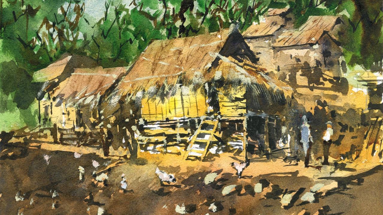
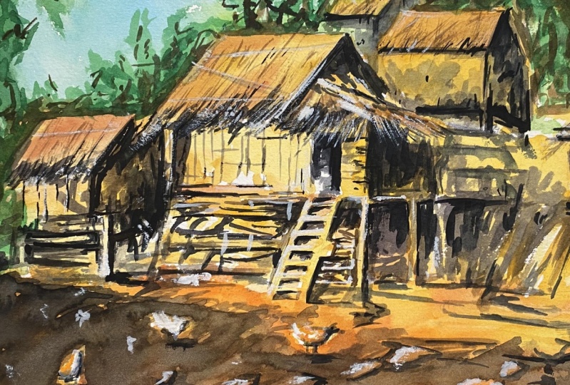
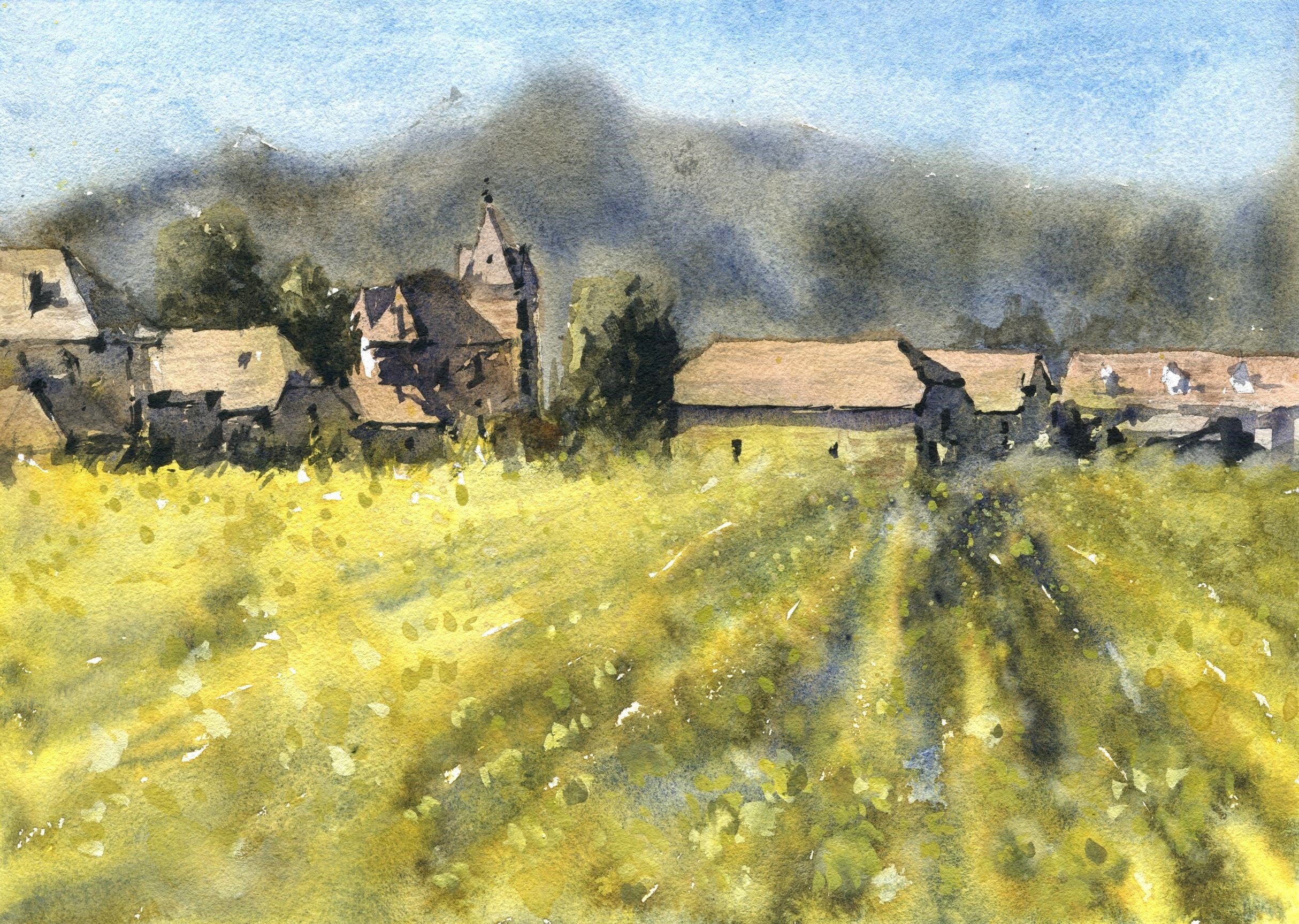
3. Drawing: Alright, so we're gonna go ahead and get straight
into this one. And I really liked the scene. I don't know what it
is about this hot, the light just crossing
over the side, but it's just amazing. And I thought, why
not give this a go? So let's start off. I'm going to put in roughly
a little indication here, scribbling aligned roughly about a third of the way
through the page. Roughly where the
bottom of this house, this larger hut in the
middle, finishes off. What I'm gonna do. I'm going to just pencil in little quick indication
roughly of the side of it, of the actual heart itself. And remember it's just a box. If you simplify this down to the bare minimum to
box on its side. So if you can draw a
box as I'm doing now, then you can draw
this hut like that. That's the main area. I think the hardest bit
or not the hardest bit, but one of the most tricky bits is getting in this ladder. And we know that it's the bottom of the
huts roughly here. And you can always just
alter this as you go. It's a little doorway here. Okay? And, um, you know, forget the little thatched
roof here that you can see. It sort of has a beat that comes down over the top
of the door here. Just being very loose
with my drawing. So I can alter and
change it up if I'm a bit off the top
of it coming down, There's a darker bit there. This roof again
coming off the edge. Then this is important
as well because it has this kind of has this sort of the effect of the light bouncing off it behind
here, it's very dark. Just in this section, the light source is coming
from the left-hand side. Okay. Little, little lines to show
the stretching across it. Oops, this should be more
on this angle like that. This is the doorway here. Look at that Just
coming downwards. That might change
that around a bit. So not accurate enough. Coming down more on a slight angle like
that. There we are. We've got this ladder,
like this ladder. And the challenge
is to preserve, really preserve the
lights on that ladder. It's gonna be tricky. But it can be done. Because that's just
this letter comes down, hits the ground
roughly about here. And I'm going to just get in the little steps of
the ladder. Like that. It's how many steps is five
steps, but it doesn't matter. We just can make it
up close enough. Okay. Underneath the
building there is darkness, but there's a tilt here that
there's a large stilts. Of course, this is just sand
and bits and pieces there. There's little bits
of wood underneath. You can see it's
kind of just kept. There is maybe some storage
so that it doesn't get wet. Behind that word,
it's all really dark. Now you've got these
planks of wood underneath the
heart as well here. It's sitting on some type of foundation or something here. Just getting these errors, the stilts is little sacs
here underneath as well. And these are kind
of like again, probably looking like the food storage or
something like that. Like that. Let me just get in this side of the
heart like that. They're just get rid of
that fetching, simple. Simplify that down. There's someone in
there, but I'm not going to make big, big deal of that. You can see this bits of wood sticking out inside
in there somewhere. I don't want to overly
complicate things. There's another looks
like another still coming down on this area is
sort of on a hilly side. So it's going up hill here. So I'm going to just get
those stilts going up a little bit,
increasing in size. And then of course you can put some little things like
rocks or what have you. There is something here
like a hot or whatever. I've left a lot of space here. Actually put this hut
probably a little, little slightly to the left, but that doesn't matter. I'm going to just
indicate this one. Here. Looks to be
another type of shelter. And some would just running
downwards like this. Okay. Another log here on the ground, little bits of rock and debris. And I think these really add
some interest around here. You can even see
like some chickens just try to draw one
in. Chicken here. Picking up the ground. Just a little indication of one. You got might have
another one here, just around there as well. The thing that makes them
look like chickens is just that tail at
the end of the beak. At the bottom. The legs come out sort of
towards the center to the back. Okay. Might just do another one here. Indication of another one. Okay. Chickens is another one here, just walking and they get
smaller as you go out the back. So there's no need to
emphasize them too much. But you gotta leg coming
out the front and then B leg at the back like that. Then we have another chicken. A triangular, almost like a triangular like shape
as you can see. Okay, good. I'm good. There's a few little bits
and pieces there as well. On this house we can
see it overlaps a bit, so it just cuts off
around about here. Rooftop overlaps here. Okay. That I will just draw this
other rooftop in like that. Bring that downwards like this. And you have yet another kind of hearts over on that side. This side of it there has a lot of probably a lot of
shade on that area, but you've also got this area at the bottom
where you've got these stilts come into
the ground like that, same like this one here. A lot of stuff going
on here in the front. And of course, I never fostered making all this
stuff too detailed. Just a little indication could be some colors and
what have you there? There's actually another one off in the distance
out the back. There seems to be
something like that. Okay. And I don't want to put
all that detail in. So I'll just do
something like this. Just a bit of this tree
coming in from the side. And that can obscure
some of that detail. But we'll just get
in the bottom of that building as
well while I'm here. But you can certainly
tell that it's like a rooftop of some sort. Maybe there'll be some
darkness under there to the main player in this though
is this Center Building. Want to put in a
little bit more effort into detailing what's
happening here. K could put in a figure,
just be walking. Figure walking in the distance, just off in the
background there. Be another one here. Gives
the scene a bit of life. Maybe put another,
another figure just standing around here. Okay. So we've got a
few figures in there. Here. There's some kind of wall. As you can see, sort of
just come stretches across. You've got these kind of
areas of wall or thing here. It looks like it's broken. A little bit. Simple structure
here in the back. We've got some of these
buildings and I think these are important to portray just
to get a sense of this, everything moving back
into the distance. So we've got some
smaller bits and pieces. Just a box. That's the
box. Always remember that. It's not. You get that top of that roof is a little
bit tricky variety that they just make this around, make that up like that. And maybe another one here. You can see just in the
background how they overlap. A bit. Same shape. Couple
another one up here. There. They just have
that come down and touch ups that same like that. There we have it. We've got
a few little another one. I wanted to just put
one more here actually, I think there's
another one there. Behind that one. A bit
more shaped with this one. Now, a lot of these
trees behind the, I don't think we need to bugger around with
those too much. But just a few
indications of branches to remind me to make sure
I go into that again. Okay. I think we're ready
to get started.
4. Paint the light: I'm going to pick up
yellow, yellow ocher. And not only that
little bit of Hansa yellow to get the
really light colors in and make sure that I
have enough detail. Not detail, but basically all the lightest parts
of my painting. So this part here
where we've got the light is bouncing off
the side of the building. I really want to create
more contrast there. Okay. But I'm also mixing in some yellow ocher into
this area. So like e.g. the underneath here the the ladder up putting a
little bit more yellow ocher, which is more of
a subdued yellow. Okay. Drops some of
this in here as well. Okay, so we've got a difference, not just the same
yellow running through the whole thing in some of
these bits of wood as well. Kind of come off with this
yellow curry sort of color. There. Go cross the right, the stilts of the house
as well like that. It's getting this
right hand side. I'll put in some of that
yellow in there as well. Okay. We'll go over the
top of all this later. So it's so we'll have the
proper colors in there. But they're only that, but in the ground as well, you'll find that there's
actually a lot of this. It's almost like
a golden orangey, slightly red color there. But it's a loop. I'm simplifying it down. Just as long as you've
got a nice yellow, maybe not as vibrant as that. You can mix in a bit of brown, tiny bit of this stuff here, which is burnt sienna. Little bit of red might do the trick. A
tiny bit in there. Don't want to overdo
it, but just to create a bit more reddish color. And we've got a lot of that
permeating through the scene, even up into the back. Okay. The trick here is
just to look at the general colors and not
worry about the details. Okay, So coming through here,
look at that just a bit. Rooftop as well. Through this house. This is also kind
of like an orangey, yellowy color down there. On top of the house. We've got more of like
a brownish color. I've used some burnt sienna, some leftover burnt sienna, which is like a reddish brown. And I'm just going to
get that in like that. Get some of it to mix-in
hopefully with the yellow. All I'm doing at the
moment is I'm just getting in basic colors. Not too much details. More of that brown, a bit of that burnt
sienna again. Keep it very light. Mix is just it's less than
ten per cent painting here. Ten to 15% paint maximum. In there. A little bit of, I've got
a bit of this whitish paints that I can just drop
in at the bottom here. We've been just some water to just to blend that
together a touch, but don't be afraid
to leave a bit of white in there as well. Sometimes it can look good. Just dropping a bit
of color back in, in that section, a
little bit of something. And trying to, try my best to blend all this together nicely. Okay, this whole mix is here. You can see is that
building on the left coming down the house, hut. Bit of warmth from the back
of the house like that. Of course here as well. I could put in a bit
there like that. But on the rooftop
again back with that little burnt sienna, kinda like brownie color. Just like that. And join it together. Join it on nicely like that. We'll go back and reassess
it just a moment. I'm going to work my way down
the page using a little bit of yellow ocher mixed
in with orange and red. Just a warmer color down here. The base, the k. Want it too brightly,
kind of yellowy. So that's why I've put in some orange and a little bit
of red in there as well. To calm it down, add a bit of difference. In there. We go. Almost there. Good. For the background. I'm gonna go put
in touch of green. Okay. Just some soft, lighter greens coming through the edges connecting onto the
houses as well. Like that. Okay. That's fine. Just letting it join
on a bit like that. We've got some over here
in the background as well. Sometimes this helps to
mix a bit of brown or something in there so that
it's not all the same color. I'm kind of joins a
bit onto the rooftops. But it's really just soft and
light colors at this stage. I don't wanna I don't wanna
get too involved with the making it detailed just yet. Just a little indication of the green there
in the background. Soft, sort of green
if it's too dark, just do what I'm doing at some more water
and continue on. Okay. Hopefully we can do
this in two layers. Well, we've got all
these lighter washes of colors in first. Then we'll progress with more of the darker ones laid off. Just putting in a little
bit of darkness here. Little bit of darkness there. But it's more of like this
reddish brown color so that it just looks more
earthy in some spots. I'm good. Now, beautiful
cerulean, the sky, I'm just picking up
Buddhist cerulean now. Drop that straight in. Let's lot of it. Let me
just add more water. Okay. Stuff. Connect everything to it. The trees, I mean, back there. More. I've got this kind of
slightly lavender type color. I'll put some of that
in there as well. Just some more coolness. Okay, good. Now that things are a wet, what I wanna do is
work a little bit on some of the win-win
affects little details. So if I got myself
maybe a fan brush, look here, I've also got
a little flat edge brush. Putting a bit of color. Let's go for some look. Purple, maybe,
purple or something. A little bit of this
stuff that just flip that in there to create some extra contrast and
little bits of detail. I don't know, I just find this to keep things interesting. Just a little splatters
of water in areas. Not to kind of picture perfect. I don't want that. I'm using these purples
here because I find that the purple was
actually help a lot. We've got all these sum. We've got all these
warm colors in here, but we don't have any coolness. Brown, purple mix
that together and flick a bit of this on the page. A bit more brown here, maybe. Good, good, good, good. Okay. Really quick dry.
5. Paint the shadows: Okay, Now that
everything's dried off, the next step is to get
in all the shadows or the little details
and go from there. So I like to do all
this in usually one go. And so I usually do my
paintings in two main layers. So I've got myself a couple
of small, smaller brushes. I've got this flat brush
and a round brush. And I'm going to firstly go and see if I can
get myself in a, these trees in a tree
details out in the back. So I've got some
darker green and I'm just picking up a
bit of green paint, drying my brush on the towel I have and
look what I'm doing. I'm just adding in
little scratchy, little shapes out
here in the back. Okay. Using an old
round brush and just using the side
of it as well to get in just indications of
foliage off in the distance. Not too much detail
there, but you're seeing, it's more just almost dry
brush down here in the back. Like that. Here. Some of it's quiet light actually
you've got more of a yellowy green here. So I can just go ahead and
just redo that bit there. It more green just stuck
in there like that. Here. Of course we've got a lot of
this stuff which is closer to us and we'll be
slightly darker. So I'm not going to again put
in all the little details, just little
indications like this, using the side of
the brush to scratch in a few smaller details of these branches and
things coming in. Okay, and this is still probably wouldn't even say
it's 50 per cent paint, it's about 30% paint. The rest of it's just water. In here. Even around this section, it's kind of you can see some
trees and things off here. That once you've got that
nice little wash like that, this is when you
can start picking up the other brush like this. Play around and add
some more details. E.g. here is e.g. a little tree trunk. Like they're going up another
branch off like that. And hopefully because it's
not completely dry yet, you can go in and add in
details without it, without, with basically that
some of this stuff spreading into the,
into that green. That there is some softness
happening in areas. More, some a bit more in
some places than others. They're there. But surprisingly it has
dried pretty quickly. The weather here in Melbourne
is quite warm today. Depending on where you are. You might get more wet and
wet and blending effects. And in some places it will look more sharp like I've got here. And I'm going to join this
on and just create and neck just another
sharp edge here. The edge of this hot, the roof of it here. Just by putting in a touch of this paint In the edges like
that. Okay, Look at that. I'm just cutting around
it to create these kind of green sharper bits like that. More here. Look at that just
cut around parts like this. You can just see here as well, there's another another one, like they're working from the top and moving your
way down the page. That's too much paint picked up. They're just going
to mix some of this. Okay, even here,
you might get a, a branch or something
running through that. That mix is a, looks to be a tree
running up here as well. So play around and experiment. You can see what I'm doing a lot of the times just getting this green to cut around the shapes so that
we've got the houses, huts in front top of one here. And of course here, just the edge of this hut that I'm trying to do this
all in one big shape. As you can see, it's just
one big gigantic tree line in the distance behind. Join it all up with each other. Okay? And then just carry the
same mix downwards. You can see it's
coming down now. And while we're coming down
with thinking to ourselves, How about the shadows? Well, let's put in some
of the shadows now I've got some lovely purple here, watering down that
purple with touch. And I'm going to
get that side of the building or some of
the sides of the buildings in with a bit of purple
like this, like that. Here. Underneath this
building like that. And the right-hand
side of it like this. Okay. Bit more, little
bit more darkness and their mood this down like this. And that's the side
of that building. Purple. We've got that purple
underneath the rooftop there. Here as well. There's a bit of darkness
in that section. So we can put some of
this in here as well. Look at that just a
little darkness there. Here. You're just bringing out the bits of darkness in
here and combining it with the background a little bit
so you can see tiny bit of that background is
even little shadows on the on the
buildings like this, it's hard to pick it out, but little shadows and stuff
you can potentially get in. Okay. Let's put in a bit here. I like that. The rooftops. Okay, so we've done those,
Let's have a look here. We've got a much darker
rooftop in this section. This section in here anyway is closer to us and it's
very, very dark. It's almost like the
biggest contrast we have in it just comes
straight down like this. And not only that, there's
actually some kind of it looks like there's a bit of a tree branch or something
on top of that roof, so I don't want to get
it all in completely. Leave a bit of transparency
in there as well. I just weary that making it
too dark in that section. Okay, good. Let's have a look around here. Now. I'm going to go pick up perhaps a little bit
of this brownish color. And let's further some of
this in to this section of the roof because there's actually some kind of fetching brown sort of fetching on
the rooftop like that. Okay. Little bits of something, but I'll indicate a
little smidge of that. And even here on that side, because it's not
actually completely orangey or it's actually quiet. It's very light brown
tinge in there. But I want to indicate
another layer of something. Some parts of it just some
inconsistencies like that. Soften that edge there. Bring that around like that. As we move underneath the hut, you can now see there is
actually some more details. Darkness underneath actually. I'm just picking up some
more of these purply color. This purply color. Let's see if I can just get
in darkness under there. That just cuts around the these little bits
and pieces of the hut that you've got more darkness and the shadows of the of the areas just
on top of the roof, top of the heart, these
little, tiny little shadows. They ran the same. They're not as dark
as that air the roof, but they kinda close to it. So you use little less paint. Here. This is large shadow just
running underneath like that. Cross the side of that building. I wanted to just dry brush
some of this as well so that it's more
interesting looking. And he has same sort of deal with sort of catching
the light of touch. But for the most
part you've got like this dark area
here on the right. Okay. Downwards, It's all just
like a purplish color. I'm feeling unless you
put in some brown and they actually dial
it down a touch. Come down and remember, I'm leaving out areas as well. So it's not all just
coloring everything in dark, but also making sure we've got some previous wash
there as well. I've just swapped over
to my round brush, change things up a bit. Let's go ahead and
put in a few of these bits at the bottom. Okay. Good. A bit of a shadow or
something here on that right side of
this stilts like that. Now you can see just
in the insides of the tiny little sections of the hot little
hatching pattern. You can see some of
them just sort of run down the page as well. Like, oops, that
one is not good. Try to keep it
straight like this. Like that. Just some
little patterns indicating the details of this hot that they're fantastic. Notice how we're just,
we're moving down the page, essentially painting
what we can find. Here at the bottom
of this hot on top, there's actually a
darker region there. So I'm just painting that in, letting that sink into
the sinking nicely. And I'm also trying
to get in a sense of the ground or
something at the top. They're creating a year just
as some kind of elevation, I suppose, sense of elevation. Around here. You've got these like this wall. And there's all kinds
of stuff in here. It's difficult really to
see what is going on 100%. But what we do certainly
have is a shadow, a large shadow running
towards the right-hand side. And I'm using that some of
that purple paint as well. Here it's casting a
shadow on the wall. We've got another figure
here to walking around. This couple there. We've got a lot of
darkness underneath here. I'm going to just add an extra bit of extra
darkness in there. And also remembering
to leave out some of that previous wash. Getting those little highlights of
things in that section. This whole area is very dark. I'll probably have
to redo this again afterwards to get
an extra contrast. But I want to do
my best to get in this large shadow shape
all at the same time. While we're painting. That sort of cuts over
the figures in a way. All the way over here. There's a bit of
darkness in here. I'm not even looking exactly
at what I'm painting. I'm just looking at
whether it's light, whether it's dark and
going from there. And then look at that. That's
another sort of something. They're a little bit of
darkness under there. We've got a whole lot of shadow and stuff running
towards this right-hand side. So just trading a little bit
of softness there does help. Okay. Good. Underneath this building, I
thought that touch of color would be nice bit of brown
with something in here. Maybe cut around some
of these bits in pieces with the switchover to that little flat brush again. Here we go. Just helps to create these little fix of the wood overlapping
and things like that. Of course, we've got this this ladder shadow
underneath the building. But we're leaving out the
yellows and the warm colors. And that's what creates the form of what's
going on in here. Without that, you can't
really imply what this is. We might have some
little bits in here that I can just
emphasize out like this. This one might be completely, almost completely cuddled,
colored in like that. There. Now this one's like go to beat up the top and then
something like that here. Just creating a bit
of negative painting. And that's essentially
just leaving out those previous wash areas. To imply detail. The less sometimes
what you leave out. I'm not sometimes a
lot of time what you, what you leave out is the important stuff,
actually in watercolors. So moving down, we're
getting there and look, there's just some more darkness around the edge of that letter. In some more brown, maybe a bit more neutral
tint in this mix. And there's more of
these like planks of wood and stuff underneath. As you can see, I'm just exaggerating it a
bit more than usual. Around this spot as well, is where this house, So these are the hot and
the background takes over. So I'm going to just add some more of this
bit of neutral tint in this section and join it up with this house here in the
distance ride in the back. Okay. Cut around that figure. I think there's I did have a
figure in here or something. What was this? I had something in there. That could be another let
me just get rid of that. Actually, I think that might
be better without there. Then of course,
underneath the hut here you've got a little
bit of darkness again. So just trying to make
that all connect up. All the shadows like this, running down the side
of the house like that. They're kinda like fetching
ethanol indicate as well. There is a house all
the way out the back. They I don't know
what exactly it is, but I will just imply some shadows around the
inside of it like that. Put a bit of green up there. They're jointed on. Okay. Just so that it looks like
this, something in there. Some type of house shape
off in the distance. Make it more house
looking at that better. Okay. Good, good. And we will just work downwards
a little bit on picking up more of this brown
and purply mix of color. Just seeing if I can get
in a few darker spots in areas indicating contrasts
and areas of the huts. It's almost like slight
detailing, really. Because everything's still,
still completely wet. Areas. You can actually get
it to merge in quite nicely. Now here I'm just
getting in the door. The entrance like that. Simple kind of entrance there. Good. I'm using this brush to indicate some little
details and ideas. It's award or
something like that. May maybe there may not
be there. Here's that. Again, this is the ladder. Again, I might think to myself, why not put a bit of a
shadow or something? Here near the ladder on
the right-hand side. There is a there is actually
a shadow there anyway. But getting an
indication of that, that could be a shadow of
something here as well. There there could be a couple of things
just lying there in these overlapping
shapes that then start to create a sense of
depth in your painting. These little bits of
wood or something, they're there there
at the top like that. Of course, we've
got some of these tree branches or
something at the top. I don't want to mess
around too much with that. Of course, we've got these
like a little branch or, or tree trunk or something
like that as well. Something like that. You can of course,
getting the figures, the legs of the figures
to look at that. It's just a simple, simple little figure there. Then I've indicated it. You may not even think
it's a figure if you're not paying attention. These could be a
couple of figures. Example that one's more bent over looking down or
something like that. This, I think I had a
person here as well, a figure off in
the distance here. So I can just again indicate
something like that. The shadow coming towards
that right hand side. All these bits, these little things here
on the ground like this rectangular palette
of something you can use that again is like
a little indication of the light hitting that side and casting a shadow
to the right. Let's have a look here.
You can do the same thing. That could be like a
little poll or who knows, could be a shadow,
something coming across. I think the big thing is
just this large shadow here on the ground which
I'm going to get in. We use we use the flat brush. I'm also use this brush
here, the mop brush. So I'm going to pick
up a large mixture of kind of purplish paint, a bit of grayish paint as well, which is basically
neutral tint in here. Mix that all up. Okay, that was a bit of brown
and they can help. And I'm gonna go
straight for it. And it's just the contrast
is really not this dark, but I'm thinking I
just want to make it a bit darker than
it actually looks. Okay, this could be something another building
off in the back. That's just casting this
little shadow, whatever. And then the interesting
thing is that you've got these hens as well, which you can simplify down, indicate a bit of detail. They also cast a
shadow like that. And these little
hints like this one, oops, cut around that. So cut around that
hand a little bit. This one here too, so that
they pop out a little more. Maybe a little hint. One here is sharper looking shadow coming through the scene. Pick up some more darker
color with my mop brush. Because I'd started off with the sharper edged flat brush. I pick up my other
mop brush as well. So I've just got two slightly smaller than the other to help me
cut around things. And what's most important
as well here is to not think of coloring everything
in just in one big go. Look at the shadow. There's actually little bits of light through the
shadow. Believe it or not. This little bit, it's a
little bit of light has to be preserved in spaces. And it's not all the same, like tone as well. The shadow, you've
got some soft debates and some other sharp a B. It's two bit more here. Here. Cut around that. Hen. You might even be, might have trouble even
differentiating what that is. Afterwards. We can always bring
it out with a bit of gouache. If needs be. Just want to make this make sure the shadow is just
one big shape. I'm being careful around this region and that
the reason why is just these hens to try
to imply them better. More of this color. Be probably put a bit more
purple in here. Actually. I'm going to look at that. I'm just trying to get in like a sense of that shadow
running through here. I can get more at the base and here actually
it would be nice. And keep, leave a little bit of the previous color in there. Some spots. You mix up a lot of
paint like this. It makes it a lot easier in After keep running
back and mixing it. I'm not the best at this. At times. Planning forwards as important, sometimes difficult to
estimate how much you need. But if you're painting
a large area like this, certainly neither a fair bit big shadow shape and it
just kinda comes in like that over the top
of everything else here. But you've got a quite nice, That's what a large sort of
shadow suppose. Running in. Just dab off touch
of this color here. I don't think that was I think that goes in
a little bit too far. But you can have something just crossing over at
the touch like that to just getting a big shape, big shape over the top of it. I think it's more
important than it looks. I'm done with the few
brush strokes and with confidence rather than
incredibly accurately, we can get some more
details in just a moment. So let's give this a quick dry. Okay, everything
is all dried off. Now in the final stages
of this painting, really just to bring
out the little details. And before I forget, I just want to put
in a bit of red or something for the
faces of these, this figure here, It's a
little touch of red like that. It's hard to get
that one in there. Just a touch of that in there. But we're bringing
out all the dark has details and areas of contrast. So firstly, I've got a bit of neutral
tint and I'm getting that brush really quite
dry at the same time. And this is so that I can just
get in extra details there that underneath underneath
the fetching of this rooftop. It's not the end of
it either. I think a bit of gouache at the end. We would be perfect to
bring some of this out. But just some good
way areas like that. I'm just adding in
using this edge of that brush touch of
darkness in there. The darker section is just underneath where there's a
light can't quite get to it. I think this is
pretty dark already. There's not much really do here. Maybe darken some of this
stuff at touch, more. That section. They're going to sections
like that on top. Actually, I've forgotten
to put in just like that. They're even on these
back buildings. You'll notice there's
a little extra shadow underneath these darker spots. Then they connect up a little bit with
everything as well. Whoops, to avoid
that here as well, you know, tiny little helped to create structure
in the building when g. So you can even put in bits and pieces like Windows
or something like that. Probably not necessary, but
little details on there. Like even on top of the roof
where you can get in like a little indications of the fetching and stuff
like that as well. Just little bits like
that. Overdo it. Here. Of course you've got all
this stuff going on. It's tricky to see and I'm
tempted to just use that really regularly brush that
I have to do this one, just pick up a bit
of this brown paint, dry it off and just see if
this will do something. Flicking it around to create this little texture on the roof. And this is trying me, trying to get in some of the the fetching I
suppose, and it does. It's not 100% running in
one direction either. So you having a bit of this inconsistency in here,
actually it looks good. And you can see how some of it falls down this side as well. Coming down here
like more vertical and then some of
it starts coming out towards the other
side like that. So as you move towards
the front of the scene, you will find that little
details like this. Do make a difference.
You don't need to do it really for these
ones out the back. I mean, you can
indicate like that. But I'm not too necessary. Long as it looks looks
kinda like that. Ching, you'll be fine. And a wet some definitely had some quash
to this afterwards. To bring out extra highlights. I think that will be quite nice. Small weirs that angled brush pick up a bit more
of this purply color.
6. Finishing touches: We'll just join this up. Its shadow of the tilt to the right-hand sides
shadow. That as well. Because we've got that
chicken there as well. Under this could be another figure or something like that. Walking, standing around. Who knows? We'll see how we go. Extra darkness in some spots. Pick up some extra paint
and threw that in there. You'll be surprised how
some of these contrast actually brings out
the details so easily. Leaving some of that
previous wash as well. Layering effect and leaving the different layers in is
the key to much of that. There we go, Just a little
something here on the ground. It could be bits and
pieces of whatever. It could be like a rock or
something here in the back. You don't need to put
everything in there by the way, you just want to put in what
you think tells the story. So if it starts
looking too messy, we don't like something in
that reference picture, then don't play around
with it, just leave it. Here. I'm just
trying to pick out some examples of perhaps rocks. Some details that I can just
slowly guess and exaggerate. I suppose. Like they are rocks or something
here on the ground. Like that. Using this darker paint. That's one of the
advantages of just leaving in these little highlights
here from the previous wash. Suddenly you can create three-dimensional
shapes that look like perhaps there's a rock
or something in there. And all aids to show and demonstrate
that light source coming from the right.
It's chicken here. I'm going to leave that chicken and this one here as well. Just getting that
shadow a touch more. She can use well, they're more these
rocks again like we just just guessing and
I'm making up stuff. And eventually you'll
find it turns into something like log here. Trying to get in
mixture contrast, maybe for this ladder here. Well, that Yeah. Extra detailing and
sharpness as well like this. And this is to further
emphasize, details. Have some darker bits
in here as well. Underneath here, underneath
the roof top there. There perhaps window something. Door here. Be a door here. Window. More tree branches and stuff. You can play around
with as well. Just increasing detail
when the background. This small flat brush. Be surprised. If you little bits and
pieces like that can do. It's quite, it's quite a
dark mix I'm using as well. They may not actually be
there in the reference, but just want to
re-emphasize them. Make it a bit more interesting. Background creates that, that
layering effect as well. Okay. Alright, well,
the final step is I'm just going to use a
bit of gouache and finish this off with the
final highlights. Bit of fresh white
gouache that I've got. And see what I can do so bit
here on top of that roof. Like that. There. Not only that will grow
up, I want to get in a few bits of highlights. But firstly, let's
do the chickens. Little bit of color like that. Maybe a yellowy color
in the gouache. This could be another chicken or something like that. Yellow for some of
these fetching. See if I can get a bit of
yellow gouache in there. I'm basically a warmer gouache, yellow mixed in with it. And I can do this
sort of thing now. Sometimes with the brush that I had before that
might work better. Okay. This looks a lot better. Actually. Looks more random, more messy, which actually
works well for this effect. It's kind of like the
sunlit parts of the Ching. Don't want to overdo it though. They're like that. Okay. Few bits and
pieces of other rocks highlight extra bit of extra
detail on the rocks and them bring out some
of the contrast better than any that
you might have. Bits in the background that
look better if you just add in little highlight
here and there. Stilts, e.g. just bring
out extra detail in them, but not too much. Figures here. Just put some, maybe a little bit of
color and the heads and the shoulders two indicates
some light like that. Little bit of this stuff on
the roof top as you can see, like kind of what it is, but why not just add-on
indication of that. And also here, there's like
a like a tree branch or something laying
across the top there. Something like
that here as well. So these little bits of
gouache and highlights in here serve to just
break up the darkness. And for me, I like it. It just makes it look
more interesting. Rather being
completely in shadow, everything completely
in shadow on that end really strengthens that light source coming
from the left as well. She used enough
water and they have gone to light actually. But it doesn't matter.
Do manage to get in. Good, good enough indication
to tidy up this ladder. Touch if I can. More of that light coming back, maybe like another little plank or something
moving up here. Some more of this
chin kind of effect. Few stray brushstrokes
with the gouache. I put it in a bit of blue for that figure or purply color. Something cool. You guys
just totally different. That you're just making it look like this person's
wearing a cap or something. Okay. And I'll call this one finished.
7. Class Project: Your class project
is to draw and paint your own Village hot
landscape in watercolor. This can be seen
featured in the class, are based on one of
your own photographs or scenes you've
observed outside. You can also refer to these scan drawing and painting
templates attached, which will allow you
to trace the drawing if you choose to do so. I recommend drawing
each scene free hand. Drawing is an important step in improving your painting skills. It provides you with
an opportunity to compose and plan your painting. Once you've finished
the drawing, use the watercolor
steps and processes included in the
class demonstrations to complete your painting.
 Watercolour Mentor (Darren Yeo Artist), Art Classes, Mentoring & Inspiration!