Transcripts
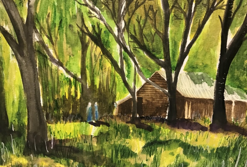
1. Introduction: Welcome. In this class, we'll be painting a loose country by in-house
seen in watercolor. Natural landscapes as
simple and beautiful, providing the
perfect subject for a beginner watercolor artist. Adding a man-made objects
such as a cottage of bond can create an
interesting contrast and help to tell a story. Learning how to capture
landscape in a quick, fun and loose manner is an essential skill that every artist should
learn to master. Watercolour is the perfect
medium that allows you to produce spontaneous and
expressive paintings. On the go, planning is crucial. I'll show you how to simplify shapes and sketching
the large ones, such as foliage, trees,
grass, and land. Getting those large
components in accurately beforehand is essential for
your painting to make sense. So join me in this class. You'll see just how
easy it is to create this amazing scene
in no time at all.
2. Materials Required: Okay, Before we get started, I wanted to talk a little bit about the materials
we'll be using. Let's start firstly with colors. So there's a lot of green in
this particular painting. And the main green that I'm
using as a darker green. This is green called
undersea green, but you can mix your own, use. Any other dark green, even olive green, hookers
green, completely fine. Just as long as it's dark so
you can dilute it out and get those lighter shades
in there as well. So very important. I do use a little bit
of brown as well. So I've got a little
bit of raw umber or burnt umber here in the
corner with a long, some darker neutral tint colors. And also this black, which is basically granulating
lunar black, lamp black. So that allows you
to further darken down some of the
brown if you need to, even some of the green
if you want to obtain a slightly muted
palette as well. I find that helps. Sometimes having a too
vibrant and contrasting can take away from the entire scene if you want to make it
look more balanced, which is why often aim for. Now, the yellows that I'm using, there's actually a few here. If you're over here, we've
got some yellow ocher. I've also gotten a little bit
of this hansa yellow light. Mainly I'm using the
yellow ocher here, and I find that applying it in very light brushstrokes
and with a very light mix, especially mostly
water in there, you can get a nice and I sort of mixing of colors in there. If we put it in a bit of
green into the yellow, just create some nice
yellowy green mixes for those soft effects
in the background. So another color that I think is important for
you to keep in mind is this one here is just
a bit of white wash and this is really a finishing touch I use at the end of paintings. And you can see it
a bit in the grass. This painting. And
all I do is just mixing a bit of white with the green and you get an
opaque green, light green. And you can use
that at the end to bring back some of the details. And you can even use
it straight and get some of the whites and
highlights back on the painting. The important thing though,
is use it sparingly. I find that too much of it starts to take away
from your watercolors. So let's about it in terms of the main colors that I'm using
in terms of the brushes. These are a few, and most of the brushes I'm using these ones
on the side here, which are watercolor brushes. They are fantastic at getting in large areas of paint for trees, for leaves, for the grounds and the soft effects of
the grass as well. So you can see that they have a larger belly compared some of these brushes
and the left, meaning they can pick
up a lot of water, but because of the tip, sharp tip on the
top of the brush, they can also cut
around shapes and just allow you to
get in details. These two on the side, we've got a number eight round brush, and I've also got
a flat brush here. A angled flat brush, really good for detailing, getting an extra little branches and grass and things
like that as well. I also have a small
brush here which is called a fan brush and specialty brush that helps me
to get in the areas of grass and things quickly because it has
multiple bristles coming out, rather than getting a
smaller round brush and doing them one by one. I find that the fan brush helps. Final thing we'll talk about
is the paper that I'm using. So what we have here is just
some paper and I'm using 100% cotton cold press or medium textured
watercolor paper. Really important
when you're looking at most landscapes because
you're not gonna be able to get that software
and wet effect and the nice blends without some
kind of textured paper. Now it doesn't have to
be cotton paper if you have other types of paper, watercolor paper, as long
as this texture on it, you're going to be
completely fine.
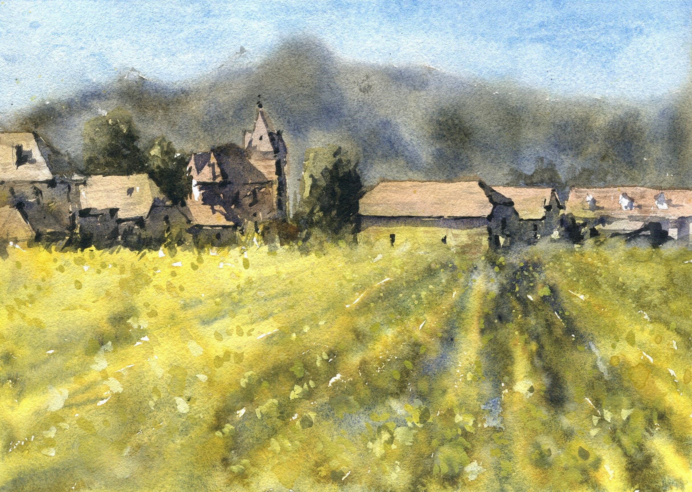
3. Drawing: Okay, We're going to start with the sketch for this scene. And the sketch is one of the most important parts of
your watercolor painting, believe it or not, because
it allows you to compose, decide whether you want
to put in all the trees, give you a guideline, a bit of a blueprint before you even start picking
up some paint. And you need to get
this one, right. So I'm going to show you
some simple ways to reduce this reference picture down
to just a really basic scene. And from there, once
we got the basics in, we can build up some
detail in the watercolors. Okay, so the first thing I
wanna do is I want to look roughly at the entire scene and look at areas where
we can separate out. Big areas are big spaces, e.g. we've got the area behind
the house and just below the house where the trees in the back and also where
the house sort of ends. You can see a distinct line with the grass finishes off and touches the house and
the grass has got this lovely green glow to it, yellowish green glow
and the background is more a bit darker and
the top is just lighter. So what I wanna do
is just kinda mark out generally where the
bottom of that houses. And I'm looking at
estimating to see where I can potentially put it now it's not halfway through the page. Say it's about
almost a quarter of the way through the page and you can, of course change it up. It doesn't need to be exactly
as per the reference photo. I'm trying to draw a little bit darker so you can see the line. Normally I go quiet. Quite lighter actually. So roughly around here. So I'd say yeah, just about a about a quarter of the way or maybe slightly more than a quarter of the way
through the page. And from here, what we can start doing is putting in
the basic shapes. There's not really much
drawing to do in this scene. It's, if you look here, e.g. we've got a tree that's
coming up around about here. I'll just start putting
in the trunk of the tree and then we've got one coming up through
the side like this. Okay. And it just goes up all the way through to the
top of the page like that. And then this one just
sort of disappears to the left, this branch. Okay, so that's again a
larger tree off there. And then I'm not really
putting in any of the leaves, all that stuff we will do later. That's mostly just in a
bit of wet and wet work. And then coming up here you can see there's like
a largest branch that's coming off
the tree and then goes, disappears off behind. Then you've got this
this trunk here. This larger trunk comes over. You can see a bit of
this tree going upwards. I can just start joining
up bits of this tree as well to make it look
a bit more detailed. There's a branch
that goes behind all these little leaves
and what have you. So this stuff we
can do a bit later. Okay. Just make sure
you've got the trunk in. And you notice just
behind here where the grass is kinda glowing a little bit
from the sunlight. And sunlight is coming. Say, Oh jeez, it looks, it looks like the
sunlight's coming directly above everything because you can see the roof of that house. Yeah. We'll go in and just put
in this tree in the back. And having, having trees that overlap with each other
is really going to help. And the reason why
is so that we get this feeling of
increasing depth. As we move into the background, we've got smaller trees, but not just smaller trees, but trees with less
detail on them as well. So you notice I just tend to
the ones at the back here, got a couple of these darker
trees off in the distance. You can barely see them. But basically you have this branch that comes up in these smaller
trees in the background. We'll figure them out later. Okay, we've got
another tree here. I always try to do the objects and trees and stuff
in the front first. And that the reason
why the reason why is so that once we get into the house and
everything like that, I don't have to cut over
the top of anything else. So we get the tree
and we know it goes all the way up
here disappears. Great thing about trees is that you don't have
to get them in perfectly because
they change in shape. Just a small change
in shape does not make any difference. It's still a tree. The inconsistencies in a sense actually make it more realistic. And that's why I really
loved drawing trees because you can have so
much artistic freedom. There have to be two to literal
with what you're doing. Over here, e.g. we've got a
tree that's just coming up. Look at that, Just,
just going to get in this branch that kinda comes all the way up and
disappears off like that. Almost the faster that
you do it at times, the better if you become
too precious with it. For some reason, it just
ends up looking too crowded and not natural. So that's why I tried to
keep things fairly flowy. Unless it's something
that's genuinely like a man-made object, house
or something like that. We need to pay more attention
to the details on the F. It's a specific landmark. Not even looking exactly at the size of the trees or the 100% location
of where they are, just, just getting in and approximate location of
where the trees are. So there's another one
you can see here as well. There's some small, smaller ones that just go up like that. They kinda darker. And you can see
this sort of under the scrub underneath
and stuff like that. That's enough trees. That's looking pretty good. Now what I wanna do is start
putting in this house. And lucky for us, we've marked in the area here where the grass kind of
ends off at the back. And I can start working
a bit on the house. Before I do that,
I'll just put in this last branch I've realized
I've forgotten to put in this larger one that
cuts over a bit and comes over here like that. But the house is almost
like an afterthought, but it is really
important actually, just to make it look like this, some more going on in here. Otherwise it's just gonna
be trees, which is fine. But I think having some kind
of man-made object in here, it always just tends to look
a bit more interesting. I'm going to start off
with a bit with the roof, just a bit of an
indication of that roof. And look at the shape
of that roof as well. It's a kind of because that's rectangular
shape on its side. Then I'm going to
put in this section of the roof looks like this. This is like the shade
or have you there. And then the bottom part of
the house which is like he is just like a fence
that runs off, almost noticed as well that this house also has another almost like another
section off in the back. You can see it's hard to
see, but there is some, looks to be like another
section back there. It's very difficult. 100% is c, What is in the distance there? I'm just estimating top of
that roof is quite important. When taking a bit more
time to draw it in. It's a triangular shape. This is just like
a triangle there. Triangle. And I'm just replicating that right-hand side a bit
more like this as well. Cutting through that tree. And then of course this comes
down and you've got a kind of bottom part of the
house like this. Okay. These bits of wood all coming across and everything
like that as well. So have a look here. I'll just draw in a couple of these little bits of wood coming down through the
back of the house like that. There's a detail
underneath here as well. It's hard to see, but just a little bit of
that rooftop underneath. It looks to be
like a darker area back then through the house. Of course, here you've
got some planks of wood just running horizontally. I'm going to remind myself, just put some of
these in like that. And of course here
you've got a bit of this darker section
of the house as well, then you can call it that in. If you're not sure, you're going to remember
to put it in late. I just color it in
and figure it out. Figure it out as you
continue on later. Just a reminder that that needs to be dark and of
course there's a window here, is that this little window? Why not put that in and
darken that a touch? And it's still pretty,
pretty basic here. There's not a whole
lot of detail. Okay? What I wanna do is
I've noticed that there's just something that's
lacking a bit in here. I want to add in maybe some figures and people walking
through here just to, just to, just to
make it more lively. And you notice this path is kinda like a bit
of a trail here. Okay, that's lighter. Okay. I put a couple of figures. Why not just put in
a couple of figures? And you start off with
the head and the head, I always make as a
kind of an oval, the rectangular shape like this. And the body, just that
rectangular shape there. And it's putting a one-foot at the front one leg, other leg. They're kind of
figure walking into the scene and to the side. And we might have
another figure here that's just turned to this one. And then both walking
into the scene. Okay. Something simple. Something simple
like that so that it tells tells a story. And not just that,
perhaps we could have someone standing over
here in the distance. Maybe they're just
about to greet this person in the house. Okay, It's a bit of a
story happening here. So there we have it. We've got a little sketch
that's sufficient.
4. Painting Light: I'm going to pick up
some light green. I'm mixing a lot
of water in here. It's probably ten
per cent paint. Ten per cent paint. A bit of green, but also what
I'll do at the same time, it makes sure I've
got some yellow. And yellow is important because I don't want
everything to turn to green. And also it just adds a, if we have some
yellows in there, we mix some greens
in there later, we have some different types
of kind of greenish colors. So just the top up there, like that, I'm starting with
a little bit of yellow. This whole part, this whole section here
is just basically getting in a little bit of paint and a little bit
of lighter color. And notice on this
rooftop as well, I thinking, what can we do? Maybe I can indicate a bit of a rusty color on the rooftop. Okay. I've just picked up
a tiny bit of red, red, orangey tinge. Just drop some of that in there. Okay, drop Buddha,
that orange in there. Sometimes I find
a bit of orange, tiny bit of orange
and a tiny bit of cerulean blue mixed together, it gives you a kinda
rusty looking color and granulocytes out. So look at that. It's just so light, you can barely tell I've got
any paint in there at all. Okay. Something like that. The cerulean, tiny bit of
cerulean and a bit of, what I've got is quinacridone, burnt orange, but you can use other types of oranges
if you want as well. Okay. Just something like that in there that I'm
keeping it so light. Always remember, you have to preserve the lights
of your painting. If you don't do that, everything is just going
to turn out the same tone. And it's going to
look very boring. And at the moment it looks
boring because you've got not many colors of course. But you'll find as
time goes by and you start adding some orange and
especially the dark colors, the form and the everything
just starts to come through. So I think that's
okay for the rooftop. I'm just going to go
through the slide here. I've got a bit of brown. This is burnt sienna, tiny bit of burnt sienna. And really it's just like
a reddish brown color. And look at how I'm just
cutting around the tree. Because I'm actually
wanting to get in some little highlights
on the tree as well. So I'm just cutting
around that tree. Let's come down here
like that, like that. Move that down like this. Notice we've got all this
darkness as well in there, but I'm not in any rush to
put that darkness in on just focusing firstly on all
these light sections, you have to have to get
into the lights first. After the light sections, you can start focusing a bit
more on the darker areas. I'm doing this pretty
quickly as well, so that it just melts
together nicely. It's also a little bit warm
in my room at the moment, so I'm just worried that it
will start drawing without too much too much time for
me to get in some detail. Look at that. We've
got some bits and pieces in here. Okay? Just brown underneath,
bits like that. So we've got that housing. We can rest assured now, we can play around with some
of the rest of the details, not be concerned too
much about the house. Now we've got that in. Now. If we've got a bit
of time as well, I sometimes like to pick up a little bit of darker
paint and drop in some some darks in here to
get in the wet and wet, darker effect underneath
so that we've got some just some variations and tonal variation in there
while the paint's still wet. We'll go through it later. So notice I've left a bit
of that sky there before. And I had some green. You can pick up bit
of green, a yellow. Okay, I've got this
yellow and just love a look around and
see what do we have? Well, we've got all these, all these branches and
everything and leaves. And I'm just going to
put in because this is really just yellow, very, very light yellow that I am coloring entire section in
this little bit of light, a little bit of white separation on the
top of the building. I don't want all the
yellow to sort of mixing into the rooftop. Okay. That I'm not worrying
too much about the branches, but I can cut over the
top of them a little bit just to leave bit of
white on the branches. You must think to you. So that's a lot of
awful lot of yellow. You see what I mean
in just a moment? Because it's not going
to stay like that. Okay. Look at this and I'm just
going across and scumbling and basically I'm just being
very loose brushstrokes. Loose little brushstrokes,
joining everything together and creating this yellowy sort
of effect everywhere. You can put a bit there as well. Because once, once we get in the greens,
you're going to find it. So it's gonna be very difficult to imply any lights or
the lighter yellow. So I tried to do this first. Um, not only that, but
even in the foreground, you will find there
is potentially some greenie sort
of bits in here. I can just mix,
start mixing that. So some of it look
at that touches the house and potentially
blends downwards. Okay. There we go. We've got a lot of this
yellow and look how loose I am just getting
it in like that. Can you have to have
faith that it will turn out fine in the end. All these colors
I've put in here, it's almost just all water. Okay. Now, go to larger brush. I've got some green watch. These can drop in a bit
of green up the top here and let it do
its thing of this is just a bit of
undersea green and it will just blend nicely
into the yellow. And then suddenly we have ourselves a situation
where we've got a, an interesting effect
in the background. Some nice wet and wet leaves
or what have you over here just watered
down the screen more. Watering down that green.
I want it very lot. And notice, awesome,
I'm letting it just melting with the yellows. I can pick up some
more yellow if I feel like it's just not
enough in there. Okay. You're very yellow here. It's kinda round these figures. I don't want to get them
in 100% yellow as well. And I'm just using, using my brush, scumbling
that brush around. And you can leave
bit of white on the paper as well as
you notice it's not all green left in some
whites in there too. Okay. I'm cutting around that tree. That tree anyway,
but there's some white here on the
paper you can see. But I'm just dropping in. Taking, taking the liberty
here to just drop in some of this green paint and
let it do its thing. Work its magic as watercolors. You have to let it do
its own thing at times. And of course, we have some of the details here for the trees, which makes it easy, easier to cut around
and get the greens in. Again, it doesn't matter
all too much even if you go over the top of
some of these trees. Okay, it's just more, more of a guideline for later because it's actually
the trees are pretty dark, so it's mostly just yes. Bit of darker paint that
we've got in there. I just leave out bit
of that white there, that yellow look at
that and you can even pick up other types of yellow. Got a bit of yellow ocher, which is a more subdued yellow. Sometimes you want to pick up a more subdued
yellow like this when you are implying you don't
want too much of a contrast, or maybe you think it
just looks too Gordy. For, I think at the moment it's probably a bit too bright. So that's why I'm
dropping in some more of this yellow ocher and it
goes down that yellow. It's still yellow but it's not a I'm striking yellow.
If you know what I mean. It just dolls that
yellow down a touch. Turns it down a notch. But of course it's
a stylistic thing. Some people love having lots of bright yellows
in their painting. In fact, I used to
paint like that, but lately, last
couple of years, I've reduced my
palette down a lot and started to use less
color and not only that, less vibrant colors as well. So coming through here, this is just more
yellow down the base. Look at that quickly
to you can paint in. Hold that color. And smaller round brush, round brush, smaller mop brush. And the same thing goes here. Of course, you can
start putting in a bit of darker color here as well. And I'm picking off this green. A lot of it is just
straight off the palette. The little bit of it, there's a little bit
of water in there. But the less water you use, the darker the paint will be when you apply
it to the paper. And not only that, you're
gonna get yourself, some, it's basically not
going to spread as much. Less spread. Which means. More detailing. And now I'm also cautious not to overdo it because I want
to go over the top wall. This with some sharper
brush strokes indicates some leaves and
leaves and stuff. So look at this just a bit
of green here and over here. And you've got to
be careful as well. I'm going to use some little bit of purple in this
green to create some perhaps shadows or
something here on the ground. But I don't want to
overdo it as well. I want to leave some want
to make sure that there's some light left in
here afterwards. But now, notice how I'm just
going a bit darker now, okay? Going a bit darker. I'm going through the
example, this one here, this has got a large sort of
shadow here on the ground. It's fairly dark. It comes across like here. Like that. This point you can pick up some other brushes and experiment. I've got this broken up, round brush and
terrible looking thing, but it creates some little
effects like these. You can use a fan brush, you can use a flat brush. This fan brushes like
I got a textured. You can see they're just a
bit of texture that can imply perhaps some grass or something. Okay. I'm going up like that, but remembering to leave
leave in some of that yellow, you can't get rid of all of it. You must leave some
of that yellow when it's gonna look more
interesting that way. It's a bit of self-controlled. It took me so long to realize how to do this when painting, to know that you need to leave
stuff in with watercolors. Because sometimes
what you leave in is more important than
what you actually, what you actually paint itself. Okay, good. So let's have a look around
and see what we've got here. It all comes down to how much detail you
want to add in here. And we've gotten so much of this wet and wet effect
here in the background, we can stop here or
you can keep on going. Put in a little bit more. I really liked this effect
of the light coming through a bit of the shadow underneath
the figures as well. And the trees here, a little bit of that
drop that in there. Now while that
paint is still wet, just got an opportunity
to do some of these interesting
little bits in pieces. Because afterwards what we're
doing is we're just get it, we're going to get in
more sharper bits. Okay, good. I'm gonna give this a very, very quick little dry. Another little trick you
should be aware of as well is using some
scratching out. I'll sometimes pick up
a little blade like this and just scratch
off a few bits of paint. And this can just indicate some little grass bits and
pieces here and there. And it works well when you've got an area
that's almost dried. So I tend to draw it
off a little bit with the hairdryer to this
bit is not dry enough, so when you go into it,
it doesn't lift off. That bit's perfect. Here, these bits, Perfect. You're getting a,
get a little bit of that coming through. Just very varying these marks. A touch creates, again, that sense of dimensionality
in your painting so that it kinda looks like there's more going on in here
than meets the eye. And of course, because we've
got all these little bits and pieces off in the
background and it really helps. So this is dry nicely on, I think I'm happy with that. Some of this just scratching
out here like that. I'm trying to be quiet, spontaneous with this as well. So that we've got some
random marks here and there. Some more here. You'll notice as you
get towards the front, you can see the
blades of grass a lot more obviously than
you can at the back. So I tend to make the ones at the front maybe
more exaggerated. Too much. Just little scratches. Paint some more here. The right hand side. This stuff adds up. Okay. So time to start
putting in some of the dark areas and detailing.
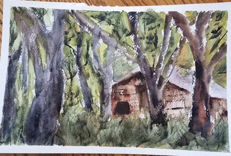
5. Painting Shadows: So what I've been doing
here is up and using a little fan brush and
some diluted green. Just going over. Once the paper's dry and getting in little bits of
darker green in here. Okay, and you can notice
these little brush strokes, but we're also making
sure that we're leaving in lots of that yellow
in the background. So I'm just picking
up some areas, making sure I've got some light left and you can see
on top of some of the tree branches
and what have you the a bit of that
yellow touching on. Okay. And I'm going through just
adding in a bit of this color. And even here in the foreground, you notice I'm just
doing this as well, just adding in a bit more few
these little brush strokes are the grass and leaving in, making sure that the
yellow is left in as well. That's really important. I like this. Here. I'm here Just making
sure I'm getting in bit more of this effect,
this grass effect, and the consistency of paint
I'm using is very light, but it is a little bit lighter than the background
color here in the grass. Just making sure I've got some different brush
strokes for the front. Bit of extra contrast. That extra darkness here. Okay? So you're doing
this same thing all over in order to get in a few different mixes
of color up at the top. It's mostly just green. And look at this, I'm picking up some
darker green as well. Why not just put it in a
bit of dark green here and they're getting a bit
more extra detail. And also you got to
remember that the trees are pretty much
dried off as well. So there's not all
that much you need to do to get in some details
in the trees I put them in last because they
are the darkest part of the painting apart from
the actual house itself. We get in the shadows
of the house as well. Notice how I go
around the house, cut around the house a
little bit like this, and create a bit of a bit of contrast between the
background and the house. Okay, so I'll just darken off
that green a bit more near the top of the roof and
the sides like this. Okay. Here, here. Underneath, there is a lot of yellow and lots
of colors in there, so I don't want to
disturb too much of that. Okay. I'm going to start
working on the house now. Let's pick up a bit of brown. I've got a bit of darker
brown, burnt umber. And I can just start
work in this house now, that darkness in here, oops, darkness coming up there. You notice actually
the House has mostly the lights on that top
section of it to the right. And the rest of it is just
kind of darker than the base. And I can go ahead and cut
around some things like this, like a little pillar
there, like that. But here a bit of darkness here. Under here. We can
just cut around that tree and bring
the paint downwards. This is just a simple Brown. Okay, but I want to make it pretty much get
it all in one go. And notice how I've left
a bit a lot as well on that top of the house to
the left here, in here. Just that same brownie color. I'm exaggerating it a bit, making it darker as I move down the page and just darken
that often little bit like that so
that we've got in I'm just kinda nice little
chocolatey brown colors in it. Okay. Good. Right. Oops, it's going
be too hard there. That's okay. They're
just putting a few little vertical lines
to indicate some of these. The bottom of that
rooftop and they're good. Now, let's go ahead and
start working the trees. And this is gonna be, you're going to use just like
more darker colors, mainly neutral tint in here. Like a grayish,
neutral tint color. Okay. I'm going to make
these trees fairly dark. Too dark, but more of like. Definitely more dark
up the front as well. Look at that, just get it in. Try to see if you can use the least amount of brush
strokes to get the scene. This one? Yeah. Okay. Sure. That I've got it firmly
attached to the ground. Here. As we go up to the side, I'm going to create
extra contrast, extra darkness up there. Here. I'm going to
bring this up like that and do this kind of thing. You get these spreading of the paint and a bit of
this dry brush effect. And it works quite
well with some of these white leftover. I'm gonna do the
same thing here. You do this intentionally
to leave in just some indications
of highlights on there. That just a bit in here. Maybe warmer color, a bit
of brown and there would be nice to want to look at that. That's another one and another branch coming
off of there like that. Let's get this one in. More water moving
upwards like that. That I'm coming off the
side here like this there. Few brush strokes. And you doing this quickly
so that you've got in these little highlights
I'm going to pressing onto the paper and letting, letting some of that
background paper show through that watch or through by pressing down and
dragging it across some. Also altering the amount
of paint on my brush, leaving less paint on the brush, leaving it kinda dry, actually slightly dry so that
this effect is possible. I'm going to go up and
do this one to the left. Now, let's go ahead and probably should have used a bigger brush for
this, but doesn't matter. We'll make do here like that. Just going up here. This is a this is a tree here
going directly upwards and just plan to make
sure it's planted on the ground bit more firmly and just get
that blend in a touch. This. Okay, good. There we go. One brush stroke is all you
need at times like that. Just one brush stroke
moving upwards, another brushstroke
moving upwards here. The brush stroke
here moving upwards. Like that. A lot of it is just kind
of layered over the top. Okay, bit more here, this larger tree to the left, I'm trying to just paint
so that you're able to see as well. Normally, I'll paint from
bottom-up like this. You've got some trees. Bit of brown in there.
In a bit more brown. Okay. And you notice some parts of the trees a little
darker than others, so I can just pick up bit of
extra paint and drop that in to some parts of it
to just let it seep in. Do its thing. Mainly around the nooks and crannies of the
tree like here, like here. You might get them more
in the little nooks, like kind of where kind of
where the light can't get too. Because remember the light
source is coming from above, so it's difficult to ascertain. I'm just enjoying in
another branch here. And this is an
opportunity as well. If you get the chance to just
add in some extra branches, some extra details, that this is gonna be just
some more branches. And they're not really here. But I want to put
them into create. Just a few more things
going on in the, in the background
so that it's not all just trees and stuff back, not trees, but bush
leaves and stuff here. Some of these darker ones coming up here in the
distance. Can you see that? So I'm just going around
darkening this button here. And of course we've
got these figures do. So. I'm still cutting around and adding some bits
and pieces in here. Okay, this is creating
a center of focus. Also. Center of focus. There. There. Here. Okay. Strengthen that side
of the tree a bit more. Here as well. We've got a bit of
verticals going up and I'm going to do them exactly the same kind
of coming up like this. I'm just trying to
make sure that you're able to see me do
this on the camera. And normally I would just
go straight over the top. I like that. It's often distance. Smaller trees. That one's probably too
much, doesn't matter. Scratch it off a
touch like that. Okay. Fantastic. I will put in some of these
figures while I am here. Let's put in a bit of blue. I'm going to just draw this off. Add-ins and details, figures. Details of the figures have
got a flat brush here. And I'll be using
some cerulean blue. Touches cerulean blue
and a bit of white. Just to get a bit of
blue for this figure. Something different in there. Maybe I'll add in
some more white. I'm just getting a bit
of color on this one as well, like that. Okay. Do you have another figure
off here in the distance? So I'll just add in
little touch of color. They're off in the
distance. Like that. On the legs. I'm going to put
in some of these a little bit of darkness at the base to create some shadow. Like a shadow directly underneath like that
for the figures. Connecting that a bit more
with the legs, like that. It's difficult because the
light source here is not entirely coming from
a specific angle. And so we're getting
just more of this general light from
above cost downwards. So I'm just trying
to get the legs in a bit more
detail like that to imply some more
shadows under there. There's a figure here as well, so I'll just put in a
couple of legs like that, just standing up right here to that shadow
underneath that figure to be in there. You can put in details, a little bit of
details like that. Person could be holding
a bag or something even. So we've got a couple of
figures walking into the scene. Really at this point,
you're just looking at some small details that
you think you might want to add on e.g.
with the house. You've got some of these wooden you can see
these wooden boards go across so I can just draw them across the truly like
that, the bit of paint. Okay. Go cross there and you can see
some of them actually just turn into these darker
areas underneath the house. Just simplify those
down a touch. And then here on
this side as well, a little bit more vertical,
some verticals there. A bit of darkness. And of course just putting in indication of these dark
areas in the house like this. That simple. Just a few brush
strokes like that. You get one up here for
the window as well. Something up there. Round
brush really shines. Flat brush, I mean,
really shines here. Makes it easy. More like that on that right
side of the house. Extra darkness. You can just pick up bits and pieces like
underneath years, sometimes you get a bit of extra extra darkness under
the roof tops. So you can imply a bit
of that here. Here. Another thing that
I've forgotten is just this kind of shadow. And I'm gonna get that
shadow in general, running across the
top of the house, maybe make it a bit more darker. Shadows of trees and things. You can see them just
cutting over the top in the areas necessary to get
in some indication of that. A little bit more white gouache, which I'm going to use, put in some highlights
with the heads of these figures and the shoulders. Shoulders like that. Oops, that one's a bit too much, something like
this. Here as well. Simple little bit select this. Also go into the trees,
that kind of thing. If you've got a bit of
yellow, you can make them any yellow into the gouache
so that you get a warmer color gouache
and do stuff like this, putting little highlights to indicate some blades
of grass and stuff. Running through
in areas works on these dry areas much
better and you can see how it just sort of
cuts in front of the trees, helps to join things
onto one another. The tree, trees in the ground. Bit of variation there. This maybe a bit more here. But here, few little strokes. They can just be indicative of some sunlit bits of grass or
something in that section. Ok. Want to overdo it though, so I'm careful to know
when to call it. Quits. Want too much of that. It's okay. I'll call that one finished.
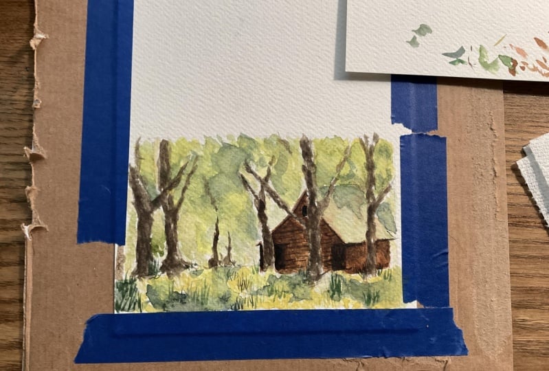
6. Class Project: Your class project
is to draw and paint your own
country landscape. This can be a St. featured
in this class are based on one of your
own photographs or scenes you've
observed outside. You can also refer to the scan drawing and painting
templates attached below, which will allow
you to trace the drawing if you choose to do so. I recommend drawing
each scene. Free hand. Drawing is an important step in improving your
painting skills. It provides you with
an opportunity to impose and plan your painting. Once you've finished
the drawing, use the watercolor
steps and processes, including the class
demonstrations to complete your painting.
 Watercolour Mentor (Darren Yeo Artist), Art Classes, Mentoring & Inspiration!