Transcripts
1. Introduction: Welcome to atmospheric
beach landscapes for beginners,
watercolor basics. In this class, we'll be paying a beach landscape from
Victoria, Melbourne. Beach landscapes as
simple and beautiful, providing the perfect subject for a beginner
watercolor artist. Capturing an impression of a
beach landscape in a quick, fun and loose manner is an essential skill that every artist should
learn to master. Watercolour is the perfect
medium that allows you to produce spontaneous and
expressive paintings on the goal. Planning is crucial. I'll show you how to simplify
shapes and sketch in large areas such as
sky, water, and land. Getting those large
components inaccurately beforehand is essential for
your painting to make sense. So join me in this class. You'll see just how
easy it is to create a beautiful beach landscape
painting in no time at all.
2. Materials Required: Before we get started
with this class, I want to just go through some of the basic
materials that you need. We start firstly with colors. The colors that I've used here, mainly yellows and blues
with some earthy tones, hues in the background as
well as little bit of green. Now, for the sand, I've actually used a
combination of this color here, which is buff titanium. It's a kind of
creamy white color and it works very well for
sand, especially sunlit sand. I've also got a bit
of this color here, which is called yellow ocher. It's a slightly
granulating yellowy color and more subdued than
say, a Hansa Yellow. Hansa yellow is locked to basically to saturated
color for sand. So these two work very well, especially in combination
with each other. You can mix them and find
that perfect blend for you. Just make sure when
you're using them, using them very thinly. So at least 90% water
to ten per cent paint. Now, in terms of
the other colors, the water I've got here
is essentially a mix of cerulean blue with a little
bit of ultramarine blue. So that creates and almost
slightly greenish blue color, but mainly on the
blue side of things. And the little area where the water connects with
the yellow is very nice. You get that slightly
green gradation or dark area where the water sort of
overlaps with the sand. So you really want
that to happen. The background,
I've used a lot of yellow ocher in terms of these, a headland and also bits
and pieces of green. So I've got a dark green here. And that's basically a
mixture you can use of ultramarine blue and a
little bit of yellow. So if you've got
something like that, you can use more blue
to yellow mix and you can create a darker
green, works very well. So another thing I do recommend is a little
tube of gouache. So this is a tube
of white gouache. I use this right at
the end to bring out some reflections in the
water, some extra waves. I also use it on top of the figures and on
the shoulders of the figures to get in elements of highlights
and the backgrounds. You can even use it for little waves and splashes
that hit the rock. And also birds flying through the headland
and areas in the back. So it's very useful
right at the very end. Let's talk a bit
about brushes. Now. I've got a bunch
of brushes here. And notice there's not
really too much of them. But I'll explain what
they are over here. We've got some
watercolor mop brushes. They have a larger belly.
These are mainly ones that I'm gonna be
using for the sky, the ground, so basically
the sand and the water. So it allows you to pick
up a lot of paint because of the larger belly
as you can see, and still be able to get in
detail because you've got that sharp point at the end. So really important to use those brushes for larger areas. Now for the details when we're looking at the figures were looking at little bit of the headlands and
the background, some of the foliage
and the birds, and even the splatters
area in the front here. You're using smaller brushes. So I've got a
little round brush, number eight round brush and also a one quarter flat
brush with the angled edge. And you can use a normal
flat brush as well. I'm just using this one
because of the angled edge just gives me a little
point in that corner. And I find that's really useful. I can almost use it as a
round brush on the edge. So that's really about it for the materials may materials, nothing I'd like to mention is the paper that I'm
using over here. I've got an A4 sheet of cold press or medium textured
cotton watercolor paper. Do recommend that
because it really, really helps when
you're using some of these wet and wet
techniques to have paper that can
withstand that amount of water on it gives
you extra time as well. I find the paper takes a
long time to dry compared to cellulose or unlabeled
watercolor paper. If you're not able to get
hundred percent cotton paper, just make sure you get yourself some water color paper
with texture on it.
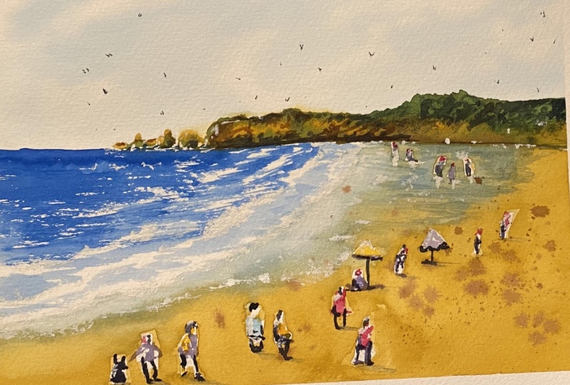
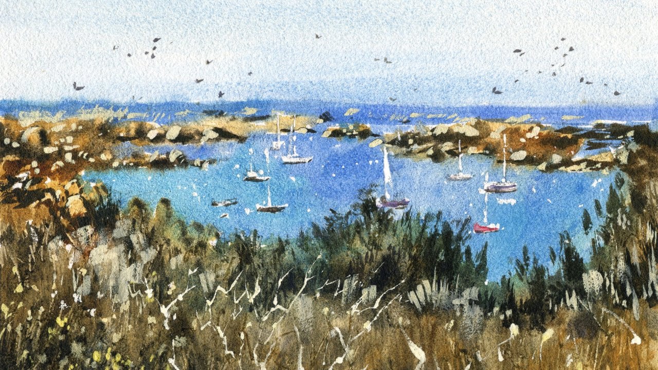
3. Drawing: Today we're gonna be doing
a beach scene and this is a scene straight off the
Great Ocean Road drive. There's a whole bunch
of beaches down there. And as you can see, there's a nice sort of a
warm headland at the back. And that contrasts
very nicely with this water and the sky. I also like the
way that the sand, wet sand interacts as well. But of those reflections from the trees that are growing
on top of the headland, got a few figures in here. And that's something I want
to play around with as well, perhaps adding a
few extra figures. Now, the vantage point that we're taking in
this particular scene, we're actually
looking downwards. It's a bit of a
overhead vantage point. So what you'll notice
is that a lot of the subjects that are closer
to us, a lot of the figures, the heads will actually be
a little bit further down, whereas the figures in
the back will appear. But basically a little
bit further up, because we're imagining
at eye level, that area at the back
is a little bit higher. So let's go ahead and
start with the drawing. So I wanted to firstly
split this scene into half because if we look at where the rocks
and the headland, all that stuff finishes, it's really right at the
back and right and center. So if I just mark out generally a center point
that you don't have to be exactly on center as well. But I'm want to stay relatively faithful
to the reference. So I'm going to draw a line
straight down the center. We'll draw this a bit
darker for you as well. Can be tricky to see
these lines underneath. On the camera,
especially in pencil. We'll make it a
little bit darker, a bit more obvious there. The great thing about
beach scenes is you just have the utmost
simplicity and beauty. We've got sky, I'm land, and we see some water. And we've got to be
Hitler and at the back. So those elements are relatively those elements and
relatively easy to draw in. But in terms of the little details of the
rocks and of the figures, that's where we can play
around heavy to fun. So I'm gonna go in
and let's figure out where some of these rocks
lies, like about here. So we can just go ahead and draw in some of
these rocks and I'll try to make them look a
bit more detailed or very, this is probably
the better word, just varied in appearance. We know it goes up like this. I'm getting a basic
indication of it. We know it goes up a
little bit more near the back region and
then curves down again. Sort of like this. Pretty basic. Okay. So go ahead and just
getting more more detailed. And again, i'm, I'm
spending a bit more time on the drawing here as well. And at the same time
I'm considering this is part of
the planning stage or I'm thinking to myself, what am I going to focus on? I'm not going to put in
much of these rocks, e.g. here, this is quite interesting. It's difficult to see, but there's almost like
a 3D section here, the rock where it
sort of cuts around. And then there's like
a little almost like a little mini beach
here as well. Another bit that sticks
out more like this, cracks in the rocks as well. It can be a bit of dry brush
that we can put on there. Of course, we've got
a bit of this tree, shrubs and stuff like
that as well up here. So we can getting a
bit of this detailing, marking out whereabouts
these shrubs and things grow down
roughly about here. The rest of it, I
can just get that in some green later on. Okay. About that line. Okay, so that's looking
good for the back section. Now, let's again have a little mark with
the water comes in. Now there's a section
where we look here. Water comes all the
way out like here. Then it retracts back in. Like this incident, ends
up around about here. We're talking about the
wet part of the sand. Where you see the
wet sand sort of finish and start to
look a bit drier. That's what I want
you to mark in. Focus on that. And I think I've gone a
little bit too far down, so I'm going to redo this a bit. I want there to be some
more sand in here. More sand in here. There you go. That's a bit more accurate. I don't like this and
it does go further back, like here. Okay. This water goes out to that side and I want to make
it pretty light as well. And the reason
being is so when we actually get in the
water and the sand, There's not a visible line
there that separates them. So it's more just
a guide for us. Okay? Another thing to try to put in is
indication of some waves. Now we can see there's
some little bits of these white sections of waves. Very important to indicate
some of this stuff coming in. I usually indicate that
actually by using a bit of white quash at the
end or trying to cut around these little waves. Just put a dry brush
to skip over some. This helps to indicate
the direction of the waves coming in and going
to the beach, like this. Big ones off in the back. So we can skip over
this with some, just leave the white
of the paper there. Something like that. Simple. Okay, Good. Three General little
waves coming in. And of course over here
there's a section of wet sand. And you can see better
the reflections of the trees and stuffing here, which is gonna
be interesting. We're going to get some
of that in later as well. But before we do that, I also want to play around
with some of these figures. They are so tiny,
they are really, really tiny compared to
the rest of the scene. We've got a little
kinda figure here. This helps to show the
scale of what's going on. But we might have a figure here. Let's just walking. Just have a little, small little figure there. I've made this one a bit larger. Mind you, I don't think I can actually paint
one that small half. Could it be careful here? Let's put in a couple more here. Maybe another one here as well. Off in the distance. These these ones just
sort of standing up and out and the back like
that bit of life. And of course, as we move closer to the front
of the scene, you can start to make them
touch larger if you'd like as well. Look at that. Just someone walking
into the scene, heads become a little bit
more closer. Further down. It could be someone
just running into the water or
something like that. Here as well. Another one here perhaps. This is just a quiet, basic and loose drawing for now, I'm not really sets dead set on keeping the figures
where they are exactly. But I do want to have a sense of decreasing size as we move out
towards the back. So I find this can
be a really good way to imply just that
sense of perspective. This could be a person with a dog or something
like that here. They're throwing something to the dog, Frisbee or something. You could have even a person sitting underneath
that umbrella. So you want to just have
a play around and in some objects and things that you think might help to
enhance the scene, make it look a bit
more interesting. Now you can have a
person just sitting here with their back turned or may not even be a
person could just be a bit of something there. I also have to think about
the the light source as well. Where do we want to
get the light source? And I think we will just
have a shadowed underneath. The figure is not too obvious a little bit underneath
the bottom of them and the distance where we've got
some water maybe underneath little reflections
of those figures in the water as well.
Would be nice. Maybe got a bit of
an umbrella there. You can even put another
one here if you'd like, just changing things up, making it look a
bit more detailed. And telling, telling a story. I think that's the
most important thing. Telling a story of
what kind of day on the beach they seize and I want it to look
a bit more crowded, a bit more lively. So that's why I've
chosen to put in some of these little umbrellas. Sometimes you have people that just sort of sit under them and face the face
the water as well. Maybe someone here just sitting down having a bit of
a chill out session. There. We've obviously got
a few more figures here in there as well. This could be a group of a few friends walking together
or something like that. Might have another one here. Just just work on
this touch. Okay. As long as the
figures in the back, their heads go a
little bit further up, you're gonna be fine. And keep some of them just almost quite inconspicuous out. They're not really too
much detail at all, but something out the back. There are people here
in the water as well. I don't know if I'm going to get much of that in much
of those people in we do have a
person standing here. There could be another
one maybe just here. The smaller figure, like that. Okay, So I think we've got enough in here to
get us started. Of course, we can
put in more figures later if we choose to, but this gives us a good start.
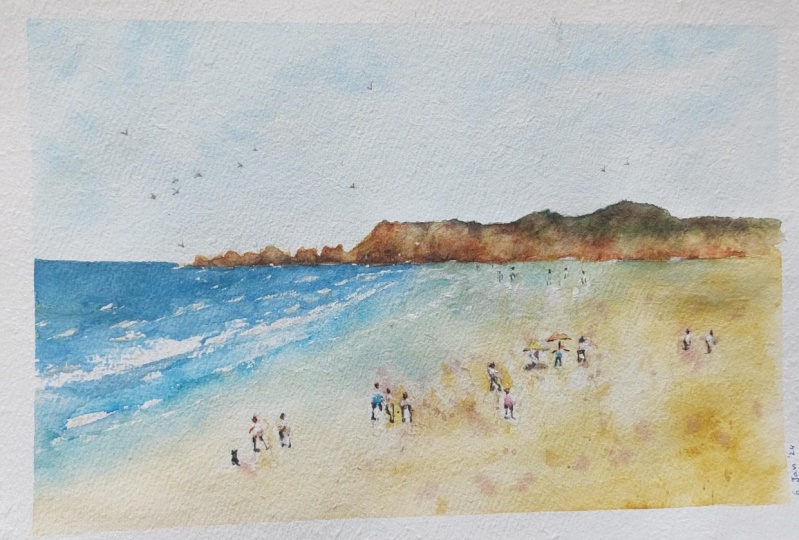
4. Painting: The first thing I'm gonna
do is we're going to get in a nice wash in the sky. I'm going to be using a large mop brush in a
medium-sized mop brush. So these two here, I'm using this one
because I've got quite a large sheet of paper
that we're painting on. And firstly, I'm just
going to go over the top with a bit
of clean water. As you can see, bit
of clean water. This is just going
to allow me to get in some softer cloud shapes. We can just work in the clouds. Later I'll get the water in. But let's start off with
a bit of cerulean blue. Okay, let's drop
some of that in, see how that looks nice. Of course, I can just feel peptides picking
up too much paint, so I'll use a smaller
mop brush here. Swap back. Let's see what that feels like. Now, remember we're leaving out some bits of whites
on the paper, okay? To indicate clouds.
And they're not, the clouds are not
really 100% white. They're just some of them are kind of a
grayish white color. Same thing goes as you move
further down the page, I just tend to be more
bit more grayish, but that scar shouldn't
take you long. Just a little bit. A color in there like that. Cutting around
some of the white, letting it do what it needs to. I always try to make the top of the scene little
bit darker as well. So adding extra
cerulean blue in here. Just spread this out more. Yeah, more here. Try not to overdo it as well
because, believe it or not, you can put too much
cerulean blue in there, and it just starts looking kind of opaque if
you're not careful. So let that melt in
and do its thing. Okay, good. We've got some clouds
in there as well. As we move further down. I'm just going to lift
this off that off. I really want this area
at the bottom here dry a bit where the water is. So I'm just lifting off
a bit of paint here at the base to encourage
that to dry a touch because I want a sharper edge for
the for the water. And I'm going to move
my way down here into some of these like
headland area, little pool of water here. See if I can just lift that off. That off. You just lift a bit
of that water off. Dries more
consistently that way. So again, I'm going to pick
up my little flat brush, kind of angled flat
brush, this one here. And work my way through these headland at the
back bit of yellow ochre. Fairly strong. I mean, I'm using maybe 50% yellow ocher
and 50 per cent water. Because I do want this
to come out a little bit and something like that. This is just the
backing color mind you, so I'm not so worried if if
it goes into the sky touched, but I don't want it
I don't really want too much of it to
bleed into the sky. So just be careful. Tend to leave a little edge here so that it separates
from the sky bit, but not a huge deal with a little bit of it
goes into the sky. We're doing, we're just putting
in a bit of this yellow, shifting it around.
What's going on here? I've got a bit of
dried yellow ocher. I'm going to have to
move that around there. If you do see it go
into the scarlet this you can actually
pick up the tissue. Pick up a tissue and
just dab it off. Very slightly like that. Again, you've got a lot of
water here in the skies. So it's no surprise that some of it is going into the sky. That the down some of these
rocks to the left as well. Just a bit of this. These rocks here. Yeah. Yeah. Yeah. All just a bit of
this yellow ocher, maybe some burnt sienna
chucked in there as well, just a little bit to create some darker spots in some areas. But I primarily want
to just do with the yellow yellow ocher first. That might dry off this section. Just speeds up the
process a little bit. So we can in some trees
and stuff on top of it. But I still have the ability
to work into these sections. Just getting a touch of
that yellow in here. The rocks mark out the boundaries
of those rocks nicely. Spreading again,
let's just give it a quick dry just re-wetting
some of these at the bottom. So just yellow ocher, just warm colored
paint like that. And as you get near to the top, That's where you want to
add in a bit of green. I'm going to pick
up some of these undersea green that
I've got here. Nice granulating green. And I'm going to just fit this, some of these into the area of the rocks and I'm sure
some of it melts, but some of it not as well. But the point of it
is just to create some darker contrast
because we're going to need that showing that more water. Okay. Good. Yeah. Yeah. Yeah. Yeah. Yeah. Just a bit of
more color in there. Notice how it just overlaps with the yellows
mixes in there nicely. I can also go a bit to the left hand side because
we've noticed there are some shrubs and things
on top of there as well. Just feathering a touch of this color to again indicate that there are
some shrubs and things. One that up the right-hand side. Yeah. Soft and often some of the
areas if you feel like it's too harsh or that kind of thing. Okay. Great. Okay. So I'm going to work a little
bit more down the page. You can start putting in things like the shadows
at the bottom of the rocks such as tiny little
indications like that. At the base of the rock. Touches of shadow and crevices. Worry too much about looking at that the exact formations on the rocks as
per the reference, but try to more indicate indicates there's
some darker spots in there. Look at the actual darkness in there rather than the shapes. I think the rock, I think it's easier to focus on just paint this bit a
little bit darker this, or adding a bit of
darkness there kind of thing makes it easier for you. Bring some more over here. Yeah. Yeah. Okay. Bit underneath here. We can go back into it
afterwards as well. Just wanted to make
a start on that. I'm fantastic. Now I'm going to start working
on a bit of the water. And we'll be using ultramarine mixed with
a little bit of yellow. Just to turn it
slightly greenish. Mostly blue. Really just a dark almost like a
darker version of the sky. I'm going, I'm going to need
a fair bit of this stuff, just trying to mix a
good amount of it up. Ultramarine blue with a bit of cerulean blue works well too. So I'm going to start
off at the back. Fairly dark. Okay. This actually goes the water
goes beyond the rocks. You can see roughly about here. And it goes behind
the rocks as well. That interestingly, there we go, You can see it just blends
in nicely into the water. That so important
to keep that yellow in there that it
doesn't disappear off. A little bit of melting
in this fine as well. Okay, So we're coming
down some more paint, moving further down
into the foreground. And this is where I
was talking about using a bit of this dry
brushing techniques. I'm lifting off. Just leaving a bit
of the white on the page as you can see here, to indicate some of these
these waves coming through. Okay, that's one, that's, this could be another
wave here like that. Now the one, It's coming forward
and then some more here. Little one here. Some more paint. It's what she leave out
that makes a difference. Even below that white showing
through the page like that. Darkness. Little spot, spotty sort of bits in here
would be nice as well. Just some darker bits. More. Mixing some cerulean blue with some of that ultramarine. For we start with
the next section. I want to get in
this yellowy area. I'm going to be
using just a touch of yellow ocher mixed
with buff titanium. And this is to get in the sand using a large brush to just
getting the big bits. First. I'll swap myself over to a smaller brush to cut
around the figures because I think the figures
are gonna be important to indicate details
and colors in here. So I want to make sure I
leave something there. Even the umbrellas, a bit of color in the
umbrellas would be nice. So I find cutting
around some of them. He's a good idea.
Okay, Look at that, just cutting around
these figures because we were there a little
contrast in there. We can imply. Yeah, just bringing this down. Looking at the water
level as well, the area of the water
and thinking, well, we didn't really stop. Okay. Go pretty close. Here. Around these figures. Such lighten mix, It's mainly just water in this
entire mix of paint. More yellow here. Here. Yeah. Foreground. Cutting around the
shirts and clothing of the figures. Just wet. This section, more, especially near this area
of the water because that's where I want it to
kind of mixing. And this is where I'm
going to just pick up again that other brush. Pick up some of that blue, and start feathering it in here. That this nice little
joining section of the blue and the sand, this is going to just melt into it like that and I'll leave
that to do its thing. We're going to move
this along the way, all the way towards
the back area. Little bit towards
the back there. Nice sort of melting
into the water. So you can see more
round this side. Having it come through
more darker bits of water. That really just coolness mixing in a bit of
coolness in here. Okay. Let it do its thing. Also. Good opportunity now
to pick off a bit of paint, some darker paint and just flick some of it into the page. So something like this
helps bit of brown, whatever color you want,
just darker color. And do this sort of thing. It helps to just get some
textures running through here. Textures can be seaweed, it could be rocks. Anything really good? Give this a quick
dry little details. I'll be using small round brush for some of these figures. But also we using which you
may call it angled brush. I had before. To put in some of the
background details of the mountains of snot, finished with them yet got a little extra contrast
would be good there. But let's work on the
fingers and I want to put in maybe a little bit
of red over the skin. You can use a bit
of brown as well. It's up to you. There's a warmer color in
there or whatever just to indicate maybe a few
people they could just be with shirts or
something like that. Then this person
here maybe walking that some of them just you can leave whatever color really you can just
put in a bit of blue, even tiny bit of cerulean blue. Let's even too dark,
something like this. Nice light color. This one here which is like, really like yellowish as well. Same with this one. Adding a bit of color. There. You can just put in the legs, you can pick up a bit of darker paint and do
something like this. Just e.g. this figure here. Here. Let's try this one. There is an extra bit of
darkness beneath this Umbrella. Umbrella. Testing a bit of a shadow underneath
the umbrella. Legs. There's one leg, they're dry dry brush
this on touch as well. I don't want to make
it too obvious, just a little bit of
dry brush like that. Here we can put in
a couple of legs, that one as well. Little shadow underneath the
legs to connect them up. Here's one, a couple of legs as well and just a bit
of a shadow joining them up. Like that. This person
could be walking, right? Or something. Again, bit of a shadow
connecting up the legs. Let's work on these ones. Okay. Couple of legs here. This, these group of three figures walking
together like that. Just a bit of that
darkness underneath them. That as well. Little indications they make such a huge difference really. Let's put these ones in here. Little couple of legs. They, they're
connected up again. Like that, the Slack some
kind of dog or whatever here. Indication dog or something. A bit like a dog. We put here, this was also
an umbrella or of some sort, and there may be a bit of darkness underneath
there like that. Getting the rest of the
colors in just a moment. Here in the back, it just
becomes quite tricky to put too much detail in there. It's hard to see what
exactly is going on. And in fact, some of them just have just appear as white
silhouettes in the distance. Bit of white gouache
can be helpful here. I'm going to put in some
color for this umbrella. It's putting in a bit of yellow. Yellow through this one. Some vibrance or a yellow little washer
that they're okay. So that this one here, really innovative bit of
pink or something here, the warmer color
like that. Okay. Persons under there
perhaps didn't really emphasize them too much. Good. Colorful the arms like that put on there for me, for the for the
shorts or fluids. The colorful their
heads like that. Get their heads
touch a red color. The shadows are just
directly underneath the figures and everything. But there are some
lead to shadows off in the distance underneath
the mountains and stuff that in the back. So a little bit of
brown mixed with black. I will just go in there and
see if I can indicate any bit of little details and
things that will help. Just to bring it together
with some final details. Okay. Just a little dry
brushing strokes to imply detail back there. I don't actually want to draw in all the little shrubs
and things because that's just going to be
in a bit of a nightmare. Little bits and
pieces like this. As you can see, they do
start to combine pile up. And suddenly before you know, it, it looks like a bunch of bushes in
there or something. It's only with combining the different layers that you
end up getting this effect. Feathering more of a downwards
and just try my best to I'm emphasize a little
texture on the rock still. Here as well. Looking
at you've got extra shadows
underneath the rock, you will notice extra
shadows in spots. And be afraid to put them in a couple of sky. Some neutral tint or
just a dark color. I've actually got
some little spots of paint that I missed out splattered on top of the page before just
in these sections. And I can turn them into birds. Like these little v
shapes in the sky. Darkness for the
heads of some of them here or
something like that. Maybe as a finishing touch, some white gouache to
bring out the extra waves. Look something
like this come in. You have to be very, very
gentle with this when using gouache so that it doesn't
overpower everything. But I think I just
needed a bit more of an angle coming in
here with the water. Like this. Make those
waves make more sense. Little bit more of
this coming out here. Little white aged, just to be to that firm where
they're very subtle. But as you can see,
it really helps. Sometimes you can even
get a bit on the rocks. Indicates some
spray or whatever. See if I can work on this
little reflection here. Little kind of a slight
reflection for the mountains. So I'm going to work just
putting in a bit of this yellow over the top. With my way down to
is this section here. The bit of green
reflection in the water. Yeah. Reflection for
these, these figures walking along the beach as well. Like in the background, like maybe the abbot of a reflection on the
water like this. Wash back there. The umbrella figures and the heads and the shoulders
of these figures. Bit of white gouache. Okay, and I'll call
that finished.
5. Class Project: Your class project is to draw and paint your own
beach landscape. This can be seen featured in
the class or based on one of your own photographs or scenes you've observed outside. You can also refer to the skin drawing and
painting templates attached below to allow you to trace the drawing if
you choose to do so. I recommend drawing
each scene. Freehand. Drawing is an important step in improving your painting skills. It provides you
with an opportunity to compose and plan
your painting. Once you've finished
the drawing, use the watercolor
steps and processes, including the class
demonstrations to complete your painting.
 Watercolour Mentor (Darren Yeo Artist), Art Classes, Mentoring & Inspiration!