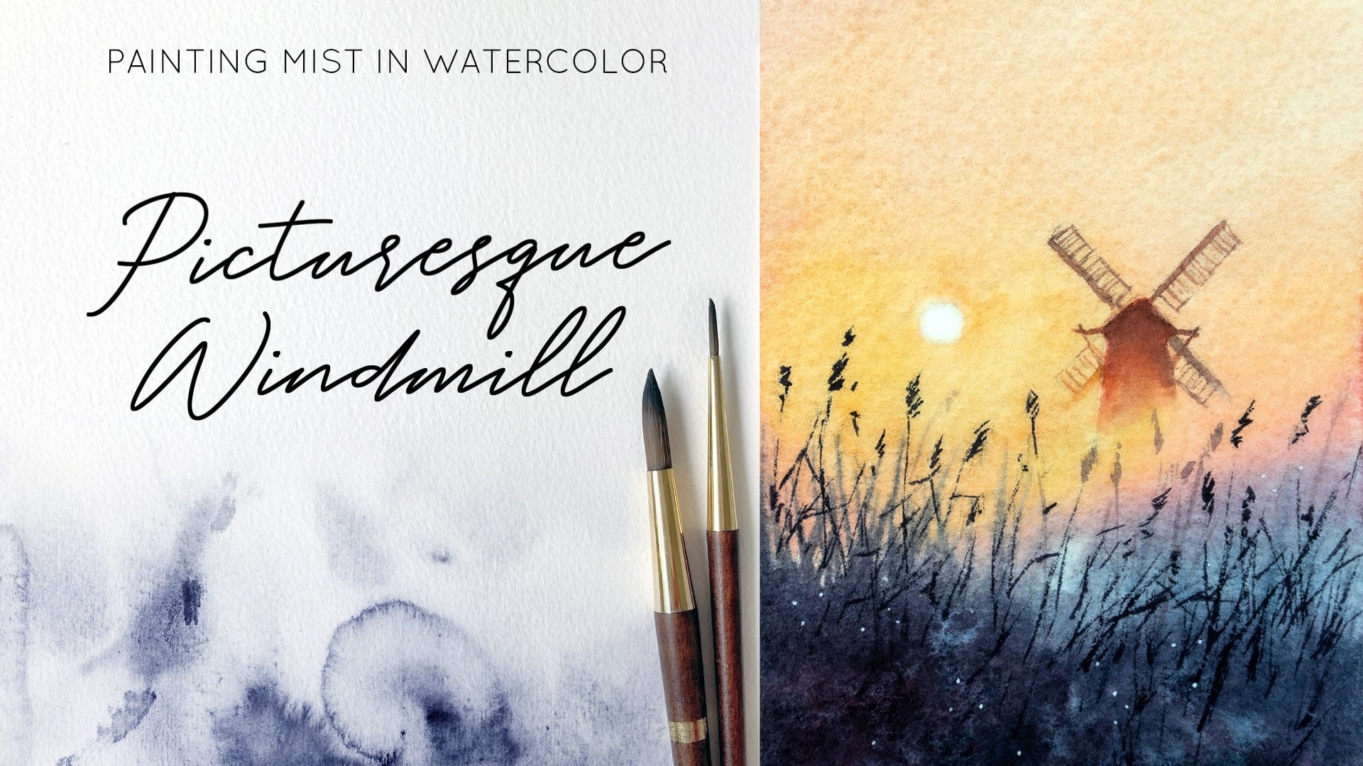
Paint an Atmospheric Blue-Pink Sunset Over a Lake, Hazy Landscapes Series
 Evgenia Cordie, Professional Watercolor Artist, Belgium
Watch this class and thousands more
Watch this class and thousands more
Lessons in This Class
-
-
1.
Welcome to the Class
3:19
-
2.
Your Project
3:16
-
3.
Colour Palette - Making Swatches and Mixes
4:40
-
4.
Painting the Background on Wet Paper
8:30
-
5.
Finishing Touches - Painting the Details
4:21
-
-
- --
- Beginner level
- Intermediate level
- Advanced level
- All levels
Community Generated
The level is determined by a majority opinion of students who have reviewed this class. The teacher's recommendation is shown until at least 5 student responses are collected.
67
Students
23
Projects
About This Class
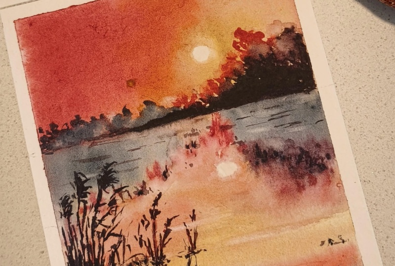
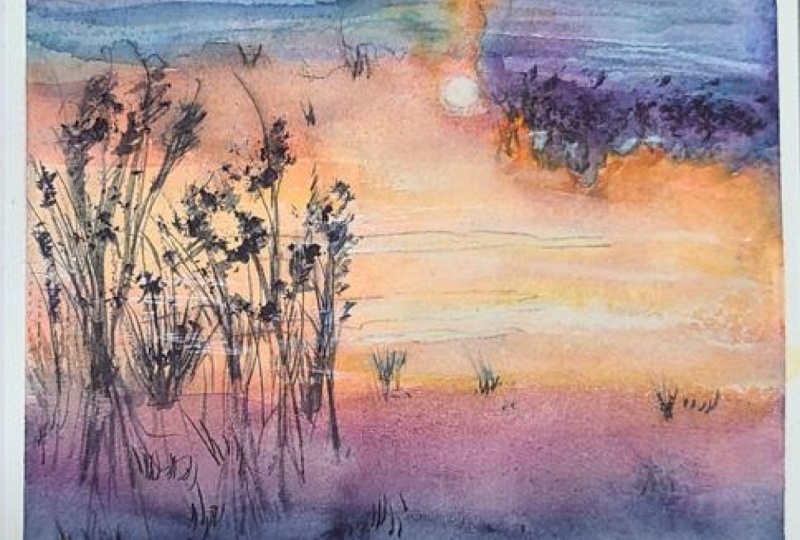
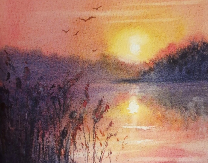
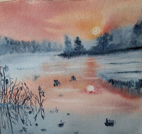
In this class, we will paint a beautiful, atmospheric blue-pink sunset over a lake, capturing calm, mirror-like water and a soft bluish haze in the distance.
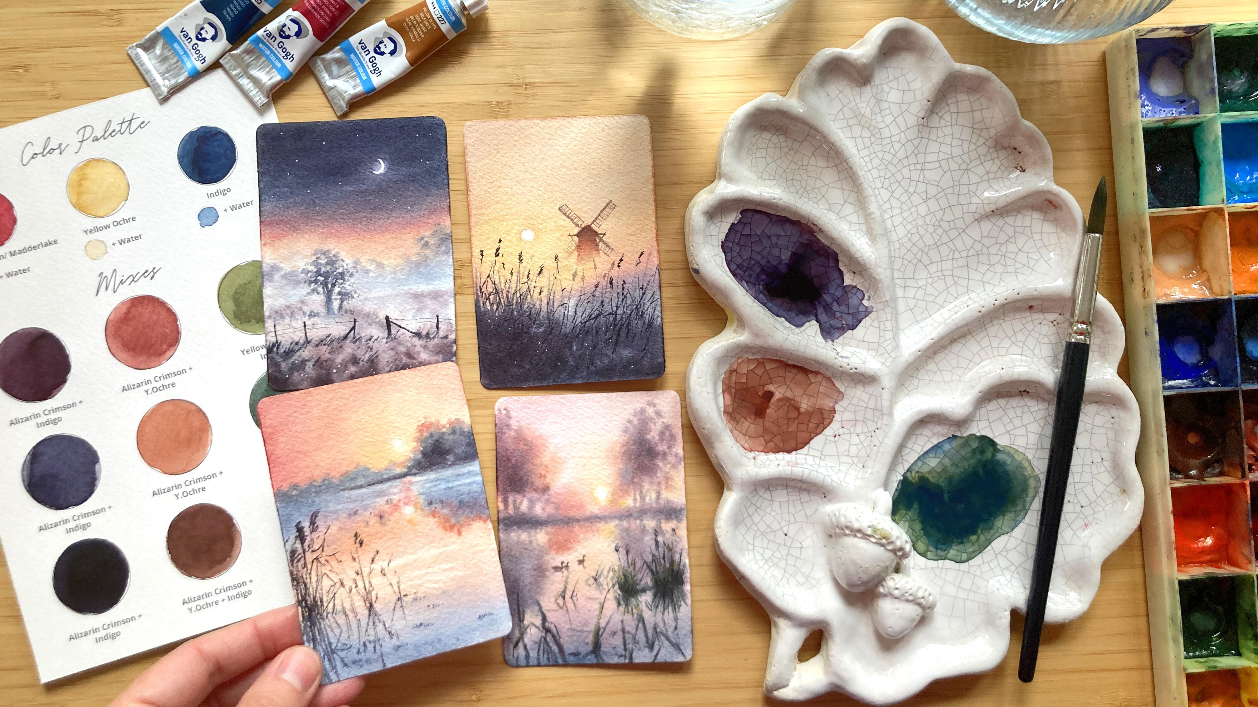
You won’t need a large palette — just three carefully chosen colors. They blend beautifully together, allowing us to create both warm and cool tones with ease. Their natural, subtle hues help you achieve the calm beauty of real landscapes — no harsh greens or overly bright colors, only soft, poetic tones.
We’ll begin by mixing our colors and exploring the full range of tints and shades they can produce. Then, step by step, you’ll paint a glowing sunny scene with a windmill, learning valuable watercolor techniques while enjoying the gentle creative flow of working on a small, expressive piece.
This class is perfect for all levels. Beginners will find the small format encouraging and stress-free, while intermediate artists can refine their technique and dive deeper into atmospheric painting. The artwork can be completed quickly thanks to the small size, and the drawing is simple, intuitive, and easy to adapt to your own style.
What You’ll Learn
- How to mix three versatile colors for a wide range of natural tones
- The wet-on-wet technique for creating atmosphere and softness
- How to paint light, water and soft backgrounds
- How to connect two colors to create a smooth gradient
- Expressing bluish haziness
- Lifting color to accentuate water texture
- Adding final details and gentle enhancements for realism
Thank you so much for exploring this class!
I’ve been a professional watercolorist for many years, fortunate to exhibit internationally and have my works held in private collections around the world. My style blends realism with a touch of magic, and I’m passionate about helping you find joy in painting through experimentation, expressive color, and your own unique vision.
Let’s dive into the mist and paint together!
Additional Resources:
- Free watercolour tutorials on my YouTube channel
- Follow me on Instagram to discover free watercolour tips and tutorials
- Check out my website
Meet Your Teacher

Are you looking to grow as a watercolor artist? I'd love to help guide you through any challenges you're facing or chat about your watercolor journey! I offer personalized instruction and feedback tailored to your needs. Let's connect and create beautiful art together!
See full profileHands-on Class Project
I’m so happy you’ve joined this class!
Your project today is a soft, atmospheric blue-pink sunset scene with a gentle bluish haze in the distance. Your goal is to create a smooth, seamless transition of the sky and the water, accentuate the light lines in the water using the technique from the lesson, paint the distant trees fading into the blue, and loosely add grasses in the foreground. The paper size I use is small—7.5 × 10.5 cm, but you can also use a larger format.

In the Resources section, you’ll find my finished painting for reference, along with a pencil sketch you can trace to help you begin. You’re welcome to follow my demonstration step by step, or choose your own subject—your creativity leads the way!
The reference photo I used comes from a Pinterest board I curated specifically for this class: https://pin.it/3Zr3zKMWM
It includes a collection of mist-and-sun images to spark your inspiration. Some photos link directly to royalty-free sources like Pexels, while others belong to their creators and should not be copied exactly. For this reason, all images provided (including those on Pinterest) are meant for inspiration only.
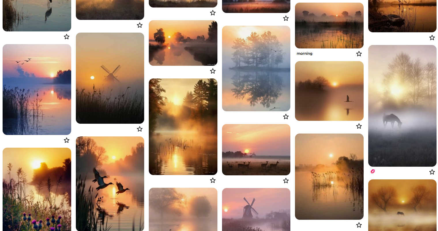
Use them to capture mood, light, color, or individual elements. Feel free to adjust the composition, shift the palette, change shapes, or rearrange elements so that your artwork becomes a true personal interpretation.
Let’s get started—I’m so excited to paint this dreamy blue-pink sunset with you!
_________
It’s a great pleasure for me to give my students feedback, so please take a photo of your painting and share it in the student project gallery under the Project and Resources tab.
I’d love to hear all about your painting process, if you had any difficulties or what was the most enjoyable part of the painting process.
Upload your artwork by clicking "Submit Project" on your right on the Projects & Resources tab.
Step 1: Upload a cover image, it can be your artwork photo, but it will be cropped. No worries, you can upload a full photo further.
Step 2: Share your thoughts about the class or/and your painting process.
Step 3: Under the field, where you write, you can find 3 small icons. Click on the first one - Image and upload your artwork. You can see your photo appearing under your text.
Step 4: Scroll to the top and click on the green button “Publish” to share your project.
If you have any struggles or questions during the class please start a discussion and I will be sure to answer your questions.
I highly encourage you to explore the work of your fellow students in the student project gallery. Viewing other creations can be truly inspiring and also to receive support can be incredibly reassuring, therefore please consider engaging by liking and leaving comments on each other's projects.
Class Ratings
Why Join Skillshare?
Take award-winning Skillshare Original Classes
Each class has short lessons, hands-on projects
Your membership supports Skillshare teachers
Learn From Anywhere
Take classes on the go with the Skillshare app. Stream or download to watch on the plane, the subway, or wherever you learn best.