Transcripts
1. Introduction: One of the students
in my in person beginner Watercolor class came to me at the end
of class and said, What do I actually
do with the brush? I thought, that's a
very good question. So in this class, we're
going to look at two things. First of all, paint
consistency because that's a massive part of
what you do with your brush. And then we're going
to look at brushwork, how to make a variety of
different marks with your brush. We're going to work from an old mask painting
as inspiration, and we're going to use the expressive brushwork to create a tonal
landscape painting. My name is Catherine Jennifer. I'm an artist and art educator. I teach in person
watercolor classes. I'm a top teacher on Skillshare, and I also have a Watercolor
app called Watercolor Joy, which is great for
beginners and for keeping you motivated as you
go on your painting journey. This is a focused
class, and by the end, you should have a much better
idea of what to do with your brush on the paper and different ways you can use
your brush to make a mark. So I hope you will join me in the class. And
2. Project: Project for the class is to
paint a loose landscape, more bit like a sketch, but to use the pen
consistency and the brush marks as a thinking tool as you
develop your landscape. When you make a painting, there are a lot of things
to think about. And when you're
learning how to paint, it can be really helpful
if you take out a few of the things and just focus down on one or two things. So for this project, the focus is on paint
consistency and brushwork. And the reason I've given you an Old Master painting
as your reference photo is Old Master paintings have usually solved a number
of problems for us. So they've usually solved
the problem of composition, and they've got a
good composition, and they've also usually solved the problem
of tonal value. However, I also strongly
recommend that for this project, you take out the
issue of color and work just in a single color
or maybe in two colors. I've used a sepia color for my landscape painting based
on the constable landscape. And I suggest you do the same. If you don't have CPR, you can
mix a brown or use a blue, like an indigo or something. But whatever you do, simplify the color
and just focus on the paint consistency and the kind of marks you're
making with your brush. You'll find a few reference photos in the class resources, which you can download. These are old master paintings, and you can work
from any of these. And when you finish
your project, take a quick photo
and upload it into the class project
gallery so that I can offer you some
personal feedback.
3. Materials: Materials you will
need for the class, your watercolor paints,
I suggest you use some old paper and practice
the brush marks first. Use a variety of brushes, especially some
really cheap old ones and really push down and work those brushes and see how far you can push the kinds
of marks that you can get. For your main painting, I suggest you work on
good watercolor paper. So gather your materials, and we will get started
looking at paint consistency.
4. Paint Consistency: Watercolor artists will often refer to paint consistency
in terms of tea, coffee, milk, cream, and butter. So over here, I've got some sepia paint which I've squeezed straight
out of the tube. To make my tea consistency, I'm just going to
have a wet brush, put a little bit of
water on my palette, and then make sure my brush
is really nice and wet. And then I'm going to take
the tiniest amount of the pigment and mix
it into my water. You want your tea consistency to still be strong enough
in terms of color, but it needs to be really
wet and loose and watery. So there is my lovely
tea consistency. For coffee consistency,
I'm just going to increase the amount of
pigment in my water. So going back to my
tube paint and thinking like instant coffee with semi skimmed milk. That's
what we're going for. So it's definitely
thicker than the tea, but it's still nice and loose, and comes out a
little bit darker. For my milk consistency, now I'm getting into the
realms of full cream milk. So it needs to be wet enough that it can move
nicely on the palate, but it's starting to
get nice and creamy. So you can see that that is a lot thicker
than the coffee. For the cream consistency, I'm going into my tube paint, and now I am thinking in
terms of double cream. So quite a lot of
pigment, quite thick. And I might just
add a little bit more you can see how delicious that is. Lovely double cream. And then for my
butter consistency, I'm going to take the exis
moisture out of my brush. And I'm going to go straight
into my tube paint. Now, here, it's quite
sticky on the palette, and I don't want it to
be quite so sticky. I want butter, but not
I can't be too sticky, so I need to increase
the quantity from my tube to get
that lovely butter, maybe add a little more liquid so that it
still moves about. But for butter, you do
need to be generous, and it's almost as if you are painting
with acrylic paint. Think thick and delicious
butter like that. Sometimes I also say
toothpaste consistency, which is similar to butter, but it's basically really creamy and delicious and almost
straight from the tube. So have a go at creating
those consistencies yourself, and then we will look at how
to use those in a painting.
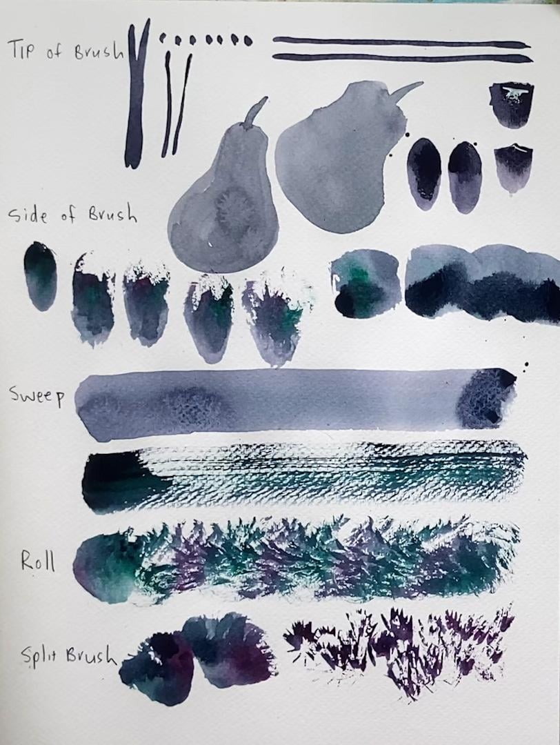
5. What to Do With Your Brush: So now you know a little more
about paint consistency. Let's look at brushwork. So you can use the
tip of your brush, and the tip of your brush, you can use just to
make little marks like this or with the
tip of the brush, you can make lines. You might make horizontal lines, or you might make vertical lines if you're painting a tree
trunk or something like that. It gets more
interesting when you start to use the
side of your brush. Now, if you're going
to paint a shape like an apple or a pear, the thing to not do is do
not outline your shape. So let's say I'm painting a
pear. There's my pear shape. Don't do it like that. And the reason why you
shouldn't do it like that is that by the time
you then go in and get some more paint
and come back and start painting in the
rest of your shape, and a lot of beginners
tend to do it like this and then go around
again and again. And the reason why that's
a bad way of doing it is that they often don't
work fast enough, and the out line starts to dry and they get these unwanted
lines in their shape. So if you are painting a shape, you will most often use
the side of your brush. And the way to do
it is just to make the shape as quickly as you can with the side of your brush. Just painter in. However, there's more you can do with the side of the brush. You can use the side of
your brush if you load it up nicely and you
can make some dabs. So you can just put
it down like that. And depending on what
shape of brush you've got, you will get a certain
shape of mark. If I use this flat brush, and I load it up nice and fully, I can just dab, and there I've got
a nice flat shape. Okay? But you can do more than that. If you start getting interesting with how
you load your brush, so if I load half my brush with a pink and half
my brush with green, and then if instead
of just touching, I can just touch
down, which is fine. But for a more interesting mark, I can push my brush. So if I come from the bottom
and push my brush and then dig right in so that the ferrule of the brush
actually touches the paper, I start to get a more
interesting mark on my paper. So I'll just show you
dabbing in, pushing and up. So I'm getting a bit
of dry brush there. I'm getting an
interesting thing there. Depending on how fast I push and how much the bristles
separate as I go, I'm getting all sorts
of interesting things. So that's pushing up. I can also load my
brush and pull down. So now, instead of having
my brush handle facing me, I'm turning a 90 degrees. I'm going to still use the side of the brush and I'm
going to pull down. And this is quite often useful for if you're
painting, say, petals on a flower and
you're just pulling down, you can connect up your marks, but it's another nice
easy way to get a shape. Then we can use the brush
for a sweeping motion. So if I get my
brush nice and wet and I have a really
full wet brush, maybe just take a
bit of the pigment out and I can just press nice and hard and make a
really nice wet sweep across my paper. If I take most of
the pigment out of the brush and I go for
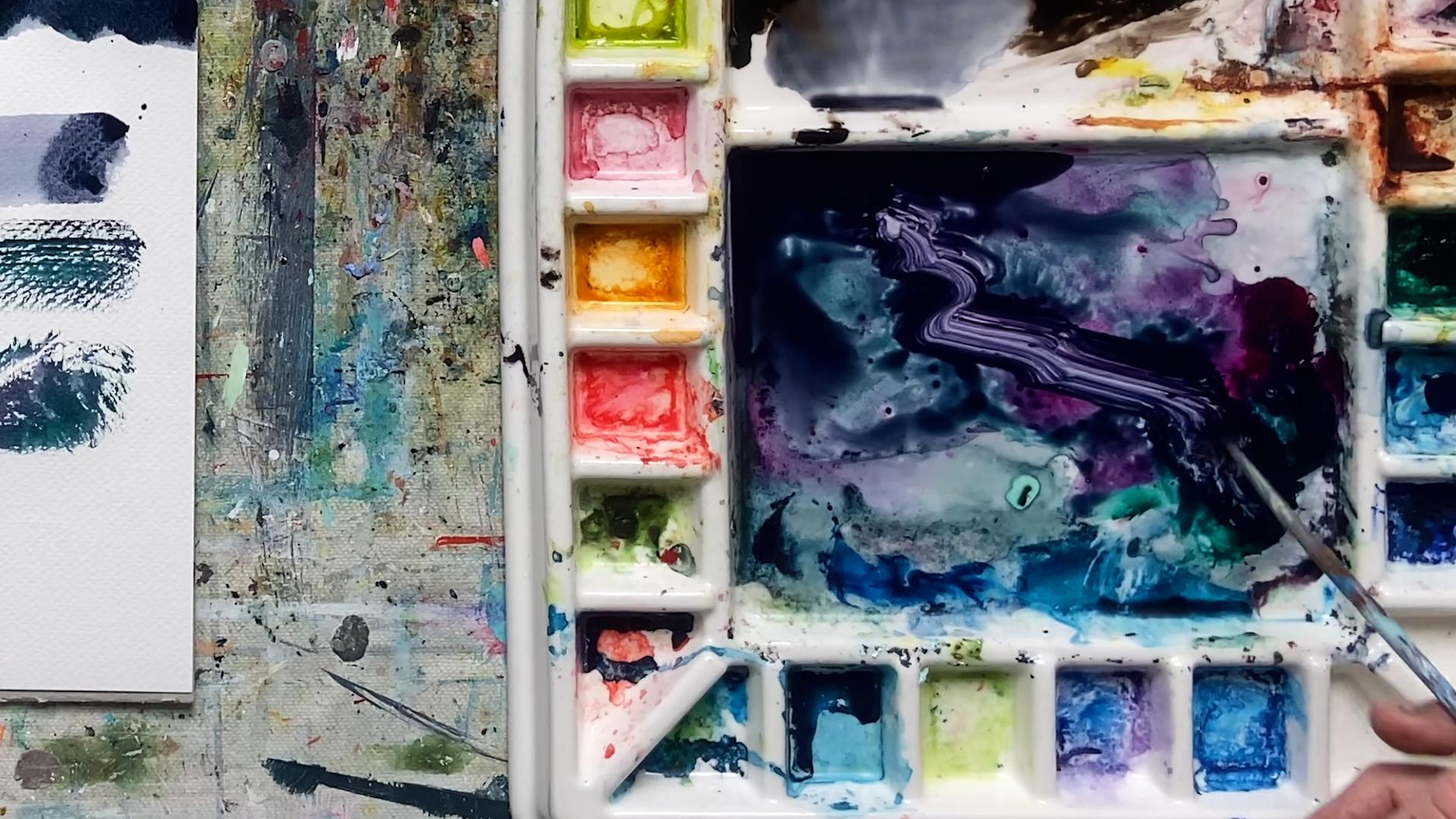
a dry brush effect, and I mix two colors, but sort of very roughly
on the palette like this, I just need a bit more green. A bit more pink. So I'm going to load pink on one side, green
on the other side, get it so that it's covering the whole thing and go
for a dry brush effect. And as you can see, that is
a whole different thing. But there's more. So I
can also roll my brush. So if I have it quite
dry, not completely dry, but quite dry, I can
use my palette here, and if I push down
on it like this, it kind of pulls the
excess moisture out. So preparing it on
the pallet like that. Now I can put my brush down and I can just
twist the handle. And start rolling it. Now,
this is useful for things like when you're making foliage or bushes or something like
that. Look at that. How fun is that? Okay, that's a nice rolling mark. Love it. And then split brush
is that same thing, but taken one step further. So I can use my palette and split brush
like this in the palette. Don't be scared of
breaking your brush. Most people are very frightened of their brushes and
they think they're going to break them,
but they're not. You can have a split brush. Some brushes will split
more easily than others, and if you've got any
really old kids brushes, steal your kids
brushes and save them, the really cheap ones, and then use them. Look at this. Look at this. This gives you the most
beautiful split brush marks. And you can use
this for trees and foliage and all sorts
of beautiful effects. Okay, so save your
cheap brushes. So have a go at trying all the different types of marks that you can
make with brush. And in the next videos, we're going to look at
how you would actually use the paint consistency, as well as this kind of brushwork in a
landscape painting.
6. Landscape Principles: So now you have a
better idea about paint consistency and how to make interesting
marks with your brush. So now we're just going
to cover a few of the basic principles
of landscape painting, and we're going to do
a quick sketch based on a painting by
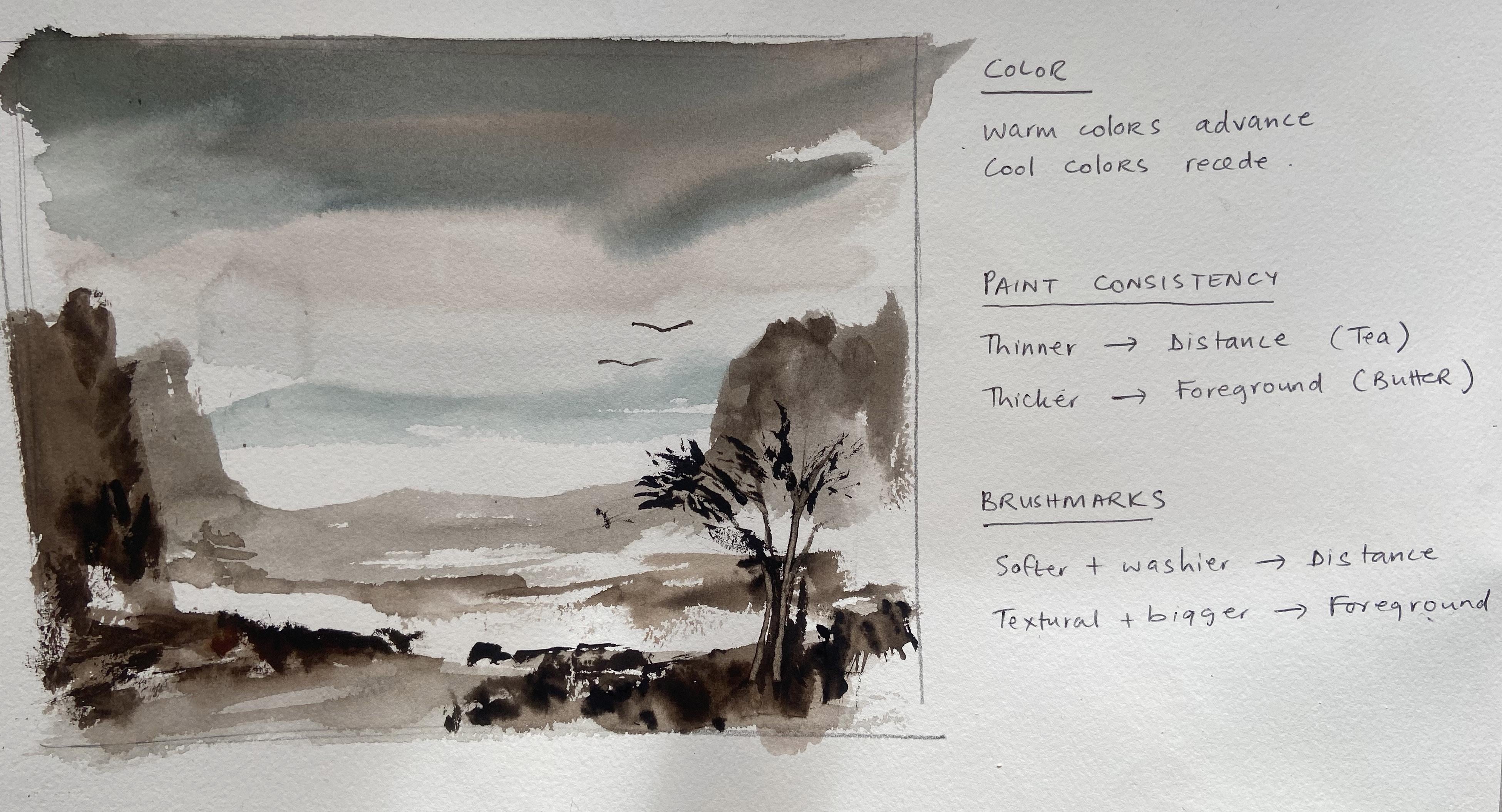
Alexander Cousins. So the first thing is color. When you doing a
landscape painting, warm colors will advance and
cool colors will recede, meaning that if you are painting some mountains
in the distance, you're going to add a
touch of cool color, and that will make them look
as if they're further away. Whereas for your foreground, you'll add a few
warm colors and that will bring your
foreground closer. The second thing is
paint consistency. The distance will have thinner paint and you'll be using more of your
tea consistency. Then as you come and
paint the foreground, you'll be using your
thicker paint and you'll be working up towards
your butter consistency. Then finally, with
your brush marks, in the distance, you'll
have your softer and washier brush marks. And in the foreground,
you'll have your textural and much
bigger brush marks. So I'm going to have
a little go now at implementing those
three things in a very quick sketch based on the picture
by Alexander Cousins. So the first thing is the sky. And for the sky, I'm just going to paint in a little bit of water
to wet the paper. And then I'm going
to just come in with a little bit of my sepia paint. And because the top of the sky is in my foreground
is closer to me, this is where I want
my paint thicker. And as it goes down
towards the horizon, that's where I want
my paint thinner. I'm only going to use
two colors in this. So if we have a nice stormy sky, it might be something like that. I'll bring my sky
down a little more. And then for my
distant mountains, I'm going to use a cool color. So if I go more into my pal blue and my
consistency is more like tea, I can just paint in some
of my distant mountains. Like that. And I want my everything to be nice and soft and washy in the distance. And anywhere where
I want to be very, very light, I need to reserve
the white of the paper. Might pop a cloud in
here, just to soften it. Then, as I come forward, I'm going to start painting
the middle ground. So now I want to start
warming up my color. Thickening up my paint and
enlarging my brush marks. So I'll come back
to my CPA paint. I might add in a touch of
burnt sienna to warm it up, and I'm going to
start painting in these nice big mountains like this and bringing in
some of the foreground. If I bring my mountains in here, as well, like that. And then I'm just taking a
little more water to soften, and I might bring my
foreground in here. Okay? Lovely. I can bring that
forward a little bit more, and I might use the same idea and just pop in some of this foreground here. Now, here, although
my consistency is T, I'm using quite big
gestural strokes. That was one big sweep
right across the page. And that's because
my brush marks in the foreground need to be
more textural and bigger. I'm just going to pop
a little bit more in here. That'll be fine. And now for this very
foreground mountain, I'm going to warm it up
a little bit more with my boon sienna and I'm thickening it up
a little bit more. I'm going for about
milk consistency now, and I just want to get this
foreground mountain in here. Okay. And I can start to
think about the bushes. That's fine. For the bushes, I'm going to change brush. Because now I'm thinking much
more about the mark-making, what textural marks can I make? And I want to get some
of these bushes in. So I'm thickening up my
paint again more like cream and warming it up a little bit more
with my burnt sienna. And now I'm going to come in. I'm using my brush, just
holding it on the end, and I'm just going to make some of these foreground bushes, just as textural marks. So all the marks we
talked about before, we had the side of the brush
with pushing into the side, if I do a few of
those, pushing down. And because I'm pushing
it into wet paint here, that gives me something
nice, as well. What else did we talk about rolling the brush and
splitting the brush. So and before I do that, I might just pull a few marks in here with
the side of the brush. Okay. Nice and big and textural. I might go up another step into pretty
much butter consistency, tiny bit of water,
just to help it move, just to get these
little things in here. So here I'm using the
side of my brush, and I'm just touching, dabbing into there to
make some of these marks. And what I might do
for this corner is just prepare the page, a tiny bit more by wetting it. Okay. And then I might also use my wet brush to release a bit of this paint thick paint
that I put there. That's quite a nice
technique you can use, and you can then use that paint that you've
released as a nice sweep, and it just gives
you that extra layer of tone in your foreground. And then here with these bushes, I can use my butter consistency. And now I can roll my brush. This brush, when I roll it, it's not so exciting. So let me try it with this
little old, very cheap brush, which I if I get the paint
nice and dry like that, you can even see it on
the palette and then I dip and just pick up really
thick butter consistency. But with this very split brush, I can get some really
nice marks and textures. And this brush, if I roll
it, let's see what happens. Yeah, it can give me
something a bit different. And then a final thing I can do, just by way of
demonstration is I can sweep up a few
trees if I want to. I feel like here,
we need something. So before I do the trees, I'm just gonna pop a bit
of medium tone in here. So again, just a
very light touch, getting a bit of texture, conscious of my values and
my tones, as I paint this. And that's nice. And then if I just pull
some of that along here, pick a bit more. Pull it along.
Lovely. So that kind of gave us a little more to
work with in the foreground. This mountain here feels
like it needs a little more. So if I come down, now, I don't want too much
texture in there because it's actually
quite far away. So I can soften that
out with this brush. In fact, it's better if I take a slightly bitter
brush and soften out. So a useful technique
when you want to soften things and adjust things is to do a bit of lifting. So what you do is you have
a brush that's clean, but moist, it's wet
but it's clean, and then you can just
press and lift that gives you another type of mark and adjusts your value a little bit. Back to the tree. One
final thing I can do, I can take my thick paint. This is probably the
consistency of cream, and I can bring in a tree. Let's say I bring it in here, just draw it up with some nice
thin strokes of my brush. Sometimes it helps to start with a nice base and then
draw the branches up. If you put enough
paint in the base, you can also scrape a tree. So if you have a palette
knife or something like this, you can put some thick paint
down and then scrape up. And that is a lovely way to get some foreground texture
and marks as a tree. And then you can use
your split brush with a nice thick consistency
butter of page. See how that's really split? And you can create some foliage on your
tree, just like that. Go back again. Create
a bit more foliage. This side. There we go. All right. And I add
a bird right there. Add another one there. Make
that one a bit lighter. So that's obviously very
rough and it's just a sketch. But hopefully it gave
you the understanding of the principles of painting a landscape and how
those three elements, color, paint consistency, and
brush marks can be used as a thinking tool when you are learning to
paint a landscape.
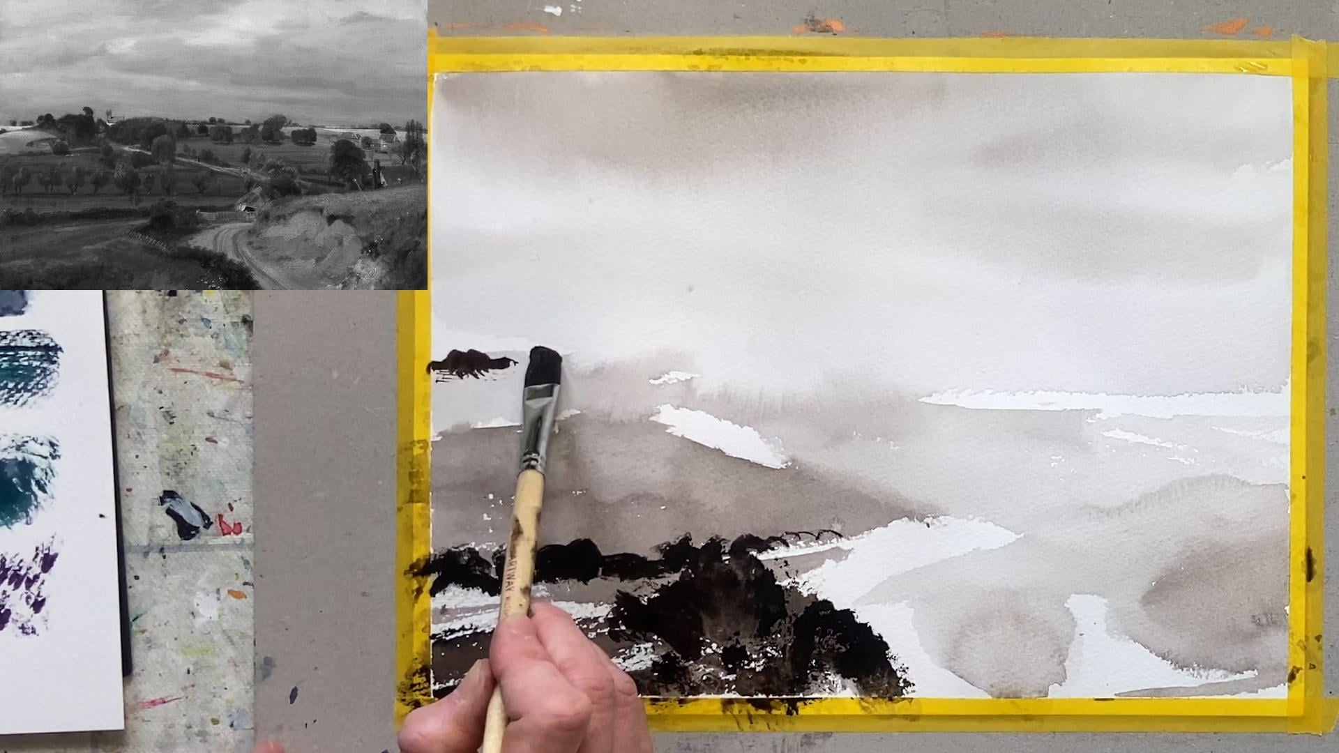
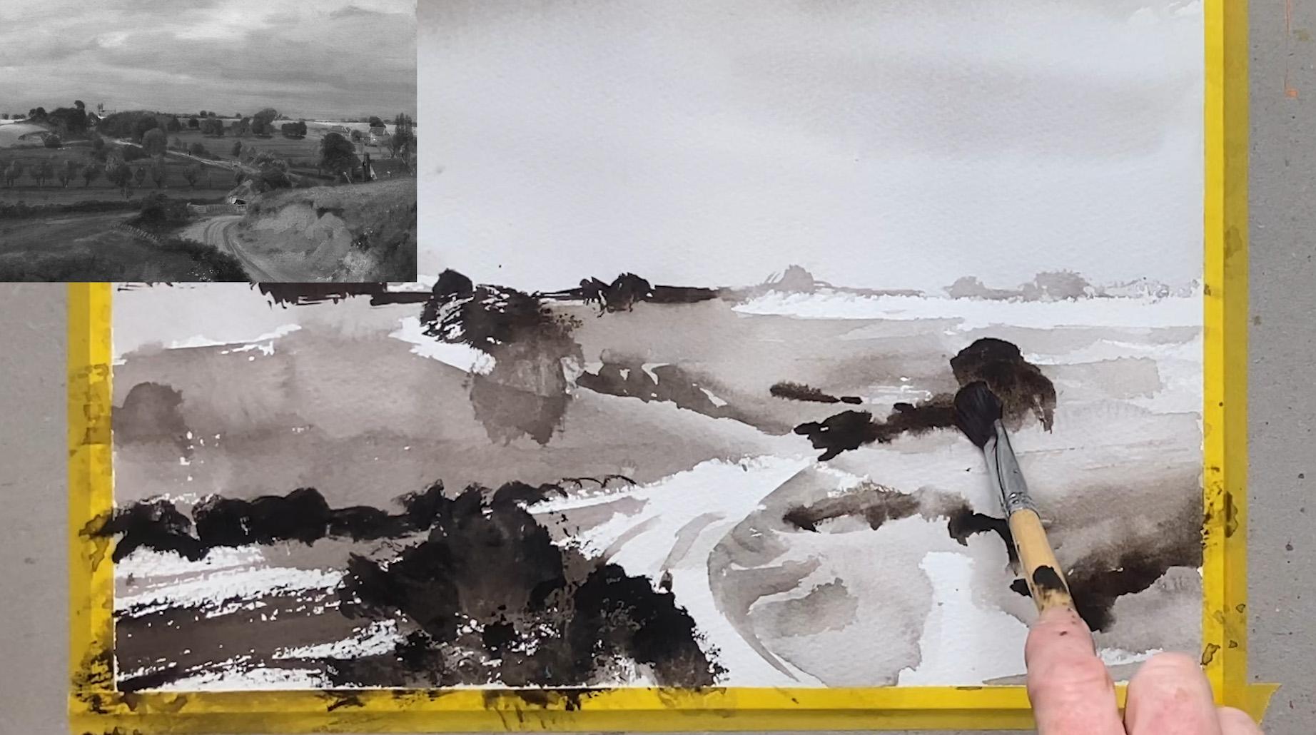
7. Constable Landscape: So now we're going
to have a go at another Old Master painting
this time by Constable. And I'm going to use a single color of paint so that I can really focus on my paint
consistency and my brushwork. This is a painting
by John Constable, and it's actually
an oil painting, but I'm going to translate
it into watercolor. Here I've changed the
painting into black and white and adjusted
the contrast and the highlights a little bit
just so that I can have a slightly better
vision of the light, medium, and dark tones. I'm working on fabriano
artistico 100% cotton paper. And the first thing I'm
going to do is just paint in a bit of water
onto the paper, and then take a little bit of my CPier paint and
start painting the sky. So the paint consistency
here is tea, and I'm using wet and wet
for the sky, very mild. At the top of the sky here, where it's actually
closer to me, I'm going to make it
a little bit darker. Pop a few clouds in. I'm purposefully
painting this in a monochrome color or a mixed. I'm going to use a
mixed dark color. But I'm not too worried
about the color. I'm more interested in
the paint consistency and the brush marks. Right. Now I'm coming
onto the land. So I'm going to stick
with my Te consistency, and I'm going to just block in the basic shape of the land. I'm using my nice big brush, and I'm taking care to leave some parts of the page just
the white of the page. As I come into the midground, I want to go more into
a coffee consistency, and I want my tone to
get slightly darker. So here you can see more of a coffee consistency
paint and a darker tone. I'm purposefully using this
big brush and I'm using sweeping brush marks to
get the sense of the land, but also have some of the
interesting dry brush effect. As I come to the foreground
in the front here, now I'm going upper level
again inconsistency. I'm going to go into
cream consistency, and I'm going to sweep in these foreground areas and just make some interesting
marks just like that. Lovely. On the right here, the tone, the value is lighter. So I'm going to release some of the pigment from my brush. And I'm going back to just
a little bit stronger than tea or pretty much is tea
came out of my brush there. Tea consistency, sweep that in, change to a bit of a coffee consistency
now, sweep that in. Nice and big. Okay. Now
I'm going to start paying attention to where are my darker blobs and
things like that. So I'm going to switch
over to a smaller brush. And I'm actually going to
start with this brush, which is a little
bit more rounded, and I'm going to squint
my eyes slightly and just focus on plopping
in the darkest darks. And I'm using now my
butter consistency. So there's some very
dark darks here. And as you can see, my butter consistency
is quite sticky. And I just want to get this line of bushes
in. Quite sticky. Now I want to think and be a little bit more
creative with my marks. So I could try a little
bit of split brush. So if I go onto this
slightly bigger brush and load it with a
butter consistency, and I can make a
sort of split brush. It's not splitting as much
as I want, but there we go, splitting and getting
a bush in there. If I go to this brush, this is just a cheap, old
size eight round brush. Grab a bit more. Paint. Remember, I said,
you've got to be quite generous with
your paint when you want to work with the
butter consistency. Now I'm going to use the dabbing the side of the brush
and just pushing into the heel of the brush to
get these foreground marks. Okay. I can roll the
brush a bit. See there. And I'm creating some nice, interesting textures just right there in the foreground. Okay. I'm going to look a
little further back to the horizon and go
back to the brush. I want it to be dark but not quite as dark as the foreground. So I'm going to
go back a step to more of a cream consistency and just plop in a few
bushes on the horizon. Take care not to work
it too much like that. Then there's this bush in front. So if I release a
bit of the paint, so I have quite a
dryer brush effect. Now I'm going to use
the side of the brush and sort of dab a bit like that, just to get these marks. I want to go a shade lighter, so I'm releasing some paint. Take a bit of that out.
I'm going to dry it a bit. And let's see if I
get a lighter shade, yes, and make this bush that
comes up here. In there. So I'm really just focusing on what marks can I make now
that are quite interesting. If I come back to
this distant here, listen bit and just see what
other marks I can make. I'm going to switch
down to my old, quite small brush, and my consistency is more
like coffee here. And I'm just going to
draw that paint across and get a few of these
bushes in on the horizon. Like that. Okay. Nice and loose. And now I just want to start defining the landscape
a little bit more, add a femid tones and call it down and
not really overwork it. So this is all
pretty much dry now. So I'm going to bring
in a coffee consistency and just start indicating
some of these trees here. And everything is just a shape. So, you know, just think
in terms of, well, that's a shape there
and that's a blob here. And the whole thing
kind of comes together in the end if you don't get too
bogged down in the detail. Okay. Make a few exp sweeps. Might just go back to
my nice big brush. Make a few sweeps across. With watercolor, you should
always use the biggest brush you can for the job that
you're trying to do. So always ask yourself, can I use a bigger brush? And if the answer is yes, then switch up because you get much better effects,
much more quickly. Um, the road, I'm going to just come in here
a couple of these. On take the moisture out. Maybe just sweep like that. With the side of the brush, I'm going to sweep up up, create the hills like that. And now I'm using the side of
the brush and pushing down. So push down, get the shadow in, push down, push down. Okay, interesting marks. And if I load quite a
bit of paint there, then I can take a brush that's just wet but
not got too much paint in it, and I can just draw it up a bit and get some interesting
effects that way. It's really fun to
paint like this. Then there's a darker
shadow around about here. So I get the dark of the
hill in I like that. Now we've got a tree, which
is an opportunity to do some sploging with the
heel of the brush. So pain consistency is more like cream and see how
it can just sploge, sploge, sploge, sploge there. A few bushes here, I can use the side
of this brush and just roughly indicate
some bushes. And then if I take this little Cheap, horrible
brush, I can just soften out a few
things like that. Final thing to do is just bring a few of these details in. There's actually a house there. So if I use the
side of the brush, I make a sweep across and
get the roof of the house. And there's a bit of a chimney, but not want to
get bogged down in too much detail.
So just like that. Okay. And then this side, there's a few trees. So I'm using the
tip of the brush, and I'm just making
sort of squiggles to get this row of
trees in like this. And then it's just a
case of finnessing the last few bits of
detail if you want to. So you could use the side of the brush with
a bit of dry brush to just add little
bits of tone where you want it and a little bit
more detail and interest. But don't get too bogged
down in last details, sometimes knowing
when to stop is an important part of
painting with watercolor. The last thing you
should always do with any painting is
check your values. Are your darks dark enough with wood colour,
they usually are not. So go back in and give
a second dark layer to any areas that really need to be the darkest
parts of your painting. There's one more fun
thing I want to do, which is just take a
bit of a palette knife. And if I sweep in some fairly wet paint in a
kind of tea slash coffee, this can see here, just
to add a bit of interest to this foreground like this. Then I can use my palette knife to
move that around a bit. And it creates a little bit of interesting texture that you don't always get from a brush, I might just do the
same thing up here, bring in a final layer
of wash into here. And then with my
tip of my brush, just bring in butter consistency to get these really dark
darks right at the end. Because I had wet it
slightly in places, it can move a little
bit in there, fine. Add a tiny bit
more wetness here, I can loosen that up a bit. And then with my palette
knife, if I want to, I can just shape
that a little bit as well and get a bit more
interesting texture in there. So hopefully, that's shown you how you can approach
a landscape painting, focusing on the
consistency of your paint and on a variety of
interesting brush marks. Working from an
old mask painting is a great way to do it.
8. Conclusion: So I hope you found that
useful and that you enjoyed exploring what you
can do with your brush. We looked at paint consistency, ranging from tea
through coffee, milk, cream, and butter, and
sometimes dou paste. And then we looked at a range of brush marks and ways you can use your brush to make more
expressive and loose marks. Then we looked at the
principles of landscape and we did a couple of landscape paintings based on Old Master. Don't forget to take a quick
photo of your project and upload it into the class
project gallery so that I can have a look and offer
you some personal feedback. And if you had any questions, you can ask your questions
inside your project, or you can use the class discussions
panel to ask a question. If you enjoyed the class, I would be really
grateful if you could leave a review
on Skillshare. And if you want to
connect with me, you can find me either in
Skillshare or on Instagram. I am at Catherine
Jennifer Designs. Same on Facebook and on YouTube. And also, don't forget, I have a beautiful app
called Watercolor Joy, which you can access either on your phone or on a
desktop computer, and the app will keep you
motivated on a daily basis. Until next time, happy painting
and thanks for watching.
 Catherine Jennifer, Artist, Art Educator, Designer