Transcripts
1. Introduction: There is something really
magical about desserts. They're not just
the sweet treats. They hold memories of birthdays, celebrations, family
gatherings, and so much more. And as an artist, I love capturing those feelings
through food illustration. I've always had a soft spot
for food illustrations. There's something so satisfying about capturing the textures, colors, and the delicious
details of our favorite treats. Hi, my name is Disha. I'm an artist and illustrator. And an educator
who loves to paint food and botanicals
in watercolors, whether it is
traditional or digital. In this class, we are
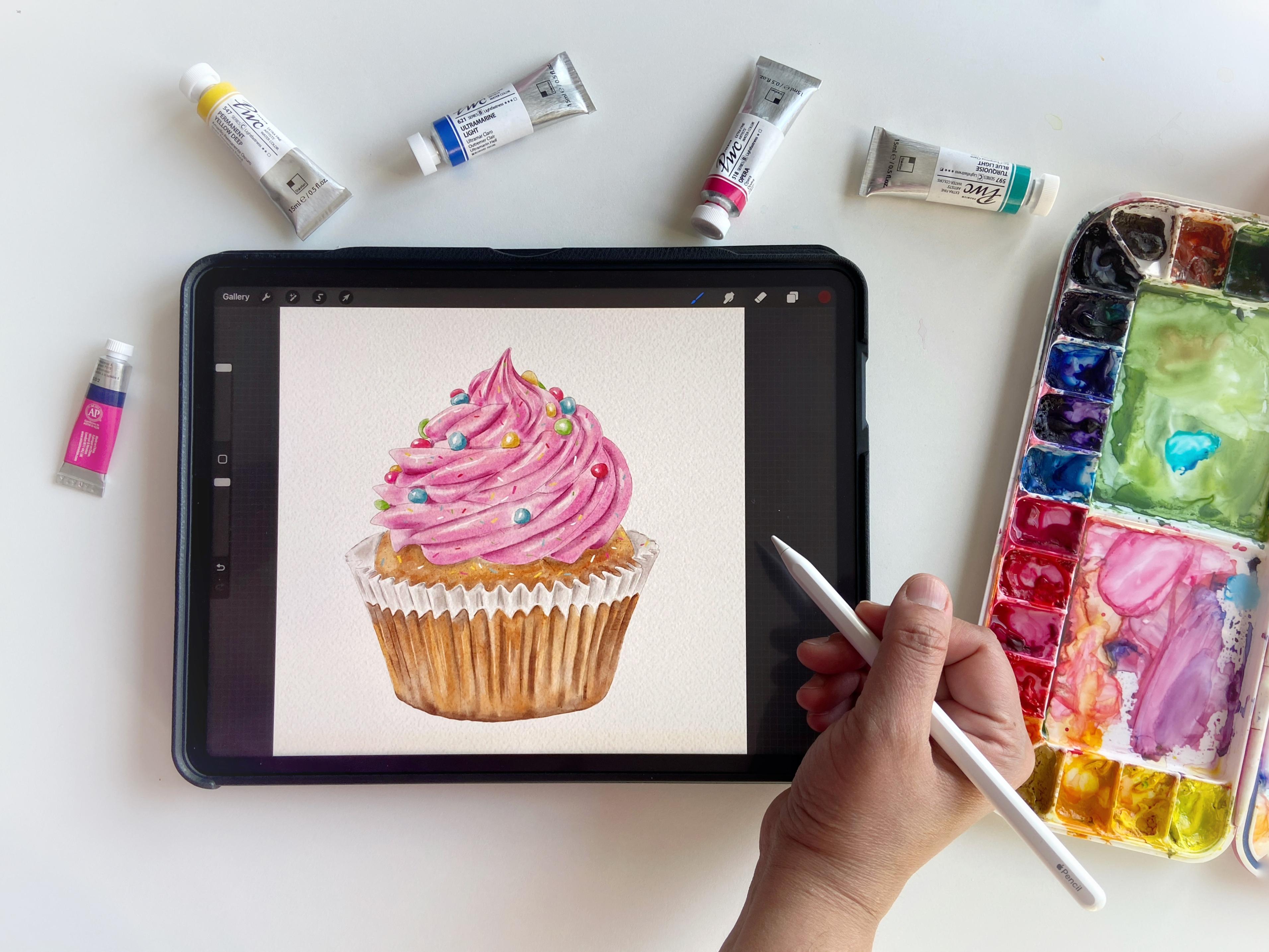
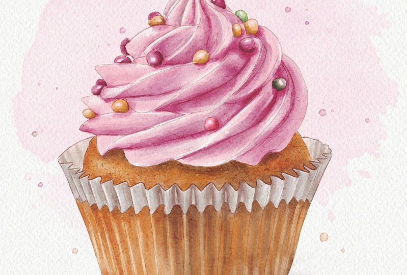
going to paint together a delicious cupcake using watercolor brushes in procreate. Whether you are new to
digital watercolor or looking to add a sweet new
project to your portfolio, this class is perfect for you. We'll explore everything
from the watercolor base to getting those delicious and realistic details
in our project. I'll walk you through my step by step process from
blocking in shapes to adding those
mouthwatering details like creamy frosting
and sprinkles. I'll also share the
essential tools and the free resources that you will need to
complete your project. In the resources tab, you will find the
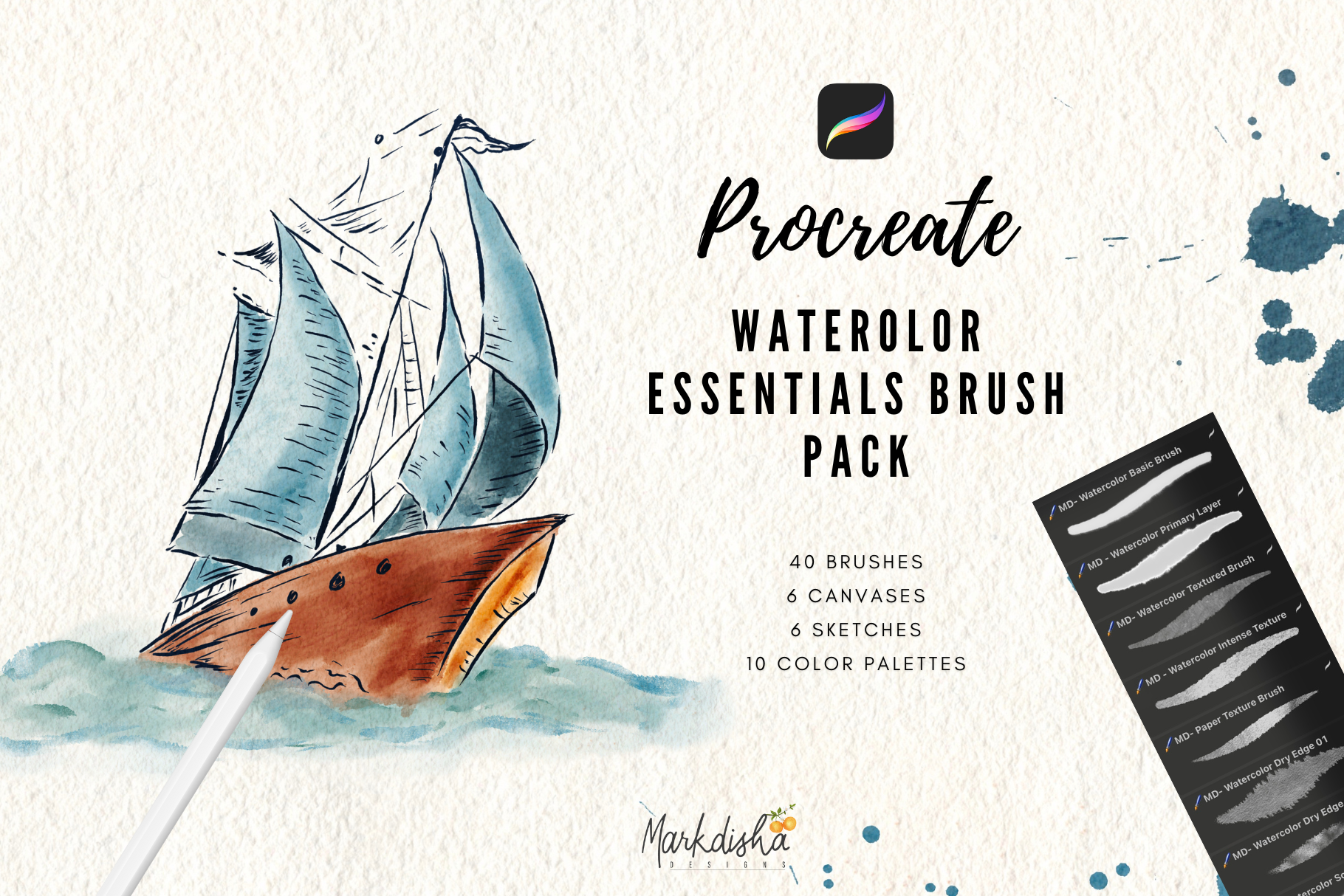
watercolor brushes, a pre made canvas, reference image and a color
palette to start with. By the end of the class,
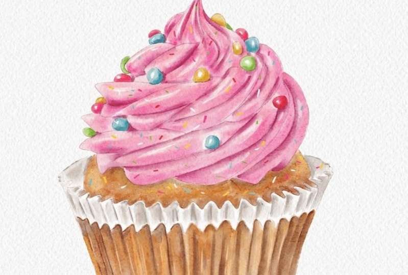
you will have a delicious, realistic cupcake illustration
ready and the skins to paint more and more watercolor realistic desserts
in proropriate. So what are we waiting for? Let's grab your iPads, your Apple pencil, and let's get started.
See you in the class.
2. Class Resources: Before we get started
with the painting, I will go over the
resources that I've provided as a
bonus in this class. In the resources, you
will find all the files, including the
watercolor brushes, the color palette, sketch, and the canvas in the
resources tab below. Once you download the files, simply tap on each file and it will be
imported in Procreate. When you open the canvas file, you will see the layers
organize something like this. The top layer is a paper
texture group which is locked, so you don't need to
make any changes to it. Below that, you'll
find the sketch layer, which I've provided
for your convenience. If you prefer to use your own
sketch, feel free to do so. Finally, we have the paint
layer where we'll be adding our colors and building
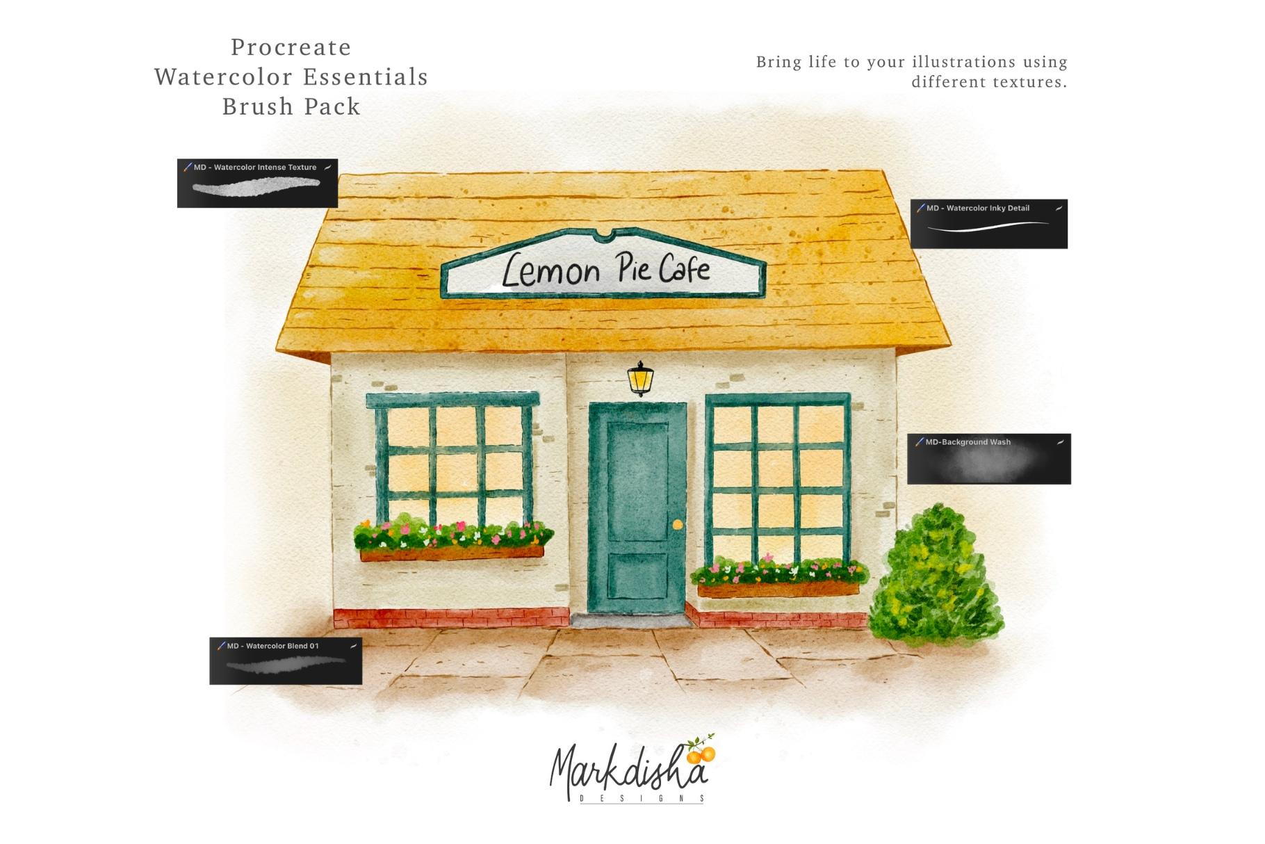
up the painting as we go. The brush set includes a primary layer brush for
painting the base colors, a watercolor blend brush
for soft blending, and some detail brushes for refining and adding
final touches. I've also included a
cupcake color palette to make the color
selection easy. I like to keep it
handy while painting, but I may also adjust the colors along the way if something
is not working right. I've provided the finals watch palette in the
resources for you. Now, let's get started
with the painting.
3. Layer 1 Frosting: First, open the layers panel
and select the sketch layer. You can see I've already set the blend mood of the
sketch layer to multiply. Now let's reduce the opacity slightly so the sketch
is not too strong. This is just for our
guidance for now. Now select the paint layer and let's keep the reference
image open for guidance. But don't worry about
matching the colors exactly. I've intentionally
made some changes to the colors in the painting. The reference is basically
for understanding the placement of highlights
and the shadows. Now, by using the
primary layer brush and a mid tone pink, I will start painting
the frosting in the direction of those walls. Since I want to keep
this piece playful, I'm not too much
focusing on the depth. If you look closely,
the dark areas in the reference are
not exactly pink. They lean more towards gray. However, for this project, I'm simplifying things and avoiding neutral
tones a little bit. And just so you know, this
brush is pressure sensitive, which means with more pressure, the strokes become thicker
and with less pressure, the strokes will become
thinner and lighter. Mmm I'm also adding different shades of pink
wherever I think are needed. I think I made a mark, which I don't like.
I'll just erase that. By the way, if you have taken my first procreate
watercolor class, you might remember that I used a selection method to
create the crisp edges. This time, I'm keeping
things much looser, so I'm not concerned if the paint extends
beyond the edges. We can always refine that later. Now, I think I'll add a slightly lighter pink in some areas just to
balance things out. And feel free to adjust your brush size as needed
while you're working. Feel the frosting is
pretty much done. Let's move on to blending and see how it looks before
we take the next step. And to select the
watercolor blend brush, I will long press
the smudge tool. This will automatically select the exact brush that I
was using for painting, and I love this trick
because sometimes my smudge tool is set to a different brush
in a different set, and this saves me from scrolling
through my brush sets. Now I can go and select the watercolor blend for smudging. Zoom in a little
and gently blend, following the natural
direction of the frost. This will help maintain the soft and swirl
look of the frosting. Alright, it looks like we've
covered the entire frosting. Now you'll notice that
there is not much depth yet because we are missing
those darker shadows. And to add that, we'll
use an even deeper shade. I'm going to pick this magenta, then head back to the palette and maybe choose a purple tone, something like this. Let's see. Yeah, I think this will work, and I'll likely add some
of it to the folds here. This is a bit of an experiment. You always have to
try different things, test out different shades, and see what works best. And you can already see some definitions
starting to form now. I think I need to
adjust the color a little bit. Let's try. I like this one better, so for now, let's go with this. Let's gently blend these edges. And don't press your
brush too hard. Just keep it light
and soft. Like so. Alright, the frosting
looks good for now. Let's start working on the
candies in the next video. It
4. Layer 2 Candies: Now for the candies,
I will create a new layer on top
of the frosting. And then start by picking
random shades from the palate. Yeah, I'll just use a mix of shades with
the primary brush, making it a bit smaller. I'll start by covering them up, leaving some white areas and adding depth by making
certain parts darker. Now, I'm going to use the sketch brush and
rename this layer as candies and next, create a new layer. I'm going to add some highlights using a pure white shade. I'm just going to place
them in a few areas. And don't worry, we'll
blend everything right in. Right now, I'm just switching
between two brushes. Now, I'll take the
blend brush and gently soften the edges,
but not too much. Just enough to remove the harsh lines while
keeping some texture. It's okay if your
strokes remain visible. We are not aiming for a
hyperrealistic effect here. A All right, that works as highlights. Now I'll create
another new layer this time for the shadows. For that, I'll pick a color from here and use the sketch brush. Let's see how this works. Maybe I'll grab a shade from
this area. Yeah, this one. The sketch brush is great
for defining lines, so I'll add a few marks, just some, not all
placing them randomly. Something like this. Alright, next, we are going to add some
details to the candies. For that, I'll use
the same shade. Actually, maybe I'll bring it down a bit to a
more neutral tone. Let's see how it looks. It's not quite working. Let me adjust it. Yeah, this should be fine. But I'm going to
reduce the opacity because I don't want the
shades to be too harsh. So here, you'll just see me adding some shadows
under the candies and then I'll be blending them softly to reduce
the harsh edges. Oh Okay, this looks good. So the frosting and candies
are pretty much done. Let's move on to the
base in the next video.
5. Layer 3 Base: Now for the cupcake base, let's create a new layer and bring it below
the paint layer, which is basically
the frosting layer, and name it as
let's call it base. For this, I'll take the
right shade and make sure we have the correct brush
selected. Yes, this one. Make sure you're working
on the correct layer. If you want, you can use
a selection tool again, but I'll go ahead and paint
it manually like this, just covering up the area. Now, let's use the smudge tool again to soften
these harsh lines. We actually need some
darker shades in these pockets here as well. Maybe I'll make it even darker, especially we need to add some depth where the icing
is touching the cupcake. And let's use the smudge
tool to blend it in. You'll notice that some strokes are coming out beyond the edges. I'll come back later
and erase those. This is the difference between the selection tool and
working without it. You don't have to
worry too much about that because we are
experimenting with a loser painting style rather than aiming for
complete realism here. Food is always a very
fun subject to paint, so I did not want to
overcomplicate the process. One thing that was bothering me was the
edge of the icing. And you can just use
any brush for that. Just make sure it has
a nice clean edge. I'm using the sketch brush from the same set
that I provided. If you want, you can
temporarily hide the layer to see exactly where you need
to erase the extra strokes. This is an extra
step I take when I don't use free hand
selection before painting. Honestly, it really
depends on my mood. If I'm feeling relaxed
and just having fun. I paint loosely like this. But when I want a
polished end result, I take more time
with the prep work. So it's completely up to you. If you prefer a more structured
approach, just go for it. But if you just want
to enjoy the process, you can paint the
way we did here. We might actually hide or delete the sketch
layer at the end, but it really depends on
how the final piece looks. We'll see. One thing
I always recommend is keeping different sections or elements on separate layers. It makes editing so much easier. For example, if the candies
and the frosting were on the same layer and I had to erase the frosting
in some areas, it would have been a
little hassle for me. So keeping layers separate
gives you more control, and I was not very good at that when I started
painting on procrad. But with time, I
started doing it, and it has made such a big
difference in my workflow now. All right. That looks
much better than before. This part is looking
a bit too dark, so I'm going to add a lighter
shade and smudge it out. I'll do the same for the base, just erasing any extra color that's overlapping
into the pink area. Okay, now everything is
coming out together nicely. So let's move on to the cupcake
liner in the next video.
6. Cupcake Liner Part 1: All right. Now we need to paint the cupcake liner or we can
call it the baking cup. If you look at the reference, you'll notice that the base
of the cupcake is slightly visible through the wrapper and the upper part
is more like paper. That's the effect that I'm
going to recreate here. I've already marked
down the lines, so I'll follow those as I paint. For this, I'll use the same colors and
create a new layer. Let's call this layer as
paper for our reference. Now, I'm going to switch between light and dark shades to
build up the texture. Just making the lines like this. And one thing to note
here is that when you are using this
primary layer brush, you'll see that the color
starts out more saturated at the beginning of the stroke and fades as you move downward. That's just how
this brush behaves. If you want more
even application, you can go with the stroke
in both directions. Mm. Now I'll switch to a lighter tone to
add some variation. If you look closely
at the reference, you'll notice that
the top and bottom of the wrapper are much darker
compared to the middle. So I'll take a darker shade and start defining those areas. Let's focus on the edge first. Now I'll add some lines
to create the depth. Next, let's use the smudge too. I'm blending in an upward
vertical motion like this. If you feel like certain
areas need more color, just add the color
and blend again. All right. This looks good now. So you know the drill, we need to refine the edges. For that, I'll go back
to my sketch brush. Since I had previously
reduced the opacity, I'll bring it back 200%. First using a mid tone. I'll work on the edges. Like so. Just marking
down these areas. Now, I'm defining the base of the cupcake curve with
the sketch brush, and honestly, there's
no shame in working as if you're working with a
pencil or any other tool. It's just all about achieving the result
that we are looking for. As long as we're painting, would we intend to paint don't
worry about the process. Now I'm going back in
with the smudge tool. We don't want the
lines to be too harsh, so I'll blend them smoothly. I'm also being intentional
with the strokes, keeping them inside the shape rather than extending
beyond the edges. Well, just erase the extra
paint here. Like so. Looking good. I think I'll
leave it as is for now.
7. Cupcake Liner Part 2: Now let's move on to
the upper part of the liner where we
just see the paper. I will use another layer, and you can see that I work
in layers most of the time. I don't want to
take any chances of going insane after
doing so much work. So for this part, I'm just
picking the color from here. Let's just add it here, maybe. We'll use the primary brush again and mark down
certain areas. I think this dark tone looks a little darker
than the reference, but I'll go with it for now and then add a lighter
tone if needed. We don't need to cover
the whole paper. We just need to get a hint of the shadows to give
it a little depth. Okay, I'll pick a lighter
shade and add it here. Something like this. I've always loved painting food, honestly. If you have been following
me on Instagram for a long time or have
seen my work before, you must have
noticed that I have been painting food
for a long time. But there was a gap in between. I'm not sure why,
but I just love it. So let's go to our Smudge
tool and smudge this. Again, the same process, we'll pick our sketch brush and check where we need to add those details because we need to cover some of
the details over here. We need a slightly darker
shade, not this one. Let's take this one. Just to give a
little hint of glow here or maybe some
darkness here. I'm just trying to mimic
what I see in the image, not 100% exact or perfect, but at least we get the hint. Okay. So now let's
pick our smudge tool. We don't want it
to be too harsh, so let's reduce the opacity of the smudge tool and
blend it very slightly. Oh. And once we are done
with this part, we'll add some white
highlights for the final defining
touch. Looks good. All right. Let's go
to the pure white. And to pick the pure white, just double tap on the circle of this color wheel and you'll
get the pure white shade. And let's add some highlights just on the white of the paper. Once we are done
with that, we'll add the highlights on the
lower part as well. Let's go back to this layer. Here we can pick
the lightest shade and then go even lighter to add some subtle
highlights like this. We don't need the
highlights to be very prominent since
this is paper, not a metallic object. Blending it a little bit. Cleaning up the edges now. What I'm going to do is hide this layer and check if we
need any other cleanup. I think we need a little
bit of cleaning up here and here,
maybe here as well. This looks good so far. Okay, next step, I
think I'm going to move to the candies and
work a little bit on them.
8. Candies Detail: Now, let's just define
the candies a little because I think they're
looking a little sad. So what I'll do is go to the candies layer and add a
pop of color to each of them. For that, I'm just going to pick a darker tone of
whichever color they are. I will use the
sketch brush here, by the way, and then
blend it a little bit. If you don't want to blend, you can actually
leave it as it is. That will give it a more
paintedly and interesting look. Now, let's pick a darker shade here and make it more vibrant. Such a beautiful shade. You'll notice that it's actually
covering or frosting, and I don't like that. So if you need to adjust the
colors, make any changes, or fix any mistakes, now is the perfect
time to do so. Next, let's take this and
grab a darker tone of yellow. I'll be providing you
with the swatches, but feel free to change
the colors as you like. I never recommend sticking to the same palette
that I am using. Use your own imagination and
your own personal style, and that's what we
are aiming for here. I don't want you to
just follow along like a student and copy the lesson. I want you to learn
the techniques and then make your
own decisions, and that is the goal. Let's close this. We
don't need it anymore. Now let's move on
to the next video, and we'll add some final
touches to our painting.
9. Final Touches: All right. The next
and final step is to add some texture
in the cupcake. For that, I was thinking of adding some air
pockets to the cake. To achieve that, I
actually went ahead and created a new brush
called MD splatter, which you can find in the
brush set that I've provided. And now I'll just show
you how this brush works. I'll create a new layer and pick a dark shade just for
the demonstration. Once you tap with the brush, you will see these
platter like dots. Depending on the size
that you're using, you can adjust it
to your preference. I'll reduce the size a little and pick a
dark brown shade. I won't be working directly
on the base layer, rather I'll create a
new layer on top of it and apply a clipping mask so that whatever I
paint stays within this shape and does
not go outside. Let's test it out. There we go. We have some air
pockets in the cake, and you can experiment
with different shades. This one is too light, so I'll just adjust it. You can also reduce
the brush size to make the texture more subtle. For me, I really like it. But if you want, you can
take it a step further. And there we go. We have our
air pockets in the cupcake. Now, let's go to
the sketch layer. One thing I wanted to experiment is by going to the sketch layer, and let's see if we can use it as outline for our cupcake. So currently it's in multiply
mode with very low opacity. Now, if you increase the opacity while keeping it
in multiply mode, create a masking layer and
create a clipping mask. We can just drop in some
colors in this layer to see if it can be used as an
outline for our painting. Let's try a pink tone. I'll drop it in this layer. Not quite right, Let's go with a slightly
darker shade instead. This is part of the
experimentation process. You can try as many
times as you like. And that's what I love about clipping masks that they
are non destructive. So if you don't like the result, you can always change
it, remove it, or maybe delete the layer, and it is not going to affect
our original layer at all. Oh, actually, I like this one. So I'll go with this shade and add it to the final palette. And one more fun extra thing that we can do is if
you're interested, you can add some sprinkles by picking up different
bright colors. So I'm going to try yellow
with the sketch brush using a very small size and just drawing on
top of the frosting. It's all about how you
want to play with it. This part is totally optional. If you want to add
the sprinkles, go ahead and otherwise
it's almost done. Wait. I can't really see it. Oh, I think. Oh, that's why it needs to be on the top
layer, so let's fix that. Now, let's try and differentiate Let's add some green, as well. We can also add
some orange shades. I swear I really want
to eat a cupcake now. Let's try white. Oh, that looks nice, too. And not all in the same
direction, of course. And there we have it.
The cupcake is ready. I really hope you guys
enjoyed this class. This was a really
fun class to make, and I am really excited
to see all your projects. So please do share them
in the project gallery, and I always try to give a feedback and reply back to your projects
as soon as I can. So thank you for watching. See you in my next class.
10. Final Thoughts: Thank you for joining
me in this class. I really hope you enjoyed
the class as much as I did, and I'm really excited
to see all your project. Please do share your projects
in the project gallery. And if you want, you
can also share them on Instagram and tag me at
the rate mark Tsher. I love to share your
projects in my stories. Also share this class with
your friends and family who would love to paint
realistic desserts like us, and don't forget to follow
me on Skillshare because I'm coming up with more and more fun tutorials
in the future. Until then keep creating and
see you in my next class.
 Disha Sharma, Artist & Illustrator