Transcripts
1. Introduction: Hello and welcome to the
watercolor painting tutorial. Today we'll be
painting a beautiful, tranquil landscape
featuring a lighthouse, a soft sky, and a winding
path through grassy hills, a peaceful place that would
be wonderful to visit. This tutorial offers plenty
of opportunities to practice various watercolor
techniques from wet to wet in the sky to wet
on dry dry brushing, adding fine details,
using liner brushes, and even incorporating a touch of guash into your painting. I'll guide you through
the entire process step by step in a calm
and relaxed manner. We'll focus on one
section at a time, allowing you to follow
along comfortably and bring the scene to life with a
few easy to follow steps. You will learn how to paint a
soft sky with white clouds, how to create the
rounded form of the lighthouse and fence posts, and how to capture the look of rolling hills covered
in tall grasses. My hope is that you
approach this painting with patience and
a relaxed mindset. Take this time for yourself. No pressure, no rush. Just enjoy the process and let it become a quiet
creative moment. With a bit of patience
and my guidance, we'll arrive at a
beautiful scene together. By the end of this tutorial, you will have a
vibrant landscape filled with rich color
and interesting textures. I hope you'll feel proud
of what you've created. So gather your supplies,
take a deep breath, and let's begin this
joyful painting together. Happy painting. Oh
2. Project and Resources: I've prepared a selection
of helpful resources for your project available in
projects and resources section. You'll find a PDF with the
supply list I used for the painting along
with a reference photo and an image of my finished
artwork for guidance. Line drawings in
various sizes are also provided so
you can print and transfer them onto
your watercolor paper in the size that best
fits your needs. My painting is in a
15 by 11 inch format. Additionally, there are working progress photos to help you follow the process and
focus on specific areas. Feel free to explore
these materials and use them to create your own unique and beautiful painting. Please share your
progress shots or final painting in the projects
and resources section. I also encourage you
to take your time to view each other's work in
the student project gallery. It's always inspiring to
see what others create and the support of your
fellow students can be incredibly comforting. Don't forget to like and
comment on each other's work. Lastly, I highly
recommend watching each lesson before
you begin painting. This will give you a
clear understanding of what to expect at each
stage of the tutorial. If you find this class helpful, I would greatly appreciate it if you could leave
an honest review. Your feedback will help me
improve my content and assist other students in deciding whether to join the class.
Thank you in advance.
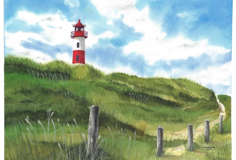
3. Inspiration & Painting Plan: Before we begin painting, let me share a few words about the reference photo
and our painting plan. Here you can see the
original reference photo. I think it's really beautiful
and works well as it is. However, I wanted to make the
sky a little more dynamic. So I looked for another photo with a more interesting sky, richer colors and cloud shapes. And once I found one I like, I used Photoshop to remove the original sky and replace
it with the new one. Really like this
new version because both the clouds and the tall grasses seem
to lean to the left, giving this entire scene a greater sense of
movement and energy. Next, I started exploring
a few other ideas. Using the Procreate
app on my iPad, I experimented by drawing in some flying birds to see
how they would look. I also considered adding some flowers on the
hills and more of those dry tall grasses to make the area feel
like a lash meadow. Just wanted to explore different possibilities
and see what felt right. In the end, I decided to include more tall grasses for
texture and depth, but I chose not to add
the birds or flowers. Of course, if you
like those ideas, feel free to include
them in your version. In the class materials, you will find all these
optional elements, so you can take a look
and decide what you like. Or maybe you will come up with something
entirely your own. Perhaps a silhouette of
a person walking along the path or a bird
perched on a fence post. Feel free to change the
composition however you like. Speaking of composition,
this painting follows one of my favorite and
most commonly used rules, the rule of thirds. This means dividing the image
into three equal parts, both horizontally
and vertically. The main subject, in this case, the lighthouse should ideally
be placed along one of those lines or at one of the
points where they intersect, which are called focal points. That's exactly what we see here. The lighthouse is
positioned right at the upper left focal point and also aligns with
the left vertical line. I also want to mention that the size of your
painting matters. I painted this on 15
by 11 inch paper. If I had chosen 12 by 9 ", the lighthouse would have
ended up really small. Even at 15 by 11, it's still quite small,
but it's doable. You paint at this size, you will notice that
the lighthouse windows are super tiny and the railing around the top has vertical bars as thin as hers. We're going to paint this
landscape in a few stages. As always, I will break the process into
manageable sections. We won't paint
everything all at once. Instead, we will focus on one
specific element at a time. We'll begin with the sky
since it's the farthest away. Then we will move on to the
lighthouse, or focal point. After that, we will
work on the hills. And once the hills are painted, we will move on to
the fence posts, which will be the final
structural element. After that, we will return to the hills to add the
tiniest details using guh, something best done at the very end when
everything else is dry. Paint each area
slowly and calmly, usually with at
least two layers. Now let's move on
to the next part, applying masking fluid to the lighthouse and
the fence posts.
4. Masking: Before we apply any paint, I recommend masking out the lighthouse and
the fence posts. These elements are
quite small compared to the large areas of sky
and hills behind them, masking them will allow
us to paint freely without worrying
about accidentally covering them with paint. Using Windsor Newton masking
fluid with a yellow tint. This is a new battle I bought
recently. It looked green. So at first, I thought
the fluid was green, but it turns out that it's
just a new battle design. I'm not really sure
if it's a redesign or just a specific
one I received. Normally, the battle
is transparent and you can see the yellow
masking fluid inside. We'll also need a
container of water, a small piece of soap. I keep mine in a
little container. An old battle cap or anything small for pouring a small
amount of masking fluid. And a brush specifically
for masking. Just a cheap brush. I use this one only for masking. Never use your good brushes
for applying masking fluid. Before using masking fluid, it's a good idea to
gently roll the battle to evenly distribute the
yellow pigment inside. Don't shake it as that
can create a foam, which may lead to gaps when
the masking is applied. Alternatively, you can steer
the contents with a stick. I'm using a simple
barbecue stick here. Pour a small amount
of masking into your separate container and
close the battle right away. We don't want the masking
fluid in the battle to be exposed to oxygen
for too long, as it will start to dry
and form clumps inside. Pour only what you need for the moment and keep
the rest sealed. Start by dipping
your brush in water, then rub it gently on the soap. This creates a
protective layer on the bristles helping prevent
them from sticking together. Don't worry, the
soap won't affect how the masking fluid
behaves on your paper. It will also not affect
watercolor paint later. Now dip the brush into the masking fluid and
begin applying it to the lighthouse and then to the fence posts.
Take your time here. Try to create a straight edge
along the lighthouse wall. Ideally, if we wanted to
get really straight edges, we might use ruling pen for
this kind of precision. But the lighthouse is
so small that I think we can manage it without
any special tools. Just try to be precise. Next, move on to the fence and apply masking fluid
to the posts. In the class materials, you will find a reference image showing exactly where I
applied the masking fluid. Once you've finished masking, rinse your brush thoroughly, clean it with soap again, and it should stay in good
condition much longer. Here you can see my old
brushes which I used for masking fluid without
the soap trick. Notice how the bristles
are stuck together. So using soap really
helps prolong the life of brushes
dedicated to masking. Now, leave everything
to dry completely, and in the next part, we'll begin painting the sky.
5. Sky - Part 1: The masking fluid is
now completely dry, so we can move on to
painting the sky. We'll divide this process into two parts as I think it's easier to manage than trying to do everything in one go
with a single layer. If we look at the
original reference photo, this guy had a bit
different feel. When it comes to colors, it reminds me more of a
very light windsor blue or maybe cerulean blue with a touch of ultramarine
blue in the upper right. In the reference photo
with the new sky, the colors are a bit different. The blue feels closer to
Windsor blue but with a slightly more
neutral tone like cobalt blue in the
bottom left corner. Since I aim to interpret
the reference photo, not copy it in a
hyperrealistic way, I don't worry too much about
matching the exact colors. I like to use something similar, but I don't stress if
it looks different. After all, this is my painting, and no one will be comparing it side by side with the photo. I always keep that in mind. So for my sky, I chose two
colors cobbled blue for the lower part of the sky and Windsor blue green shade
for the upper part. Of course, feel free to use different colors
if you prefer. You could also simplify
by using just one color, and I think that Windsor blue the green shade would
work perfectly here, starting with a lighter
tone at the bottom and gradually darkening
it toward the top. For painting the sky, I'll be using a size 12 brush. I dipped it in water to apply an even water layer across the entire sky area and failure. It turned out I hadn't cleaned the brush after my
last painting session, so there was some
leftover pigment on it. I quickly grabbed
a different brush just for applying water. So here is a reminder. Always clean your brushes
thoroughly after each session. Otherwise, you might get some unexpected
surprises next time. I will clean that first brush in a moment and continue
painting with it afterward. In the meantime, let's
go ahead and apply a clean water layer over
the entire sky area. We don't have to worry
about the lighthouse or the fence posts since
they are masked out. When you reach the hill area, it's fine to slightly overlap
the edge with the water. Don't worry to be
too precise here. If the sky color bleeds
slightly over the hills, it's actually helpful
for a few reasons. The hills will be much darker, so we will easily cover
any overlapping color. If we overlap the sky
color over the hills, it will help visually push
the sky behind the hills, giving us a better
sense of depth. And finally, I will use a
scrubber brush anyway later to gently soften
the edge and make the transition
look more natural. You will see that part soon. Once the entire area is wet, don't rush to apply
the paint right away. Let the water sit for a few seconds and
soak into the paper. You're looking for a high
shin on the surface, not a mat finish, but also no paddles. If you do see paddles, just use your brush to gently
spread the water evenly. Now, if you're working in a very warm environment
where water dries quickly, use the priming method. Apply the first layer of clean water and let it
soak into the paper. Then wait until
you see a low sin. Not a high shin, but low shin, you will see a mad surface of the paper and then apply a
second layer of water on top. The second layer won't soak in as quickly because the
fibers are already damp, so it will stay wet longer
giving you more time to work. When you're ready, begin
applying the blue. I will start from the cobalt
blue and the lower part, and then I will move upward, slowly transitioning
to Windsor blue. If you use one color, just use a lighter tone now and gradually transition to a
darker tone moving upward. The idea here is to apply the sky blue between the clouds. In the reference photo, the clouds have sharp,
well defined edges. If I wanted to paint
them that way, I would probably use more
of a wet on dry technique. However, I want to create a
very soft diffused edges. I think they look a bit
more interesting this way, and that's why I'm using
the wet on wet technique because I know that the edges
will stay soft and blurry. I'm carefully controlling
the paint's concentration by observing how much it
spreads in the water. This is something that you
will develop with practice. Only you know how
wet your paper is, and you will need to adjust your paint consistency
accordingly. If I notice that the paint
is spreading too much, I have two options. First is to use a more
concentrated mix, or the second one is to
let it spread and then lift off the excess with a clean de brush where
it's gone too far. Either option works. It just depends on
the effect you want. In a way, we are using a negative painting
technique here. Rather than painting
the clouds directly, we are painting around them the spaces between to
define their shapes. As long as the paper is still wet and you can see
that high shin, you can continue adjusting, adding more color or
lifting paint as needed. But once it begins to dry and the surface turns
mat with a low shin, it's best to stop working in that area to avoid
unwanted marks. While applying the paint, keep in mind that it will spread more than you
expect on wet paper. So use less paint if
you don't want it spread too far or use
more concentrated paint, if you want it to stay closer
to where you apply it. More pigment means
less spreading. Once you're satisfied
with the way the blue is distributed
across the sky, carefully clean
masking tape around the edges and allow the
painting to dry completely. When it's fully dry, we will move on
to the next step.
6. Sky - Part 2: Once the first sky layer
is completely dry, we can add a bit more
detail by painting the grayish shadows on the
clouds to give them more form. Let's start by
preparing the color. On my palette, I still have the two blues from
the first layer, Windsor blue and cobalt blue. I will add more cobalt blue
now and then mix in a bit of burnt sienna to neutralize
the blue and create a muted bluish gray
tone for the shadows. I'm using the same blues to keep the color
harmony consistent. Since brown is the
complimentary color to blue, it helps neutralize it. The result is a subtle
greenish blue gray, perfect for soft cloud shadows. Alternatively, you can also mix burnt sienna with ultramarine
blue to get a neutral gray, and then you can add a touch of your original blue
to maintain harmony. Now, I'm switching to a
smaller brush size ten, and I'll be using the
wet on wet technique. But this time, I'm only
wetting the white areas of the clouds and using less water to avoid the
paint spreading too much. Using the tip of my brush, I lightly drop in the gray shadows mainly
at the bottom and right sides of the
clouds because our light source is coming
from the upper left. The left side of the
clouds will remain mostly white with subtle shadows
underneath and on the right. If the paint spreads too far, I gently sweep it back to
avoid covering too much white. When a hard edge appears, I rinse and blot my brush and then soften the edge
with a clean de brush. While the paint is still wet, I can drop in darker, more concentrated gray tones to deepen the shadow
where needed. I repeat the process
across all the clouds, applying a water glaze, then dropping in gray
shadows at the lower edges. After everything
dries, I noticed one area where I wanted
more defined shadow. I light the wet that spot again, and I added a little more shadow gray to shape
the front cloud. Once everything is dry, we can carefully remove
the masking fluid from the lighthouse and start
painting it in the next part.
7. Lighthouse - Initial Layer: In this part, we will apply
a simple initial wash on the lighthouse to begin
shaping its nice rounded form. Let me show you how to do this. I'm switching to an
even smaller brush size six to have more control
over the details, but the lighthouse
is also so small that a brush size six will
work really well here. I've just changed the
water in my container and cleaned my palette to keep
the colors fresh and vibrant. For the lighthouse, I'll
be mixing two reds, Queen acrodonRd and
permanent Alyzarin crimson. This will be my main red mix. I will also keep
queen acrodonRd on its own for some
brighter accents later. The other side of my palette, I'm preparing a neutral gray by mixing ultramarine
blue and burnt sienna. I will keep some
burnt sienna separate as well for warmer shadow areas. The lighthouse is quite small, so painting it wet and
dry would be easy. However, I decided to apply a light water wash first to
ensure smooth gradients. Start by applying a thin
water layer over the roof, while it's still damp, take your gray mix and paint the right side of the roof
to create that shadow. You might wonder why I am starting with gray
instead of red. Well, this is a bit
different approach. I want to show you using a neutral gray to paint
shadow areas first. When this layer dries, we will apply the red on top, and the shadows will
naturally form beneath. The gray won't be as dark
as the final shadow, so we will have to add deeper tones later to
build up the depth. You will see how this
works as we progress, but this initial
layer will definitely help to create a
deeper shadow later. Next, apply a water wash over the lower part
of the lighthouse. Leaving the top area around the windows
under the roof dry. Then use the gray again
to paint the shadow on the right side of the main
structure of the lighthouse. Near the balustrade, switch to burnt sienna to
warm up the shadow. As you apply paint, try to keep the
right edge lighter. This will represent
reflected light which helps create the illusion of the
lighthouse' around form. Even at this early stage, adding these subtle
gray shadows transforms this flat white shape into
a three dimensional form. Don't let the shadow extend
all the way to the left side. Aim to create a smooth
gradient from the pure white on the left and gradually
transitioning into the shadow, starting around the
middle of the lighthouse. Now, let's dry this
layer with a hair dryer. While drying, I noticed a jagged edge on the left
side of the building. Using a scrubber brush, I gently lift off the overlapping blue paint and blot it with a paper towel. This helps make the left edge
perfectly smooth and clean. Once the surface
is completely dry, it's time to add
quinacridon red to the roof and other red elements. After applying this base red, dropping a mixture of quin aquedon red
and lazarin crimson on the right side to deepen
the shadowed red areas. I'll repeat this process on the lower part of the
lighthouse as well. First, I wash of
quinacredon red, then adding quinacrodon
red and lzarine mix in the shadow areas. You might wonder if the initial gray
shadow was necessary. Well, it wasn't
really necessary, but it helps to
build that shadow. When we add red
over that shadow, the underlying gray layer intensifies the depth by
creating a subtle buildup. It also unifies the red and
white parts of the lighthouse because the shadow underneath connects both areas naturally. With the initial layer done, leave it to dry fully, and in the next part,
we will continue refining and finishing
the lighthouse.
8. Lighthouse - Details: In this part, we will finish the lighthouse by adding
a few important details. Once the red layer dried, I felt it wasn't as
intense as I wanted. In this case, a second layer
is the perfect solution. I also decided to shift
the color slightly warmer. To do this, I mixed
Windsor yellow deep, my warm yellow into a blend of quinacrodon red and
permanent lazarin crimson. S warmer red will be applied wet and dry over all the red areas. Applying it wet and dry
allows me to quickly cover this whole area without the paint
spreading too much, which is ideal given the
small size of the lighthouse. Next, I will intensify the shadows by dropping
the gray mix of ultramarine blue and
the burnt sienna over the still wet red paint. Notice how many layers
we have to build up to reach a satisfying
intensity and saturation. Watercolors always dry lighter
than they appear when wet. So it's often unpredictable how light the final
color will be. So don't hesitate to apply multiple layers until you're
happy with the result. From my experience, the
most common mistake is using colors that are too light and not
pushing the dark tones enough. Getting those shadows dark
enough is crucial for creating a convincing sense
of depth and realism. After this step, we can
start adding more details. Use a mix of red with the gray to paint the
underside of the gallery. I still feel the tone
isn't dark enough, so I will mix pains gray
with burnt sienna and apply this dark mixture to the deepest shadow areas and then fill the
rest with the red, gently pulling the dark tones
into the surrounding areas. Apply this dark color also under the roof and along the
right side of the roof. Oh Now we can add the cast shadow
beneath the gallery. I'll begin with burnt
sienna and then switch to the gray mix of ultramarine blue
and burnt sienna. Notice that here I am
intentionally creating a sharper, more defined edge
for the shadow. Cast shadows usually
have crisp edges. I will dry this with
a hair dryer now, and once dry, I will use a scrubber brush to gently
soften the shadow edge a bit. Next using a darker tone, I will paint the area
where the lamp is located. I will simplify this by painting a dark square in the center with a few subtle lines suggesting structural elements,
nothing too detailed. Now I'll switch to a smaller
liner brush size zero. You don't necessarily
need a liner brush. You can use a
regular round brush with a sharp point instead. A liner brush has
elongated bristles, similar to a rigor brush, making it perfect for painting longer lines
or tiny details. I will use this brush to paint the bars in the balustrade. First, I will establish the main horizontal structure and then at the vertical bars. It's important to make the
spaces between the bars narrower on the left and the right edges and
wider in the middle. This helps create
the illusion of the round form of
the balustrade. The closer the
bars are together, the more they appear to
recede into the background. H. I'll also add just a touch of
cobbled blue between the structural elements
in the lamp area. Since there are
transparent windows, we should see some of
the blue behind them. Finally, using a small brush
and a darker color mix, I will paint the windows. I can't really see the
pencil lines anymore, so I will place the windows
roughly where they should be simple oval shapes with
a straight bottom edge. Now I will move on to
a super tiny detail, which is optional,
but I think it adds more to the
realism of the scene. I will use white guash and a tiny brush to paint the
mountains in the windows. For the window on
the white wall, I will use pure white guash, and for the window
on the red wall, pure white would be too harsh, so I will mix a bit of
permanent izarin crimson into the white guash and paint the mountains with the
softer reddish tone. If I add a tiny shadow beneath each window
and on the right side, it will make them appear
more three dimensional. As a very last detail, I will use a scrubber brush
to gently lift paint from the reflected light area on the right side of the
wall to lighten it up. This adds interest and enhances the three
dimensional effect. You don't have to use a
scrubber brush for this. You can also use your regular
painting round brush. Just wet that area slightly and lift the paint
with a paper towel. And with this little detail, the lighthouse is finished. Now we can take a break and later move on to applying the
initial layer to the hills.
9. Hills - Initial Layer: Now that the sky and
lighthouse are complete, we can move on to
painting the hills. Notice that we paint gradually, starting from the planes
that are farthest away and moving toward
those that are closer. This way, each closer plane
overlaps the previous one, preventing the weird
gaps between them. For example, there is no gap between the lighthouse
and the sky. The sky behind it appears
as one continuous element. We paint the hills,
we will overlap the sky and lighthouse slightly, creating a nice effect
with clear distinctions between planes while maintaining
unity in the painting. Let's begin by
painting the path. For this, I'll mix, burnt sienna with a bit
of Windsor yellow deep and then tone down the color
by adding ultramarine blue. This will be my main light, yellowish brown color for
the path and sandy areas. I'll also mix a very
delicate purple using quinacridone red
and ultramarine blue. This will be the initial
color for the shadows. The goal of this stage is
to cover the entire area including the path and green
hills with an initial color. We want to create a
base to build upon. The more layers we apply, the more saturated the
colors will become, making it easier to
achieve darker tones. This initial layer is just a light version of the final colors
we will add later. Let's begin by applying
this brownish color to the path and the sand in
the bottom right corner. Using a large brush
and the wet on dry technique because it doesn't really matter if we
get some blooms, overlaps, or brush
marks at this stage. It's just the initial layer, and we will add
more colors later, and mistakes won't
be noticeable. Besides, since this is
nature we're painting, a bit of imperfection can actually contribute to
a more natural look. Also makes the painting
process much less stressful when we don't have to worry about perfection
or fine details. I'm adding a little more Windsor yellow deep in the bottom right. While the paint is still wet, I'm dropping some of that purple color into a few
areas to suggest shadows. Now, let's shift to greens. I'm mixing green gold
with ultramarine blue, which gives us a
fresh natural green. I will start covering the
hills with this green, but I will be adjusting the
color along the way to add variety and reflect the tones
from the reference photo. For example, I will add burnt
sienna and Windsor Yellow deep to shift the green
toward brownish olive. Then I will return to the green gold and
ultramarine blue mix. On the left side, I will
use more brown again. I'm also going to add some Windsor green yellow shade to introduce a
fresher green tone. Feel free to experiment
with your own greens. You don't have to follow my colors or the
reference exactly. Use what you think will
look good in your painting. O I'm using a regular
round brush here, but you can also try a fan brush to create a
grassy edge on the hel. Just a few brush strokes can suggest many blades of grass. Of course, you can
also use the tip of a round brush to paint grasses
at the top of the hill. Later, we will use both a round brush and a liner
brush for those details. When you finish applying
this initial layer, let everything dry completely. You can speed up the drying time with a hair dryer if you like, but make sure the paper
is completely dry and has returned to its
natural temperature before moving on
to the next step.
10. Hills - Deepening Colors: The initial layer is
now completely dry, and in this part, we will
need to be brave with color. We'll apply strong
greens that will become the main
colors of the hills. Because these colors
are quite dark, we will use darker tones
than before and more paint. Let's start by
preparing the colors. My dark green will be a mix of green gold
and paints gray. I will also mix green
gold with a bit of Windsor green and
ultramarine blue. This will be my middle green. Finally, I will use Windsor yellow deep mixed
with burnt sienna and possibly a touch of the previous mix that
I have on the brush. It doesn't have to be exact. Any colors you choose
will work fine. Make it your own, and don't stress too much about
the exact hues. Tonal values are always more important than
precise colors. I'll use a size 12 brush because it has a sharp point
which will be helpful. But it is also still large
enough to cover big areas. I will pick up the middle
green and begin applying many short brush strokes to suggest grass blades at
the top of the hill. You can also use a fan
brush for this if you like, but I prefer a bit more
control over each blade. Notice that I'm painting
the grass blades as if the wind is blowing
from the right to left. I will keep this direction in mind while
painting the hills. I want everything to lean
slightly toward the left, which will help
create the feeling of a gentle breeze coming
from the right. Along the way, I'll be changing the green color and switching
between my three paddles. Most importantly, notice that
at the bottom of the hills, I will use a darker tone, while at the top, I will
use a lighter green. This creates the effect of small hills stacked
one behind another. The dark green suggests
a small valley, while the lighter green on top indicates a hill
catching more light. I keep this idea in mind as I shape these
landscape elements. As you can see, I'm focusing just on the top part for now. It's easier to manage painting smaller sections than tackling
the entire area at once. After applying the
green to the top, I will let it dry before
moving to the lower area. The right side where the
path is is farther away, so naturally that area will
have fewer details later. When you approach the path, apply the green in a way that follows the
shape of the path. Don't be afraid to
use dark colors. They will dry lighter
than they appear now, and we will likely need
to darken them later. Also, the dark
areas will serve as a background for the
light grasses on top. So painting them darker
will create nice contrast. When I finish this upper part, I dry everything
with a hair dryer. I prepared more paint since I've already used up
what I mixed earlier, and now I'm ready to apply green to the
rest of the hills. I'll start from the
top and work downward. I'm looking at the reference
photo for inspiration, observing how the
big green areas are distributed and where the
lighter and darker spots are. Of course, I'm simplifying everything into
broad green shapes, remembering to use darker green at the bottom and
lighter green on top. In the bottom left corner, I'll also introduce
some burnt sienna because I noticed
it in the photo. Can you see how I'm simplifying the scene into basic
shapes and colors? Our goal here is just
to cover the hills with nice saturated green hues that will form the base for
painting grass blades later. Near the sand area, I'm blending the
green gently to avoid a harsh contrast between the green and the
light brown sand. A few more green brush
strokes on the right side, and this part is done. It might not look perfect yet, but please don't give up. Trust the process,
and everything will come together
beautifully in the end. Every painting goes through
an ugly stage where it's hard to tell if it's
headed in the right direction. This was that stage for
me with this painting. I had many other ideas on how
to approach it differently, but I kept going because I knew things could change
as I progressed. Now, take a break
if you need to. Make sure everything
is completely dry before moving on
to the next step.
11. Grass: Now that everything is dry, we can move on to what might be the most tedious part
painting the grass. For this, I'll be using
two types of brushes, a regular size eight round
brush for larger paint areas, and liner brush for the
individual grass blades. Feel free to use any brush with elongated bristles such as
riggers, designers or liners. They all work similarly. If you don't have any of these, a regular round brush will do though you'll need to
be a bit more precise. I'll be using the same
colors as before, my dark green mix of green
gold and paints gray, a middle green made from green
gold and ultramarine blue, sometimes with a bit
of Windsor green and a more yellowish brown mix of Windsor yellow deep
and burnt sienna. I start by choosing
a small area to work on and apply dark
green at the bottom part. This third overall layer
deepens the green even more. I use the size eight
round brush for this. Then I switch to a liner brush
and using the dark tone, begin painting
many brush strokes that represent grass blades. Notice I lean them
toward the left, creating the effect of a gentle breeze blowing
from the right to left. It's also worth mentioning
that it's best to paint each blade from
the bottom to the top, not the other way around. That's because a brush stroke
is thicker at the start, the bottom of the blade, and naturally tapers off toward the tip as
you lift the brush, leaving a thin, delicate end. I will then slowly move
to the right side, working patiently on
each small section. If needed, I'll
first add dark green at the bottom and then
paint the grass blades. This is definitely the
most tedious part, but I believe the end
result is worth the effort. You could, of course, use
a fan brush for this, but I find it doesn't give me the same control
as a liner brush, which lets me paint each
grass blade individually. Will speed up this part of the video because I'm basically applying hundreds of thin lines until I'm happy with the result. The more we move to the right, the less detail is needed since that area is farther away. Naturally, we see fewer
details in the distance, but adding some grass there
still suggests texture. While painting the darker
areas with a larger brush, I'm already thinking about the lighter high grasses we
will add later with guash. Those will need a darker
background to stand out, so I'm imagining where those lighter high
grasses will go, and I'm applying darker
paint in those spots now. The closer we get, the more
detail we need to include. At the bottom, the
grass is really tall and using a rigger or liner brush helps a lot to paint those
individual blades. That's because
this type of brush doesn't have a white
belly in the bristles. So even if you
press a bit harder, the line only gets slightly
wider, but not too much. With a round brush, you have to use just the tip to
get a thin line. And if your hand isn't steady enough or pressure
isn't consistent, the line can quickly
become much wider. That's why a rigor brush is much better suited for
this kind of work. While painting the
tallest grasses, I slowed down a bit to carefully paint each blade
in the right direction. Notice that with watercolors, it's easy to paint
dark over light, but painting light
over dark is much harder because watercolors
are transparent. This is why painting
detailed things like grass or hair with
watercolor can be challenging. It would be almost
impossible to paint around each grass blade with a darker
color to define its shape. From this point of
view, opaque paints like acrylics or oils are easier to work
with because you can easily paint
light over dark. However, it's not entirely
impossible with watercolors. Some pigments are more opaque, so you could use them for
painting light over dark. Personally, I prefer to
use gouache for that, and I will show you
how in the next part. Below the biggest fence post, I painted this area with a deep dark color
again to create a dark background for the lighter grasses
that will come later. I mixed burnt sienna
with paints gray, the green from my palette. I don't worry about
perfect application here. No need for perfectly smooth
layer or clean edges. It's nature, so a bit of randomness and organic
shapes are welcome. I will finish this section by painting the grasses in
the bottom right corner. Notice that here I slightly changed the
direction of the grass, imagining the path
running between the grasses and blades leaning toward the
path on both sides. I also felt that one hill
looked a bit too straight, so I used a darker green
to sadly adjust its shape. Now, I think this
part is finished. Take all the time you need painting the grass.
There is no rush. You can add as many or as few
grass blades as you like. You can even just suggest
some blades and leave the hills smoother if
that feels right to you. In the next short part, we will paint the fence posts.
12. Fence Posts: Now we will add another
important element to our painting,
the fence posts. Let's start by removing
the masking fluid. You can do this using your
fingers or if you have one, a rubber masking pickup tool. I personally prefer to
use this tool because it makes the process
easier and cleaner. Next, let's prepare the colors
we'll need for this part. I'll clean some
space on my palette. The first color is a mix of burnt sienna and
ultramarine blue, which creates a bluish gray that will serve as our main
color for the posts. We'll also need a
much darker tone, so I will mix burnt sienna
and paints gray for that. After removing the
masking fluid, the edges of the
painted areas are not always perfectly smooth,
and that's okay. But if you want to
refine the edges a bit, I like to use a damp
scrub or brush, gently rubbing it along
the edge to reactivate the paint and then lightly
blotting with a paper towel. This helps smooth out any imperfections without
damaging the paper. Now, using a size six brush, I'll begin by applying
the lighter gray color. I paint it mostly on the
right side of the post, leaving the left side white because that side
catches the sunlight. Next, I will start building
the form of the post by adding browns and blacks
to create volume and depth. Notice how similar this process is to painting the
lighthouse earlier. Both have rounded form, and we paint them similarly. We leave the sit facing
the light much lighter, paint the shadow starting from the middle and on
the opposite edge, we keep a lighter stroke
for the reflected light. This approach helps create
the illusion of roundness. I will add more brown
at the bottom of the post and then
deepen the shadow with even darker paint to ensure the post has a strong,
convincing shadow. I repeat the process on
the other posts as well. Since they are farther away, they will have fewer details. Just remember to
paint the right side, darker and left side lighter to keep the
light consistent. Once the first layer is dry, we can add some
texture and details. First, I will use a more
concentrated dark paint with less water on
a nearly dry brush, applying it gently using
the dry brush technique. This creates an organic, irregular texture that works beautifully with the cold
pressed paper surface. Next using a liner
brush and dark paint, I will add a few
thin vertical lines running along the posts to
suggest cracks in the woods. These tiny details add a subtle but effective
touch of realism. Finally, I want to add
some details to the path. I mix a bit of
quinacrodon red into my grayish paint to create
a muted purple shade, and I use this to paint a shadow along the
left side of the path. With the liner brush again, I will add a few more
grassblades along both sides of the path and darken the edges of
the grassy areas. I'm also painting some grass
growing in the front of the fence posts now that the
masking fluid is removed. This helps integrate the posts
naturally into the scene. And with that, we can
call the sport finished. In the next and final part, we will add beautiful finishing
details that will bring even more life to
this painting. So
13. Details with Gouache: After finishing
the previous part, the painting already looks good, but we can enhance it further by adding lighter grasses
using white guash. I'll squeeze a small amount
of guash onto my palette and prepare a mix of Windsor yellow deep and burnt
sienna next to it. Using a liner brush, I will blend this
yellowish brown with the white guash to create
a soft pastel light brown, something similar to yellow
ochre, but less saturated. Let's call it a creamy color. Now the fun part begins. I will start adding those nice long grass
blades at the bottom. I know gouache can be tricky. If you use too much water, the paint becomes too
transparent and may disappear. If you use too little, it won't flow smoothly
for nice brush strokes. This is a great opportunity to practice adjusting your
paint consistency. Don't worry if your first
strokes are too light. That just means there
is too much water, so add more paint to your mix. Since we'll be painting many, many fine lines, you will have plenty of chances to find
the right consistency. Each brush stroke contributes to the overall texture
and look of the grass. The more brush strokes you add, the denser and more natural
your grassy area will appear. We can also mix white guash with green to create an opaque, lighter green, perfect for adding even more
grasses and highlights. I'm using just white guash mixed with different
watercolor paints here. This is a great way to add
opaque details when needed. However, it's important to remember that mixing white guash with any color will always
produce a pastel muted tone. If you want a more intense, saturated and vibrant
opaque color, you will need to use
the pure guache color instead of mixing it
with watercolors. I actually have a set of guache
paints in various colors, but I don't usually include
them in my tutorials, since we are focusing mainly
on watercolor painting. Still, I believe gouache is a wonderful complement
to watercolors. They work really well together. Maybe one day I'll
create a tutorial that incorporates more gouache
colors alongside watercolor. For now, let's focus on
finishing this painting. Using the light creamy
color I mixed earlier, I'm painting those tall grasses with seed heads at the top. They're all very easy to create, and I think they add a lot
of character to the scene. They also help show
the direction of the wind and give
the painting that fresh sunny coastal day feeling with grasses waving
gently along the path. To paint these grasses, you can start either from the
stem or from the seed head. Both ways work fine. Just make sure before each brass stroke
that you know exactly which direction the brass will bend and how much
curve it will have. It's often necessary to
go over the seed heads two or three times to make sure that the color
stands out clearly. I had to apply the paint
multiple times myself, and that's perfectly normal. It's just part of the process. I'm also adding some of these grasses higher
up on the hills. But I keep in mind that since these hills are farther away, the grasses there are
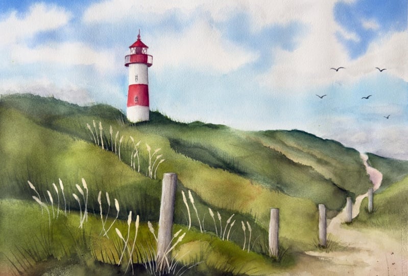
shorter and less visible, which helps create depth and
distance in the painting. And with these tiny details, the painting is finished. As you can see, I didn't
add flowers, birds, or even paint the
lines connecting the fence posts that were
visible in the reference photo. I felt that what I
painted so far was enough and I didn't want to
overcrowd the composition. But of course, feel free to add any of those
elements if you want. It's your painting and you can do whatever
feels right for you. Now it's time to
sign the painting. I always do this in the
bottom right corner. Usually, I use watercolor
for my signature, but if that corner is too dark, I add some white guash
to my watercolor paint. When we remove the masking tape, we'll get a nice clean
border around the painting. Then usually the next day, especially if I've done a
lot of wet on wet work, I detach the painting
from the Gaitor board and carefully cut off the margins with staples using scissors. I also want to show you how
flat the painting stays when it's attached to the
Gaitor board with staples. I love using Gaitor board
with staples because it keeps the paper very flat and
prevents any buckling, which makes painting so much
easier and more comfortable. All right, now let's move on to the final part of the tutorial, where we'll summarize
everything what we've learned.
14. Summary: Thank you so much for joining me in this watercolor
painting tutorial. I hope you enjoyed
the process and feel inspired to paint
the scene yourself. Before we wrap up, let's quickly recap what we've covered
in this project. We began by discussing the
reference photo and how I modified the
composition to create a more dynamic and
balanced painting. You learned how small changes
like replacing the sky or adjusting elements can greatly enhance
the final artwork. We worked in manageable sections painting one element
at a time from the sky lighthouse and hills to the details like fence
posts, and grass. The step by step
approach helps you focus and stay relaxed
while painting. You practiced essential
watercolor techniques such as wet and wet for the sky, wet and dry for the structure, glazing layers for depth, and dry brushing for texture. We also used guash for the final details showing how it can complement
watercolor beautifully. We focused on expressing a calm, breezy coastal
atmosphere by leaning the grass to one side and
creating soft cloud edges. These subtle decisions
added movement and life to the scene. Throughout the
process, we embraced imperfection and trusted
the layers to evolve. With patience and mindfulness, the painting gradually
came together, even through the ugly stage that every painting
goes through. Truly hope this project
brought you joy and gave a sense of calm
as you painted. Thank you again for
spending your time with me, and I look forward to seeing your beautiful version of
this light house scene. Take care and happy
painting. Bye.
 Krzysztof Kowalski, Watercolor artist