Transcripts
1. Class Intro: Ever tried to paint
something wrong, different than it looks and still found yourself trying
to make it look right? That pull toward
correctness is so strong, even when we're aware of it, it's surprisingly
hard to let go of. And that's exactly why I'm
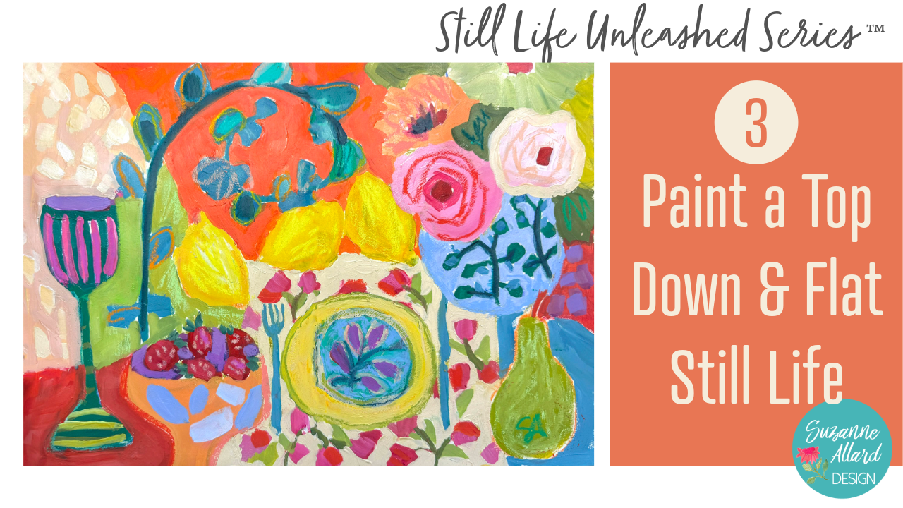
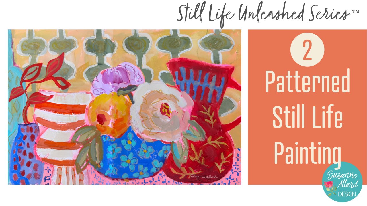
so excited about this class. In this class, we're exploring a top down and flat approach to still life,
flipping perspective, one that shifts your
attention away from realism and toward shape, color, and overall design, and we're intentionally
distorting things. When I paint this
way, I have to keep reminding myself not
to shade or not to fix perspective
and not to try to study the photo or the object
and make it look real. And that's where it
gets really interesting because instead of
describing objects, we're learning to
design the painting, and this approach
really breaks the mold, not just for still life, but for how you think
about painting in general. It stretches our brain
in the best way. And once you feel that shift, you start seeing new
possibilities everywhere. For this class project,
we'll create a still life where objects don't have
to agree or make sense, perspective flips, helements are placed in unexpected ways, and they exist together
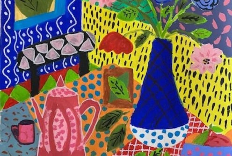
because they work visually, not because they're accurate. And I'll show you that
in many other paintings. As I paint, I'll talk through
my decisions in real time, what I'm noticing, what
I'm changing, and why. And so it feels like we're figuring this out
together as we go, which is how I love
to do classes anyway. And if you find yourself
wanting things to look right or getting
stuck in perfectionism, this is a really
freeing way to work. And if you haven't taken my class module
designing still life, freedom, confidence, and choice, I do recommend starting there, because that's all
about loosening those habits and learning how to make more intuitive
design decisions, which pairs beautifully
with what we're doing here. If you're new here,
I'm Suzanne Allard. I didn't start painting
until my early 50s, and I learned almost everything I know through online
classes like this. Today, I license my art. I sell originals and prints, and I love teaching because I know we're all creative souls, and sometimes we just
need a different way in. Alright, so let's take a look at the supplies
we'll be using, gather a little inspiration
and get painting.
2. Supplies for Still Life Unleashed Series: Okay, let's talk
about supplies for this Still Life Unleashed
series of classes. I in general, when it
comes to supplies, I definitely have a problem. I am addicted to art supplies. So bear that in mind. You know, you do not need
all of these supplies. I just am an art supply junkie, and I love experimenting
with things. But I did try to keep it
under control, 'cause, you know, limits are good. So let's start with here, let me flip us down
to this camera, and let's start with what
I painted on in the class. I used these three sketchbooks
and a canvas board. But, of course, you
can also use paper. So I'll just quickly
go through them. And by the way, I
painted this cover, so it doesn't come like this. This is the Stillman and Burn. And I have all of this
in the supplies list. I work really hard on
my supplies list to make sure they have
everything I reference. So you can let me know
if I leave anything out. But I have links to everything, and I just really love
the paper in this, and I like an off white paper. Just a personal preference. And then this is the Moleskin
Art Journal the Large. It's probably two thirds full. This is, let's see, one of the paintings that we're
going to do in the class. Yeah, that's one. That's
one I did outside of class. This is one of the
class paintings. I love this sketchbook,
as well, moleskin. And then the third one
we use is the fabriano. This is called I think
that's in the back of Ansia. Yeah, Vensia. And it's
just a little bit larger. The paper is also
a nice thickness, and it is, like, a more white color, but it, you know, takes pretty much
everything I do to it. So I give you a sneak peek ala
This was a class painting. That was a warm up
to a class painting. Well, really the I can't
remember which one. I love doing those fruit ones. Okay. So those are the
sketchbooks I used, and I would say they are
three of my favorite brands. Down because they're so heavy. I also use the canvas panel
in one of the classes, and I love these as well. I provided a link for them. They frame up just like
paper wood, you know, in a frame, but they're
already treated and they have, you know, some
substance to them. And they're more expensive than paper, of course, but not. Ridiculous. And
they're just easier to handle for me than a big canvas. If I'm on the easel,
then I use a canvas, usually, or one of those panels. For paper, I would say a
Watercolor or mixed media paper, definitely something
heavier, 140 pound or more. And the Europe, you
guys call that 300 GSM. I would prime the paper, and I also prime my
sketchbook pages, and I'll show you how I do that, or I'll show you what I
use because the reason and I do have a YouTube on why I do this kind of in more depth, but the bottom line is
that paper like this is, you know, especially
Watercolor paper is meant to absorb
the paint, right? Makes sense. And
if you're going to use watercolors on
it, that's great. You get that bleed
effect and so forth. Or even if you're going to use Acrylic with a watery wash, then you're going to
get that bleed effect. So it really depends
on what you want. If you're using a more
watery consistency in this class and you
want to have um, that washy look, then don't
prime the Watercolor paper. But if you're going to work
the way I did in the class, which is Acrylic and
kind of juicy paint, you want it to sit on top, not get absorbed in.
Does that make sense? So we prime the surface
with something, and you can use I use
them interchangeably, depending on what I want. I use a fluid map medium if I just want to kind of
have a more slick surface, and if I want that kind
of crunchy, toothy feel, I use gesso, and you just
brush it on and let it dry. And that's enough. That way, when you paint, your paint won't get sucked
up by the paper. Before I learned
to do this, I was trying to paint with Acrylic,
and, you know, you'd paint, and the kind of paint
would disappear and then paint another
layer and disappear. And you waste a
lot of paint that. Again, if you're
gonna do the wash heathing where you want
the bleed and so forth, then you would not
prime the paper. And the same thing applies
to the sketchbooks. So I usually prime them with the MT medium or the gesso
for the same reasons. Okay, so that's surfaces. For palette, I either use, you know, a piece of plexi. I think I have an old
piece of Plexiglass here. I usually use palette paper. I just like to be able to
use it easily quickly. And then sometimes you get some nice pieces to use for collage, or some people use them as inspiration for
abstract paintings. But that's disposable palette. Basically, you tear off the
sheet and throw it out. For brushes in this
series of classes, I used my Suzanne Allard design
juicy brushstroke series, and they are they just came out. Um and I think I only used I might have used
one more smaller brush. So but any flat, if you wanted to get
the same effects, a flat number six, and maybe for the occasional
detail of flat number four, and maybe sometimes a Filbert, and that's what
this shape is here and it's kind of
rounded at the top. But I would say any
good quality brush, what I would be
careful of is just don't get anything
that's too smushy, like, super, super soft. You're not going to have maybe the effect and control
that you want. And on the other hand, don't
get anything too stiff. Like for this. Anyway, or just understand that brushes will
change the effect. So there's no wrong brush. But if you're trying to get certain effects, learning
what they do, like, these Princeton catalysts
are really, really stiff. And so you're going to
get a different effect. You're gonna more,
like, push the paint, and it's kind of
better for oils. So just understand
if you're getting if you're not getting
the result you want, might be the brushes. Of course, it might
be the paint, too. Speaking of paint, I use in this Still Life
Unleashed series, basically two types of paint. I use the Acro gouache and my favorite brands
are the Hbain. That's what these two
are and the Turner. And I put them both in a palette the same way I do the acrylics, which
I'll show you in a second. And then the acrylics I'm
using are the Nova Color. These are the paints that are available only via
their website. They don't sell in
stores and they're artist quality paints for
a student grade price, but they really only a good
deal in the US because the shipping is too much to make it worth getting out of the country is what
people tell me. Anyway, I have a Suzanne Allard
design bundle with them. You do not need to
buy Nova Colors. You do not need to buy
the Turner or the Hbin. You can use what
you have. Just try to buy the best quality
that you can afford. I would rather have you have fewer colors and
a better quality. So if you'll see I use a limited
palette of the acrylics, which is what's often called
the split primary palette, which is really
just two yellows, two reds and two blues. But within each of
those, you have a warm yellow and a cool yellow, a warm red and a cool red, and a warm blue and a cool blue. So really that and maybe
a few really fun colors like fluorescent magenda,
which I'm obsessed with. And maybe, you know, you can make almost every color from that split primary palette. So I would rather see you get
a good brand and just get those six colors plus white and then get some cheap brand
and get a bunch of colors. You'll learn so much more
about color and you'll like the result
of your paintings better because the
cheaper paints don't have much pigment in them. They have a lot of
fillers, so you just you're not getting that, you know, kind of rich look that you probably want.
Alright, so that's paint. For sketching, I
sketch my compositions in usually three or
so different ways, always very casually. And in the designing
Still Life class, I talk about how you can use really anything.
You can use a pencil. You can use a colored pencil. You can use sometimes
I like to use this fun fluorescent pink
solid marker by sakura. Or one of these pencils by Well, this I would use for
actually something that's going to show
because they're pricey, these luminant
carinash luminants. And I've got all that
in the supply list. But I often will just take
a little bit of paint, water down on my brush
and sketch with that. So I also love sketching
with neoclor crayons. And, you know, these
are the neocolor twos, so that means that they
are water soluble. So if I sketch
with one of these, I can it'll dissolve with
the paint that goes on it. It doesn't really show, and I kind of like when
some of it does show. So that's those are the different sketching
tools that I use. All right. And let me show you the paint,
and then I'll show you A couple of sort of paint
related, I guess, things. So quickly, I put my for me, success in painting means I can just get my stuff
out and start painting. I don't have to squeeze
a lot and work a lot. It just helps me to
be more on the go. So for the acrolGuah
and you could actually use these containers
for either Acrylic, there's no rhyme
or reason to why I just I'm using them this way. But I put the acro gouache
in these containers and then I can kind of see the split
primary there a little bit. The warm yellow, cool
yellow, warm red, cool red. And some blues. There's a couple of other
things like an opera pink, which is another color that I buy because
you can't make it. So these guys, I keep
them with wrapped in a wet paper towel like you just saw me take off in the fridge, and they have lasted months,
months, months, months. It's amazing. Sometimes
the silicone rubbery cover is a little tricky
to get back on, especially 'cause I
probably have some paint in there, but that's it. That's how easy it
is to get them out, start painting and
put them back. And then I if I find that
they're drying too fast, I will add sometimes a slow
dry medium by liquitex. And so they're just
it's so convenient. They're ready to go.
And same with my novas. I have a small one and
a big one of these. Is my wet paper towel. And, um, it took a while to find the right container to do
what I wanted, but I did. And, yeah. So again, you know, now, if
I notice, like, that one looks a little
dry when I'm painting, I will use my I think
it was originally a makeup like a face
hydrating spray. But I use it this way. You know, I don't like them too, you know, over the watery, but if they need a spray, then I'll do that. But again, I bet you I've had this in the fridge for six
months. And that incredible. So it's a great way to save save paint and make
them convenient. And it's fun because you
can mix some of the colors that you really like right
in the little wells. Okay. Last thing I
want to show you, I think some people ask, let me get my sketchbook. You know, how do you
keep the pages from sticking if sometimes
like this one, we paint in the class. I
love how this turned out. But, well, the
acrylics not too bad, but sometimes they will stick. Let me see if I can
get one to stick. Oh, you hear that? That
was a sticky sound. And so I will use
this fixative Um, if I want to use something
non toxic in the house, like in the winter, this
is the Dega spectra fix. It's completely natural. I can do it right
now. No issues. If I want to use something, this one's a little pricey. So if I want to just do it outside in the garage, I use my Okay, I think we're
okay. If I okay, using, you know, going
out in the garage, I can use the crylon
workable fixative, which does not smell good,
but in the garage, it's fine. But I don't and it doesn't linger too much on
the sketchbook pages, 'cause I don't want my
sketchbooks to smell. Well, I don't mind if they smell good. But I don't want
them to smell bad. Alright, I think I've
covered everything, and we are gonna have so
much fun in this class. I can't wait to get
started with you.
3. Gathering Inspiration: Alright, so let's take a
look at my Pintors board. And we're going to look for some examples of
flat, modern art. I've got I'll have links to
this in the supply list, but I've got my
Still Life Art board and then Still Life
reference picks. I also love to collect images of vases and
bowls and pots, and then color reference. Those are the main ones here, and you're welcome to you,
look at these boards. Like I said, I'll
give you the link, but it's really fun to
make your own as well. So within the Still
Life Art board, I've got several
examples of artists who depicted this kind of top
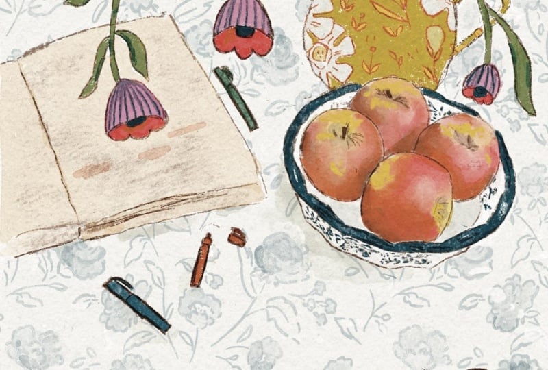
down flat composition. So, you know, here's a good one. Very much top down. And the one we're
going to do is a little more mixed like this. This is Lully Wallace. It's not in there, but
I know that's her work. And see how the plate
here is topped down, and then the vase and
cups are to the side. So we're going to do
a mixed perspective, and this will really
help us with, you know, thinking about rules. Here's one by Emily
Powell. Same thing. The plates are top down, but here's a candlestick that
you're looking straight at. And she used some gold
foil in this one, too. There's I just really
helps you to look at this to realize
there are no rules. Here's another example. It looks like a plate of maybe lemons over
here and then a cup. Face on and some pots face on. But then here's a dish of
strawberries, face up. And, you know, I love
this kind of artwork. You don't really Your
brain's trying to go, well, but where's the table, and where is the tablecloth? And you know, you don't
have to worry about any of that with this kind of design. Let's just look
at a couple more, and then I'll show you
what I've selected as our reference pictures for
this class. Let's see here. I want to show you so you have
a top view of this plate, but then side views of these
vessels, random lemons. And then I like the bowl
it's kind of a combination. It's almost a top view
of the fruit in it, but a side view of
the bowl itself. So take as much time as you want looking
at still life art, and then I will show
you Still Life pick, which is photos I've collected. These are not artworks. Well, photograph is an art,
but you know what I mean? These are not
paintings. And there's a few top down in here. But what I picked
for this painting are actually these two, this one, because I just liked
some of the objects in it, especially this vase of flowers and the bowl
of strawberries and I've got a second one that I picked and these are
in your class documents. Here's the second one
and I thought we'd use this one for color
reference, maybe. I really am into
this blue glass and this pretty emerald
green these days. Let me show you though, the one that I already did is a sample painting
for the class. I used this reference that we already looked at and
then for color reference, I picked this painting by a
Russian artist Eccentris. I think I think he or she is, and I just loved the colors. So doing that, I came up
with this example painting, and it has the strawberries. It has sort of the
vase of flowers. But you can see the colors really come from this painting. And it forces you to play with colors that you
wouldn't normally play with. Like, I don't usually have a bright lemon
yellow like this, especially with this
rich, beautiful blue. And so you might say, Well, how did you get that
painting from this photo? But that's just it's just my imagination moving things around and playing with things. So for this painting, I'm not going to do
the exact same thing. I do want to use this reference, but I also want to add
this reference over here and push the colors
more in this direction. It'll be fun to compare what we paint with the example painting. Alright. Well, again, these photos are all in
your class documents, so it might be helpful
for you to pull them out, have them on an iPad or
a laptop nearby or print them for when we get
started on the painting. Alright, so next, let's look at the surface that we're gonna use and get ourselves
ready to create this.
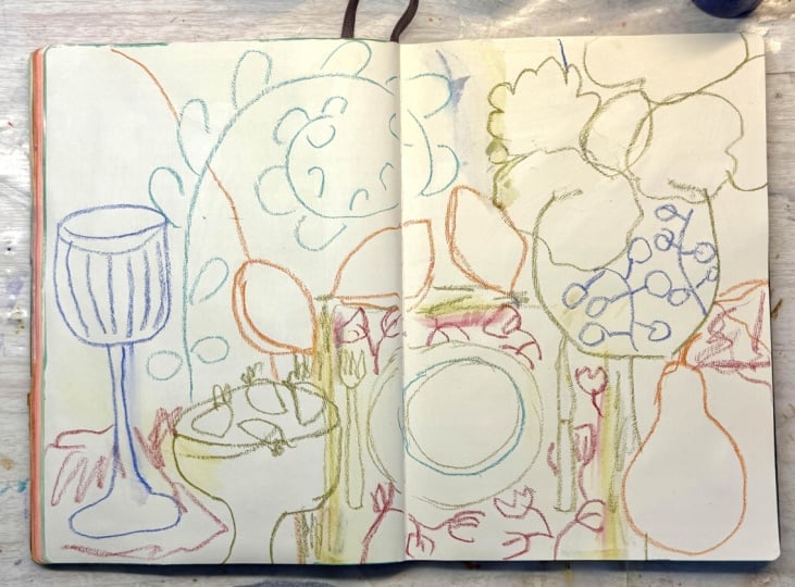
4. Design, Composition, Sketching: Okay, so I've got my
example painting. This is the one I showed
you in the last video. But here it is in
the sketchbook. And um it was really fun. It was fun to do. It was fun to break out of my normal
color patterns. And just I love it. I love working in a big
sketchbook like this. I did this one in the
disfabriano sketchbook. I'll have it in my supply list. But, um, we're gonna do the painting in my other
favorite large sketchbook, which is a mole skin. Art journal. This is the biggie. I think they might make
one bigger than this, but I've been doing
some of these. You can see I've got some
backgrounds done and some other still life here, but we're going to just go
with a plain background. Now, I do have this already primed with clear
Gesso or Matt medium, and sometimes I mix it too. So you can probably
hear compared to the pages that are not done. Maybe, I can hear it. The texture. So you
don't have to do that, but I like to prime my
pages because it helps the paint sit on the
paper and not soak in. So I just find otherwise, it seems like you put paint down and it just sort of
somewhat disappears, and that can be a cool effect, but that's not what
I'm going for. So I've got my spread open. I've got my reference
pictures, the sample painting, and then the pictures we talked about that you have
in your class documents. I have those right
here. This was one of the reference pictures. And another reference,
that's not the color. That was the one I used before. But the one I want to use for color this time is this one. I just like the blue, the green, that lime green here. It's actually more cool
colors than I usually use. I usually tend to
use warm colors. So let's start sketching. That's going to be
the interesting part. And the thing to think
about with this kind of still life is we are not
painting what we see. We're not copying. We're not it's better to think that
you're designing the page. Not creating this scene. So that's why we can put
things wherever we want. Think of yourself more as a designer for this kind of work. And if you think
in terms of shape, color, interest,
and overall design, then you won't get
us hung up and, you know, but that
plate has to be here, or, you know, the vase has to
be blue or whatever it is. And you won't be worrying about perspective and shading
and anything like that. So we're going to use shape and think of these as objects that we can move around almost like you
would do a collage, but we're doing it mentally. So think like a designer, not like a camera, okay? That might help. And objects don't have to agree spatially. They don't have to be I could make this cup huge if I wanted, or I could make, you know, the bouquet and this one tiny. Um, where they could it could be much larger or the cup could be much larger than the bouquet.
You see what I'm saying? And what we're
going here is flat. So we're intentionally
trying to not do dimensions. We're trying to
change perspectives. We're trying to do some
top down things and some side things and
stay away from form, meaning we're not trying to shade and make things have form. So those are all the
things to keep in mind for this top down
and flat glass. So I'm just going to prop up that picture so I
can see it and start thinking about maybe putting that I love how fat that
this vas is fat and round. So I do have to think about
in the sketchbook, the seam, and you may be working
on a sketchbook or on paper or canvas even
so it doesn't matter. But when I'm doing this, I do think about not putting things right at
the edge of the seam. So I do want the
dinner plate, sort of. So let's start with the plate. Let's do a plate in place, Matt. Maybe like this. I'm using, by the way, a neo
color crayon. This is gold. I don't know why
I love the gold. It doesn't even
look gold, but it just gives a green color. But I've got these
little bits of the cray, and I just like how they work. I like that they're
water soluble. So if I make a mistake,
like, I'll show you. Baby wipes are
great for mistakes. Let's say I just wipe it off. And especially if I've put
Matt medium on the paper, it seems to wipe off
easier than just so. Not that we really
need to wipe it off because we're gonna
be painting over it, but I just want to
show you sometimes when I get a lot
of things on here, it does help to wipe things off. Well, I've already
got paint on my hand, so I'll to a good start. Not even sure. Oh, I see. Oh, I got it on
there. 'cause I've got my paints out already. Alright, so let's
we'll do a plate here and maybe
another plate inside. Let's do a fork. It's
got four times roughly. You see how I'm drawing,
I'm standing actually, and I'm trying to just make a
very the opposite of tight, the opposite of precise, playful strokes, gestural, even, I don't want everything perfect. That's not what I'm
going for here. Alright. And then I do
love the lemons in this. So I think I want to
put this fat vase in. So let's do that since
it's a bigger element. And maybe I'll put
it kind of right on top like this and then just have really big blooms. Smaller one there. I'm just
kind of going off the page. Maybe cascading over there. This is where I like
to remind myself when I'm painting later that I
want this on top of this, I can go back in and
remove that bit of crayon. Of course, if you're
using a pencil, you could erase, too. But let's see. I'm gonna
look at the other. I did like that bowl
of strawberries. And in my sample
painting, I put it here, and that was kind of fun, but I want to try
something different. So I think I'll make a
fun little let's see. Thinking of a bowl that's sort of half perspective one way, but I don't want
it just floating. So let me put it a
little closer to here. And like this. Kind
of a cup bowl thing. And we'll put that
over there, too. And let's try some
strawberries in there. The best thing to do is just I just say it
because I have to remind myself constantly is
to play and relax. And I know your brain, if it's like mine is going, but that's not right, and
that doesn't go there. And you shouldn't
do it that way. And all other kinds of nonsense. I'm just switching colors
or crayons just because I always like to have a
wine glass, it seems. And that might be nice
here, really tall. Baby, that's a little too fat. There we go. And what do I want? I think sometimes even
though I'm gonna paint, this gives me an idea of what to do when I draw
it in, sketch it in. So this could be a
nice pattern for this. Face. Okay, and the lemons. We might as well
put those in yellow or maybe orange
to remember them. They can just be kind
of here and there. Oh, and I love pears, too. There's no pears in the picture, but I just love the
shape of Oh, Ina. Let's just do a pear
shape right here. A big whole pear. And some lemons can
be kind of just But floating here. Okay. Let's see. Let's look at the inspiration. You know, sometimes
I get inspiration, so even in this tablecloth,
look at that design there. That's really pretty. So let's
put it in because why not? So it's kind of a vine
that comes out like this, and it could just kind
of come like this. I'll just make a
few. Actually, it's got only shapes on the outside, which is kind of interesting
until you run out of room. And then we could do
some on the inside. Who knows when I painted,
I might change it, but it gives me an idea. And what else in
this tablecloth? Is tablecloths so
pretty, isn't it? Maybe we'll have
another stripe there. I want something on the plate. We could just have
flowers on it. I'm looking at these flowers on this place mat.
Those are pretty. Let's, um, let's kind
of do those loosely here along You know, I'm not I'm getting I'm getting
the idea of them up here, but I'm not trying
to recreate them. Just creating kind of a pattern inspired by these
flowers right here. And maybe we'll paint
them similarly. Who knows? You know, when you
paint things like this, you're kind of just giving
the suggestion of it. You're not trying to
render it accurately, and it will read that way. That means that your eye
will see it that way. You don't have to
make the flower look exactly like a flower or any of these things cause your eye will read
them that way. I kind of wish my
place mat was bigger. So I think I'm going to
just move it up and out. I think I did this in the
last painting, actually. I think I remember now that
I ended up making it bigger. Just to help me remember, I will take out a few of the lines so that I don't end up
painting it smaller. Like a note to myself that
this is all place Matt. So I might move the
knife over, who knows? Alright. So now I'm looking
just overall balance wise, let's pause and take a look. Do we have, you know, some nice elements here, kind of anchoring things? There's empty space here. There's nothing wrong
with empty space. We're letting color do the work, flat color do the work in
a composition like this. So it's okay to have
chunks of flat color. I might just come
through here with, you know, a piece of color
here, whatever that is. So back here, it will
be a different color. And yeah, let's do that. We'll divide the background
maybe in three ish colors. Have another one come maybe, like, it'll be easier
if it comes this way. And that's all the same color. From here over. So we have
one background color here, maybe another one here, and here a little bit too
divided in thirds, though. So I think I'll do is move this color line to here
and take it that way, 'cause I don't want it to be too too evenly matchy
balanced sections. Well, I want it to be balanced, but I don't want them
to be too similar. I want the whole thing balanced. We'll see if I even remember
that we're doing that. That's why I make notes, but um, this looks busy in this sketch because we have all
this little detail. But as we play with these, like, we may I always like
to have some stripes, so this might be a good
place for stripes there. And then I do like
to, in my sketch, look around and see, is there
a texture or pattern or, you know, what do I want to
do on the front of this? We may just let it be color
and then do something, look for a texture
to put on it after. I think that's a good
sketch to start painting, and then we'll see what we
want to add and play with. I do feel like there needs to be something dropping
off there to change. I don't know what. We're
over that way, maybe. Maybe the suggestion of
a table, something here. Then maybe something back here. Maybe it's a
tablecloth. Who knows? Yeah, it feels a
little more balanced. Okay, let's get on
to painting. Whoo.
5. Painting First Layer: Okay, so for colors
and keeping it simple, I've got the Nova colors here. The bundle. There's a Suzanne Allard bundle with Nova Color paint
out of California, but you can use
any Acrylic paint. I would just stay with an
artist quality not to play. You don't have to have artist
quality to play like this. I don't want anyone to be
held back from playing, but you will notice a
pigment difference. Um, and not all student
grade paints are the same. I would say a liquitex basics is pretty good for
student grade. So I'm doing a split
primary palette, which just means that, you know, the primary colors
we all learned in school, red, blue and yellow, well, it's split because
there's two of each, and there's one that's
warm and one that's cool. So for the yellows, I have the Indian
yellow for the warm, and then for the cool
yellow, I have the hansa. And then for my reds, my cool is the quinacridone red. And the warm is the
nap doll crimson. And you can pick any number
of warm or cool reds. I'm just showing you
the ones I'm using. And then for my cool blue,
I have ultramarine blue. Some people argue
that this is actually warm I just I just I
know what they mean, but I always think of it as cool and serle and blue for my warm. The reason that ultramarine is technically a warmer color is
because on the color wheel, it's closer to red. You
know, it's over here. But it just and when you mix it, it does mix better
with warm colors, but I'm getting too
much into color theory, so we'll leave that alone. Suffice it to say, we
simplify things by having this split
primary palette It's just six colors plus white. And that way, we will have
cohesion in our colors, and I might get a little bit
of burnt sienna out just to help cool off or knock
back, not cool off. It reduces the roma or saturation and
intensity in colors. So it's a nice color to just calm things down or
push colors back. So we'll see. If I find myself wanting it,
then I'll get it out. Okay. So looking at this and looking at the
color reference that I have. Which was this picture. I'm going to try I'm gonna
make this emerald green. I've just been I
don't use that much. And I don't know. I've just been having
emerald green on my mind. I don't know where I'll use it. I could use it in the
background of the vase. But then I want to do
these blooms first, or I could use it on the blooms. I like to paint my little
bits first and then come into the background of them
and cut around them. So I like to paint all
the elements first. Then I'll show you
a then you get this great effect of painting behind the things and you get kind of a more
organic shape. So what if we make
I know we'll do. We'll do the emerald green
and maybe do the wineglass, something here in the
plate and the blooms. I do want to move the colors
around for this design, so I'm going to look at three to five places to
put color odd numbers. So, let's first make
an emerald green. Let's see. It sample paper
to see if it's too dark. White always cools
things off so you get I'm pretty close. Maybe it's a touch
more cerulean. I'm not trying to match
the plate in the picture. I'm just trying to get
what I'm a color I like that I think of as emerald. But mostly a color I like. There's something that I'm
not loving about that. Maybe I'll just lighten
it a little bit. Let's get a little
more life to it. Close enough, Suzanne. Um,
let's do the stripes in this. And then now see how
I'm holding this. Oh, by the way, the brushes are from my new set of brushes, um that I designed to help
make juicy brush strokes. So the bristles are a little
more stiff than my last set. But say I'm holding it, sort of like a a sword, magic wand, so that I
don't get too nitpicky. Acrylic dries darker
than it looks wet. So remember that. It's something you just keep
in your mind if you had a color that you really like and then it dries
and you're going, Well, that's not what
I wanted. That's why. That can be why. So you might need a
little yellow or a little white to it to get it
closer to what you wanted. And let's make a line
here in this plate. It's kind of fun to use colors
that you never really use. I made that plate a little
bit too perfectly round. So intentionally trying to be
a little off the wall here. Alright, so for these, so since I'm gonna
cut around them, I don't need to worry too much. Well, this is not a worrying
style of painting anyway, but I'm just dabbing
the in quickly. And if you can get
yourself to hold the brush loosely like this
and work quickly, you might like some of
the results you get. So happy accidents. Okay. Well, that's a good start. I wonder if we I
have that color, if I just lighten it up and go just a little
more blue with it. If we can do this
sky in that. Yeah. Now, for that, for a
line, I am gonna hold it. I mean, I could go like this. Well, let's try it. I can feel myself
trying to be too precise following a line
that I made loosely. It's just amazing, isn't it? That we have to keep reminding
ourselves to not fuss. So probably vary these
little guys a little bit. Make some of them more
greenish, some more blue. Again, I'll be cutting
round all this. I love that cutting around part. I'm gonna keep this
going behind the lemon. I could have put it on top, but I just made a call
to do it that way. I just have varying the
color a tiniest bit. H we're letting shape, color, design, be our story here. So now that I have this blue, I need to use it somewhere else. Well, I need to, but
I like doing that. So I'm going to do the fork a knife. And what else? Maybe just, like, a little Dab of it here on some
of these flowers. I could even have some little leaves coming
off here that are blue. Something like this
with analogous colors, analogous colors are colors next to each other
on the collar wheel, so like blue and green
or yellow and red. That can be a nice
little design element. So see how I've brought
that blue just even in little bit somewhere else. And I may even pull
some down here. We can always I'm breaking my my own self
imposed rule about painting my objects first here because I have the
blue ready to go. But I do like cutting in, usually around an object. Let's bring it over here. But who knows? I may
change that color. Okay. We've got enough blue. Where do we want to go next color wise? Let's do the lemons
and the pear. But we're gonna make them. Rather than a real
lemony colour, let's make them
kind of orangish. 'Cause we can do that
certainly with the pear. Pears come in all
different colours, and we're not worrying
about it being realistic. If our lemons end up looking like something else because they're not
yellow, that's okay. I like having do you see the green still left in my brush. I watched it a little
bit, but not too much, and that's where you get
that kind of interest. Plus, we have the yummy um No Color crayon
showing through. And also dissolving into the paint since it's
a watercolor fran. I'll make this one a
little bit lighter, a little more white,
just for some variety. Oops. I want to be careful. I almost started to shade. And remember this class is flat. So let's just flatten
out the color. That's what we're
tasked with doing here. The little birdie on my shoulder imaginary birdie
said, What are you doing? And I also realized I don't want that background line going right into the end of this lemon, 'cause it's just gonna
design wise look weird. So I'm moving the lemon a bit. Alright, I think
that's pretty flat. And we'll do some yellow
around this plate. I just lightened
it a little bit. Just remember to relax. Every time your brain thinks
you're doing something incorrectly, you could pause, you could go back and look
at some of the art in the Pintres board where they're all breaking
the rules, so to speak. Okay, I'm gonna
just make the pair, more of a limey green. H. I kind of like
the orange creyon. You know, sometimes I leave
that, and I'm liking it here. So I'm gonna intentionally
not cover it all and make a happy accident out of the fact that I
didn't get to cut in. I'm flattening this so I don't look like I'm trying
to make shadows. Flattening it, meaning
all the same color. And then I'll make
a little stem. We can make a little
reddish stem. Maybe mix it with
some of the green. Okay. Since I'm headed
toward reddish on my brush, I'll just give it
a little rinse. I won't go do these
strawberries. Don't have to make
them red, do I? But I think they'd be cute red. And I've got four there, but I'm going to do five.
I like odd numbers. Just put another one here
and make this one a big one. Variety of shape, size, creates interest. Well,
I have the red out. I'm gonna make some
flower centers, which may or may not stay red, and I'm not gonna put them in the center of
every flower or the same.
6. Deciding and Painting Layer Two: Okay, while I have my red out, I'm gonna take it in a little pink direction and make some of these
place mat shapes. We'll be cutting in
around these, so Oh, this quinacradon
red is so beautiful. I'm gonna have to go
on top of some of these I like this color. Okay. I think this pink would
be fun striped here. And it's switch to a
little bit larger brush. This is the six felbert
and make some big juicy. Well, here I'm reminding myself. I caught myself again
starting to shade. So I'm going to
flatten out by making the color More uniform. Let's make one really pale. Okay. Paint is drying so fast because it's winter and my my house is warm and dry. Okay. Um, I got plenty of pink around. It's switched to,
like, a peach color. That's also in here,
right in here and here. We can go any color
direction we want. I just I find for me personally, I can tend to be all over
the place with color. So having a photo
or something that I'm at least starting out thinking I'll stick with keeps me from going
just a little nuts. I think this would be
a good color for this. And then maybe we'll come
back in and do a pattern. See how my brush went out
there and made a bump. Let's leave that and
see if we like it. You got to resist the impulse to fix because that's kind of where some of the
wonkiness comes in. I think this color,
but much lighter might be nice for this background. So I just added some white.
Let's see what we think. Yeah. Let me put just a scrap piece of paper so it doesn't I don't end up painting
the pages below it. I like that. Maybe I'll
take it a little more. Um, I feel like I want
some of this green over here from the pair. Oops. When you get when you add
lemon yellow to serle and, you get turquoise pretty
quickly, intensely. So you have to go with
a warmer yellow to get this kind of lime green,
but that's too bright. And I want to knock
it back a little bit, so I'm gonna hit it with
a little bit of red, which is its compliment, and I knocked it back too far. That's too far. Yeah, that just turned into I mean,
it's not bad. It's just a little
darker than I wanted. This is how you I've
spent hours doing this, and this is how you learn to mix colors so fun, in my opinion. And I'm thinking about how
it needs to be lighter than what I end up putting down because
it's gonna darken. Alright, let's go with that. Oh, I want to do those little I want to get another
brush and do the little, um, strawberry stems so
I can cut around them. I need to make a dark
green real quick. Might as well put
the others in. Okay. We'll come back to that
and let it dry a second. When you do the cutting in, you might be more comfortable
with a smaller brush, but go as big as you can get yourself to do so
that you don't get fussy. Alright, there's
some pretty green and we'll have some green
leaves on these guys, too. So just think, remind
yourself you're checking balance, not accuracy. And the flatness we're
doing is intentional. I'm thinking I want a really
pale green bloom up here. I don't want all these flowers to be the same kind,
so let's do this. And I'm not thinking about light hating this 'cause
we're doing flat. I like how fresh this is looking color wise.
It's nice and fresh. Alright, it's a good time to pause and let some things dry.
7. Painting Shapes and Interest: Alright, let's see where
we want to go next. Um, I really like a couple of things I
really like this sort of crayon that we did here. And then I definitely
want to leave some of this an off white color because I think that's
what makes it so fresh. So this is where either
here or before now, you just start at
some point forgetting about your references
and unless you want to just get specific ideas
for a particular area and then just really responding to and
looking at what's here. So I need something
to decide what's going to go back here and I think maybe maybe I'll do these flowers and then paint this and kind
of see where we are. Color wise, I I do feel like we need
something color wise. So I'm gonna look
for any inspiration. Yeah. You know what I love is
a It's close to this blue, but it's got a
little violet to it, altamarne with white just
a tad of the cool red. Basically, it's a
lavender color. That might be
prettier in the vase. Yeah, let's do that. The vase is gonna be tricky cause we have so many ups
I want it be lighter. Otherwise, those little
leaves won't show up. Probably needs to be even lighter. I'm gonna pull this over and
mix right on my plexiglass. I've just learned
it will dry darker, so you might as well, you paint over things enough
times before you learn that. So I'm gonna cut in
around all this. And this is where I really
love how the shapes change. See how it's kind of
blocky right now. By the time we cut in, these stems will be
thinner and irregular, and it just gets character. I'm not doing it precise, obviously, 'cause of
the brush I'm using. I couldn't and the
way I'm holding it, I couldn't be precise. Whoops, went right over
that stem. That's okay. Might turn out to
be a good thing. I love this part. I don't know why, well,
I love all of this, but cutting in for some
reason is so satisfying. Okay. Face done. Now, where else to use this? I know? I want to just put some, like, shapes on this. Maybe it's pottery. We can
put different colours on it. And we could have our
plate be this color. Maybe it's just a lot lighter. And, you know, if you ever
paint something of color, and you don't like it,
you just paint over it. It's definitely looking too too it's calling too much
attention to itself, so we'll figure out how to
solve that at some point. But now, with the lighter color, it can make more shapes here. And Go back to the darker one. Yeah, that's fun. Okay, so I got this area which I
could make another green. Bit darker. I don't know if I want it to be
a dark green, though. Well, let's find one
way to find out. I've got this darker
green on my brush, so we'll do some stems here. We could have done
them in any color, but we don't even
really need stems. But I like lines, so I'm thinking more
that they're lines. I think lines add interest. I'm wondering do I want some other lines? Okay. Um, what's left? We got this flower over here, and that yellow
might be nice there because we have all
the yellow here. So trying to break
all the rules, and some rules they don't put saturated colors at the
edge of a painting, so there we go. We're
breaking that rule. Well, that's pretty. I
really like that color. We could play with. Let's see here. An edge around
the plate with that color. Oops. Got too dark. I don't like it,
so I'm putting it in. Okay. I have to watch my
tendency to fall in love with the color and
then put it everywhere. Placet. I need a couple
more little flowers. Remember how we made that
place bigger over here, so I just want to put some pink there so it kind of registers that it's that size. And then we'll do
some color there. Maybe we'll put red in here. I don't usually
use a lot of red, so it'll be good to play with. Let's see. I say very red red. Maybe we'll just make
it kind of watery. So it's not too intense. Who, that's intense. And a little green that
will knock it back. Compliments knock back. Colors compliments are
opposite on the color wheel. It's still intense, so I'm
just knocking it back more with It's a good experiment in using red a brighter red
than I would normally use. Now I put it in my left hand. That's really
living dangerously. So by watering it
down a little bit, by adding a little green, we can soften it. I could have left those crayon
marks. I did like them. I'll carry this over here. Might as well take it
all the way up there. With the matte medium on
the paper and watered down, Acrylic you get sort of
a translucent yumminess. I'm thinking about what
color do I want for the background of
these strawberries. Let's see how just a bit
of Oops. Violet looks. Well, the strawberries get lost a little bit 'cause
it's a bit dark, so I can bring up the, um, value of that a little bit by adding some of
that light blue to it. But we know it's gonna darken, so let me a little more. And now we have to put
this color somewhere else. And one more place.
I don't know. It's just a thing I like
to do threes or fives. There is a rhyme method to that madness that
supposedly the eye, if you put even
numbers in things, looks for the pairs of them, and then stops or something. And if you do odd numbers, the brain doesn't
do that as much. Alright. I think before I decide what color
to do back here, I want to cut in the place mat, and I think I want
to cut that in with, like, an off white color, which I need to
clean this up and get a new sheet out and
make. So let's pause.
8. Cutting In: Alright. You can make an
ivory or a beige with your three primaries
and white and just keep mixing till you get the
shade you want. I cheated. And I used my acrolGhivory
white and beige mixture. So here goes. I love the difference between this and then once we
get it all cut in, even though we're pretty much painting it just a little
darker than the paper, you'll see how the
shapes start to emerge. The p so Okay, so I think you can see I used a smaller brush just to get the
ties at the fork. Otherwise, you know, I don't
want it to be precise, but I want it to read as a fork. And I love how these
shapes emerged, and it just sort
of put everything into this sort of subtle focus. And I brought the
color over here, even though your
brain would say, Well, the placemd ended here. What's it doing over there?
So that's the kind of thing that's okay to do. And then I really
love this color. So I'm wondering if I
want to do some maybe some let's just see how some pattern pipe marks work here. And, uh, any other
place I want to use you? Maybe an outline. Yeah, that's fun. To do something here. It's just too bright. See how this is drying.
We're not even going to be able to see these
hardly. That's okay. It'll be a subtle mark. All right. So what
I see left to do is whatever I'm doing back
here and fix this. I can put some cherries in here, which might be nice and then paint a different
color behind them. But let's stew this first. So looking at balance and
thinking about color, I don't think there's
any of the colors that I already have that I want
to use exactly as they are. Although we could
do a light pink. Yeah, we could do that. Let's mix of pink and
see what we think. Actually, now you've got
this off white out here, I love working with off white. Sometimes it's called
Buff or ivory. I'm trying to think
what Golden calls it. Let me see. I got to stand back up and see what
I think of that color. No, I don't like it with
the warm white. I want it. Feels sort of, I don't know, too, like, dusty rose. Let's try it with
some regular white. And maybe it will just make it the ever so slightest of pinks. See how that feels.
Mm. I love it. You know what? Maybe I'd rather just
have a bright orange. Let's see. I'm trying to get
out of the habit of mixing paint as much
with my brushes, 'cause it's hard on the brushes. Ooh. That's pretty. Look at that. I just
grabbed some of the pink to soften
it, lighten it. And that's really pretty. It's gonna be loud, but Ooh, yeah, I like that. We can always we
can always knock, go over it or knock
something back. But Hmm. It's gonna take the direction of this painting into an
even more colorful. So if you like that, great. If you don't it. And I might do it, and then say, tomorrow, I'm gonna tone that down and paint
over it again. I can't tell you how many
times I've painted over, especially at background
color after cutting it in, but it's a good thing I
like cutting in, right? And we don't have to
make it all the same. If you ever get too
much paint up in, you can take a palette knife and kind of scrape
it out like that or wipe it on a paper towel. For some reason, I have
found an orange color. This is kind of a vermilion
or reddish orange, but to do fun things
in my paintings. If you ever find
that a painting is just completely lacking in mph, just for whatever reason, a little bit of
orange seems to help. Turquoise is the same way. All right, I'll just work on this and speed this up for you. The Okay. I think at this point,
we let the whole thing dry and then maybe come in with some crayon bits, maybe, maybe, maybe,
maybe we'll see. I just want to catch
the white that's there. You could leave it, but I
just wanted to cover it. All right. Let her dry.
9. Details and Finishing: Okay, so I wanted to play
with this a little bit more. And one thing I did is I
colored this in a crayon with a neo color crayon just to make it go away. It
was driving me crazy. So it also gave me an idea
of what to put on there. So that's something I
do sometimes is put either you can take
a piece of paper to or even cover it or take a paper and a
color or take these, which I could wash off
if I didn't want them. And I think I'd like it better with kind
of a turquoise color. So let's do that. And
see where we are. You just have to
experiment sometimes. Let's see what that does. And then maybe I'll
put something on it. Um I'm not gonna do in on the whole thing. Messing around. The other
thing I want to do is come in here with some crayon
and do some fun things. And some of this. You could use oil pastels,
too. I've got those too. Sometimes they show up better. The downside is they
take longer to dry. But they're so juicy. This is a oil pastel. Just a little something
something here and there. Texture is fun. Just
'cause it's flat doesn't mean it
can't have texture. See, maybe this one. Might be fun to take
this well pastel that's pretty close to the
color of the background here. We do something with it. That was fun. Okay. Stepping back, thinking. This is Let me see which
one of these I like. Well, this one's
definitely brighter. I like to incorporate the
signatures in a color of the artwork, kind of
make it part of it. I really like the texture
we did in the lemons. I wish I had a little
bit lighter pastel so it showed up better. Doesn't do it. Alright, I'm gonna stand back. I mean, we're done, you know? This is one of those
things where it's done. Um, except for me for this, I want something here. I might just do a let's see how colored pencil
and some branches do. And I like to use pencil because sometimes it'll
give me an idea of, you know, just
leaving the pencil as is or go over it with pain. So I was able to scratch
through, and that's kind of fun. I press harder and see if I can scratch
through some more. I don't want it to look too. Perfect. Well, that's better.
Definitely better. I need to stop staring at it. Stop staring at it. Move on. Look at this turquoise. Isn't that incredible? Alright, I'm gonna stop. Uh oh, I know. No, sees soon as I say that, I do want to put in the little strawberry
do hookies so that, you know, they're cute. The little seeds. That helps tell us that
they're strawberries, but also, they're just cute. And they're a small design wise, they're a small mark, which
we don't have a lot of. You know, that I
said I'm gonna stop. I'm trying not to make
this shade looking. I just wanted to
maybe come around. I do like so let's talk about some of the things
that I like in this. I like how the you're not
sure what you're looking at. I think that makes
something interesting. So, you know, you can't
quite tell where this vase. In fact, if you hadn't
been along for the ride, you might not realize that
that's a vase with flowers. It sort of melts into the pair. And I like that. I like
all of that variety. Let's put this stem back in. And mystery, I guess. So I like how
things move around. This is just great
for the composition because this Fibonacci
spiral brings you right in. You look around a little bit, you go over here, it's
well balanced color wise. So I don't think
I'll do much more, but you never know
I might be back. We'll see. I'm loving the oil pastel, giving me some nice
texture in that plate. As soon as I say I'm done
with something, I keep going. Let's just put a little
texture in this. Plate. And maybe a little bit. I like to come in
with a similar color. Well, that's pretty. But I happen to
do it everywhere, so it doesn't seem like
I'm trying to shade it because I don't want to
do form in this one. Okay, walking away.
10. Class Wrap up and Resources: I hope you really enjoy painting this top down and
flat still life and exploring this
different way of seeing and designing.
Isn't it freeing? In this class, we focused
on letting go of realism, not worrying about
shading perspective or how things are supposed
to exist in space. And instead, we paid
attention to shade, flatness, color,
and overall design. We mixed viewpoints,
we perspectives, we simplified forms and made decisions based on what
felt right visually, rather than what made
sense in real life. And be patient with yourself. This is a process of unlearning. What I love about this approach is how it shifts
the way you see. You know, it asks you
to loosen old habits and make more intentional
design choices. And that opens up so
many possibilities, not just for still life, but
for your work as a whole. Don't forget to use the cheat sheet on the class downloads, because I captured
the key concepts from this class so that you can
revisit them and explore them, you know, in the future if
you play with these ideas. And I also have a
Facebook student group. The link should be in
your welcome email. If you don't have it, you
can always email me at heart at susanneer.com, and
I will send it to you. You can also find me on YouTube, Instagram and Facebook
for more Inspiration. And if you like my newsletter, Your Creative Adventure, you can sign up at Suzanne allard.com. I share studio updates, creative insights, and just kind of my thoughts
in the creative journey. Most of all, though, I'm glad that you painted along with me. I really love working
this way and playing with design and letting
go correctness. And I hope you did, too. And remember, you get
to choose how things are seen in these paintings. I'll see you in the next class.
 Suzanne Allard, Landscape, Floral, Abstract Painting Teacher