Transcripts
1. Introduction: Hi, I'm Marie and welcome
to my watercolor class. If you like to paint flowers
and realistic subjects, then you're in the right place. My simple step by step watercolor method will help you to paint
anything you like. In my classes, you'll learn the skills and techniques
that you'll need to really bring your
subjects to life using deep washes
of rich color in layers and adding detailing that really adds a unique
look to your painting. You'll find all the
resources that you need below under the projects
and resources tab. There's a reference
image to paint from and an outline image that you can trace so that we can get
straight on with the painting. There's also a list of
materials that I use. In the coming lessons, I'll show you how to mix the paint that
you'll need to paint this beautiful subject and the techniques that you'll use in order to build up the flower. If you have any questions, just message me below. I'm always happy to hear from you and always happy to help. Let's get started.
2. Mixing Colours: Hi, welcome to this beautiful
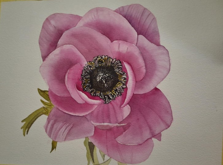
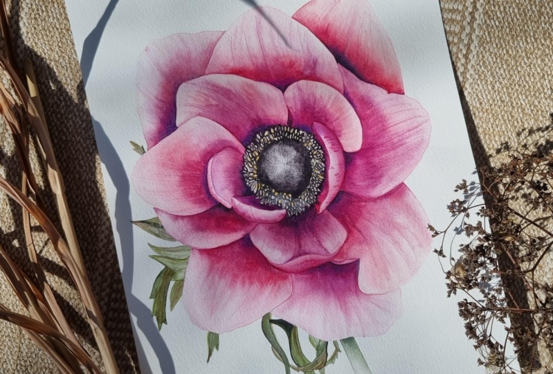
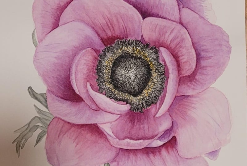
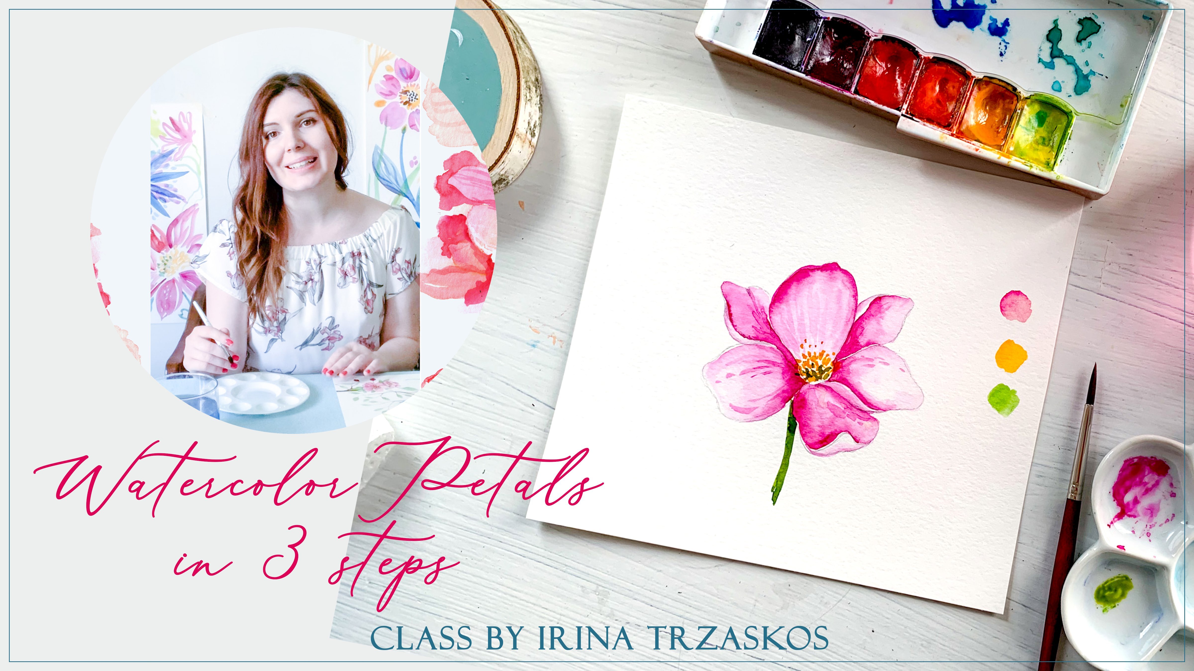
deep pink neme tutorial. In this tutorial, I focus on creating depth by honing in on the tonal contrast of each petal from the darkest points
at the base to the lighter, fuller areas where the petal
is capturing more light. This creates a really
three dimensional image that just pops off the paper. So first of all, I'm going to prepare my palette
and in order to really capitalize on the tonal
values of each pink petal, I use three different
colors mixed together in different
consistencies. With this, I can
create a lighter pink right through to
the darkest shadow pink, which has a lot
more purple in it. The lightest color that
I'll use is permanent rose. And to this, I'll add
quinacridone magenta, which is a much
deeper, richer pink. Therefore, darkening
up the pink of the petals and creating a
much richer, deeper color. And for the darkest
shadow areas, mainly at the base of the
petals where they tuck under, I'll add Windsor
violet to my pink mix. I'll use these mixes in much
thicker consistencies where I need to in order to create the really
rich areas of color. Then I need a green for
the little leaves that we can see poking out
from behind the flower. For this, I use cadmium yellow pale and
French ultramarine blue. Then for any areas of
green that are really dark or where a dark
shadow is created, I'll just add a touch of
sepia into my green mix. This gives me a lovely
deep dark green. Then the last color
that I need is the dark almost black color
in the center of the nem. For this, I'm using French ultramarine blue
and cadmium red deep. So you can see here this is creating a really
lovely dark color, but it's still too blue leaning. In order to make it a
more neutral black, I add a touch of yellow to it, and then I just balance
the colors out, adding a tiny touch at a time until I've got
the hue that I want. And just popping that down here. Now, I'm also just going to add a little yellow ochre
here mixed with a touch of sepia for the
little seed heads in the center of the stamen. I'll keep this quite
a watery wash. And here is the color
chart that I can refer back to whilst
painting my flower.
3. Materials: Here I'll show you the materials that I use in this project. First of all, you need a
palette for your paint, and then I use this big water container
because there's two sections. In one, I can rinse
my brushes off and then I also have clean
water available as well. You can also just use
two separate containers. But it's important to always
have clean water to hand. I use a selection of brushes. For this tutorial, I'm
using a size three brush. This is a sable round brush with a very fine point for the more delicate veins
that I want to paint in. Then I also use a number
four and a number six round. I swap these two brushes depending on the size of the
area that I want to paint. These are the paints
that I'll be using. I prefer to use
paint straight from the tube as I find the mixing
of them a little easier, but pans are fine as well. I use Windsor and Newton
professional watercolors and the colors that I use for this tutorial are in
the materials list, which you can find in the projects and
resources tab down below. Now, if you already have a
different brand of paint, all these colors
can be substituted. I also have a kitchen towel
to hand as it can catch any drips off of my brush or if I need to clean
the paint off quickly, it's quite absorbent and just really handy to
keep by your side. I use hot press paper because I really like to paint
on a smooth surface. Again, if you prefer
something with a little texture,
that's absolutely fine. I find that a smooth
surface makes painting in small
detail a little easier. In the next lesson,
we'll take a look at how I transfer my image, my outline drawing onto
my watercolor painting.
4. Transferring the Outline Drawing: Below in the Projects
and Resources tab, you'll find an outline
drawing of your anom. I like to also add a
reverse outline as this is a really good simple method of transferring your image
onto your watercolor paper. I simply place a piece of tracing paper over
the outline image. I like to use a
mechanical pencil as the lead tip is very narrow
and it stays narrow. It doesn't become blunt
and this means that you can be very precise with the
details that you're drawing. If you don't use one
of these pencils, use quite a hard pencil, so maybe a two H or harder so that your pencil
marks don't smudge. Again, you can keep your lines
nice and thin and precise. Then I trace all of
the lines of my image, including all the little
details that I've added. You might want to secure
your tracing paper with a little masking tape so
that it doesn't move around. Then once I finish
tracing the outline, I simply turn my tracing paper over and place it where I want
it on my watercolor paper. Again, secure it with
masking tape if you need to, and then just draw
over the lines again. It doesn't matter if
you scribble over them as long as you cover all of the pencil lines so that it transfers the image to
your watercolor paper. And by using the reverse image, if you use this method, you end up with a drawing of your nem the right way round. Then when you finished, you can neaten up
any pencil lines if you feel the need to or even remove any if they're
too dark with an eraser. Now you're ready
to start painting.
5. Starting with the Petals: Then once I've transferred my drawing onto my
watercolor paper, I'm going to start by
painting in the petals. I'm mixing up a large
puddle of my pink mix. Now with this mix,
I'll continually adjust it as I go by looking at my reference image and
picking out whether the area I'm working on is a
darker or a lighter pink. So for this main puddle here, I want to get as close to the middle pink
color that I'll use, and then I can easily darken
it up or lighten it up by adding either my Windsor
violet or my permanent rose. Beginning with my first petal, I'm adding a watery
wash all over it. Then I add in my
lighter pink mix. So I'm carefully picking out where the lightest
areas on the petal will be. For this one, it's around
the top edge here. Now, because my
surface is quite wet, I can pull out any
areas of paint that I want with my
clean damp brush, making sure that I'm saving
these very lightest areas. Then I'll add a slightly more
saturated mix of my paint into the areas where I can see the color on the
petal is darker. All the time I'm cleaning off my brush and using it barely damp to blend out the edges into the lighter
areas of the petal. Now, if your paint starts to become streaky as
you're doing this, then it's best to let the
petal dry off completely, and then you can
come back in and put a water wash over
the whole petal again once it's dried and then add your
painting over the top. So once your paint
becomes streaky, it means that your surface is getting too dry to work with. Because we want the different
tonal values of each petal here to flow from dark
into light smoothly, we are working with each petal
quite wet to start with. But as it dries off, this is when you might
find that it's harder to blend the different
layers into each other. Then I'm taking my
eraser and removing any dark lines as
I don't want these to show through the
lighter areas of my paint. Then I add a water glaze
over the next petal. This time, I'm
adding my paint into the very darkest
area on my petal. Again, I make sure
that my petal is quite wet so that I've got time
to work the paint out, making sure that all
the edges of it are smoothly blended up
into the lighter areas. This is two different
ways of working really, I tend to switch between
the two depending on the amount of dark
or light areas on the petal to begin with. For example, if
you're starting with a very light petal
to begin with, I would use the
first method where I add a very light wash first. Whereas here I'm coming
straight into the darker areas, adding paint to these
and then blending the paint out to create
the lighter areas. Again, your surface needs
to remain wet enough so that you have time to work with the paint
on your paper, but not too wet so that you have no control over where
the paint goes. It may take a little practice, but once you've got
the hang of it, you'll be able to completely control your paint on the paper. It's just getting that
balance of wetness correct. The balance of how
wet your paper is against how wet your
paint mixes as well. Now, what I want to do with
this whole first layer of petal painting is work my
way around the flower, mapping out the darker and lighter tonal areas so that I end up with a pink tonal
map of my whole flower. Once the first layer
is completely dry, I'll then come back in and
deepen up areas and pay a lot more attention to the edges and the
detail on each petal. With this first layer, I'm working with my paint a bit looser and then I'll use
the second layer and possibly a third in places to really tidy up and
hone in on the detail. Now as I go along, I'm all the time looking back
at my reference image and adjusting the color mix depending on the area of the
petal that I'm working on. So I'm adding in more
of my Windsor violet, mainly to the base
of the petals, where the color is darker
due to the shadow there and really making sure that I retain the lighter areas on
each petal as well. Because once my
painting is finished, it's the contrast between these dark shadows and
the much lighter areas on the petal that will
create the depth in my painting and therefore a
much more naturalistic image. A a then moving on to
the next petal, I'm moving my paper
around so that I'm not painting in
the petal next to it, making sure that each
one is completely dry before I paint the one
in directly next door. I add my water glaze again, making sure it's quite wet and will give me enough time
to work on the petal. Then I add in my mid
to lighter pink first. I'm making sure
that I'm retaining the lighter area through the
central part of the petal. And just very lightly
brushing over it to help those edges settle in
using my clean damp brush. Then I'm coming in
with my darker mix. This is my pink with the
Windsor violet added, and I'm adding it
in such a way that it's creating a slightly
textured surface, hinting at the beginning
of the veins in the petal. A Then coming back in again and adding an even darker layer
at the base here. On this first layer, I'll try and make
the darker areas as dark as I can by
adding in my dark mix. But in order to really
increase the contrast, I definitely have to come
back in again and add my darker mix over the top
once the layer is dry. Then I continue
picking out the shapes of the petals as I
work my way around. As I'm painting in these
smaller areas of petal, where the petal has been foreshortened in the
central area here, I'm careful to use less water. It's not necessary to keep the smaller sections
wet for so long and it can also be harder to keep control of my paint
in smaller areas. I don't want it spreading
out too much too quickly. Then moving on to
this large petal, I thoroughly wet it. And then add in my lighter
pink to start with. Then taking quite a thick
consistency of my darker mix, I drop it in here to
the base of my petal. Using my clean damp brush, I gently help to pull
the paint out and blend it into the lighter
area at the top of the petal. Again, just pulling out the beginnings of the
little veins here as I go. Now on a smaller
petal like this, I dampen the surface thoroughly, but I'm careful not to leave
any pools of water at all. Then using my darker mix, I come straight in
with this along one edge and taking
my clean damp brush, I just blend the edge of
the dark paint along here, creating a little
texture as I go. But I'm being really careful
not to pull the dark paint up to the edge of the petal as I want to
keep this very light. So this is an example of where it's really important not to add too much water because on such
a small slither of petal, if it was too wet, I wouldn't be able
to save my light aside as the paint would
spread out too much into it. Now I'm just continuing
to paint in the rest of the petals using
the same methods. So remember, always look back to your reference image and see exactly what is going
on within each petal, checking the color and where the lighter and
darker areas are. By treating each
petal individually, you make sure that
you end up with a really interesting
final image, rather than if you were
to just paint them all uniformly in the same way.
6. 2nd Layer of Petals: Once I've completed
my first layer, I'm going to apply
a second layer. With this, I want
to really enrich the colors and strengthen
the tonal contrast. I'll also add in any details
at this stage as well. I start off by laying
a water glaze over my first petal and using
my darker paint mix, I drop it into the darkest
areas on the petal again. I then take my clean damp
brush and blend up and out the edges of this darker paint into the lighter
areas of the petal. With this layer, I'm being
a lot more careful of my edges as I want to
really neaten them up, as I work my way
around the flower, Then with quite a concentrated
mix of the same color, I add this into the very darkest shadows
and creases on the petal. It's this really concentrated
mix of my paint that will add the deepest
contrast all over the image. I add this quite
sparingly in places just to really accentuate
the darkest details. Now on this layer,
I'm also pulling out the paint that I apply
with the very tip of my brush in order to create the crossy textured effect on
the surface of the petals. On each petal, there are a
few more prominent veins, but there's also a
background surface pattern that I'm faintly
painting in as well. Then moving on to
the next petal, I dampen this first. Now, while adding my water glazes to this second
layer of petals, I don't want my petals as
wet as the first layer and I have to be careful not to disturb the paint
underneath too much. You can see here that
with the tip of my brush, I'm just pulling out all
of these little lines and creating the surface texture and pattern that's
on the petals. Then just adding in that really deep touch of
color into the very base of the petal here as it disappears behind the
top overlapping ones. I'm all the time trying to
increase the contrast in the shadows as this will really give my painting
the depth that I want. Then I continue to work my
way around the petals again, I'm continually
adding to my mix, sometimes to make
the mix thicker and then others to just help
it lean more towards a brighter pink or to add in my windsor violet to really deepen the pink up
for the shadows. As I said, I'm really
paying a lot more attention to all of the edges and
where the petals meet. Now, where they meet each other, it gives us a really
good opportunity to really look and decide which side of the join is darker and which
side is lighter. By accurately painting this in, it really helps with the
realism of your painted image. Now I'm just going to continue
to paint around my flower, deepening up the color
and the contrast on each petal and adding
in any details. I and
7. Final Layer, Contrast & Details: Once I've been over the
whole flower again, adding a second layer, I can take a look at my image
as a whole and see where I still want to really accentuate that contrast
and enrich the color. I'm adding in some quite
concentrated mix here. And then also really
defining any of the stronger veins that
stand out on the petals. I paint these in again
using the tip of my brush, but leaning on it a little
more heavily this time, and the surface
that I'm painting on is still just barely damp. Then I use my clean
damp brush to very gently brush over the
lines to make sure that they settle smoothly into
the background and are not left standing out too much so that they
look unnatural. And then I can also just add in any more little
veins on the petal. And Then I still want to darken up some of these deep shadows at the base of some of
the petals even more. I'm coming in here and just covering a small area at a time. I really just want to
capture that shadow where the petal dips down behind
the stamen in the center. I'm just adding in my thicker
darkness of paint and using my clean damp brush to very quickly smooth out
the edges a little. Now I'm standing back and
looking at my painting and I'm noticing where those absolute darkest tonal
values are on it, and I want to paint these in and strengthen up these areas. Now on the whole,
depending on how large the area is that I'm
painting at this stage, it's usually quite a small specific little
area of shadow. I'm not dampening
the surface first. I'm just adding in my paint and then
smoothing out the edges, working quite quickly so that the edges don't have time
to dry into the paper. But by working this way, I managed to keep my color
a lot more concentrated, so I really do get the
darkest hues that I can. Here I'm adding a very
light water glaze as I want to add in a
little more color here, not just a small shadow. This is the stage
of your painting when you get to really
add impact to it. You can take as
long as you like, standing back and looking at your flower and deciding
where you really feel that the contrast could be accentuated and then painting
in that extra layer of your dark pink mix and also adding in any of the more prominent
veins that you can see, as this will really give
your flower character. And Once you're happy with
the level of contrast and color that you've
achieved on your petals, we can move on and paint in the little green
leaves that are just appearing around some of
the edges of the flower.
8. Leaves: Okay so I'm mixing up
a little puddle of my green and I'm keeping
my green quite dark. I lightly dampen the first
leaf and add in my green. Now, as I'm keeping
my green quite dark, it's leaning a little
too much towards a blue. I'm just adding in the
tiniest touch of red in order to balance the green out and keep it more
natural looking. Now, with these little leaves, they're all different shapes. What I'm looking at here
is the actual shape of each little element and
how dark or light it is. By treating each little
element separately, it makes it a lot easier to paint this little
jumble of leaves. I've also changed down
to a smaller brush. This is my number
three sable brush, which has a lovely fine point on it for this small detailed work. First of all, I paint in the lighter color with a more
watery wash of my green, and then I just drop in a slightly thicker consistency
of the same color to the areas of each
little section where I can see a shadow or
a darker detail. On any really dark areas such
this part of the leaf here, which sits behind the others, I just add a small
touch of sepia into the mix to really
darken it up further. With most of the little
leaves like this one here, I just add the
lightest base color. While that base
color is still damp, I come back in and
add the detail and any shade with a thicker
consistency of green, therefore, making it darker. And just gently
blend in any edges that I need to with
my cleaned off brush. I just continue to pick
out each little section of leaf and painted
in in the same way. Then I paint the little bit of stem that we can see
here in the same way. Applying a light water glaze and then adding a very
light wash of my green. I then add in a slightly
thicker consistency, creating a darker tone to
add in the shadow area. Then moving up to the side and continuing to paint in
the little leaves here.
9. Stamen: Then once I've
finished the leaves, I come into the center here
to paint in the stamen. The first thing I
want to do is mix up a nice thick puddle of my
dark color for the center. I start with French
ultramarine bloom and cadmium red deep. I mix these colors up first until I've got a
really lovely deep color. Then I add in my yellow to bring the color more
towards a black. It's still a little blue here, so I add in more of my yellow because the
color in the center is leaning more towards
a dark brown black rather than a blue black. Once I'm happy with the color, I start by adding a light water glaze to
the central area here. And then I add in my color, making sure that I retain the highlight in the
center of this dome shape. I'm making sure
that the edges of my black are kept soft
in the center here. Then taking my number
three brush again, I'm going to paint
in these little seed like shapes fanning
out from the center. I'm also picking
out the shapes of the filaments and anthers on
the outer edge here as well. A I'm quite loosely painting around the little
seed heads that I drew in. This is when it really
helps if you've been accurate with your
drawing because it saves time now when
you come to paint because you can
just follow around the little shapes that
you've already drawn in. I'm making sure that
these shapes are rounded off or tube like and painting in the little bit of space between the shapes
with my dark paint. Then I just follow around the whole section
in the same way. And then once I finish
painting in all of the little seed heads
and anthers and going to mix up a little
yellow ochre with just a touch of sepia to
dull it down slightly. And then keeping it in
quite a watery mix, I'm coming in to paint the heads of the
inner circle here, I'm painting them
in quite loosely, but being careful to leave a little lighter patch
on most of the heads. This is because I don't
want them to look flat, each little head is
a rounded shape. By leaving a light patch or
a highlight on each one, it creates the illusion
of a curved surface. U. I work my way around picking out the odd larger shape to paint in with this
yellow mix as well. Then for the next color
that I want to use, I'm going to take a touch of my pink mix and mix it in with
the remainder of my black. Using it in quite a watery wash, I want to add this hint of color to the surrounding
outer ring here. I'm keeping my mixes quite
watery as I want the work that I've already done to show through once I add these washes. So I can use these washes to build up the
intensity of color in the center here without losing all of the detail
that I've added in first. Again, I work my way
around the circle, being careful to leave
some highlighted areas, saving a light spot on as many
of these shapes as I can. Then once I finished
with that wash, I'm coming back to my black mix. It's slightly thicker this time, and I'm going to use
this to paint in the darkest tones that I can
see in the central area. Now, although my wash
is slightly thicker, it's still not too thick, so that I can still
see the detail and the nuance in tone showing
through from underneath. I'm also going to work
into the outer ring, building up this area and
darkening it overall, but still making
sure that I have the lighter areas and the detail showing
through here as well. And now I'm just
adding a touch more of my yellow mix to deepen
the color up here. And just a few final touches. And then when you're happy with your painting, you finish.
10. Sharing your Image & Conclusion: So you've finished, well done. I really hope you've enjoyed this tutorial and that you've mastered the techniques and the skill of controlling
your washes. I'd love to see your
finished image, if you'd like to share, you can do that below. Don't forget to hit follow if you'd like to
be kept up to date with the classes that I'll
release here on skill share. If you'd like to continue your watercolor journey with me, I also have plenty
more tutorials over in my online school. The ink is below.
Goodbye for now and I hope to see you
here again in class soon.
 Marie Burke, Watercolor Artist