Transcripts
1. Intro: Looking for a fun and
simple project to practice your Procreate watercolor
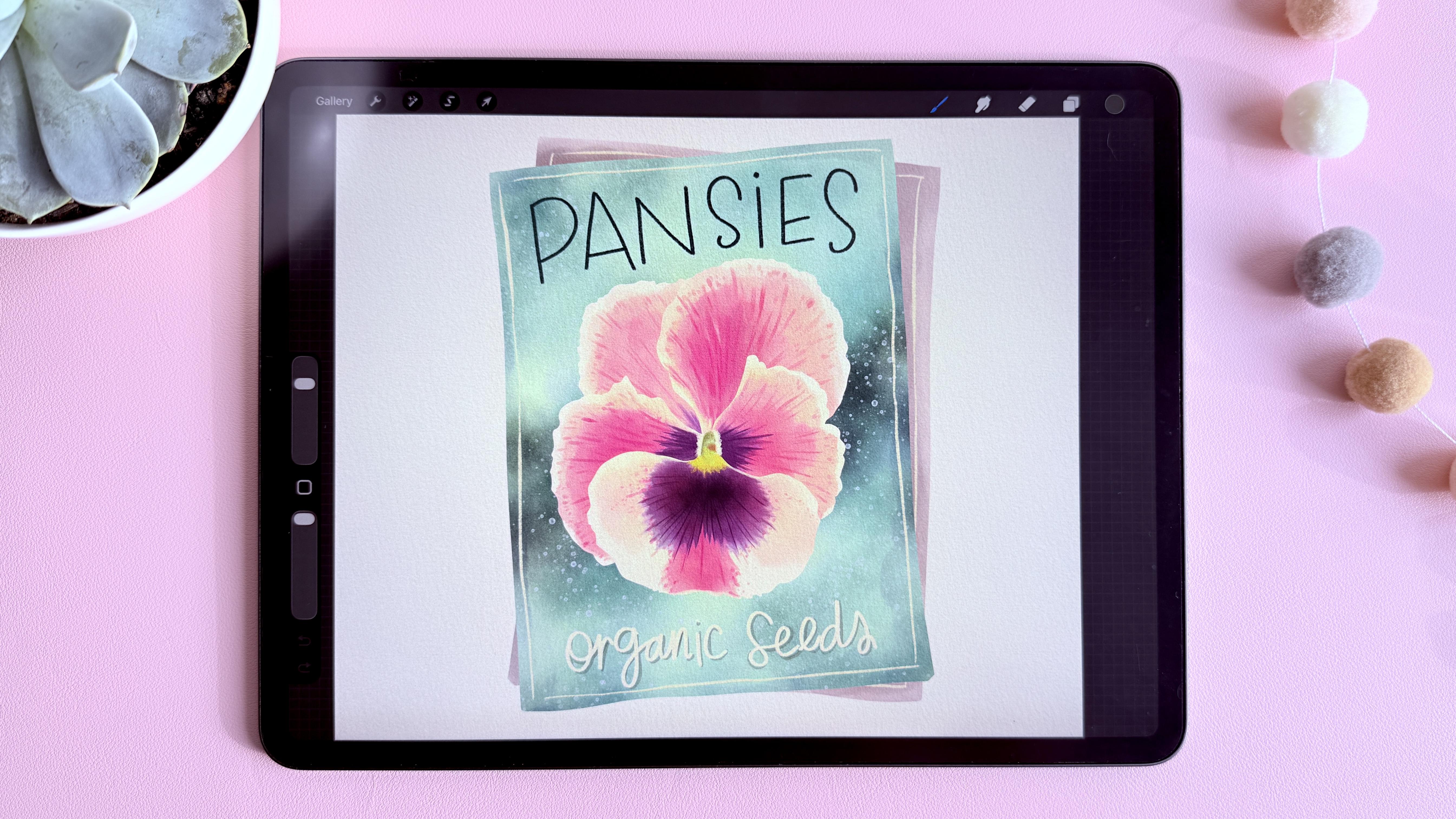
skills, this class is for you. We'll be painting this
cute fancy set packet together using my Easy
Procreate watercolor technique, and to make things as fun
and stress free as possible, I've included the brushes, color palettes, reference image, and even the file with the base layers
already made for you. So you can skip the drawing
and sketching stage and jump straight into painting. As we work through the project, I'll also share some tips
and tricks that you can apply to all of your future Procreate
watercolor projects. We're not aiming for
perfection here. The goal is simply to
enjoy the process, practice your digital
watercolor skills, and create something
beautiful along the way. So grab your iPad,
open Procreate, and let's get started.
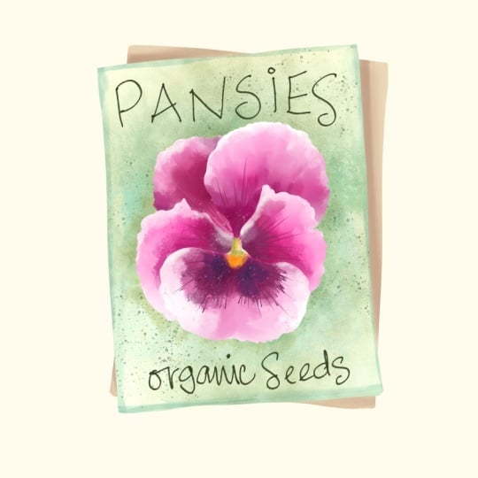
2. Class Project: For your class project, you can either follow along and paint the same seat
packet that I'm painting or use the techniques from this class to
create your own version. You'll find that the
Procreate base file, the reference image, and the watercolor brushes and color palette in the
class resources section. I've also included an extra
resources PDF with lots of additional free goodies that you can use in your
future projects. Once you finish your painting, make sure to upload it
to the project gallery. I absolutely love
seeing what you create, and it's always inspiring for other students to see different interpretations of the project. And if you enjoy the class, I'd really appreciate it
if you left a review. Reviews help other
students discover the class and help me continue creating new classes for you. I can't wait to see
what you create, so let's go to the next
lesson and start painting.
3. Part 1 super fina hbl: In this lesson, we will start
painting our set package. So the first thing to do is to download the files if
you want to work on my files and you
don't want to draw anything or if you want
to create your own, I am using a 12 by 12 canvas and you can start
painting your own thing. So if you're working
with my file right now, you see that it's
all the same color. I have this one here in different colors just
so you can see what the different layers
are if you want to learn how I create the layers
and the logic behind this, you can watch my EZ
Procreate watercolors class. I'll leave a link to
it in the description, and it explains the
logic behind this. Basically, very fast. It's that we have
layers that are not touching each other so
that I can paint on them. So for example, this petal, I can paint on this petal
without getting into this one. So I'm going to convert
all these to a base color, and I'll be back in a sec. So now our files are
exactly the same. This is what you see in yours. What I'm going to do
first is in the sketch, I'm going to make it later, just so it's a guide there, but it doesn't interfere
with my painting, and I'm going to grab
my color palette, which I'm using the soft
botanical spice Androma which is included in the class. If yours is not set as active, if it doesn't have this
blue checkmark here, you can tap on the
tree dots here. I'm going to do it on
this one so you can see it and you set as active. And that way, when
you drag this out, that's a palette
you're going to see. I like to keep it there
so it's easier to color. And I'm going to be using my
Sandra's watercolor brushes. They're also included
in the class, so go ahead and download them. I'll leave a video at the end of the class explaining
how to install these, the color palette,
and the brushes. But you can use any
watercolor brushes you like. For all the base layers, I'm going to choose the
ultimate field rough, and I'm going to start painting from the back to the front. So that means I'm going
to start in this layer. And I want the background of the pansies to be very light. So I'm just maybe going
to create a bit of shadow here and see my
brush is too small. So I'm going to make it
way bigger and just paint. See that I can only
paint on that layer. And this is why it's so great to have the layers separated. I'm just going to add a bit
of color to this back one. So it stands out from
the background and I'm adding darker areas here where it's creating a
shadow from the front one. I leave some areas like this. And see if I press softly, it creates very
soft transitions. But if I press hard, I can create these
more evident effects. So I'm going to press hard in some areas just so it looks
more like real watercolors. Okay, I think that's
enough for the back. So now I'm going to go and
paint this front package. I think I want that one
to be some sort of teal, so let's try it with this color. And see I'm pressing softly in some areas and then
harder in others, just to create some
shadows behind the flower. And I think I'm going to
use this color to make even more shadows and to create that variation in
color because in watercolors, you see that sometimes you touch two different colors in your palette
and then they mix, and I think that looks so nice. So I'm going to try
to do that here. And then maybe we
are darker color, and I'm going to press
very softly and see that I'm even coloring like
putting my pencil outside. The shape because if I'm coloring here and
then it's so thick, but if I color
outside the shape, then it bleeds into it a bit and I'm going to create
the borders like this. Very irregular. For the flower, I have included in the class
a reference image, so you can go here
and go to Canvas, turn on reference, and here
I can go to the images, and I'm going to
import an image. I'm going to choose an image
from my photo gallery, and here I can make it
bigger from this corner, I can make this smaller Great. I'm going to be using
this to paint this. I am going to go to
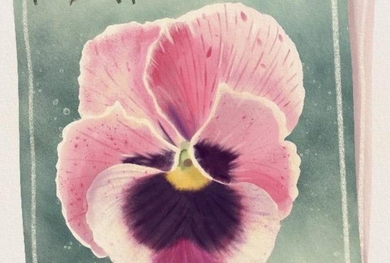
the first petal. The first petal
is this back one. So this is pinks and purples. I'm going to be using these
pinks and purples here. I'm going to start not
with the lightest pink, but with this one and press softly here at the edges because you see that
the edges are very white. I'm trying to leave the
edges like a whiter color. If you want this to be
very white, right now, mine is a cream color because I love my watercolor
solute vintage. But if you wanted that
to be very white, what you can do is
before you start painting, you select white. I don't have it
here in my palette, so I'm going to go
here and select white. Then you go to
each layer and you tap it and you press fill layer. C, I'm going to start painting with the pink on this and you'll see how
different that looks. Let me show you. Done on this one, which
has like a cream layer. So see what you like best. Right now, I'm thinking I want
this to be a bit lighter, not as white, but not as yellow. So what I'm going to do is I'm going to choose
this light color, and I'm going to go into each petal and tap it and fill layer. And see, that's not as white,
but it's not as yellow. So I'm just going to do
that. On each layer. And now I can go
back to pedal one and start painting with my pink. If I press very softly, it creates this very,
very soft painting. But if I press hard, here, I can create these
very jagged edges, and here I start
pressing softer, and then it creates
these beautiful effects. And if I go back in again
and press even harder, I can start layering
the colors in. I want to create a
darker pink here, but leave a lot of the
edges like lighter. And see that this petal
is lighter than this one. I'm going to leave it
like that for now, and we're going to add
the details at the end. I'm not trying to create
something hyperrealistic here. Personally, I don't enjoy that. So if you are creating something
super hyper realistic, mean a lot and go very slowly
and create all the details. But here, we're creating
something very artistic. So I'm going to
go to this petal. And again, I'm going
to do the same thing. I'm going to try to leave the
white here in the borders. But if let's say I painted over it here and I wanted more white, I
can add that later. So don't worry too
much about it. Just have fun. This is so relaxing once the shapes
are already made. It's just having fun and coloring it in and if
you make a mistake, you can just select the
white again and fill the layer with white
and you start again. Okay, so here I want to make this a bit darker so I'm
going to choose this color. And press harder here. You can also go to
your brushes and grab this ultimate fill
rough linear burn, and this will intensify
the color even more. If it gets too splochy
and you don't like that, you can go and grab the
water blend brush and just kind of tap in the areas that you think
you want to blend in. Don't go like that because then you lose all the
watercolor effect. Just tap in some areas. Okay, great. Now we're going to
go to these petals, and I'm going to use the
ultimate filled rough brush again and paint them. So again, I'm trying to
leave some white borders. This petal is very dark. So I'm pressing hard
and then soft to blend that in harder in some areas and then soft so that I don't get
those edges everywhere. I have to press hard and then
soft and then I blend that I'm making this petal very dark, and I don't like this here, so I'm just going to
add some more color. And then use the water
bland brush and kind of, like, blend that in a bit. And it's all a matter of taste. Like, whatever you
think looks good. Okay. And you see here that
there was, like, white, and then there's a purple and
I didn't leave that there. We're going to add that later. I'm just creating the
base colors here first. And this one has
very little pink. So see, like here, it has a bit. And then here, It's
very, very pink. So so I'm just going
to build on it. And then here it has, like, a very, very little pink. But it's mostly like white. Okay. So now we're going to
start adding the details. I'm going to choose this
purple and it's very light. So it's definitely not going to be the purple I
want it to look like. Like, at the end, I
wanted to be darker. But I'm going to start
building on it like this. And then I can go to
the ultimate fill rough linear burn and add more. And it's still not as
dark as I want it. I'm going to go here and make this purple darker
by dragging this here and I'm going to make
this a bit smaller and I like that much better. I'm pressing harder
in some areas. And now I'm going to go here
to the adjustments and grab liquefy and it's going to tell me that I have an
alpha lock layer selected. I'm going to open the layers. Alpha lock is when you see
that checkerboard in the back, and it's what's
allowing us to paint just on the petal
and not go outside. So if I swipe to the
right with two fingers, I have turned it off, and now I can go
here again and turn liquefy on and then let
me move this up a bit. I'm going to keep this
at 9% and the pressure. I want to increase
to the maximum, and I'm going to start
pulling some edges here. See? So you have to be patient because it
doesn't drag that much. But it's going to help
me create these veins. You can even push back in if
you don't like something. Push back in in between them. Here, I'm going to
make it very small here too. And there in here. See, I'm doing it
back and forth. And then I kind of want to do this with the pink one a bit. Okay. And I can press here
again and exit the liquefy. And then I'm going to
go with the bloom, and I still have my
purple selected. And I have it like 20%, and I'm going to
choose this purple, and I'm going to tap and intensify that purple,
especially there, and I can go with some pink
and a bit bigger and tap one if I want to make it
like redder in some areas. And then I'm going to grab my ultimate fill rough again and grab that color from
the middle by pressing it, make this much smaller and then intensify some
of these lines. And see I'm just adding
a tiny bit more detail. Then I can make it a tiny bit
bigger and grab the pink. That way, I can add
this center line here and some of these lines. Then here, I'm going to make it a bit bigger and
then add some dots. It's not dots, but I want to give it a
bit of texture there. And see that I'm going
to the purple sometimes. And I'm just having
some fun here with it. See, I went outside the
petal and I don't want that, so I'm going to undo that. And I'm going to make
sure that I go to that petal and I swipe to
the right with two fingers. So I turn the Alpha lock again, and then I can't go
outside the petal. You just have to turn it on when you're using
the liquefy tool. But otherwise, I like to
keep it on so that I don't paint outside of. Okay. I like that, and I'm going
to add the yellow here, so I'm going to go
back to my palette and grab this and
just paint with the yellow see that I'm going inside
the purple a bit, just so I can keep creating
that same effect here. It has a little bit
of green there too, but let's add it here a bit. Then we're going to create
the center at the end. Don't worry too much about it. Now see there's white there, so I'm going to go
in with the white and just add some white. Here I'll add some
white to the border also and down here. So because the white
is very transparent, I have to go over
it a lot. Okay. Now I'm going to start adding some details to
the other petals, so I'm going to go
back to this one. Again, I'm going to choose a purple and make
it a bit bigger and add it here and here. And, and then go in
and make it darker. And I'm going to turn
off Alpha lock and do the same thing with
the liquefied tool and pull some areas. Then go back to
the layers. Great. Turn on Alpha lock again and choosing the
ultimate fill rough. I'm going to make it smaller and add some details like
I did here also. Remember, you can rotate your canvas to make it
easier for you to draw. I don't like rotating it
a lot when I'm teaching classes because it
makes you dizzy, but it's a great tool to use. Okay, so now I want to add
some lines to the pink also, so I'm going to go back
and grab that pink. And then I'm going to go here
and make it a bit darker and add some of these
kind of veins just a bit. And I'm pressing really softly. I'm going to make
this a bit bigger, just so that the petals have some sort of texture and
they're not that flat. See I'm pressing
softly and I'm making short little lines almost
dots just to create texture. This is according to your style, how much detail and what type of detail
you're going to add. I love adding lots
and lots of details. So try different things
and see what you like best and do whatever makes it fun for you because
this is supposed to be fun. If you're suffering through this and this is not the
technique for you. If you're having
fun, then great. There's a difference
between, yes, you're learning and
it's going to be harder for you and I paint almost all my illustrations in the same type of
technique and style. But if you haven't done it
and you're just learning, then obviously it's going
to be a bit harder for you, but you should be enjoying it. Yes, it can be a
bit challenging, but you're supposed
to be having fun. I'm going to choose
the white now and make this part and see
how that white is so transparent that I'm
going to have to go in several times just
to make this whiter. I'm lifting my pencil
and putting it back in just to make
this way darker. If I turn the alpha
lock off again, I can use liquefy again
and pull that out. If it's making strokes
that are too big, you can make this even smaller. Then create even
smaller details. I just want to do
this a tiny bit, just so it's not
super smooth. Great. Don't worry too much
about that center because we're going to paint
it in afterwards. And what I'm going to do
now is go again and turn on the alpha lock just so I'm
painting inside my shape, and I'm going to paint these
white borders a bit better. And now I'm going to
go to the other petal, paint this white here
and with the pink, add some of those details
and dark in some areas. Add some of those shapes. See that I'm going from
the white to the pink and it creates these
whiter areas here. I think that's so pretty. So try moving the colors around. See that these things are
not there in the flower, but I'm just making them up because I think
they look pretty. Here I can even go and grab
a tiny bit of a darker pink and make it smaller and
not some darker areas. Great. Now we go
to the next one. I'm going to go
back to this pink, and I'm not going to add too many because see that's the lightest of the petals. So I'm going to keep
this one lighter, not add too many littles, just a tiny little bit. And see it has a bit
of purple there, so I'm just going to maybe add
a tiny bit of purple here. And I think we're pretty
much done with the flower. I just want to fix
this center part here. So I'm going to go to the front petal and create a new layer. And there see that
there's, like, that green. I'm going to choose that green
and kind of draw that in. And then there's kind
of it's kind of round, but I'm going to make
it pink because I don't want to introduce
other colors here. I'm going to make it
pink, and then I'm going to add this kind
of orange on top. And then add a tiny bit of darker green here to
breathe like this shadow. Um, and then I lost some of
the white of the petals, so I'm going to just
bring it back in. I kind of losing the thing I did with the liquefitol there. And that is super
bright and very big. So I'm going to just choose this green here and
kind of go over it. So it's a darker color. And here, I'm going to use this lighter green to
cover it a bit more. H and then I'll choose this creamish
color and just go over everything just to
make it a little bit lighter. That way, it doesn't
stand out as much and then go back in
here with the yellow. Yeah, I think that
looks so much better. I like the flower like that. In the next lesson, we will
finalize the illustration.
4. Painting - Part 2: In this lesson, we will finish
painting our seed package. I'm going to go
back to my package, and I am going to
grab this bloom. And what this sauce is, I'm going to show you here,
see, it creates, like, some granulated watercolors,
and if you make it darker, it becomes like that, like darker and granulated. So I'm going to choose
this color and see if it works and make
some areas darker. I'm just tapping I don't know if this is
too bright of a green. I really don't like
bright greens, but I think it's
working with the pink. So just stopping in some areas, especially here to make
the flour come out, and I can mix in other
colors like this green, for example, and then like mute some of
that bright green. That's too dark. If you
don't want it to be so dark, you can also reduce
the transparency and see now it's not
going to be so dark. I'm going to do
some of this blue. And definitely, I'm making this package way darker
than I expected. But I think it's looking
really nice with the flower. Okay. I think that
is dark enough. So now I'm going to go here and grab my
there's two things. There's texture. I want
to show you in black. See, that you can add
some texture like that, or you can go to splatter, and that creates more
perfect little dots and you can make it bigger. So see. I'm going to add some of that splatter in this
color and see how it looks. Yeah. I like it. And I'm going to do the writing. And for the writing, I love in sketching in
the classic library, I love the six B pencil. And I think for the lettering, I'm going to create a new layer. And the reason I'm creating
a new layer is because so if I write I write pansies, first of all, I can do that. I can move it behind
the flour bit, I can move it up and down. I can change the color like I can swipe to the right
and make it alpha lock and then choose a
different color and tap on it and fill layer. So it allows me to play
around with it a lot. I'm going to delete
it, create a new one, and with this dark green, I am going to make my brush
bigger and just write it. Let's say these two letters
I think are too big, so I'm going to select them and reduce the size a tiny bit. Great. And then down here, I think I'm going to
choose this white color and write organic seeds. And again, if I
just want to move this because if I
move the whole layer, like it moves the top two, but if I just want to
move this to center it, I select it and move it around right now that I'm doing this, I'm
going to close this. I really don't like that
grain from the background. So what I can do is
grab this layer and go here to adjustments and go to hue saturation
and brightness. I can change the hue here. Oh, that's so much better, and I can change the saturation. And the brightness. I'm not going to touch the brightness, but I am going to make
it less saturated and I don't like the color
of the back package anymore. So I'm going to do the
same thing and make it less saturated and make it a color that I
think goes well with this, which could be that
purple or Yeah, I kind of like that kind of
mob and make it a bit darker. Yeah. So I'm going to
turn off my sketch, and I think here
in my text layer, I want to try to add, like, a bit of a border. Yeah, that looks better. So I'm going to do
the same thing to the package and just
add a border like this. Then finally, if my flower
is looking a bit flat, I can go to the top of my
stack and add a new layer. And what I'm going to do
there is in my watercolors, I can grab the bloom and
let's choose this pink. I'm going to make
it full opacity and I'm going to
make it very big. No, I think I'm going
to choose this yellow. I'm going to make
it bigger and top on the middle and you see
that it covered everything. Let me zoom in so
you can see it. And then if I go here and I
can change the blending mode, until I find an
effect that I like. Like, see if you wanted
to make it lighter, that would work. See this one. But I kind of really liked
this darker color one. See, without it, with it. It's not much, but it kind
of gives it that yellow, like, kind of light
and kills that white. And you can tap here and
reduce the intensity. So there nothing. And then like halfway there, and then like super yellow. I think I'm going
to leave it there. And I don't like this very
much, the organic seeds. They're not showing up so much. So what I can do is
under the text layer, and I can create another layer. And what I can do there
is I'm going to grab my ultimate field
rough brush and choose this darker green
color and just add some shadows to this just
so you can see it more. And I just realized there's
another thing I don't like. It's very white
compared to all these. So if I just go to that layer with the text
and I create an Alpha lock, I can choose this color
that's a bit more yellow, make my brush very big, and then color in the text. And same with the pansies, I think that color
doesn't go well, so I'm just going to
choose this color. And by choosing a color
that's already there, it makes it all come together. Because this is a darker color and I have a watercolor brush, this is just going to add color on top of it and I
don't want that. You can use a brush like
the Shape Builder solid, which will put in solid color
and just paint over it. And there's not a
huge difference. I don't know if you
can see it in camera, but this is a color that's going to look
a bit better than the one we had because that color is not present
anywhere else in the design. And that's it. See the paper texture under. If you want to make
that even darker, you can go here and go to the texture layer and swipe
to the left and duplicate it. And you'll see that
now it has much, much more of a paper texture. But I think that's too much.
So I'm going to go here and swipe to the
left and unlock it. And if I tap on the linear burn, I can reduce the opacity. So I can see it there, but not as much. I think we're done. In the next lesson,
we'll wrap things up.
5. Wrapping Things Up: Oh, welcome to the last
lesson. Well done. You now know how to paint
with watercolor brushes in Procreate and you've completed your own fancy set
packet painting. I hope you enjoyed the
process and picked up some useful techniques
that you can use in future
watercolor projects. Don't forget to upload your artwork to the project gallery. I always love seeing
your projects. If you'd like to keep
learning with me, make sure to follow
my skills or profile, join my newsletter and come
say hello on Instagram. And if you enjoy the class, please take a moment
to leave a review. It makes a huge difference and helps other students
find the class. Thanks so much for taking
this class with me, and I'll see you
in the next one. Bye.
 Sandra Mejia, Illustrator + Pattern Designer