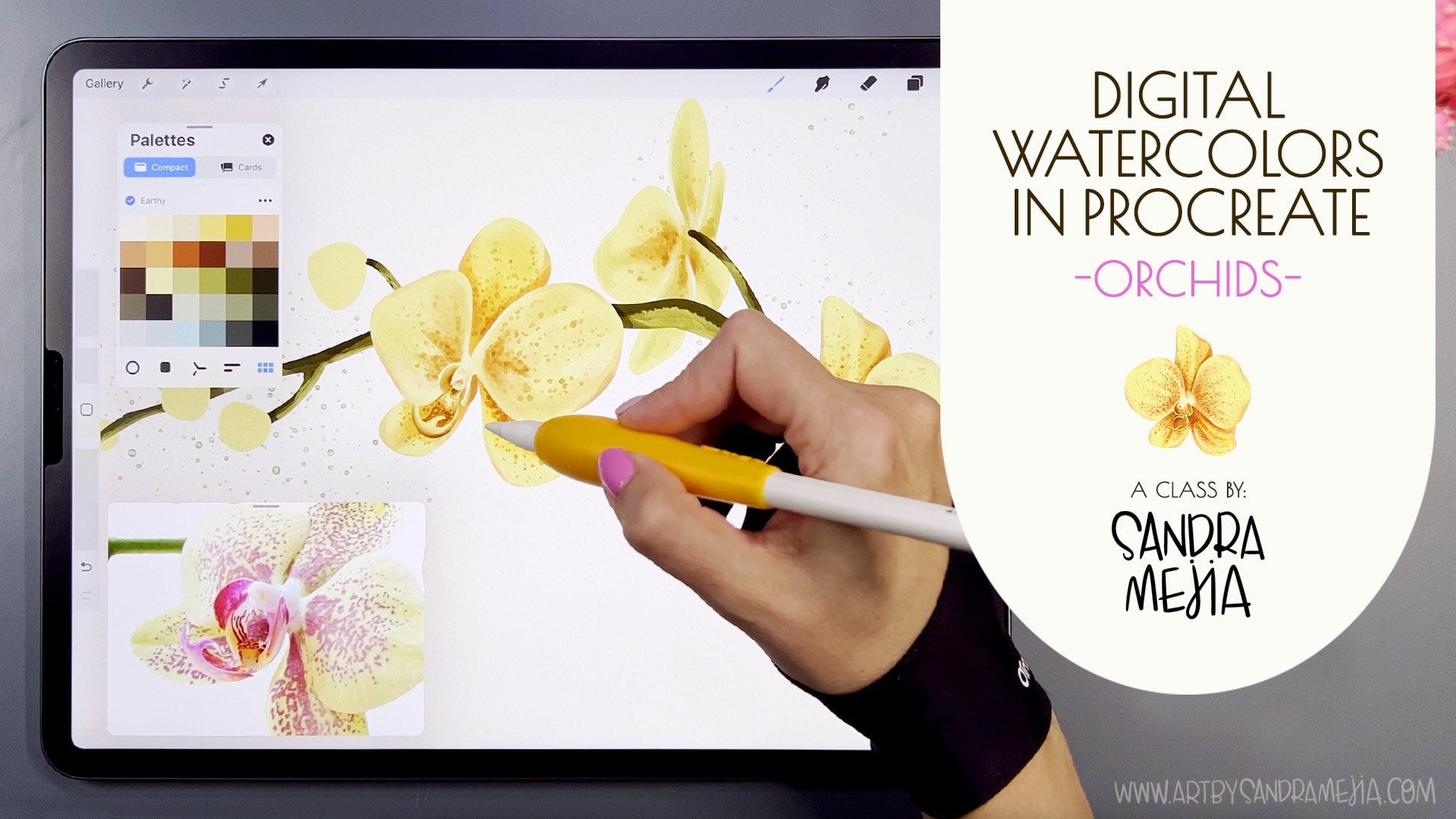
Transcripts
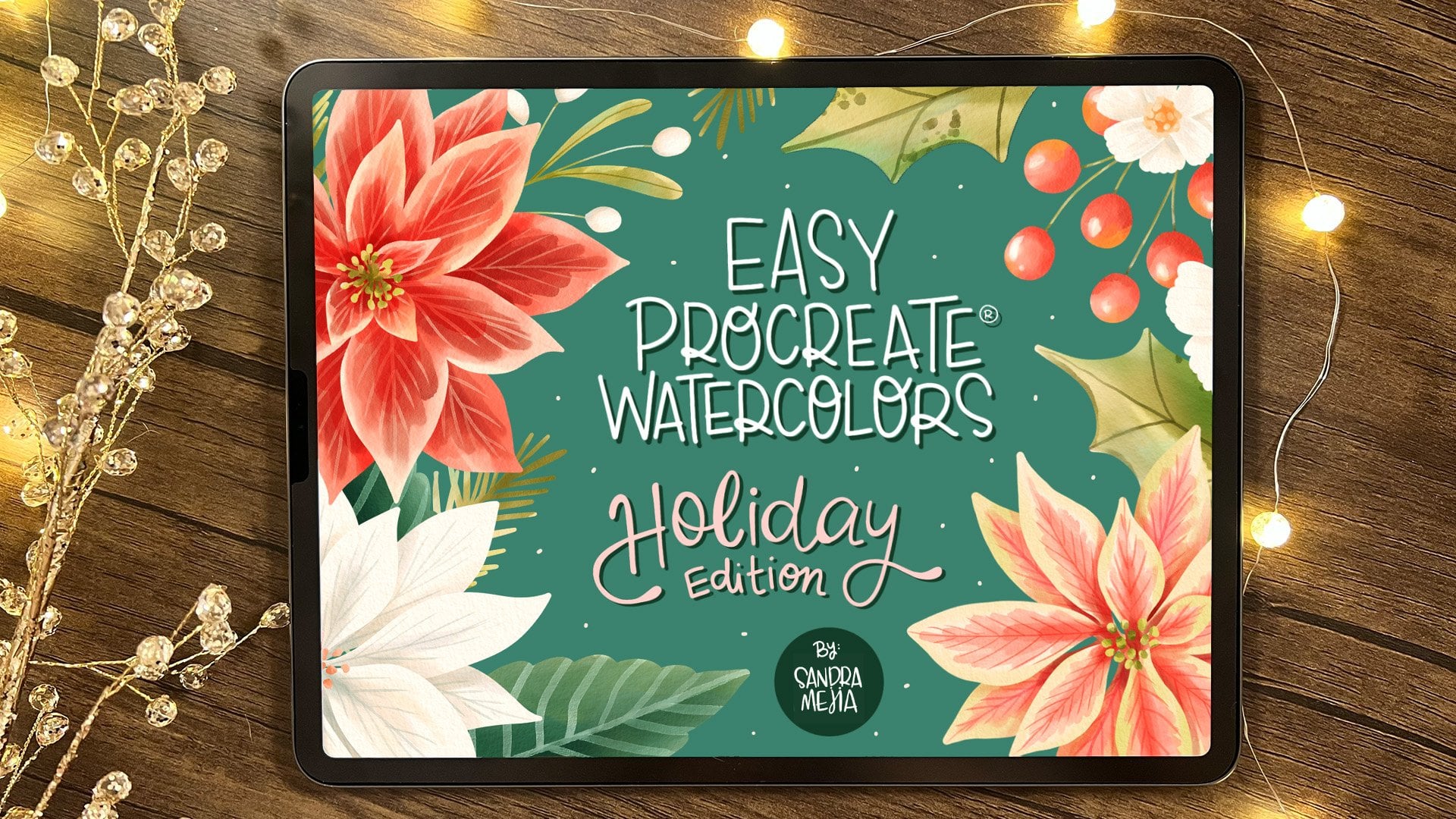
1. Class Trailer: Easy Watercolors in Procreate: Hey, today I'm here
to tell you a secret, how I have traded this for this, mostly. In this class, I'm going
to teach you how to create gorgeous botanical
illustrations using procreate on your iPad. I'm Sandra Mejia and I'm a freelance illustrator
and pattern designer, and I license my art for different companies to
put on their products. A lot of my art is created using traditional
watercolors and although traditional
watercolor past will always have a special
place in my heart, using digital watercolors in
procreate is so much easier. Especially if you're
working commercially, because if a client comes back and they want
to change something, it's so much easier when
it's done digitally. I don't have to carry a
lot of paints in my bag. I can just pack my iPad and
then I can paint anywhere, and the best best part is I
don't have to spend hours in photoshop cleaning up the paper texture out
of my watercolors. Let me show you exactly
what I do to create these watercolor elements
to create this composition. For this class, we're
going to be using a limited set of brushes because that's my preferred
way of doing this, not being confused
with a ton of brushes, just focusing on
creating some art. So those are included
with the class and also the color palette. And I'll show you all the
basic techniques that I use to create my
watercolor style. We'll get comfortable
with the brushes, we'll create some greenery, very loose greenery, and then we'll start creating
our floral elements. So we're going to
go through a path of painting simple flowers and going up in complexity until you feel really comfortable
painting anything. I'll even show you how I create some little friends for my
compositions and how to export each element
individually without a paper texture so you
can use this in stickers, clip part, or anything you want. Finally, we will bring
all those elements into a file and build a
beautiful composition. As a bonus, I'll
also show you how I create a decorated letter. You can use this to sell
clip art or to create your own stickers or to create personalized wedding
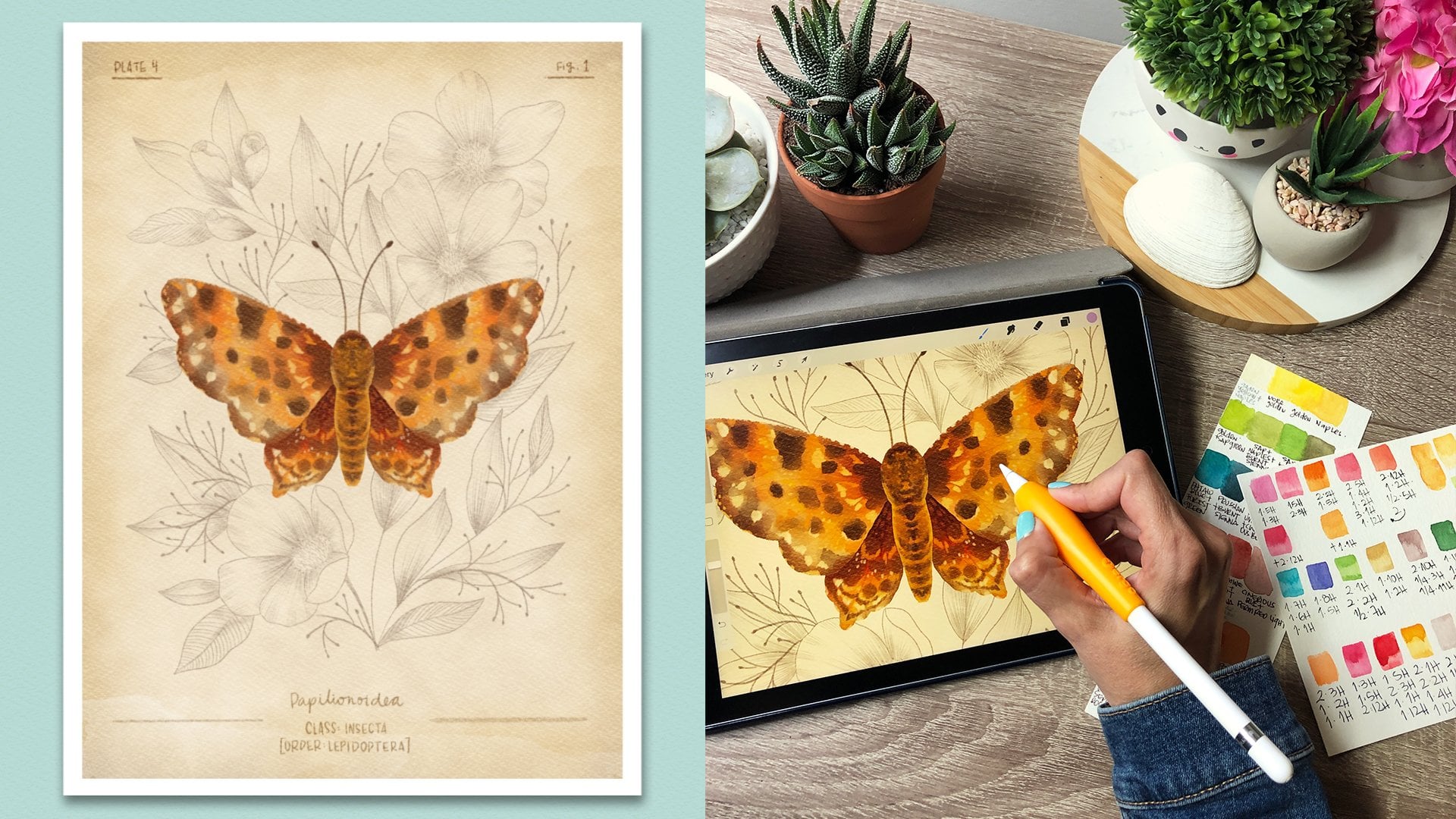
invitations, for example. I'll also give you my
reference images and sketches and my base
procreate files. This why if you're super
eager to start painting, you can just use my files and start practicing your
watercoloring techniques. Join me, and let's start
painting digital watercolors.
2. Class Project and Resources: For the class project, you're going to create
your favorite flowers and arrange them in a
composition or monogram. Or you can also follow
along with my flowers on the files I have provided
and just practice on them. Remember to download
the resources. This class includes
appropriate files, so they're ready
for you to go and just start adding paint to them. It has the JP sketches. If you rather work with that. It has the color palette, I'm using it for the class and the brush sets that
I'm using for the class. If you want to get the
complete watercolor brush set, you can sign up to my
newsletter and get it for free. This is not required
for the class. It's totally optional. I provide all the brushes that I use in the class in
the class resources, so download those too. I'm also providing some
reference images that I took. So if you want to use
that, that's good too. Remember to share your projects
in the project gallery, I would love to see
what you create. Okay. So make sure you download everything and in
the next lesson, I'm going to show
you how to install the brushes and the
color palettes.
3. Installing Brushes and Color Palette: Okay. So after you have downloaded all the files that are available
with the class, I have mine in iCloud Drive, but you could also have
them on your iPad or Dropbox or whatever you
chose to download them. You'll find them here. So When I double tap on it or I open it, it will import
directly to procreate. When you go into a file and
you go to your brushes, you might find them
here at the top. This time it imported here, but sometimes it's at the
bottom of your stock. So make sure you check there if you don't find it
at the top here. Also, if you import just one
brush and not a whole set, it will usually import here to this folder called imported. That is how you
install the brushes. Included with this class is the mini watercolor brush set, which has these four brushes and the SM watercolor stamps, which has the stamp brushes. Now I know how to
install brushes, and I'm going to show you how to install the color palettes. For example, here,
I have my swatches, and if I double tap on them, they will import to procreate
also automatically. When you go here, they will be either the first palette up here or they'll be
the last one here. Usually they're the last one. If you want to work
with this palette, you just stop here
and set as default, so that when you drag your
palette out like this, that's the palette
that you will see. If you haven't worked with
a color picker before, in procreate, you have different
options to pick colors. Here you can just choose whatever color and here you'll
see what you're choosing. And here you slide it to change this This is a similar way, but the slider is here and
then you move it around here. This one has different types
of color theory things. Complementary, it shows you the complementary colors and
you just drag them around, and then the one you touch is the one that's
going to be chosen. You can do split complementary,
analogous antratic. I never use this, but if you like color theory,
you might like it. Then there's here,
which is super useful if you know the
hex code, for example, if a client gives you the
hex code, or if for example, you're doing something for
spoon flower and you need a specific hex code,
then you input it here. But if the palette is out here, it has some limitations
to what you can do. What you have to do if
you want to input that hex code is closed here. And then when you open it
here, don't drag it out, and that way, you'll be able
to type in the hex code. Enter and see, that's your new color here.
Same with the palette. When it's docked here
and not outside, you can create new
color palette, and it will be up here, your new color palette. What you can do is go to the
classic mode, for example, and start choosing
colors and just stop here to add them
to your palette. If you want to delete that, just leave it press
and delete this watch, or it replaces it for
the current color. You see here that
there's two colors. You can also set these colors like this one is
setting this color, but if I touch here, I
can change this color, and this is called
the secondary color. What that does is that
if you're painting, for example, I'm painting
something green, let's choose this brush. If I'm painting something
with this green, and I want to go back to
that secondary color, I can just press here
and it will change to that previous color.
Just leave it pressed. Leave it pressed. This is great if you're alternating between two colors constantly. It'll save a lot of time. Now that you have
your color palette, I'm going to go back to my botanical soft and set it as default because
that's the one that I'm going to be
using for the class. I'm going to drag it out here. It's easier to choose
colors this way than to go in here and choose
a color and then go out. I prefer to have it always here. Now you know how to
install your brushes and your watercolor palettes and
how to use the palettes. Let's go to the next
lesson and start with the watercolor basics. Oh.
4. Digital Watercolors Basics: In this lesson,
you're going to get comfortable with the
brushes and I'll teach you how to add a paper texture and all the little basics
so that you can feel comfortable working
with these new tools, and then we can start
creating some florals. In the gallery, let's go
and create a new document. You press here, and here
I have some preset sizes. So I have created. So come already with procreate, and you can organize this, you can delete presets by swiping to the left
or you can edit them, or if you don't have the size here for what
you want to create, you just press here and you will create a new preset
for your canvasses. You can call this one like
vertical or whatever you want. Here you establish the size. Let's say we want an 11 by 15 ", I always work at 300 DPI, so I can print my work later
and it's a good resolution. Here we'll tell you
how many layers you have available to
work on Procreate. This will change depending
on your iPads capacity. Here in the color profile, I always work with this
RGB color profile because the CMYK colors in Procreate
are always more muted. If a client ever wants my work transferred
from RGB to CMYK, I do that in photoshop, but usually clients take RGB files and there's
no problem with it. Also some print on demand sites require RGB files,
this is great. Just make sure that
if you're using very neon pinks and
yellows and greens, when you're going to
transfer that to CMYK, it's going to be a bit more
muted, have that in mind. I don't touch anything else
here and I click Create. Now I have created a new
document, and the next time, if I go to the gallery and I want to create a new document, that preset will be saved here. Here, if you tap on the name, you can rename it.
Let's say basics. Now you can go into that
document and we're going to start with the
watercolor paper texture. There's several
ways of doing this. You can import a picture
of a watercolor paper, or you can add different layers for
the watercolor paper and make it more complex. Sometimes if you've bought
watercolor brush sets, they come with canvases and sometimes they have
five, six layers, and they look amazing, they do give different
types of depth. To the illustrations,
but I like to keep it very simple and
just work with one layer. I add that by using watercolor
paper texture brush. The cool part about
using a brush to the texture is that once
you have that brush, you can duplicate it And then when you go
into the Brush studio, if you go here to grain, you'll see that
this is the texture that it adds to the paper. If you go to edit Import, there's a source
library by Procreate, and it has a bunch of textures here that you
can use as papers. So there's this paper
macros really good, sketch paper, There's also
this one munch and recycle. Just experiment by using
these types of paper two and tap twice so that this gets
inverted and then pressed on. Here you have it. This creates a totally different texture that you can use
in your paintings. Just press done,
and now you have a different type of paper
texture to add to your art. So here, in the mini
water color set, this is the first brush
add paper texture, and it says set layer
to linear burn. Remember to always do that. With that brush, I'm going
to go to the color picker, and I always use a gray
that's around here, and I am going to make
my canvas very small because I want to paint it all
without lifting my pencil. So you cannot see
what's happening here. It's very light, but I'm
covering my whole canvas. There's some watercolor
texture now, but I wanted to be
a bit more obvious. What I'm going to do is
duplicate that layer. See that we can see the watercolor paper
texture much more. Now I'm going to pinch
those two layers to merge them together. I'm going to set
it to linear burn. This is a blending mode
and it changes the way this layer is going to interact
with the bottom layers. With linear burn, it's going
to make it transparent and the grain is going to ingrain itself in the layers
I paint underneath. If you've never
worked with procreate before and you don't
understand what layers are. It's like sheets
of tracing paper. Every layer you create, it's as if you're layering
sheets of tracing paper. This is really good because if you want to change
something underneath, you don't have to affect
every other layer. You can just take
that piece of paper out and fix it or erase it or whatever and
then put it back in and the other layers
are left intact. So you're going to see how this works as we progress
in the class, but that's kind of
a basic explanation of what a layer is. So you see that I press plus
here to create a new layer. I'm going to drag this
layer underneath, and this is where
we're going to draw. This layer, I don't
touch anymore. If you choose a gray
that's too dark and you see that your paper
looks muddy or too grayish, I have to sum in a lot here for you guys to
see it on camera. Make sure you're standing
on the paper layer and go here to adjustments, use
saturation brightness, and here in the brightness, just drag it a bit to the right so you can
still see the texture, but it's a lot brighter. So I think mine is good there. It's at 54% and I'm just going to touch
here to release it, and that is my paper texture. If you want to make
sure that you're not painting on it by mistake, just go to your layers, swipe to the left,
and lock that layer. That way you won't be able
to paint on it by mistake. Let's go to this layer
and start painting. Now we're going to
choose our colors. If you install your color
palette, it's down here. If you haven't set
it as default, do so now so that
when you drag it out, this is the one we see you can totally work with a
different color palette. This is just what I'm going
to be working on today. Let's go to a brushes, and I don't like working with a ton of brushes at the
same time because then I'm more worried about choosing the perfect brush and
not about just painting. I want this to be fun.
It's the same approach I use with my watercolor
illustrations. I basically just paint with two brushes like a very
thin one and a bigger one because I can't be bothered to start
changing 1,000 brushes. So this is a very simple way to approach watercolor
painting in procreate. I feel that once you have this down and you have
the technique down, you can start experimenting with other brushes and start
adding to the mix. But for beginners,
and even for me, I still do this, I
like a very basic set. So this is why this set only
includes these brushes. And these two do
basically the same thing. Just one has rough edges and the other one
has smooth edges. So I'm going to show
you. Let's choose this purple, for example. Here I'm pressing very softly
and here I'm pressing hard. Then I can go and press softly again and blur those edges. I'm pressing really
hard, really soft. It changes the size and the amount of paint that you're
laying down on the paper. This one is the ultimate feel rough and that's why it
has those rough edges. Now the ultimate feel smooth, I'm going to make it bigger. It's the same. Here
I'm pressing normal. Here I'm pressing harder and here I'm pressing
really soft. Okay. This one you see has
smoother edges than this one. That's basically the
only difference. I'm going to show you what
happens if I turn off the watercolor layer because some people don't like
working with overlay layers. I have some texture
ingrained in the brushes. I created these brushes a long time ago and I still love them and I still use them for my commercial projects
because of this. If I don't want to have
this overlay layer, this will still have
some watercolor texture. This is your choice if you want to use the overlay layer or not. So let's add another color
here to see how they mix. I'm going to add this
pink, for example. Sometimes you tap your color and it doesn't actually change. So sometimes you have to tap
it again for it to change. So let's add some pink. I'm pressing softly here. You'll see that these are
very transparent brushes and it starts
overlaying the colors. If you add another layer, it starts making that
color even darker. Let's go back to the purple. It starts making
everything darker as if you were painting
with the real water colors. Works exactly the
same for this one. You can overlay and
make areas darker. You can change the size
and make it really, or you can change the size and then use it to add details. So they both can be
used in the same way. And if you press softly, it goes lighter and
then if you press hard, it goes bigger and darker. This is why I love these brushes because you can use
them for details too. You can follow along in this class with any
brush you have, like if you have purchased
another brush, that's great. The technique is going
to be exactly the same. Now let's see what that
other brush is for. So let's say I have
this here and here. Then I added a bit
of pink around here. And then I want a darker
purple in some areas, and I was like adding textures. I can press very, very lightly to kind of
blend that into there, so it's not like very obvious. This one's blended
and this one's not. But sometimes you lift your
pencil and you're like, and then you have those lines. That's what the water
blend brush is for. So I just blends the colors, and you have to touch softly. If you press hard,
it goes very big. That's also an effect
that you might like. It blooms the colors a lot. But if you press softly, it's just going to merge
some colors into the others. It's going to blend it. And I don't like to
blend it too much like this because then you've
lost the watercolor effect. So just blend it enough that the color
is kind of blend and sometimes leave some
hard edges like here because watercolor
does do that. So that will make it look
a bit more realistic. Okay. This is the basics of working with watercolor
brushes and I've made it the most
simple way possible for you to not get overwhelmed
with this technique. Now we're going to start practicing on creating
some foliage. So let's go to the
next lesson. No.
5. Painting Leaves and Greenery: In this lesson, we're going to start creating some greenery. If you haven't imported your files yet your
Procreate files, just go to your files and you'll find them
here, for example, greenery in Procreate, and you can just
double tap on it or click open and it will automatically import
into procreate. Here you see it. I have
created a stack group here, I have everything
organized per project. If you want to do
that, just create a new file and have a square, then you drop in any color. You add a layer, and
then with a brush, probably like sketching
brush, let's say, peppermint. Choose a different color and write the name
of your stack. You can center it, and then just exit and
go to the gallery. Now you can drag this into here, and it will create a stack. Now when you create
new documents, you can put them inside here, and that way, your art
will be very organized. Let's say you already
have a stack created, and you have another
document that you want to put into that stack. If you drag your document into
the stack, it won't work. You have to drag the
stack into the document. It's weird, but
that's how it goes. This way, I keep
everything very organized. Let's go back here and I
already have my greenery here, so I'm going to open it. I have created some basic
shapes to guide you. This is how I usually work. I create a sketch like
fast sketch on one layer, and that way, the sketch
guides me when I'm painting. You can totally follow
along without a sketch or create your own sketches,
that is perfect too. So I'm going to
delete this title, and I'm going to use the
watercolor paper texture here. But I don't want to
create it again. So I'm going to go back
to the gallery and go to the basic file
that we just created, and I'm going to go
to layers and drag this layer out with
my other hand, touch gallery,
touch the document, I want to paste it in, open the layers and drop it in here, you'll see that it pasted with
the normal blending mode. I have to tap on it and
make it linear burn. And because my document
was horizontal, this one pasted vertical, so I'm just going to
touch there and I'm going to tap here and press 90. That way, it's rotated to a 90 degree angle and I'm
just going to drag it out. It doesn't matter if it overlaps
a bit. There I have it. So there's my paper texture. Sometimes I like to keep
my layers very organized. So if I go to the layers
panel and I tap here, I can rename this paper. And I'm going to lock it.
Now I have my sketch here. But if you were starting on your own to create
some sketches, what I would do is
add a new layer. I'm going to drag it underneath. I love sketching with
the procreate brushes. I love this peppermint
or the six B pencil. The narner pencil is great too. Let's sketch with the
six pencil, for example. Let's drag our palette out
and choose this color. You would just create your
sketch of your leaves. I'm doing this very loosely. You can take your time, and then you would have
a sketch layer. I'm going to delete this because I already
have a sketch layer. If you're working
with these sketches or with your own sketches, let's go here and
adjust the opacity. I want to make this very transparent so I
can barely see it. I usually work with it
light, maybe like this. But it's a bit easier for
you to see on camera. I'm going to turn
the opacity up a bit more. I think that's enough. I'm going to create a new layer and I'm going to drag that
underneath the sketch, just leave it pressed
and drag it underneath, and I'm going to
call that paint. Usually, I like working with
a lot of layers in my work. But for these very basic shapes, we're going to work in
only one or two layers. Let's grab the brushes. I love the ultimate feel rough. I love those rough edges, so I'm going to use that one. If you like more smooth
edges, then choose this one. So here, I am going to create very simple shapes at
just the brush size. And don't lift your pencil until you're done with a shape. Because if you lift it there
and then you go and do this, you'll have that
long line there, and then you're going to have
to go to the water blend, make it smaller and
kind blend that out. And then it's more work for you. For these very simple shapes, I just like doing them
without lifting the pencil. Let's go back to
the ultimate feel rough and I'm going
to delete that leaf. And I'm going to
continue doing this. This is just for you to try your hand at it and start
getting used to the brush. It doesn't have to
be a masterpiece. Just play around with it, start getting used
to the pressure. Press softly and then press. Don't let the sketch
contrive your drawing. I feel like if you're trying to follow the sketch too closely, then your drawing looks
like a bit force. Sometimes I like leaving these small gaps because that
happens in watercolors too, like in traditional watercolors. Let's turn the sketch off so
you can see how this looks. And here, if you want
to blend that out, just go to the water blend, and I'm going to
make it very small. I'm just going to
blend that a bit. Great. You have
your first leave. Let's turn on the sketch
again and keep doing this. I'm going to use the
ultimate feel smooth here for those of you that
like really smooth lines. I don't know why I was
working with that palette, but I'm going to go back to my botanical soft because
that one is too muted. So I'm going to set that one as a default and
drag it out here. And continue working
with this one. So let's choose this
color, for example. This is a big size brush. You can reduce the size if
you want a bit more control. I'm going to make the line here. And if you want to try adding
different colors to it, like darker areas,
you can do so too. Or even different shades
of color in some areas. I'm pressing very softly. You can do that too.
This is how it looks. You can keep
practicing with those. Again, this is just
for you to start feeling comfortable
with the technique. I'm going to color in this one so you can see what I do if, for example, it has
different colors, like the flowers on the leaves. I want to create the leaves in the background and the
colors in the foreground. I'm going to create the
leaves in this layer, and let's choose this green. I'm just going to
create the stems first. And then the little leaves. And now, in another layer, I'm going to create a new layer and I'm going to
call it flowers. And there I'm going
to add the flowers. So let's say we want them yellow Okay, so I'm going to turn off this sketch so we can see
what's happening here. Right now, I don't like
the overlapping areas, so I'm going to use my water blend brush and make it a bit bigger and just
blend them out a bit. See that when you overlap, the color gets darker. So when you add the water,
it also helps to create some splashes of darker areas. If you want to do more of that, you can go here and choose your color and add
a darker color, for example, if I want
a bit of orange here. I can go back to the water blend and kind of tap
it, so it expands. And I can drag it
out more if I want. See, I can drag it out more. Or I can leave it
very concentrated. So you can layer as much
as you want like that. And then if you want
to add another detail, for example, I want a
very bright center. I can do this. There we have our
flowers. I'm going to show you this one
and then you can practice on the other
ones if you want. I'm going to the leaves. Now I'm going to add
the little berries in the other layer. So what you can do is just
choose one color for and add some and then add
a second layer. This is the same color. But I'm adding a second layer on and even a third
layer on others. And this way they
all look different. Or you can just do this and add some red and then
choose a different color. And then this one, maybe. And that way, you have some
variation and some overlap. Or even some you can add a
totally different shade. And then when you turn it off. This is the different types
of effects you can create. Okay. I'm sure now you're super familiar with the
brushes and how they work, and now I'm going to
show you the technique I use for creating more
complex artwork. I would use this in one layer
where I draw directly and painted in one or two layers for very simple
shapes like this one. But if I'm creating
a complex flower or something that
involves more leaves, more layers, and I
want more control, this is the technique
that I use. I'm going to create
another layer and I'm going to call it base. And here I have two options. I can choose a brush
that has texture, for example, the peppermint. See it has some texture. So when I drop some color in, the treshol is very
high right now. So I have not lifted my pencil and I'm dragging it
to the left and you'll see that the treshol
starts reduced and the area that is covered
by the pink is reduced. So once it's contained
inside my shape, I can stop. And then I can go back in with my pencil and try to
fill in this gap. And this is way more
time consuming. But it's kind of the only way
that you can feel in shapes fast and then keep this
kind of more rough outline. Let's do that. But
because I like my watercolors being
cut out perfectly, and I don't care if they
have very smooth lines. I'm going to go to
the calligraphy set that comes with procreate, and I'm going to choose
a monoline brush so that when I create a shape
and I fill it in. I'm done. So this will
make your life easier. Here we're going to
practice something. Let's practice with a leaf
and create any shape of leaf, it doesn't matter
and fill it in. And then let's create
another one here. Maybe it's one of these
leaves that has holes. I just fill it in. I create this in any color that I want because it doesn't
really matter. And then I go to the layers. I swipe right with two fingers and that
turns on the alpha lock. That means When I
paint on this shape, it only paints
inside the shapes. So that's what alpha lock does. What we're going to do is
choose a very light color. I always choose the first one
here and go to the layers, tap on it, and fill layer. I like this color
because I can't see it. It's not super obvious, but I can still see
what I'm doing. That's why I don't fill
it with totally white, and it gives me a base
for my water colors. Now, what I can do is go to my brushes and choose the
brush that you prefer. I'm going to make it bigger and I can start
feeling in the shape. So let's say that
we want the greens. So I like starting with a light green and
maybe filling it in. I'm adding different
pressures from the start, I create some
variations in color. And then I'm just going
to continue adding very randomly areas
that I want darker. You can follow reference image
and do it realistically. I cannot and don't like
painting realistically. So I just add darker and
lighter areas wherever I want. So I'm going with darker greens. And this is why this palette
starts with lighter colors, and then it progresses towards darker colors of that same hue. Okay. I'm just
adding this randomly and I'm trying to leave some areas where it would
be obvious like this. Do the brush stop there. I can also add different tones. Because when I paint
in real watercolors, I like doing that. I like touching my palette and
getting some blue in there and just creating some
variation in the tones, and I think that's what
makes watercolors so pretty. Now that I have that,
I'm going to go with my water bland and blend some areas. I'm going
to make it bigger. Here, I don't like this part. This one. I like
these variations. Again, I'm not super
picky about this. If you're doing very realistic, you may want to go in very carefully and see where you
want to plan the areas. But for me, I think
this looks good. Now I'm going to go
back to this brush and make it very small and I'm
going to add some details. You could add some details in that same layer
we're painting on, or you can use clipping
mask, which is amazing. If you press plus here, you'll get another layer
on top of this leave. If you tap here, you can
choose clipping mask. What this does is very
similar to the alpha lock, where if you paint your only
painting inside the shape, but the difference is that
because it's on its own layer, then you can do
different things to it like you can hide
it or delete it. You can play with the opacity, you can play with
the blending modes, You can change the color, you can make it
bigger or smaller. So it's really handy
to have it separated. I think it gives you
more possibilities. Now let's delete this and
start creating details. Try different ways
of creating details. This will all vary
depending on your style. Just experiment,
make dark details, light details, try different things if you don't know what
your style is yet. Then I love either
changing the opacity here or changing the blending
modes. Look at that. It's so cool because
it just changes colors like a real water color. I love. I don't know. I love light details. So now we're just
going to paint this other one in a looser way. So I'm choosing my brush, and let's choose this color, for example, and make
the brush really big. I'm pressing softly and then
harder here in some areas. Again, I'm going
to do that again. And then you can even add a darker color and
with a smaller brush, just create some shadows. If you want to make it
lighter, just press softly. Maybe make it a bit bigger, so it's easier and press softly. Pressing hard and
then pressing soft. Then you can darken
some areas here. Just variating the pressure. So there you have it.
This is a technique that I use for painting
everything in watercolor. In the next lesson, we're going to start
painting some flowers.
6. Painting a Pansy: In this lesson one,
we're going to paint some floral elements. I'm going to go into
the florals file, and this florals
file already has the paper and all the parts of the flowers painted so
that we're saving time. It will also have
the sketch imported. I just don't have it here yet so that you can
see how I do that. If you go here into actions, you can add insert a photo because I have
this sketch in my photos. And then I drop it in here, and this is another
way to add a sketch. And now I have this
to guide my drawing. So this has a white background, so I don't see
anything in the back. So I'm going to
make the white part transparent by tapping here
and setting this to multiply. What this does is that it
creates a tracing paper effect. The only thing I can see now are the black outlines and
not the white background. And I'm going to reduce
the opacity so that I can see what's happening
in the back and tap here. And now if I turn
on these layers, you can see that all the
parts have been painted. We're going to use exactly the same technique that
I just showed you, and this is how I
paint every element. But we're going to use it again and again so you
can practice it. Let me take my palette out. And we can start
painting this flower. I'm going to make this
one purple and yellow. Maybe I'll start
with the yellow. The way to reference
pictures while you're drawing is using a split screen. If you go up here slowly, you'll see your
last use apps here, and I don't see my gallery here. So what I have to do
is close this and find my gallery and open it
and then close it again. And I can go back to Procreate. So when I drag this up, I'll have my gallery here. If I drag this here, I can drag it to the
left or the right, whatever you prefer,
and I drop it in there. I can then find my flower and
I can move these like this. I reduce the space, and then I consume in here. And paint by using
this photo reference. If you want to be
super realistic, then you definitely
need a photo reference. If you want to paint like me, which is way looser, then you might want to follow
it, but you don't have to. In the next lesson, I'll
show you a different way to use reference images
in your canvas also. If you go to the
layers in this file, you'll see that I
have already created all the layers here
so that you can just start coloring with your watercolor techniques and you don't have to take so long
to create your base petals. But what I do is basically
let's hide all these layers. In the calligraphy section, I like using the monoline brush. So what I would do here is select petals that
are not overlapping, for example, this
one and this one. And I fill them in. Because this is a smooth brush, it all gets filled in the same. I think I'm going to add
this petal to the same layer too because I want the colors to spread here in the middle. I drop in that color, and then I need to
create another layer for this petal in the back, so I'm going to create a
layer, drag it underneath. The I would just choose
a different color. It doesn't matter right now, and then I create a closed shape so that I can drop color in. That way, I will create all the layers for
all the florals. And once I have that, I would go to each layer and swipe with two fingers so that
I activate the alpha lock. And then I'm going to choose a very light color and
tap here and fill layer, tap here and fill layer. And I would do that
with all the layers. That way, I give each layer a light base so that
I can start adding water colors as if they were traditional water colors because this is how they
work in real life. They go from light to dark, so I want to recreate
the same experience. If you see the file
I have provided, I'm going to delete these two. It has one layer for the seeds. It's very light here, but you can see it. So it has another layer for petals and another layer
for petals are in the back. And then one last layer for these petals here and the stem. If you want, you can create
a set of layers per flower, like I did here, and then you go and add other layers
for another flower. But I like working this way because then I don't
need as many layers. Then if I need to
separate the elements, I will show you later how to
do that. This is also great. If your iPad doesn't have too much capacity and you
can't add too many layers. This is a great way
to save layers. The way you choose what to draw on each layer is what I said. Draw things that are not
touching each other. For example, in
this flower here, I want to draw the
seeds in the middle. And then I want to
draw some petals. S one touch themselves, but it's okay because I want the paint to merge
between these two petals. But I want this petal and this petal to be differentiated
from this one in the back. That's why this one
is in one layer, and then this ones here
are in another layer. So, here, I added this ones, and I still want this one to be differentiated
from this ones. So I added this layer. And you'll see this more
clearly as we start painting. But that's my thinking behind the way I create these layers. So I like working from
the back to the front, and this layer only
has this part here, so we're not going
to touch it yet. We're going to go to this one. And you'll see that here, if I turn it off and on, you'll see that this
petal is there. So I'm going to
go to my brushes, and I'm just using my ultimate
field rough as usual. I'm going to make my brush big and start using
some yellow here. Oh, no, that's the purple petal. I'm going to start
with a light purple and I'm just going to
slightly start adding color. You see that the
borders are white. So I'm going to try
to leave the borders unpaintedm if you paint
them, it doesn't matter. We can just go back later
and add some white. So I'm just adding more
and more layers of color. And the reason why I like
adding two different types of purple is because it will
give it some variation, just a tiny bit, but I think it makes it look
more like real water colors. And again, I'm not creating a scientific illustration here, so it doesn't have to
be super accurate. I think at a bit darker here. And then go back in
with some pink maybe. And you'll see that here it
has white in the middle. So if I use this
brush to add white, it would actually add it
unlike real water colors. So I'm going to reduce the
size and add like veins here. I add a bit more white here. And you'll see that it
looks very digital. I'm just going to
go in with, like, a softer hand and kind of blend it out and add
more white here, and then I'll use my water blend to just blend it in a bit. That petal is ready and I want to start
painting the front. I'll go to this layer, which has the front petals. I'm going to choose yellow, and I'm going to go get my
ultimate feel rough brush. Make it very big and start
adding some color here. See, I'm tapping very softly. I don't know how to
show this in video, but I'm really softly
and then harder here. That's how I create those
hard edges, wh I love. And then softly again. And then her And then I lift my pencil and then I do that again in
different areas. I think this is enough
for the yellow, so now I'm going to start
adding these details. So I'm just going to make my
pre smaller and grab purple. I want it to be even smaller. I'm not sure that those
details are dark enough. So I'm going to go to
the layers and create a new layer on top
of that and set that as a clipping mask so that I can create the
details on this layer, and then I can change
the blending mode or the transparency or
the color without it being attached and painted in the same
layer as the petals. Even if I make a
mistake or something, then it won't matter
because I'll be able to remove it or fix
it really easily. I'm just following
the picture slightly, not super super realistic. And then here. And then I'm going to go to the layers and play with the blending mode. I think multiply it looks
better because it looks like it actually was painted
on top of the yellow paint. So I'm going to go back to the petals layer with my brush, I'm going to make it larger and I'm going to make this area here darker and it has
a bit of green there, so I'm going to
choose this kind of orange and add it
to this part here. And then a tiny bit
of green there. Now I want to add
white to this part. And this part here. Then
here in the borders. If I want to make
that super obvious, I can go to the sketching set in Procreate and
grab the six B pencil, for example, and just
make it really defined. Then I like using the water blend and just
blending this edge a bit. Okay. So I'm kind
of happy with this. I'm going to show
you one last trick to create more
variation in colors, but now I'm going to close
this reference layer, so I just closed out like that. And then we're back here. I'm going to turn
off the sketch so I can see how this is
looking without a sketch. And I can see there's no
definition in the borders. So I'm going to grab
this yellow and grab my brush and a tiny bit of color in
some of the borders. I. Maybe here. And I'm going to make it way
bigger and just kind of like touch slightly on the
border, like tapping. And then you'll create
those kind of blooms. Yeah. I like that much better. So another trick is
going to the selection, and here you have free hand
selected and you just go and select some
weird shaped area. Here in feeler, we're
going to smooth it out. Now it won't have harsh lines. Then if you go here
to adjustments, hue saturation, I'm
going to change the hue, so you can see the areas
that are selected. This way, you can use this to
create variation in colors. Here, making it more pink, or you can keep it
at the same hue and just change the saturation. I made it super saturated or even the darkness
and the brightness. Even if you change
it a bit here, once you release it, there's going to be more
variation in the tone. Let's do that here too. In the purple one. I'm going
to select some parts here. Feather it, and then go to saturation brightness
and make it a bit more saturated and
maybe a bit darker. And a touch here to release it. And I think that
looks much better. So now that flower is ready, we're going to continue
with this one.
7. Painting Simple Florals: In this lesson, we're going to continue painting some florals. Again, we're going to start
with the back layers. Let's think about this. I'm creating these
elements so that later I can create a
composition with them. I'm trying to think
about the colors. I don't want the
flowers to be too yellow or then all the
flowers will be pink, I want a variation of color. If this one is
yellow and purple, and this one is going to be shades of red because
it's a puppy. Like these shades of red. Then maybe I should create
another yellow one, I'll make this one
another yellow, and then I'll make
this one pink. Then these little
ones could be purple. Or I could make
this one pink and this one purple
and this one red. These sys here could be yellow. Let's stick to the
original plan. This is, I didn't cut this
part off because I want you to see how my mind works when
I'm making decisions. This is when I'm
making decisions for colors of my element. Let's start with
pink. Again, I'm just pressing harder in some
areas and lighter in others. I lifting my pencil to
create darker areas here. Then going in with
a way darker pink. I see I press harder. I'm trying to smooth
out some of the edges. I always like adding a tiny
little bit of another color. So I'm going to add a
little bit of yellow here. Just very softly. Just so it looks
like if you were painting real watercolors and your touched a bit of
yellow in the palette. Now I'm going to
go to the ones and I'm going to start with
a bit of yellow here now that I have it in my brush and then start with the pink
and do the same thing. I'm keeping in mind that
if the back is dark, I want to keep the
borders a bit light so that you can really
tell the difference. If I make these the
same tone as these, then you won't really be able to see what's happening there. And I'm going to grab this pink now and add some darker shades. And I can make my brush
smaller and add some little. On the way you add detail. Again, it's something
very personal. This is what I do when I'm painting real water colors also. I'm going to go back to the
back petals and do the same. I'm not pressing hard on my brush because then I
create very thick lines. I'm barely applying
any pressure. And then I think this back
layer needs a bit more color. So I'm going to add
an even darker shade here to create some shadows
between those petals. I'm pressing softly here at
the end so I can blend it. Yeah, I think that looks better, and I'm going to do
that here too so that this front part has some
shadow cast on these petals. I'm going to go back to this layer and add a bit
of this dark here too. Yeah. I really like that. Now I'm going to go to the seat and just paint that yellow. I'm just tapping my brush
in different areas. And then I'm going to add
a bit of orange here. Just to make it darker
in the bottom so that it looks like the
lights hitting here. And this is in shadows. It can even make it a bit there. Now I can go with
a very small brush and just add some details. I think those are too dark. So I'm going to add
way lighter details. I'm going to use
this orange here. Then you can see it that much. I'm going to turn
off the sketch layer so I can actually see
what's happening. I like it much better like this? It's more subtle. I'm even
going to add some white. Yeah, I think that looks great. So now we have another
flower that's ready. Let's make these
little small ones. These ones are going
to be very fast, and they're all in one layer, so they're here in the petals. Those I said, I
wanted to make yellow because this one is
going to be purple and this one is
going to be red. So Again, see, I'm just varying my pressure randomly
and I'm trying to not think about it
much because that way, I feel like it's more random. If you're thinking about it
too much, then I don't know. It seems a bit contrived
and it's not as much fun. A bit of orange in the middle. I like to do it like these
because then it's like real watercolors where you don't really know where the
watercolor is going to go. Sometimes it's going to create
some fun effects there. I really like that. For
these ones in the middle, let's try these red and
a very small brush. Try some dots like these. No, that doesn't look right. Maybe a solid middle. Maybe a larger solid meddle. Yeah, I think this looks better, so I'm going to do that. Okay. Create a very
simple solid center. I am not adding
too much detail to these elements because they're
probably be too small. I don't want those
details to get lost. When you're reducing it, you see that you cannot
really see the details much. In this one, you can't because those are really
wanted to stand out, but I like it to be
like these subtle. If you're using this
in a very small area, it's not going to look muddy, it's just going to look like
it has almost no detail. For this ones, I'm
just going to add very fine lines a
little bit here. I Great. Now let's paint this one. This one is going to be purple. Let's go here to the back of the petals and grab
the light purple. That is too small.
Make the brush big. You can be using any
colors you want. I just want you to see how I use light colors
and then I start going. Because if you start
with very dark colors, then that would take away from the watercolor effect also. I'm going to go dark now. And then we could even add
a bit of this bluish here. And we can go to the selection
and grab the middle part like this. Fetter it. And go here to hue
saturation brightness, and I'm going to make it more saturated and
then a bit darker. Great. I'm happy with that. I'm just going to
add some details, so I'm going to reduce the
size and use that same purple. Now, I'm just going to add
some veins in the middle. In real life, I'd be
turning my canvas constantly because it's way easier to draw lines
in one direction. But I'm not making you easy. I'm just going to
continue like this. Okay. If you want, you can add
some white like dots. Try different markings
on the petals. I'm just making this up, but if you don't
know what to do, look at pictures of flowers
like the markings are crazy. So you can get
inspiration from that. I'm going to add a white
outline on the border. Yeah, I think that
looks way better. Now I'm going to go
to the next petals and do exactly the same thing. I'm going to start
with some of the blue. Just again, I won't
show up much, but I want that color change. And then I'm going to
go in with darker. And some shadow here for this. Again, use the
selection. Better it. Let's go out a bit of saturation and reduce the brightness a bit. Yeah. Then I want to separate this weird petal we have here. I'm going to make my brush smaller and with
the dark purple, I'm just going to
create a shadow here so that it looks
like it's folded. And I'm trying to separate
it from the back petal, so I make it way darker and
I'm going to go in with the white and actually give it
a little white outline. And use my water bland brush in a very small size to blend this border out and this one here because I don't want it coming
into this petal. I actually want that
part of the petal to be So I'm going to add some darker areas. So middle lines. So detail. And then some markings also. And then I want to add some white to some of
the petals here. This will separate them
from the ones in the back, and it also looks like
they're folded in a bit, which I think is really cool. Now we only need to
paint the middle part. Go to the seeds layer. I'm going to make this just yellow tiny bit of orange here. Then let's try little
white dots again. Yeah. I think that looks good. Now we're done with
this flower too, and we're going to go
to the biggest one. Oh.
8. Painting a Poppy: In this lesson, we're
going to paint a puppy. This one actually
has three layers, so we're going to
start by painting this one and this one has
a stem and some petal. I'm going to start with
the stem and just paint this green a little
bit of this green. And then make it darker here. I don't want to
touch that petal, so just make it darker here. Now the petal. I want to
make my brush really big. And I'm going to add
a lot of red here. I'm not going to add details until I'm done painting
all the petals. I'm going to go and see this
one has a petal here too, so I'm going to go back to
this color and paint that one. Now I'm going to
go to this layer. Then I'm going to start
with a yellow base in some areas just to
create that variation of color and then go back to the pinkish red
here like salmon. I. Then some more red, especially here in the middle. Sam two red there, so you can see that this is a different petal
than this one. I'm going to do that
and just make it red here and leave it light there. Great. Now the last layer, I'm going to add a
bit of yellow two. And then add this Now I'm going to add red and I want to keep
this side light, but this one darker. That's to a red. Because this flower
has such huge areas, you might want to
go to this layer, for example, that has
this big petal here, and you can create a
clipping mask and use the watercolor stamps and maybe use this one and stamp it there. Now we can move it so
it covers the whole. I'm going to go and play
with the blending modes, and I think this one is
really nice because it brings out some of the yellow
and deepen some of the red and look
at this texture here, that is really pretty
watercolor texture. But I think it's too bright, so I'm just going to reduce the opacity and just make it subtle enough
that you can see it, but it's not super super bright. I think I don't need to do it to the other petals, but you can. If you want to just duplicate this layer and then drag
it underneath here, tap it so that you can
make it a clipping mask also and then you
can move it around. See here. Can you even expand it so that it covers
both petals there. Then I won't add it
to the front ones because I think that
would be too much. I'm just going to go
back into each layer and deepen some shadows to differentiate what's
happening here. In this back one. If
in your color palette, you don't have a very dark color of the one you want to use. You can always go here, if you go down, you're using
the same shade of color. Now let's go back to our brush. That way, I can use a
darker shade of that color. I'm just adding shadows here. I don't really
like these petals. You can also select
areas of your painting, if you drag down
with three fingers and you cut them,
then they're gone. I think that looks
so much better. Don't be afraid to change
things afterwards. Now I'm going to
go to this layer and add some shadows here. Pressing hard in
some areas to create lines and then softer
here to blend it. And if you don't like
one of the borders, just go to your water brush and modify the size and
just blend that in. And then go here. We'll use it to separate
these two petals. Maybe here. Same here. Now I blend this side. Then I can blend a bit here. Now I want to start
adding lines. Especially puppies have a lot
of lines in their petals. I'm just going to
make a small brush and with the same dark color, I'm just going to add lines. I'm trying to push
really softly, so I'm not creating
defined lines. And if you're not
sure about this part, you can do it in
a different layer like we did with this one. Just so that if you mess up, you can erase it or you can recolor it or
use blending modes. I'm going to rotate
my canvas here because my lines are
so ugly when I don't. I'm starting some lines from the middle and then some
lines from the top. I can make a harsh line here if I want to divide
these petals. And then one here. I
think that looks better. Now I'm going to go back to the other layers and
create the lines. I'm going to speed this part up because it's
just adding lines. C see that I'm curving my lines. I'm trying to follow the
shape of the petals. And finally, the last layer. I'm going to deepen
the shadow here too. And actually go back to this one and deepen
the shadow here too. You can also add. You can also add darker marks. Here, we add it lighter. Here, I'm going to add darker. This is just a style I like. I always go back and forth
between all the layers, and I start by creating
a very simple layer, and then I start adding more and more details
and more shading. Don't be worried about jumping
back and forth. Great. I'm now missing the middle part, so I'm going to go
to the seats layer, and here I want a
very dark green. I'm going to start
with this green. I'm going to add
more grain here. If I turn my sketch on again
and I make it less opaque, I'll see the shape of it, so it's like a pot in the
middle and then it has this black little hairs. I really don't know how
you call those in English. I'm going to reduce
the opacity a lot. Actually, I'm going to turn it off and keep working
in my seats. Just making these darker
here and then adding a tiny bit of lime green. Just to make it a bit lively. And then with a very small brush and that same light color, I'm going to create
some indentations here. Just to start giving
it that rounded shape. Then I'm going to go
in with a darker green and start defining the shape.
It was coming like this. And if you so in, you'll see how ugly that looks. But when we use the
water bland brush. Then it will look much. And now, I'm just going to
create a layer on top. And I'm going to
use in sketching the six B pencil.
And with black. I'm just going to
create some seeds. Just go randomly around. Sometimes I just
press, sometimes I drag my pencil this way, it creates different
sizes of seeds. Then I don't like
this part here, so I'm going to go
and erase this. And just go back in and
add some other seeds. Now I'm going to make my pencil and I'm just going to
create lines like this. I don't worry if
you're going in there, we're going to move
this layer later. It looks really good. So I'm going to bring
it underneath the seat. And it automatically became a clipping mask
for these petals. So if that happens, just touch here and deactivate
clipping mask. Now, this green thing seems like it's floating there.
And I don't like that. So I'm going to have to
give it more shadow here. So go back to my
watercolor brush and go into the sat part. Give it away darker shadows. I'm going to go to these petals. I'm going to grab this red here. If I leave it pressed, I can grab colors
from my canvas. So that's the color I have now, and now I'm going to
create a deep shadow here. I might even want to go deeper, so go back here and
bring it down even more and add a bit
more of a shadow here, and then go back to the petal and add a deeper
shadow in that part. Now it looks less like it's floating and more
like it belongs. I want to try making
this a bit bigger. I think that looks
way way better. Just going back to the seeds. I'm going to add a tiny
bit of yellow here. I really don't like that. Sometimes there's
things that don't work when you've tried them out and you see
they don't work, don't be scared to go
back and change things. I really don't like that seed. I'm going to go to the
seed layer and grab my eraser and I'm going to erase that whole
thing in the middle. I'm just going to create another layer so that
I can experiment here. And with my watercolor brush, I'm going to grab that black, and I'm going to
see what happens if I just add a black
center in the middle. I just want to make
it even bigger here. And I can add a bit
of light to it here. I can also go to the
layers and go here to these little hairs and
make them alpha locked. And I can add a bit of these color so that there's a
variation in shade in them. And I'm going to try
to make them bigger. I like this so much better, never be scared to waste time and experiment
other things. It's never a waste of time. Just keep tweaking
things until you find something that
makes you happy. I'm going to do one final thing and I'm just going to
bring this down a bit, make it a bit bigger and
bring it down a bit. Yeah. I'm super happy
with these flowers, and in the next lesson, we're going to create a
really complex floral.
9. Painting Complex Florals: That was. In this lesson, we're going to paint
some more leaves and one of our most
complex florals. I'm going to go to the
florals file and open it, you will see that
this is a sketch, and it's an imported JP because I created this as
coloring sheets for you. But I have already
imported it into the file, so it's ready for you to go. If you have something like this that you have
imported as a photo, just go here and set
it to multiply so that the white becomes
transparent and you can only see the black ink, and then you can
reduce the opacity. And I have my paper
texture here also. So I'm going to just
set that to linear burn and I'm going to lock it. And I have gone ahead and
already created all the shapes, like the solid base so that we can go right into
the coloring part. But if you were doing
this on your own, you would just
create every shape. And for example, for the flower, this is a very complex flower. I created a bunch of layers. The way these layers work is I create layers that are
not touching each other. See here back petals and I start from the
back to the front. Petals, back petals and it starts going to the
front the front, the front, and then the
little detail in the middle. Okay. So let's start by
painting the flower. I'm going to drag
the palette out. I have my ultimate field
rough selected and I'm going to go to my layers and start painting the back layers. So I think I'm going to make it shades of pink and yellowish. I want my brush to be very big. I'm going to be painting
in a very loose style. This is not realistic. If you want to paint realistic and you have a reference image, you can go here and in Canvas, turn on the reference, and here you can
choose an image. I'm going to import an image. Then you can have your
reference image here. You can so that way you
can start painting here. If you want to do something
way more realistic, this would be great
for you, supers in, and then you can start
painting petal by petal. Again, I'm not a
realistic painter, so I'm just going to
start painting loosely. What I'm trying to do is
that the petals inside the inside part of
the petals will be darker and then the outside
will be lighter here. The insides are darker
and then they go to very light almost
white on the outside. I'm pressing very
softly when I'm going outside and lifting my pencil and adding more
paint to the inside. I'm not sure which petals
are on these layers, so I go around painting
and see where it paints. The press in very
softly and darker. And then softly, so it blends. Then sometimes I
like to just add darker splashes like that
that look very, very defined. I can go to my layer and see that there's only
four petals there. So now I can go to
the next layer. I want to add some yellow to these petals to some of them. So I'm going to add some yellow. Just because I feel
that flowers are not always exactly the same shade. They have varying shades. There's this petal here. Let's see. I have one more petal on top
and then two here. You could hide all the
layers and then just show the ones that
are on this layer. But I don't want that
because I want to see how these petals that I'm painting are interacting
with the rest of the flower. Because here, for
example, I need to see these other petals to see how much paint I need
to add to this petal. If I had this he then, then I wouldn't know
if this was going to show up or not when these
other layers were turned on. And then I go to this layer. You can also turn it
off and turn it on and see which petals they are. Don't overtake this.
Just try to have fun. And if it doesn't work
out, you just start again. I'm also trying to add contrast between other petals that
I have painted already, so see this one is
very light here. So I'm trying to add
darker pinks here, so it really shows up. Let's go here and
see where this is. S here, these little areas details are going to be yellow. So I want this to
be very pink so that they have a lot of
contrast against the yellow. And I'm going to add a
tiny bit of yellow too. And then here. Same here. I want to make this really dark. Now we're painting
more petals here, so I want to add more yellow. And then because this one
is touching this one. I want it to be
lighter so I don't add so much pink. Same here. I don't want it to be exactly
the same pink as this, so you can see the difference. I'm just going to make
this one very dark here at the base. Those are all painted. Let's go to this ones. I'm keeping this one pale
because it's against this pink. And don't worry, for example, about this fold here because
this is this fold here. I'm just adding some colors and then we'll come in and
add more details later. I want to add some yellow there. Sometimes I just press so that it creates a
bloom of color. And then the ones. I want to leave
these edges here, so I'm pressing really softly. And again, I want to so yellow. The layers done, this one. Again, leave the borders very
white and then darker here. I think it was this one. And then Yeah. If I was painting like a
realistic botanical painting, then this process
would have to be way longer and you'd have to be very careful that you're actually following the
reference picture. And then this one
is this big one. Then we have all
these little ones that are kind of faults, see? Those I want to keep very light. I'm just basically adding
a tiny bit of pink at some point in some
places, but not much. Where are they? Here. Okay. And finally,
the middle part. Those are going to be yellow. So I'm going to
start with a light yellow and fill them all in, and I'm pressing
harder in some areas. And then I'm going to reduce
the size of the brush and start adding a darker
yellow in some areas. I'm pressing hard and then
softening the borders. And then I can even go in
with like a light orange and a smaller brush and start creating some differentiation
between them. And at this point,
I like turning off my sketch so I can actually
see how it's going to look. So I'm going to
turn off my sketch and continue filling this in. Maybe I want to
have more yellow, so it's like a deeper
yellow in some areas. So I'm just lifting
my pencil up a lot and placing it
down again and again, so it creates a deeper yellow. I think that's looking good. But if you look here,
there's green inside. So that pedal there. That's the middle.
It's this one. This one. I want to go into there and just
start adding some green. And now I think
that looks better. What I'm going to do now is now that everything
is colored, start adding some even
deeper shadows here. I want a bigger brush so
I can soften it better. I don't want to make this
super dark either because the nice thing about water
colors is that they're soft. So if you add too much color, then it would be too
concentrated and it won't look that much
as real water colors. I just want to do
this in some areas, especially in the back
petals here and maybe here. So, it's this petal. These inside parts of the
flower, I want them to be Again, not all of them. Now I'm going to jump to here. Because this is the middle. I do want this to be darker. Maybe some of these petals. I want this one, so
there it is. Okay. Did I hide some?
Okay. There they are. Okay. I like that. You can also add
lighter details. So for example, in
these petals here, you can grab your light, very light brush and add
some details like this, like opposite as to
what I did before. Or you can go to your layers
and on top of this one, but under the yellow details. You can create a new layer
and set that to add, for example, and add
some lighter details. But here, you have to be careful
that this doesn't happen because it's not a clipping
mask on this petal. You can just erase those
parts you made a mistake on, and now you can add
details to all the petals. At the end, if you
think that's too much, you can come here and
reduce the opacity. Or you can try different
blending modes. And those ones are a
much subtle effect. So I like that, and I'm going
to do that for every petal. Just because I think that
gives it way more definition. When I work in
traditional watercolors, I also do it in this style. I also add these kind of lines. So if you work in
traditional watercolors, also, try to bring that
into your digital style. Here you can also use this to add some more definition
to certain areas. If I want this to be lighter, I'm going to lighten
certain areas. Then you could add
another layer. In that one, you can
add darker details. For example, here in this fold. I want to make this darker. And I want to make this petal
like this so you can see that the petal is folded.
I want to make this. I want to create some
definitions in these petals. Yeah, something like that. The only thing is I'm not
happy with this green here, so I'm going to go to that
layer and I'm going to make my brush bigger
and add green maybe. Because it looks
too flat right now, it's too solid green. I. So I think this looks better and I'm happy with how it is. So now we're just going to
go and paint some leaves. So while I put a lot of
detail in my flowers, I don't like putting
so much detail in the leaves because I want
them to be the hero. So I'm going to
close this reference now and I'm going to start
painting some leaves. I'm going to go to this layer. And I'm going to make
my brush very big. And I think these leaves need to match with
this grain here, so I'm going to start
with this grain. And I'm just going to
go really fast on the. I want to give them
an initial coverage. And I'm pressing
hard in some areas. Just so that when I'm
creating the background, I'm already establishing
this variation of color. And I'm going to start
adding more and more layers. And then go even darker
with this screen, for example, and add
some darker areas. I'm going to add a
bit of blue again, just to create that
variation of color. If you want to create more of a watercolor texture effect, you can use the
watercolor stamps. The way you use this is that we're going to use
them as stamps. We're going to stamp them
on top of our image so that this texture just
ingrains on the image itself, and it looks like
watercolor textures. Let's try this one, for example, and go to the layers
and create a layer on top of the leaves and set
that to clipping mask. We're going to do this
in an extra layer so that then you can move
it around and modify it. Let's choose a darker green. I'm going to stamp
this one here, and I just pressed once and see, it's a very big size.
You can see it here. If this is not a clipping mask, you can see the stamp here. Now if you set it
as a clipping mask, you can move it around. We don't want this line here. We can move it like this, maybe Or you can also use a water brush this
water blending brush, and you can blend these areas here if you don't
like how they look. So that gives a very
cool water color effect. And the cool thing
about having it in a different layer
is that now you can reduce the opacity of it or you can change
the blending mode. See it that way more intense. There's so many options
with the blending modes. I'm just going to leave it
at multiply and maybe reduce a bed so that I can see the
colors that were underneath, without it and with it. Then you can use a different
stamp here if you want. Maybe this one. I would
create another layer, set it to clipping mask and tap one here so that I can
move this one around. You can also make it bigger. I like that one, but
it cuts up here. I'm going to use a water
brush to blend it. And that looks more natural. Then I'm going to set
that to multiply two. That one, I actually like
it to be really dark. Maybe I'm even going
to duplicate it. I'm going to move it up here. Rotated there. You can do this on
the flowers too, but I prefer a very subtle
effect on my flowers, so I'm going to
leave it as this. Now you can add details to these leaves if
that's your style, my style is very detailed. I'm going to show you
how I add details to it. But you can leave
them like this. I'm just going to
create another layer. Set that to clipping mask. I'm going to grab this brush and make it very small
and with a darker grain. I'm just going to
add some veins. And if at any point, you see that you need
to darken some areas, then just go ahead and
go back to this layer and add more shadows or whatever you want
to add more color. I'm going to make my
brush really big and I really want these areas
at the bottom to be. So I'm going to add a
bit more color here. I'm thinking later when I'm going to create
my composition. If I'm going to put
the flower here, I don't want this
to be super light, so it doesn't
create any contrast with the flowers that
I'm going to put on top. That's why I'm going way
darker on the leaves and leaving the flowers
soft and subtle. I also like darkening some of
the tips here. I like that. Now I'm going to do this really fast and add some
detail to all these leaves. Go back to my super small brush and go back to my detail layer. And if I want to change the blending mode
for the details, I just go here and try other
type of blending modes. I'm liking the color
burn here because see how it's shifting depending
on the color underneath. So I think I'm going
to leave it as is. And now we're done
with this lesson and in the next lesson, we're going to create
another type of floral that mixes flowers and leaves
in the same illustration.
10. Painting Multiple Flowers and Buds: In this lesson, we're going
to paint one last floral that mixes greenery and flowers
in the same illustration. Let's go to Florals
two and I have everything ready for you to
start painting right away. If you want to use a
reference image for this, you can pull up the image
included in the class. Just choose the best method
for you to use a reference. I like using this one best. I'm going to make
this flower very pink and yellow
just like this one, but I'm also going to
add some shades of red. So that red poppy that
we painted before. That's the only red
thing we have for now. So we're going to have to add some red in some other areas, so that doesn't stand out
like it doesn't belong. So never use one
color in one place of your illustration and that's it because then it looks weird. Just use that color
in other places. That way, everything will
tie up together very nicely. I'm going to drag out my colors. I'm going to go to layers, and I'm going to start painting from the back to
the front again. This one is those little
tree things up here. I'm just going to swim in
there so you can see it and grab a green paint that I'm going to
add a bit of blue here just because we've
been painting a lot of green leaves and I want to incorporate a
bit of this blue too. Maybe add some dark here. Then we're going
to continue onto the next layer and do
exactly the same thing. Maybe a bit of this green. And I'm going really fast because I'm not paying a
lot of attention to this. This is not a part that we
need to be very detailed. The center point of attention
will be the flowers. Let's go to this layer. Is there any bit of dark here? Now, let's go here. This one has these ones and the bottom stem. A bit of blue. And dark. Let's go to the stem. Correct. It has some parts here too. And now we can go
to the next layer. And this is where
the petals start. These are the back petals, and what I'm going to do
is just paint them pink. I'm just going to create
a soft base of pink. Now that I see where they are, I can add darker pinks. These are the back petals, so I want them to be
than the front petals. I'm going to probably
add some of that red now here in the tips, maybe a little bit
in the middle. Great. Now I can go
to the next layer. Then the next layer is
the green things here, so I'm going to
go back to green. Don't spend too much
time on that just very simply a bit darker here. Next layer. I'm going to start
with light pink so this is the other petals. Basically, these petals. I just realized I forgot
this petal in the back, so I'm going to go back
there and painted. Let's go back here. I'm going
to add a tiny bit of red. And I'm going to go
to the next layer, and that's the top
of the petals. So that'll be this part. I'm noticing that this
petal was left unpainted, so I wonder what layer it's in. Oh, it's in another layer. Let's add a bit of
yellow to the ones. And then work on the darker areas for those
maybe with this pink. Maybe here. See they're kind of
darker in the outside. Not that I'm following
the reference a lot, but Great, maybe at a tiny bit
of red to these petals also, so it's not just in one. And then I think I'm going
to go a bit on this one. And make some shadows with pink. Now you can really see the
difference between the petals. Finally, I'm going to
go to this one and just painted a light pink. Now we're going to start
adding the yellow. I'm going to go to a bright
yellow and make my brush much smaller and go to this petal. That one would be this
layer, layer seven. I'm just going to add some
yellow in the border. Maybe make my brush
a bit bigger. I'm going to blend it out a bit. So it's a very intense yellow, so I'm going in
with many layers. I think that was the only
one that was on this layer. So now I need to
find that layer. So I think it's this one. I'm going to add some yellow
for the other flowers. Not that one. And then this one is here on its own. I think that looks good. So now, I'm just going to add some little lines to everything so that it matches the style
that I was using before. So make my brush very small
and with a dark pink, maybe. Let's try this one. I'm going to create this line
in the middle here. I'm just going to
add a little bit of lines to the petals. And now we go to the next layer. Next layer of petals. I think that's
enough for details. I'm not going to add more
details to anything else. I think we're done
with this flower and in the next lesson, we're going to create some bugs to go with our flowers. Oh.
11. Painting Insects: In this lesson, we're
going to create some little friends
for our flowers. Let's go into the
complements pile, and here we have
two butterflies and a dragonfly I wanted to show you this middle one where the butterflies open
because we're going to be using something really
cool that Procreate has that it's the symmetry tool. If you go here, you'll
see that I already have all the layers for you
and we have our sketch. It's already deemed. We're going to start
painting our butterfly. You see that there's a line here in the middle of this file. It's because I have the
symmetry activated. But I'm going to show
you how to do it. If you go here to actions
and you go to Canvas, you'll see that the
drawing guide is on. If you turn that off, you
won't see that line anymore. If we turn it on and we
go to edit drawing guide. When you first come
into this menu, it's usually a two degrade. If you go here to symmetry, you'll see the line appear. There's different
types of symmetry. This is a vertical one where everything we paint on one side gets reflected
to the other. Horizontal one is
the same thing, but up and down, and
then there's quadrants. What I paint here
gets repeated in this tree and
radial, same thing. But for now, we're going to use a vertical one and you can change the color
of that line here. And you can change the
opacity and the thickness, if you want to see
it more or less. Here you can move it around. So I'm going to place it in the middle of my
butterfly and press done. Now I have my line there. I hope you can still see
it because I made it very, very thin, but here it is. If we go to the layers, we'll see that the only one that says assisted
is the sketch layer. That's because we added the
assisted layer only to that. Whatever I paint here, that is not going to affect it. But because I do want
that to affect it. I'm going to go to this layer, which has the top wings, and I'm going to tap it
and press drawing assist. Now that one is assist set two. I want to add that one to
the bottom wings also. That would be this
one, and I'm going to tap it and drawing assist. I'm not going to
do it to the body because I just want to
paint the body normally, and we're going to start
painting in this layer. Let's rug the colors out. Let's think about this. For choosing the colors
of the butterflies, I want to see my elements this way to see what colors
can complement them. And I'm thinking I want to add some dark because I have a lot of dark here and I don't
have dark anywhere. I want to add dark black
also maybe kind of browns. I definitely want to add
some more yellow to these and maybe some sort of orange because here we
added a bit of red, but it's not enough really. This one is still standing out. I want to make sure I add
a bright red and some yellow and some black
to my complements. So I'm going here And again, I have to take up my colors and make sure I have my brush
selected and make it very big. Let's start with some yellow. S, everything I'm painting
here is getting repeated here. I love this effect. For butterflies, I love creating splashes
of color like this. I think it gives really
nice texture to the leaves. I'm going to add a white border and I'm pressing harder in some areas and softer in others. And I'm making some areas
really, really dark. Now I'm going to
add a bit of red. I pressed really hard there, and that's why I created
those jagged edges. I'm not even
following my sketch. Just creating markings as I go. Maybe I'll go back to the black and create a little circle here. Maybe I can create
these texture lines. That's too, so I'm going to make it and I'm going to
create these lines. I like how that looks. Some people don't like
painting black watercolors. I love painting, even in
traditional watercolors, I love painting with
black watercolors, choose the colors that
suit your art the best. Now we're going to the top layer and I'm going to
do the same thing. I'm going to start with
the darker yellow, make my brush very big and just start adding
some color here. I want to leave
some areas that are kind of white like that. I want to make this
part really dark, so it differentiates itself
from the bottom wing. I can maybe even go back to the bottom wing and
then add some red here. I think that looks nice. Let's go back here and add
some red only to the top. And I'm going to go in with the black maybe
create a border also. And then we can just create some and reduce the size and then create
some not so small, and then create some of
these lines here too, some details. Great. Now, if you want, you can create a top layer and set that to a clipping mask and then go in with a yellow,
for example. Let's make this bigger and create some additional markings. So that this is
not so plain, see, because the clipping
mask is not assisted, it only drew it on one side. So you need to make sure
that you always paint on assisted layers if you wanted
to paint on both sides. So I'm going to turn
the drawing assist on that layer and make
some markings here. That doesn't look that pretty, but if we go to
the blending mode and we try different
blending modes out, I think that one looks
really, really nice, gives kind of a
bright pop of color. Now because I don't
want these layers to be assisted anymore
because I'm going to be painting these
other elements here. I'm just going to tap on each one and turn off
the drawing assist. And I can continue
painting everything normally as we have
done until now. I'm going to go to this
layer and paint the body. The body is probably
going to be black also not super dark. And I don't have
antennas for it. I can create a new layer
and make this very small and the antenna. Great. There's our butterfly. Now
to get rid of this line, we go to the Canvas and we
turn off drawing guide, and then we don't
see it anymore. Now we can start
painting these guys. Let's start with
the back layer and make our brush very big and
that should be the back wing. Maybe I'm going to create
this one in shades of green And again, add some black. For now, I'm just going to
add some lines to this. Maybe some detail like that. And now go back to the other
layer and add this wing. Again, I'm going to
choose this screen. I'm going to try to leave a
white border on the side. Just add some
markings like this. And then let's hot
some black border. And then lines like that
and then dots again. I think we have to go dark here. So that this wing will be
differentiated from this one, and I'm going to go back to this one and do exactly
the same thing here. Yeah. That way, it's much better. Now I'm going to go to the top
layer to create this wing. I'm thinking if I
create the same color. I think I'm going to
go dark on this one. I'm going to add some And I'm going to add some
black here to the two D side. And then just go add
some details like the If you don't want to make this up, you can search for reference images for butterflies
and you'll find a bunch. I want to create some
green detail here. And that doesn't really
show up that much. I'm going to create
another layer on top and set it to clipping mask, and I'm going to say this to screen and see how
this works out. See, that's much better. Yeah. I like that. Now I'm
going to go to the body, which is, I think here. Yeah, layer three. And I'm guessing the
body is going to have to be black also. I'm just going to
keep him very light. And go to this
layer where I added the antenna and I'm
going to add the legs. And usually they're kind of hay, which is creepy when
you think about it. I don't like looking
at insects up close. Those pictures of you look up online and have
details. No, thank you. They usually don't look
as cute as you think. Let's give this one
more of a moth antenna. Which that part, I think it
is actually really cute. Great. I can give you
a happy phase two. You don't have to, it
might be cute. Maybe here. Nope. Cute. You can add a little bit of light to
the eye, for example. So much better. Now let's do this guy and now
that we're there, we can do this light
of the eye too. Let's go back to our layers. The back layer will
be the back wings. For him, maybe a purple
dragon fly. That'd be cute. I'm going to add a bit of
black just to melt this here. Great. Just make
this size smaller and choose this purple and
add the little details. The wings are so detailed when
you look at them up close. Again, that's when I don't like looking at the bogs clothes because then you
see not just the cute wings but everything else. I'm scared of mo bogs. Okay. Great. I'm going to add a
tiny bit of this green here. And that way we can make this
one fit in with this one. Now let's go to this wing and add some green before we start and then go
back to the purple. I'm going to make
this one lighter. And then go to this one, which I will make even lighter. Okay. So now that's looking
very convoluted and you can't really tell what's
happening when you're seeing it so small. So I'm going to have to go in to the back layers and start
differentiating them. So let's go to the back layer. And I'm going to choose
an even darker purple. And I'm just going to
create some shadows. Here. And here. And then I'm going to go to this one and create
this shadow here. And I want it now it's
differentiated from this one, but now it's like
blending in with this one and you don't
know what's happening. So I'm going to go and
choose white here, very light color and just
add this to the border. And I think that makes it much. I'm going to do the same
thing to the top wing. And I just realize I
didn't add green here, so I'm going to add
some of this one here. I'm going to paint the body, which is in layer tree Let's
start with this light black. Then what you can
do if you want to make this smoother
transition between this and this is you can go to the top wing and
turn off the alpha lock. Then you can use the water
blend brush to blend it out a bit. Go back and forth. That way, it looks like it's
blending into the body, which I think looks
so much better. Okay. You can add more
detail to this if you want. Let's turn on the
alpha lock for this again and choose the brush and then add some dots to
this one two if we want. Just to stay consistent with the same style and do to
the other ones. Okay. And there we have it. Now, our
complements are ready too. In the next lesson, I'm going
to show you how to take all these elements and put them together
in a composition. And how to export them with a transparent
background so that you don't have the paper
background going everywhere, on your element.
12. Exporting Icons with Transparent Backgrounds: In this lesson, I'm
going to show you how to export the individual elements with transparent background. Right now, the watercolor paper is applied to the whole Canvas, not just the
individual elements, and I'm going to show
you how to export them with the paper
applied just to the icons. This is super useful in case you're going to make stickers or you're going to use
your elements in a composition like we're
going to do later, or if you're going
to sell clipart. What I like to do is go
outside my stack into my Procreate gallery
and then duplicate the whole stack Now this stat, I like to name watercolors plot. And now when I go in here, I'm going to delete this basics because
we don't need that. When I go in here, I know that whatever I do here
doesn't affect my original icons
because I'm going to flatten them and they're each
going to be in one layer. So if I want to modify something or change colors
or do something, I still have my original
icons in there, and I will be affecting
them by doing this. I'm going to go into each file, and I'm going to
show you something. If I turn the background
to a dark color, You'll see that
the paper texture is applied to everything, and I only want it to
be applied to my icons. So the best way to do this is to merge all the
icons into one layer, and then I'm going to delete the sketch because we
don't need it anymore. I'm going to swipe to the left to unlock the paper texture, and I'm going to create
a clipping mask. That way, the texture is only applied to the icons
and not the background. So if I pinch these two, I have deleted the texture from all the background layers. Here you'll see
that these elements are very transparent
and these ones are not. This is because I
drew these ones directly with the
watercolor pencils. I didn't create a basic shape first and then colored them in. So what you want to do with these ones if you
don't want them to be so transparent is you can
duplicate this and merge it, and then they will be
way less transparent. If I turn off that
background color, you'll see that every element is transparent on the border, like no paper or anything else. What I want to do is go to
the selection and make sure free hand is selected and I'm going to
select each element, and I'm going to cut and
paste and then go back to that base layer and do the same thing for
every element. Drag down with three
fingers, cut and paste. And I'm going to speed this up because it's exactly the same
process every time. Select, cut and paste, go back to the original layer. Select, cut on paste
original layer. Okay, so now we have
everything on its own layer. You can go into each layer and name each one by double tapping, rename fern. I don't know. You can rename everyone if you want to be super organized. Right now, I'm not
going to do that. I'm just going to
go to the gallery and go into the next file. I'm going to do exactly the
same process for all of them. So I'm going to merge all my colored layers,
delete the sketch. Unlock the paper, create a clipping mask with
the paper and merge, and then I'm going
to cut them all out. I'm going to cut each one
of these individually. Now we have each element
on its own layer. I'm going to turn off
the background color just so I know which
ones I have done. I'm going to go here and
do exactly the same thing. This is going to
be super sped up. When you have just one
element and you don't have to cut and paste anything,
it's just one element. Okay, now we're done creating all our transparent pagrons
but how do we export these? If you go here, share then you can share
layers as PNG files. And that way, I'm
going to save it to my iPad or you can save it
to dropbox or whatever. That way, when you
go to the gallery, you'll see that the three
layers were exported. The only problem is that it exports with the
whole Canvas size, so this is not centered. The only work around I found
for that is taking it to photoshop and then saving
it as the right size there, so it's not the whole Canvas. Or the other thing you
can do is you can go into that file and then move
every element to the middle. And I'm going to turn on the background color so you
can see what I'm doing. And then just go to
ambas crop and resize. And then crop your ambas. Like this, so
you're not touching any of the elements done, and then turn off
the background color and export it like that. Share PNG files. I'm going to save it
to my iPad again, so that when I go
into my gallery, instead of them being like that, they're actually full images
in the middle of the page. So I'm going to do that
to every one of my files. I'm going to go here, Canvas, crop and resize, I. D, and then I'm going to share
it PNG file and save it. And then this one. Go to Canvas, crop and resize. I'm making sure I'm not
touching any of the elements. De export PNG files. I'm actually going to
move this one a bit up. And finally, this one. You can if you want to see this because it has some marks here. So now, if I go into my gallery, I have all my images here
as transparent PNGs. In the next lesson, we're
going to create a composition.
13. Creating Compositions: No, no, no, no. This lesson, we're going to be creating
a composition with all the icons that we
have already created. In surface pattern design, each individual illustration,
it's called an icon. We're going to bring everything into this file and arrange it. If you're going into
the composition file, if you downloaded my files, you'll see that I have
this sketch here. You can follow it or you can
create your own composition. I'm going to make this
sketch transparent by setting multiply to it and
then reducing the opacity. Now I'm going to import all the layers underneath my sketch. I'm going to go to gallery
and grab my first file. In the layers, I am going
to select all of them. Swipe to the right. And
once they're all selected, I'm going to hold my finger and with my
other hand, go to gallery. Open the composition file, and don't drop them in there. Just go to the layers and drop
them in the layers panel. And now they're all there. We're going to do the same
thing with our other elements. If for some reason, your iPad has a very limited
number of layers. What you'd have to do is
create a smaller Canvas, but don't create it too
small because remember this is raster and you cannot
make it bigger later. Or what you can do is import
as many elements as it allows and then start merging your layers so you free
up space for more icons. For example, if you only
have seven layers available, you would bring in
five icons because these two are already there. And then you place them
wherever you want, and then you merge them
and that's one layer, and then you bring on over more and more icons until you're done with
your composition. That's not the ideal,
but it's a work around. Because we're going
to be working with a lot of selection of layers. What I'd like to do is go here to the actions in preferences, we can go to gesture controls, and we're going to go to layer select and you'll see that
I have this activated. This is a quick menu
button that appears here. I'll show you in a second, and it says Apple pencil while holding will invoke
layer select. You can also do it with touch or even simply touching
with a finger. I don't like using
this one because if sometimes you
touch by mistake, it changes layer and
then you're painting in a layer you didn't
want to be painting on. What I like to have
is this one or this one activated and
then you press done. Now if I press this button here, and then I tap on here, it would select that layer. Then I can move it
around really easy. This way, it's going to be
easier to work with layers. You see sometimes a
lot of layers come up, and this is why having your layers with names
is really useful. But you can also see
what's in that layer here. Now it gives you an option to choose which layer
you want to select. Let's say I want to select
this leave. I just stop there. Then when I move it, It saves
me a lot of time from going into the layers and then selecting here and then coming
here and selecting here. But it's a preference and you can do what
suits you better, just try to make
your life easier and optimize the time
you spend designing. Before I bring in more elements, I'm going to place
these elements around in the composition. Let's start. That leaf is
not even in my composition, so I'm going to turn
it off for now. That was one of the examples
we had. Same with this leaf. Maybe I'll just delete them or you can use them in your
composition if you want. Let's start with these flowers. Those are down here. I can rotate them here. And you can also change
the size if you want. And you don't have
to be super precise. This is just a guide. Just
assemble it as you see fit. I just want you to learn how to assemble your Cas
in a composition. So now let's choose this one. I I wish it would just select it
that way, but it does. It would save a lot of time. Usually, I work in
compositions in photoshop because it does
speed up the process, but you definitely don't
need to have photoshop. Procreate is super capable, so you can do everything here. I really like this part. Once I have all the icons ready and I can just start
moving them around and trying different
compositions and seeing the whole illustration come
to life is super exciting. Okay. And here, if you
have a part that you don't want in your composition,
you can do two things. You can straight up
erase that area that is overlapping or that it's showing somewhere where
you don't want to show. Or if you don't want to
affect your icon permanently, you can go to the layers and then if you on it, you
can create a mask. And you'll see this
white appear here. These acts as the
name says, as a mask. Whatever I'm going to
paint here in black is going to hide
things in this layer, and whatever is white, it's going to show things. If I go to the
brushes and I'm going to select let's say this pencil. This is a six pencil. Black is selected now because it automatically does that
because I'm on the mask. Okay. So if I paint these, you'll see that everything I'm painting in black gets deleted. And if I want to bring
back one of those parts, I would just go to my colors. Let's go to the classic
view and choose white, tap twice here in the corner
and it would choose white. I can just bring
back those areas later if I realize
I do need them. Let me do that and I'm
going to leave it like that because I don't want that
stem coming out of there. If at some point
you're running out of layers and you have
a lot of masks, you can just pinch them, and then the changes will
be applied permanently. I do have that icon
saved in another file, so I don't care as much here to erase it because if I ever
wanted it to bring it back, I would just go to the
other file and import it. Now let's go to this one. So now let's continue
creating our composition. I don't like how that
one's looking there, so I'm just going to make it
smaller and place it here. I didn't even add this
one to the sketch. I'm going to try
it down here and later we can move things
around if we don't like them. You will see that
because this greenery, we painted in just one
layer without creating the base layer and then
adding color on top. They're very transparent. If you want to overlay them like this and you want this
one to be visible, what you can do is
go to that layer, the one you want to be
visible and select. Now that layer is selected. Now we're going to
go to the layer underneath. Which is this one. And we're going to erase these parts that
are overlapping. It'll be very easy because only the parts that are
overlapping are selected. And then when you release it. It works perfectly. So
we're done with this one. Now, let's bring in
some more icons. Again, if you're
running out of layers, you can just merge all of these. I'm not going to do it yet. I'll go to the gallery again and now bring in these florals. I'm going to do the
same thing again. Just go to the layers, select them all, drag
them out, go to gallery. Go to my composition file, open the layers,
and drop them here. I think this ones might
be a bit too big, so I might have to resize them. Let's start with
this puppy here. If you can't see the sketch, just make it a bit darker. Maybe that's easier. Now, let's continue
the composition. I want to put this flower
on top of this one, so I'll just go into the
layers and drag this on top. And then I can continue
moving my layers around. Again, I want this one to
be on top of this one, and, I want the purple
to be on top of this. I'm going to drag this one
underneath all the flowers. Yeah. I like that water. Now I'm going to continue
moving this ones. Let me turn off the sketch here so you can see
what's happening. C. These ones don't have
the same problem that this one had because when
we created these ones, we made the basic shape and then we painted on top of them. If you want something to have
a transparent background, just go ahead and paint with
your watercolor pencil, don't make a base layer
and then paint on top. But if you want things to
have a solid background, so they're not transparent. The way we did everything else, other than the greenery,
that's the way to go. I really like doing that because I like
having the ability to overlay layers like this and not have to worry about
the transparency. But if that's something
you want to do, then now you know how to do it. I'm going to turn
the sketch back on. Make it a bit lighter. And I'm almost done
positioning these flowers. Now I'm going to bring
in more elements. I think I still have
enough layers to do it. I'm going to go to the gallery, and I didn't use the
complex florals in this composition
because we're going to use it later in the monogram. But I did use this one. What I'm going to do is just go into that file and it
only has one layer, so I'm going to bring it out. And drop it in here. I dropped it in behind these flowers because
that's where it goes. But if you dropped it
in somewhere else, you can just rearrange it later. I think this one is way smaller. Great. Now I'm going to
bring the insect friends. Go to the gallery. Go here. Select all of them,
drag them out. Go back to the gallery, go back to this file, and I'm going to drop
them in at the top. I'm just going to drag
this one down because I want these insects to be
on top of everything. I'm going to reduce their
size because they're huge. So I don't even know
where this one goes. So I'm going to
drop it off here. And I'm going to
start with this guy. Let's make it stand here
on these leaves there. Maybe there. And then this one goes here. Oh, yeah, I didn't use the butterfly for this composition, so I'm going to delete it. And now I'm going to
turn off my sketch. I see here that I use those
little yellow flowers again, so I'm just going to turn off my sketch and assess
the situation here. I do think we need some yellow here because the yellow is very concentrated
here on the bottom. So I'm going to duplicate these little flowers
and add some here. And maybe rotate them so they don't look like
exactly the same. I'm going to place
out one there, but I want it to be on
top of this flower, so I'm just going to drag it up. And don't be scared to
assess your composation, move things around until
you're happy with it. I like how that looks. So now we're going to work with this paper texture
because we already saved all the icons
with a paper texture. I don't want more
texture on top. That might be the
effect you want. But They already have a
bit of a subtle texture. I don't want to have even more. So I do want the background to look
like watercolor paper, so it looks more realistic. But what I'm going to do is drag this layer to the bottom. And that way, we have
it just on the back. I think that looks way better. If for some reason,
you're finding that your colors are not
looking like they all belong together and
you need to bring all the palette together
as a cohesive palette. There's a little
trick that I use for digital art and traditional art, and it's that if you mix every
color with the same color, for example, you
choose a yellow. When I'm doing water colors, I choose above
titanium, for example. For digital, I choose a
type of yellow always. Then you mix every
color with that color, then they will all go together. How you do that in
digital is you go to the top of your stack
and you add a new layer. Again, if you don't
have space for layers, just merge things down and
then you'll have more space. I don't want to do that
because I do have the space. I want the ability to move things around later
if I want to. I'm going to grab my colors
And from our palette, I like this yellow, for example, and I'm going to drag it in and drop it on top of
the whole Canvas. Now in the blending modes, I am going to go to either like linear burn, color
burn, multiply. I'm going to reduce the opacity because I don't want
it to be that yellow, but this looks more like a vintage
illustration, which I love. So that's before
adding anything to it, and this is adding some yellow. Then I will just go through the whole stack until I find
something I really like. This divide is really cool. If you like blues and purples, it creates such a pretty effect. I really didn't
like using purples, but I've been into
purples a lot lately, so I really like
that divide one. But I'm just going
to leave it at multiply at a 9% capacity. I think that looks better. If you want to center these to the Canvas because we
had this title here, it's not centered, you
just select every layer. Except for the background, and I like grouping it that
if I want to do that later, I don't have to
select everything again and you can
just move it around. I'm going to place it centered
in the canvas. That's it. Now you can print this and
you can create a writing card from the or you can use
it in so many other ways. I would love to see the
compositions you create, either follow mine
or create your own. Now in the next lesson, I'm going to show you how
to use the elements in a different way by creating
a decorated alphabet letter.
14. Creating Decorated Alphabets: In this lesson, I'm
going to show you how to create a decorative alphabet. I'm going to use my initial. You can use your initial, you can create the whole
alphabet, whatever you want. So we're going to be working
on this monogram file, and I'm going to bring
in some of the elements. The first one that I'm going to bring in are the
complex plurals. Just grab them all. And
you know the drill. Let's make this
and see what else? I have the moth here
and leaves and the. Just bring in any
element that you want. I'm going to reduce that again. I'm going to go here. Maybe I will use my butterfly there, so I'm going to bring them both. I'm not going to
bring this one in, so you can also choose which
ones you want to bring in. Then finally, some greenery. Let's bring this yellow
one too, just in case. Okay. Let's start with this one. This is the same process
as I showed you before. I'm going to make this
way smaller and I'm going to leave it here because I don't know where to put it yet. I don't know where
that one goes either. Or this one because
it's not in the sketch. I'm just going to place the
elements that I do have in the sketch and then I can start experimenting
with the rest. Let's place that there. I'm just going to leave
the ones to the side. I think this one
doesn't go there. Yeah. These ones look
way better here. I'm going to bring in this other element that I didn't bring in. That's this fern. I'm going to bring this
flower to the front. I'm going to create my initial. Here, you can just use
any font that you have. I'm going to go to layer here at the bottom because I want the later to
be in the background, and there I can go
here and add a text, and then I can choose
an S, for example, if you double on it, it will be selected, and
here you can choose fonts. You can use fonts that you have. Done. And then I can
make it a way bigger. Just make sure you have
commercial license to use the font if
you're going to sell this or
something like that, or you're going to
use it commercially. So that's how you do it
by typing in the font. I prefer drawing my letters. I'm going to delete that. In this layer, I'm going to
go to my monoline brush, which is here in calligraphy. I'm going to choose
whatever color, and I'm just going
to draw my letter. For this, I like
going into the brush, and here in stabilization
stream line. You'll see that here
if I draw lines, If I make the
stream line bigger, it will be less precise, but my lines will be less shaky. Also here in civilization, see. My lines look a bit smoother. So I like having that
control over my brush, especially when I'm
doing lettering. So just press done
when you're done, and I'm just going
to do it like this. You can draw the whole
letter if you want, but because this part is
not going to be shown, I choose not to. Now I'm closing off the shape, and I'm going to drop
it in with color. This way, I can see
that here it's too, so I'm just going to go
around and correct it. Great. Now this part. I'm going to close it
here. Pretty crooked. I'm going to close it here
again. And that's much better? And now drop the color in. Now we can go and see things
that don't look so pretty. You can also use eraser if there's an area
you don't like. The curve letters
are the harder ones. If it was an A, it would
just be straight lines. Okay. I like that. Now I'm
going to turn off this sketch. I'm going to see if I want to include some of these
elements on here. I think this guy
has to be smaller. Yeah. I think I might
place this one here, let's see, but way smaller. I don't want to
saturate it either. Like I don't want it
to be super busy. Maybe there pot on
top of the leaves. So let's just bring it up and move it a tiny
bit up. Rotate. Yeah, I'm just going to
make it a bit smaller. So I'm just showing
you all the process of me moving around the composition and
trying elements in different places so you know
how it goes in real life. I don't think I'm
going to use this one. Or this one. So I'm just
going to delete them. Also this one. I might just
move this leaf around a bit. I think I need to
tilt the flower also. Make it a bit smaller. Maybe I'm going to
duplicate this leaf here. So select it, drag down with
three fingers and duplicate. And now we can move
this one here. I'm going to make it smaller. I don't know. It's kind of
missing something there. The flower looks like
it's floating too much. Oh, that's much better. Yeah. Yeah, at least I think
that's much better. I just want to move
that leave again. Yeah. And now because that's
where I stopped my letter, I'm going to go back in
there and just complete it. Now we just need to make the letter look a bit
more water color. So I'm going to go to the
layer where I have my letter. Turn on alpha lock and
let's bring the colors out. And again, I'm going to choose this very light color
and fill that layer in. And with the watercolor brushes, I'm going to paint it as
if it was watercolor, and I think that's
going to look more realistic than just
having a solid color. So I'm going to make my
brush as big as I can, and I'm choosing this
very dark color. And just going around, pressing my brush harder and
softer in different areas. I can go in again if I
want to make it darker. Maybe here where the leaves are. Yeah. That looks better. Again, because this brush has already some watercolor
texture on it, you don't need your watercolor
paper texture on top. But if you want to add
that texture to the paper, then we can just choose
another one of our files, and I'm going to select
the paper and the overlay, and I'm going to drag them out. I'm going to bring them here. The overlay layers always become normal and 100% opacity when you bring them
into another file, so you need to go
back and fix them. So I think it was 9% multiply and I'm going to bring my
paper texture to the bottom. There. There you have it,
you can create a whole alphabet like this also. If you want to export
just the letter with a transparent background, then go to the gallery,
duplicate that file. Here you can flatten
all the elements. Then let's delete the sketch, and then use this
as a clipping mask, so it's just on the
letters and merge it because everything already had paper texture applied to it, I'm not even going to
use the paper texture, so I'm going to delete it.
Turn off the background. I'm going to go to the
Camvas crop and resize. And just resize it, so you don't have all that
extra space around your icon, press done, and now you have it with a
transparent background. If you want to save it,
just go to share PNG. We're done with this.
In the next lesson, we're going to wrap things up.
15. Wrapping Things Up: We've come to the end
of the class and I hope you had tons of fun creating your watercolor florals or whatever subject you
chose to illustrate. You can use these techniques
to paint anything else you want, animals,
cities, everything. Keep experimenting with them. I hope you really
like the way that I create watercolors in the iPad. There's tons of different
ways of doing this, but this is my preferred way. And you can use these icons
for tons of different things. You can create stickers. You can sell them
as digital assets. You can create compositions
and sell that on products, or you can license your artwork. There's tons of
different uses for this. Remember to post your
projects in the project area. I can't wait to see what you create and follow me
here on Skillshare and make sure to join my newsletter where I have a bunch
of freebies for you and I keep you updated
of everything that's happening with me and
new class lunches. See you soon. Bye.
 Sandra Mejia, Illustrator + Pattern Designer