Transcripts
1. Intro: Did you know that winter
holiday art is one of the most sold themes in
the art licensing world? Imagine creating beautiful
holiday icons in watercolor without even meaning a paintbrush or Impropriate. O, I'm Sandra Mahia and I'm a freelance illustrator
and pattern designer, and my art has been used in a variety of licensing products. I've also taught illustration
and pattern design to over 130,000 students and today I want to share with you my easy digital
watercolor technique Inpropriate the holiday edition. Although you're
creating winry icons like pine tree leaves, pensias, mistletoe, candles, and more perfect
for the holiday season. By creating individual elements, you'll unlock endless
possibilities because this gives you the ability to repurpose
them for various designs, maximizing both your
time and creativity. And the techniques that
you learn here can be applied to themes
all year round. You'll learn my easy
watercolor technique, how to add watercolor
paper textures to the icons while keeping a
transparent background, and how to assemble these
into greeting card designs, one of the best selling
products for artists like us. Plus, with the individual
icons that you create, there's so much
more that you can do like designing
wrapping paper, tags, or even product packaging. We'll cover each
step from setting up your canvas to installing the
brushes and color palette. Then we'll paint the
festive elements one by one so you get to really
master the technique. You'll get everything you need. My essential set of watercolor
brushes, the sketches, my procreate files with the
base shapes already done, and the color palette, all to help you create
amazing designs. Just bring the Pcreate up, your iPad and an Apple pencil, and you're ready to create. Even if you're a total
beginner, don't worry, I will show you every step of the process so you
can follow along. At the end of this class, you'll have all these elements plus two greeting card designs and the skills to
create so many more. Join me and let's get started creating holiday
magic in Procreate.
2. Class Project + Supplies: In this class, you'll
be creating a set of holiday icons and then assembling them into
a greeting card or two or however many you want. You can follow along with
my elements and my designs, but remember to
use these only for educational purposes as I hold a commercial
license for them. So don't sell
anything with them. Or you can create
your own icons and compositions with your
favorite seasonal element. This is your chance to get creative and create elements
that feel like you. For supplies, it's
pretty simple. You just need your iPad
with the Procreate app installed and an Apple pencil
is highly recommended. I'll provide you
with my basic go to watercolor brush set. The sketches, my Procreate files with the base elements in them, and my color palette. If you want my extended
Procreate watercolor brush set plus a lot of other freebies, just sign up to my newsletter
to get them for free. Grab your iPad, download
the class assets, and let's dive in.
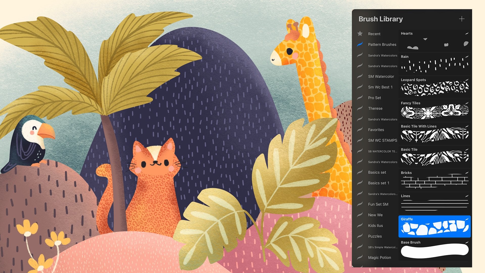
3. Installing the Brushes + Color Palettes: I'm going to show
you how to install brushes and color
palettes in Procreate. It's very easy. You just go to wherever you have
your assets set. So I have mine here
in my dropbox, but you can have
them on your iPad, Cloud Drive, wherever. So the brushes always
end with brush set. So if you just tap on it, it should import
directly into Procreate. When you go to your brushes, you'll see it up here, Sandra's watercolors, that's the set that has
just been imported. If you imported just one brush, you'd have to go to the
bottom of your stack and find the imported brushes and
there you would find them. But if it's a set,
it will be up here. And now we're going to go to the folders again and I'm going to install
a color palette. Those end with swatches.
It's the same thing. You just tap on it and it will import
directly into Percrd. When you go into your swatches, you will find it usually at the bottom of the
stack, here it is. If you want to work with Devon, you just press here,
set it as default, and now when you drag
your palette out, that's the one that's
going to show there. Procore has made
this super easy, so that's how you
install your assets. Now in the next
lesson, I am going to show you how to set
up your canvas.
4. Setting Up the Canvas: In this lesson, I'm going
to show you how to set up your canvas so that
we can start working. I usually work at 12 by 12 " when I'm going to create
my artwork or patterns, but for this class, I have made the
files at six by 6 ". In case you have an
iPad with less storage, that way you can import my files and use them because if they're larger files and you have
a smaller capacity iPad, then you won't have as
many layers to work with, and then it might be hard to
import some of the files. So I recommend you work
bigger if you can, but if you can't, it's okay.
Work with what you have. When you go into Procreate, you can see that you have
all your files here. I like to put my files in
stack so they're organized. The way you create a new file in Procreate is you
press plus here. If you have already
set your presets, you will find your
preset saved here. I already have mine here, but I'm going to show
you how to create it. If you press here,
you'll be able to create a custom Canvas and I like to give it a name
so I know what it is. Six by 6 " at 300, for example. And here, I'm going
to set the size. You can set it in pix
inches whatever you want. So let's say six by six, and the DPI is very,
very important. You have to have
it at 300 so that you can print this later
and it will look crisp. This is the minimum
resolution you should have. And then you see
how many layers I get Ba it's a small file, I get a lot of layers, but this will vary
depending on your iPad. If you don't have too many
layers available, don't worry. I'm going to show
you work arounds. And here in the color profile, these are the most
important settings. I always like to work on this one because
for some reason, CMYK inappropriate, leaves
the colors very muted. So I like to work on these
ones and I take into account that the
very neon colors, especially the pinks,
the greens in RGB, if I have to turn
that into CMYK later, those will become more muted. So I don't use very
neon colors if I know that I might have to
change it into CMYK later. But now a lot of companies
are using RGB to print. So it's not so problematic
as it was before. So this is what I
like to work in. And those are the only
things I touch here. So basically, I keep this here and I only
modify my dimensions. When you click Create, it
will create your Canvas. But if I go to the gallery
again and I press here, you'll see that that
preset is saved here. So the next time you're
going to create a file, it'll be there and you
just have to tap it. Okay, so in the next lesson, we're going to start
working on our elements.
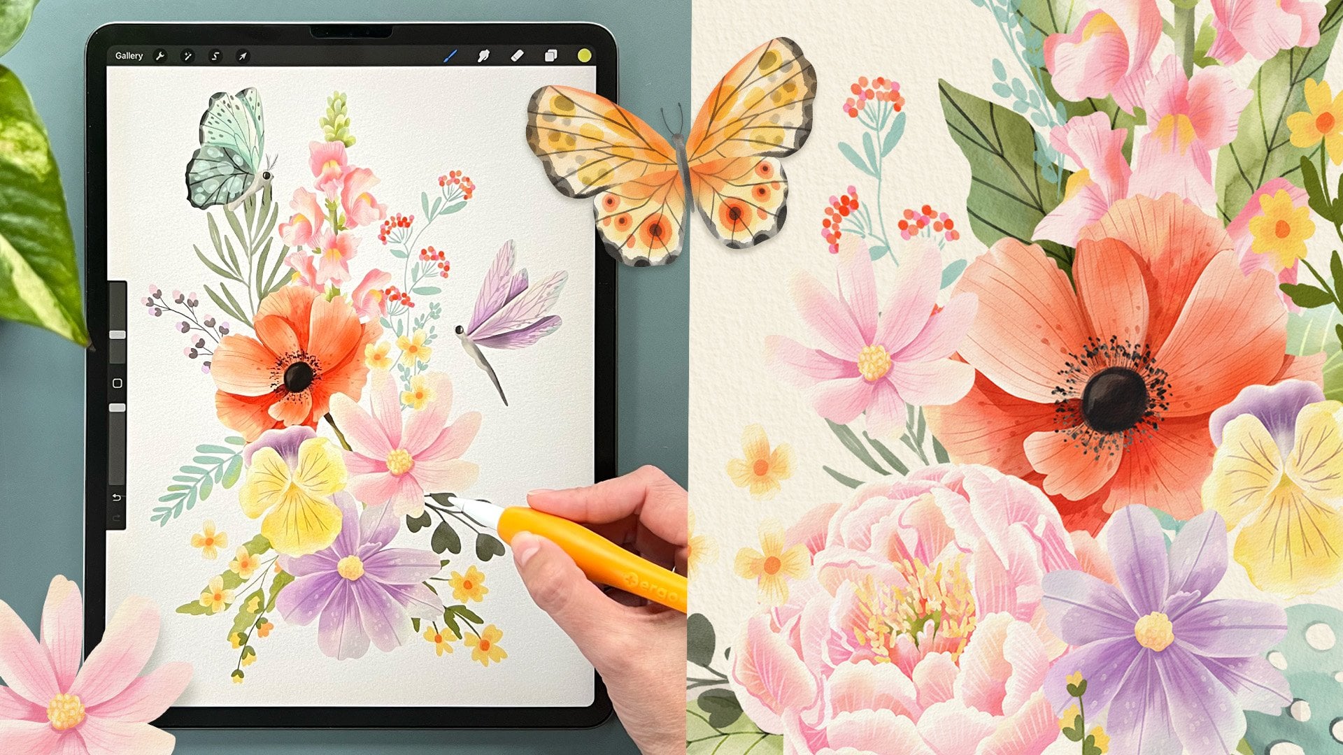
5. The Technique: In this lesson, I'm going to
explain the technique that I like to use to paint
digital watercolors. There are many ways
that you can do this, but this is how I do it, and I found that it's
really great to paint digital watercolors this way
because I get more control, and that's how I like to paint my watercolors in a
controlled manner. You can start sketching your own flowers or
your own elements. I recommend creating
one element per canvas. That way, you'll
have like six inch or whatever size you
made your canvas. You'll have very big elements
that then you can use in other compositions and not just a page with
little tiny elements. Bigger you have your elements, the better because then
let's say you're creating a piece of fabric and
you made it very small, then it's going to
have to be very small printed in that
piece of fabric. But if you have it big,
then you can choose to create a big print
or a small print. So having bigger
elements gives you more options when you're going to produce stuff
with your artwork. So even if you're creating
art for stickers, I would recommend
making it big because you'll never regret
making the art bigger, you will regret it making it smaller if then you need
it for something big. So here, you'll find your first layer and you can choose whatever
brush you want. I usually like in sketching
the six B pencil, and here you can start
creating your sketch. You can be as
realistic as you want. Make it as loose as you want. I like making my sketches very loose so that they
flow more naturally. And here I'm just creating
very basic shapes for the petals for my pincetia. I'm not looking
at any reference. If you wanted to
be very realistic, I suggest you look at reference. I like my art very stylized. So I did look at
some Poinsas before. I went to the garden
center and looked at a lot of them because
it's Christmas time here, so Pin SDs are out. The other option you can
do is I have provided all the JPEG files
for my sketches. And the way to import that is you go here to the
actions panel, and in ad, you insert a photo. I'm inserting a photo
because I have it s to my iPad already,
so here it is. And when you tap here, you release it, and then
you have your sketch. I'm going to delete my sketch, so swipe left and delete it. And let's start working with this one so that I can
show you the technique. When you import the sketch, if it's a JPEG, you'll see that it has a
white background. Let me add another layer
and drag it underneath. And let's choose another color. Actually, let's
drag this palette out and let's choose this color. So if I draw here, you won't see what's
happening because this sketch layer has
a white background. So the way to work with
sketches that you in ported this way is to
tap here on the end, reduce the opacity a bit, and set this to multiply. That way, the white becomes transparent and you can see
what's happening underneath. Let's delete this layer. I'm going to create a new one and drag it underneath again, leave it press and
drag it underneath. And here, I'm going to take
a brush that is solid. So in calligraphy, monoline is my favorite
brush for this. And using any color, I'm going to start
creating some solid shapes that we're going to use later to add the watercolor
effect too. So if you have just one leaf, for example, you do that and then you fill
it in with color. Sara stem. And that's it. Even if you have more
leaves, it's very easy. But when you have elements like flowers where things
are overlapping, you're going to have
to start building different layers so that you go from the
back to the front. So the way you do this is you start with the element
star on the back. So here, for example,
this leaf is on the back. So I'm going to trace it,
but I don't want to just, do it like this because
I don't want to have to be careful
when I'm drying these other ones that I'm
actually overlapping it. So I'm just going
to make it bigger. And I'm going to see
what other petals are in the back
that I can draw in this same layer because we don't want to have one
layer per petal. You can, but that's
very unnecessary, and you can add different
petals in the same layer. I cannot add this one because this one is
overlapping this one, so it cannot be in
the same layer. So this one is also
furthest back and this one, this one, and this one. So those are the ones that I'm going to add to this shape. So I'm going to connect
it, so it's all one shape. You don't have to, but it's easier this way because
it's faster to cover. And I'm just going to go around and create
this base layer. And now I drop my coloring, and I'm just going
to color this spark in because I made that
dot and it didn't color, but now I have the first layer. So I'm going to
create another layer and I'm going to choose
a different color. The colors here don't matter. So now I'm going to see what petals are on top of that one. I would say this
one not this one because you see that this
one is on top of this one, so still not that one. This one, this one, this one and this one. Okay, so I'm going to
create that shape. And I fill it in, and now
I have another layer. So now I want to
do the same thing, create another layer and
choose another color and then see what petals
are on top of that layer. So I would say this one, this one, this one, this one, and this one and
this one I cannot paint yet because this one
is on top of this one, so that one has to
be on another layer. So I'll just do the same thing
again and paint this one. And then drop my color in. You see, because this shape
was separated from the rest, it didn't fill out, so I just dropped this in and no problem. Even if you had to make
another layer here, you just drop the color in. It doesn't matter. They
don't have to be connected. It's just easier to color
if everything is connected. I'm going to create just one more layer for the other petal, choose a different color, and that will be
just this petal. I'm going to fill
it in. Finally, I have to create the little
seeds in the middle, so I need another
layer for that. And here I'm going to make
my brush a bit bigger, and I'm just going to draw
some little dots, basically. And then make it very
small and then draw some little lines
connecting to the middle. And if it's hard for you
to see what you're doing, you can make the
sketch even lighter. Just tab here and then
make it even lighter. But right now we don't
need that sketch anymore, so I'm going to delete it. And now we have all
the base colors for our first element. And I started with
the most complex one so that you
understand how to do it. Now, I'm going to explain how we color
with the watercolors. To add a more realistic
look to watercolors, you should add a
watercolor paper texture, and the easiest way that I found is to create
a layer on top. And then if you downloaded my
mini watercolor brush set, you'll find that I have an
ad paper texture brush, and it's a set layer to linear burn that's
very important. So we're going to
use that brush. I'm going to make my
canvas very small, and I'm going to choose
this third color, like a yellowish color. And I'm just going to color
over the whole canvas, licked my pencil, and I
can do it three times. And what that does is that it gives you a watercolor
paper texture. So now if I go here, you'll see that
it's very yellow. I kind of like the
yellowish look, but I don't want it so much. So if I go to hue saturation, I can reduce the saturation, and then it's less
yellowish, see? And it's a very subtle effect. I'm going to tap here again. And now I can go and set
this to linear burn. And you'll see that it kind of ingrains itself into the color. Here it's normal and it's
kind of just standing on top, and here it's linear burn and
it's kind of more subtle. You can also try
different blending modes and see what you like best. They all eat different results. So it's all a matter
of preference. Linear burn is very subw. You can also reduce the opacity here and change how it looks. Like, see here with AD, you can see it more
in the darker areas. With linear burn, it's almost invisible in
the darker areas. So just choose the effect
you like the most. I'm kind of liking
the ad, actually, so I'm going to leave it
there and reduce it a bit. I think that's enough, and that's how I'm going to
work in my collection. So now that we have that
color paper texture, I like to lock that
layer by swiping to the left so that I'm never painting on it
and making a mistake. The second thing we're
going to do to prepare for painting is watercolors are usually paint in white watercolor paper
or a little bit toned, and that is how I like to
work here from light to dark. So we're going to give all
of these a very light layer. You could give it a white layer, but then you're not
going to see where your layers are or
what you're doing. I am going to go to each layer, swipe to the right
with two fingers and turn on Alpha lock. You'll see that a checkerboard
appears in each layer. So when I tap here and
I press fill layer, you'll see that that layer will all be filled with the
color that I chose, which is this light color. And now there it is.
You can barely see it. I don't know if in camera, it's even harder to see, but you can sort of see the shapes. Now, I'm going to
go to this layer that had this little leaf here, and first I'm going to show
you how the technique works. Okay, so let's create
a new layer here just so I can show you
how these brushes work. I have created three brushes. These ones are
basically the same. The only difference is
that this one is rough and this one is smooth.
So let me show you. See I'm pressing hard here and here I'm pressing
very softly. Very softly kind of blurs the edges if I go back in there. And then this one is the same, but the edges are smooth. And again, I'm pressing
hard there and softly here and I
can blur the edges. And then I can press hard again. So see, they also
have a paper texture ingrained in them already so
that if you turn off this, it still has some
sort of texture. So you can choose
whatever you want to use or you can use any
watercolor brush you have. You don't have to use mine. Finally, the water blend
is just like adding water, and it just blends
out the color. And because we have that
texture applied on top, you can still see the
texture on the blend. But if we turned
off that texture, then you would see that it
just smudges the paint. So it doesn't look as good. This is why we have our
watercolor paper texture. Okay, and that is how they work. And now let's go to this
layer that has a leaf here, and I'm going to very, very fast show you by using this ultimate fill rough
brush, how you can do it. So I like painting with
a lighter color first. And then going into
darker colors. And then, I'm pressing
hard and then soft. So I'm creating these
watercolor effects. If you want, you can paint with a smaller brush size and just paint in a
more controlled way. See I'm going like, softer here, and then here I'm going
harder and then harder here, but I'm kind of smoothing
out everything. So that the watercolor
effects are not so harsh. And I am adding darker and
darker colors as I go. It can also add some darker colors to
the edges like this. Just make it very small
and go around the edges, darkening some areas and
then smoothing it out. That way, it looks more
like a watercolor effect. You can even choose a
darker color and make it smaller and use this brush
to add some details. Or as we'll see, as
we paint our ponsas, you can use it like this, like pressing hard and softly to add some
more textured details. See? You can add little dots and even grab
some other colors and then, like you're making this
more like an autumn leaf. And in watercolors,
it's always really cool to touch
different shades of colors and add it to your art because
when you're painting traditional watercolors
and your paintbrush touches like a blue, then it kind of gets mixed in, and that gives it a more
realistic look, I think. But this is all a
matter of preference. And this technique is the
one that we're going to use to build all of our icons. So it's very simple. You just have to be
very playful with it, but because you already
have the basic shapes set, then you don't have to worry about controlling the
watercolor brush as much. And now you can have
fun because you're not going to go
outside your shape. So now that you know
how to do this, let's move on and go
to our first element, which is the spruce.
6. Blue Spruce: And and and in this lesson, we're going to start
with the blue spruce. You can create your own
elements or you can work with my procreate files where all the elements have
the base shapes created. So let's start with this one. So here in the file, you'll see that I already
have my paper texture. I have set it to linear
burn because this way, it's easier for you to
see the base shapes, but you can set it to
whatever you want. And I have my elements here. They're all in one layer. You can also create each
one in its own layer. But for each of everything, I have created it in one layer and I can
separate them later. You'll see that the
Alpha lock is activated. If you haven't activated
your Alpha lock, just swipe to the right with two fingers and you'll
see the checkerboard. That means that now
we can paint on top of this and just
paint on our element. So again, I'll be using the ultimate fill rough
for everything here, and you can use whatever
brush you want. And I'm going to go here to the palettes and take them out. And I want to be using the
traditional Christmas one, so I'm going to set
that one as default. So every time I pull
my palette out, that's the one that
comes out here. So let's start with this, and this is going
to be very basic. So I'm just going to create
some shades of green, again, starting from
the lighter one. I'm going to make my brush
bigger and just sort of add a base shade going
darker in some areas, which means I'm
pressing harder on my pencil and lighter
on other ones. I really like these
effects like this. So I have smoothed it out by pressing
softer in some areas, but I'm leaving these effects in other ones because I think that gives it a more realistic look. And what I'm going
to do is just start adding a bit darker
and darker areas. And these elements don't need too many layers because
they're very basic. So I'm just going randomly and making sure there's variation in the tones.
That's what I'm looking for. And then some of these effects. So I can also press like that once and you'll see that
it creates that effect. So if that's something you like, that's a great way to do it. And I always like adding a tiny bit of another tone
to it, as I said before. So maybe a tiny bit of
blue here in some corners. I don't know. I think that just makes
it more interesting. And I'm going to do the
same with these ones. But if I start with a different
tone in the background, see there we started
with the yellow. Here I'm going to
start with the blue, and as I add the greens, you'll see that it creates
a totally different look. Like, the tone is different. You can do this if you want, or if you don't want,
you don't have to. Just play around
with the brushes, play around with the sizes, see what effects you
can get that you like, and that's how you find your style of painting
because this is mine, but you can't find yours. See, they look different.
This one has, like, a yellowish undertone, and this one is more
blue, more cold. I'm just going to go very fast
in these elements that are one layered because again, they don't need as much detail. If you wanted, you could go very specifically and make your
brush very small and then, for example, see this leaf
that is overlapping this one. I could go in and darken
the back one like this. Just to create that
differentiation and make it even more detailed. Same here. Say, this
one is in the back. You could do that. And if you find it hard to control
where your brush is going, you could use a selection tool, make sure that free
hand is selected, and just select that lead the part that's
going to be darker, and then with your
brush, you can go in and add a darker shade here. And then the selected. And that way, it makes
it easier sometimes. So it can be as
detailed as you want. You can also make
this brush very, very small and then add
some details to each leave. Just try everything out and see what you like
best for your style. And I, for example, like this style more because
I like my art to be very, very detailed, but you might
like something more simple. So just try different things
out, see what works for you. And now we have finished
our first element. So in the next lesson, we're going to paint some pine leaves.
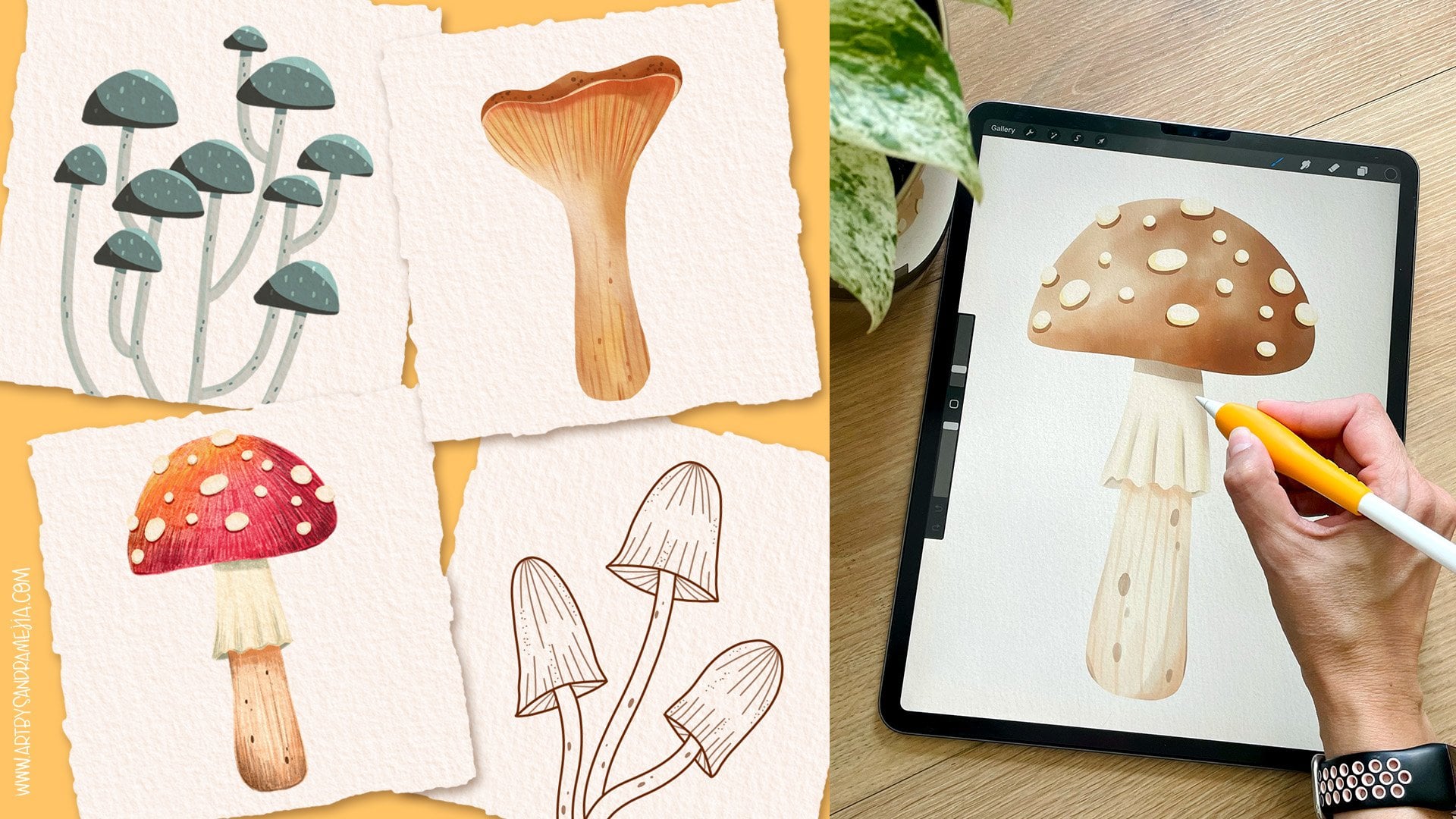
7. Pine Leaf: In this lesson, we're going
to paint a pine leaf. It's very, very simple. It is very similar
to the one before, but we need to create
more leafy elements for our compositions later. So again, I have this file. I have my leaf here,
my paper texture, and I'm going to grab my
ultimate field rough brush. I'm going to create this one. I want this one to be very dark. You want to create your
elements in variation. Don't make them all green, for example, unless that's
what you're going for, but give them some variations so that when we
create a composition, everything doesn't
look just the same. So create ones that
are darker than the other ones also so that
you can create contrast. So I'm going to go with
these bluish greens and because I want
it to be very dark, I'm not going to start
with the lighter colors. I'm going to start with
a medium range one, and I'm going to make sure
that my brush is very. I'm just feeling most of it in going lighter in
some areas here, see. Even having that creamy base
color gives it a bit of interest now because now we're having different shades already. I'm going to go to the darker green and just kind
of darken these areas here. Then even darker. I see that I'm leaving
some effects like this. And then I want it's
kind of boring. So I want to try this orange and don't be
scared to try things. If they don't work,
it just erase them. That's why this is digital
art, and it's so amazing. I'm going to try
this orange here. I'm going very lightly just to see how it looks like with the stem painted
kind of brownish. Maybe add this color. Try things out. Sometimes you might get
things that look good. Sometimes you won't,
but you have to try. I think that looks
good, but I think the leaves need a
bit more green. They're too blue. I'm going to add some
light green areas here. Yeah, I like that better. This is a very simple
element and we're done. Then in the next lesson, we're going to start
painting some berries. It
8. Berries: In this lesson, we're going
to paint some berries. Now you know how to
paint those one layer, very simple leafy shapes. Now we're going to go into
a file that has two layers. So you'll see that we
have two layers here. This one is with the berries because they're on
top of the branches, and this one has the branches. I always like painting from
the back to the front. So I'm going to go
to the last layer, which is the stems, and I'm going to start
painting those. And those are going to
be very, very basic. They're going to be
this dark green. I'm going to make my
brush a bit bigger. And you don't have to
pay too much attention to these tiny little details, but it can create these effects by pressing
farther away from the branch, with that, or you can have your smaller brush
and just do this. I want them to be very, very dark underneath each berry. So it's like they're
casting a shadow. So you just go over
several times, like lift your pencil and
then go back over it, and that will darken the color. And then maybe I'll just add a tiny bit of lighter
green, like, all over. I then go back with
the darker grain. So it's not so light in some areas. So that's
how it looks like. But because they're
very, very small shapes, I wouldn't pay too much
attention to them. You don't need them to
be so detailed because you're barely going to see them later when you use
them in a composition. Unless you're making
stickers, for example, and then this is all
that it's going to be, then go in more detail. But work smart and know that if this is
going to be part of a greeting card and this
is probably going to be used smaller and
with other elements, then you don't have to
waste so much time in this. Because sometimes you're
very perfectionist and we want everything to
be absolutely perfect, but sometimes it's
not needed and that just weighs us
down and slows us down. I'm guilty of that.
But I've learned now to be more I don't know, easy going with my art
and just have fun. Here, I'm going to go to the layer with the berries
and start painting those. I'm not just saying to
create sloppy things. I'm just talking about knowing where to put your
energy and your timing, something that actually matters. So with the berries,
I'm going to start with a very light pink. And let me show you here. The theory for round things
is that it goes from lighter and then these
sides get darker, so you can get the
sense of volume. You can do this.
With these brushes, go like that and
then go darker and once you've saturated that color so much that it actually
doesn't go darker, you can go to other shades
and do the same thing. You don't have to use the
whole range of colors. I just have it there
for variation, but you can jump around them. See, you can have your
berries like that. That's a very graphic look. You can use your water blend here don't just do this because
then it looks very ugly, touch in certain areas to blend those colors
so they don't look as layered and you might
like how that looks or you might just
want to go back in with another color and then darken the whole
thing even more. En and maybe you like
that even better. I do. You can use white, for example, if you want
to make this light. Show more. And then add another speck of light if you want to make
them very shiny. That's basically what we're
going to do with all of them. You could do each one
like this, finish it, and then go to the next one, but I'm going to show you
a faster way of working. You can leave this lighter area here and then press
harder here and then just do this for each one. I'm basically just giving each a base color and establishing where I want
that light area to be in. Then I'm going to go
to a darker color. And press harder in some
places and don't blend it so much if you want this more
watercolor effect like that. Like an experiment to
see what you like best. And see this way, it's
much faster because I'm not jumping in between
colors for each one. I'm just like patch
drawing them. Then I can go in
with my water blend. I don't like using the
water blend that much, but there are some areas that are to define all
those lines here, I don't like that, so I
can just use it like this. Again, I'm not doing this, I'm just pressing ones. You can even make it smaller if you want to be more precise. I'm going to go in and
add some white here. There it is. I think the
only thing it's missing is like one tiny bit of
like other color. So I'm going to grab
this yellow and make my brush big and add a tiny
bit of yellow to some areas. And see that I don't
know if you can see it, but that gives it way
more interest than this. Like, it makes it less flat. So I'm going to do
that to all of them. So more darker. I think they need to
be a bit brighter red. What you can do is you can go
here to adjustments and it can go to hue saturation and you can make them a tiny
bit more saturated. See I'm going to go t. You probably don't want that
to be so saturated, but I'm going to saturate
them a tiny little bit. You can reduce the primes if you want to make them darker, or you can make them
lighter this way. Just because they're berries,
I want them to be more saturated and I think that
makes them pop a bit more. They have now you know how to paint things with
different layers. Now I'm going to move on to
something similar to this, which is the mistletoe.
9. Mistletoe: In this lesson, we're going
to paint this mistletoe, and this is going to be very
similar to the last element. We painted because it
also has two layers. So the first one will be the leaves and the stems and the second one
will be the berries, and this time we're going
to paint them like white. So let's start with the leaves. Let's make our brush
bigger and paint these ones in a
very greenish tone, not bluish, but green. And make sure to follow along with any color palette you want. This is just a suggested one, but you don't have to use it. See that I'm pressing
hard and then lifting my pencil a bit
just to soften that out. So it's not just like that, which could be an
effect that you want, but it's more subtle. I'm going to make the brush smaller and make
sure that here I also add some darker
areas under the berries. And I'm going to add a
bit of bluish hue here. And I have my brush
set to small, like, smaller than the first layer so that I can
control the better. I press the very lightly here
just so it's very subtle. I think these leaves need
a little bit of detail, and again, that is my style. So I'm going to grab
this dark green, and I'm just going to
add some veins to it. Here you can also
press lighter here. So it gives it a
variation of tone. Then try this and
see if I like it. No, I think that's too much. I'm just going to leave
it with the middle line, but I'm going to make it a
bit thinner and less dark. Yes. I like that much better. Now I'm going to
go to the berries. And now with the berries, I want them to be white, not totally white, but whiter. What I'm going to do
is I'm going to go to that layer and choose my white and tap on it
and press fill layer. Now I have a lighter
base to work on. But I can't see where they are, I can imagine they're here. But if you want to
see where they are, you can go to your
background color and make it darker
like this gray. That way, it will be easier
to see what you're doing. Now we can go and start adding these very light colors I just want to add a tiny bit here because I want to leave
this part mostly white, but add some yellowish shadows. You can also use this
grayish here to add a bit more depth like that. And then add a little bit
here on the border just so we can create some dimension. And if you like them like that, you can make them like that
or you can make them even yellower but I'm going to leave them basically
white and just have some shadow here. I'm going to do
that to all of them using this gray to add
some sort of shadow that you can barely see can go in with the darker
one if you want a bit more. Then you can go in with
the yellowish shades. Okay, I think that looks good. I'm going to go and make my
background color white again, and there we have
some mistletoe, and now we're going to
go to the next lesson and paint some IV leaves.
10. Ivy Leaves: In this lesson,
we're going to paint some ivy leaves and
these are very simple. They're just in one layer, but I'm going to show you
how I add more detail to my leaves and how you can create some color
changing effects. Here I have my paper texture and the layer where I'm
going to be painting on, and I'm just going
to grab my brush and start painting these apes. I'm going to start
with the light green and paint them all like this. I'm just pressing
hard and softly and leaving some areas unpainted so I can create
some watercolor effect. Now I'm just going to
start going darker, again, you can be
as realistic as you want or make it very
stylized like this. I'm going to reduce this and I'm going to add some details with
the very dark green. And I can add some it'll spots. And I can go into the borders
and some darker areas. Now I'm going to add
a tiny bit of blue. I want to variate the
shades a bit more. What you can do is go
to the selection tool, make sure that free
hand is selected, I'm going to go and
select some random areas. Of this leave, Let's
do it one by one. And here, I'm going
to feather it out. That means that the border
is not going to be crisp, it's going to be softer. So once I've done that, I can go here to
the adjustments, hue saturation brightness, and I can change the saturation, see I can make it more
saturated and the brightness. See that's the part that's selected right now
that we're changing. We can make it
lighter or darker. But I can also change the hue. This tool is great to give
it a bit more interest. I'm going to change it
to a brighter green, just a tiny bit there
and now release it. Then see it looks more of a watercolor effect as if you had blended
in different colors. I'm just going to do that
really fast to the other two and just have some areas
where I'm going to do it. I can click there and then
select on this one, too. I'm going to fetter it just a
bit and then go here to use saturation brightness
and I'm going to change that here a bit and
just release it. That's another way
that you can create color variations in your
shapes. We're done here. In the next lesson,
we're going to paint some poinsettia leaves because we're going to paint some flowers later and we're going to need some
leaves for that.
11. Poinsettia Leaves: In this lesson, we're going to paint some Poinceia leaves, and we're going to be creating
some different details. We're going to make this
one some shades of teal, so I'm going to start
with this color and just do the same
thing, fill it in. And I want to make the sides a bit lighter and then
the middle a bit darker. So I'm going to
start going darker than just adding darker
shades to the middle. I want these leaves to
be dark in general. I'm going to go darker
than I want to be bore. I really don't
like this flash of color here it's too evident. I'm just going to go
with my water blend and make it a bit bigger and
blend that in a bit. Same here. Then I'm going to continue adding
some darker colors. I'm going to darken
the whole leaves and then just darken
the middle a bit more. See I'm pressing very,
very softly here. Hard and then soft to kind
of blend the sides in. And then hard again here. Great. I think that's enough. And now I want to add a tiny bit of yellowish
green just to the side. What I'm going to do
with this one that is different from
the ones that we've made before is that I'm
going to add white details. You cannot do this in
watercolor unless you're using wash or acrylics or a white pen, but you can do it here
because it's digital and this brush works
for light colors also. I am going to actually
take this very light green tell color and use that
to create my details. By varying the way
I create details, I also create variety and interest in the
final composition. So you won't see it now, but you'll see it once
we create a composition. And here, if you don't
like these areas that overlap and look very, very digital, you
can just go in with your water brush and make it small and kind of
smooth those out. In that way, it
looks much better. And now I'm going to go and
add the details to this one. Blend those in. I'm just tapping
lightly. That's great. Now I'm going to use
my selection tool and I'm going to select
half of this leaf, tap the circle to close it and then half
of this leaf here. I'm going to go
here and in curves, I can change also the
lightness and darkness. See, I want to make those really dark and then I release here. That's another way
that you can create differences in the
tones in your elements. In the next lesson,
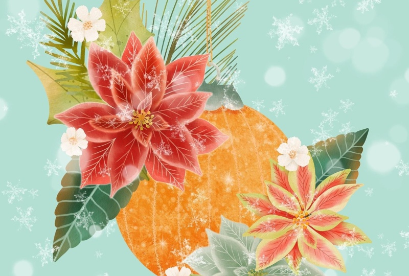
let's stop creating some foliage for a bit and we're going to paint a Christmas ball.
12. Ball Ornament: Here I have my Christmas ball, and I have created two layers. So in the background, we have the ball and the string, and in the pop, we have this little thing
that holds the ornament. As usual, we're going
to start with the back. So I'm thinking I want
this ball to be gold. So I'm going to start
with a very light color. And I'm just going to
create like lines here. Now I'm just going to start
adding more yellow to it keeping those lines in place. I'm pressing harder in some areas just to create
some contrast and interest. Especially down here, I want
to create darker areas. I'm going to go in with
an even darker shade. The paint in the
top at the bottom. So it's darker. This
will create some volume. I'm actually going to
go in with a bit of dark red and do that here too. And now I'm going to go in with this light yellowish color
and just fell it all in. So the white lines
are not so dark. And finally go in
with this yellow and add some more defined lines. And I'm going to define
the lines a bit more. I press hard there, and then I press softer here
to bring it out. So these lines too thick. I'm going to select some
areas here in the bottom. I'm going to feather it a bit and then go
here to the curves, and I'm going to make them a
bit darker and then release. Now I'm going to
do the same thing, the leg with the middle. Here, I'm just going to create some shine Make sure you
scatter that a little bit. Now I'm going to go here to
use saturation and increase the saturation a bit and then go back to Kirk's and lighten that up so I'm going up
and release it. If you think the
lines are too white, you can just go back in
with some more yellow and a bigger brush and
just soften them up a bit. Then I'm going to go in with a very light color and actually create some
highlights this way also. You can make your bolt
shine by creating these little stars
like this if you want. Like little shining areas
where you can make, like, little white dots
like sort of glittery. Then ones darker, well, lighter actually,
but more evident. That way you have a
shiny sparkly ball. You can add more of
these as you want. You can add more lights,
more highlights. I think I like how that looks. Now I'm going to
concentrate in this area. I'm going to make
a little shadow for the part that
hangs the ornament. I'm going to go in with
this orange and just make a shadow like that. Now we're going to
paint the string. That will be a very basic color. Let's just choose this
dark color for the string, or you can also make it golden. So just add some
darker areas to it. Here, actually, I
want to go into this ornament and use
my rays very small and I'm going to erase this part here so that it looks like it's actually
holding the ornament. Those tiny little details that make it look more realistic. Now I'm going to
paint this part. For that part, I think I'm just going to go very
basic with gray. As if it was, like,
kind of, like, silver, but not fly and going to
make my push a bit bigger. A bit bigger and darker here. And even with a darker gray, like that, I just wanted
to be very simple. Now with this very light color, just add some highlights,
maybe with white. Maybe like this to accentuate that round area. Maybe here. Yeah. And then they're
very obvious there, and I don't like it. So I'm going to go
to my water blend and just basically touch a bit, like taping a bit to
blend these sides in. Great. That looks much better, and we're done with our ball. If for some reason,
you think it's too orange now and you
wanted more yellow, you can also go to
the selection here, select the whole ball. You don't have to fetter it here because we're
changing the color of it all and go to hue
saturation brightness, and we're going to change
it to be a bit more yellow. There a bit more saturated. A a tiny bit brighter and just
release it and that's it. You can add decorations ball, patterns, whatever you want. I'm going to add a
lot of decorations with the flowers
and leaves to it, so I want to keep it simple, but it can do whatever
other decorations you want. In the next lesson, we're
going to paint some candles.
13. Candles: In this lesson, I'm going to show you how to
paint some candles. So again, I have
created two layers. So the back one has
just a little wick, and then in the front, I have the candle and then the flame. So let's paint this very simply. So let's start with
the wick and I'm going to make that one like
a grayish color. That one very simple. Now I want to keep the
cream color of the candle. I'm just going to add some
shading with this color. Not too much, here on the
sides so I can create some volume. I think
that's enough. And here, I'm just going
to paint this yellow and orange and red like
this, and then some red. And then some more yellow
because that's too red. So I'm going to
some more yellow. But I want it to be saturated so it looks like it's on fire. And maybe here you can
see some of that light. Bouncing off here on the candle. Okay, great. We have one candle, but what if we
need more candles? Repeating the same candle is very obvious and
doesn't look good. What I'm going to do is repeat the same
candle so it's fast, but then change some things
so that it looks different and nobody's going to know that we just copy it and paste it. I'm going to go here and
I'm going to slide to the right and these two are selected and I'm
going to group them, and this is going to
be candle number one. But now I'm going
to swipe to the left and duplicate this group, so we have another candle. I'm going to tap here
and move it to the side. And I want to make
this candle longer. I'm going to release
that and then I'm going to go to the layer
that has this body of the candle and I'm
going to select it and click here so
I can transform it. If I move this around
with the uniform on, it will also change the
width and I don't want that. I'm going to tap
here on free form, and I'm just going to drag
it down so I make it longer, but I'm keeping the same width. So now I release that and
I have a different candle. But this is giving us away because it looks
exactly like this one. I'm going to go to
my layers and you'll see that this is Alpha lock because we were painting on it. I need to turn that
off before I use the liquefy tool that I'm going to show you,
which is super cool. Just swipe with two
fingers to the right, the checkerboard will disappear, and now I can go to the
selection and select just this area and then go
here and go to liquefy. Here you'll find push
and we're going to use this to move this around. Right now it's moving
the whole thing around because this
size is too big. I'm going to make it smaller. That way, I'm going
to be able to push this part around and then push here and change this shape. Here, push it here
and you can make it even smaller for more
precise pushing. Now I can release here and
you'll see that it looks like a totally different candle
except for the shading. What I'm going to
do is just turn the alpha lock on again
with my brush, I'm just going to
add a little bit of shading somewhere else. I'm going to soften this. I'm going to use
the water blend. The blend is differently. There it is. It's a
totally different candle. Let me move it. I'm going to touch the group there
and move it up. It's beside this one. And now if you place
them like that, you will know that you did that and it didn't
take that long. This is very useful,
especially if you have to paint 12 different candles, then you can paint like
maybe two or three and then modify the other
ones, and that way, it won't look as
repetitive as if you had just copied the
same 112 times. I actually even like
this even better, so I can go back to this one, turn up the Alpha lock, select the flame and go here to liquefy and kind of move
this one around a tiny bit. And revisit, and
that looks better. So now we're done
with our candles, and in the next
lesson, we're going to start painting some
little white flowers.
14. White Flowers: In this lesson,
I'm going to show you how to paint
some white flowers. So remember what we had to
do with the white berries. We had to go to the background
and change its color. So I'm going to make this color. And then I have
three layers here. This one is for the little
seeds in the middle. And then this one
is for some petals, and then this one
has the back petals. So I'm going to make
these two layers white. So grab the white.
Tap on the layer, peel layer, and
same with this one. I don't need to do
the same thing to this one because those are
going to be yellow anyway, so it doesn't matter
if they're beige. So let's start with
the back petals. The way I'm going
to make the shadows here is with some of these grays and with these
very light yellow colors. Let's see which petals are
in the back, these two. I'm going to focus
on this one first. My brush is not too big. Here I want to be
very subtle because I want to keep it mostly white. I'm just adding some color
here and some color here. Enough to make these
back petal differentiate from the front petals. But we want it to
be basically white. I'm going to grab
this one to add a tiny bit more shadow and
I'm pressing really softly. I think that's enough. So
now I'm going to go to the front petals and do
exactly the same thing. Start with this one and add
some very light shadows here. We're just adding enough to
create some sort of alum. Here, I want to
keep it very light, so it's very differentiated
from the one in the back. I'm not going to go and
paint to the border. I'm just painting here
inside the petal. Again, see I'm leaving
this area very white. If for some reason
you painted over it, you can just go back
to the white and then ing that back out
again like the white. Now I'm going to
add a bit of gray. I want to add some more
here in the middle. And just a little bit here
on the rest of the petals. You don't want to add too much gray because then they'll
look like they're muddy, and that's not what we're after. And now I want to
add some details. So I'm going to try
this very light gray, and I'm going to
press very lightly, make my brush small. I have it at 2% and see how
that looks with some veins. Just so that they're
not so white. See if you like that.
Find some style of adding details that you like or leave them as they were. I went to do the same
thing to the bottom layer. And finally, I'm going to go to the top layer and
paint the middle in. So I'll make my brush bigger and I'll start with this yellow
and see how that looks. I want to go lighter, so I'm
going to go lighter here. And this is I call it yellow, but it's more like an oranging. I want to go even
darker in some areas. I like that, but I don't
think this is looking good, so I'm going to go
back into those petals there and add a bit
of this orange here. I'm pressing really softly. Maybe it'll press a bit
darker here in the middle. And I think that brings
it together even more. So I'm happy with it. And
what I'm going to do is speed paint these
other two because I'm going to use exactly
the same technique. And here I'm batch painting
them as I taught you, because this way it'll be much faster than
doing one by one. So at the beginning,
just do one by one, but once you get the hang of it, just batch paint them, and you'll be done in no time. Mm hmm. And we're done. Now you know
how to paint white flowers. In the next lesson, I'm going
to show you how to paint a pink and white un seria that has those very
pretty textures.
15. Pink Poinsettia: In this lesson, we're going
to paint a pink pointsia. Well, those are kind
of like greenish, and then they have pink
splotches in the middle. So this one has four layers, and I'm going to start
painting in the back. So I'm going to start with
a very light green in all the petals mainly
on the outside of them. And then I'm just going
to go over lightly, so they're a bit greener. And now the fun part starts. I'm going to choose the pink and reduce the brush size
and see if this works. That's too big, a bit smaller. And then I'm just
going to start, like, pressing soft and hard and creating these pink
areas in the middle. I'm pressing hard in some
areas, softer in others. And I'm not thinking too
much about what I'm doing. I'm just going with the flow. I'm going to add a bitmrk
pink here in the middle. And now I'm going to grab a darker shade of pink and
make the brush smaller. I'm going to use si stool
and see what happens. And I'm going to
create the middle, and I'm not going to the top. So see here, I
press really light, and then I press really hard, so that it's very lightly
visible here at the beginning. And now I want to create
some veins because the pinceas have
very visible veins. And you can turn a canvas around if that makes it
easier for you to draw. When I'm recording, I don't
like turning my canvas around much because
then if I speed it up, then you start
getting like dizzy, but it's definitely an
amazing tool to have. And what I want
to do now is grab my selection tool and in each petal select like a
little area in the middle. And I'm going to make sure
to feather that a bit. Not too much, and go here to
use saturation brightness, and I'm going to make that a little bit
pinker, just a tiny bit. You don't want to change
with colors that much, so that then it doesn't match with anything else in
your other elements, but you can definitely
lay with them here a bit. And now you tap here
to deselect it. And now we can go
to the next layer. So go here and we're going to
do exactly the same thing. I'm going to start with the
green, make it a bit bigger. And this time, I'm going to
make the green a bit lighter. And I'm not going to paint the middle just so that the pink can show up
being way more pink. So lighter, great. And I'm going to grab the pink, make it smaller, and start
making the middle areas. The smaller you make your brush, the more precise you can make
these splotches of color. See this one's more
precise than this one, and you can do
whichever you prefer. I press softer in
some areas here, and then harder in other ones just so that it creates
some variation in on. Now I'm going to go over
some parts in the middle. And if you don't like
some of those blends, you can just grab the water
blend brush and touch a bit. Make it a tiny bit bigger. You can blend the areas
that you don't like. Now I'm going to grab my ultimate filled rough
brush again and reduce the size to toe and grab this second paint
and do the same. So I'm going to
spit this part up because it's exactly
doing the same thing, just adding some veins. H. And now I can move
to the next layer. Make it bigger, use the green, grade the borders,
and now the pink. There are some areas
here that I don't like, so I'm going to use
my water bland brush and blend them a bit. Great, and then go back to the ultimate fill rough
or whatever brush you're using for your details and reduce the size and
add the final details. Great. Now, that part is ready,
but as you can see, there's not much
definition between all the layers of petals. So I can go back to the back
petals and I can create a new layer on top and set
this as a clipping mask. I'm going to set
this to multiply. This way, whatever I paint here, it's only going
to show up on top of this because this
is a clipping mask. It means that it's
clipped inside the shape, and by setting it to multiply, it's going to make
the color darker. So I'm going to choose this pink and make my brush a bit bigger, and I'm just going to go like, over these areas where these
leaves are overlapping. Areas to make this darker
make it subtle, like, soft. So that you start seeing a difference between the back layers and
the front layers. It doesn't have to be too much, but you'll see here that it
starts actually having depth. It can even go a bit
darker here in the middle. And now I can go to the next
layer and do the same thing. So I create a new layer. I touch here, set it
to clipping mask, and set it to multiply. I'm going to go back to the pink and add some shadows here. I want to darken
the middle, too, so that's why I'm
going darker here. You can also use
this opportunity to darken the middle
here a bit more. And now going to
choose the darker red. I add a bit more of depth
here in the middle. And now I can go on to the next layer and do
exactly the same thing. Add a layer, set it
to clipping mask, set it to multiply, choose the lighter pink. And here, I'm just going
to create some shadows in the middle behind
these little dots and darken the middle
a tiny bit more. And go in with the darker red and darken this in
the middle even more. And now the last
thing we have to do is paint the little
dots in the middle. So I'm going to go here to this layer and I'm going
to paint them with a light green and
see how that looks. Maybe go darker with
a smaller brush, darken some areas, and
even darker in some areas. And there we have it. We have
our finished poinsettia. Now I'm going to spit
paint a white one and a red one because it's
exactly the same process, just using different colors. So in the next lesson, I'm going to speak paint through the red and the white considas.
16. White and Red Poinsettias: In this lesson, I am going
to spit paint the red and the white pointsia
because I'm following exactly the same process
as I did for the last one. I just wanted you
to see how I do it. But it's basically
the same thing. Start painting
from the layers to the front and make sure you have that in between the layers so that it doesn't look so flat. So because this is
a white flower, I made the background
a different color, and I'm going to make all
the layers actually white. Mm So basically, I do the same thing with
it for the white flowers. I add some shadows very subtle
with this light yellow, and then with this grayish, and I added the details
with that same gray. Here I'm going to
do the next layer. Now I'm going to go
to the next layer. And the last row petals. I'm going to make the
middle a bit darker. And finally, these little seeds. I'm going to make the green and just add some
darker colors in some areas. If you want to see how
that looks yellow, just go to hue saturation
and change it. I think that looks
so much better. So I'm going to leave it kind of like
an orange like that. So release that. And you'll see that again, we have the same
problem as before. They're flat in the bottom. Like there's not a lot of differentiation
between the leaves. So I'm going to do exactly
the same thing we did before. I'm going to go to the
layers, add a new layer, set it as clipping mask
and set up to multiply, and then I'm going to use this light gray and
create some shadows. So I'm going to make
this a bit bigger. I'm just going to darken
these shadows a bit. Don't do it too much because
it's a white flower, so painting white elements in watercolor is
not the easiest. I just want to make sure
you see the difference between the petals that are in the back and the petals
that are in the front. Great. And I'm going to do the same thing for
all the layers. Mm hmm. So there we have
our white quinceia and now I'm going to
paint the red one. I'm going to start
with the light red, not the lightest because I want this quincea to
be really, really red. I was creating some
spots like this, so it gets sort of like a
watercolor texture look. And I'm going to
add a darker red here kind of in the
middle like this. So for this one,
I'm doing basically the same thing I did with
the pink and green one, but just with shades of red. And for the details, I'm going to create them
in this cream color. I and now you can move
on to the next layer. Here I'm trying to
leave the borders a bit lighter because they're on
top of these other petals. That way, it'll
make them show up lower and then
darkening the middles. I'm doing this very fast, like it's fast forwarded, but still I'm doing very
fast because that way, it can be more loose. And then I'm going to go in with the darker And then with the details. And then I just realized
I forgot this petal, so I can go back to that
layer and just paint it. And this layer.
And in this layer, I'm going to add a
bit of yellow first, so I'm creating some
variation in the tone also. This is another way to create differentiation
between the layers. Now I can go in with the red. And again, I'm going to
leave some borders that are whiter just to help
differentiate more. And here, I'm going to try to create the inside
shadows with this red. Deep. More vibrant red
than these ones, and then create a bit of the inside shadows with
this one, but not as much. The middle, I want
to make darker. The final petal. And then for the middle part, I'm going to make a yellowish. And maybe add some green here. Yeah, I think green
works better. So I'm just going to add
some darker as of green. And now I want to still add
some depth to the layers, so I'm going to go do exactly the same thing
with the clipping masks. Let's say that you have too many layers now and
you're running out of layers. What you can do is you can
merge these layers together, make sure they're ready, and then you can keep
working on these ones. I'm not going to merge mine, but that's a workaround
that can save you. So let's continue. Okay, that looks so much better. So we're done with our poinsas and we're done painting
all of our elements. In the next lesson. I'm
going to show you how to prepare them to
create a composition.
17. Prepping the Elements: In this lesson, we're
going to prepare the elements so that
you can use them as individual PNG files or that you can use them
later in the composition. The easiest way to do this is to keep your original files intact. I have them here in this stack and because they are stacked, I can go here, click Select, tap my stack, and
duplicate the whole thing. Now going to press here, I can call this one flat. And I can go into
my stack and I have all my files and I have all my files intact
in the other stack. I'm going to delete this one
because that one was just to learn the technique and you'll see that I have all
my elements here. They all have their names, so that makes them
easier to work with. What I'm going to do is I'm
going to go into each one. In these cases where they're all they have several
elements in the same file, I am going to separate them. And I'm going to eliminate the paper texture
from the background. What I'm going to do
is make sure that you only have one layer
for your artwork and I'm going to unlock
the paper texture and I'm going to touch on it and set it as
a clipping mask. That way, the texture is
no longer on the page, it's only on the elements, and now I can merge them. In this case where I
have three of these, I am going to cut each
one out like this. I put three fingers down, cut and paste, and that one has been placed
in a new layer. I go back to the original layer I selected three fingers down, cut and paste, and now each
one is on its own layer. What I'm going to do
is select them and position them in the
middle of the canvas. And now I'm going to go here
to the actions in Canvas, I'm going to go to
crop and resize. I'm going to crop this canvas. Make sure that no
elements are falling off and press done. Now what I'm going to do
is rename each layer. Spruce one spruce two. Name spruce tree. Now I'm going to turn
the background color off so that I have a
transparent background. You go here to the
little wrench actions share and here you're going to share your layers as PNG files. You'll see that it says
save three images. I'm going to save those
three images to my iPad. Now when I go to the gallery, you'll see those
three images here and they have
transparent backgrounds. We're going to do that
with each of our files. Let's go back into the gallery. This one is very simple
because it only has one. I am going to unlock the paper texture set it as a clipping mask,
merge them both. Then I'm going to
go to my Canvas, crop and resize,
crop it like this. Turn off the background
and share PNG file. Save it and go to the gallery
and go to the next one. Here, this one has two
layers for the elements. I'm going to merge them together without merging
the paper texture. You only have one image and then I'm going to
unlock the paper texture, set it as a clipping mask, and now I can merge them. I forgot to rename the past one, but I'll rename this one Brees
now I can go here and crop my canvas. Press done. Turn off the background and share here because it
only has one layer, you can share layers as PNG
files or share image as PNG. It's the same thing and you save and now I'm going to do exactly the
same thing for all of them. I'm going to show you here with several elements
and several layers. What I'm going to do is merge all the layers first
or the images, and then unlock
the paper texture, set it as a clipping mask, merge them both, and now I
can separate the elements. Again, with the selection, three fingers down,
cut and paste, then I go to the other one, selection, three fingers down, cut and paste, and now I'm going to move
them all to the middle. I'm going to rename
each white flower one, white flower two. Naming them is great because then it will be easier
to work with them, white flower tree and keep
your files more organized. Now going to crop the canvas. Press on, turn off
the background, and we're going to share it. I'm going to continue
doing that to all of these canvases and
in the next lesson, we're going to create
our first composition.
18. Ball Ornament Greeting Card: In this leistd, we're
going to create a Coston, and it's going to
be a greeting card. We're going to create
a greeting card, which is an amazing
thing to either produce yourself and
sell or have it printed, or you can get your art license for greeting card companies. So usually those cards are 5 " by 7 " in a vertical format. I usually create
mine twice the size. So greeting cards
usually have a bleed so that you don't make your
design exactly the same size, like five by seven because if the cutting machine
moves a tiny bit, you might leave a white
border on the side. So they have a bleed. So I'm going to create a new canvas. I'm going to call it 5.5
by 7.5 greeting card. And I just make sure
this is at 300, and here I'm going to select
the inches and press Create. And here we have that file. There's two ways to insert
the images you created. You can go here and
add insert a photo, and then you can
insert your image. And you tap here to release it. Or you can go to the gallery and then find the
image you want to bring in. You select this
one, for example, you go to the layer and you drag it out, and then
with this finger, you go to your gallery and
you go into that file, and then into your layers,
and you drop it there. So the good thing about this is that it keeps
the name of the layer, but it takes a bit longer, so you can do it
however you prefer. So I'm going to
hide this one for now and I'm going
to start placing my ball I'm going to make it smaller and you
can make things smaller. But if you make things bigger, they will start pixelating. And if your icons are getting fuzzy or pixelated when
you're moving them around, make sure that you go here and you test different methods. For my type of art,
bilinear works best. I never get fuzzy edges when
I move my icons around. So let's say I want my bolder,
I'm going to release it. It's not centered, so I'm going to move it a
bit more to the center. And now I'm going to make
my poinsettia visible, and I'm going to make
it smaller, too. And I think I want
to place the ball in the middle and then have some flower arrangement
here with some leaves, and then another one here. So I'm going to start
placing things there. When you're creating designs, make sure that things
look balanced. And what balance means is
that if I had this image, it looks like it's heavier on this side because
it's too empty here. So if I add this
big element here, I should add something
here to balance it out. You'll get this sense of balance and composition,
the more you practice, and the more you look
at other artists art to understand how they
handle the composition. I think I want to
lower this a bit more, and then I want to bring
some foliage for this side. So I'm going to show you another way you can import images. Close Procreate and
open your gallery, and then go back
to Procreate and drag up here and you'll
see your gallery here. So just drag it to the side and you can make
it smaller here. And this way, you can just
drag elements into here. So I just drug it in. And that is super easy. So now I'm going to
rotate it and resize it, and maybe that one there. And I'm going to bring
it underneath the flour. And these two might
be a bit big, so I'm going to make them a bit smaller. Yeah, that's better. You can also just stand
here, for example, if you want to insert a layer on top of the ball
and under the leaf, you would stand
here on this layer, and whatever you import is going to be imported
on top of that. So because I want
something behind this, I am going to import
this leaf and make it smaller and rotate it I'm
just trying things out. I can move things around
later if they don't work. Like, for example, this
is too close to here, but I can make this
smaller later if I want. But I think it looks good there. I want it to be on top
of this leave though, so I will just drag it up. And there it is. Now, let's bring another one of
those leaves in here. Maybe there. Maybe one of these glue bruises,
bring this one in. That looks good there.
I want to add one of these maybe to fill
in this space because this one is not too dense.
Maybe add it in there. But I kind of wanted to
be behind the string. So I'm going to
release it there and bring it underneath the ball. Yeah, I think that looks better. We're going to do something
with the string later. I think that looks good. So now I want to start
building this side. So I'm going to add this one and then put
it on top of the ball. Now, let's bring
in the pink one. I really like how this
pink one turned out. Let's bring it
underneath everything. Maybe turn it around a bit more. And if this doesn't come as
easily to you, don't worry. Like, I do this a lot, so I'm kind of used to my elements and how they
fit in composition. So it's kind of easier for me. But if you haven't
done this for long or you're using my elements
that you're not used to that, then you might
struggle a bit more. Just play around,
enjoy yourself, put things in different places, different sizes,
different rotations, and just have fun with it and
see what you come up with. I need more leaves here. So I'm going to
make sure I'm under the flowers and just bring in the other leave
that we haven't used. If you make it smaller, but you haven't
released a selection, you can make it
as big as you had it before and
nothing will happen. It's only if you release the selection that it will get pixelated if you reduce it, and then you make it big again. Because I'm thinking here,
I'm going to need to add a long leaf or something to fill in this area because here, I'm going to add the message. So that's why I put
that one there. Well, now let's bring
one of this in here. And if you want to turn
something, you can also, flip it vertically
or horizontally. And then it faces the other way. Let's add this one here. So I'm filling in this corner. I think one of these
would look good here. I'm going to bring
that one in again. I think I'm going to put some of those white flowers in here. So maybe drag this on in. And I'm going to make
them very small. I don't want the
background to be white because these lets
don't look good there. So I'm going to play with
the background later, but I know I don't want
the white background so that these flowers
can send out a bit more. Let's bring this one in too. Yeah, I think that's
looking good. So what I'm going
to do now is fix this string because
it's so small. So I can go into
the ball and I can just leave I'm going to close it now because I
don't want any more elements. I'm going to leave my finger
pressed here and make sure I am in the same
brush I drew it with. And I'm just leaving
my pencil pressed. And then you'll
see that it's very obvious that it's
not like watercolor. So I'm just going to
swipe to the right with two fingers and activate the Alpha lock and then go to my watercolor brush and
bring my color palette out, and then with a darker color, I'm just going to paint some of it and even
go down to this area. And then maybe a bit
of lighter year. Now I'm going to
set my background. So I'm going to go
here and play with some colors here
from my palette. Usually, for green cards, lighter backgrounds are better. So I think this
one would be good. And just follow your instinct and what you think looks great. And if you're running out of
layers, you can merge these. Just add some icons, merge, add some more, merge once you're absolutely
sure of the placement. And because we left
the bleed and here you don't have rulers to know
where the bleed goes to, I have a trick for it, and I have included
this in the resources. So just go here and
insert a photo, and you'll have this
red square here. It will be placed in the
middle of the canvas, so just release it
wherever it is. And that is a five by
seven inch square. So if you just
reduce its opacity, you'll be able to
see where it goes. Like the bleed. So
whatever is outside these lines will probably
get cut off in production. So I'm going to select all
my elements and group them. And then I'm going to make
that group smaller just a bit. I might just have to make
this leaf go in a bit. I don't want to go directly
to the border either. I want to leave some
breathing room because imagine that this is a line
where they cut things off. You don't want this
touching the cut line. So I'm going to make
it a bit smaller. And place it in the middle
of the middle square. I think that's good. So
I'm going to release it. And now I can go
back into my ball, and I should have
done this later, drawing the line after I
position everything perfectly. But I'm going to show
you how to fix that. You just take out
the Alpha lock. So I'm just going to go here
and with free hand selected, I'm going to select this
stop card and just go here and make sure
that free form is selected and I'm
going to pull up. And I can do this because
it's a straight line, but if it was another element that you had to draw parts in, you would have to draw parts in. Like you would have
to actually draw it. So I think that looks good. And now I'm going to
add my lettering here. So I'm going to go
on top of my group, and I'm going to choose
this white color and for drawing lettering, I love this monoline, and I like to increase the stabilization
and streamline a bit more so that it's
easier for me to draw. See, if this was lower, the lines would
be a lot shakier. So this is your
friend for lettering. Don't put it too much because then it's not very
precise when you draw. But I think this is
good. So press on. And you can go
here and add text, and you can add a font if you
don't know how to letter, or you can go to Canvas, turn on the drawing guide, and then you'll have
this guide to guide you. When you're drawing,
you're lettering. You don't have to be super creative if you're super
creative, that's amazing. But if not, you can just
put any text there, and if a company
wants to license it, they will tell you what
text they want there. Or if you're producing your own and then you're
going to print it, then you do have
to add something. So let's add
something very basic. And in another layer. And then because it's
in a separate layer, I can change the size
of it and the position. And now I can move
my happy also. And that's why I like having
them in separate layers. So now let's hide or delete that layer and hide the drawing guide and
see how we like it. I think we need some
little snow dot, so I'm just going to go here
and add some little dots. And here I can draw outside of the margins
because if they cut a dot, it doesn't really matter. It's not an important
part of the composition. Here we have our first
greeting card design, and in the next lesson, I'm going to show you how to
create one with the candles.
19. Candles Greeting Card: In this lesson, we're going to create a candles greeting card. So we're going to do
exactly the same thing as in the last project. I'm just going to create a
composition with the elements. I wanted to show you two
different compositions, so you can see how valuable it is to create separate
elements because you can create a whole range of products from just the
same piece of art. So if you want, you can add the template
from the beginning. If you prefer to have that
in mind from the beginning, I'm going to reduce
the opacity a lot, and you can lock this so you're not moving it or drawing
on it or anything. And I'm going to
do the same thing here and direct
my elements here, make this smaller, and I'm going to start
with the candles. So I place this one here. And then I want to
have two candles there and then have a composition of florals here
and then some message here. Again, I'm going
to add the poinsas and let's start with this one. We're going to
make them smaller. Maybe add this one here. Now split that one there for now and then maybe
a the white one. And then the red one. Yeah, I think once the
flowers are placed, I can just start adding
some foliage in the back. Bring it here
underneath the flowers. And I can make
everything smaller. I don't have to
wait until the end. If I see that
everything is too big, I can modify the size now. Actually, I don't want to modify the size of the candles.
I think those are okay. It's just these flowers. So just make them a
tiny bit smaller. I think that looks cool. So again, I'm going to
go here actually here, so I start adding things
under the candles, and I want to add some of these magnolia leaves just because they fell in
the space so well. These are very dark. So I want to add some
of the darkness here, too, because of that thing I was showing you
about the balance. So I'm going to bring
this one in again. And now I want to
bring in this one. I think it works there. Oh, let's use these berries. We didn't use them before. Oh, wow, those are huge. If you're using
the same element, make sure you don't
do it too many times. And also making it different sizes might help to
make it not as obvious. And another trick is,
for example, here, I can go in with my
eraser and erase this one and this one. Let's actually move it up here. And see, it looks
like it's different, but it only took you 2 seconds. I'm just going to go to the
eraser again and make sure that I erase this
properly there. I think I'm going to
make the candles, go up a bit higher just so I fill in this space some more. This one is too close to
the border down here, so I'm just going to select
everything. Group it. And I'm going to move
it up a tidy bit. Make sure it's centered
here and it looks centered. Nothing's touching
these borders. Perfect. And I'm going
to give it a background. Let's go to the
background color. I think I'm going to make
this one this green. So press on, and I'm going to add my
lettering here again. I have my Mine selected. I can close that now and I'm going to turn
on my drawing guide. And maybe here I can
say Happy New Year. I don't know, people give
cards for Happy New Year. I'm going to unlock
this and make it a bit darker just
so I can see where it goes to and just
add my message. Maybe that's too
big, but we'll see. Say happy holidays. And now I can that around a bit. So I'm going to
make that smaller, and I don't want to
touching these elements, so I'm going to place it there and then go to the happy and
make that one smaller, too. And now I'm going to
turn off my guide and turn off my drawing guide
and see how that looks. I'm not happy with the happy, so I'm going to move
it and place it here. And I like it much better there. So always be playful
with your art, and if you feel like
something's not right, just keep moving it around until you get
something you like. And now I'm going to add some little dots
to this one, too. Just to fill in the
space and to create some consistency
between both of them because if I'm going
to print them to sell, for example, I could
make a set out of them, and then they would
all kind of match. And I really don't like how
this is so close to this. If you haven't merged
all your layers, you can go there and
still make changes. And there, that's perfect. So now you have two
compositions and you can make so many more
with these same elements. You can create a whole
range of products. Just let your
imagination run wild, and I hope you really like this, and it has inspired
you to create more art in icons that you can reuse
for different products. Now let's go to the next lesson where we're going
to wrap things up.
20. Wrap-up: Thank you so much
for joining me in this Eazy Procreate
Watercolors class, the holiday edition. I hope that you have tons of fun and that you learned
a lot today. Now you have a beautiful
set of holiday themed elements and two
completed greeting card designs. Plus, with the individual
elements that you created, there's so much
more that you can do like designing
wrapping paper, tags, or even product packaging. These skills are going to open up so many creative
possibilities. I'd love to see what you create, please share your projects in the project gallery and make
sure you leave a review of the class and you follow
me here on Skillshare and tag me on Instagram so I
can reshare your projects. Also, if you think a friend
might enjoy this class, please share it with them
so more people can find. Before you go, remember to sign up to my Happy
Designers Backpack, which is my newsletter, and I have monthly creative
bricks for you and a lot of other previies
like my royalty pricing, mini class, cropriate
brushes, and much more. Thanks again for joining me
and see you next time. Bye.