Transcripts
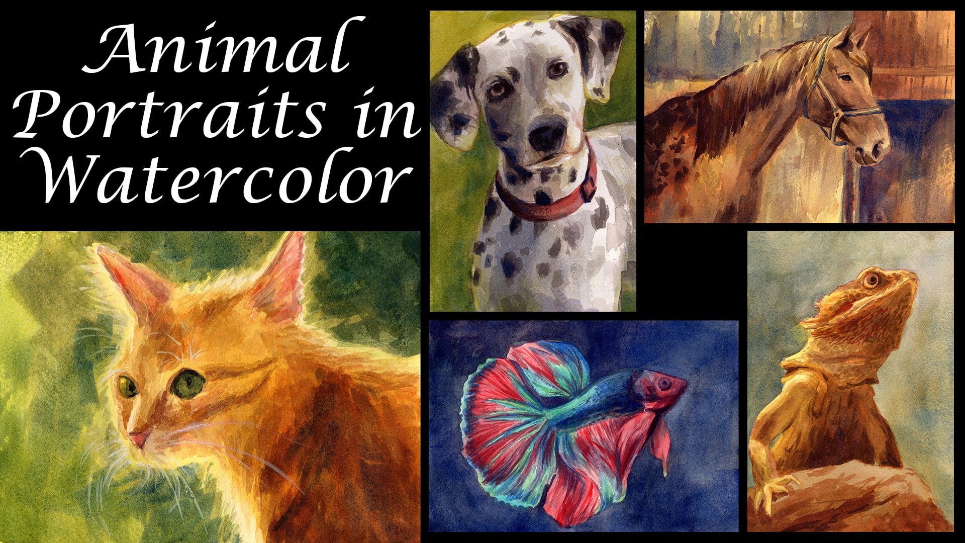
1. Introduction: Hi. My name is Rachel, and I'm an artist who works primarily in traditional mediums such as oil paints, watercolor and ink. In this course, I'm going to be demonstrating my watercolor technique for creating portrait. It's that while life like are also very dreamy and a little bit abstract, I hope that you'll join this course follow along and also post your own projects in the discussion. I look forward to seeing them there.
2. Supplies: Let's talk a little bit about supplies. Of course, you're going to need water pillars. Any set will dio a cup of water by your side. Brushes of assorted sizes, some masking tape, paper, more paper. Actually, just have lots of paper on hand so you can get lots of practice. You're gonna need a rigid surface to tape your paper, too, and some optional items include masking fluid pens for adding details. A dropper for achieving certain effects with your water color carbon paper to transfer your drawing onto your watercolor paper or a light box. If you have one, I think that's about it. Let's paint.
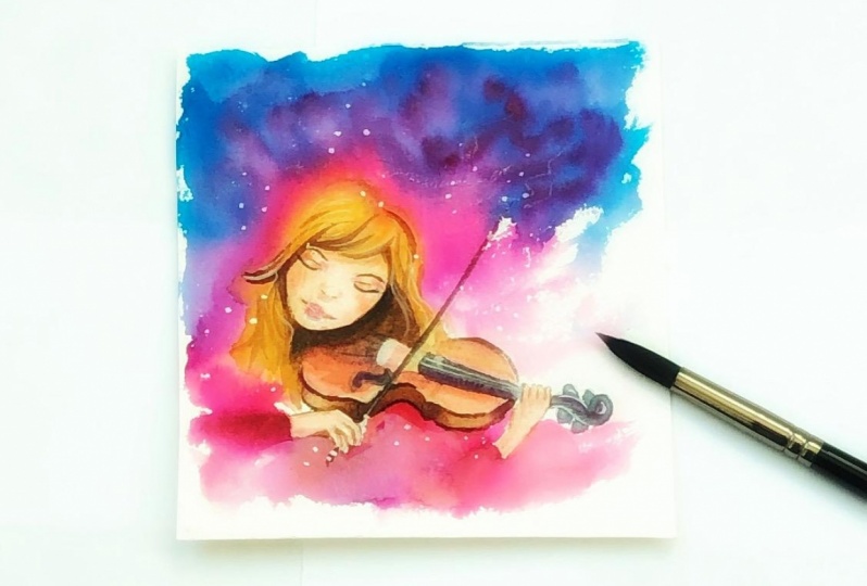
3. Transfer Your Drawing: any time I'm trying a new technique, especially in watercolor. I know that I'm going to be doing it several times for practice. And that's why I do my drawing on one sheet of paper, usually just a piece of computer printer paper. And I use that as a template to transfer that drawing onto several sheets of water color. That way, I can stay in my workflow and just go from one sheet of paper to the next. In order. Teoh, make corrections. As I learned, if you have a light box, it's really easy to transfer any drawing, even onto very thick watercolor paper. I'm using £140 watercolor paper. I, typically by a big roll of paper and just cut it down to whatever size is that I want to use. That allows me to have a lot of flexibility in the way that I work, and especially when I'm practicing something new. It's kind of nice, Teoh. I set my mind a ease, knowing that I am getting my practice in the most economic way possible. So if you have a light box, you can just set your drawing down on the lightbox first, make sure you use some tape. Teoh, fix it in place and then just place you were watercolor paper on top of that and use a pencil too lightly. Transfer your design or you're drawing onto your watercolor paper. You can see in my picture here of Lindsay and her violin. I'm actually not going to draw every single detail in my original drawing onto my watercolor paper. Specifically, I'm going to leave the details and lines that define the back of her head out because in order to kind of achieve that dreamy abstract look, I want toe have a lot of went on what water colors merging in with the form that defines her. And then that way she's going to kind of blend in with the background. You can check just by lifting it up, lifting up your watercolor paper just to make sure you didn't miss anything crucial. And once you have your drawing transferred and you've double checked everything you can then move on and go ahead and just transfer this onto several sheets of paper. If you're like me, you'll end up doing this several times before you're happy with the results. It's also a little bit easier as faras your process goes and getting into a good flow to just go ahead and do all of your transfer drawings at once. Otherwise, you might end up doing an entire painting and then finding that you need Teoh. Go back and do another tracing another transfer, and that can kind of get you out of the flow that you'll develop while you work. You don't necessarily need to worry too much about making your pencil lines too dark. As you progress with your water color and you layer colors and values on top, The pencil lines are going to become pretty obscure, although I do try to keep them somewhat light. And in fact, sometimes I even go back and erase some of the pencil marks before I start painting. Just because I know that those areas are going to be very light and I don't necessarily want the pencil marks to show through, so that could be up to you. But there's really no right or wrong way to do it. The pencil lines are basically just a guide for you, and you don't necessarily even have to stick with um strictly by the time I was ready, Teoh, begin filming this project. I had actually already done this painting about five or six times, So I condemn finitely, tell you from my personal experience that it's better to just go ahead and have several pieces of watercolor paper ready to go so that you can really hone this technique and get the result that you want. If you don't have a light box, there is another technique that you can use to transfer any drawing that you have onto watercolor paper, and especially if you are using a block of watercolor paper, as I am in this example. Ah lightbox isn't going to work very well for you anyway, because there's too many sheets of paper for the light to shine through. So what you can do is buy a pack of carbon paper. It's extremely inexpensive. You get about 10 sheets and they will last you. For years, I have had the same pack of carbon paper, and now for about four years, and you can just use them over and over and over again. With this technique, you will actually place the carbon paper dark side down on the paper that you want to transfer your drawing two, and then you will place your template on top of that, secure it into place with masking masking tape, and then begin with a pen or pencil or really any utensil that will apply pressure through the paper. It's the pressure of actually transfers the carbon from the carbon paper on Teoh, your substrate of choice. The only thing that I would caution you is that applying too much pressure can be detrimental. The carbon that transfers from the carbon paper is a little bit different than the graphite that you have in your pencil, and it's much more difficult to erase. And especially when you're carbon paper is newer and hasn't been used much. It's going to transfer lines onto your watercolor paper that are actually very dark and bold. You might actually be surprised to see how well this carbon paper transfers your image. So if you're using a new pack of carbon paper, really do some testing with it so that you can get a good sense of the appropriate amount of pressure that you want. Teoh apply, and before you remove your template from the carbon paper and your watercolor paper. You're gonna want to just lift it up from one corner as I'm here just to check to make sure that you've gone over all of the lines. Because once you remove the paper, it's going to be pretty difficult toe lining of exactly.
4. Practice the Techniques!: before you start working on any of your watercolor shades that you've transferred your drawing onto, I definitely recommend getting some scrap pieces of paper and practicing the wet on wet technique, especially if you are like me, and you tend to work in water colors a little bit too tightly, and you feel like you need to loosen up. This is a great way to do it and to kind of get the feel for this technique before you actually start working on any of your projects. The first thing that you want to dio is Get your paper nice and wet, of course, for the wet on wet technique, and then you just want to experiment kind of splashing some colors around, letting the merge into one another, Um, placing colors on top of one another. And as you can see, I am also experimenting with some texturizing techniques. Um, specifically, I am sprinkling a little bit of salt on some of the wet areas, and that can create a really nice texture. For that. Abstract went on what background so that it's a little bit more texturizing and not just completely smooth and keep in mind too that you don't want to overwork this process. The more your brush comes in contact with the paint that's already down on the paper, the more likely you are to get colors that are muddy it and aren't blending spontaneously. So go ahead and do as much practices you want until you get comfortable with this technique , and it helps you really just to kind of loosen up. And you might be surprised at what you get. Another technique, of course, is to use an eye dropper to drop a little bit of water, and that can also create some great textures.
5. Wet on Wet Layer 1: once you've been able to practice with your wet on wet technique and you feel confident and comfortable enough to move onto your projects, Um, go ahead and fasten your watercolor paper down to whatever rigid surface you've chosen to use. I've decided to use a clipboard rather than just taping it down to my desk. That way, if I want to pick it up and rotate it so that the water flows in different directions, I can do that. And then you're going to want Teoh. Just get your paper. What, almost everywhere. I have decided that I'm mostly going to leave the face area untouched during this phase, although I do want to spill some of the abstract shapes onto the face because I do want to create the effect of the dreamy background kind of intermingling with the more realistic aspect of the portrait. And you might also want to think about a particular color scheme that you'd like to work with. I decided that I want Teoh have a lot of turquoise green, even a little bit of yellow in my painting, but I don't want Teoh. Have my painting be strictly that color tone and I especially don't want it. Teoh appear to be too cold, and so what you'll see me doing is using some very light water down reds and pinks just to add a little bit of warm and balance to the composition. And again, when you were working on your wet and wet technique, don't brush over the areas too much. Lay down your paints and just let the paint and pigments intermingle with one another spontaneously. Don't try to control the shapes that you get because you'll end up with a lot of muddy areas. And I know that for me that is a big challenge. And I wanted Teoh avoid that. I know that I'm going to want some really dark areas. So what I'll have to do after I lay down all of this paint is I will have to wait for it to dry entirely so that I can add another layer and add up and
6. Wet on Wet Layer 2: Once you have allowed your first layer of wet on what abstract technique dry completely, you can add a little bit more depth in saturation by re wedding most of the surface and basically doing another wet on wet technique over what you already have. And this one should actually go a little bit quicker. You shouldn't spend quite as much time on it because you already have that basic framework and you don't necessarily need Teoh cover all of it up. You're just going to add a little bit more pigment, um, a little bit more saturation. And to get more saturation, all you need to do is use more paint and a little bit less water, and that's going to give you the illusion of depth in saturation. And I knew that I wanted the background, especially behind her, to be a little bit stormy and dramatic. And so I want to make sure that I do add ah, lot of pigment and a lot of saturation in the area, and you see, on this past, I'm also being a little bit more careful. Teoh avoid the actual figure, even though I let the water color spill over onto the figure quite a lot in the initial pass, but as I move forward, I want to leave myself plenty of room. Teoh define the figure and add some realism to her features. I'm also here starting to go over the hair area that's blending in with the background, but I'm not going to do too much. I don't want to add too much detail. And again, once you finish this layer, let it dry entirely before you move on.
7. Defining the Portrait: on this third pass, I will continue to build up my values in the background. But what I will be primarily focused on is actually getting to the portrait and the features. So you see, right now I am working on, um, what was my dried painting? And I am just adding even more depth and saturation to portions of the background that I want to really be dark and moody. But for the most part, I'm going toe. Leave the background as is, and just occasionally I'll come back to it as I'm waiting for parts of the portrait to dry , and I will be adding even more depth to that background and with water colors. What you have to remember is that to achieve depth, saturation and dark values, it's really a matter of building layers. And when you apply paint to an already dry layer of paint, that is a technique called glazing. Now you can see right now I'm actually starting to work on the portrait. I start out on my portrait. It's in a very general, simple manner. I have mixed a skin tone that's essentially just a yellow and a red to make orange And then I tone it down just a little bit with blue so that it doesn't look too orange, and I'm keeping the wash very light. I'm applying it over the entire face. I'm not worried about keeping her eyes white. Um, in reality, leaving the whites of the eyes white usually makes the portrait appear a little bit off. And with water color, it's definitely okay just to go ahead and go over the eyes with the same tone that you use for the skin, especially if it's not a close up portrait such as what I'm working on here. And then you see that I'm allowing all of the skin areas to dry completely, and I'm moving on Teoh other parts of the painting. Right now I'm working on the violin. I'm not going to have a lot of detail or realism in the violin because it's not the focus of this painting, and so the violin is going to be pretty dark. It's going to kind of because she's holding it lower. It's it's not getting a lot of light. The light source I am imagining is coming from that upper right hand corner, and so the areas of the portrait closest to the area are the ones that I'm going to keep the lightest and everything else I'm going. Teoh allow Teoh have a very dark value. Another thing that I tend to do when I'm working on portrait is I don't worry too much about mixing precise, realistic colors. You'll see that I essentially mix a magenta or purple to create the illusion of shadow. And so a lot of these areas that I know are going to be a little bit darker. I'm going to start building up a combination of magenta purple, and then I'll go over it with some warmer tones. Now that most of the face and skin areas have had a chance to dry, I'm going back in with darker and more saturated colors to start building up the features of the face. So I'm especially looking at the areas that are falling within shadow on her face. So the neck that's being obscured a little bit and not getting much light Ah, the side of her nose, the jaw line, the cheekbone area. These are all the areas where I'm going to start building up value as I go and again, Getting an exact precise color isn't nearly as important as focusing on value in saturation and with water colors in general. What you want to dio is work from light to dark. You don't want to try to go dark too fast because you will end up getting a lot of money colors or, um, you're going to get tones. But don't work in harmony with the rest of your painting, so it's better to start light and then, over time, build up your saturation and build up your values. And another thing. I'm keeping in mind as I work on this, because toward the back I want to have this stormy, abstract, dreamy look that's kind of spilling into her hair into the back of her head. But then, as she leaves that darkness and enters the light, I want her features to be a little bit more defined, and so I'm using less water in my paint. I'm letting the paint, um, be a little bit easier to control, and that allows me. Teoh have areas of emphasis that are really well defined. Now this here is an area that I could have applied masking fluid and in a few of my attempts, I actually did use masking fluid to block out the strings of the violin. I did, in the end, feel like it made the strings a little bit too stark. Violin strings are very, very thin. They don't at all need to be perfect. Even if you're kind of hit and miss with strings on an instrument, it'll actually look more realistic that way. Then, if you have perfectly straight blocked out lines. And so I think ultimately I was, I was happy to go this route without the masking fluid, even though it took a little bit more concentration. Teoh keep those lines relatively straight, and then you see here I have built up the violin. I started out with basically a purple color, and I've added essentially the same color that I'm using on her skin, in the more saturated areas onto the violin, too. Give it a wood grain look, and I'm using, uh, a wet on dry method and very controlled in order to give that violin just a little bit of wood grain texture. And as I and building up her face, you'll see that there's a lot of areas that I'm just completely leaving alone, especially those areas that are being lit up by the light. I really don't need to come back in and touch those up at all. And sometimes when you're working on Portrait's, it's important to keep in mind that less is more because you can certainly dio too much to a portrait and add too much definition, and that makes it a little bit rougher, which, depending on the look that you're going for that actually might be advantageous. But I really wanted her face to be very softly lit, and so I've mostly left it alone, except for the features that needed to be more prominent. And I'm just about done with this phase with the watercolor phase, just adding a little bit more texture a little bit more up, defining some features of the violin a little bit more and even going back into the background just a little bit again. The specific colors that you use are not as important as your values and saturation, so keep that in mind as you work, and now we're ready for the final details
8. Ink Details: now, my water colors are completely dry and I've removed the masking tape, although you may actually want to leave the masking tape in place. If you're going Teoh, add a few last details with ink. I am using a micron liner. My crones are really great to use with water colors because they are filled with India Ink in India Ink. If you do go back over, the ink with your water color will not smudge a lot of inks. In fact, most inks will actually smudge if you go back over them with a water based medium. But if you are certain that you're not going to add any more water color or any more water than you, don't necessarily need to be too careful about what kind of ink you're using. And again, as I look around for areas to use ink, I'm really looking for areas that I want to further define, and I really dio believe that with thank as well as with details on faces, less is more. And so I'm really just looking for small areas such as the eyes, the lips, the nostrils, some of the green in the violin. These are areas where I can add really small marks, just Teoh. Give the portrait and the figure more definition. It's not necessarily going Teoh. Correct anything that you don't like in your water color, but it is a really effective way. Teoh add points of focus in definition
9. Final Thoughts: I hope that you've enjoyed this course and you feel inspired to go and create your own watercolor dreamy portrait's. I want to show you a few of my bloopers as a way just to encourage you to continue trying And don't get frustrated. And remember, we're not seeking perfection. Were seeking progress in practice. Makes progress. Can't wait to see your projects. Thank you.
 Rachael Broadwell, Fine Arts Teacher