Transcripts
1. Intro to Painting En Plein Air with Watercolor: welcome. My name is Rachel, and in this course on watercolor on plain air painting, I'm going to show you how you can get started painting on plain air with minimal watercolor supplies. And I'm also going to show you some of my more advanced equipment that I use when I'm painting on plain air with water color. My goal for this course is to help you overcome the intimidation that I think is natural Teoh being new at painting out of doors. So I'm going to show you some ways that you can kind of ease into that process. And I'm also going to show you some of the strategies that I utilize when I'm tryingto put together a composition when there's so much information all around me. First, I'll show you some very minimalist equipment and supplies that you'll need just to get started on planner painting. I will also show you my full sketch kit, which, like most artists, is pretty extensive just because I love art supplies so much. Um, but I promise everything is very portable. Everything that I used to sketch with, it's just in my regular sized bag that I carry around. Lastly, I'm going to show you my full outdoor studio set up with my prashad box that I can use with watercolor. And I could also use it with oil painting. So for this course, I will show you the water teller aspects of that equipment. I hope that you will join me in this course of watercolor on plain air painting. And I really look forward to seeing your projects. If you have any questions at all, please post those in the discussion and I will make sure to answer all of them. Thanks so much. Now let's put on our grubby is close, get outside and paints.
2. Get Started with Minimal Supplies - Cafe Sketch Pt. 1: I'm going to show you a much more minimalist sketch kit that I almost always have with me. So I always try to have a pencil with me. It may not be this pencil. Usually you can find one, even if you forget one a water brush. And usually I can just stick with one. I really don't need all the different sizes. Next is my fountain pen. This is what I do all my sketching with. Or if I want to add a few lines to my watercolor painting. I can do that once the water color is dry. But this ink will smudge if I try to do a drawing and then put water color on top and then my gel pen. Just add a few highlights at the end, if I want. And, of course, my watercolor palette. This is just my Windsor and Newton Cotman set, and it basically just has a warm and cool version of all the primaries. And then it also has some earthy colors in that bottom room. And this, of course, is just my travel brush that I don't use very often. But it is nice to have just in case Sometimes, you know, I do forget to bring one of my water brushes along with me, so that's just always in the palate. And then I usually have this little jar in my purse. This is just the little jar that usedto have lotion in it, and it cleaned it out, and it's really easy to fill with water. If its empty and I'm at a restaurant, I could just ask for a glass of water and then pour a little bit in there. It's ready to go. And then if I forget paper towels and I am in a cafe or restaurant, I'll just use some napkins. They're not as absorbent, but they'll do the trick. And then, of course, I always try to have my sketchbook. And this is really all I need. If I just want to sit in a cafe or restaurant and just do a little bit of observational on plain air watercolor painting
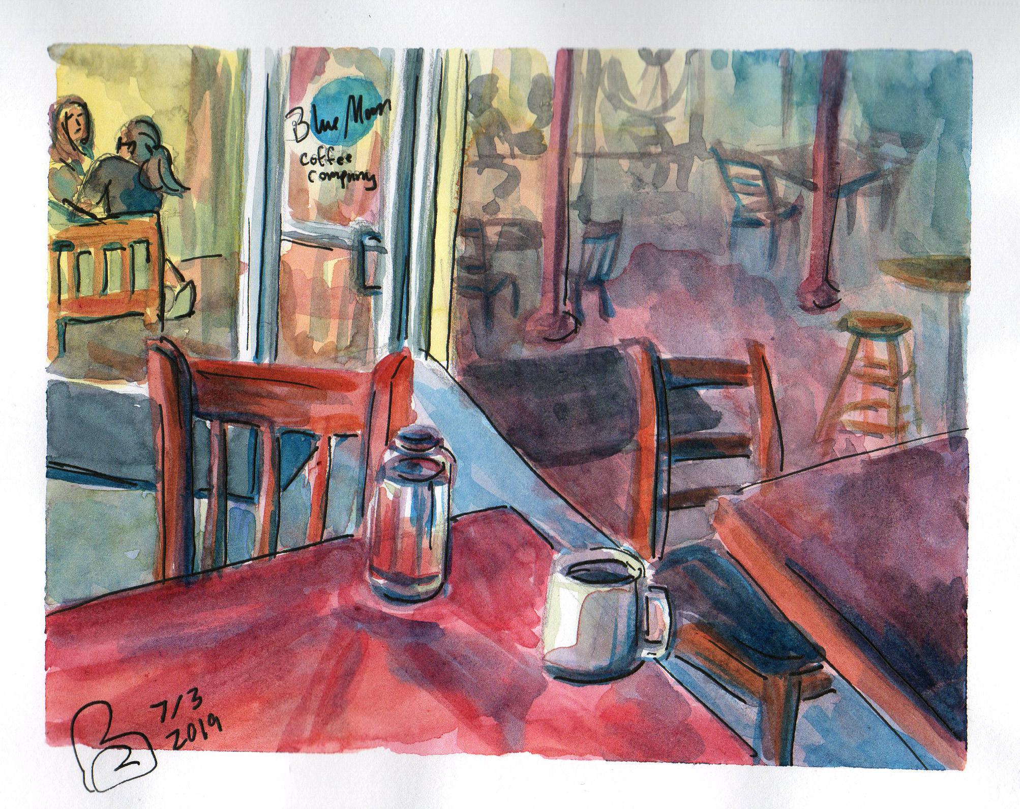
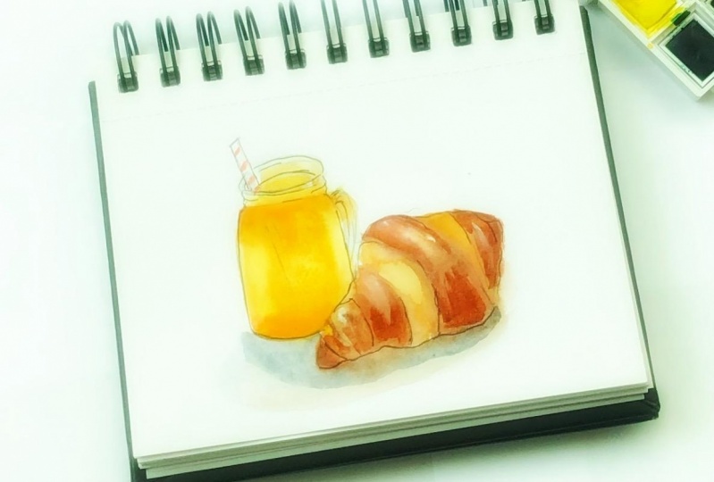
3. Get Started with Minimal Supplies - Cafe Sketch Pt. 2: Some people might say that sitting indoors somewhere like a cafe or, you know, a shopping center, something like that isn't really unplanned are painting because you're not outdoors. However, I think that it really should count as on plane are painting, because to me it's all about doing observation, Aled painting, taking color notes and really getting a sense of the environment that you're actually in rather than working from, say, a photo reference or anything like that, I even think that you can sit inside your own house and do some observational painting of the environment in which you live. And to me, that's still unplanned air painting. But I digress, So I am actually sitting in one of my favorite little coffee shops. It's very comfortable. It gets a lot of traffic, but it's not overly crowded or noisy. So it is just kind of a nice welcoming place to sit and draw. And I had some delicious food and I felt very replenished and ready Teoh work on this environment. The most challenging aspect of doing on plainer painting inside a building is that perspective, of course, is a big challenge for a lot of us in my tip for doing perspective, drawing when you are kind of in a hurry or you haven't yet gone through the process of formally learning perspective. Drawing is to start out with your vertical lines and work out your angles based on that. So if you start with all the vertical lines that you see, it's a little bit easier to judge all of the angles and the depth. So what I'm doing here is I'm just applying a wash over the entire painting and especially everything that's a little bit more in the background, because I want everything in the background to look a little bit recessed. And I'm going to achieve that by using a lot of very soft washes, keeping everything very soft and really pretty neutral. I sketched in some of the tables and chairs in the back room, but I certainly didn't even attempt to do all of them. And I am including very few people in this sketch, and you may just want to leave people out entirely. If you are new to this kind of painting, in fact, you might want to narrow your focus. For example, you could just paint the glass of water in front of you. Or, you know, just your coffee cup or just your spoon or your fork. And that's really going to help you get used to doing observation. Aled Painting. And over time you'll feel more comfortable expanding your view. And I'm working very general. I'm not worried about getting every detail on every chair exactly right. Ah, sometimes just laying down one stroke will do the trick. And keep in mind that water color is not a medium that we really used to draw with. And so it might be easier for you just to get used to the idea that watercolor should be soft. It should be very general. You're going to get a lot of bleeds, and that will actually work in your advantage as long as you allow it. Teoh and you don't try. Teoh have too much control if you want a lot of control. Of course, you would use something like a pencil or a pen, and you would really take your time. But the nice thing about on plainer paintings that are done in watercolor is that they're very sporadic and you get a lot of just unexpected interactions and then another way to make this process a little bit easier for you, especially if you're working on a more complex subject matter is to use your color very, very subjectively. So while there are very strong color patterns based on the interior design of the space, for example, there's a lot of red, all the tabletops, air red. I think that the floor in the background is read. Those, uh, polls back there are red, but I'm not just going to use flat local colors. And in order to achieve some depth, I'm really just paying attention to what the value is that I'm trying to achieve. So the hell lighter, dark the paint should be. And then I'm looking at tone, So I'm looking to see how warm or cool the color should be. So a cool color is always going to have more blue mixed in. Warmer colors are going to have more yellows and reds. And then, of course, I'm using a lot of neutrals where I'm just kind of combining all three primary colors to get something that's more neutral. But it might lean more toward red, blue or yellow, and every once in a while just because that pallet is so small. You saw a few seconds ago that I just had to wipe it out clean because sometimes I'll use up all of those mixing wells and they'll be a little bit money and I'll want colors that are more vibrant. So what I'll do is I'll just dip my napkin or paper towel into my water and use that just to kind of mop up those well so that I have a little bit cleaner space to work with. And now I am going back in with some more vibrant colors. I start out usually with my neutrals, just to kind of set everything on, um, a perspective plane that I want so things that are more in the distance. I want those to be a little bit more neutral and maybe a little bit cooler, and then things that are in the foreground or that I want to draw your attention to. I'm going to use colors that are more bold and vibrant. But again, I'm using these colors very subjectively, and I'm interpreting things in a way that is not so much literal as it is. I like to think of it kind of as poetic. So I'm really embellishing a lot of these colors. All right, so I've got this all finished up. I'm gonna clean off this palette really well, because I like to keep it very clean. And now that my painting is dry, I'm just going back in with my fountain pen. And I'm just adding a few strokes where I want some harder edges to be where I want to draw your attention. But I'm not going to go and outline everything in this painting. I don't want it to look like a coloring book that I colored in. So I'll primarily only use this pen here in the foreground and on objects that I want. Teoh make stand out just a little bit more. All right, So I'm ready to take the tape off and show you this finished products. You got anything there? We go pretty happy with this. These scenes are always a little bit challenging, but it does get easier the more you do it. I wanted to give her a couple of facial features back there, even though she's pretty far back. Those were the only people I paint. And basically, when I sketched these two girls back there, I just kind of caught a glimpse of them and I draw them very loosely. I don't really worry about anatomy or things being completely accurate, and then I'm just gonna sign it, date it. And I think that this was a pretty successful little cafe on plain air painting, and the food was great, too.
4. Plein Air From the Comfort of Your Car - Supplies & Set-Up: So right now I'm sitting in my car with my two dogs. There's watching there's Hazel so they might be making a few more appearances in this video . But I'm sitting in my car and I'm getting ready to do a little bit of water color painting . I think that's sitting in your car is actually a really great way toe acclimated yourself. Teoh painting on plain air and with watercolor. It's actually very, very easy to do this. I've actually done this with oil paint as well. So if you've seen my course on on plain air painting with oil paints, you'll actually see that I can paint in my car with oil. Paints is well, although that's a little bit riskier, because it could be quite messy. If you make a mistake watercolor a lot safer. It's a lot easier to clean up. It's a little bit more compact, and you don't need any kind of solvents or anything like that. And the risk of staining is a lot less with watercolor than it is with oil paints and being in your car to paint enables you Teoh be outside, but also to be a little bit sheltered So if you are feeling anxious about drawing attention to yourself or having people walk up and want to see your painting that you might not feel completely confident about, This is a great way just to get outside and do some observational on planner painting. So I'm going to show you my set up for painting in the car, and then I'm going to run through just a quick couple of exercises just to get you started with this kind of painting. So here's the scene that I'm looking at. This is the downtown of the little town that I live in, and today just happens to be the Fourth of July. So I was kind of looking for, uh, an American flag to paint. So I'm gonna be focusing in here and let me just show you my set up this device here is just what's going to be holding my camera as a paint. So my painting will be in my lap. I have seen people use their steering wheel to kind of, um attach their paper or there canvas or whatever they're using to paying actually up here , and they just kind of cover everything so they don't make a mess. Um, I haven't quite figured that out yet, but I'm just using my cup holder here. Teoh with a jar of water with a lid on it and then all of my watercolors sketching stuff is in this bag that my dog is currently sitting on, so he's gonna have to move. He doesn't know it yet. Here is the bag that I usually carry on my sketching stuff in. Sorry, it's a little bit of a close up here just the way that my camera is positioned and all my sketching stuff. It's inside this bag, and right now, I probably have more art supplies in here than I really need. Um, but just for the sake of showing you, I'm gonna go ahead and show you everything, but I'll let you know what's essential and what is not essential. So, of course, the most essential thing for sketching is gonna be a sketchbook. And so I'm using a mixed media sketchbook bike. Anson and the paper is £98. I usually use watercolor paper. That's £140 when I'm actually, you know, doing a finished painting. But for sketching this I have found is has been pretty nice. These sketchbooks air pretty inexpensive. I think this one was $45. And then I just use these paperclips to hold my paper in place, especially if I am outside in the wind is blowing I don't want my pages to start blowing with the wind So these clips are really nice just to keep everything in place. Next, I have some masking tape and this is not essential for sketching in a sketchbook, because in the sketchbook, because the water, because the paper is thinner, we're not going to use as much water. And so we're not gonna worry too much about buckling, and the tape doesn't really help with buckling. Anyway, the only reason that I used tape when im sketching is just because I like to have a really nice clean border around my sketch. Okay, so this little pack contains all of my watercolor. I'm gonna show you the essentials first. Of course. Now all you really need if you confined a watercolor set like this, this is a Windsor and new in Cotman set. This is pretty inexpensive. It has plenty of colors and the cool thing is that it actually came with a little travel brush. So let me show you. This is very, very small. I actually don't like to use this, but if I forgot a brush or I lost a brush, I would have this and I'd still be able to do a little sketch. And I do have a very, very small watercolor sketch book that I use. Sometimes in this brush is actually a pretty decent size for that. You can see whenever I put the cap back on it, it seems like I end up splaying some of the bristles, which is a little bit annoying. So what I I like to use most are these brushes that you can actually fill with water. So if you didn't have water with you or you forgot it, these brushes would actually replace the need for having a jar of water. And you can actually dio a really decent painting with just this water. So I would say that these are somewhat essential. Okay, Another essential item. Paper towels. You need this Teoh kind of block things off to clean your brush. Um, to make sure you don't have more water on your brush than you're really wanting. So definitely, always have some paper towels with you. If you're in a restaurant, though, and that you don't have paper towels, you can always use napkins. They're not as absorbent, but they'll do the trick in a pinch. So those really are all of the essentials. And now I'm going to show you some of the other things that I just I like to use and I like toe have with me. The first is a fountain pen, but you could use, you know, any kind of pen or a pencil. And I like to use this just to do an initial sketch, especially if I have some time to really sit and work out a composition I'll usually dio sketch in ink before I get started. And I do have a separate sketchbook. But I could also just use this in my watercolor sketch book to do a quick thumbnail sketch , and that helps with a lot of the problem solving that goes into a composition. Ah, the next thing is a little dropper. I like to use this. It's not essential, but I like to use it to get some water onto my palate just to get those caked paints. Teoh liquefy a little bit so that they're usable. But of course, with my water brushes, I could also just squeeze some water out of those brushes onto my paint to get them wet. Right next, I have a little airtight jar of India ink, and I also have a dip pen with me that I'll show you in a little bit. And India ink is a waterproof ink so you could actually do a drawing with your India ink. Let it dry, and then you can actually paint over it with your water color. And the ink won't smudge if you have another kind of ink like Sumi ink or actually the ink in a fountain pen, Sumi Ink and this kind of ink that's in a fountain pen or not waterproof. So if you do a drawing in ink with either of those kinds of on and then you go over it with your water color, you're gonna get a lot of smudging. Next. I have just a little bit of masking fluid. I rarely use this, especially with plain air painting, because it's just a little bit messy in cumbersome, so I don't use it very often. But I dio just have it in my bag basically because there's room for it in here. Next thing I have is a white gel pen, and this is nice. If there are some areas in your painting after you're done and you've let it dry and you want to kind of just define some little accents, So I don't use this very extensively at any point. But for really thin lines, that should be light instead of black. This is really handy to have. All right. Next, this is just my little pencil pouch that I keep all my most basic sketching items in. So you can see I have another little tiny sketchbook in here. Um, but what I want to show you in here, first of all is a pencil pencils air really nice to dio your initial sketch on your watercolor paper. Usually, pencil lines don't show through too much. Or if they do, it's barely noticeable unless you're actually looking for them. So I do like to do a little sketch with a pencil on my watercolor paper before I start painting. And then This is the dip pen I was telling you about. It's nice because it has a lid. And so sometimes, when I'm usually actually when I'm done with the painting, I'll go back in with Cem India ink and just add some hard edges. I usually I'm not going to do a full drawing in ink before I do my watercolor, because I don't want everything to be outlined. I like to use ink just to show where some of the harder edges should be to draw some attention towards certain elements in my composition, but I don't like to overly use ink in my watercolors.
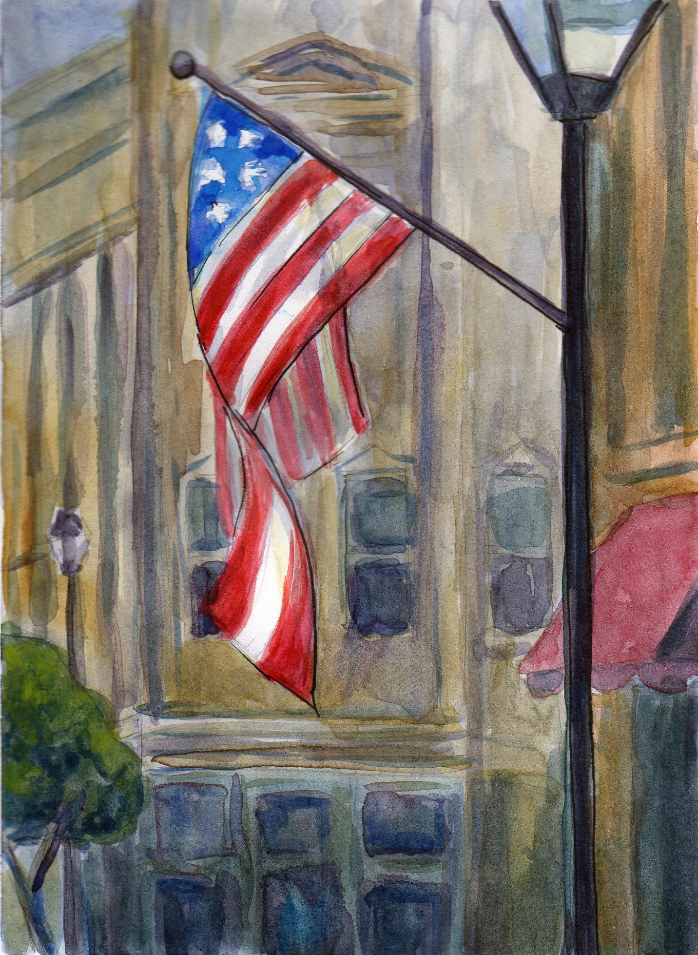
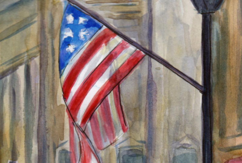
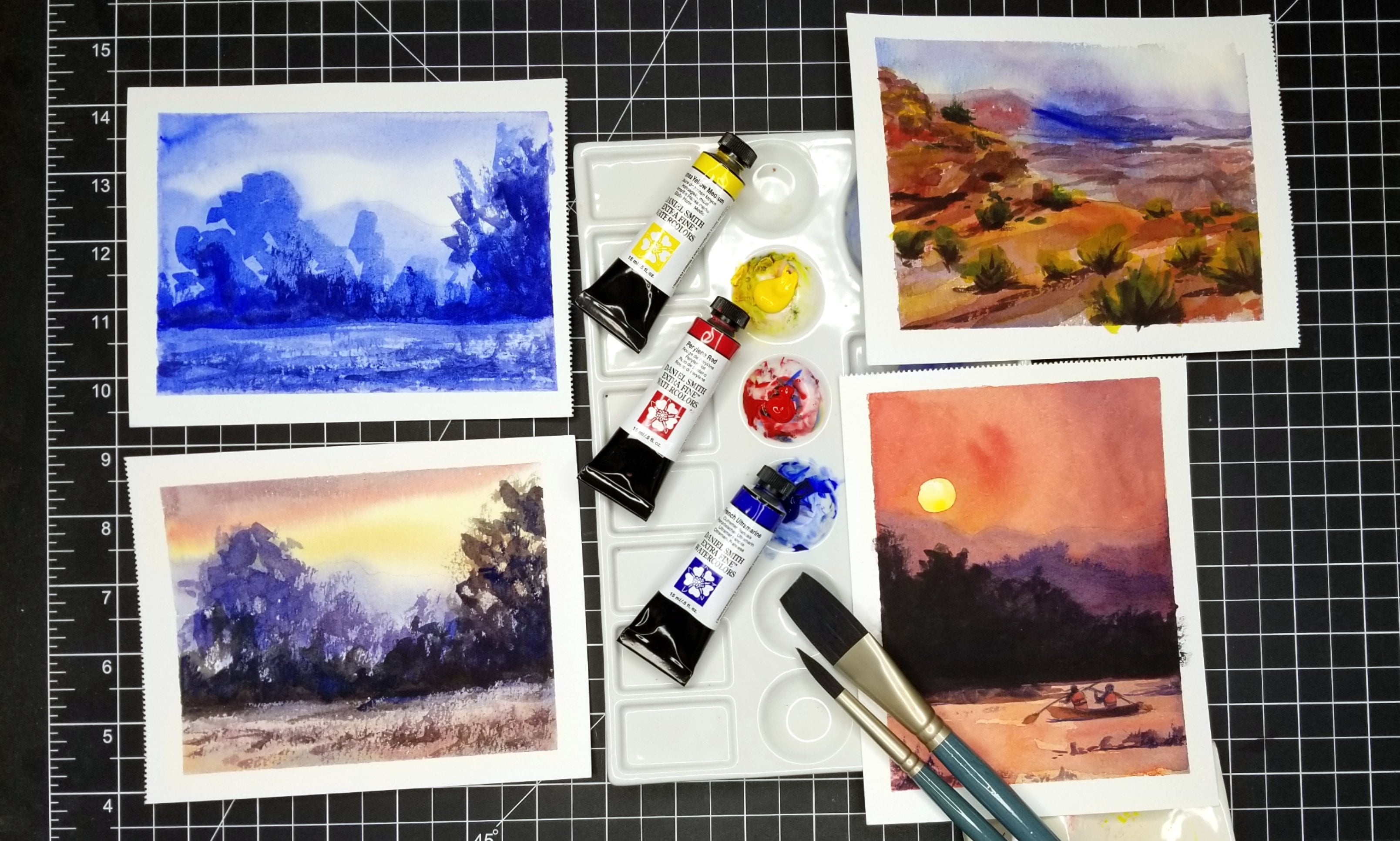
5. Plein Air From the Comfort of Your Car - Quick Sketch in Ink: So now I'm ready. Teoh, start doing some quick sketches of this composition. And what I've done in my sketchbook is I just used the masking tape to section off a couple of rectangles that I'm going to be working with. And again, that's not necessary. It's just something that I do. It visually helps me, and I also just like the hard, clean edges that I get when I remove the tape. So what I have right here I have my water brush with just a little bit of water and there you actually don't need it to be completely full unless you're going to be, you know, spending several hours painting. And then I have my pencil and my pen. And if you're new to either plane, air painting or watercolor painting or both, I recommend starting out very, very simple. So what I'm going to do first is just a quick sketch with ink just to kind of figure out my composition, and that's going to help me get through the painting process because I'm gonna work out some of the problems from the on sets. And so I have already decided that I want my primary focus of this composition to be that American flag that is attached to a light post. So I'm gonna go ahead and figure out where that should be. I think you know, probably I'll put this right in the middle. There's gonna be some other elements of this composition that are less symmetrical. So I'm gonna kind of design everything else around this flag. The wind is actually not blowing today, which is kind of nice, because this flag will likely stay in place, or at least close to in place for the duration of my sketch and my painting. But in the case that the wind was blowing and this flag was just kind of going crazy with the wind, what I would do is I would do a quick gesture, drawing of the pose that catches my eye and try to just stick with that and not worry about the changing conditions too much. I want to make sure I have the right number of stripes on this flag. Don't see. Looks like I need to make it a little bit wider. It's OK if you hear background noises. I am downtown, so there's cars driving by. There's people walking by. And of course, my dogs air here in the car with me, and they have lots and lots of energy. So this light posts, I'm gonna kind of offset it a little bit. So it's going off the page. But I do want to include it. And even if you're not a very confident drawer, I really recommend trying Teoh sketch in ink. Or even if you're gonna use pencil, try to commit yourself to not erasing. And the reason for that is that even if it's not perfect, even if there's lots mistakes that bother you, um, erasing actually ends up being very counterproductive, especially for beginners. And it can end up really frustrating you because if you think about sitting out and sketching and you're out there for 30 minutes and you're just continuously erasing and redoing everything, you could easily be sketching for 30 minutes and still have a blank sheet of paper. So even if you're new to drying your new toe observational drawing, try to just commit yourself to that and you'll see yourself improve very quickly and also even drawings that are in perfect or they're not in perspective. And I'm definitely not a great perspective. Drawer things. We're still going to come together and make sense. Okay, So the primary focus of this painting, of course, is this flag. But there are also some buildings in the background, and I basically am going to keep those very light into a minimal, so they kind of fade into the background. But I do want to capture just a few essential lines just to add a little bit of interest. I think that this painting would be a little bit boring if we didn't have anything in here other than this flag in a very neutral background. So we will include those just to add a little bit of interest. But you can see that I'm keeping it extremely, general and lights I'm not worrying about, You know, solid lines are keeping them perfectly straight or in perspective. And I think that one important thing when you are doing on plain air painting, no matter what medium it is, you should try to just relax your mind. To do this you're painting is gonna turn out better if you come to it from a relaxed mindset, it's going to feel fresher. It's going to be more spontaneous and vibrance. I know that that is easier said than done. I think that most of us are just naturally perfectionistic. But I think it's also good to make an effort to sort of let that go and remember to, You know, if you dio and on plain air painting and you don't like how it turns out, no one else even has to see it. It's just for you. It's just for your experience in your own self improvement, and I don't need these buildings to be identifiable. We live in a small town anyway, so nobody is going Teoh know if I'm drawing these things incorrectly. Okay, so let's leave this sketch here now I do. What I want to do with this sketch is just kind of work out the lights and the darks. It is kind of nice to do on plain air painting when you have some cloud coverage or it's a little bit overcast because that sort of flattens everything, especially, You know, when you're doing buildings, you're not going to get as many shadows. And that just kind of makes things a little bit simpler, especially if you're just starting out. So I'm always on the lookout for a nice, overcast day to do a little bit of painting. You can, of course, paint in any condition, but this is probably my favorite condition to pay under and actually is starting to Sprinkle outside. So I'm very glad, but I'm in my car. And again it is the fourth of July Today. Hopefully, we don't have rain on our fireworks and are our parades literally might rain on our parade today. That's okay. Okay. And so as for the dark's in the background, I don't I'm gonna kind of just make a note of where they are, but I want Teoh make sure that I actually keep everything in the background pretty light when I'm actually doing my painting. Not worried about shading at all when I'm doing this ink sketch. Because obviously, you know, I'm just doing black and white. The next sketch that I dio for this composition I'm going Teoh dio monochromatic Lee. And so then will actually work out a little bit more of the shading. Not sure there's a This is a tree right here. It'll probably translate better in color right now. it seems a little bit odd and distracting, but, you know, it's kind of a nice way, actually. Maybe I'll move it up. So I have a little bit more of the trunk showing, but it is kind of nice, especially when you're doing a lot of geometric shapes to have a couple of organic elements as well. And I don't want these windows back here to distract from my flag. So I'm gonna try to shade this one in a little bit lighter, and you can see that that kind of pushes it back further than this one, which I shaded a little bit darker. Okay, so I'm going to go ahead and move on to my monochromatic sketch.
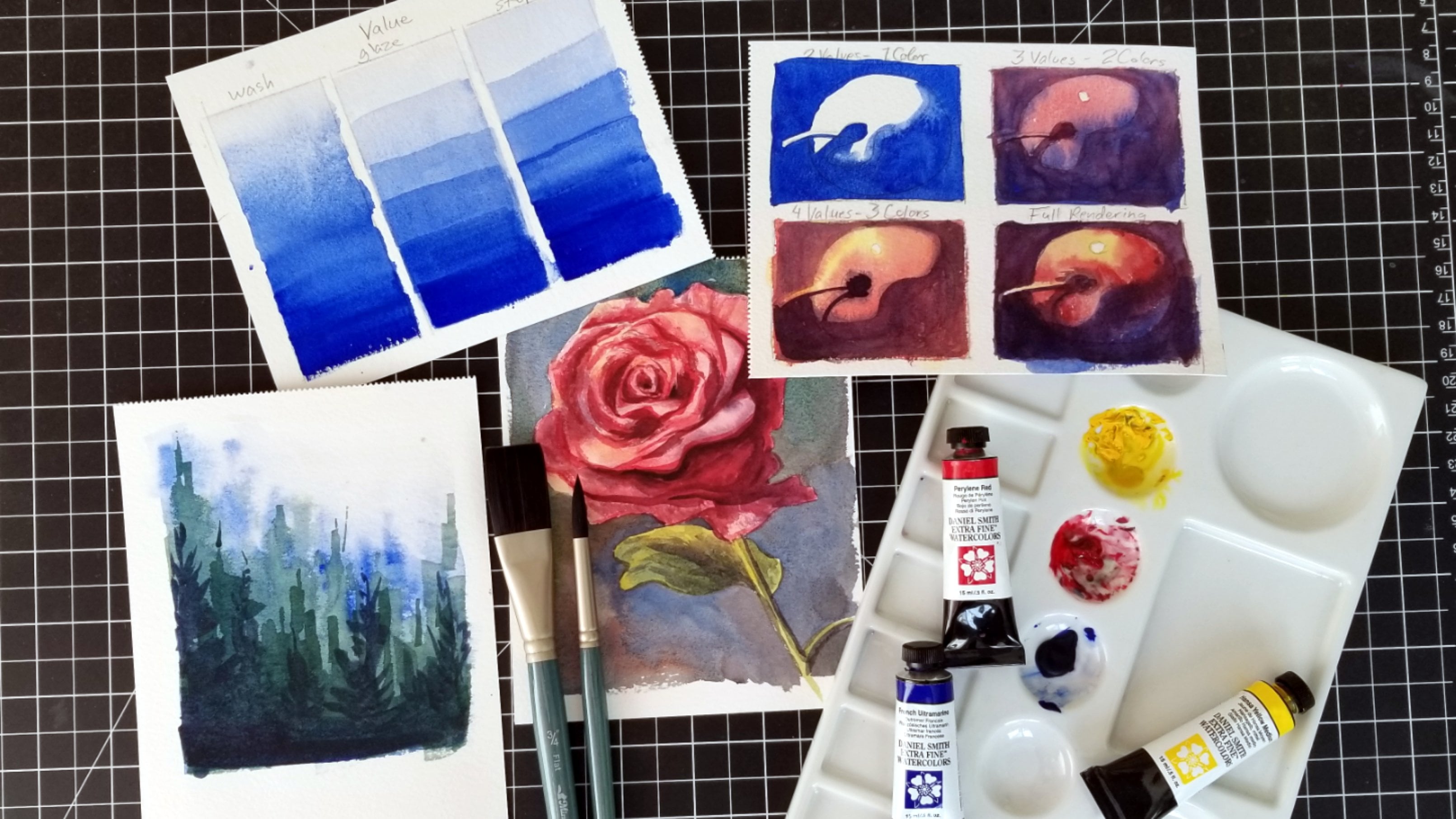
6. Plein Air From the Comfort of Your Car - Monochrome Watercolor Sketch: Now I'm ready. Teoh work on my monochromatic sketch with watercolor, but I am first just going to quickly sketch with pencil. This composition and the reason I'm even doing a sketch on the actual paper that I'll be water coloring on is because watercolor is such a fluid medium. It's hard. Teoh, get your structure down. I know that there are some watercolors who can just start out with their watercolor, and they're comfortable working out the structure later and letting it be very loose and soft to begin with. But I really think that it helps to kind of know where things need to be before I start putting lots of water color down. And although I'm not pressing very hard with my pencil, I'm not gonna be too concerned about, um, pencil lines showing in general. I find that they really don't show too much, even if they're very sketchy and most of the places were in putting lines. I'm going to be working with darker values anyway, and that what kind of help hide those pencil lines a little bit said. This composition is going to be monochromatic. So the whole purpose of this composition is just value. And as I said, if you're new to unplanned or painting or your new toe watercolor or you're new to both, I recommend starting out with some very basic sketches and doing a sketch with your water color but limiting yourself to one color so that you can kind of develop a feel for the medium without worrying about, you know, having an infinite number of colors that you can mix. All right, so with watercolor, we generally start from our lightest values, and we work Teoh our darkest values. And so I'm going to apply a wash over pretty much all of this background because I don't want any bright whites back here. The only bright whites that I want are the stars and stripes of my flag and with watercolor . Your lighter values will basically just have more water in the mix, and then to get darker values, you're going to increase the pigments. So you'll you can either add more of your pigment to your mix, or you can start a new mix that just has less water in it, and then you're gonna get some darker values, and my goal here with this painting is not toe have, you know a finished piece, but just to work out the values so that this composition makes sense? This here is just a little bit of sky. So I'm going to want Teoh have that lighter, so I'll go over the rest of us with another wash. And I'm not going to worry, especially for the background, about letting this wash dry before I add more paint to it, because it's in the background and I want Teoh, um, not draw too much attention to the background. I want it to be a little bit softer, a little bit blurrier and not worry too much about straight lines. It's good to kind of define what your goal is, and my goal for this is just to get values in place, not to have a perfect rendered painting. And you might just have to remind yourself of that. If you find yourself, you know, feeling frustrated or you find yourself fiddling with a certain area, you know, trying to get it perfect. Just remind yourself that plainer painting is anti perfectionistic. It's really meant to be very loose and fresh, and the imperfections, I think, are actually part of the term, - and when you're working exclusively with value, you'll find that working on texture is also very important. So this tree here, I can't rely on having Green Teoh tell the viewer that it's a tree. So I'm trying. Teoh apply a little bit of a rough texture here, and it may not translate as successfully as I would like, but I'm learning, and I like what Bob Ross says, Barbara said. If you're learning, you're not failing, and I think it's That's a good mantra for a plane air painting. It's it's challenging. You have a lot of information. If you're working from photo reference, you already have your image translated into a two dimensional form, whether it's, you know, a printed photo or digital. But when you're working in plain air and you're outside and you're just making observations , it's it's more challenging. Teoh do all of these translations on the spot, and you also even if you're not in a hurry. I usually find that I work quicker when I'm working outside anyway, so you just don't have time for perfectionism, and I think that translates over into other aspects of your life to which this day and age , I think we all need Teoh find a way to kind of step back from things and to not worry so much. So hopefully this practice and it could be, you know, somewhat meditative Teoh. Hopefully that helps you in other aspects of your life is well, I know it has for me. And I think one big thing that I've learned is that if I stick with something, if I stick with a composition, even if I'm feeling really discouraged by it at first, if I stick with it, I usually find that I'm glad I did. Sometimes I don't realize it until much, much later. Sometimes I'll do a sketch in my sketchbook, and I won't feel good about it at all. And then I'll just be flipping through my sketchbook sometime later, and I'll find that that sketch I didn't really like it first has kind of its own charm. And hopefully you can start to see that, For example, here in this lamppost, I'm distinguishing it from the background just by increasing the saturation. So I'm using more pigment, less paints. I'm even though my lines are not perfect at all. I'm making these edges a little bit harder, whereas in the back room I'm trying to keep all those lines pretty soft and washed out. And this just kind of helps Dr certain elements to the foreground. Obviously, I'm not going to be able to paint every star. And lucky for me, this flag is folded in a way that you apparently can see any stars, actually, so I'll just kind of keep my stars to a minimum. They're not going to be stars. In fact, they'll just be areas that are white. And now I'm looking back at the actual flag and it has actually shifted a little bit. So some wind must have picked up and caused it to move just a little bit. So it's actually no longer in this position. So, you know, that's a great aspect of actually having a sketch candy. So I could just refer back to this Teoh, remind myself how I had decided to paint this flag so thin this out a little bit so I can go in with a little bit lighter value. I'm just squeezing some of this water out of my water brush, and it will just naturally dilute some of that paint that was already on the brush. - Okay , so I think I'm just about done with the sketch, even though this is all done in Brown and the reason that I'm sketching in brown. By the way, there's no other reason for it other than it's just a color in my palette that I find that I don't use very often. You can maybe see that I use my ultra Marine blue a lot, and so I run out of it a little bit quicker. So if I'm just doing a monochromatic sketch, I try to just pick a color that has a lot of pigment. So obviously not, you know, yellow. Um, and I picked that just, you know, so that I can use a color that I don't normally use a lot of it's most likely with this palette. I'm going to run out of certain colors that I use a lot, and I'm still gonna have colors and here that I don't use very often, and I'm gonna have to buy a new one anyway, so I may as well take the opportunity to use up some of these other colors when I can. And I have my paper towels just off to the side over here. I know you can't see them, but every once in a while I just need Teoh dry off my brush. And so I just kind of blocked my brush off. And then if I feel like I maybe went a little bit overboard there, it could just blot it, enlighten it a little bit. Okay? So let me just my palate up my paintbrush off to the side and they will just kind of show you these up close. So I think that this translates really well. I think this is actually a pretty successful composition. And then you can see how my sketch really really helped me work through some of the compositional issues that I was bound to have such a that flag moving. So now that we've done some sketches, I'm going to do a more complete painting. Although I will try to do it fairly quickly. And these sketches are going to really help me with that process because I've already done so much of the problem solving with this composition, and I've taken a scene that at first seemed a little bit complex and intimidating, and I've managed to simplify it in a way that still reads the way that I wanted to read. All right, so let's get started.
7. Plein Air From the Comfort of Your Car - Full Color American Flag Sketch Pt. 1: Okay. Now I'm ready to start on my final composition here in my sketchbook. Ah, this is some of my nephews. Beautiful artwork over here. I loaned him my sketchbook once. I definitely recommend lending small Children, Your sketchbook. It's very interesting. So I I feel like this drying went a lot better. I went ahead and sketch this all on here because I had done this drawing to other times on a slightly smaller scale. This drawing just felt a lot easier to put together into kind of make sense of things. So I'm pretty happy with that. And let's go ahead and start painting. Try to make sure my camera stays focused here. So now I'm going to be using a full color range, which does not mean I'm going to be using my full palette. There's colors on here. I didn't even add any water to just because I know that I won't be using them. And I'm gonna try to keep my paper towel right here. Okay, So to start out with, I want to first kind of block in this background, and I still want to keep it very neutral and toned down, so I'm going to be mixing up Ah, Gray Wash. And one of my favorite ways to make Gray is to use my number. I think that this is a raw number, and then I add in a bit of ultra marine blue, and this just makes a really nice, toned down sort of gray. So I'm gonna go ahead and basically go over my entire background with this gray and just a heads up. There might be times that I have to mute this video. I want to try to keep this video all in real time. However, I am very, very close to a train station, and so when trains come through, it's very loud. But if a train comes through and I have to mute the video or continue painting in real time , and I'll just kind of make a mental note Teoh holding whatever I wanted to say during that time so that I could make sure everything makes it into this video. But that's just one aspect of working outside. Your conditions are almost never going to be perfect. You have very little control over your surroundings. Obviously, when you're outside and that's something that you have to get used to. But really, I don't necessarily think of it as a drawback, except in the situations where I am trying Teoh make a video. Otherwise, I think that these changing elements that it's actually if you think about like a boot camp , you know when you have to deal with a lot of situations that are stressful and new to you. But you adapt and it actually makes you a better artist in the long run. And that's kind of how I think about working outside and kind of working through the different challenges that inevitably are going to come up. So I'm going Teoh, even while this wash back here is fairly what I'm going to start applying a very warm wash on top of it. It's not going to be in the long run. It won't be a completely vivid color, but I want to just kind of get the sense of how these buildings look back here. I just didn't want to use a really bright, bold yellow back here because that would draw your eye away from the flag and more into the background, so I kind of like how this is going Teoh. Blend in and bleed with that grey, and you'll probably see that I was actually able to draw in more details in this drawing because it's larger. It's about twice the size of those sketches that I did and you can also see. So far, I've just kind of transformed this mix back here into other colors because I want to keep these also toned down and neutral. Um, it kind of helps just to transform one mix into your other mixes, and that keeps it. I mean, one way of seeing it is that it's a very muddy color, but I tend to think of these as very neutral colors. Okay, I'm always very, um, subjective in my use of color, so I definitely am in no way trying to make any specific color that I see around me. What I'm really doing is trying to match the value, which is how lighter, dark something is. And I'm trying to match the tone, and I think of tone as how warm or cool it is. So, for example, thes buildings back here kind of made of concrete and the way that the light is reflecting off them right now makes them look warm. So I'm using very warm colors such as yellow. Teoh represents those buildings, and then anything that's dark, I'm going to be a lot more concerned with just matching the value. And for the most part, I find that dark objects are a little bit cooler and tone. So I'm just mixing up some neutrals that will help me achieved the dark value that I want and at the same time they'll be neutral. But the hopefully will lean a little toward being on the cooler side in tone. But again, I anything back here, I don't need it to be overly dark or saturated, because I want everything back here to kind of fade into the background, whereas my focal point will be the flag. And so the flag will probably be the last thing that I actually pain. Right now, I'm just avoiding it. I'm painting around it since watercolors air transparent. Um, if you go over something, for example, like with a wash, you won't be able to put anything lighter on top of that wash, which is why, in watercolor, we tend to try to work from our lightest values and then we build up to our darker values because I can always go darker. Then what I've initially laid down by adding more pigmentation but trying to make something that is too dark light is usually not possible. And so that's just one thing Teoh be a little bit aware of. But it's something I think that you just develop an intuition for as you work more and more with this medium. Okay, so I think kind of bring this back up to a warmer tone out in san Yellow, a little bit of red, - and you can see with how much this water flows. Why? It's nice to have a pencil sketch to give your painting some structure while you're working through the washes, and I tend Teoh start out with a lot of washes rather than going in and trying to do some hard lines from the onset of a painting. One of my favorite things about water color is the wash is that you get in all these, um, you know, bleeds and merging together that you really don't control. But once you kind of just learned to expect them to happen, I think at first it can feel almost frustrating. And when the paint is wet and you see two colors merging together that you didn't intend to merge together, it could be a little bit alarming. But as you work more with watercolor, you just develop a comfort with that. And, ah, lot of times that merging creates so much visual interest. And it's something that you can't even replicate, even if you you know, if you got some result that you really liked, and then you tried to replicate it again, that's pretty difficult to dio. So one way to handle situations like that that are a little out of your control, it's just to accept them. Now I'm avoiding the poll of this light here, but I wouldn't necessarily have to. In fact, let me just show you one of the nice things about watercolors. Since I know that I'll be going over that pole with a very saturated and dark color, I can go ahead and just paint right over it, and then when I I'll be able to go over that with my darker color and it will cover up this lighter value
8. Plein Air From the Comfort of Your Car - Full Color American Flag Sketch Pt. 2: - it did make some compositional changes to this tree. I tried to make the shape of it a little bit more organic. As I said before, these trees we have here downtown are very manicured and kind of geometrically shaped rather than organic. I don't really like that. I think they should just let them be. So I tried to make my tree just a little bit more organic and less regular and boxy looking . You can see I have some bleeding going on here, Um, and again, that's something, I think, especially when you're just starting out. That could be very troubling, and you kind of feel like it's a mess. But I say, you know, just leave it, let it be what it dry and just keep working is this. Wash is still very light, and watercolor always dries a little bit lighter than when you first apply. It's when you first apply it. It's going toe look kind of dark and, you know, foreboding, I think. But just stick with it, let things happen. And again when I'm mixing colors, I mix in a way that's very intuitive, and it's not really something that you know, I have ah method for again. I'm just trying to match the tone, which is the warmth or coolness of, ah, particular color that I'm seeing in nature. And I'm trying Teoh get the value that I want. So if it looks like I am mixing paint in a way that is a little bit random, it's because it really is. And I'm kind of trained myself just to see color that way, not so much as you know. Oh, I'm mixing this orange or whatever light brown, whatever you might want to call this. I don't think of it that way, and I think to when you're painting outside, it helps to train you to work more intuitively, because you are trying to capture just a moment in time that you are witnessing. And so you have to work pretty fast. But basically, if I need a color that's cooler and tone, I'm you're going to see that I add blue to it. If I need to warm it up, I add either red or yellow. If I make something and it's ah, it goes a little bit too far to one side too fast than all counterbalance it so I had added a little bit too much blue into this mix. It took it way too far into the blue Range. I'm so I added some red to tone it down. - Just a tip. If you're trying to dio a line that's fairly straight and narrow, like this poll, rather than painting from your wrist paint from your whole arms, you can see it's not my wrist that's trying to do this because I would end up curving that line. So I'm placing my brush and I'm pulling up with my whole arm. I'm keeping my wrist pretty immobile, and this is still a wash, too. So it's very light and value, and I'll be going over this poll more so I don't need to worry about all this bleeding. - I have a couple of greens in this palette, but I I like to mix my own green, so I almost never used these premixed greens. And usually I find, even if I do try to use them, I still end up mixing other colors into them because these greens to me just they don't seem very natural. And two, if you are trying to mix up some colors that are a little bit more neutral. The most sure fire way to do that is whatever color you have on here right now, this is leaning more toward green. So you're just going to mix that complementary color. So the compliment to Green obviously is red. So if I wanted to tone this down, all I would need to dio is add some run. And this is kind of how I transform my mixes when I'm working in these neutrals in these more toned down colors and, in my opinion, using these more neutral colors using a mix that I just sort of transform throughout. My painting, kind of in a subtle way, brings a lot of harmony to the composition. And, you know, again, that's just one of those things that it's sort of my my own personal preference. It's definitely not, um, any kind of rule. It's just the way that I my work, has developed. - One thing I do struggle with when I'm working in my sketchbook is you know, I do tend to work with a lot of lot of water, especially when I'm doing my washes. So there's a lot of water in my uh, washes And this paper, it's very thin and it does buckle. It's not too bad right now, but I do have to be kind of cognizant of that so that I don't just start puddling water here that, you know it won't dry in a timely manner. That's kind of the main concern for me. And if you have an area of your painting that you're still working on, but it's very wet, it just leave it for the time being and go work on a different part of your composition.
9. Plein Air From the Comfort of Your Car - Full Color American Flag Sketch Pt. 3: so you can see down here where I had a lot of bleeding. Go on and I just let that dry. And I'm just going to kind of ignore that. Sometimes that just happens as long as I try to keep everything back here pretty light in value and soft. So, you know, try to minimize the number of hard lines that I have back there. Things like this and I can, you know, apply more of a wash to it to kind of soften up that bleed a little bit. But it's just not something that's worth worrying about. And it certainly isn't so bad that I would, you know, throw this out or start over. And I think you know, the way that I think about painting on plain air that makes the most sense to me and to kind of just accept when things don't go quite as planned is to think of this as just kind of taking notes on the environment. So if you think about you know, when you're in school and you're taking notes on a subject, you're not writing down every single word said by your teacher or your professor, you're just trying to get the most important things. And so when I'm outside painting, the most important thing to me is first of all, just the experience. Because the more I do this, um, you know, I think I improve over time. Of course, it also has other benefits. You know, it has the benefit of just kind of helping me to relax. It's sort of meditative when I'm just really focused on painting what I see. It's easy for me to just kind of get lost in the process of doing this. And so there's a lot of value to doing on plain air painting way beyond your final products . And there's just so many ways Teoh make corrections or to make adjustments. Teoh lead the eye away from what you don't want, noticed and you know, to draw the eye to other aspects that you do want notice. So I'm gonna just keep working on this with experience. I know not even worry about those kinds of mistakes or imperfections and just keep going and things will work out. And I'm just about ready Teoh move on from the background. Anyway, this is really just the background is just about applying washes and getting a few key values in there. Some very soft lines because I'm working in my car and I mused, Teoh, having just a lot of space around me, whether I'm painting outsider, I'm in my studio. I make these big motions with my arm because I work very gestural E Um, I guess that's the one drawback about being in the car is that your space is so limited and a lot of these architectural lines I'm letting them kind of just be implied. So I'm not, for the most part, worried about solid lines, especially in the background, solid blinds, air, the kind of attract B I. And so if you kind of keep these lines broken and suggestive, it won't draw too much attention away from the main subject. And, you know, the other benefits of that is just kind of being able to let go of thinking that you have to paint something that is 100% accurate. All right, so I am ready to start working a little bit more on the main subjects. I'm still going to start out with a fairly light wash as I work around these stars that I kind of loosely sketched in maintaining that shape of the stars. Definitely not a concern at all. I'd like these to be a little bit less circular than I had in my sketch, But other than just keeping them non circular, I don't have any intention of, you know, painting around the edges of the stars. And while that's still wet, I'm just going to add in some fellow blue. I started out with just ultra Marine blue, which isn't quite as vivid. A low blue kind of draws the eye a little bit more, so I kind of want to just bleed it in here a little bit. And I'm trying to get all that blue pigment out of my water brushed by just squeezing it so water comes through the bristles and then rubbing it off on my paper towel to kind of clean that. So when I move on to the Red Stripes, I'm not gonna have any blue in there. But actually, before I start the stripes, I do want to dio a very light wash. Actually, then it means grab halo. The blues looks so similar to one another in the palate Sometimes I actually accidentally reach for the wrong one. But from this I just definitely don't really want fellow going to mix a very light value. So lots of water. And I wanted to be a very neutral tone because these stripes on here, while they're obviously the local color is white. There's some of them that are going to be in shadow, especially back here. I'm just gonna go ahead and go over this entire area with a little bit of shadow on a little appear to, But we will leave some pure white on this flag, and I want to let that dry completely. So in the meantime, I can go ahead and work a little bit more on this light pole over here. And I don't have black in this paella. And even if I did, it would be one that I just would never use. So are mixing up this pull. You know, the local color is black, but I'm just going to mix up a very dark but neutral color to do this pull. And hopefully I won't get any more bleeds. I think everything around it is fairly dry. You'll get bleeds, you know, even if this poll was dry. But there was some area around the pole that was still wet. That's when you're going to get the bleeds that maybe you don't so much once. So if you are going for a hard line, just try to make sure that the area you're painting as well as the areas directly around it are pretty much completely dry. And with watercolor, that's not usually too much of an issue because they do dry pretty fast. - More at it. Let's go ahead. And this poll for this light pole in the distance, I don't want it to be a start, so I'm kind of diluting that color that's already on my brush just a little bit, keeping that fairly soft. We'll just kind of suggest a few of these lines back here a little bit more. - Okay , I think that the flag should be fairly dry speaking starts first. What? I'm gonna dio we're gonna use my paper. Tell it to clean off one of these wells, Think we'll get rid of this one. Since the flag is my focal point, I want the colors to be more vivid and, um, you know, not colluded with other mixes. So that's usually when I find that you need to clear off a space, and I think you can already see because I used such neutral a soft, light colors in the background. It's gonna be pretty easy to make this flag. The very obvious focal point of this sketch and maybe a flag is you know, it's a pretty easy subject matter because it's so brightly colored. I think it's a little bit more challenging if you have a landscape scene and you want your focal point to be some specific tree and it's surrounded by other trees and other green things that's a little bit more challenging. Um, let's see, just looking back at that flag. It's moving right now, and I just want Teoh, you know, I mean, it is just a sketch, but I want to be as accurate as possible with the flag. Make sure that I'm at least starting out with the same with the right colored stripe here. - Let's go a little bit in Boulder with some of these
10. Plein Air From the Comfort of Your Car - Full Color American Flag Sketch Pt. 4: Let's go a little bit in Boulder with some of these. - This fold back here is a little bit behind this one's from extra going toe. Leave those stripes a little more subdued. Same down here, the portion of the flag that's kind of waving toward us. I want it to be a little bit more vivid. Okay, let's add a little bit more blue around her. Stroh's, I think, back to marry a rich Marine kind of looking for some areas that are more in shadow a little bit more recessed because I don't want this to be a flat color. - Maybe try to get some of this transparency so you can already see that this bleed right in this area is already a little bit less noticeable. They softened it up just by applying more wash on top of it, and I can kind of distract away from it just by making the lines for these windows a little bit more prominent. - And you can see that where I went over this, um, overhang with the dark saturated color for that poll, I pretty much completely covered up where this was all red before. I want to see what parts of my flag are still wet. Sometimes it's hard to tell unless you actually pick it up and move it around and you can see where it's still wet because water will reflect on those areas a little bit more. So I still have parts of that blue around the stars that is pretty wet, even though I want Teoh paint this polling. But I don't want to do that while this is what I'm gonna get some bleeding that I didn't really intend. So I think what I'll do is I'll kind of continue working over here on this poll. Maybe on this window to I'm going to just thistle a little bit. So I have a little bit more access to it. Since I have some equipment in here, I want this whole that to be super thick, and I wanted to be fairly straight. I'm trying to use as much control as I can, although of course it's not gonna be perfect. - I think just about done with this I just want to make sure that that flag is really, really bold. So I'm going to clean off a little space in here, so I can mix ups more really vivid read and blue. I'm gonna make sure my brushes pretty clean. So squeezing some water out through the bristles I'm wiping that pigment off. So I had predominantly used this red with This is a cool red. I think this is a littering crimson to do these stripes, but to kind of add some warmth to that, I'm going to go ahead and use my warmer red, and I want this to be pretty concentrated. So I'm just adding a lot of pigment, and it's a little bit watery, but it's definitely not, uh, it's not so watery that it would be a wash. And again these stripes that are a little bit folded behind the flag. I'm going to leave those less vivid, so I don't want them to be as boulder a strong as the stripes up front. - Yes , I'm just kind of looking around trying toe, see if there's anything else I want to touch up at all. I think maybe it all just add a little bit more bright yellow onto that tree. It already has a lot of a very subdued and dark green on it, so the yellow I put on it isn't going to make a huge difference, but just to give maybe a little bit sense of sunlight. The sun is actually out now, whereas it was very overcast before. And I think it's nice. Just have a little bit more bright green back here. Screen is a nice compliment to all this red. Okay, Cem, just gonna check and see how wet this is, even if it's a little bit What? I can go ahead and remove the tape, for example. It's still pretty well, obviously on that tree that I just did, uh, see well, kind of continue that line a little bit more in that one. - I think with any painting you could you know, of course, potentially. Just go on and on with it with watercolor that you really have to be pretty careful about not overworking it because you want the colors that you want to keep vivid. You don't want to obviously start adding too much paint on there because it it will just kind of get money and deluded. And I think the a good way to decide when to stop is just, you know, when you can look at it and you can see that your match, Your message has come across and you can kind of squint your eyes. Make sure you have a fairly decent value range in here, but definitely don't feel like you need to work, Teoh The point of some kind of perfection. So go ahead and remove the tape when I remove tape from a water color. If you pull it straight down, you risk snagging some of this paper and then tearing into your painting. So I try to keep this angle. Try to keep this angle at about 45 degrees and I pull away from the painting. So let's see if I can show you a little bit closer up. You can see it's definitely not something that is perfect in anyway, but I'm really happy with it. I think it's very impressionistic, Um, but yeah, this is basically my whole sketching process when I really want to work out a composition and I want to take something that's a little bit complicated and intimidating. Um, for me, painting, you know, buildings and urban scenes is still very intimidating, but I was able to use my sketches. Teoh work for a lot of the problems that I knew that I would inevitably have. So if you're just beginning, I really do encourage you to take the time to do some studies, even if it's not something that you get around to doing. Ah, full color painting of take some time just to sketch and to do monochromatic studies. And that kind of just helps you with your observation. ALS skills. It helps you with your compositional skills, and it helps you Teoh get acclimated. Teoh, the medium of water color and my personal opinion is that you should always sign in date your sketches. I think of my sketchbook is a bit of a journal. I like flipping back through and kind of seeing how I've evolved in doing these kinds of paintings. And I think that you'll be really impressed with yourself if you do that. So make a note of what day you did a painting. Um, you don't have to go looking through your sketchbook journal every week to see how far you've come, but you know, every couple of months you might want to go back and really see how much you've progressed
11. The Value of Taking Time to Sketch!: So let me just show you a close up of how these turned out. First, I will show you the ink sketch, and you can really see how that helped me work out this composition and to simplify all of these forms both the geometric forms in the organic forms. And it also helped me to kind of freeze frame the position of this flag so that I could refer back to this rather than having to redraw this flag over here after the wind had moved it. Let me go ahead and remove the tape and you'll kind of see why I personally like to use masking tape when im sketching in my sketchbook. But again, of course, totally optional. All right, so you can see I really like these clean edges that I get especially over here, where the water color actually is. I just think that that makes it look a little bit nice. And when I flip back through my sketchbook, even if I did a sketch that I didn't love, I think that it just is a little bit of element that's visually pleasing. So even if my actual painting wasn't good, always really happy with these nice, solid lines for some reason. All right, so I'm going to go ahead and start working on a more complete painting, although I will try to keep it very quick and short, and I will be using this original sketch for that composition as well.
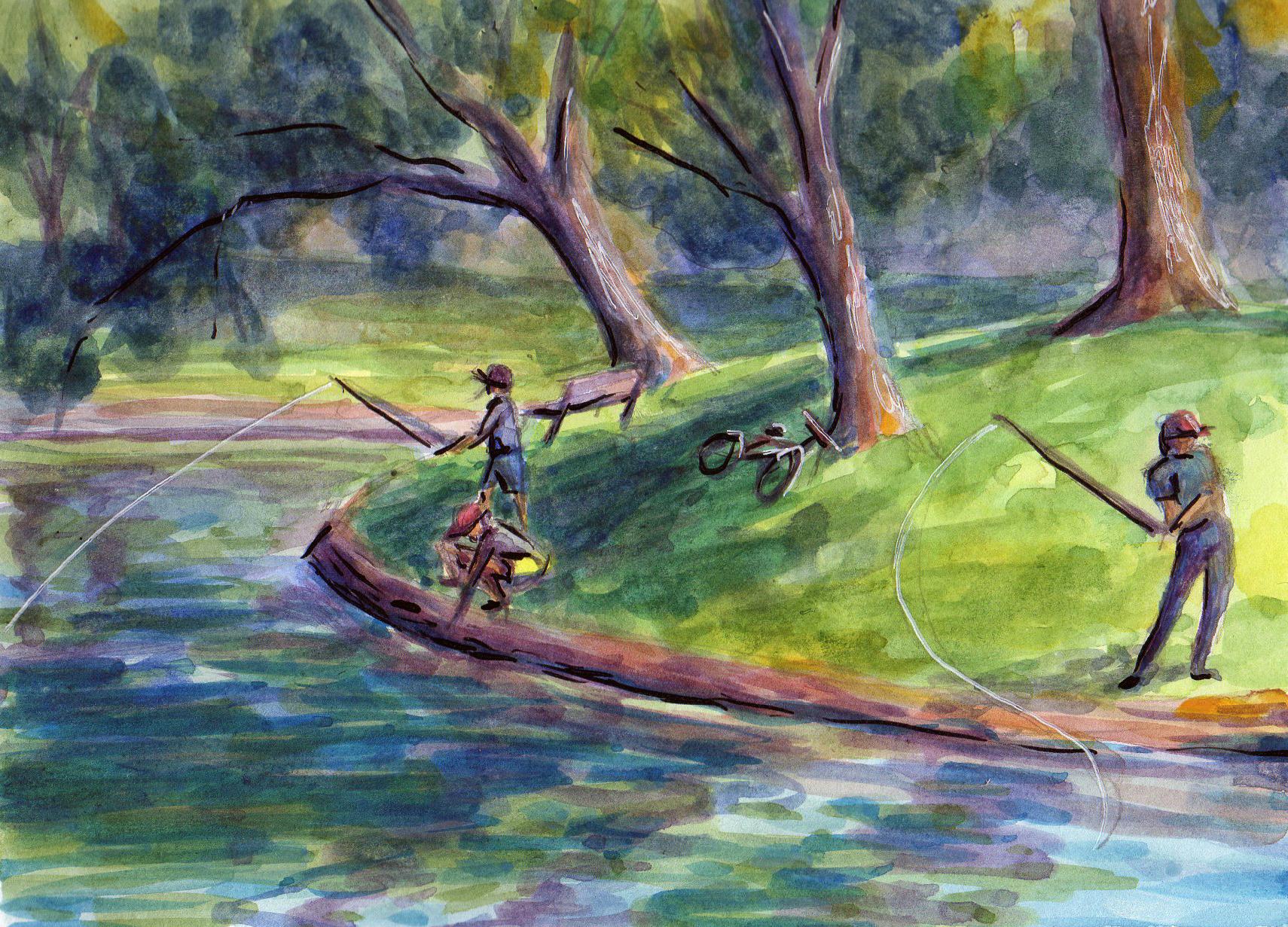
12. Plein Air with a Fully Mobile Studio - Finding a Place to Paint: There are a few things to keep in mind as you're looking for a spot to paint. I just came over to one of the park's that I lived nearby. Really like this park just because it's kind of peaceful. It has this little pond and people are often fishing here. But you want to find a spot to sit that is fairly comfortable. So I found a picnic table, and it just so happened to be a little bit shaded. And this, of course, might change as the light changes. But I always try to find somewhere in the shade to say not only for my own comfort, but also because the white of the paper could be very blinding if you have direct light on it. You also want to think about the time of day that you're painting best time of data. Pain is either in the morning or in the way afternoon evening. You can, of course, paint any time of day, but the light is going to be better early or later.
13. Plein Air with a Fully Mobile Studio - Supplies & Set-Up: I'm going to go over my complete sketch kits. So this is all of the supplies that I might bring with me when im sketching in watercolor outdoors. But typically, I don't bring all of this. So the first thing, of course, is my sketchbook. This is a mixed media sketchbook that I can use. Watercolor on paper towels is very essential, especially if you're painting outside, where you might not have napkins masking tape. And this little pouch has some of my most basic supplies in it. First thing, of course, is my water color pallets. So this is a Windsor and new in Cotman palette. This is what I almost always used to sketch. It just has lots of primary pillars. It has this brush that is a travel brush. It's extremely small. I don't use it unless I actually forget another paintbrush, because it's so small. But it's nice because it's always in there and it pulls up very compact. So what I really like to paint with are these water brushes, and I have several. They come in different sizes. I think I got a pack of five, and I think it was something like $10 for the pack of five on Amazon, so they're really inexpensive. You store your water right in the handle, and then you just squeeze the water out. I have some masking fluid, although I don't usually use this when I'm painting outside, it's just a little too cumbersome. I have some India ink. I also don't usually bring this along with me, but I did today because I think that I might actually use it. Then I'm just getting out some of the other sizes of water brushes. And so even if you forget to bring, like a little jar of water, if you have those with you and they have a little water in them than your good, I use this dropper just to get some water onto my palate just to get my paints wet and ready to go. I like to use these little clips toe hold my pages in place, especially if it's windy. This is my fountain pen that I like to sketch with. I don't usually use that with my watercolor unless I, you know, do a few lines after I've completed the water color. But that ink will actually smudge, Um, this is a micro on Penn and this ink will not smudge. So you could actually do a little drawing and then paint over that without having to worry . And same with India. This is just my ink sketch book. I don't use watercolor and X. The paper is too thin. But I like to do some sketches with that and then this pouch, I kind of just have my drawing supplies in for sketching. But I'm just going to show you a couple of things. First of all, my mechanical pencil and second of all my dip pen. And this is what I use with my India. But usually I don't bring my India ink and depend out with me. I can just use my micron if I want Tohave Inc that is waterproof. It won't smudge. And then I have this really small jar of this actually had some kind of lotion in it before , and I used up all the lotion and I cleaned it out, and now it's just a really small portable jar that I keep water in
14. Plein Air with a Fully Mobile Studio - Process Overview: for this little sketch. I had a little bit more time and I was very comfortable. And so when that's the case and I'm not in any kind of rush, I do like to do an initial sketch in ink in my sketchbook. So I'm just using my fountain pen and my regular sketchbook that I don't use water color in . And the primary purpose of me doing this is just to kind of get into the right mindset of what I'm going to dio and start working out the composition. So this also enables me Teoh capture really quick glimpses of what's going on around me. For example, I didn't know how long these kids in this adult across the pond we're going to be sitting there fishing. So I at least wanted to capture a gesture of what they were doing so that I could at least imagine it into my painting if they left. Another purpose of doing a sketch like this is also just to capture light and shadow in a very crude and quick way. Obviously, I'm Onley using black ink, but I wanted to make sure that just in case the light changed, I was able to capture where the shadows were and where the light was hitting a lot of the prominent objects. So now I'm ready to actually start painting in my watercolor sketch book. And as I said, I like to use masking tape just so I have a clean edge. Even when I was sketching in my sketchbook, you saw that I kind of drew out a border that wasn't just the edge of my pages. And that's just a personal preference. So right now I am doing another very, very quick, even more crude sketch with my pencil onto my watercolor paper and the kids over there that were fishing. They were kind of doing some other things, Um, that I thought were more interesting, so I actually changed the pose for them. But you'll see that I kept the adult in pretty much the same pose that I had done the initial sketch with. I don't worry too much about pencil lines showing through my watercolors, for the most part. Usually they're barely noticeable, if at all, to be quite honest, even when I leave them fairly dark. And what I'm doing now is I'm working from light to dark, which is how you generally want to work in watercolor. You build your darks up with layers of paint, and so you kind of capture and preserve all your lighter areas at the onset. And you're going to see throughout this painting that, other than you know, all the greens. Obviously, there were a lot of greens in the scene. Um, I very subjective in my use of color. And if you think about playing air, painting has just kind of taking notes, just like when you were in school and you just needed tidbits of the really important information. You wrote it down and you took notes. So sketching outside, doing painting on plain air is kind of like that. You don't need to capture everything as it literally is. For example, I'm not worrying about the exact color of these shadow areas in the trees and in the sand bags that make up this little island. I'm basically just going to mix up whatever color I think interprets well as a shadow. In this case, it's kind of a violent color, and you'll find that even when you are not using literal colors that you're seeing in nature. You're kind of interpreting those You're gonna find that the image does come together and will make sense. I also will reuse a mix in multiple places in the painting, even if that color isn't necessarily true to life. But I think reusing a pile of paint or a mix of paint is not Onley efficient and economic. It also helps you to develop some harmony throughout your composition. And as I work, I'm just building up some of my values that need to be a little bit darker. I'm further defining some of the forms while I'm leaving other forms very muted. Behind those trees, there were actually houses and cars and kind of just a lot of noise. And so I'm not even bothering with all of that information. I'm just going Teoh, try to keep that area very neutral and toned it down so that I kind of push it back into the composition and give it some distance, because I don't want to put a bunch of stuff back there and have that distract away from the focal points. Which, of course, is the people fishing you see there that I just cleaned off one of the mixing wells on my palette just because some of that color was getting a bit muddy and a new that I was going to want toe mix up some color to use on skin tones, and I didn't want that to be completely polluted. So every once in a while I just take my paper towel and I get it damp. And then I just wipe off in area so that I have a clean spot on this little palate. And as the light changes around me, I am just referring back to my initial sketch to remind me of where shadows were falling where the light was so that I don't inadvertently start changing my painting and moving the shadows around as they're moving in real life because I want to capture just one moment in time. And I want that moment in time Teoh, be as I was doing my sketch. That was my initial impression of the scene. Right now I'm trying to use some of the white, which I believe is good wash in this palette. It came with it to kind of bring out some of the highlights where the sun is hitting the trees and a little bit of where the sun is really reflecting off the water. I haven't really had a lot of success with that white water color or Grosh being opaque enough to make much of a difference. So what I'm actually going to end up doing is using a white gel pen to achieve some of those highlights. Once my watercolor is all dry and as you're working on plain air, you're going to want to be cognizant of how much time you're putting into it, and you want to make sure that you're not overworking your piece. One of the best things about painting on plain air is that we generally get compositions that just look a little bit fresher than compositions that we do indoors from photo references, where we're having a lot of time to kind of mess with things and overthink. So you want to really challenge yourself to try to work quickly and find a point where your composition just looks interesting and call that good. Now I'm using just a little bit of India ink, and even though India ink is something that I could have actually used to sketch in my composition and gone over it with watercolor without having it smear. I usually choose not to do that because I don't want Teoh have too much ink on my paper. I'm just using the ink Teoh access some of the harder edges, some of the finer lines. I'm not actually going around and outlining any object fully because I don't want it to look like a coloring book that I colored in. So I just use ink very sparingly, just to define some hard edges. All right, so now I'm calling this painting good, and I'm removing the tape. A tip on removing tape from watercolor paper, especially this watercolor paper of its only £90. It's not very thick poi away from your painting. That way, you'll be less likely to snagged the paper and actually tear into your painting and just remove it very slowly. So here is the finished painting. I was pretty happy with how this turned out. I think that it's very vibrant. It feels very fresh to me, and I feel like I captured a moment which is really the most important thing when planting on planner when you're doing sketches and you have a sketchbook. I really encourage you to kind of think of it as a journal in a way not just of where you were and what you were doing, but also your progress as an artist and how you were working at that time. You'll be amazed when you look back, how much you've progressed and how much you've learned by just painting from observation consistently.
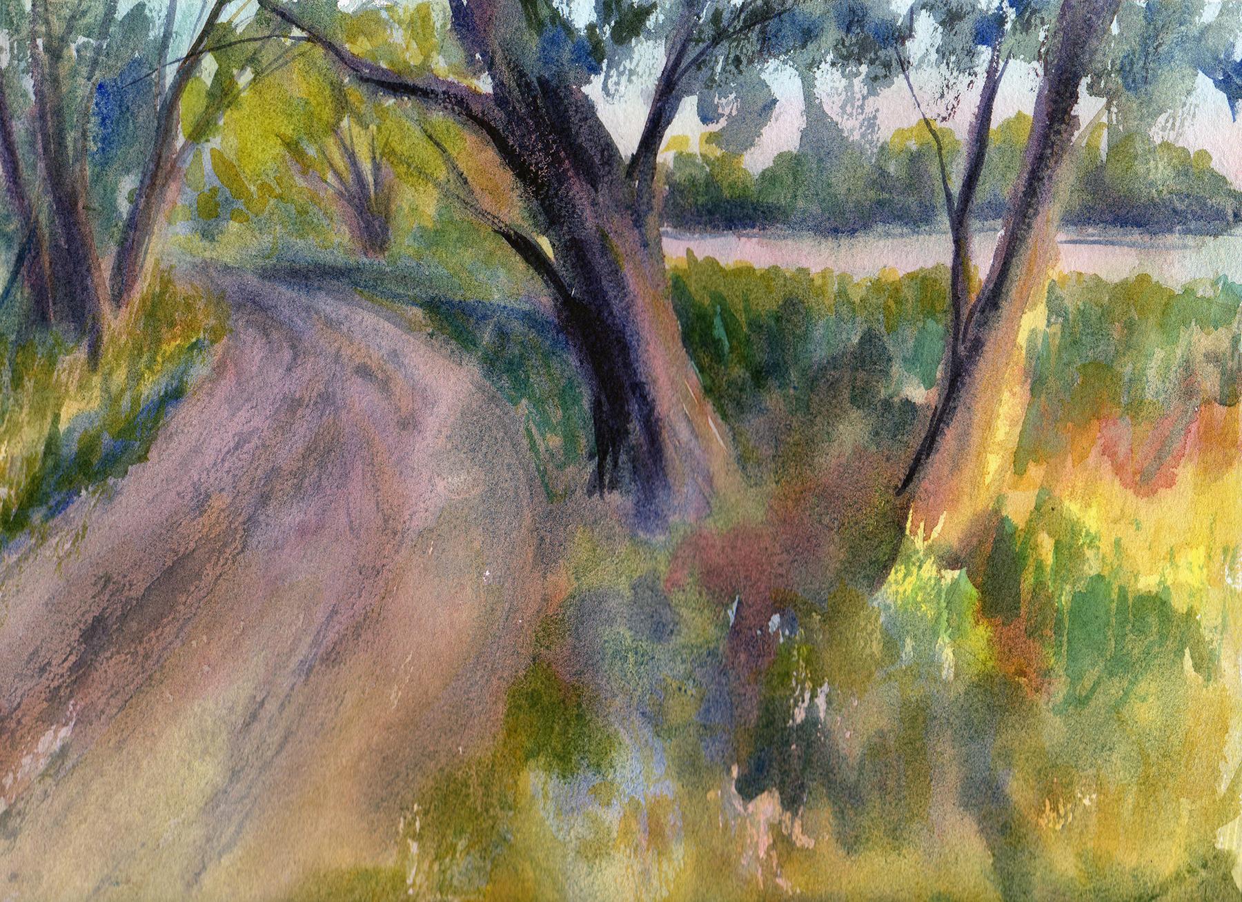
15. Plein Air with a Pochade Box - Finding a Place to Paint: So I've come out to the country. It's just a little spot that I like to come to every once in a while and you're going to see it's actually really flooded today. So this is a little lake, and the shoreline is usually beyond these trees, and obviously they're a little bit submerged in water. So I'm a little bit limited today on the various locations that I can use. But I think that I have enough here to work with. As you can see, it is about eight o'clock in the evening and it's July. So the sun should last intel. Well, sunset will probably be around 9 39 45 or so, so I still have a little time to work. And I'm just trying to scout a nice composition right now, really, actually use my viewfinder to do this, because even the lens of my video camera gives me a pretty vast amount of visual information. And so I definitely wants to narrow down my composition. But because of the time of day, we have some really interesting light effects, and this is why I recommend painting on plain air, either in the evening or in the morning because of the sun will be at an angle and you'll get some interesting shadows. And also it won't be completely overwhelmingly bright. If you try to paint during the afternoon, of course, it could be done. Um, if you are going to paint in the afternoon, I recommend highly overcast days and you can see we don't even have any clouds in the sky today, and I would not choose to paint outdoors in the afternoon on a cloudless day. It would just be way too bright. The shadows would be very harsh and distracting, and also the light reflecting on your white paper would make it itself very difficult to look at. So some of the compositions I'm thinking about this road is kind of interesting. I like how the trees in the distance are a little bit more lit and the trees in the foreground are a little darker. Obviously, this flooding in these beautiful reflections make a very interesting composition, especially because it's so different from what I'm used to seeing at this lake. So it's just a little bit unique, and because the sun is right behind this tree here, everything is a little bit backlit. The other side of this road is kind of nice. Um, it's, you know, got a little bit of a slope to it. There's lots of cross shadows coming across here, so probably pick one of those three compositions. Or if I'm feeling really ambitious and the bugs aren't bothering me too much, I might attempt to do more than one composition. I'll definitely be spraying myself with bug spray because all this flooding means lots and lots of mosquitoes. And actually, every time I come out here, usually get a tick stuck to me. Unfortunately, so I'll be using lots and lots of bug spray, and next I'm going to show you my equipment. I brought some extra equipment today because I do plan on taking some time to really sit and work on a composition. So I'm going Teoh show you that. But the biggest addition that I have today is just a folding chair, and this folding chair just happens to have, like a canopy over it, and that's really nice. If I were painting out in the middle of the afternoon and it was just too sunny, I could actually use that canopy on the folding chair to create some shade for me, and that would actually make it a little bit more tolerable. So let's take a look at all the other things that I brought along with me today.
16. Plein Air with a Pochade Box - Supplies & Set-Up: that's Here's what my folding chair looks like when it's all set up with its little canopy up. Probably don't really need the canopy today, but I just wanted to show you that. And if you concede e that little bag, I'll try to zoom in here. This little bag attached to it is actually a mosquito net that came with this chair, so that's actually really nice. I really could use this to paint in almost any condition, and you can see to that it has a cup holder, as many folding chairs dio. But this is really nice, especially for watercolor painting, because you can set your water right there and it's really handy, and you're less likely to spill it. So I just wanted to give you a little close up of that, and now I'm gonna show you everything that I brought in my backpack as well. Okay, so this is my little backpack that I keep all of my art supplies in that I like to take out when in doing on planner painting, whether it's watercolor or oil. And of course, they brought my little sketchbook so that I can work out any issues that I might have with the composition that I choose, so I don't waste any of my good paper. And then I'll just kind of go through the pockets here to show you everything that I have. Not everything in here is going to be completely necessary, but I have some painter's tape paper towels. I think I have a whole roll of paper towels actually, in this bag. Let's see how my viewfinder here, which is really helpful here. I have just some wipes to wash my hands if I need to, so this is optional, but it is definitely convenient. And depending on where you live, bug spray is going to be extremely important. I already doused myself with bug spray, and I was very generous with it today because it's humid and flooded here and I will probably still get bit by mosquitoes and then sunscreen. Of course, I already put some on before I came out, and then this is just more sunscreen for my face. It's a higher SPF. Okay, now I actually have two tripods here. This is actually a tripod for oil painting, and I just have it hooked onto the straps of my bag so that I don't risk losing it at all. But then this tripod, this is a more of a heavy duty tripod, and I use this to set up my prashad box, the Peschard boxes. They're a little bit we'll probably a lot heavier than just your typical digital SLR camera . And so I don't really trust the cheap tripod that I use for my camera to hold up the weight of my prashad box. So this is it folds out to be full length. It's very compact, though, and it's very heavy duty. It's very sturdy and durable, and it has not failed me yet with my prashad box. And I think if you're going to invest in something like a prashad box, you really also should invest in a very high quality tripod to set it up on. So I'll just set this off to the side for now. Yes, all right, so I do have a whole roll. While it's not a full role, but lots of paper towels, you really can never have too many when you're watercolor painting, and then these are my paintbrushes. They come in this nice travel case, but I actually use these indoors as well. And this here is a masking fluid applicator. I'm not going to need this, and so I don't want to lose it. So I'm gonna go ahead and just put it in one of the pockets of my bag. I don't want it to roll out and me not realize it, but I know that I'm not gonna be working with any masking fluid today. And then this is a block of watercolor paper. It's called a block because the edges are all glued down and this eliminates the need for using masking tape or painter's tape. Teoh hold the paper flat so it doesn't buckle in this paper. I think it's Windsor in new and brand. But the important thing is that it's 100% cotton, so it's much more absorbent than the cheap watercolor that I often you watercolor paper that I used to practice on. And for example, my sketchbook is, um, the paper is made out of synthetic fiber, and most watercolor paper is made out of synthetic fibre. There are some papers that are hybrids between, you know, cotton in a synthetic fibre. Those air a little bit better. But the best watercolor paper that you can get is going to be 100% cotton and at least £140 Which is what this is. Okay. Next, I have just by a little sketch pack here. So I have my fountain pen that I like to use to do sketches. My mechanical pencil. I also have my depending here, which it don't plan on using. It actually didn't bring any ink out with me today. And last but not least, is my prashad box. And mine has seen better days, so that broke off. But otherwise it's very sturdy. It's in really good condition, and I'm gonna show you how to set this up. But before I do, I just want to show you The nice thing about this is that I actually comes with this attachment already on it. This is a sienna, the shot box. And this is a standard, uh, attachment for a you know, general, Typical tripod. So whatever tripod you buy should work with this prashad box. And I think most push rod boxes are outfitted for that purpose. So let's just see what else I have in here. I guess I actually did bring my watercolor sketch kits, though I plan to just primarily use the water colors that are in my Passat box right now. But it's always nice to have these, just in case some circumstance arose where I wasn't going to actually be able to sit out here and do a whole painting. I could still get in a quick sketch. And I feel like, you know, my time was well used and it looks like that is everything that I brought, So I'm going to show you how to set up the Prashad bucks and then we'll get started.
17. Plein Air with a Pochade Box - Setting Up the Box: in this video, I'm going to show you how Teoh get a prashad box set up. And none of this is to say that you need to have a prashad box to dio planner painting with water color. In fact, I think most watercolor on planner painters don't use a prashad box. Usually these are used for oils or acrylics, but it does work for water color if you're interested in this. But there's lots of different outfits that you can have either to purchase or to improvise that will work perfectly well. So what I'm going to do first is I'm going to get my tripod set up. And before I do anything with the push hotbox, I want to make sure that it is the proper heights. And since I'll be sitting, we'll need to test that out because I don't want my shot bucks to be too high or too low. And if you're going to buy a prashad box and a tri pod, I really recommend finding a tripod. Of course, that's very stern and heavy duty, but that also has a mechanism on the top so that you can make sure that the attachment on the top is level some mine has kind of ah, bubble level so that I can tell because I don't necessarily want my Peschard box to be leaning one way or another. And so when you've got that all set up, you can go ahead and slide the attachment on the back of your Breshad box into place. And then my tripod just has a knob to tighten that clamp to make sure that it's a really nice tight fit. So I'm just taking some of the things off of my chair. I don't really want to put them down on the ground because the grounds a little bit damp still. But I need Teoh sit in my chair just to make sure about that height will work for me. Okay? And now that I have everything set up on the tripod, I'm going to show you how to actually open up. They pushed hard box, and you might think that that's a little bit silly, but I know because I didn't read the instructions right away when I bought this, that I had done this wrong and I thought that my Peschard box was actually broken. So what? You need to do first is you need to slide this arm back all the way. So you need to loosen all these knobs, it'll tighten, and then also remember to remove this tray appears that doesn't just fall off. Many actually hooks right onto the side here and then to tighten your tripod up. So that's you can paint. You just will find the angle that you want and tight in all these knobs. All right, so this is very sturdy, but I'm going to just show you just a zone F y I. What happens if you forget? Teoh, Push this arm back if you leave it here. Even if you tighten all the knobs, this is going to just basically fall over back here, so it's just not possible to keep it tight enough. But you have to push this arm back. And so when I my oil painting, I usually have my prashad box set up like this basically at a 90 degree angle. But for watercolor, I don't want that much of an angle, so I'm actually going to let it go down as flat as it can. I'm still going to tighten up all the knobs, Okay, and then this is actually an insert. But it did not come with the prashad box about it separately. But I think it was only $7 or something like that. And it fits in here. Pretty nice has this lid, and then I have my watercolors already set up in here. I used to water colors. I'm so I went ahead and I just filled this up. And then there's lots of room for mixing, and then I can keep paintbrushes over here. I probably would not want to keep a full glass of water on this tray. It does kind of slope down a little ways. Um, so probably I'm all I'm gonna keep up here is just might wait. Paintbrushes. So that's basically how to set up a prashad box. If you do choose to purchase one, I do think that they're worth it, but they are a little bit of an expense. And there's other ways to paint outdoors without this entire set up. And so I would definitely recommend just finding out whether you really want to invest in painting on plain air. And if you do, I think that a prashad box or even a specialty easel for watercolors that you take outside . Uh, it's just a really nice thing to have, and it just makes your painting experience a little bit more comfortable. All right, so I have my easel mouth position in the direction I want to paint. Originally, I was facing that flooded lakeshore, but it just so happens that right now the sun was directly in my eyes to maybe when it goes down a little bit more, I'll be able to paint in that direction. The only thing that's off screen is my glass of water right now. And then some of the extra supplies that I, um, you know will grab for them if, as I need them, such as my paper towels What? Me? Go ahead. You're gonna show you how to set your water color block in here or if you are using just a sheet of water color and you have it taped to a panel that works as well. So there's some knobs on the back here that you'll just want to listen. You can just secure this in place, tighten the knobs, be good to go
18. Plein Air with a Pochade Box - Pt. 1: so I'm just gonna set this led off to the side. I don't need it. And before I start on my sketch, I want Teoh put some water into my paints because I've been sitting here for a while. They're all dried up, and so they're going to need just a little bit of time. Teoh, activate. So I'm just adding a little bit of water. Teach little. Well, I usually find that the blues are a little bit more resistant. Teoh, activate the dry out a lot more for some reason. So I have to add a little bit more, especially to my French ultra Marine blue. And then also, I will quickly just go over the colors that I have. I don't have the tubes with me. So some of these have names that I don't have memorized. So I'm going to refer to them in terms of whether they are a cool or a warm color. So, basically, I always try to have a warm and cool version of each primary color on my pellets. So this first well, here is just white wash. And I don't know that I will use this. I try not to use white wash usually, but I do have it just in case it comes in handy. Next is my cool yellow, and it is considered a cool yellow because it's a little bit closer in temperature to like a lemon yellow or a sunshine yellow. Next, I have a warm yellow, and this is a warm yellow because it's closer. If you think about the color spectrum, this is a little bit closer to orange, so it's a warm yellow. Next is a cool red, and it's cool again because if you think about the spectrum, this would sit a little bit closer to the blues, the violets, the magenta as. And then this warm ride would say on that spectrum, closer to the oranges and then this. Over here I know it's very dark, and it's difficult to see, but it is my cool blue, and I usually use like a French ultra Marine for my cool blue, and it's considered a cool blue because on the spectrum it's it's a little bit closer to violet and indigo. Next is a low blue, and this is a warm blue because it sits on that spectrum a little bit closer to the greens and then this next color. I can't remember exactly what it's called, but it's a very neutral, earthy teller, and then this, too, is just going to be another neutral, earthy color. I think this one here might have a little bit more red in it, and this one's a little bit cooler. So I have kind of a cool, earthy color and a warm, earthy color. And I don't always have those with me because I usually can mix up, um, the colors I need without them, but they're nice toe have. And then, lastly, this is a green, but it's not really a true green. It's a very earthy green. It's I know that the color is called jadeite genuine, and it's actually made of minerals. Um, so I don't know that I'll necessarily use this because I usually don't find this color out in nature very often, and I do prefer just to mix all of my own greens so those are gonna be all of our colors. And before I get started on the painting, I just want to dio a really quick value study of my composition, and I'm just going to do this in ink with my fountain pen that I like to use for sketching , and I'm going to use my viewfinder. And the nice thing about these viewfinders is that this window opens and you get any dimension from a square Teoh an extreme landscape. So I think that my paper is nine inches by 12 inches. And you know, this may not the precise, but actually, there are some measurements here. Like, if I was doing an eight by 10 um, I would know to open it to their um I don't see. I think nine by 12 is pretty close, Teoh. Oh, you know what? It's actually pretty close. Teoh this, okay? And so what I do with my viewfinder is I just hold it up. This really just helps to simplify your composition, because when you're painting outdoors, you have so much information coming in that you might be tempted to try to paint everything that you see. And we have such a wide vision range because of our peripheral vision, but it just really gets really overwhelming. So the view friend, or is very helpful just to help you narrow down a scene usually at least while I'm sketching. I'm gonna keep that handy, just in case I need to check its again. We'll try to do my sketch appearing. Come see it. And I don't want do a very large sketch because I don't need to spend a lot of time on her , so make it a little bit smaller than the page here and what I'm looking for here are some lines to kind of lead me into this composition. I'm looking for where I'm going to place the horizon line. I'm gonna place it pretty high up. It's just not a lot going on in the sky. But the way that the light is illuminating the trees make the tree is very interesting. And I'm right next to this little dirt road. Inroads, air. Usually a nice visual to kind of leave your your viewers I into the composition kind of Ah , a symbol that we usually perceive as being a little bit welcoming. And then I have this tree over here, which I really like. How the Sinus hitting And I actually think I'll move it a little bit closer to the road. Course you do that. You are painting you could move elements in a way that makes him a little bit or interesting or helps them to fit into your composition a little bit better trees back here . They're kind of in the mid ground. You do want to think about you know what's in the foreground, what's in the mid ground. And then what is in the background. Kind of do a little work to differentiates nos areas so that you can create a little bit of up. And we have these trees that are way back in the distance, not getting a lot of light back there tree. Maybe I should actually is this tree a little bit closer? Some of these leaves And then there's just lots and lots of growth here on more trees over here, like Teoh, use the sketching process for a couple of different purposes. Uh, one is Teoh work out the actual composition, so kind of figuring out where everything is going to fit within my paper that I'm actually physically painting on. And another reason is to through the use of just values and, you know, basically scribbling in my darks. I want Teoh make a note of how the light is hitting everything right now because the light can change very fast and so it can be nice to just have a sketch to be able to refer back to, so that you can be reminded of what initially inspired you to paint in the spot that you pick. But I do these sketches very, very loose. I don't need to spend a lot of time doing this because ultimately I really just want to get down to painting. And then I really like how there's over here. There's a lot of white and this road is all kind of in shadow right now is maybe a few spots of color hitting it. I don't want to give the impression that this road is very light on values. It's knots still just kind of scribbled us in, and these trees back here very, very dark, except where the light is hitting them. And when I'm doing a sketch, I don't spend much time at all. Actually, you know, doing a drawing and really articulating everything, because actually the values that you apply so the these darker scribbles really helped to interpret the scene, and so a lot of you know, detailed drawing just really isn't necessary. And it saves time to to take a really loose approach to your sketch, especially. So I'm gonna start my sketch aside. I'll actually, for now, I'll keep it in my lap.
19. Plein Air with a Pochade Box - Pt. 2: and then I'm just going Teoh very loosely sketched this with pencil on to my paper. - And because the sun is going down so fast, I want to make sure that as I finish using something such as my pencil, I don't want to just set it down on the ground because a big head start, I don't want to be kind of scrambling around looking important. So I'm gonna try to just put everything back where it belongs as soon as I no longer needed . Okay. So, again, in watercolor, we're always going Teoh paint from our lightest values. And then we build up our darkest values and I usually try Teoh, determine what the overall tone of the painting is going to be or the temperature, and I'll apply a wash with bats. So see, Hello. Kind of a play. Very white. Watch of orange. I'm going to use my cool yellow and a little bit of my warm red. Gonna add a lot of water to this because I wanted to be very light. I don't want it. Teoh overwhelm Rainey's, and we're just going to work very, very loosely and quickly. And if you're used to using paper made with synthetic fibers, you will find that 100% cotton paper is much more thirsty for water. And typically, when it's a human is it is Right now I find that my painting does not drive very fast. But I think because with paper is gonna be so, absorb it. I want have that problem so much. Yeah, a pen. And I really like how the sky is a little bit blue at the top and then it fades. Teoh kind of a pink, but it's, um it's not a very pure blue, and that's why I'm trying to just make going ahead and mixing it in with my orange is a very subtle and one blue. Now let's get somebody in there a lot of pain to be a little bit stronger now I kind of want Still, you can see were some of the lighter spots in all this growth Waas. I'm referring back to my sketch right now because I've really lost a lot of that sunshine already and again, I feel like I can't say it enough, but when you're mixing colors, it's really more important to mix quickly than it is to mix some accurate, precise color that you actually see. So I'm just looking at the temperature or the tone, which is how warmer, cruel an area is, especially, you know, when you compare it, Teoh other things around it that makes it a little bit easier to determine. But when you're painting and planer, you just don't have time to do a lot of really precise mixing and usually just having, you know, your values in the right place and the, you know, general temperature or tone will bring your composition together. Right now, everything is just gonna be very, very soft, right? - We have lots people driving by. I think that people don't realize how very flooded it is. There's a lot of people coming out. I think maybe two try to do some fishing. Everyone's turning around when they see how flooded it is. So luckily, get the area to myself. I definitely did not expect, but though I came out here prepared Teoh, be around a lot of people and just a note about paper. You're gonna quickly realize if you look up 100% cotton watercolor paper, it's much more expensive than any of the synthetic watercolor paper. Um, and I use both. I use synthetic watercolor paper just to sketch and kind of work something's outs. But once you use 100% cotton paper a promise you'll never want to go back. It's just it's a completely different painting experience. So this paper is pretty drenched right now, so I'm actually going to take a break right now. And I'm gonna use my break here just to snap some pictures because I can tell it's going to get dark so fast that I will not be able to pay any other compositions. So I'm just gonna seize the moment and get some photographs that I can refer to later. And then hopefully that will give me some time to let this dry, and then we can finish up. Are painting
20. Plein Air with a Pochade Box - Pt. 3: so the light is fading pretty fast here. So what I'm gonna do and actually going to set this up right? A little bit more so I can see it a little bit better. I don't have to worry about the sun hitting it anymore. I'm also going to not use such watery paints since I need Teoh. Hurry up. So I'm gonna be using thicker paint and won't drip. It'll drop a little bit, but I don't think it will be too bad. We're just going to start working on building up our values here. And I think what I'll dio for the sake of keeping things, there's a big bugs keeping things separated. I'm gonna keep on my cooler mixes over on this side. And then my warmer mixes over here and some of them are going to be a little bit neutral. Sexually need Teoh, start working on some of these trees. You kind of just right in the middle as faras their temperature. - Certainly the nice thing about being out. I was just getting to listen, Teoh nature all around you. Good. Hurry. Oh, - okay . You, Here. You, You, You, You, You, You You, - uh , Here you, - You , you, you, you, you, you you bucks. Having to paint fast may not be the ideal way that you want to sit and do it. I actually really thought I had more time with the sun when I came out here on the actually some of my favorite paintings and that being these, that I kind of had to rush through. Oh, sure, why? Maybe because everything happens a little bit more spontaneously, but it's really it's it's not such a bad thing. - And it will. Certainly, I hope you become a little bit more creative and flexible with the way that you mix your pain. So Oh, no. Whatever condition you find yourself in mean unless it's unsafe, of course. But try to just work with what you've got. Sometimes we have such a limited amount of time or limited opportunity, and so painting under circumstances that are not perfect, not ideal is better than not painting at all. That's my opinion. Anyway, just trying to get some quick foliage here a little bit. Thank you. You guys, too. All right. So this might be about all I can accomplish. They need to make sure get everything cleaned up with the amount of light that I have left , and it's a little bit hard to judge now because the light is getting so low. So once I have some better light, I'll actually show you what this ended up looking like.
21. Plein Air with a Pochade Box - Process Overview at 8x Speed:
22. Conclusion: all right, Well, this is what my painting ended up looking like when I got it back home, and I was able to get a scan of it so you can definitely see that even though I was rushed and I really had to work against time while doing this, it really turned out pretty interesting and vibrance. And that's my favorite thing about painting on plain air is that even when your situation isn't exactly perfect and you have to work really fast, what you usually end up getting is something spontaneous and vibrance. And this is why I encourage everyone to give on plainer painting a try. Doing it with water color is one way to get started that is pretty portable and easy to clean up, and it's going to help you develop your observation skills and also your skills in interpreting color. It's also just a great way to get back in touch with nature, to disconnect from technology and all the distractions and just kind of use it as a way Teoh. Maybe meditates or relax, really, it should just be a very enjoyable process, and once you get into it, the time just really flies by. I really hope that you enjoyed this course and I look forward to seeing your projects. Please ask any questions that you might have and have a great day painting outdoors.
23. Bonus! Using Color Subjectively: In this quick sped up lesson, I'm going to address one of the most common questions that I hear from students and people who are learning to paint, whether it's in watercolor or oil or any other color medium. The question being How do I mix ex color, whether they're looking at a photo reference or they're painting from life, This seems to be something that trips people up, and it definitely is something that has tripped me up. A swell as I've been learning to deal with color for a long time. I actually worked monochromatic Lee with ink and graphite. It wasn't until maybe high school that I ever even used any kind of color medium, so it can be overwhelming and intimidating to have so many color mixes at your disposal. Even if you're just using a limited palate, you really can mix colors infinitely, and something that I think a lot of people try to do is to mimic exactly what they see in life. And there are people who conduce that really well, and they're really good at it. And if that's your goal than I recommend really working on your color theory. However, for the purpose of plain air painting working in a sketchbook, just generally learning how to paint from observation. I'm going to show you in this video that the colors that you use and the colors that you mix are so much less important than other attributes of the painting. So you can see that I have divided this sketchbook page into two sections, and I am painting the exact same scene. I'm sitting at a park and I'm just painting this tree that's across this pond, and what I'm doing is I'm applying the principles of design and painting, but I'm using color very subjectively in both. But you're going to see that even though they're going to turn out looking quite different from one another, as long as you have your values and your shapes. Generally, your shapes don't need to be perfect by any means, but your values, the temperature that's going Teoh get you most of the way. And so when I'm planting on planner, I use color very, very subjectively. I'm really not trying. Teoh mimic the colors that I'm seeing. I'm just mixing colors in a way that I can approximately get the values of the lightness or darkness of the color and the temperature, which refers Teoh. How warm or cool. Any given mix cleans, and you can see that the section on the left is a lot cooler because I started out with a wash of fellow blue and in building it up from that. And that initial wash makes a big impact on the outcome of your painting, even if it's a pretty light wash. And then in the section on the right, I started out with a wash of yellow Oakar, and so it's going to be a lot warmer in tone, but you're gonna be able to look at both and know what's going on. You might have a preference for one or the other, but overall, this is just meant to be an example to show you that color truly is something very subjective and unique to each of us. You could go and sit with a friend who has the same colors of paint, the same paper, the same paintbrushes and looking at the same scene. You guys, we're going to paint something different. And all of this is just to say, Don't be fussy about mixing specific colors. Use on plain air painting just to get outdoors, relax and enjoy a little painting
24. Bonus! Painting Subjects that Move & Change: one of my favorite things to do when painting on planner is to include subjects in my paintings, such as people walking by kids playing or fishing at the pond or animals like in this case , I am doing a little study of a couple of ducks and so to kind of get my observation ALS skills to the point where I can include subjects that I know are going to be moving away and changing as I paint. I do little studies like this where I'll just pick something very simple. So I'm not including really any scenery. I'm going to have them sitting down on the grass as they are, but I'm going to keep everything very loose. And I'm working very, very quickly, much more quickly than I normally work. When I'm painting a landscape where you know not much is going to be changing in terms of subjects actually changing position and with my pencil, I just very quickly sketched in one moment of how I observed them and even though they stayed in that exact position for me, the half a second as they were sitting and cleaning themselves, I was able just to very loosely sketched that in. I'm not very worried about being anatomically correct or anything like that, because this is just going to be an impression of these dogs. And even though they're sitting in the same spot for a portion of this painting, I knew that eventually they would most likely get up and move. And so, as I looked over at them, I just tried to take mental notes of their coloration and how the shadows were falling on them, where the highlights from where the sun was hitting them waas and keeping those things in mind enables me, Teoh, get a pretty good impression of how these ducks were in one given moment. And even after these ducks got up and left, I think they jumped into the pond. There were other ducks around who were similarly colored, and so any reference that I needed then for coloration, I could at least get from some of the other ducks around me. So the most important thing I wanted to capture in this study was really how light and shadow were affecting these ducks, and they were kind of sitting in a shaded area, but they were each getting just a little bit of sunshine on them. And I think that if you can capture the way an object is illuminated, even if it's very rough, even if it's not completely accurate, I think that just making that attempt is actually going to get you most of the weights where you want to get. So whether you are wanting to start including human subjects in your paintings or animals, or you just find that you sometimes get frustrated when you're painting and suddenly you find that something that you were painting has changed, and it's completely beyond your control. Doing little studies like this just really helps you, Teoh sharpen your mental image of objects that you're looking at, and it also helps you to learn to paint more quickly. And you can also use multiple points of reference to dio this kind of observational painting. For example, if I were painting a person, I might see someone walking by, and I might just have enough time to sort of capture their gesture or how they're moving. But it may not be enough for me to see how the light and shadow is affecting their form, and so them after I get that gesture drawing in, I'll wait for someone else to walk by. And when another person walks by, I'll just make sure that I pay special of focus and attention. Teoh the light and shadow on them and then I'll use that reference. Teoh, continue working on that initial gesture. So what I'll get is something that looks like a person walking by who I was able to actually capture their form, their gesture, the color of their clothes, how the sun was hitting them. But I actually might be a conglomeration of several different people that I've used to create one impression, and I think that that is a really good skill to start building. I think that including subjects in your paintings such as people and animals and other things that move it brings a different kind of life and energy. It's your paintings that makes them a little bit more interesting. It sort of gives a sense that there's a story behind the painting, so being able to do that, I think is a really great strength and something that you do have to develop a skill for, and so I recommend just you know, even if it's 10 minutes sitting in a cafe, where you're just drawing people passing by or sitting around you, it's just a really great muscle Teoh exercise and have at your disposal.
 Rachael Broadwell, Fine Arts Teacher