Transcripts
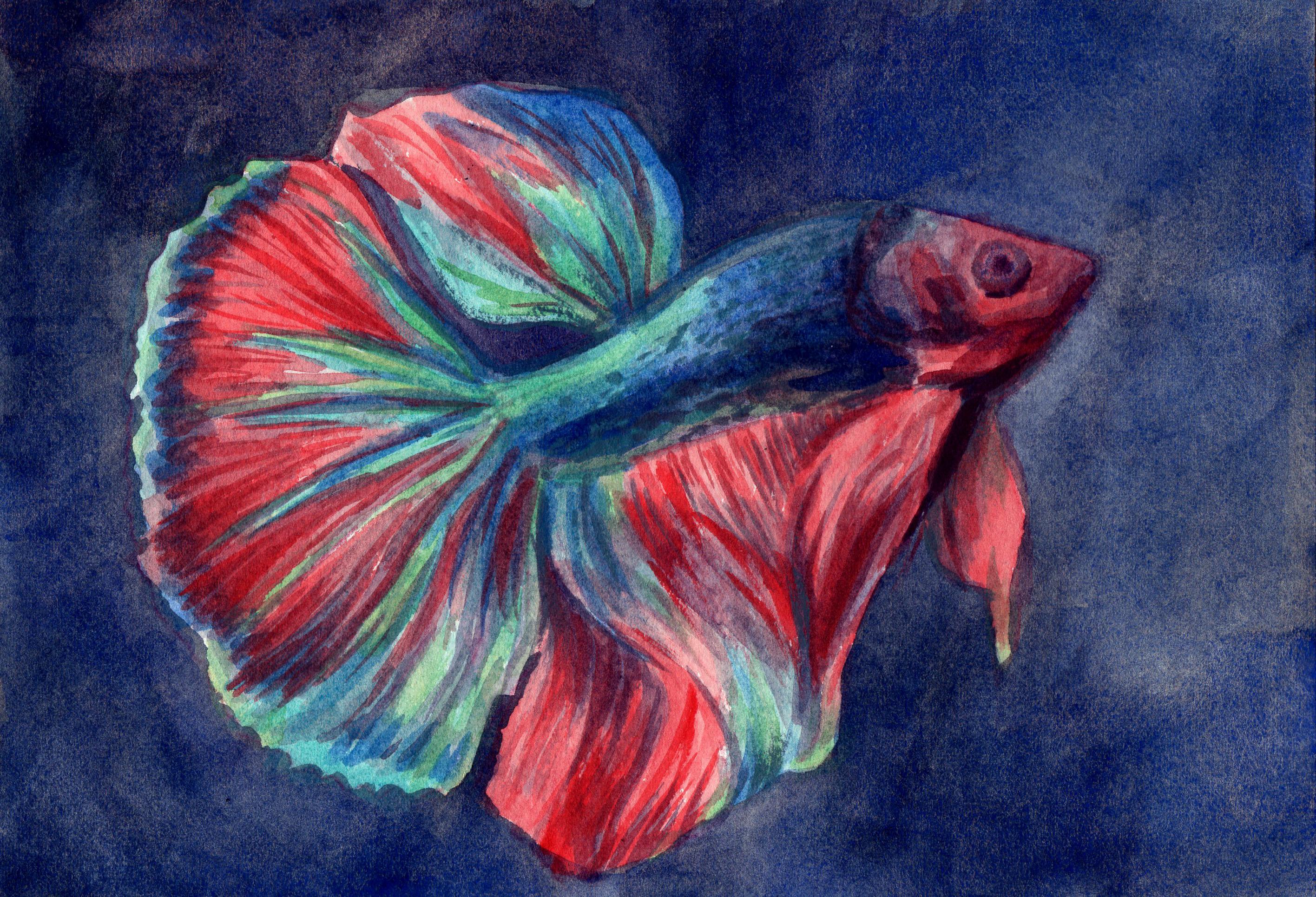
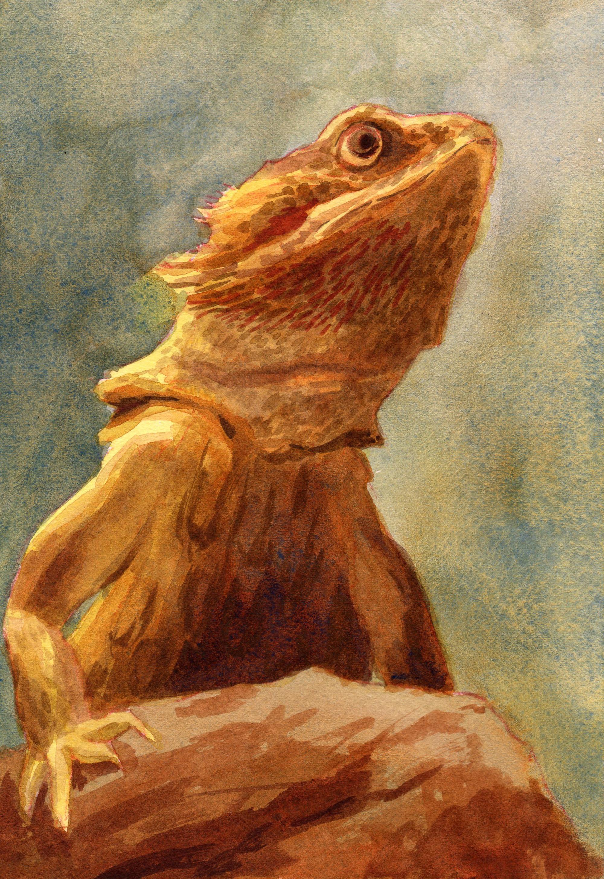
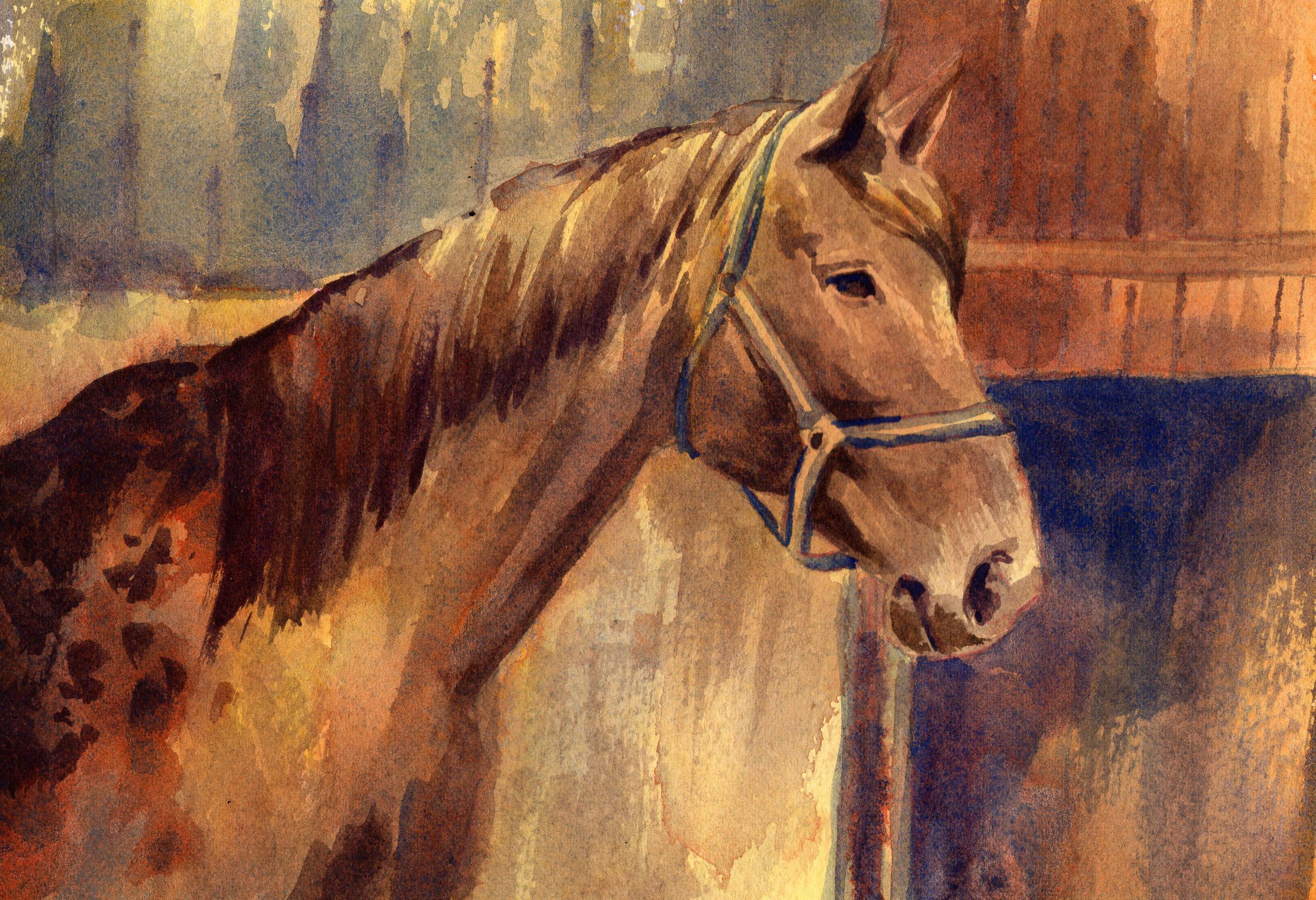
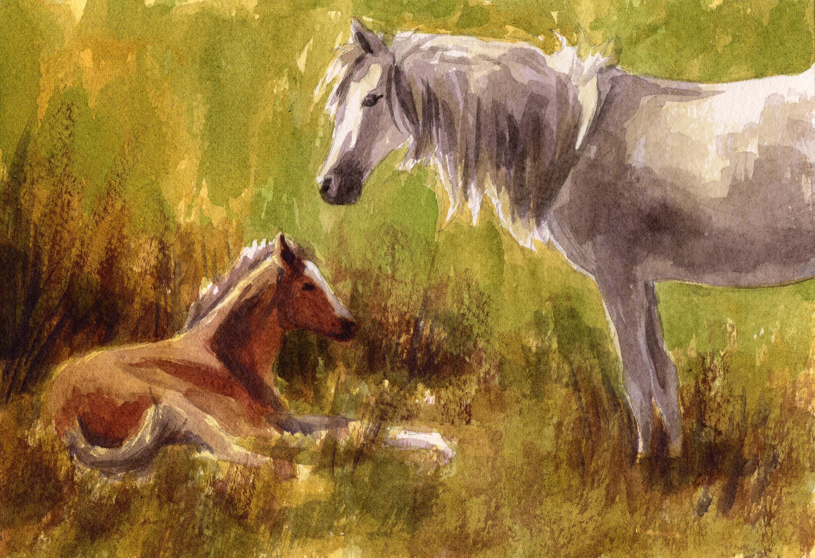
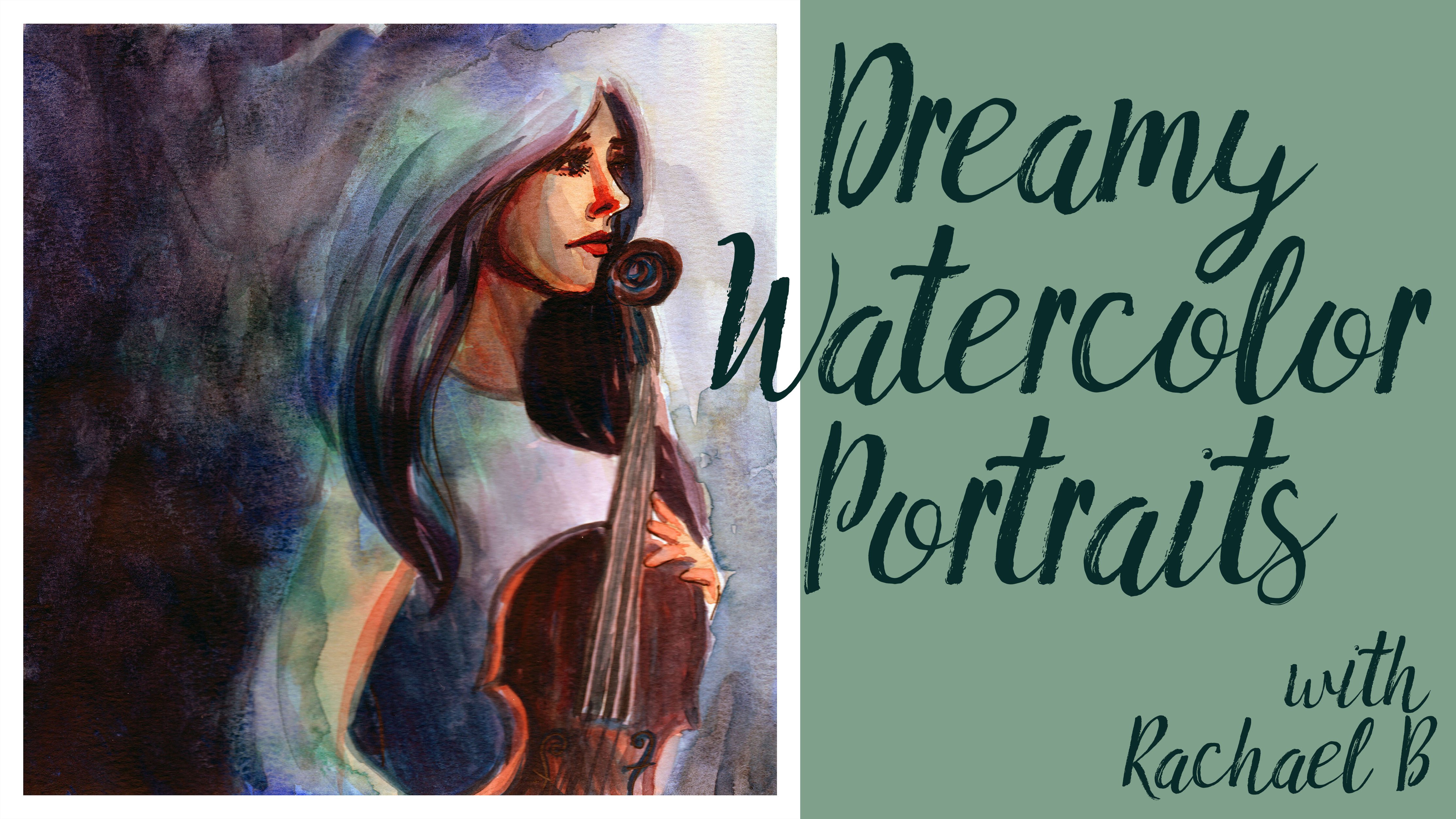
1. Introduction: Hello and welcome to my studio. My name is Rachel broad wall and I'm an art teacher here on Skillshare. In this class, we will be using basic watercolor techniques and just a few colors to create beautiful portraits of pets and animals. Pet Portraits make great gifts and are one of the most popular subjects for commissioned artwork. So painting animals is a great skill for all artists to master. In the first part of this course, I will be demonstrating in detail the concepts and processes for painting a cute, fuzzy kitten. After we've gone over this simple process which can be applied to painting any subject. We will move on to look at a few variations we encounter when painting animals, such as spots, stripes, iridescence, and scales. I'll discuss ways to change the background environment of your portrait, as well as how to decide what to include or leave out of pet portraits. I will also show you a great technique for creating an ink underpainting for your watercolor portrait. Finally, there's a bonus video in which we review the watercolor painting process as applied to a horse. And we'll also discuss how to identify the undertone of your painting and how to use color in a way that promotes harmony throughout the composition. All of the photo references I'll be using in my demonstrations are available for you to download in the projects and resources section of this course. To access the project session, you may need to log into Skillshare on a browser if you do not see it in the Skillshare app. The techniques and materials for this course are simple and minimal, and it is meant to be friendly for all skill levels. I hope you'll join me in this course and I'd love to see your pet portraits posted in the projects. I'm happy to give feedback and answer any questions that you have. I really hope that you'll join me in this course. And I want to let you know right off hand that if you have any questions or need further clarification on anything that you can post your questions in the discussion section of this course. I also want to encourage you to post your projects in paintings in the project section of this course. And I can give you feedback and you can also let me know there if you're struggling with anything in particular, and I'm happy to help. I also want to let you know that I have several Skillshare courses that go all the way from the fundamentals of painting up into more intermediate and advanced techniques. So I encourage you to follow me here on Skillshare to get notifications about new courses that come out and check out my catalog of all the courses that I have in place here on Skillshare. All right, let's get painting.
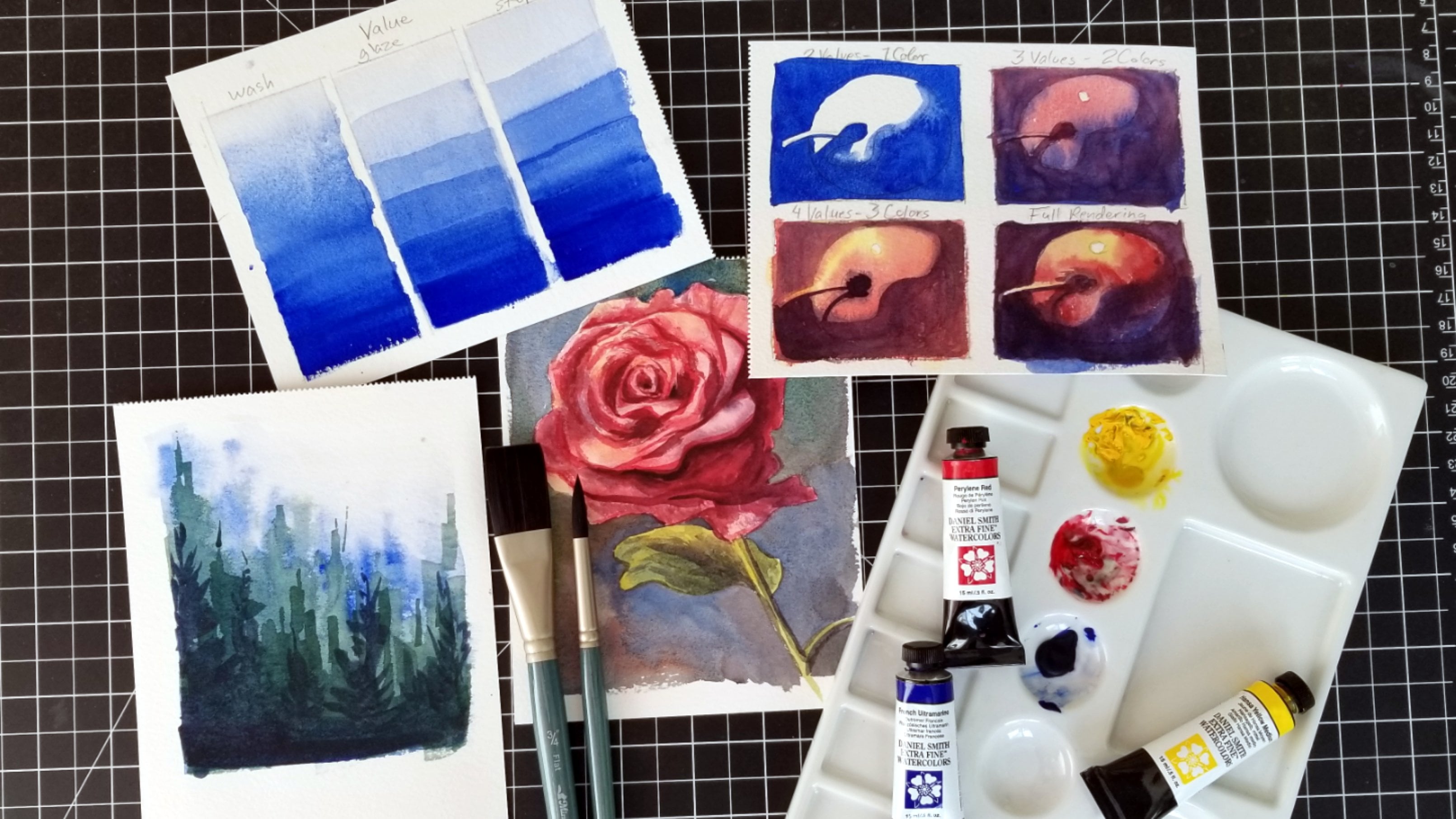
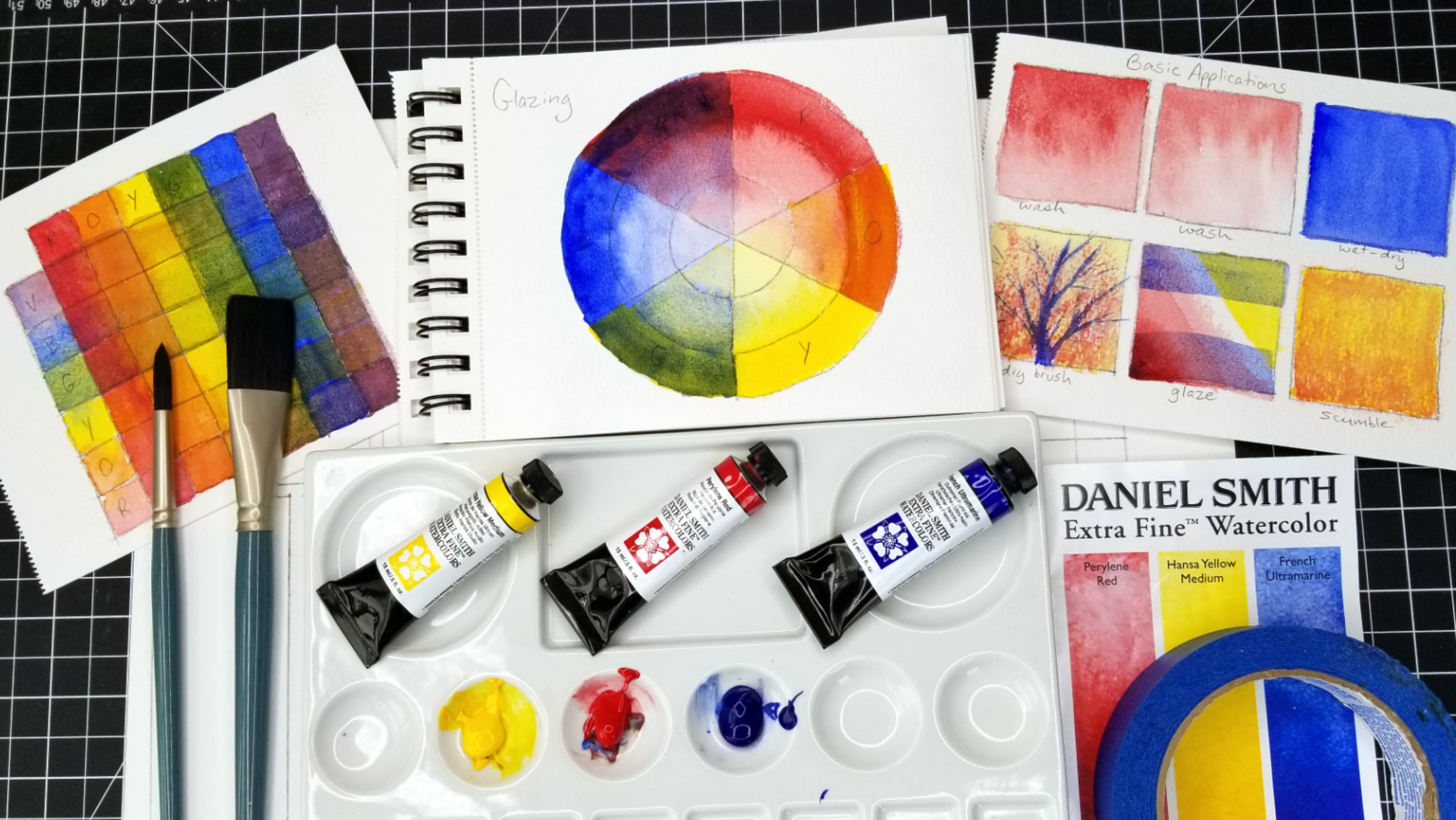
2. Supplies: All right, so let's get started by talking about the supplies that we'll need for this course. Obviously, you'll need watercolor. But I want you to know that you do not need a lot of colors. In fact, I'm only going to be using three colors. For this course. I will be using French Ultramarine Blue, perylene, read, and Hansa yellow medium. Now, these three colors happen to come in a set from Daniel Smith. It's their primary set, so it's very affordable and this is really high-quality watercolor. And I always encourage people, whether you're a beginner or intermediate, or even if you're advanced, you know, try narrowing down to a very limited palette of just your primary colors because this is going to help you really learn how to use your colors effectively. Now the one other thing I'll be using is some whitewash. And this is something I'll use mostly at the end just to add in like whiskers and things like that, I'm not going to use any masking fluid for this course. And so I find that little details like whiskers, which we commonly see on animals. It's best just to not worry about leaving the white of the paper for those unless you're going to use masking fluid. So just forget about the whiskers as we proceed through the painting process will come in with a little bit of whitewash in the end. Now, for gosh, I actually prefer the M Graham brand just because it reactivates a lot easier than some of the other guage brands that I've had experience with so far. So these are just my recommendations, but I also want to emphasize that you do not need these three specific colors. But I encourage you just to have a blue, a red, and a yellow, and it doesn't matter what brand. If you don't have these high-quality paints yet and you're still just kind of exploring with some less expensive paints. That's totally fine. That's how I started off and it helped me to get more comfortable with the materials before I decided to invest. Next, let's talk about brushes. These are actually going to be the only two brushes that I use for this course. If you have more brushes, that's totally fine. But I really want to emphasize that you can do so much with very few materials. So I have a nice flat brush. This is what I'll be using to apply water to my paper and also some initial washes. And then I have a round brush. This is a size 12. Oh, and by the way, this is just three quarter inch. It doesn't matter what size these are. But I would say that for your washes, you really want to use the largest brush that you can, especially in relationship to the size of your paper. So this is a round brush, it's a size 12. And you can see that this is going to be a very versatile brush because even though I can use it to apply a lot of water and a lot of broad strokes. It comes to a nice point so that I can also use this to do a lot of the detail work that I'm going to do. And I don't really plan on having like a lot of really intricate details in these pet portraits because I like to keep them very loose and impressionist. But this I find does everything that I want to do. Now, these brushes are both synthetic squirrel. That means that they're not made out of natural or real squirrel hair, but they mimic the properties of brushes like that. So they hold a lot of water. And if you're interested in these, they're made by Creative Mark. And they're called mimic, which is spelled MIMO IK. And they're not too expensive. And I have been using these for a really long time and I just find that their excellent quality and really, really happy with them. So I recommend these, but of course, use whatever you have. I also just have a pencil here. And this is for obviously drying or transferring, which we'll talk about in a little bit. This is the paper. I'll be using this as a watercolor block. This is made by Fabriano and it is 100% cotton. And this is kinda the best paper that you can use for watercolor. However, when I started out, I definitely wasn't using 100% cotton paper because it is quite expensive. So use whatever you have. I would say that what's most important is the weight. So this is 140 pounds. And that's the weight that I would recommend no matter what kind of paper you're using. So even if it is a cheaper paper. Is not 100% cotton. At least make sure that it's a 140 pounds so that it doesn't buckle too much and so that it can hold plenty of water. And this is just five inches by seven inches. And I feel like this is a really good size for gift giving. People don't always like to have the biggest painting on their walls. People like to have multiple paintings on their walls. So I like this size. I really like painting on a little bit of a smaller size, but of course you should pay on whatever size you feel comfortable with. If you are a beginner, I find that it is easier to start smaller. I also have a watercolor sketch book here, so this does not have 100% cotton paper in it and that's totally fine. But before I get started, I like to do like a value study at least. So I like to do a little bit of sketching and just start thinking about the values and also the soft edges versus hard edges that I'm going to employ in the painting. So we will be doing a little bit of sketching as an example to kinda show you how I worked through that process. I also like to have some scrap paper laying around. So this can be paper that when I cut it down to the size I needed it, I had some leftover like this one or this one is actually another painting that I had done on the other side. I don't really care about. So I'm using the other side to just practice because sometimes when we mix up our watercolors, the color we see on the palette is a little bit different than when it is applied. So what we really want to make sure is that when we're applying our watercolors, who are our paper, we don't want it to be necessarily darker than what we expected. Because with watercolor, as we'll discuss, we work from our light values and then we build up to our dark values. So it's important, especially in the beginning stages that you know where your mix is on the value scale. And I find that the best way to assess that is just to have a little bit of scratch paper off to the side. You can test a little swatch of it before you apply it to your actual painting. This here is transfer paper and you can see that I've used this quite a lot for lots of different projects. And I love transfer paper because it allows you to not worry about drawing. Of course, working on your drawing skills is important, but sometimes especially when you're making a gift for somebody or wanting to do a portrait, you don't necessarily want to go through all the pains of learning to draw accurately while you're trying to give a gift to somebody. So this is great to use when you just need an accurate drawing. And what I do, you can see that I have printed off some pets here, just this is a copy paper printed this off on my printer from my computer. And so what we will be doing just to give you a short example, is I'll be placing the photograph on top of the watercolor paper. And then I'll tape it into place so it doesn't move and shift. And then with the transfer paper, I'll put it face down in between the photograph and the watercolor paper. And then as I apply pressure with my pencil to the photograph, the lines that I press down are going to then transfer on to my watercolor paper. So this takes a lot of the anxiety out of having to draw accurately. And if drawing just isn't even your interests, you're more interested in just diving into painting and getting into painting techniques. I really recommend getting some transfer paper. On. This. Transfer paper is kinda nice because it actually as you paint, it will kind of fade out. Other transfer paper that people use for typewriters and things like that is a little bit more permanent, which there's nothing wrong with that. I use it sometimes as well. But just know that this will kind of fade and smudges you paint over it and so those lines will disappear a little bit. And other types of paper may not do that quite so much. Right? And so speaking of these pictures, these are actually all pictures of pets that I pulled off of a website called pixabay. And Pixabay just has a lot of free photographs that you can use. People upload their photographs knowing that people will use these. There isn't any kind of royalty fee that you have to pay. There isn't any kind of hoops that you have to jump through to use these photos. They're uploaded with the intention of anyone being able to use them. So when I print, I PR for just to print black and white, I don't really see any point in printing color because I feel like printed color, especially on my cheap printer, isn't going to be great color anyway. So I'm really just using these for getting the initial shape as a transfer to my watercolor paper. And then also it's kind of a guide in terms of value. So as far as the color goes, I actually just prefer to look at the picture on my tablet here. So you can see this is the pixabay websites. Sorry about the glare. But this is how I look at color. I just look at it on my screen and I don't worry about printing the color out. All right, so next, obviously just a little bit of masking tape. I prefer this cheap painter's tape from the hardware store. There's nothing wrong with it. I know that there is Artist's tape out there that you can use. It's a little bit more expensive. I've never had any issue using painter's tape with my watercolor papers. I know people have said that they might rip the paper. I haven't really experienced that myself personally, so I pretty much always just use painter's tape. Obviously. Have some paper towels handy. And of course, you want to have water. And then I also have this little spray bottle because that's how I activate my watercolors before I get started and just decide, no, I know you can see that there's other colors on my palette, but I'm only going to be using these three colors. And this palette is a ceramic palettes. So I find that it's really nice to mix colors on a ceramic palette, but it doesn't matter what you have, whether it's plastic or ceramic or whatever you choose to use, is totally fine. But I do recommend that your palette just be white because watercolor is transparent and so it's hard to judge the color if you are mixing it on a surface that has its own color. All right, so I think that covers all of our supplies and I think that we'll go ahead and get started painting.
3. Using Transfer Paper : In this video, I'm going to show you how to use transfer paper to get a nice good image of your pets on your watercolor paper. One of the difficult things about watercolor paper is that you can't trace onto it. So it's pretty thick being a 140 pounds. And that's per ream, not per sheet obviously, but it's a very thick paper. And so even if you have a light box, it would be difficult for you to be able to place your watercolor paper on top of a photograph and be able to trace the photograph from underneath the paper, even with a light box. And so transfer paper is a really great way to get around that. Oh, and by the way, if you're using a watercolor block like I am, so it's glued on every side. I would actually have to remove the paper from the block in order to even tried to trace an image onto it. And that kind of defeats the purpose of buying a watercolor block. Watercolor block is really nice because you don't actually have to tape around the edges. So a lot of times if I have to use a larger sheet of paper or if I don't have a block, then I will actually tape my paper onto my surface with painter's tape so that it doesn't buckle so much. But watercolor blocks take away needing to do that because they're glued on every site and so they're not going to buckle. And so this is a really nice way to be able to paint with watercolor because I can move this around as I paint if it's taped onto my surface, I obviously, I'm going to have a harder time moving it around and rotating it if I need to. So transfer paper is very inexpensive. You can get it online. You can also get the carbon paper for like typewriters. I almost any office supply store even now. I mean, people don't really use typewriters anymore. And maybe there's another purpose for carbon paper that I'm not thinking of, but it's very inexpensive. You usually get a whole bunch of sheets, and each sheet lasts a really, really long time. The transfer paper that I have is called the cerebral. So I think that's called SA, RA L. And it's a little bit more for like arts and crafts rather than for office per purposes. And so it actually, and it doesn't last quite as long. I find that each sheet wears out a little bit faster than typical carbon paper from an office store. But I like it because the lions will actually dissipate a little bit as you apply your watercolor. So the lines are a little bit less permanent. So I have my printed photo taped in place on top of my watercolor paper, as you can see here. And that's just so that as I go over it, it doesn't shift as I work. And then I'm going to place my transfer paper face down. So you can see that this side is where all the pigment is that's going to transfer the side. You can tell it doesn't have that pigment applied, so this side doesn't transfer. So we want the transfer side face down on our watercolor paper. Just put that in place. Okay, now the trick with animals is that there's all these soft edges, so I don't necessarily want to draw like a thick, solid line. So what I'm going to be doing is as I go over this, I'm just going to kind of make a little indication of lines where we have all these soft edges instead of like a solid line. And then in some places I can go ahead with a solid line like right here on the ear. I can just kind of go along there and apply pressure or around the eyes. I can use a more solid line. And you don't have to transfer every detail onto your paper. What I kinda look for are the prominent features like the eyes, the nose. And then we kind of just want a general indication of the overall shape of the animal. And then I also like to kinda think about where these highlights are. And so I'll try to be very careful about going around in indicating where all these different highlights are. Because those are going to be really important to this painting in particular, because the highlights and the way that the light is hitting the cat is kind of what makes this photo really beautiful. So I want to make sure I maintain that. So you can see here on this soft edge where there's firm, just kind of making a few indications there, affirm. And then over here on the other side of this highlight, I'm going to do the same. And then every once in a while you can just lift things up and see how it's transferring. If you've never used transfer paper before, I recommend practicing a little bit before you get into it, just so you can get a sense of how much pressure to apply if you're using carbon paper, which is more permanent than I would say, it's more important to be careful not to apply too much pressure. So you would want a lighter pressure so that your lines are not to prominence. And as long as you have your photo taped in place, then you can flip it as many times as you want and you don't have to worry about realigning it. So that's a big reason. Need to kinda take everything into place. So as I said, the eyes are really important to indicate exactly where they are because that's one of those things as with whether you're doing an animal face or a human face. If that's off, it's usually the first thing that people will kind of be bothered by. And again, here I'm just kind of trying to indicate where some of these highlights are without using lines that are too solid. But I'm not really going to worry too much about like for not going to do whiskers at all because I'm going to do those with whitewash at the very end. So we're not even going to think about those right now. So these are just kinda of hatched lines. The only markings that I'm really going to indicate here are kind of where these stripes are. And so I'm not going to outline those, but I'm just going to apply a little bit of pressure. And I'm just going to kind of scribble these into kinda indicates some of these important marks. All right, so let's check. We don't want to transfer too much detail. I think that this is actually a really good amount. So I'll kind of show you a little bit closer here. So not too much. And again, if you're using transfer paper like this, you don't even really have to worry about how dark your lines are because they are going to fade in dissipate as we apply watercolor. Okay, so now we have our transfer done, but before we start painting directly onto this, I do just want to do a little sketch, a value study in my sketchbook. So that's what we're going to be doing next.
4. Value Sketch: For my sketch, I am actually not going to transfer the drawing onto my sketchbook paper because for this phase it's more about kind of exploring the value relationships more than it is about getting an accurate painting of the cat. So all I'm going to do is just kinda sketch in very loosely. And I'm not even going to, this is a square as opposed to the five by seven rectangle that my painting will be. But I'm not going to be really worrying about any background details here. So I'm just going to quickly sketch in very loosely, just generally the overall shape of the cat. And I'm focusing obviously more on the face because that's where a lot of the details are going to be. So this doesn't need to be an accurate drawing by any stretch. But, you know, sketching is a great way though to kind of work on your drawing skills. And it's sort of risk-free because it's just a sketch. You're the only one who asked to see it. So it's a really good opportunity to work on your drawing and observation skills. And I'm not really going to have a lot of details in terms of the drawing here either It's just I'm I'm really just going off of my transfer right now. Just kinda indicating to where the highlights are going to be. Okay. So for this study, let's go ahead and just kinda, I'm going to dip my brush into my water and I'm just going to generally get this area whets. I'll do a little bit of background, but not really much in the background for this painting is actually very simple anyway. And I'm going to be doing this monochromatic light. Now. You can do a couple of different things. You could use just a single color and I would recommend it being blue just because blue is going to have the most range in value because it has a dark local value to it, as opposed to yellow, where even at its darkest it's not going to get very, very dark. Red is okay too. It's kind of in the middle in terms of its local value. But I would recommend using blue, otherwise mixing up a violet, which is what I'm going to do. So I want a lot of water because I'm going to start out with my lightest value. Of course. I'm just going to add a little bit of red in here. So we get a nice violet. And if you wanted just a neutral color, you could also add a little bit of yellow in it, but because this is just a value study, I'm not going to worry about that. But I feel like violet gives me a nice range of value. So I'm going to start out very, very light here, and I'm just going to apply a wash all over. Now, you do have the option of kinda leaving the highlights. Pure whites. And the I find it looks a little bit more natural if you can add just even a little bit of color even into the highlights. So that's how I'm going to be approaching this painting overall. So now I have a wash, my paper is still very wet. I'm going to add a little bit more pigment into this mix so that I can get a nice medium value here going. And while the paper is still wet, I'll go ahead and start dropping in a little bit more value so that we can get some nice soft edges. So I'm going to start in the background and I'm an NB. Just going around. And again, the paper is very wet, so things like this are just going to happen. And that's part of the fun of watercolor actually. So just let it go. This is just a sketch anyway. But I am trying overall to kind of avoid the highlight areas and I can show you if something like this happens in you need to lighten up an area a little bit. I'll show you how to handle that. So then I'm going to add this middle value into the body of the cat. Again, just trying to avoid the areas that should be remaining in highlights. And I know that it's difficult at this point even see my drawing, so I apologize for that, but that's just kind of the nature of art. Sometimes things get obscured. So with a paper towel, kinda wrap it around your finger. And then you can go in while it's still wet and just kinda pick up some of this pigment again. All right. So at this point I need this to kinda dry. So I'm going to grab my hairdryer and I'll just mute the video while I do this and I'll probably speed it up too. Okay. So let me just kinda show you this close up. You can still see the drawing through the watercolor. I have two values applied at this point. So I went in with my very light wash initially. And so you can kinda still see that just around the edges of the cat. But then I went in with a little bit more pigment to get a nice medium value. Now I only want to, for this value steady apply maybe one or two more values. So this is going to remain really loose. It's just to, again, help me understand value relationships and also think about how I'm going to approach the paintings. So I'm going to add more pigment to this mix now. And this is going to be a good opportunity to use some scratch paper here so I can at least know what I'm going to get. And so some of the background is a little bit darker. So I'm gonna kinda go around in here and now that everything is dry, don't have to worry about it bleeding into the highlights nearly as much. So it's a little trickier to get soft edges when you want to win your papers, drive it. Here's what you can do to kind of soften up some of these edges. Just dip your brush back into your water without adding any more pigment. And then just kinda go along these edges so that the wet pigment can kind of blend out into the lighter pigment that's already dry. And then even by blotting your brush off onto some paper towel to get some of that water out, then you can start to use a little bit of dry brush to also create the illusion of some softer edges. Even when your paper is relatively dry. And it adds a little bit of nice texture in there as well. And then this is a good technique to use around the areas of the animal that are a little bit fury like here. We're going to have some wispy hairs so I can kinda cut into that area with a little bit of pigment. And as long as they don't have too much water on my brush, then I can get a lot of really nice control with that. And down here as well. Okay, so that's all I'm going to be doing with the background and just want to have some good, Again value relationships. Because the focus of this painting, obviously being the cat, but secondarily being the lights around the cat. That's going to be a major interests of very good focal point for this painting. So the next thing that I'm going to do with my values as I'm going to kinda go in and look at some of the features of the cat. So like the nose, the eyes, some of the markings around the cat. So I'm going to look for some areas in here that just needs to be darkened up a little bit. For the eyes. I'm just going to kinda go around them for now. Except this I, this I being more in shadow. I'm just gonna go over that. And don't be afraid to do that with watercolor, you're going to get a much better effect if you paint very broadly. Instead of trying to preserve every detail. That is what is going to give you that nice loose appearance. So here I want to make sure I maintain that highlight on the nose. So I'll go here and you can see this little area. I'm going to leave that lighter value. I'll just go around this eye for now. Xor is a little bit of a highlight in the eye that I want to make sure I don't lose. And sometimes they just need to dry off my brush a little bit. It doesn't take all the pigment out of the brush to kind of wipe it off on your paper towel. But this will give you a nice dry brush for these soft edges here. And I know it can feel a little bit unnerving to kinda start losing the line work that you place down. But just know that on camera, it might be difficult to see where this is, but in-person I can see it well enough. So don't worry too much about that. By watching this video. Don't think that you're going to have to completely lose your drawing, you really don't. It's just difficult for the camera to get those very slight details. Okay, and then I know that this part of the cat is in even a little bit more shadows. I'm going to just add a little pigment here. Not worried about the exact balance between the red and the blue, because obviously this isn't about color, it's just about value. Now this might be still a little bit wet. But I'm gonna see if I can kind of start carving out where this other ions just so that you can see it a little bit more clearly. But these will remain very soft edges. And then we'll look at this kind of prominent stripe right here. And we'll keep this very soft for now as well. Okay, so now let's look at this. I, so as we're doing I is we want to see if there's any little bit of a highlight or a reflection in the eye because that will give your painting a lot of life to maintain that. So there's going to be just a little highlight here. So what I'm gonna do is I'm going to kind of carve around it with a nice hard edge. And then I'm gonna go ahead and just paint in the rest of the eye. And I always err on the side of maybe making the highlight too big because it's easier to go back in and make it smaller later. If, if you need to, then it is to get more white. If you make the highlight too small, it's going to be a lot more challenging to go back in and get that highlight larger. And as we sketch, we are really doing so much of the difficult work, the difficult decision-making that we will be doing in our painting with color. But when you're doing a value study, all you're really worrying about is applying the proper values. And also, you know, kind of thinking about your soft edges versus your hard edges. And it takes out that whole element of color. And so it helps you to kinda work through these challenging issues without the added challenge of color. So that's why this is a really, really important step. And I find that if I don't sketch before I paint, then my first painting ends up being a sketch because I usually end up having to redo it anyway. So it's never a waste of time no matter how much of a hurry you feel like you're in, it's never a waste of time to do a little bit of sketching before you start on your final painting. Into if you are using kind of expensive paper or pigments or whatever, you're going to feel like. If you mess up your first attempt at the painting, you might feel like you've wasted maybe some money or whatever. So I like to just kind of avoid that. And I'll do a sketch before I get started. So here I'm just kinda thinking about some of the texture of the fur. I left these highlights maybe a little bit too large, but again, I'd rather have my lightest areas be too big so that I can kinda cut back into them as I am right now. Then have them be too small because it's more difficult to get them back later. And right now too, as I'm kinda fiddling around with some of this stuff, I'm really kinda waiting for this area to dry so that I can go in and finish these details on the cats. So it's good to have something to fiddle with so that you don't get impatient and then go back in there where I want to add in some hard edges, but it's still a little bit soft in there. Maybe. Okay, And so my darkest value I'm going to reserve for the least amount of areas. So as we progress through our values, you probably have noticed, as I've worked on this value study, that my lightest value was something I applied all over the place. But as I progress and I make my values a little bit darker each time, they're applied to ever smaller and smaller areas. So just because you have a value doesn't mean you have to find a place all over your paintings who apply it. So with my darkest value here, it's really just going to be reserved for the eyes and a little bit forward the markings. So I have a lot of pigment in my mix and not as much water and I'm even going to just kinda wipe this off on my paper towel and I'm going to swatch it. So I know what I'm getting. And doing a swatch not only tells you the value or the color that you're going to get, but it also can show you how much water you have. So if you apply this and you feel like it's too watery, you can blot it off on your paper towel a little bit more if you need to. But it just kind of helps you to know what you're going to get before you actually apply it onto your painting. So here I'm just going to go in to the eyes. Eyes are very, very important. Obviously when you're doing any kind of portrait, whether it's a human or an animal. So they tend to be very, very prominent. And if my cat ends up looking a little bit cross-eyed and this sketch that's okay. Sometimes that happens. Sometimes getting the pupils placed exactly right is a little bit tricky. So here I am just kind of going around and applying the darker features around the eyes and constantly looking off to my side and no, you can't really see that, but I'm just constantly looking at my reference. And for your value study, all you really need is your, if you do a black and white print out, That's really all you need for this stage is just to look at your black and white prints out. But it's also good practice to actually do your value study while you're looking at the full photograph with color and everything, because it helps you start to be able to see value through the color, which can be very, very challenging. So for these markings, I want my brush to be relatively dry. It still has nice pigment on it, but I just don't want it too much water in here because I want to kinda just add these little wisps for the stripes to give that nice feeling of fur. And then there's some markings back here that are a little bit less prominent. So I'm going to go in. My brush again is very, very dry, so there's not a lot of water and that's how I can kinda get these nice textures here. And I'm just going to be very, very loose and general with all these marks. Okay? So this really is all that you need for a value study. You know, I think it's always well-worth the time to take and just do a quick study like this, again, because it just helps you learn so much. I'm not going to bother with whiskers or anything like that in my value study. Although when we get to whiskers, I'll show you how to kind of practice so that your lines are what you want them to be not too thick or not to dilute it or anything like that. So we'll talk about whiskers when we get there. But this is a really great exercise to do, to just get to know your subject and the value relationships and start thinking about your soft edges versus your hard edges.
5. Applying Washes: Alright, so I'm gonna go ahead and just put my sketch aside. Although I do want it somewhere where I can see it. It's not going to be in camera view, but I just find it very helpful to keep this in my view so that I can refer to it when I need to. And then I also have my little tablet over here to the side. So I'm looking at my color image as I paint. And I'm just going to go ahead and set this over here. And then we can go ahead and get started on our painting. So I'm just going to leave this mix here. I like having really nice muted colors and my paintings, so I try to reuse previous mixes in any way that I can. And so many paper towels. I'm going to just keep this well, nice and clean right here because this is where I'll kinda have some of my more pure colors that I want to keep. So the first thing I'm going to do now, just like I did on my sketch, I'm going to just wet the whole paper. You might be able to see a little bit of violet color in my water just because I still have the water I was using for my sketch. That's not something to worry about too much. What you might start noticing is that my lines are already starting to dissipate. So that's just something to keep in mind. But I do want to get this nice and wet so I can get some good soft edges. And my initial wash here that I apply is just going to be yellow. I want it to be very, very watery. If I want to have any kind of pure yellow in any painting, I always start with yellow as my first color and they don't put anything else into it. And for this painting, I want the highlights around the cat to be this really nice, light yellow. So I'm just going to apply this everywhere and it works because the cat itself is orange and then the background is going to be primarily green. So both of those secondary pillars have yellow in them. So I can just go ahead and freely apply yellow everywhere and not worry about anything. Now if you are using this transfer paper that does kind of fade away, what you can do with some of the features that you really need to maintain is just go in with pencil, which will not fade nearly as much. So I might do that just in a few key areas, such as the eyes right here. And you can apply pencil even when your paper is still very wet. I'm being careful not to apply my pencil marks too dark. But some of these prominent features, I just don't want to lose their place. Maybe just a few patches here and there. Just as kind of an indication of some of these edges that are not going to be hard edges by any means. Okay? So this is still nice and wet. What I'm gonna do now is I'm going to go ahead and start working on the background. So some nice greens. I'm going to add a little bit more yellow in here, get some blue. Again, I don't wanna go too dark with my values at this stage because I want to work up from light to dark. But while this is why it can get some really nice soft edges here. And if it runs into the face of my cat here, not going to worry about that too much because I can use, again my paper towel to kinda lift some of that out if I need to, just like I showed you in the sketch phase. But I don't want to cut into those highlight areas too much. So I'm just kinda giving us an all over with the green. Because again, the really nice light yellow that's really only going to show up in the highlights around the cat. So now I can do a little bit of orange. And I'm just going to clean this out for now so that you can actually see it. So yellow, just a little bit of red. I just, I know my red is very, very strong, so I don't want to put too much red in at once. So I'm just going to slowly add that in. And now we can kinda give the cat a nice overall with the orange. Just avoiding those highlight areas again. And while you're doing these phases with the soft edges, it's pretty important to kinda work fast. So don't worry too much about details. I will kind of avoid the eyes here. But right now we just want to make sure that we're getting a nice coat on here while the edges are still nice and soft. And one thing about painting, you know, whether it's watercolor or any other media. And a lot of times as you're beginning, things are just going to look a little weird at first. And it's, can be very difficult to envision it going further. But I really encourage, you know, matter at the beginning how kinda weird and awkward it looks. Keep going, keep working on it because it's a process and it's important to keep that in mind, I think, and it's easy to become discouraged or lose sight of the bigger picture as you're working through the process. So now I'm going to go into the background again, and now I'm just going to start using this mix because they don't really need it to be a pure green. So it's okay that it has a little bit of red in here that's going to kind of tone it down a little bit and make it look more natural. So I'm gonna go into some of the background areas that need a little bit more of a dark value. While it's still nice and wet. Leaving just maybe a little bit of a halo of this light green around the cat's. At this point. Still just using my big brush because I'm want nice big strokes. Detail at this point is just not on my mind. And then some kinda get some of the water out of there so I can do a little dry brush right here around the cat. And it can be easy to try to follow really closely with your photo reference in terms of the background. Now for this photo, the background is nice and blurred, which kinda is very helpful. But even if there's a lot of detail in the background, it's best to kinda keep your backgrounds very, very loose and not go into all that detail that you might be able to see because it's going to distract from your painting overall. And I really wanted to kinda get the background out of the way at this point. So I'm going in as much as I can and just applying lots of value in the areas where I need it so that I can spend the rest of my time really focusing on the cat. And I'm also waiting for the cat to dry at this point. So being able to just go in and kinda get the background out of the way is going to be helpful to, you know, obviously get that out of the way, not have to worry about it anymore, but also to allow the water on the cat on the subject to dry a little bit so that when we go in and work on it, we can kinda start fresh. I don't want to go over the whole background with a dark value, but I'll do just a little dry brush here so that we have a little bit of variety back there without it being too much. And then I think I'll do a nice bit of darker blue in here too, for a little more variation. So I think I'm going to soften this up right here. So I'm just using my paper towel around my finger to just kinda lift a little bit right there because I felt like that line had become a little bit awkward. Not totally sure about how I feel about it. And then to write in these areas around, highlight these kinda free areas. I just want to be able to use nice dry brush here because I want this edge to be nice and soft. So I don't want too much contrast right there. So I want my brush to be fairly dry without much pigment on it. So I can kind of feather that's a little bit just here along the edges. Okay, so I think I'm going to be finished with this larger brush. So I'll set this aside. We'll go ahead and start working on the cattle little bit more.
6. Fur, Pt. 1: So I'm going to be building my colors for the cat out of this. Well, right now you can see it's a very yellow, orange and you don't have any blue in here. But as I proceed, I will start adding more blue into my orange and also a little bit more red. The blue and the orange. Obviously blue and orange are complimentary colors. So when you mix them together, you get a more muted, natural, earthy color. And so that's going to come along with applying more value. So right now we're going to kind of stick with a nice, this is kinda just your typical medium, orange. And we're going to start going in here and just kind of blocking some areas out. Being careful to leave the highlights intact. And I don't want too much brush or I'm sorry, I don't want too much water on the brush right now. I want the edges to kinda remains somewhat soft, soft as possible anyway. Even though I'm not working wet into wet. But what I'm really trying to do here is kind of just go in and define some of the highlights so that I can make sure to maintain those. And this is really the power of these round brushes because I can use it really loaded up with paint in with water and just make really broad strokes. But I can also work around a lot of these details. But I'm really trying to maintain a lot of looseness here. And I'm trying to apply color very generally. Other than maybe around the eyes. You can see. I added just a little too much red in there. As you get to know your particular pigments that you're using, even if you're not using the same ones that I do. You'll notice that some of your pigments are very, very strong. It's usually red. Reds are usually going to be your strongest pigments. So when you add them into mixtures, they're going to very easily overpower the other colors in the mix. So it's something just to, it's a, it's a property to kind of get to know within your set of colors and how to handle that. But even if you get a mix that's not quite what you expected. It's, it's definitely not the end of the world. You can always adjust it a little bit more if you need to, or you can just kind of go with it. And I decided to go with it because in this area of the cat any way, it's going to be darker. So it doesn't really matter if if it's not quite the orange I was initially going for. Because it's going I'm going to be going over that again with more muted and darker colors anyway. And here I'm just trying to soften up this edge around the highlight again. Okay, so I now I'm actually going to see, I guess I'll I'll put some on my mixes over in these smaller wells. I'm gonna do kind of a nice light pink for the nose and the ears. So it's going to be fairly watery and lights at this point, but it's just going to be a little bit of red. And let's just kinda how it looks good. Just test that out a little bit before I apply it. Maybe it needs to be just a little lighter over here. And then on the new the eyes are pretty much going to be the last thing that I address in my painting because that's where the most detail is going to be. So I like to, not only do I in watercolor, I like to work from my lightest values up to my darkest values. I like to work from broad to specific. So that's something I think you'll hear from a lot of artists. And that is part of the reason why paintings look so awkward in the beginning phases. Because before we have those details in there that really kind of pull everything together, it just doesn't look quite right. So that's something that we all just kinda have to learn to work through. But as I said, stick with the process and you will be rewarded for doing so. So now I'm adding a little bit of blue into this orange mixture. So you can really see this almost made like a nice, rich warm brown, a very nice neutral color. So I'm going to start going into, do some of the darker areas and even start putting in the stripes a little bit. So I want my brush to be relatively dry here. And definitely, even though this obviously is it a little bit darker value, I didn't want to make too much of a leap in value because I want it to be nice and natural looking. So if we have a dramatic shift in value, that's going to detract from the softness of the firm where we kinda need more gradual value shifts. In here I can tell that my paper is still pretty wet, so I know I'm gonna get some nice soft edges. And it's going to be a little bit darker back here anyway. So I'm not going to really worry about the stripes that I can see at this point. Just want to add a little bit more value. You can tell I really use my paper towel until it's just kind of a wet pulpy. And sometimes I'll even after I've used a paper towel, I'll just lay it out flat like this and I'll just let it dry and then I'll use it again. And you can actually use your paper towels over and over again. You can see two, as I am building up my values, I'm applying the paint to fewer, fewer and smaller areas so that those lighter values I had applied, I don't want to lose those by going over them too much with darker values, it's really important in watercolor to maintain the lighter values that are important to the painting.
7. Fur, Pt. 2: And with far too, we don't want to overdo it. So I'm actually just about finished with the fur, even though it is very simple at this point. And again, I know that this painting still is kinda looking awkward, but that's really just because we haven't gone in and done any of the facial features yet. So once we get to those, you're really going to start to see this come together. All right, so I want kind of a nice rich earthy color here. So this is going to have just a little bit more blue in the mix and a lot more pigment. And then I'm gonna go ahead and start putting in some of these stripes back here, leaving them really nice and soft. Not, you know, I'm, I'm looking at my photo reference, but I'm not trying to copy every single detail of every single stripe. I just want to really give the impression of these stripes without making them too much of a focal points. And now I'm gonna go ahead and kinda dry this brush off a little bit. And then we're going to go into some of these details on the face. And since this is why I don't want to put my hand in it. So I'm being a little bit careful just to kinda keep my hand away and not rest my hand on my paper. A little bit more pigments. And actually I brought some of that pigment a little close to the eyes. So I'm just gonna see if I can pick it up a little bit. That's good enough. Right now I'm just kinda scanning over everything. I want to make sure you don't overdo it with this color just because I've mixed it up. I don't want to just kind of start placing it places out of convenience if it's not really belonging there. So sometimes I'm just moving my brush around just as a way of kind of scanning over the whole painting. And two, you probably notice that as I proceed through the painting, I am using dry brush more and more as I go through. So in the beginning I use a very wet brush. And then as I proceed through the painting, I end up using more and more dry brush techniques. Okay, so I'm gonna go back into the IRS and get some of these values where it's not really orange necessarily, but it's kind of a muted violet. So I'm going to reuse this mix over here, just add a little bit of red into it so I get a nice violet over here. You can see this isn't like a really bright purple color, It's very, very muted. And this might actually be a little dark. So let me test it on my scratch paper. So if it's a little dark, I can dip it in my water and then I can also kind of get some of that water back out. Now I have a lighter value. So I'm gonna kinda dry that a little bit. And then I'm just going to kind of very delicately placed this, especially on the ears where it's a little bit translucent. Little more water in there to lighten that value. And then I can also use a little of this on the nose. I think. Although it might want to go back in with a little bit more, just read on the nose as well. So grab just a little bit more red. I don't want it to be too, too saturated, but a little bit more saturated than it was before. And I can kinda push this a little bit because there's so much green and orange in this. I feel like just a little bit of red kinda adds up just the tiniest bit of interests there. And I'm going to use some dry brush to kind of add a little bit more red in here. The pink areas and some parts of the ears. Hey, so I'm gonna go back into this nice muted violet. And I'm actually going to use this on top of some of the markings. So I'll test this out. Just kinda glaze on top of some of these markings here. And also starts going around the eyes a little bit. And also down kind of around the mouth. It's a little bit difficult to really pick out the precise color down here, but I'm just going to kind of glaze over this area with just a little bit of this muted violet. Because it's going to go over on top of that yellow and we're going to get a nice neutral color. So then we don't really have to worry about pin picking exactly what color that is because it is kind of a neutral color. So we'll just keep that very soft. And then these areas that are a little bit more in shadow and going to glaze over those with a little bit of this muted violet. Mix up a little bit more of that. And I'll just grab some orange over here to throw it in. So we get kind of a nice warm violet. And so we're going to tone down some of this that's more in shadow over here as well. Because our brightest colors should be kind of where the light is hitting the most. And as we move into shadow, we're going to Mu our colors more. And I think we can move that even a little further. And if you are feeling uncomfortable with these kinda muted colors, you don't quite understand what's going on. I would say a lot of people do have that tendency to just avoid muted colors because they're worried that they're going to appear muddy. And so to kinda demystify this, some of my beginner watercolor courses that I have available here really go into neutral colors. And really what makes the painting look muddy is when you end up with kind of hodgepodge of colors all over the place kind of indiscriminately. But what we are doing is we're contrasting these neutral colors against these more pure colors where the light is. And so that is why it kind of helps to create a painting that's very natural feeling and a painting that feels like it is full of light and life. So using muted colors will not make your painting muddy, but you do need to understand their purpose and how to mix them so that you can use them wisely. And you can see too that the stripes here in them are shadowed part of the cat. They need to be darker than the stripes that are on the face because they're in shadow. And there's also going to be less contrast in this shadow area than there is in the areas that are getting more lights. All right, so we've got the cat really in a good place at this point. And so we can start moving on to details next.
8. Features & Details : Okay, so we are going to finally start to get to work on some of the smaller details, the facial features of the chi. And we're also going to be softening up some of the fur a little bit more. So this area here is nice and dry. So I can finally start to go in and work on some of those details without worrying about my watercolor paints kind of flowing all over the place. I'm going to just kinda clean out this well, not too much because we don't need these colors again to be completely pure by any means. But I am going to start working on the eyes now. So I'm going to mix up a nice kind of muted green kind of a hazel color for this cat's eyes. So do you need a lot of yellow inherit? And then to kind of tone this down just a little bit, I'm going to grab some of this orange towel and just kinda add it in a little bit. Okay, so I'm going to zoom in on this I here so you can kinda see what I'm doing. Now one thing I'm realizing is that even though I applied a nice yellow wash everywhere, I feel like this either it's just a little too much white in there and even the highlights of the eye, as you can see in the photo reference, isn't pure white. So before I applied the green, I'm just going to go in with a little bit of this yellow to kinda get rid of some of that. It's not pure white, it definitely has some yellow there, but it faded a lot, so it's a little lighter than what I want. So while we let that, I just kinda dry a little bit, Let's go ahead work on this larger eye. So I'm actually going to make this green just a little bit darker over here because this eye doesn't really have any highlights hitting it. And it's also little bit more in the shadow of the cats not really getting any direct light, so we don't need to have it be too light in value. So I'm just going to go all over this. I, with this green here. Don't have to worry about avoiding the pupil because it's going to be really darks. We're just going to apply that on top of the green. I feel like I can darken this a little bit. And I also need to just tone it down ever so slightly by adding just a little bit of red in there. So I'm just going to drop some of this darker green in her room, the eye. We can leave just a little go into this lighter green in there, just to add a little bit of interest. Okay, and now let's move on back to this I here. So kinda same thing. Maybe just a little bit more yellow over here because we're getting more light on this I just test that looks pretty good. So okay, right here, we want to make sure that we maintain a little bit of that highlight up here in the corner. So I'm just going to kind of carve around that. It's a small detail, but it's a really important one. And again, in watercolor, we kind of work from the broad to the specific. So we're getting into the specifics on this painting finally. So let's let both of the eyes sit. I'm gonna kinda zoom out here. And we're going to start doing a little bit of dry brush around the soft edges. I'm going to add some yellow in here, gradually add some red. And yeah, this had some green in there and not a big deal. Because we're really have a lot of nice neutral oranges at this point. We want to embrace really. So let's just go around here. Not too much water in the brush, not too much pigment either. Just going to kind of soften up some of these edges. And I'm just looking for areas that maybe need a little bit of correction, little bit of texture. We can kinda add some nice wisps that go into the highlight to kind of soften up the edge between the local color and then that highlight there. And then back here, I can actually kinda go over the highlight a little bit more because This highlight back here is just not as bright as all the other highlights. So I can kinda just go in and add a little bit of texture to soften that up and make it a little bit less bright. And then we can do the same with her red. Let's just test that out. Just in a few. That's a little too bright. So I'll block that off. A little bit of dry brushing here and there on the ear as well. And I'm kind of exaggerating the pinks in the ear. But I feel like that's just kind of a fun little splash of color. Even though maybe the reds, if I wanted to be totally naturalistic, I would mute them a little bit more. I really like to have these little accents of read, especially when I have a composition with so much green in it because it's such a nice compliments. Let's kinda make another kind of neutral violet color here too. Again. I'm going to dry this off on a test it out. I want it to be nice and dry. And then I'm gonna do a little dry brushing in some of these darker features again. So I'm going to go ahead and go over these oranges with this nice muted violet, which will do two things. It'll kinda tone the color down, make it look more natural. And then it also brings the value down and just a little bit, but not too much. Then here in this stripe, I just want to add a little bit of texture with this darker violet on top of these kind of muted orange stripes. And then here we have where the whiskers are coming out. But instead of going in and doing all these little dots and just going to add these very light kinda strokes right here. To give the impression that I want. Let's have a little bit more blue in here. And then in the ear can have a little bit more of this nice muted violet feel like it kinda helps it feel more translucence, velvety. And we'll just glaze over some of the darker areas on the stripes again. And I feel like the shadows maybe in some of these stripes There's a little bit too much blue. So if I add a little bit more red to the mix, I think I can kinda tell knees down and make them look in place. Little bit more natural. Again. It's kinda work on softening this up. Let's transition between the shadows and the light on the face. Okay. So now I think my eyes are sufficiently dry so I can kinda go back in. What I'm gonna do is I'm going to mix up a nice rich dark green. That means a little bit more blue. Go a little bit of yellow in there. Blue. And then I'm going to tone it down with just the tiniest bit of red again. I don't want too much water in there. And it told us so I don't put my hand in the wet part of the cat because I do need to have my hand fairly stable here. So I'm just going around the eyes. I don't want to completely darken up the entire I bet some of the areas around the edge can certainly be darker and it can start to append a block in where the pupils are going to be. Pupils. I always find a little bit challenging. Because in the picture, I mean this I is fairly dark. It's kinda difficult to see exactly where the pupil is. So I'm just doing my best, at least to kinda make sure that this pupil and this pupil line up in a way that makes sense and it looks natural so that my cat doesn't look cross-eyed. You can see how some of these really, really tiny details that we're adding in now really start to pull the whole painting together. Whereas it went from looking very, very loose and awkward to now it's starting to make more sense. And that, again, is just the process that we have to kind of become a little bit more comfortable with. Even I personally still struggle with that a lot. So it's easy to feel like you're painting is not on the right track in the beginning stages. But the only way to combat that is to kind of make yourself work through paintings even when they don't feel right. So even if you just really are not feeling great about your painting, I really encourage you just to stick with it, keep going, keep working on it. Because even if in the end it still doesn't feel quite right or what you wanted it to be. You're going to learn so much more by seeing a painting through all the way, then by tossing it aside. Okay, So at this point, we can actually let the face dry a little bit more and then go into the background and cut into some of these highlights to kind of soften them up a little bit. So we've kind of just let that be. But now we can go in and kind of address that. So I'm going to add a little bit more yellow into this mix because I don't want my darkest green right up against my highlights. And we're just going to kind of soften up some of these areas here. And by leaving myself really kinda generous highlights, then I'm able to kind of go back in and cut away where I need to. But if they tried to keep my highlights like really, really precise in the beginning, I wouldn't have this leeway to go back in and make any adjustments. And I'm adding more water to this just to really keep it nice and light and value. And especially back here, I don't need as much highlight as I did in the front of the cat where there's a lot more direct light. So this is going to be kind of a very narrow rim or kind of halo back here. And that's kinda how I think about these highlights when there's backlighting and you kinda get this glow around the edge of the figure. I think of it as kind of like a halo or a rim. And then you can see right here I kinda put my hand in the background while it was still wet, so I can kind of go over that at this point and kinda correct and a little bit or you can leave it. It's not bad by any means, but I feel like it's just a little distracting. Kinda wanna keep the background really basic. So I don't want too much texture back here. Okay, so we're looking pretty good at this point. And what we're going to be doing next is we're just going to add the final details into the eyes and then we're going to be doing whiskers next.
9. Final Details & Whiskers: Okay, so now what I'm going to be doing is adding in just the darkest parts of the eyes. Otherwise, we're really done with the rest of the cat. I like to leave everything really nice and soft and loose and brushy and you know, impressionist. So I'm not going to go in and add more texture to the fur or anything like that. So I'm gonna go into the eyes and I'm going to make use of this mixture right here, this kinda dark green. But I almost want it to be black, so I'm going to add in more red and lots and lots more blue. So I want really, really dark value and it's not going to be pure black. That's totally okay. Sometimes using pure black doesn't look entirely natural anyway. So this is going to just be a very dark print out. I would describe it as like a muted violet. And I don't want a lot of pigment on my brush. And so I can just kind of see that I want it to be a little bit darker right around this eye here. And then I'm gonna go ahead and just kinda mark in the pupil. And I don't want this really to be like an outline, so I'm not going to go around the whole aisle like it's eyeliner or something like that, just leave it very minimal. Again, the darker the value, the fewer places I'm going to actually apply it. This pupil is really difficult to see over here. So I'm just going to do my best. I'm just going to put it in. Let's see. I'm going to just take a look, make sure the eyes look in all right here. I think I think I'm pretty happy with them. I don't want to overdo them. It can be really easy to be tempted to print. I want to make them super, super perfect, but let's resist that urge. So what we're gonna do next to start working on the whiskers. So I'm going to be using my white brush for this and one squeeze out just a little bit more so that it can be nice and thick. So I'm gonna do the whiskers and kind of two steps here. I'm going to mix some white in with some yellow. Oops, there's a little bit of violet on my brush, so I'm just going to clean that up. So because I have the highlights around the cat kinda this halo is kind of a nice very light yellow. I want some of my whiskers just to be that as well. So I'm going to again grab a little bit of why outta here. Little bit of yellow out of here. And I want my white gouache to be really, really, really thick so I don't want to water it down too much. I can tell that there is quite a bit of water in there, so I'm going to dry off my brush here and grab a little bit more. That should be good. Now before I actually go in and start putting wisps of whiskers on my painting. I want to kind of test out my stroke. So I'm going to grab my scratch paper here. And I'm just clips, just going to practice on top of some of these dark swatches. So we're going to use a very light touch. I'm using the very tip of my round brush here. And again, there's not much water in here. So you can see we get this nice twist. Now, what I don't want you to worry about is like drawing a line like let the stroke skip here in there, you don't need a solid line. And if you get kinda these dry brush strokes, that's totally fine too. So just kinda practice making really quick gestures. Because that's all these whiskers are going to be. They're not going to be perfect. They're not going to be solid lines. We just kinda wanna get the general impression of these. So let's start in an area that's a little bit less consequential. I would say maybe here in the ear and just kinda add a few wisps going out from the highlight into the green area. And then we can kind of soften up some of these edges here a little bit. So there's just a little bit of yellow mixed into this squash. And we're just going to, for some of these furry areas, just a few short strokes. And then right here, Let's get kind of a nice natural looking for. Okay, now down here, let's go ahead and start putting in just a few whiskers. It's just some very quick gestures. Let the lines just be broken here in there. Don't make them all the exact same length. Really. Think about varying the direction as you proceed. And I, as I look over at my photo reference, I'm not trying to capture every single whisper, but what I'm looking at is kind of the direction of the whiskers, how they are curving. And that's all I'm really trying to focus on here. So not getting every single width, whisper or whisker, I'm sorry. I think of them as like little wisps. So whisper I guess is appropriate for what these are. But again, just kinda that general direction. Not every single whisker and you know, they don't all have to be perfectly skinny. Little lines. Go ahead and let them be broken up. Let them be even like kinda thick and clumped together. So like right here. And with gosh, a lot of times what you'll find is that when you initially apply the garage, it looks very white and then as it dries, it does kind of fade in a little bit. Add just a little bit more yellow in here actually. But we don't want to overdo the whiskers. So be a little bit judicious in how many you apply. It can be easy to kinda overdo these. So you can see that these are very, very soft looking. They don't need to stand out too much. And I think that is something that you can run into with whiskers a lot is that there's too much emphasis on them when they really should be kinda soft and just sort of blend in. Okay, And then one other place that we can put them as actually on the ear. And I can see there's just a tiny, tiny bit of a pink element that might be too much red. Okay? So this is going to be a little bit pink over here where some of these wisps of for over the ear are. And again, we're just going to be very delicate and subtle about these. We've already really done most of the work with the colors that we've applied. So this is all just the very, very final and very subtle details. Sometimes because we notice details, we tend to overemphasize them when we paint. So now I've got those kind of yellow wash whiskers. And now I'm going to do just a little bit of pure white and just a very few areas. So I don't want really any water added to this. And again, we'll just kinda see how this is looking from the scratch paper. And then just a few areas. Here, I can add some white highlights. But these are going to be very minimal. And this is kind of our last little step. And I can kinda see some whiskers actually going back here that I didn't notice quite before. So I'm going to just finish up with this pure white and then I'm gonna go back into this kind of peach color to do some of those. So rinse this off and then I'm going to dry it off because again, I don't want too much water. And let's go back in here. And we're going to just add a few of these back here. And they're going to be very, very subtle. They look like they're standing out a lot right now, but they will fade. Okay? So that really is it. That is how you can use watercolor to create like a really nice painterly impressionist animal portrait. And it's so fun to do. It does take some practice, especially with some of these really soft edges. And kind of getting that texture of the fur right without going in with too much detail. So I'm gonna do a couple more examples for you. And I'm going to talk about some of the different challenges and how to address those in watercolor painting when it comes to pet portraits. But this was really the basic process. And if you have any questions, please let me know.
10. Using Waterproof Ink as an Underpainting: In this video, I'm going to show you a technique that I use sometimes but not always. I'm going to be creating an underpainting with waterproof ink. And this is something that I like to do anytime that I kind of just want to do my value study and my painting at the same time. What's really important to know here is that the kind of ink that you use must be waterproof. I, for example, I'm going to be using India ink. And then you also have to let the ink dry completely before you can go over it with your watercolor. So even if you have some ink and it's called India ink, I really would recommend just testing it out just for your own peace of mind and making sure that when you paint over it with your watercolor, that it doesn't smudge or bleed into your watercolor. So India ink, the one that I'm using here I know is completely waterproof as long as I let it dry completely. I can paint over this with my watercolor. And so this is going to help me to do a value study. And it's also going to have me preserve my drawing. A really compare this process to the process of oil painting where you might do an underpainting and then let it dry and then glaze over it with your oil paints to get the colors that you want. So essentially we are creating our values and then we're going to be applying the color on top. So in this video, I'm only going to be talking about doing this under painting in ink. And I'm going to really approach this just as I would, as if I were painting with watercolor. And by the way, if you don't have India ink or another waterproof ink, you can do this with just watercolor. So basically, just as I showed you in that first value steady sketch that I did with the cat. You can mix up a color or you can just use blue or something like that. Or you can kind of mix a light gray with all three primaries. And you can apply a really light value study to your drawing and then let it dry completely. Now the only downside with that is that the watercolor that you apply even after you let it dry completely, there is a chance that it can reactivate and basically begin to interfere with the colors that you place on top of it. But if you just think about it as glazing with watercolor, which is something that I talk about in my introductory watercolor courses quite a bit. And it's a technique that I really like to employ as long as you don't scrub those colors on top of your value study, you're going to be able to get a really nice glazed effect. But for the purposes of this video, we're going to just kinda stick with the ink underpainting. And so you can see here that I am applying my lightest values first and I'm going basically all over with the exception of areas that in this case I do want to leave completely white. One important thing to know about applying an ink under painting is that any color that you apply on top of the ink, you're not going to get any kind of pure or super vibrant, fully saturated colors because it is going to optically blend with the ink that you're painting on top of. So any area that you want to maintain a really, really bright or have like a pure color there, I would recommend leaving those areas completely whites. So I really like doing this again in cases where I want to maintain my drawing a little bit better. But I also like to do this in cases where I am very conscious about the fact that the subject is going to be difficult to model. Now, this Dalmatian, as you can see, is a black and white animal. And I think that it can be a little bit tricky to really accurately get the values while trying to focus on color at the same time. So I find doing an understudy or I'm sorry, an underpainting. Really helpful whether it's an ink or in watercolor. And because it's a black and white animal, you don't have to worry too much about the color that you're applying underneath. In fact, in the next video, where I'm going to be applying color on top of this underpainting. You're going to see how I actually add color in that. I don't necessarily see in the photo. And that's just because I want to make sure that the painting has a lot of interests in it. And it can be really challenging when you're dealing with a black and white animal to really get a good variety of color in there. And if you don't want it to actually look like it's just a black and whites values study. Then it's really important to kinda know where you can push those colors and exaggerate a little bit. So now I'm going in with a little bit darker value here. And I need to be very judicious about where I apply this. Because another important thing about doing an under painting like this is that I don't want any of my values to get too dark because I want to be able to accomplish most of that with my actual watercolor. So my underpainting really overall is going to remain pretty light in value. So even the darkest features, for example, the nostrils on the nose. I'm not going to make those pure black with my ink, although I easily could. And then also, maintaining the details of the eyes can be a lot easier if you do use an under painting like this so that you can go over it with watercolor and not worry about losing the lines that make up those features. In this dog happens to have very interesting eyes. So if you look at the photo reference in the corner, you can see that one eye is blue and the other eyes brown. And so I do just want to make sure I capture that. And when I'm working monochromatic Lee, and it's a lot easier for me to not lose sight of little details like that. You can see here that I am really trying hard not to worry too much about getting super dark values and trying to leave things relatively light, even as I start to kind of place the spots on the dog. I don't want these to be too dark because I'm going to be applying actual color on top of this in order to make it look less flat and a lot more interesting. And if I go too dark with my ink than the watercolors that I apply on top are just not going to show through nearly as much. And here's just a tip on painting. Any kind of animal that has either spots or stripes. Don't go in and paint those spots and stripes all just one value. So you can especially see, for example, the spots on the top of the dog's head. I put those in a really, really light and even though I will go through and darken those with the watercolor later, it's really important to know that if you don't want them to look flat, you should start with a light value and then you can kind of place a darker value on top to give these spots a little bit more dimension. Because if you think about it and if you look really closely, spots, especially around the outer edges of them, they are a little bit softer where they're blending into the white fur. In an animal with sponsors stripes can feel a little bit overwhelming because we feel a lot of pressure to get every single spot exactly in the right place and to make sure we don't miss any spots because that's important to the animal. But I would say, you know, do the best that you can, but don't worry too much about making these spots completely perfect. I think as long as you get the just of it and especially if you get the ones around the face area, you're really going to get a good likeness of the animal that you're painting. I would say on a scale of one to 10, one being a light value, almost white, ten being the darkest value. I really don't want to go pass the value of five in any portion of this underpainting. That gives me lots of room to work on those values with the paints. And here I am just making sure that it's completely dry. It has to be 100% dry before you go over it with the watercolor.
11. Applying Color to an Ink Underpainting: Alright, so we are going to continue on with our Dalmatian portrait, but now we are going to begin applying color. So this is my ink under painting and I did this with a waterproof ink. In particular, this is India ink. And I let it dry completely before I started on the painting. Now one thing I'll do here is I'm actually going to change the background that the dog is in. So the dog already is outside, you can see, but I'm going to give them kind of a grassy background. And the first decision that I have to make as what to do with the lightest values. And as you know, with my former painting, I don't really like to leave any area completely whites. So what I'm doing here is I'm using a very washed out, very watery blue, and this is just pure ultramarine blue. And I'm applying it pretty much all over. And the reason that I chose blue to apply as my lightest value is because if I'm thinking the dog is outside, and so the light that is shining on the dog is going to be very cool. It's going to be kind of a skylight. So I know you can barely tell, but I feel like those little tiny details make a big difference. Another thing that you're going to see me do toward the bottom of this paint painting is to kinda splash some of this green onto the bottom side of the dog. This is something I really like to do, especially if the subject has a really light color because we're going to get some of that reflected light from the grass on the underside of the dog. And so that's why you kinda see me splashing a little bit of green that down there, which I will continue to do. So here I'm just going to go ahead and very loosely paint in a nice green background. I want it to have a little bit of variation, but I'm not going to be worrying about any kind of detail or anything like that. Just kinda making it up. Because I think that that kinda looks nicer than the background in the photograph. And that's just something that you want to always think about when you have a photo reference. So if you're going to include any background, try to think, what do I like or what do we not like about this background and what is it feasible for me to change? So if the background is not something that's interesting to you, or maybe it's distracting or maybe it's an inside photo and you want to make it look more outdoorsy. These are always things that I'm thinking about when I'm working from a photo reference. What do I want my painting to look like versus what do I have to work with. In a photo reference is always just a jumping off points. You're never going to be beholden to a photo reference unless of course, you're doing it for someone else and they have a specific request. So I would say, you know, just kinda learn to play around with things like that. It makes the painting process a lot more fun. All right, so I'm adding some red into that same mix. Little bit of yellow here. So I get kind of a nice muted violet and I'm going to be applying this all over the shadows now this is how I start to really play with colors. And just as I mentioned in the previous video, when I'm working with a subject that is black and white and it's local colors. I like to try to find fun ways to incorporate colors into that animal so that it doesn't look flat or monochromatic. And if you think about it, when you look at a photograph, a lot of times it flattens out the colors that we would naturally see. And so I encourage you anytime that you're out and about to really take some time to observe around you. And kind of notice the way that light reflects off of other objects. Because you're actually going to see that there's color everywhere, places that you really don't expect. And it's a really good practice to start observing that so that you can start incorporating that into your artwork. And it really helps you to expand, especially if you are going to be working from photo references a lot. So I'm still going over all of these areas that are kind of in shadow with this muted violet color mixing up more as I need it. Really just going over all the areas that are gray from the ink under painting. Now I'm mixing up an even darker value. So this had a lot more blue and red in it, but there still is some yellow so that it's not just like a violet color, It's a very muted color. And here you can see just as I was talking in the previous video about spots and having a lighter value underneath a darker value. Here I'm applying a darker value on these spots, but I'm not going all the way out to the edge. I'm kinda letting the edges of these spots be that lighter value. That makes them look a lot more natural and also a lot softer on an animal that has fur. And two, I want to talk just a little bit more about spots and stripes. I know a little bit in the previous videos too. But when you have stripes, it's really important to get the underlying value, the modelling of the object or the animal that you're painting before you add the spots, because those can really become distractions for you and you may miss out on opportunities to do some values and some modeling that really bring the animal to life. So I always do spots and stripes last and do all the underlying modelling and values first. And here I'm using that same kind of dark, muted violet to do some of the modelling around the color as well. The color is actually going to be a nice bright write it. There'll be a little bit brighter and my painting than it is in the photograph. Because I also feel like that is a nice complement to all the green in the background. And it adds just a really nice splash of color. And an object like a nose can be a little bit challenging because it's so dark, you might be tempted to go in and start adding details that you don't really see in the photo. For example, you might try to make the nostrils just a lot darker than the rest of the nose. But if you look at the photo reference, you can only just barely see an indication of where the nostrils are. And so it's really challenging for us to do this. It's kinda one of those things where it's easier said than done. But only paint what you can actually see. If you can't see it, don't try to paint it. We have a tendency to use the logical side of our brain where we know that these details are there and we want to be able to articulate those. But it won't look natural. The photo reference again, it's just the jumping off point so you don't need to strictly stick with it. However, I would say for things like that, it's a safe bet that if in the photo you're not seeing that detail very well that in your painting It's not going to look very natural if you overemphasize some of those details. So you can see that the nose, there's just a little bit of indication of where the nostrils are, but it's not super detailed and it's very, very loose. Here. I am just kind of going in with a lighter value. Again. Sometimes I do end up going a little bit back and forth if I feel like there was too much whites left in the painting. Or for example, I want the back part of the dog to kind of recede into the background. So that's why I went over it with kind of a bluish violet just to kind of push it into the background here on the color and basically glazing over it with a completely bright red. And so some of those values that I had already placed there are going to help a lot with the modelling and where the light is really hitting that color. I'm allowing it just to be really, really nice and bright. And now I've mixed up a brown, and this is a very warm brown for this IS, so it's mostly red, a little bit of blue and then some yellow in there as well. And then I'm using that again just on the dark side of the other eye, just because it's a dark value. One thing that I think that I could've done better in this painting was I could have just added a little bit of very light red around the muzzle, around the nose of the dog. I don't think that I ended up really doing that, but I think that that would have added a very nice subtle splash of color into the composition as well. And sometimes there's things that when you're just in the heat of painting, you, you don't really notice, you don't really think about it. The more that you paint though, the more you're going to start picking up on those things and being more consistent about getting them. And then I decided I wanted to really kind of brighten up that background a little bit more. So I mixed up a whole bunch of yellow. I'm going to leave it pretty watery. I'm basically going to be applying it like a glaze onto the background. And so these are just one of those little adjustments that you can always make by glazing. So just adding nice watery yellow on top of all of this green is just going to brighten up that background quite a lot. It looked a little bit too cool for me before. And I'm letting a little bit of that green go down to the bottom edges of the ears as well. And I'm going to brighten up the color a little bit more because I feel like after I applied that initial wash, it could kind of improved just a little bit. So I'm just adding a few splashes of really nice bright red here and there. And then more violet just to kind of reemphasize some of the darker areas. And on pet portraits, I always feel like the eyes are really, really important, especially when the animal is looking directly at the viewer. And so I really want to emphasize the eyes and make sure that they are really reflective of the animal. So here I'm just kind of finishing around looking for areas of improvement that of course you don't want to overwork your painting. And so it's important to know when to go ahead and stop. And on a subject like this, it can be really easy to just kinda want to overdo it. But I think that we're at a good point with this painting. And so now I think we are ready to move on.
12. How to Paint Iridescent Animals - Painting a Betta Fish: Often when we think of pets, we think of our furry friends, but sometimes we have pets that are not Ferrari. And in this video, I really want to emphasize getting an iridescent look. And this really applies a lot to fish and birds, and maybe amphibians, maybe even reptiles. So we're just going to focus on painting this little better fish in this video. And what I'm really going to spend most of the time talking about is how we can create an iridescent look. Now, right off the bat, I want to let you know that the colors that I have used so far, so my blue, red, and yellow, they're not quite going to be sufficient to get that iridescent, nice, bright turquoise that we can see in the fish. So I will be adding an additional color to my palette during this painting. So stay tuned for that. I'm going to start out just with the background. Now, one important thing to know about getting an iridescent look is that it's all about contrast. So it's less about the actual color itself. If I really needed to, I could definitely use just these three primary colors to get the same essentially effect that I'm going to be getting through the use of a turquoise, then I'm going to add in here. So what you really need to know is that iridescence is kind of that contrast between really dark muted colors and bright pure colors. So that's essentially what we are going to be accomplishing in this painting. I'm starting out with the background, just kinda going all over it with this nice dark muted color, mostly blue, little bit of red and a little bit of yellow in there. And I will probably go through and darken this up just a little bit more here. So I'm going in with more blue, more red, and just a tiny bit of yellow to mute that down so that I can get a really nice dark background. It doesn't need to be pure black like it appears to be in the photograph. Because one thing I really like about watercolor is that you get all these really interesting granulations and you might lose that if you try to go too dark. So right now, I'm just going to kinda stay focused on getting all the dark values in. And essentially I'm going to be doing a little bit of an underpainting again with this, except instead of using ink, I actually am just going to be using watercolor for all of this. And basically my underpainting is going to be this muted violet. So once I get the background where I want it, I'm going to start applying values to the body of the fish. And essentially what I will do is all the areas that I want to remain really, really bright and airy doesn't, I'm going to leave those whites, but I'm going to apply this muted violet all over the fish where I see shadows and opportunities for modelling. So here you can see I'm finally going into the body of the fish. And I'm just kinda looking for the form of the fish trying to get that modelling. So this is essentially something that I think of as an additional value study. I'm not worrying about scales or texture at this point. That's something that we'll get to a little bit later. So try not to worry too much about that. We really need to focus on working from general to specific. So we're going to start with our general all over values and modeling before we even start thinking about any kind of texture like the scales or even the striations in the fins. So here you can see I started with my lighter values first and then I'm starting to go in with some of the darker values. And I'm identifying areas on the fish that don't need to be super, super bright and colorful. And in particular, I am really attracted to that turquoise color in the fish. And so that's specifically what I'm going to be leaving, white so that it can appear the brightest. And then some of those reds are very bright too. So I'll leave some areas white where it will eventually be applying reds. But right now this is really just kind of a monochromatic value study. And under painting all in one. And as long as you start out with your lightest values and then begin to layer values on top of those lighter values, you're going to get a really nice, gradual, natural looking buildup of values that won't look too contrasty. And here I'm just adding this additional color. So this is just a turquoise. I believe that it's a Daniel Smith brand. And this is going to be a color that I will be applying to all the areas really that are blue. Because Even the areas that on the fish that don't look turquoise necessarily, I can always layer some of my ultramarine blue on top of this turquoise by just know that this is the color I want to emphasize. So I'm going to start out relatively light. So lots of water in here. And I'm going to be basically applying this everywhere on the fish that I see any blue at all. And I can always go over it with a more saturated mix. But right now I'm just going to keep it really nice and light. And I don't need to worry about being too specific where I applied this either. Because I know that if I apply this in an area that eventually is going to be red, the red will easily overpower this color. So I would rather apply this in a more general fashion and then go over it with other colors later. Then miss the opportunity to have this color where I wish that I was. So you can already see how bright this is compared to that muted violet that's everywhere else. So here I've added a little bit of ultramarine blue into the mix, so I can start bringing out those more blue tones to contrast with the turquoise. And even later I'll end up kind of going over the turquoise a little bit with a mix that's made of just turquoise and yellow. And that's going to really bring out some of those more aquamarine colors that you see like in the tail fin and in the dorsal fin. For now, I'm kinda giving it an all over treatment with this mix of turquoise and ultramarine blue. Now I'm going in with my reds. I don't want to start out too saturated. So had to add a lot of water into that mix because it's such a strong color. And now I can just kind of generally apply this light red kind of watery mix all over. Pretty much anywhere that isn't blue at this point, I can go ahead and safely just be red. And again, if I had some blue and an area that really needs to be red, the red will easily overpower that turquoise color at this point. So once I get all of this red applied, we really shouldn't have any more whitespace remaining. But you can really see, I think at this point how leaving the white spaces as opposed to adding any kind of value to that area with the underpainting allows the color to really be very bright and pure. And this is exactly what is going to help us to recreate that look of iridescence. And again, this is something that you'll find on lots of fish, of course, and also birds. I find that when I paint birds, I am seeing a lot of iridescence and it can be really tricky to know how to capture that. But again, it's always about contrast. So the areas that you want to be the brightest and most iridescent leave those colors very, very pure. But then everywhere else in your painting, you really need to have more muted colors and maybe even darker colors. All right, so we've pretty much obliterated all of the white out of this painting noun. So I can start going in and being a little bit more bold with my colors. So here I'm adding a little bit of yellow and more turquoise into my mix. And this is going to kinda help distinguish some of the areas that are more aquamarine from the areas that are just turquoise. And if I didn't have this turquoise color, what I would end up doing is using my ultramarine blue with really just a lot of yellow. So it would be a very yellow green that I would be creating. And so there's just a few areas where I'm really seeing this color. And I want to apply it very judiciously because a lot of times too, when we have a color that really catches our eye, it's not because it takes up a lot of the painting, but because it's very bright and it actually usually takes up a very small portion of the painting. Think about if you are looking at some kind of crystal or diamond or something like that, it doesn't have to be big to capture your eye, it just has to really sparkle. And that's really how we want to think about having our colors. On an iridescent subjects like this, you only need a few areas that are really brighten pure to catch the eye and create that. Illusion of iridescence. And here I'm going in with red. And the red is doing a couple of things. Of course, there's going to be a couple areas that are really nice and bright red. But I can also glaze the red on top of some of the underlying underpainting that kinda muted violet to create even more depth and modeling. And I'm also using it to help create those really subtle striations in the fins as well. And now I'm getting close to actually putting in some of the texture for the scale. So you can see I've mixed up another really muted violet down here. And I'm going to be not applying the scale texture throughout the entire fish, but just really to the upper part of the body. So just as you can see here, I'm almost using a pointillism dry brush technique and just placing in some dots. I'm not going in and trying to draw individual scales or anything like that. I'm just creating a texture. And that's enough to give the illusion of scales. But again, I don't want to put those all over the place because it can become distracting. And really what I want, of course, is to have my focal point B, the iridescence of this fish and the gentleness of the fins. So if I add too much texture, that's really going to distract away from what is really my focal points. And I'm just going to do a little bit more modeling here on the head. Looks a little too light in the photograph, the head is really in shadow. I don't necessarily want my painting to be that dark, but I will need to kinda dark in that area up just a little bit to make it look a little more natural. So this is basically just pure blue. So as I glaze it on top of some of these reds, it recreates that nice muted violet that I used in the under painting. And for the final stages of a subject like this, it really is a lot of dry brush. So all of the washes are always going to be kind of in the beginning of the painting process, no matter what subjects I paint. It really is essentially the same process where I start out with my lightest washes. And then as I proceed through the painting and start working more and more on detail, I'm going to end up with a lot more dry brush techniques rather than washes in here and just adding a lot of blue onto the background. Feel like that just might make it look a little bit more natural. Not being too specific about it. And it's not really to darken the value as much as it is just to add a nice blue tone overall. All right, so that is it for this fish. And in the next video I'm going to show you how to paint a reptile. So stay tuned for that.
13. Creating Texture for Non-Furry Pets - Painting a Bearded Dragon: All right, so we are going to be painting this bearded dragon in this video. And this video, the emphasis really will be more on texture. So you can see that this beard of dragging kinda has those spikes, which gives it its beard. So here I am starting. I've already applied a couple of washes to the background of this painting. And I'm just going to be doing another wash here of kind of the local value that I can see. Now, I could have made this more of a really yellowish orange, but I felt like I could probably achieve that through glazes. So I'm going to just kind of go over the background. The background here is going to be really, really simple. I decided that the photograph itself has just a lot of yellows and oranges in it. And so the background being more neutral and warm, I decided to change that to be a little bit more of a neutral greens. So that's the main change that I'll be making to this composition from the photograph. So now I'm mixing up a nice neutral color, so lots of yellow, of course it had a little bit of blue in it before. And then I'm adding some red. So this is kind of give me kind of a nice lights. I'd say yellowish orange is how I would describe this. And this is how I'm going to start out with some of the modeling. Now, just like with spots or stripes or scales, I want to do the underlying value study first before I worry about any of those textures or details. So that's what I'll be doing for the first portion of this video. I'm just going to be going through and trying my best to ignore some of those details. So some of those spots on the underbelly of the bearded dragon and then the spikes around the head. I'm just going to be ignoring those completely. And that's something that really does take practice because again, our eyes are kind of, you know, looking for details. That's what's important. That's what our brain is trained to look out for because those little details can be very important to us in the environment. But when we're painting, we kinda have to almost reverse engineer what we're painting. So we have to start with the underlying value and then we can place texture on top. And I think that that is where a lot of new artists really struggle the most because they want to paint what they see and what they see are all these tiny little details. And in the beginning stages of the painting, if you kinda overemphasize those, you're going to end up with a painting that looks a little bit disjointed and flat. So here I've mixed up a little bit more of a middle orange to go over all the shadowy areas. And again, when I'm using a photo reference, I look at the colors in the photo reference as kind of a jumping off point. But I know that the lens of a camera tends to flatten and washed-out color. So I always, and looking to exaggerate color a little bit, maybe make it a little bit more saturated, more chromatic than what I see in the photograph because I think that that adds a lot of interests and it helps bring the subject to life really well. So while I use kind of a muted Violet, do a lot of the modeling on the fish in the previous video. That wouldn't really work for this subject. Because I think that it would just make it look a little too flat. The subject overall is very warm and color. And so even in the shadows, I see a lot of warm in here. I'm adding a little bit of blue into that orange. I want to make sure it's not too dark, but this will also kind of help push some of those darker values that I'm seeing. And you can certainly see that the pattern of light in the photo reference is that the light is coming from the upper left side. So that's where I'm going to have my highlights. That's the areas that I'm going to leave kind of pure yellow. And then everywhere else is going to need to have a little bit of a darker value in order to create modeling that's really convincing. And again, just like with my subjects and other videos, the background, I want to remain really simple. Of course, he is kinda propped up on this rock or log, whatever it is. I'm going to add a little bit of detail in here, but really not much because that obviously is not going to be my focal point. So I want to capture it in a way that makes it look three-dimensional. But I don't want to go in and try to capture every single little detail that I see in the object. Adding a little bit of a darker value underneath the hand or the clock of the bearded dragon helps to kind of ground it and make it look like it has weight. Like it's really standing on that rock and not just kinda floating above it going in here with just a little bit more value to really bring out some of these features. Start really looking at. I and the modeling around that, again, I'm not going to be painting any of the spikes or any of the spots just yet. I really want to get my modeling pretty much completed. Now I can always glaze on top of the texture that I laid down. But I really find that in order to best determine the value that I need to do those little details, I really want to have my values in place as best as I can. So I'm going to go ahead and dry this here, make sure it's completely dry because when I do go in with details, I don't necessarily want those to be very soft. So I want to be able to have some hard edges when I go in with some of those details. And you can see that with this dark value F to continuously add reds and yellows to it in order to keep it from going to cool in temperature. Because again, I think overall it's really important to have a nice warm tone. Now just like I did with the fish, the details that I'm beginning to add here with kind of a dry brush. I'm almost doing pointillism or stippling to kinda add those in. So it's not like I'm going in and zooming in on my photo and trying to see the exact shape of all of these little spikes and scales around the bearded dragon. But basically what I'm doing is I'm just trying to create a texture that gives the impression of scales and spikes. And they don't want to go in with a value that's too dark. In fact, you really don't need to mix up a super dark value for this because as you glaze color on top of those underlying colors, the values are going to naturally build up. And so what you don't want to do is go in on top of all your modelling with a value that is so dark that it feels out of place. So you basically want it to blend in with the modelling underneath it and not stand out too much. Now of course, the harsher the texture is, the more contrast you're going to have. But it's always best to err on the side of being a little bit too lights and then adding value to it than to go in way too dark from the get-go. So here you can see I'm just using the very tip of my round brush and constantly kind of having to blot some of the water out of there so that it's not too wet so that I can get these nice hard lines. And so this is just a really simple way to think about building up texture rather than going in and trying to see every single detail or replicate things exactly. Knowing how you can use different strokes and different techniques to create the impression of texture will really get you to a good place where it doesn't look overworked, but it looks very natural and we get all those variations in texture that we really want. And in the areas where there's more shadow, of course, they can use a little bit of a darker value to create those textures. And then I need to be mindful that when I'm adding texture to parts of the bearded dragon that have a little bit more light's hitting those areas. I need to go in with not so much of a concentrated mix. So it should be a little bit more watery and diluted so that we don't get too much contrast in those areas that we really want to feel like the light is hitting. And in fact, one of the decisions that I tend to make is I will pick either the light areas or the shadow areas to add detail. So in this case I'm actually adding most details to the shadow areas. But there might be times where I leave the shadows very simple and add details and so the light areas, but I would recommend picking either the shadow or the light areas to really focus your details and not do both, because that can also make the painting look very busy and overworked. So we're just about done here. At this point. I'm kind of in my nitpicking phase, which I think every artist does to some extent, the thing that you've got to work on sometimes is just standing back and knowing when you're painting is done. So here I'm just adding a few splashes of color. So overall, the bearded dragon is mostly yellow and orange and the shadows are kind of a warm brown color. But I'm looking for areas that I can add just a little bit of this bright red to just to kind of add a little bit of visual interests and variations to the painting. So it's not going to be like overwhelming amount of red, but I really feel like this adds a lot of color depth. And so this is one of those things that I'll kind of do in my nitpicking stage of the painting process is I'll just look for opportunities to add little splashes of color. And again, I kind of always go back to the eyes because I feel like those are so important. Even on a reptile like this. I think that the eyes are kind of where we tend to look for personality the most. And there's a lot that I can't really see in the photograph and I don't want to kind of pick out it too much, but I do like to add a little bit extra contrast around the eye areas just to kind of emphasize that. And if you're doing a pet portrait for someone, usually that's, you know, in addition to spots and stripes and things like that, That's kind of one of the most important aspects in terms of the pets personality. So here I'm just adding a little bit of value around the mouth area, realizing that maybe that's a little too bright. But that's kind of the benefit of leaving your lightest areas alone is that you can always go back in and add value to them. But if you go into dark areas and then you wish that they were lighter, That's a little bit trickier to deal with. So it's always best to err on the side of leaving things to lights and then being able to go back in with additional value at a later stage when you are in a better position to judge your painting.
14. Process Overview - Painting a Horse: All right, so in this video I'm going to be doing this horse painting just for fun. And just to kind of reiterate this overall process and to really emphasize how the process really is consistent no matter what your subject is. So the first thing that I always look for is, what can I do for the overall tone of this painting and what is my lightest color? Now it might be a little bit difficult to see in this photograph that I'm going to choose orange as my undertone for this painting and for my lightest value. And again, that's because when you're doing arts, it's not really about mimicking the precise colors that you see in the photograph. It's really about adding your own little bit of style and interpretation. So when I interpret this photo, I think of it as being very warm. Even the gray area behind the horse, I feel like it's a very warm gray and I feel like the highlights on the horse, the areas that are getting the most sunlight are really nice and warm. And so to really emphasize the warmth of this overall composition, I'm going to start out with this nice yellowish orange here. Now I'm adding a little bit of red and even a little bit of blue in here. And then I'm going to use this as kind of the local color for the horse. And yes, this is very bright. For now, it feels a little bit unnatural. And again, you know, when we're building up a painting and we're really trusting in the process. We really have to maybe constantly remind ourselves that the beginning phases of the painting are all about generalizations and the details will come later. So here I've added a little bit more blue into that mix to kind of capture a little bit of the shadows on the back of the horse. And I'm starting to kind of put in the main. You can see that overall the painting is still very wet and so everything I apply is going to be very soft. It's going to merge. And so I'm not going to try to control it too much. I'm really just using this as an initial block in. And this blue going over the yellow in the background, really kind of very well mimics that gray that we see behind the horse in the photo reference. So in this painting, what you'll see me do a lot is just kind of reuse the same mixture over and over again. And I'm just constantly adding color into it to shift the color and the value in the direction that I want. The overall, this painting has a lot of browns in it. A lot of nice warm browns. So it's really easy and fun to be able just to kind of reuse the same mix throughout the entire painting because that gives it a lot of unity in, I think that it also is a great way to kind of explore color theory. And I haven't used my hairdryer or anything on this, haven't let it sit so it still even though it's gradually drying in some areas, overall, it's still very wet. So that's why I'm getting all of these nice soft edges. And that's really good to do in the beginning stages of the painting because then as you proceed in your adding more details with a dryer brush, those soft edges underneath are going to be what makes the painting feel very unified and natural. So I'm going in here with some of the darker values on the shadow that's falling on the back of the horse. And using this to kinda create the texture in the main here. But again, I want to leave some of that yellow showing through that nice yellowish orange because that's where we're going to get some of those highlights from the sun hitting. And I'm going to be exaggerating those just a little bit. Doing just a little bit more application of some darker values throughout the horse just to get some of that modeling. For now, I'm leaving that bridal alone. It will go over it with blue, but I don't need it to be a bright blue like it is in the photograph, which is why I went ahead and went over that with the same orange because as I apply blue over that, we can get it to lean toward the blue side of things. But I do overall one it to be nice and neutral so it doesn't stand out too much. So this is just a little bit more of a value applications of the face of the horse to really start bringing out the form of the horse's head. So just kinda looking for areas that are getting more light versus areas that are more in shadow here. And as I work into my darker values, you can see that I'm applying them. A little bit more sparingly and being very judicious with them because I obviously need to make sure that I maintain a lot of those highlights. And if you look at the photo reference, you can actually see a second horse in the door of the barn. I've decided just to leave that horse out entirely because I felt like that would be a little bit distracting or try to add into the painting. And really as far as the subject goes, it doesn't add much to the painting to help a horse back there. So again, just because you're seeing something in the photograph doesn't mean that you have to paint it in your painting. So you get to make those decisions about what is important to you, what kinds of details that you want to kind of add or exaggerate into your painting from your photo reference and what things would you rather just leave out? And again, thinking about the background of this, I really want to leave it very simple because obviously there's a lot of oranges and browns in this photograph. And I really want the horse to be the focal point. And so I want to have all of my details on my strong details in the horse itself and not really in the background because that would make it very distracting. And I can't see a lot of details in the eye of the horse in the photograph. So I'm leaving the eye very, very general in this photo. Not trained to add details that I can't really see from the reference. Applying some glazes to the background just to make it look a little bit more unified. I don't really want a lot of contrast in the background because again, the contrast really should be reserved for the subject or the focal point of the painting. So going over everything with a glaze kinda helps to unify it and make it less contrasted. Here I am going into the bridle with just a little bit of blue. So when I glaze blue on top of this yellowish orange, it really becomes more of a neutral color. But I think that it's still cool enough in value. And then I'm just going to glaze over the background with a little bit more blue, allowing some of the warmer colors to kinda show through a little bit. But especially in the shadow area, this will create a really nice contrast between that dark doorway and the muzzle of the horse. So I wanted to just go and glaze over that with a little bit of blue here. And then again, this really nice cool glaze. I can apply it to some of the shadow areas on the horse too, just to pray a little bit more contrast within the horse. So hopefully through this process, you can really see how we can apply the same techniques no matter what the subject is, to create a really nice unified painting based on a photo reference. So we're going to start from the general applying lots of light value washes. And then we are going to gradually build up our values. And then in the end stages we are going to be using more dry brush techniques to create texture and to emphasize important details in the painting. And of course, you can always use glazing as well. So I hope that you enjoyed this and I hope to see your guises projects posted in the class.
15. Thank you!: Thank you so much for taking this course. I really appreciate it. I really hope to see your projects in paintings in the project section of this course. And again, if you have any questions or need further clarification, please feel free to post any questions that you have in the discussion section of this course. And remember to check out my catalog of other painting courses here on Skillshare, you'll find a lot of information and I'm always adding new courses, so be sure to follow me. And as always, happy painting.
 Rachael Broadwell, Fine Arts Teacher