Transcripts
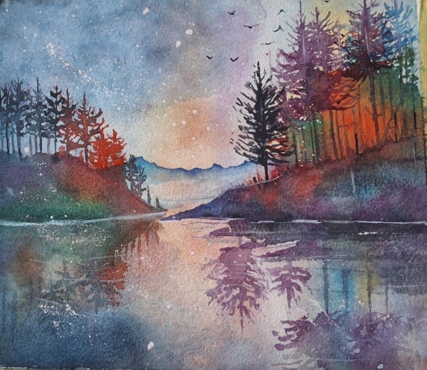
1. Welcome To The Class!: Hello, everyone. My
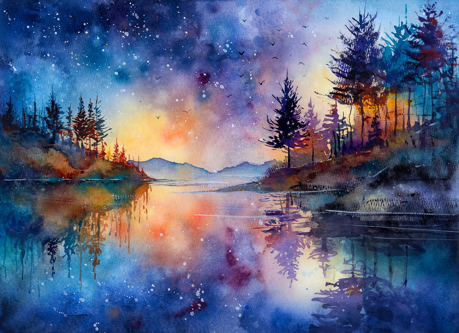
name's Will Elliston, and today we're painting
a cosmic forest. This scene blends a nighttime landscape
with dreamy color, where pines meet a sky that
glows as if lit from within, and a lake that mirrors
everything back. We will explore loose flowing
washes for aurora light, gentle lifting for mist, and crisp, simple silhouettes
for trees and shoreline. Color harmony and value
design do the heavy lifting while tiny splatters and soft blooms become
stars and atmosphere. It's playful, calming and
wonderfully expressive. I've been a professional
artist for many years, exploring lots of different
subjects from wildlife and portraits to cityscapes
and countryside scenes. I've always been entranced by the possibilities
of watercolor. But when I started,
I had no idea where to begin or
how to improve. I didn't know what
supplies I needed, how to create the
effects I wanted, or which colors to mix. Now I've taken part in many
worldwide exhibitions, been featured in magazines, and been lucky enough
to win awards from well respected
organizations such as the International
Watercolor Society, the Masters of
Watercolor Alliance, Windsor and Newton, and the SAA. Watercolor can be overwhelming
for those starting out, which is why my goal
is to help you feel relaxed and enjoy this medium
in a step by step manner. Today, I'll be guiding you
through a complete painting, demonstrating a
variety of techniques, and explaining how I use all
my supplies and materials. Whether you're just starting out or already have some experience, you'll be able to
follow along at your own pace and improve
your watercolor skills. If this class is too challenging
or too easy for you, I have a variety of classes available at different
skill levels. I like to start off with a free expressive
approach with no fear of making mistakes as we create exciting textures
for the underlayer. As the painting progresses, we'll add more details to bring it to life and
make it stand out. I strive to simplify
complex subjects into easier shapes that
encourage playfulness. Throughout this class, I'll be sharing plenty of
tips and tricks. I'll show you how to turn
mistakes into opportunities, taking the stress out of
painting in order to have fun. I'll also provide you with
my watercolor mixing charts, which are an invaluable tool when it comes to choosing
and mixing colors. If you have any questions, you can post them in the
discussion thread down below. I'll be sure to read and
respond to everything you post. Don't forget to follow
me on Skillshare by clicking the Follow
button at the top. This means you'll be the
first to know when I launch a new class
or post giveaways. You can also follow me on Instagram at Will Elliston
to see my latest works. So let's get started and turn this celestial night into
a luminous painting.
2. Your Project: Thank you so much for
joining this class. This painting is
all about capturing an atmospheric forest that opens up into a
starry cosmic sky. Thinking broad color fields that drift from warm
glow to cool night, letting edges soften and
shapes echo in the water. The trees are
elegant silhouettes placed for rhythm and balance, while scattered light and small sparkles suggest
distant stars. Let the paint travel, allow blooms and granulation
to become texture, and keep the composition
spacious so the sky can breathe. The mood is contemplative
and bold at once, a quiet landscape with
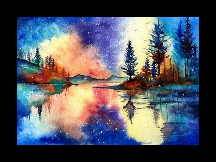
a celestial heart. In the resource section, I've added a high
resolution image of my finished painting
to help guide you. You're welcome to
follow my painting exactly or experiment with
your own composition. As we're going to be focusing on the painting aspect
of watercolor, I've provided templates
you can use to help transfer or trace the
sketch before you paint. It's fine to trace when using it as a guide for
learning how to paint. It's important to
have the underdrawing correct so that you can relax and have fun learning the
watercolor medium itself. Whichever direction
you take this class, it would be great
to see your results and the paintings you
create through it. I love giving my
students feedback, so please take a photo
afterwards and share it in the student project gallery under the project
and resource tab. I'm always intrigued to
see how many students have different approaches and how they progress with each class. I'd love to hear
about your process and what you learned
along the way, or if you had any difficulties. I strongly recommend
that you take a look at each other's work in the
student project gallery. It's so inspiring to see
each other's work and extremely comforting to get the support of your
fellow students. So don't forget to like and
comment on each other's work.
3. Materials & Supplies: Before we get started
with the painting, let's go over all
the materials and supplies you'll need to paint
along in today's class. Having the right materials can greatly impact the
outcome of your artwork. So I'll go over all the supplies I use for
this class and beyond. They're very useful to have at your disposal and we'll make it easier for you
to follow along. Let's start with the
paints themselves. And like most of the materials
we'll be using today, it's a lot to do
with preference. I have 12 stable colors in my palette that I
fill up from tubes. They are Cadmium
Yellow, Yellow Ochre, burnt sienna, Cadmium
Red, Alizarin Crimson, Opramarne blue, cobalt blue,
serlean blue, lavender, purple, ridian, black, and
at the end of the painting, I often use white gouache
for tiny highlights. I don't use any
particular brand. These colors you can
get from any brand, although I personally
use Daniel Smith, Windsor and Newton
or Holbein paints. So let's move on to brushes. The brush I use the most is
a synthetic round brush like this Escoda Purl brush
or this Van Gogh brush. They're very versatile because
not only can you use them for detailed work
with their fine tip, but as they can hold
a lot of water, they are good for
washers as well. They're also quite affordable, so I have quite a few
in different sizes. Next are the mop brushes. Mop brushes are good for
broad brush strokes, filling in large areas and creating smooth
transitions or washes. They also have a nice tip that can be used for smaller details. But for really small details, highlights or anything
that needs more precision, I use a synthetic
size zero brush. All brands have them,
and they're super cheap. Another useful brush to have is a Chinese calligraphy brush. They tend to have long bristles
and a very pointy tip. They're perfect
for adding texture or creating dynamic
lines in your paintings. You can even fan them
out like this to achieve fur or feather
textures as well. And that's it for
brushes. Onto paper. The better quality
of your paper, the easier it will be to paint. Cheap paper criinkles easily
and is very unforgiving, not allowing you to
rework mistakes. It's harder to create
appealing effects and apply useful techniques
like rubbing away pigment. Good quality paper, however, such as cotton based paper, not only allows you to rework
mistakes multiple times, but because the pigment
reacts much better on it, the chances of
mistakes are a lot lower and you'll be more likely to create
better paintings. I use Arches paper because that's what's available
in my local art shop. A water spray is
absolutely essential. By using this, it
gives you more time to paint the areas you
want before it dries. It also allows you to
reactivate the paint if you want to add a smooth
line or remove some paint. I also have an old rag or t shirt which I use
to clean my brush. Cleaning off the paint
before dipping it in the water will make the
water last a lot longer. It's always useful to
have a tissue at hand whilst painting to
lift off excess paint. Also, you never know when an unwanted splash or drip might occur that needs
wiping away quickly. I also have a water dropper
to keep the paints wet. When you paint, it's
important to have them a similar consistency to what
they're like in the tubes. This way, it's easier to
pick up sufficient pigment. A hair dryer is useful
to have for speeding up the drying time and controlling the
dampness of the paper. And lastly, masking tape. And this, of course, is just to hold the paper down still onto the surface to stop it sliding
around whilst painting. Also, if you plan on
painting to the edge, it'll allow you to create a
very crisp, clean border. And that's everything
you need to follow along with
today's painting. Of course, experiment with whatever tools suppliers
you want to use yourself. Now let's get on and
start the drawing.
4. Preparing The Composition: So let's start off
the drawing with a nice soft lead pencil
marking the horizon line, where the edge of the lake
meets the distant hills. Then we can start mapping
out where the trees are on the right hand side and mirror their
reflection downwards, keeping it nice and
fluid at the moment. And we can mark the trees
on the left hand side, using very simple shapes,
very softly plied. Now we've had that
map down roughly, we can switch to a more fine pencil and start actually adding
in a few more details. Still quite rough. I'm not spending a
lot of time making sure it's absolutely realistic, trying to convey
the general energy of trees at the moment, a few branches, how their
reflections relate. Because a lot of this painting
will be quite abstract. So just getting
the silhouettes in the correct place will help
anchor the composition. Drawing in the distant
hills, quite uneven, some of them higher than others, but making sure that land where the land meets the water
is a straight line. Then just adding these kind of triangles for the trees
on the left hand side, then making them a bit
bushier and organic, really stretching the reflections
on the left, as well. And now we can rub
out the loose lines.
5. Starting With Yellows: First thing I'm going to
do is use a large brush to wet all the paper so that
none of the paper is dry. And I just use a large brush
so that it saves some time. If you don't have a large brush, you can still do it
with a small brush. It just might take a bit longer. Maybe you can use a clean
sponge if you have one. Just making sure I get all
of the paper saturated. And then once it's
fully absorbed in, we can drop in some
camium yellow. And I'm adding
this cabium yellow where the lightest part
of the sky will be. Of course, when we add on
this as a first pigment, then it becomes the
darkest part of the sky. But when we're adding
later darker pigments, this will become the brightest. But we always start
from light to dark as a general principle. So that's what I'm doing now. I'm allowing the reflections to mirror what goes on in the top. So if I apply a bit
of yellow in the sky, I want to match that underneath. But the reflections don't have to be perfectly symmetrical, just a general idea. You can see how wet my
paper is because you can see the paper is buckling
in the middle there. That's perfectly fine
because I have it fully taped down and
it's cotton based paper, but it's 100% cotton paper. I know with the hair dryer, it'll dry out
completely flat again. And the reason I wet the
paper to begin with, is so there's no hard
edges at the moment. Wherever I'm placing pigment, at this stage, it'll be
soft and transitional. So bit by bit, I'm
adding pigment, bit of Yellow Ochre now because the Yellow Ochre adds a kind of golden element to it, rather than the pure yellow
of the Cadmium Yellow. Using the brush to
spread that out. Agitating it so there's no thick pieces of
pigment on there.
6. Adding Cool Colours: So now you've added the
warm part of the sky. It's time to include the cool part and integrate
that into the scene. So I'm going to
use Cerulean Blue. You can use turquoise blue, and I'm starting from the
outside working my way inwards. Because, of course, this yellow with the blue that
I'm applying now will look green if we
mix it straight away. So we've got to allow
a little bit of a gap where it borders
on each other. And then in between that, we can make it a bit lighter
and apply a bit of purple. Now we can roughly match
that down at the bottom. So we're connecting
it on the side there. And because it's wet on wet, we're making sure none of this paper dries
for the time being. So have your water spray
ready in case it is. We know it's all going to be
smooth because it is wet. Even if these blues and yellows mix to make
a green color, at least it will be
a smooth transition. We're not looking for
hard edges right now. I'm using my water spray
because I can feel and see that that shimmer from the paper has gone and
it's starting to dry up. I want to keep it saturated. So I'm going back with
thicker pigment now, but because there's so
much water on the paper, all that thick pigment
blends out into a nice wash. And I'm using
a very cheap brush here. It didn't cost much at all. I think it was about $5
or something like that, which, when it comes to
brushes is very cheap. And because of that, you can see there's little
hairs coming out on the paper. And if that ever happens to you, just leave them there
because although they're very obvious now, when they dry off,
you can pick them off and there'll be no
sign that they were there. So they look bold now because
they absorb all the water, but as they dry, they'll
be less obvious. If you try to pick
them off right now, you'll smudge it with your
fingers or with the brush, and it'll be very obvious that you've tried to
interfere with it. So now I actually picked up
a turquoise from my palate, and I'm using that. I used that to mix the blues into the greens
because it's a cleaner green than if the blues and greens were
mixed in together. And now I'm even starting to add cadmium red into that yellow
where it meets the purple. That cadmium red mixes well
with purple and yellow. So it's a nice color to use. Likewise, the turquoise or the green mix nicely with
the yellow and the blue. So if you think of it
in abstract terms, we've got two soft yellow
balls on each side or spaces covered with a cool
blue and purple exterior, purples going down the middle.
7. Adding Darks To The Sky: And now we've
covered the whole of the paper for this
background sky wash, and we can start building
up the pigment on that. Try to keep your yellows clean. Once you apply them,
don't go over them with a blue or a purple. You can touch a little bit of
red in there, warm colors, but I'm trying to
keep the cool areas cool with cool colors and the warm areas with warm colors. And only when they're
blended on the outside, do they merge together,
not in their own sections. So now, as it's starting to dry, I'm getting a bit thicker. So I added thicker blues, cobalt blue into the blue
section and the cool section, and now I'm mixing an orange, which I mix from Cadmium
Yellow and camium red into the warm sections. And you can see
right now how I've incidentally or I've misjudged mixing that orange
with the purple. And it started to
gray each other out. It started to neutralize each
other and look quite muted. Which is not the intention, so I overcome it by using
a tissue to soak it up to take away a
lot of that purple, and I go back with the orange
so that it's warmer now. It's less purple in
that very central area. And now I'm splatting
it with pure water. I clean my brush, and I splattered it with
some pure water. It's okay to get
messy at this stage. Once we've set up
the color areas, once we've mapped
out the color zones, now we can start to be
a bit more playful and create that interesting
texture for the sky, which causes it to feel like
a celestial space scene. So I'm using a hungry
brush or a thirsty brush to suck out some of that pigment to create
some unevenness. And now I'm using pure
black with the blue. You can use ultra marine
blue, or you can use cobalt, and I'm going to the border, the outskirts to
make it darker on the edge so that it
blends bit by bit. Because this is what will
make the yellow really glow. If we make sure the outside
of the composition is dark and the middle
is light, warm light. I really glows. And
then in between, we've got that purple and
orange in the middle. Now you can see how
adding this pure cadmium red into that blue
makes a purple. That's why it's nice to
have purple and orange in the middle because when
you mix red into the blue, it makes a lovely purple. And when you mix the
red into the yellow, it makes a lovely orange. So they harmonize the yellows and the blues in a lovely way. And as it starts to dry, we can tap more this
pigment and it will start to hold a bit more. I
8. Creating Texture: A mixing some Yellow
Ochre with cabium red. And I've got a bit of gouache
here. You can use white. And I'm going to
experiment with flicking this on here to create some stars or just
some more texture because it's still quite wet. It's going to blend
out. And in fact, we're going to play with
a lot of texture now. So these marks might not
even be perceivable once we're done with this
experimental mark making. You can see because
the paper has dried, when you splat this water on, it pushes away the pigment
to create unevenness. And that's what I'm
looking for here. And not necessarily
clouds in the sky. They're those cosmic auroras
happening in the distance. And I'm going back
between the hair dryer, getting it to a
point where it's 80% dry and then splatting it again, allowing the pigment to move,
and then drying it again. And sometimes, like right now, I'm using the hair dryer with the brush to really agitate it. And if you do get any muddiness, like in the middle,
where the purple and the oranges, we can
work on that later. I'll show you how to get
rid of that muddiness. But for the time being,
we need to focus on that balance of
creating texture. And interest whilst keeping that glowing yellow
preserved in the middle. I accidentally smudged that yellow with a blue brush there, so I'm using pure water, and I'm very quickly scrubbing it to get
that blueness away and using the hair
dryer to blow the water upwards out of that section. Then a tissue to help draw out
any blue that's not there. And because of that error, I've actually washed
away a lot of the pigment that we put up
at the top, but that's okay. We're having fun here.
There's no rules in this section because it's
all about creating chaos. And in fact, I'm going
to use that build up of pigment from the
pools at the top and redistribute it around the
composition, having fun. Using that bright orange now
and dropping that around. And within this chaos, I'm still trying to keep
it fairly symmetrical on both sides from the top to the bottom for
the reflections. So if I'm adding
some yellow or red, orange marks above in the sky, I want to roughly
match it down below. And on the side note, you can see on the bottom
edge border of this painting, I've made it a bit darker
blue than at the top, especially on the top right, you can see the sky is lighter than the darkness on
the bottom right. And that's because we'll be painting the
reflection as water, and water just looks
better when it's darker towards the
border at the bottom, the closer it is to the eye.
9. Adding Stars: So now I'm mixing some black
with some ultramarine again. And at the top corner where
we lost some of that pigment, I'm just applying
it quite thickly. And a lot of this pigment
will hold its shape now because it's not sodden. The paper isn't soaking wet. It's still moist, but
it's not soaking wet, so it'll hold a
lot of this shape. Let me start playing around with the tones
and the colors. Using darker and
deeper pigments now, using a zar and Crimson drying it a bit with
the hair dryer, now splats of water again. You can see each step. I'm splatting and drying,
splatting and drying. I'm drying it so that it
almost looks dry visually, but if you were to touch it, it still has dampness to it, and then I'm splattering
it with water. And now I'm creating
a very hard edge by actually applying a full brushstroke of pure water and
purposely agitating it. And these inconsistencies
in the wet areas and the dry areas is what creates
that exciting texture. And then using a tissue to
help pick up some areas, even using my finger. It's okay for this area
to get quite messy. As long as we can keep our
colors looking vibrant, the textures can be
as mess as we want, because it's going to be
the trees and the land that anchor it down
and give it clarity. This is the exciting part of the painting where we don't
need to worry about details. So it was a bit muddy
in the middle there. So I applied some water, and I have a brush
purely for scraping off the pigment and then
using a tissue to pick it up. So I've made that center a lot brighter now
and less gray. Now, I've wet some white guash, and I'm splatting it on the dark areas to create
the feeling of stars. The good thing about splatting is that it looks more organic, so they're placed in
a more random way that feels more natural. And also the sizes of the
splats are a bit more natural. You've got some larger ones, some very tiny ones, much like when you look
at the sky at night, you have some minuscule
stars and some larger stars, and it just gives a
feeling of depth. And we have to do this step now before we paint
the trees because, of course, the stars
are behind the trees. So far, these stars are white
using just white guash, but I'm going to
add some warmth. Gonna use this orange that I have in my palette
and then I'm going to mix a bit of camium yellow, and then I'm going to
make some yellow stars.
10. Distant Hills: So now we've finished painting the sky and we can move
on to the distant hills. So I'm using cobalt
blue for this with a little bit of sarin crimson to make it a bit more purple. And I'm starting with a
confident stroke at the top, using a mid consistency
and then I'm using pure water to spread it out into the rest of
the areas at the top. So that means the top of the hills are going to be
darker than the bottom. And notice how on the left, I'm thinking about
the foreground trees and the bank and the foreground. So I don't paint over that. I kind of use the pencil line
to keep that bit intact. So I'm just painting the
distant hills at the moment. Added a bit of turquoise blue in there to add a
bit of variety. So we have warm blues
and cool blues. Using that lighter
consistency to fill out the rest of
the distant hills. Then I can use water and a
bit more pigment to drop in so that it's
darker at the top and lighter at the bottom to
give that feeling of depth. Because you can imagine there's low clouds or fog in the
distance coming off the lake. And that strong
contrast is quite dramatic that clear silhouette against the sky of
the distant hills. Then a few very thin lines in the lake below to
imply some ripples. Following that horizontal line. And this distant hill
actually works as a visual bridge because
without these distant hills, the two land masses on either
side won't be connected, and it'll feel like
we're floating in space. So this distant hill
is very important for the composition to anchor
it and give it sturdiness. The strong horizontal nature
of it connects the two.
11. Starting The Trees: Now we can start thinking about painting the bank on
the right hand side. I'm starting with the right
hand side because basically, it's the focal point is when I think of
this image in my mind, it's the main thing
that stands out. I could easily start on the
left hand side, as well, but for some reason, I feel like the focal point, the main center of interest is, in fact, this tree I'm
painting right now. So I just want to get it
down and describe it so that I can paint everything else in accordance to what
I'm painting right now. So I'm starting off with
purple at the top and blending it into a kind of
burnt sienna orange color. And it's just a
classic pine tree, and it's dark enough so that it has some nice contrast against
that light, glowing sky. Starting to paint
the tree next to it. And you can see the tree
next to it is a lot darker, and it doesn't really matter
which pigment that is. It can be dark, ultramarine, Alizarin
Crimson or again, purple. Because the consistency
is stronger, it looks a lot darker, and then we can
use water to draw it out and it will
become lighter. Then I'm mixing in some Viridian
green at the base there. And I'm just kind of going back and forth with all
these different colors. So a bit more purple.
Using the tip of my brush, using the side of my brush, adding pure water to
spread out that pigment. In fact, the bit
that I'm painting right now is going
to be an underlayer. So it's not the sky, but it's the kind of
out of focus glow from trees behind the ones
we're going to paint on top. So I'm using wet on wet
technique to create some soft, ambiguous shapes. Starting at the
top of this tree, using a nice turquoises
syllan blue kind of color. And then we're
going to connect it to that wash down below. Making sure the top is nice and defined with the pointy
edge on my brush. So we get the branches and
the feeling of texture. And then we can create the large blue shape down
below and connect it. O. Add a few clear shapes like the general silhouettes
of the trees and then connect them with some more ambiguous shapes that aren't anything
in particular. See that orange and purple isn't anything you can look
at and know what it is. But you'll see when we paint over the top of it,
it doesn't really matter. All that it needs is a feeling of glow like trees are
glowing in the distance. If you look at the final image, it'll make more sense. We're painting it
with the end in mind.
12. Starting The Reflections: Now we can start thinking about the reflections of these
trees just a little bit. So we can match that
blue, that turquois blue. Maybe add a bit of
cobalt in there too, because it's going to be a
bit darker, the reflection. Luckily, we have
the pencil lines to help guide us with what
we're going to do here. And the reflections can be a lot more abstract because they're distorted by
the water anyway. So as long as we map out the general shape of where
the trees are above, it'll be quite believable and understandable
as reflections. Also, this is the underlayer
for the reflections. So we're adding a
bit of coolness now, and then on top of that
later on once it's dried, we can describe the
shapes a bit more. But at the moment,
it's about creating those expressive and exciting
colors and textures. So I'm not trying to
blend everything. Because it's wet
and wet, there's a nice soft transitions, but I don't want everything
to be a flat single color. I want there to be
a range of colors, cool colors in this reflection, and a bit of variation in tone. So we've got some
light green areas, mid tone purple areas, and now we're applying some darker blue almost black areas. Describing the mounds and the little pieces of land or rocks that are falling
into the water. No, I'm mixing Burnt Sienna. And working from
left to right on this mound and connecting it to that wash
we've just painted. So we've got a
warm section where the land meets the water in the center and then connecting it with
this blue area now, which is a good
example of how you can break the rules in
watercolor because usually, traditionally, we
think of cool colors receding and warm
colors close up. But as you can see now, we've got a blue cool color
for the most foreground area and that kind of warm burnt
sienna in the midground. And, of course, we do have
the blue distant hills. But because of the nature
of the composition, the tones, it just works. It adds to that
mysterious cosmic feel.
13. Adding Variety: Always flicking water on this area to increase the
feeling of texture as it dries. Now I can go over this
section with a cool color. So that every single shape and wash is not flat
or a single color. You can see every single part
of this painting is either connected to another
part of the painting or it blends into
a different color. So the trees have
purple and red. The bank has orange and blue. Even the distant
mountains is subtly got cool blues and warm blues. So I've now allowed that foreground area and
reflection to dry a bit. So when I apply this rich
pigment or this dark pigment, it holds its shape a bit more. So it's all about timing. I wouldn't have applied these
brushstrokes 2 minutes ago. It needed those 2 minutes for the water to absorb
and start drying out. Using pure water to
agitate it a bit. And at the moment,
the reflections are just a hard line,
a general shape. But now I'm trying to
correct that a bit. I don't want it to be a
boring, hard edged shape. So I used a tissue to
soften some of the edges, and I'm using the side of
my brush to do that, too. And you can scrub it with a brush to make sure it's
a nice soft gradient. And it's this variety that makes a composition
interesting. It's not that I have this
big vision before I start painting and have
all the answers beforehand before starting out. The magic is made during
the process of watercolor, and I can see that there's too many
hard edges, for example, so I need to soften
some, and in doing so, it increases the variety and
makes it more interesting. Likewise, with the color
I was just talking about, if it was all just green
trees with no variety, it wouldn't look interesting. So by adding this variety, it becomes itself interesting. And it does take a bit of
practice to figure out how to create that variety
and to remind yourself of the ways in
which to make variety. But it doesn't take high technical ability
in order to do it. It's more about the awareness of the principles
of watercolor and design that helps
guide your decisions and ultimately ends up with
more captivating paintings. There timeless principles and rules that have worked for
artists for many years, and it's what leads
my direction.
14. The Focal Point: Contrast is similar to
variety, of course, because contrast means opposites and variety means difference. So contrast plays a role
here because you can see there's a lot of grays and muted colors in that
foreground area. And without those, these
vibrant sections wouldn't pop at all because everything
would look equally vibrant. And without the contrast of that grayness and
the muted tones, it just wouldn't look
as bright or vivid. So I'm going back to paint a
more pronounced tree because that purple and
Burnt Sienna tree next to this one isn't so
pronounced at the end. So for a vocal point, for a main center of interest, it needs to be a bit
more eye catching. And what we just painted
there with those trees and the reflection on the right is actually one wash because
it's all connected. A wash doesn't
need to be seen as a flat space or
shape in watercolor. That's all connected as
one wash, technically, even though it combines so many different colors
and tones and shapes. And that's how we
create a feeling of unity and harmony, really. The best we can do to connect everything in a
single composition, the more aesthetically pleasing
the whole thing will be. Of course, there will
be some elements that are just disconnected, but the most we can
do to avoid that, the better the outcome will be. And although I said
at the beginning, it was an underlayer. I actually ended up
much more than that because it actually has a lot of form and
structure to it. So we only need to add
a few trees above it at the top and maybe a
bit more structure to make the banks
a bit more clear. But at the moment, dealing with this tree
with very dark pigment, as you can see, it's not pure black, but it looks like black. As you can see from my palette, it's a very dark blue purple. And that's because I want
it to be very striking. The strike contrast,
the darker it is, the more the sky glows. And also, it brings the tree
more into the foreground, and it makes those other
trees a bit more distant, like they're glowing from
the atmosphere and the air. If you think about a sunset and how it makes
everything warm, it's because of all
the particles being illuminated by that setting sun. And that's kind of what makes
the scene quite mystical is because although it looks
like a nighttime scene, it's technically a sunset scene, and it's a bit ambiguous about the time of the
day and the nature of the light and the
glow in the sky.
15. Dry Brushing Trees: Let's move on to
the larger trees on the right hand side and
do a similar thing. They're going to
paint some trees with higher contrast over the sky and that took what is
blue and yellow area. This is going to be
quite a big tree. But just because
it's bigger doesn't mean I'm going to
add more detail. I'm going to try and achieve
a kind of dry brush effect. To create texture
which implies leaves, branches, without having to
paint every single strand. So using the side of my brush, using a thick pigment so that the tooth of the
paper picks it up. So we fill out the area like
that and then we can connect it all and anchor it
with just a few details. Using the tip of the brush. I used a cobot blue
to do that dry brush, and now I'm going back with that dark pigment
again on top of it. Using purple that
I have pre mixed in my palette and using a bit of lavender to
make it a bit lighter. But I'm using this cool
color for the top. And as it comes down, I'm going to blend it into a warm orange where
it meets that yellow. But we'll come back to
that later. All right. I just trying to define the characteristics
of a pine tree. Because once you convey that kind of visual
language of what a pine tree is and add
just a few select details, then the rest of it can
be quite atmospheric. So now I'm putting
in that burnt sienna and orange tone over the yellow and swirling my brush around so that it blends
into that purple. A.
16. Connecting The Trees: Now it's time to connect
these trees with the ground. So implying some thin trunks. I don't want to
put thick trunks. I want that glow. I don't want
it to be too eye catching. If I made them thick
branches and thick trunks, they would kind of steal
their attention away from that dark tree
in the center. Like I said, I want
everything to be connected. So these thin lines that
connect the tree to the land just compositionally make it feel a bit
more comfortable, make it more easy on the eye. I could paint the
whole tree downwards, but I want to keep that glow, that warm glow from behind
the trees in there. So that's why I'm
just choosing to put some thin lines as branches
and trunks instead. Now, one final tree
in the background here just to reach the
top right hand corner. And this is going to
just be very expressive and just an impression
of what a tree is rather than anything super detailed or not that I'm putting
any care into it. Just filling out that
space in a way that doesn't capture the attention. Really, this section
of the painting, the goal of it is not to take
or steal attention away. So really, no one should want to necessarily
look at this section. If someone is drawn
to this section, it means there's
too much detail. So it's about creating
something ambiguous, but also makes sense, because if it didn't make
sense, then it would stick out. Just lots of abstract motions with my brush just to
create some texture. That can be thought
of as forest leaves, branches, some messy strokes. So dry brush now as we
go down into the land, there'll be a few branches
coming off the trunks, some horizontal ones
to connect them a few dry brush marks using that dark black or dark purple to imply some rock textures
on the land down there. Maybe there's some
reflections of these branches and
trunks in the water, again, using dry brush. Or if you're not going
to use dry brush, just a light diluted stroke.
17. Tree Reflections: Going back to that
purple light purple mix and matching the reflection
of the tree above. But with even less detail
as it's the reflection. Which is quite easy to do to paint a tree without
as much detail because painting it upside down like this feels a bit odd. So you're naturally going to paint something that's
a bit more abstract. And notice how I'm not sure
if it was intentional or not, but keeping that
sky a bit lighter. So where this reflection of the tree blends on the
sky as a clear contrast. It's not getting lost
in the same mid tone. We've got a light color for
the sky and a mid tone tree. A few clean horizontal
lines for ripples there. Now, I got to connect this tree to the land and the reflections. Adding a few strokes
of dark pigment, and then we'll come back with pure water so that
they blend seamlessly. Some very abstract,
swirly brush barks here. I was holding my
brush at the end so that they're a bit more fluid and organic,
less controlled. Bit more depth here. Dropping in some dark pigments. So even though
we've got a lot of scripture like brush
marks going on, whilst they're still wet,
we're mixing up the tones. Getting some pure black again onto my brush
and going back up to this tree to boost
the contrast even more. So we've been using a lot of dry brush now in this section. We've taken advantage of the wet on wet
approach in the sky, the distant hills, this
mound of ground on the left. And now we're contrasting
that with dry brush. Again, all about a variety. And now I'm using my
scrubber brush again. I don't know where I got this,
but I like it because it's got rough bristles and I don't worry about
damaging any point on it. Because I felt the distant
hills were a bit too dark. I wanted to make it a bit
more like a gradient, so distant hills are dark at the top and
blend out at the bottom.
18. Painting The Birds: Now, before we move on
to the left hand side, I'm just going to add a
few birds in the sky. These are going to
be very subtle, but in the light areas
where it's glowing, just going to use a brush
that has a nice fine tip and basically just paint
out some V shapes. So some Vs that are
the right way round, some upside down Vs, and these will just imply
some birds in the sky. And again, I'm
varying the shape, the size, and how dark they are. The smaller ones will
be a bit lighter. These are again, very subtle. I don't want to create
any large bird shapes. And I'm keeping most of them
on the right hand side. I don't want to put any on
the left where it's glowing because I want to keep the silhouette of the
trees very clean on the left. Maybe I'll play some birds on the left once I've already
painted the trees, but I think I'm just going to keep the birds on the
right flying towards the left because that
adds a feeling of movement or at least it guides the viewer's eye
across the composition. We're following the line
of birds going across.
19. Starting The Leftside: We're going to follow a similar idea on the left hand side, but we're just going to change
the color scheme a bit. So I'm going to pre wet this bank on the left
with pure water. So it's all nicely saturated. Then using just pure burnt
sienna at the moment, just dropping that
into the water so that it's got a lot of
soft edges to it. The reason we pre wet it is that the pigment can spill out itself into these areas bit by bit. But we can actually
be a lot bolder. I'm not applying thin pigment. I'm going to make it quite rich. Adding a bit of Yellow
Ochre now into here. Again, I'm not trying
to achieve a flat wash. I want to create some interest, so I'm purposely
dabbing it in unevenly. A bit of a sarin crimson
now to create a bit of variety in tone a bit darker at the bottom of the bank where it meets the water. And in the middle
bit there. Now we can use that as a base
and just move around. So creating a little
line at the bottom, preserving a bit of
the lightness of the yellow sky where the
water meets the mound, there'll be a little
bit of reflection on that line indicates that. A bit of Viridian
green in there, and now a bit of turquoise. And this turquoise on top of
the brown looks like black. But it's more
interesting than black. Because they're
complimentary colors, they'll mix and blend out
in an interesting way. Now I've got this
cobalt teal blue that I'm taking direct from the tube. I like this cobalt teal blue
because it's quite opaic. It's got a lot of
granulation to it. So when we apply water later on, it's going to create a lot
of interesting textures.
20. More Reflections: So we've set up a lot
of potential here with that base brown and the thick green and
a bit of turquoise. Now we can start
playing around with it. So I'm using this
thin brush to draw out the liquid down below
as the reflections. And as this turquoise has
mixed with the brown, it looks kind of gray and muted, but that allows it to pop up above where it's
nice and vibrant. I'm trying to think of where
that mound goes up to. I'm agitating it a bit. Taking some more Cerlean blue. The water there and the
top bit of the mound. So on this left, I
think there'll be a bit of reflection of the blue, and then on the right, we'll have some
brown reflections. I want the reflections
to be quite bold, so that's why I'm adding
a lot of turquoise in now Ultramarine Blue
right in the middle there, the middle and the
top and the bottom. And the bits in between can
remain slightly mid tone. But it's still wet.
It's wet and wet, and it's still technically
part of the same wash, even though we've got
bits that are thin and diluted and we've got thick
bits straight up the tube. It's all one wash.
A dynamic wash. I'm not painting one
bit and waiting for it to dry completely before
moving on to the next part. If I were to take a break now, I could come back
and reactivate it, and I would purposely reactivate the areas that I want there to be more texture. As I fill in this reflection
area below the mound, I know all that pigment from above will pour
itself into there. So I'm allowing a little
bit of a gap there. You can see where the
yellow of the sky is preserved in the reflection because I don't want it
to fill in completely. Now I'm starting to merge some green in at
the bottom there. See how the reflection
is stretched a bit. It's a bit more
stretched downward. It's not such a sharp
angle as the mound. Agitating that green so
that it blends out a bit into the wash. A
21. Manipulating The Pigments: It's all fairly mid
tone at the moment. So whilst it's wet on wet, I'm going to start adding a bit more of a darker tone to it, especially where the
land meets the water. When it's halfway
drying like it is now, when you add a thicker tone like this with a thicker
consistency of the pigment, it'll hold its shape a lot more. Because the water
content is less, of course, the pigment
won't move around as much. The reflection is
looking a bit too cool with all that warmth
from the land above it, so I'm adding a bit of brown
to acknowledge that warmth. And now we've done
that, I'm going to start messing around
with it, agitating it, flicking it with water
because some of it's 90% dry, some of it's still
very wet and adding the splats creates a
lot of uneven texture. It creates interest.
Interest that I wouldn't be able to achieve if I was consciously
painting it bit by bit. I'm allowing the watercolor
to create the texture. I'm manipulating it,
but I'm being very random with the splats and where the water
curdls are happening. I can't control those
things directly. I'm just manipulating them and allowing the watercolor
to achieve them. But because I know the
nature of watercolor, you can learn to
manipulate them yourself. You know what it likes, what it doesn't like,
what will happen. You can predict
where things will go by setting up the conditions of the pigment and
the paper yourself. For example, you can see that thick green we used
straight from the tube. The watery burnt sienna is not going to wash
on top of that. It's going to flow around it in between it, not over the top. So when I pour water on it, the rivers of pigment, the streams and the flow of
the water move around it, and using a hair dryer to agitate it and a tissue
to pick certain bits out. We can influence the
pigment to create interesting shapes without
thinking about strict detail. I used a hair dryer to help
speed up the drying process, but it's still slightly damp
and I'm using dark pigment, little strands of dark pigment, where the water meets the land, again, just to create that allusion of the bank
sinking into the water. We can refine where this edge, where the corner of
this land falls into the water as it meets the
middle, like a little point. And now we're going
to start adding the reflections of the trees. Even though we
haven't painted yet, I can assume where these
trees are going to go. And I'm just going to add
them in as warm oranges. So even though we've got
a green color there, I'm going to connect
them with orange. Using some fine strokes, a pointy brush just
to blend them in.
22. Trees On The Leftside: Now we're going to
paint the trees above. And if you want to rest
your hand on the paper, make sure that the paper
is completely dry first. So we're painting the trees the same way we did
the other ones, using a very dark pigment
to make a clear silhouette, starting from left to right, using a clean, solid line to
establish strong verticals. And then we build
up the branches and the leaves on top of that. But it's important. Our verticals are very
clear and perpendicular. Because it's these
cleaned verticals that ground the composition. Everything ose is quite organic. We've got a bit of
horizontal lines in the water and
the distant hills. But everything else is
very angular and flowing. And the diagonal nature of the banks creates interest,
makes it exciting. And the flowing
nature of the sky and the washes and the distant
hills create interest as well. But we need these structural verticals
for the tree branches. To keep it anchored and
to give it structure. Not only does it make
the painting feel more confident, but in doing so, it makes the whole piece more aesthetically
pleasing and calming, really, because it's
somewhat trustworthy. It's reassuring to look at. It's not so agitating. If everything without
these vertical lines, it would feel too
jarring, a bit too lost. The eye wouldn't know where to go and there'd be nothing
to lead it or guide it. But these verticals
connect the sky to the land and the
land to the water. So we've applied the
verticals there, and now I'm using horizontal
lines to imply the branches. Using the very tip of my brush, some smaller trees
at the bottom there. And notice how we've
shifted towards this glow. I've gone from a
cool blue color for these trees to a warm
brown and orange. Almost like they're
being illuminated. But it's not that they're
being illuminated. It's that the sky, the warm sun and glow is lighting the particles
and atmosphere and the air, the dust, so that when
we see these trees, they're illuminated
in their silhouettes. And this color also
connects it with the land because we've used this
brown on the land there. So once we've
painted these trees, we want to make sure
they're actually connected. We don't want them to feel
like they're just stuck on. Using some pure red just at the bottom here where
it's most vibrant.
23. Filling Out The Trees: Now I'm going to fill
in these trees a bit more using black and
again, burnt sienna. We've created a nice warm
base for these trees, but I think the contrast
should be increased a bit. So I'm going over them again, filling them out with this
almost black pigment. And this consistency
is quite strong. It's not that diluted. So when it dries,
it's not going to be a kind of gray brown color. It's going to keep this
tone the way it is. I want to achieve
that strong contrast. And I'm allowing
little tiny gaps in between the branches
to show that background. Making sure I've got a brush
with a strong tip on it. I'll try not to overthink
my brush strokes, trying to feel my way through them rather
than overthink them, keeping them nice and organic. Maybe another tree in between
these two to connect. Now we can start darkening
the other trees. We might have been able to paint them dark from the
get go straight away. But actually, having
the orange underlay on the trees on the
right hand side of this bank and the blue underlay on the trees we're painting now, it creates a kind of glow, a warm glow where
it's orange and a cool glow where it's blue. It just wouldn't be the same
if it was all just one wash. It adds a bit more
depth and excitement. So now I'm blending
these trees into the bank itself by adding a bit more
pigment and pure water. In fact, we can add a
bit of lavender, too, with a bit of cobalt blue, and start dropping that in. Of course, blue and brown
make a gray kind of color. But because cobalt blue
is an opaic watercolor, you can still see
the blue on top of that brown because it
blocks off a lot of the brown I'm sure you have found that
paintings in real life, especially watercolor look much better than through
photos or through videos. So watercolor with its nature of these intricate textures and details just look much
better in real life. The camera has a hard time understanding the tones and the textures and the
whole variety of color. Using a tissue just to agitate and dab out
some of that darkness. Using the side of my brush to play around with it
a bit. There we go.
24. Playful Reflections: Let's go back to the
reflections on the left again. Now that we've added
these dark trees, we've got a better idea
of where they can go. I'm using a brush with a very
fine tip again, same brush. Using that dark pigment just to fill out the general shape, and then we can
use water to blend them in and connect
them afterwards. So I'm just thinking of a scruffy little triangle, really. Like a metal scour that
you wash pans with, but shaped as a triangle. An upside down
triangle or a cone. Using a bit of blue on that one. Not necessarily matching
the exact color with the same tree above. So verticals, just
to map it out. Using pure water to blend the
bottom of them or the top, depending on which
way you see it to connect it into the
rest of the reflection. Then making a bit more sense out of those reflections, too. Bit more Burnt Sienna. This burnt sienna on top
of the blue will look a lot darker and less
vibrant. That's okay. Then see how it shifts to more vibrancy when we go over the yellow. It's the same color. But when it's over the
blue, it looks dark, and when it's over the yellow, it looks bright because of the color families
and their relationships. Intermingling them together. Keeping these reflections
a lot lighter than the actual trees
above, actually. I still want to convey
that glow from the sky. I don't think I'm even going to paint the last of the
trees on the left there. Just going to keep some
subtle vertical lines there, and keep it ambiguous. Then I'm going to
get a little bit of diluted whitewash and add some light splats just
over the ground areas. And these splats aren't
really perceivable. They're not really noticeable, but they do influence
the painting. They add a little bit more
depth and sparkle to it.
25. Horizontal Lines: We've almost finished now. I'm just adding a
few light touches. I'm using this ruler to make sure I've got a
nice straight, even line. I'm just going to apply
this straight line to get a clean reflection. I'm not actually
touching the ruler. I'm just using it as a
guide and painting just above parallel to the ruler. I'm not painting against
the ruler at all, just using it as a guide. And there's something about
a white line where the water touches the land
that just increases the illusion I think when
the water touches the land, it creates ripples or little waves that reflect
the lightness from the sky. I'm also using this ruler to correct any other wonky
lines I've got down there. Adding a few strokes
of this white guash, using a bit of a dry brush mark really to further create the
feeling of ripples going on. Some of my lines there
are a bit dirty. They're a bit wonky, so this
helps clean them up a bit. And then using my finger
to smudge the end of them so that it's a
bit of a transition. Doesn't just end
in one white line. Same with the distant hills. By adding a little
white line here, it feels like a bit of
land in the distance. And then just one
or two strokes in the foreground again to convey the feeling
of water or ripples. Just a few more. Helps with the flow
of the painting. Maybe on the rocks, we can imply a few highlights, but they're not
really highlights. They just kind of
tell the viewer, there's a bit of land there, what separates the land from the atmosphere. A
bit more structure.
26. Final Thoughts: Welcome back and
congratulations for completing this class on painting a
cosmic forocne in watercolor. We explored how simple
silhouettes and a strong value plan
allow color to sing, how soft merges and controlled blooms
create mist and glow, and how tiny accents can read
as stars without clutter. Reflections became shapes
first and detailed second, giving the lake a calm voice. These ideas translate
beautifully into night harbors, mountain skies, and any subject where atmosphere
leads the story. Remember, watercolor painting is not just about technical skills, but also about expressing your creativity and
personal style. I encourage you to continue
exploring, experimenting, and pushing your
boundaries to create your own unique
watercolor masterpieces. As we come to the
end of this class, I hope you feel
more confident and comfortable with your
watercolor painting abilities. Practice is key when it comes
to improving your skills, so keep on painting
and experimenting. I want to express my gratitude for each and every one of you. Your passion for watercolor
painting is so inspiring, and I'm honored to
be your teacher. If you would like feedback on your painting, I'd
love to give it. So please share your painting in the student projects
gallery down below, and I'll be sure to respond. If you prefer, you can
share it on Instagram, tagging me at Will Elliston, as I would love to see it. Skillshare also loves
seeing my students work, so tag them as well
at Skillshare. After putting so
much effort into it, why not share your creation? If you have any questions
or comments about today's class or want any specific advice
related to watercolor, please reach out to me in
the discussion section. You can also let me know about any subject wildlife or scene you'd like me
to do a class on. If you found this class useful, I'd really appreciate
getting your feedback on it. Reading your reviews
fills my heart with joy and helps me create the best
experience for my students. Lastly, please click
the Follow button Utop so you can follow
me on Skillshare. This means that you'll be
the first to know when I launch a new class
or post giveaways. I hope you feel ready to paint these luminous night scenes
with confidence and ease. I look forward to seeing you in future classes until
then, happy painting.
 Will Elliston, Award-Winning Watercolour Artist