Transcripts
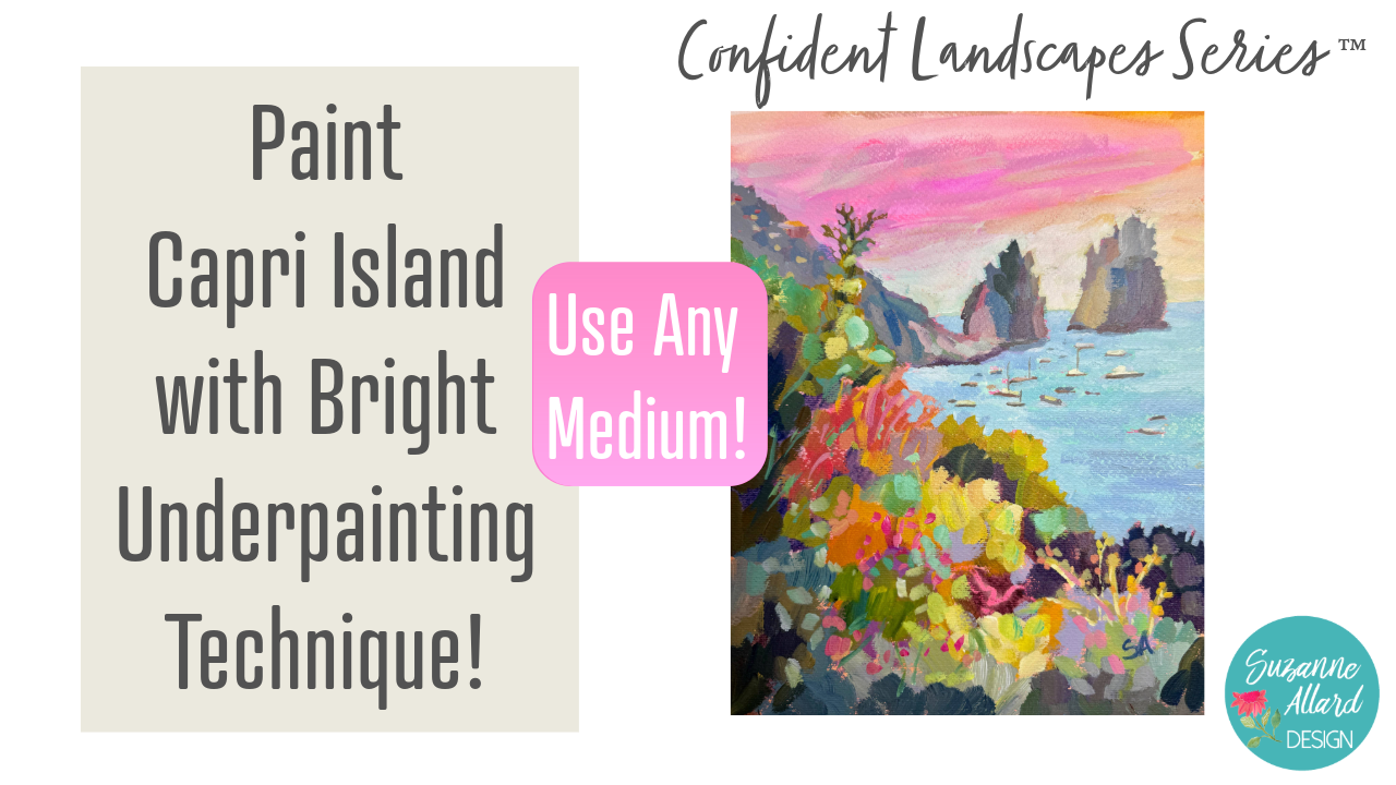
1. Class Intro: Okay, I've got another
travel opportunity. This is the one where
we're going to Capri. Capri is an island in the
Amalfi coast of Italy, and the scenery
there is stunning because it's steep and you're up high and you're looking
out into the water. And I was hiking one day down
this ravine to this beach. That's the only thing
is you have to go way down to get to the beach. But I turned around and took this photo, and it
was incredible. So I've been wanting to paint it ever since.
We're going to do that. We're going to start with a really multi colored
vibrant underpainting, and that's going to inform
the layers that we put above. And we're going to use acrylic. We're going to paint on
acrylic paper for this one, but you can use
watercolor paper, and I'll talk you through that or a canvas, if you would like. This one is a little unique because we're going
to have little boats. We're going to have a
foreground of, you know, vegetation that we're going
to enhance the color of. We're going to talk a lot
about focal point and how to get that viewer looking
where you want them to look, how to keep things
that you don't want them distract the
viewer out of it, and just put together
this composition in a way that takes this photo, uses this photo as a reference, but then we make this
painting our own. Alright, so let's get started.
2. About Me: Hey, I just wanted to tell
you a little bit more about me if you haven't taken
many of my classes. My name is Suzanne Allard, of course, and I'm a
self taught artist. I got started painting later
in life in my early 50s, and I finally decided to
stop being scared of paint. I would create other things,
but for some reason, painting felt like, No, no, though, that's
for real artist. That's not me. Um, I'm
just a creative person. And I got sick of hearing myself say that and
started painting. And I started just, you know, with some basic drawing, like little challenges
on Instagram. And I'm not a big drawer.
I don't draw much. I'm a sketcher. And
just one thing, you know, I don't want to say
one thing led to another, because I worked hard. I don't want to diminish
that. I worked a lot. I painted a lot. I created
a lot, asked my family. I was obsessed.
I'm still kind of obsessed. I paint
in the evenings. But I just wanted to
share a little bit of that story because I think one of the
things that really gets you where you want to go is just frankly not giving up. And, you know, you can
get tired and you can have take a break and
recharge your batteries, all that, but just don't stop
and keep taking classes. And eventually, you
know, if you want, you can get to where it's
you're selling paintings. Many of my students have gone to sell paintings and
show paintings, and that's so exciting for me. I myself sell my work online and license my work
and teach classes online. I haven't done in person
retreat yet. That's on my list. I have to think about that one because I get requests for it, but I think that if you are
interested in pursuing, whether it's casual painting, just for pleasure, all the
way up to an art business, like I have and beyond, you know, just stick to
what you like to do. And then do that
part and then add on things that you don't know
little by little so that you can learn and keep your focus, keep your determination, and
you'll be able to get there. Alright, keep creating. Let's get started
on this painting.
3. About My Acrylic Palette: And then I just want to show
you I used acrylic paint, and I put together
this palette I got the idea from Patty Malka. She's an artist, a
wonderful artist, and she posted about she's posted for years about how
she organizes her paints. I changed it up just a little
bit from what she does, but it's basically
what she does. So she puts the paints in here, and then this is she
uses a paper towel, but I got one of those Swedish dish towels that
we have at Costco, or you can find other places, and I keep it damp
and in the bag. But it was hard to do, but it's worked to take those expensive
golden paints and squeeze almost the whole tube
into this craft container. I did take a knife and cut the top because it was in my way when I
would go to paint, so I cut it off and
I still use it. Then the other thing I do
that Patty doesn't do is I get this glad sticky wrap
and I put it on there, and then I put my top on. But within the wells, I've got you do not need
these exact colors, but just have a cool and
a warm yellow, orange. This is a naps all pink. Certainly not necessary. This is a permanent
rose, cad red. This I don't use much
in this painting. This is a most of these
are golden or Nova. This is the Nova
flores and magenta. Any brand will work
as long as I really encourage you to try to
get artist grade paints, not student grade,
you're just going to really like the results so much better and enjoy painting, even if you get fewer colors. If you want to really limit your palette and still
have plenty of options, get your two yellows, a cool, and a warm, two blues, ultramarine for sure, and then either a
cerulean like this, this is a Prussian blue, but just two blues, try to pick one that's warmer, Cerleans a good warm one. Then I know people
call ultramarine blue warm because
it goes toward red, but to me, it always feels cool. Then this is a dioxin sine,
purple, not necessary. One of these is fine. These are good tone down colors. This is yellow ochre, burnt sienna, and burnt umber. You don't need all three. I
do love having turquoise. You can make it with a lemon yellow and a cerrillm
so you don't need it, and you certainly
don't need green. You can make greens
all day long. So yeah, those are the paints. I just go like this.
I do miss them. Like if I just
finished painting, I'll take a cosmetic Mr. Or even just a spray bottle
and I seal it with this. And then I put this on here
and put it in the bag. And if I know I'm not going
to paint for several days, I might put the whole
thing in the fridge. And I just keep that wet towel
in there and then seal it, seal it, you know,
cross I can like this. And yeah, it lasts weeks. As long as you keep enough
paint in these wells, when they start to get
low, just replenish. And within the paint, I did mix a little
bit of slow dry. It's an additive that you can let me get the
bible, I'll show you. You can add it to
your it's either slow dry or retarder
or just a couple of drops of that we'll
extend the drying time. And I think that helps to
keep them nice and moist. All right. Let's get painting.
4. Let's Underpaint!: All right. For this painting, I wanted to work on
this picture I took. We were in Capri, which is in
the Amalfi Coast in Italy, and we went on a hike that
was I forget the name of it, but it had an estate at the bottom that had been
owned by somebody in the 30s. And so there was this
path walking down, and I just stopped and looked to my left, and
this is what I saw. And I haven't painted it before, so we'll see what we do with it. And as always, I just use
these as a jumping off point. I've got my this
is acrylic paper. This is a brand that
I think I found at Hobby Lobby or
maybe at Michael's. But just acrylic. If
you get acrylic paper, then you don't have to put gesso on the paper
first because they've got something already there to keep the paint from soaking
into the paper. So if you use watercolor
paper, it's fine, just take a layer of gesso, a primer and kind of
put that on there. Think of it as a paint primer. I've got my palette paper and my craft box,
palette of acrylics. And then I like to
use this sometimes. It's called a solid marker, fluorescent solidified
paint for my sketch. I just like how the
bits show through. But you can use
paint, of course. You can use really
anything to sketch. If you don't want
it to show through, then just use a pencil
or really anything. If you do want it
to show through and you like kind of
the fluorescent bits, then you could use a
highlighter you might have on hand or a bit of fluorescent paint or even
just pink or orange paint. So the first thing
I think about is, do I want to tone the canvas? And that is, do I want to
put a color down first, to give it something,
something behind it? And usually I go with a pink, but I thought it'd be
interesting to see if since we've got
these blues and things, what if we went with a really,
really pale turquoise? So let's try it,
see what happens. For that part, you just
need a good size brush. It can even be a
house paint brush. You don't need anything special, and we're gonna water it down. And I don't want it to be
a really um let's see. Well, yeah, that works.
I was gonna say really kind of obnoxious fluorescent. We could also do
sometimes I'll do this. Put a little bit of one color
kind of where, you know, I see the water is and maybe a different
color other places. So let's play with that. Since pink is kind
of a compliment, kind of red is a
compliment of green, we can put this
compliment down here where roughly where
all this green is, even though we're going
to use different colors. Like, you know, I don't I'm not going to fill this with green. Let's put a little bit of be orange more
orangy down here. You could, like I said, just paint the whole
thing one color or you could not paint
it anything at all. I just like when these bits show through. Really watered down. And I'm just kind of
holding the picture to kind of really eye things. So one of the decisions to
make in a photo like this is, do I even want to
incorporate this? This is a tree coming in, and we could just
completely remove it. My concern there is
composition wise. Then you'd end up with
this sort of line here of green or whatever
colors we choose, and then sky, kind of
dividing this right in half. And I think compositionally, what is actually behind this tree is another
one of these. So we could do that
and break it up. So really, you could
go three ways. You could just do this and then get rid of the tree completely and have nothing behind here, or you could put the tree in, or you could put the
other really island that's out there.
Let's try that. Let's just try putting
another island out here and taking the tree out because we can always
put the tree back in, maybe if we want to. Alright. I'm going to put a bit of fluorescent
up in the sky. This is fuscent magenta, I'm really gonna water
it down, though, because I like when that shows through and can make
some interesting sunset, maybe a tiny bit of
water down yellow. Okay. I'm gonna let that
dry while we talk a little bit about what to do
next and start sketching. I'm just gonna move this
for a sec, while we sketch. This is it's a strangest stuff. It's paint. Solidified.
It's a little bit stinky. But it makes kind of an
interesting texture. All right. So I'm just going to, you know, look at basically
to sketch this, this is about a third of
the way down the paper. Then the water lines about
another third ish, not quite. So my water line is there, and this kind of comes up in like so the greenery
continues up here, but then there's kind of a mountain that comes
down here to the water. And kind of meets
the greenery here. And then it kind of
attaches to this island, which is actually kind of
in front of the water line. And then I'll put the other island I think
is further back. So we'll make this one there, and then this one will be
maybe taller back there. And down in here, I want some shape type sections. I'm not going to be
painting this specifically, but I'm looking for some shapes like this is kind
of darker in here. There's some really
dark evergreen. So this sections darker, so
I'm kind of outlining that. This is more of a
tree here over here. Kind some dark areas there. I'm going to ignore can't remember if that's
a wall or a gate. There's some Buganba down there. We'll have fun making
this really colorful. Maybe dropped us
down a bit more. And then I think also
it'll be nice to have these little boats here you add. Then you've got
some clouds, bits. There's definitely a
difference here kind of where it's more cloudy, so we
could kind of mark that. We may do something
with it may not. So that's how
loosely eyes catch. Alright. I've got my
friend's photo to the side. I'm just gonna wipe this off so I can still
use this page. No sounds and tearing it
off and wasting it until it's all used got my paints. I give them a little sprits with my makeup, cosmetic sprayer. Again, I'll put links
to all these supplies in the class supplies download. For brushes, I've got a variety of really flat
shapes. These are called flat. The only one that's kind
of a fill biird is this. That's for any details. And you can use a
small flat or a round. Actually, that is a flat. It's just kind of dried, funny. This is a four.
This is a bright, meaning that the
bristles are shorter. See how the flat is long
and the bright is shorter, but they're still a square
or rectangle shape. And then I've got I
think this is a six. Rosemary numbers
are hard to read. But this is the hog hair, kind of bristly, and
then these are smooth. So I'm going to
start with a sketch with this one. This
is a number four. I mean, not a sketch. I'm gonna start with a block in we
already did the sketch. I often sketch with this, but we're at block in stage,
so never mind that. Let's plo in with
the bristle one. And got my picture
that I'm looking at, and you should print it out
and have it next to you. And I'm standing, by the way, because when I'm working
on something like this, if you don't have an
easel, this is 11 by 14, and it's at this stage, if I sit down, I'm
too close to it. So this allows me to get
some distance and hold the brush like this and kind of not get
too fussy with it. So I recommend that
if you don't have an easel to just stand and
take breaks if you need to. So the first thing I want
to do is get some of this in here and decide the
colors that I'm going with. I see in my photo that I have a wide range of
lights and darks. So I'm going to start
with my darkest darks, which when I look at my
photo are down in here, here, there, maybe
some there and there. And then if I squint, this is almost as dark but not quite. And remember, things
in the distance should always be made less
saturated and lighter. So I don't want to make
that as dark as this. That'll be a shade lighter. So my darkest darks
are throughout here. I just gonna make, like,
grab some burnt umber and this first layer blocking in
is watered down quite a bit. So here's kind of a purple
with some burnt umber. And I'm just gonna get
in some of these darks. I could use a dark green. I could use a dark blue. Sometimes I move around. I just added some Prussian blue. Down here is a bit dark. Over here as well. Kind of
all along the front here. But not the top of that. Um, that's kind of warm there. So I'm leaving some
space for that. Got some dark over here. Can take that more
of a blue direction. Since I've got this water
down and a little lighter, I'm going to go ahead and
hit that island there, especially this right
side of it is darker. And then with the same
kind of lighter blue. Let's hit it with a tiny bit of white.
Lighten it up a little bit. Let's hit that hill
that's in the distance. We'll use value and saturation
to distance that hill. And we know this one's gonna be similar, so let's go
ahead and get that. I'm gonna make it
even further, though, so it's gonna be lighter. Alright, so let's
come back here. And make some decisions about where am I
going to make colors. Colors draw the eye in, and I want kind of the eye that could
just kind of come in. Maybe this is going to be a
line bringing the viewer in. This is going to be a
line being the viewer in. So maybe this area
here depends on it could be kind of
a focal point here or it could end up being
the water with the boats. It will probably be the
water with the boats, and then we can make color come along here
to support that. So I see a little bit
of orange yellow there, so I'm going to put
some of that in. My brush still has
some blue in it, so it'll be tone down naturally. Especially against there. It's quite light. Adding a little more yellow. A lot of yellow down here. And there's I'm going
to keep kind of dark and not as interesting because I don't want it
pulling people away. But I'm gonna make
a little lavender and put it maybe right in here. It's a dirty lavender
'cause my brush is dirty. Look, that's okay. That's
what I want right now. We'll come in with
brighter colors as we go. Let's see. Maybe something
brighter. Right in here?
5. Building Layer Two: No. That was a little fluorescent
magenta mixed in. It does a lot of heavy
lifting, very small amounts. Okay, I think I will
use a paper towel. This is a shop towel,
but paper towel works fine and just take out
some of that paint. I haven't washed it, though. I do want some green here. So I'm going to grab
green but mostly make green with other colors
yellow and blue, bit of purple and come
in here with that. Just plocking in the
shapes at this point. There's a little
variety in that green. And now I realized, so this is I was taking my brush strokes
down for this area, but the tree is going that way. So let's use our brush
strokes to help us go in the direction
of what's there. We don't have to cover
all the background. I often have to remind
myself of that. I am going to take
this branch up here, though, I think
it's interesting. And we'll cut into that. There's a bit of yellow in that. There's some lighter
shades over here. So see how it's kind of
light sparkly there. That's what I'm doing
here with this. And kind of lemony yellow here. So I'm blocking,
but also layering. If I've got a color going,
I'm going to go ahead and use that.This is where we
could use actually. I just wiped my because
we could use a pink to kind of bring the
viewer's eye in here. So we could turn this shrubbery here just a little
bit more pink. And lighten it up. Along the top of this shrub, I'm gonna make it just a
really warm golden green. I'm holding my brush
like this to keep things loose. I want that brighter. Keeping my marks in the
direction of the shrub. Okay. I think I'm gonna pick up
on that lavender here. If we decide that it draws too much attention to down
here, we can always change it. But for now, I think
it's a big flower, but I'm just gonna make a section of lavender
and let that. Of course, I also love
that color carry Winkle. So let's make some
with some white. A bit of purple.
That's a little too. We need a tiny bit of
blue. Little more white. And then I need to muddy that
down a little bit with some green, knock it back a little. I keep making it darker. Okay. There's a bit
of it over here, too, another flower.
Some smaller bits. So you see how the
crayon thingy I used, the solid marker is where
my paint was watery, it didn't it's not covering it. So that's why I just
like the kind of unexpected no matter
what you use, whether you use a
highlighter or a crayon, it's just kind of fun
to see what happens. I'm going to since I've
got this color made, and I see that some of this back here is kind of this color. I'm going to go ahead and take advantage of having some of that made and maybe that bit there. Comes down. There's kind of a pinky thing
up there, maybe a house. Um, we can't see this one, but we know it's gonna
have some variation on it, so let's just put that in. And since I've got this lighter
color, I'm looking round. Is there anywhere
I want to put it? I don't think so. Although, I'm looking
at the boats, if we darken a little bit, maybe with a bit of let's see. We could go purple. But I feel like I've got a
lot of purple. Let's see. I'm trying to think what let's have a little
bit of orange and just make a neutral for
some of these boats. They're teeny, tiny. And we want to change
the color of them. I'm trying to make the
tiniest little mark. Some of them are
lighter in color, too, or have bits
that are lighter. There's one down there. I can just grab what's on my palette really and
get some variety. They're going different
directions somewhat. Bigger one right there. I got that different color mix, so I might as well throw
in a little variety here. Thank you. I lighten this one up
because it's further away. The leading bits of a brushstroke like that help
you create some variety. Let's go back down here. Well, that's too dark. This is more pronounced
vegetation because it's closer, so I can make it
the shapes larger. This is darker over here. Oh And down in here. Almost done blocking
in the main parts. Trying to decide, What do I
want to do here color wise? It should be a lighter value. Maybe grabbing a bit of turquoise to see if I can
make something I like. Hm, not sure. I'm going to darken down
here because dark tends to draw in to the painting. So even though it's
not in our picture, I'm gonna darken it up. Along the bottom edge. Very I'm gonna vary
it a little bit by just grabbing a little
something else. Okay, we don't have
to cover I see, I always have to remind myself,
don't cover all the pink. Um, and I'm gonna go back to that dark that was here
and make it a bit larger. Back in the purple direction. They're in here 'cause we kind of lost a
bit of that dark, so I'm just putting it
back in a little bit. And we can leave that for now. Some dark coming
through there. Alright, we're gonna
let all of this dry and then come back in and probably defines I don't know whether
I'll define some of this more before I
cut in the water. I may. We'll see. See what we think
when we come back. It's kind of cool how some of this shows up behind
here, doesn't it? We'll see if there's
something to be kept there. That's
6. Building Dimension: Alright, let's see
where we are on this. I think at this point,
I want to come in and add another level
of detail here. Maybe a little bit
here and there, separate these a
little bit more with probably pushing that back with some less saturated color. And then maybe we'll come
in here on the water. I'm just really taken by the shapes back
here that emerged and deciding if I want
to leave them somehow. So I don't know yet on that. Alright, so let's see. I'm going to get a little
bit smaller brush. Actually, it doesn't have to be, but I do I think I'm going to take one that's a little less. My Rosemary one is really sort of spread out doesn't allow me
to get as much detail. So I think I'm gonna switch
to one of my Princeton Aspen. This is an eight number six flat and come in here
and just using my photo, think about just a little
more detail in here, just another layer
on this because this was really
just blocking in. So now starting to
build up some layers. You know, a little
darker. Bencienas great for toning things down. Again, working on one stroke. Changing the color
just a little bit. And kind of like that there. Before I leave this color, I'll use some more of it here. Maybe make it a little. Whoops, not that orangy. That orange is very intense. This is where just
being mindful and minimal with the prototox can really create a lot of interest. There's even some line there. We can they're
basically branches, but we can put some of
that in over here as well. I really like how that
brushstroke came. So I'm also looking
at what I don't want to get rid of and don't
want to cover up. You learn that the
hard way. Done it. And then thought, Oh, why did I? So just slowing down
a little bit now. Got this orange going. Do
I want it anywhere else? Do a really saturated version
of this house up here. I mean, unsaturated, cause we don't want it
showing up too much. Some blue. Burnt
umber, darken that up. I'm not covering everything. Just a suggestion, some
branche stuff that we'll probably paint over somewhat. Try to make those
marks kind of loose. These lines are
bringing, you know, people toward the viewer
end to the painting. Go back to the purple here. Purple burnt sienna makes
a really nice dark. Okay I'm just looking
to vary these colors. I don't. I like a lot of color, but I like a lot of variety, and then I want some of these neutrals that we're making here to help pop some of
the brighter colors. Alright, let's add some
white and come back here with some desaturated
details there. It's kind of dark through there. It's almost a pink
on the left side. It's really time to
wipe out my brush. Get too many. Se all the
different colors in it. And you can get to mud if
you let that go too far. It's kind of light colored here. One stroke and stop. And then it's kind
of darker back here. Gonna go in a
unsaturated blue for this island back here and make some of these subtle
shapes of cliff pieces. Changing the color
as we come down. We'll cut into that, as well. Here's where I can cut in to my branchy thing
here on my leaves. You want when you're cutting in, you want the paint to be
moving really easily. So I added a bit of water. Sometimes you have to push the paint down to the
end of the brush. Don't want to get rid of that bit of pink
there like that. There's some sort of
rock formations down there that are let me
go a little lighter. We can suggest. Same with here. We really don't need
much detail on these. We're just showing that
they're out there. I do want to make the shape
of this one different. Okay, let's go down in here.
Worry about the brush. Kind of mix some neutrally. Bightish colors in here. There's actually, I
think it'd be pretty. There's a really we can also
kind of look at some of these marks going this way and suggest some of that
using the end of the brush, a little bit lighter shade, maybe even a little
bit more yellow. This stuff that's closer can
get a little more detail. Bits of arquoise that leaves can sometimes
have that feel. So one thing that's
happening that I don't like is there's just too much
of a straight line here. So what I'm going to do
is bring this out more. And when we cut in, too, actually, I'll just save
it for the cut in because we can change that
line a little bit. But this part, at least,
I can soften that line there by making more saturated
saturated as forward. So make that come out is obviously something in the foreground by
just brightening it. Now I'm sitting
down, by the way, because we're I'm getting to where I'm working on
a little more detail. Just go to brighten
this up some more. Brighten this up too. Remember, acrylic
always dries darker. So it still gets me where I'll
put it in and I'll think, Okay, that's what I'm going for, and then it dries and
it's much more dull. Really prepare.
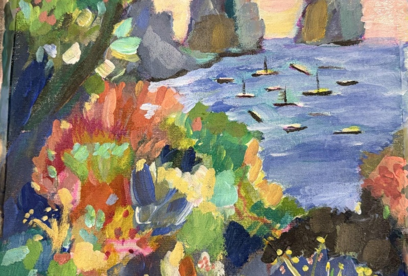
7. Painting Water: I'm going to put some of
those a little more detail for that see that pink
boganda in there. It just kind of
inspires me to put in a little more bright
highlights in there. Bits of I can put them really. Whoops. Too big of a glob. Brighten it up with some white. I'm not even trying
to make them look like Bugainvie or anything. It's just a bit of color. It's down here as well. And I think I'm gonna
change that purple there because I think at least add
some green to it next to it. It's just too much purple. And that the little bits
of flowers will pop more. Y come back there. Alright, let's leave
this piece now, and let's start cutting
in on the water, which means I have to make
that decision about back here. It kind of looks like
it came out like, you know, some more islands
way in the background. And so, we'll see. I'll do this water
first and then we'll see what we think then. Alright, the water. I am gonna retain some
of the turquoise color, reminding myself to go lighter
because it'll dry darker. See, and that's pretty. I've got the flat brush, but I might usually
sometimes for cutting in, I like to switch to the softer
or more synthetic brushes. Let's see. Just have to
make sure you have plenty of paint on your brush. And remember, I
was going to work on making this less of a line. So I think we'll
cut way in here. Yeah, I'm not liking I'm getting too rough
of a line there. So I'm going to switch
to. This should work. This is a bright, as well, but it's just softer bristles. And a bright gives
you more control than a flat because the flat, remember, the
bristles are longer, so you get a little more
control, which I want a little. I want to have
that here. And I'm going to vary this watercolor. Not watercolor as in
watercolor paint, but the color of the water. Um, to get those kind of textures that
you get with water. Trying to also keep some
of my pink bits there. And I don't know if you can
see the paint chunky paint, but that works really
well for water because it looks like it's the waves. So let that be. Just make sure there's
a lot of paint on your brush if you
want that effect. I can let bits of the
turquoise show through. I'm going to cut in quite
a bit here. And in here. You don't need as much detail back here because
it's further away. So one way I can convey that is to not cut
in with as much detail. And then it's coming along here. Los the water's a bit
lighter back there. Reflection. So we'll come in. When I do this, I'm trying to get off load the
brush a little bit. You can do it by using
a palette knife, too. But And coming around here, the water gets a bit darker, almost purply against there, even darker. But desaturated, so I'm
adding a little bit of burnt humber and we can assume the same thing is going to be the case
where that is hitting. No going around the
boats, cutting in. I can kind of just make
them thin boat shapes. I'm just adding a
little turquoise blue, the ultimarine blue, white. The cutting them will give us some interesting shapes,
and then if we want to go, we feel like we need more detail on the boat or on
a couple of them, we can go in and
put that in later. You see me kind of using
the brush sideways. If I have more hairy to cover, then I flatten it out. If you ever find that
your paint is spread all over like this and you just want to be able to
grab more of it, so you can take this like this, get some off your brush, and then scoop it all together unless you have too many variety of colors and you don't
want to mix them, but that can help you get
the paint back to the end of your brush instead of all
over your palette paper. H mixing this way, I do get naturally just
some variety of color in my painting because I didn't mix up a big
patch of the same blue. I kind of mix as I go. So I
get nice natural variety. Alright, here's where I have to decide if I keep
going with the water. I think I will at
least bring it here, which means some
probably letting that idea go because otherwise it felt like there's too much, um, not enough water in the composition and
too much greenery. I think we need some darker
water here around this. And I'm going to
lighten up even more the water toward the back because the further away
it is, the less saturated. And this water here has got
some bits of darker blue. Here, it's a bit darker. Just some variety. It's quite a bit
darker down here. Alright, so good time to
stand back and take a look. Oh, that sky is fun, isn't it? You know, even though
that stuff back there could be sky,
could be who knows what? I'm kind of wanting to leave it. Um, so I'm gonna let this dry and probably come back in and
brighten up some of this.
8. Let's Refine Things: Okay, let's take this
a little further. Um, I do want to brighten
up just a little bit here. I just a little bit I
don't want to make it, you know, too much
of a focal point, but maybe just a
little bit of color. And I am going to it
might be a mistake, but we'll see come
through here with some sky and maybe
keep some of this. We'll see what
happens. You know, it just you got to play. If I left it the way it is, it'd be fine and, you know, might end up being
the best thing to do. But I want to keep going. We'll see. We'll
see what happens. Alright, let's see here. Let me come in here first and just do a little bit
of brightening up. Maybe with a few smaller details, too. Bit of light. Bits. So variety
of size and shape. So line. I'm kind of looking
to get the picture, but also just kind of
semi intuitively playing. I'm looking at this, you know, do I have enough of a
definition here between the mountain and just adding a little color
for some contrast. If you want to make
something contrast, do its complimentary color. So this is kind of
purple and cool, so I'm doing, like, a warmer turquoise there
to bring that out. I like that color. Every time it dries duller, then I come back in and put
in a little more brightness. I also love a really
pale turquoise, so we can warm turquoise. We can find some bits for that. This is a little bit too
monochromatic all the same. Just a little variety there. And maybe some
highlights down in here. Bits of still keeping it dark,
but just some highlights. Alright. Over here, let's see
what color I have. I want to make just
a few more um, interesting bits here
coming down into the water. I'm looking at the
picture, and it has these ridges which weren't
as pronounced as I wanted. I'm gonna put a dark side
to this one, as well. I kind of see through the picture that that one
is dark on that side, but more saturated because
it's a little further. I mean, less saturated. So I'm gonna see if I
can make a dark that is still pushing back. Maybe a tiny bit of the purple. Whoops. I just kicked Mike.
I kicked the can. I wonder where that
expression came from. That's too vibrant. I remember I'm trying to
keep these colors saturated, and have a little bit of
interest there, but not much. Okay. I'm gonna play with this little
house here just that. And then there's little bits of their houses incredibly
along the way up there. So just suggesting those. Most of them are
kind of whitish. They stop here 'cause
that's an actual cliff. I keep trying to
make this lighter, and it keeps drying dark, so let's see if that's
gonna be light enough. Um, the other thing, it's not quite that that I wanted to do that it's these details that kind of
bring these things home. If you're feeling like, I don't know what this
is, I don't like it. Hang in there until you
get some details in. So there's a little
bit of darkness here kind of there like that. And it's not that pronounced,
though I want to blend. I do want to blend
that a little bit, because it's further away, so you wouldn't see that detail. The um, when I did
the cutting in, I didn't bring that lighter watercolor all the
way to the end, so it created this
effect of, like, the water dropping off, so
I just want to fix that. Got a bit of Turquise bit of altamarne
and more more white. Let's see if that's It's a little darker than what
I have, but that's okay. I just want to bring that
water all the way in there. And now I want to blend
it with this. Okay. Now the water looks like
it's just going straight in. The other thing is
there are little bits of water holes in here, which sometimes we call sky
holes if they're a sky. So I'm gonna go ahead
and put those in. But I need to make sure I've
got lots of creamy paint on my brush to get
some good water holes. And we kind of already did one, and here it comes in here
this way down in here. But there's something, like,
right in the middle of that. Probably some trees down there. And we can come down here, too. This is a little too round. I'm gonna want another
coat on that to just really solidify it. Luckily, acrylic dries quickly. Alright, I'm gonna be
brave and cover up the sky that might end up
being something I don't like as much
as it is right now, but I still want to do it. And, you know, it's your painting. You
know, you do what you want. I'm going to start with
more of a yellow down here, but I don't want it to be that Yellow Ochre is
nice to tone down. We'll see if we can get kind
of the sky is always whiter, lighter down by the horizon. I think that's gonna
be too yellow. I want to cut in, but not a lot because this
is very far away. Just want to get some of the
craggy kind of shapes that. And I'm gonna try
leaving bits of this yummy background
shining through. I can always cover them up
later if I don't like it. The reason I turned my paper is I want the brush
to goling this way, and that's easier to
do from this angle. Let's see what happens
if I add more water to my brush and kind
of blend in this pink. My sky color looks
too green, I think. I just grabbed a
bit of turquoise. Cutting in that kind of
cragginess over here. Getting lots of paint on my brush. Et's try something. I'm gonna transition to
a pink that's similar to the background and
cut in around this. This is just I need a smaller brush because those are
little details there. I just want to suggest those leaves I need a
little more control, so I'm back to the bright
so I can get in there. And make that kind of an
interesting little delicate bit. Let's see if we can blend here. Finger paper towel,
whatever it takes, right? This was just a way for me to
try and stand back and see if if it is going to make sense to keep some of
that sky the way it is. To kind of work with the happy accident of
the background. And even those
marks those crayon, solid mark or bits of that fluorescent showing
through a pretty. We see um sunsets and sunrises like this
where they're kind of going in a diagonal. So let's play with it. Maybe
bring some warmth in here. All right. I got to stand
up and see what I think. Hmm, kind of makes sense. I feel like I need a little more of the white coming
up this way, though. So that it's a little more
this way, not so diagonal. Wispy clouds. Breaking up the
pink a little bit. Oh, I'm starting to
really like that. We inadvertently
invented a sunset. All right, so now I just need to come back in here to where it's kind of greenish in
here and brighten that up. I'm gonna let it dry and then
see what we think of it.
9. Final Details: All right. Let's finish
this up with some details. I want to actually
look at the boats and not that I've got
each boat the way it is, but just suggest the
boat shapes a little bit more and make them show up as boats. So some of them have light hitting them
like this one here. That's the top of the
boat is lighter in color. Some of them a darker,
let's see here. And then kind of a darker almost that one that's a yacht right there. Oh, my God, the boats
there yachts, boats. Crazy. Yeah. Just grabbing a variety
of some of these, if you look closely, are
darker, some are lighter. And I'm just making a mark that especially as
they get to the back, they're very hadly visible. You need a bit darker. Little line on this one. This one's quite dark there.
There's one down here. Actually there's one
we didn't put in. Well, there's a lot
we didn't put in, but put a few more closer
to shore and down in here. All I'm using the reference
for at this point is, what do these look like as
they're closer and further and just a shape and a
suggestion of some color. They all really have some kind of whitish
on the top of them. And yellow can make it look like the sun is kind of
hitting bits of them. You can put a top
on that big yacht. There is also a mask. It's a couple of
masks for sailboats. And those parouays really
interesting to put in the line. It's a little too fat, but I can fix that. If you have a line or
brush, that's even better. Put a couple more details
in and then come in with cutting in a little
bit more on them. Also, just a little more
sort of texture here. I'm gonna imagine that this side has a little more warmth. Maybe not that dark. Remember it's gonna dry darker. Is there any other place I
wanted a little more detail? Maybe, you know, the buildings there are different colors, so I can take some
of this yellow, just some bits of it. Adding another layer
of smaller detail now. Isn't that fun how that
fluorescent stayed there, and that's from the background, and I'm just leaving it. I didn't paint over that. Grabbing a little bit of that fluorescent magenta with some white and all the stuff
that's in my brush. It's got too much paint in it. I do like pink, and we
have a lot in the sun set, so I just want to put
some somewhere else. Alright, that's enough of that. Alright, I want to
refine the boats, and then I think we're
going to be done. So I still want
my smaller brush, but I do want it clean. Get another napkin. Can't have a clean brush with
a dirty napkin, can you? Or towel. Okay. I just want to refine
the little boats. Whoops. That's what
happens when you dip into your white too much and
turn it into other colors. It's time to refill my white. Going back to my watercolor, color of water, not watercolor. And, um, just on
a couple of these want to make them
more of a boat shape. And you'll have to
play so that you don't see the color you made or, you know, so that
it blends in with the background and no one ever knows that this is
what you were doing. I was my mask. I got too fat. Underpainting is like an eraser. Okay. I think that's good. I have my collection of boats
here, a couple over here. Maybe that one needs a
little bit of white on it. And you can really make a white look more white by
adding a little bit of yellow. Okay. Let me stand back. And I think this
is ready to sign. Yeah, I like those boats. See, I couldn't really
see them close up, and I love the bits
of pink there. Um, Yep. I think it's ready to sign. So I usually sign with
some sort of small round. A liner is also a good
one to sign with. Something with a point helps. This one's probably better, and I use a color from the painting that
will show up here. So it could be the water blue, but I don't want to draw the eye down here to the
signature too much. So I think I'll just go
with one of these darks, maybe mix a little
bit of blue with it. Make a navy. And it needs to be a little
more watery to draw. And again, if you don't
like how it turns out, as long as it's dry underneath, just grab your paper towel
and wipe it off. We're done. That to that. So fun. And this ended up
being just, you know, one of those things that I thought we were
going to cover up, but figured out how to work with it and I really
like how it turned out. I hope you enjoyed it, too, and can't wait to
see what you create.
10. Wrap Up and Resources: Well, I hope you had fun
visiting Copfre with me. I really love the
painting that we did. I'm glad that it I
have a big one, too. Let me get it straight for you. The color that we did,
the textures in here, the little boats were fun. And then those
little bits of pink. Can you see those
little bits of pink that pop in here and there
and how we talked about, you know, putting this
stuff less saturated, push it pushes it back. See how that works? I mean, I'm reversed here, so I'm
trying to get it straight. And then our focal point, all of this yumminess in here, bringing us right
in here, you know, it really makes me want to
be on one of those boats. But this is a great way to
capture a moment on a trip, and, you know, then you can frame this and
you've got this moment. You can do the same
with the photo, but the photo just I don't know, it doesn't have as
much meaning to it. You didn't go
through. You didn't study it the way
you study, right? Think about how we
study the photo. Even if we're not
copying it exactly, we're still really
looking at it. And so I think
that experience of connecting with the photo
and connecting with the place and then
putting some of that connected feeling into your painting is
one of the things I like most about
landscape paintings. And if you want
to stay in touch, I have a newsletter on my
website at suzann aller.com. I'll put the link also in
the class supply list, and I have a YouTube channel you might like with
supply reviews, and I do paint and chats casually, sometimes.
Those are fun. I'm also on Instagram
and Facebook, and I also have a Facebook
only student group, very supportive.
Super encouraging. That's the tone that
I've set there. Several thousand
students on there. Please join if you
get a link to it, if you and you want to email me, I'll send you an invite. And my email is art
at susan ller.com. And I hope more than anything that you keep creating that you don't give up because creating
is good for your soul, and that's good for
the world, really. When you feel creative and it's good for your family,
it's good for yourself. And then that just imagine if
we're all creating, right? The world would be in
a much better place. So let's create and bring
more joy to the world. Okay, buy it for now.
 Suzanne Allard, Landscape, Floral, Abstract Painting Teacher