Transcripts
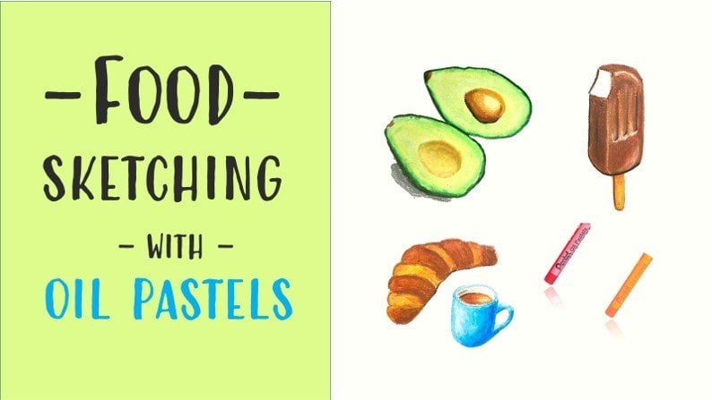
1. Introduction : Hi, I'm Elizabeth, an Italian artist. I'm originally a watercolor artist, but at a certain point in my life, I fell in love with oil pastels. Oil pastors are easy. They have vibrant colors so that you can lay down color with your fingers and you can blend your painting and you can achieve incredible results. Even if you're a beginner. Today, I will take you step-by-step through this landscape, but before the landscape, but we will sketch together any introductory exercise, a simple landscape just to understand background, middle ground for grams. And then I will take you by your hand to sketch these easy landscape with me. You will be surprised how easy it is to blend pastors to achieve color variation, to replicate the illusion of light and shadow, you will learn plenty of oil pastels, trick, and basics of landscapes in general, in this class. It's an easy class, but the result will surprise you. I think if you are ready to fully love is pastels with me. Grab your supplies, we can come sketch and waiting for you in my next lesson.
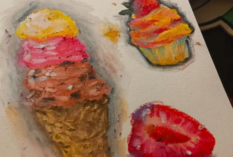
2. Supplies: The, show you the supplies that we using for this project. First of all, of course you need some oil pastels. I'm using some basic budget Sandy pastels for the first sketcher painters. So you see that you can achieve nice results with very basic parcels. In then I will use this other box of pastels that are of a superior quality but still very affordable. They're called very green and put them online. These pastels are of better quality in their more blended and seeker and softer. While other brand that you could use that is very, very nice for first projects for Beginners. I'm Craig passer expression instance. These pastors, I don't have many colors, but the quality is really very, very fine, and they're also quite affordable. So I suggest that you try these great bass expressionists. They are very comparable quality to these daily green. I've heard that the junior Cray paths are smaller, but the quality is very comparable and they are more budget friendly. If you want to start on pastors, they could be a good idea, good plan to start from. Then. You need some paper tissue to clean your hands and blender Lee Tuan. You need a pencil to draw some basic clients and an eraser. Then you need some colored pencil to refine the edges into, add some details. And I have also used Posca paint, the white posca pen, to add white details on top. I strongly suggest that you buy also some OpenStack wide pastels because you're going to use your white pastels much more that all the other pastors. So I have a white pastel in my set, but I have also bought some loose past-tense to blend and the white highlights. For paper. I will draw in the first sketch in a very budget friendly sketch book that I use for drawing. This is a sketch book that I use for colored pencils, that I use for incur, that I used for a variety is just a sketch with it I used to play. This is quite need for pastors because it allows you to play, make mistakes, draw again. So I suggest that you try a basic sketch book like this. For the second project, which is slightly more complicated, I use this oil pastel drawing paper, which is very, very nice and smooth sheets paper like this from portal veins. I fought this also online. But let's say that any paper with some tooth will do the trick and allow you to blend multiple layers. Let's see.
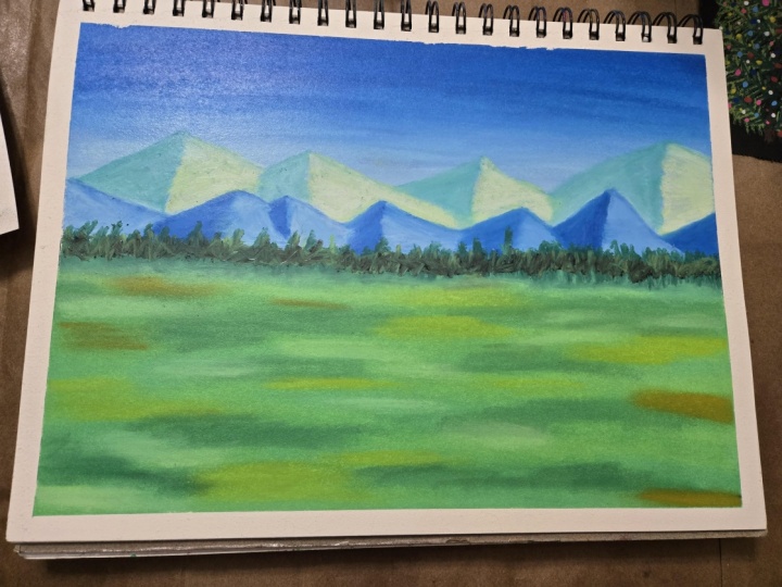
3. Preliminary Sketch: For the first sketch, the first sketch is a very simple one, and it is drawn from my imagination. So we draw a line for the horizon here. We the yellow-green. We are using our Pentel pastels that are very budget friendly Bastille allow us to have a very lovely sketch. Then I take the blue, this blue number 51 and IP lead, because I have used it a lot already. I will keep my pastors here so they don't roll. They don't fall off the table. And I will draw some mountains with different heights like this. Now. And we reimagined as usual, conventionally, that light source will come from the top right corner. So I will have here shadow and I will put the, I will just lay down some pastors on the shadow side here also. Then we take a cold green. This is number 16, blue-green. And we'll draw another range of mountains that are behind this. Same thing. I will lay down some pastels on the left-hand side that is away from light. Here and here. Now I take my white and they blend the colors. And I will also put some color on the side in light that will be naturally lighter because I have, I'm pulling colors that I have only on the left-hand side. So you see naturally it, there is a very nice gradation and gives the idea of amount time with some texture and with lightened shadow. Same here. I can also put the slightly more irregular natural topper is too small. And I will do the same. I blended. Now, I take my light blue and I blend my mountains in front. Not completely because I will add some white later. But I do the same thing. We can be slightly more irregular. I take my white, I clean it from green, or we could leave it 30 here. So very important, and we blend it on the right-hand side where I have light falling apart. White is obviously the colors that we use the most. Here is now very important because we will put a row of trees is a slightly more irregular. And once again, I blend it with my pale blue. Okay, so here we have our mountains. Now. We need to put down some grass for grass. So we use two different greens that we use this pale green and we use adapting green and maybe for blending we can use some yellow. But I will lay down these fields of grass is meadows with the direction maybe. And then I will mix these green. Now this greener all vary in natural. So if I want to give a more natural feeling, I can warm them up with maybe some yellow ocher in some points. Okay, so I take some yellow ocher and I can just warmed them up. Some point. Be careful not to lay down squares are rectangles, but be irregular and natural. Now we blend again with my yellow green. You can also use your finger, very likely to blend them together. But these low budget pastors are not very blind double. So it's better if you use maybe some yellow. You can take some lemon yellow. Input, some sun rays here in there. You see how well it blends. Okay? This is quite an actual field. Now we will put a row of trees in the back to do so, we can take our very dark green, dark green or deep green. I think that deep green is maybe nicer, is green is a little warmer. And I will add a faraway row of trees, the verifier, so we don't really see the shape. They must not be too regular, tried to be a bit irregular. Some will be taller, some will be lower, some bushes maybe here, like this. So these are the faraway trees. You can also maybe add some light 10. He said that the light is from year, so you can add some light on the right side of our trees here in there. Must be very regular circuit. Looks like a real forest. You can also add some touches of yellow ocher to achieve more organic green. Now the sky for this sky, I will use these light blue. And they will lay down quite irregular way, in an irregular way, leaving some white space for clouds. I'll take cobalt blue. Let me just grab my cobalt blue. This is cobalt blue and it's number 23, cobalt blue. And me clean my hands. I use baby wipes. I take cobalt blue here and I will just add some patches, dark patches on top. Now, you blend it again with your light blue. And again, you take your Y and you blend everything together. Pulling down color. Here you can have a round motion to simulate clouds because clouds are fluffy on top, a quite flat on the bottom. So we are just bringing down some of these blue goes skies started on top and much like around most why did towards the horizon. Okay, So if you want to add some final touches, like here, you can have, you can even add some brown for the shadow below D. Also you can put some chunks sharing there. Okay? Okay, So this is basically done. And this is just to demonstrate how we can lay down a simple landscape, blend colors together to achieve a certain depth. Faraway mountains, sky, trees, and then our fields of grass. This sketch is finished. This exercise, introductory exercise. Now let's go to the final project.
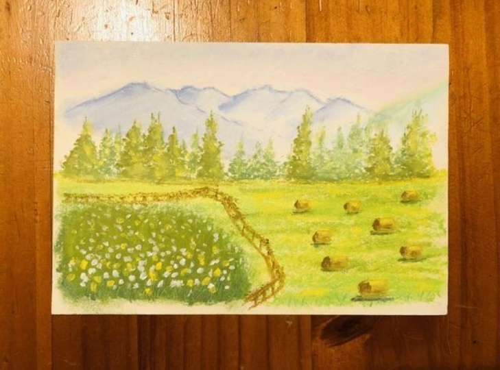
4. Final Project | First Layer: For this second sketch, I will use my reference picture that I will upload in the resource section. I will start by drawing some simple lines. The horizon, the fence, row of trees. Just to occupy the different sections of my paper. A healer. And let's put some faraway mountains like this. So we are ready, we can start. I always suggest to start from foreground and to move towards yourself in the foreground. I'm not sure. I will add some sky. Maybe I will leave the sky blank, but we will see at the end. So I start with the SEMP faraway mountain time. I'm using these pastors that are of better quality. They are more pleasurable than our painters, but love to use different supplies just to see the difference. Okay, I will start with faraway mountains and I will use them. And we'll use this one, the sky blue. I will. If you just put down is much more blending mode, then our painters and we follow the top engine, the end here, and we'll put them on these mountains smelling green. So to give some textures. Then I take this lighter blue and I will blend the mountains like this. And we tried to follow the direction. Smiley button. Here. I'm going to add some dark blue. I'm not feeling everything because there will be using some white to blend everything. So I'm taking some white. Now. Why do I always buy stock? White pastors? Because I use them so much that I know I will finish this. So always buy them loose and open stock. And I just blend everything nicely. And we use them my finger to blend everything together. And we now use my finger without pushing just very lightly, like this direction of the mountain. Here again, you're saying we now add some blue and some fines make here. And if so, why? Here just on top of the mountain. I'm here with my finger without pushing very delicate blend. And the same thing here. Now I bring my finger with a baby wife, Pam, because I don't want to contaminate with blue, my green. So I will add some white here. Blend them together so I will achieve a nice texture. Don't worry too much about the edges because we will refine them with the color pencils. Here we will have some trees, but we can add them at the end. Now we can start adding a field here. And the hay bales, hey, roles. So I will start adding some yellow green like this. So I will draw my horizon line and in horizontal stroke or fill it here. Can, we can give a movement, as we have seen in the previous project? We can use different colors. We have these nice olive green and we can put some olive green here and there. We will use it again in the foreground. And then we have this lighter green arrows. When we blend everything together nicely. We can also add some patches of yellow to lighten it up. In some here where we have wide that we can add some yellow. And then we can also blend nicely with my finger. Add some color if you think you don't have enough color, because if you want to, if it doesn't blend nicely, maybe there is not enough color so you blend it nicely with your colleagues, with your finger. You blend it nicely with your finger like this. Perfect. I add some here near the fence. And here we have a blue shell of a darker green. So these Moshe, we will do in olive green like this. And then we can mix some cooler green like this one. You see these cooler green, especially on the bottom here. And now we can blend it. So we have nice color variation. Now we take again our green it to give the idea of push. We will work some upward strokes like this in all directions, in different directions. And also take him very darker green here at the base. Here in there. You add some darker green for shadow. Now we take black cup and we add our fence. Now the pencil is obviously gone. But remember the movement of the fence was a horizontal here, then it was coming here and here. And then will be false. And they get closer. And smaller. Once we are far away. So these use our fences and now we need to add trees and a hay. For trains, we take the same darker green vector we have used for the base of the bush shop. And we will draw some lines of different heights. And then we will use, we'll draw our trees upwards, movement here, and then here is the base. You see triangular. They can also be towards the ground or the first the first branches can be upward, then they go like this. The off-course, much thinner, top and much why they're on bottom. Piece is the first layer within take this medium, intermediate green and some threes in the back. Just some green to fill the blank space. Faraway trees. We need to darken the side of the tree that is away from light. To do so we take some brown like this and we can lower branches and the side to why we will put some more green again. And maybe we can put smear lung here to lengthen the society. And now we use our very dark green and to blend everything. And we blend everything together. But you see that you have these effects on the left side and lighter here. So here now you can take some of this brown to add some shadow here. Okay.
5. Final Project | Final Touches: And now we need to draw our tables. I take these yellow ocher and I draw some rectangles for the moment beam rectangles. A big one in the foreground, smaller one. More faraway. Just almost little rectangles here and here. Now let's take some brown and I draw some shadow here to refine shape here. So almost any impressionistic style here, I don't have it. Then goes so you take now and you draw some shadow here. You also take your yellow, you clean it. Thank you. Throw some light on top, but to give some roundness. Now we're ready for the final details with our colored pencil. Here have white spot. I take some yellow ocher, some orange, some yellow ocher. And those who need some brown and some green and some glands. Okay, so I take some darker green here and some yellow ocher. I have some, I think I have everything. Now. I take my black and I will find shadow here. And here. Must be a very soft, waxy pencil like this one I'm using. Now. I have lost my yellow on top. Again. Now I take my darker green and some, if necessary, I will add some sharp points to the green to be 300. And also in the back, I can fill in missing some threes. I can add some greenery in the back. Maybe it can refine the shape here with my orange. I lay down some code or where I seeing there will be a shadow towards the left-hand side. Refine the spot from some grass. Chapter one because it is in the foreground. So I can now sum here also. I will put some white flowers here in the bush. Maybe bigger towards us as smaller. In the back. I need to make to see inner shadow under the hay here. To accentuated the roundness, I can put some brown here in the bottom. Like this. You go on until you're satisfied. And then you blend again slightly with your yellow here. Okay. We can add some white highlights, maybe here and there. Now we can also refine the top of the mountain. We the blue, cobalt blue faces from my colors. And I refine here, make it sharper and more, more like a real mountain with angles and sharp edges. Same always agree in here. The cool green. And I refine the edge. I could even put some vertical lines because this should be some trees here. So I can even use these factor green the same that I have used for our trees. For the tree top. Actually there is a difference, so I will use blend is treats week my cool green, this cobalt green. And I can also blend these trees in the back with some lighter green light. The yellow green distant trees and lighter trees that are towards us are. I use it also to add some light here, some more yellow here and there. Just some lights trucks. Okay. Somewhere. Finished.
6. Conclusions: So I hope you had fun in this class as much as I had to sketch with you. We have painted along the introductory sketch and the final project, and I can wait to see them both in the project gallery. I seriously invite you to upload them so that other students can see what kind of results you can achieve and lost. So I can give you my feedback. Don't be shy in doing this. I will seriously appreciate it. Also, if you liked this class, you can find my other classes on my channel here on Skillshare. So don't hesitate to follow me. And also you can find me on Instagram where I post my watercolor and oil pastels sketches. So I'm really excited to have you brought all the way through the end of the lesson. I hope you have learned the basics of oil pastels, landscapes. And from now on, you can paint your own landscapes from your reference image. I will be delighted to see you in the next class. Child.
 Elisabetta Furcht, Anyone can paint!